A Daily History of Holes, Dots, Lines, Science, History, Math, Physics, Art, the Unintentional Absurd, Architecture, Maps, Data Visualization, Blank and Missing Things, and so on. |1.6 million words, 7500 images, 4.9 million hits| Press & appearances in The Times, Le Figaro, Mensa, The Economist, The Guardian, Discovery News, Slate, Le Monde, Sci American Blogs, Le Pont, and many other places… 5000+ total posts since 2008.

Category: Prints–looking HARD/deeply at

  • Locating Chaos: Giovanni Della Porta’s Natural Magic and Chaos in the Sky

    JF Ptak Science Books LLC  Post 571
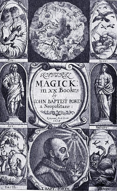
    Porta title page
    Giovani Baptista della Porta was a magus, or a natural
    magician*, who searched nature for similarities that would serve to build a
    broad template of forced  understanding of seeming likenesses, looking for the great connector
    in the exceptional and the unusual, the stuff outside of the formerly
    Aristotlean world.   Natural Magic is his magnum opus, an expansion of  its earlier
    version (Magna naturalis)  published in Latin in 1558, which Porta expanded to twenty sections in 1589. It was an encyclopedic work of vast proportions, a
    gold-mine of information and clever wishfulness, and very accessible due to
    Porta’s  wide inter-personal travel**,
    very wide reading and critical abilities, clear reasoning and deep vision:  the book was hugely successful, going into at
    least twelve Latin, four Italian, seven French, two German, and two English
    editions in the early modern era. Natural
    Magic
    , which first appeared in English in 1658, concerned itself with
    magic, alchemy, optics, geometry, cryptography, magnetism, agriculture, the art
    of memory, munitions, and many other topics, all grouped together and refined,
    distilled, into a cloudy assemblage of natural knowledge—it would end up that the magical
    whole was worth far less than the sum of its parts. 

    But the parts were pretty considerable, and much of the
    information was spot-on for the time, not the least of which was a very capable
    demonstration and explanation of a lensed camera obscura. 

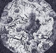
    What I’m interested in right now though is the title page of
    the book.

    Porta title page detailIt turns out and as we can see in the top image of the
    title page, Chaos is not some subspace trajectory of cellular automata, or in
    Dr. Brown’s/Einstein’s dancing dust—it is right above us.  This recognition of its regular, localizable structure
    probably does not support parameterization, or anything else for that matter,
    except to say that it is definitely “pretty”. 
    The title page has nine illustrated compartments:  the four corners depict the four elements,
    the two opposing middles show art and nature; the bottom shows the author,
    illuminated by the knowing sun.  The top
    center image is the element showing “chaos”, which I’ve chosen to use a map,
    identifying where exactly chaos might be. 
    I’ve not seen an antiquarian map identifying chaos, though I have seen a
    number showing lots of other non-existent places, like heaven and hell and
    purgatory and Eden and the Kingdom of Prester John, to name a few.  But not chaos.
    Porta sky

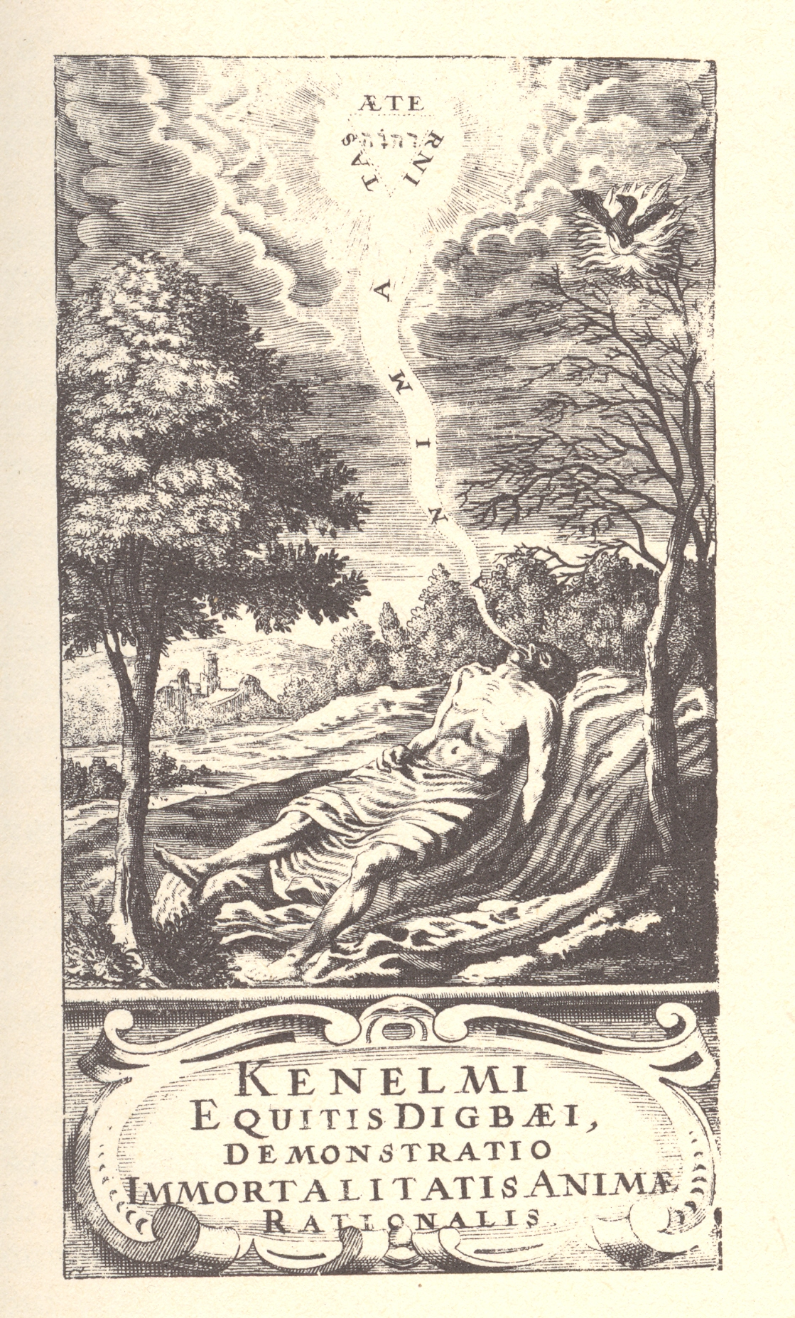
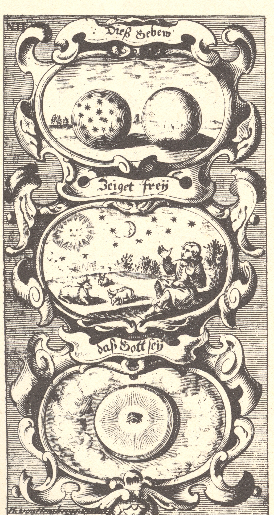
    On the other hand there are many different, substantiated, anthropomorphic objects that wind up in the sky in antiquarian images: there haven’t yet been anything spelling out chaos,  though there are many Hebrew names for the g*d incised and cut into plates of wood and metal.   There are all manners of hands-of-the-creator, gearworks for the Primum Mobile, eyes, doves, geometric shapes, blazing fires, blazing iconic people, multiple worlds, flying people, and so on. But no chaos.

    These are just two examples of the alternative-to-the-sun-in-the-sky category, a wonderful image from Kenelem Digby’s Demonstratio immortabiliitatis animae rationalis, printed in 1664.  The other is a very striking example from J.B.von Helmont’s surviving and prodigal (and prodigiously brilliant) son Franciscus Mercurius’  Das Geheimnuess der Schoepflung.  Printed in 1701, two years after FM’s death (and years after his other brothers succumbed to the Plague), the book was a bit of an amalgamation of the author’s vast and undisciplined interests, which sloshed over into the areas of magic, conjuring, Kaballa and astrology. 
    He had more success editing and translating his father’s works. 
    Porta sky 2
    I admit I’m taking a wide liberty with “chaos”, and that the the first image could simply be the creator stepping in to rid the heavens of chaos, but I liked the idea of chaos being located on a map better.  Mea culpa. 

    * Porta writes in the first chapter, defining the word “magic”:  Magic took her name and original [sic] from

    Persia.
    . . . In the Persian language, a Magician is nothing else but one that expounds
    and studies divine things; and it is the general name of wise-men in that
    country. . . . Magic was begun in Persia by Zoroastres.”

    ** A fair amount of information in this book was derived
    from his own house-bound Academia de
    Secret
    i—a name I now love!—a society of friends and scholars who discussed
    topics ranging from physiognomy to optics to cosmology to conjuring. 

    The Chapters/books of Natural
    Magick
    are shown here below to give an idea of what the book is about:

    The First Book of Natural
    Magick
     “Of the Causes of Wonderful Things.”
     “Wherein are searched out the
    causes of things which produce wonderful effects”

    The Second Book of Natural Magick  “Of the Generation of Animals.”
     “Showing how living creatures of
    diverse kinds, may be mingled and coupled together, that from them, new and yet
    profitable kinds of living creatures may be generated.”

    The Third Book Of Natural Magick  “Of the Production of New Plants.”
     Which delivers certain precepts of
    Husbandry, and shows how to intermingle sundry kinds of Plants and how to
    produce new kinds.

    The Fourth Book Of Natural Magick  “Of Increasing Household-Stuff.”
     Which teaches things belonging to
    house-keeping; How to prepare domestic necessities with a small cost; And how
    to keep them when they are procured.

    The Fifth Book Of Natural Magick  “Of Changing Metals.”  “Which treateth of Alchemy, showing how
    metals may be altered and transformed, one into another”

    The Sixth Book Of Natural
    Magick
     “Of Counterfeiting
    Glorious Stones.
    “

    The Seventh Book Of
    Natural Magick
     “Of the Wonders of
    the Load-Stone.
    “

    The Eighth Book Of Natural
    Magick
     “Of Physical
    Experiments”

    The Ninth Book Of Natural
    Magick
     “Of Beautifiying
    Women.”

    The Tenth Book Of Natural
    Magick
     “Of Distillation.“

    The Eleventh Book Of
    Natural Magick
     “Of Perfuming.
    “

    The Twelveth Book Of
    Natural Magick
    “Of Artificial
    Fires.
    “

    The Thirteenth Book Of
    Natural Magick
    “Of Tempering Steel.
    “

    The Fourteenth Book Of
    Natural Magick
    “Of Cookery.“

    The Fifteenth Book Of Natural Magick “Of Fishing, Fowling, Hunting, etc. ”
    (Complete)

    The Sixteenth Book Of
    Natural Magick
     “Of Invisible Writing.“

    The Seventeenth Book Of
    Natural Magick
    “Of Strange Glasses.“

    The Eighteenth Book Of
    Natural Magick
     “Of Static Experiments.“

    The Nineteenth Book Of
    Natural Magick
     “Of Pneumatic
    Experiments.
    “

    The Twentyth Book Of
    Natural Magick
     “Of the Chaos. “

  • The Anatomy of Comparison Department: HMS Ships Firing On London, 1909

    JF Ptak Science Books LLC  Post 596    Blog Bookstore

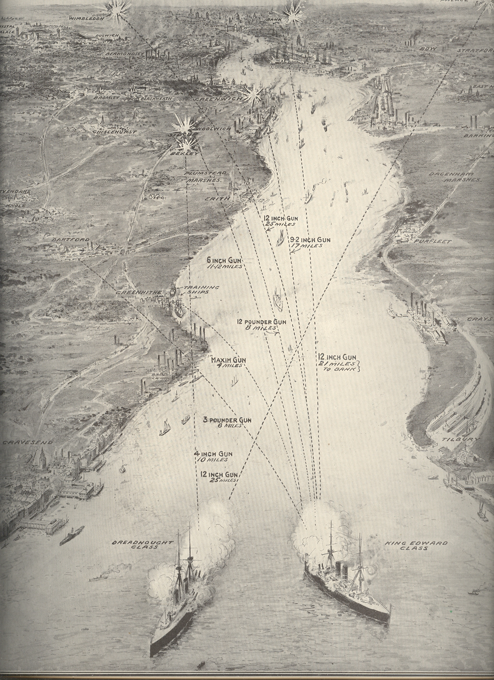
    HMS Ships Firing On  London,
    1909, Old vs. New  Comparing Shipboard
    Firepower:  a Compelling Comparative Graphic Display from the Illustrated London News for 24 July 1909

    Blog--april 26--london bombed Without looking at the sub-title and explanation of this of this print (“Firing
    from Thames Mouth to the Edge of Greater
    London”) its purpose might be a fair mystery, given the ships and the targets
    and all. The two large ships at bottom are a Dreadnaught Class battleship and a
    (smaller) King Edward Class ship, and, yes, they are firing towards London—but they
    are doing so to illustrate a point on modern weaponry and the vast, new
    superiorities of British advances in the death/protection arts.

    In June 1667 during the Second Anglo-Dutch War the British were set upon by
    an running attack by the Dutch Admiral Michiel de Ruyter, who had advanced as
    far up and into the coast as the mouth of the Thames.  The Dutch advance up the Thames was repulsed,
    though their secondary targets (so to speak) at Gravesend
    and the River Medway proved a scorching defeat for the British, and propelled
    the rocky war to a quick peace favorable to the Dutch. 

    This image shows what could’ve been the results of that engagement at
    Gravesend had the Dutch fleet been outfitted with the HMS’ new 12-inch guns—de Ruyter
    would’ve been able to reach the outskirts of London from that position, and
    could’ve b=done so from a distance of 25 miles or so. Of course the artist and
    editor aren’t really suggesting a “what if” scenario to the course of events of
    the Second Dutch War—they were merely creating a very compelling, highly
    illustrative comparison from old to new firepower, and to perhaps quite some fears
    about the strength of the Navy as the unstable and rickety international system
    limped its way into WWI, just five years in the future. 


  • An Unusual View: Looking into the Past and the Future–St. Quentin, 1917

      JF Ptak Science Books LLC  Post 593       Blog Bookstore

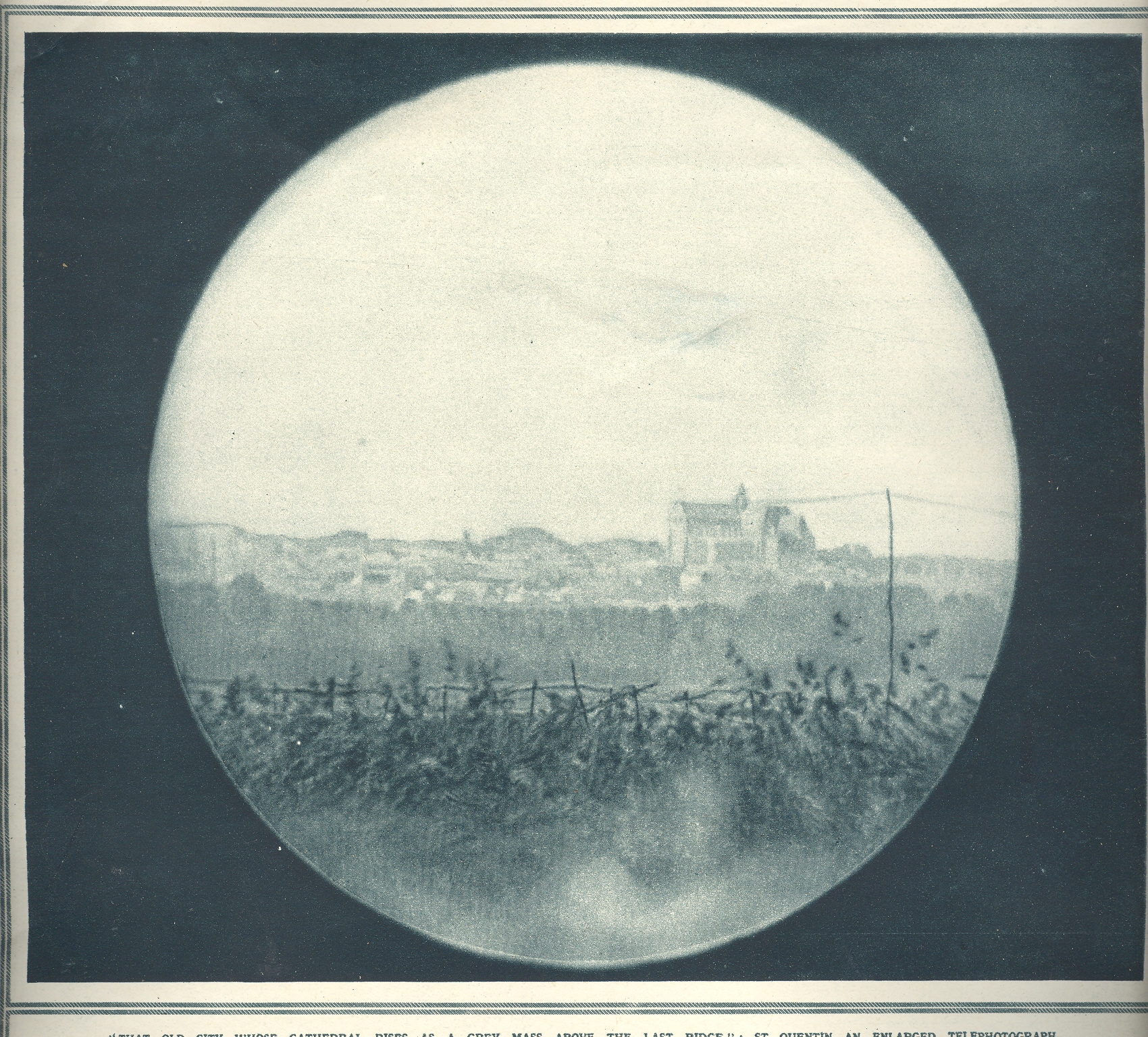
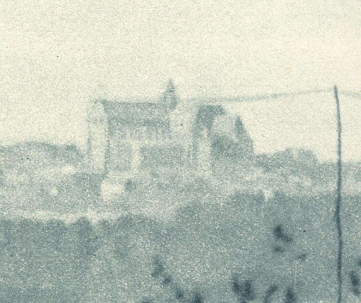
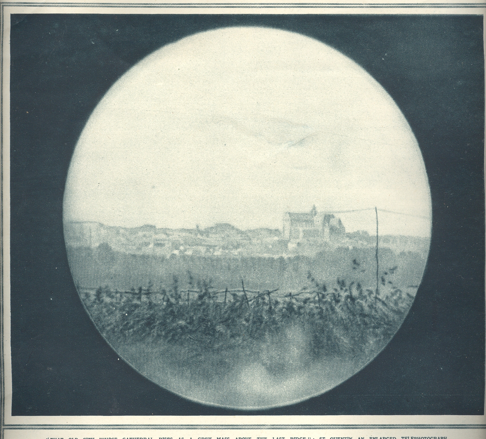
    Blog--WWI--st. quentin This lovely, seemingly antique daguerreian view is what the American Expeditionary Force (AEF) commander General JJ Pershing saw at the front lines of St. Quentin in July 1917.  The U.S. had entered the war, finally, on April 2 1917, nearly three years after the war began, landing in France 13  June 1917 and entering almost immediately into battle at Chateau-Thierry.  On 2 July Pershing estimated that the U.S. would need a million fighting men; the day that this photo was published in The Illustrated London News, he revised that estimate to three million.  The view he was seeing here was more than of a town about to be pounded by thousands of artillery shells–the magazine was sharing a view of what the European and Empire countries had been seeing for 31 months, and what the Americans would now be sharing for another 17 months. 

    Blog--WWI--st. quentin det
    It is a beautiful and deadly view, seen through French field binoculars at the tip of the front for the battle.  The large building to the right is the town’s Gothic cathedral/collegiate masterpiece:  it was old and large, with a 370-foot-long and 130-foot-high nave.  It was a highpoint for that part of France, and was the burying place for St. Quentin and St. Victorious–their graves would be covered by the rubble of the cathedral’s collapsed roof very soon after this picture was taken.  The building was shelled and burned all night long–the French blaming the Germans and vice versa. 

    If Pershing had really good sight he might’ve been able to see the 116,000 American soldiers wIraHayesArlingtonho would be killed in battle, though I suspect he had a pretty good idea of what was to come, thinking as he did that he need 3 million soldiers.  To be utterly fair I don’t think that he could’ve possibly  seen in his imagination  what 9 million dead soldiers looked like, or what 16 million dead soldiers and civilians looked like, or what 37 million dead and wound soldiers and civilians looked like, all the casualties of this war, all done in 4 years. 

    I’ve found it odd in a way that I’ve not really been able to explain that Pershing is buried so very close to Ira Hamilton Hayes at Arlington.  I used to leave a good twig on Jackson’s headstone on Memorial Day, and then get that unusual, uncomfortable emotion on seeing the large Pershing monument just a few hundred feet away. 


  • Unfinished, Blank and Empty: Durer, Gaudi, Schubert, Mozart, West, Stuart

    JF Ptak Science Books LLC  Post 588       Blog Bookstore

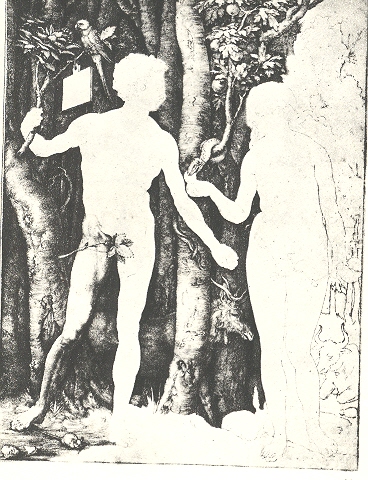
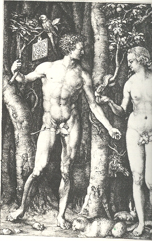
    Unfinished in some ways is part of something that is not there, part of the missing, the blank, the empty.  One aspect of this calling to emptiness is seen in this semi-completed, semi-empty trial proof version of Albrecht Durer’s intaglio Adam and Eve (1504) , the finished and full state of which is seen below.  The unfinished bit is easier to see but hard to find, sometimes.  Leonardo comes to mind several times:  the magnificent Sforza equestrian statue and St. Jerome Praying in the Wilderness come to mind, as with his Study for the Adoration of the Magi.  Gilbert Stuart’s ultra-famous mostly-finished portrait of George Washington wound up in thousands of schoolrooms across the United States as well as—cropped—one the one dollar bill. Nearly-as-famous Benjamin West left unfinished another icon of revolutionary American history, the American Peace conference, half of the historical figures faded unfinished into history.

    There are some things that are unfinished but really aren’t so:  say, for example the not-endable Ulysses, complete and incomplete in its circularity.  Mozart’s Requiem, a piece of music that helped drive the poor man to his death, was unfinished though completed by another hand.  Blog--blank durer 001

    There are unfinished examples of architecture bounding into the urban landscape, fantastic examples of extraordinary things.  The great Schloss Neuschwanstein, the empty and unfinished dream of the “mad” and mysteriously murdered King Ludwig of Bavaria, is certainly one.  This building ironically seems for me more compelling, filled far more than Uncle Walt’s doppelganger in Orlando.  The greatest structure of the Drippingly Baroque is another unfinished masterpiece, the work of Gaudi in Barcelona, the Sagarda Familia.  Started in the 19th century and stopped with Gaudi’s death in 1926, the Sagarda’s forest of towers was only 15% complete—the city is still at work on it, with 40% more to go.  

    We could look at these images while listening to audio examples of the unfinished:  the tidied-up requiem of Mozart, Schubert’s unfinished 8th Symphony, and Mahler’s unfinished 10th  come to mind.

    There are spectacular monuments to unfinished business: American Federal treaties with Native Americans (almost all of which were signed, documented and not enforced; empty, blank, broken); the assurances to the millions still waiting for some verifiable change in the townships of South Africa; promises of decent wages and health coverage for the marginalized “partners” of oblivious behemoth  monsterstores. [I can think of one major player whose corporate name spelled backwards relates to railroading the law, driving that point home to employees, suppliers and patrons.  “Tram Law.”] A history of unfinished business would be massive, and then, once you got to the end, all you’d be doing would be driving a Ford Pinto off the end of an unfinished bridge.
    Some things that looked sort-of finished are later revealed to be not so:  Einstein’s Unfinished Symphony of relativity (titled so in Listening to the Sounds of Space-Time  by Marcia Bartusiak) is one. Mathematics—all of mathematics—also comes to mind, the great edifice nearly “completed” by Hilbert until one of his famous questions got answered by Goedel, and then all became unfinished again.  One day everything seemed filled-up; the next, well, it wasn’t.


  • Fish-Eye Views, Part II: Escher’s Tetrahedral Planetoid

    J.F. Ptak Science Books LLC  Post 586    Blog Bookstore 

    Planetoid Late
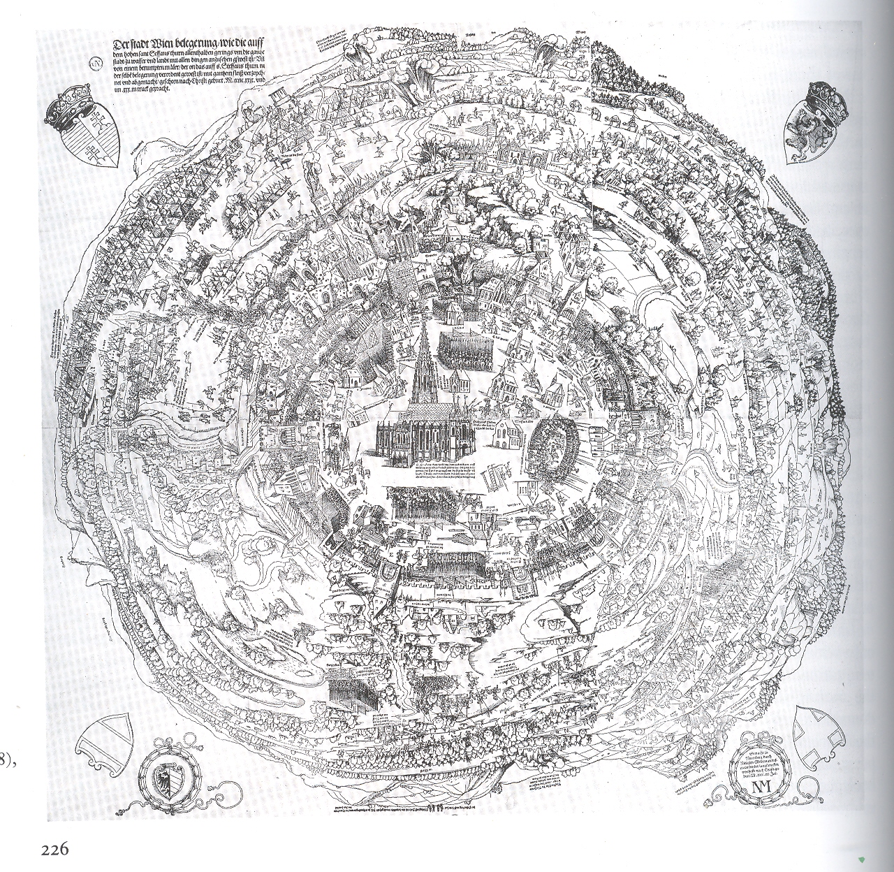
    last month I wrote a short post about an antiquarian fish-eye view of the city
    of Vienna(1529). (“I’ve paid some attention to antique images that look straight down at
    things (Looking
    Straight-on At Things
      and  Looking 
    Straight-Down on Things
    ) and I can say that they are in general pretty
    uncommon–this is the first time though that I’ve noticed a fish-eye
    view looking straight down, an image conveying a 360-degree horizon-to-horizon
    landscape.”)  I’ve not found another
    antique view like this, but I did just come across this magnificent work by
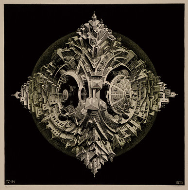
    M.C. Escher  (1989-1972) called
    Tetrahedral* Planetoid, produced in 1954 and now living at D.C.’s National
    Gallery. 

    The
    view of the planetoid is quite complete, as we can see individual houses and even
    some people  What I find particularly
    amazing, apart from the design of course, is that this meticulous ideal was an engraving
    done on wood.  It is a glorious accomplishment,
    and a joyful optical shock to the system.  .

    Escher planetoid

     
    *A tetrahedron (plural: tetrahedra) is a polyhedron
    composed of four triangular faces, three of which meet at each vertex.


  • “Emerging” as a Verb: a Note on Patterns in Science and Art

    JF Ptak  Science Books LLC  Post 583
    Blog Bookstore

    And all that appears confusedly on walls is very like the vibration of bells:
    you can hear in their ringing all the sounds or words you want to imagine.”
    – Leonardo da Vinci 1492

    Finding recurring events, schemes and objects, finding predictability, finding a pattern, making a pattern emerge seems to be what we do here on earth.  After all, the stuff that we use to organize our existence into transferable bits of knowledge–points and lines and symbols that stand for sounds which stand for other things which constistute language–don’t exist, but they do tell us pretty much everything we need to know about our environments, real and imagined.

    Blog--emerge

    Stars are (as my daughter Emma pointed out when she was four) “messy” until imaginary lines are drawn between them; the relationship of the elements are mysterious until a (a) they were “discovered” and (b) table of relationships was figured for them.  Mathematics, the queen of the sciences, is nothing but making patterns emerge.  Art* and aesthetics developed over millennia to arrive at things like paint and the golden ratio [(a+b)/a=a/b] and perspective, making images and other representations emerge from the chosen media.  Patterns emerge from massive, seemingly too-complex entities:   even the weather’s patterns emerge (to within a particular range). (Better yet, with weather, it is extraordinary to see how small variations of the initial condition of this sort of dynamical system can produce large, long term variations. Have a look at one of the greatest works on the circulation of the atmosphere at my blog store.)

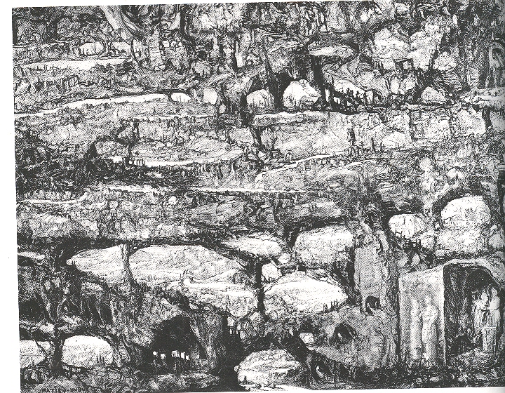
    In a slightly odd and definitely beautiful book by Jurgis Baltrusaitis, Aberrations, an Essay on the Legend of Forms (MIT 1989) I found a fantastic illustration of the work of Mathieu Dubus (1590-1665/5). Dubus evidently was a pre-modern modernist, and painter of fantastic landscapes, though (apparently) very few have survived the years.  He was an outsider to the great Golden Era of Dutch art of the 17th century, probably a little too far afield for most tastes, though his associate and contemporary, Hercules Seegers (Seeghers), another experimentalist-as-artist, found far more afield, at least so far as royal patrons were concerned.  (Segers was also collected somewhat by Rembrandt, who owned at least one of his paintings.  In his own bit of “emerging”, Rembrandt actually purchased one of the metal plates from which a Seegers print was made, and reworked it, making it his own,  publishing prints from the “combined” effort.)  It is also interesting to note that if Dubus was included in the Big Books on Dutch art of this era, he would fall between the beautiful Gerard Dou (small, exquisite, dark, very layered) and Jakob Duck (who had a very Dickensian taste for street/common/low life).

    The Dubus work, The Destruction of Sodom and Gomorrha.,  is exceptional, and odd–I still don’t understand if the image was actually painted on an old and decaying wall, or if was painted on agate that looked like a decaying wall, or if was painted on canvas and made to look like the above.  No matter–the effect is that the artist used the “natural” occurrence of breaks and segments to make his picture of the great destruction from Genesis emerge from the seemingly “found” surface. It is a remarkable image, and I’m fairly well certain that the 17th century wasn’t ready for it.

    It is remarkable that humans have sought for thousands of years to make representations of their environment and ideas more clear; and it wasn’t until the second decade of the twentieth century that artists sought the “reverse”, until, finally, a person wasn’t able to tell what a painting was “of” unless told so.  (Jackson Pollock told the story many times of seeing his work exhibited upside down.) 

    *”Art is the imposing of a pattern on experience, and our aesthetic enjoyment is recognition of the pattern.” is what Alfred North Whitehead (1861-1944, English philosopher and mathematician) said, sucking the very life out of the discovery part of the whole experience. 


  • The First Fisheye View? Vienna, 1529

    JF Ptak Science Books LLC  Post 567

    Fisheye


    This magnificent woodcut,
    The Siege of Vienna*, executed by Nicolaus Meldmann, was published in 1529/30 and depicts a view of the city of Vienna from an extraordinary and perhaps unprecedented perspective.  I’ve paid some attention to antique images that look straight down at things (Looking Straight-on At Things  and  Looking  Straight-Down on Things) and I can say that they are in general pretty uncommon–this is the first time though that I’ve noticed a fish-eye view looking straight down, an image conveying a 360-degree horizon-to-horizon landscape.  It is just simply phenomenal, even if a fair number of the buildings in town are missing and so on–the (unnamed) artist-on-the-spot actually climbed a high spire and made a number of sketches, extrapolating it all into this horizon-bending whole.  But the representation of the city wasn’t the paramount concern in the print–it was the placement of what was going on outside of it that was important. And what was happening concerned all of Europe–it was the invasion by the Muslim Ottoman
    Empire
    , led by Sultan Suleiman I (the magnificent)
    , and in 1529 they had made their way through Hungary and into central Europe, laying  seige to the principal city of Vienna with an army of 150,000 (or 300,00) soldiers. . It was the high point of the Ottoman expansion, as they were ultimately turned back by the Austrians in a determined and complex series of battles of mining/tunnels versus anti-mining and anti-tunnels (such battles being fought, still, deeply into World War I).  So this print was made for a wide audience of Europeans, trying to get a glimpse of the siege of Vienna and the positions of the Ottoman forces, knowing that the outcome of the siege could very well hold the fate of the rest of Europe.  

    If you check out the other posts in this blog on “Looking Straight Down” you’ll see a number of examples of early straightdownedness–none though approach the vast area that the artist of this print had taken under control and displayed. 

    *I found this reproduction in Landau and Parshall’s beautiful, attentive and intuitively incisive The Renaissance Print,1470-1550, published by Yale University Press in 1994.  It is a rich book, with very deep depth and a light touch, hard to do in an academic/historical work.  But they did it. 


  • (Un-?) Necessary Emotion: Medical and Anatomical Illustration and the Human Spirit

    JF Ptak Science Books LLC  Post 565

    Standard illustrations that give a little more than they need to have always been very interesting to me–sometimes this takes the form of completely unnecessary detail in almost-invisible expendable space fillers (as I’ve looked at in this series)

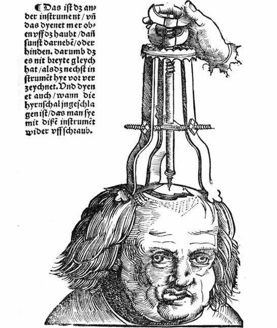
    Gersdorff_-_Schädelwunde

    and sometimes it is in the most obvious places. 

    Now, in this remarkable image from Hans von Gersdorff ‘s (who we met earlier in this blog) Feldbuch der Wunderartzney (Fieldbook of Wound Surgery, and printed in 1517) comes an unexpected bit of detail.  The machine, the surgical device, operates something like a cork-puller: it is meant to attach to and extract a piece of skull that had become embedded in the brain following a skull fracture.  The procedure looks as though it is just beginning–the man’s head has been shaved, the fracture revealed, and the penetration about to begin.  The patient looks, well, I’m not so sure exactly what this look means–perhaps nothing, perhaps the man has brain damage.His right eye has drifted, his jaw set off to the the side and is jutting considerably.  I suspect that a simple view of the top of the patient’s head would’ve been enough to illustrate the image, but–as seems to be more often than not in the 16th century–the illustrator has included not only the entire head, but has given the head character, history, emotion and dignity.  Everything necessary to imbue the surgeon-reader with with the sense of humanity associated with his trade and task. 


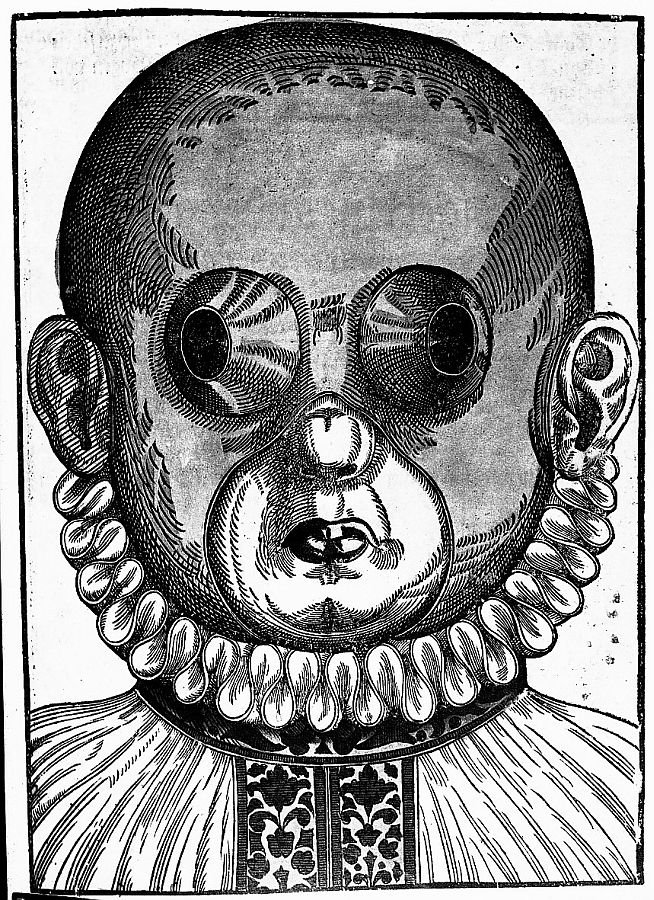
    Zzzzzzbartisch

    I should think that the same may be said for many of the illustrations from Georg Bartisch’s Augendienst (The Treatment of the Eye, printed in 1583).  The woodcut at right is an example of Bartisch’s suggestion for crossed eyes–the mask would be worn for different periods of time, the openings supposedly working to make the eye muscles assume their normal positions.  The remedy looks bizarre (and very symmetrical) from our point of view here in its future, but what seems very modern is the careful treatment of the illustration of the patient, who is erect, calm, well dressed and terribly decent. 

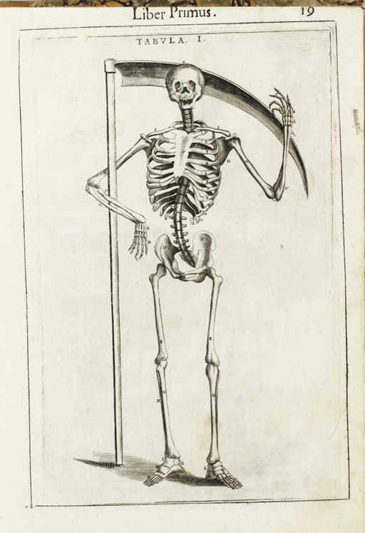
    The thread of deeply humanized anatomy runs deep in the 16th and 17th centuries,where human bodies are dissected to show the different levels of our delicate existence.  The bodies are not simple cadavers, but seem to have some sort of “liveliness” in their post-living being.  This image (below) by Guido Guidi (1508-1569).in his De anatome corporis humani libri
    VII.

     (printed in Venice in 1611)  gives the beckoning skeleton a smile  to go along with its timeless  gesture for the remembrance  of mortality.

    Blog--emotion--guidi 

    Certainly there can be no escaping the modesty of the model
    in Alexander Read’s (1580-1641). Somatographia Anthropine, or a Description
    of the Body of Man. . .By Artificiall Figures representing the members…
    (printed
    in London by Jaggard
    in 1616).  Even though she is displaying most of her abdomen, this person is still caring for her moral appearance.

    Blog--emotion--woman

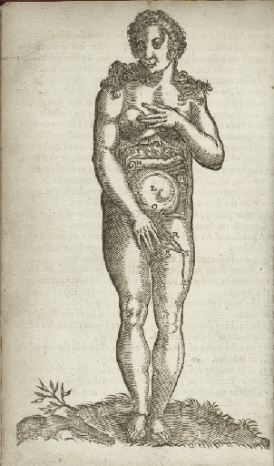
    Another example of this modesty can be found in the work of Adriaan
    van de Spiegel’s(1578-1625). Opera quae extant omnia (edited by Johannes
    vander Linder) printed by the famous Blaeu’s in Amsterdam
    in 1645:  here we see the nearly full-term foetus ably
    displayed, the mother’s skin pulled back as if to form petals to the flower of
    the child (helped along by a strategically-placed plant in the foreground).


    These images can go on and on–these are just a few scant examples.

    Another quick example: 
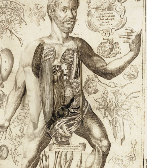
    Johannes Remmelin’s (1583-1632) Kleiner Welt Spiegel, das ist,
    Abbildung goettlicher Schoepffung an des Menschen Leib….
    (printed in Ulm
    in 1661) has many illustrations in which the anatomical model seems quite
    serene; ambiguous, sometimes, to what is going on, but at the same time looking
    inviting, welcoming even.

    Blog--emotion man beard 
    All I’m saying is t hat there seems to be something special going on in these images–certainly a “something” that was lacking in most other (non-artistic) anatomies of the 19th and 20th centuries.  Emotion was certainly extracted from the examples of modern and recent-past anatomical studies. I feel a little happier with the artists and physicians who were interested in connecting humanity to these studies than the slabs of Netter and Grey, to say nothing of the Adam and Eve project or deeply modern technologies.  A little reminder now and then that there was something else connected to the viscera and bones and muscles and veins might not be too bad. 


  • A Map of The Office, 1942 -&- On the Cusp of Color: Bringing Color to Packaging

    JF Ptak Science Books LLC  Post 564

    Color 001


    An Occasion An Appreciation,
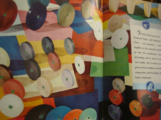
    a badly-titled but butterly-produced and broadly-illustrated work is a shiny, slippery and slick celebration of gummed paper.  It may well be the Gutenberg Bible of gummed paper celebration books. 

    The book is a silver anniversary (1917-1942) of the Mid-States Gummed Paper Company of Chicago, makers of gummed,.flat, non-curling special gum gummed papers.  It was a company started by box makers, the logical extension of that business. (“Gummed cloth tapes completed the manufactured joint of corrugated boxes, and gummed kraft sealing tape close the box,” Indeed. Also its a nicely-written Color 003
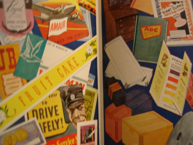
    sentence, and a well-written book.)  There is a continuous reference throughout the book to “flat, really flat” gummed tape, something that is lost on me if I don’t think about it–the use of splashy color throughout the work, though, isn’t. 

    The company’s color tapes washed over a wide spectrum, adding an artistic touch to a packaging world which was largely black and white. It also produced color gummed labels for  packaging and advertising, which made all the difference. (To appreciate this all you have to do is wind your way through a year or two of LIFE magazine from 1939/1940 and see the vanilla- and blandly-colored boxes of cereals and cans of  such and so spread across the issues.  People Color 004are much more convinced to buy something that has a colorful, pictorial image on the box than one that is a white box with black lettering. )*

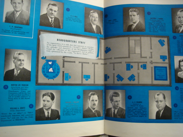
    Another very interesting bit about this book is that it published an indexed map of the offices of the headquarters staff–which is a very unusual map to my experience, very.  I’ve got a small collection of office layouts/maps from the 1900-1940 period, mainly because it belongs to a period long ago and far away, even though the tail end of office design like this creeps its way into my own life, showing up at places like “computer headquarters” in tv shows like the Rockford Files in 1980. It is a wonderful insight into the way business was done, and I can just about see the polished red linoleum floors, open Color 002transoms and abundant oak everything, all swirling in cigarette smoke, populated with people wearing real clothing.

    Yet another oddity is the map of the locations of the company–it definitely belongs to the Blank and Empty Things category of this blog–showing the five cities where it  had offices.  The resulting map though is quite unusual, as it shows just the five point and leaves the rest of the country jet black in a deep blue background, everything else missing. 

    I know I’ve had some fun with this book, but I’ve got to say that it was very well done, very well written, and about as interesting as its topic could allow. 

    * I believe that the first mass-produced book illustrated with color photos was by Leica for its labs, published in Berlin in 1938 (?).  color printing in photography had been around by a laborious process since at least the 1890’s, but that’s a different story


  • Humanist Secular Prints in the Renaissance: Bedroom vs Boredom Eyes

    JF Ptak Science Books LLC   Post 563

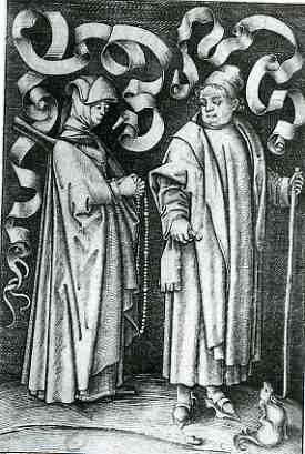
     blog 26 mar humanist 1733At about the same time as the development of a tonal system in the art/print world–which appeared later of course than that in the painting world, given the means of production for the printed medium–came the introduction of the deeply and occasionally troubled vernacular.  The examples below are works done in a cycle by the semi-problematic Israhel van Meckenem (ca. 1450-ca.1510), whose productive and highly-skilled period of productivity swirled around that of Mantegna*, Schongauer, Durer, de Barberi, and Raimondi.  He  is not well remembered in the histories of early printmaking, even though  he had magnificent skills, though not as prodigious as those of his contemporaries.  It is interesting to note that in addition to his artistic and technical prowess, van Meckenem also had a hard touch for business.  For example, answering a particular and immodest call, he produced images exploiting fears of death and eternal death.  Some prints  were, upon purchase and display, supposed to ward off the Plague.  Others presented images of Christ, purchased by hopefuls as indulgences to free them of the burden of thousands of years in Purgatory**.
     blog 26 mar humanist 1735


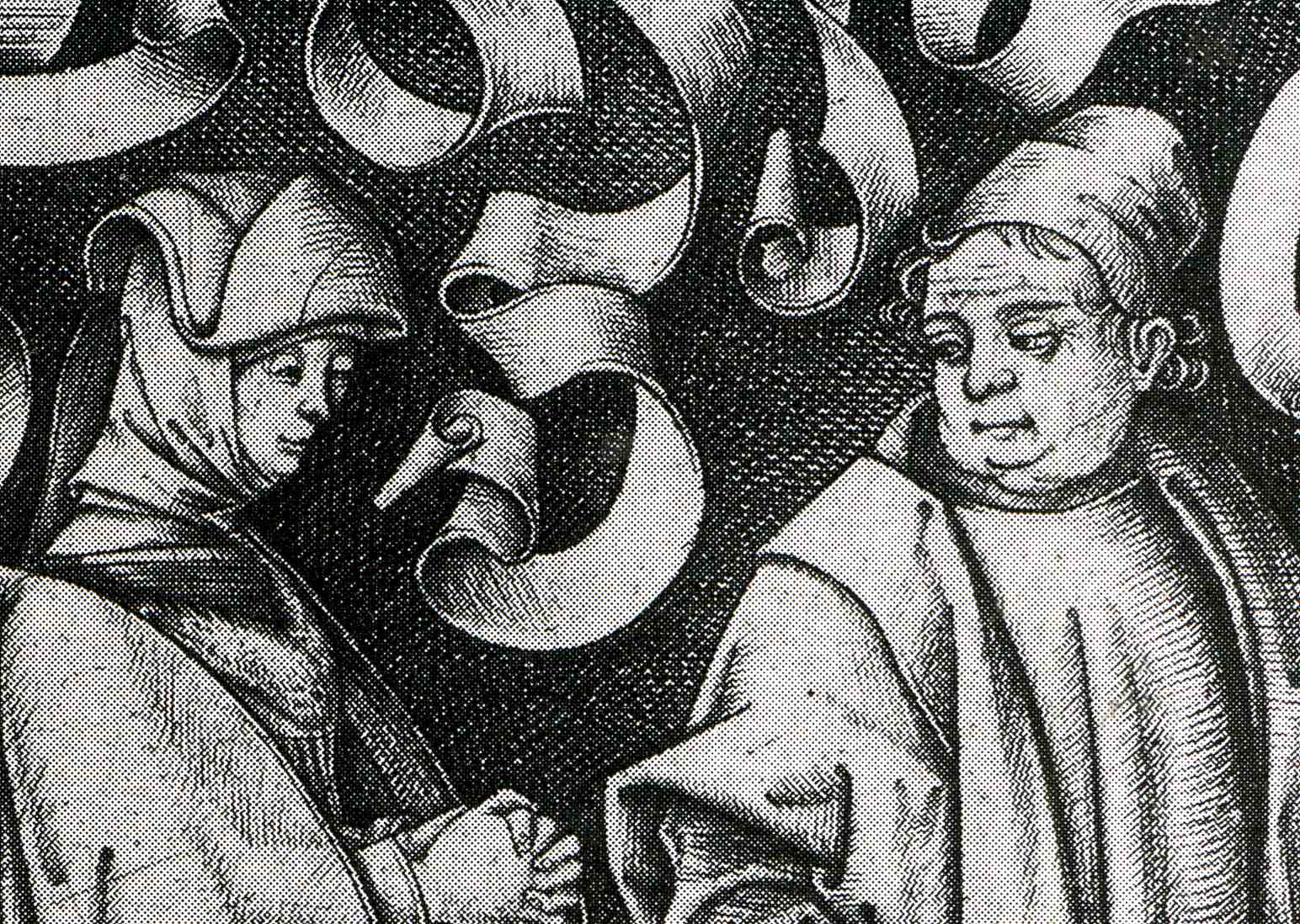
    This series captured my eye because of the eyes it captured.  It is a lusty series of profane images, or at least they were one-way lusts and desires.  In general, the women in this series seem pretty resistant, if not militant and disgusted, by the fumbling and obvious (or oblivious) suggestions of the men.  The women are distant, arms crossed, leaning away, eyes averted.  In the example above, a church-going couple are, well , going to church, but the man/husband seems to be thinking of a different sort of worship–for her part, the woman/wife keeps her hands very prayerfully clasped, knuckle-busting tight; the scrolls in the back seem to be ready for the thought-balloon legend “oh dear sweet god leave me alone!”.  The busty-jowled, pigdog man’s emotion is clearly displayed in his fat-lidded eyes..  (As a humorous aside, if you look closely in the right bottom corner of the print you’ll see a small doggie scratching itself, which I take to be the artist’s statement on the whole scene.  I’ve included a detail at the bottom of this post.)

     blog 26 mar humanis knife737
     blog 26 mar humanis knife738

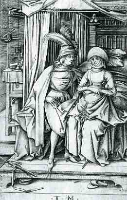
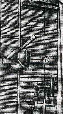
    Next is this slightly ambiguous scene of a puffy-plumed man staring hard at his “date”, sitting at the edge of a bed.  Her look is non-committal; his isn’t.  (Perhaps she is pregnant? )  The wonderful bit about this scene though is the knife in the door above the latch, sunk deep into the wood by the man to keep whatever was going to happen private. 

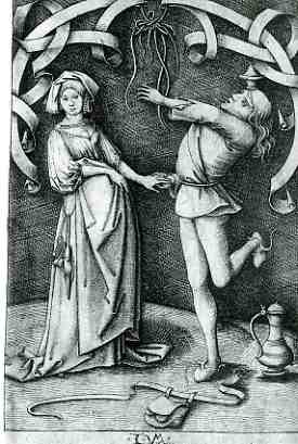
    The final image shows a dancing man–his purse loosened and on the floor to free him up, I guess–trying his best to impress his lady.  The woman, obviously, wants no part of the foolishness.  Her body language is slight but VERY clear.  He tries to hold her hand; she only lets him touch her, her fingers straight and her thumb relaxed, not gripping anything at all.  She just wants to get the hell out of there. 

    And so we have a modest introduction to foolish sexual dalliance, ca. 1500.

     blog 26 mar humanist 1732
      blog 26 mar humanist 1736


    * Andreas Mantegna has been credited with beginning printmaking in Italy, as has the Master of the Playing Cards in Germany. 

    ** Some of the prints were sold with indulgences for 45,000 years out of Purgatory.  The problem with these things is that no one knew if 45,000 years meant anything at all in terms of time-in-eternity.  My guess is that you’d need a whole lot of those things to make any difference at all.