A Daily History of Holes, Dots, Lines, Science, History, Math, Physics, Art, the Unintentional Absurd, Architecture, Maps, Data Visualization, Blank and Missing Things, and so on. |1.6 million words, 7500 images, 4.9 million hits| Press & appearances in The Times, Le Figaro, Mensa, The Economist, The Guardian, Discovery News, Slate, Le Monde, Sci American Blogs, Le Pont, and many other places… 5000+ total posts since 2008.

Category: Prints–looking HARD/deeply at

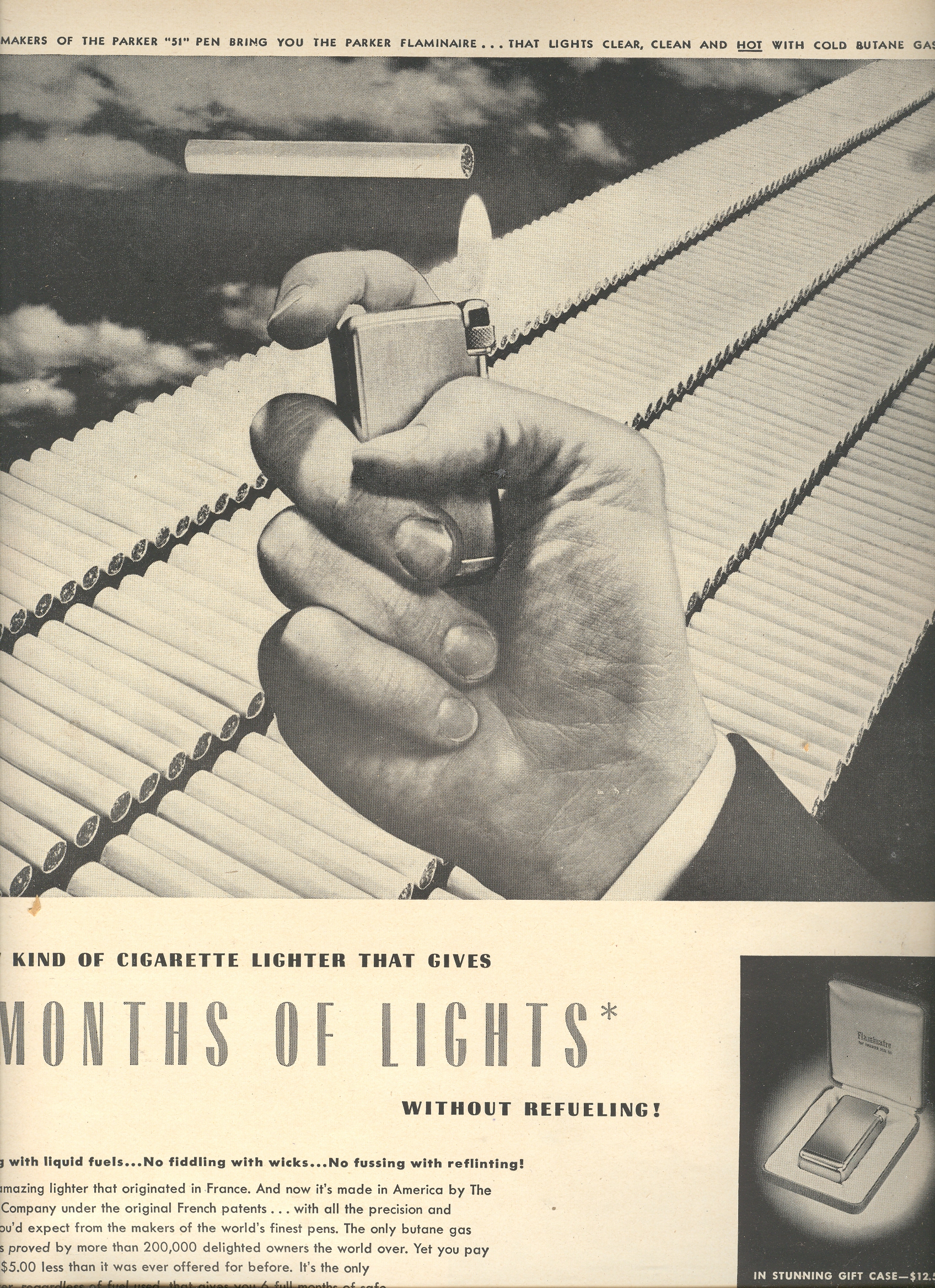
  • Cruising Down the Cigarette Highway, 1950: the Unlimited Reach of Tobacco

    JF Ptak Science Books LLC  Post 699  Blog Bookstore

    See also my related posts:

    The Worst Picture of Santa, Ever 

    and 
    Deathly Equality: Liberty and Lung Cancer

    This is a simple ad for a butane-based lighter (appearing in LIFE magazine for 18 December 1950), lighting the
    way down Cigarette Road.  Actually,
    it was more a highway than a road, and a superhighway at that. Government-sponsored warnings about tobacco health issues was still more than a decade away:  medical doctors were part of the advertising machine, as were actors (including RWR), sports figures, and virtually anyone else with a mouth.

    ==Blog July 27=cis It seems to me that there are about 300
    cigarettes in this ad, and that looks like a lot—point of fact though is that
    in 1950, the average American (of 18+ years) smoked about 3,522 cigarettes a
    year, which means about 10 cigarettes a day for everyone in the country.  Not 10 per smoker; 10 for everyone in the entire country, smoker
    or not, who was over 18 years of age.

    The average smoker in 1950 smoked about 2.5 packs a day, or
    50 cigarettes or so—that’s equal to this line of cigarettes being smoked every
    six days. 
    There were virtually no brakes.

    Even Santa (a pipe smoker) got into the business. This was a standard, acceptable, vanilla-packaged advertisement.

    ==Blog July 27=cigs xmas


    United States Cigarette Consumption, ,
    1900–2007

    First number is total consumption in billions; second number
    is per capita yearly consumption for people 18+.


    1915   17.9   285

    1920   44.6   665

    1925  79.8  1,085

    1930 119.3 1,485

    1935 134.4 1,564

    1940 181.9 1,976

    1945 340.6 3,449

    1950 369.8 3,522

    1955 396.4 3,597

    1960 484.4 4,171

    1965 528.8 4,259

    1970 536.5 3,985

    1975 607.2 4,123

    1980 631.5 3,851

    1985 594.0 3,461

    1990 525.0 2,827

    1995 487.0 2,515

    2000 430.0 2,092

    2005 376.0 1,716

    2007 360.0

    Source: Tobacco Outlook Report, Economic
    Research Service, U.S. Dept. of Agriculture.

    JF Ptak Science Books LLC  Post 699  Blog Bookstore


  • Asclepius, Modern Medicine and Health Reform

    JF Ptak Science Books LLC  Pos 698  Blog Bookstore

    Our exhausted elected servants have
    retired to their native haunts, spent perhaps by their efforts to noodle
    through a desperate plan to reform our national health care mess. It may be
    that they’ve retired to make good on their wakening efforts on health care, and
    go full throttle into sleep-and-dream efforts. 
    They might be able to find something there. At least for some of them
    there may be not a great difference between their awake and their asleep
    reasonings, so few will get injured. 

    ==jblog==july 26==ascelpius

    This is not without precedent; and as
    a matter of fact dream mental and physical therapy is far older than any sort of
    medicine that we recognize as “moderns”. 
    The dream temple was in extensive use in Egypt some 4000 years ago; people
    attended the temple and through various means entered a trance state, after
    which their visions/dreams were analyzed for medical benefit.  It was in many respects a hospital of dreams,
    with treatments ranging through the expansive gamut of sacrifices to the appropriate
    deities, sweating, fasting, bathing, meditation, sleep, and of course, more
    sleep.

    But the one degree of separation business
    connecting health care reform with sleep-thinking is Asclepius, on whose pillow
    the legislators can feel safe and comfortable. 
    In ancient Greece

    The connection between modern
    medicine and sleep and dreams is the staff of Asclepius—a snake-entwined staff,
    which is the very symbol of modern medicine. 
    In ancient Greece
    ,
    people in need would go to their Asclepieion and take their treatment, again
    consisting of fasting, prayers, meditation and sleep.

    The connection between modern
    medicine and sleep and dreams is the staff of Asclepius—a snake-entwined staff,
    which is the very symbol of modern medicine. 
    In ancient
    Greece
    the first step in attending the benefits of an Asclepieion was to sleep in its
    outer courtyard, waiting for a vision of the great Asclepius, who would be recognized
    by this very staff.  Once the pilgrim
    achieved this first level of dream/sleep/vision they could proceed to the
    interior of the temple and seek their treatment.  Perhaps now that the Congress is on vacation
    they might be more attuned to the possibility of entertaining a helpful sleepytime
    vision from the iconic benefactor of modern medicine, and  proceed accordingly.


  • A History of Dots: the Black Sun of Das Planeten Buch, 1541

    JF Ptak Science Books LLC  Post 694  Blog  Bookstore

    History of Dots, Part 15

    Soft on the Heals ==Blog July 21=dotsof
    the 1898 Planetary Visits post (earlier today) is this 1541 Books of the Planets (Das Planeten Buch.
    Von Natur, ey
    genthumb, und wirckung der siben Planeten…), which was published
    in Strassburg by Jacob Cammerkander..  It
    is a collection of medieval German accumulated astro-data and posie, cobbled
    together by an anonymous author, and strung together for the masses—it was
    evidently very popular, eager fingers pulling the many editions to pieces (and such), so that very few now exist. 

    The dot that I have in mind here is the standard astronomical depiction of the sun, and it appears brilliantly-n-black in the bottom panel close-by the image of Saturn racing across the sky. 


  • Space 1898: Pre-Modern Space Flight

    JF Ptak Science Books LLC  Post 693  Blog Bookstore

    Also have a peek at my post on pre-historic space flight: de Bergerac, Leonardo & Co.

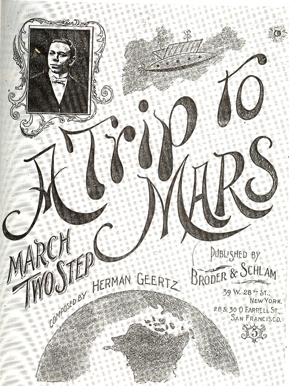
    Herman Geertz, a mysterious, unknown quality of a person to me, made a major contribution to the history of American spaceflight, albeit an unusual, ephemeral one.  In 1898 he published a song—with the firm of Broder & Schlam of San Francisco—called “A Trip to Mars (a March Two Step)”, and is perhaps the first piece of music ever published in the United States about interplanetary spaceflight. 
    ==Blog July 21=mars
    The musician–whose portrait appears in a frame at the upper left—also includes an odd view of the planet Mars, and, most important, an image of a space ship.  It actually took about 20 years for this sort of popularization of Mars to grab a hook in song, even though the interest in the planet and the possibility of life there had been bubbling since Schiapparelli’s  (misunderstood) work on the planet  in which he famously identified its “canalli” (and which was infamously and wrongly translated as “canals”.  Much of this great misunderstanding was rooted in Percival Lowell’s book Mars in which he takes the canalli idea and runs with it to the goal line of Martian civilization).

    One year later, in 1898, Kurd Lasswitz—a professor of math and physics, a Kant expert and philosophe, and an historian of science—published what was to make him the equivalent of Germany’s Jules Verne/H.G. Wells (in importance if not in quantity).  Auf  Zwei Planeten (first published in Leipzig in 1898) was an immediate best seller, as it was Germany’s first work of science fiction, and it made its scientist/historian an instant sensation.  It was an interesting, high-tech-utopian story that describes humans finding and dealing with an isolated Martian colony existing at the North Pole; humanity has its ups and downs, as do the Martians, the species trading moral highgrounds and such, until a peaceful co-existence comes into play between the two planets.  It was pretty heady stuff for the time.  Lasswitz saw into the future in this book, bits here and bits there:  space travel is rather accurately summarized as is a sort of television (that was actually a Martian tele-telescope) and synthetic fuels and foods. 

    This period right before the turn of the century was particularly progressive for the sciences and for science fiction.  In the world of science fiction, for example, in 1895 there was Lowell’s Mars, Williams Morris’ The Wood Beyond the World; for 1896 there was Morris’ The Well at the World’s End, H. G. Wells The Island of Dr. Moreau and The Invisible Man, and Louis Tracy’s The Final War.  1897 saw Lasswitz’ Two planets, Bram Stoker’s Dracula and William Le Queux The Great War in England in 1897.  1898 rounded things out very nicely with Well’s War of the Worlds.

     Frankly though science outstripped the fiction part of the creativity index:   the end of 1895 saw an entirely new world intruded by Roentgen’s X-Rays; 1896 saw Becquerel’s discovery of radioactivity and Langely’s aerodrome; 1897 Thomson’s discovery of the electron; 1898, the discovery of radium by the Curies; 1899, Collin’s invention of the wireless telephone, 1899/1900 the introduction of the quantum theory by Max Planck and also the rediscovery of Mendel’s work by Correns.    It was, in short, a remarkable and remarkably-intense period whose outward reach seemed to be more dominated by the fiction aspect of science (with spaceflight and invading aliens) while the vast  new interior worlds of the previously unseen were totally dominated by the sciences, which was of course the stuff that would stick,  If you stretched this period by just another five years, the Einstein annus mirablis would be included, further deepening this unbelievable period of achievement.  Then again, nearly the whole of modernity is invented during this time:  from 1875-1915 or so nearly every genre of human pursuit entered the modern period.  New methods of writing in literature and for the stage, new ways of painting (from impressionism to non-representational art), through music and the sciences, biology and geology.  Everything changes, except for one field:  political science.  Actually, if you included the invention of the concentration camp during the Boer War(S) then I guess you could throw polysci into this group, though but by screaming and kicking. 


  • Vision: Looking Straight Up, Down, Across and Through–1525-1905

    JF Ptak Science Books LLC  Post 679  Blog Bookstore

    “Vision:  a device that belongs to those who have it. Far-reaching and fore-shortened, it is something that works best when used closely, loosely, finely and not at all. A gift-and-a-half and a half-a-bother.”  
    The imagined Devil’s Dictionary of Ambrose Bierce

    [See also my post Perspectives: Inside Looking Out, Outside Looking In]

     
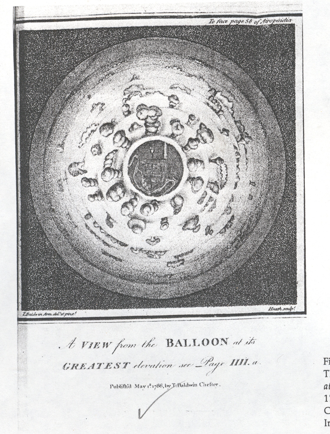
     There is a BLOG==july 9--perspective Downsmall series of posts on this blog that deal with the perspective of lookinBLOG==july 9--perspective upg at things straight-on:  straight up, straight down, straight across.  As it turns out, in my many years of looking at prints and images, view that look directly up and down are pretty uncommon.  Some of the earliest straight-on images actually offered a new vision to people who were so long accustomed to not looking at things in this way.

    BLOG==july 9--perspective Down

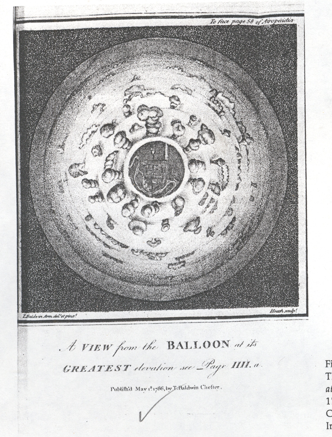
    And for a long time it was just not possible, not really, to look straight down at something from a height, or at least until the invention of flight at the hands of the Montgolfier brothers in 1783.  This first image offers a view looking straight down from a balloon through a bank of clouds and onto a town, and was drawn and published in 1786.  It must have been shocking to see this for the first time in that year, the image so unexpected and mostly not imaginable.  One of the other aspects here is that the viewer is looking obliquely down from the tops of clouds, the first time that this was ever done—so far as I can determine—with a scientific vantage point. 

    BLOG==july 9--perspective up

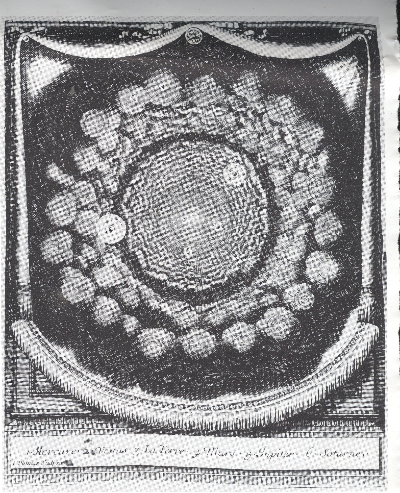
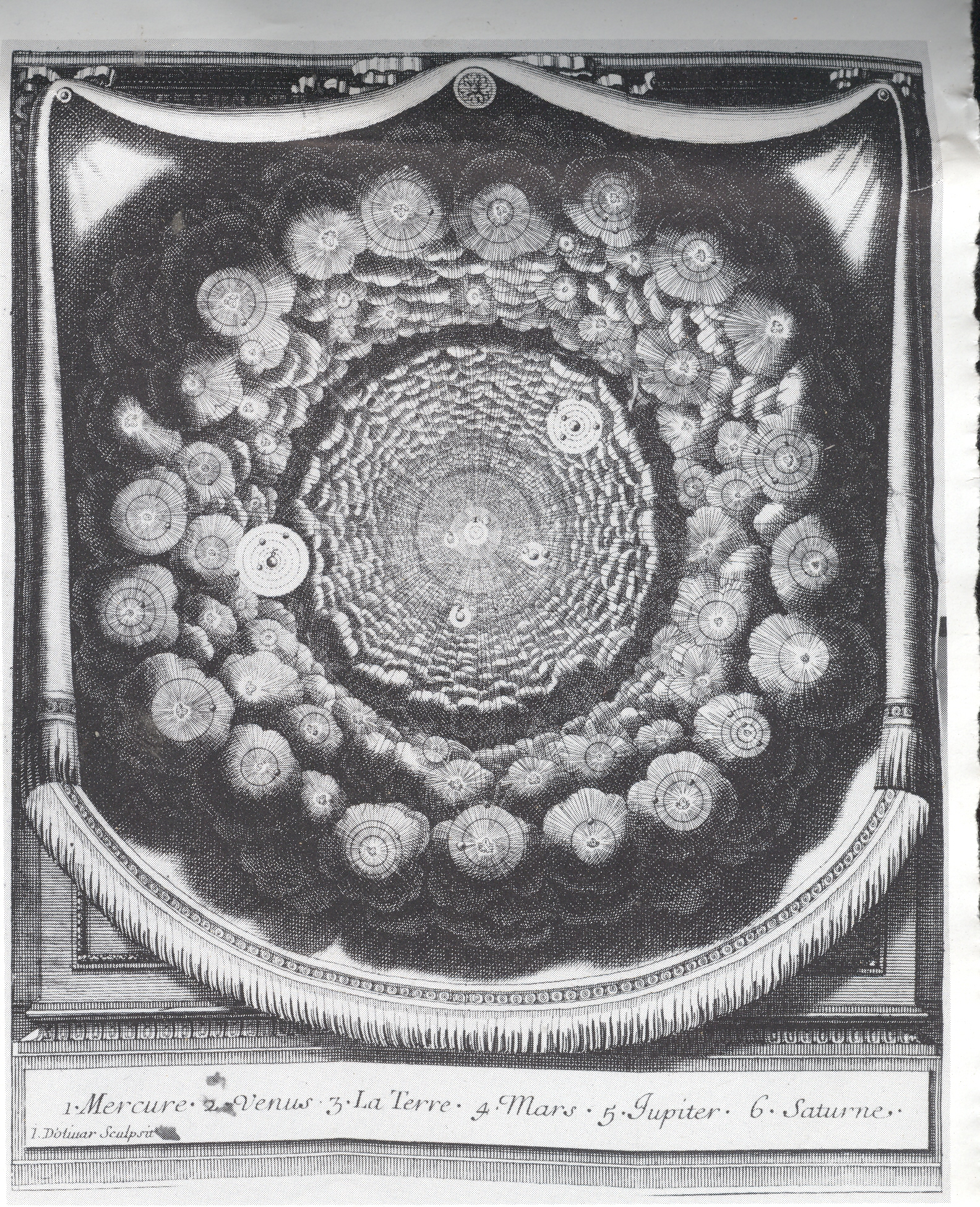
    The seeming complement to this image is from Entretiens sur la Pluralitie de Mondes (Conversations on the Plurality of Worlds), written by the great French philosophe Bernard le Bouvier de Fontenelle in 1686 (just a year before publication of perhaps the greatest work in the history of science, Newton’s Principia Mathematica). The Plurality was a best-seller by the best-selling Fontenelle. An excellent attempt by a rather restricted writer to engage the population-at-large, writing a high-pop book on what was basically the history of astronomy and cosmology of the preceding century. Copernicus was a major feature of his imaginary conversations with a muse as he wandered through a metaphorical garden of questions, with the observations of Galileo and Cassini also very prominently featured. But what interests me here is the great similarity between the two, the view from the balloon looking down, and the Fontenelle, looking up.  (Or what would pass for “up” in space.)  Except that the cloud-y looking things in Fonetenelle aren’t clouds at all, but solar systems.  This was a radical, church-pounding idea at the tiem, displacing the unique centrality of the human condition, offering the possibilities of other lives on other solar systems and other planets

    BLOG==july 9--perspective across . 

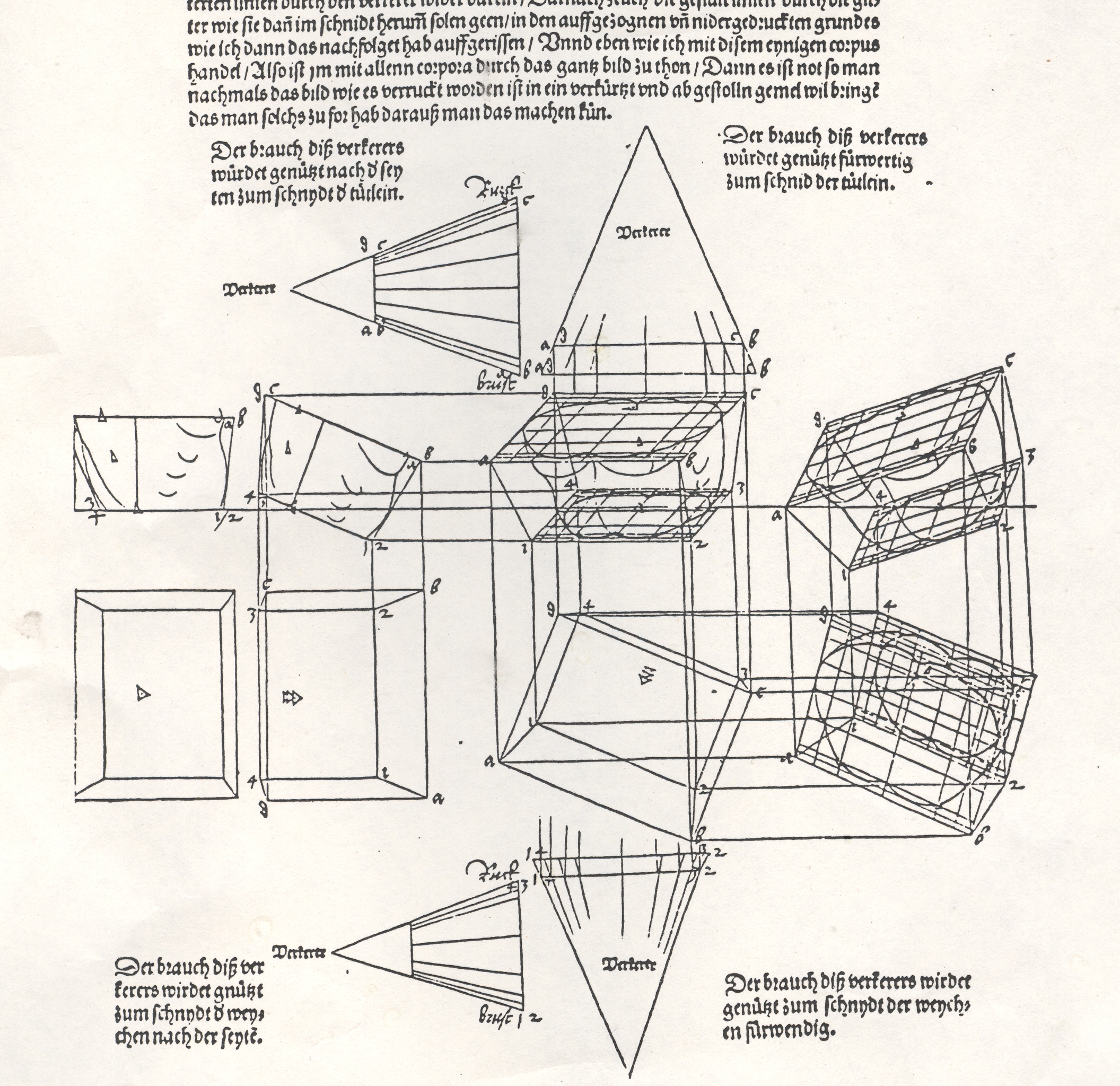
    Albrecht Durer’s (1471-1528) drawing of a geometrical man was an amazing–startling, even–object to the early 16th century consciousness. His Underwysung der Messung (“Treatise on Measuring”) written about 500 years ago (in 1525) set the stage for this next work–it is here that we find some of the most recognizable of Durer’s illustrations of the instruments that he employed to do his perspective work:   his …Symmetria partium…humanorum corporum (1537) was a masterpiece, and a key piece of revolutionary visionary thinking.  Durer–so far as I can tell–created an orthographically rotating human figures in three-dimensional trapezoids, creating incredibly human-like non-human forms.  Supra-human, perhaps; mechanized, calculated, structural. His use of stereometry, the science of measuring volume, was adapted to this study of human form and the relationship between that and movement.

    By doing this one could rotate the figures, pinch them, stretch them, and the proportions would remain exactly the same.

    They were in a sense a CAT scan.  And in this way the person in 1525, seeing this for the first time, would be experiencing something like the sensation of seeing an X-Ray for the first time in 1895 or a magnified flea in 1626.  It was a spectacular effort an a major key to understanding movement, and anatomy, and of course map making.

    This was a new way of thinking about the body, challenging the god-grace and ubiquitous church-inspired revelation of the body and how it worked.  This was not a necessarily easy time in which to picture humans in such a scientific way.  (In 1553 the physician and theological scholar Michael Severtus would be burned at the stake by John Calvin for his views on the Trinity, Nicean Creed and other related things, though his undeniably revolutionary idea of cardiopulmonary circulation was in itself a direct challenge to church teachings).

    Durer’s innovation accommodated empirical observation and allowed for proportional change.  Its importance in relational drawing, anatomical and  technical, cannot be understated, which I think trumped it as a subversive agent to orthodoxy.

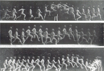
    Blog--july 9--marey Fast forwarding a bit there are the images of arrested time by Etienne Marey (who was a technoid and physician) and  who was able to capture motion of all sorts–he was able to develop a picture so to speak of the movement of blood in the body via his instrument to calculate blood pressure, and he also created a shotgun-style camera that made the world’s first high-speed photographs of movement.  And so it cane to pass that in the late 1870’s and early 1880’s people were instantly able to see what a horse looked like when it galloped or what the body did *exactly* when jumping over a chair.  When you couple this with fourth-dimension material one wonders why it took several more decades to bump into these images in the art world of the earliest part of the twentieth century.

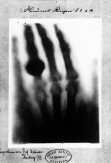
    Blog--july 9--roentgen In 1895 50-year-old Wilhelm Conrad Röntgen’s ephochal discovery was announced (“Ueber eine neue Art von Strahlen”. “On a New Type of Ray”), built upon the work of J. Plucker (1801-1868), J. W. Hittorf (1824-1914), C. F. Varley (1828-1883), E. Goldstein (1850-1931), Sir William Crookes (1832-1919), H. Hertz (1857-1894) and the horribly odious Phil Lenard (1862-1947 and who didn’t die soon enough). The experiment revealed as much to humans as did the experiments and inventions of Hooke and Leeuwenhoek on the invisible worlds revealed by their microscopes. Bertha, Roentgen’s wife, sat for 15 minutes while her husband passed his rays through her hand; she ran from the room once she saw the results, revealing her very bones and no doubt a strong sense of the fragility of life, and the strong presence of death.  Many had the a similar reaction to the Kandinsky’s shapes and Malevich’s white circles and red rectangles and Ibsen’s drama and Einstein’s dancing dust and the rogue syncopation of jazz—these newnesses were threatening to all of the established ways of looking at physics, and art, and theatre, and listening to jazz.  It was a new perspective which challenged the firmly established vision of these things, upsetting the nature of comfort and acceptance.    It is probably a very natural reaction to try and protect established memory—but memory is made all of the time, and so should be relatively flexible…at least it is mechanically healthier to allow a little bending than to be rigid and brittle. 


  • Nazi Designers of Current Corporate Logos: Franziskaner Beer’s Nazi Connection

    JF Ptak Science Books  LLC  Post 670  Blog Bookstore

    [An associated post on the long lives of liberated Nazi concentration camp doctors can be seen HERE.]

    Do you have movable Nazi-designed art in the streets of your
    town?  I do!  And probably so do you.

    It was a cloudless, perfect day in my mountain city when I
    first noticed the 10-foot tall Nazi-designed art tooling down the street on three sides
    of the beer truck.  I‘d seen the design
    many times, but it wasn’t until I was stuck in traffic behind the truck that I
    noticed the artist’s stylized signature beside the logo.  The light changed, and I watched it—while I
    was stalled and stopped by recognition—make its way into the world, merrily
    selling its product, Franziskaner Beer. 

    Franziskaner_logo

    You’ve seen the truck—a smiling Franciscan monk nestled in a
    green oval, holding a liter-like mug of his product, content in his
    experience.  The artist, Ludwig Hohlwein*,
    is listed in many places as a “graphic design from Munich”,
    and the “prince of posters”, and was an enormously gifted artist—he was also
    the leading designer of Nazi propaganda posters from 1933 to 1945. 

    I wondered how this could be, how a corporate logo and
    identity designed by a Nazi –in 1935–could still be in use?  In a series of emails with the parent company
    of Franziskaner, Spaten, N.A.  (which was
    actually Spaten-Lowenbrau, which was in turn purchased by InterBev), I never really
    did get my answer.  Spaten N.A. (a
    personal name was never used in the correspondence) went from an semi-apologetic
    attitude of not knowing who or what the artist was, to a highly defensive
    posture , somehow huddling down with the American bombing of Dresden and Tokyo
    in a questionable semi-logic justifying their use of Hohlwein.  The result was not surprising, but the means
    and the arguments certainly were—I am aware of course that Spaten has invested
    untold millions in establishing their iconic image; but, at the end of the day,
    their artist is still a Nazi, and a bad one at that.  Franziskaner_logo

    Why is this so bothersome? 
    The history of firms doing business with the Nazis during the war and
    former Nazi concerns successfully surviving the war (in one form or another)
    that continued to do business is a long, complex story.  My guess is that if all of these companies were to magically disappear in a pretty gedankenexperiment that there would be huge gaping holes in our economic landscape. Do we think of Auschwitz when we seek headache relief?  Probably
    not,  though the maker of zyklon-b and
    one of the principle reasons for Auschwitz, the enormous
    and powerful conglomerate firm of I.G. Farben, escaped the war’s end by being broken into
    companies such as BASF, Bayer and Hoescht (much to the dismay of people like General Patton, who thought that dismantling the company was supposed to actually dismember it, not rationally cleave it into its constituent and self-sustaining elements.  Also the folks who went to prison for their war crimes at I.G were all pretty much back and in the boardroom(s) within a few years.) 
    Or for that matter do we think of
    gas chambers when filling up at Exxon? 
    Exxon had been Standard Oil (New Jersey),
    which shipped fuel to the Nazis during the war and was one of the largest
    stockholders in Farben, and happily made money with the Nazis during the course
    of the war. 

    There are just a few examples of many,
    many cases of, what, what do we call it? Business?  That’s what Prescott Bush must’ve called it.  One of his wartime activities was being responsible for the UBC  (Union Banking  Corporation) which was involved with laundering/banking Nazi funds (including some big numbers for Fritz Thyssen of Thyssen steel, monolithic-backer of Hitler in the ’20’s and ’30’s).  There was nothing necessarily illegal with that until it became illegal–UBC and the pater familias of the Bush dynasty continued their practices into mid-1942, when the federal government caught up with them and slammed UBC and Brown Brothers Harriman under the Trading with the Enemy Act, as they were in fact helping out the Nazi cause.

    It seems that in a world
    of questionable origins of popular goods it might seem best to have little
    sense of history and  a forgetful one at
    that.

    Is this Nazi-drawn art any less repellent, say, than seeing
    R.E. Lee and Stonewall Jackson in stained glass at the National Cathedral, or
    driving down the Jefferson Davis Highway in Virginia, or cheering for the
    unredeemably-named Washington DC National Football League team?  Mitsubishi and BMW made aircraft that
    supported heinous regimes and shot down American men; on the other hand, the
    isolationist publisher and proselytizer of the brazenly stupid Protocols of the Elders of Zion
    and trader with Nazis, Henry Ford, still makes a good truck.  I have two of them. (GM was there too.)  Monsanto produced Agent Orange which defoliated large swaths of Vietnam while filling up American soldiers with dioxins; Dow Chemical produced napalm for effective and horrible use in the same war–does this matter when we buy the food produced by their chemical additives?

    It is a potentially endless list of supposedly benign
    betrayals—a surface scratched revealing a torturous and bloody past.  But in an age where (as it says on the
    National Archives) it is not longer true that “the past is prologue”, the past
    is not even the past, so, I guess, we get a fresh start whenever we need
    one.  It’s like a convenient memory
    lapse, like berating President Hugo Chavez while filling up at the Citgo stations selling
    his oil. (Citgo is also a NASCAR sponsor) 

    Maybe in some minds the Spaten folks were right after
    all—transgressions are excusable in the face of the transgressions of the
    accuser, which would be a free pass to moral leniency.  The United
    States did firebomb Dresden and Tokyo, and we consume all
    manner of food an energy beyond the rest of the world while billions of people
    suffer invisibly (to us).  The weight of
    this history can bring you quickly to silence. 
    Perhaps it is just exhaustion that lets us necessarily forget these
    unpleasant pasts—perhaps with their memory nothing would get done.

     

    VW

    On the other hand, well, there goes that truck and the happy
    Monk.  I’m not so sure why it bothers me so endlessly–perhaps it is the utterly trivial nature of it all, something that could’ve been so easily rectified as folks were dusting themselves off in May 1945.  Why not just get rid of that image and replace it by something similar (or whatever) that was executed by a Not-a-Bad-Nazi and start afresh? But it looks like Spaten NA is content with their artist–he might be a Nazi, but he’s their Nazi, and it is a conceit and a contentment to let sleeping Nazis lie.  

    Volkswagen certainly does. The “VW” logo was designed by Nikolai Borg under the direction of “Nazi designer” Fritz Todt (!)–Borg is still alive and is currently suing to be officially recognized as it designer.  The cog part of the wheel surrounding the VW letters–which is a design commonly seen encircling the Nazi swastika–was ordered to be removed by the occupying British forces just after the war, softening up the image a little.  Hohlwein remains intact and un-de-nazified..

     *It is interesting to note that Hohlwein’s post-WWI history frequently escapes the mention of stores selling his posters.  I’ve noticed too that his death date is often conveniently listed as 1939, though he survived the war.


  • Dadaist Images in 19th Century Prints: William Rimmer’s Artistic Anatomy, 1877

    JF Ptak Science Books LLC  Post 667

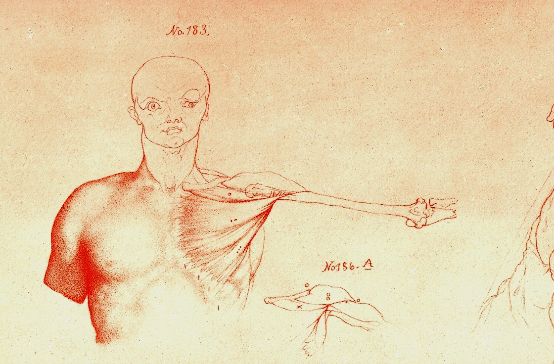
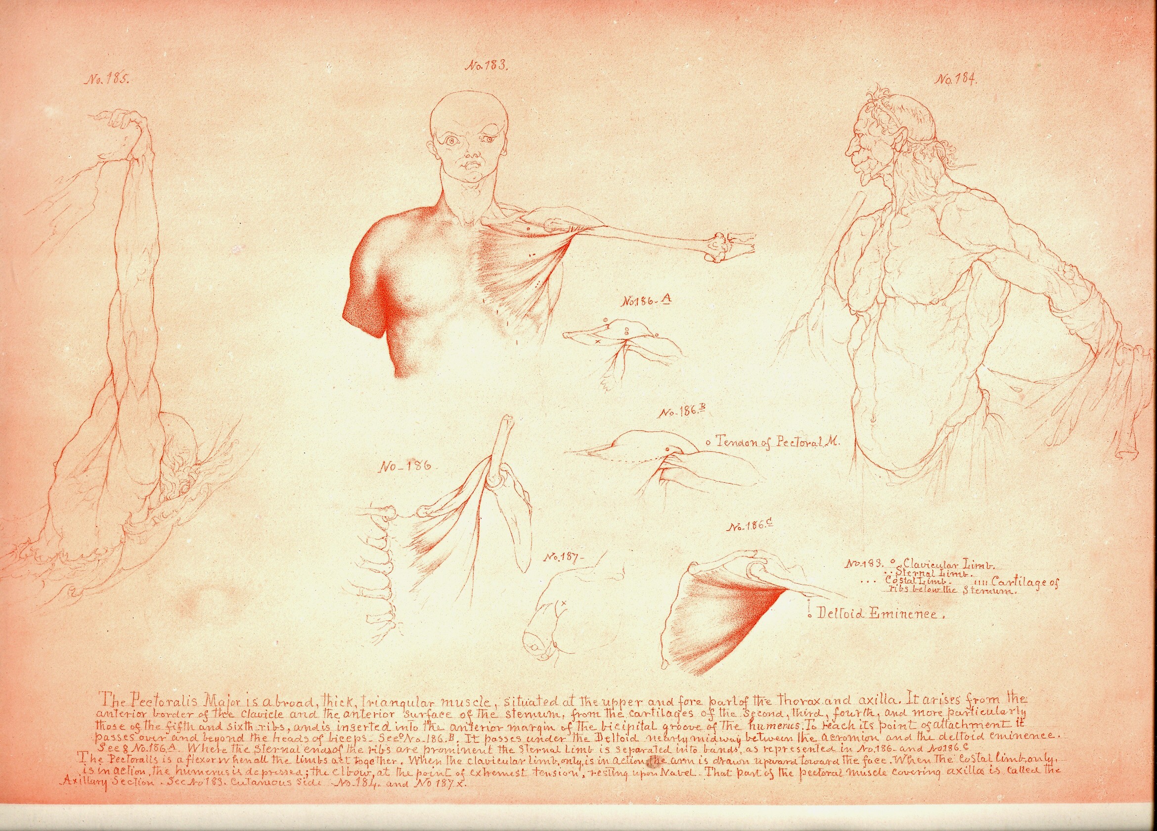
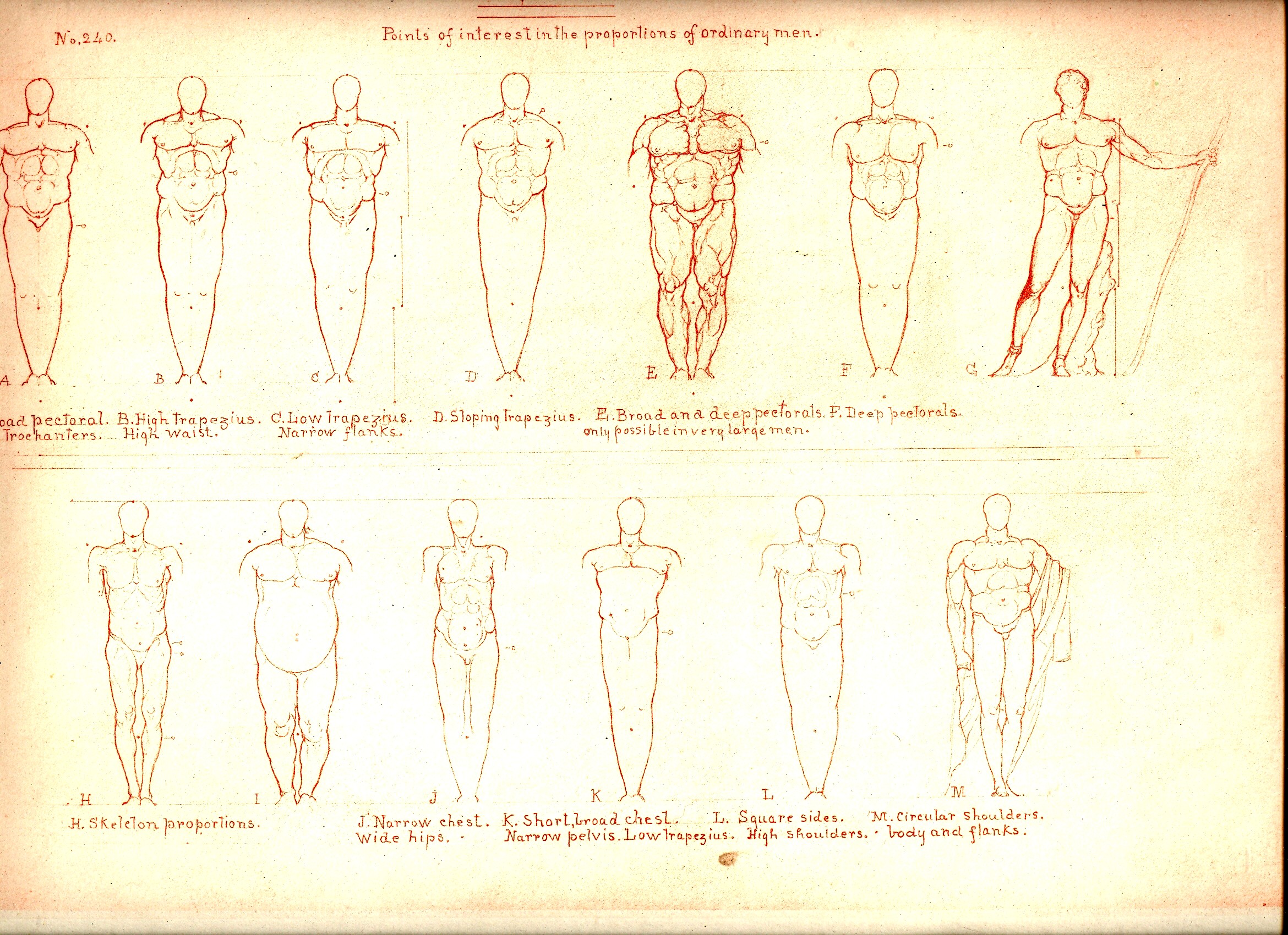
    Blog==June 29--rimmer pecs det Looking at old prints sometimes reveals more
    than just their own history, simple or not: 
    there are, from time to time, subtle bits of otherness that creeps into
    the image, if you allow yourself the time to see it.  And sometimes looking at images of the past
    reveal a little of the future, or the possibility of the future.
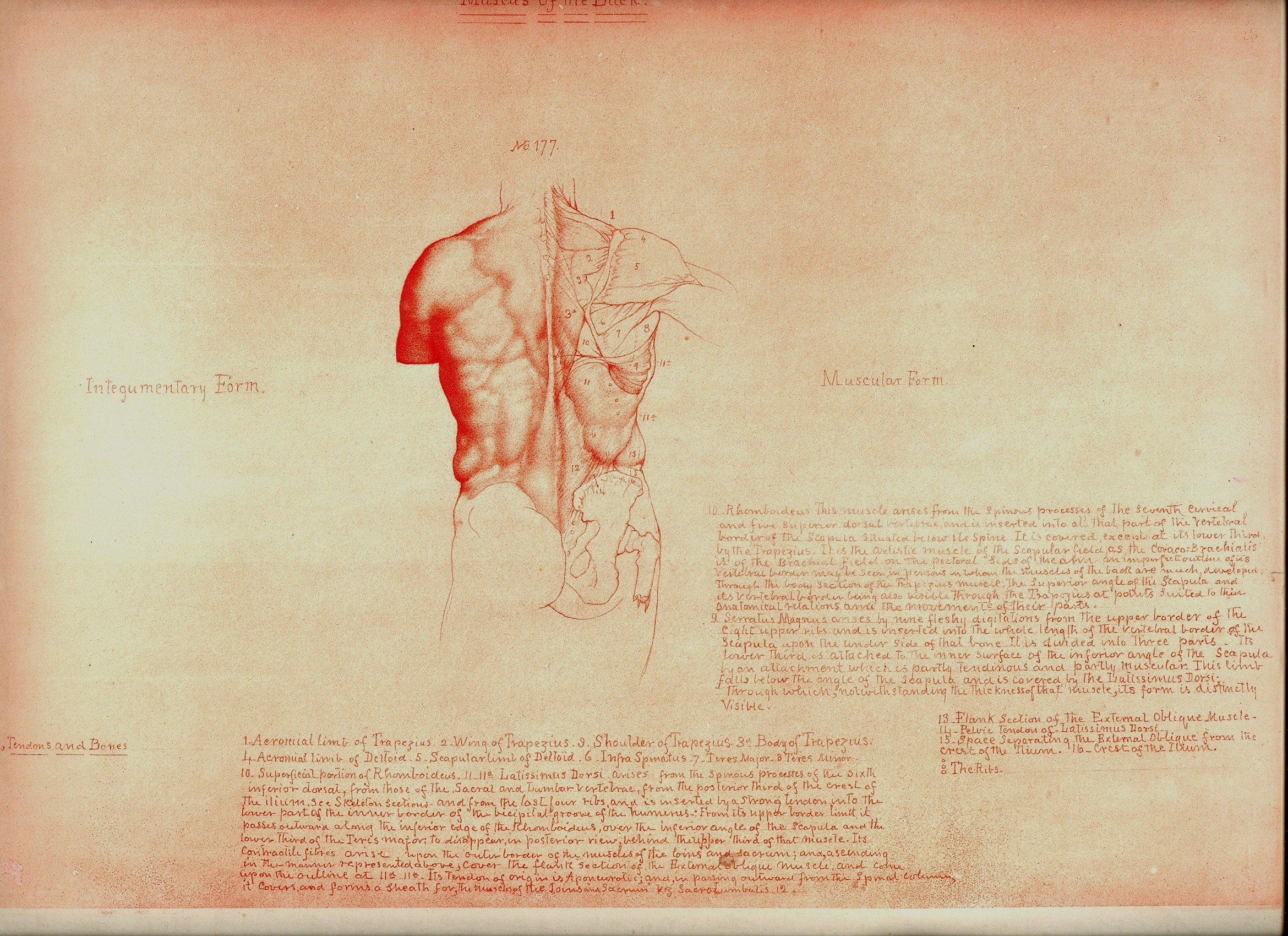
    Blog==June 29--rimmer pecsBlog==June 29--rimmer backdet

    I wrote a little about this in the odd
    art/color textbooks of the pre-Kandinskian Emily Vanderpoel , about whose color
    theory I still understand not at all, though the images that she produced as
    illustrations to these bizarre theories are stunning, pre-modernist, and unintentional
    creations.

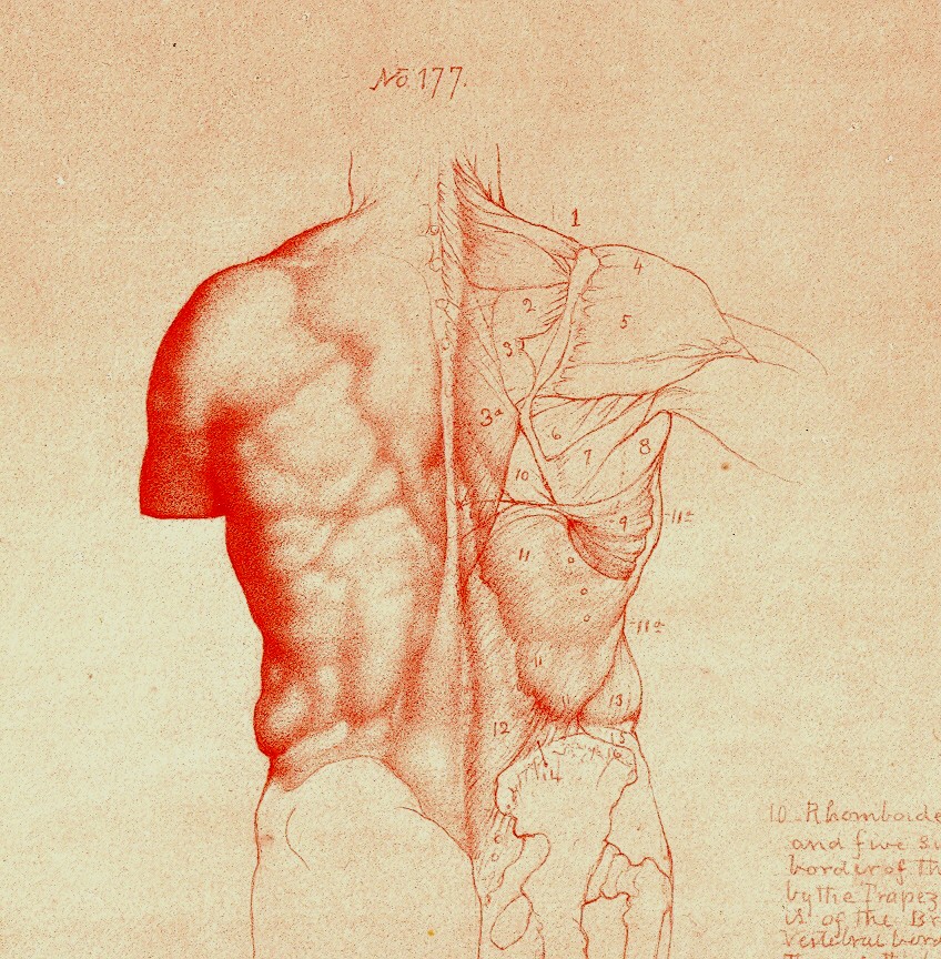
    William Rimmer’s (1816-1879) Art Anatomy (1877 and subsequent
    printings) is another such adventure. 
    Rimmer was a very accomplished artist, and was also a fine
    anatomist.  He was very concerned and
    interested in what happens to the skin, forced into action by all of the stuff
    underneath it.  He pursued the movement
    of muscle, and bone, and the interplay of the two, and produced a wonderful
    exponent of artistic anatomy. 

     And inside
    of these images is something else, sometimes. 
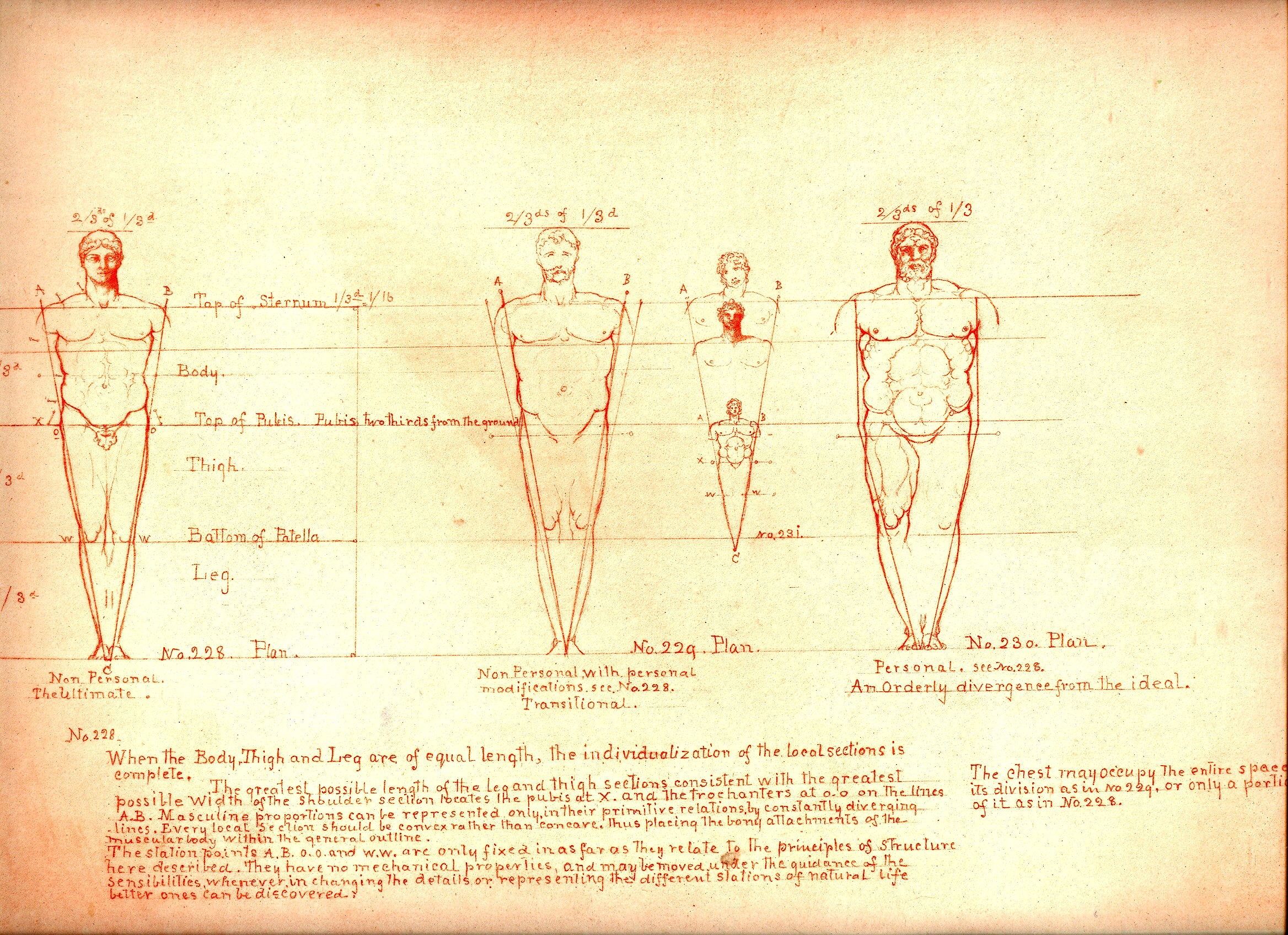
    There is an undoubted Leonardoesque quality to many of his drawings, the
    figures appearing with deft lines and interesting shadings, many times

    Blog==June 29--rimmer back

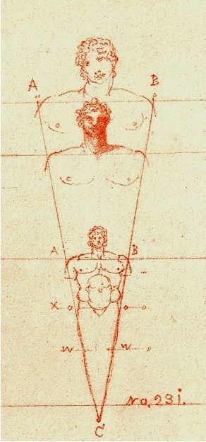
    surrounded by the author’s notes and explanations  But there’s also something else—some of the
    images are just, well, a little bizarre given the time in which they were
    executed.  Some of the details are
    positively modernist, begging to be identified as a 1920’/1930’s creation, or
    Dadaist, or something—just not 19th century.  I’ve included some further examples below

    Blog==June 29--rimmer little man .

    Blog==June 29--rimmer muscle


  • Odd Images Department: Submerged, Miniature, 19th Century People

    JF Ptak Science Books LLC  Post 660

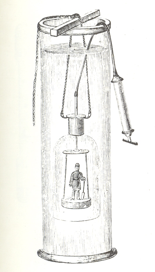
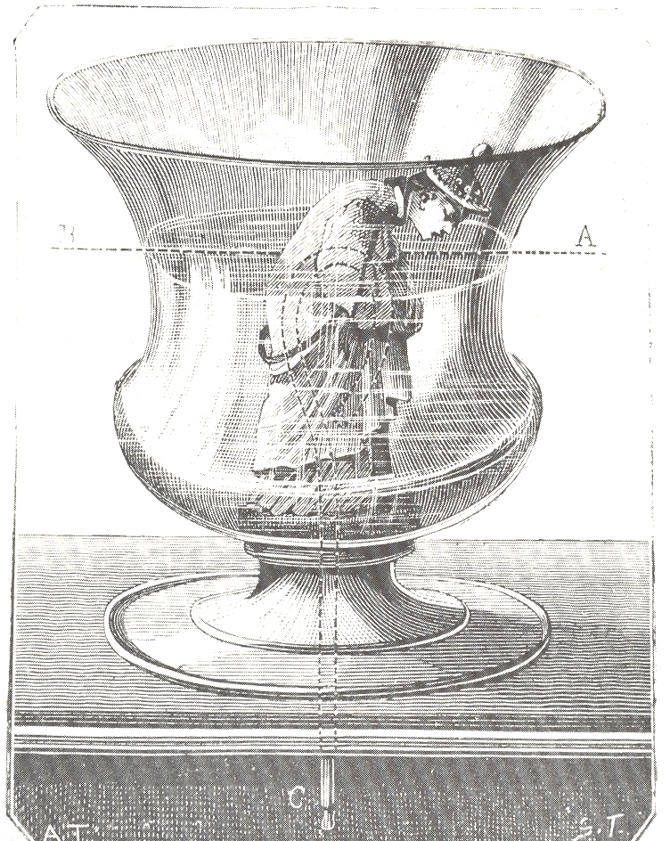
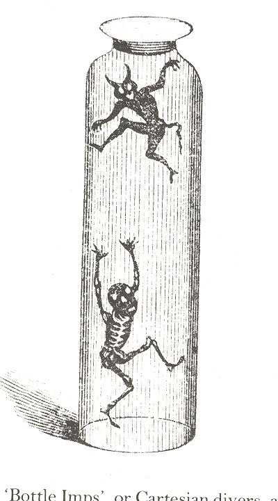
    Blog--june 22--people in glasses diver Oh, all right–these aren’t really miniature people–they just look like it. (And I’ll be interested to see how people come to this post via Google!)  What these images display are physical science laboratory demonstration tools and toys. (People have been swimming in fomalin and formaldehyde for a long time, hundreds of years–but I’m not dealing with the biological preparations today, I’m only after found, out-of-context oddness.)

    This first image, lovely and odd as it seems, is a simple demonstration device showing how a diving bell operates and was manufactured around 1910.  This would’ve been used in a classroom for a three dimensional learning tool , a standard approach to help elucidate phyical principles.  Classrooms would’ve had cabinets stuffed with these sorts of instruments–if the school had any money–and were in vogue for hundreds of years.  In this case we see the worker with his shovel being lowered into water, encased in a glass dome, with a line attached top a syringe which delivers oxygen.  (The image is from the catalog of John J. Griffin & Sons, Scientific Handicraft… London, 1910.)

    Blog--june 22--people in glasses tantalus The second image is a pretty high-end cup of tantalus–a vessel that cannot be filled because of pressure and siphoning and an exit port. It is named for the Greek bad boy Tantalus, who was the son of Zeus and Plouto, and by whose various misdeeds was cast away in Tartarus, the lowest strata of Hades in a place reserved for evildoing evildoers.  Tantalus lived a life of theft and flippant care:  for example, he was the one whom invited to dine with the gods, stole their ambrosia and gave it to the people.  In another example we see Tantalus offering his son to the gods by preparing him, thinnly dicing the boy, and chopping that, serving him to the gods for luncheon–not everyone was fooled, and no one was amused.  Part of his trials in the Underworld gives us the term “tantalzing”:  desire without fulfillment. His position in the afterlife, such as it was, was not pretty: Tantalus was to stand in perpetual hunger in a stream beneath fruiting trees; the water though would prevent him from reaching anything to eat, every time, and forever. . Every time he grew thirsty, the water level would lower itself, and he couldn’t reach anything to drink.  Pretty bad stuff to do for eternity.  This cup was called a Tantalus Cup because it would siphon itself off (through a tube in the bottom of the glass) so that the glass would always only get about half-way filled.  Why a “Chinese-like” figure was chosen for Tantalus, I don’t know. 

    Blog--june 22--people in glasses imps Lastly is a Jar of Sinking  Imps–I’ve seen this before with Mother/Father figures, regular humans–but this device contains non-humans.  This image comes from Aryton Paris, Philosophy in Sport (1853), and was a scientific toy demonstrating what happens to air-filled items immersed in water (and where they are nearly the same specific gravity as water), when pressure is applied to a rubber bladder on top of the filled jar.  The pressure from the weight applied to the rubber bladder causes the air in the imps to compress; and when the air is compressed, the imps sink to the bottom.  Not exactly hours of fun, unless there was nothing else around,  though I must confess I’ve seen my daughters have long periods of uninterrupted fun with slimmest of found objects….


  • The Shotgun in the Service of Natural History–Shooting Flowers

    JF Ptak Science Books  LLC  Post 657

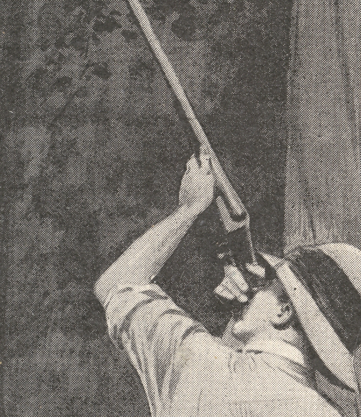
    In the always summery days of summer of 1912  , Mr.  F. Aumaury Talbot  went hunting in the wilds of Nigeria–not horribly unusual of course, except that the man was shooting flowers from trees.  

    Blog--june 19--detailBlog--june 19--detail 2

    I’ve never seen a picture like this, nor have I read anything about shotgunning blossoms from on-high in a tree canopy. And that’s what the man is doing–right down to the shotgun.   Mr. Talbot (for whom an estimable cash prize for academic work in anthropology is still named) was able to collect eighty (!) new species of flowers on this trip to Nigeria, many collected in this fashion. 

    We read in the story about this image (from The Illustrated London News of 8 June 1912) that in the 2 June issue appeared another shotgunning-in-the-service-of-Understanding-Nature:   this time shooting butterflies.  With a shotgun. 

    Blo--june 19--shooting flowers


  • Spectacular Gravitational Sculpture in the Rings of Saturn, 2009

    JF Ptak Science Books LLC  Post 651  Blog Bookstore

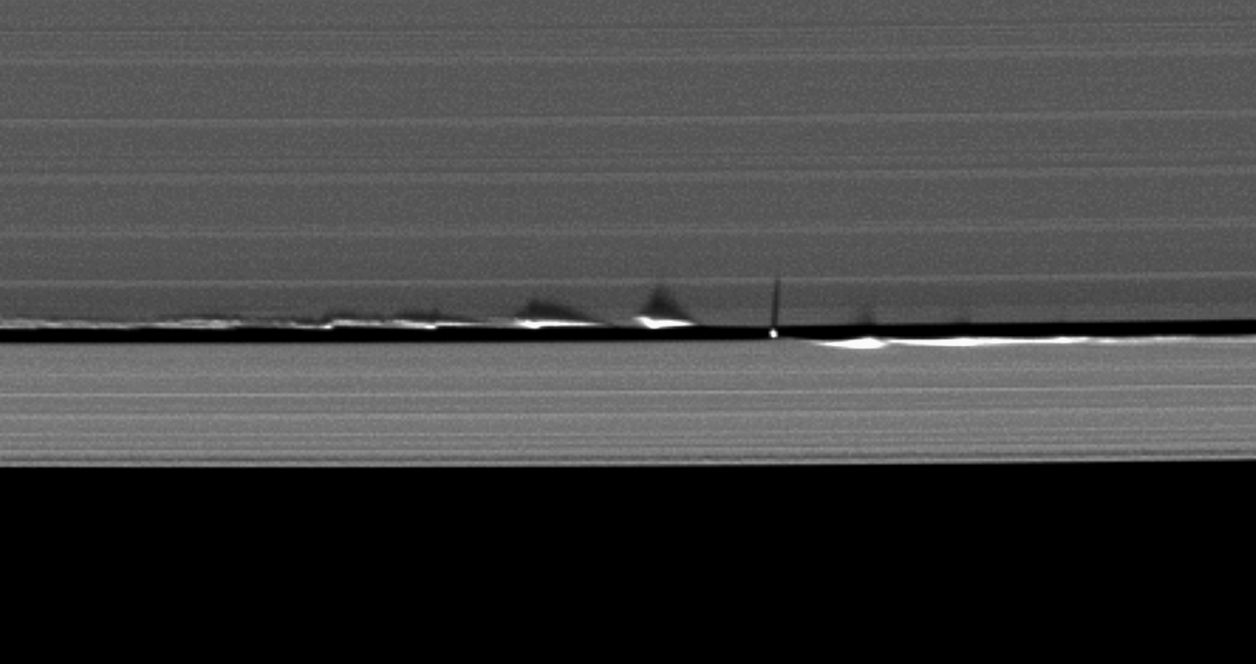
    These images, released on 9 June 2009, are from the Cassini Orbiter Imaging website (here for the press release of the photo) and were made by the international-effort Cassini voyager, launched 10 years ago in August.  The vertical structures (waves) that we see here in the rings of Saturn are cause dby the gravitational pull of Saturn’s 5-mile diameter moon Daphnis, which makes its home in orbit within the Keller Gap in Saturn’s outer A ring.  The news relsease says that the enormous strucutres–these bumps being beween 500-10,000 feet high–are the result of the gravitational pull of the moon perturbing the ring-edge partciles as it swings by.
    Blog--june 15--saturn rings det

    The photos are just stunning.  They are also the first evidences showing waves in the ring structure.  I think that they’re simply gorgeous. The little “ball bearing” type figure with the long shadow is Daphnis.  The JPL-managed spacecraft has produced remarkable photos throughout its long life–particularly in the cases of Jupiter and Saturn, where in my opinion no sci-fi or speculative artwork has ever come close to depicting the impossible beauty of those two planets as has Cassini.