A Daily History of Holes, Dots, Lines, Science, History, Math, Physics, Art, the Unintentional Absurd, Architecture, Maps, Data Visualization, Blank and Missing Things, and so on. |1.6 million words, 7500 images, 4.9 million hits| Press & appearances in The Times, Le Figaro, Mensa, The Economist, The Guardian, Discovery News, Slate, Le Monde, Sci American Blogs, Le Pont, and many other places… 5000+ total posts since 2008.

Category: Outsider Logic

  • Found Dadaist Art–Floating Eyes and Ears, 1650 & 1807

    JF Ptak Science Books LLC Post 857
    Dada found--tp I’ve
    written a few times in this blog (here, here and here) about what I think is
    found/unintentional antiquarian Dadaist art and would like today to continue
    that thread with the following two unusual pieces of art.

    The first
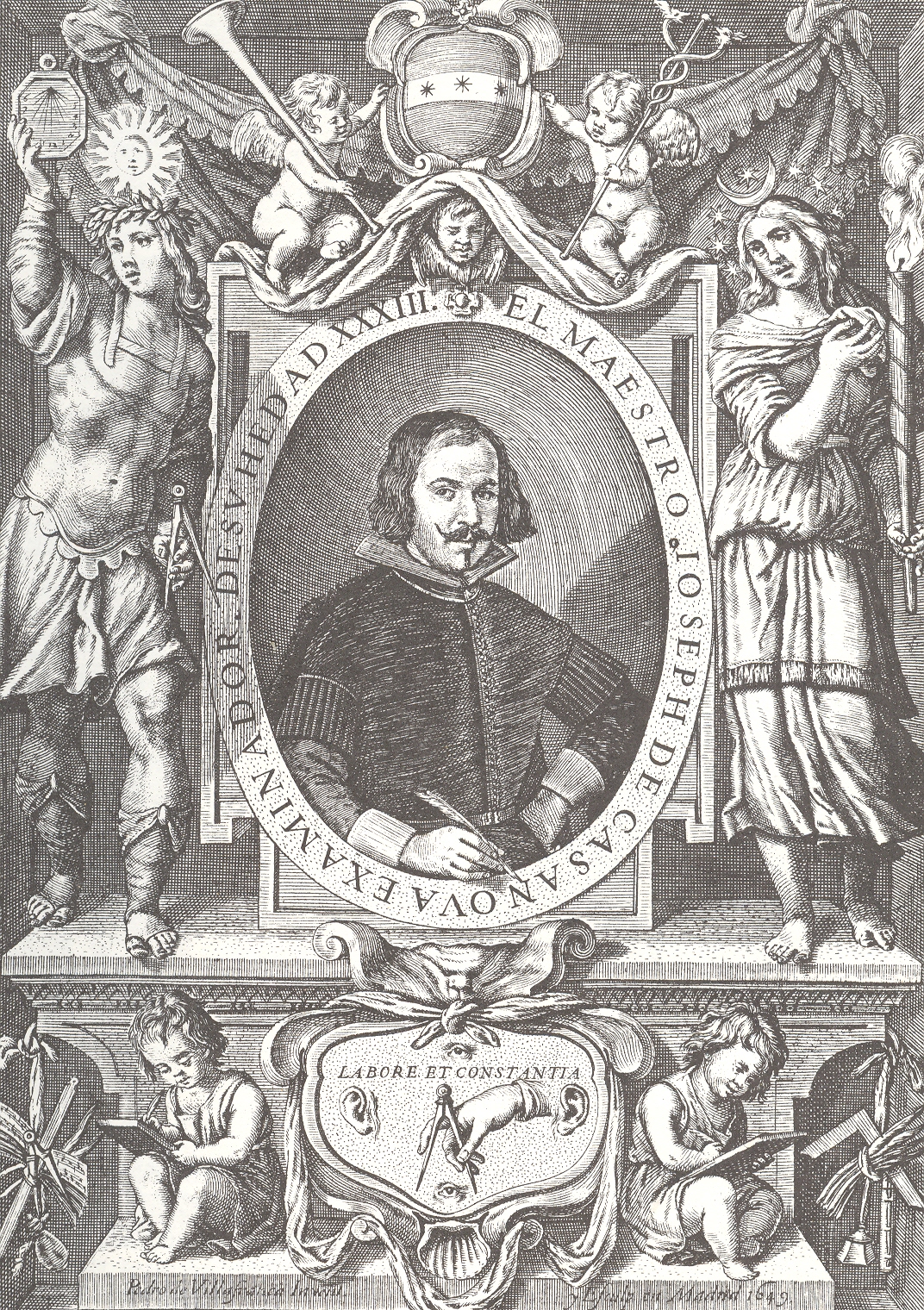
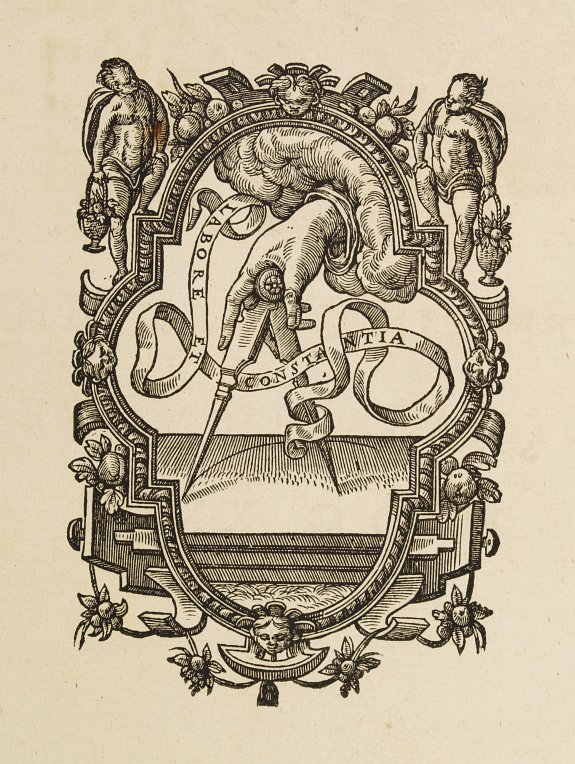
    is a detail from the title page of Joseph de Casanova’s Primera parte del
    arte de escrivir todas formas de letras
    (1650). This is not the Casanova (Giacamo,
    1725-1798) who most people would initially think of—the seductive womanizer of
    the 18th century—but another, earlier, Spanish Casanova (1613-1692)
    who was important in the history of round hand script and the lettera bastarda.  Joseph Casanova ‘s evolutionary handwriting
    style was considerably lighter and easier than most styles, and his influence
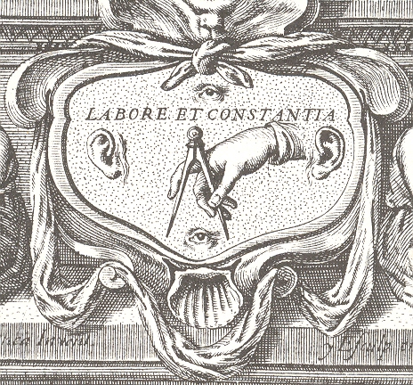
    in changing handwriting practices was substantial.  What is interesting for me is the detail at
    the bottom of the engraved title page for his book, the emblem containing  “Labore et Constantia”.  Labor and consistency, decorated with a hand
    and compass, ever watching and listening with ears and eyes above and below.Dada found--tp detail
    [This
    design comes from (at least) one earlier source—the printer’s device for Christoph
    Plantijn (Antwerp,
    1583), though without the eyes (below).] I like the floating aspect of the disembodied
    body parts, floating in their little sea of constancy, ruled by a compass. 

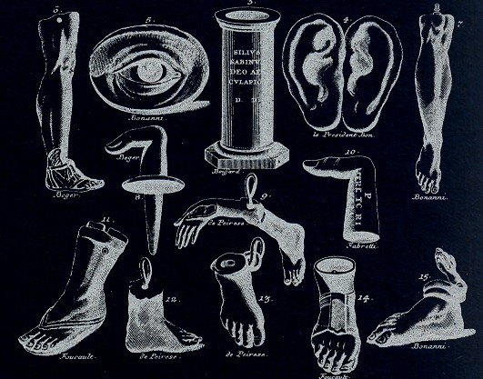
    Dada found--multiples  The
    second image has another set of disembodied eyes/ears (among other things) and
    has all the flavor of the dada/surrealist flourishes of the frammenti of Piranesi.
    This comes from Bernhard von Montfaucon’s Greichische,
    Romische und andere Alterthuemer…
    (Nurenberg, 1807). When taken out of
    context, as a disembodied image, the von Montfaucon certainly has a dadaist taste
    for me, especially if you edit the image a little.
    Dada-found labore 

    Dada found 2--multiples


  • A Smiling Man at Work in a Smokey Fire, 1788

    JF Ptak Science Books LLC  Post 834 

    ++ blog ++ nov 15 firre man

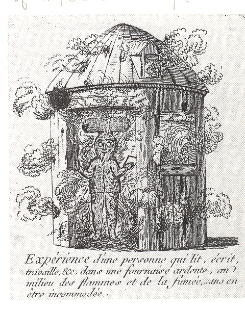
    There’s not much that I can say at this point about C.J.
    Leroux,  the author of the work in which
    this magnificent engraving was  published, Decouverte
    contre les incendies
    …1 Without a pretty good library to hike to Leroux’s
    efforts remain a mystery to me, except for what I can deduce from the
    image.  The shack in the image is burning,
    and the man inside is fine, evidently protected from the fire by a special suit
    made of fire-resistant materials.  It is
    an interesting idea in protecting people from fire—sidestepping the issue of
    making the house more fire resistant by making the people in the house
    resistant to fire.  I suspect that the
    inventor/designer/theorist of such a gown had in mind the sale of millions of
    such things—that way if a fire struck a house in a dense section of Paris the entire
    neighborhood would don their suits and escpae the flames.  The neighborhood might not survive, but the
    people would.  That might not be the
    chief interest of the royals at that time who I am sure would be more
    interested in the physical plant and the real estate than the people crawling
    around inside it.  This display also begs
    the question of manufacturing the house so that some portion of it would be
    fire resistant which would (perhaps) save neighboring dwelling. 

    Be that as it may, it really didn’t matter, as the materials
    for creating such a suit as the test man is wearing didn’t yet exist. Certainly
    nothing existed at the time that would allow someone to read, write and work through
    smoke and flames in a fiery furnace (“fournaise ardente”) all the while
    with  no inconvenience (“en etre incommode”)2. The large mushroom-shaped cap would be a supply of oxygen, I guess; the smile on the face of the suit must betray a secret knowledge as to why the paper and pen are not on fire. 

    It seems to be a nice piece of different
    thinking.

    Notes:

    1.  Full title:  Découverte contre les incendies, les dangers des eaux, de l’air méphytique ou contagieux et de plusieurs autres maux qui affligent l’humanité, avec un supplément contre les dangers des voyages et des chutes. Par C. J. Leroux  Published and printed by the author in 36 pages in Paris, 1788. 

    2. The legend reads: “ Experience d’une personne qui lit, ecrit,  travaille, &c. dans une fournaise ardente, au  milieu des flames et de la fume, ans en  etre incommode.”


  • Odd Art Department: Art Brut in Advertising?

    JF Ptak Science Books LLC  Post 810  Blog Bookstore

     + blog 10.26 tauranga

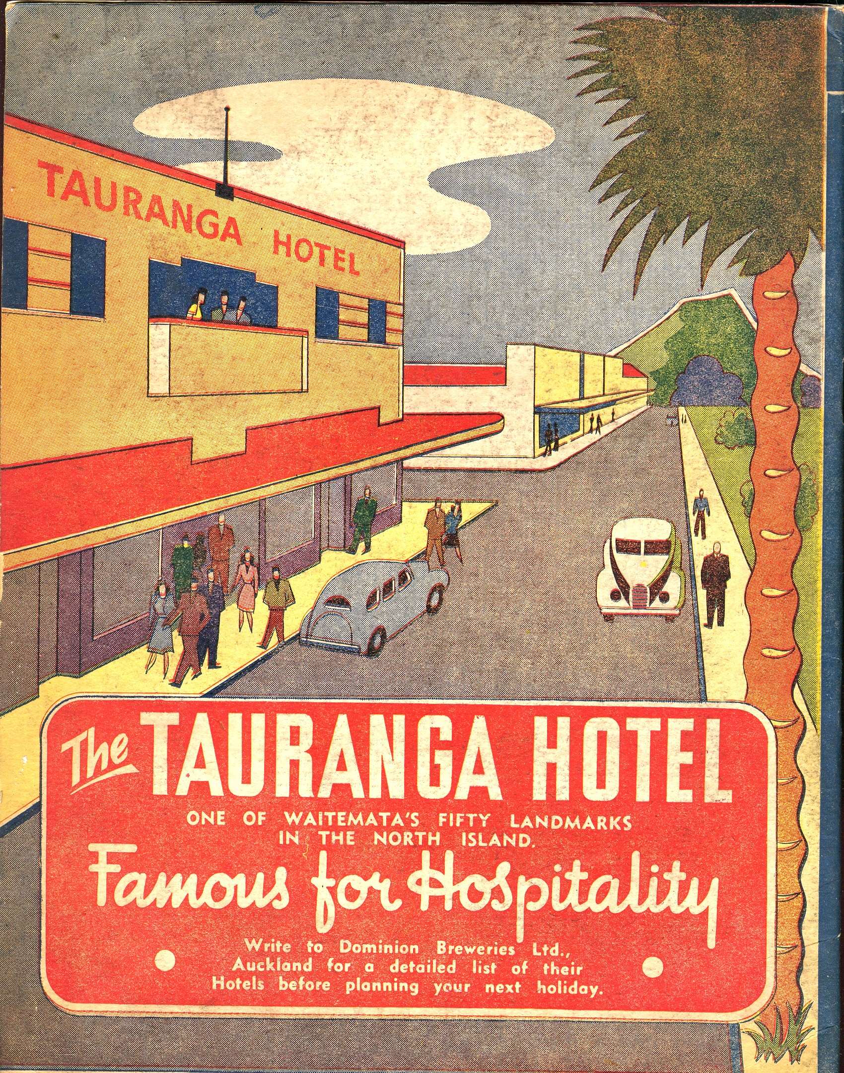
    There’s not much in this illustration–the entire back page of an oversize pulbicity tourist pamphlet–to suggest any sort of professionalism, or training, or, well, ability.  But there it is, badly drawn, with unusual (if not bad) coloring, trying to entice people to visit this seaside resort in New Zealand. 

    Maybe this is more “outsider art”
    than Art Brut.  Art Brut was a term used by
    Jean Dubuftet to describe raw/rough art produced by non-artists (and those
    mostly mental asylum residents1).  Art
    critic Roger Cardinal coined “outsider art” as a English-language adaptation of
    the Dubuffet term2, and has since come into use to describe unusual,
    technically naïve and unschooled Otherness of artworks.  This cover illustration is certainly bearing
    a pretty good-sized helping of otherness to it, from its pale, weird coloring
    to its basic inability to draw.  Somehow
    though it is attractive to me, and ultra-calming when it is not troubling.  It is just one of those peculiar works that
    is good and bad at the same time.

    Notes:

    1. A spectacular and early example
    of Art Brut is found in the phenomenally detailed, insightful-of-other-worlds
    work of  Adolf Wolfli.

    2. “Those works created
    from solitude and from pure and authentic creative impulses – where the worries
    of competition, acclaim and social promotion do not interfere – are, because of
    these very facts, more precious than the productions of professionals. After a
    certain familiarity with these flourishings of an exalted feverishness, lived
    so fully and so intensely by their authors, we cannot avoid the feeling that in
    relation to these works, cultural art in its entirety appears to be the game of
    a futile society, a fallacious parade.” – Jean Dubuffet. Place à
    l’incivisme
    (Make way for Incivism). Art and Text no.27 (December 1987 –
    February 1988).


  • The Library of One Book

    JF Ptak Science Books  Post 778  Blog Bookstore

    + card factory det

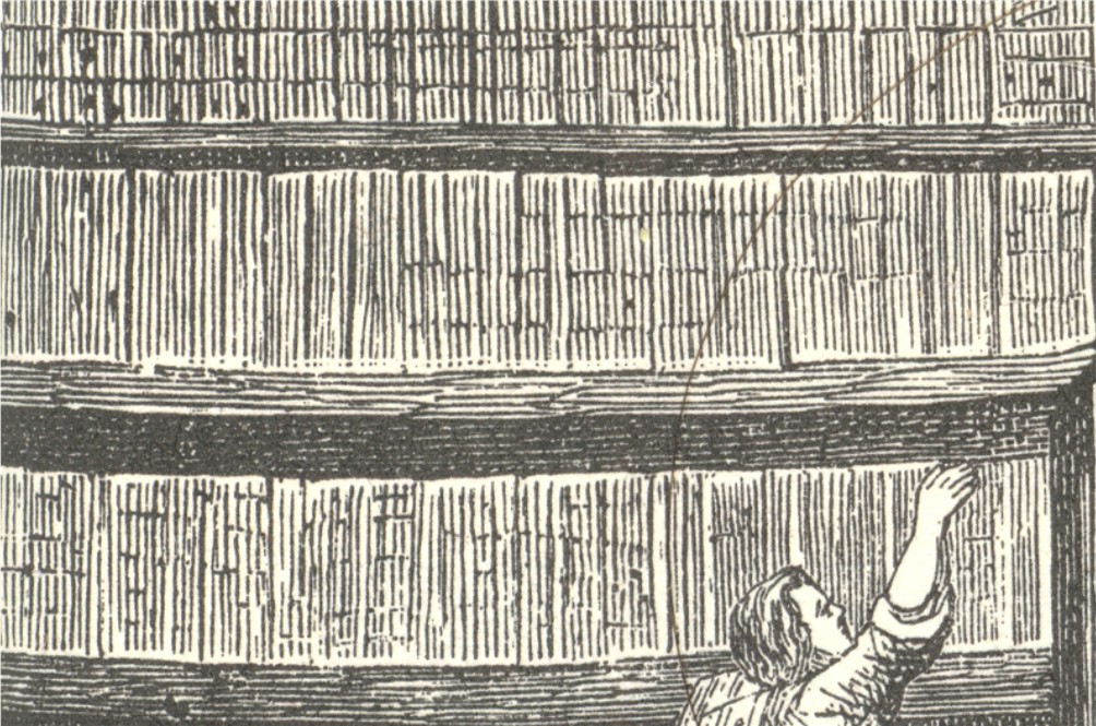
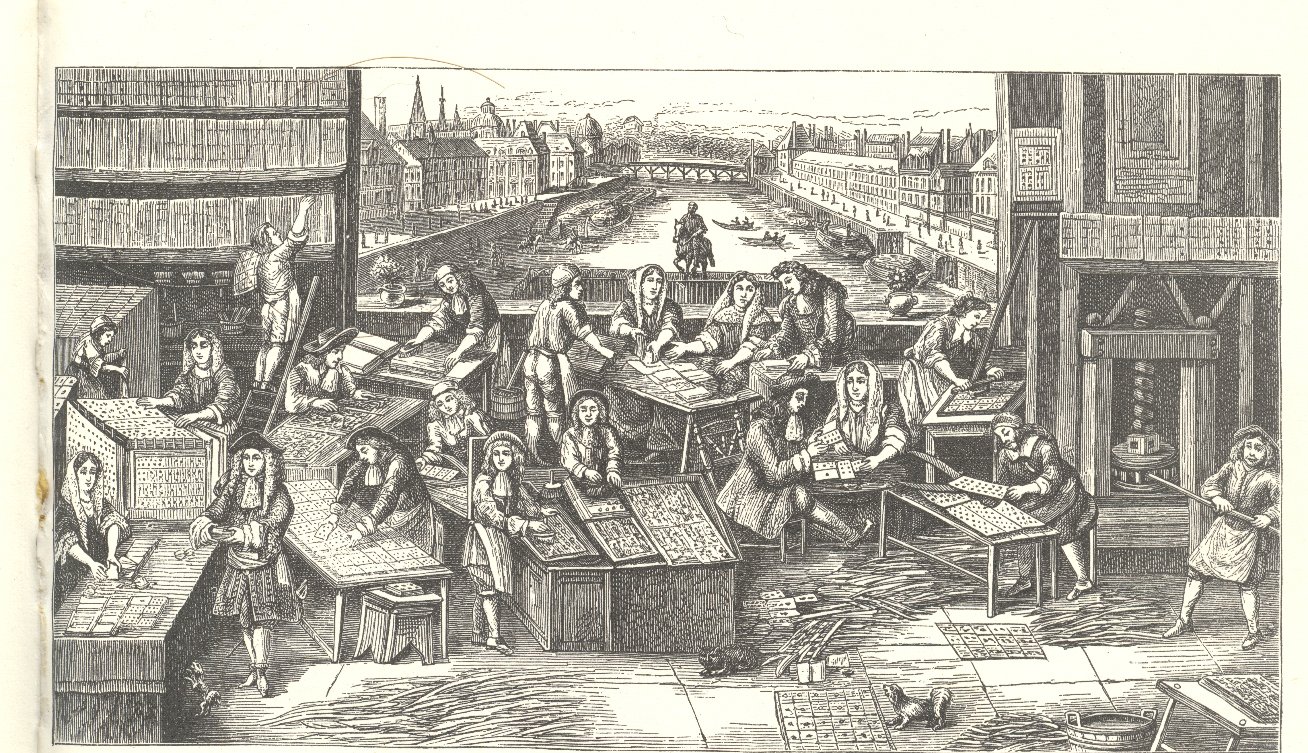
    Is this an image of a  librarian carefully reaching for a carefully
    placed book, carefully arranged in a carefully-odd Borgesian-style library
    housing only books of the same height and thickness?  Or is this a librarian in a Library of the
    Same Book, housing thousands of copies of copies of the same book, climbing the
    ladder to make sure that he had a copy of just the copy that was requested (“a
    copy held at least 5 feet from the ground, near a side window though not
    touching a vertical piece of wood”)? 

    + card factory

    Neither.  These are
    shelves filled with nothing but uncut sheets of playing cards, housed for the
    playing card factory somewhere in Paris (?) “during the reign of Louis XIV”.  Playing cards, which were introduced to
    Europe via Marco Polo from China
    or traders coming from the Middle East or etc., are much older in Europe than one would think, I think, and by the time
    this print was made, playing cards were already quite popular there for two
    centuries. 


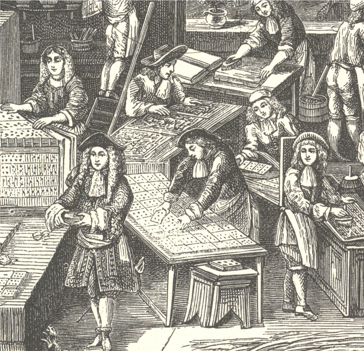
    I can’t identify all of the activities of all of the twelve
    tables of card preparation here, though some seem pretty obvious:  the trimmer working near the pressman, the
    sorters and assemblers of decks of cards at the lower left corner, the paper
    preparer (?) just to the right of the man on the ladder, the pair of men
    preparing the type trays at middle-bottom, and that’s about it.  I’m not sure what everyone else was
    doing.  I’m not even so sure what’s going
    on with the sheets of cards on the bookshelves, the target of this post—it can’t
    be for drying purposes, as the sheets are too close together…perhaps it is just
    for storage of different sheets of cards for different decks.  

    In any event I’m right or I’m wrong on this guess, about the same odds as being dealt “nothing” in a game of five-card poker (almost 1:1 odds), but that’s fine:  I just like the composition of the print.

    + card factory det 2


    ·Posted by :

    ·in:


  • The Hidden Beauties of Barrels, Pig Bristles and Forgotten Escalators

    JF Ptak Science Books LLC   Post 776    Blog Bookstore

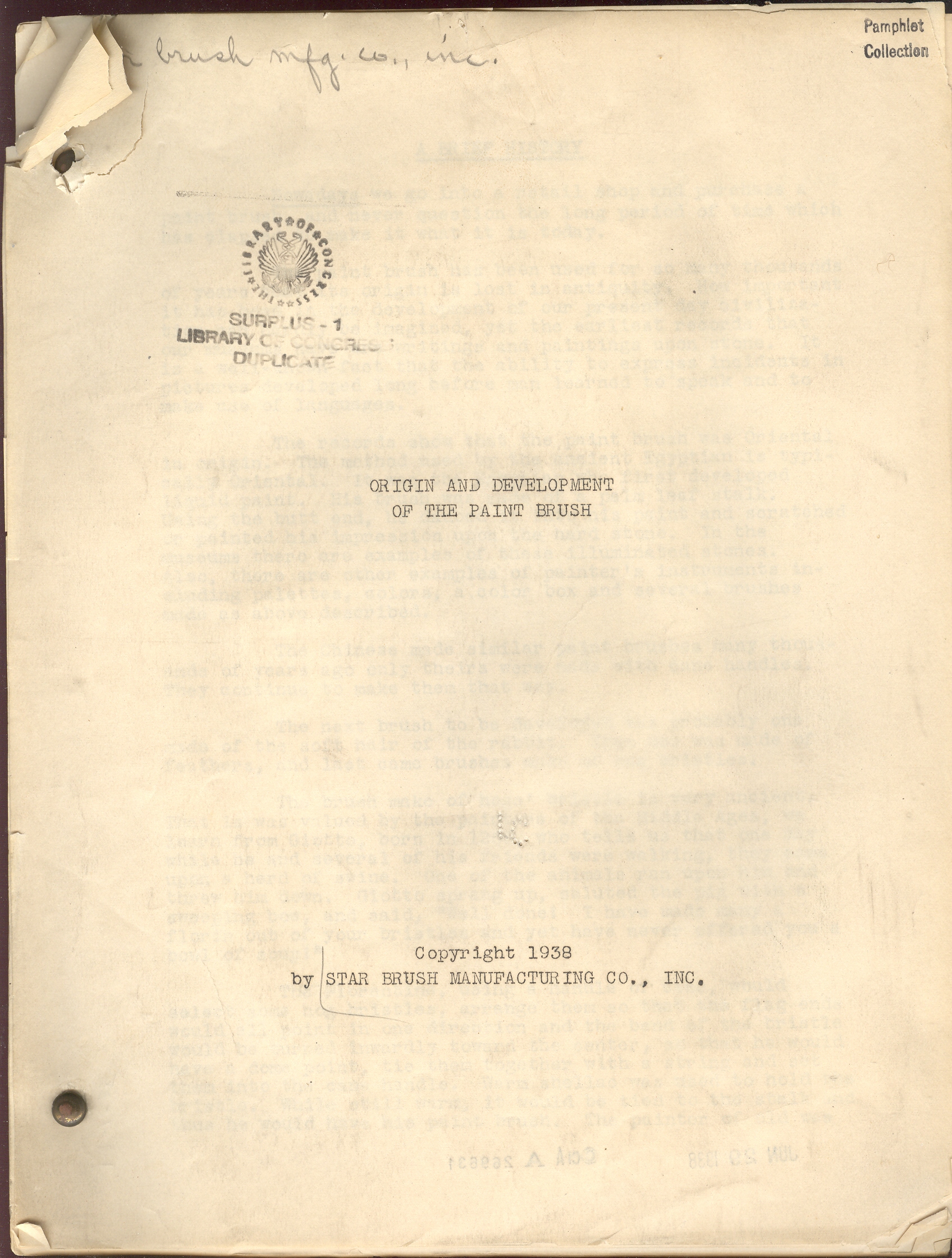
    I wonder what is was like to be a traveling salesman hauling
    around hundred-pound barrels of pig bristles?

    + simplicity paintbrush

    We don’t really find out the answer to that question in Origin and Development of the Paint Brush (1938),
    but that remarkable, far from the maddening crowd question does present itself in
    the text.  And that is why I love
    pamphlets like these.

    Spending my professional life with the book, and being a
    reader, I’ve come into contact with and have been exposed to a good, solid, Big  Number of books, a Big Book of Big Numbers of
    books.  And so when the unusual creeps in
    or is stumbled upon, they shine like little novas in my book-sky.  And the ones that shine with their own
    special light are the titles come in three favorite flavors:  the Sublime Mundane, Outsider Logic, and
    Fantastic
    (and Impossible).  Today’s
    selection are from the first category, and exhibit titles and texts that look
    like non-luminous and uni-dimensional but turn out to be anything but mundane.

    + simplicity escalators

    Earlier in this blog I’ve written on pamphlets entitled Flagpole Painting, School Safety Pioneers, Fortunes to be Made with Frogs, Where are the Dead?, How to Repair a Zipper, Mud’s Romantic Story, Soap in Everyday Life, The Fine Art of Squeezing, Salt Salesman’s Manual, Know Your Groceries, The Book of Envelope Facts (and others),
    and they’ve all shown a terrific inner quality that is completely hidden by
    their so-sleepy and yet strangely-compelling titles.  Like the paint brush history pamphlet.  Here are a few other new examples:

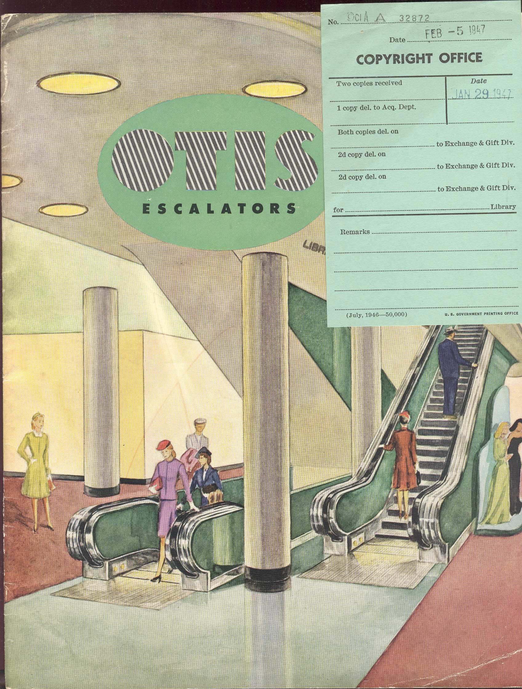
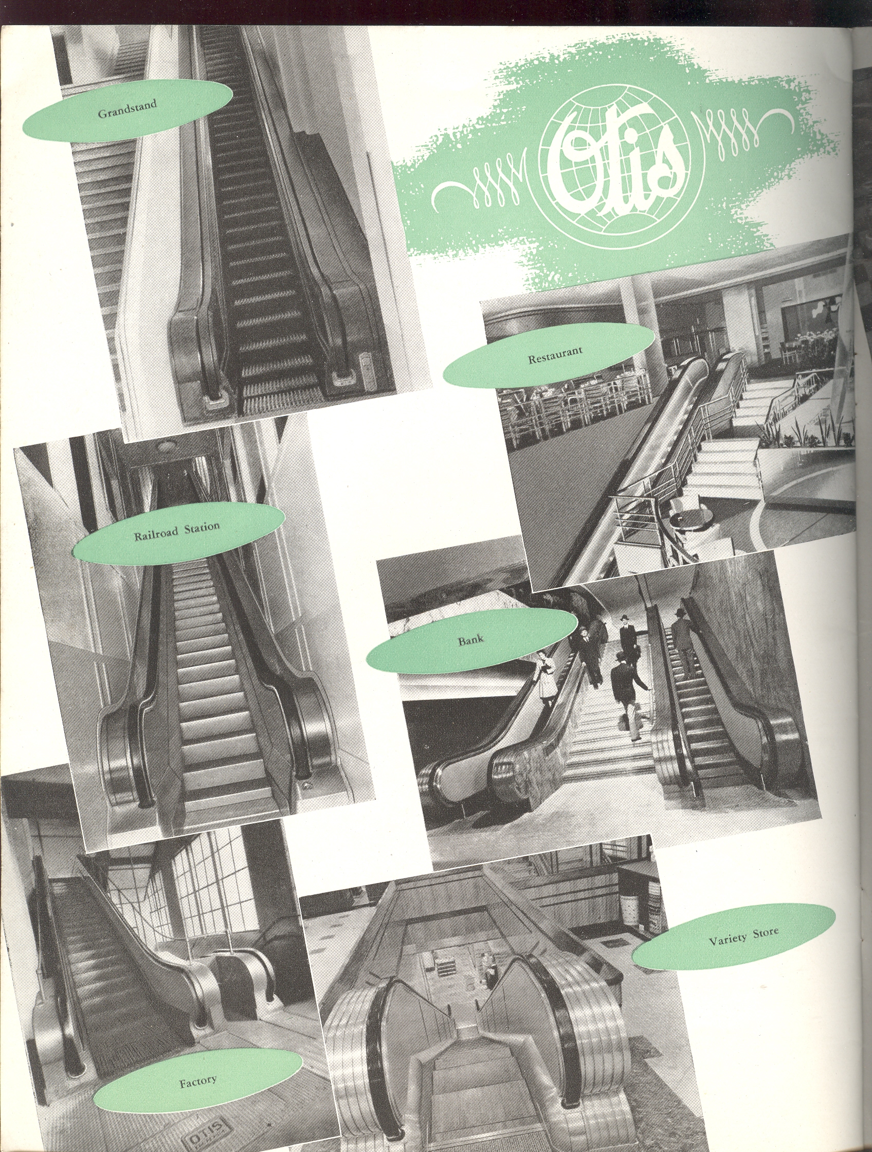
    The Otis Elevator
    pamphlet (1947) is efficiently designed beneath its semi-bizarre cover,
    floating in odd typeface, completely lifeless design, mannequin humans, and
    washed-out pastels.  The Chinese coloring
    book style of its covers hides a superior content, complete with schematics and
    beautifully supplied with photos of elevators long-since removed from sight and
    memory.  + simplicity escalators back 002


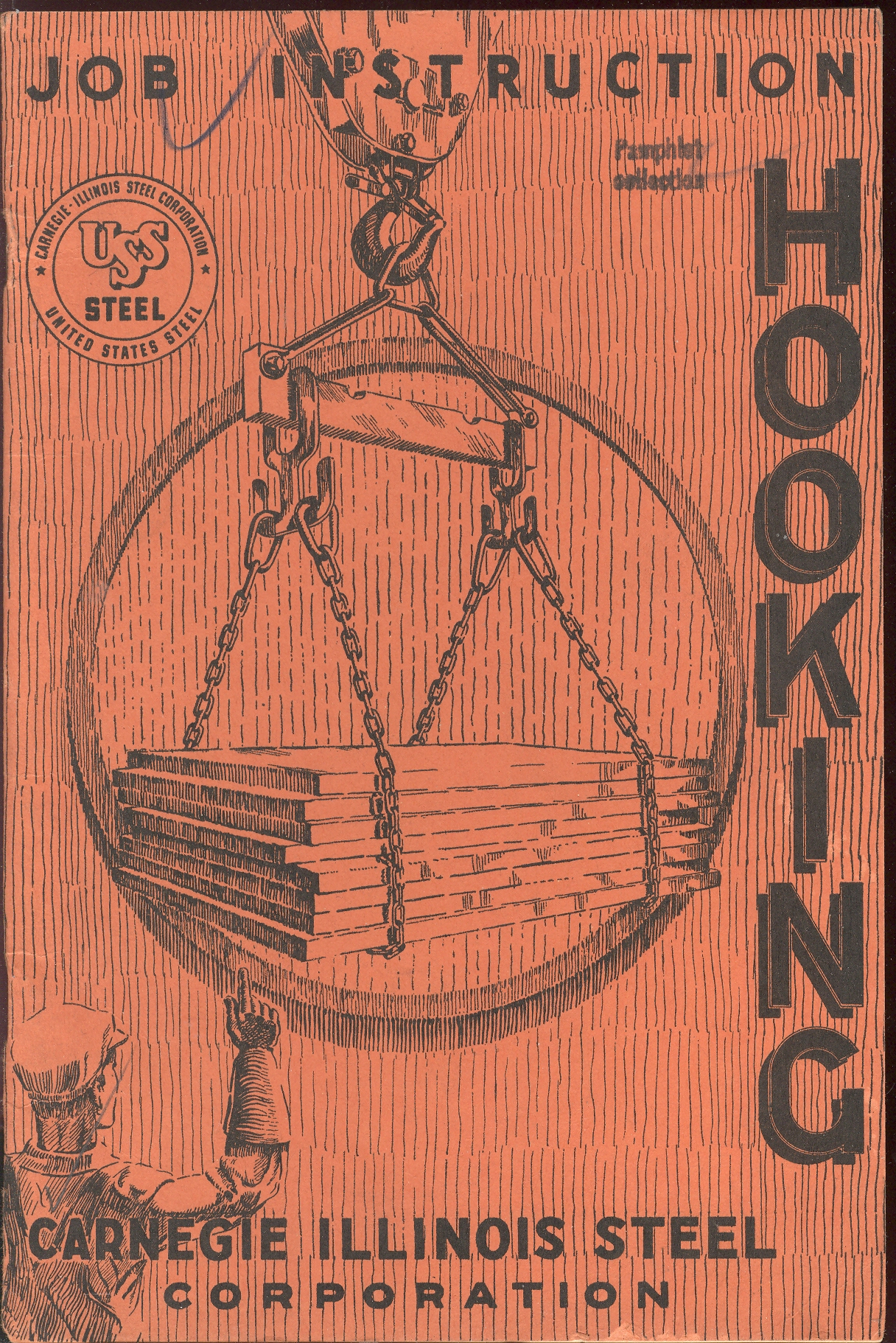
    The Hooking pamphlet is not about its obvious contemporary
    counterpart, but is a luminous, luxurious introduction and stylizer to the
    science of hooking large objects to cranes via giant hooks and chains, and especially
    about how to keep yourself from being 
    crushed by tons of steel not hooked properly. 

    + simplicity hooking

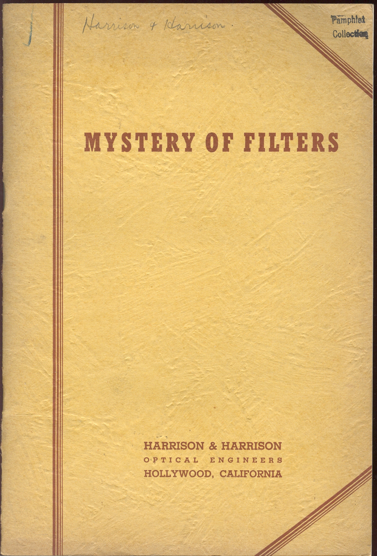
    The Mystery of Filters
    charm is wholly in its title and cover design, its text describing nothing
    but camera filters.  It is still a cool
    cover, nonetheless.

    + simplicity filters

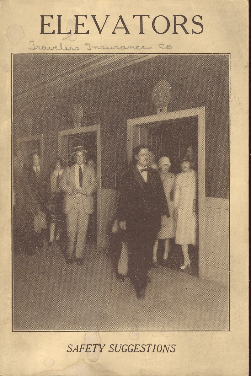
    Elevators,
    published by Travelers’ Insurance Company, tried to protect themselves a little
    further by ensuring safe practices of elevator operation, mostly in industrial
    settings.  This was published in 1926 and
    was already in its seventh printing from its inception in 1913 when the
    elevator was just in its second decade of popular, relatively widespread usage.
    The haven’t-given-this-cover-design-a-moment’s-thought hides a thorough (and
    bland) treatment of elevator safety; too bad, the cover photosnap-art promises
    something more.  Its not there, except
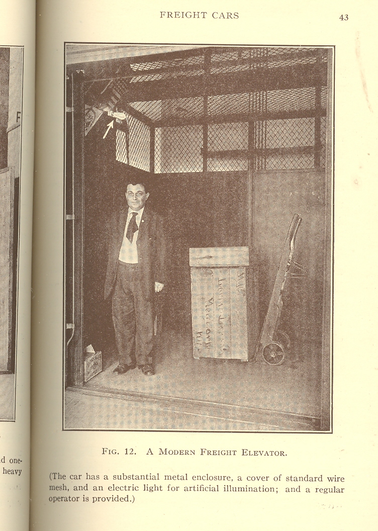
    for this beautiful photo of an industrial elevator op with a tie.

    + simplicity elevatorsAnd coming back to wood barrels that are not necessarily
    filled with pig (or wild boar) bristles but with something else less advanced
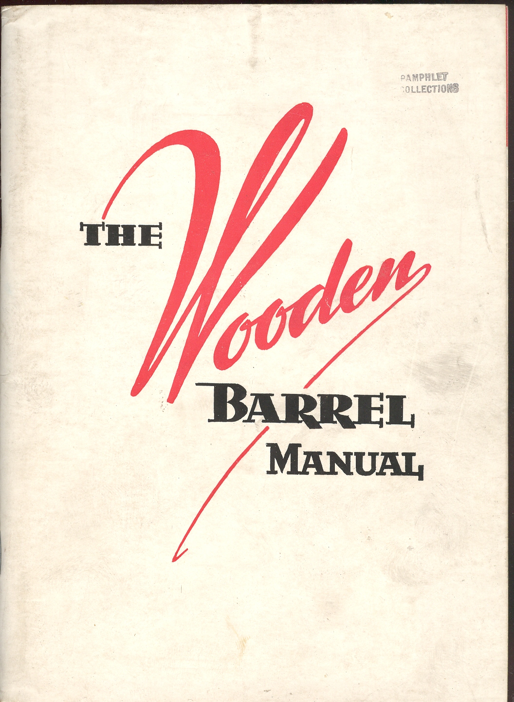
    comes this manual on making wood barrels. 
    Everything is there, everything you’d need to make a barrel (and a good
    one at that), and I admire this sort of fantastic dedication to what is
    essentially (to our modern mind) mundane—except that it is as dry
    as well-cured barrel wood.  But I admire
    it still,  as I do the Elevator pamphlet,
    because, well, they’re done right. + simplicity elevators interior tie

    + simplicity wooden barrels


  • A Stone-Cold Masterpiece of Naive Art: Teresa Ottalo, ca. 1860

    JF Ptak Science Books LLC  Post 773  Blog Bookstore

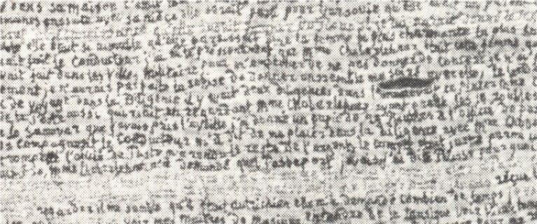
    As a collector of naive art–particularly produced with letters or numbers–and as a person generally interested in naive and outsider (and art brut and letterist and found )art, I was astonished to find this spectacular work by Terea Ottalo (ca. 1800-1870).  First of all, I make this to be about 200 lines long, and about 50 inches tall.  The words are, well, minute.

    Secondly:  this magnificnet thing was EMBROIDERED.  Breathtaking, really.

    I haven’t yet found out anything about Ms. Ottalo, except some basic references of her affiliated “school” of art.

    I do know that this, whatever it is, is a masterpiece. 

    ++00++ 9.29 teresa ottalo

    And an unfortunately smudgy detail, such as it is–I cannot offhandedly find a good, clear, high resolution image of anything at all by Ms. Ottalo.  This will have to do for now, but I think it gives a reasonable idea of the fineness of this work (found in Michek Thevoz’s Art Brut, Skira, 1976)–this sample detail represents less than 10% of the overall image:                                                                                                                                        

    ++00++ 9.29 teresa ottalo detail

    ·Posted by :

    ·in:

    — —

  • Weird Questions and Weirder Answers Department: Curing Insanity

    JF Ptak Science Books LLC  Post 756  Blog Bookstore


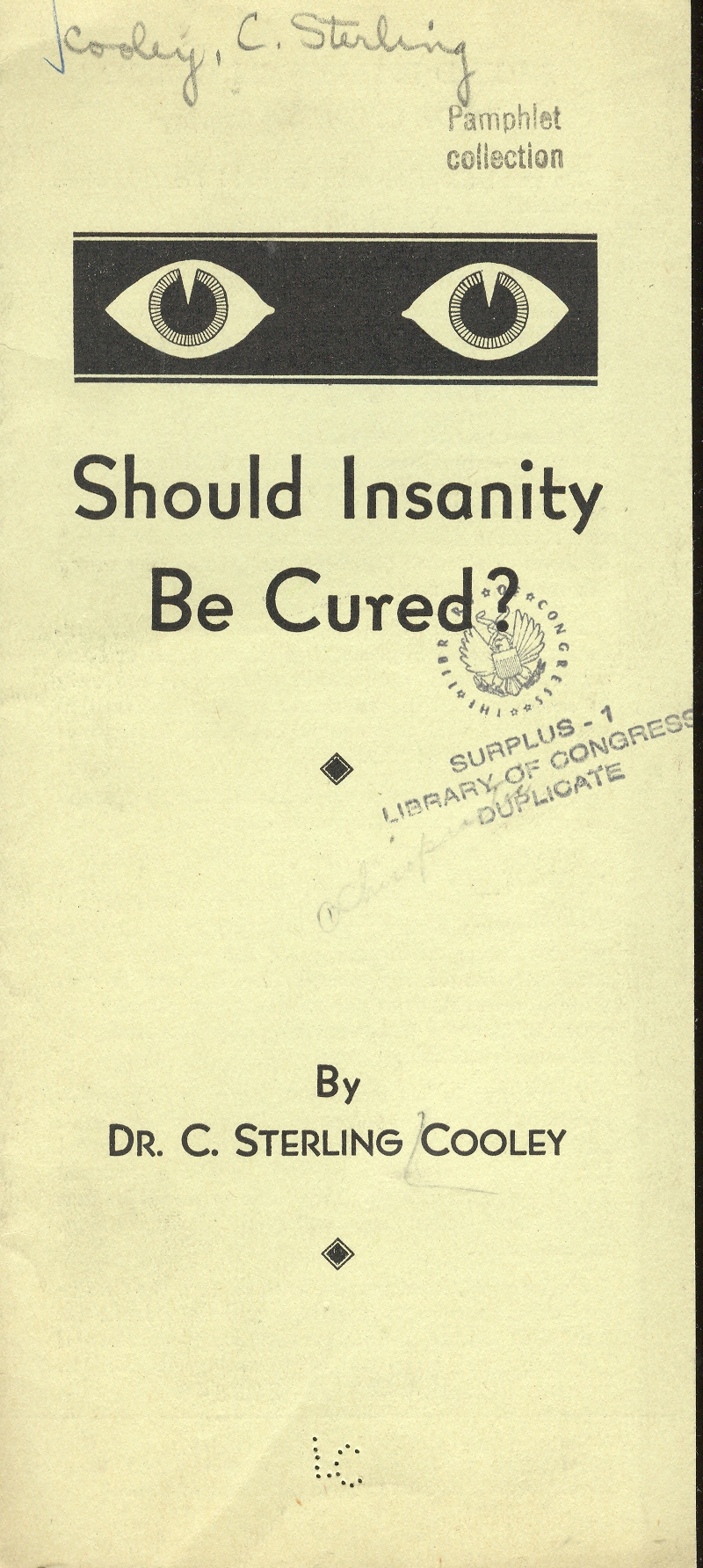
    ++00++ 9.15 insanity Dr. C. Sterling Cooly wrote an incredibly-titled pamphlet of slim means called Should Insanity be Cured?  How could anyone proceed further than this?  Dr. Cooley wasn’t a eugenic apologist, nor was he an accountant for a life insurance firm—he was advocating a drugless cure for all different sorts of “insanity”, which was a term he doesn’t really stop to identify and classify, which of course is deeply problematic. 


    Or it is so until you hear how one can treat the insane via his new drugless method:  chiropractic.  I didn’t see that one coming.  “An insane mind is a sick brain, a sick body is an insane body” writes Dr. Cooley with leading confidence, claiming that chiropractic can release “the power within…marvels of healing are performed not only in mental cases but in virtually ALL forms of disease”.  That’s a lot to live up to in theory, let alone in practice. 

    Dr. Cooley was evidently a deeply important founder father of modern chiropractic, with a 50  year career in the area (1908-1957), and who was also very prolific–this is one work that he probably should’ve edited out of the publishing phase. 

    ·Posted by :

    ·in:


  • Connections: from Plugging Gibraltar to Shakespeare’s Memories in One Step

    JF Ptak Science Books LLC  Post 691  Blog Bookstore

    “Simply the thing I am shall make me live.”

    –from Jorge Luis Borges, “Shakespeare’s Memory”


    ==Blog July 21==shakespeares memorie It is interesting to pursue a loose thought to its not-necessarily
    logical end.  Such is the case with the
    Paneuropic ideas of Hermann Soergel (1885-1952). Soergel was a Bauhaus
    architect and author of a number of works on design and far more ethereal,
    floating-castle ideas. His most spectacular contribution—incubated in the
    mid-1920’s and still clinging by its fingertips as an idea among some current
    thinkers—was to put a dam across the straights of Gibraltar.  The dam would generate electricity of course,
    but most importantly to Soergel, it would also empty an enormous amount of
    water from the Mediterranean leaving vast new
    expanses of land to be developed and colonized over generations into the
    future.  The master plan at work was that
    the world would be divided into three economic spheres in the future, all
    beginning with the letter “A”:  American,
    Asia, and the new land to be created by Soergel, “Atlantropa”, which was the
    former Europe expanded into the new dry beds of the Mediterranean and North Africa.  And also
    of course Egypt,
    which would be covered with canals and semi-submerged by the new borders of the
    meandering sea.  This would be the way
    for Europa to compete with the rest of the world in the future. 


    Perhaps it is actually three steps to get from the idea of
    damming up the straits of Gibraltar to the osmosis of Shakepeare’s memories into
    someone else’s brain—a squinting acquiescence of the middle touch being the
    brilliant Jorge Luis Borges.  You see it
    was in the Argentine master’s last published story, “Shakespeare’s Memory”, that
    we meet Herr Soergel (as Hermann Sorgel) again. 
    But so far as I can remember Soergel exists only as a fictional
    character, with no reference to his real-life self.  In this wonderful story, Soergel inherits the
    memories of William Shakespeare—these bits come to him slowly but surely, until
    they start to conflict with his own memory, and things get difficult.  The man with Shakespeare’s memories winds up
    phoning strangers on the telephone, giving them away at random, until Soergel
    is left with his own mind again. 
    Superior as Bill’s memories were, they still weren’t Hermann’s, who
    wanted his own life back in the end. 


    And so from the titanic, pan-europic technodream of
    Bauhausian Hermann Soergel to the dead brains and living memories of William
    Shakespeare, all through the fingers of the beautiful Jorge Luis Borges.  

    I should point out that the image above comes from the Illustrierte Zeitung (Leipzig) for August 1931, and is a drawing by an artist named “AS. Christ” after Soergel’s Panropa’s ideas.


  • Pale Horses and the Lake of Fire: a Map to the End of the World

    JF Ptak Science Books LLC  Post 649  Blog Bookstore

    There are, in my experience, very few antiquarian images
    depicting the end of the world in which we see the entire globe exploding or in
    pieces or in flames. This sort of image gets more play in the 20th
    century, especially after 8 August 1945, but prior to that it is really very
    scarce.  I own a few images that appear
    in the 17th and 19th centuries, and another from 1929 (Das Weltbild which show a “giant ice
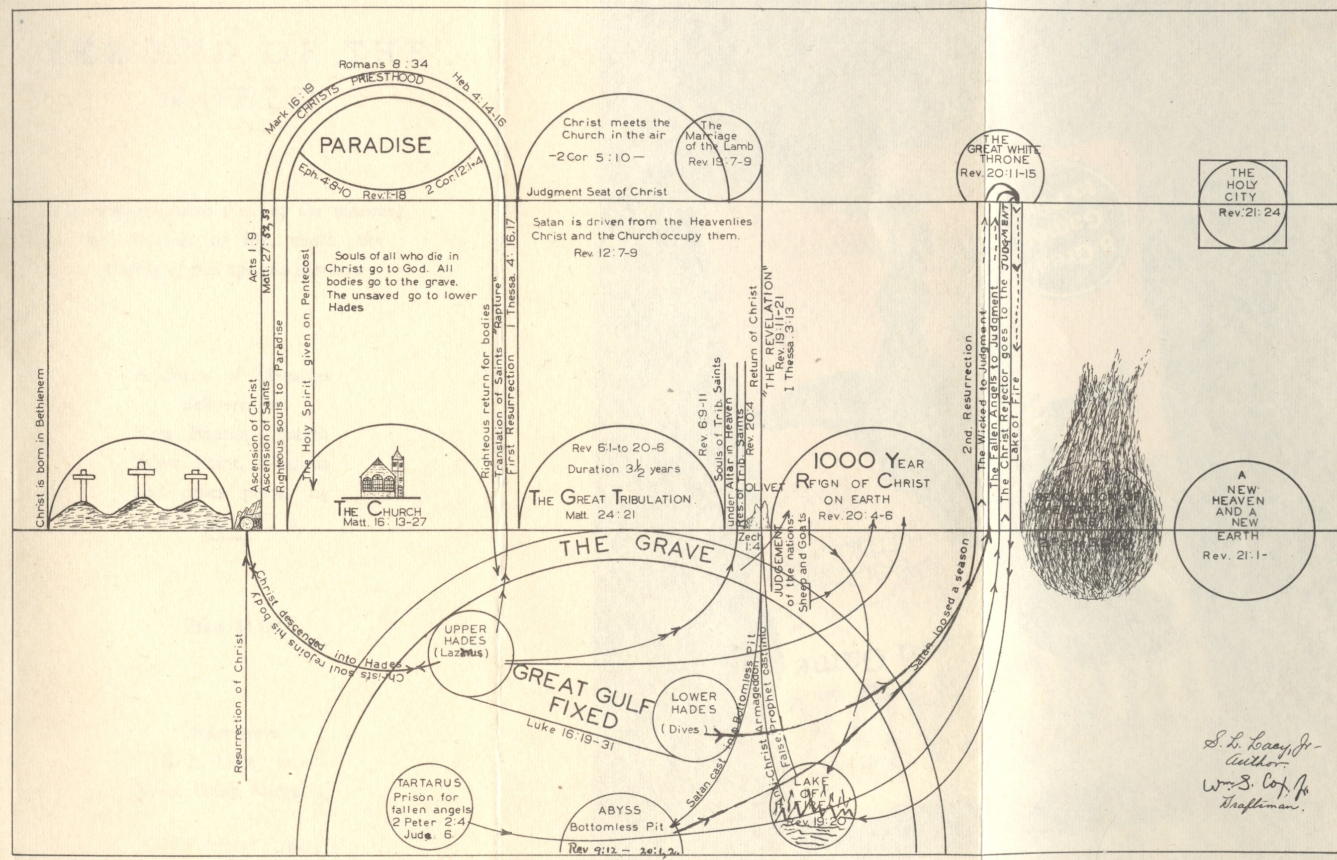
    ball” colliding into and completely destroying the earth). .  Then there is this new find, S.L. Lacy’s The End of the World, (necessarily) self-published
    in West Point, Virginia, in 1941.  It is a short and stocky, and bound in orange
    wrappers—its spine title (The End of the
    World
    ) begs the casual reader to pull it from the shelf. It’s a simple
    book—studying the Bible prophecies and revelations on the end of all things—and
    it annoys and is insulting but doesn’t disappoint.

    Blog--jun 13 end of the world

    I
    started to breeze through the book (back-to-front as always) and opened the
    book to Chapter XIII, finding this delicious chapter heading:  “The Chronological Order of Final Things”,
    this being a full page pre-PowerPoint summation of the time-shrinking fireball
    that is rolling inexorably towards us all. 
    To say that one is able to put a period at the end of the world’s flow
    of time, that someone is able to identify the point in the future where the
    future is no more, is “presumptive”–this in the most understated
    fashion as to offend even the highest of high-Victorians’ sense of restrained
    propriety.  Wrapped in a comfortable
    Christian chrysalis of pre- and post-apocalyptic religious certitude, Mr. Lacy
    delivers his interpretation of biblical prophecy for the coming of the end,
    hustling it to the front of the religious line of things to come.

    It seems that in 1941 the end was beginning, and Lacy saw
    all of the images implied by prophecy that were necessary to announce the
    glorious final days of broad retribution. This includes the list if the ten
    things indicating “the sign of The Times”, one of which (Number 5)
    was “The Automobile” and another (Number 7) was “Increased
    Knowledge and Travel” (announced by Nathum 2: 3,4 and old dependable
    Daniel. 12:4, respectively.  There’s
    nothing that doesn’t fit into Daniel’s visions or revelations, though Mr. Cash
    has certainly made a lovely song of them.) 
    When everything fits perfectly into a predictive model with no possibility
    of falsification (or of proof or disproof), then the model has no validity
    outside of a belief system in itself. Very tidy.

    Blog--jun 13 end of the world det

    It is an annoying, cloying minor treatise, promising little
    more than The Lake of Fire awaiting almost all of us, even the sleeping dead,
    who would be scraped from their graves to be spit into this burning
    tragedy. 

    Lacy does a lot of inspired interpretation and
    philosophizing, much of which he doesn’t seem to bother separating from
    biblical quotations—I don’t think it is intentional, just bad writing.  A random
    find in Lacy’s thinking dislodges the following  nugget:

    “Satan is in the atmosphere above the earth, with access to
    heaven and earth with a circumscribed power over the atmospheric elements and
    the earth including the inhabitants”. 

     Oh dear.

    But enough of this nonsense. What brought me to this work is
    the folding schematic map at the front of the book.  It is a slightly complex jumble of
    semi-circles and circular reasoning, and I have no interest in straightening
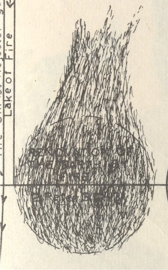
    out this jumbled linguine. What has my interest is the dissolving Earth part of
    the diagram, a part of the dead earth that comes between Calvary 
    and Heaven-on-Earth.  What makes this
    image different from the others though is that the Earth reappears—different from
    its former self having been vanquished and cleansed by all consuming fire, but
    the Earth nevertheless.  Or something
    like it.  Or nothing like it. 


  • Bizarre Titles with Real Content: the Fine Art of Squeezing

    JF Ptak Science Books LLC  Post 612   Blog Bookstore

    The Heart is a Lonely Hunter, This Side of Paradise, Revolutions of the Heavenly Spheres, In Praise of Folly, the Divine Comedy,  Pride and Prejudice.

    Sometimes magnificent titles of books deliver magnificent things.

    Blog--may 11--odd 001

    Then there are the uneven, unruly titles hiding great works like Aristtotle’s On Youth and Old Age, On Life and Death, On Breathing; Das Kaptial, On the Origin of Species, Paradise Lost, Brothers Karamazov,  Tractatus Logico-Philosohicus.

    There are badly-titled books that are just bad–we don’t need to get into that right now, wounding the wounded.

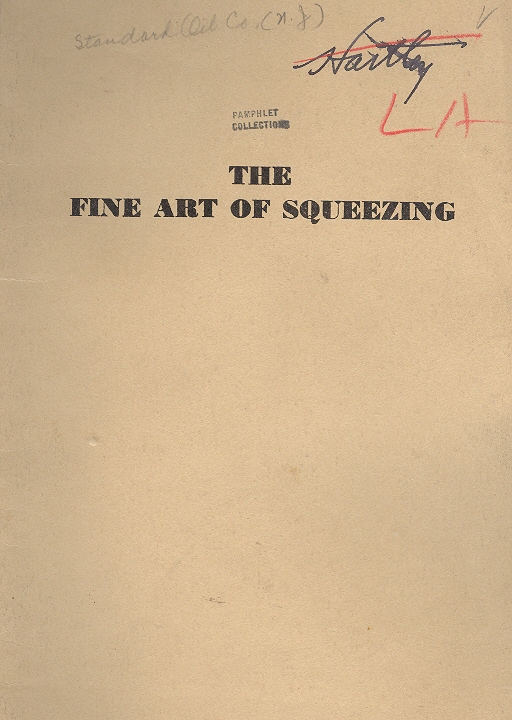
    And then sometimes a book title promises a lot and delivers it–but not the “a lot” that you expected.  The Fine Art of Squeezing, god knows, is a title that demands attention.  I thought, well, I’m not sure what I was expecting–possibly it would actually be on squeezing things. (I’ve seen many examples of this sort of bizarre title/content continuity, so I thought it a possibility.)  But  the story here is delivered by the Standard Oil Company of New Jersey and details their properties being nationalized–squeezed–by the government of Mexico in 1938.  It is one of a series of pamphlets, and it evidently sucked up every bit of creativity at Standard Oil:  The Question of Subsoil Rights in Mexico and The Accustomed Practices in Cases of Expropriation and Confiscation are two titles that deliver the contents’ good accurately and dryly.  This singluarly-titled work also has chapter headings that equally lovely and bizarre:  “The Revolutionary Squeeze”, “The Constitutional Squeeze:, “The Concession Squeeze”, “Strangling the Goose “and other fortifies the reader with the possibility of a surreal experience.  It is not, of course–it is a competent and direct summation of Standard’s deal with Mexico. 

    Blog--may 11--odd 003


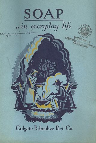
    Soap…in Everyday Life is another one of those lovely naive titles, though it only hides a very accurate and authoritative display of Soap Knowledge, published by the Colgate-Palmolive-Peet Co. The draw to this pamphlet for me stops as soon as you open it.  (It is a happy little soap-making theme on the cover, though.)

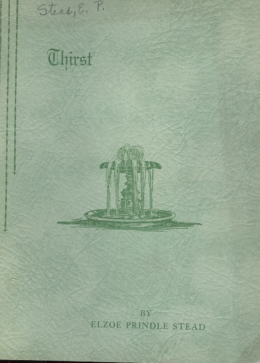
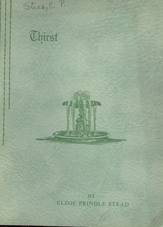
    Thirst is another disappointment–weird title and design, and was written in 1937 (and self-published) by Elzoe Prindle Stead.  The joy of the title is quickly dissolved by the content, with chapter headings such as “Born Once”, “Once to Die”, “Going to Hell”, “For Him of the Second Death”, “Forgotten or rejected Savior”, and “Jesus goes to the Cross.  Its a major proselytizing vehicle which defines itself with the last chapter title, “Why Not”. 
    Blog--may 11--odd