A Daily History of Holes, Dots, Lines, Science, History, Math, Physics, Art, the Unintentional Absurd, Architecture, Maps, Data Visualization, Blank and Missing Things, and so on. |1.6 million words, 7500 images, 4.9 million hits| Press & appearances in The Times, Le Figaro, Mensa, The Economist, The Guardian, Discovery News, Slate, Le Monde, Sci American Blogs, Le Pont, and many other places… 5000+ total posts since 2008.

Category: Information, Quantitative Display of

  • Ships in the Skyline: Graphic Displays of Information

    JF Ptak Science Books   Quick Post (Overall post #2515)

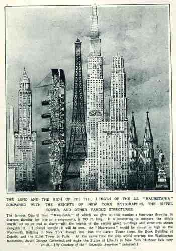
    This wonderful display (appearing in The Illustrated London News for 26 March 1927, page 518) of quantitative data isn’t quite as whimsical as it appears in detail, though I can think of onlyBlog1sept_16_ship_skyline_detail5_2
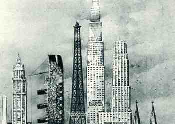
    a few (antiquarian) times that I have seen a ship made part of a cosmopolitan vertical cityscape.  It is a great way of comparing two disparate, out-of-place equals, and certainly can get the idea of the size of something as stand-alone and solitary as a great ship to children (and adults, too) by comparing it to something as obvious as a tall building.,  This time its really just comparing the length of the SS Mauretania with the heights of some famous and notable buildings. (The Mauretania, 1906-1935, was a fabled, luxurious and fast ocean liner of the Cunard line; it was refitted for a resurgent oceanic service at about this time.)   In the larger, expanded second image we see the Mauretania stacked up against (from left to right) the Washington Monument (555′), the Woolworth Building (792′), the Mauretania  (790′), the Eiffel Tower (984′), the Larkin Building (proposed at 1208′), the Book Building (873′), the Koln Cathedral (512′) and the Statue of Liberty (305′).  The Larkin Building (not the F.L. Wright structure of the same name) was a proposed super-tall of 110 floors for 330 W. 42nd Street that was proposed in 1926 and not canceled until 1930, and which would’ve been the tallest building in the world.   In any event, this was a big ship–the largest in the world when it was launched as a matter of fact–and the drawing is wonderful.   (Upon closer inspection, there is a terrific amount of detail in the cross section of the ship.)                                                   

    Blog1sept_16_ship_skyline564


  • Inside Looking Out, Part II: From Inside the Eye, Nostril and NYC.

    JF Ptak Science Books  [Extending Post 1813]

    Machbook

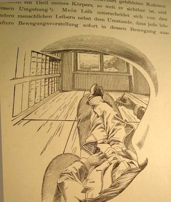
    I cannot think of another illustration by a scientist or philosopher who attempts to explain their own, literal, view of the world and then offer what this looks like to the reader from inside his own head, looking out through his own eye.  That’s exactly what Ernst Mach is doing right here on page 15 of his influential book Die Analyse der Empfindungen,  the fourth German edition (“The Analysis of Sensations and the Relation of the Physical to the Psychical”, published in Jena in 1903).

    There is nothing in this world for Mach that is not admissible to the human brain that is not empirically verifiable–that is, the world is nothing but awash in sensation and that sensation itself forms part of the experience of, well, experience. I’ve actually never been interested in the philosophy of science, and this is one of the reasons why.  Nevertheless I boldly break through my own prejudices to enjoy this phenomenally original image, drawn from the inside of Mach’s working mind, looking out through his eye socket, over his mustache, under his eyebrow, around his nose, out across his body and then leaping into the rest of the world.  I think he does make his point about the essential.

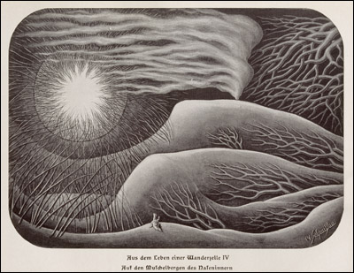
    Another interesting perspective is achieved by the one-and-only Fritz Kahn in 1926 with his imagery of viewing the world from deep within a human nostril. 

    Kahn, fritz nostrill
    This is a different sort of interpretation (from his Das Leben des Menschen/”The Life of Man”, printed in Stuttgart in 1931, volume 5, and found at the National Library of Medicine site section “Dream Anatomies” here https://www.nlm.nih.gov/dreamanatomy/da_g_IV-A-06.html) from the Machian view,  Dr. Kahn’s (1888-1968, a gynecologist and a renowned popular science communicator) being more of a landscape with the solar apogee of the nostril opening to the outside world. 

    Steinberg_352

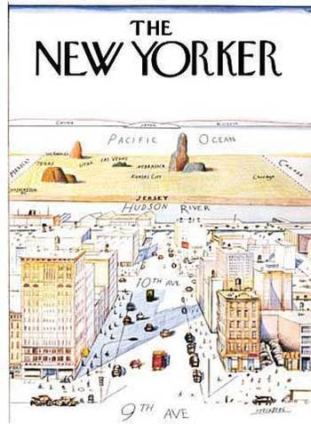
    And similar in a way to the Mach’s internal view of the outside world is this classic Saul Steinberg New Yorker cartoon of the world view of the New Yorker (and of course this includes only Manhattan). I know some number of people who have transposed their bodies much like Herr Mach into the Steinberg map–except that their worldview ends basically at the Hudson River (Mach’s feet) with the rest of the world being the sliver out there beyond the river (Mach’s window) until you go 359 degrees around the world to get back to the East River (and back inside Mach’s noggin).  It is an unusual world view to have, but someone has to have it so that we can at least identify it so. 

    I just like the picture. 

    Notes 


  • Blank and Missing Things: Life. An Example in the Discovery of the Obvious

    JF Ptak Science Books    Post 1934

    An entry in the series on the History of Blank, Empty and Missing Things.

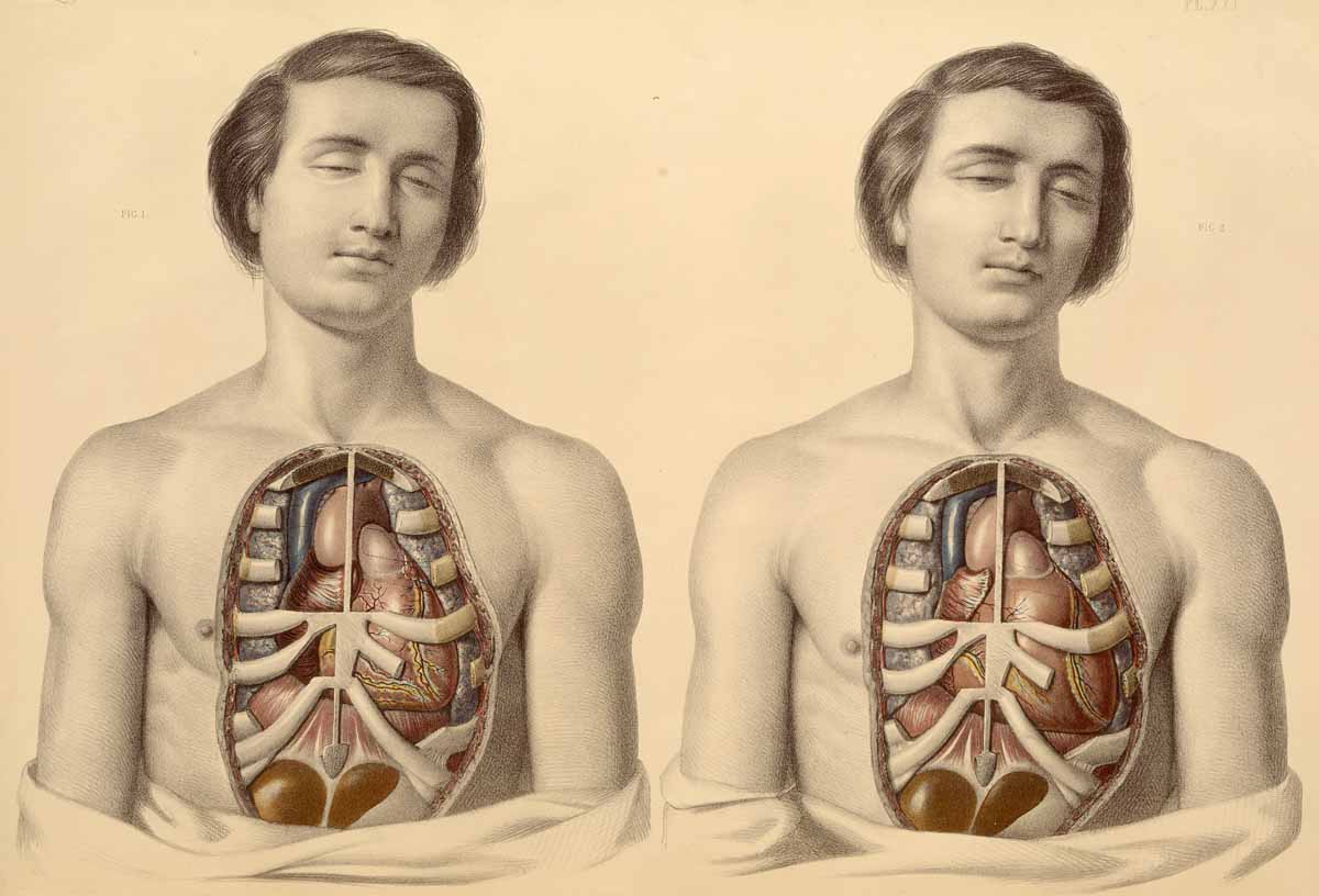
    Anatomy--before and after
    This is fascinating–the anatomist Francis Sibson (1814-1876) in his Medical Anatomy  (London, 1869) provided descriptive/illustrative examples of what the body’s internal organs look like in cadavers and in living patients.  Offhand I am not aware of such a comparison being done before this date, and as he clearly demonstrates (and which you can see more clearly by expanding the above example) there is of course a huge difference in the anatomy of the living and the deceased. 

    This is an enormous observation that seems as though it should have been made earlier, but perhaps it wasn’t–though it must be admitted that “the obvious” isn’t until it is.  For example, Etienne Durand was the first architect to include examples of plans of different buildings on the same scale side-by-side, and that wasn’t until the mid-19th century–clearly this would be pro forma for just about describing two elements of anything, but it just simply wasn’t done until 160 years ago or so.  This also applies in a way (though there are more complexities involved as to why this is different) to the antisepsis practices of Joseph Lister who in simply washing surgical tools between use on different patients (and hand-washing and the use of surgical masks and so on) increased the chances of surviving surgery by at least 50% (though I think that number is much bigger than that), and these practices weren’t begun until the mid-19th century. 

    So the business of identifying “the obvious” is very tricky, because, well, something isn’t obvious if it hasn’t been done/seen before.  Or, if it has been seen, it hasn’t been seen seen.  As in clouds–as present as they have been for the whole of human history they basically escaped classification by the great human natural history classifiers until the very early 19th century. 

    And when I looked at the history of the word “obvious” it seems to have made its first appearance in print in 1603, so I went naturally to William Shakespeare for a quote using the new word.  Evidently, the great wordweaver never used “obvious”. (See here for an index of all the words of Shakespeare.)

    [Image printed by chromolithography after the artwork of William Fairland, 1869. Source: the National Library of Medicine.]


  • The Earth Skeleton, Primal Pansperma & the Gigantic California

    JF Ptak Science Books   Post 1933

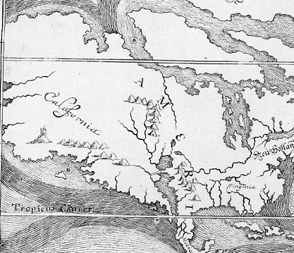
    Happel map895 detail;
    [Detail of  E.W. Happel’s map in his Relationes Curiosae (1675), plates 23 in the Peabody Library’s The World Encompassed, 1952.]]

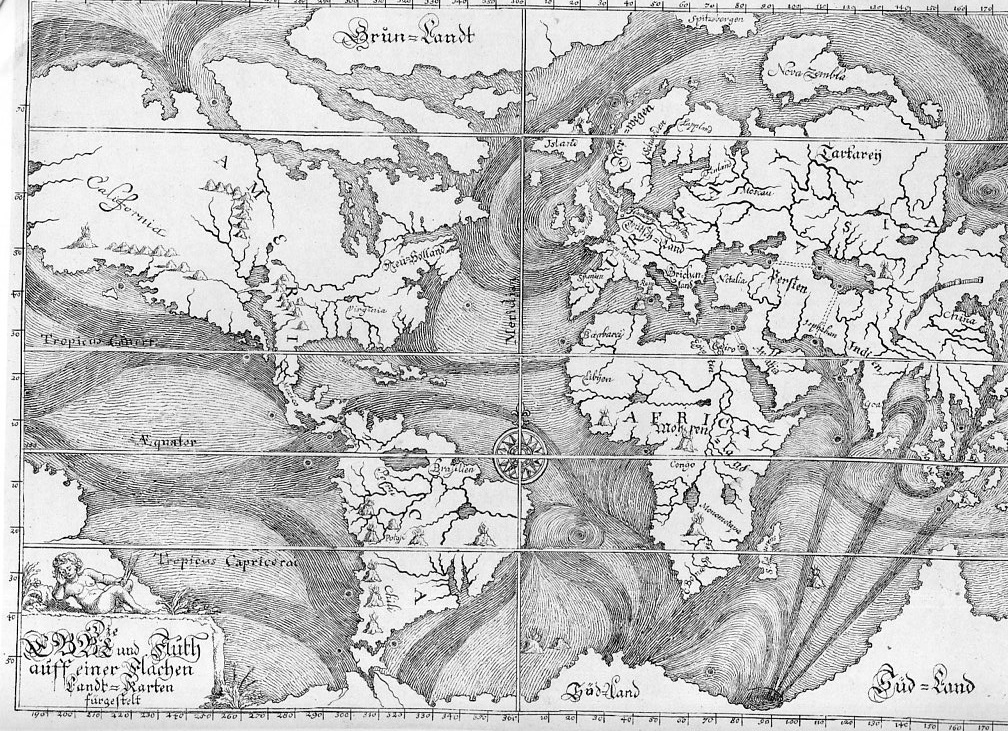
    I’m not sure how my thinking went from Athanasius Kircher’s Earth skeleton to the magnificent Eberhard Werner Happel 1675 world map of ocean currents featuring what might be the largest California ever seen in the history of cartography, but, well, the thinking wound up there, (and this leaving out Bishop Burnett’s perfect primordial world egg in the process). This was intended as a simply post following up yesterday’s bit in the Blank and Missing Things series relating to California as an island and the missing land mass connecting the non-island to the rest of North America.  Nominally California usually appears as a stubby/plump infected-appendix-sized bit either attached/not to the continent, but the California in the Happel (1647-1730, a man of math and medicine) map is larger than the rest of North America from the California gulf to the Atlantic.  Of course that also includes all of Alaska and then some imagined lands as well, but, still the mass of it is labelled “California” stands by itself larger than South America, Africa (which looks surprisingly good for the age of the rendering), China (which is very very small) and Russia (which lacks virtually all of Russia east if the Urals).  The only land mass that comes close to California’s size is the Antarctic regions, which is drawn here as a solid land mass including the scant points of data for New Zealand and Australia and whatever other island was found in southerly South Sea travels, all drawn together and fitted into an enormous continent.

    Happel map895[The full image of the Happel map]

    Although there weren’t many explorers yet to go up the west coast of North America in 1675, other maps of the period render the coastline in a more accurate way than this.  The point of the map, really, is to display what was known of the ocean currents, some of which was correct but a lot of which is not–though it is a very good attempt given the state of the data collection.  The source of this map,the Peabody Library’s The World Encompassed (1952)  calls it the “first chart of ocean currents”, which I think is incorrect–and it is here where our favorite 17th century science-Jesuit comes into play, for it is in Athanasius Kircher’s Mundus Subterreaneus (1642) that the first map of ocean currents occurs.

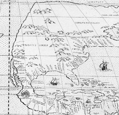
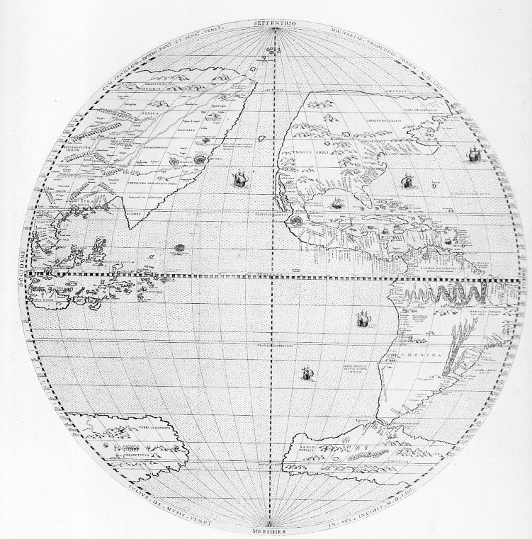
    Tramerzinus map896_edited-1 detailed

    [Michael Tramezinus’s map of the Western Hemisphere (1534) showing a mostly non-existent western coastline of North America along with a stringy California–but given the time and the available information, it is an excellent map that is not afraid to define unknown lands with a squiggly line. Source, plate 35 from The World Encompassed.]

    Kircher is a highly problematic character in the history of science.  He is at times wonderful and insightful and creative; at other times he is boring, pedantic, grueling, wrong, fanciful, and stingy with attribution.  I’m no Kircher scholar, but it seems to me after al this time that sometimes he writes stuff that he couldn’t’ve meant, that he absolutely knew better than to assert–but there it is, anyway, written as gospel truth (and the Gospels and related religious mythio-stories evidently demanded obedience to their own truths, in which Kircher complies) . This is one of the problems with the Fra Athanasius.

    Tramerzinus map896
    [The full detail of the Tramezinus map.]

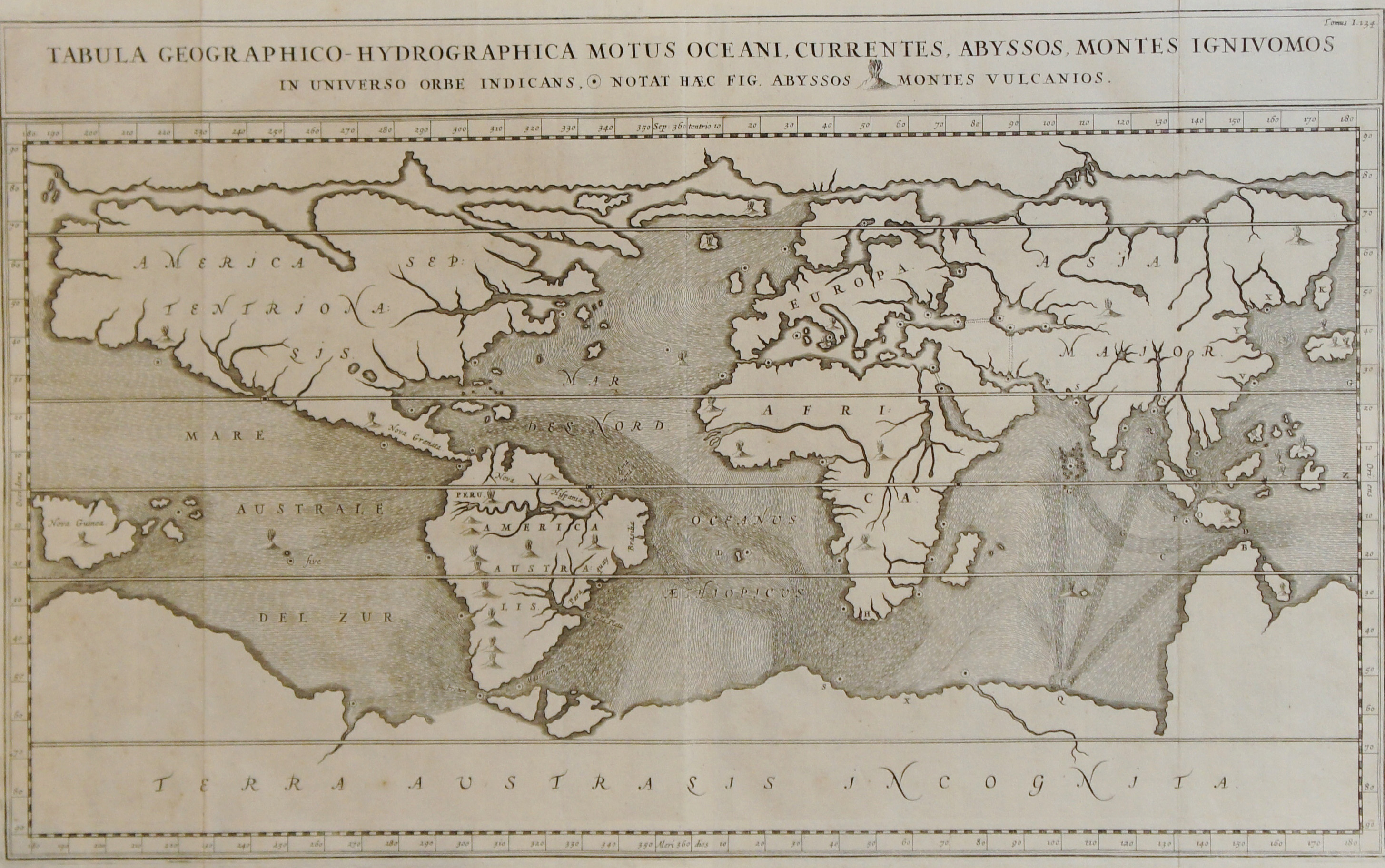
    In his Mundus Subterraneus Kircher presents the true first map of ocean currents (Tabula Geographico-Hydrographica motus Oceani, currents, abyssos, montes igniuomos in universe orbe indican), some bits being correct and others not so. He rejects the Aristotelian concept of condensation, and figures that the accumulation of snow/rain/dew is simply not enough water to feed the rivers and lakes and oceans, so he devised subterranean oceans and rivers with vast stores of water to feed the waters topside.  His hydrophyllaciae is one of four components of an underground Earth that closely coincides with the four elements and with the human condition, much in the tradition of the Medieval body/spirit approach to the understanding of the world system. 

    Kircher current maop
    [Source: image from the mapseller site of Sebastian Hidalgo Sola, Buenos Aires, here.]

    John Edward Fletcher, in his A Study of the Life and Works of Athanasius Kircher, ‘Germanus Incredibilis …” describes Kircher creating an “Earth Skeleton”which he dresses according to science and ecclesiastical needs, finding a vis spermatica, the launching of all matter from the primeval chaos of primordial Earth.  The Mundus addresses this and many other things–it is, in all of this and all of its faults (as Fletcher states), a great repository of all geological knowledge of the time.  There is the good with the bad in the Mundus, “a conglomeration of exotic facts and fiction, along with odd scraps of truth and the occasional flash of brilliance” (Fletcher, p. 172), and the ocean currents map is one of those bits.

    Kircher undertakes an enormous and probably impossible job in this book, but may actually be kept from getting to the big point by depending upon himself too much. As Fletcher points out (page 171), the Mundus‘ third edition of 1671 failed to take into account the major advances in fields touching on the book’s contents, in particular, the work of Mariotte and Varenius, which was much superior to that of Kircher on the ocean currents, neither of which are discussed or even mentioned in the new edition.

    This was a very round-about way of getting to the California-part of the Happel map, but the attribution of the World Encompassed as “the first” of its kind needed to be addressed.

    Notes:

    Here’s an interesting read on the Kircher/Happel maps:  from http://www.coastalguide.com/helmsman/gulf-stream-history-noaa2.shtml


  • A Dance of Armless Anatomy, 1741: an Enormously Expressive Anatomist

    JF Ptak Science Books    Quick Post

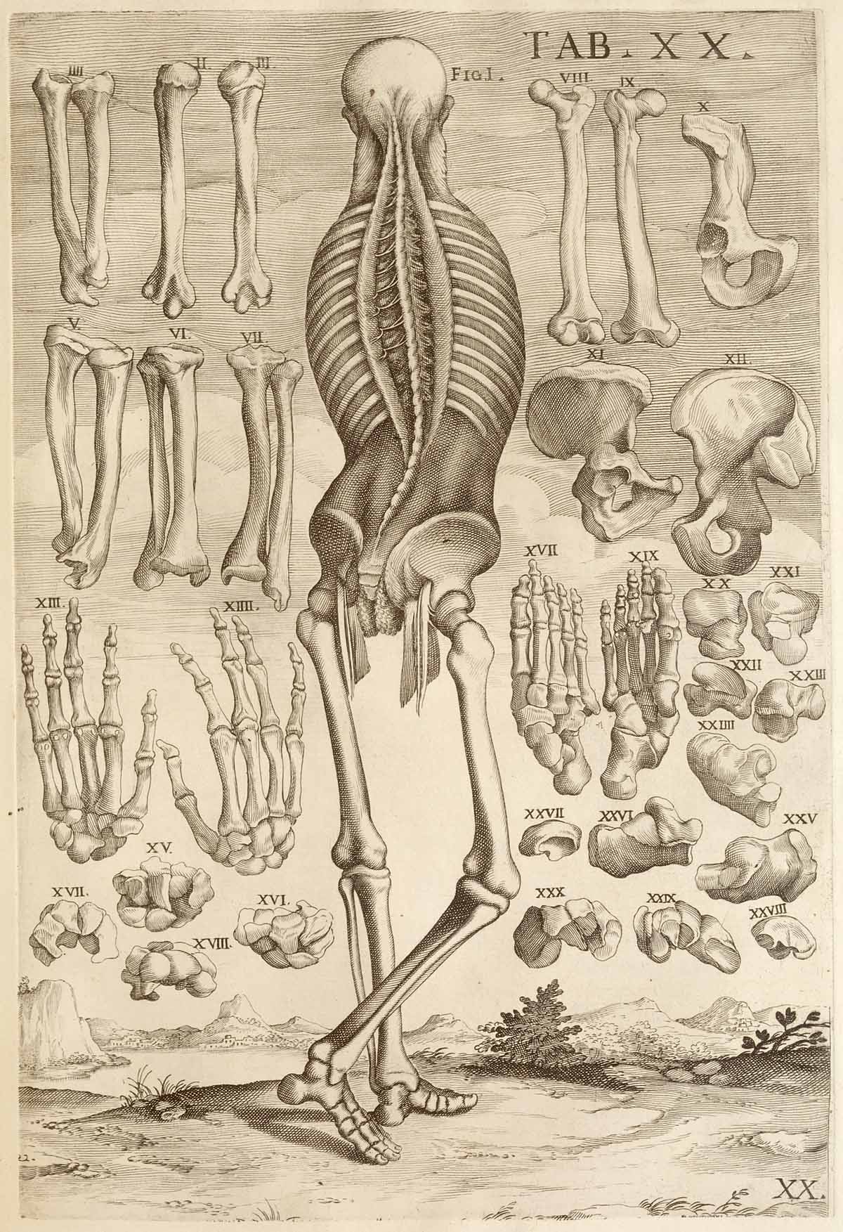
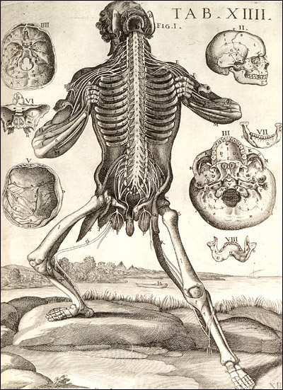
    Anatomy da cortona

      This “dancing” skeleton is the work of artist/anatomical illustrator Pietro Berrettini da Cortona (1596-1669) and appears as a copperplate engraving in his book Tabulae anatomicae…which was printed in Rome in 1741. 

    [Source: National Library of Medicine.]

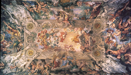
    He complete this work around 1618 and it was neglected for more than a century, finally seeing publication in 1741.  It may be because Mr. da Cortona was busy being an architect and artist-outside-of-anatomy, For example, he did this:

    Cortona ceiling
    [Source:  Galleria Borghese.]

     Which is not to say that a giant ceiling to the dedication of a pope is “better” necessarily than anatomical illustration, but it certainly consumes more effort and time.

    That said, when da Cortona did these images in his youth he reserved very little in the way of expressive sentiment of the cadaver models.  His work was nothing short of extraordinary:

    Cortona[Source: National Library of Medicine.]

    This is simply magnificent, and the artist is letting everyone know it.

    [The full text but with muddy images is available at the Internet Archive,]

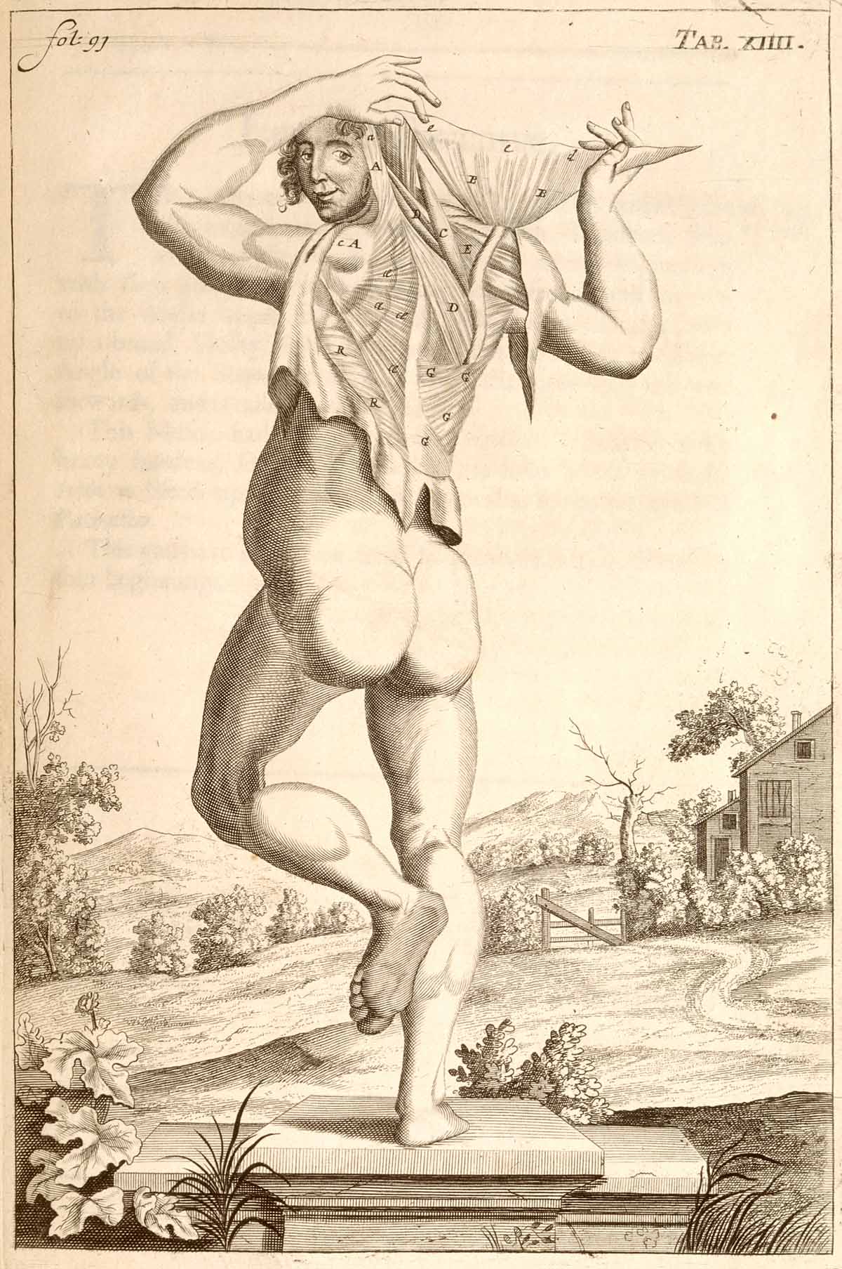
    A not-armless dancing anatomical figure that isn’t nearly as aggressive as the figure above–and in fact seems to have a bit of a “come hither” attitude” is this example from A compleat treatise of the muscles, as they appear in the humane body, and arise in dissection…by John Brown (ca.1642-1702) and which was published in London in 1681:

    Anatomy john brown

    [Source:  http://www.nlm.nih.gov/dreamanatomy/images/1200-dpi/I-D-3-16.jpg]


  • Acoustic Weapon “Performance Degrader”, 1933

    JF Ptak Science Books  Post 1926

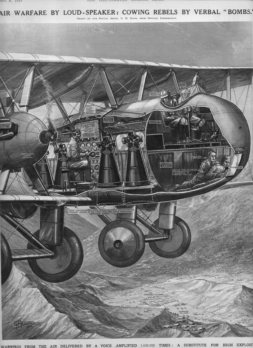
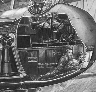
    From the looks of it, this image from an 8 April 1933 issue of the Illustrated London News is not quite a “verbal bomb” as we might think of such a thing today.  The cutaway drawing (by the sensational G.H. Davies, who produced hundreds of these images for the magazine over four decades)shows an acoustic device housed in a Vickers Victoria aircraft. As described in the descriptive text to the image, Sir Philip Sassoon (“speaking in the House of Commons on the Air Estimates last month”) mentioned in May 1933 an attempt to induce forces hostile to the U.K. in Northern Kurdistan by flying over rebel strongholds and threatening an air attack if no surrender was forthcoming.

    Verbal bombs877

    Evidently a translator would address the town at 2-4,000′ elevation through an audio system that amplified the voice”1,600,000 times”. An address was made to the leaders of the tribesmnen to surrender their position, else an air attack would occur after three days. Even though described in the title of the image as a “verbal bomb”, it isn’t anything like the directed energy/sonic/acoustic/infrasonics/pulse weapon performance degraders that are currently available.  What was happening here was simply (or not so) an attempt to get an enemy to relieve their position via tangible threat, sort of an acoustic leaflet bombing prior to the real thing. Of course this was backed up by actual bombing, which was still a relatively new weapon for armies–several nations which possessed this newish facility of war practiced bombing civilian/military targets alike in extra-territorial possessions. (There was a hot debate over what constituted fair use of aerial bombs beginning in earnest in the 1920’s, but much of that soon devolved into debates on what constituted “civilian populations”, and there the definitions were wide and sloppy.)  In any event, the loudspeakers did not emit high-powered sound that would disturb/puncture eardrums or cause dizziness or problems with eyesight by making the eyeballs vibrate–they were just loud conveyers of Bad Things to Come.

    Verbal bombs det 2879
    Verbal bombs det878


  • Big Shadows–Industrial Silhouettescapes, 1936

    JF Ptak Science Books    Quick Post

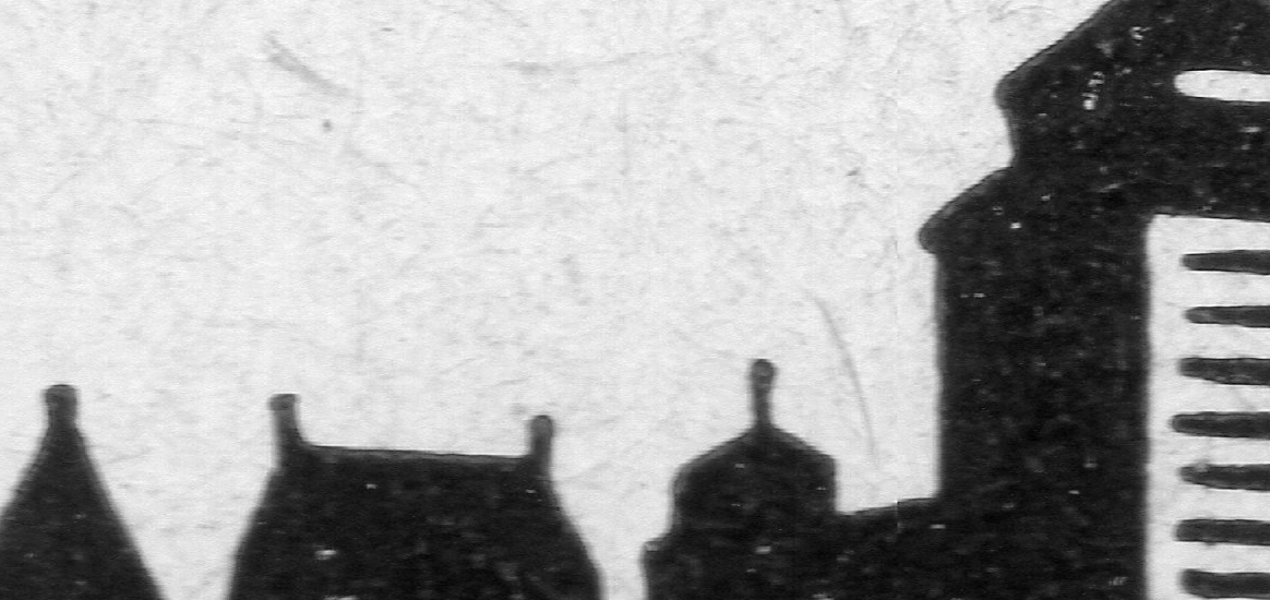
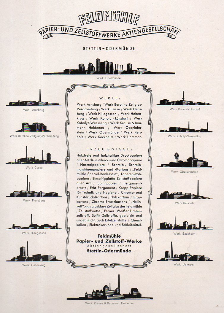
    In my experience with images in silhouette, the technical adaptations are very unusual (at least for things that are not spotter guides for enemy aircraft or ships-at-night)–more uncommon still are industrial buildings rendered in silhouette.  But here’s an example, taken from the Illustrirte Zeitung (Leipzig) for 1936.  These are factories in the Feldmuehle Papier- und Zellstoffwerke company, and are really quite attractive.

    The following two images are details from the 14th silhouette, at bottom-center:


    Industrial silhouettes874


    Industrial silhouettes873

    And the full-pahe ads looks so:

    Industrial silhouettes872


  • The Unspoken Bits in Antique Historical Charts: Africa, 1826

    JF Ptak Science Books     Quick Post

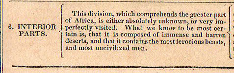
    John L. Blake’s Geographical Atlas is interesting for what it says and doesn’t say–granted, you can’t much take someone to task for things that they do not say, unless of course the unspoken bit makes a louder noise in its absence than in its presence. 

    Africa chrono816


  • Sequential Illustration and the Seven Stage Rule of Human Decay

     JF Ptak Science Books       Post 1910

    Among graduated indicators the semi-physical allocations of measurable units time must be the most significant–or at least in modern times, over the last few hundreds years, when the popular class was able to afford time-keeping devices so that they could have a greater appreciation and control over time past and future.  Simplified articulations of long periods of time is generally not a topic of illustration, however–art and illustration showing the development of a story is generally not a common occurrence in published form. 

    It is not terribly uncommon in ancient and early modern times, though.  Trajan’s Column is an excellent example of a sequential story, this told in stone; legends and myths and other stories are told in vases and friezes in Greece, and in various codices and altars in Mayan and Mixtec cultures. 

    But in more modern times the telling of the sequential stories in published form, again, is not a common thing.  Even the telling of the story of the development of, say, a tree or the  life cycle of a bird is just not a common occurrence, in spite of the more-popular appearance of graphical and expressive modes of displaying quantitative data in the mid-19th century. 

    http://www.internetmonk.com/wp-content/uploads/AdamAndEve_Garden_Lucas_Cranach.jpg

    Perhaps the most common of the early transitions in displaying these stories since the Renaissance have been in the telling of the lives of the Saints, or in the Passion of the Christ, or in the depiction of the legend of Adam and Eve (as in the work of Lucius Cranach, above).  There are interesting cycles showing the Christian mythic formulation of the creation of the world, as in the case of Thomas Burnet’s (illustrated title page to his)  Sacred History of the Earth  where there is a glorious seven-sphere display of the beginning and ending of our planet. 

    [Source, with full text, here.]

    I wonder though if one of the most popular and common sequential depictions of an important and shared story is that of the ages of man/people:  generally they show a pyramidal showcase of silhouettes or full-body portraits of one person as that body develops and decays over the major decades of a life.

    They would normally appear in a configuration like the following:

    File:The Stages of Life BM 1992 0125 31.jpg

    And earlier on, very famously, like so:

    File:Stages of Life by Bartholomeus Anglicus 1486.jpg

    (I’ve written about and identified these and other related depictions of the ages of man here.)

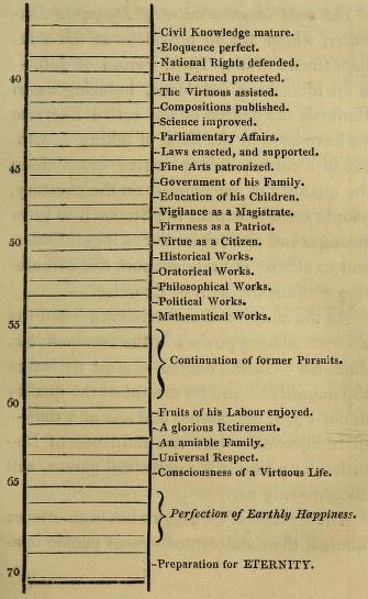
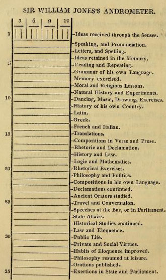
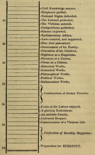
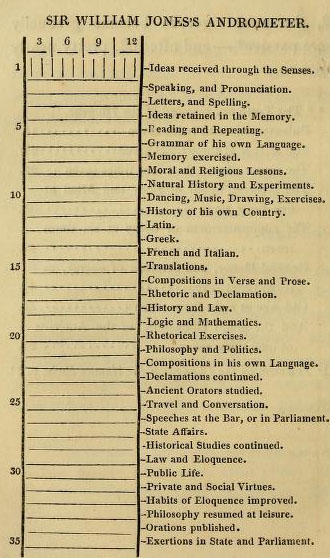
     I came to think about all of this again after reading an interesting post in the excellent Public Domain Review blog where I found this absolutely delightful “barometric” rendition of the stages of life, a sequential, top-to-bottom graphical display of the stages, but without illustration.  I cannot remember seeing such a “list” before, and was not familiar with the book from which it came (The art of invigorating and prolonging life, by food, clothes, air, exercise, wine, sleep, &c
    and peptic precepts, pointing out agreeable and
    effectual methods to prevent and relieve indigestion, and to regulate
    and strengthen the action of the stomach and bowels … : to which is
    added, the pleasure of making a will …

    which was printed in 1822 by Constable for Hurst/Robinson in London, the full text of which can be found at the Internet Archive). 
    Stages of life (a)

    Stages of life (b)

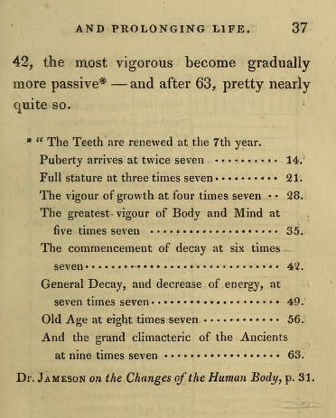
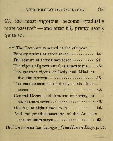
    And the “Rule of Seven” which precedes the longer list above:
    Stages of living rule of 7
    It is interesting to note that this was the fourth edition of this work, and that the end of the book, the very synopsis for ideas of full life and longevity, the whole is topped off by a chapter on happy-making and your personal will. 

    There were many admonishments that made and still make perfect sense found in these pages:  early to bed and early to rise sort of material.  Plain, but sensible.  Eating early. Dressing sensibly.  Eating (for the time) modestly. Interesting recipes. Pure air making for “a diverted mind”.  Good advice for the mature bookbuyers there in first quarter 19th-century England.  I imagine that most of those readers were no doubt born in the second-to-last decade of the 18th century, which means that their instructions on Daily Life business was from their parents who got their information from their parents, which means by 1822 much of the handed-down wisdom relating to diet and exercise was from the early 18th century.   Perhaps this work was the breath of fresh air that people needed, making it popular enough to find its was into at least four editions. (Also worth noting is that the average resting pulse rate for the readers of this book was said to be 60, which I think is lower than the American national average today.)

    There is of course a suffocating number of ill-advised recommendations, like for athletes, where the consumed foods should not include veal, lamb, pork, fish or cheese puddings, “or vegetables”, which leaves little room for anything besides red beef, which was to be had in quantities, including beef pudding, jellied beef, and “beef tea”. There was also a lot of beer and malt liquor drinking, with suggestions for “three pints of home-brewed” to be had with dinner, followed by three glasses of wine (‘the less, the better”)–then again, clean/drinkable water was a tough go at times, so beer was a common-enough stand-in.  All things being equal, the advice utilized whatever was the good data for the time. 

    The long list from birth to death of supposed and impending accomplishments is interesting particularly for the “decaying” part (which is outlined in the second chart) of life, where we find that at age 54 a person should be conducting their mathematical works, after which (from 55 to 60) one is relegated to pursuing “former works”.  (After all, the period of general decay according to the Rules of Seven chart begins at age 6×7.) And it is here that the creative life ends, because from this point to the preparation for eternity the life is spent enjoying one’s earthly works.

    In any event, I just wanted to point out the unusual nature of the “William Jones’ Andrometer”, which is a display of information that is outside my usual experience. 

    Note:

    I briefly considered including “logic trees” in this description, as they do tell a story, in a way.  ParticPorphyrysularly
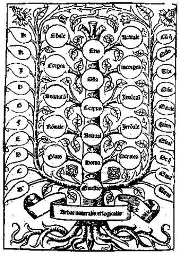
    Porphyry’s Tree came to mind (which was a classification in diagrammatic form on different kinds of being) and then Pacioloi’s summary of ratios from his Summa de arithmetica (1494). They do certainly represent a structured depiction of thought, but they are not a narrative, though they would provide the structure for one. Anyway, I’m convinced tonight at least that these diagrams don’t belong in the sequential illustration discussion.  (And in a weird way these diagrams enter the modern conversation so far as their overuse is concerned. Even in the Middle Ages the idea of the logic tree was being so over- and mis-employed that they would remind the modern reader of the “Top 15 (or whatever number) Photographs of Butterflies (and again, whatever he counted thing might be).)


  • Looking Straight Down Department: Antiquarian Waterspouts

    JF Ptak Science Books   Quick Post   Some examples from the uncollected series on Looking Straight Down can be found here and here.

    I’ve been involved in this blog at retrieving and tabulating antique images that look straight down on something. Today I imagine that we all take these sorts of views for granted, what with satellite images and Google Earth and airplanes and all.  But in the pre-heavier-than-air era, seeing a published image that looked straight down from a height was quite rare. (And it needs to be strait down, not a bird’s-eye view.  Things are very different between looking obliquely from an airplane window onto a cityscape than skydiving directly down on top of it.)

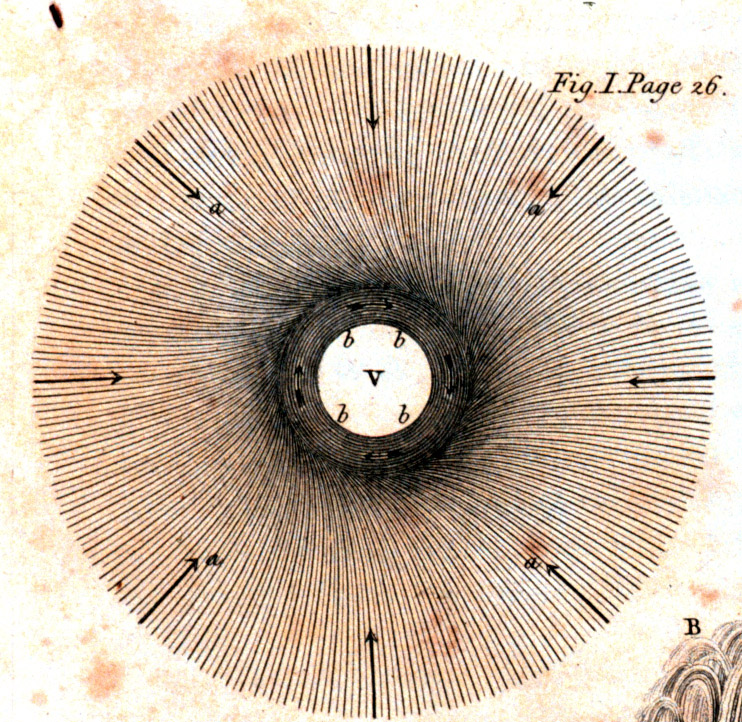
    Benjamin Franklin had long been thinking about waterspouts, going back at least to the early 1750’s, though he did not have an article about them in print until the appearance of “Physical and Meteorological Observations: Conjectures and Suppositions”  in the Royal Society’s Philosophical Transactions, LV (1765). The first image that I’ve been able to find of the waterspout occurs in 1774, though a prettier version of it is reworked a little, but with sharper delineations, in 1818:

    Waterspout detail

    Here’s the full image (with a magic square that related to another article in the volume):