A Daily History of Holes, Dots, Lines, Science, History, Math, Physics, Art, the Unintentional Absurd, Architecture, Maps, Data Visualization, Blank and Missing Things, and so on. |1.6 million words, 7500 images, 4.9 million hits| Press & appearances in The Times, Le Figaro, Mensa, The Economist, The Guardian, Discovery News, Slate, Le Monde, Sci American Blogs, Le Pont, and many other places… 5000+ total posts since 2008.

Category: Information, Quantitative Display of

  • An Early and Unsatisfying Projection of an Electron, 1920

    JF Ptak Science Books  Quick Post

    People have been thinking along the lines of “electrons” for a long time, though the word is of relatively recent origin (1874), coined by the wonderfully-named Johnstone Stoney (1826-1911) after deducing that ther must be some type of electrical bit that vibrates within the atom that would generate light.  J.J. Thomson (1856-1940) stated later in 1897 in his paper “Cathode Rays” that evidence points to the fact that there must exist particles that are less massive than the hydrogen atom–he called these objects “corpuscles” but he was referring to what we now know as “electrons”. The gorgeous “oil drop” experiment of 1910 by R.A.Millikan (1868-1953) determined the charge of the electron, and in the next year–1911–Ernest Rutherford (1871-1937, and one of the 20th century’s greatest Kiwis) proposed the structure of the nuclear atom.  Then the major development of Louis de Broglie’s (1892-1960) particle/wave duality, and so on into our near-present.  But in between the beautiful work of Millikan and Rutherford came this little beast, a very unsatisfyingly-assumed image of an atom and its swirling electrons. The image appeared in the December 1920 issue of Illustrated World and just seems so unfair to the cause of beauty that I thought to share it.   
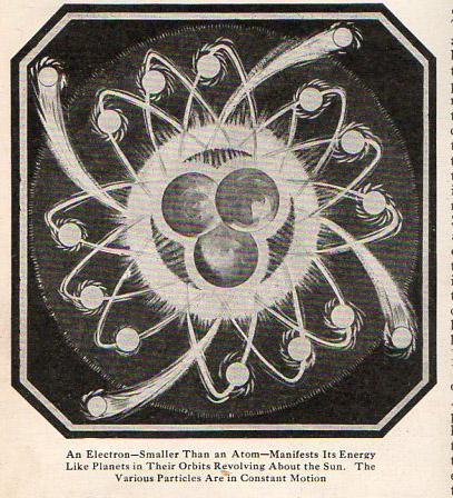
    Electron059


  • The Micro-Biological Beauty of the Plans of Catacombs

    JF
    Ptak Science Books     Post 1971

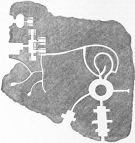
    Cemetery four[Plan of a portion of the principal storey in the Poggio Gajella]

    The plans of underground cities, of catacombs and cemeteries, share a certain biological appeal in their design with the plans of Medieval cities, or at least they seem so to me.  Removed from their context and placed in an undifferentiated environment, the plans look very much like biological structures, and art.  As maps of cities of the dead it is somewhat ironic that their geological chrysalis seem to indicate a biological structure.

    And sometimes the images aren’t so reminiscent of micro-structures as they are macro-structures, as in the case above. If you squint just a little and look at the Poggio Gajella you can visualize a cross section of the upper torso of a body, including an open mouth, with nasal cavity, throat, digestive system, and even intestines and egress routes–a picture of a person in the city of the dead.

    The images below illustrating this ragged point are by Seroux d’Agincourt, (1730-1814), and appear in his  Histoire de l’art par les monuments, depuis sa décadence au IVme siècle jusqu’ à son renouvellement au XVIme (Paris, 1825). The images illustrate the article “catacombs” from  the Encyclopedia Britannica, in the great/standard 11th edition, from Project Gutenberg:


  • The Astronomy of the Great Flood

    JF Ptak Science Books  Quick Post

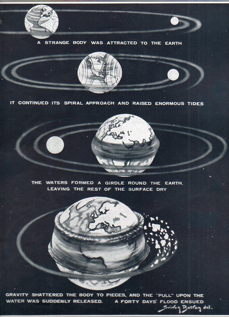
    This lovely if not very convincing argument was produced and directed by “a German engineer, Herr” (Enrst) Horgiger, of Munich.  He attempted to wed belief and mythology and astronomy, providing a worlds-in-collision explanation for the Flood.  From the caption to the drawing I do not know if it is The Flood of Noah, as it occurs in the book of Genesis in the Bible, or the flood of Apollodorus, or Hygenius, or of the Eridu Genesis (some 2000 years or so before Genesis) or the flood of Atrachasis (of about 1650 bce) or the flood of Gilgamesh (of about 1100 bce), or if it is the flood of Emhil, or Zeus, or Allah, or Yahweh, or the other 150+ great floods of mythology categorized by James Frazer in his astounding but unreadable books. But it is a flood, and his reason is that a wandering body in space came into temporary orbit around the Earth with a resulting gravitational soup that caused the waters to rise up after which the flood occurred and the orbiting sphere to break apart.

    The flood 1925057
    As I said, it is a pretty picture, with a nice deep blue background that my scanner won’t capture.

    Source:  The Illustrated London News, 21 January 1925, “A New Theory of the Flood: How it Might Repeat Itself”.


  • A Mall of Skeletons

    JF Ptak Science Books  Post 1968


    Follow Me on Pinterest

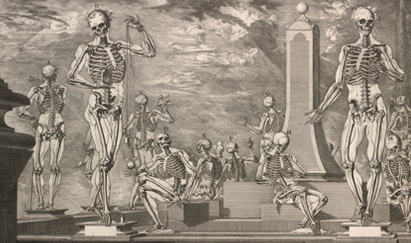
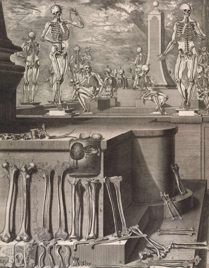
    There is a murder of crows, a congress of owls, a charm of finches, a convocation of eagles, a labor of moles, a murmuration of starlings, and so on, but there is nothing for a group (“knot”?) of lawyers, or a collection (a “slick”?) of politicians…or for that matter a grouping of skeletons. Perhaps when you have a grouping of ten or more skeletons (standing and non-interred) they could be called a “Mall”.  They should be called something, I guess. But of course one wouldn’t have many opportunities to describe a mall of skeletons, though one opportunity presents itself right now:  in my experience of looking at antique scientific and medical images it is not very often that I have seen such an assembly as in the following image. 

    Anatomy  Crisostomo_martinez-atlas detail

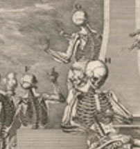
    The skeletons are mostly in poses of some sort of relaxation, appearing in candid stances, far away from that of being in the anxious state of being a skeleton.  Most of the skeletons have some degree of skin-in-outline, and a few entertain themselves with a casual object, like an apple or a plumb bob.  (The two figures in the rear seem to be having an “I told you so” sort of conversation, with the sitting person making the point and the standing refusing it:)

    Anatomy  Crisostomo_martinez-atlas detail_edited-1
    The engraving (which is the top half of the full plate engraving seen below)  is from Crisostomo Martinez (1638-1694), an Enlightenment figure from Valencia who produced a lovely anatomical atlas that really wasn’t terribly “Enlightenment-y”, what with a deluge of unnecessary characterizations and Baroque decoration serving as miniature cartoons from one anatomical image to the next. That said, the images are quite beautiful, and creative, and imaginative, and clear, and concise…but perhaps not as detailed as they could be from the anatomical side. 

    Anatomy  Crisostomo_martinez-atlas
    The assembly of loose bones on the bottom half of the engraving is interesting but not as useful as it could be–close-ups would be nice for the details in the nicely-sectioned bones.  But the purpose in these illustrations wasn’t necessarily just the presentation of anatomical information, otherwise we would have had less nothing and more something.  Making visions of thinly-skin-clad skeletons certainly had its use and a good purpose, but a lot of the utility of these investigations is lost in the artful and beautiful presentation. 


  • Good Thinking on One Sheet of Paper

    JF Ptak Science Books  Quick Post

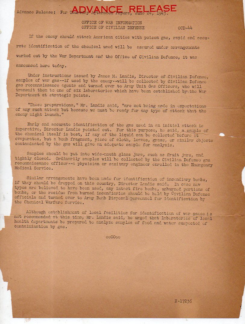
    These are two good examples of reasonable thought,. easily presented, and conveyed on a single piece of paper. A good job, well done.

    (I’ve written a number of times on gas attack in warfare on this blog, all searchable in the Google-box. But the two that come quickest to mind are the post on the one-page summary of America’s position on gas warfare, written in 1917, here, and the other on a “filmstrip” I put together from an Italian pamphlet on protecting civilian populations from bomb and ga attack, 1943, here.)

    Gas Attack037


  • History of Squares: Squares Big and Little in Infographics, 1890

    JF Ptak Science Books   Quick Post


    Follow Me on Pinterest


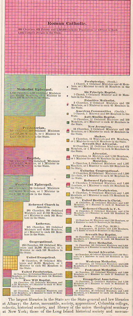
    This display of quantitative data appeared in the Rand McNally atlas of 1890, and details the various religions as practiced and reported in New York state for the census of 1880.  The work certainly gets it point across.  See also: Fantastic Sqaure(s), 1840 and the blog series, Quantitative Display of Information.

    Information--religion006
    This is the most detailed detail in the detail of the full infographic:

    Information--religion005


  • The Anatomy of Bacon and the Imported Food Needs of the British Family, 1949

    JF Ptak Science Books  Quick Post


    Follow Me on Pinterest
      

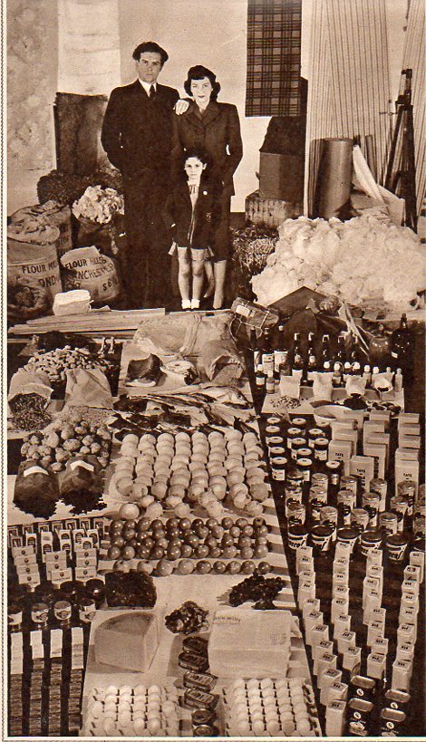
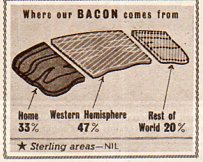
    Images displaying collective consumption over a long period of time, put together and arranged in one place to display the largeness of it all are pretty dramatic. (Like seeing a lifetime supply of butter consumed, or toothpaste used, or gasoline pumped, or sleep hours combined).  Nothing quite succeeds like excess, even when  here isn’t any–collecting discretely-used stuff used in bits and pieces over the short-term can add up to quite a lot if collected and displayed in its long-term use.  As in the case of this relatively modest consumption by “an average family of three” over a four month period in 1949. It just looks like a lot, when gathered together–more so, when you consider that this is a third of a year’s consumption, which means that if the full year was displayed it would probably encircle the family. 

    Food consumption975
    Understatement alrt: Great Britain suffered food and material shortages for years after the end of WWII, a difficult peacetime in victory.  That said, this four month assortment of food looks to be pretty spare, especially for fruits and cheese. 

    Food consumption977

    Source: The Illustrated London News, 26 March, 1949.


  • The Black Sun and Red Earth, 1862

    JF Ptak Science Books  Quick Post

    Follow Me on Pinterest


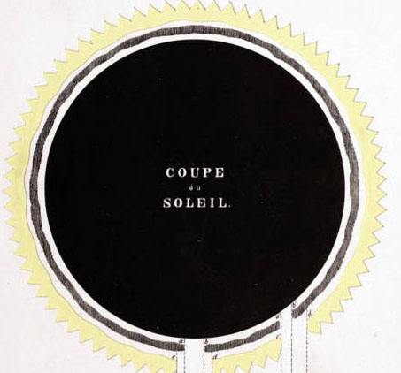
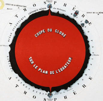
    These compelling images belong to Astronomie Populaire ou Description des Corps Célestes, Avec Atlas en Tableaux Transparents, à l’usage des Gens du Monde, which was published in Bruxelles in 1862.  The book is surprising, with several of the engravings being laid in, with holes for the interiors of stars and glassine on the back of the plate so that the image can be held up to (candle) light for a better effect of looking at the night sky.

    What I’ve selected though from this beautiful work are the cross sections of the Sun and the Earth. [Also of interest: an earlier post on this blog, Earths Inside the Earth, a Note on Interior Civiizations.]


    ASTRONOMY--sun_edited-1

    Source: Linda Hall Library

    And the Earth:

    ASTRONOMY EART_edited-1

    These are details from the following:


  • A Note on Venn and his Diagrams

    JF Ptak Science Books   Post 1952
    Follow Me on Pinterest 

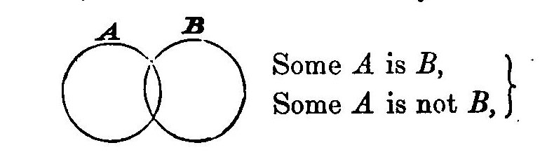
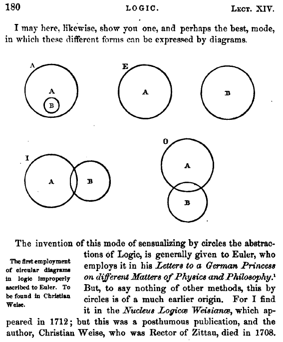
    It seems so unlikely that the Venn diagrams took so long to appear, that it hadn’t been Aristotle’s Diagrams, or Cartesian Diagrams; rather, these elegant creations–about a different way to represent propositions by diagrams– belong to Mr. Venn’s invention in 1880. Mostly. It was in that year that these famous more fully-developed diagrams first appeared in a paper entitled “On the Diagrammatic and Mechanical Representation of Propositions and Reasonings“ in the Philosophical Magazine and Journal of Science.  They seem so beautiful, and so simple, and so powerful, and so elegant. So necessary.  And so why-did-they-take-so-long-to-appear, so obvious.  In a way, they are in that category of The Great Obvious Invention, in a similar vein to Mr. Luke Howard first classifying the names of clouds  in 1803.  Sometimes things are not obvious until they are.  


    Venn diagram
    [Source: Internet Archives, John Venn, Symbolic Logic, 1881, full text.]

    Well, almost.  The diagrams did mostly make an appearance earlier–though not in the Venn form–in the work of Christian Weise (d. 1708) and then in that of Leonhard Euler (1707-1783), that according to the great William Rowan Hamilton, explained in his work Metaphysics and Logic (1858-1860). But the final form seems to be that of Venn.  

    Hamilton’s work appears so:

    Euler diagram


    They also appeared in the Proceedings of the Cambridge Philosophical Society,
    volume 4, 1880, in his article “On the employment of geometrical
    diagrams for the sensible representation of logical propositions” (here) in which he discusses the history of the diagrams, including the Hamiton history.  Venn also includes this beautiful logic template of Bolzano:

    I found a wonderful book review of Venn’s book Symbolic Logic that appeared the following year, appearing in the journal Nature on 14 July 1881, and reviewed by the inimitable W. Stanley Jevons (which is reproduced below).


  • A Stunningly Detailed Bird’s-Eye View of NYC, 1879

    JF Ptak Science Books  Quick Post 

    Follow Me on Pinterest


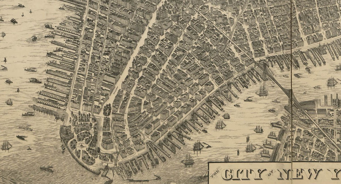
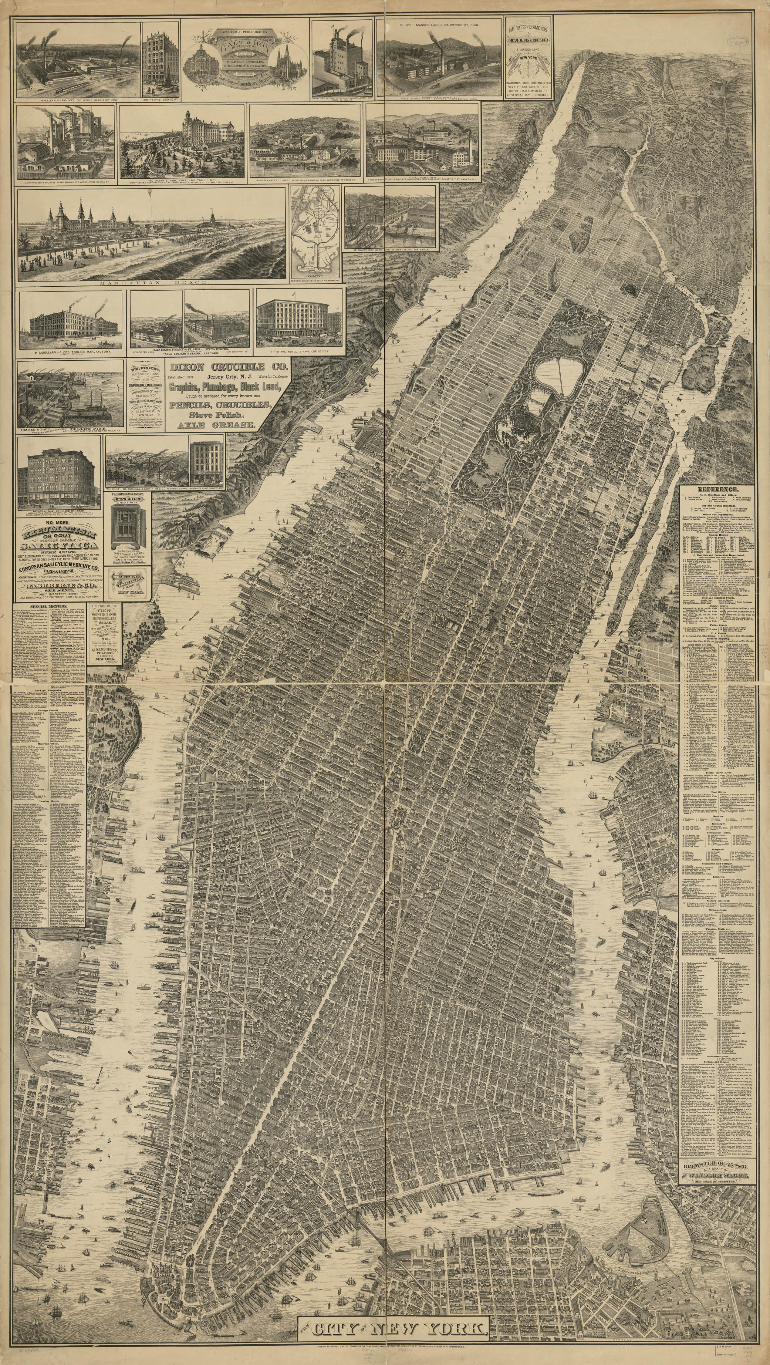
    This remarkable map, a bird’s-eye perspective view of New York City, was created by Will L. Taylor  (“chief draftsman”), and published by Galt & Hoy of New York in 1879.  There is a great attempt at representing (all?) buildings in accurate detail, though the Library of Congress notes that the map is not necessarily drawn to scale. The very issue of what seems to be an attempt to show the footprints and perhaps even the elevations of all structures in the city is incredible.  I know from experience with a 1910 bird’s-eye view of my own small city (Asheville, with a population of about 18,000 in that year) that our houses was drawn in and was shockingly accurate–I imagine with a large enough team of draftspeople that this project might well be possible for NYC. 

    Nyc mega map brooklyn bridge[Source:  the Library of Congress. The original is quite large (188 x 107 cm) and printed on four sheets, and is just superb.]

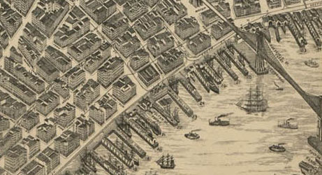
    And a bit more of a detail:

    Nyc mega map brooklyn bridge big
    The full map, below, clicakable and downloadable as a 2.5 meg file–its a very lovely thing.

    Nyc mega map