A Daily History of Holes, Dots, Lines, Science, History, Math, Physics, Art, the Unintentional Absurd, Architecture, Maps, Data Visualization, Blank and Missing Things, and so on. |1.6 million words, 7500 images, 4.9 million hits| Press & appearances in The Times, Le Figaro, Mensa, The Economist, The Guardian, Discovery News, Slate, Le Monde, Sci American Blogs, Le Pont, and many other places… 5000+ total posts since 2008.

Category: Information, Quantitative Display of

  • Propaganda Maps: the Big Lie and the Surrounding Threat to Germany, 1927

    JF Ptak Science Books  
    Bloggermany_surrounded328

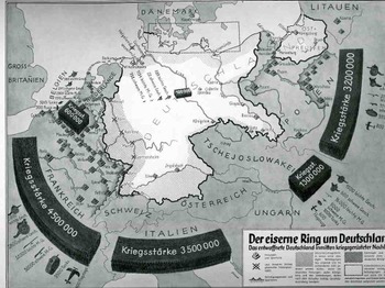
    These two displays come at different ends of the beginning of WWII and, in a way, couldn’t be further away from themselves in the stories they were trying to tell(some truth, some fiction), and were separated in time by  11 years or so.   The first “Der eiserne Ring um Deutschland” (“The Iron Ring and Germany”) shows Germany surrounded by imaginarily aggressive (and aggressively-portrayed) neighbors nine years after the end of WWI.  They both display subsets of the Big Lie superset described by Hitler in 1925 in Mein Kampf (actually, sort of better described by the German term Lügenfabrik, or “lie factory”, used by Goebbels in his descriptions of the British.  The “Big Lie” was basically a lie so big and so preposterous, so outrageous, so impossible, that no one would possibly utter something so insane and dubious, and so therefore the massive untruth is taken as true.) 

    This representation depicts the threat posed to Germany-making an iron ring-by the potentially hostile French, Italians, Belgians, Czechs and  Poles.  It shows the ring composed of a combined army of 13.1 million men versus the standing army of Germany, which in 1928 was given as 100,000, and listing virtually no heavy weapons and no air force whatsoever.. (The interesting bit here is that neither the Soviet Union nor Great Britain is included in these aggressive forces, the Soviets less-so than the English.)   The designer goes so far as to shade in areas of Germany that were under immediate threat, extending from the Donau to the Rhine, to a 50-mile-wide area all around the country, with East Prussia almost entirely consumed.  (Certainly the Treaty of Versailles was a very troubling document closing the end of the war and, it cam be argued, opening the door for the next one.  It took six months to sign the peace treaty following the cessation of hostilities in November 1918, and the troubled negotiations produced a troubled treaty, ripping Germany up and saddling it with unrealistic retributions that began to wither in only four years, with the treaty virtually dissolved by 1935.)
    Blognazi_brit_aircraft325

    It is no wonder when looking at propaganda such as this that Germany was immured with fear of national collapse at the hands of land-hungry neighbors, and that there was a huge need to re-instate the army and a system of “self protection”.    (By 1936, only 8 years later, it was beyond question about what Germany was up to-I can say that after having at least breezed through every page of the Illustrirte Zeitung (Leipzig)  from 1930-1940, that even a very casual reader could’ve tracked, graphically, the interest in military reporting and militarism in the page’s of what would’ve been the German equivalent of LIFE magazine.  By 1935 there was so much glorification of weapons and the Nazi manifesto that it should’ve been a surprise to no one when the Germans moved into their neighboring countries.)  This was by no means the earliest depiction of this rampant sale of fear or fear mongering (a design which has existed for thousands of years and not at all a creation of the present republican administration), but it is a very big and bald one, a somewhat staggering one, a bright shining lie.  (A Bright Shining Lie by John Paul Vann is by the way a great book on American involvement in Vietnam.) 

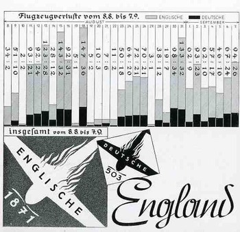
    The second image, a graph showing the successes of and very limited damage to the German Luftwaffe at the beginning stages of WWII, in August 1940.  This was a bad time for the Allies, this part of the war coined by Winston Churchill in 18 June 1940 in the House of Commons:  “The Battle of France is over. I expect the Battle of Britain is about to begin”. 

    Hitler’s Luftschlacht um England would start by air, where the Brits were far less the equal in military capacity, rather than by a land/sea assault, which would’ve tested the British at their strengths.  This second part of the assault on England was Unternehmen Seelöwe, or “Operation Sea Lion”, which would’ve begun the land assault following the victorious air campaign. 
    The graph shows aircraft losses from 9 July to 8 August, 1940, the German losses in black, and the British in gray.  As you can see, it was a pretty lopsided affair, made even more dramatic by the fictitious number of English planes being destroyed.

    This would all change, of course, with the Germans losing this battle, in a big way, with a resulting decisive victory for the Brits. (Who would of course muscle their way through the war another seven months before the U.S. was attacked and entered the war.) . It would coming to a screeching and collapsing reverse for the Germans by May 1941.  The results of the battle, in terms of aircraft and humans, were,  for England: 1,023 fighters: 376 bombers, 148 coastal command aircraft  for a total of 1,547 aircraft and  544 pilots and aircrew killed.  There were also 27,450 civilians killed and 32,138 wounded.  The Germans lost 873 fighters and 1,014
    bombers for a total of 1,887 aircraft and  2,500 pilots

    I could find no graph of course showing the results of the endgame in the Zeitung.


  • A Map of the Human Ability to Replace Itself, 1610-1723

    JF Ptak Science Books   Post 2009

    Follow Me on Pinterest


    Blogmissing_man041_3

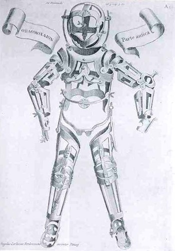
    This woodcut of applications and applicators to injured humans, lacking the human, waiting for the human, the missing human, was made by Hieronymous Fabrizzi (or Jerome Fabricius, 1537-1619), and found in his Opera Chirurgica, printed in 1723.  Even though this is a pretty straight-forward image, it strikes me as a little odd, a little off,  looking a bit like inhuman trappings, the entrapments of a human waiting to be built, an artificial skin with artificial bones.  It was much less than that, and in its way, much more—it was a statement of the advances of medicine in the 16th century, a map of the ability of man to replace himself; a map of the artificial man. Perhaps the image of our own artificial man, showing our ability to replace organs, bone, skin, limbs, etc.may come to look to the people of the near future the same way that we here in the present look back on Fabricius’ mage. 

    A Map of Getting Wounded

    Gersdorff_p21v_3

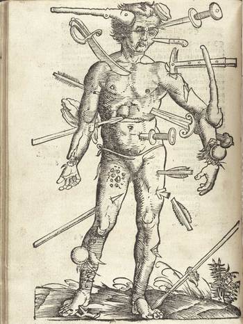
    This map of the wounded man was a very popular, much reproduced image, seeing publication in many works since it first appeared in Johannes de Ketham’s Fasciculus Medicinae,  printed in the year Columbus set sail for India.  It was a battle map, really—a battle for the human body, showing the effects of what happened to that body when someone tried to erase its existence.  The image is graphic, realistic and fairly gruesome, and highly useful.  It was accompanied by instructions on how to deal with all of the trauma, and to save the man thus that he could fight again.  In its way, this might be the earliest issue of M.A.S.H.  This woodcut, as the next, appeared in Hans von Gersdorff. Feldtbüch der Wundartzney (printed in Strassburg, by  H. Schotten, in 1528).

    A Map of Letting the Blood out of the Human Body.

    Gersdorffx400jpg_other_2

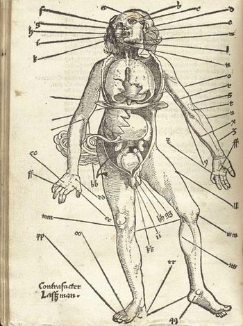
    Well, it really wasn’t like that, not how I mean by by snippy modernist viewpoint looking back on medical history with no contextual appreciation.  Bloodletting was an approach to healthfulness, as blood was seen as one of the four major elements (or “humours”) of the human body that needed to be kept in balance.  This was accomplished via the application of leeches or by the more common (and quicker) practice of venesection, or opening a vein to allow the blood to come out. (Let’s reference Steve Reich’s magnificent “Bruise Blood” creation of 1966 at this point—I don’t think that I’ll ever have a better chance to drop a reference to this piece of revolutionary music in regards to venesection again.)  Thus this map was map for the practiconers of bloodletting—the physicians, and more probably the barbers and other assistants who would inherit this lesser procedure from the more-busy doctors.  In the history of maps of anatomy and the general practice of mapping the human condition, this woodcut x-ray of the best places to drain human blood would not survive close to the age of modernity, disappearing almost entirely by the 18th century, and becoming much more scarce well before that.


  • On the Early Magnificence of the Modern Mundane–Frost on Windows, 1555

    JF Ptak Science Books    Post 2017    Paper Microscope series

    Follow Me on Pinterest


    Magnus weather snow--detail
    To paraphrase an idea often stated by our younger daughter, Tess, on her understanding of science–“Everything goes Somewhere”–the things that we take for granted today all made a first appearance somewhere, sometime. 

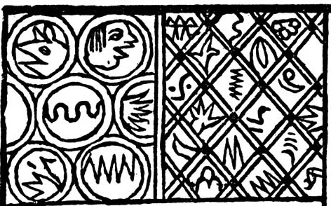
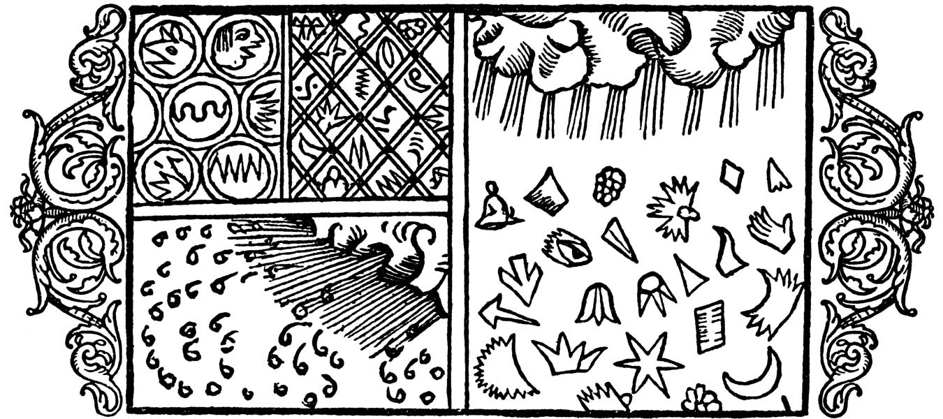
    This is the thought that struck me when I saw this illustration of frost on a pane of glass, on looking through a window that is covered with frost.  I really don’t know offhand when the very first record of an image of frost on a window occurs, but this one, found in the fantastic work on the history of Scandanavia (and etc.) in Olaus Magnus’ Histotria di gentibus septentrionale (“History of the Northern Peoples”), which was pubished in 1555, must be at least very early. 

    Magnus weather snow[Image source: http://www.avrosys.nu/prints/index.htm]

    The sections of the print on the right shows different forms of ice crystals–most, or all, are fairly unbelievable, but then again this decades before the microscope was invented.  That said, it does take a little bit of imagination to see an eye in a crystal, though not long afterwards scientific investigators like the great and unusual Athansius Kircher found the Virgin Mary in agate–and there’s a very long and deep history of anthropomorphization of natural history elements beyond this. The image on the bottom left is of falling snow, but the images on the left (top) are said to be frost on windows. 

    What a fantastic realization, to imagine that this may be among the earliest representations of the great and graphical and physical world of ice.  Everything gets seen the first time somewhere–maybe this is it for frost-on-a-window, maybe not. I’m not a frost expert.  I did try to find the first photograph of frost on a window, and then the first photograph of frost, but there were no hits in Google, and of course nothing in my books on the history of photography.  Then again, this is a pretty arcane matter, except that frost on the window can be fantastically beautiful and complex, and I wonder why it would not have made very early appearances in print and photography.  Perhaps it did, but I have a feeling that it didn’t. 


  • The Paper Microscope: Cities in Stone

    JF Ptak Science Books   Post 2016

    Follow Me on Pinterest


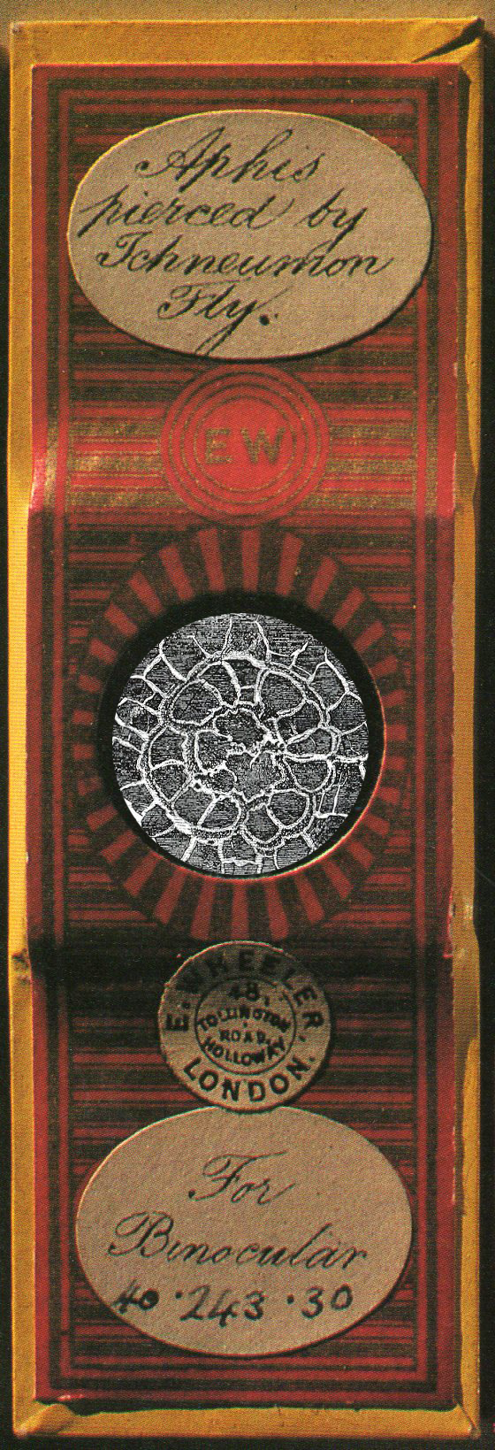
    This is a  Paper Microscope presentation of an 18th century image, presented in the form of an amalgamated 19th century microscope slide:

    Microscope slide243_edited-3
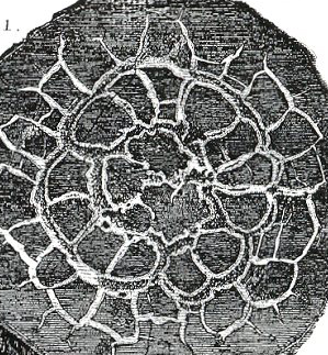
    The presentation of the specimen is the detail as follows, from an engraving from 1788:

    Hutton rock city detail
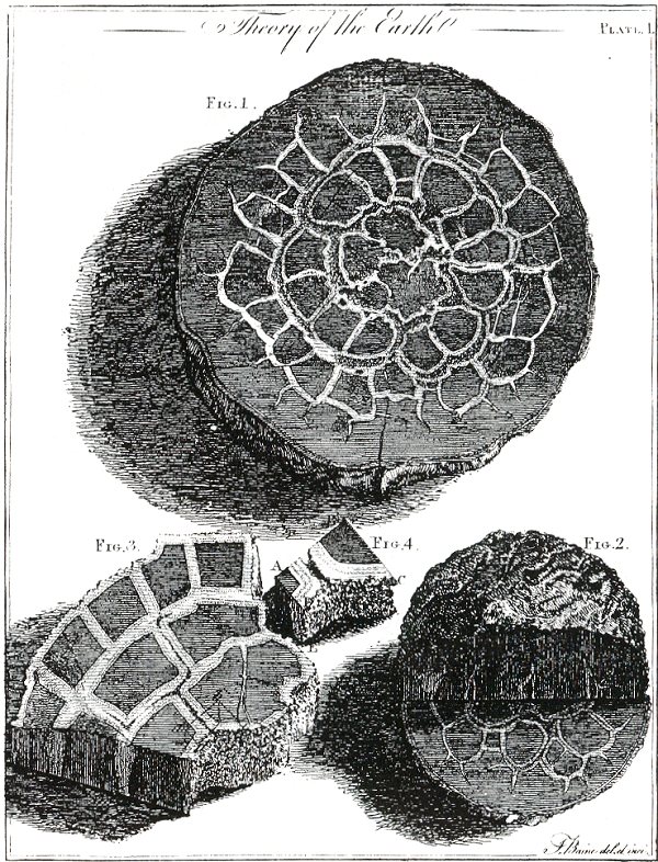
    James Hutton explained this cross-section in iron-stone as a function of the internal heat of the Earth, “by means of fusion, or by congelation from a  state  of simple fluidity and expansion” as he wrote in 1788 (in the Transactions of the Royal Society of Edinburgh)–now he may be explaining why this rock looks the way it does and getting at the root of his uniformitarianism, but what I see is a city plan. 

    Hutton rock city
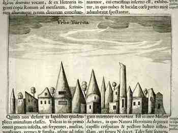
    Seeing things in stone like this was not terribly unusual, though seeing maps may well have been.  One of our favorite Jesuits, the problematic Athanasius Kircher, saw cities in stone–except Fr. Kircher saw profiles of buildings more so than maps.  Let’s make no mistake about it:  Hutton did not see city maps, though Kircher did see buildings in his stones…and more. 

    For example exhibited an image of  St. Jerome (in no less a place than the cave of the Nativity in  Bethlehem!) that he found in agate. His Mundus Subterraneus (1661) is a home to a wide range of these objects: quadrupeds of all shapes and descriptions, human full-length portraits, hands with jewels, and even the Virgin Mary and child. As spectacular as these are there is always more: the magnificent cityscape (reproduced here) and the sublime discoveries of a full set of the alphabet and a series of 15 geometrical drawings, all naturally impressed in stone.

    1blog_oc_t_9_not_here_kircher_793

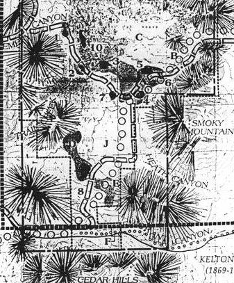
     Then down in Arizona, near Silver City, there is another city in stone, the City of Rocks, a real collection of rocks but not a real city, these being the remnants of an ancinet volcano, place-keepers for the stuff that wasn’t there any longer, a hint of a great hulking mass, a sort of plan in their own way:

    City o frocks detail


  • On Learned Ignorance

    JF Ptak Science Books   Post 2015Follow Me on Pinterest

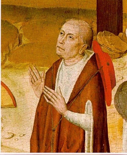
    Nicholas CusaIn keeping with a post earlier today on a Medieval jewel of scholarship (Sacrobosco’s Sphaera) is this short note on Nicolas of Cusa’s beautifully-named de docta ignorantia, or On Learned Ignorance. Nicolaus (1401-1464, Nicholas Cusanus/Kues) was a philosopher, mathematician, theologian, astronomer, cardinal, and mystic, a product of the University of Padua (1423) and then the University of Cologne, and “arguably the most important German thinker of fifteenth century” (Stanford Encyclopedia of Philosophy, here). He was deeply intuitive, a visionary, and in his Learned Ignorance he presented a way of the human mind to release itself to learn the mind of god (among many other things). [Image: detail in Meister des Marienlebens, located in the hospital at Kues (Germany), showing Nicolas of Cusa.]

    In this work is something really amazing–here’s this wide thinker at the end of the Medieval period, writing on advanced theological issues, finding time to stop and smell the astronomical/cosmological roses long enough to think about the unending nature of the universe, about infinity, about the stars being suns for other planets, about the Earth spinning on an axis and circling the Sun. And all of this done without observations, and without calculation, and without a theory–its just a bunch of the big thoughts of modernity found in a small tract about knowing the Creator. Very curious.

    The astronomical views of the cardinal are scattered through his philosophical treatises. They evince complete independence of traditional doctrines, though they are based on symbolism of numbers, on combinations of letters, and on abstract speculations rather than observation. The earth is a star like other stars, is not the centre of the universe, is not at rest, nor are its poles fixed. The celestial bodies are not strictly spherical, nor are their orbits circular. The difference between theory and appearance is explained by relative motion. Had Copernicus been aware of these assertions he would probably have been encouraged by them to publish his own monumental work.–Catholic Encyclopedia, 1913

    Indeed! But I doubt that last sentence–Nicolas’ work was entirely theoretical, and Copernicus was very heavy and deeply laden with data. Even though Nicolas was never considered a heretic–though it must have been a close call here and there–an earlier confrontation by Copernicus with his De Revolutionibus on anything but his death bed would probably have been received with a closed fist.


  • A Long-Lived Medieval Astronomy Text

    JF Ptak Science Books Post 2014

    Sacro Busto, or Sacrobosco (also called John or Johannes Halifax, Holyfax, Holywalde, Sacroboscus, Sacrobuschus, de Sacro Bosco, or de Sacro Busto) was a member of the Order of St. Augustine and a professor of mathematics and atronomy/astrology at Paris ca. 1230. (There are many places attributed to be his birthplace, but it seems fairly certain that he at least was educated at Oxford.) He became a celebrated member of the intelligensia, with his fame in the later centuries coming via three of his surviving works, each an elementary textbook on mathematics and astronomy:  De algorismo, the De computo, and De sphaera.

    [Source for this image and the third, fourth and fifth, below, come from a 1531 edition of the Tractatus viewable in full via Google Books, here.]

    I think it is accurate to say that the Sphaera was the most famous of his works–it is a very long-lived fundamental textobok on astronomy (and the second astronomical text everprinted, in 1472) and went through 24 editions to 1500, and then another 40 editions from 1500 to 1547.  The book was still in use in the mid-17th century but far less so, until it finally was superceded and fell away into the aniquarian dust.  It was a short work–basically about 35 pages–and concisely written, even elementary, but it did receive some close attention by some of the great early thinkers in astronomy and mathematics who contributed commetaries, including Michael Scot (between 1230 and 1235), John Pecham (prior to 1279), and by Campanus of Novara between (1265 to 1292).

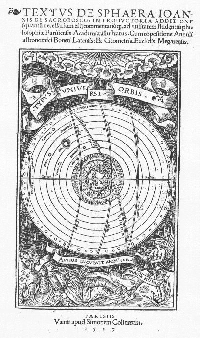
    It may seem a little trifling after this to concentrate on the interesting aspect of the images in his Sphaera, but that is what brought me to Sacrobusto today.  For example, this is the beautiful title page, showing (via an early metal engraving process utilizing little punches making those fine small dots) the structure of our existence:

    Sacro bustoThe work (29 cm tall and as I  said 35 pages long) is called (in full) Textus de sphaera Ioannis de Sacrobosco. Introductoria additione (quantu necessarium est) commentario[que], ad vtilitatem studentiu philosophiae Parisiensis Academiae illustratus. Cum copositione Annuli astronomici Boneti Latensis: Et Geometria Euclidis Megarensis, which was printed in Paris (Parisiis) by Simonem Colinaeum in 1527, while Sacrobusto was a professor there.  

     [Source: Johannes de Sacrobosco – Editions of the Tractatusde Sphaera – home, Roberto de Andrade Martins  http://www.ghtc.usp.br/server/Sacrobosco/Sacrobosco-ed1.htm.]

    There are a number of beautiful and small woodcut illustrations throughout the book in its various editions, for example:

     And:

    And this:

    And so:

    Meanwhile in Sacro Busto’s Vberrimum sphere mundi comētū intersertis etiā questionibus dñi
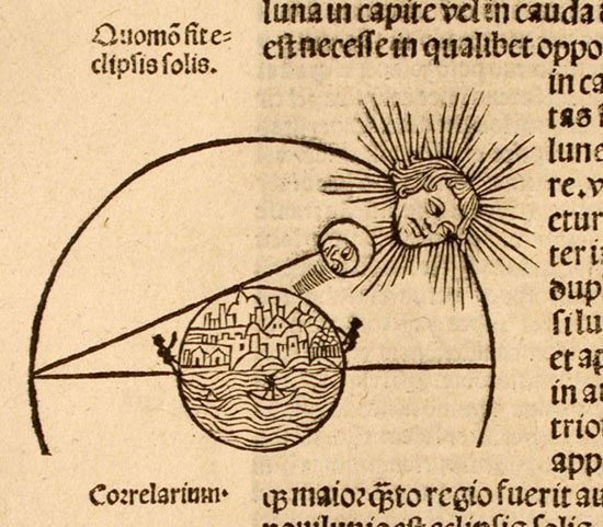
    Petri de aliaco …[Paris, Guy Marchand for Jean Petit, February, 1498-99.] we find this beautiful illustration of a solar eclipse–finding again those curious stick-figure humans under a very Martin-Luther-like Sun:

    Solar eclipse
                                                                          [Source: Lilly Library, Indiana University, here.]


  • An Underground Tornado of Coal

    JF Ptak Science Books   Quick Post  #427 

    Follow Me on Pinterest


    Coal tornado220

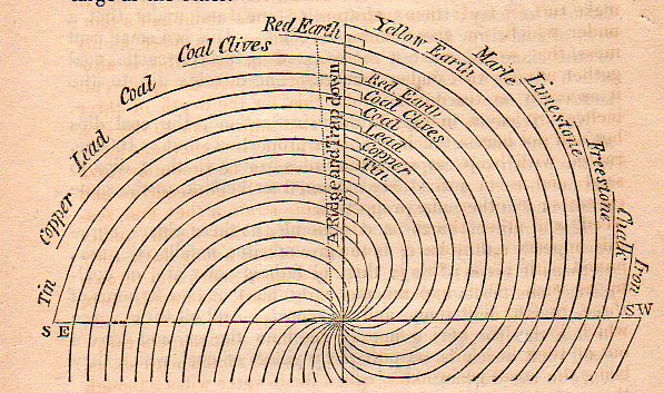
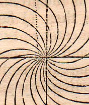
    This simple theoretical map is an invented scheme of John Strachey (1671-1743), an early geologist who with this thinking introduced the very big geological idea of strata. The original appeared in the Philosophical Transactions in 1725 (full text here, and another, with a more-realized version of representing strata, is here), and was reprinted I believe in Popular Science Monthly in 1869 with the above illustration (somewhat changed from the original).   My interest in the image is tinged with design, as it reminds me of an enromous subterranean tornado of coal, even though what Strachey is doing here is establishing the idea of strata.  

    Coal tornado221

    These lines then are the strata of these geological elements as they fan themselves out like pages from a book from the center of the Earth outward.  Its all very vague at this point, but the kernel of a great idea is present.

    The phrase “underground tornado” appears very few times in the intertubes with the world “shelter” accompanying it.  It is nonsensical, mostly, to think of underground weather and particularly extreme weather, but it has certainy playud itself out many times in literature in the pre-science-fiction fiction days. In some stories there are multiple suns, amd waterfalls, and vast canyons many times the size of the Grand Canyon, and so on–there just doesn’t seem to be much bad weather, down there.

    [Note: Strachey, a country squire and gentleman of science, published his theories and findings in two papers in 1719 and 1725, and then in a small pamphlet in 1727.]


  • Making Lines into Stars, Botany to Cosmology–an Episode in the History of Lines

    JF Ptak Science Books   Post 2003   Follow Me on Pinterest

    Horteus malabar
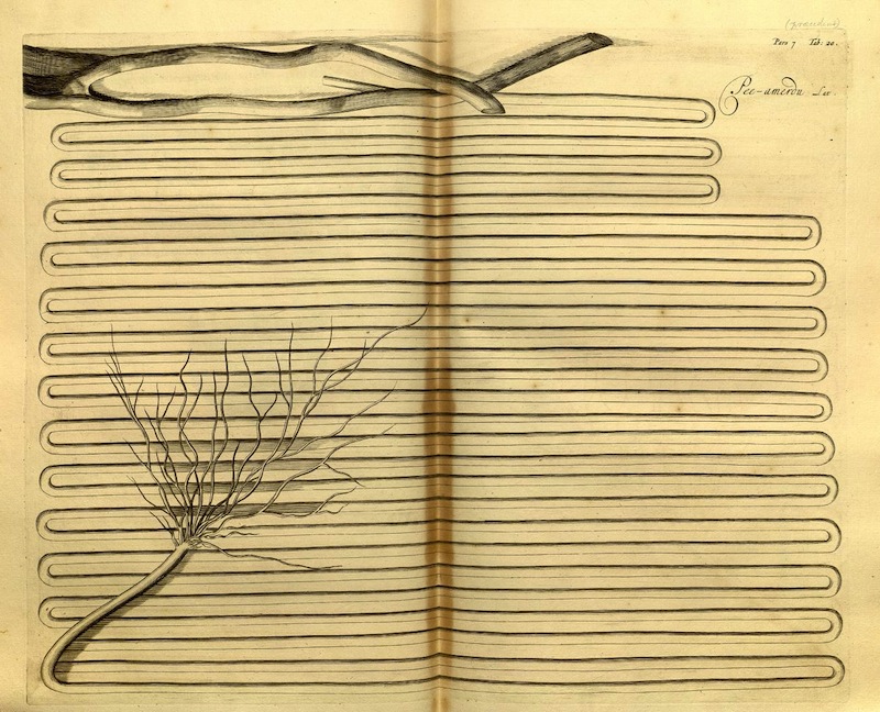
    I wanted to share this magnficient image, illustrating the Hortus Malabaricus (“Garden of Malabar:) and found at the great Public Domain Review site, here.

    There are many more images in this work, and the PDR links to many more still, but I’ve picked this one probably for all the wrong reasons, selecting it from the graphic aspect, the differentiation of space, the long line.  There is a category for The History of Lines on this blog, but it seems that there aren’t many contributions to it, mainly because just about every other thing could classify as such. But this image is certainly remarkable enough to make the category. 

    Also, it is a quick four-step process in photoshop to render these lines and their botanical aspect/origin into a star cluster via  a progression in the spatter filter.  A twist here and a simple turn there could render them the opposite way, from sky above to mud below, going from the star cluster to geology, as in the form of agates, and particualrly the more “living/anthropomorphized” agates of the great/greatly-problematic Fr. Athanasius Kircher.

    Step 1 (original detail):

    Horteus malabar b

    Step two:

    Horteus malaba psray radius a
    Step three:

    Horteus malaba psray radius cStep four:

    Horteus malaba psray radius d

    And Fr. Kircher’s agates, which appear from simply heigtening the smoothing application of the splatter in step four, rendering the star cluster so:

    Horteus malaba psray radius agates
    When Kircher looked closely enough at his agates, he saw hidden objects: sometimes a Madonna, other times animals, and still others–and perhaps more famously–town skylines encased in the rock, as with this example from his Mundus Subterraneus (an undefined edition but ca. 1660):

    Kircher agate
    If you looked close enough at  the agate-ified Malabar engraving you’ll be able to find a town–and just about anything else.  


  • Showing Deep Depth in a Star Cluster Engraving, 1865

    JF Ptak Science Books   Post 2002 Follow Me on Pinterest

    Astronomy--47 Tuc189

    This beautiful engraving appeared in Amedee Guillemin’s  Le Ciel: notions d’astronomie a l’usage des
    gens du monde et de la jeunesse, 
    which was published
    by Librairie de L. Hachette and Company, and printed in 1865 (the
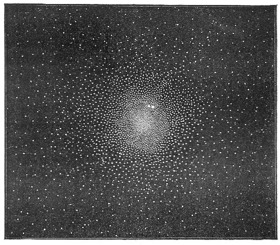
    images from which are available here).  There are many striking images in this book, and I’ve chosen this one because it has a certain deep depth to it, and relays a complexity and distinctness to something that is generally imaged as being less so, being a massive star cluster and all.  The “Amas du Toucan”, known now more familiarly as 47 Toucanae or 47 Tuc (NGC 104), is a bright element in the southern sky, a huge clsuter 120 light years wide and 16,700 light years from Earth, visible to the naked eye in the constellation Toucan (created by Petrus Plancius in 1598 or so).   And here it is, in a little 9×8 cm engraving with hundreds of white points as stars, made after an engraving of Sir William Herschel (1738-1822, a German-born Engloish astronomer who–with his sister Caroline and brother John–spent decades observing and recroding stars, double stars, clusters and nebulae).  

    Astronomy--47 tuc big detail

    47 Tuc was first catalogued as not-a-star by Abbe Nicolas Louis de Lacaille (1713-1762),  a French astronomer who found it too be too fuzzy to be a single star, and who produced a 10,000 (Southern) star catalog, Coelum Australe Stelliferum, which was published in 1762, and which also introduced 14 new constellations.  47 Tuc made another quck appearance in the great Catalogue des Nébuleuses et des Amas d’Étoiles (“Catalogue of Nebulae and Star Clusters”), a superb and meticulous work by Charles Messier, and published in 1771.

    The Guillemin work is simply a lovely and elegant thing–one of many accomplishments in a beautiful and relatively simple book. 


  • How High is the Sky? A Cross Section of Black and Red Earths

    JF Ptak Science Books    Post 2000

    [This is numbered post 2,000–a number that does not include another 500 or so “Quick Posts”–written for this blog since beginning in February 2008.]

    Preyssinger Earth plan

    • “Der Erde und Ihre Atmosphare” from Astronomischer Bilderatlas, by Ludwig
      Preyssinger, published in 1853 (with 12 engraved plates1, following the
      first edition of 1840, which had 10 plates). Source: found at Michael Stoll’s flickr set, a superior and large image, here.]

    Our older daughter Emma asked that question years ago, when she was six or seven.  It was a great question, and one of those questions, really, that only kids can come up with. It is also reminiscent of Ruth Krauss and Maurice Sendak’s A Hole is to Dig, a classic work published in 1952 with these sorts of question/responses, a kid-cratic method of inquiry and answer, that is possible generally only with a younger and fluid mind.  (“What is a hole? A hole is when you step in it you go down” and “a hole is to dig” and so on.)

    People from long ago certainly knew that clouds were not nearly as high as the Sun and Moon and stars, but how high could they be? How high was the sky?  How thick was the envelope of air around the Earth?  Exploratory balloon ascents could help that question along, but only somewhat: heights attained in the first 80 years or so of ballooning reached 43,000 feet. (The question of ballooning and the limits of the atmosphere comes up early, as we can see with Jane C. Webb Loudon, the author of the anonymously-published The Mummy!: Or a Tale of the Twenty-Second Century  in 1827, interestingly published nine years after Mary Shelley’s Frankenstein:  “… and the  hampers are filled with elastic plugs for our ears and noses, and tubes  and barrels of common air, for us to breathe when we get beyond the  atmosphere of the earth.”)  In 1803, the record stood at 24,000; in 1835, 26,000; in 1862, 39,000; the record of 43,000 feet was reached in 1927, and at a great cost. On the other hand, more than half of the atmosphere exists at 3 miles above the Earth, and 70% of it is at 5 miles and under; at 22 miles exists about 99% of the atmosphere, and at 62 miles the atmosphere is so thin that it is a virtual vacuum, and is basically negligible. (The exosphere reaches out though to about to about 6,200 miles, but that’s where free moving particles are able to escape the Earth’s gravity and get swept away by the solar wind.)

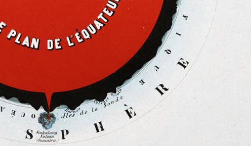
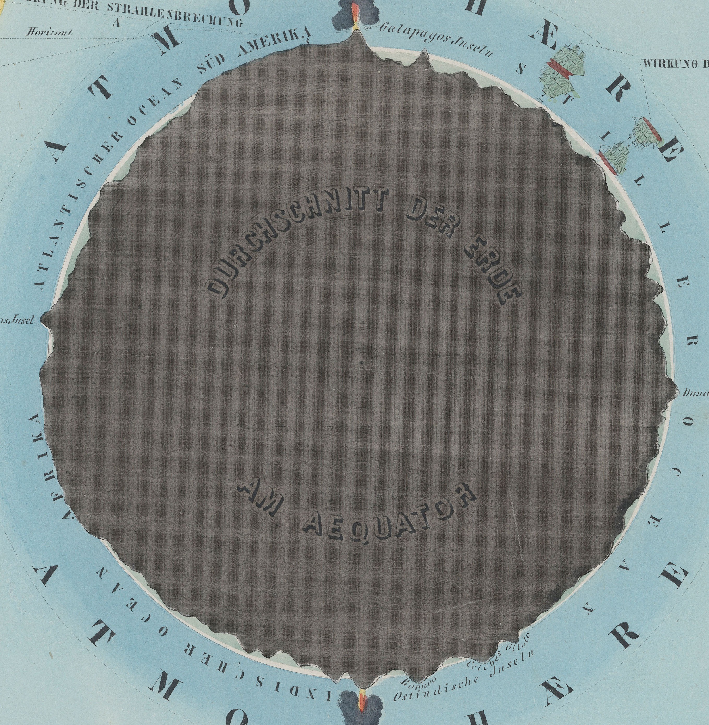
    Herr Preyssinger was trying to exhibit this atmospheric density in his illustration #10 to his beautiful astronomical atlas. (I should add here that Preyssinger’s work is a very uncommon production, made so that several of the engraved plates coul dbe held up to a solitary light source in a dark room and be illuminated cut-outs in the paper which also had transparent material on the verso to difuse the light…very smart.)  His illustration for the atmosphere was very effective, and was set against a plan of the earth made at the equator.  I’ve also included the same plate #10 from a French edition of the same work made slightly later, though the interior of this Earth is colored in a brilliant red.

    Preyssinger Earth plan detaik_edited-1
    So when the engraving above was printed in 1862, the balloon ascension record stood at about 5 miles, getting humans to above 70% of the ocean of air.

    Relative to humans getting high above the ground, the atmosphere is high; relative to just about everything else–like the 99% at 22 miles compared to the 7,900 or so miles of the Earth’s diameter, the atmosphere is but a thin slip. IF we reached that distance down into the Earth, we would just be touching the outer mantle.

    Preyssinger red larger

    •  Fromt the French edition, printed in 1862, here.  French explanation (Astronomie Populaire ou Description des Corps
      Celestes, Astronomie Populaire en Tableux Transparents..
      .., published in
      1862) of plate X, here. 

    Preyssinger Earth plan det

    Notes:

    1. Twelve plates, as follows:  Die Central-Sonne und die Ansicht von der Fixsternwelt; Himmelskarte; Darstellung des Sonnensystems; Vergleichende Darstellung der Grösse der Planeten; Die Sonne und verschiedene Erscheinungen derselben; Der Mond durch das Fernrohr gesehen; Transparente Darstellung der Mondsphasen; Finsternisse; Ansicht von den Jahreszeiten; Die Erde und ihre Atomsphäre; Kometen und Aerolithen.