A Daily History of Holes, Dots, Lines, Science, History, Math, Physics, Art, the Unintentional Absurd, Architecture, Maps, Data Visualization, Blank and Missing Things, and so on. |1.6 million words, 7500 images, 4.9 million hits| Press & appearances in The Times, Le Figaro, Mensa, The Economist, The Guardian, Discovery News, Slate, Le Monde, Sci American Blogs, Le Pont, and many other places… 5000+ total posts since 2008.

Category: Iconography

  • Wholesale and Retail: the Timelessness of Bailouts and Corporate Thievery

    JF Ptak Science Books   Post 399

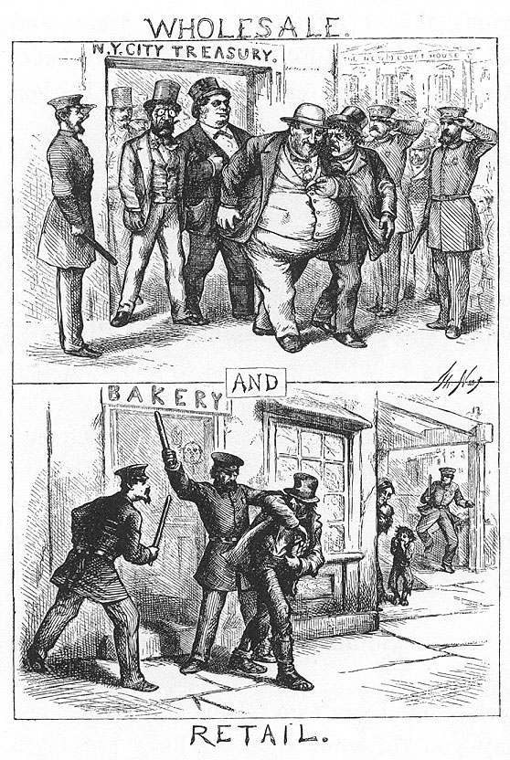
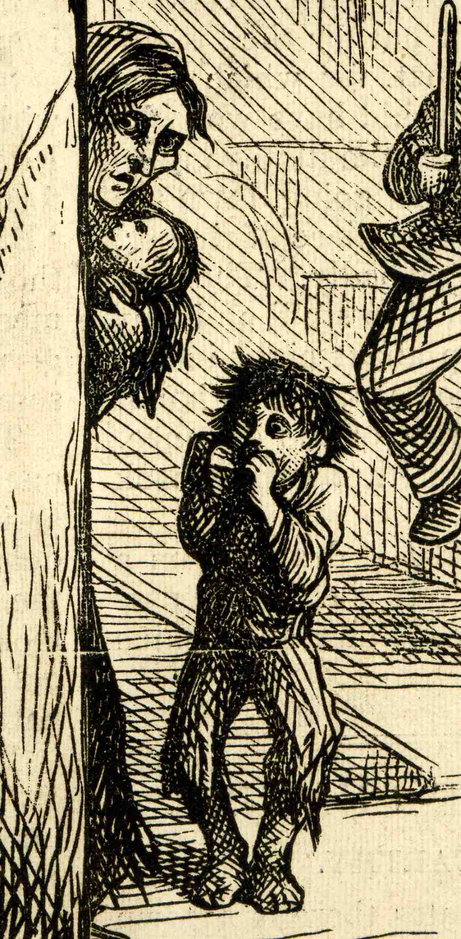
    0--blog---Nov 28 wholesale147 The largely-heroic Thomas Nast has proved–unfortunately–that his visual social commentary is timeless.  For example, this iconic 1871  image of the wholesale theft and corruption of U.S. treasury and government funds by William “Boss” Tweed and his Tammany Hall conspirators versus the swift retribution to the retail theft of the destitute man trying to provide food for his starving family can still be run today on editorial pages–except of course that no one likes to see the faces of  horrified children, their innocence and observation uncomfortably reflecting the true nature of the social situation.

    Nast addressed his audience visually–the illiterate readers didn’t need a word of English to understand these images, knowing full well who the disgusting Tweed was and of course being well familiar with the folks in the bottom half of the cartoon.

    The image is immediately understandable, and powerful.

    Evermore so since Nast used terror in the face of the little child–seeing his father being beaten and arrested by at least three of NYC’s finest–to send the point home to the heart of any viewer who had one.I’m not an historian of this media, but over the decades I’ve seen many dozens of thousands of such images, and I think that I can say accurately that (at least before 1900) children are not used in such a way to make a political point. 

    The emaciated mother, the terribly-afflicted baby in her arms, the terrified sibling, all set against the jowly baker and the rotund Tweed make the image utterly heartbreaking, horrifying.

    08 Wholesale and Retail

    The faces have changed, today, and Tweed has been replaced by a host of others; the process is the same, though with different and more extravagant mechanics.  And the money is bigger. 


    I doubt that there will be much trickle down from the trillion dollar bailout that would reach today’s version of this child–we’re just not reminded as often that there are still large populations of these children who might benefit from a tiny percentage of largese from something like the AIG bequest. I’m just saying that if say one-tenth of one percent  ( .1% ) of the trillion dollars (and one trillion dollars looks like this: $1,000,000,000,000) coming down the sluice was tithed to the 10 million kids in this country who could really use some help that there would be one billion dollars more to help someone out.  I know that this will not happen, mainly because those tenths of a percent add up–why, if you take 10 of them you’d get all the way up to one percent. 


  • The Magnetic Sleep Doctor and the Shelf-Life of Dream Images

    JF Ptak Science Books LLC  Post 382

    0-blog---Nov 19 sleep082

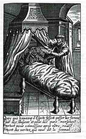
    This interesting and semi-bizarre image shows a doctor of magnetism (and necrologer and astrologer and several other things) conspiring at the edge of science and the heart of all things dark to adjust the dreams of the formerly sleeping man.  The patient is awakening and the doctor is doing, well, things that I don’t understand:  suffice to say that he was trying to assuage good dreams for the other man via the secrets of magnetism.

    The mysteries of sleep and the dreamworld were hotbeds of investigation from all sides, and there is a fairly deep publication record on the subject for the 1550-1700 period. This image comes from Le Palais du Prince du Sommeil, ou est enseignee l’Onriomancie autrement l’Art de Deviner par les Songes, printed in Lyon by Jean Pavhlhe in 1670, and written by the spectre-like M. Mirbel, whose history and biography are just about non-existent. 

    The idea of approaching sleep and dreams via magnetism is unusual even in the very unusual history of unusual ways of adjusting dreams–the interpretation of dreams is evidently closely related in mysterious and bendy ways, almost as convoluted and soft as the physical means used to induce them. 

    The history of big dreams and dreaming in general is far bigger than the issue of fixing them, and much paler, considering the vast range of imagery.  Jung (Memories, Dreams, Reflections), Havelock Ellis (World of Dreams), Freud (oy vey), Shakespeare (“we are such stuff…”), Leonardo, Joseph (and the Pharohs), William Blake, Solomon and of course Daniel, and then on and on into the night.

    Daniel’s
    dreams (as in The Book of Daniel) were gigantic and full, and there
    have been many others who have recorded their dreams in the history of
    literature and religion.  I must say though that the dream of King
    Prasenajit (the ruler of Kosala,  located on the northeast of modern
    Uttar Pradesh, India), a disciple of Buddha, had a dream in ten parts
    which troubled him greatly, and when you look at its elements you can
    see why:

    -Three jugs set in a row, one put against the other.
    The first and the last of the jugs are mutually exchanging the vapours
    of the liquids that are contained in them, vapours which never descend
    in the empty jug situated in the midst.
    -A horse that swallows the food concomitantly through the mouth and through the anus.
    -A tree full of flowers.
    -A tree full of fruits.
    -A man who is knitting a rope. Behind the man there is a sheep. The owner of the sheep eats the rope knitted by the first man.
    -A fox lying down on a bed made of gold, and eating out of golden vessels.
    -A cow suckling her own calf, against the law of nature.
    -Four
    oxen that arrive, bellowing, from the four corners of the horizon. They
    are rushing upon each other, in order to start fighting, but all of a
    sudden they vanish, right before clashing their horns together.
    -A pond surrounded by slopes. Its water is turbid in the offing, but clear near the shore.
    -A huge torrent, entirely red.

    This would give anyone pause, even more so if you were a disciple of the Buddha.  None of these images fit into my dream dictionary (especially the horse one), but perhaps they are deeply related to the times and not transferable over the centuries.  Which is an interesting way of looking at a particular time and understanding a bit of it that doesn’t normally sink into the public record–the expression of dreams might tell a little more about the time and place than about the person.  This sort of made-up historiographic (?) approach reminds me a little of snooping around old Domesday books and business/city directories, looking at the sorts of jobs that were common once upon a time and now slipped away into the tar pit.  So to with dream imagery?  Perhaps like just about everything else, dream images may well have a shelf life.  (I was going to reference Twinkies as an example contrary to this, but I understand that a new something-or-other has been added to it/them to make it so that these fine products will actually go bad after a while, rather than like before, when it could be counted on the cockroaches nibbling on them into eternity following the death of Dr. Strangelove.  Perhaps a former-chemist/librarian out there knows what this ingredient is and will share the knowledge?)

                                                                                             :

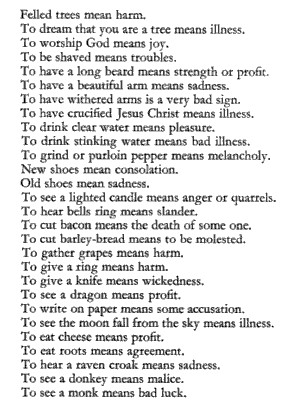
    Blog--magnetic dreamsFor example, this 18th century directory for what dream images may
    “mean” are mostly foreign to the general experience, I would say.  On the other hand, to attach meaning to the importance of dreaming about stealing pepper may be a little quixotic, but much less so than interpreting it as a harbinger f melancholy.  I know that to even mention the business of pepper theft in 1650 tells us a lot about its importance and why it would’ve been stealable and can tell us something about the foods of the time, trade, commodities and such.  Thinking about it in terms of a predictive element may not be as fruitful…


  • The Towering Magnificence of the Porcupine, 1604

    JF Ptak Science Books LLC  Post 359                                            

    000-ebay--Nov 4--porcupine995

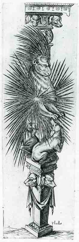
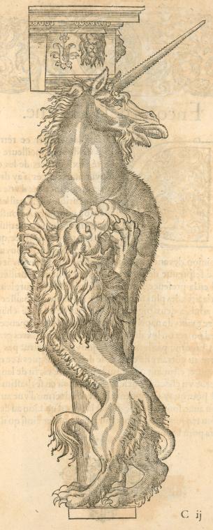
    This is perhaps the greatest monument ever erected to the porcupine–of course it may be the only monument ever erected to the porcupine, but it is undeniably monumental.  This unusual image was published in Strassburg in 1604  in Joseph Boillot’s (1546-1603) sumptuous New Termis Buch (first printed in 1592 as a Nouveaux pourtraits et figures de termes).  It is a bestiary of sorts, a very curious book, offering real and imaginary animals together in alabastered, marblized, memorialized, architectural form, with the  great hope of offering them to fellow engineers and builders for incorporation into the real world.  Or perhaps not, perhaps it was all just done in fun, an exercise, an experience, an artistic creation wrapped inside  the fundus of a great Baroque eyeball.  Unicorn


    The end result is the Boillot produced some extraordinary beasts, wrapping them in extraordinary garments, surrounded by other wonderful animals real and not, and elevated to extraordinary heights.  The powerful unicorn, draped with the vicious but subdued lion; the ass, regal, judicious, pensive, thoughtful, kept in place, or warm, by a dragon. Then of course there is the porcupine, absolutely magnificently appointed with spikes  kept by by dogs, supported at all levels by the creatures.


  • The Poetics of STDs and the Mountain of Truth; a Rollicking Good Time in 1545

    JF Ptak Science Books  Post 348

    Mountain of truth

    The progress of man/humankind has, in our dim antiquarian past, been represented in art in stages of ascending a mountain.  The fine arts and sciences have been shown, in their various intellectual pedigrees, at various points on the mountain of the mind, usually with Philosophia sitting supremely at the top (with Astronomia and Mathematica generally not far underneath). This is mind, I came across another sort of progression to the Olympian heights, though it has no people in it, just the mountain, and a curious idea, ascending to faith, or truth. 

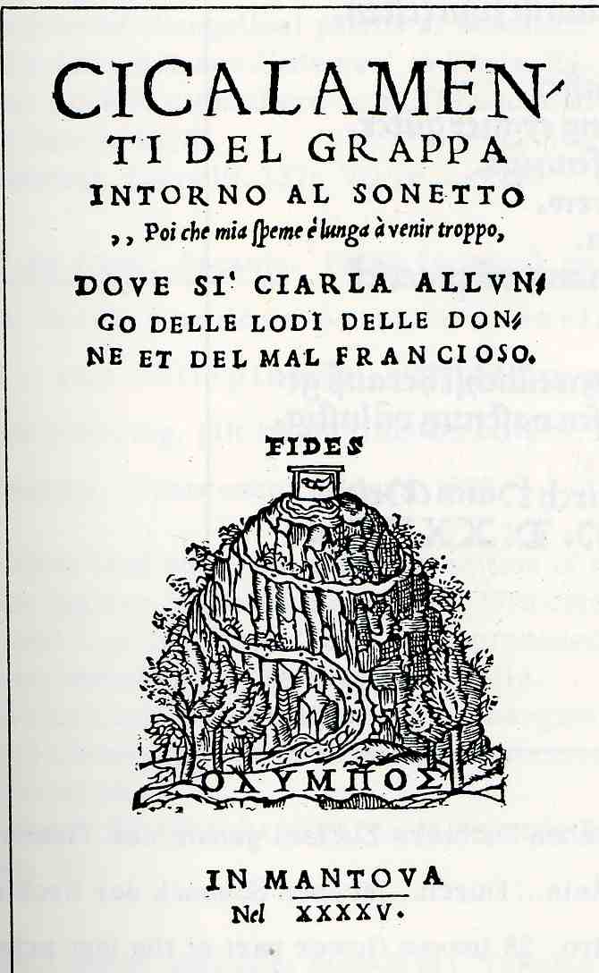
    The image is on the title page of a curious, little, early work by the pseudonymous  “Grappa” (well-named for the drink), Cicalamenti de Grapps intorno  al Sonetto…though its real nature is revealed in the subtitle,“dove si’ Cliarala allungo delle lodi delle donne et del mal francioso”, or “where one chats at length about women with The French [venereal] Disease”.  It is also dedicated to a non-existent courtesan who was heralded as being lovely, generous, and deep in the seat of this same disease.  Indeedy! This ribald, blustery, frank, coarse innuendo-laced tract (28 leaves long) was not terribly unusual when it was printed in 1545, celebrating as it does the low- and high-cultural private life of Renaissance Italy.  Doctors, poets, gluttons, cheats and of course lots of beautiful women romp around ostensibly in an attempt to prove the usefulness of their sinful vices, relating it all somehow to the disease-improved poetic capacities of the STD-bestowed Petrarch, master of forlorn and unrequited love poetry and the father of Humanism  (It relates in a way that I can’t explain to Petrarch’s Canzoniere, sonnet #88, mostly written, I think, about a  girl/woman that he fell in love with in church, which is why we can see he needed to invent Humanism. He seems to say that the needs of love are strong, stronger than he could stand, evidently, and that one should flee, renounce it; he seems to for himself, the girl across the pew or across the great open space in the cathedral never weakening to him a bit.  He pines over her, and announces his own amoroso intoppo, or “amorous fumblings”, and would take flight from himself as well. Evidently the people in this work by Grappa do not take his warnings to heart, though they do seem to renounce the “love” part but not the “sex” part. I could be really wrong on this god knows; all I wanted to do was look at the pretty picture on the cover!)

    Stumbling into things like this  makes you remember that the Renaissance wasn’t all stuffy and main-springy; perspective-this and techno-that; they had their fun, too, even in 1545, and put it into print.

    Back to the woodcut on the title page: it features a small, winding route up a mountain, the top of which is sanctified “fide”.  Now considering what these folks were doing in this work I wouldn’t necessarily christen the end of the adventure with this word, particularly if it meant (as it does) the name of the World Chess Federation (FIDE).  Seriously though fide means “faith”, as in bona fide (on good faith, by good authority), as opposed to mal fide (bad faith).  I cannot determine what in the world the structure is on the top of the mountain, or what is in it. 


  • Allegory and Symbolism: the New Botany and a New Way of Classifying, 1737

    JF Ptak Science Books   Post 318

    Carl Linnaeus (1707-1787) was the father of modern botany–he was a Swedish zoologist, physician, and above all, way above all else, he was a botanist. He was also widely recognized  as an accomplished, applied polymath:  Rousseau said of him “Tell him I know no greater man on earth”, and Goethe, one of the greatest of all polymaths and an expert on recognizing another one,  wrote: “With the exception of Shakespeare and Spinoza, I know no one among the no longer living who has influenced me more strongly”.  Pretty strong stuff from giants.

    1blog_oc_t11_linnaus814

    In addition to much else, Linnaeus contributed a template, a grid for identification and discussion,  establishing conventions for the naming of living organisms that became universally accepted in the scientific world—the  the starting point of binomial nomenclature. 

    And perhaps it is small of me, but I concentrated a bit on the frontispiece to his greatest books (rather than on the writing)–it is truly a capstone of the botanical canon.  The book is Hortus Cliffortianus plantas exhibens quas in Hortus tam vivis quam siccis… and it was published in Amsterdam in 1737, and it was as beautiful as it was important. The book was basically the product of the desire of the entrepreneur and multiply-rich East India Company investor and Anglo-Dutch banker George Clifford, whose desire to catalog his massive and extraordinary gardens brought him to Linnaeus.  The partnership, or at least the bringing of Linnaeus on-board for this unique and monumental opportunity, was one of the most fortuitous in the history of 18th century science. 

    The fine, baroque frontispiece allegorical engraving by Jan Wandelaar pretty well drips symbolism and allegory–which is a good thing since that is what is was supposed to do.  The main figure in all of this is a crowned Europa, seated before the very gates of the Clifford garden, holding a set of keys (to the botanical kingdom).  She is surrounded by activity, including three people representing the continents (Africa, Asia and America) offering  her gifts of plants.  Europa is bathed in light, perhaps because the figure to her right, Apollo, is just now removing a drape or cloak from her (which I guess is the pre-Linnaean coverlet of incomplete  and incorrect botanical knowledge), and providing her with his own source of light (with the torch in his left hand).  Between Apollo’s legs we can see the arm/tentacle of some sort of beast/hydra/dragon, no doubt another representation of incomplete knowledge, or worse. 

    Around the edges of the print , beginning in the foregorund, we see a map (represnerting Clifford’s gardens, probably, or the general sense of planning an approrpiate way of growing and displaying plants); to the right of the map are two cherubs/imps sitting before a roaring brazier, one holding a staff of some sort and the other pointing to a (celsius) thermometerm which Linnaeus had a hand in invneting.  Moving up the side of the print we come to my favorite part, the producing banana tree (you can see the bananas if you look closely), which I imagine must’ve been a great rarity in Eruope in the 18th century).  All in all I’d say that the artist accomplished the task of allegorically depicting the importance of the pages that followed.


  • The Art of Writing in the Dark: a Fire-Lit Alphabet,1808

    JF Ptak Science Books LLC, Post 265

    Blog1sept_6_writing_in_dark515

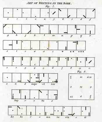
    This curious illustration appears in forty-five volume Cyclopedia of  Abraham Rees (published 1795-1820), displaying a system for communicating over distances at night.  When this part of the Cyclopedia was printed in 1808, the electrical telegraph was still 37 years away from coming into being–45 years from being somewhat well-used.  Before this time (visual) communications over long distances at night were limited to just these sorts of means–lighted semaphores, hand-held torches, that sort of thing.  Signaling at sea at night was somewhat different at this time and didn’t include anything remotely close to the alphabet.  So the rather complex system that we see at left is extremely uncommon–it seems also very cumbersome to put into effect.  Unfortunately I don’t have the text volume that would explain then entire system and implementation, so I’m going to guess that there was a large, powerful light source that was covered by a tight, black, covering tablet that would eliminate nearly all light leakage.  The symbols for each letter of the alphabet (and numerals) would be cut out from another tablet that would fit over the face of the light source, placed between the blank and the light.  To transmit a letter the user would then simply remove the blank covering tablet to reveal the light broadcast by the hole or slit in the tablet underneath.  The blank would then be placed back, a new tablet for a new letter placed underneath, and the process would begin again:  blank (dark); letter (light); blank (dark); letter (light), and so on to the end of the message.   I guess the distance at which these symbols could be seen would be dependent on light source, atmospheric conditions, ad so on.  The way that the letters are made into symbols seems to me very intelligent, so that you distinguish the differences from an appreciable distance.  I like it–its an elegant idea.  (Well, maybe it didn’t work in this manner, but it seems to make sense to me.)

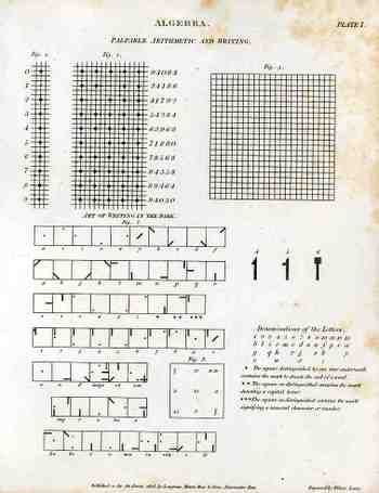
    The image of the full sheet:

    Blog1sept_6_palpable514


  • The Mother of all Renaisance Logical Graphs, The Knight’s Tour, Porphyry and Boethius

    JF Ptak Science Books LLC  Post 179
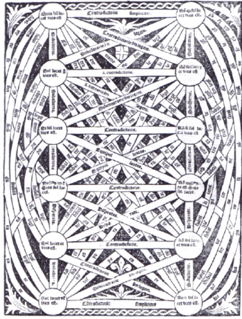
    Graphcontradictory_tree
    Following up on a post from 21 July about an early graph showing difference over time (state populations,
    1790-1860, US Census), I’m thinking that the claim may still be basically true
    in it most restricted sense. Doing some
    more thinking on how information has been represented and the history of graphs
    in general, I think that this is still the case even though there may be some
    close associates that reach back hundreds of years into the past.

    Something that seems similar but really isn’t is this
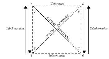
    advanced, morphed, untranquilized version of the square of opposition. A general, basic square of opposition begins
    with the four Aristotelian propositions: universal affirmative (symbolized as A,  “Omne S est P”.  or “Every S is P All S is P”;  universal negative (symbolized as E, “Nullum S
    est P” or  “No S is P All S is not P”; particular
    affirmative (symbolized as  I,  “Quoddam S est P” or Some S is P Some S is Pl
    and  particular negative (symbolized as O,
    “Quoddam S non est P” or Some S is not P
    Some S is not P.  The parent graph of this inherently perplexing and beautiful logical relations table is below, taken from the Murray State site (and if you follow the link you’ll have a concise and clear explanation of how this works):Traditionalsquare

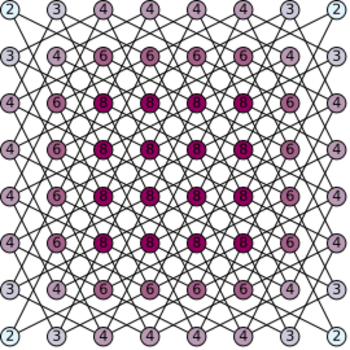
    The square of opposition does in a way resemble another interesting graph-like description of an old-school (ancient) mathematical problem:  the Knight’s Tour.  This is a problem setting forward a chess piece knight on a trip across the chessboard (8×8 square) during which he must touch every square and touch every square but once.  (Here’s a way-above interesting [read “obsessive” and lovely] site that gets the issue across  in a big, mathematical, artistic manner.)
    One solution for the Knight’s Tour as follows (from here)…yes, I know it has nothing to do with what we’re talking about, but it does bear a resemblance to the logical decision maps, which I think is uncommon.       
    Knights_tour

    For a wonderful summation of the visualization of data and bearing heavily upon the Renaissance see James Franklin’s Diagrammatic reasoning and modelling in the imagination:the secret weapons of the Scientific Revolution and his website.
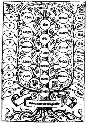
    Porphyrys
     

    Wandering off the path a little more leads us to the decision scheme known as Porphyrys Tree, a hierarchial organizer based upon the then Aristotlean categories (substance, quantity, relation, quality, doing, undergoing, place where, time when, position and having).  These would really form the roots of the Porphyryn Tree, and which, “if they were worked out fully, would contain all the species of the things what are in the world” (from Eleonore Stump Boethius, Cornell; Boethius was the “Last of the Romans”, killed in ca. 526, but whose writings and influence lived on to make him perhaps the greatest tutor of the Middle Ages).


  • Dada and Modernism for Children? 1905-1932

    JF Ptak Science Books LLC Post 161
    Blogdadanemo
    In a sub-sub-sub category of the sub-category of “Books that I Want to See” comes Dada-ist books for children, and less loosely, modernist books for kids.  Or students.  I’m not sure how close I can define this field because, well, I know basically nothing about it, but I am interested in how long it took for the bits of
    created modernism (1895-1915 or so) to reach the level of publications intended for children.  And by Modernism I’m talking about the epochal changes in nearly all disciplines brought about by people like Einstein, Ibsen, Klee, Kandinsky, Braque, Stravinsky, Woolf, and so on. (Nearly all disciplines, that is, except for politics—and then I guess too that if you included the concentration camp then it would join the modernist ranks, too.)

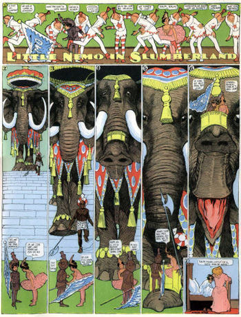
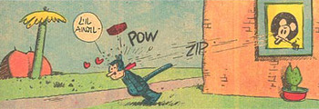
    I’ve started thinking about this in Europe but the first thing that comes to my mind is Little Nemo (and Dreams of the Rarebit Fiend too, while we’re at it), the fantastic creation of Michigan-born (Ypsilanty-schooled) Windsor McKay (1867-1934), which I think is definitely modern but not at all related to Dada, and which came to life in the miracle year of 1905.   McKay just happened to be years above and away from whatever his contemporaries were doing.  No one came close to McKay, in my opinion, until Ignatz picked up his first brick, and George Herriman drew Krazy Kat for the first time in 1913.  Blogdada_herriman

    Still skirting the Dada part, I’d love to see Konvolut von 14 russischen Kinderbuchern der Jahre 1930-32, a spectacular constructivist work aimed at children and from what I can see is a treasure trove of  Malevichian insight. 
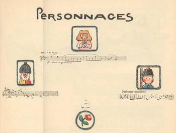
    Andrew. Helle’s La Boite a Jouhoux, (“The Box of Toys”) Ballet pour enfants (Paris, 1913), is a beautiful composition, a modernist construction, using the idea and artwork of illustrator Helle and the music of Claude Debussy.  The score is witty and has a very light touch, Debussy pleasingly borrowing from himself and his
    Blogbooks_wantdebussy

    friends in a work partly inspired in a Milneian way by 7-year-old Chouchou Debussy (and her toys and dolls).  It’s a beautiful work that I’d love to have in my hands.
    Blogbdad_kid_debussy294

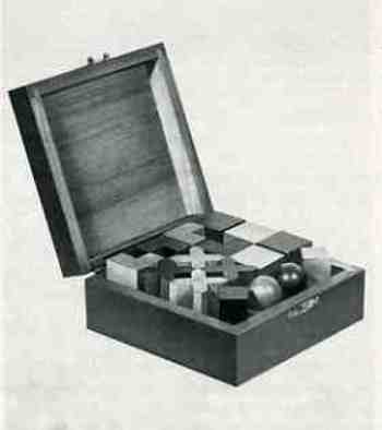
    Another magnificent-looking object that I’d like to see is the box wooden Bauhaus-inspired shapes, pictured in Junge Menschen kommt ans Bauhaus//Werbeprospekt, published in Dessau in 1929 and featuring work by Klee, Kandinsky, Albers, Ridel and Meyer.  The box of shapes is to die for, and it seems as though it offered new geometrical toys/tools  for the inquiring mind in the last year of the ‘twenties.
    Blogbooks_wanted_kids291
     

    But I’m no closer to Dada for kids than at the beginning of this post, hoping as I was that something might shake loose if I thought about it some.  Its an interesting question to me, and I’d really like to return to it when I actually know something. 

    ·Posted by :

    ·in:

    —

  • Early “Clip Art” Books: Amman, Vogtherr and the Mustard Seed Garden

    JF Ptak Science Books LLC   Post #102
    Artists’ pattern books of the 16th century are, in a way, somewhat like our present
    clip art books.  They were certainly used by artists and students for details that
    they were not privy to as well as for inspiration; they were in some sense meant to
    be copied directly by those looking for bits and pieces to help flesh out a design
    for an armorial or coat of arms or bit of a title page.  So they were in fact intended to
    function somewhat like a clip art book. 
    Blogpattern_book_amman120

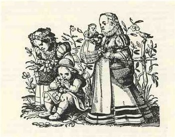
    One of the great pattern books printed in the second half of the sixteenth century belonged to Jobst Amman and began publication in Frankfurt in 1578: Kunstbuchlin.  Kunst und Lehrbuchlein fur die anfahenden Jungen Daraus reissen und Malen zu lernen Darinnen allerley Art lustige. ..(Art and instruction book for young beginners, from
    which to learn how to draw and paint; containing all sorts of cheerful and pleasant illustrations of men and women, also of little children, little animals and other
    subjects; published for the benefit of all young people who love this art
    ).  It really was intended for instruction in the arts for children but also served as a
    comprehensive pattern book for artists, jobber printers, craftsmen and the
    like-basically a clip art book of the 16th century, without the “clip” part.  (This
    book would’ve been studied, copied, and studied again, used for inspiration-it was
    not meant to have the images cut out and applied.)  There were 293 images in this
    book-each woodcut printed on its own page, with book standing about 12 inches
    tall-and for the most part featured women, children, pagan gods, religious leaders,
    emblemata, allegorical scenes, and perhaps most interesting from my point of view,
    scenes of people in different professions from all stations of life.  Amman was
    interested really in performing an artistic function, and really didn’t have a
    religious or moral authority that he was trying to sell to the reader.  So, in that
    way, his work was really pretty unusual, and, if you look hard enough, a delightful
    insight into some aspects of “common life” of 1578, from the styles of unpretentious
    clothing to how and where people worked.  His attention to detail and minuatiae
    makes this work a valuable, snap-shot like visualizations of tiny aspects of a past
    world. 

    In his later years,  Jost Amman created woodcuts for some of the greatest
    illustrated books of his time, including  titles as the Bible, Livy’s History of
    Rome, Flavius’s Jewish War, Reynard the Fox, the Kunstbuchlin, (1578), books on
    hunting, warfare, cooking and women’s fashion.>  He was truly prodigious, though it
    is unlikely that he created every work of art by himself-what probably happened was
    that he undertook all of the designs and then (again, probably) fanned out the work
    to be finished, with artists helping him to finish the original designs and
    woodcutters to actually make the woodblocks. 

    Sadly, A later edition of the Kunstbuchlin appeared in 1599-after Amman was
    dead-which was expanded to include previously-published Amman images that,
    beautiful as they were, had nothing really to do with the stated subject of the
    book, and seemingly undertaken to do a little cashing-out for the publisher.  The
    newly added images included images from Amman’s work on Turkey, horsemanship,
    =coasts of arms and pedigrees, horse breeding and a number of other unrelated
    things. 

    It is fitting that this book was reprinted in 1968 by the glorious Dover Publishers,
    as, so far as I can tell, they were the first mega-publishers of very affordable
    collections of clip -art art
    Blogpattern_book119
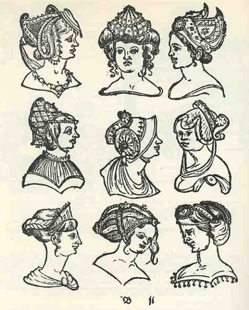
    Another example of an artists’ pattern book is Heinrich Vogtherr’s Kunstbuerchlin vonn Allerly seltzamen und wunderbarren frembden Stucken.published in Strassburg at around the same time as Amman (ca. 1575), but with an entirely different approach to the subject.  Vogtherr included hundreds of woodcut designs for workpeople in the
    arts (such  as “painters, sculptores, goldsmiths, stonemasons, and armorers” Heitz, Elsaessische Buechermarken) depicting the unusual and the semi-fantastical:  bizarre and extended headdresses for men and woman, incredible hairstyles (watch out, Ballmer), outrageous hands and feet, armaments real and imagined, as well as true but perhaps enhanced coats of arms, armorials, swords, halberds, and so on. 

    Somehow and with perhaps very limited understanding is has led in my mind to the superb translation of the enormously revered manual of Chinese painting, The Mustard Seed Garden (Chieh Tzu Yuan Hua Chuan by Wang Kai,  first published in 1679) by Mai-Mai Sze, The Tao of Painting. A Study of the Ritual Disposition of Chinese Painting, 1956.  They’re not understating the secondary title whatsoever: this is basically a catalog which offers the student of Chinese art everything they need to know about forms  and shape and content and genre, along with how to draw these things, where to place them, how to establish the boundaries of the artwork, the different sorts of brushwork to use, and on to the end.
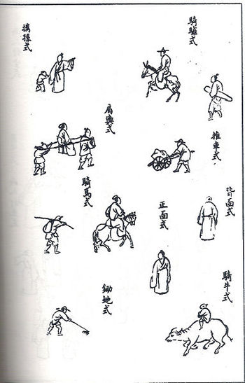
    Blogpattern_book_mustardIt describes the (eighteen) basic principles and rules, including the Six Canons (including the circulation of Ch’i), the Six Essentials (“action of the Ch’i and powerful brushwork go together” and “color (if used) should enrich” and “to exhibit originality even to the point of  eccentricity, without violating the LI of things”), The Three Faults (all concerned with brushwork), and  The Twelve Things to Avoid (“mountains without Ch’i, the pulse of Life”). 

    This is followed by notes on the preparations of colors and other materials used in painting.

    The next 600 pages or so is a very detailed visual description of how things should look and  takes up 15 pages of index in its very minute description.  For example, the section on trees discusses
    how trees should appear in the distance, methods for painting vines on trees, describing autumn willows,  dotting fruits in blossoms, and much more.  this treatment extends to rocks, humans, houses and structures, boats, furniture, city walls, palaces, waterwheels, and etc.  There is a longer section devoted to the painting of flowers and plants, where we see entries such as “rules of painting flowers phrased for  memorizing”, “flowers with eight and nine large petals”, “rules for painting sleeping birds phrased for memorizing” (a title for a poem if I’ve ever heard one), “painting thick leaves that withstand winter”, “a hanging and bent branch”, “plants with thorns and furry leaves”, and hundreds of other pages. 

    It is a stupendous work that I find beautiful and relaxing for reasons I don’t understand.

    The great Kenneth Rexroth said it most forcefully/grumpily, probably, when he reviewed the book for The Nation in 1957:
    “This is a book every American artist and art critic should buy and study—every night for several years.  Nothing could be a better answer to the problems and dilemmas of modern abstract expressionism.  Nothing could be a better antidote to the enervating poisons which have diluted modern painting.  This is a lucid, profound, exhaustive explanation of what you think you are doing, but aren’t, what you would like to do, but can’t.  Furthermore, the larger second volume consists of more than two hundred detailed pictures, with complete explanation of how it was done, long ago, by far better men than you.  It is all there—a complete alphabet of expression…”
    ·Posted by :

    ·in:

    —

  • The Beauty and Iconography of Title Pages: Frau Mauro’s Sphaera volgare novamente (1537) and a Very Early Glimpse of America on a Globe

    JF Ptak Science Books   Post #95
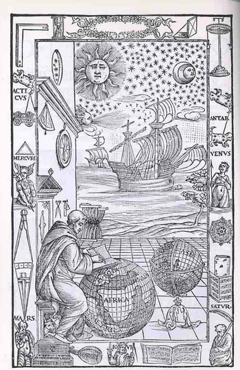
    Blogtpamerica105
    This magnificent piece of tidy work was done for this new edition of Johannes de Sacrobosco’s Sphaera by Fra Mauro Fiorentino (1492-1556), and gives us all a chance to have a bit of fun reading late Renaissance iconography. The work is entitled Sphaera volgare novamente tradotta con molte notande additoni di geometria, cosmographia, arte navicatoria et stereometria (and so on), published in Venice in 1537, and as stated in the title this is an augmented edition of Sacrobosco with Mauro adding segments on geometry, cosmography, navigation and perspective.

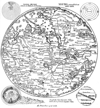
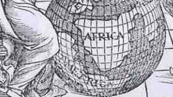
    The wood engraving is of particular interest because of the globe upon which Fra Mauro is writing—as you can more clearly see in the detail; shot (below) we can see a large continent labeled “America” just hundreds of miles off the coast of Africa.  The Americas still make only guest appearances on globes at this point, and seeing it here, as a bit of an afterthought, is a treat (considering how easy it is to overlook it).  There is another Fra Mauro, much more famous than our’s above, whose cartographic workshop produced a seminal, magnificent  map of the world in 1453, thus bringing the two Mauro’s together, if only slightly, via their maps (one great, the other incidental).
    Mauro_map

    Looking a little more closely at the elements of this image we find a number of interesting bits.  Working from the upper right hand corner across and down we find a right angle (for the architectural and building parts of the book), then a sand clock, a decorative laurel wreath with a pocket sundial (!) right next to it, ending with an object that looks as though it might be a physical sciences demonstration tool (I’m guessing).  Working down from the “what is it” we see the first cut of a three-times-repeated constellation that I think has nothing to do with the word “Antar” beneath it. 

    “Antar” probably refers to the famous Arab warrior-poet, subject of lots of attention over the centuries including two works by Bach and Rimsky-Korsikov (and also the name of Apollo as worshiped at Actium) Below Antar is an armed and clothed (?!) Venus, major domo goddess of love and beauty and for whom existed innumerable cults (witnessed by just some of the famous Venuses as Venus de Milo ,Venus de’ Medici, Capitoline Venus, Esquiline Venus, Venus Felix, Venus of Arles, Venus Anadyomene (also here), Venus, Pan and Eros, Venus Genetrix, Venus of Capua, Venus Kallipygos, Venus Pudica, and so on into the sweaty  night.)

    Blogtpamerica_detail

    Following Venus is, I think a complex compass rose, though it may also be a calendar—I can’t quite tell from the detail of the cut.  This is turn is followed by a heavily fortified book (actually this sort of bonding, meant for heavy use, was relatively common at this time)and a score of (5-line staff) music. 

    Returning to the right angle and moving down we se the same constellation under which hangs a very stable-appearing wagon, with a triangle beneath it , followed by a representation of Mercury, the messenger of the gods, who in turn is positioned over a large set of dividers.  On the wall over the head of Fra Mauro we see two precision instruments—a surveying tool and an astrolabe.  The two small tools near Mauro’s head seem to be a scale and a pair of scissors. 

    The central panel shows two caravans (approximately 100-footers?), being driven by a favorable wind to hospitable shores beneath a starry and benign firmament. 

    The bottom tier is the most emblematic of the set of images, as we see the related Saturn-Jove-Mars all together.  Saturn is also Kronos, which is why we see the old horned man caring the scythe of time’s reckoning; he is also the father of Zeus, also known as Jupiter (Juppiter Optimus Maximus Soter (Jupiter Best, Greatest, Savior)), also known as Jove, who stands here crowned and warning us with a sword and dividers.  Jove in turn was the father of Mars, who here doesn’t look terribly war-like at all.  Punctuating the spaces between these three are a keyboard instrument, a lute and a score of music.  I’m not sure that these lyrical/musical devices had anything to do with the three generations of super gods, but there you have it. 

    ·Posted by :

    ·in:

    —