A Daily History of Holes, Dots, Lines, Science, History, Math, Physics, Art, the Unintentional Absurd, Architecture, Maps, Data Visualization, Blank and Missing Things, and so on. |1.6 million words, 7500 images, 4.9 million hits| Press & appearances in The Times, Le Figaro, Mensa, The Economist, The Guardian, Discovery News, Slate, Le Monde, Sci American Blogs, Le Pont, and many other places… 5000+ total posts since 2008.

Category: Iconography

  • On the Center of Everything (continued)

    JF Science Book

    Continuation of  Visual Chronology of Cosmology Part 1 and Visual Chronology of Cosmology Part II,.

    I started out in this post to write about the scholar pictured in Andrew Borde’s book, The Breuiary of Healthe, for all maner of syckenesses and diseaes, Expressynge the obscure terms of Greke, Araby, Latyn, and Barbary, in Engluish concernying Phisicke and Chierurgerie…., which was printed in London in 1556.  Underneath this rather long title is perhaps the earliest “modern” work on hygiene–or at least (in a real test of qualifications) it was the first book written by a medical man on hygiene that was originally written and published in English.  In its way it is a wonderful book, being a compendium, really, of 384 short chapters on the this-and-that of medicine, all alphabetically arranged, which made it a simpler book to compose than a full treatise on the subject arranged in a medically-logical way.  But what I liked in it was the contrasting image of the scholar, which to me is the very picture of ennui, laid side-by-side with the chief element by which this book is probably best remembered, which is “Myrth is one of the chiefest thygnes in physicke” (or “humor is the best medicine”).  Borde’s scholar may not be taking his own medicine, here.   

    In looking for the text for this fine book I came across something else, Borde’s Aristotelian celestial spheres in his  The First Book of the Introduction of Knowledge, printed in 1542, the year before the publication of Copernicus‘ De Revolutionibus. It is a magnificent woodcut, and tells the story of a vision of mankind that would soon come to vast change. 
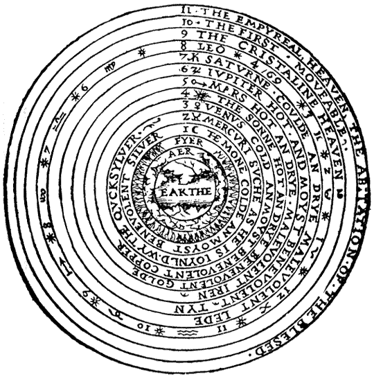
    Ptolemaic Universe
    Source:  the Luminarium, here.

    The image shows us the geocentric universe, the creation, and eleven-sphere unit that follows the Earth at center and the four subluminaries (earth wind air fire), followed by the orbit of the Moon and Mercury and Venus, after which comes the Sun, followed by the rest of the planets.  These spheres are followed by the fixed stars/the starry firmament), and ultimately by the Primum Mobile, divided into the crystalline heaven, the first mover, and the Empyrean.  Its a beautiful image. 

    The following is in a sense a cross-section of the Borde image, which shows pretty much the same information (with the Sun being in the fourth sphere).  This is manuscript is more than a hundred years earlier than the Borde, and accurately represents the elements of cosmology of the time.
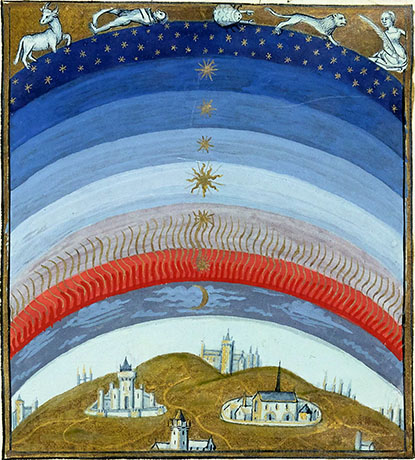
    Image source:  Luminarium, here; From Les Echecs amoureux (“Amorous Chess”) Manuscript made for Louise of Savoy, 15th c.  Bibliothèque nationale de France, département des Manuscrits; Mss.fr.143, fo 20.

    An even earlier version of this more-or-less static image, the perfect image of the perfect creation in which all of the stars in the visible sky were always there, in some perfect number, in the configurations for all time. (This idea of course would be one of the greatest disfigurers of ancient thought that the telescope of Galileo  would provide.)
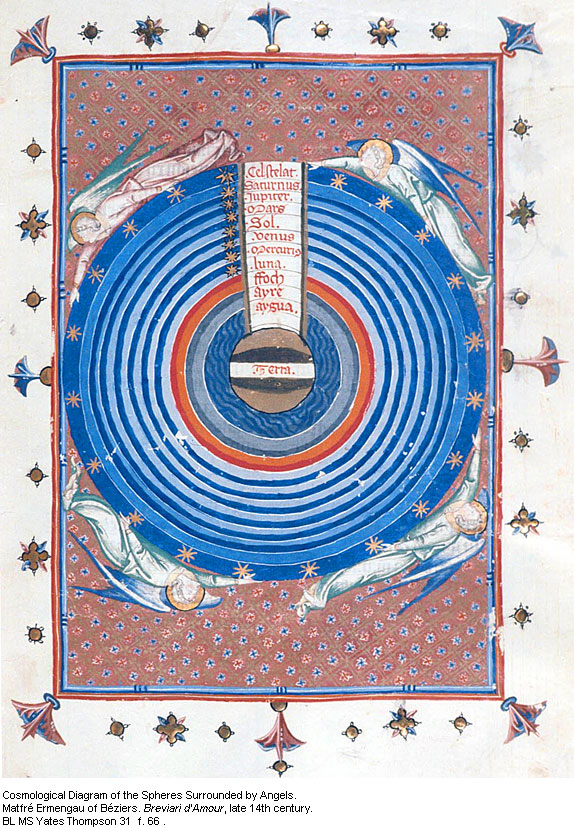
    Spheres of angels
    Source:  Spheres Surrounded by Angels, Brevari d’amour, late 14th c

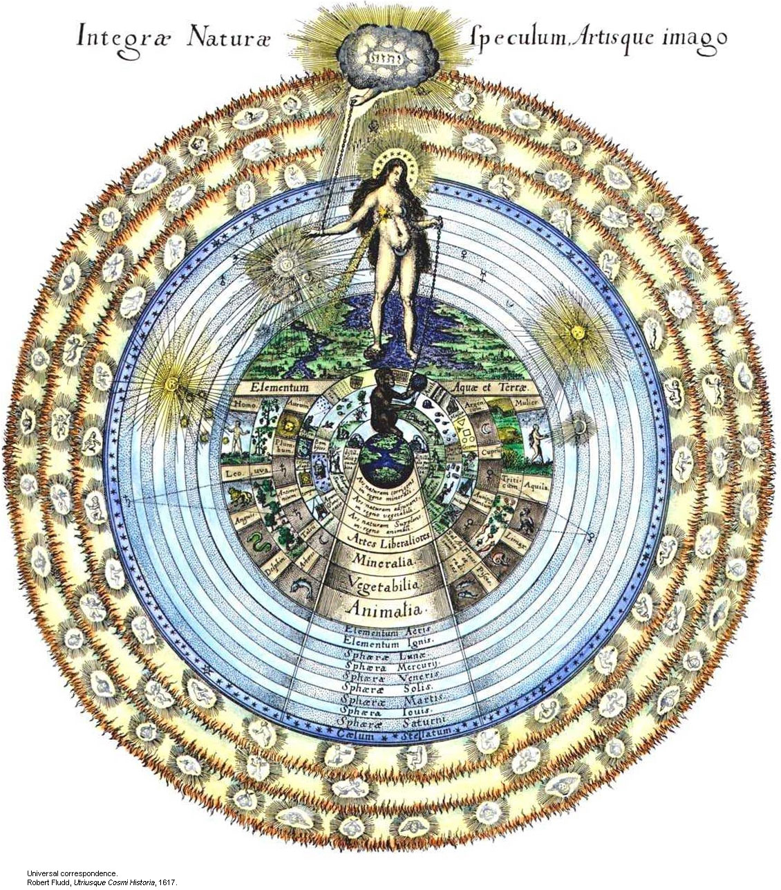
    Robert  Fludd, a visionary of a different sort, as his celestial sphere will show:
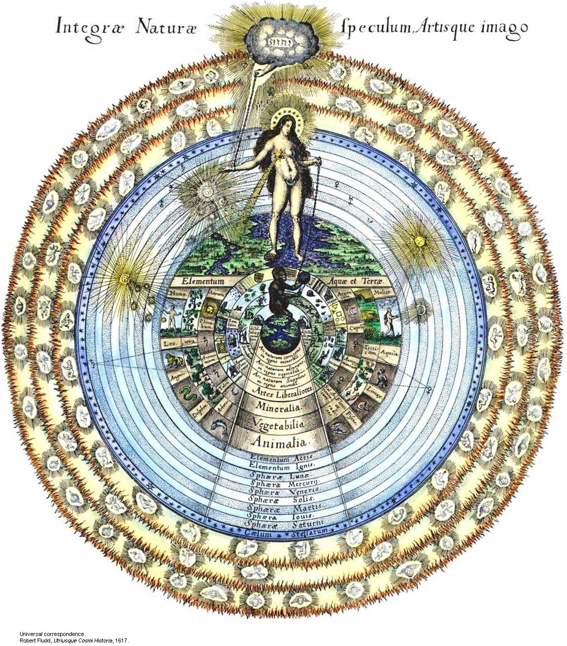
    Spheres--robert fludd
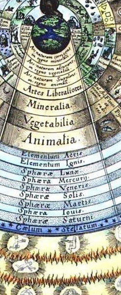
    And here in detail:

    Universal Correspondence from Fludd’s Utriusque Cosmi Historia, 1617.Rob
    Spheres--robert fludd det

    Fludd’s (1574-1637)  features a complicated astrological existence well beyond the point of Copernicus.  In addition to everything else, real and imagined, Rosicrucianism and astrology and puffy-birds, Fludd, who was  an English physician, delved deeply into the real stuff of the world in this book in addition to all of the other make-believe–optics, the musical intervals, perspective drawing, hydraulic engineering, construction of lifting machines, military engineering and many other interesting, physical science topics.  But this drawing, right there on the title page, reveals Fludd’s real interests and shows what governs what he does.  Everything else, the math and and the physics, services this need.  Of course the image is beautiful, which is why it is here, but it is also a deeply personal, exploitative, cover-all for the things that Fludd *wanted* to find.
  • Buckets of Missing Smiles–an Incredibly Brief Anthropology of an Expression in the Face of the Sun

    JF Ptak Science Books Post 1666

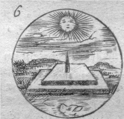
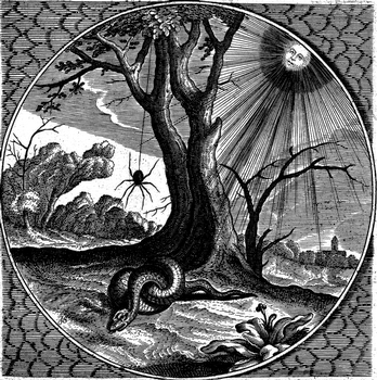
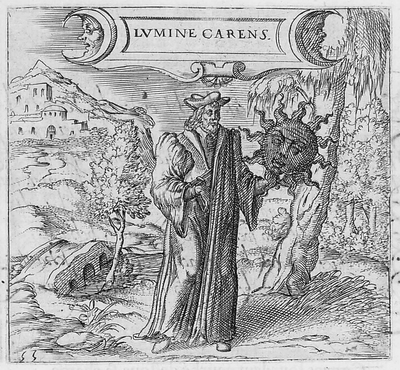
    The depiction of the anthropomorphic Sun featured with a broad toothy smile seems a commonplace fixture in modern times–at least in the very popular media–but it seems to me that the Sun was an impressively dour character in the most misty and moldy past. Its a much harder issue for me to locate a happy Sun than a phlegmatic one, as we can in the coming examples.  Here, for instance, the Sun is actually disappointed, and dark:

    av1615055pict

    [Georgette de Montenay/Anna Roemer Visscher, Cent emblemes chrestiens (c. 1615)] 

    The Sun (representative in this case of the Christian god) disavows the heavily robbed false philosopher, finding nothing but fault in the erroneous thinking and pronouncements, so much so in fact that it distances itself from the phonylogian by turning itself black and devoid of light, absenting the light that was supposed to be shone via the heretic’s teaching. 

    Feigning to be a philosopher with your long cloak
    You bring forward all false theories about the pure Sun.
    First learn to recognize what is the true light.
    The balmy day does not shine in obscure night

    Conversely, the sun would also shine to dispel the false teaching of other philosophers, as so, though this time without any face at all:

    hu1689024pict[Source: Pieter Huygen, Beginselen van Gods Koninkrijk (1689)]

    But mostly it seems the Sun appears to those who came before with a mostly blank expression:

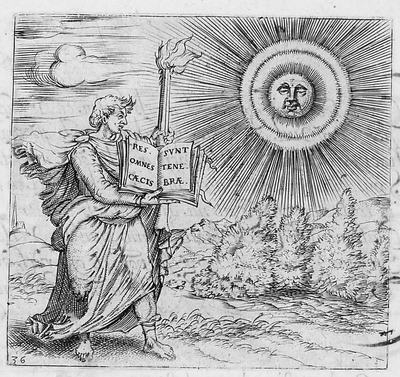
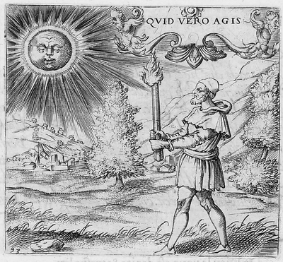
    Blogsunfacescolor Where was the smilign Sun hundreds of years ago?  Anthropomorphic images of the Sun have appeared in books in the West for several hundred years, and in almost every case where the Sun has a face, it is usually expressionless, its mouth drawn into a mid-Western farmer/Abe Lincoln horizontal, a tightly drawn nothing.  Two thin lips, firmly repulsing all emotion.  The face of the Sun was insurmountable, a tabula rasa, showing perhaps that there was nothing there at all inhabiting this iconographic image of The Creator to give the poor observer a glimpse into the depths of the future.

    Blogsunfacesdetailtwo

    This observation  seems to stand for Sun Gods and Goddesses as well, even the ones who are being tugged or pulled or charioted a cross the vaults of the heavens—the Nordic Sól, Greek  Helios , Roman Sol Invictus, Vedic Surya and of course Elijah ascending to Heaven in a Chariot of Fire, all seem pretty intractable.  But in general images that we see of Sun deities like Apollo, Greece and Rome; Freyr, Norse; Garuda, Hindu; Huitzilopochtli (Uitzilopochtli), Aztec; Inti, Inca; Liza,West African; Lugh, Celtic and Re (Ra) and Isis, and on and on, show a small, set pair of lips, if they have a mouth at all, and this going back beyond the Sumerians (Shamash). 

    Blogsunfaces2048

    When the Sun really loses its human personae in the 17th century (the scientific sun and stars beginning much earlier, as in for example Allessandro Piccolomini’s Della Sfera del Mondo, 1552, with simple star maps unadorned by icons and written in the vernacular), it is replaced with starry images which seem to somehow have more emotional authority than the sun images with faces.  Perhaps the sun was meant to have this Delphic, blank-mirroring quality, given its importance as a giver (and taker) of things,

    Blogsunfacedetailone
     
    and that it was not within human capacity to understand it as an emotive entity, especially during bad times.  But in those times of Good and Bad it wasn’t necessary to see a frown or a smile on an image of the Sun, I guess because of the complaints of redundancy.

    Blogsunfaces047

     No matter, though, as the modern astronomical text took care of the Sun and its missing buckets of smiles in due course—until more modern times, when the Sun is made to have a matching disposition, a result of kinder modern artists. 

    Blogsunfacedetailthree  

    f16914406

    This Sun seems to rule with an ennui  Daniel de la Feuille, Devises et emblemes (1691); and then again, in the following superbly engraved work by Jacob Cats, Sinne- en minnebeelden (1627):

    beeld037

    The Sun here seems to have a knowledge-worn expression, a sense of having-seen-it-all, in this beautiful work by Georgette de Montenay/Anna Roemer Visscher, in Cent emblemes chrestiens (c. 1615)

    av1615036pict

    And again from the Montenay we see a smirking Sun (definitely not a smiling one) judging the efforts of humans once again, and finding them coming up far to short:

    av1615093pict

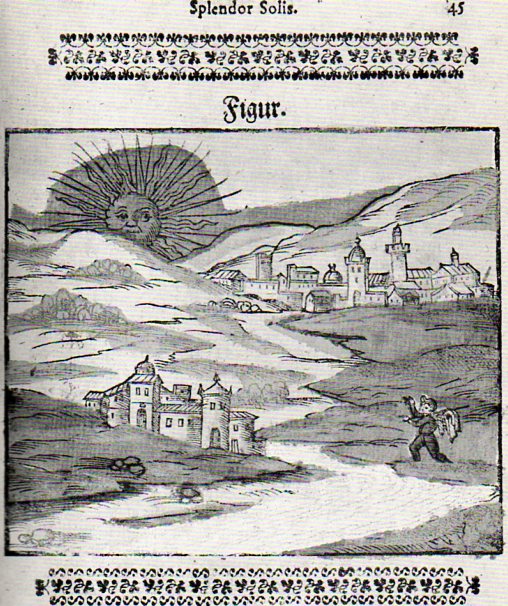
    I guess you could make a case for an “amused” Sun in the Montenay, though in a third-person sort of Royal way of being removedly amused.  Here–in a rare and very important work in the history of alchemy–we see a rising Sun in an amused state, welcoming the book’s author, on his alchemical pilgrimage. 

    Sun--splender solis029
    In another illustration from this book (by Salomon Trismosin, Auretum Velius oder Guldin Schatz und Kunsthkammer, printed by Georg Straub at Lake Constance in 1598/9, and also known as “Splendor Solis”) we find the following expected facial posture:

    [trismosin, salomon (?pseud., fl. 1473?). <i>aureum vellus, oder guldin schatz und kunstkammer.</i> rorschach: 'gedruckt in des f. gottshausz s. gallen reichshoff' leonhard straub, 1598-99.]

    And so on and on this continues, this presentation of the Sun as both removed and judging, until–in some cases–the business of representing the Sun anthropomorphically disappears altogether, even in allegorical representation, like so: 

    The Man in the Moon will just have to wait his turn, though I can’t resist the following couple of images, the first of which shows the Moon in a phase of nothingness and a nil expression:

    f16914302

    [Source:  Daniel de la Feuille, Devises et emblemes (1691)]

    And then this classic image from an iconic and early science fiction film:

    http://data.whicdn.com/images/17391911/moon,vintage,jules,verne,le,voyage,dans,la,lune-d0ec6d7f016fe54cb3a634c84919da1d_h_thumb.jpg

    And from the 1905 motion picture version of Jules Vernes From the Earth to the Moon called A Trip to the Moon–upon the approach, the Moon’s surface was blank, but quickly developed a face, which was sort of smiling–until struck in the eye by the Verne capsule. 

    Offhand, though, my memory doesn’t offer too many smiling-Moon expressions. 


  • Extra-Earths Department #4: Brueghel Dips into the Late Renaissance Allegorical Sky

    JF Ptak Science Books LLC  Post 1664

    See the other Extra-Earth posts:  Mondo Bizarro, Science Afflictions and the Dubious Mind—Bad Science, Part 1. NYC in Space (?!) here and Extra-Earth Humano-Alien Souls From Outer Space Repopulate Earth-Hell!!(??) here.

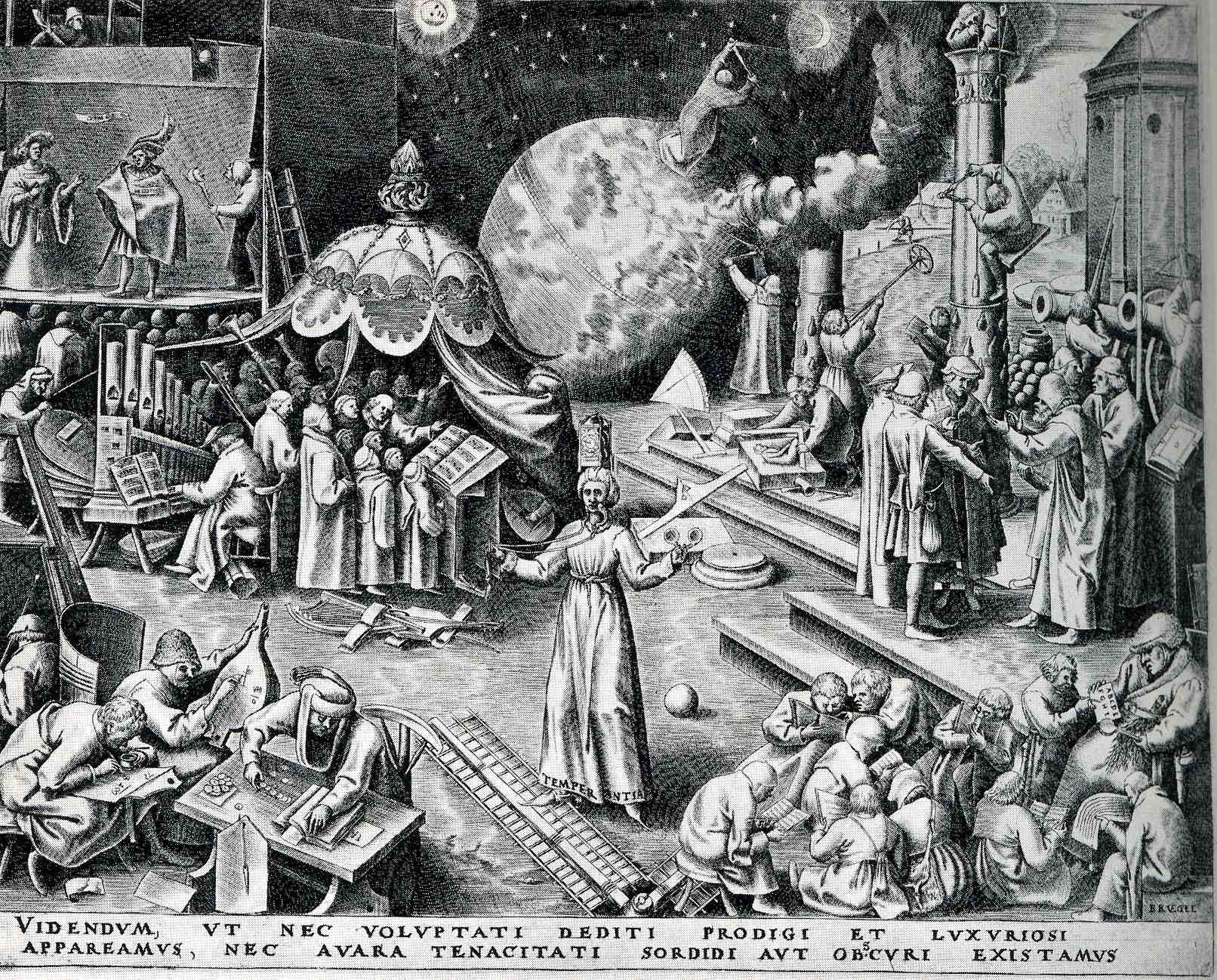
    0 blog feb 17 brug597

    Peter Brueghel (the elder, born ca. 1525 and dying in 1569), was the Dutch semi-discoverer and king of “normality” of Renaissance art–and by “normality” I mean that he depicted non-royal things that were generally off the palette for almost everyone else, finding subjects in peasants and small life (hunting, meals, working at agriculture, festivals, dances, and so on).  Brueghel was also perhaps the first painter to depict a landscape for  the sake of its own beauty, without being a backdrop for a religious study or building or historical scene. He was extraordinarily prolific in his skimpy 45 years, fully populating his scenes with suites of busy and evolving life.

    Browsing through some of his work, I came across the print called “Temerpance”, which in general I think was supposed to warn us against excessive pleasure, but which really just confused me a little.

      (TEMPERANTIA; and then, VIDENDVM, VT NEC VOLVPTATI DEDITI PRODIGI ET SVXVRIOSI//APPAREAMVS, NEC AVARA TENACITATI SORDIDI AVT OBSCVRI EXISTAMVS. “We must look to it that, in the devotion to sensual pleasures, we do not become wasteful and luxuriant, but also that we do not, because of miserly greed, live in filth and ignorance”.)  

    To me, it looks like people here are pretty industrious, mostly engaged in scientific or musical pursuits:  lots of books, musical instruments, people writing and reading.  But I guess that these were sensual pleasures, pleasures of the mind and heart, and not a pleasure devolved from the godhead.  Perhaps the complete opposite is true:  the print showing the triumph of the pursuit of the mind over sensual graft, lifting mankind above the filth and ignorance of the body.  Sheesh. 

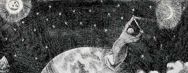
    0 blog feb 17 brug man earthBut the real grit of my interest is the action lurking in the background, the man, the astronomer, making measurements in the sky, triangulating the Moon and the Sun (perhaps).  What on earth is he standing on?  He does seem to be standing on earth in the background of the earth on which thee people in the foreground are standing–which means, with a stretch, we have the fourth entry in this blog’s short “Extra Earths” category.

    0 blog feb 17 brug man math

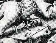
    The more I think about it, and the more closely I look at the print, this confusion must be my own–this must be Brueghel’s way of showing the possible worlds that exist outside the sensual and self indulgent. He shows children (and adults) learning their ABC’s at the feet of teh schoolmaster at bottom right, a theatre scene at upper left, a large musical ensemble (complete with choir).  An industrious man measures his fields, while builders to his right measure their progress and trueness on a column; at bottom right we see an “accountant” of the times working his tables and figures, while another to his right works on a math problem, clutching his pot of ink.  The figure in the middle (with “temperance” written in the hem of his garment), reminds us of our mortality, with a sword in one hand and a clock on his head.  All in all, it is a delightful scene of industry and invention–and it has an extra earth. 

    Of course the extra-earth is allegorical, but, still, it is an unusal thing to see.


  • Prometheus Unbound; or, the Triumph of Science in Olympus (1879)

    JF Ptak Science Books   Post 1571

    The wonderful Punch, or the London Chiarivari strikes again for the year 1879.  The quick-browse is seldom complete, as I’ve witnessed again and again; 1879 revealed several fantastic images that were posed to this blog last week (here, for the Technology Museum of the Future and also here for Thomas Edison’s Anti-Gravity Underwear and Kite Babies), and as it turns out just a few pages away, there existed a larger, two-page illustration that was again on the triumph of science, and which I missed completely, twice.

    The message in this cartoon is the glory of “science”, which was flying very high indeed in the newly-electrified times of 1879.  Dominating the image is Mr. Punch himself, holding the electrical sun in one hand, illuminating everything.  To his right, Mars and Heracles stand before an enormous cannon, with different reactions; Bacchus sits astride a barrel of coffee of all things with Pan enjoying a short cup of Joe, while in the lower left corner Hades himself is making a photograph of Eros (?), an hourglass slung across his back, finally coming to grips with capturing change.  In the right corner at bottom is a young man who is intent perhaps on reporting on the situation via a handy public telephone–such things didn’t yet exist in 1879, the telephone being just three years old, but the artist thought enough of its future power to add it into this scene of the triumph of science and technology over the panoply of gods and demigods.

    On the right ide of the image the gods make no further advance against science and technology.  Ares-as-workingman is puzzled by the giant Nasmyth hammer, with the Cyclops in the background a little more concerned, disbelieving what their eye told them.  Poseidon is shuttled away in the lower left, accompanied by what looks to be a weeping mermaid., hustled to the exit by a torpedo, a diver in a deep sea suit, and what I think is a special life-preserving inflatable suit.  In the middle of the image we see two women dressed in legal and academic garb, looking determined before a finicky Hermes; and above them, lording over it all, is a very dissatisfied Zeus, and a headache-y Hera.

    Since the image is entitled “Prometheus Unbound, or Science in Olympus”, I guess that Zeus must be reacting to electricity as the unbound Prometheus, a modern version of a kind power given to humankind via electricity.  It is this new Prometheus that is the undoing of the god’s retreat.

    Overall, this is a very plain Victorian view in the trust of science and technology to lead in all things, even the very basis of much of European mythology.   [I hope that I haven’t abused the mythology too much.]


  • The Statue of Liberty as a Billboard, 1888

    JF Ptak Science Books   Post 1567

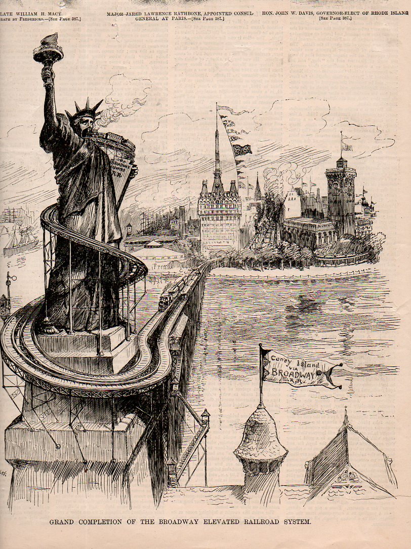
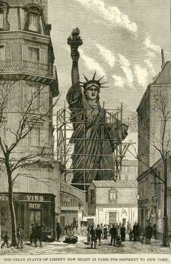
    This image of the near-future Statue of Liberty (“Liberty Enlightening the World”) appeared in the German version of Puck magazine in 1888–since the statue was officially dedicated on 28 October 1886 it didn’t take the cartoonists and social satirists very long at all to get around to using Lady Liberty/Libertas as a backdrop for their message.   And the message here was the creeping advertising age, which was just the shroud of an advancing consumerist society, because there wouldn’t be that many ads if there wasn’t so much material fighting for so many consumers. Advertising was beginning to creeping in everywhere–and here the cartoonist foresaw a near-future in which the Statue of Liberty was a pure advertising vehicle, and as it turns out, most of the stuff advertised there was junk. 

    http://www.printsoldandrare.com/wallstreet/1156ws.jpg

    Here’s another version in glorious black and white

    http://2.bp.blogspot.com/_sGYULzoQCgA/R1DsrSOectI/AAAAAAAABNA/-jpU7nyymuA/s1600-R/1885-puck-magazine-Predicti.jpg

    Another intriguing image of the Statue of Liberty of the future appears below, and described in an earlier post on this blog, here.  Although not being used for advertising, she has become just another part of the landscape, swallowed up by the advancing transportation age. 

    Statue liberty407

    And although it looks as though Lady Liberty is being packed away as part of a mothball fleet of iconic Americana, this image shows her in France, being constructed (for deconstruction), in 1884. 

    0 blog jan 22 statue409


  • Strange Things in the Sky Dept.: Mountains and Allegories of Time

    JF Ptak Science Books  Post 1554

    In the history of mountains seldom have they raised themselves so magnificently as that seen in Jacopo da Valenza’s St. Jerome in the Wilderness. Painted in about 1509, da Valenza (who flourished from 1478-1509) depicts the 4th century Saint–a Doctor of the Catholic Church,  proponent of asceticism, scholar, philosopher, historian and translator of the Bible–sitting calmly and reading a book balanced on the top of  a rock pile, sitting in a deep state, with a metaphorical depiction of time and biography looming impossibly and invisibly behind him in the form of a mountain.

    I believe that the scene that wind their way around the mountains are those from St. Jerome’s life, displayed for all but not to him, shown as a chronological memory in simultaneous display. 

    The imagery of the mountain displays as much history and imagination as required by the viewer.  It has a distinct Tower of Babel quality to it, though here the mountain very decidedly has no upper limit, no summit, the mountain disappearing into the north end of the painting, and actually seems to be getting larger and more dense as it ascends. 

    Jerome is serene, larger matters on his mind than a simple history of one life. 

    The saint is frequently shown in very stark surroundings, and occasionally appears in more formal and lush biblio-related scenes–as the man did, after all, serve his Pope in very advanced capacities in Rome for a number of years.  But this I think is how we picture Jerome in a generalized way–except for the extraordinary mountain. 


  • Baroque Weeping Baby Skeletons, the Creation of Man, Genesis and a Tiny Bit of All That.

    JF Ptak Science Books  Post 1357

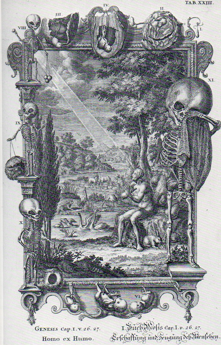
    Jean-Jacques Scheuchzer’s Physique Sacree (published 1732-1737) is an enormous, plumply illustrated thing, an extraordinarily diverse work on the Old Testament and the antique sacred and its relationship to the panoply of natural philosophy.  Its  759 illustrations are usually given overly-encrusted decorated borders by a diverse and at times bizarre selection of themes from biology, geology, astronomy, physics, chemistry, and whatever else seemed to work. It is a production of the High Baroque and high imagination, working within the very definite confines of ecclesiastical squareness and scientific roundness–and somehow the pegs all seem to fit, for Scheuchzer.

    The image that I latched onto [and which is available at 200% if you click through it]  illustrates Genesis I 26, 27:

      Baroque480

    “26: And God said, Let us make man in our image, after our likeness: and let them have dominion over the fish of the sea, and over the fowl of the air, and over the cattle, and over all the earth, and over every creeping thing that creepeth upon the earth.
    27: So God created man in his own image, in the image of God created he him; male and female created he them.”

    Indeed.  We can see the pure holly light (appreciably wide as it gets to its subject than when it started, where it is also degraded)  extending diagonally across the image to a surprised/fearful Adam, who is popped into a landscape of the newly-created.  But it is the border illustration that is most extraordinary to me–it is an 11-segment depiction of the birth process, told almost exclusively in baby skeletons.  The story begins at top-right corner, with perhaps a hint of conception, and then through  developmental stages II (embryonic) and then III/IV (taking us through the third month) and then V through VII (showing perhaps through the seventh month or so), displayed in a top- and bottom-middle display, and not in order.  I really don’t know enough of developmental anatomy to say what is depicted in images VIII through XI, except to note that–of course–they are all skeletons, and the last is weeping. 

    Spermatozoa seem to be missing in images I and II, or at least Scheuchzer didn’t make an attempt to show them at work, even though he must’ve been aware of their existence, discovered  fifty years earlier (in 1677) by Leeuwenhoeck.  But this discovery certainly didn’t get in the way of maintaining the theory and belief in the homonuclus–the tiny, preformed person carried completely within the sperm and implanted in the woman who served basically as an oven, a receptacle.  Scheuzcher believed on the other hand that the homonuclus was located in the ovaries–still part of the preformationist camp, but getting closer to elevating the importance of woman in embryological development.

     [All that said I don’t know the reason for the weeping skeleton; or, for that matter, what the things are that the two skeletons at upper left are holding.]

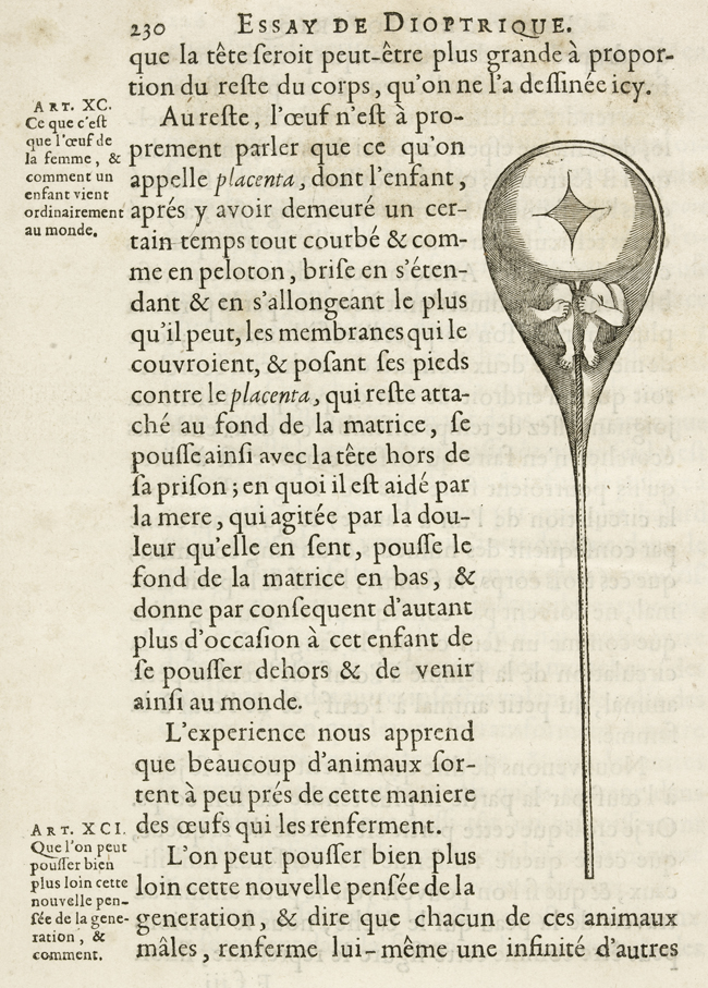
    The homunuclus, famously illustrated in Nicolas Hartsoeker’s Essay de Dioptrique in 1694: 

    Ovary Hartsoeker


  • The Very Describable Macro Color of 1930’s Floors–Well…Color, Symbolism and Swastikas in Floor

    JF Ptak Science Books   Post 1334    

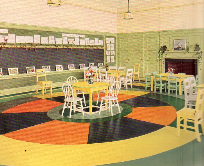
    Color floor--cvr382I remember that the floor of my grandmother’s beauty salon (in Great Barrington, Massachusetts) was a dark (gray on black?) rolled linoleum affair, not much different from the floors that you’d see (if you could see them) in black and white movies from the 1930’s.  Grandma’s floors were probably that old–my memory is from the early 1960’s and the salon was far older than that–and so they looked like you’d expect an old, shiny, kept floor to look.  Plus you’d never really see floors in those older films, anyway, so it was difficult to see even if there was a design, let alone imaging a color.

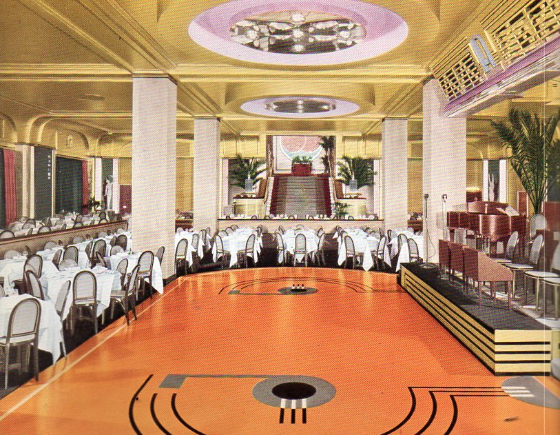
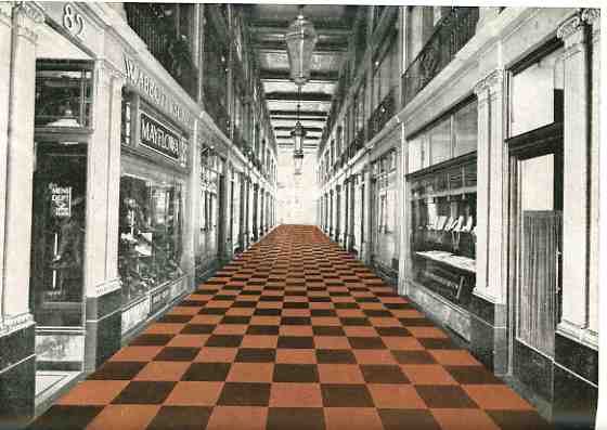
      That’s why it is so surprising to see magnificently-colored floors in catalogs such as Armstrong Cork Company’s  Better Floor for Better Business (1936) and Home Decorator’s Idea Book (1931). (Both of these booklets are available for purchase from our blog bookstore.) Color wasn’t invented after World War II–it just seems that way.  Color photographs, color home films and color motion pictures really didn’t get a popular start until then, so it might be natural to assume that the world was a bit more bland in shades of gray before then.

    Color floor--dining374
    All the same, these floors are so terrifically colorful that they look to me to be like a tiny design writ large–like a design for nightclub’s matchbook cover done on a 500 square foot canvas. 

    Color floor--kinder375
    [This is a kindergarten room, by the way.]

    Color floor--clothing store376

    000-ebay--Oct 30 rubber floor965See what I mean? These floors are beautiful in a way that escapes beauty.  I don’t particularly like them nor would I want to live on them, but they do have a certain inescapable loveliness to them that is just not beautiful.  Perhaps it is the odd juxtaposition of unexpected color. This is seen in sharper detail (left) in a post that a made (“There Was a Rubber Lady in a Rubber Room…) earlier in this blog.  Or maybe it is the unexpected combination of colors, or the unexpectedness of the colors themselves, that is the driver to this lusciousness.

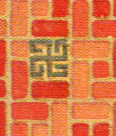
    And then there are the swastikas.

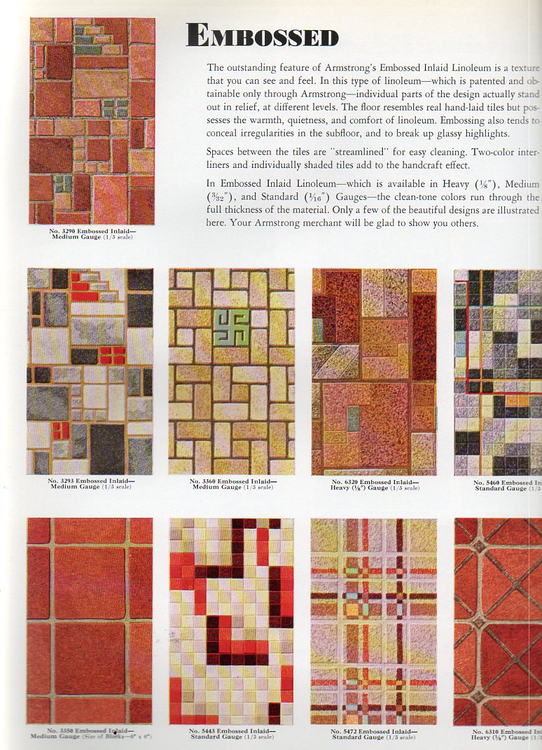
    Now the swastika is a very, very old symbol, thousands of years old, transcontinental, transoceanic, a transcendental image that was completely and forever corrupted by the National Socialist Party, a shameful symbol, a symbol turned into a hatefuil and horrible thing in just 20 years or so, overtaking two millenia of use.  And here we are, in the early- and mid-1930’s, during the time of the Nazis and Hitler and their free use of the swastika, here we are with this Armstrong firm from Lancaster, Pennsylvania, still using the swastika in design elements for their floors. 

    Color floor--swastika 377

    Color floor--swastika 378

    (Here’s one page of floor design elements from the Armstrong catalog at left; and the detail for design number three at right.)

    Armstrong was also in the heart of some country within the United States (Lancaster) that was very rich in symbolist design, but I think that this has nothing to do with anything.  I’m also not making th case for their being fascist leanings at Armstrong–I’m simply pointing out that even as late as 1938 (when another edition of this work appeared again with swastika design) that the image was still acceptable enough to have as part of a part of a floor.  It strikes me as deeply odd.

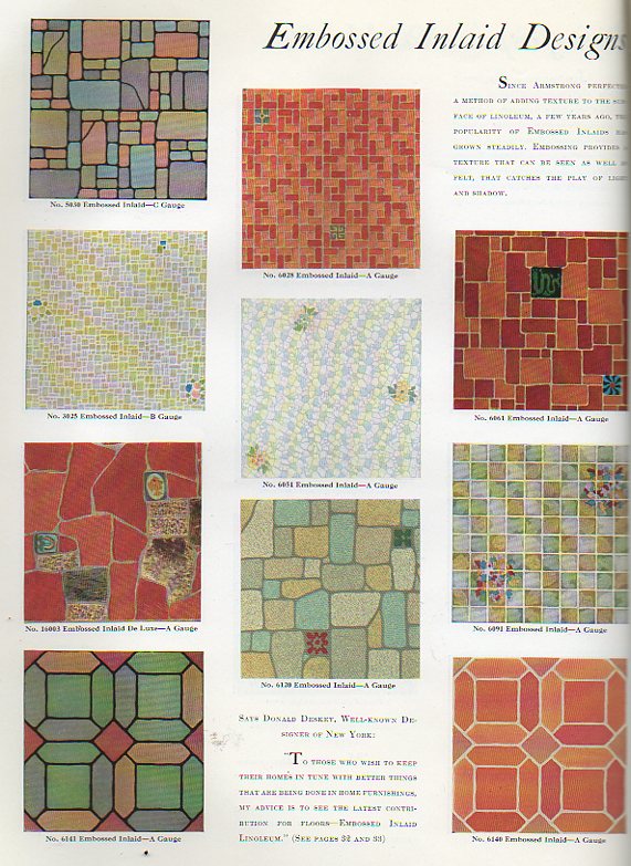
    Here’s another example from the 1936 catalog (and just to be perfectly clear I’m not highlighting the swastika part–it is offset in different colors in the originals):

    Color floor--swastika 379

    Color floor--swastika 380


    I’m not seeing Nazis in my porridge, though Madison Sqaure Garden was still getting filled up by American Nazis for their German Bund meeting in 1936–I’m just pointing out that it seems surpising that the symbol was still being used in popular design as late as it was. 


  • Reading Symbolism in Raymond Lull’s Portrait

    JF Ptak Science Books  Post 1333

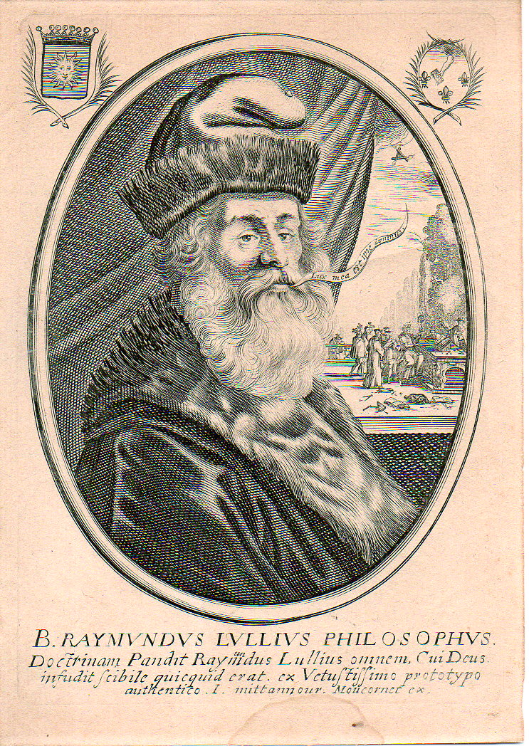
    Raymon Lull is perhaps the most famous Catalan given to the world–he is also one of the most famous people in history with the most names. (He was also known as Ramon, Raimundo and Raymond, Raimundus and Raymundus Lull, Lully, Llull, and Lullus and Lulio, among others.) Seriously though, he was a very interesting thinker who went far beyond the norm, and then some, his creativity overmatching the possibilities of the parenthetical sciences of his time, and stretching timeless logic as well as he went along.  But so it goes, as they say; he did do aggressive work and at the very least it was for the most part quite pretty-sounding.  And as he pushed up and against existing thinking it was up to that confronted thinking to push back–which sometimes happened and sometimes didn’t. He studied the law, alchemy, botany, religions, and may well have written the first novel ever to appear in Europe (at least it was the first in Catalan)–I think that you could say, overall, that he was a rationalist. 

    • The original engraving is available at the blog’s bookstore, here. 

    This engraving is one version of many that I’ve seen online, and may be the original–this is a pure guess on my part, my reasoning is so mainly because there is so much more added detail than in any other versions of the engraving.  the added bits in the corners, and of course the scene revealed by the pulled-back curtain.  The engraved lines are also very sharp, very pronounced, not like some of the other version which look a little less defined…this one is razor sharp. (The image is available for purchase from our blog bookstore.)

    Lull087

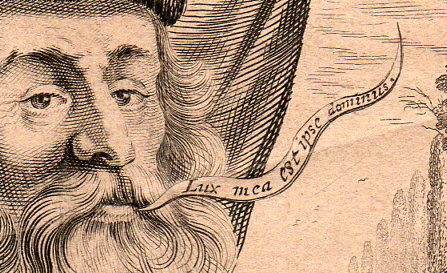
    The word balloon (and by the way I wrote a post here two years ago on the history of word balloons) coming from Lull’s mouth is Lux mea est ipse dominius “My light is that of the Lord”, a claim for divine inspiration, guidance, fortitude.  Beyond all else Lull was a Christian, and a Christian to some severe fault–he was very involved in the conversion of Muslims, and was also an (utter) expulsioist in regards to the Jews.  The Christian philosophies of Lull are clearly shown in this 17th century portrait of the man. 

    Lull371

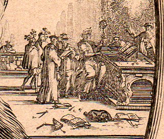
    And in the scene that is not seen in the other reproductions of this portrait online we see a small host of interesting sci-philosophical instruments cluttered around what seems to be a giant working with an astrolabe.  (This fellow is a head taller than the other people gathered around him, and he is most definitely sitting down on a high stool, making him taller still.)  We see dividers and various measuring devices, plotting instruments, and even a pair of specs, which would’ve been very uncommon in in the 13th century.  I’m happy to see a dog sleeping through the ruckus.

    In the sky in place of the sun is a triangular collection of burning candles, or they seem like candles, which continues a very old tradition of symbolizing unity, and in this case, in  a Christian theme, a god surrounded by the holy trinity… related symbols appear frequently in images depicting the Old Testament creation cycle. 

      Lull373

    Continuing this theme, if you look in the right upper corner of the engraving there is another interesting symbol–a hand issuing from a cloud with a book, sourounded by three fleur de lis.  This is in obvious reference to the balloon statement, the hand of god issuing a book, or knowledge, to the recipient (which would be the reader or Lull); the fleur de lis, a French lily, was often used in Renaissance and Baroque imaging as a representation of the holy trinity, and of purity and chastity, spirituality.  Or  perhaps it was just a flower. 

     My own interest in Lull–aside from the  great beauty in which his ideas were encapsulated and presented–is in his idea generator, and the possible influence it had on later thinkers like Leibniz who may have built on his interesting breakthrough to produce one of the earliest arithmetical calculators.  Lull’s own calculator (which I wrote a little about here) is simple and elegant, and may actually be powerful for some–it was a series of discs that when turned would relate ideas and letters and numbers which were by serendipity intended to generate unexpected ideas to think about.  For the 13th century this was a major idea, and I like it even today. 


  • What I Learned from Johnny Cash’s 1949 Report Card

    JF Ptak Science Books   Post 1181

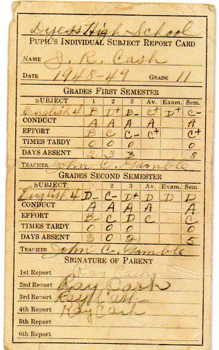
    This great relic of Americana–the report card of Johnny Cash from Dyess High School in 1949 –is the stuff of deep emotion.  It means that John R. Cash walked this (“Pupil’s Individual Subject Report Card”)  English report card home to his parents for review, the 17-year-old wondering about how they might react to his not-great grades in English and “effort”.  Or perhaps he wasn’t worried at all, perhaps he didn’t care.  He missed very few classes, and was never late.  He received straight A’s in conduct from his teacher, John C. Gramble.

    Johnny cash report card584
    [Image source: Cash, by the editors of Rolling Stone Magazine, 2007.]

    So, the young Cash, who had grown up lyrical, with music and words swimming in his head, was unmoved by “English” (which was probably more like “composition” than what we think of it today) and was not interested in trying to overcome his disinterest, overly.  Be that as it may, even though he was a D student, he was respectful of the class and teacher and classmates, always getting A’s in conduct.

    Mr Cash signed the report card each time, and I suspect that he knew exactly what was going on with J.R. in spite of the grades.

    Only six years later, in 1955, Johnny Cash had his first national hit in “Cry Cry Cry”.

    And so where was Dyess High School?

    As it turns out, Johnny Cash lived in a place in his early youth that owed its life to deep government intervention in the lives of its citizens.  The short story is that people–almost entirely farming families–who had lost everything in the Great Depression and the resulting drought were given an advance1 of money to buy a house and land and a chance to start life anew.  Ray Cash, Johnny’s father–born in 1897 in Rison, Arkansas–entered his family on the relief rolls and was one of 500 families selected  to settle a 15,000 timber-cut swath of Arkansas bottom land up in the north-east corner of Arkansas in Mississippi County, basically due north of Memphis Tennessee just this side of the border.
           
    The program brought to bear on this situation was the Federal Emergency Relief Agency (FERA), which was administrated on the national level by Harry Hopkins and in Arkansas by Alabama-born former teamster William R. Dyess.  The farms and farmland was administered through the Rural Rehabilitation program, which under Dyess’ direction in Arkansas started the “Colonization Project No. 1″ in May 1934.

    Ray Cash and family moved into House 266 on its 20 acres in 1936, one of five families selected from Cleveland County, and the same year in which Colonization Project No. 1 was incorporated as Dyess Colony.  In a short period of time construction in the new Colony included  “an administration building (and a )…town center (which)  included a community bank, beauty salon/barbershop, blacksmith shop, café, cannery, cotton gin, feedmill, furniture factory, harness shop, hospital, ice house, library, theater, newspaper (the Colony Herald), post office, printing shop, service station/garage, sorghum mill, and school. Members of the colony often performed community tasks on a cooperative basis, though the farms were worked individually.”2   
    ________
    Notes

    * “Criteria for the all-white community included that applicants be destitute from the economic crisis, come from the lowest poverty level, be of “good moral background,” and that husband and wife each have the physical ability to clear the land and farm their acreage. Each farmer would draw a subsistence advance to buy twenty to forty acres of land and one of the new five-room houses, plus a mule, a cow, groceries, and supplies until the first year’s crop came in. All were expected to pay back the advance. The town would operate as a cooperative in which seed was purchased and crops were sold communally.”Encyclopedia of Arkansas History and Culture.

    2. Encyclopedia of Arkansas History and Culture.

    Dyess had population of 2500 in 1936, now a town of 550 or so.  I cannot see any remnants of the wagon-wheel design of the farm houses that were built there in 1934/5 from Google satellite images.

    An excellent reference for the movement of families into the Mississippi River bottomlands is The final frontiers, 1880-1930: settling the southern bottomlands, by John Solomon Otto.

    And now for this musical video about Dyess: