A Daily History of Holes, Dots, Lines, Science, History, Math, Physics, Art, the Unintentional Absurd, Architecture, Maps, Data Visualization, Blank and Missing Things, and so on. |1.6 million words, 7500 images, 4.9 million hits| Press & appearances in The Times, Le Figaro, Mensa, The Economist, The Guardian, Discovery News, Slate, Le Monde, Sci American Blogs, Le Pont, and many other places… 5000+ total posts since 2008.

Category: Art History

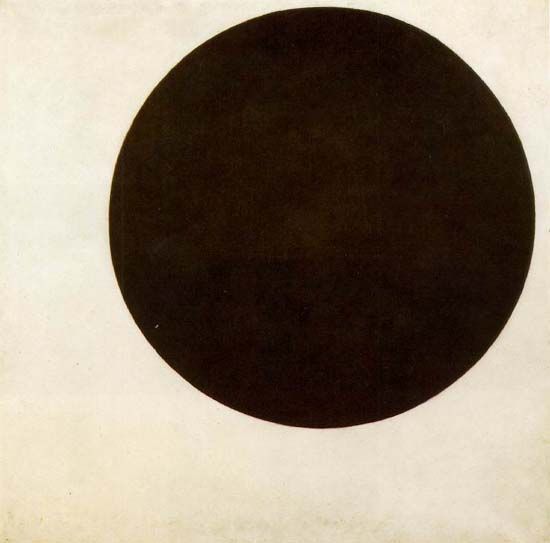
  • Suprematist Planetary Images of Very High Contrast 1837

    JF Ptak Science Books   Post 1993    Follow Me on Pinterest

    There are times when the future turns up in unexpected places–and sometimes that imagery is quite unintentional, and belongs only to the viewer in that future, looking back.  It seems to me that many of these examples belong in the history of scientific illustration

    Thomas Dick’s Celestial Scenery, or, The wonders of the planetary system displayed
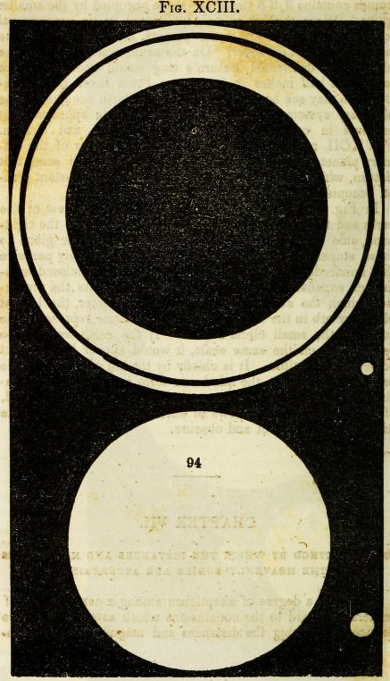
    was published by Harper & Brothers in New York in 1838 is a good example for a home of some of these flashes of future brilliance.  What we’re seeing in the pages of this chunky book–which was an influential object in the early reading of a number of people who were to become influential astronomers, one including E.E.. Barnard–are lovely, simple, and include some relatively simple images of size comparisons. The result seems to my eye to suggest Suprematist art, geometrical art that would come into being another 75 years hence or so.  (This movement was founded by the great Kazimir Malevich in the 19-teens, who said of it: “Under Suprematism I understand the primacy of pure feeling in creative art. To the Suprematist, the visual phenomena of the objective world are, in themselves, meaningless; the significant thing is feeling, as such, quite apart from the environment in which it is called forth.“) Of course the Dick images were simple comparatives and not-yet-art–but they certainly do suggests themselves as something more than what they are. The full text of the book is located at the Internet Archive, here.  (Thanks to Trevor Owens and his interesting Pinterest collection here who brought my attention to the Dick book via images of the Martian canals.)

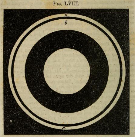
    A plan of the rings of Saturn relating their size and some of their imagined composition:

    Astronomy dick saturn
    Kazimir Malevich, Black Circle, 1915:

    Black_circle

    Comparative of the Earth to Saturn’s rings; image bottom, depicts the Sun and Jupiter

    Astronomy dick earth saturn


  • The Marcel Duchamp of 18th Century France: Jean-Jacques Lequeu

    JF Ptak Science Books  Follow Me on Pinterest

    Lequeu_portrait


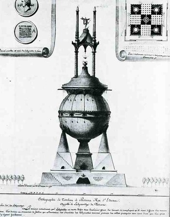
    Jean-Jacques Lequeu (1757-1825), a French architect of fabulously distanced sight, produced this breathtaking image in 1792.  The Tomb of Lars Porsena, King of Etruria (the great Etruscan king, d. ca. 500 BCE ), is just one of hundreds of works by Lequeu, a re-discovered architectural genius who worked during the same era as other visionary architects such as Etienne Boullee (1728-1799), Claude-Nicolas Ledoux (1736-1806), Louis-Jean Desprez (1743-1803), Francois Barbier (1768-1826), Charles Bernard (1765-1818), Francois-Joseph Belanger (1747-1818), and others, though these guys are the most famous.  As a matter of fact, I think, almost all of these architects were re-discovered—Boullee, perhaps the most famous of the lot, was found again not in his buildings but in his visionary drawings that he deposited with the National Library.  But Lequeu—found again in the same way–it seems had to be rescued from an even greater obscurity than the others.  He tried to expose a unity that he saw in the world, some secret sort of unity, that he saw all around him, and which was unseen by everyone else in creation—at least until the 20th century.

    Lequeu started out in a staid and brilliant way, a successful architect in his own right, and student of Scoufflot, designing ancient-inspiration buildings for the super rich.  But along came the Revolution and away went his career—he wound up a surveyor and a cartographer until his retirement in 1815, after which he enters social and historical oblivion, until he finally dies in total obscurity ten years later (or so, the date is unclear).  His post-revolutionary vision was as phenomenal as his success in selling his ideas were dismal.  Well, this is really a cheap shot—his imagination was shockingly large, enormous, his designs fantastic and beautiful, and completely unexpected, and they seemed to grow larger/loftier and more interesting as time wore away at him.

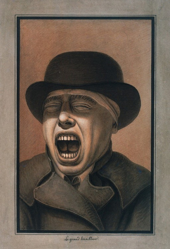
    I think that as Lequeu was cleaved away, cell by cell falling through the floorboards of his single rented room, he reached further into time and deeper into space than almost any architect of that hundred-year period.   I also think that he was very well aware of his genius being seen as pure eccentricity—his dozen or so self portraits are among the most bizarre that I’ve ever seen (before 1900).

    Bloglequewu289

    The odd thing in all of this is that in this brilliance there is still a reluctance to leave the Baroque, and this at a time when just about everyone else—beginning around 1750—was abandoning it.  So much of the work of the other visionaries mentioned earlier freed themselves of the Baroque—not entirely true, not true at all, for the unique creations of Lequeu, who (as in the Tomb of Lars Porsena) included more than a few bits of the practice even in his most incredible works. 

    Somehow Lequeu saw the Lars Porsena tomb as a 650-foot tall (!!) structure, with impossible insight and filigree.  Extraordinary. (In the upper corners of the drawing of the tomb Lequeu included a design for a coin and also the plan of the structure.  The original tomb of Lars Porsena, according to Pliny the elder in his Natural History, XXXVI, 19, 91ff, was a 15 meter high rectangular base with 90 meter sides–completely destroyed in the wars in the first century. 
    Bloglequewu288_2

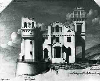
    Perhaps his most sensational creation (and one which was devoid of all Baroque influence, as it turns out) was his Meeting Place at Bellevue.  It is almost impossible to believe that it is am 18th century creation—it is as harmonious (armonia) as it is asymmetrical.  It looks deeply 20th century, and looked as far into the future as it was deeply unknown.


  • The Micro-Biological Beauty of the Plans of Catacombs

    JF
    Ptak Science Books     Post 1971

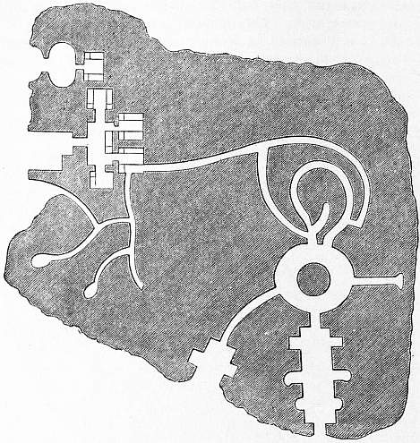
    Cemetery four[Plan of a portion of the principal storey in the Poggio Gajella]

    The plans of underground cities, of catacombs and cemeteries, share a certain biological appeal in their design with the plans of Medieval cities, or at least they seem so to me.  Removed from their context and placed in an undifferentiated environment, the plans look very much like biological structures, and art.  As maps of cities of the dead it is somewhat ironic that their geological chrysalis seem to indicate a biological structure.

    And sometimes the images aren’t so reminiscent of micro-structures as they are macro-structures, as in the case above. If you squint just a little and look at the Poggio Gajella you can visualize a cross section of the upper torso of a body, including an open mouth, with nasal cavity, throat, digestive system, and even intestines and egress routes–a picture of a person in the city of the dead.

    The images below illustrating this ragged point are by Seroux d’Agincourt, (1730-1814), and appear in his  Histoire de l’art par les monuments, depuis sa décadence au IVme siècle jusqu’ à son renouvellement au XVIme (Paris, 1825). The images illustrate the article “catacombs” from  the Encyclopedia Britannica, in the great/standard 11th edition, from Project Gutenberg:


  • The Non-Anatomy of Tears, the “Excrementrious Humiditie of the Brayne”

    JF Ptak Science Books  Post 1969 


    Follow Me on Pinterest

    “Tears are the trails of plenty and of want, both of which are sometimes the same.“–Not from Ambrose Bierce’s Devils Dictionary.

    “Let one rejoice in smiles, the other in tears;
    Let the same labour or pain be the office of both….”-Robert Burton, Anatomy of Melancholy

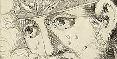
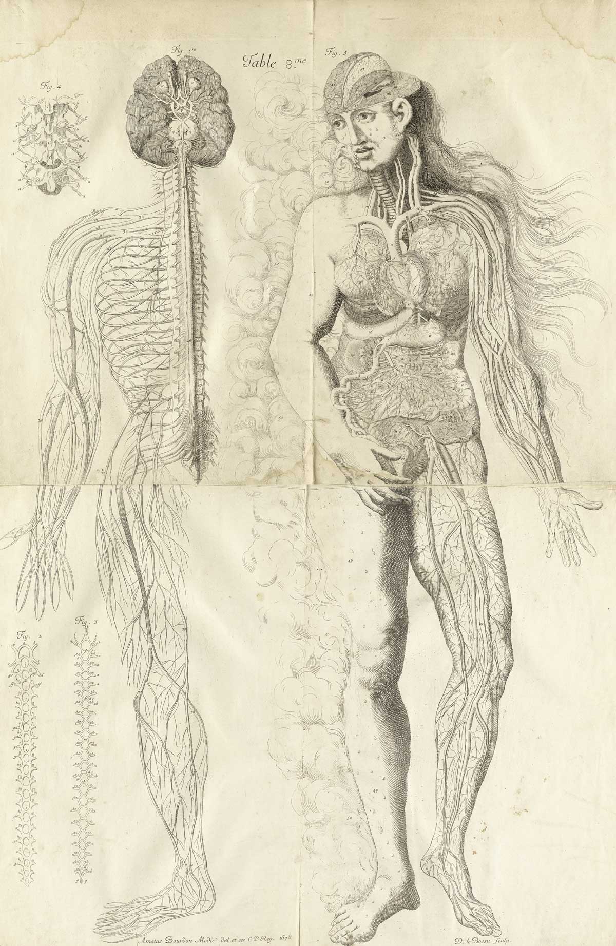
    The image above is a detail from one of the sixteen engraved images found in Ame Bourdon’s fabulous anatomy,  Nouvelles tables anatomiques (printed in Cambray and also in Pair by Laurens d’Houry in 1678). (A good description is found for this work, as well as the rest of the illustrations in their entirety, from the National Library of Medicine, the source for this diversion). 

    I’m not sure why the subject here is crying; and I’m also feeling that I’ve never seen an example of a crying figure in any antiquarian anatomy book before this one.  I remember from another;project that eyelids and tears were of some considerable interest later on, finding no less than 25 books dedicated to the subject printed in the period 1825-1895 or thereabouts.  (That bit of research was undertaken doing some background on a 19th c aboriginal torture of staking a victim to the high desert ground and cutting their eyelids off so that the sun would cause blindness from constant exposure).  And I don’t know when the eyelid is given its first anatomical drawing/consideration, displayed on its own and flattened out for inspection.  And it would be interesting to know when the first extended modern scientific appraisal of tears was made. On the offhand I thought that Burton in his absolutely magnificent and very difficult book, The Anatomy of Melancholy, might have something to say about it, but it doesn’t–as a matter of point, it seems that the word ‘tear/s” appears less than ten times through the whole work, which I find a little surprising. 

    No matter.  I just wanted this to be a quick diversion to consider if Bourdon really did intend to include tears for his model, or if the engraver took a little liberty and added some emotional elements to the image.  It is certainly plausible, as human anatomical specimens had been presented in any number of different poses and posed with different items and in tremendously wide spectrum of emotion expression that crying would be but a small step to take for exhibition. There also seems to be perhaps no connection to any sort of physiology of crying–the subject just looks like someone with tears on their face, unassociated with any sort of muscle movement around the eyes, or glands or ducts or whatever. (Charles Darwin described a usual contraction of the muscles around the eyes when the subject cried, as he published in his Expression of Emotions in Man and Animals (1872)). The tears may just be Baroque ornamentation.

    On the other hand, there may be a tenuous connection in the engraving to the tears and the sectioned brain. It wasn’t too much earlier in the history of crying that it was thought that tears were a cathartic-purgative product of the brain, which is an idea that goes back to Hippocrates and his heirs and which held sway for more than a thousand years. 

    As Tom Lutz writes in his wonder Crying, the Natural & Cultural History of Tears (W.W. Norton, 1999) the English physician Timothy Bright poetically described tears in 1586 as “the excrementious humiditie of the brayne” (page 73), which were the “brai’s thinnest and most liquide exrement”.  The idea of catharsis began to wane by the 17th century, and the four humours were identified more as a belief system than a medical reality, but the idea of the cathartic brain and its release of tears may have hung on to be included in Bordon. 

     But it does seem rare, crying does, in the annals of the history of anatomy–much less so in the history of art books that explore emotions and facial expression (like Chalres Le Brun (1616-1690) in his Méthode pour apprendre à dessiner les passions (1698)). At the end of the day, these tears may well just have been a sly way of the engraver to exercise a little creativity.  

    Bourdon-t08t08a full copy woman


  • Recording the Commonplace from the Viewpoint of a Child, 1868

    JF Ptak Science Books   Post 1966     Part of the series on Antique Children’s Art


    Follow Me on Pinterest

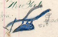
    Manuscript--blank book022
    It is difficult to find children’s art from the 19th century–original work, printed work, published work.  Very difficult–perhaps even more so for the published work than the manuscript.  It is easy to understand why:  first, the children would need access to paper and pencil or pen and ink–items that had some cost, that were not inexpensive, not available to the vast majority of children. Their work was ephemeral, produced on slate, or in horn books, or in charcoal on a wall, or in dust.  Then, if the children did manage to record their creativity, then it would have to survive a generation of possessionship within their own lifetimes–to survive from the first part of the 19th century, the paperwork would have to survive five generations or more, 150+ years of house cleanings.  Tough odds.

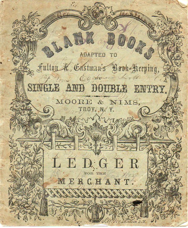
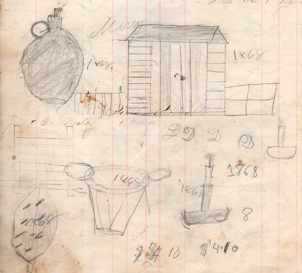
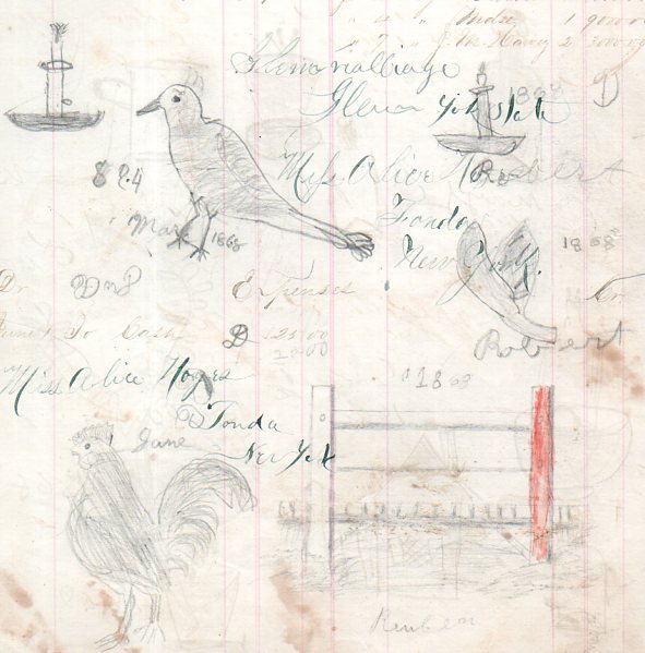
    Manuscript--blank book017One way that this artwork survives is accidentally, as in the case below. Scribbles, notes, sketches, finding their way into ledgers and notebooks and works for children–the book closed, placed on a shelf, and perhaps forgotten. Put away in a trunk, saved in an attic, stored.  And then, finally, found again after a century or two.  Opened, the book of seeming nothingness is loaded with, well, everything.  In this glorious example, ironically titled Blank Books, the books are anything but, now.  This notebook was intended as a Ledger for the Merchant, and there was a bit of that done…but at some point, the ledger became a practice book, a tablet. And from the looks of it, from the scribbled date in practice signatures over the ledger columns, that change took place around 1868.

    And in the blank spaces of the ledger and notations appear all sorts of everyday things, the sort of stuff that might be invisible to an adult because we take it for granted–perhaps not so with children, who might be fascinated by these objects because they have only been cognizant human beings for a few years.  (It never fails to amaze me when I look at the photographs that our daughters made when they were three or four, wandering–and I could write “wondering”–around the house with a digicam.  The images they recorded were things that were mostly part of the background hum of everyday life for me, except that their pictures were made at their eye level and gave a new meaning to these objects, for me.)  What the child/children recorded in this dead ledger were common objects in 1868.  Perhaps they are of a forgotten commonness.  Whatever the case, it gives these objects a renewed interest to the observer of the future and our present simply because a child saw fit to draw them in the limited space in which they could draw. 

    Manuscript--blank book019

    Manuscript--blank book020

    ·Posted by :

    ·in:

    — —

  • A Note on the History of the Blot: Writing on Clouds, 1785-1921

    JF Ptak Science Books    Post 1963

    Sometime we see a Cloud that’s dragonish,
    A Vapour sometime like a Bear, or Lion,
    A tower’d citadel, a pendant Rock,
    A forked Mountain, or Promontory,
    With Trees upon’t, that nod unto the World
    And mock our Eyes with Air.–Anthony and Cleopatra (Act IV Scene II) from the title page of Cozens’ A New Method…, 1785

    This blog maintains a longish thread on the History of Dots, but no where in there yet is any appreciation or discussion of the blot (the “blot” being “the unhappy and rejected love of the Dot” not according to Ambrose Bierce). 

    Cloud-writing is difficult work, mostly because it involves making the invisible visible in an imaginary landscape. This is I think exactly what Alexander Cozens (1717-1786) had in mind when he wrote about using ink blots for inspiration in preparing a landscape, writing about it in  his A New Method of assisting the
    Invention in Drawing Original Compositions of
    Landscape
    .  In 1785. He had the idea in mind and was using it in lessons for decades before that, but the work only found its way into print at the end of the century, a year before his death–and more than a century before such thoughts began to enter the early archaeology of the social meme. In a way he wrote about implementing a sort of simple calculus of discovery, of seeing the impression of possibilities in, well, anything, but particularly in the memory and sensation of forms. 

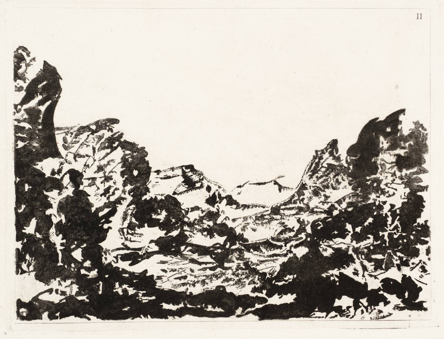
    These weren’t literally what we would think of today as ink blots–they were suggestive forms that sort of looked like blots from which more determined and refined images could be made.  He suggested that landscapes be generated as instinctively as possible, with  blots being used to arouse memory and curiosity and to be incorporated into or suggestive of natural forms in constructing the landscape. [Although the word “blot” reaches back into the 14th century according to the OED, the version that Cozens had in mind I think was the verb “blot”, which appears around 1440, and which means “to spot or stain with ink or other discolouring liquid or matter; to blur” (emphasis mine). It seems to me that the blot art that Cozens had in mind was both a blurring and a refining method, something that could release the artist and allow the mind to roam freely around the blot’s inspiration and the artist’s landscape memory. as Simon Schama says about the blot in Landscape and Memory, “there blots were deliberately random impressions meant to express, rather than to slavishly outline, the natural heaping of rock forms.  The impulsiveness and spontaneity of their production served to reinforce the new idea…that mountains were dynamic, even turbulent things…” (page 461).]

    Cozens was working on imagination and discovery, a way to make an improvisation in art, a riff on whatever the ink blot might suggest to the viewer.  On page seven of his pamphlet he describes The Blot:

    ‘A true blot is an assemblage of dark shapes or masses made
    with ink upon a piece of paper, and likewise of light ones produced by
    the paper being left blank. All the shapes are rude and unmeaning, as
    they are formed with the swiftest hand. But at the same time there
    appears a general disposition of these masses, producing one
    comprehensive form, which may be conceived and purposedly intended
    before the blot is begun. This general form will exhibit some kind of
    subject, and this is all that should be done designedly’ (p.7, from The Tate description),

    • Cozens blot[An example of Cozens’ work with the blot, source: the Tate http://www.tate.org.uk/art/artworks/cozens-plate-11-t03179]

     In a way it Cozens reminds me of Leonardo’s cracks and shadows:

    “…if you look upon an old wall covered with dirt, or the odd
    appearance of some streaked stones, you may discover several things like
    landscapes, battles, clouds, uncommon attitudes, humerous faces,
    draperies, &c. Out of this confused mass of objects, the mind will
    be furnished with abundance of designs and subjects perfectly new”.–Leonardo Treatise on Painting (in the English translation published in 1721), pp 5-6

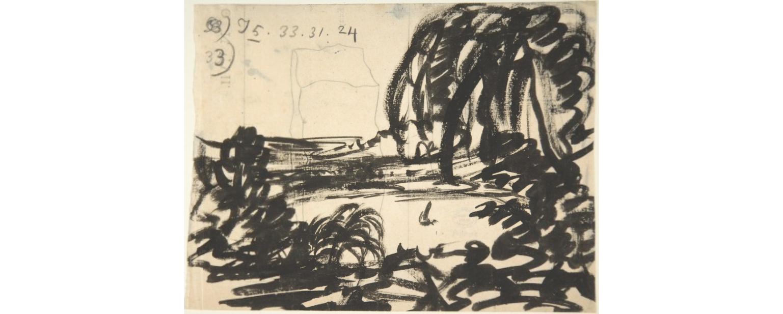
    Another example from the Metropolitan Museum of Art of Cozens’ “A Blot-Lake with Boat, Surrounded by Trees”:

    Cozens blot art lake
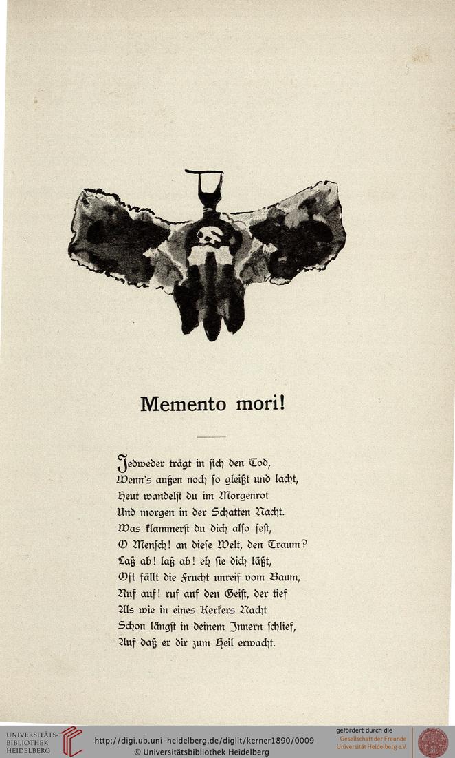
    Cozens worked for insight, for “the art of seeing properly”, for surprise, the discovery of forms. IT was an extraordinary work, especially given its time, ten and more decades and more away from the work of Redon and ernst and the rest of the suggestive painters, and even seven decades out from Courbet.  It was slightly closer in time to the quizzical work of Justinus Kerner, whose Kleksographien of 1890 used ink blots in a parlor-game fashion for his readers to fashion stories and narratives with. (A full text with illustrations of the 1890 edition of the work is found here, in the digital collections of the University of Heidelberg).

    An example of Kerner’s work:

    Kerner i,age

    And well in advance of Hermann  Rorschach’s 1921 book Psychodiagnostik, which employed the use of ink blots to help him diagnose schizophrenia, the predictive and diagnostic aspect of the idea coming in 1939, not as a result of Rorschach’s doing). 

    What these blots might all have in common was their pre-modern earliness. their anticipation of something that would become a standard framework in the decades–or centuries–to come. 

    ·Posted by :

    ·in:

    —

  • The Solids in Bellini (?) Is the Blankness a Heritage of Uccello or Bartleby?

    JF Ptak Science Books   Post 1943 (Part of the series on the History of Blank, Empty and Missing Things.)
    Follow Me on Pinterest 

    “Where is abstract without solids, I ask you?” — William Gaddis, on the solids in Uccello, The Recognitions, 1955

    Actually, I think that there’s plenty of abstract without solids, so long as you’ve seen solids before.

    I’ve returned to a slightly recurrent theme in this blog dealing with the great Paolo Uccello (1397-1475) and his study of perspective–but most directly as he was observed by William Gaddis in his Great American Novel The Recognitions.  (I am forever grateful to my brilliant Patti Digh for really hooking me into Gaddis so many years ago–Patti was long intrigued by Gaddis and wrote her UVa master dissertation on his Big Book. Gaddis’ book can be found here.) Among other things Uccello is recognized as being one of the greatest and among the earliest artist to re-discover the science of perspective, and was throughout his life a passionate student and practioner. 
    Blogsan_romano[Much of Uccello’s work can be found at Paolo Uccello Complete Works website, here.]

    “Painting is exquisite as the punishment for the thinker.”–William Gaddis, The Recognitions

     The “solids’ recognized by Gaddis (and not really
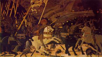
    discussed, and mentioned only twice in the book I believe) are incredible to me.  Looking at his painting Battle of San Romano 
    (1457) we see Perspective in her place; but when we look at, say, the rumps
    of the horses, we see almost no detail, just a mass of color, a solid,
    with spectacular plainness. What in the world was he thinking?  He could
    certainly have painted the horse and the other solids with texture and
    detail, but he didn’t, and to me it seems antithetical to the painting. 
    What in the name of all motherly things was he thinking?  And who else
    on earth was using such huge amounts of plain solids in their
    paintings?  I’m not aware that anyone else was, and I am relatively
    clueless as to why he did it, abandoning detail in order to raise awareness of the surrounding parts of the painting, or perhaps heightening  a sense of the not-yet-existent abstract, or drawing attention to the perspectival aspect of the work?
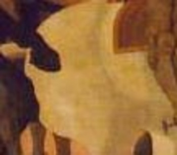
     

    Blogsan_romano_rump[A detail of the missing detail, above.]

    But the solids are not just limited to Uccello, though they may have appeared there first, especially as the “exhibited” variety of this thinking. Jacopo Bellini (ca. 1400-ca. 1470) was a contemporary, living pretty much during the same period of time as Uccello, and who was responsible as much as anyone else for introducing oils in painting and establishing the Venetian style.  He was a brilliant artist, the teacher of Mantegna, ran a fabulous studio, and was the father of two great artists. (One son, Giovanni, was a highly regarded artist who was also the teacher of Girgione and Titian.) 

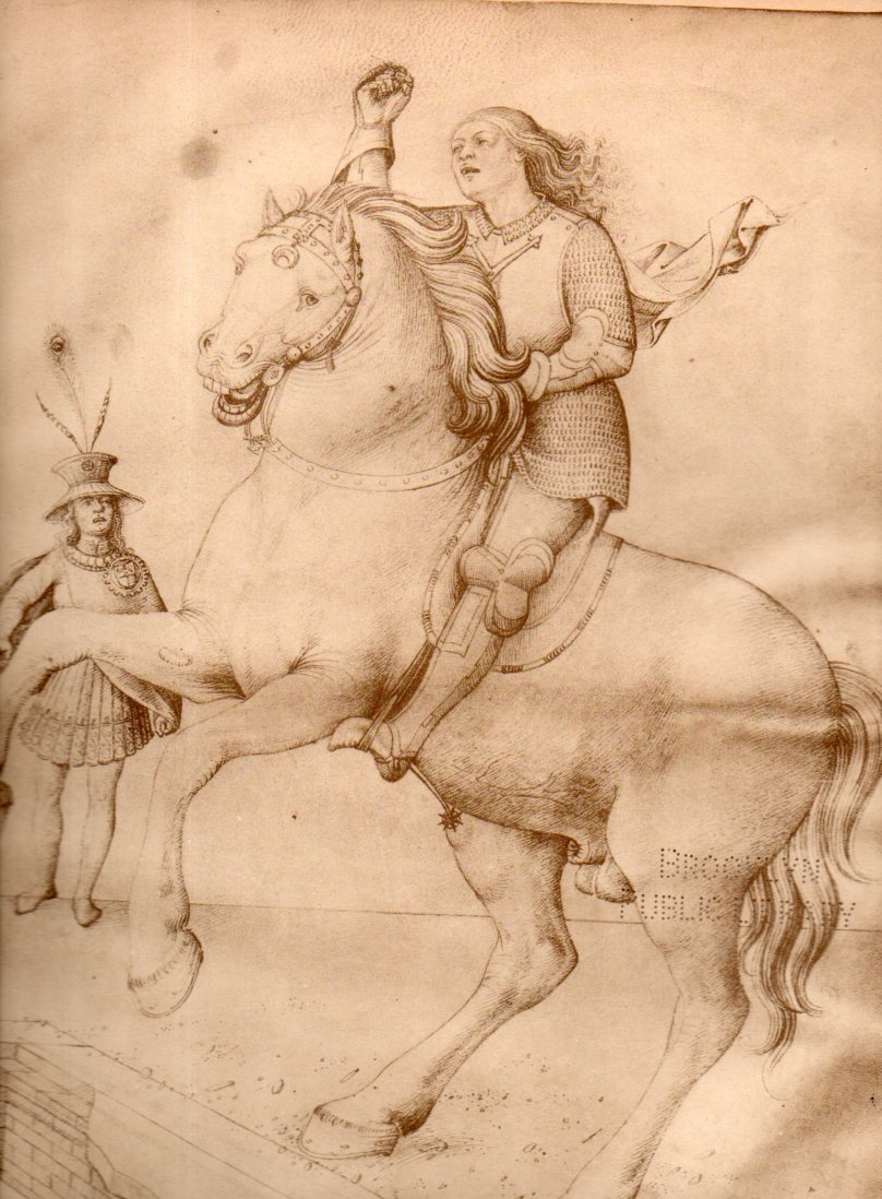
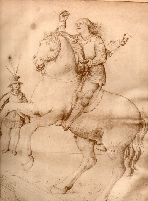
    In looking through two volumes of Jacopo’s drawings, I was struck by the number of times that horses and other objects appeared without detail, as solid solids, or mostly solid, quite outside the way in which these things were painted in the 15th century. Pacing though the books flipping through the open pages is like looking at a pop-up book in reverse–each set of pages opened are like looking into, looking through, the book, into space.  They are collections of perspective. And they are populated by those other solids, which was surprising.

    His horses appear very much like those in Uccello–except of course that these images were personal, workbooks for the artist, idea-machines and memory devices.  There was plenty of detail in other aspects of these drawings, but the lack of the detail int he Uccellian manner really struck me.

    Christiane L. Joost-Gaugier’s “Jacopo Bellini’s Interest in Perspective and its Iconographical Significance” found in  Zeitschrift fuer Kunstgeschichte  (1975)
    makes a very learned and eloquent case for the overwhelming interest
    that Belinni had in the study of perspective–not to the exclusion of
    all other things, because there were still patrons to be satisfied and
    religious and triumphal scenes that needed to be  painted–and
    concentrated on that interpretation focusing on Bellini’s stylebooks. 
    (Most of Bellini’s output has been lost, but there are two volumes of
    manuscript studies that have survived.)

    “Though
    many of Jacopo Bellini’s drawings are reminiscent of model-book notions
    in that they illustrate a variety of suggestions for the representation
    of traditional themes – for example Flagellations, Adorations, Davids,
    and animals -they are, taken as a whole, entirely different from model
    book drawings. Jacopo rarely concentrated on a subject for the sake of
    its thematic content. Almost never does a bald statement of fact appear
    to describe, for example, a biblical event. Rather than focusing on the
    event itself, Jacopo’s compositions characteristically are concerned
    with other things. In the vast majority of cases the subject is set
    within the context of a variety of architectural motifs or in that of an
    extensive naturalistic world. It would appear that for Jacopo Bellini
    biblical subject matter was a justification for his participation in a
    variety of other new interests. Primary among these was the special
    attention given to perspective…”
    No mention of course of the Uccello horses.  And perhaps they’re really not there there, but it certainly looks like they are, at least to me.  They might not have been there for Gaddis, either, as Bellini doesn’t show up in the book, Gaddis thinking more about Uccello, and then even more so of Hieronymous Bosch, Hugo van der Goes, and Hans Memling.

    And here it is, Bellini’s solids, an example:
    Solids bellini913
    There are others as well, examples of what, I am not sure–fantastic visions into blankness and into the future of what painting would become 450 years hence.

    Perhaps they were just place-keepers, to be filled-in as neededm just a shrt-hand expression of a horse rather than a transcendental imperative.  After all, Bellini knew horse muscles, and decided in his workbooks that he just didn’t need to draw them, or that in the sense of Bartleby the scrivener that he’d prefer not to. 

    Notes:

  • The Most Beautiful Perspective Drawings of the Baroque?

    JF Ptak Science Books  Quick Post

    Follow Me on Pinterest

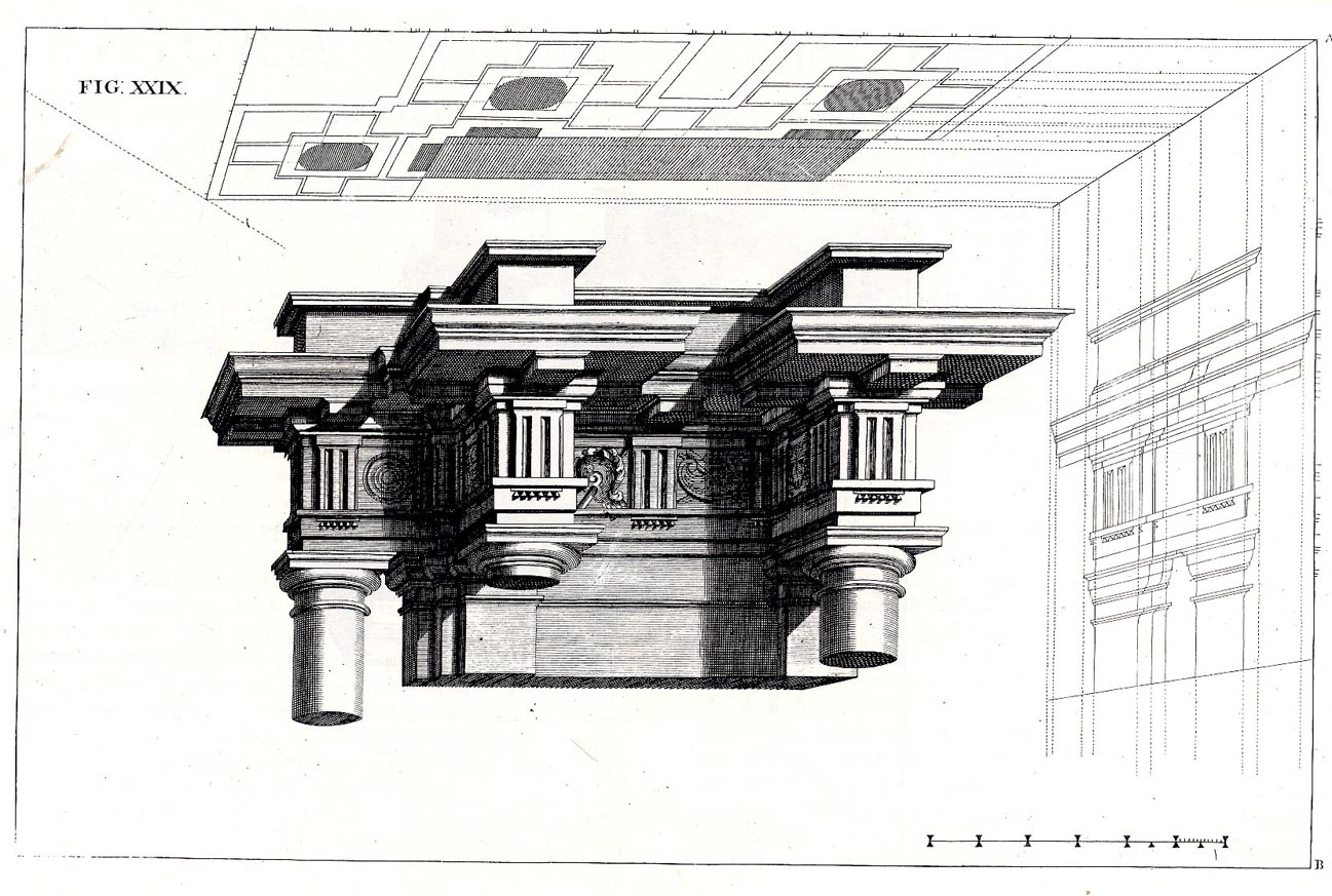
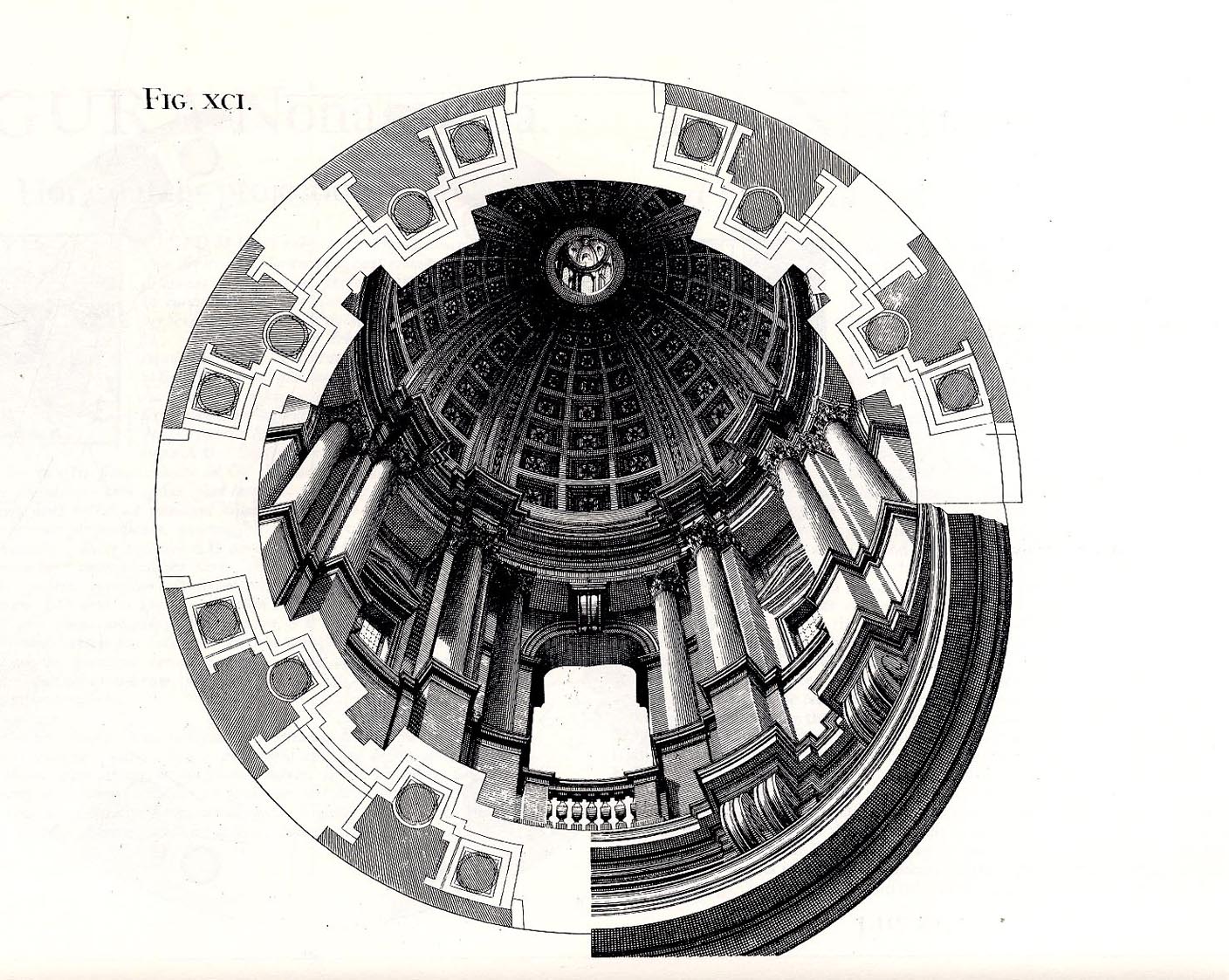
     The fantastic Jesuit Andrea Pozzo published results of his researches on perspective in his Perspectiva pictorum et architectoru (1693),
    explaining how he was able to compellingly, unbelievably  represent
    three-dimensional images on two-dimensional spaces, this image showing
    plan and projection and profile, effectively giving you a
    three-dimensional cross section of the architectural element…and having them seemingly float in space. His work is just absolutely gorgeous. 

    Pozzo 7


    Pozo
    Pozo 2


  • Fabulist Images from an Accomplished Genre-ist

    JF Ptak Science Books  Quick Post

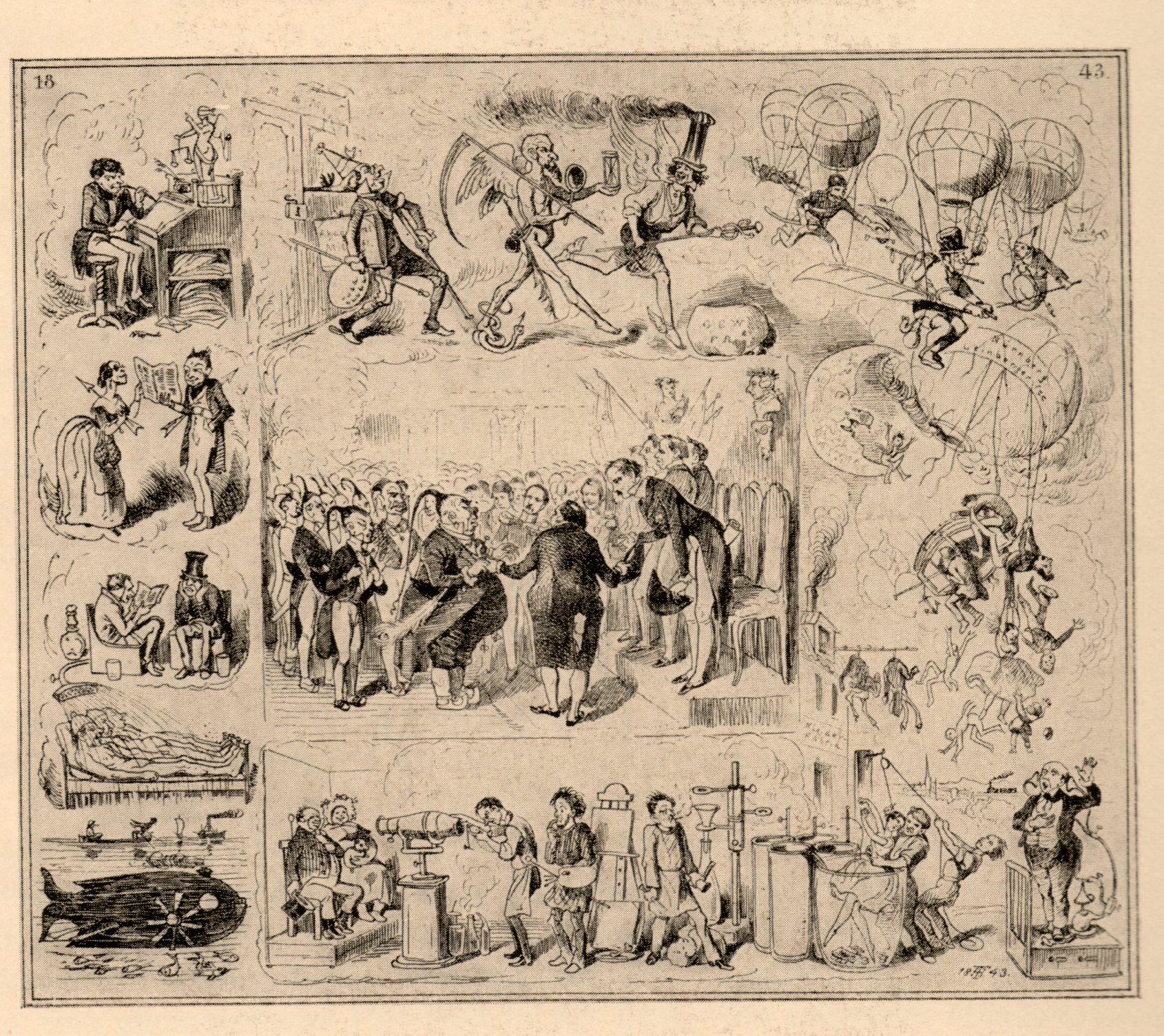
    I stumbled upon these very inventive, peep-into-the-future of  imagination images by Theodor Hosemann in journal Exlibris Buchkunst (for the year 1910).  Hosemann’s (1807-1875) name came into a blurry recognition as a leading genre painter and very busy illustrator in mid-century Germany, but certainly not for these images, which remind me very much of J.J. Grandville, one of the leading imagist illustrators of the 19th century.  (Grandville has been a subject in this blog quite often; for example, see here.)

    Hosemann908
    The originals were completed in 1847 and depict some of the trials demanded of future vision, looking into the year 1947. I particularly like the steam-driven horse-mobiles and the steaming-hatted Mercury laughingly outrunning a grimaced Time. 


  • More Outhouse Book Reviews: British Privy Statement

    JF Ptak Science Books  Quick Post   [Part of the Daily Dose from Dr. Odd series]

    Follow Me on Pinterest


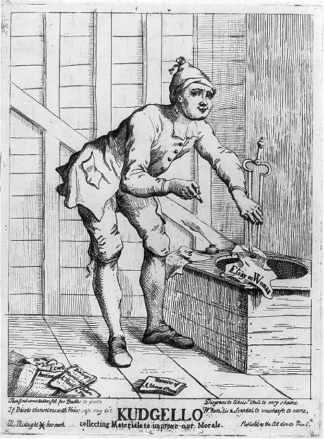
    Just two days ago there appeared in this blog a bit on an image I had never seen before–dogs acting as biological book reviewers, doing with books one of the things dogs do best. And then, this, (“Kudgello collecting materials to improve our morals”) printed around 1766 and another scatological review of books, this based on morals and highly scented books of a sexual nature, all seemingly removed with fire tongs from the wastebucket of an outdoor privy.

    Outhouse books
    {Source: the Library of Congress]  

    The books on the floor, the rescued books, include Dialogue
    … Married Lady … A Maid, Aretine
    (Mansfield, William Murray, Earl of, 1705-1793), Sodom, a play, and Memoirs of a woman of pleasure (Cleland, John, 1709-1789)

    The verse at bottom includes: “Thou Grub street author, fit for Bawds to
    quote / If Bawds themselves with Honor safe may do’t / Disgrace to
    libels! Foil to very shame / Whom ’tis a Scandal to vouchsafe to name.” Also: “M. Midnight * her mark ; Publish’d as the Act directs, Price 6d.”

    Of course the principal interest here is what the semi-smug Kudgello is hoisting from the pit, Essay on Woman, which was written by Thomas Potter in about 1755 with the assistance of John Wilkes This was a take-off of Alexander Pope’s Essay on Man, though without the intelligence, art, insight or writing ability. I’ve included this image in the blog because it is so unexpected–and that it comes fast on the heals of a similarly-unexpected scatological book review found only 48 hours earlier.