A Daily History of Holes, Dots, Lines, Science, History, Math, Physics, Art, the Unintentional Absurd, Architecture, Maps, Data Visualization, Blank and Missing Things, and so on. |1.6 million words, 7500 images, 4.9 million hits| Press & appearances in The Times, Le Figaro, Mensa, The Economist, The Guardian, Discovery News, Slate, Le Monde, Sci American Blogs, Le Pont, and many other places… 5000+ total posts since 2008.

Category: Art History

  • Allegory, Metaphor, or Nothing? Touching Books, 1435

    JF Ptak Science Books  quick post

    Reading means approaching something that is just coming into being. –Italo Calvin (1979)
    Follow Me on Pinterest


    Van der Weyden  virgin child det
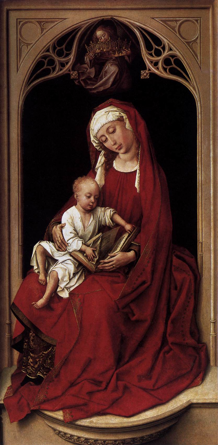
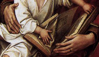
    What is it exactly that the Christ child is doing in this painting (ca. 1435) by Rogier van der Weyden?  I don’t think he’s reading, and there are some who seem in anti-reading–tearing out pages of the book, which is supposed to be the Old Testament, an allegory for pointing the way to the newness of the Bible in the New Testament. 

    To me he looks like just any other baby handling a book–not tearing, but just figuring out how the book functions, how to make it work, with fat-fisted baby hands. Perhaps the baby was looking into the past and the OT and not seeing the future in it in the NT.  But even in an era of high symbolism and metaphor, perhaps this is just a baby playing with a book.

    Van der Weyden  virgin child


    ·Posted by :

    ·in:


  • The Earliest Images of a Giant Attacking NYC?

    JF Ptak Science Books   Post 1950

    Mccay new york951
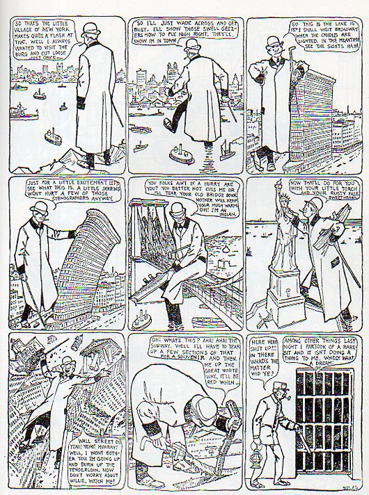
    The revolutionary comic strip generator Winsor McCay had a great 12 months in 1904/1905.  McCay may have been the Einstein of his field, and his
    work I think may still be the standard bearer for high excellence and
    creativity.  It was in 1904 that he began his Dreams of a Rarebit Fiend, which seems to have also launched the main character for the creation of his crowning masterpiece of the medium, Little Nemo in Slumberland, which would premier in 1905. (McCay’s work was appearing in two different newspapers in New York in 19041, forcing him to contractually sign his work for Rarebit as “Silas”).  
    Nothing had really quite been seen like that before, two newspaper
    strips that were filled with vision and elegance and weirdness and the
    bizarre, beautiful stories illustrated on one sheet of paper, of great
    imagination and a wide stretch of subversiveness. They so captivated the
    readers of the time that McCay went off on illustrative lecture
    circuits, found movie (in their relative infancy) versions of his work,
    and performed in vaudeville venues along with Charlie Chaplin and W.C. Fields.

    Mccay new york952
    What is different in Rarebit from McCay’s other work seems to be its new material from strip to strip–there’s no recurring characters–unlike Nemo, which has storylines that continue for periods of weeks–and there is a great reliance on message than in the usually-beautiful artwork that is found in Little Nemo. Rarebit tells a social story, and is capable of satirizing political and other issues; this is almost never the case in Little Nemo. 

    Mccay new york950
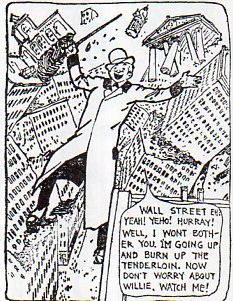
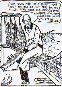
    There’s also the appearance of giants in –this one, in particular, we see a New York City stomper of varying heights. The giant seems tallest when standing on the New Jersey palisades; when he gets to Daniel Burnham’s Beaux-Arts  Flatiron/Fuller building–which had just been completed a few years before this strip–he rises above it by about 1/4, making him about 400′ tall.  When he gets to the Statue of Liberty, which is about 305′ from ground to the base of the torch, making the giant somewhat shorter than earlier, tough he seems his mightiest when sitting on the center span of the Brooklyn Bridge, this portrayal making him seem considerably taller than the earlier 400′, as the height of the bridge from tower to river is about 276′).    I’m not altogether sure of how early NYC-attacking giants come in in the literature, though there are plenty of other appearances of giants in the history of myth and literature (including the Cyclops, Eoclesia, Paul Bunyan, Fatna/Fanolt, Gargantua, Goliath, Orin, the Kraken, Rukh, Zeus, and so on, all of whom come before our Wall-Street-Wrecking giant rarebit fiend. (I wrote earlier in this blog on an Alphabet of Giants, here).  There is an 11-minute movie (The Pet, 1921) by McCay featuring a city-attacking giant, which may actually be the first movie featuring a gigantic-anything distributing mayhem on a city:

    Its unclear to me why a person should have nightmares from the seasoned
    cheese slathered toast that it is rarebit–it seems fairly innocuous,
    unless of course it is weirdly seasoned or the cheese is bad.  But this
    is Cartoonlandia, which means anything is possible.

    Notes

    1.  The strip ran from September 1904 to 1911; it appeared in different papers and under different title for a few years from 1911-1913, and then once again revived under a different name in bits and spurts from 1923 to 1925. 


  • Is the Mona Lisa Smile Nothing?

    JF Ptak Science Books   Quick Post
    Follow Me on Pinterest 

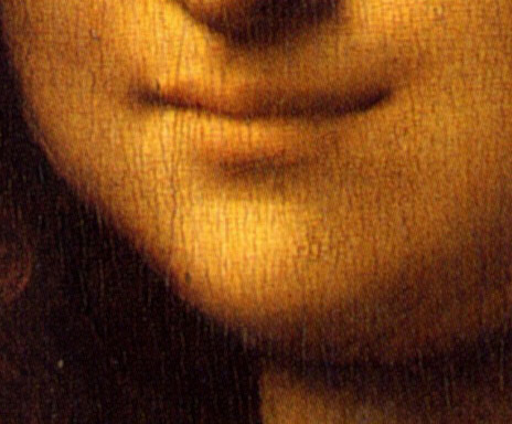
    It is said that the smile of the Mona Lisa says everything to everyone, but in saying all of that so loudly in such a quiet way, is it possible that the smile is saying noting?  That in the vast encyclopedia of emotion that this smile is said to contain, is there really no “there” there?

    Mona_Lisa smile
    It has been pointed out by many that while the male figures in Leonardo’s work have a great diversity, the female figures seem not to, that there is a definite overlapping consistency of charm and image from one figure to the next.  The young Leonardo took his time with la Gioconda1, in a way making the painting his own in spite of the person for whom the work was painted.  Perhaps he did more than that, perhaps he developed the Mona Lisa within an existing framework, and then continued that practice in his painting over the years. 

    It is intriguing, in its way, to think of her like this, a simple solution under the great enigma.  But I think it is probably wrongheaded, and that at base those other folks writing about the sameness in the female figures are incorrect.  Though there is something to be said about a continuing fascination in Leonardo with that smile. 

    So, I think thinking of Leonardo’s women as more-or-less invariant and their smiles tending towards one another, establishing the Mona Lisa’s smile as the apotheosis of the symbol of some sort of glorified, unified, aspect of women might make for an interesting sci-fi adventure, but I believe it doesn’t exist in the real world–or in mine, anyway.  That smile is not nothing. 

    Notes

    1. Like many paintings, this one is known by a number of names: La Gioconda or La Joconde, or Portrait of Lisa Gherardini, wife of Francesco del Giocondo, or Mona Lisa, and so on.


  • Renaissance Fire Eyes and Solar Faces

    JF Ptak Science Books   Quick Post 

    Follow Me on Pinterest

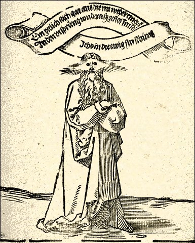
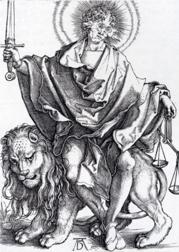
    Fire in the eyes unmask the smoke of the heart–not Ambrose Bierce


    Flaming eyes

    These interesting images of searing eyes, of stars in the eyes, solar eyes, of the universe in the head, come from Albrecht Durer (1471 – 1528) and maybe-Durer, respectively.  The top image is very shocking and is attributed to Durer though it is not signed by him.  Die Sonne der Gerechtigkeit (Sol Iustitiae) was printed in 1499 in Ulm (source here), and is part of a larger work; the floating moebius-like ribbon reads “Everything that goes
    out now re-enters the source from which it flowed. I am Eternal
    Providence.”  With eyes and a head like that, I can imagine the statement to approach the truth.

    The copperplate engraving below (and this definitely by Durer) was printed between 1499-1501 and is known as Sol Justitiae; or The Judge; not necessary providential per se, but as a representative of truth or justice, it comes close to being the Great Determiner.  In any event, they are very strong images.  See HERE for a listing of Durer engravings.


    Flaming eyes durer

    ·Posted by :

    ·in:


  • The History of Want: Ads in 1871

    JF Ptak Science Books  Post 1944

    Want ads corn horizon928

    Want ads corn horizon927
    In the long history of People Wanting Things, it has only been in the past few centuries where human beings were able to see the possibilities of their wants, or needs, displayed in print in the forms of advertisements in newspapers and magazines.  For thousands of years previously the wants were visceral and obvious–certainly the physical part of stuff that wasn’t exactly needed was not on display in any format, their descriptions passed by word of mouth–at least for the vast unwashed and working classes who could neither afford the newspapers or the goods for sale, as these were the times (in general that were BDI (“before disposable income). The “luxury” of catalogued needs really didn’t begin until the mass circulation broadsheet or newspaper and the growth of the lower middle class, which in North America wasn’t until the 19th century. Not only did this medium display the possibly variations of need, but also made suggestions of needs-not-yet-imagined, introducing the unknown for consideration in the “need” department. These are early advertisements that were also selling the possibilities of themselves, as well the dream that went with them.

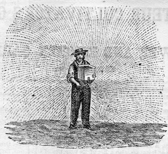
    Want ads elastic917It is interesting to look at advertisements from other eras–they seem to have an hypnotic effect, a small about of caffeinated want-lust is perhaps left over from those antique displays.  In any event it is fascinating and revealing to see what the popular goods were that were being displayed.  And by the time of the example that I’m using for today’s post–American Agriculturist for the Farm, Garden, and Household (published in New York in 1871, this being volume XXX of the rock-of-Gibraltar journal for the small farmer)–the pages were teeming with material for sale. For this one issue (February, 1871) there were a scant forty pages to the issue–the format though was packed with info, the type was about 8-point and in triple columns, and the sheets were 13 inches tall.  Pages 121-148 (of 160) is news and reports on all matters agricultural, from news on different seeds to newly manufactured sowers to discussions of fertilizers to a new type of cucumber; the rest of the issue, pages 149-160, were entirely dedicated to advertisement, the ads running cheek-to-jowl, some of which were 1/8-pagers, and the other tiny slugs of one square inch. There’s about 250 ads on these twelve pages, many of which are illustrated. The woodcut images are occasionally fantastic. 


  • Marble Clouds and their Emotional Shadows: Cloud Geometries in Art

    JF Ptak Science Books   Post 1942 (Part I)
    Follow Me on Pinterest

    I silently laugh at my own cenotaph 
    	And out of the caverns of rain..  Percy B. Shelley, "The Cloud", 1820
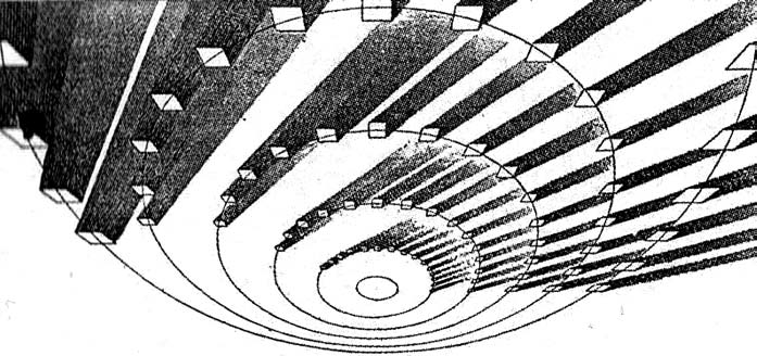
    [John Ruskin, Cloud Perspectival, 1860. Source for all Ruskin images:  “Cloud Studies: The Visible Invisible”,
    by Mary Jacobus, here.]

    John Ruskin (1819-1900) was still a very young man when he published the start of a series of works in art criticism, Modern Painters, in 18431.  To refer to it as a great work in critical theory is painting the work with a narrow brush, though–it had a very sweeping overall effect, and addressed all manner of issues integral to art, and was a developing vision of what art was looking at in the 19th century.  Ostensibly it began as a defense of the work of J.M.W. Turner and the way in which that man represented nature in his pre-Impressionist, pre-Expressionist work. Ruskin makes the case that the works that were so grating part of the art world i the 1830’s were highly consistent with centuries of representing nature in art–and not only that, but presenting evidence that turner did so like no other artist in history.  Ruskin would weave further volumes of Modern Painters through the body of his other work for the next 17 years, publishing the last installment in a fifth volume in 1860.

    Turner (1775-1851) was a great Romantic and a lot of that work tends towards a very full and very early expression of Impressionism and Expressionism, something that not everyone was ready for in the first quarter of the 19th century. This is particularly so in his paintings of clouds, and even more so in cloud/ocean interaction.  They are sweeping and breath-taking and very emotional works, in some ways like the late string quartets of Beethoven–powerful, provocative, internal dialogs of the deep power of nature. He must stand with John Constable as the Cloud Man of the 19th Century, or perhaps Constable stands with him.  They both in a way stand with Luke Howard, the scientist who was really the first classifier of clouds–an undertaking which in some impossible way escaped the recognition of the greatest classifiers it he history of science–and who did so in a paper in 1802, written at a time when Constable and Turner were both young artists.

    Turner and Constable both painted clouds like perhaps no others before them; and Ruskin, in his deep appreciation for the importance of the representation of nature int he art, also made a contribution to the understanding of clouds that was of an extraordinary nature. In the fifth volume of his Modern Painters Ruskin attempts a perspective study of clouds, and may have been about the first to do so. The illustrations of this effort I think are incredible, and remind me very much of installing a sort of rigidity to clouds, a cloud geometry, veritable studies of stones and blocks in the sky.  The imaging part of this exercise must have been an enormous thing back there in 1860, to think of clouds in a perspectival way, floating very large geometric objects in the sky. The astonishing results are seen (above) and following:
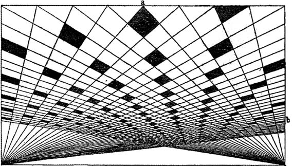
     And this:
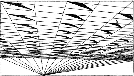
    [John Ruskin, Cloud Perspective: Curvilinear., Modern Painters, Vol. V, Plate LXV.]

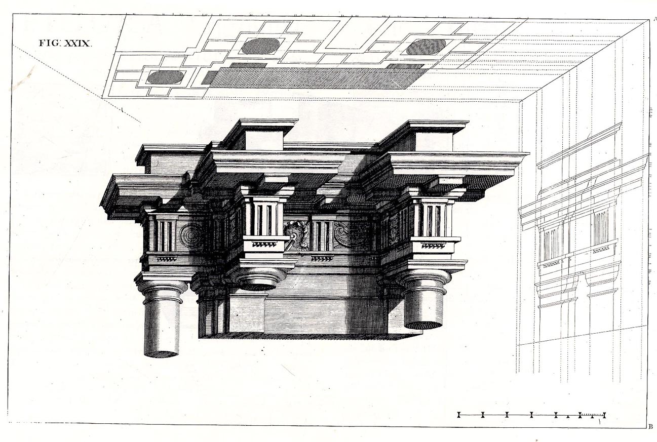
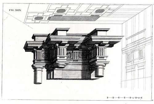
     In a way the first image reminds me of Andrea Pozzo’s work in his monumental   Rules and
    examples of perspective proper for painters and architects
    (1693):
     
    Pozo

    but really more in the way that Pozzo’s work seems to be elevated and floating in a heavy perspectivist space, bigger and blockier sky-borne marble than with ruskin.  But still, the disembodied floatiness of the Pozzo work is ethereal.

    Ruskin does round out his blocky and beautiful geometry, which definitely reminds me of work w=that would appear 90 years later:  Ruskin, again:
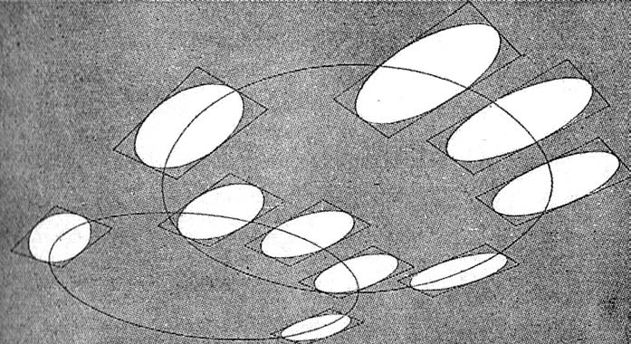
    And  Georgia O’Keefe’s Clouds III (1963), though her clouds tend towards a more rigid geometry in Clouds IV (1965, following):

    Clouds O'KeefeO’Keefe, Clouds Above the Sky III, 1963

    Clouds okeefe sky above iv 1965O’Keefe, Clouds Above the Sky IV, 1965

    Ms. Georgia is definitely seeing her clouds with different eyes than Ruskin, and they are entirely different creatures–but still, the two come together in my head as relatives. The clouds, I mean.

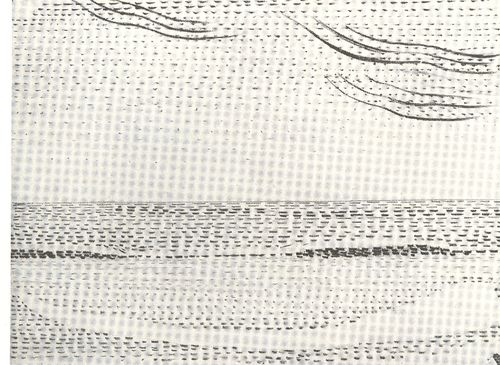
    I started looking around for early hard-line cloud geometries and thus far I haven’t found very much, though there is a tremendous example by Henry Van de Velde’s (1863-1957) “Sun at Ocean (Rhythmic Synthesis”) which I found in  Werner Hoffman’s Turning Points in Twentieth century Art, 1890-1917 and which was executed in 1888/9, looks to me to be absolutely incredible for its time, a nearly non-representational, proto-abstract something, done three decades before these genres came into being.
    Clouds van de velde
    I don;t know where the designer Van de Velde fits in the early history of non-representational art, but his effort in the second to last decade of the 19th century certainly seems to be very unusual for its time, and a good example of creative cloud representation. 

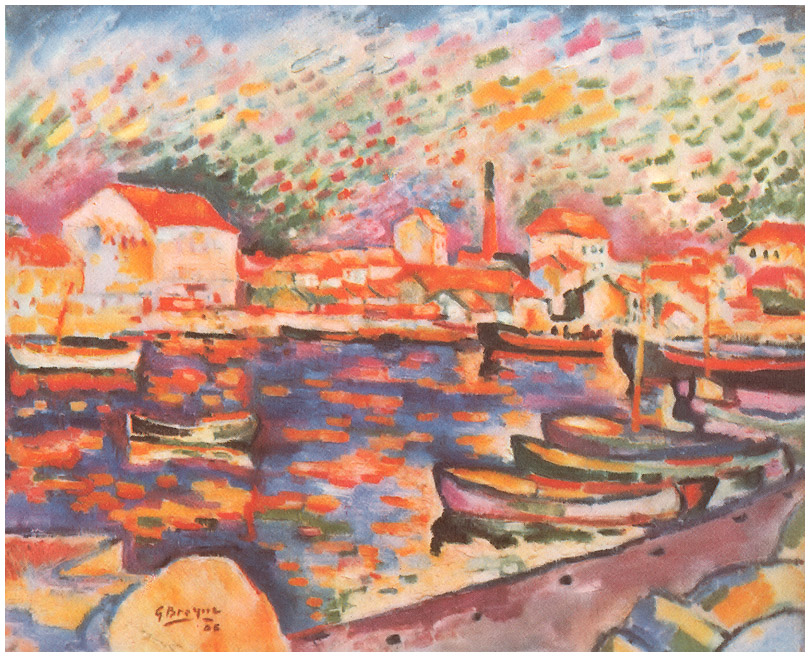
    Non-standard cloud imagery is much easier to finding the 20th century, like those of Georges Braque in his La Ciotat Harbor (1906):
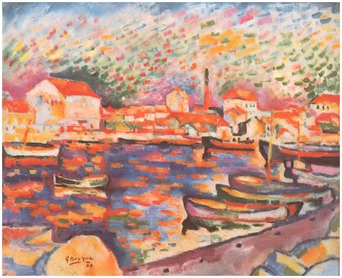
    Clouds braque
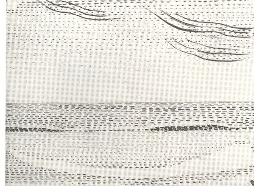
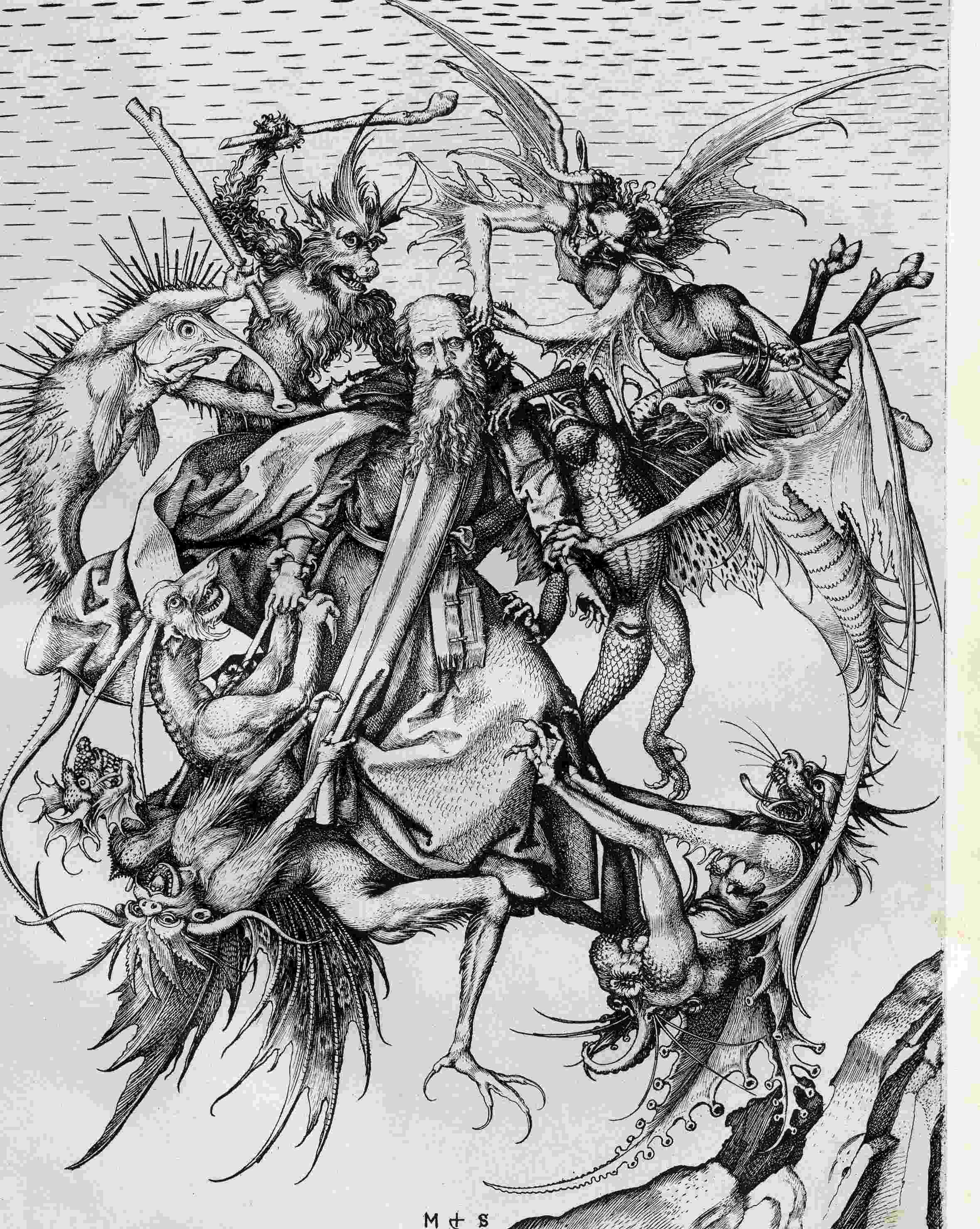
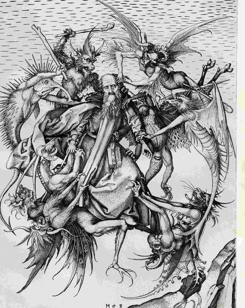
    Even this starts to have the look of something earlier, particularly if you turned the clouds-in-art clock way back, say, into the Renaissance. For example Martin Schoengauer‘s spectacular  The Temptation of St. Anthony, which was printed in 1470/5, has
    a beautiful, fluid circularity to it, full of an earthy roundness even
    as the saint is pursued by demons.  But the sky in the background is
    populated with nothing but dashes to suggest clouds, and which also starts to look something like the Fauvist and Expressionist works to come, 400/500 years later.
    Clouds schoengauer

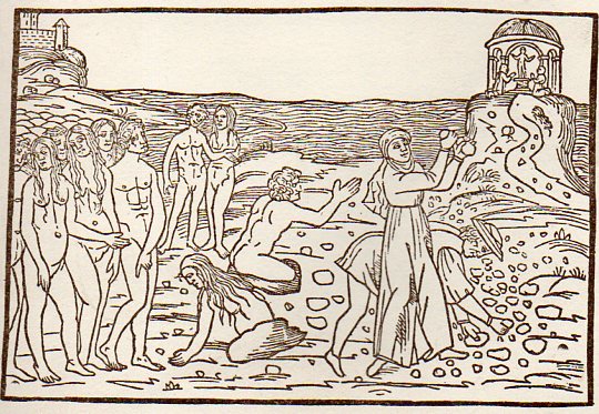
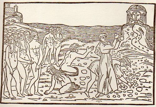
    (There are many examples of the sky being simply not represented at all, particularly in woodblock,

    like this image from Ovid (Accipe Studiose Lector P. Ouidij Metamorphosin...printed in Venice in 1509:
    Clouds no couds livy913

    “You could not see a cloud, because
    No cloud was in the sky:
    No birds were flying overhead —
    There were no birds to fly”.–Lewis Carroll, Through the Looking Glass.

    There are many non-sky images like this.

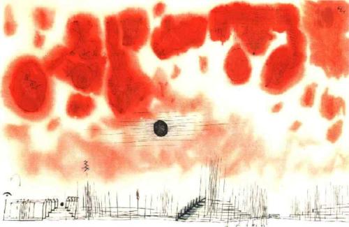
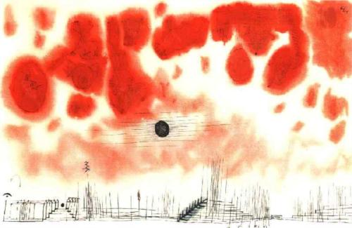
    Another interesting modern example is this Paul Klee (though it comes fairly late in that career, in 1940):
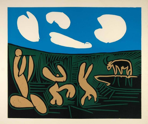
    Clouds Paul Klee 1940And an example from the ubiquitous Picasso, still later, in 1962:
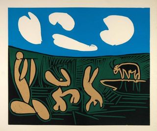
    Clouds Picasso

    But earlier images are harder to locate.  The obvious early-ish source (though still much later in the century) would be Van Gogh (say, with Starry Night) and Monet, though the fractalesque Van Gogh gets much closer to the re-interperative power of the Ruskin images than the reflected impressionist beauty of the Monet.

    Clouds Monet
    On a cursory look around the antiquarian painterly sky-world, it is becoming obvious that the cloud geometries of Ruskin are very uncommon. 

    Notes

    1.  For full text of Ruskin’s  Modern Painters , see  (1873)volume 5 for (1860) and  (1873)

  • Dogs as Book Reviewers, 1697

    JF Ptak Science Books  Quick Post

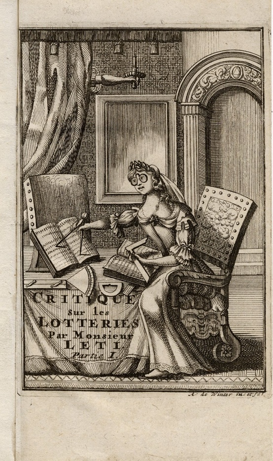
    Having a go at Pinterest I came across a very interesting image–a satirical, and very biting, portrayal of a woman as a scholar (here, with thanks to Whitney Trettien). The artist gives the woman a very monkey-ish feeling, a trained animal aspect, sitting there trying to figure our the words in a book with a right angle and a compass, and sporting monstrous glasses. 

    Books woman
    The work is by Gregorio Leti (1630-1701), Critique historique, politique, morale, economique et comique sur les lotteries, which was published in 1693. (Available at the Folger Shakespeare Library, here.) Leti was a critic of many things, but most particularly of the Catholic Church and of the Pope, a collection of efforts which earned a place for all of his works on the Index Librorum Prohibitorum.

    Within the same book is another double page image, the top showing a writer besieged by his demons, and the bottom, well, the bottom shows the work of dog reviewers of the written word. It is the only antiquarian print that I have seen of such behavior.   


  • A History of Blank, Empty and Missing Things: Mona Lisa’s Jewelry

    JF Ptak Science Books  Post 1939    Part of the series on the History of Blank, Empty and Missing Things.

    Follow Me on Pinterest

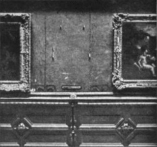
    Mona_lisa_stolen-1911

    [A photo of the place on the wall in the Louvre where the Mona Lisa lived until stolen in 1911.]

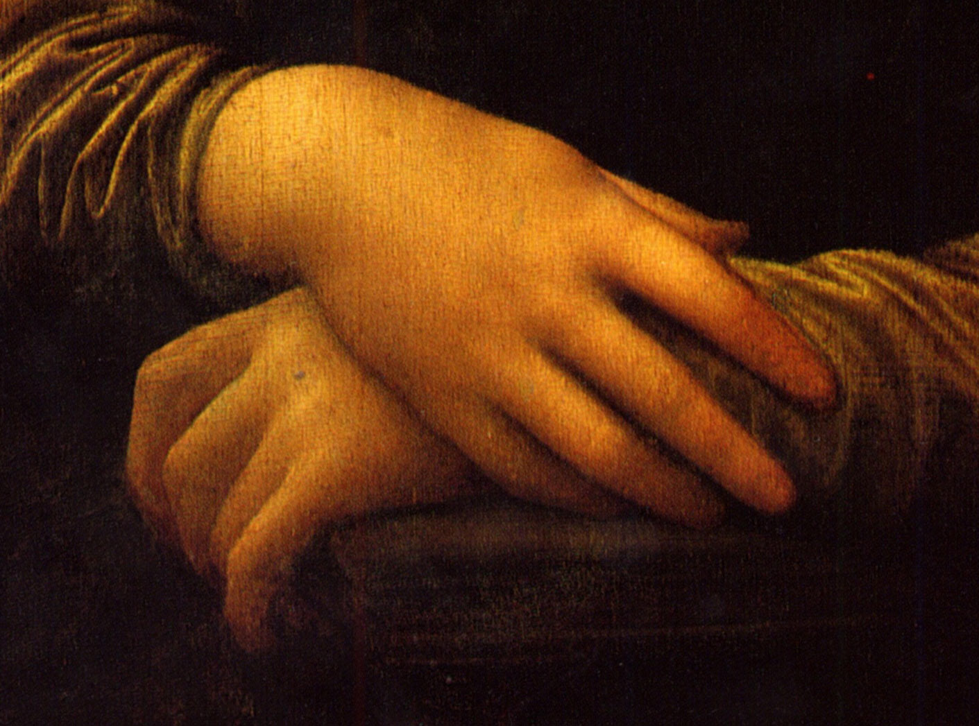
    I bumped into a Google search page that was filled with entries for designers and jewelers with business names invoking the Mona Lisa–Mona Lisa Jewelry and so on.  This coupling could well be found in the crushed metaphor jar in the back of the refrigerator.  One thing is for certain: no doubt the real Mona Lisa had plenty of money (probably the wife of a successful merchant named Francesco de Giocondo) and privilege to afford jewelry, but in the Leonardo’s painting she is pictured quite plainly, wearing none. Her hair is also very simply portrayed. This was a rare thing to do in portrait–as a real people who portraits were being made usually wore as much jewelry as they could or in some sensical variation of that. The hair too was a big deal–all you have to do is take a quick survey of hairstyles of Renaissance women in paintings and it will become instantly clear hairstyles were complex and involved. Mona Lisa’s dress, too, is very simple–plain even–and in understated, muted color. 

    Mona_Lisa yhands
    All of this was exceptionally unusual for the time.

    There’s not a speck of jewelry on the Mona Lisa, and her hair is simply parted, falling to her shoulders.  Maybe Leonardo didn’t want anything in the painting to fix it at any specific point in time, as the whole entity seems to be in a state of suspended completion, or complete but not quite there, still becoming something.  Perhaps highly defined hair and jewelry on her fingers would have been unacceptable anchors, giving places for the eyes to land and move away from the lush layers of light and tone that give the painting some of its enormous “motion”. 

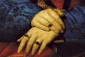
    It is hard to imagine the hands of Mona Lisa like those seen in the portrait by Raphael of  Maddalena Strozzi Doni. Painted at about the same time as the Mona Lisa, the 22-year-old master Raphael achieved a great image of course, but one very much in opposition to Leonardo’s. (The next year Raphael would paint St. Catherine, who would have no jewelry and simple hair, but of course she was also a saint–but he did give her some pretty fancy and involved clothing, in spite of the wheel she was leaning against. Depictions of saints and religious icons are different from secular portraits–but even here it is difficult to break away from imaging luxurious cloth and clothing.)

    Raphael msddalena hands[The hands of Raphael’s  Maddalena Strozzi Doni, 1506.]

    So in the history of missing things, or of missing jewelry and finery, the Mona Lisa must rank pretty high. It was just unusual to think of a business name invoking the antithesis of what the business is about. 

    The Mona Lisa of course became one of the most famous missing things in the history of missing things when she was stolen by the not-very-bright Vincenzo Peruggia in 1911, but that’s another story (and one which I talk a little about in the post The Most Famous Missing Doorknob in the History of Art).


  • What the Eye of God Sees: Gassendi’s Vision, 1658

    JF Ptak Science Books   Post 1938
    Follow Me on Pinterest


    Gasseni eye of god det_edited-1
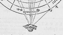
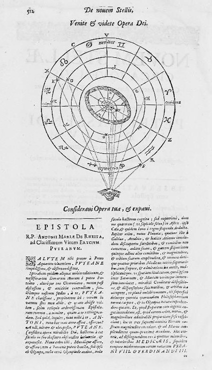
    Pierre Gassendi (1592-1655) published this God’s-eye-view of creation a few years after his death in the fourth volume (Astronomica) of his six-volume Opera Omina.  His friends and supporters of course saw to the publication of this mathematician/philosopher/logician’s work1 back there in 1658, so Gassendi–a very prominent thinker from a long-line of thinkers nearly on the verge of great discovery here and there and certainly a witness to it–made his greatest adventure in publishing only in death. 

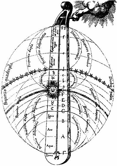
    Imaging a physical god is a tricky business in the history of the printed book. Bits of the creator of the universe turn up in book illustrations over hundreds of years, though I am not sure when the very first picture of a part of god appears.  The hand of the creator (generally seen as the Primum Mobile) is not terribly uncommon in images of a scientific nature in the 17th and 18th centuries, and is perhaps best exemplified by Robert Fludd’s famous Monochord:

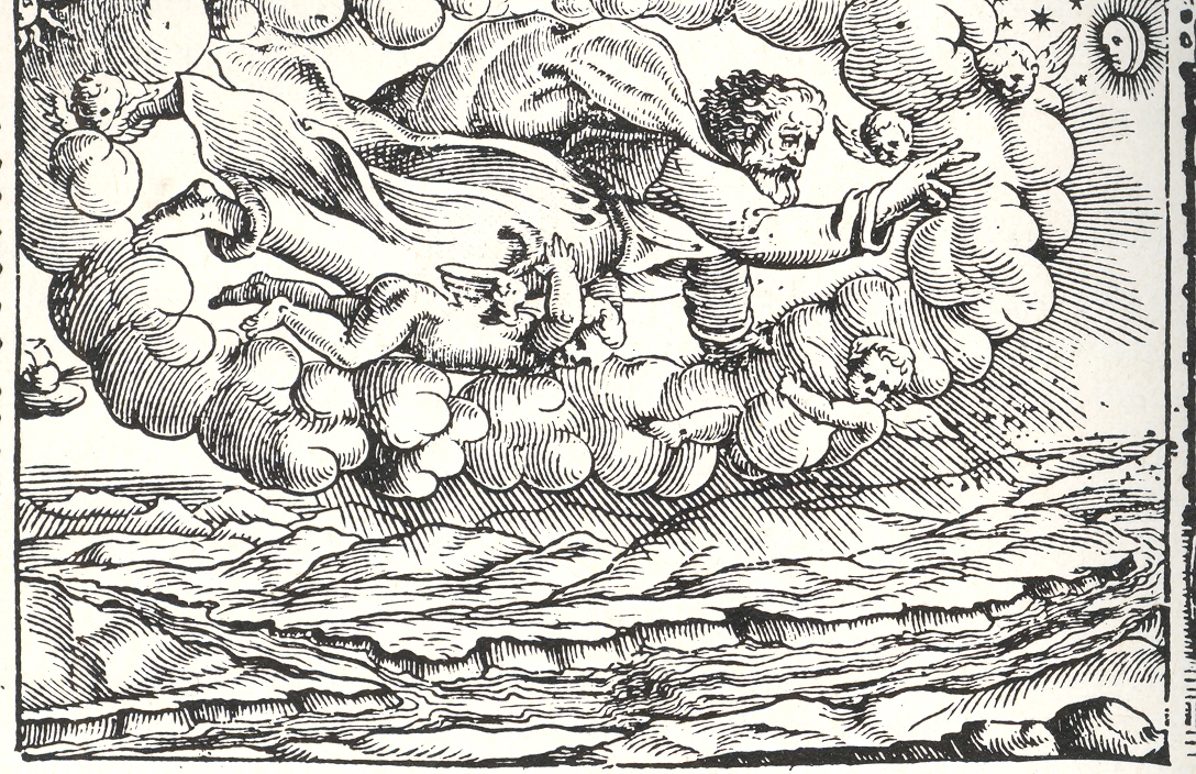
    Robert fludd celestialOf course there are many instance of the full-bodied god being seen through a break in the clouds, though in all the instances of this that I have seen the tantalizing peak into whatever region it is that this god exists is left entirely blank, a small white space. As so:

    God in the sky

    (Title page is for the narrative poem Le Metamorfosi, Ovid’s  Metamorphoses,
    translated into Italian by Gioseppe Horologgi, and published in Venice in 1563. See an earlier post on this blog, A History of Blank and Empty Things: God in a Hole in the Sky, here.)

     The eye of god is also not very uncommon, and is represented by an eye and also in a sacred triangle.  Less common though are images like Gassendi’s, which in a way, in an odd and almost offhand way, give the reader a sense of what it is that god might be seeing in  agodly-lineof-sight  Perhaps this is incorrect–but in judging his image with others in my experience it seems to me that the representation is a little more “personalized” here than just about anywhere else.

    Gasseni eye of god

    Notes:


  • Beautiful Ladders of the Baroque

    JF Ptak Science Books LLC     Post 1921

    Blogzabaggi043web
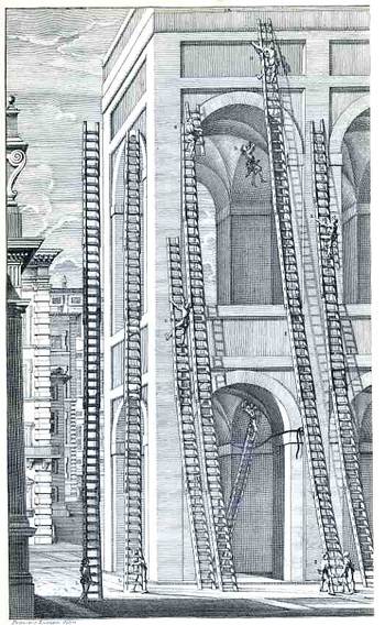
    This gorgeous, near-pre-Dadist image belongs to Niccola Zabaglia, who published the engraving in his book Castelli, e ponti di maestro Niccola Zabaglia con alcune ingegnose practice, e con la descriziojne del trasporto dell’obelsico Vaticano, e di altri del cav. Domenico Fontana, in Rome, in 1743.  This is the literal and absolute height of pre-modern, pre-mechanized building construction in the soaring Roman Baroque, ordained by “maestro”, the master, Zabaglia (1664-1750), a spectacular (and necessary) proponent of practical mechanics as applied to the building trades.  Among the “Castles” and churches and bridges alluded to in the title of his book, Zabaglia was responsible for affecting the maintenance and repair of St. Peter’s (more particularly to the basilica and the vault)—specifically, he had to figure out how to get the workmen and materials into place, and into very difficult and very high places, without damaging or destroying any of the existing decoration, artwork, sculpture, frescoes, and so on.  This was no easy feat to perform back there in the dim, 265+ years-ago pre-electric pre-power past, with enormous technical and operational difficulties, and Zabaglia accomplished this was superior affect, devising complex and elegant moving and stationary scaffolds, hoisting and holding mechanisms for the ladders, and much else.  He did just beautiful work, and he is a patron saint in the history of repair. 

    Ladders and scaffolds were important of course but were among the least of Zabaglia’s numerous accomplishments and inventions—they were so plentiful and useful that two Pope Benedicts ago (Pope Benedict the 14th) ordered their publication with actual teams of artists and engravers performing specific tasks.

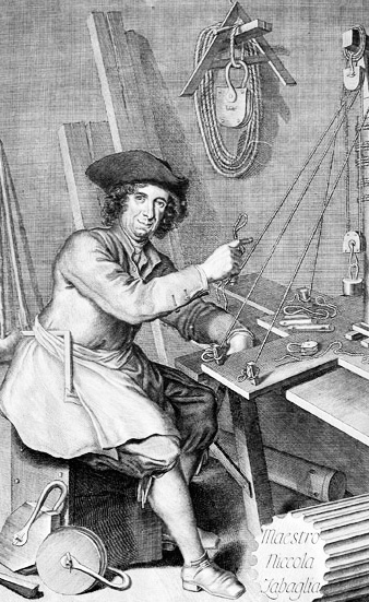
    It cannot be left unsaid that Zabaglia’s portrait as the frontispiece to his work presents almost without a doubt the most approachable, humane and amused representations of a major engineer/artist/artisan published in almost any work of the 18th century–I mean, the man just looks so happy in his work.  There he is, surrounded by the tools of his trade, in work clothing and a scruffy hat, and needing a shave, and just looking as pleased as can be.  No?

    ZabagliaBut to the ladders:  the examples in the engraving above are certainly massive.  The ladder in the middle I would say must be 70′ tall (judging that it has 60-odd rungs and that there are 5 rungs to the men who are stabilizing it at bottom), and since they’re made of a good hardwood (to prevent bowing that must occur in a lesser material), the things must’ve weighed a good amount.  And offhand I’m not exactly sure how they raised them.  I can’t see the tops of the building, but I would assume that there was a pulley up there. I hope.  In any event, the ladders and their found geometries are gorgeous things.  Also, I would guess that in the very long histories of ladders (a ladder appears in a cave painting from 10,000 BCE and also appears in one of the very first photographic experiments) that these must’ve been among the high points in ladder construction.