A Daily History of Holes, Dots, Lines, Science, History, Math, Physics, Art, the Unintentional Absurd, Architecture, Maps, Data Visualization, Blank and Missing Things, and so on. |1.6 million words, 7500 images, 4.9 million hits| Press & appearances in The Times, Le Figaro, Mensa, The Economist, The Guardian, Discovery News, Slate, Le Monde, Sci American Blogs, Le Pont, and many other places… 5000+ total posts since 2008.

Category: Art History

  • Heavy Metal Mondrian–a Sewer Story

    JF Ptak Science Books   Quick Post


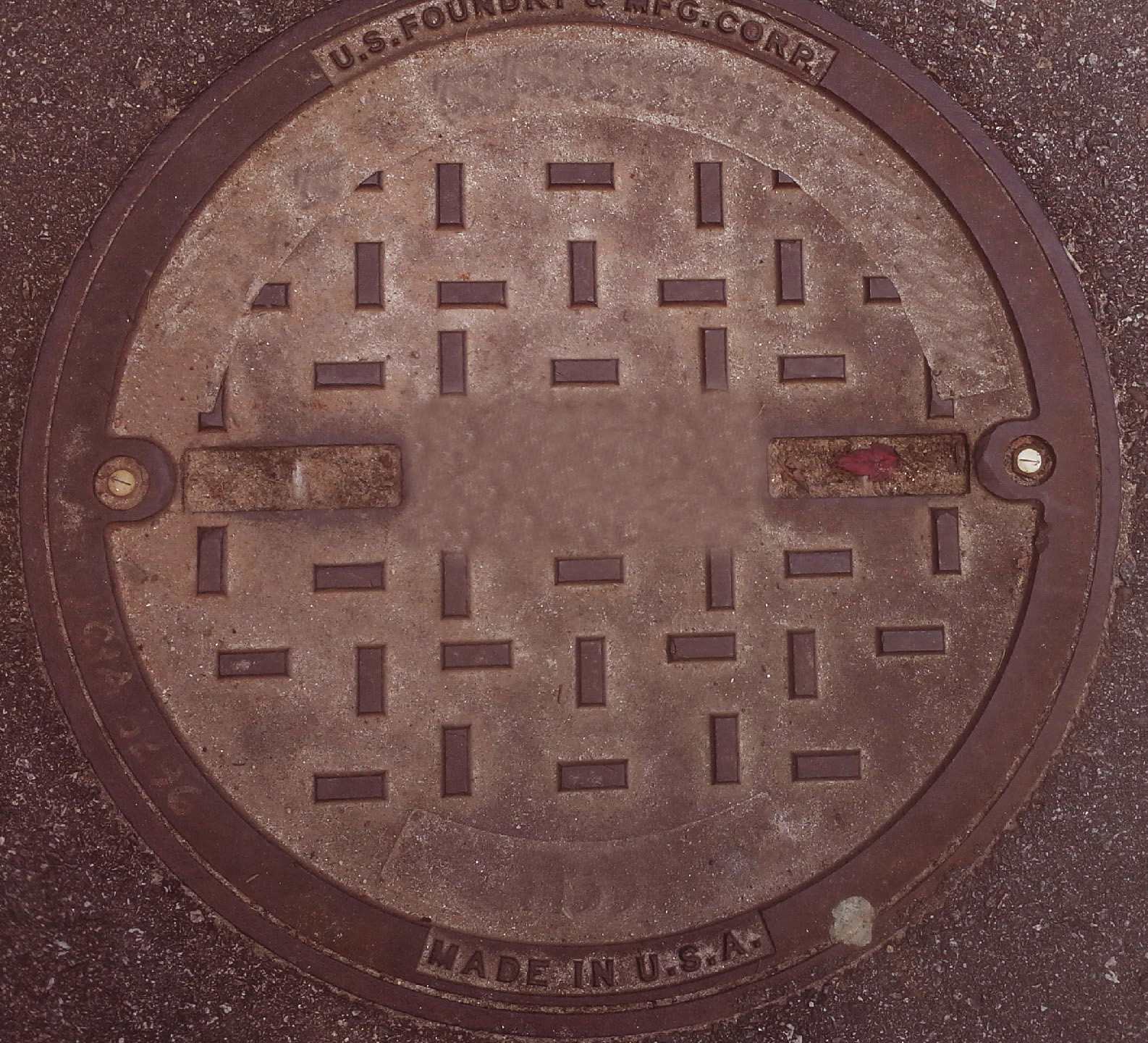
    Mondrian sewer cleaned detail
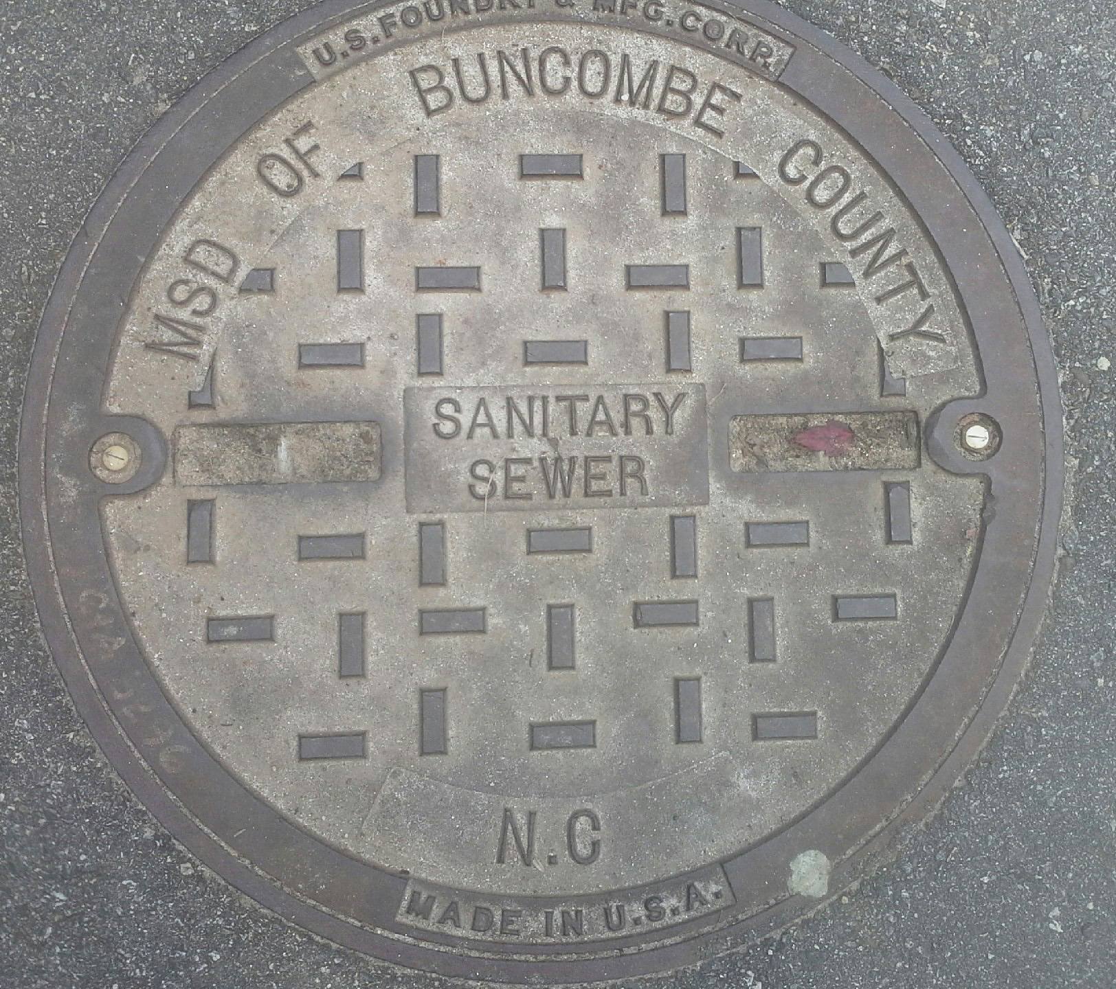
    Walking through the Western North Carolina Mountain Fair last week-end I found a little bit of Piet Mondrian (1872-1944) embedded in the sidewalk.  (Mondrian helped establish De Stijl (1917 or thereabouts), with a philosophy of using lines to
    transform artistic thought onto canvas, and the lines were all
    horizontal or vertical, with square and rectangular shapes. These would
    represent the pure harmonies of expression, along with the primary
    colors as well as black and white. His images are iconic.)

    Here’s the cleaned-up version of what I saw underneath the text:

    Mondrian sewer cleaned_edited-1
    And the original:

    Mondrian sewer

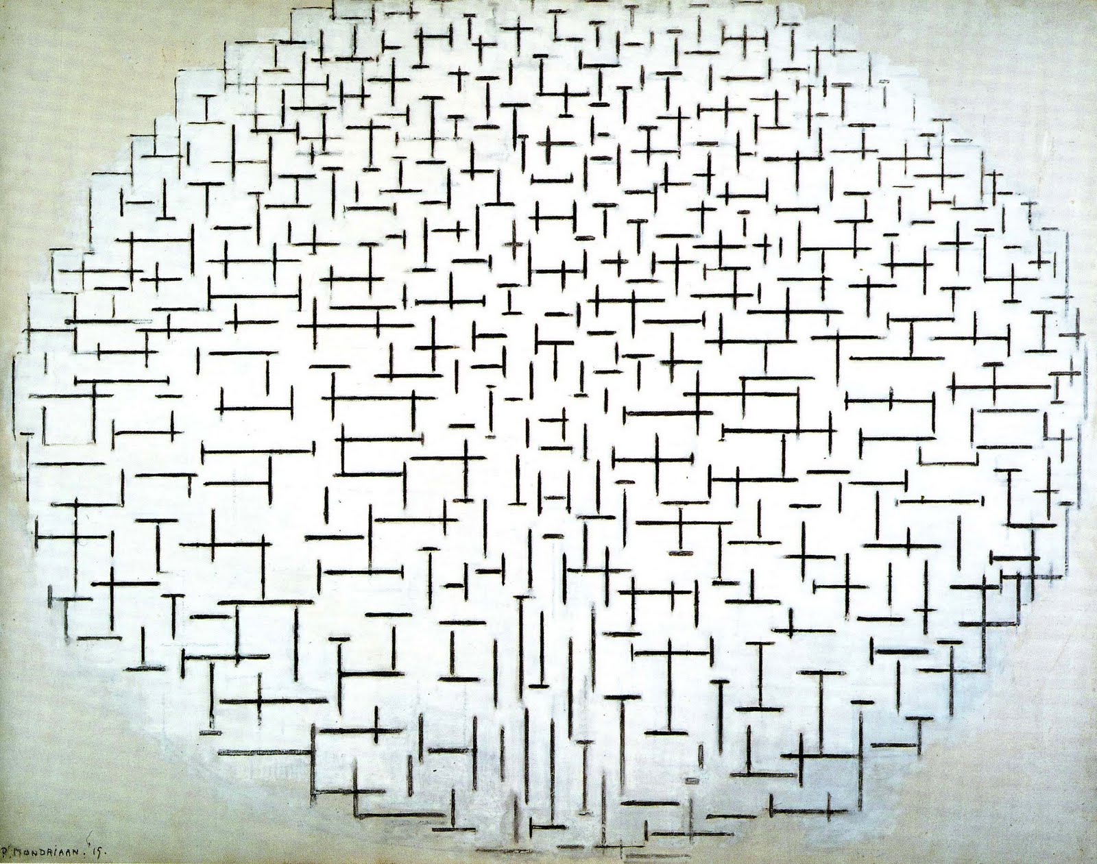
    And Mondrian’s trees:

    Mondrian trees

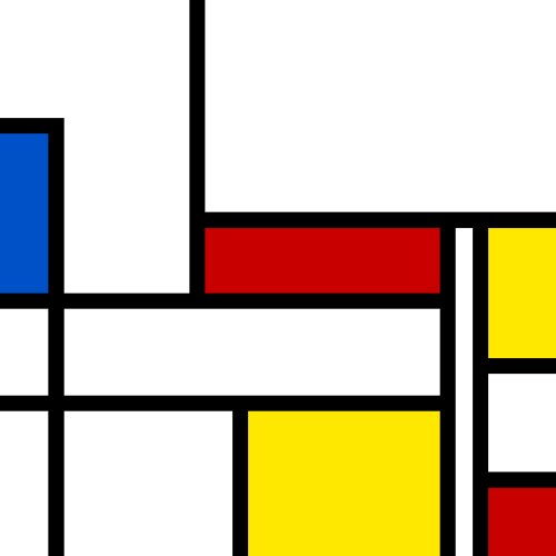
    And this:

    Mondrian original
    Had he seen this sewer access, I think that Mondrian would have been pleased.)

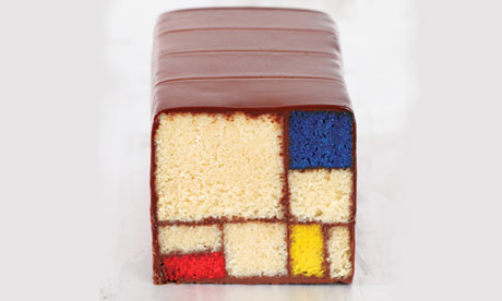
    Once you start looking for Mr. Mondrian, he seems to be everywhere:

    Mondrian-cake-010[Source: The Guardian blog.]

    ·Posted by :

    ·in:


  • Bathroom Buddha Mistletoe Urinal–the Most-Missing Piece of Modern Art?

    JF Ptak Science Books    Post 2085    Blank, Empty & Missing Things series  
    Follow Me on Pinterest

    “All in all, the creative act is not performed by the artist alone..
    the spectator brings the work in contact with the external world by
    deciphering and interpreting its inner qualifications and thus adds his
    contribution to the creative act.” (Marcel Duchamp)

    I guess to this quote you could replace “spectator” with just about anything else, including the object that is the art.

    This ten-minute missive came from a post a few days ago (Napkins of the Apocalypse) where I located the ultimate end of the American civil defense experience during the Cold War–in the spindle hole of a survival LP issued by a trashy-thready record label in 1962. I wondered if the hopes/dream/prayers of that episodic horrorshow belonged more in the Blank/Missing/Empty or the Holes series of this blog…and where that dark hole fit.

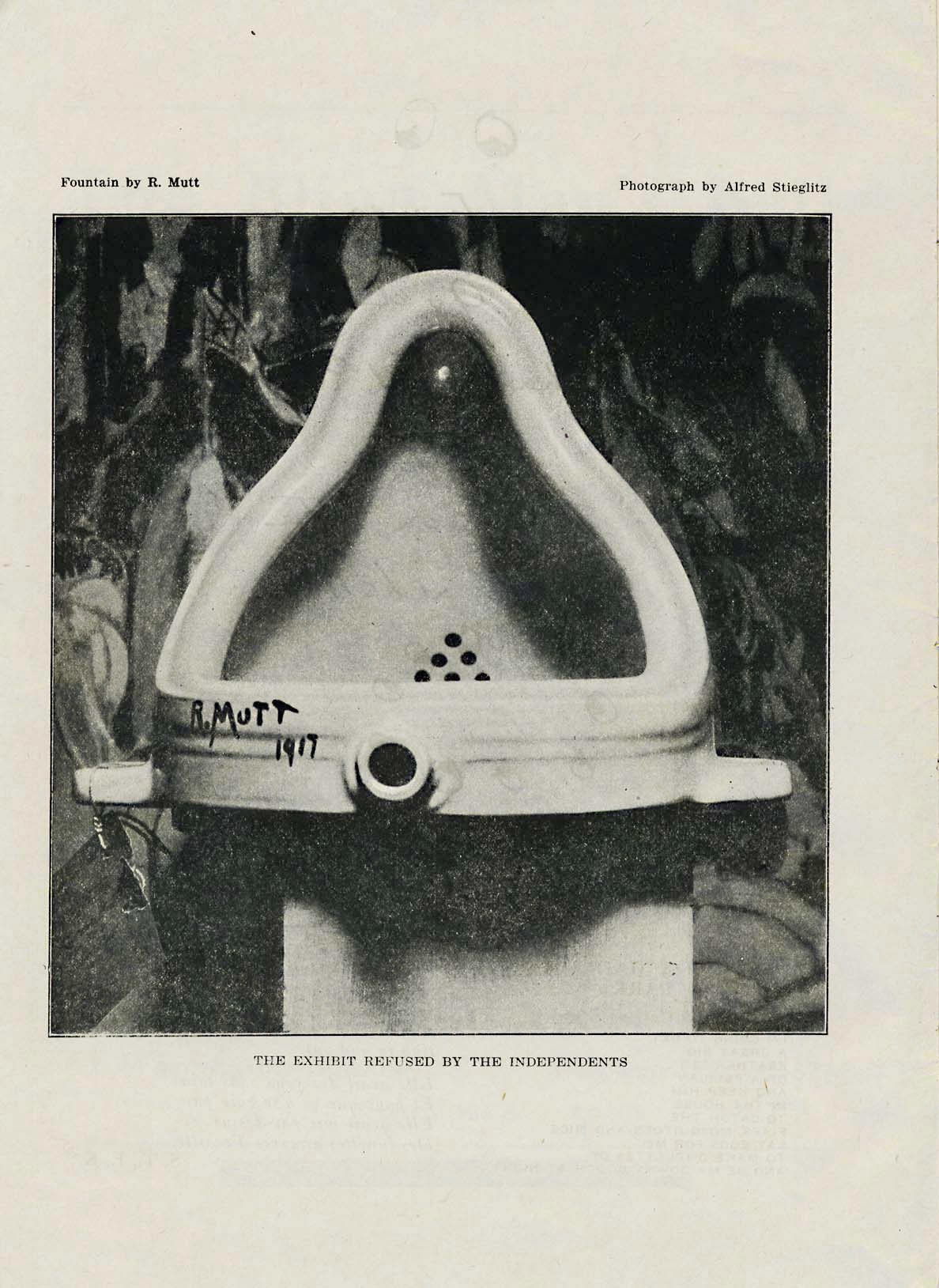
    Duchamp_fountain
    [Image source:  Stephen Hicks]

    The hole re-appeared this morning while doing the dishes, the drain in the sink sparking a vision of “FiVah” (or “Five A”, anti-art’s anti-anti-artist) Marcel Duchamp and his iconic found art sculpture “Fountain”.  It is of course the most famous urinal in the history of urination (I can’t speak to famous urinals in non-urinating history) which Duchamp signed “R.Mutt” in 1917 to make it his own.  Art.

    There are many missing qualities to this artwork that allows it to slide right into this blog’s Blank, Empty and Missing Things series, not the least of which is that the first “Fountain” went missing almost immediately.  It was rejected from a major show of Duchamp’s colleagues, and left a footprint of itself with a blank exhibition card dispaly, nonchalantly photographed in front of a Marsden Hartley painting.  It was a shocking piece of art that lead and still leads to debate on what is art and what is not, especially so far as “original” artwork is concerned. 

    “Fountain” has/had a number of questions about originality–as a concept it was certainly original, in the use of found object as a piece of sculptural art, and of course in its own self, being a urinal and all.  Then there’s the question of this original idea being so but being hosted in a stock/standard item that was hardly an original construction–it was a simple porcelain object from an assembly line production.  that said, even though this was not original when it came to replacing the lost not-original original it proved to be very difficult, at least it was back then in the nineteen-teens. 

    The urinal that replaced the missing urinal was not quite right, and so was not the not-original original replacing the not-original non-art that was a great original idea. 

    “Fountain” reminded people of a Buddha; it was hung in various unusual places and its iterations shown in exhibitions far-and-wide, including a very early Dada exhibit where one of them was hung from the ceiling of the gallery with a piece of Mistletoe attached, perhaps in a Duchampian way telling people to “kiss off”. 

    So this great instigator and Jimmy-Hoffa-of-Artworks was missing on many levels–it was a mass-produced private work that was censored by its artist’s peers, and original piece of art that wasn’t itself original and that went missing almost as soon as it was created.

    It has everything in nothing going for it. 

    ·Posted by :

    ·in:


  • A Couple of Cubist Comics

    JF Ptak Science Books   Quick Post

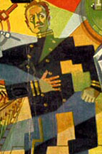
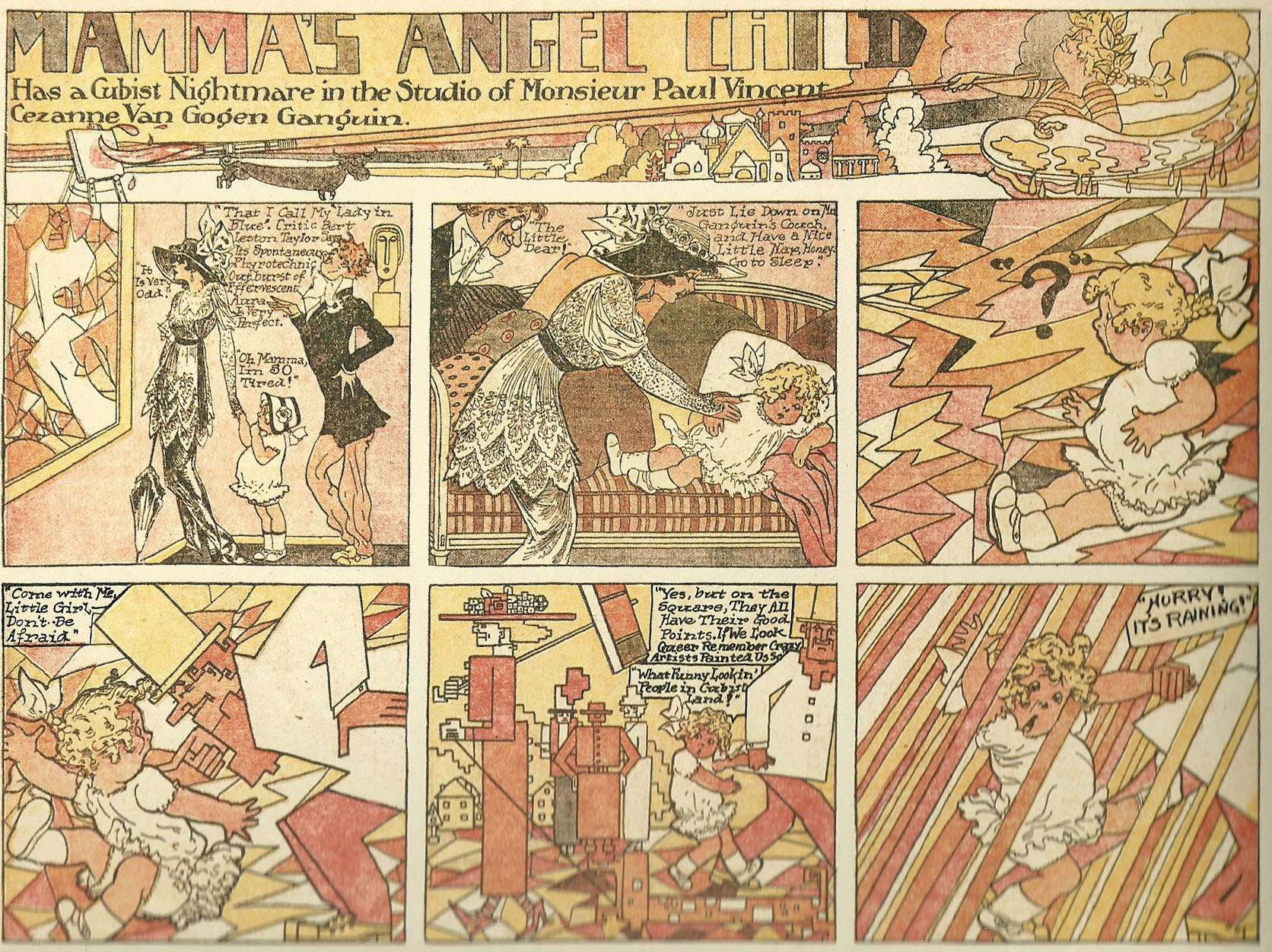
    This is not a particularly early Cubust-like comic book or sci-fi pulp image–it actually comes quite late in the career of early Cubism, in 1934–some 21 years or so following the pro forma appearance of the movement at the Armory in 1913.  But it is interesting, and seems to have been composed in context with the story–and it looks rather good.

    Razzle sci fi man det

    [ast_3501.jpg]

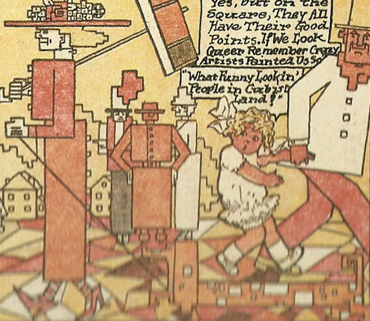
    The earliest examples go right back into the very heart of Cubism:

    Cubist comics det

    This is a detail from a very early example, “Mamma’s Angel Child”, by M.T. “Penny” Ross, which appeared within a year or two of the show.  Ross (1881-1937) was a very active illustrator and seemingly somewhat Zelig-like, somewhat everywhere, and signed this work “Paul Vincent Cezanne Van Gogen Gaugin”, just to make sure that there was no mistake, and no real understatement. 
    Cubist comics

    ·Posted by :

    ·in:


  • Motion Bones

    JF Ptak Science Books  Post 2077  

    Follow Me on Pinterest


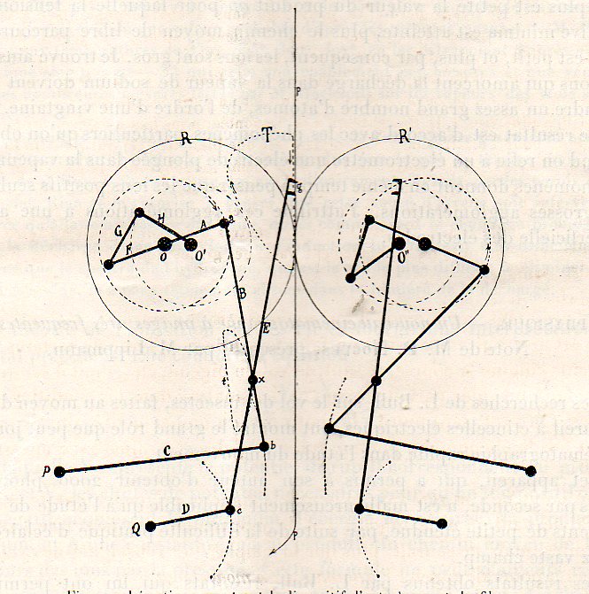
    Dance comptes422

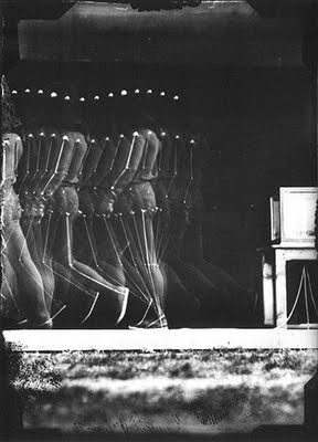
    While looking through an issue of the Comptes Rendus for the announcement of the funeral of the great mathematician and all-around genius Henri Poincare1, I found in the weekly issue (a fraction of an inch comprising the three-inch-thick half-yearly volume of papers published by the French Academy) this wonderful illustration.  It looks a bit like the superstructure to a Cubist dance, and bears a good strong attraction to many of the still images produced by Etienne Marey, maybe even a little like a mirrored representation of a stick figure skeleton of Duchamp’s Nude Descending, which interestingly was finished in this same year. 

    Marey-_Man_walking,_1890–91[Etienne Marey, ca. 1880/1]

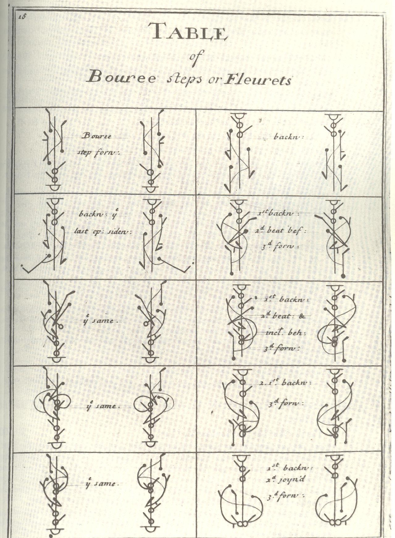
    There’s also a bit of early dance notation that the image reminds me of, particularly Raoul Feuillet’s publication of Pierre Beauchamp’s Orchesography4 ,
    a work published first in 1700  (and then in English in 1706) and
    dedicated to instructing people on the movements of the dance:

    Blog--apr 7 dance

    The image is an illustration for the article “Un nouveau cinematographie a images, tres frequentes”, by P(ierre) Nogues, and was a technical rendering of a device that ran film through a projector at a very high speed.  Nogues (1878-1971) was an assistant and collaborator to Etienne Marey, who was one of the earliest and perhaps the greatest figures in early cinematography and who–like Eadweard Muybridge–successful managed to create articulate optical machines that could capture and record minute and fast motion in people, animals, blood, and so on.  Nogues and his contemporaries lie Georges Demeny, Francois-Franck and Lucian Bull were among the founding encyclopedists of motion.  The drawing above was an outline for a sprocket device that feed flexible film through a camera at very high speed (ultimately reaching some 380 frames per second).  It is a beautiful thing. 

    [M. Duchamp, Nude Descending a Staircase, No. 2 (Nu descendant un escalier n° 2, 1912.  It is interesting to note in passing that this painting was supposedly rejected in the Salon des Indépendants show of 1912 and then caused a massive set-to in the NYC Armory Show of 1913. The infighting and family strife in the Salon in the 1900-1912 period is so big and complex it would make a fine if drippy daytime television romance drama.]

    Notes:

    1. Poincare died 17 July 1912, aged 58; the announcement of the funeral for one of the intellectual kings of the 19th century appeared on page 263 in this issue for 22 July 1912. 


  • An Interesting 3-Section Perspective, 1560

    JF Ptak Science Books    Post 2069


    Cousin_p09 det
    [Detail from engraving in the seventh image, below]

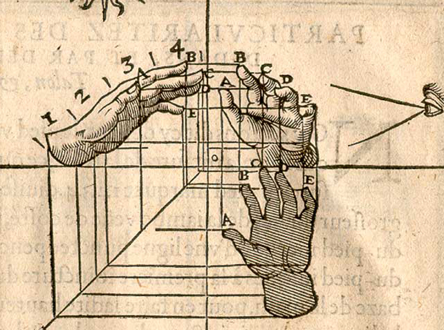
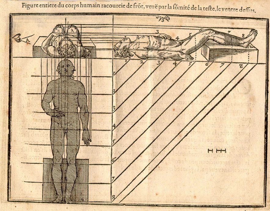
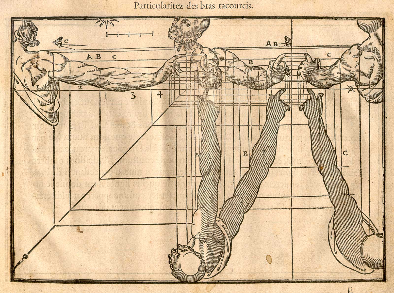
    I’m not sure if I’ve ever seen a 16th century human perspective drawing showing the body in plan and elevation and cross-section.  Jehan Cousin the Younger (1522-1595, in France), the son of Jean Cousin the Elder 91490-1560), a painter and sculptor, produced such an image in his Livre de Perspective, which was published in 1560. Well, the image definitely was published in 1560, though the artist may have been father and it may have been son–they worked closely together, and the Younger was taught at great length by the Elder, so much so that their work became indistinguishable. Nevertheless, the images I think are quite extraordinary, as we see below: 


    And so by Andreas Mantegna, a classic example:

    The following images come from the 1608 edition of the Cousin Perspective. a number of which are fairly unusual (all from the Library of Congress site, here):

    Cousin_p16


  • Ars Morendi

    JF Ptak Science Books   Post 2061   
    Follow Me on Pinterest

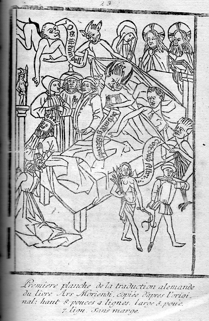
    Ars398
    The late Medieval/early Renaissance Tractatus artis bene moriendi was a work book of the dead–rather, a book for those about to be dead, an instructional for the process of dying the good death along the (loose) order of the Tibetan Bardo Thodol and the Egyptian book of the dead.  The Ars was written in the early the 15th century (some sources say 1415) and began appearing in some of the earliest illustrated printed books by about 1450–it was a wildly popular/necessary book, going through some 100 editions by 15001. 

    The books basically readied the dying for death, for a holy death, a death filled with high possibilities of a rewarding afterlife, for dying in the good graces of Christ and the christian ideals.  The images were such that non-readers could understand them–and this is still pretty much the case.

    Many of the variants of this work include a dozen or more woodblock illustrations, an example of which is found above.  We see the soon-to-be-departed at the very last instant before death, surrounded by all manner of distractions and entertainments aimed at luring the person to an earthly- rather than holy-demise. Demons, conjurers, makers of greed, and devils surround his bed in temptation, all while the Virgin Mary, Christ and the creator look down upon the besieged from behind the top of the bed. 

    Death was not an uncommon visitor in Europe in the early/mid 15th century, and perhaps this book served some in the way it taught people how to die a noble and religious death, especially when clergy may not have been so available. 

    (We offer a version of this print–printed in 1771 in Leipzig, and published in Heinecken’s Idee Generale d’une Collection Complette d’Estampes.  True this woodcut comes some 200 years or so after the original, but it still has a flavor of substantial age, of one of the earliest images to ever appear in a printed books.) 

    Here’s another example, this time the dying man is beign attacked by agents of pride and greed.  The images are genuinely upsetting–scary even.

    ·Posted by :

    ·in:


  • Soviet Book and Dustjacket Design

    JF Ptak Science Books  Post 2051  
     
    Follow Me on Pinterest
     

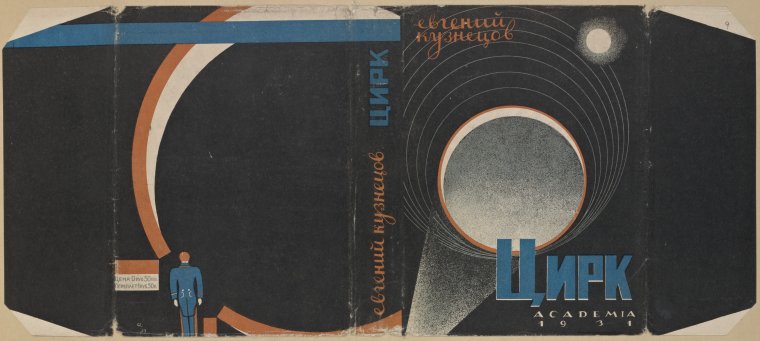
    Russian dj art

    [Kuznetsov, E. Tsirk. [Circus.] Moscow: Academia, 1931; Cover design by N. Akimov.; 8 v., [655] leaves of plates : col. ill. ; 32 x 57 cm.]

    I found this dustjacket art of Soviet-era books (all from the 1930’s save one)  in the New York Public Library collections (here)
    and was struck by the geometrical objects in many of the designs. They
    have a sense of warmth to me, somehow, like softer work coming from the
    tail end of the Constructivist period, having elements of Dada but
    really just having some of the hard edge of Constructivism without the
    scorching/awakening images that might have been embedded in the
    geometrical design. 

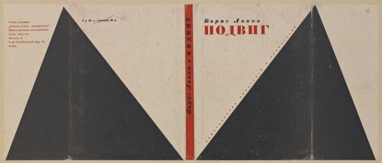
    Russian dj triangle

    Lapin, Boris Matveevich. Podvig. [A Heroic Exploit.] Leningrad: Izd-vo Pisatelei v Leningrade, 1934. Cover design by S. Iudovin.

    ·Posted by :

    ·in:

    —

  • Marcel Duchamp & Chess & Video

    JF Ptak Science Books  Quick Post

    All chess players are artists.–M. Duchamp

    Duchmap stopped painting at a certain point in the 1920’s, which was fairly early on in his life, but he didn’t stop making art. 

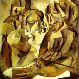
    Duchamp chess

    [“Portrait de joueurs d’échecs” Marcel Duchamp, 1911]

    Dreams that Money Can Buy is a 1947 film by surrealist/dadaist Hans Richter (1888-1976, a 1912 member of the Blaue Reiter) that includes many artists. This is a Duchamp’s fragment, with music by John Cage. (As a matter of fact, Richter claims to have made the first abstract film in Rhythmus 21 in 1921 and also made the interesting  8 x 8: A Chess Sonata in 8 Movements in 1957.)

    ·Posted by :

    ·in:


  • Dots and Lines in Optical Diversion

    JF Ptak Science Books     Part of the History of Dots series  Post 2007

    Follow Me on Pinterest

    Long is the line in the history of art–far less so the dot. 
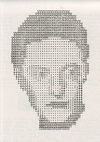
     
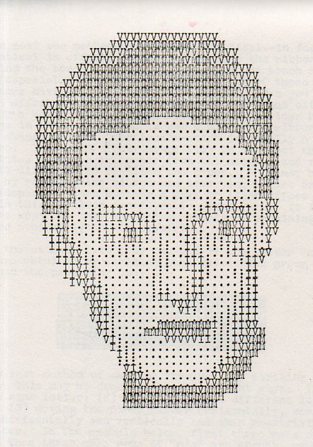
    Artyping216

    The line has been part of a long and deep inheritance of rendering a truth, factual, perspectival presence–in general, at least. Certain symbolic and metaphoric elements will sometimes confuse and collapse bits of the image, but the effort for centuries has been to present a balanced nature as close as practicable to its perfection.  That was the strength of the line. 

    The strength of the dot was in doing something not quite the opposite but approaching it. 

    It is interesting to think of the importance of dots in the first revolutionary changes in 500 years in the history of art.  Honestly, there wasn’t anything epochal that happened between the re-discovery of perspective (ca. 1330-1400) and the arrival of Impressionism (and just afterwards of non-representational art) in the 1872/3/4-1915 period.  
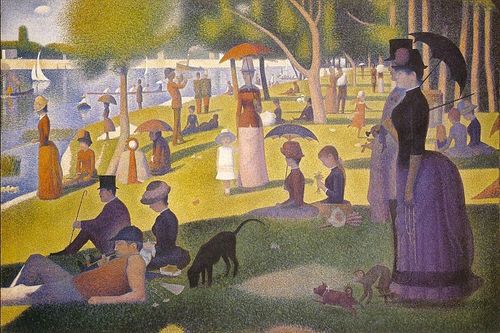
    Suerat Dots aren’t brought to bear formally in the revolutionary movement until the early 1880’s.  Impressionism for all intents and purposes is formed with the Societe Anonyme in 1872 (whose members included Monet, Pissaro, Degas, Sisley, Morisot and eleven others), and perhaps more realistically in 1874 when the Societe exhibited its first salon.  (The first show held at the Nadar Studio in Paris in April 1874; a tiny, one month long affair, compared to mammoth exhibitions like the Universal Exposition in Paris in 1867.) 

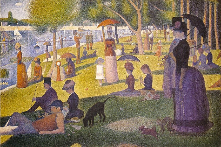
    It was Georges Seurat who brought the whole world to the dot experience with his artistic method of Pointilism, in particular with his magnificent Un dimanche après-midi à l’Île de la Grande Jatte, an enormous work given its composition—dots.  The dots replaced the brushstroke, and their placement in relation to their color was an absolutely brilliant innovation, establishing a perfect result for the viewer when examining the work as a whole.  (It may well be that the French chemist an designer Michel Chevreul made this discovery a few decades earlier, noticing the effect and changes in color depending on placement and—in his case, with fabric—color in the dyes for his material.)

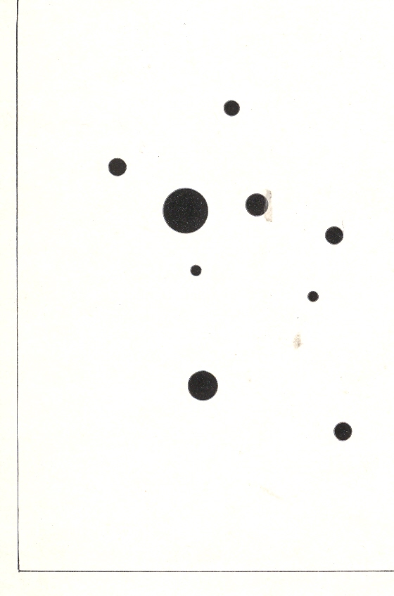
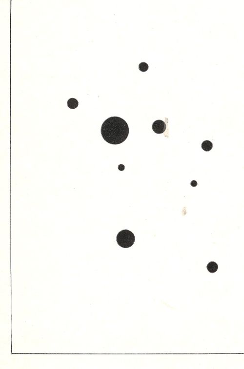
    Wassily Kandinsky (1866-1944), the discoverer of nothingness in art and the introduction of the first BLOG==july 13=kamd non-representational paintings in art history (1913) used his fair share of dots in his exploration of the previously invisible.  One good example is his 9 Points in Ascendance (1918), which is nothing but black dots, an impossible composition just two decades prior to its creation. 
    In the middle of this appeared the half-tone illustration, the great liberator of photographic illustration in popular publication.  Invented in the late 1870’s by Stephen Henry Horgan and used in the Illustrated London News for the first time in 1881, it made the publication of accurate images much feasible and economical.  No longer were readers dependent on the accuracies of artists interpreting photographs or photographed scenes—the photographs themselves were now publishable at little cost and in high quality, vastly increasing the veracity of published reports dependent upon images.  This was revolutionary in its own way, democratizing the sharing of images and icons.


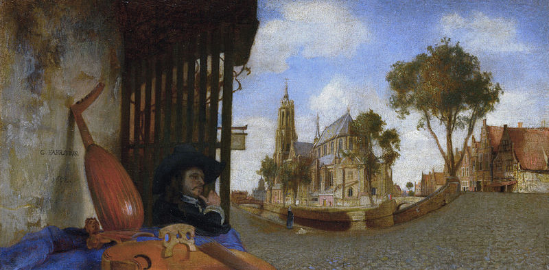
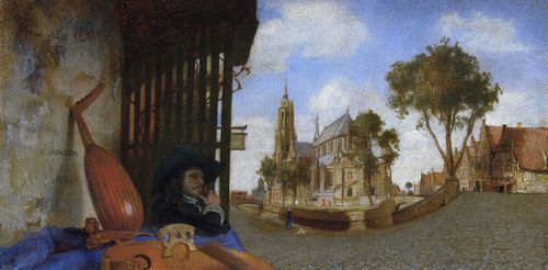
    That said about dots, the line was surely used to transport a bit of reality in art, even before the 18th century–among the earliest appearances being with Hans Holbein in his The Ambassadors of 1533, and a beautiful and very famous use was made by Andrea Pozzo in his illusionistic works at S. Ignazio in Rome in 1685 (and which I mention in an earlier post).  Certainly Carel Fabritius attempted and succeeded in this throughout his career, playing with the substance of perspective, as we can see here in his View in Delft, in 1652:
    Fabritius
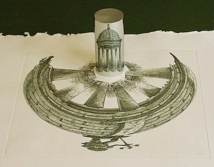
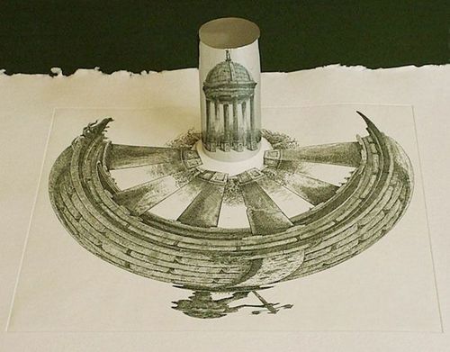
    Also the lines of the anamorphic image severely distorted the presentation of reality–if you had the mirror to distort it and if you had the mirror to reconstitute it:
    Anamorphic art
    Source:  Anamorphic Art

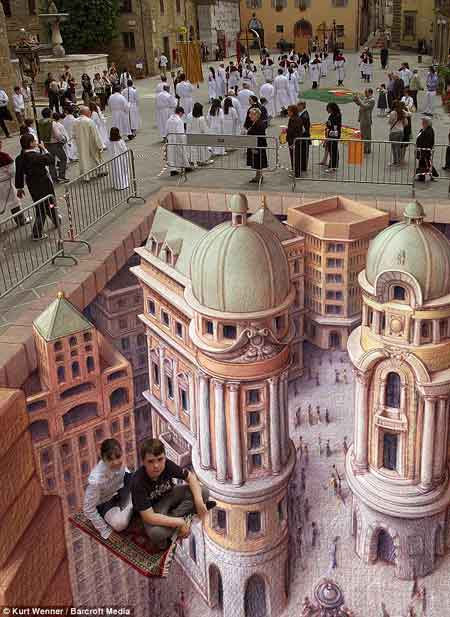
    This example is much more recognizable in widely-circulated images of the modern work of  people like Kurt Wenner, who have continued in the tradition of Leonardo’s researches in the difficulties of wide angle distortion:
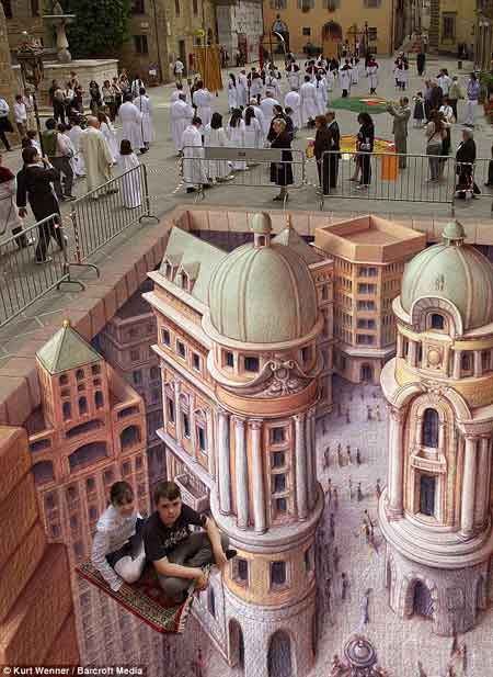
    Anamorphic art b
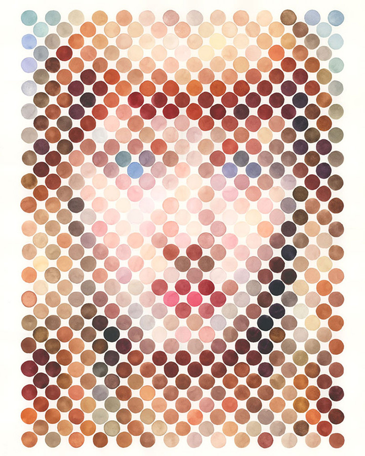
    Seeing this collection of dots in the construction of human faces I was reminded very strongly of the portraits made on the typewriter by Julius Nelson in his work, Artyping, published and sold for a dollar by the Artyping Bureau of Johnstown, Pennsylvania, in 1939 (and pictured first, above).  Nelson was an instructor in “secretarial science” in Windber High School in Pennsylvania and no doubt put together this pamphlet as something expressive of his artform and as an advertisement for his profession.  This was hardly the first time that anyone used the typewriter artistically, as I can recall some measure of artistic expression in type in Punch magazine as far back as 1869, though portraiture by typewriter does not appear to be a very wide section in the art world between those times. In any event, a portrait that he made here is rather close to those presented on the Modern Metropolis site–the “Dot Portraits”  Nathan Manire.
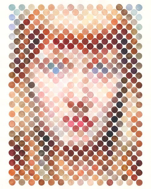
    Dot portraits

     Modern Art would have the final dispositional comment on the typewriter as an instrument of art, when Claes Oldenburg made his Soft Typewriter in 1963:
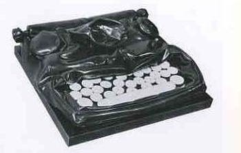
    Blogtypewriter_nwrriter_soft036_2 

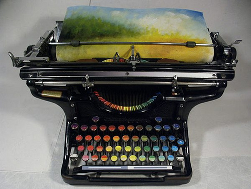
    And then, of course, the magnificent resurrection of the typewriter artform, replacing the spplication of black or red with something a little more complex:
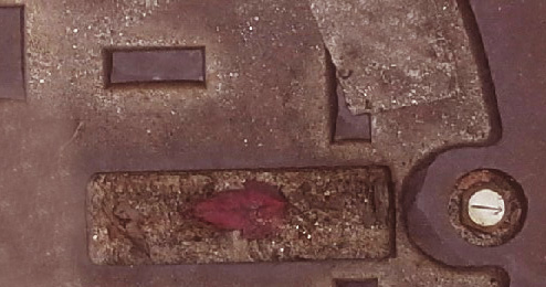
    Typewriter chromatic
    [Source: the chromatic typewriter, by Tyree Callahan, found here  http://www.samanthahahn.com/blog/2012/01/16/chromatic-typewriter/]


  • Melville on the Depiction of Whales

    JF Ptak Science Books  Quick Post

    I was digging a little in Herman Melville and Moby-Dick and fell into eleven pages of his scholarly ruminations on the depictions of whales in art and literature, fictional and otherwise.  Its really a very fine little gem, bobbing there in the nearly the exact middle of the book. (It is not the middle of the middle of the middle like Gettysburg in Mr. Foote’s The Civil War, a Narrative, where as it happens the battle appears in the middle chapter if the middle volume, but it is close enough.)  Here it is, from the full text at the University of Virginia:

    ·Posted by :

    ·in: