A Daily History of Holes, Dots, Lines, Science, History, Math, Physics, Art, the Unintentional Absurd, Architecture, Maps, Data Visualization, Blank and Missing Things, and so on. |1.6 million words, 7500 images, 4.9 million hits| Press & appearances in The Times, Le Figaro, Mensa, The Economist, The Guardian, Discovery News, Slate, Le Monde, Sci American Blogs, Le Pont, and many other places… 5000+ total posts since 2008.

Category: Art History

  • A Black-on-Black Detail in a Sea of Hats Panorama, 1912

    JF Ptak Science Books   Quick Post

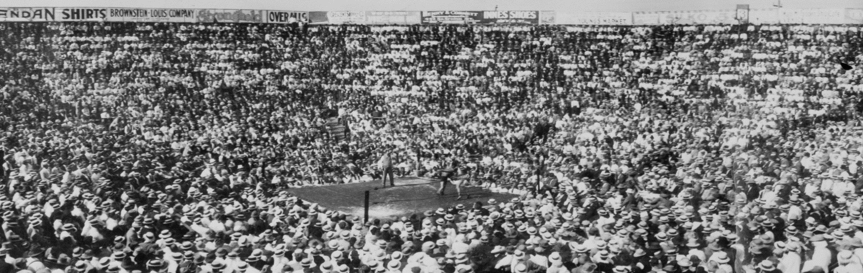
    In my long exposure to antiquarian prints I’ve long paid attention to images with a lot of black in the engraving or etching or woodcut–nighttime, caves, underwater, windlowless low-light interiors, and so on.  It is a definite challenge to accomplish these images, as well as a high use of ink–in any event, my eye is set for black details in black images in black prints. And so it came to be that I noticed this very small detail in the backdrop for the photo-copying of this fine panorama below, found at the Prints and Photographs Division of the Library of Congress (here). 

    Black on black of Boxing Day

    It is basically invisible to inspection in the version of the full print, below, but in the 80 mb examples it pops right out. (It certainly occupies less than 1% of the image space, but up-close it takes on a bit of its own life and legacy.) 

    The full photograph (45″ long)  shows a boxing match between Wolgast and Rivers at the Vernon Arena in 1912:

    Boxing sea of hats

    I was originally attracted to the photo by the hats, but the black blotch on black won out.  

    Panorama boxing vernon arena detail A

    For a wonderful essay on Black on Black art, see Public Domain review, here.  

    • Title: Vernon Arena, Wolgast – Rivers boxing match
    • Related Names: 
         Prince, Geo. (George), 1848- , copyright claimant
    • Date Created/Published: c1912.
    • Medium: 1 photographic print : gelatin silver ; 8 x 45.5 in.

  • The First Image of a Child’s Art in a Painting? (1515)

    JF Ptak Science Books   Post 2426  

    Part of the Children’s Art series

    Caroto

    I’ve written a number of times on this blog on art created by children–actualyl antiquarian children’s art, art made by kids from, say, before 1900.  That, and the depiction of kids’ art in work by painters through the centuries but before the last one. The second seems to be much more uncommon than the uncommon first category. For many good reasons, artwork made before (an arbitrary) 1900 seems to be fairly scarce, and when you to to <1850, scarcer yet, particularly when you remove the work of the privileged classes.  For the majority of people unused paper was not a common thing, certainly nothing as it is today when you can get a ream of paper for virtually nothing; in the 1850s, a child with access to paper and the means to express themselves on it would certainly have been a restricted minority.  

    As a “collector”of sorts of antique art by children most of what I have as doodles and artwork drawn on the blank pages of books, or their covers, or in ledgers,  really more like  kidlife marginalia, expressions of creativity on whatever paper was available.  It seems to me that the majority of kids would not have had much access to these means of production, especially if their major outlet for writing in school was slate and chalk.  Add to this difficulty the fact that the artwork would have to have survived the whims and taste and etc. of four or five and more generations of moves and house cleaning and so on, and the chances of childhood art’s survival become thinner and thinner. 

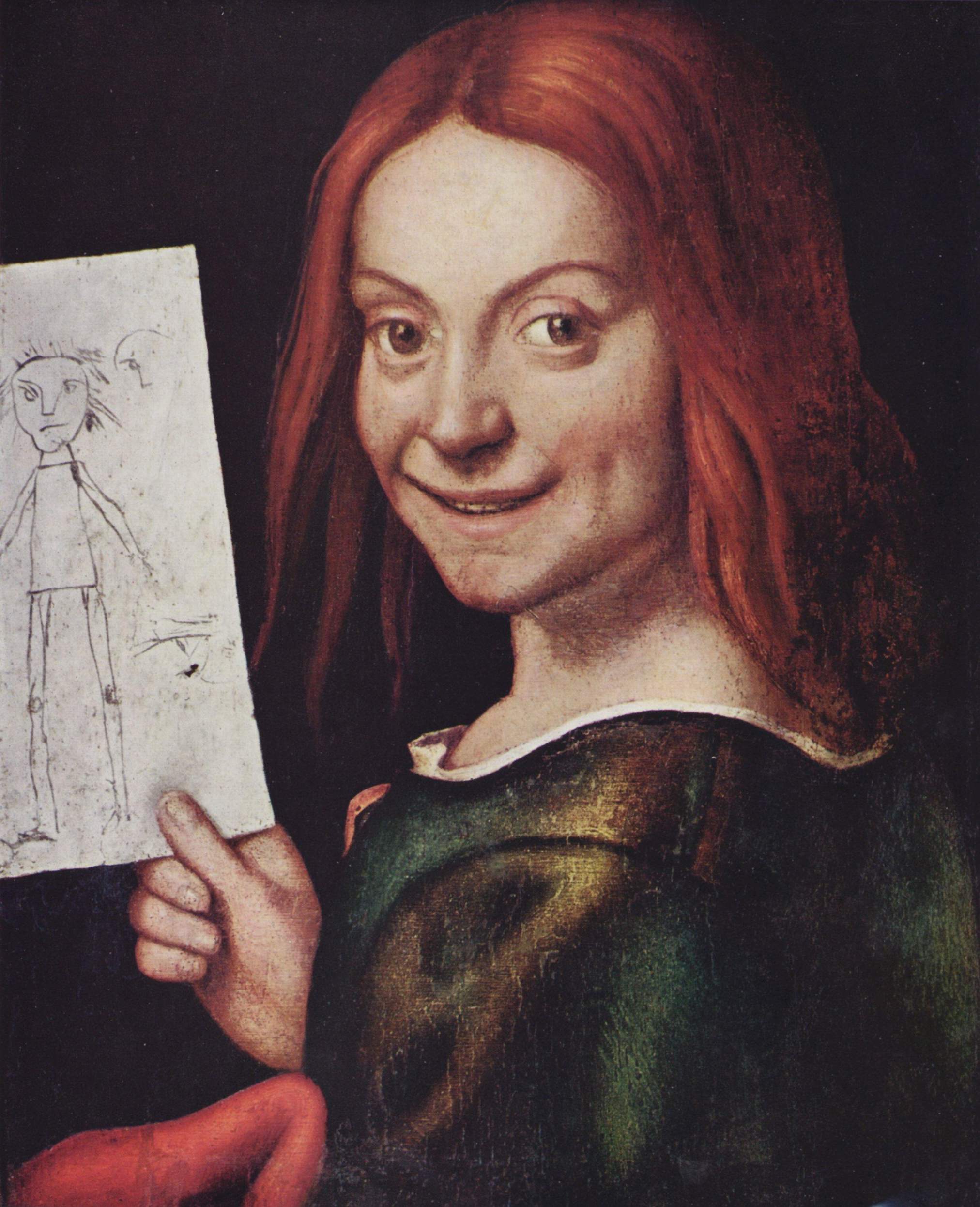
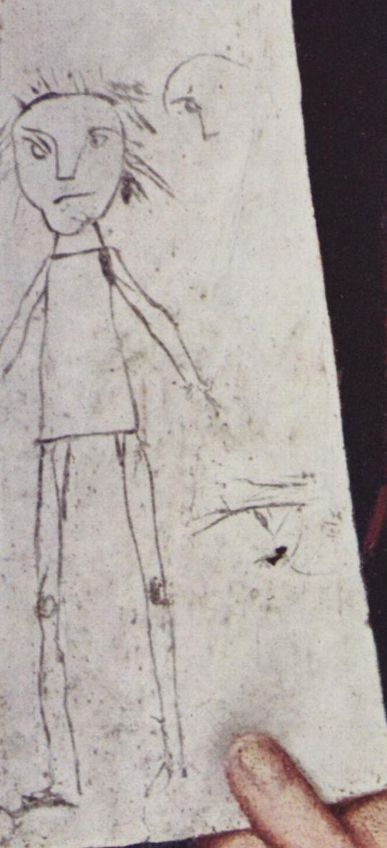
    This all comes up again because today for the first time I have seen this fantastic painting by Giovanni Francesco Caroto “Portrait of a Young Boy holding a Child’s Drawing” (Ritratto di Fanciullo con Disegno,), painted around 1515. I’m certain that I’ve never seen any artwork earlier than this and in an article that I saw in The Independent the author claims that this is the first artwork to depict a child’s artwork. It is a remarkable thing, seeing this drawing so proudly displayed by the child. Also it is not common to see someone in portraiture at this early stage with such a big toothy smile!  

    It is also incredible how in nearly all cases in recovering art by children that they basically look pretty much the same, for thousands of years. Perhaps with the vast majority of children performing artworks they all have about the same facility to reproduce what they were feeling or seeing, and so the continuing historical sameness.  

    This is no less than a great classic in the history of art by children.


    Notes


    I’ve researched this painting a little and don’t care too much for what I’ve found in some cases, in the interpretation of the painting–just a little unsettling with an uncomfortable fit. In one instance Harry Angelman, the identifier/discoverer of Angelman’s Syndrome1, saw this painting while in Italy and was much taken with it and associated the child with the children ad the disorders that he was studying.  In other cases there are associations drawn between this painting and Jean Dubuffet’s Art Brut, which is another direction that I really don’t care for too much.  

    1. Angelman Syndrome:  “is a neuro-genetic disorder characterized by severe intellectual and developmental disability, sleep disturbance, seizures, jerky movements (especially hand-flapping), frequent laughter or smiling, and usually a happy demeanor.”

    Caroto detail

    For some interesting reading in the history of childhood:   

    The classic by Philippe Ariès, Centuries of Childhood: A Social History of Family Life (London: Jonathan Cape, 1962)

    Lawrence Stone, The Family, Sex and Marriage in England 1500-1800 (London: Weidenfeld and Nicolson, 1977)

    Linda Pollock, Forgotten Children: Parent-Child Relations from 1500-1900 (Cambridge: Cambridge Univ. Press, 1983)


    ·Posted by :

    ·in:

    —

  • Mummy Cloth, New Harmony, and Color (1902-1936)

    JF Ptak Science Books   Post 2410

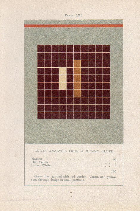
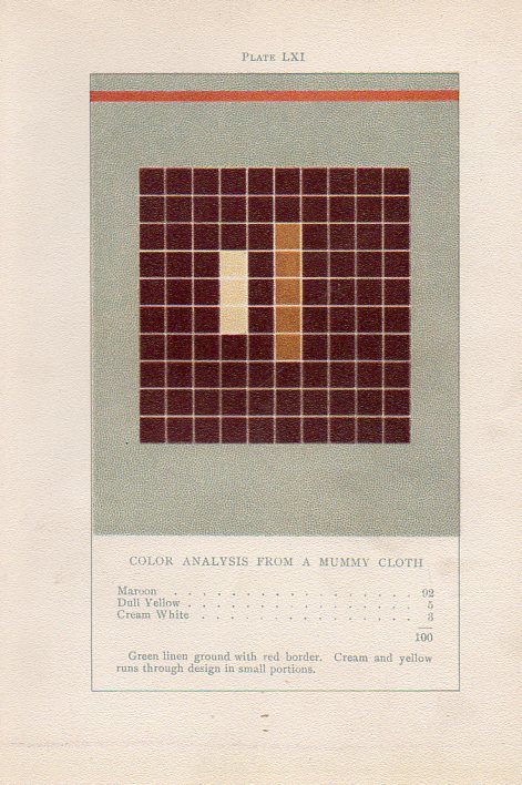
    Earlier in this blog, about seven years ago, I wrote about an extraordinary book by an aesthetician named Emily Vanderpoel called Color problems : a practical manual for the lay student of color (1902).  It is “extraordinary” in a narrower sense, and that “extraordinary” might not actually be positive for its original intent.  The extra-intent of the book, what has come out of it for me, was something that was unintentionally accomplished by the author.  The images that she used to illustrate her color theory ideas–the basis of which are not really comprehensible to me–turn out to be artwork in themselves, a found art, the artistry of the images taking over the original intention for the arrangement of their color.  She winds up with beautiful illustrations all on their own, a pre-abstract art abstract art, predating the non-representational art world by 11 years.  

    Here’s an example of her vision:  

    Art-vanderpoel186
    Here are some earlier posts on Vanderpoel on this blog:
    • What Color “Is”–an Unintentional Modernist Masterpiece of Book Illustration? (Here)
    • Quantifying art: the Art-ematics of Roger de Piles and Emily Vanderpoel (Here)

    Color theory is old and pretty—as a matter of fact there is a very attractive gathering of color theory models (in black and white, though) displaying some two dozen or more color models from the last 400 years.  People like Della Porta (1593), our old friend and resident oddball polymath crank Kircher (1646), the smarter-than-you-could-imagine Newton (1660), Waller (1686), Lambert (1772), the wide ranging and again polymathic Goethe (1792), Herschel (1817, who also ushered in our understanding of the other light-sensitive shape spacing medium of photography in 1840), the semi-forgotten Chevreul (1835), the beautiful Maxwell (1857), Wundt (1874, the early experimental psychologist who also looked for spirits/spiritmus and ghosts), von Bezold (1878), Rood (1879), Munsell (1918) Kandinsky (1914 and not decipherable by me) and Klee (1924), and so on towards the present, all tried to analyze the prospects of color.

    The funny thing is here is that I didn’t look at the Klees, so I didn’t see how much they have in common with the Vanderpoel color studies.  In a way it seems that they were both after the same thing: an understanding of the object in color-sense.  

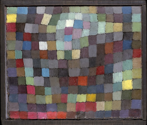
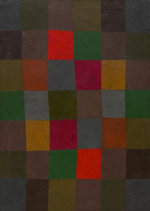
    Here are some examples of Klee’s grid paintings,  so-called (by Will Grohmann) “Magic Squares”, which weren’t square and not even straight, necessarily, but they were magical, and they did generate a divisional articulation of the color field that Klee was studying.  And in their way they do remind me of the earlier Vanderpoel work.  

    There is of course a lot that has been written on this aspect of Klee’s work,by Klee himself and many others, so I’m not going down that road this morning–I really just wanted to get on board with the Vanderpoel/Klee attributions.  

    Klee maibild

     
    Maibild  1925 (“May Picture”)  Source: Metropolitan Museum of Art
     
     
    Klee new harmon

    New Harmony (Neue Harmonie) 1936, via the Guggenheim Museum and the Painters Table 


    ·Posted by :

    ·in:


  • Ars Morendi–the Book for the Dying and Dead

    JF Ptak Science Books    Post 2380

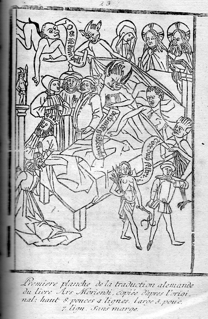
    Ars398

    [Woodcut, printed in 1771, from an ealier woodcut of the late 15th century;  6×4 inches. This version available from our Blog Bookstore.]

    The lare Medieval/early Renaissance Tractatus artis bene moriendi was a work book of the dead–rather, a book for those about to be dead, an instructional for the process of dying the good death along the (loose) order of the Tibetan Bardo Thodol and the Egyptian book of the dead.  The Ars was written in the early the 15th century (some sources say 1415) and began appearing in some of the earliest illustrated printed books by about 1460–it was a wildly popular/necessary book, going through some 100 editions by 15001. 

    The books basically readied the dying for death, for a holy death, a death filled with high possibilities of a rewarding afterlife, for dying in the good graces of Christ and the christian ideals.  The images were such that non-readers could understand them–and this is still pretty much the case.

    Many of the variants of this work include a dozen or more woodblock illustrations, an example of which is found above.  We see the soon-to-be-departed at the very last instant before death, surrounded by all manner of distractions and entertainments aimed at luring the person to an earthly- rather than holy-demise. Demons, conjurers, makers of greed, and devils surround his bed in temptation, all while the Virgin Mary, Christ and the creator look down upon the besieged from behind the top of the bed. 

    Death was not an uncommon visitor in Europe in the early/mid 15th century, and perhaps this book served some in the way it taught people how to die a noble and religious death, especially when clergy may not have been so available. 

    (The blog offers a version of this print, not nearly as old as the original, but with some sort of substantial age on it–it was printed in 1771 in Leipzig, and published in Heinecken’s Idee Generale d’une Collection Complette d’Estampes, and it is an attractive print suggestive of a greater age.

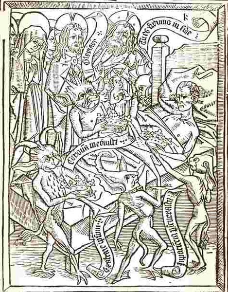
    Here’s another example, this time the dying man is beign attacked by agents of pride and greed.  The images are genuinely upsetting–scary even.

    Ars moredni pride
    Notes:

    1. English editions/variation of this work include The Waye of Dying Well and The Sicke Mannes Salve, and then in 1650 the Holy Living and Holy Dying. 


  • There are No Van Goghs in Arles (?)

    JF Ptak Science Books   Post 2354

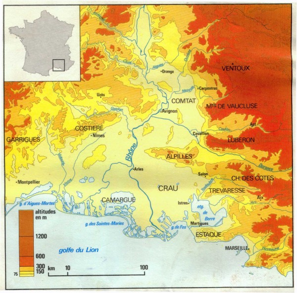
    Van Gog the crau

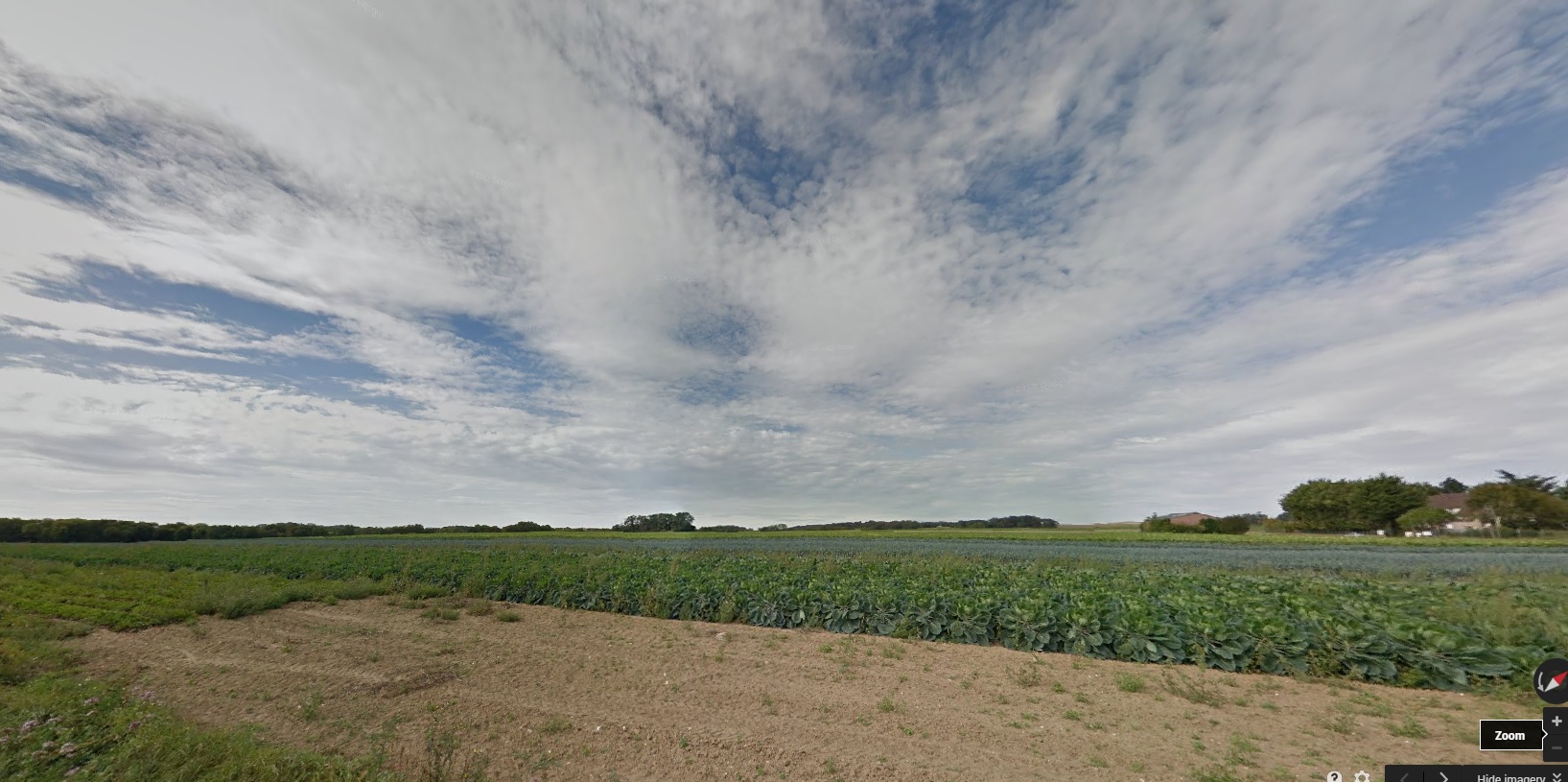
    “Average soil depth is 40cm overlying a 5 to 25 meter thick layer of impermeable conglomerate making the alluvial water table inaccessible to the roots of plants. Topography is extremely flat with rounded silicaceous stones covering 50% of the soil and protecting it from big temperature variations.”

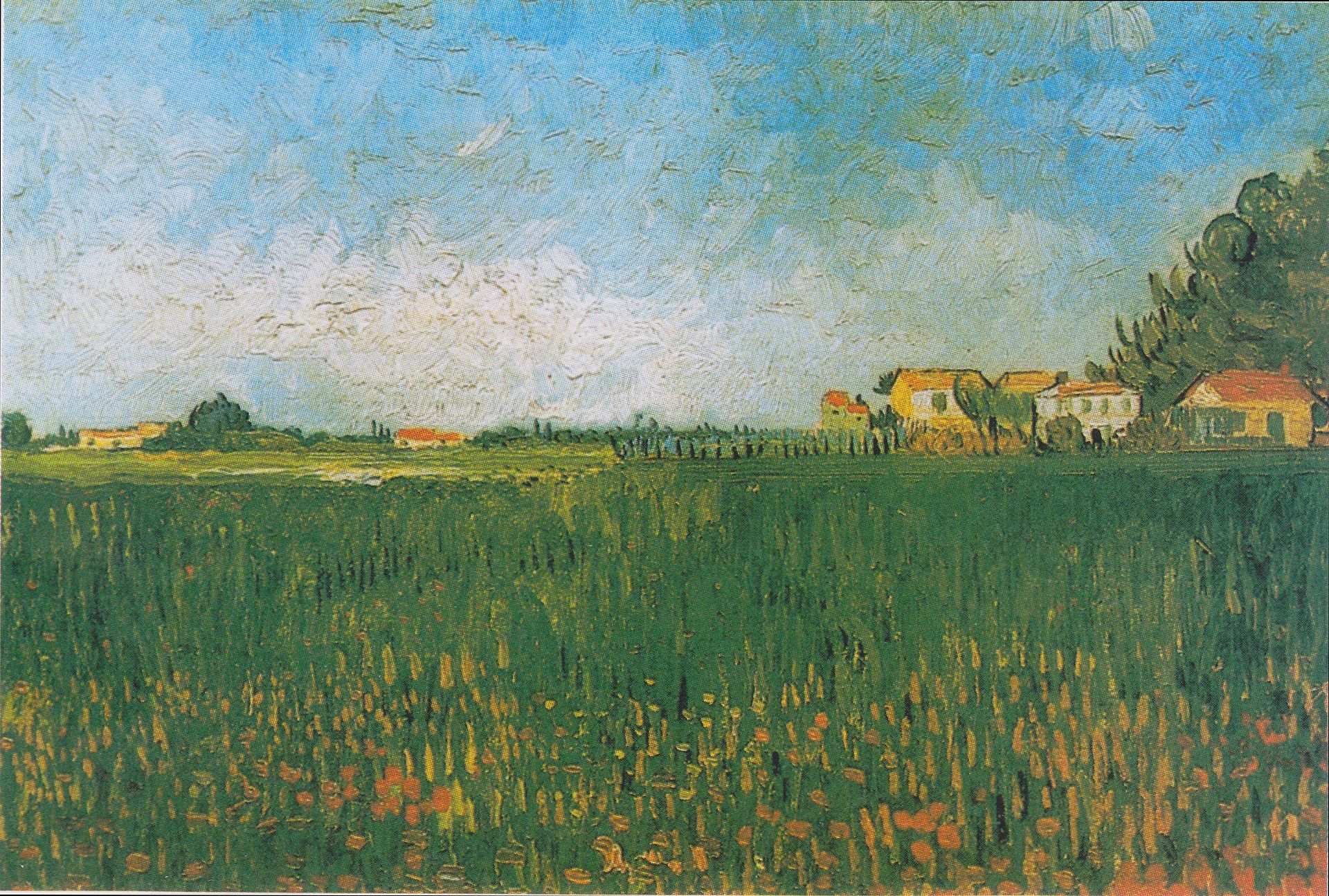
    And so goes the description of the soils in the Crau, the Plaine de la Crau, a massive flats/alluvial basin that is the home to fine hay and shepherds going back to Roman times, and a plains filled with flat earth and big sky, and light.  In the middle of it all was Arles and in Arles from 1888-1890 was Vincent van Gogh, who found the place extraordinary, and who there at the end of his life was at his most productive, imaginative, creative, visionary self.  The other side of that soil map above–as it pretty as it is and conveying as much information as it does–stands the solitary magic that van Gogh created there.

    Van_Gogh_-_Bauernhäuser_in_einem_Weizenfeld_bei_Arles.jpeg[Image source: Wikipedia]

    Here is van Gogh writing to Emile Bernard from Arles, Sunday, 15 July, 1888 on la Crau:

    Have made large pen drawings — 2 — an immense flat expanse of country — seen in bird’s-eye view from the top of a hill — vineyards, harvested fields of wheat, all of it multiplied endlessly, streaming away like the surface of a sea towards the horizon bounded by the hillocks of La Crau.
    It does not look Japanese, and it’s actually the most Japanese thing that I’ve done. 
    A microscopic figure of a ploughman, a little train passing through the wheatfields; that’s the only life there is in it. Listen, I passed – a few days after my arrival — that place with a painter friend.
    There’s something that would be boring to do, he said. I said nothing myself, but I found that so astonishing that I didn’t even have the strength to give that idiot a piece of my mind. I go back there, go back, go back again — well, I’ve done two drawings of it — of that flat landscape in which there was nothing but………. the infinite… eternity.
    Well — while I’m drawing along comes a chap who isn’t a painter but a soldier. I say, ‘Does it astonish you that I find that as beautiful as the sea?’ Now he knew the sea — that one. ‘No — it doesn’t astonish me’ — he says – ‘that you find that as beautiful as the sea — but I find it  even more beautiful than the ocean because it’s inhabited.’ —Source: van Gogh Museum, the Letter of Vincent van Gogh, here.

    It seems a little odd that of the 300 of the artworks that he completed during that time that none remain in Arles. Nor does the Yellow House and other pieces immortalized by van Gogh during this time.  The other side of that is much else has remained pretty much the same–including the asylum where he stayed for a year being treated for his not-to-be-discovered illness with the hopeful but shallow psychological methods of the day, and of course the Crau.  

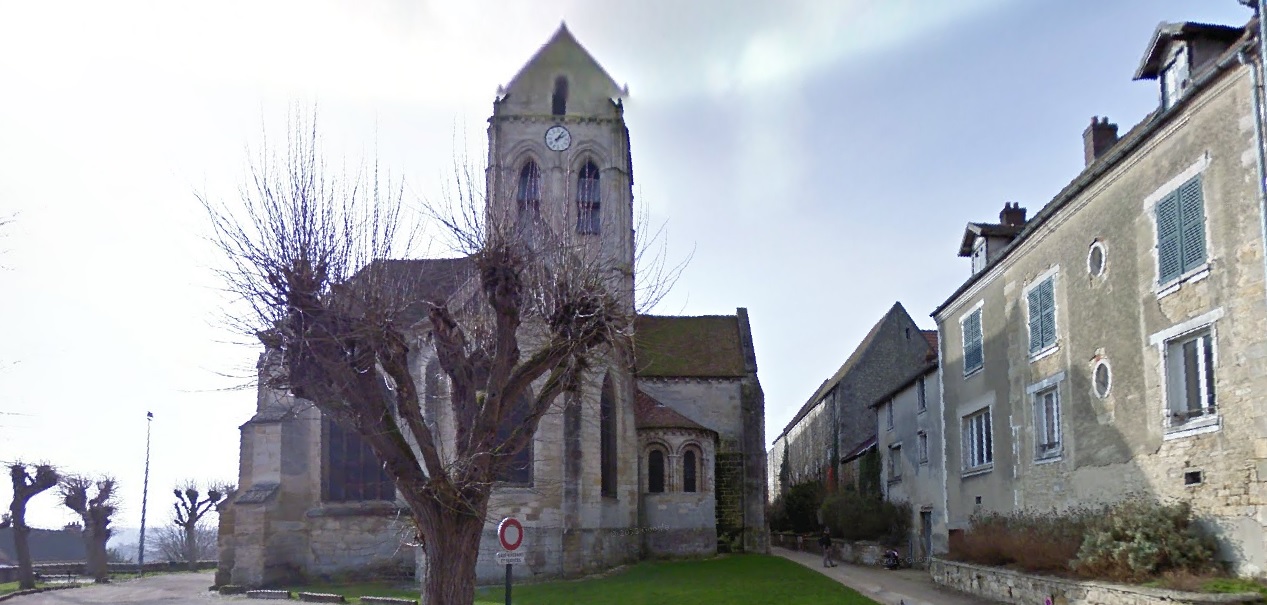
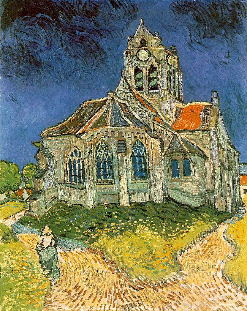
    In some ways it is a bit of science fiction for me to be able to walk via Google through so much of van Gogh’s life–for example, right up to the spot where he painted his “Church in Auvers-sur-Oise, View from the Chevet” just a month before he died in July, 1890:

    Van Gogh Auvers

     And be able to compare it to the original:

    Van gogh church[Image source, here, Vincent van Gogh and Auvers-sur-Oise]

    Van Gogh left Arles for Auvers in May of 1890, looking so much better and healthier that even Dr. Gachet thought that he might be cured.  However, that was not the case, and the sight of his brother in his own (lengthy) illness (Theo would die just months of Vincent) plus whatever else you might want to throw into the pot would lead to the path of his suicide. 

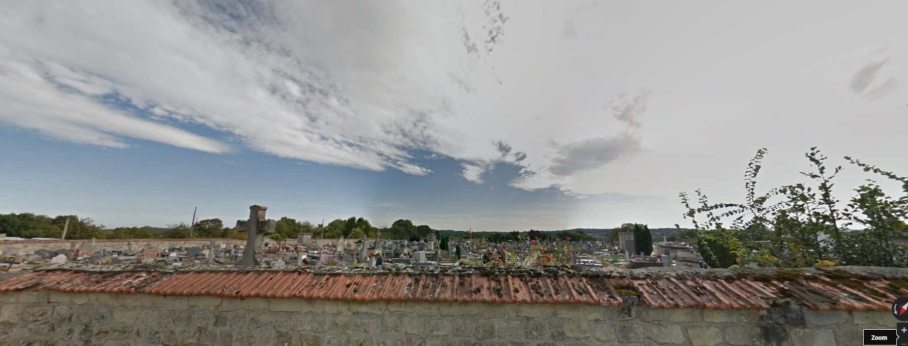
    Van Gogh was buried in Auvers, north-east of Paris, and Google will take you there, too. I went, mainly just to see what was on the other side of the wall that you see in the endless series of photos of the Vincent and Theo headstones.  You can ride the Google car from the church, up a small hill, and certainly less than a kilometer away is the cemetery, reachable along a roughish road.  The other side of the wall is featured in the fist screen capture, with Theo’s headstone to the right of the large cross, and Vincent next to him, there against the other side of the wall, which has clay shingles on the street side:

    Van Gogh grave

    And what you would see if you could see over the wall from the cemetery, looking over and past the van Goghs:

    Van Gogh grave opposite

    I like this view better.


    ·Posted by :

    ·in:


  • What Everything Sold for in the Armory Show, 1913

    JF Ptak Science Books  Post 2352

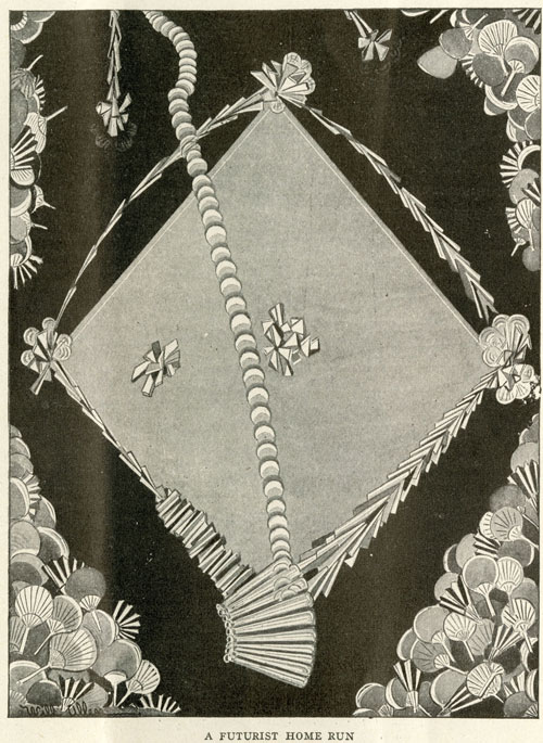
    Between 17 February and 15 March 1913 there occurred in the huge building at Lex between 25th and 26th streets in NYC–the monumental International Exhibition of Modern Art at the armory of the Sixty-Ninth Regiment, the Fighting 69th (so called by Robert E. Lee), the “Fighting Irish”, the famous Armory Show, the Armory Show.  This was the first large public exhibition of modern art in America, and even though the 69th regiment had seen five wars (at least, so far as I can tell), the armory itself hadn’t really seen one, until 1913, when battle lines were drawn among the Cubists and within and without the confines of the modern” part of modern art, the sensitive honor of the nature of art laid bare.  

    FuturistHomeRun-LIFE2[Source: the New York Historical Society’s excellent 100th anniversary celebration of the Armory Show,   armory.nyhistory.org.]

    The most legendary of the most public battles fought here was probably over Maestro Duchamp’s Nude Descending a Staircase (1912), presenting itself as a shocking state of a-stairs, creating whimsical diversions even amongst the cognoscenti who found their way down every avenue for diversion and especially derision. (Check this fine site celebrating the 100th anniversary of the show, listing and displaying many of the most famous of the cartoons published taking a swing against art and Duchamp here http://armory.nyhistory.org/category/artworks/)

    But my reason for stopping here with the Armory Show today is a chance find in Steven Watson’s Strange Bedfellows, the First American Avant-Garde (Abbeville 1991) where on page 168 is a data box stating:

    • “Total Sales:  $44,148 ($30,491 for works by European Artists, $13,675 for works by American artists.”

    …which I found extraordinary.  Even using the Bureau of Labor Statistic’s CPI calculator this figure gets bumped up to the buying power of somewhat more than $1,000,000 in 2014 dollars, it is still incredibly shy of anything approaching any aspect of the financials of the art world.  Here was the greatest collection of artists (perhaps?) of modern times under one roof with their works offered for sale for nearly a month and only $44,000 was generated, with only a third of that going to American artists.  

    When you consider some of the individual successes at the show–Redon collecting $7000, Cezanne $6700, Wilhelm Lehmbuch  $1600, Edward Kramer $1675–you have four artists collecting more than a third of the total sales, leaving $27,000 to be shared by the rest of the exhibitors. (This is a very impressive and long list, some of names of the blockbuster of blockbuster shows shown below, via a Wiki article on the exhibition http://en.wikipedia.org/wiki/Armory_Show.)

    And then when you consider that some 1600 pieces of art were exhibited, it leads me to the conclusion based on these bits of data that not all that much was sold at the monster show. 

    Now of course $44,000 was a lot of money in 1913, though it was still not very much money at all actually spent in a creative/explorative/appreciative manner.  The total was about 100 times the average salary of an American worker (about 400/year).  TO put things in perspective, the total sales at the show in terms of 100 times the average American yearly income would be about $5,000,000 which is still a tiny percentage of what the enormous sum could be had these pieces of art been for sale in 2014.  

    In short, really, the difference in the numbers is so vast that they are almost without meaning sop far as comparison goes between 1913 and today.  That said, I still find it extraordinary.

    By the way, Duchamp sold four pieces for a total of $972, according to Mr. Watson.  

    Notes: 

    ·Posted by :

    ·in:

    —

  • Human Computer Art, 1949

    JF Ptak Science Books   Post 2321  A Post called “Computer Art, 1949”, revisited and much expanded

    This is a great example of an exactly-what-is-this object, something that seems to be one thing, then the other, but then neither.  
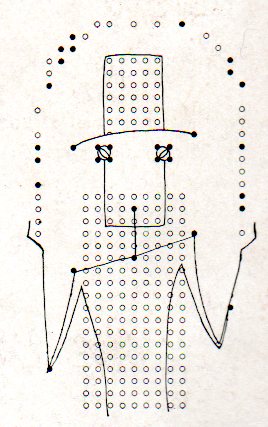
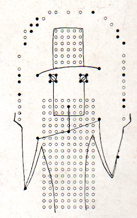
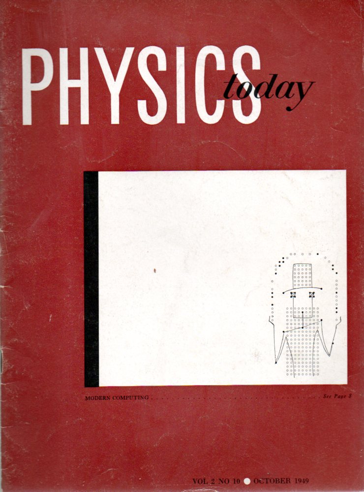
    Computer art154I’m not sure how to investigate this right off-hand, but I think that there is a special category in the history of art, subcat history of art and technology, subcat history of computer art, subcat using the technical aspects of the computer in art.  The image above comes from the front cover of one of the early issues of the “new” Physics Today magazine (volume 2, number 10), in October 1949–it is the artwork of Paul Bond, who created this portrait of a juggler “on a matrix sheet used for plotting computor [sic] plug board diagrams”, and is one of 11 such images.  So, while not computer art–artwork generated by the computer–it is artwork using items designed to operate the computer, a sort of very early computer-material montage.  (It would be in the first-time-ish category, but I can’t say this with any surety–it is however very very early for what it is.)

    It reminds me in a way of a magazine article using the illustration of a photograph–it was in the curious category of the first time an image of a photograph was published, that is to say it was a woodcut of a photograph though not the photograph itself.  This appeared in Golding Bird’s series of articles, “A Treatise on Photogenic Drawing”, which was five papers found and bound in the London-published journal, The Mirror.  and were extremely works on the new science of photography, appearing in issues from April 20-May 25, 1839. The image appears on page 241 (issue no. 945, Saturday April 20) and displays this first image of a photogenic drawing, which was the first publication of an image produced by any sort of photographic process.  (The process here is the ‘sun picture” , a photographic process, making this the first published “photographic” image, but really it is more like the first publication of a photographic image that was produced via woodcut.  It predates the first mass-published photograph by four years and the first (entirely) photographically illustrated book (The Pencil of Nature ) by six years.)

    Our computer artwork illustrates an interesting article (“Modern Computing”) by pioneers R.D. Richtmyer and N.C. Metropolis . Richtmyer/Metropolis have a very sober approach to the computer–and mostly speaking about the ENIAC–and address its romance, possibilities, and seemingly (to me) most of all “a need for defining the limits of computing machine operation, as well as its promise”. In effect, the authors really only address the known quantities of computing capacity in 1949, and even though tempted by looking into the future, they really do not. Their vision of the future is very pragmatic, and so far as speaking to future applications of the machine they choose the very Bartlebian philosophy and chose not to: they conclude “by their very nature, these applications are not easy to foresee, and perhaps, therefore, this is the point at which this discussion should close”, preferring to watch the beautiful and complex whirlwind in a thicket from the outside.  

    There have been much earlier images of automated steam-driven robots with some sort of calculating brain, and images of imaginative computer-like objects, and stretching back into the 18th century, so the idea of creativity and thinking and human-like qualities made by things constructed of metal and wood with a power source of steam or electricity and so on was well-established, though lurking in deep-background. Art made with the computer seems to come a fair bit later than this issue, later still than what might be considered the first art generated via the computer (which were images made from manipulating an oscilloscope) in 1952. This was the work of Ben F. Laposky (1914-2000) an Iowan and mathematician/draftsman and former sign-painter who took long time exposure photographs of waves motions on a cathode ray oscilloscope with sine wave generators and found beauty in them. His work was first exhibited at the Sanford Museum in Cherokee, Iowa, in 1952, as “Oscillons or Electronic Abstractions”1 –hundreds of other shows would follow.2 One of the earliest appearances in print of the oscillons is in Scripta Mathematica, Sept-Dec, 1952, pp 305 (and then somewhat later in Design, May 1953).

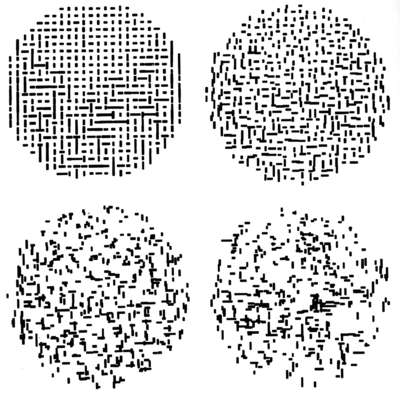
    Among the earliest computer-generated art–that is, art made via an automatic process input by humans by created by the machine–was created and noted by A. Michael Noll (b. 1939) with an IBM 7094 and described as “computer art” in “an August 1962 technical memorandum”3. Noll has written extensively (and interestingly! and early) on human/computer interfaces including computers and dance, fourth dimensional imaging, and much else4, including a fabulous comparative study of an original Mondrian and a computer-generated alternative5. (Noll is today widely recognized as one of the first in the field of digital art and 3-D animation.) 
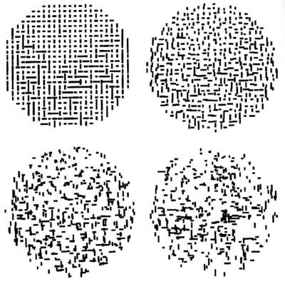
    Noll

    [Image source: Compart, Cener for Excellence in Digital Art, here.]

    In any event, I think at the very least that the Bond artwork is very curious, interesting, and probably very early for what it is.
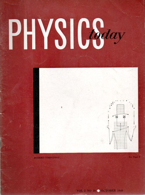
    Computer art153Notes.

    1. This reference was first found in Arthur I. Miller’s Colliding Worlds, (Norton, 2014) on page 66.  Miller is perhaps the most upper tier in upper tier historians of science with the specialty of art/science interface–over the years I have enjoyed his work enormously.

    –See here for a full text of Electronic Abstractions.

    2.  “Electronic Abstractions are a new kind of abstract art. They are beautiful design compositions formed by the combination of electrical wave forms as displayed on a cathode-ray oscilloscope. The exhibit consists of 50 photographs of these patterns . A wide variety of shapes and textures is included. The patterns all have an abstract quality, yet retain a geometrical precision . They are related to various mathematical curves, the intricate tracings of the geometric lathes and pendulum patterns, but show possibilities far beyond these sources of design.”—Sanford Museum, Gallery notes for Electronic Abstractions, 1952 (Wiki)  For a good appreciation of Laposky, see Alison Drain, “Laposky’s Lights Make Visual Music” in Symmetry 4/3, pp 32-33.

    3.  Miller, page 68.

    4. See the following: 

    Noll, A. Michael, “Short-Time Spectrum and Cepstrum Techniques for Vocal-Pitch Detection,” Journal of the Acoustical Society of America, Vol. 36, No. 2, (February 1964), pp. 296–302

    Noll, A. Michael, “Computers and the Visual Arts,” Design and Planning 2: Computers in Design and Communication (Edited by Martin Krampen and Peter Seitz), Hastings House, Publishers, Inc.: New York (1967), pp. 65–79.

    Noll, A. Michael, “The Digital Computer as a Creative Medium,” IEEE Spectrum, Vol. 4, No. 10, (October 1967), pp. 89–95

     Noll, A. Michael, “Choreography and Computers,” Dance Magazine, Vol. XXXXI, No. 1, (January 1967), pp. 43–45

     Noll, A. Michael, “The Effects of Artistic Training on Aesthetic Preferences for Pseudo-Random Computer-Generated Patterns,” The Psychological Record, Vol. 22, No. 4, (Fall 1972), pp 449–462.

     Noll, A. Michael, “Computer-Generated Three-Dimensional Movies,” Computers and Automation, Vol. 14, No. 11, (November 1965), pp. 20-23.

    Noll, A. Michael, “Computer Animation and the Fourth Dimension,” AFIPS Conference Proceedings, Vol. 33, 1968 Fall Joint Computer Conference, Thompson Book Company: Washington, D.C. (1968), pp. 1279-1283

     Noll, A. Michael, “Art Ex Machina,” IEEE Student Journal, Vol. 8, No. 4, (September 1970), pp. 10-14.

    5.  Noll, A. Michael, “Human or Machine: A Subjective Comparison of Piet Mondrian’s ‘Composition with Lines’ and a Computer-Generated Picture,” The Psychological Record, Vol. 16. No. 1, (January 1966), pp. 1–10.

  • Crazy Cubes, Baseball Cannons, Logic, and the 4th Dimension, 1897

    JF Ptak Science Books   Post 2258

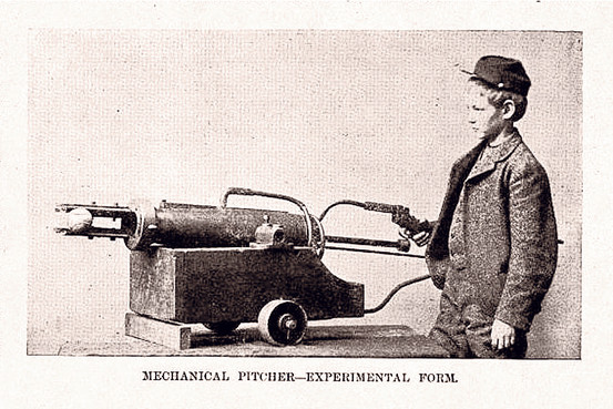
    Hinton cannon[Source:  Joshua Robinson, “A Machine Before its Time”, Wall Street Journal, June 21, 2010. See below.]

    Somewhat Zelig-like, Charles Howard Hinton (1853-1907) is a sort of shadowy Oxford-educated figure who turns up in the beautiful Jorge Luis Borges’ works, and who married George Boole’s daughter, and who was a great and very early visualizer of geometries of higher dimensions, and who was the coiner of tesseract, and the inventor of a baseball pitching machine, and a practical joker, and a sci-fi writer, and who deserved an obituary in the New York Sun by the masterful Gellett Burgess (May 5, 1907), and who seemed to keep one step ahead of everyone and himself.

    He was also the creator of crazy cubes.

    There are many standard-bearers in the history of modern art who probably owe something to Hinton, who published his ideas on the fourth dimension (illustrated!) just at the time when this idea was in it trial runs in the artwork of the modern age.

    And so do baseball players—or at least those at Princeton, where he introduced his machine which evidently was used there for several seasons. The pitching gun really was a cannon, the baseball loaded into the thing with an appropriate cartridge to shoot the ball at pitcherly speeds, which he described it in Harper’s Weekly for March 20, 1897. (How Hinton got to Princeton is interesting and a mystery, both; he was an instructor of math in England until he was charged and convicted of bigamy in 1886, whereupon he took his first wife and four (?) sons to Japan to teach in Yokohama for a while, then yadda yadda yadda he starts teaching at Princeton in 1893.)

    Hinton was into a lot of things, with a very inquisitive mind, and very smart. And so he bounced here and there in his careers, from position to position. David Toome, in his fine The New Time Travelers: A Journey to the Frontiers of Physics (2010) gently and wonderfully describes Hinton (in his relations to the exterior world of work) as “buoyant” (page 29).

    In any event, Hinton seems not to have patented the thing,so far as I can determine in 10 minutes of patent searches.

    The cannon seems to have excited a bit of baseball scifi in itself, adding to Hinton’s other pleasures.

    In a longer and better article than mine, Joshua Robinson writes in the Wall Street Journal about  Hinton’s machine and the near-roboticized future of baseball:

    “…(I)n 1896, the Los Angeles Times called it a “Frankenstein.” One Washington Post columnist worried it would ring in an age of robots ruining the national pastime—this was a long time before anyone was worried about steroids.

    “There would be the base-burning, high-pressure, anti-friction catcher,” he wrote, “and the shortstop made of aluminium and rivets and filled with cogs, cams, valves, shafts, and belting.”

    Hinton’s pitcher was an interesting idea, but ultimately it proved to be too cumbersome and slow to be of any sustained use. Plus, as Robinson points out, after the cartridge was fired there was a puff of smoke, which caused occasional consternatiuon and confusion for those standing in front of the canon. And ducking.

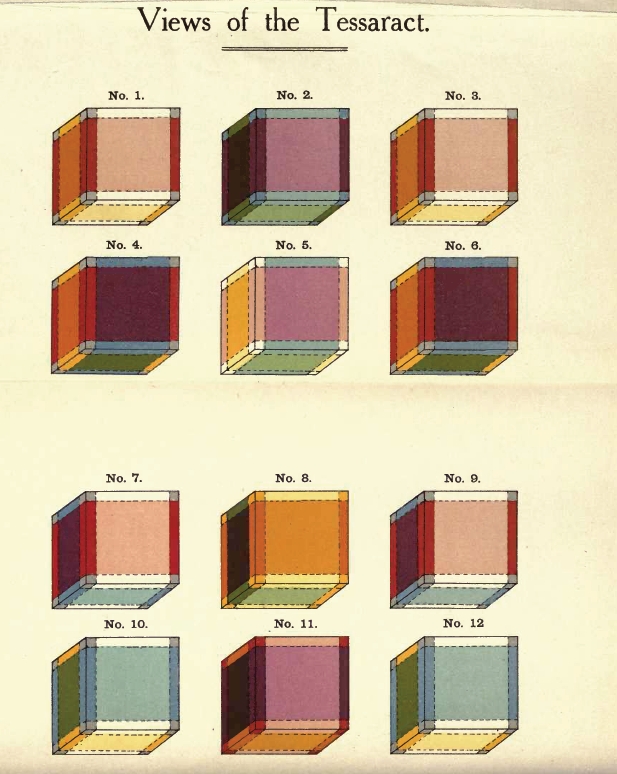
    And the so-called “crazy cubes”?  That moniker is my own creation. These were simply (really not so) creations by Hinton that he said would help people visualize his four dimensional world, as Rudy Rucker (see below) describes as “points moving around in three dimensions might be imagined as successive cross-sections of a static four-dimensional arrangement of lines passing through a three-dimensional plane…”  Evidently the cubes helped many people experience a more internalized world of fantastic difference, some stating that the cubes drove some people insane. Of course they were just colored cubes, pretty in themselves–though the problem of visualization was fairly knotty.  

    Hinton tesseract[Source: The Fairyland of Geometry, a Cultural History of Higher Space, 1869-1909, here.]


    Notes:


  • A Note on the History of Simultaneity

    JF Ptak Science Books     

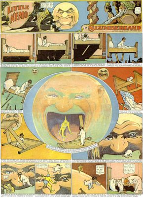
    There is a great, unifying factor drawing together Aztec glyphs, Little Nemo in Slumberland, Marcel Duchamp, the Renaissance Sienese Sassetta, Guillaume Appolinaire, William S. Porter—they all display disparate chronological sense to a single story.

    Blog--may 25--st. anthony
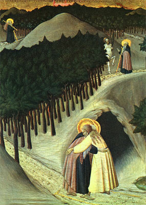
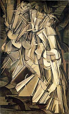
    The concept of displaying the passage of time, relating multiple events taking place at the same (or different) times, is really quite a lot older than the what is generally considered to be its recent modernist beginning.  Duchamp’s Nude Descending, which is a masterpiece of modernism displaying unfolding time and multiple perspective views across time of the same object, is the direct descendant of centuries-old artworks.  The Egyptians and the Aztecs certainly made use of this idea of multiple stories at multiple times in their stone storyboards.  Closer to the present is the genre of early Renaissance painting like Sassetta’s The Meeting of St Anthony Abbot and St Paul the Hermit (painted circa 1440), which shows several aspects of the story over time, and depicted on the same canvas. (We see the beginning of St. Anthony’s journey at top left, heading out on his journey as a younger man, winding his way through dark wood and along a curving trail; we see him a second time as an old man, and then lastly at bottom, elderly, finally meeting the other monk.)


    Blog--may 26--nemo

    The rollout of the Sassetta masterpiece (hanging happily at  the National Gallery in D.C.) reminds me a lot of the great hallmark of storytelling at the beginning of the twentieth century—no, not Barzun or Cendars, but Little Nemo (who predates all of the other greats who were to come in the next ten years or so).  Winsor McCay’s (1871-1934) Little Nemo in Slumberland (appearing in the Hearst newspapers beginning in 1902)—better yet, the comic strip in general—adopts a platform for storytelling that is nothing short of revolutionary.  By breaking out the development of the narrative in front of the reader and on one single sheet of paper gives the author fantastic maneuverability.  This is also seen in the early motion pictures of Edwin S. Porter (like The Ex Convict, 1905) and D.W. Griffith (The Lonely Villa, 1909) who both use a new concept of contrasting editing—cutaways from the main action and pace of the.

    Blog--may 26--nude descending


    film and incorporating vignettes of actions that are related and happening elsewhere, sometimes all of it happening at once.   The story is able to develop multiple themes that are occurring at the same time but in disparate locations—the artwork of futurists Balla and Boccioni and the unclassifiable Duchamp reach for the same end, and so to (again) with Apollinaire and Cendars and the rest…and all of them coming into view in 1912/1913 or so.

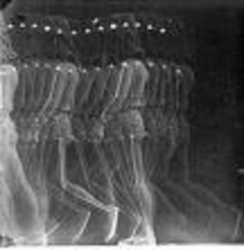
    There’s a lot to talk about on the tech end of this too, not the least of which is the work of Etienne Marey who made highly successful photographic investigations (in the 1870’s and 1880’s)
    of all manner of locomotion, some of the results of which look like the x-ray of Duchamp’s Nude.  Perhaps the greatest early enablers of technological simultaneity are the telegraph and (more impressively) the telephone, both of which allowed people to be in two different places at the same time (so to speak).

    Blog--may26--marey

    Again, this is just a note, thinking out loud, about the concept of simultaneity, and I doubt that I’ve even broken the surface…I’ve not even considered the math and physical aspects of it all, not even a whisper about Einstein and Schroedinger.  I’ve just done a search and found two works by eminent historians of science on this topic which I should think would demand reading:  Max Jammer’s Concept of Simultaneity (2005) and Peter Galison’s Einstein’s Clocks, Poincare’s Maps and the Empire of Time (2003).  I’d like to return to this post when I think I might have an idea of what I’m talking about…


    ·Posted by :

    ·in:

    — —

  • Found-Art in Electrical Discharge, 1880

    JF Ptak Science Books   Post 2212  History of Anticipation series   

    It makes me wonder about how things were labeled “art” in the history of labeling things.  In a way it is not at all like naming where the American “West” is, or where the “South” begins, because those definitions seem to get very local and very detailed very quickly, and then the labels get bigger and wider and more open to interpretation.  That is to say that the labels make more accommodation for the idea, at least far more so than the labeling of “art” was concerned in the pre-Kandinsky/Cubist/Abstract era, or at the very least before the era of early impressionism.  
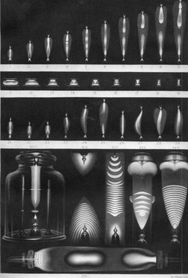
    Electrical discharge031

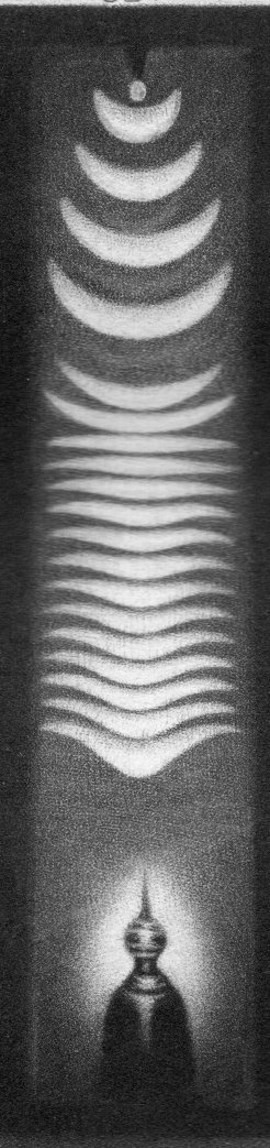
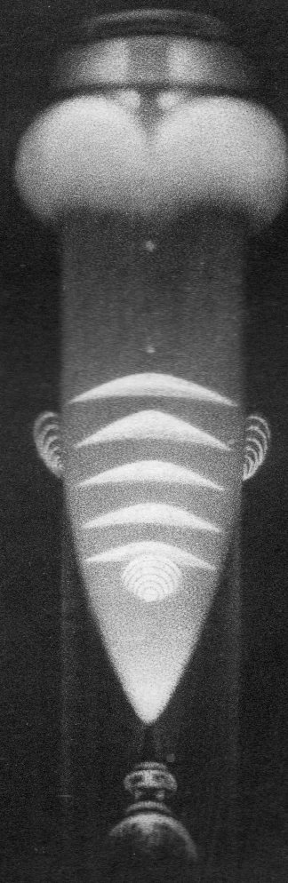
    This is a tiny detail from a full-plate plate from Nature, in an article by Warren de la Rue on electrical discharge (and printed 24 June 1880). (Actually, the big full-page images like this are fairly rare in Nature–more so when the image is mostly very dark, meaning they took a lot of ink to print.)  It is a beautiful thing, and was probably always considered beautiful in a scientific sense, though I think it would have been very highly unlikely for it to have been appreciated in an extra-scientific artistic sense by significant portion of the viewing population, let alone be called “art”.  Even if someone approached it as Impressionistic, it still did not resemble anything recognizable, and those days for non-representational art was still more than 30 years away.  

     Calling things “art” was far more regulated at this in the art history than what it would become in the decade of so after the popularization of discussion on the fourth dimension and the discovery of the X-rays and Thomson’s atom and then, just a little while later, the first appearance of the theory of relativity. The protocols were far more strict prior to the invention of Impressionism (I have no idea how J.M.W. Turner survived in his Outsider-y genre for all of those decades before progressive Impressionism) than those that existed in 1880, or at least for those that existed that could consider these electrical discharge images as “art”.  

    Of course Roualt and van Gogh and Rosseau and Braque and the rests had their own difficult experiences with acceptance, and some were even rejected by the groups that they helped to establish (like Duchamp with his readymades getting the heave-ho in NYC).  

    In general though there were very few people who had one foot in the Beaux Ecole school who could have another foot in the expansive world who could have considered scientific images like these as “art”.  

    The full image: 

    Electrical discharge030


    See also this post on Emily Van der Poel’s beautiful pre-abstract/cubist found art :  

    Art-vanderpoel186 


    Electrical discharge032


    ·Posted by :

    ·in:

    — —