A Daily History of Holes, Dots, Lines, Science, History, Math, Physics, Art, the Unintentional Absurd, Architecture, Maps, Data Visualization, Blank and Missing Things, and so on. |1.6 million words, 7500 images, 4.9 million hits| Press & appearances in The Times, Le Figaro, Mensa, The Economist, The Guardian, Discovery News, Slate, Le Monde, Sci American Blogs, Le Pont, and many other places… 5000+ total posts since 2008.

Category: Art History

  • The Coloring Book of Hell–Hell in Black & White (ca. 1600)

    JF Ptak Science Books   Post 2676

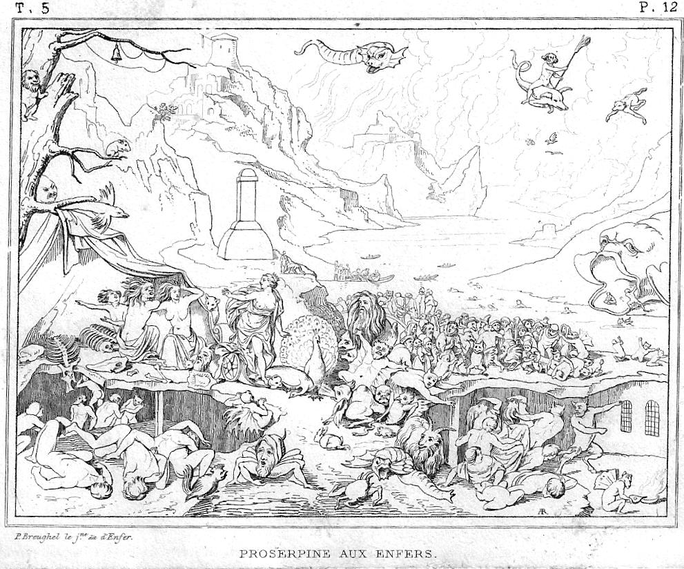
    If you were to wish a foul curse upon the soul of the dead in Hell, then it is Prosperine/Persephone who would carry it out. The Hitman of Hades had the capacity to inflict damage upon the already damaged, what with being the Queen of the Underworld and wife of Hades. She is also the daughter of Zeus and the harvest goddess Demeter, so there is also that life/death struggle bit going on in the background. 
    Brueghel hell

    This image is made from the painting by Pieter Brughel the Younger (1564-1638), son of Pieter Bruegel  and part of the dynastic family of painters. (They spelled their surname differently, depending upon the time and the user.) The legend of the engraving tells us that “P. Breughel [sic] le jne, dit l’Enfer” was also known as the “Hell Brueghel” for his interest in depicting that place, and he certainly does live up to the nickname.  Even though the engraving is pretty small (about 3×5″) it does communicate at least the sense of what the painting delivered, which was a very detailed and massive account of the underworld.  Even though the engraving is only a shadow skeleton of the original, we do get a sense of Mr. Cash’s lake of fire, and though we see the torments of the damned we generally do not see what it is they are suffering from.  Prosperine is at center left, having just arrived in Hell (according to the description1 of the plate found in Museé de peinture et de sculpture, ou, Recueil des principaux ..., volume 12, 18312, and behind her we see a river with boats dispensing new arrivals; at right, background, we see a gaping Hell Mouth though without fangs/teeth, which has at least one newly-damned trying to climb his way back into the mouth to perhaps retrace his steps to the surface of the regular world.  The image is creepy enough without the color and great detail of the original, what with the dozens of horrified dead falling about and a floating pig-snake flying above.  

    The imagination ran high on the imaging of Hell, mostly for ever and ever–Dante, Botticelli, Japanese Hell Scrolls, Bosch, and on and on, though the flavor of it slacks off a bit when most of the image is white.  So, if you were of a mind to do so, here’s your chance to color in one version of Hell as you please.  

    Notes:

    1.  “PROSERPINE AUX ENFERS. Le peintre Pierre Breughel le jeune est souvent désignésous le nom de Breughel d’Enfer parce qu’il aimait à traiter des incendies et des sujetsdiabcliques. On en voit un exempledans ce petit tableau où il a représenté Proserpine à l instant où elle arrive aux enfers tandis que tous les autres artistes anciens et modernes se sont pliis à retracer le moment où Pluton enlève la jeune déesse des riantes plaines de la Sicile. La fille de Cérès descend de son char et parait vouloir s’éloigner de l’ endroit où sont assises les trois furies, Alecto, Mégère et Tisiphone. Mais en détournant la vue de dessus les impitoyables déesses elle trouve partout des figures monstrueuses qui Iourmentent les mortels. Le lointain offre la vue de bautes montagnes d où sort un grand fleuve sur lequel on aperçoit plusieurs barques remplies des âmes des mortels qui viennent de quitter la terre. Ce charmant tableau peint sur cuivre fait partie delà galerie de Dresde. Il n avait jamais été gravé.”

    2.  I have the full set of 22 volumes for sale elsewhere on this blog–if anyone is interested in owning it, send me an email.  


  • Found-Surreal Art, Elevated (London, 1876)

    JF Ptak Science Books  Quick Post

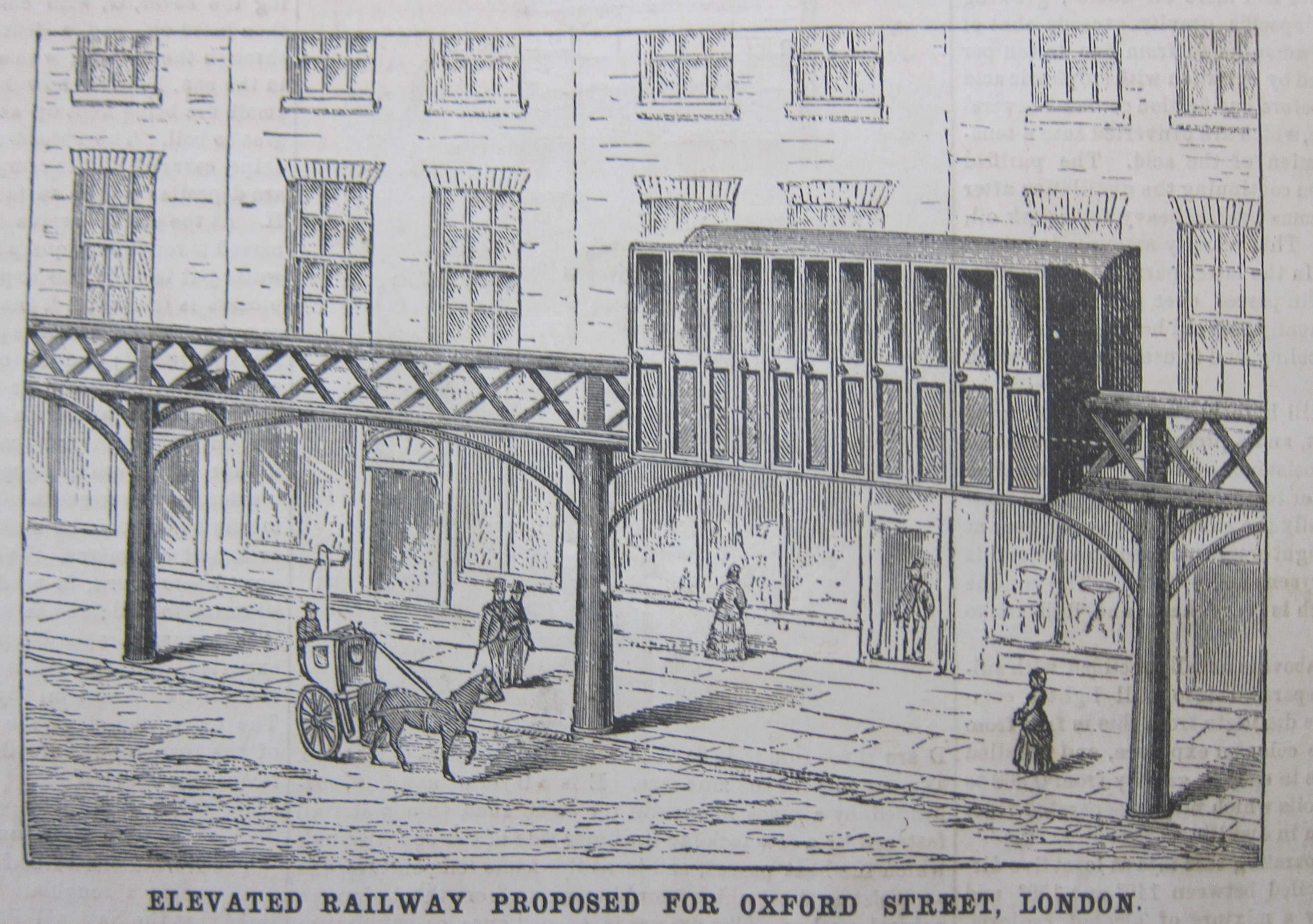
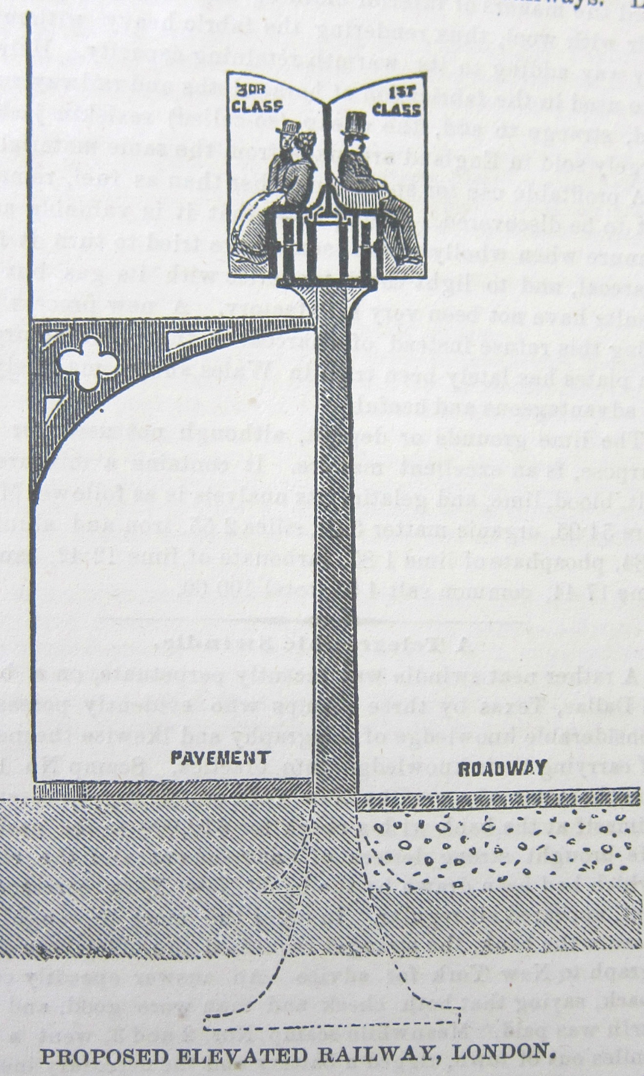
    The difference between first and third class in an elevated train seems to be (1) a chair with arms, (2) a taller hat, and (3) a big moustache.  Undoubtedly, there were actual creature comforts, though I suspect first class was meant to accommodate first-class people who would prefer not to be with not-first-class people, and enjoy the extension of that privilege in a comfortable seat.

    What attracts me to this image is the way it rubs up against the accoutrements of modernity, looking like a piece of surrealist art.  Since the image was printed in 1876 this would be “found-Surrealist art” as the existence of non-representational art was still 35 years away and the man who basically created the Surreal movement in NYC in 1924–Andre Breton–wouldn’t be born for another 20 years. In any event, this is what this looks like to me, a piece of unintentional, out-of-context art with no contemporary name.

    Sci Am 1876 elevated London

     [Source, above and below: Scientific American, February 8, 1876.  The image above is a cross section of the image below.]


      Sci Am 1876 elevated railway


  • The Dome of Creation, San Marco, Venice

    JF Ptak Science Books   Post 2625

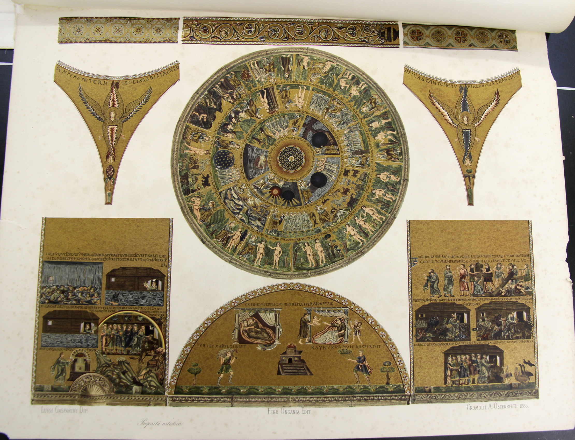
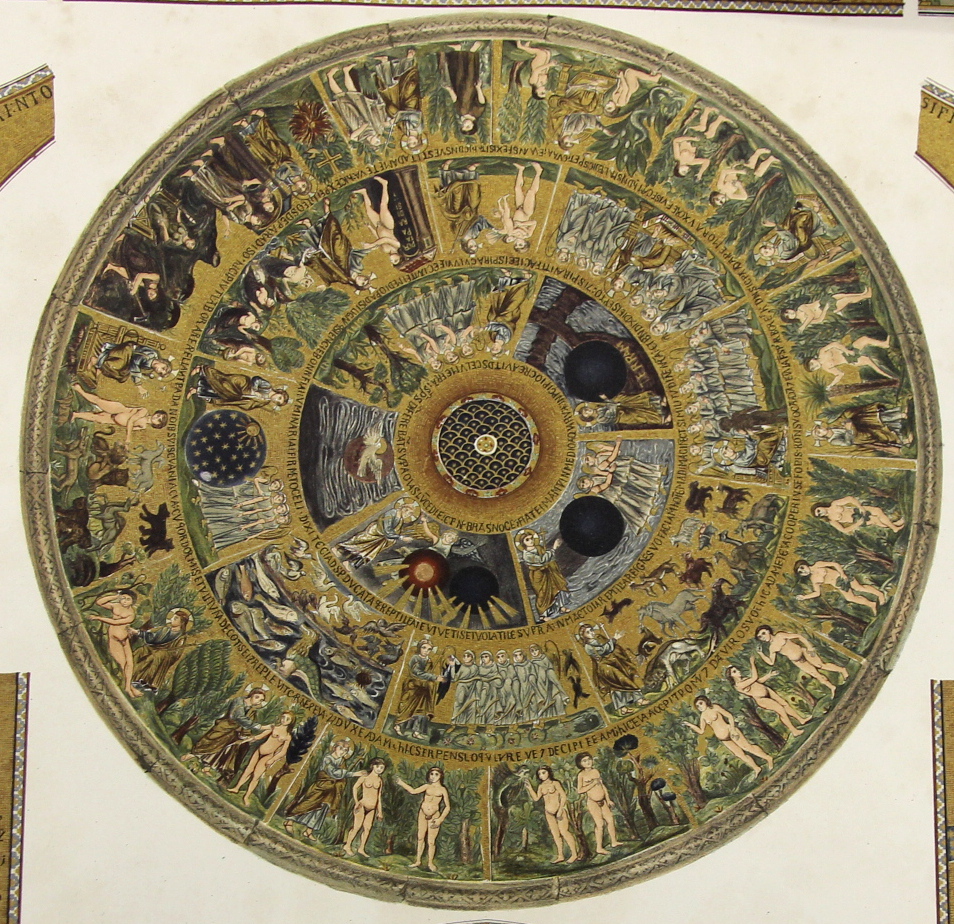
    I’m in the midst of making several posts relating to a group of large (27×21″) chromolithographs of the mosaics in San Marco (sumptuously published by Ferdinand Ongania in Venice in 1886.  The main part of this image is the story of creation, starting in the innermost circle of images, where we find the creation of light (and darkness),  and the rest, followed by the larger concentric circle showing the starry realms, the creation of the birds and fishes, then the land-based animals, and then (around “12 o’clock” on the second circle) comes the creation of life in Adam, where it all seems to go downhill.  In the outer ring we see the creation and presentation of Eve, the various temptations, the nakedness realizations and then the banishment–not all together a happy ending.  But the artwork is lovely, highlighted in gold. 

    Ongania 16 creation

    • [Creation Myth] Chromolithographic image from  Basilica di San Marino du Venezia, published by the prolific Ferdinand Ongania in 1886, 27×21″, 68x53cm. Very good condition. Ongania’s work is an exhaustive study of the iconic building, the publication being known chiefly I think for its very large and sumptuous chromolithographs of the building’s architecture, art, and endless detail. It forms two volumes of an overall monumental 12-volume epic, though these were complete in themselves.


    Ongania 16 creation detail


  • A Grant Wood Landscape in a Renaissance Painting

    JF Ptak Science Books   Quick Post

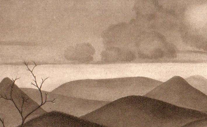
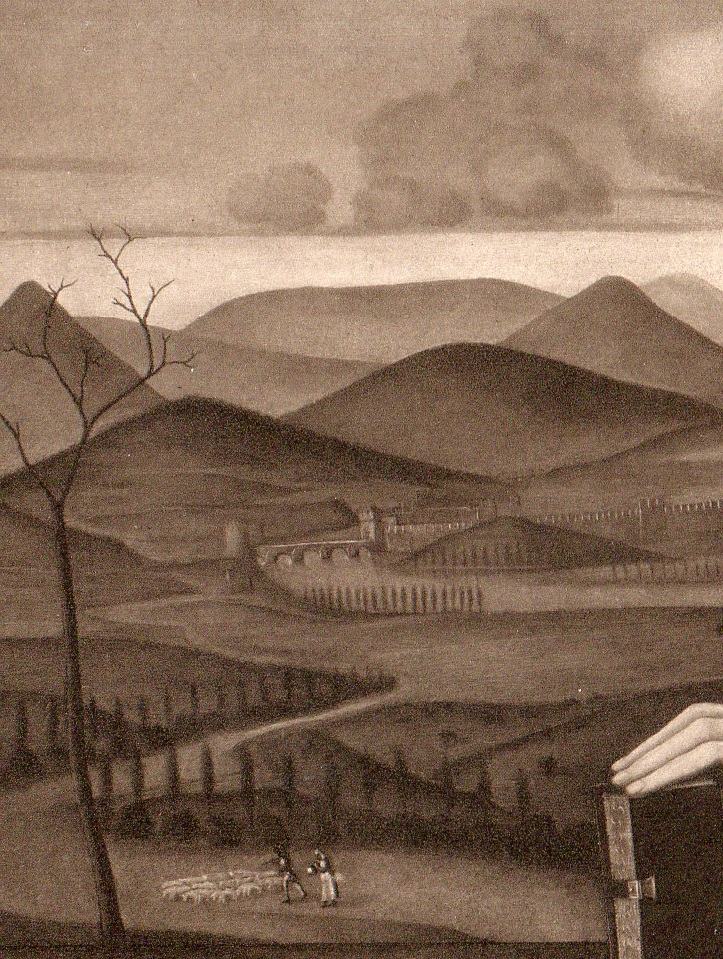
    This landscape brings to mind a certain style if not a particular artist, someone working  a lonely, cool-if-not-cold landscape, and although the terrain is certainly representational nothing on the hills seem to be, save for the tree in the foreground. It seems a little in the school of Grant Wood, or 1930’s, or something along those lines.


    Bellini_3_414


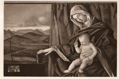
    The image is a detail, and when you pull back a little, there is more a suggestion of time and place:

    Bellini414


    When I look at the scene in context, it becomes very confusing, because it is sitting in the background of a painting by Giovanni Bellini, which was painted ca. 1500. There is no doubt that this is a Renaissance painting–but for me, seeing this grab of a modernity 400 + years into the future, I wonder what it was that moved Bellini in this way.  


    Bellini413

    [Source:  a catalog for the sale of the paintings collected by the Bourgeois brothers (which is also a good band name), Catalogue des Tableaux Anciens et Modernes composant la Collection Bourgeois Freres .printed in Cologne, 1904, painting number 3. ]


  • Neutrons, Positrons, & Hell–the Epic of the Fall of Man Suggested in the Physics of 1932

    JF Ptak Science Books   Post 2613

    Two days ago (or yesterday?) it seemed as if everything that I touched or read or researched involved the year 1932–and two of the blog posts were on things from that year. Over in the science bookstore side of what I do here, I was also working on the discovery of the positron by C.D. Anderson (announced in the Physical Review, and which showed that yes indeed there were things smaller than the atom)’ Chadwick’s discovery of the neutron, and Cockcroft1 and Walton’s splitting the lithium atom–all in that big year of 1932. And this all somehow put me in the mind of dots and circles, and then concentric circles, and then to Hell.  

    This was not the physical Hell of what was to come in 1945 and it wasn’t the future beckoning call of Armageddon that came as one of the results of decades of nuclear research–instead it was a stronger but make-believe Hell of infinite belief, brought to us via the development of numerous religions and then more beautifully described by Milton and Dante…and, in the case here, Caedmon.  

    Caedmon272

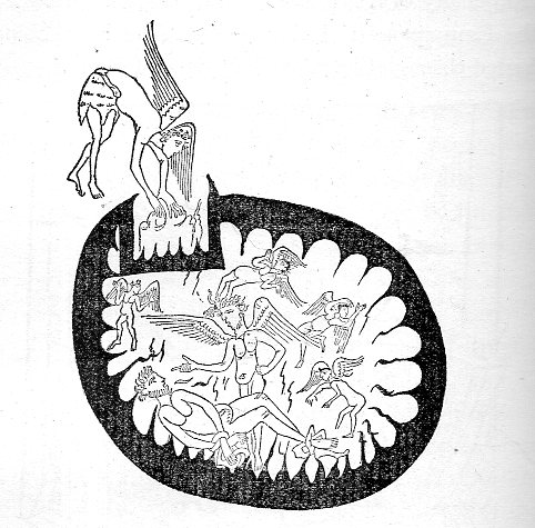
    All of this boils down to one picture that I had in mind when I was messing around with the 1932 stuff–the opening of the boundary of Hell into that of Chaos.  The image comes from a very early manuscript of Caedmon–who was a 7th century figure and the earliest English poet whose name is known. name is known–illustrating a part of the story of the fall of man. The image has stayed in the back of my mind for a long time, encountered in an interesting (and thickly spongey) book from 1896 by Stephen Gurteen (1840-1898) called The epic of the fall of man; a comparative study of Caedmon, Dante and Milton2. The striking picture is the third in the book (on page 108), though plenty of other images appear behind it through the course of the rest of the book, another 35 in all.  

    What we see is a circle within a circle, an atom of Hell, with Hell itself surrounded by Chaos, or the Abyss, and above this, there was Heaven, or the Empyrean; and in this case, an angel is reaching through the black surrounding region of Chaos and into Hell, where we see an example of the suffering of the mega-damned.  

    I know this isn’t quite a vision of an atomic model, but I associated it with our friends from 1932.  And yes there are other examples suggesting this structure springing from Dante and even Milton, but, really, it is just this one image that first comes to mind.  

    Notes:

    1. As it turns out in my experience John Cockcroft is a very rare photographic figure among physics Nobelists in that he is very frequently smiling in official photos. 

    2. Full text available here:  The epic of the fall of man; a comparative study of Caedmon, Dante and Milton, https://archive.org/details/epicoffallofmanc00gurtuoft   

    ·Posted by :

    ·in:

    —

  • The Square in Tintin, Mondrian, & Malevich (1916-1930)

    JF Ptak Science Books  Post 2584

    Tintin square015

    There are no doubt squares in the general outline of the comic book panels of Tintin–what I had in mind was a very special square that occurs in Tintin’s adventures in the Soviet Union. This was the first adventure of Tintin, and appeared in a serialized form in 1929-1930.  We are introduced to the young and intrepid journalist/adventurer here in glorious black and white (this would be the only one of the Tintin adventures that was never rendered in color at one time or another), being sent off to the newish (since 1922) Soviet Union.  At the time it was Stalin’s USSR, and things were not–shall we say–going well for the people of the Soviet Union.  Tintin’s creator, Georges Remi (“Herge”) was working an anti-Marxist angle for his conservative publisher, and he had no difficulty in supplying story lines to fulfill that need–some of these were exaggerated overall, and some were exaggerated but proved correct over time.  The adventures there were difficult, occasionally brutal, and overall not brutal enough. 

    Herge depicted an unpleasant Soviet Union, working out from the “stinking slum” of Moscow out to the farms that were being destroyed in the countryside.  He insinuated threats of violence in voting, death by firing squads, the starving of the peasants, and much else.  The deal is that by the time the strip reached its conclusion in 1930 Stalin was already underway in his loudly quiet way in instituting the Great Famine/Holodomor in the Ukraine, and by the end of this created famine–a reverse nuclear weapon of food withdrawal–something on the order of 7 million people would be starved to death by 1934. Then of course came the Great Terror of 1936-8, and the rest of it.  Herge may have exaggerated some stuff in 1929/30, but few people could have imagined (even when it was happening) the scale of Stalin’s great evil.  

    That said, I wanted really to just talk about one square in the Tintin adventure.  This is where Herge goes black (Soprano’s style)–he leaves an entire panel black to depict violence. Entirely black.  I’m not a comic book/graphic novel guy, but I’ve seen my fair share of them (most <1970) and I have to say that seeing the black panel was extremely surprising.  In my experience, it just didn’t happen.

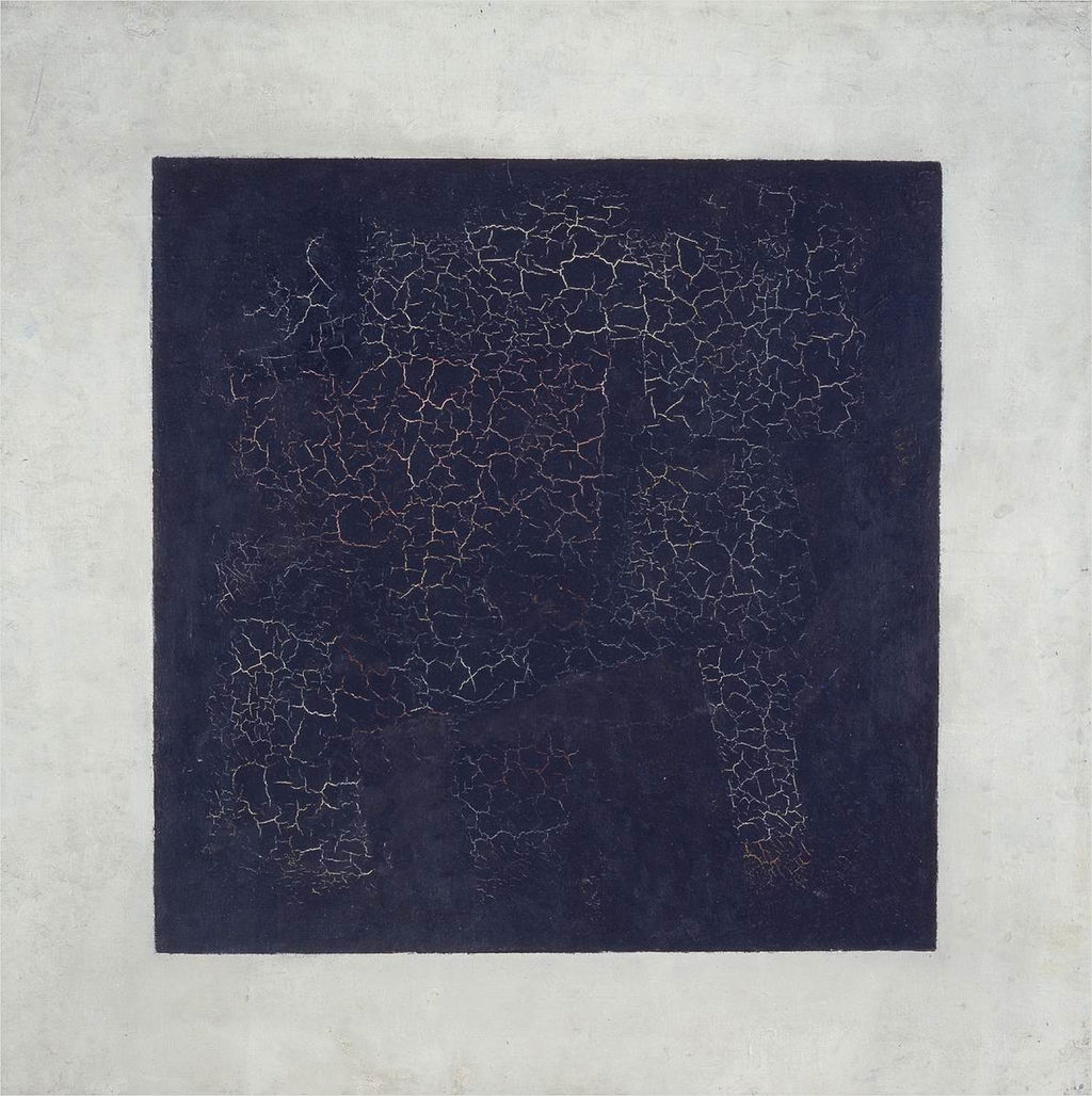
    And what that did was call to mind other squares–notably of course Kasimir Malevich’s (1878-1935) great construction, the Black Square (beginning in 1915):

    Black square

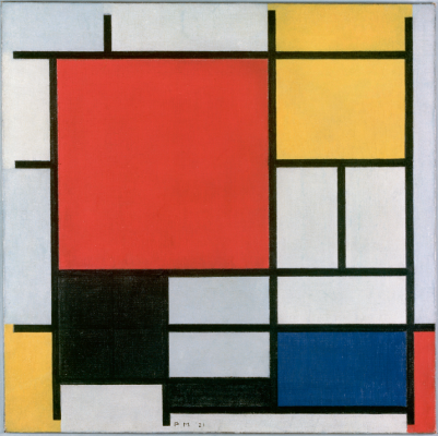
    Then of course there’s the Cubists…but what comes next to mind re the square (and the black one at that) are the later works by Piet Mondrian. Mondrian had gone through a tremendous period of change int he decades from 1905-1935, though it seems to me that even as early as 1909 squares began to appear in the skies (and other places) in his pre-Cubist representational paintings ( as in Sea Toward Sunset, 1909, and Church in Zeeland, 1909/1910), the geometry taking hold for good by 1916.  A good example is Composition with Large Red Plane, Yellow, Black, Grey and Blue, 1921:

    Mondrian black square

    [Image source: http://www.abstractcritical.com/article/malevich-and-mondrian/index.html  This illustrates an interesting article, “Malevich and Mondrian” by David Evison.]

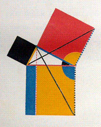
    And so we could wind our way through the history of black squares, but we’ll stop there. Oh, one more: the great squares of Oliver Byrne who in his gorgeous 1847 work replaced numbers with colors in presenting the first six books of Euclid:

    Byrne square

    [Source: https://historyofideasblog.com/thesciencebookstore/2008/05/jf-ptak-scien-1.html  I wrote a little about this in the first few months of this blog back in 2008 in “Dismantling Reality–Euclid, Mondrian, Malevich, Lobachevsky and the Appearance and Disappearance of Form Through Geometry”, which I admit is a big title for a thousand-word blog, but so it goes.]


  • A View of Otto Dix’s Apocalypse Between the Wars

    JF Ptak Science Books  Quick Post

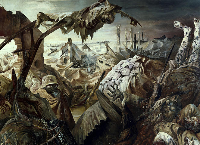
    Otto Dix (1891-1969) painted war like few others before him. He was there–he painted what he saw.  There was no inflationary appreciation of patriotic glory. For example, in the painting below (Der Krieg, 1929-1932) he depicted collapsed trenches, the miserable transport of the wounded, decomposing and horribly deformed bodies, and a view of a blank and desolate horizon. Now that I think of it a little, Georg Grosz (1893-1959) also comes to mind in regards to Dix–he was a courageous fighter, an inventive and endlessly intro-extro-spective on the social landscape, especially during the Weimar years and particularly so when 1933 came around.  They were not alone, of course, though these artists are among the shining lights of artistic-documentary-expressive experience in Germany between the wars like the brilliant Max Beckmann (1884-1950, with his Morgues of 1922), Kathe Kollwitz, Christian Rohlf, and others. In any event, the Dix painting is extraordinary.

    Here’s Dix’s Der Krieg:

    Dix trench

    ·Posted by :

    ·in:


  • Found Surreal–1868

    JF Ptak Science Books   Quick Post

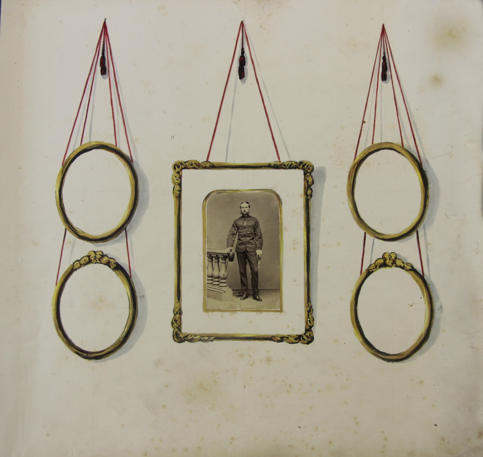
    This interesting image came from a collection of Victorian photographs, all ca. 1868 (one in the group was dated so). This example stands apart for me as an example of the Found Surreal–it has a certain artistic planned emptiness if you look at it in a certain way. Of course the original intention here was for someone getting the 18×18″ sheet ready to accept four more photographs placed in the hand-drawn frames.  

    Military photo odd


  • Atomic Jello and Henry Darger

    JF Ptak Science Books  Post 2566

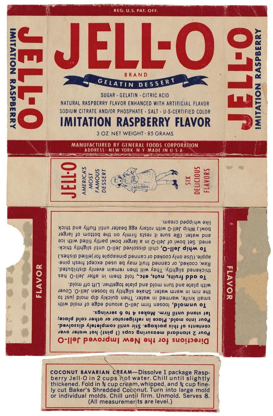
    Atomic Jello two point oneJello is a powdered gelatin formed of collagen, a cocktail of peptides and proteins from pig skin and cow bones, and “ready to eat”. 

    It is also basically what glue is.

    It is the “glue” part of this thing that brings us together here, to tell a story of atomic bomb secrets given to the Soviets and the U.S. traitors who made it happen.  

    The story of Harry Gold, David Greenglass, Ethel and Julius Rosenberg has been told countless times, and in some of them the hook for the story was this box of Jello. The Jello box was cut in half, and used as an innocuous way for Gold and Greenglass–who each possessed one half of the box–to match up, signifying that each man was communicating with his proper counterpart.  Why they thought it was innocuous to be walking around with Jello box parts in their wallets is not known, but they used it successfully, and under this cover of establishing their identities, they carried on their work.

    As I said, it is an old story. Back in the mid 1980’s when I thought I wanted to be a journalist one of the stories I dredged up was this one, and I tracked down the Rosenberg kids and interviewed them, and the janitor who cleaned up after the Rosenberg’s deaths in their execution in Ossining, and even to the Rabbi who was probably the last person to see them alive.  The story for them gets pretty weepy, and convoluted, but not so much anymore after you read the Venona transcripts regarding them.  And that pretty much tells the story, I think.

    Anyway, their stories are best told by others elsewhere.  

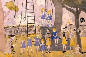
    All I wanted to do here was make the passing note that the girl on the Jello box has some resemblance to the girls populating the artwork of Henry Darger, the bleak, fabulous, impossibly-driven Outsider with what was probably a complicated and terribly unsavory fascination with young girls.   

    I don’t know if this is the exact type of Jello used by the conspirators, though this is what was entered into evidence at the trials of these people, a “replica” of what was believed to be the box, but it is good enough:

    Atomic Jello two[Source: National Archives, here: http://blogs.archives.gov/prologue/?p=4655]

    Here’s is an example of the (clothed) Darger Vivian girls. I know, I know, he is perhaps one of the great three/four great icons of Outsider art in the 20th century, but all I take away from him is a sense of very very complex creepiness:

    Darger girls

    [Source: http://www.chicagostagereview.com/the-most-conceptually-encompassing-production-of-2008-%E2%80%93-as-told-by-the-vivian-girls/]

    • See an earlier post of mine on Henry Darger and the Campbell Soup Playhouse Schoolroom for Kids, here:  https://historyofideasblog.com/thesciencebookstore/2012/09/henry-darger-and-campbell-soups-kids-playitme-schoolroom-1955.html

  • When Did Kids Start Saying “Dada” And Mean it as Art?

    JF Ptak Science Books (Updated and enlarged Archive Post)

    I guess “Dada” and not “da da” came a little before MoMA–one is from the 19-teens and the other 1929. ()I know this is a horrible joke but I’ll never have a chance to use it again…)

    In a sub-sub-sub category of the sub-category of “Books that I Want to See” comes Dada-ist books for children, and less loosely, modernist books for kids.  Or students.  I’m not sure how close I can define this field because, well, I know basically nothing about it, but I am interested in how long it took for the bits of created modernism (1895-1915 or so) to reach the level of publications intended for children.  And by Modernism I’m talking about the epochal changes in nearly all disciplines brought about by people like Einstein, Ibsen, Klee, Kandinsky, Braque, Stravinsky, Woolf, and so on. Blogdadanemo

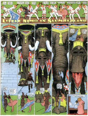
    I’ve started thinking about this in Europe but the first thing that comes to my mind is Little Nemo (and Dreams of the Rarebit Fiend too, while we’re at it), the fantastic creation of Michigan-born (Ypsilanty-schooled) Windsor McKay (1867-1934), which I think is definitely modern but not at all necessarily related to Dada, and which came to life in the miracle year of 1905.   McKay just happened to be years above and away from whatever his contemporaries were doing.  No one came close to McKay, in my opinion, until Ignatz picked up his first brick, and George Herriman drew Krazy Kat for the first time in 1913. 

    Blogdada_herriman

    Still skirting the Dada part, I’d love to see Konvolut von 14 russischen Kinderbuchern der Jahre 1930-32, a spectacular constructivist work aimed at children and from what I can see is a treasure trove of  Malevichian insight. 

    Blogbooks_wantdebussy
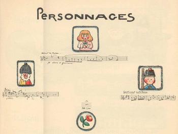
    Andrew. Helle’s La Boite a Jouhoux, (“The Box of Toys”) Ballet pour enfants (Paris, 1913), is a beautiful composition, a modernist construction, using the idea and artwork of illustrator Helle and the music of Claude Debussy.  The score is witty and has a very light touch, Debussy pleasingly borrowing from himself and his friends in a work partly inspired in a Milneian way by 7-year-old Chouchou Debussy (and her toys and dolls).  It’s a beautiful work that I’d love to have in my hands.

    Blogbdad_kid_debussy294

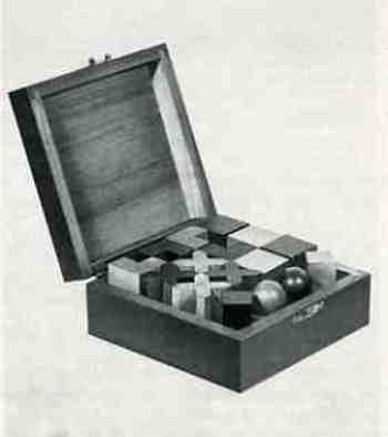
    Another magnificent-looking object that I’d like to see is the box wooden Bauhaus-inspired shapes, pictured in Junge Menschen kommt ans Bauhaus//Werbeprospekt, published in Dessau in 1929 and featuring work by Klee, Kandinsky, Albers, Ridel and Meyer.  The well-made box of shapes is to die for, and it seems as though it offered new geometrical toys/tools  for the inquiring mind in the last year of the ‘twenties.

      Blogbooks_wanted_kids291

    But I’m no closer to Dada for kids than at the beginning of this post, hoping as I was that something might shake loose if I thought about it some.  Its an interesting question to me, and I’d really like to return to it when I actually know something.