A Daily History of Holes, Dots, Lines, Science, History, Math, Physics, Art, the Unintentional Absurd, Architecture, Maps, Data Visualization, Blank and Missing Things, and so on. |1.6 million words, 7500 images, 4.9 million hits| Press & appearances in The Times, Le Figaro, Mensa, The Economist, The Guardian, Discovery News, Slate, Le Monde, Sci American Blogs, Le Pont, and many other places… 5000+ total posts since 2008.

Category: Art History

  • The Shadows of a Color “Photograph”, 1436

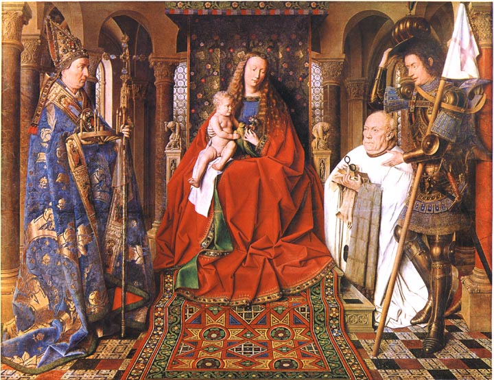
    Was it really Jan van Eyck and not J.C. Maxwell who produced the first color photograph?  Van Eyck’s after all is hanging up in Bruges in the Groeninge Museum, and Maxwell’s, well, Maxwell’s dissipated in about half an hour, leaving only an historical trace.  The problem of course is that Van Eyck’s oil (“Virgin of the Canon  van der Paele”) was done 403 years before the Daguerre invention (building of course on the work of others, notably Niepce, his former partner), so it really doesn’t count because it really doesn’t exist.  His work though *does* exist, but not as a photo—it was, is, a painting, finished in 1436, and it stands in my mind as looking so much like a perfect capturing of a moment that it seems a (luscious) snapshot. 
    Van Eyck virgin of the canon[Source: Victorian Web, http://www.victorianweb.org/painting/whh/replete/P40.html]

    In her book Color and Meaning, Practice and Theory in Renaissance Painting (1992), Marcia Hall makes the point (on page 69) that it is the lighting in this painting that makes it so extraordinary—and differentiates it entirely from the predictable light or “stage illumination of the Italians”.  Its an excellent point.  The light source in the painting is emanates as though it were a half-hour before sunset in Santa Fe; or here, in Hendersonville N.C., when there is a very low and nearly complete cloud ceiling and the sun manages just before sunset to peek through between the mountains and the cloud layers to blaze its extraordinary, horizontal-like brilliance making everything and anything that reflects that light into a work of private art. The figures in this painting by Van Eyck reflect a softer version of that light in such a manner—they are sharply illuminated, luminous, in all of their very human glory and frailty.  We have sharp relief, great detail, deep shadow—and much of that is missing in Italy at this time.

    The photo parts come in here:  the characters are caught in the middle of some very small, obscure action, and the smallness of their movements are captured perfectly

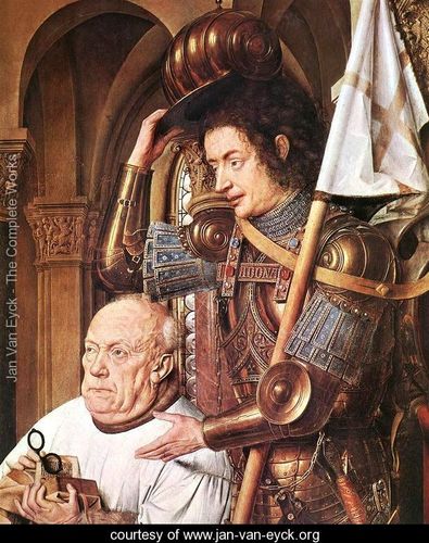
    Even though they are emotive of course the faces of the great Masaccio are relatively plain; Gozzoli, Fra Lippi, the magnificent Fra Angelico, Pisanello, Ghirlandaio, della Francesca, Veneziano, di Credi,. Perugino, and even the emotive and colorful Rafael, all working in about the same decades as van Eyck, simply do not give this anatomical expressiveness to the faces of their subjects.
    Van eyck virgin of the canon detail[Source: Jan Van Eyck . org, www.jan-van-eyck.org]

    So the extreme light and the detail in the faces gives the van Eyck this fantastical quality—on the other hand the perspective and the proportions of the characters in relation to the objects in the room and the room itself are off, secondary, not important—this too in sharp contrast to the great inventors, re-discovers, innovators of the scientific perspective.  (This homage belongs to a slightly earlier time, to Giotto and Uccello, but their work is just a bit to early for discussion with van Eyck.)  Marcia Hall goes on in her appraisal about the way in which van Eyck applied his color (“binding his pigments in a drying oil”) to give his subjects their incredible color depth, and this of course is a major element in understanding the picture (coming as it does from a stone-cold expert). 

    What I’m thinking now, the aspect that is giving this painting its “photographic” quality, its supra-realistic event, is this new use of light, new angle, with the immersion of anatomical detail and the “different”–Northern–perspective. 

    This is a very, overly, simple observation and simplification, but I think in general that it is true.
    ·Posted by :

    ·in:

    — —

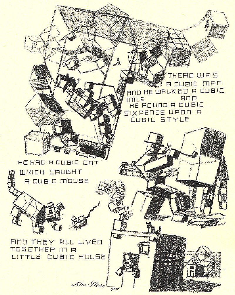
  • There Was a Cubic Man and he Walked a Cubic Mile… (1917)

    JF Ptak Science Books  Quick Post

    • “A Slight Attack of Dimentia Brought on by Excessive Study of the Much Talked of Cubist Pictures in the International Exhibition in New York.”


    Cubist cartoon

    This is John Sloan’s illustration in The Masses summing up the legendary Armory Show of 1913.

    Between 17 February and 15 March 1913 there occurred in the huge building at Lex between 25th and 26th streets in NYC–the monumental International Exhibition of Modern Art at the armory of the Sixty-Ninth Regiment, the Fighting 69th (so called by Robert E. Lee), the “Fighting Irish”, the famous Armory Show, the Armory Show.  This was the first large public exhibition of modern art in America, and even though the 69th regiment had seen five wars (at least, so far as I can tell), the armory itself hadn’t really seen one, until 1913, when battle lines were drawn among the Cubists and within and without the confines of the modern” part of modern art, the sensitive honor of the nature of art laid bare.

    • Here’s a good source for other caricatures of the show:  http://armory.nyhistory.org/category/artworks/

    Interestingly, Sloan was one of the organizers of the show, as well as a contributor–his artistic orientation was far from the base that made the show so famous. Sloan (1871-1951) was on his own a wonderful artist, of a different school, and one of my favorites depicting city/street urban life of the 1920’s. 

    His cartoon for the radical The Masses is interesting and poignant, and although it pokes fun at the Cubists, it is respectful, and intriguing (in spite of the clever “dimentia”). There were a number of other artful interpretations of the vast modernity of the show that weren’t nearly so kind, not understanding or appreciating the Abstract and Cubist work.  

    ·Posted by :

    ·in:

    —

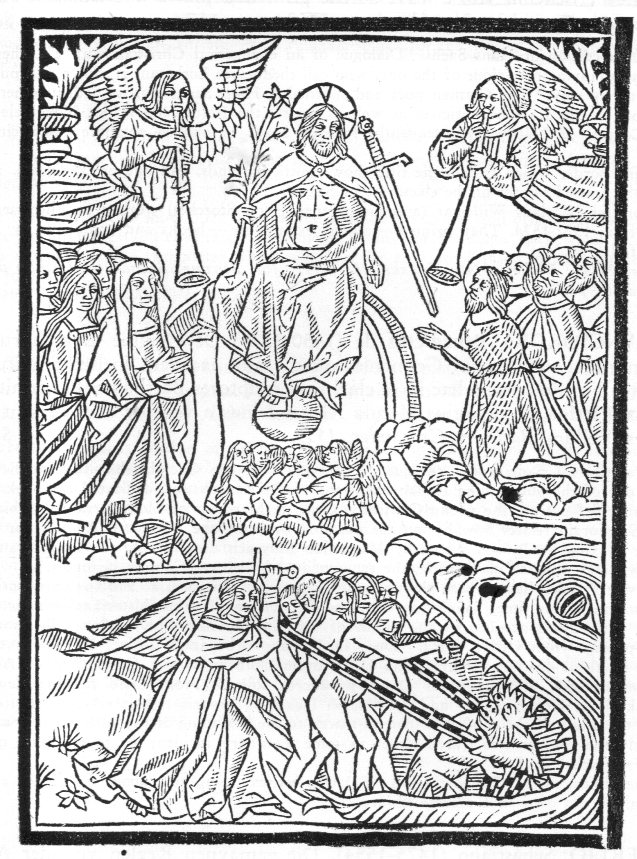
  • A Chain but Not a Chain (?) in the Last Judgment (1512)

    JF Ptak Science Books  

    Chain236

    This interesting image, “The Last Judgment”, appeared as a woodcut in a book by Ricius (Rici, Rizzi, Rizius), Paul(us) (Paulus Israelita), Freiherr von Sprinzenstein (1530 Reichs- u. erbländischer Freiherr, 1480-1541), Eruditiones christianae religigionis plurimum utiles & cuilibet christiano ad modum necessarie, which was printed in Paris in 1512. The author was a German Jew who converted to Christianity and wrote and studied a form of Christianized kabbalaism, a philosopher, translator, and a physician who was the doctor to Emperor Maximillian I.  What attracted me in all of that in this image had nothing to do with any of this–what I’m seeing here, wrapped around the condemned entering Hell in the mouth of the beast, is a chain.  The unhappy group standing in the jaw of the beast, cowering against a very annoyed Archangel Michael, are being collected with the “chain” and pulled downward by a hell-beast.  

    It is an odd object, and I’m not convinced that it is a chain, though it does look like one.  The issue with chain is that outside of being worn for defense and adornment (for centuries) steel chain didn’t appear in the west in extended use unto the 19th century.  There is a sketch of chain in a Leonardo sketch, but a popular use of a chain really doesn’t exist for another two centuries.

    Again, this item does have a torus-like shape and does look like a chain of some sort, but that doesn’t necessarily make it one.  Also I’m not familiar with its symbology if it isn’t a chain, so I’m a bit out of my element. I’m glad though to share this should someone out there know what it is, or isn’t. It is certain though that it is odd. 

    UPDATE:

    A friend on facebook provided an interesting Bible quote on chains/Last Judgment:“For if God spared not the angels that sinned, but cast them down to hell, and delivered them into chains of darkness….” 2 Peter 2:4.

    Also there are:

    And the angels who did not keep their positions of authority but abandoned their proper dwelling–these he has kept in darkness, bound with everlasting chains for judgment on the great Day.–Jude 1:6

    And I saw an angel coming down out of heaven, having the key to the Abyss and holding in his hand a great chain.–Revelation 20:1


  • Beautiful and Practical Perspective, 1596

    JF Ptak Science Books  Post 2531

    Sirigatti forms _4.5_

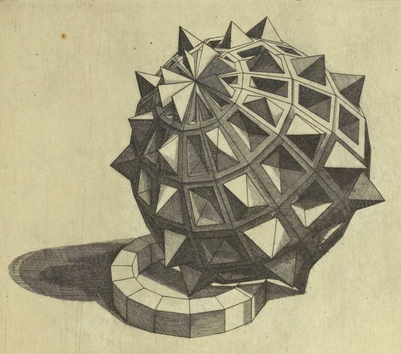
    One of the most highly valued of disciplines to the Renaissance painter and architect and engineer was perspective, and at the end of the 16th century Lorenzo Sirigatti produced a superior example of the field.  La pratica di prospettiva del cavaliere Lorenzo Sirigatti was printed in Venice in 1596 and proved to be a valuable source of inspiration and possibility. 

    The full text is located at the Getty Museum (here) from which came the five images I’ve used in this post.  Part of the acclaim of the Sirigatti work was its fine elegance and non-nonsense line, and the general exclusion of a background brought a particular clarity to the designs. The images themselves follow a development from the introduction of the basic elements of perspective to an increasing complexity in their use, flowing from fundamentals to forms to architectural standards. They are lovely things, works of art in themselves even removed from their context.  

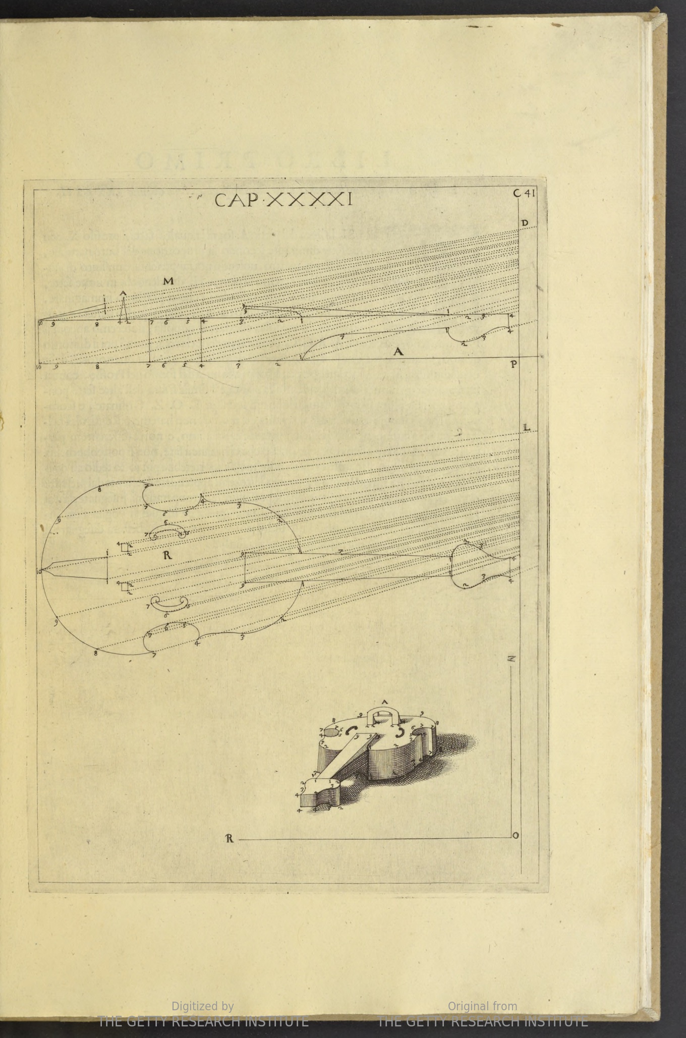
    One of the principal attractions to me was the quietness of the design, leaving everything outside of the subject to blankness–many other works of this type included scenes into which perspective studies appeared, but this was hardly the case with Sirigatti. For example, a perspective with violin:

    Sirigatti perspective violin

    Source: Getty Museum

    ·Posted by :

    ·in:

    — —

  • Design in U.S.A-Themed Pamphlets, 1895-1945

    JF Ptak Science Books   Quick Post 

    USA Naive_3_

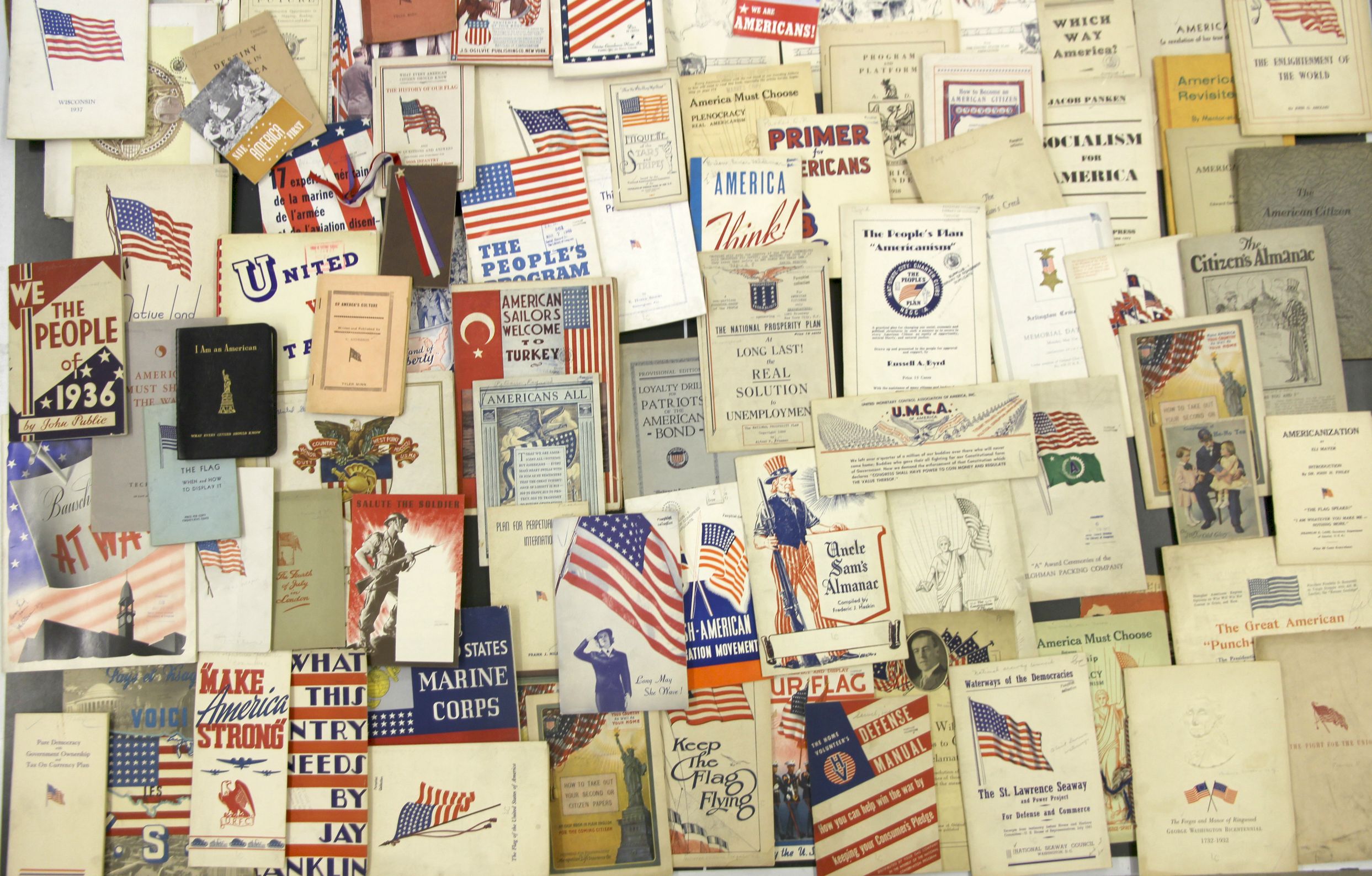
    I’ve written a number of times on this blog on the now-unusual covers and titles and contents (sometimes all three combined) culled from a 90,000-item pamphlet collection. This afternoon I came across a small collection of U.S.A. patriotic (and otherwise) covers, published 1895-1945, most of which have a flag or other patriotic emblems on them.  Some of the 125+ so works are simply patriotic works, some are flag-emblazoned works on economics, some are anti-Commie, some are isolationist, and some are, well, a little meshuga–what they all have  in common is that they either have a flag or the (declarative!) words American/American on the cover.  There’s more to this collection, but this will do for now–I think these would be very interesting, and attractive, displayed properly, and they’d have more than a design-related story to tell. 

    And details:


  • Art+Chemistry+Decomposition=Art

    JF Ptak Science Books  Quick Post

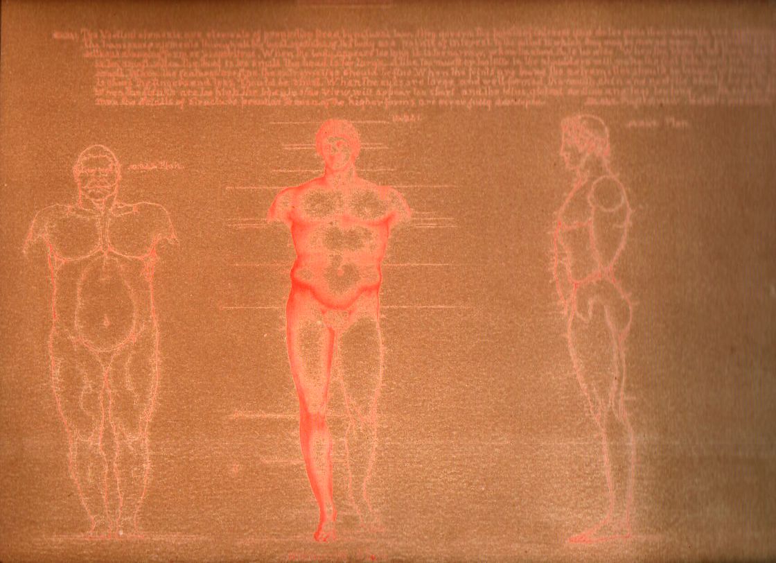
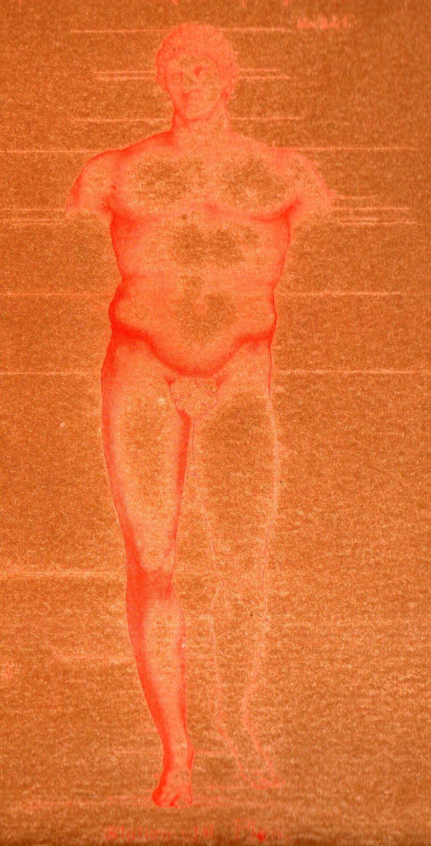
    I wrote earlier this month about the fantastic Leonardo-esque anatomy work by the prodigious William Rimmer (here)–I’m drawn back to him tonight after having stumbled upon a very unusual and interesting plate from his 1884 work.  There was an earlier edition of this work1, quite rare, that was printed in a limited edition of 50 for 50 dollars–which was a lot of money back at Centennial, a little less than what a carpenter might make in a month. (See another earlier post here “How Much is 50 Cents in 1876 Worth Today?”)

    Rimmer Odd137

    Again, I am called back to Rimmer for this interesting decomposition.  There is some sort of deterioration of the printing process, some minor mystery of the ink/paper/time/conditions battle that is going on here, and it looks as though art is losing.  On the other hand, the deterioration is creating its own artwork, probably unexpected by the original artist and printer.  

    Rimmer Odd138

    Notes:

     1. 

    [Source: Literary World, volumes 7-9, 1876-7, pg 200. Google Books: https://books.google.com/books?id=x0kDAAAAYAAJ]


  • A Leonardoesque Pre-Surrealist Anatomy Book for Artists, 1884

    JF Ptak Science Books (Expanding Post 667 from June 2009)

    Blog==June 29--rimmer pecs det

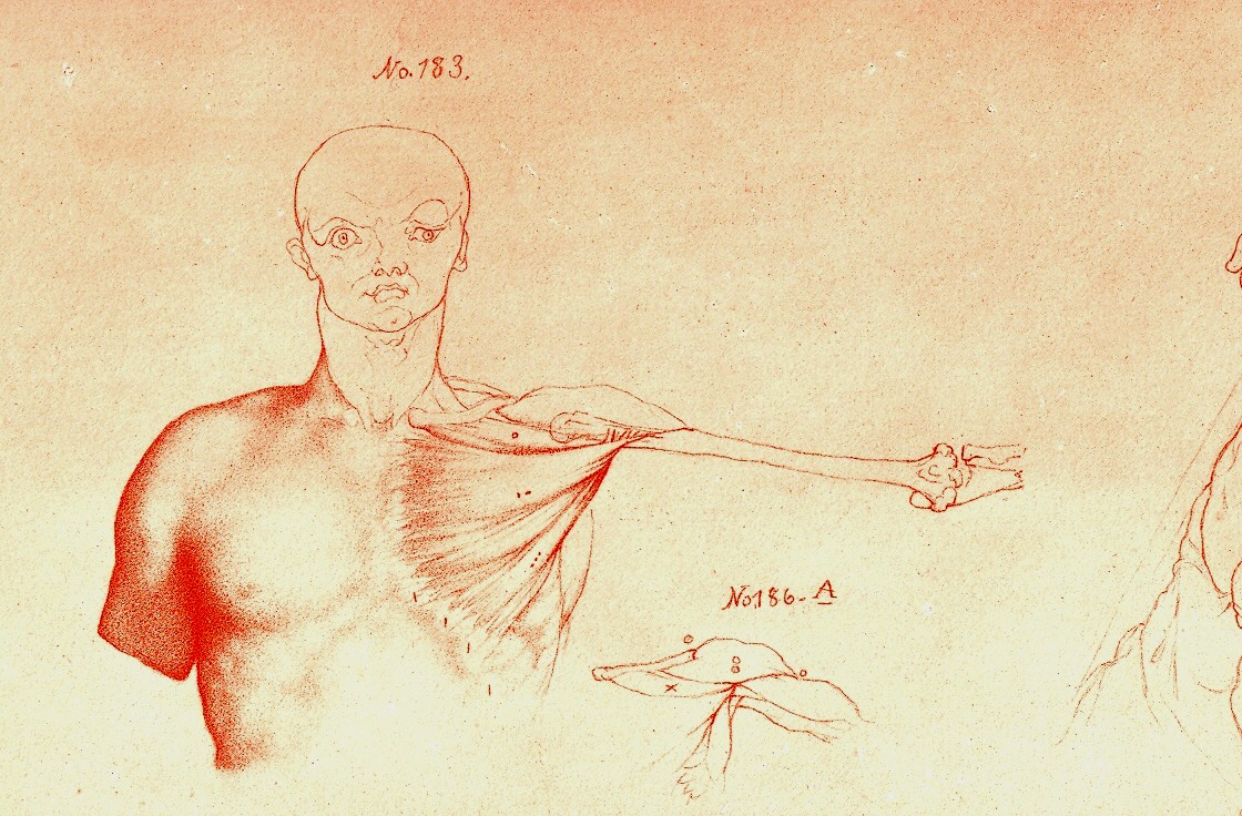
     Looking at old prints sometimes reveals more than just their own history, simple or not:  there are, from time to time, subtle bits of otherness that creeps into the image, if you allow yourself the time to see it. 

    And sometimes looking at images of the past reveal a little of the future, or the possibility of the future, as we can see here in these examples in the book by the art-anatomist William Rimmer (1816-1879).  His work is superior, and spot-on, and has Leonardo-flourishes all throughout his work–he reaches deeply into the past to the great anatomical standards, and also employs newly established work too (as with Charles Darwin1). There is also–to me anyway–a certain quality of his work that predates modern art movements, like the Surrealists, and Dadaists, that melt into his work, giving it a very post-modern sympathy.  The drawings sometimes have a great “unexpected” sense to them, which I think is not often found in anatomical artwork, given the nature of the exercise and all, giving Rimmer a sense of surprise and somewhat-removed fantasy.

    (In another example of this idea of pre-dating a modern movement, I wrote a little about the odd art/color textbooks of the pre-Kandinskian Emily Vanderpoel , about whose color theory I still understand not at all, though the images that she produced as illustrations to these bizarre theories are stunning, pre-modernist, and unintentional creations.)

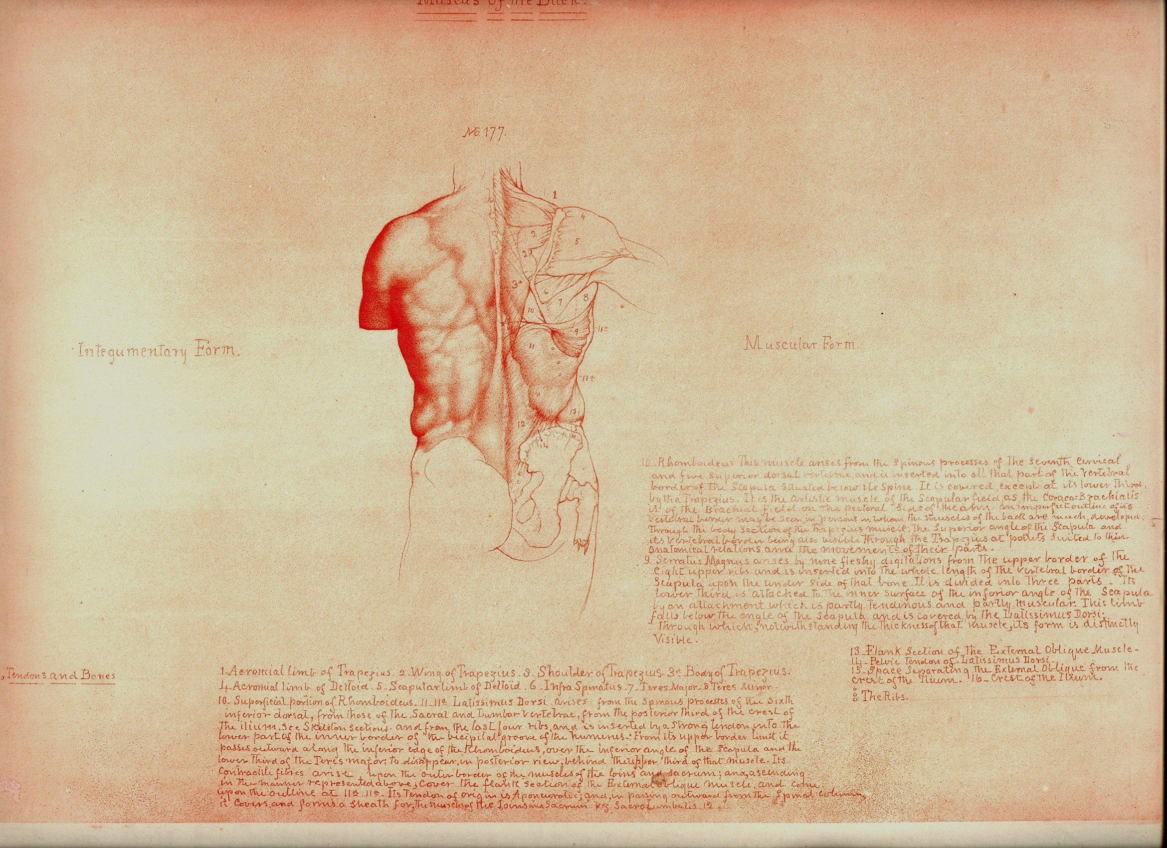
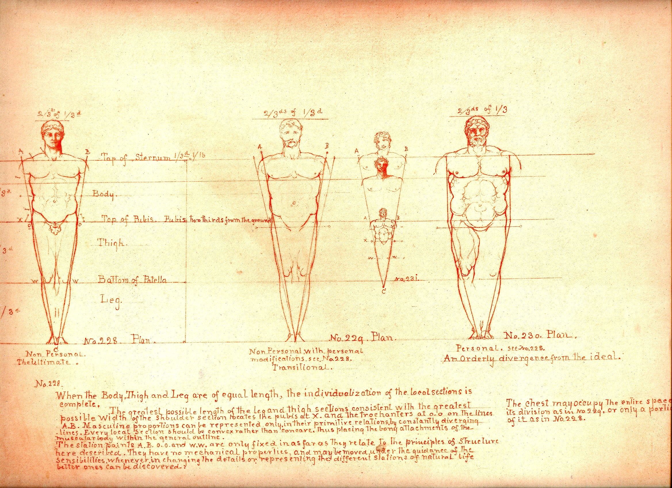
    The images being discussed here are found in Rimmer’s  Art Anatomy (1877 is the first edition and very rare for its process and for being destroyed in a printing house fire, and subsequent printings, this one being the subsequent 1884 printing).  He was a very accomplished artist, and was also a physician and a fine anatomist, with a long career of having varied careers in the arts.  He was very concerned and interested in what happens to the skin, forced into action by all of the stuff underneath it.  He pursued the movement of muscle, and bone, and the interplay of the two, and produced a wonderful exponent of artistic anatomy. 

    Blog==June 29--rimmer back

    Even the design of the book and the placement of drawings and text on the page–page after page–is both antique and pre-modernist, the images surrounded by the author’s notes and explanations, sometimes the very spacing and placement on the page is an evocative mystery.  

    Perhaps some of this “mystery” may be easily solved given the way in which the book came into being.  According to Amy Beth Werbel in her Thomas Eakins: Art, Medicine, and Sexuality in Nineteenth-century Philadelphia (Yale University Press, page 61, here) Rimmer constructed most of the work while on vacation, using no models, and seemingly working without reference. That would be an extraordinary accomplishment, and might explain some of the “surprising” parts that I just spoke of, but it really doesn’t necessarily address that dreamy quality of looking not-so-quietly into the future of art. (There are other odd and, well, bizarre, bits that Rimmer writes about that seem unrelated to this anatomy task, but I’ll just have to chalk that up to “personality” at the present time.)

    (I’ll expand this quite a bit as I’ve got 50 or so of these lithographs that I’ll be selling.)

    Blog==June 29--rimmer little man


    Notes:

    1. Elliott Davis writes a very interesting article on Darwin and Rimmer and about the influence of the former on our artist.  For example, Davis writes that Rimmer’s work “represents the most comprehensive anatomy book issued in the United States at the time and provides new insight into the influence of Darwin’s evolutionary theory on artistic practice.“ See:  ”Life Drawing from Ape to Human: Charles Darwin’s Theories of Evolution and William Rimmer’s Art Anatomy” by Elliott Bostwick Davis, on the Nineteenth Century Art Worldwide blog http://www.19thc-artworldwide.org, here. Also from Davis’ article is this good footnote on two further sources of information for Rimmer:  “Marzio, 1976, p. 1. For information on Rimmer, see Truman H. Bartlett, The Art Life of William Rimmer: Sculptor, Painter, Physician. Boston and New York: Houghton Mifflin, 1890. [And] Jeffrey Weidman, Neil Harris, and Philip Cash, William Rimmer. A Yankee Michelangelo, Exh. Cat. Brockton, Brockton Art Museum/Fuller Memorial (Hanover and London: University Press of New England, 1985).


  • Concentration, ca. 1572.

    JF Ptak Science Books  Post 2482

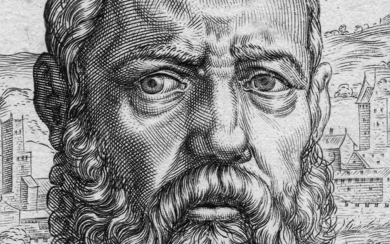
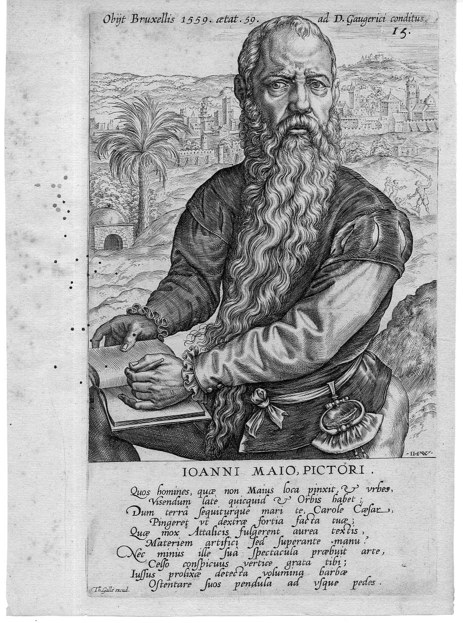
    Ioni Maio130

    This engraved portrait of the very striking Jan Cornelis Vermeijen (also “Vermeyer”, and here known as “Ioanni  Mao”) appears in Dominicus Lampsonius (Latinised form of Dominique Lampsone) Pictorum Aliquot Celebrium Germaniae Inferioris Effigies and published by Volcxen Diericx (1570-1600 fl).  (The first edition was published in 1572, and I believe that this image appeared somewhat later in the century as there are some differences in the text around the image.) Diericx was the  “widow of Hieronymus Cock , who took over his business ‘Aux Quatre Vents’ after his death in 1570. She and her new husband, Lambrecht Bottin are mentioned together by Plantijn at the head of a list of printmakers and print sellers in Antwerp, which was assembled between 1577 and 1580. Since the death of Hieronymus Cock in 1570 to her death in 1600 all the prints published by her have the sentence Aux Quatre Vents without the name of Cock”.–British Museum online. 

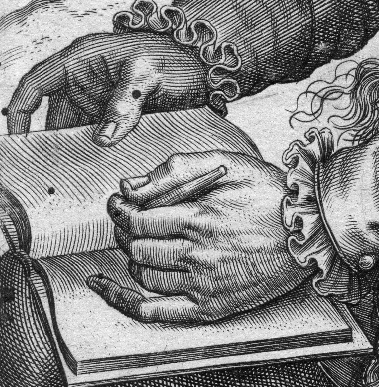
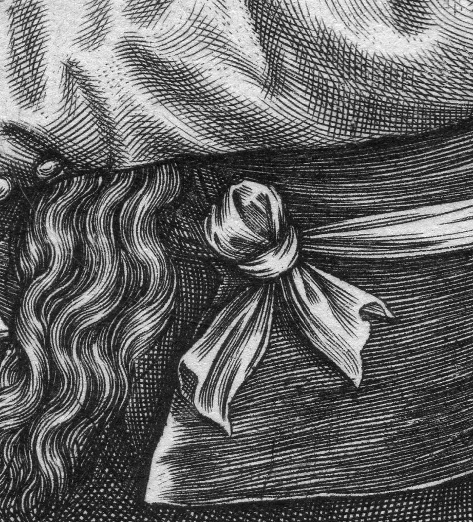
    I’ve long liked this portrait of Cornelis Vermeijen (ca. 1500-1559), I think mostly for his hands and for the ultra-concentrated bit of concentration that is going on in his eye/forehead conversation.  Even though I ‘ve owned this for a long time I’ve never known about the placement of the palm tree over Jan’s left shoulder or the murderous attack going on over his right. 

    The work was executed by Theodore Galle (signed in the plate at very bottom-left) after the engraving by Jan Wierix (1549-1620, who signed his name “I H W” in the bottom right of the portrait.  The other Dutch artists comprising the illustrations include The artists included in the book are (in this order): “Hubert van Eyck, Jan van Eyck, Hieronymus Bosch, Rogier van der Weyden, Dirk Bouts, Bernard van Orley, Jan Mabuse, Joachim Patinir, Quentin Matsys, Lucas van Leyden, Jan van Amstel, Joos van Cleve, Matthys Cock, Herri met de Bles, Pieter Coecke van Aelst, Jan van Scorel, Lambert Lombard, Pieter Bruegel the Elder, Willem Key, Lucas Gassel, Frans Floris, and Hieronymus Cock.” (Wiki)

    Ioni Maio129

    • The original is offered for sale at the blog’s bookstore, here. 

    Ioni Maio131

    Ioni Maio132


    The legend reads “Quos homines quae non majus loca pinacit et urbes Visendum late quicquid et Orbis habet Vum terra sequiturque mari te Carole Caesar Pingeret ut dextrae fortia facta tilt 6 Quae mox Attalicis fulgerent aurea teactis Materiem artifici sed superante manu Nec minus ille sua spectacula praebuit Celso conspicuus vertice grata tib…”


  • A Visual History of Art: 188 Artists on 780 Engravings (1814)

     JF Ptak Science Books

    2013-07-25 14.52.12

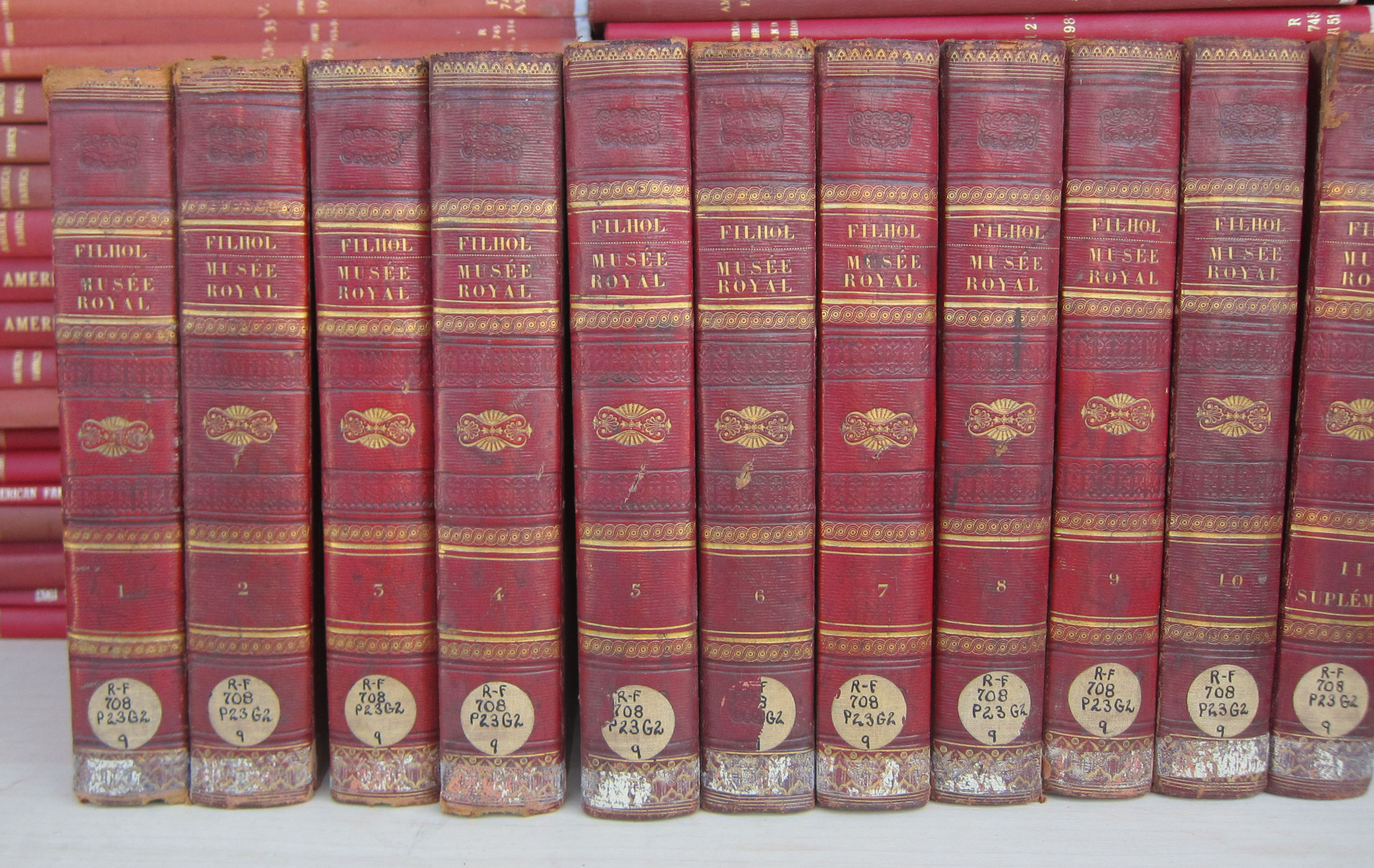
    There’s a fine experience in reading and looking at a history of art that is an artwork in itself–especially an antiquarian artwork. That is in a way what this work (Gallerie du Musee de France publiee par Filhol, Graveur, le Texte Redige par Lavallee..) edited by Antoine Michel Filhol, and Armand Carafee, and Joseph Lavallee is–it is exciting and exhausting, in good and perhaps not-so-good ways.  Being a general history of art the book looks at Ancient and Western art over the 1700 years or so, but mostly from the Renaissance forward.  It is exhaustive in its way and exhausting, in an Old School museum sort of way, where there is a lot of stuff to look at, all jammed in together, sometimes without a unifying force.  That means for each section there is artwork from, well, anywhere; although frustrating it is also exciting, because you never really know what’s coming next.  This is especially true due to the fact that every engraving is protected by a tissue guard, which makes it mostly not possible to see the artwork until you open the guard page, which is when you may be surprised by the Rembrandt or Holbein.

    ·Posted by :

    ·in:


  • German Police in Caricature, 1926

    JF Ptak Science Books   Quick Post

    Police caricature996

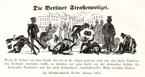
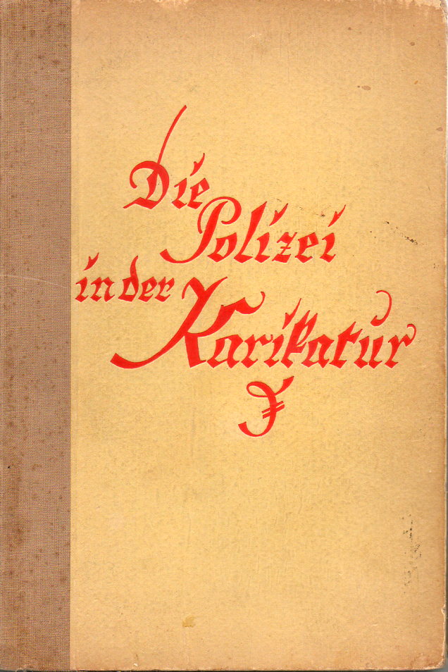
    I’ve long found this book (Die Polizei in der Karikatur, by Fritz Hellwag, published by Gersbach & Sohn, Berlin, 1926) interesting, though not interesting enough to go looking for the other nine (!) volumes in this slim series1. The images of the police are at best slightly benign, but then almost entirely mostly-negative, with a major dollop of vicious and crushing.

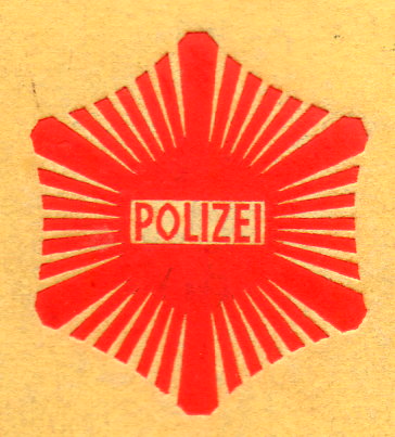
    Truth be told I bought it for the rear cover design/medallion:

    Police caricature994


    Police caricature995

    For a long time I’ve been meaning to begin a series on Weimar Germany, mostly through the long run of Illustrirte Zeitung (Leipzig) that I have here covering WWI and then through that 1919-1932 period that is so, well, “full”.  Perhaps that can begin soon.  The political/social crush of the 1919-1929 period was remarkable, and the decade+ as presented in the IZ is (as its name states) very illustrated…

    Notes:

    1.  The others in the series–edited by Dr. W. Abegg, a high-ranking police official–include [with notations “672 abb.” meaning “62 illustrations”, “125 S.” meaning “25pp”, and “Bd.” “meaning “volume”]; Die Polizei in Einzeldarstellungen including  Band 1: Polizei und Volk (von Ernst van den Bergh, 32 Abb., 119 S.); Bd. 2: Geschichte der Polizei (von Kurt Melcher, 43 Abb., 119 S.); Bd. 3: Polizei und Politik (von Bernhard Weiss, 140 Abb., 160 S.); Bd. 5: Polizei und Wirtschaft (von Julius Hirsch u. C. Falck, 83 Abb., 167 S.); Bd. 6: Polizei und Verkehr (von Erich Giese u. H. Paetsch, 207 Abb., 198 S.); Bd. 7: Polizei und Technik (von Franz M. Feldhaus, 80 Abb., 134 S.); Bd. 8: Polizei und Kind (von H. Degenhardt u. M. Hagemann, 65 Abb., 124 S.); Bd. 10: Polizei und Mode (von Max von Boehn, 124 Abb., 119 S.); Bd. 11: Polizei und Zensur (von H. H. Houben, 62 Abb., 141 S.); Bd. 12: Die Polizei in der Karikatur (von Fritz Hellwag, 178 Abb., 125 S.).