A Daily History of Holes, Dots, Lines, Science, History, Math, Physics, Art, the Unintentional Absurd, Architecture, Maps, Data Visualization, Blank and Missing Things, and so on. |1.6 million words, 7500 images, 4.9 million hits| Press & appearances in The Times, Le Figaro, Mensa, The Economist, The Guardian, Discovery News, Slate, Le Monde, Sci American Blogs, Le Pont, and many other places… 5000+ total posts since 2008.

Category: Art History

  • Walker Evans’ Indelible Images of The Great Depression

    JF Ptak Science Books   Post 1892

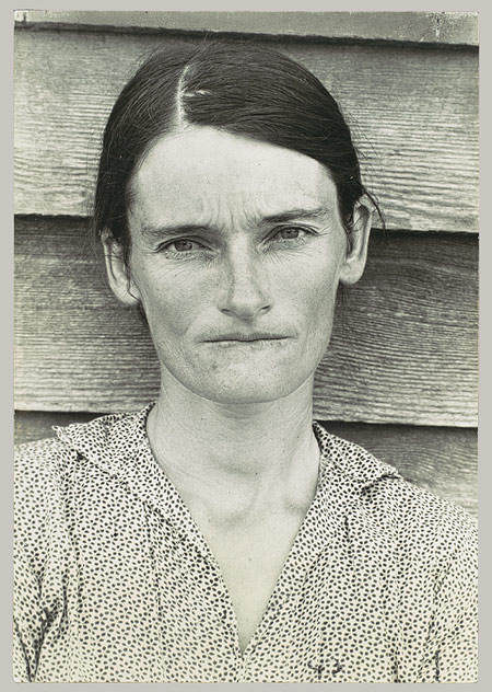
    Evans, walker  farmer tenemnt wife det


    Evans--alabamna tenant farmer wife The photographer Walker Evans (1903-1975) was an ultra-light and lyrical traveler, who didn’t leave a footprint in the country he moved through, though the impact of his work–the result of the travel–fastened a famously indelible image on American history–indelible, and fast, being recognized for his work with a commanding exhibition at the new Museum of Modern Art in 1938.  

    Evans possessed a crystaline lens which yielded both spectacular detail and subtle quietnesses. He could turn a tenement farmer’s rough-hewn wooden kitchen drawer filled with roustabout cutlery into a photographic masterpiece, and then photograph the face of that farmer or that farmer’s family and have it stand as an absolute testimonal to the expereince of the Great Depression in the American life. Evans made some of the core memories of that visual experience. He (along with some of the greatest photographers America has produced) worked for the government for a time during the Depression, answering to Roy Stryker at the Resettlement Administration and the Farm Security Administration, with the mission of taking photographs of America–which he did, establishing himself as one of the early and preeminent masters of documentary photography. 

    I was thinking of him earlier today, adn thought that I’m make a selection Walker’s photographs from the magnificent collection of Farm Security Administration images at the Library of Congress. (Also, see the Museum of Modern Art for a nice appraisal, here).

    Shoeshine stand detail, Southeastern U.S.  1936

    [Shoeshine stand detail, Southeastern U.S.]


  • A Charming “First” Traveller’s Guide to Rome in Full Text, 1600

    JF Ptak Science Books  Quick Post

    Franzini 1
    I was very happy to find a full-text and nicely-navigable copy of this classic work online. Giorlamo Francini’s Le
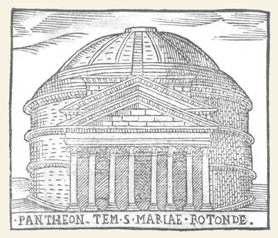
    Cose maravigliose dell’alma citta di Roma, anfiteatro del mondo : con  le chiese, et antichita rapresentate in disegno / da Girolamo Francino ; con l’aggiunta del dottor Prospero Parisio (In Roma : Ad instanza di Gio. Antonio Franzini, & herede di Girolamo Franzini) was printed in 1600 and is considered an iconic work on travel writing, as well as one of the first sophisticated/modern “guide books” to the city of Rome. It was pocket-sized, and contained all manner of information about buildings and artists–useful info, if you had never been to the city before. It was also a distinct difference from books intended to the pilgrim; this book was definitely looking for a popular, general readership, looking to benefit in their stay in Rome by having a literary, artistic, and architectural key to the city. 

    The illustrations are charming and lovely–even though small (less than two inches square),  they provide just enough detail for you to unmistakeably identify the principle structures.   The full text (with illustrations) is located here.

    ·Posted by :

    ·in:

    — —

  • Black Sky and Morning Arrows

    JF Ptak Science Books  Quick Post

    Ripa757

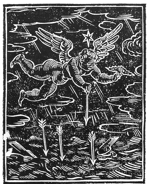
    I’ve just written a short post on the beautiful key to iconography by Cesare Ripa, Iconologia overa descrittione d’imagini delle virtu, viti, sffetti, passioni humane, corpi celesti, Mondo e sue parti…, which was published in Padua in 1611.  The version I used was an 18th-century English translation with new illustrations–now though the translation was very appreciated, the images were not so.  As I pointed out, they do serve the purpose of illustrating the specifics in iconography, the images were not that pleasing.  I wanted to include here an example from the original, and in particular the imagery of “Dawn”.

    It is a gorgeous thing, a very striking, very strong woodcut showing the messenger of the new day coming, attacking the night with arrows of dawn. 

    I enjoy he earlier, more robust images for this iconology, even though there are many variants to choose from–there were more than 40 editions of this work since its first non-illustrated edition in 1593–but given it all I much prefer the early 17th century flavor. 


  • The Life of Enormous Baroque Curves in Womens’ Fashions

    JF Ptak Science Books   Quick Post

    Theodore Andrea Cook wrote a lovely book called The Curves of Life, published by the admirable firm of Constable and Company in London in 1914, a book which is filled with all manner of marvels of insight in finding curves in natural and created situation. (I wrote a little about the book in an earlier post about stairs, here.) The beauty of spirals found in fero-concrete, geometries of Minoan clay seals, the beauty of the human laminae of cochlea of interval, the colon of the Dogfish, Maori war canoes, and so on, were all subject matter ripe for the discriminant picking of Mr. Cook as he explored the depths of curves.


    Curves756

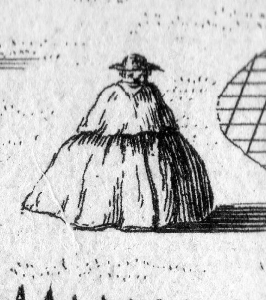
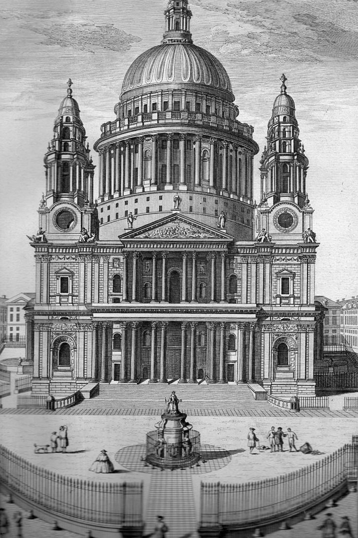
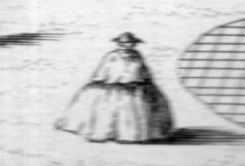
    One thing that perhaps escaped his grasp–at least in this book–was the curve in the costume of Baroque women oif semi-high (or at least non-ordinary) standing. As I’ve seen a number of times in some illustrated books, the trend towards the curvilinear is absoutely outstanding. The example that I came across tonight is an excellent example. Of course there was no great need to supply interesting bits of social life in these engravings of famous architectural achievenents outside of supplying a human scale to the structures, but as if often the case the artist (or engraver) went a little further than was really demanded by the artistic “needs” of the image and provided some interesting and at times very unexpected glimpes into somewhat-common street life

    This image comes from Regles des cinq ordres d’architecture de Jacques Barozzio de Vignolle, which was originally written by Vignolla (1507-1573) in 1560. and published in 1680 or so.  The engraving of our interest here is “Elevation du Portail de la Cathedrale de St. Paul de Londres”, and the main part of that is the 1% in the bottom quarter, showing a very roundish dress. 

    Curves754

    An outstanding curve of high fashion, not seen in the Cook book.

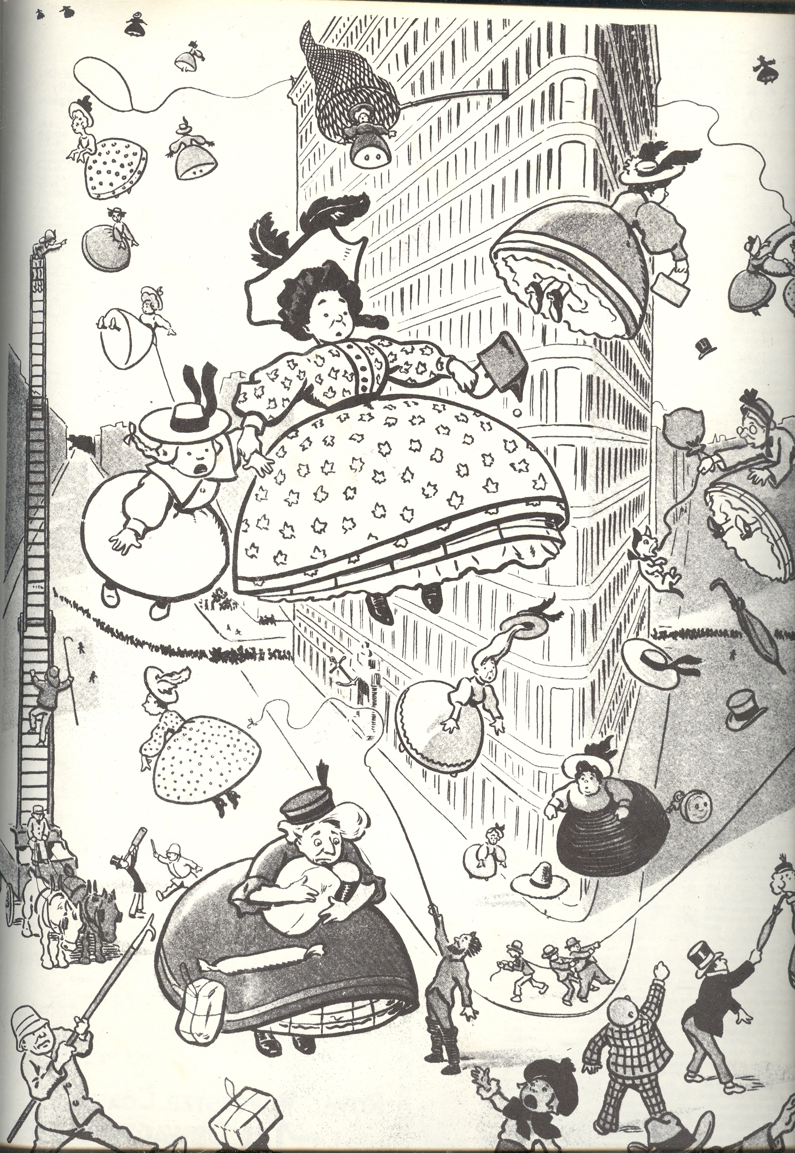
    This also reminds me a little of bombing fashinistas in an earlier post I wrote (here), showing parachuting (though they look a little like bombs) on this 1904 image. 

    5-women


  • A Half-Alphabet of Color by Isaac Newton, and What the Colors “Naked” and “Dead” Are (1659)

    JF Science Books   Post 1880 


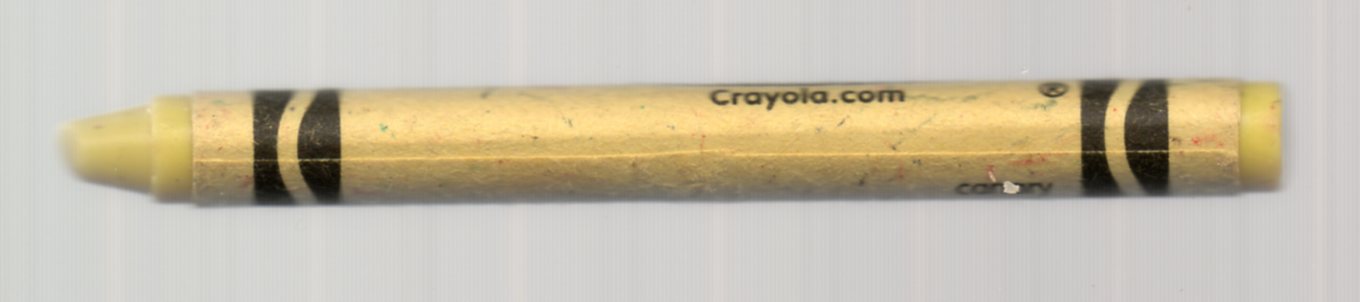
    Crsyon dead

    All material quoted below is from the magnificent The Newton Project website, which contains transcriptions of Newton’s writing in science, alchemy and religion, and also contains much correspondence. 

    There isn’t quite a complete alphabet here, but I think it is close enough, and it does organize (for my mind) some early thinking on color-making by Isaac Newton (1642-1727) when he as 17 years old.  There’s much of interest on the construction of color here, not the least of which is some prosaic methods for coloring dead people and a general color for clouds.  Things would get more involved, of course, as Sir Isaac would later write perhaps the most important books ever written on optics (in 1704).

    After the half-alphabet there is an installment of Newton’s mechanisms of art, containing instructions on the instruments of drawing, and how to do emblem work, prepare bases, how to shadow, how to enlarge and copy work, how to draw a landscape, and more.

    But first, here’s his list of how to make color.

    How to prepare your colours
    Such colours as have need of grinding you must grind them with faire water, then put them on a smoth chalk stone, & let them dry. then grind them againe with Gum water & reserve them in muscle shels for your use.

    B is for Blood

    A blood red colour.
    Sinaper, lake, & vermillion make a good red.

    Another
    Take blew Inde & steepe it in water & put to it a little Verditer.

    Another
    Take some of the clearest blood of a sheepe & put it into a bladder & with a needle prick holes in thebottom of it then  <6r>  hang it up to dry in the sunne; & disolve it {i}n allum water according as you have need.

    Charecole black & seacole black
    Grind charcole very small with water, let it dry then grind it with oyle. thus make seacole black.

    ·Posted by :

    ·in:

    — —

  • Dorothea Lange, Imperial Valley, California, 1937. FSA Photographs

    JF Ptak Science Books  Post 1878
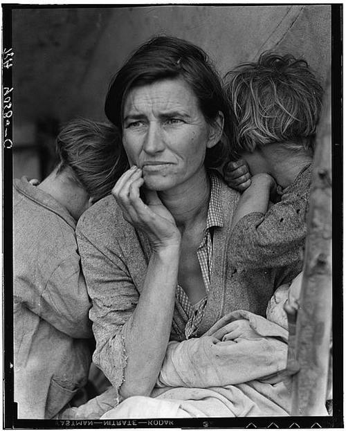
    Migrant Mother


    Dorothea Lange, a standard portrait photographer-turned-superb-documentarian, had a six-year-run of photographic success and inspiration and energy as few people have ever experienced in the history of photography From her 1936 Migrant Mother, which is perhaps the great photograph of the American Great Depression (which I wrote about in The Best Dollar the U.S. Government Ever Spent) to the wicked sharpness of her documenting the terrible business of relocating Japanese American citizens to concentration camps in 1942. Lange traveled the country recording the state of Americans in what may have been one of the great journeys of th 1930’s. 

    The period in which this was all happening was one of the most chaotic in modern history–at least in the West.  The Depression was full-bore-on, of course; as Germany strained its way into confrontation with the rest of the world, taking its calculated and inexorable steps towards world hemispheric chaos. The other images of these six years are almost a dada-kaleidoscopic  assembly of the believable and the not believable:  Sudetendland, Kristallnacht, Neville Chamerbalin, Austria, Poland, Nanking, Canton, War of the Worlds, Munich Agreement, WWII in Europe, Spanish Revolution, lynching, Jewish explusion, concentration camps, Pearl Harbor. In the United States, there was a certain right-wing element that ran deep into the national consciousness, the worst embodied in Father Coughlin’s filthy radio diatribes on keeping America out of war wrapped in Jew-hating monologues, the ridiculous semi-levitating philosopher-fake and home-town-boy-gone-bad Charles Pelley and his Silver Shirts being part of his support; Henry Ford and his assault on Judaism and insistence on The Protocols of the Elders of Zion, Charles Lindbergh and America First, and so on., and for a divisive time until the crystalizing of Pearl Harbor.

    The literature of this time, of this 1936-1942 period, expressing the soul of the country seems pretty full, with these few works standing as good examples of the work of the period:   John Steinbeck’s beginning in “the Harvest Gypsies”/Their Blood is Strong, The Grapes of Wrath,  Faulkner’s Absolom! Absolom! (1936), Pare Lorentz The Plow that Broke the Plains, Carey McWIlliams Factories in the Field (1939), Taylor/Lange’s An American Exodus (1939), For Whom the Bell Tolls (1940), the New Masses,   Abel Meeropol’s anti-lynching poem “Strange Fruit”, and so on, deeply on.

    But perhaps in all of it, perhaps nothing else quite expresses the emotion of the period than Lange’s Migrant Mother.  It seems to have everything, in one photograph.  In the vast result of Lange’s work during this period it is interesting to have a look at her in Imperial Valley, California, in 1937–it seems less-often mentioned, though the work is very strong.  So I decided to post a few of the images with a link to the rest of the collection (below).

    Lange worte:

    “I was forced to switch from Nipomo to the Imperial Valley because of the conditions there. They have always been notoriously bad as you know and what goes on in the Imperial is beyond belief. The Imperial Valley has a social structure all its own and partly because of its isolation in the state those in control get away with it. But this year’s freeze practically wiped out the crop and what it didn’t kill is delayed–in the meanwhile, because of the warm, no rain climate and possibilities for work the region is swamped with homeless moving families. The relief association offices are open day and night 24 hours. The people continue to pour in and there is no way to stop them and no work when they get there.”

    http://memory.loc.gov/pnp/fsa/8b31000/8b31800/8b31812r.jpg
    Former tenant farmers on relief. LC-USF34T01

    Other samples below but a fuller listing of images is available here.

    Imperial Valley, California, February and March 1937
    Resettlement Administration

    Notes:

    1. Lange was still very new to the FSA project when she made this photograph in the spring of 1936.  On the tail end of a month-long road trip she was nearing the end of her day when she spotted a hand-lettered sign “Pea-Pickers Camp” by the side of the road.  Lange briefly considered stopping but went ahead, questioning her judgment continuously for the next 20 miles, when she finally turned around to find the turn-off for the camp.  She drove down the dirt road and found a ramshackle assembly of tents, one of which contained “an exhausted mother sitting forlornly with her children”.  Lange spent only 10 minutes with the woman, making five exposures.  She learned that “the crops had frozen, and the woman and children were living on vegetables scavenged from the fields, and the few birds that the children managed to catch.  The mother could not leave; she had sold the tires from her car”.

    The images were made using a Graflex camera. The original negatives are 4×5″ film.

    ·Posted by :

    ·in:

    —

  • German Weimar-era Advert Artwork, 1923


    JF Ptak Science Books  Post 1857

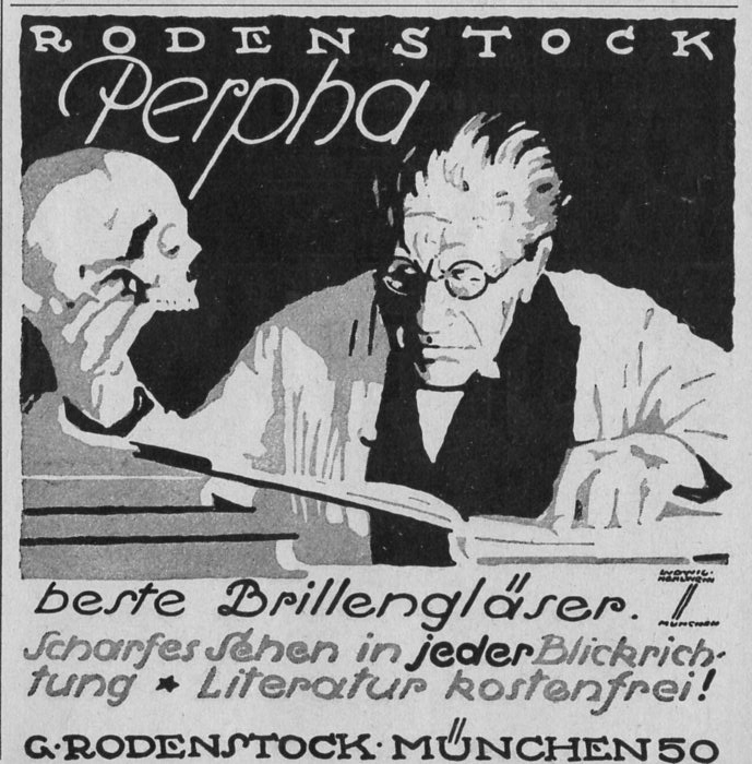
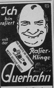
    The following ads appear in just three weekly issues of the LIFE-magazine-like Illustrirte Zeitung (Leipzig).  Generally the ads are crowded onto the 15-inch-tall pages–sometimes as many as 15 to a page.  Their design is remarkable, and artful, and effective.  Plus, they’re chock-a-block full of smaller design elements.  For example, this one is one of my favorites for this period:

    German B+W679

    I actually used it for the “Open” sign for my store back in Georgetown so many years ago oh my brothers.  That was before I discovered that it has a major problematic problem–it was designed by one of the greatest German designers of the time, Ludwig Hollwein, who also happened to be “a” (and then “the”) principle designer for propaganda/posters for the National Socialists, and that from the early period (1933) right on through the end of the war. 

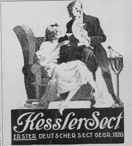
    There was more to worry about than simply selling Germany’s oldest champagne, but of course many were immune to worry.  When this ad ran for Kessler champagne, hyperinflation had struck very deeply into thew Weimar Republic, with the U.S. dollar trading at 1:27,000 Marks. Even in January 1919 inflation wasn’t bad, with the dollar at 1:9 Marks (up from 1:5 in January 1918), but the simple tale of a long story is that the Weimar Republic kept printing money, and things got completely out of control, with the dollar trading in December of 1923 at 1:1.2 trillion Marks, which was a fertile seeding bed for National Socialism. 

    German B+W663

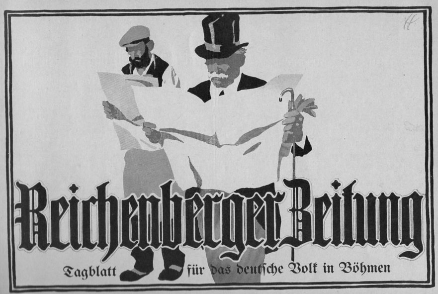
    This one is actually quite large, about a half-page, trying to sell the idea of the Reichenberger Zeitung to both the privileged and the working classes (the newspaper, which began in 1860, would not survive the Nazis, going belly-up in 1935):

    German B+W662

    Well, I don’t mean for this post to be very writer-y; I just wanted to post some of the images from these issues.  There’s really a lot to choose from, but these twenty or so will have to do for now: 

    This one is about an inch tall in the magazine:

    German B+W676

    Another tiny ad, this for a mechanical calculator:

    German B+W682

    ·Posted by :

    ·in:

    —

  • Magritte-Like Disorienting Geometry in Found-Art Urban Design, 1925

    JF Ptak Science Books  Quick Post

    Future street630 a

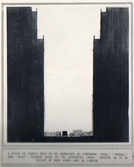
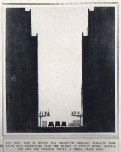
    These images “Traffic on Three Levels; Solving Street Congestion” from the Illustrated London News (15 August 1925) struck me as something much more–or much less?–than their appeal to urban design.  I think that it is very difficult to look at these images and not see them from the top, down. Even by the time you get to the fourth image at bottom right, the design still pulls attracts your eye to the top of the image and away from the traffic scene below.

    They seem to have that sense of abstract art, achieving a type of geometry and disorientation, both at the same time, pulling you into the work and de-arranging it at teh same time.  And that to me makes it highly artful, if unintentional.  They are sort of hallucinating–I know that is a bit of a stretch–but their confusion of the expected with this sort of misty, unknown atmosphere, has a sense of Rene Magritte to them had he worked his magic in geometrical blocks. 

    Future street630 b


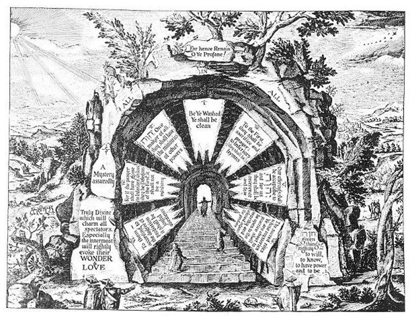
  • The Beautiful Inscrutable: Khunrath’s Fabulous Alchemical Exploratorium, ca. 1600

    JF Ptak Science Books  Post 1846   Part of the Series on the Artistic Display of Information

    I followed a link to the lovely website Res Obscura and found this great image from the work of Heinrich Khunrath, Ampitheatrum Sapientiae Aeternae (Hamburg, 1595, or in English  “The Amphitheater of Eternal Knowledge”).  Khunrath (1560-1605) packed about as much perplexing, confusing, inscrutable and beautiful displays of not-verifiable alternative information into his very full 45 years as just about anyone. He was a  Paracelsian, John Dee-ophile, hermeticist/alchemist seeker of “eternal wisdom” via medico-magical-interpretative Christianity, a deeply physico-chemical-spiritual experimentorium, and the meaning of his work (outside of where it fits int he history of science) really pretty much escapes me–except that the illustrations are beautiful. Res Obscura has a lot to say about the interpretation of the images, as do the other links below. I have really nothing to add, as I really dont’ know enough to say what is being represented in these very complex displays. 

    One thing that does seem obvious to me: the meanings and interpretation of this work is extremely fluid.

    [Image is greatly clickable]

    http://1.bp.blogspot.com/-R1UEoMw5nTM/Tx1DNSxW4GI/AAAAAAAAA44/gbeH-3zD6Js/s1600/hermtxt1750.jpg

    [Source: http://resobscura.blogspot.com/]

    Transcription of the text surrounding the Hermaphodite (that someone refers to as the Hermaphrospehere, is available here from the Special Collections Department at the University of Wisconsin.

    And other very complex symbolist allegorical somethings:
    ..

    which is an English version of the Latin of Amhitheatrum Sapientae Aeternae (from 1606) and available here along with other in-English goodness.


  • A Prehistoric Rayograph–a Proto-Example of Man Ray from 1810

    JF Ptak Science Books   Post 1843

    “I have never painted a recent picture.” Man Ray, 1966

    “Unconcerned but Not Indifferent”—1976, Man Ray’s epitaph.

    Emmanuel Radnitzky (1890 –1976) removed the “Emm_uel”  and the “__dnitzk” from his names to become Man Ray, a South Philly-born, Brooklyn- and Manhattan-bred Parisian ex-Pat artist became (by the early 1920’s) perhaps the most influential of the Dadaist/modernist photographers. No offense to his given name, but “Man Ray” is superior.

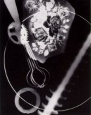
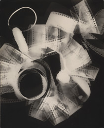
    0 blog jan 27 man rayograph 1943 0 blog jan 27 man ray


    And Man Ray was far more than a photographer, as he worked across many different art forms, not the least of which was motion pictures.  But what comes to my mind first with his name is his self-titled “rayograph”, a photographic process which was actually a photogram, which was the direct exposure of an object placed upon a photosensitive paper.  This is also the earliest form of photography, something employed by Fox Talbot who called it “photogenic drawing”) as early as 1834.  (I wrote a little bit about this process in a post “Things That Almost Were But Weren’t”.) But Man Ray’s rayographs stand clear and distinct to me, different even from his contemporaries’ works (including Susan Derges, Max Ernst, Raoul Hausmann, Laszlo Moholy-Nagy and Alexander Rodchenko).  

    0 blog jan 27 man rayograph 2

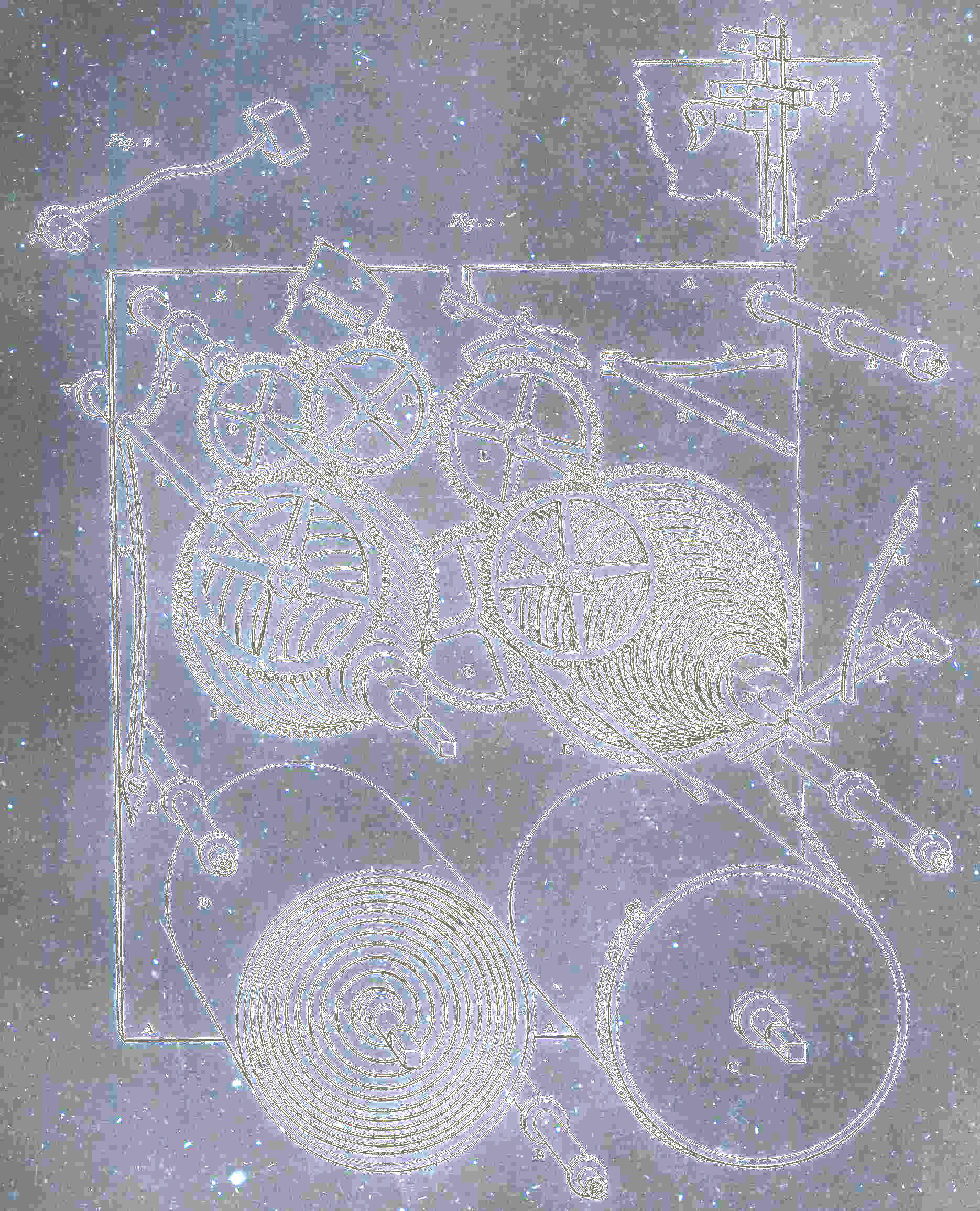
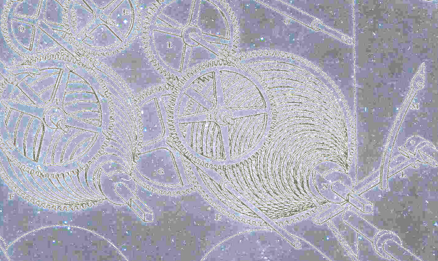
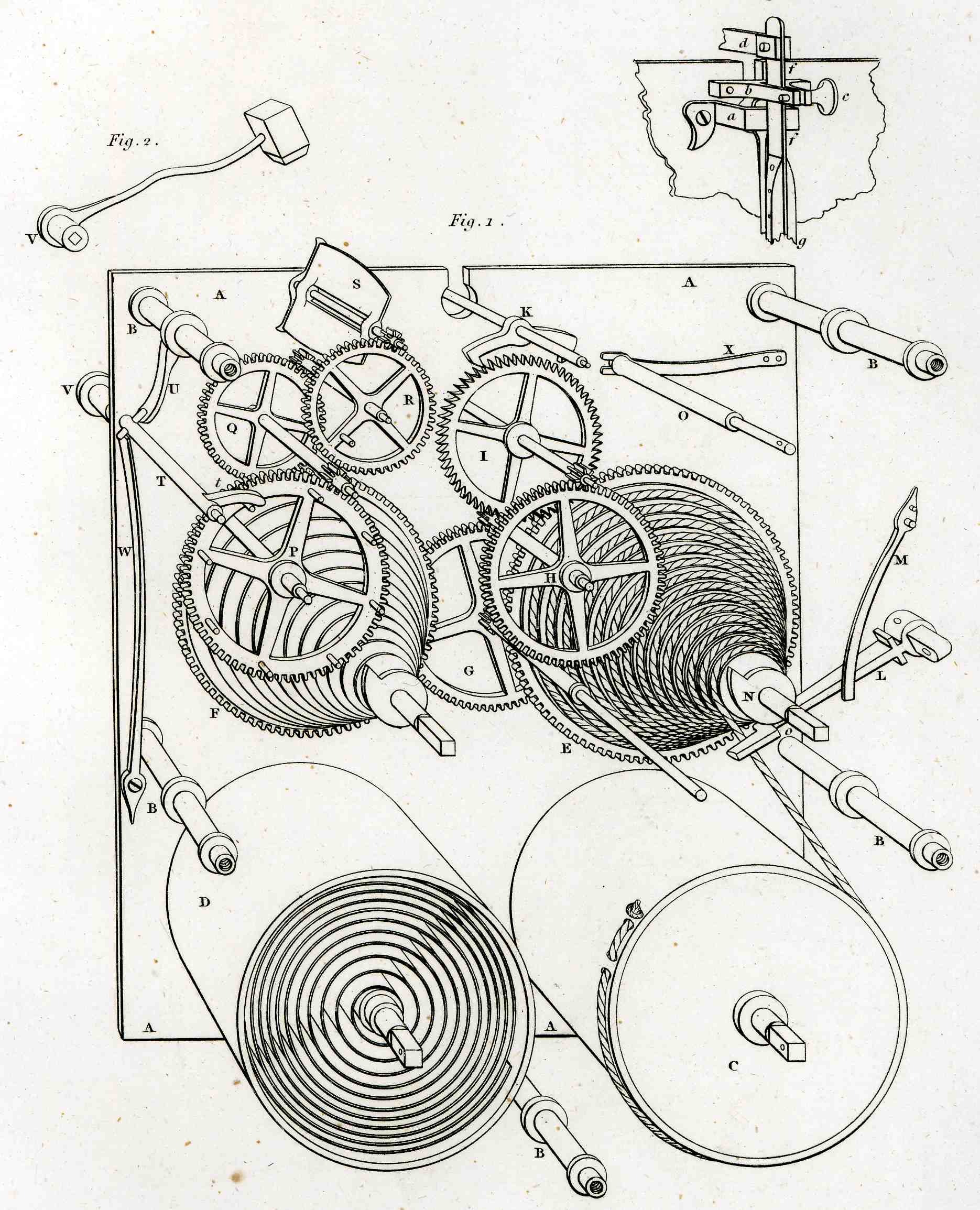
     Of course my antiquarian pretender (the image on the above right) to the rayograph isn’t one—it just had the look and feel of one, contained that shock of recognition that I had seen it before, and the palce where I would’ve seen it was with Man Ray.  All I did with this engraving—an image of clockworks published in Abraham Rhee’s Encyclopedia of 1810–was to solarize it.  So it isn’t even a rayograph, but just looks like one, though Man Ray did work quite a bit with the solarized image.  I just like it. 

    0 blog jan 27 man ray 2

    This is the engraving in its “before” (and superior) state:

    0 blog jan 27durer459