A Daily History of Holes, Dots, Lines, Science, History, Math, Physics, Art, the Unintentional Absurd, Architecture, Maps, Data Visualization, Blank and Missing Things, and so on. |1.6 million words, 7500 images, 4.9 million hits| Press & appearances in The Times, Le Figaro, Mensa, The Economist, The Guardian, Discovery News, Slate, Le Monde, Sci American Blogs, Le Pont, and many other places… 5000+ total posts since 2008.

Category: Art History

  • The Ship of Fools, In Praise of Folly, and Intelligent Dischord: Brant, Erasmus, and Geiler, 1497-1515

    JF Ptak Science Books  Post 1788
    Bloggeilership186
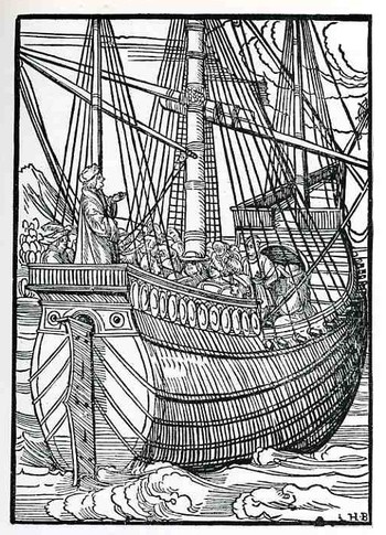
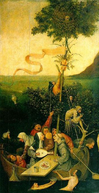
    Johann Geiler von Kayserberg’s Navicula Penitentie (Augsurg, printed by Johann Ottmar, and printed in 1511) is a remarkable book in many ways, but what I’m concerned with here is the fantastic woodcut illustrating the title page.  The book itself is a collection of penitential sermons against moral corruption in his Strassburg community—the sermons won him wide respect and some considerable fame as an orator, writer and theologian—but it is the woodcut of the ship (I’m sorry to reveal) that distracts me more.  It is evidently the earliest depiction of a fully-rigged and outfitted ship, with great and accurate detail, far beyond what had been published in the previous 50 or so years of movable type printing.  Presumably what we are seeing is Geiler preaching to ship full of what seem to be clerical/clergy folks rather than sailor—clearly Geiler is approaching the upper class here in the ship and not the working man. 

    I think that Geiler had Sebastian Brant’s 1494 Ship of Fools in mind when the great Hans Burgkmair (the “H.B” who signed this work of art) produced this seafaring image for him.  Also Geiler’s publication date of 1511 is shared with Erasmus’ fantastically influential (and leading-to-the-Protestant-Reformation) book The Praise of Folly. (It was written very quickly, in about a week, and centered around conversations he had with his good friend Sir Thomas More; the Latin title of the book is a bit of a wink and a nod to More, Moriae Encomium.)  The Fool, the Feast of the Fool, the Feast of the Beasts and so on were all very old institutions that allowed and tolerated the caricature and criticism of church and power structure officials—and this at a time in the Middle ages and Renaissance when such free speech by non-Fool types was strictly unacceptable.
    Brant_books
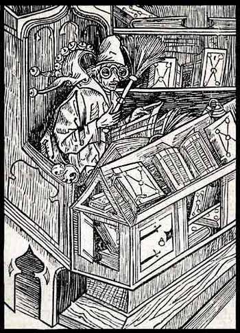
    In the same work by Brant (“Of Useless Books”, thankfully found with all 117 of the images from the work at the University of Houston library  ) we find the following image of the sage Fool.shorn of his headdress, sitting in the library, wearing glasses, and reading, surrounded by disheveled books that were clearly being used and consumed by the supposed clown. To me it shows the substantiation of the wisdom of the free-thought folly speech of the Fool, who, although clothed ridiculously, was a thoughtful, careful, well-read individual whose message much resembled the messenger. 

    The images in Brant’s book are so singular and many of the titles so captivating I’ve included many from the list from Houston’s table of contents, below: 


    Of Useless Books the Haintz-Nar-Meister
    Of Beggars Albrecht Dürer
    Of Good Counselors the Haintz-Nar-Meister
    Of Bad Women Albrecht Dürer
    Of Greed the Gnad-Her-Meister
    Power of Fatuity Artist unknown
    Of Newfangled Ways the Haintz-Nar-Meister
    Of Star-Gazing Albrecht Dürer
    Of Old Fools the Haintz-Nar-Meister
    Wanting to Know All Regions the Gnad-Her-Meister
    Of Training Children Albrecht Dürer
    Not Wanting to be a Fool Albrecht Dürer
    Of Trouble-Making Albrecht Dürer
    Not Understanding Raillery Albrecht Dürer
    Not Following Good Advice Albrecht Dürer
    Wanting to Escape Consequences of Evil Albrecht Dürer
    Of Bad Manners Artist unknown
    Not Providing in Advance Albrecht Dürer 
    Of True Frienship Albrecht Dürer
    Ship_of_fools_bosh_2
    Quarreling and Going to Court Albrecht Dürer
    Disdain of the Holy Scriptures the Gnad-Her-Meister
    Of Crude Fools Albrecht Dürer 12 Of Hasty Fools Artist unknown
    Of Becoming a Cleric Albrecht Dürer
    Of Wooing Albrecht Dürer
    Of Great Boasting the Haintz-Nar-Meister
    Of Arrogance Toward God Albrecht Dürer
    Of Gamblers the Haintz-Nar-Meister
    Of Foolish Plans Albrecht Dürer
    Of Oppressed Fools Albrecht Dürer
    Of Gluttony and Rebelling Albrecht Dürer
    Highwaymen and Lawyers Albrecht Dürer
    Of Useless Death the Haintz-Nar-Meister
    Foolish Messengers Artist unknown
    Of Serving Two Masters the Haintz-Nar-Meister
    Of Cooks and Waiters Albrecht Dürer
    Of Much Babbling the Haintz-Nar-Meister
    Of Peasants’ Squandering Albrecht Dürer 2
    Of Finding Treasure Albrecht Dürer 7
    Contempt of poverty Artist unknown
    Not Practicing What You Preach the Haintz-Nar-Meister
    Of Persisting in Good Albrecht Dürer
    The Teaching of Wisdom Albrecht Dürer
    Not Preparing For Death Albrecht Dürer
    Of Overestimating One’s Fortune
    Of Too Much Care the Haintz-Nar-Meister r
    Of God’s Plagues and Punishments Albrecht Dürer
    Of Unnecessary Wishes the Haintz-Nar-Meister
    Of Foolish Trading Albrecht Dürer
    Of Useless Studying Albrecht Dürer
    Of Jabbering in the Choir Albrecht Dürer
    He Who Judges Others Albrecht Dürer
    Of Overbearing Pride Albrecht Dürer
    Of Seeking Postponement Albrecht Dürer
    Expecting Inheritance Albrecht Dürer
    Of Guarding Wives Albrecht Dürer
    Giving and Regretting It Albrecht Dürer
    Fools, Far, Near, and Forever Albrecht Dürer

  • From Blood Flow to Little Nemo–Sequential Illustrations of Ideas and Stories

    JF Ptak Science Books  Post 1786

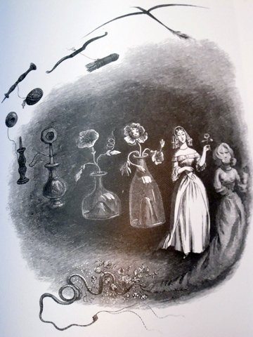
    It is intriguing to see ideas are communicated when drawn as a series of events on a single piece of paper–a single-panel, progressive illustration showing the sequential development of an idea.  This thought struck me while looking at some of the work of J.J. Grandville (above, “Les Metamorphoses du sommeil”, from his book Un Autre Monde, a proto-surrealist work printed in 1844) ) and caused me to think about how old this idea might be, how far back it stretched into the sciences and literature.  And right now, I really don’t have the answer.

    Again, what I’m thinking about is a single-sheet describing an action or thought–not like what might be the earliest example of the “comic book” the Histoire de M. Vieux Bois (1827) by Rodolphe Toepffer (Geneva, 1799–1846) but more like Little Nemo in Slumberland, by Winsor McKay (the following example from 1905).  The difference between the two in composition is simply that McKay in his Sunday comics efforts would develop the story on a single sheet of paper, so that you are in a way watching the story unfold as a motion picture would; and in the case of Toepffer, the story is told more in a conventional graphic novel way–in a book over dozens or hundreds of pages, with one illustration per page.  (I wonder about including Egyptian and Mixtec hieroglyphics, but I don’t think that they apply.)

    File:Little Nemo moon.jpg

    What seems like an early ready-made example of the sequential imaging of an idea on one piece of paper might be from the great William Harvey’s  De Motu Cordis et Sanguinis in Animalibus (On the Movement of the Heart and Blood in Animals), which was printed in 1628, and which in an iconic display shows Harvey’s demonstration of blood operating in a closed system, and circulated by the heart, and undergoing a “a motion in a circle”.

    Image from Exercitationes Anatomicae

    [Source:  this image from Exercitationes Anatomicae, De Motu Cordis & Sanguinis Circulatione.. Rotterdam: Arnoldus Leers, 1660..]


  • A Line in the Sand: a Note on Modernity, 1908

    JF Ptak Science Books   Post 1783

    Klimt3_edited-1
      Klimt2

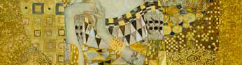
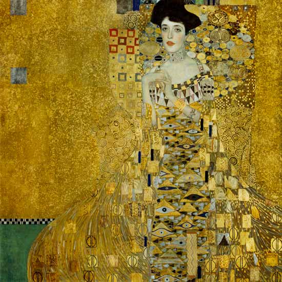
    Is this detail a peek at the boundary of The Modern?

    Are we seeing the boundaries of the new art? I’m not saying that this is the boundary, or the outermost, or the inner–but it is there, somehow, marking a line between the old and the revolutionary new, a line in the sand in the history of art.

    The 1907 portrait of Adele Bloch-Bauer by Gustav Klimt almost seems to be among the earliest images of a synthetic human, a human no longer solely interacting with its environment, but also now becoming a part of it, the subject losing a part of itself to be a segment of design.  The painting was also moving away from solely representational work, with Klimt allowing the expression of his painting to take over the recognizable subject. The subject and the idea of representational painting would disappear completely in just a few years’ time with the appearance of Kandinsky’s watercolor (Untitled) (1910).  Klimit himself would continue his experimentation with The Kiss, which he worked on from 1905-1908.

    Klimt

    It is interesting to me to see how the subject and environment of a painting become one, as in the work, for examples of  Ferdinand Leger, like his Nudes in the Forest (1909/10):

    Ferdinard Leger Nudes in the Forest

    and Jacques Villon Soldiers on March (1913)

    http://www.indiana.edu/~dws/dws_chapter_2/images/19.VillonSoldiers.jpg


    and Umberto Boccioni, States of Mind I (1911)

    http://www.shafe.co.uk/crystal/images/lshafe/Boccioni_States_of_Mind_The_Farewells_1911.jpg

    annd Michael Lerionov Blue Rayonism (1912)

    http://myweb.rollins.edu/aboguslawski/Ruspaint/lario4.jpg

    Lyonel Feininger Umpferstedt I, 1914

    Lyonel Feininger, Umpferstedt I.

    These more so than the earliest non-representational artists, like Franz Kupka’s Noctures (1911), or Gino Severini Hierogyphic of the Bal Tabarin (1912); and not in the very suggestive work of  Vlaminck’s La Partie en Campagne (1905) or Matisse’s Joie de Vivre (1905) or even Picasso’s Les Demoiselles d’Avignon (1907).  The Klimt just seems to me a blending of subject and the rest of the painting, and not in a Cubist or Constructivist or non-representational sort of way.


  • The Liar in Political Winsprumerfall–a Short Episode in Blank, Empty & Missing Things

    JF Ptak Science Books     Post  1805  [Part of the History of Blank, Empty and Missing Things series.]

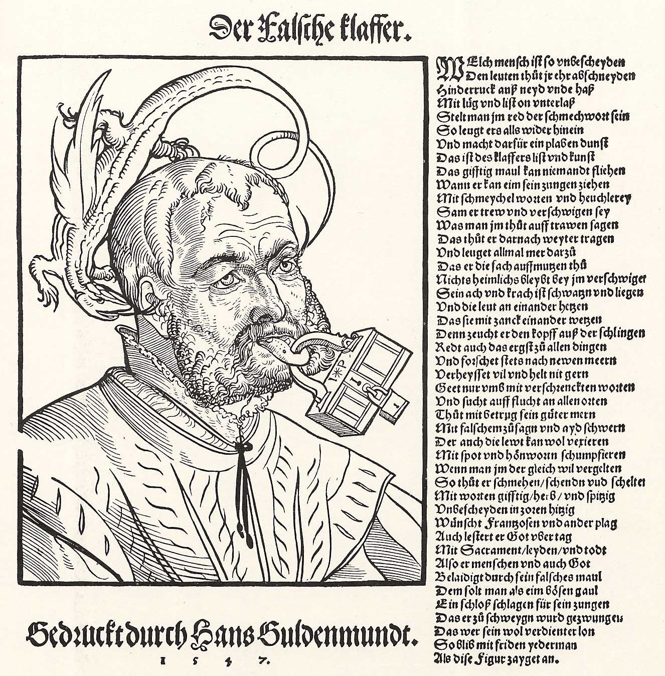
    Pencz, Georg: Der Verleumder
    [Source:  Zeno.org.]
    As we approach the new political season (where it is always all fours seasons,
    simultaneously, and known as “Winsprumerfall”) and where everything is good and
    bad, and decent and not, and moral and wanting, and right and wrong so far as the “wrongness” falls upon your opponent, and cloudy and clear, and all at the same time as always, everything all at once, it might serve us well to have an image of Georg Pencz’s
    (who I wrote about earlier today, here) Verleumder in mind. 
    And as we can see and guess, the wood engraving depicts the lying liar, the defamer influencing a value judgment, the slanderer of a fact known to be true and uttered false, a libeler.  A cheat of the fact.  In times like these, it is always good to listen closely and follow the logic, and then the money.  And then fact-check.

  • The Dance of Work: Satires and Grotesques of the Professions, 1700.

    JF Ptak Science Books   Post 1754


    Nicolas de Larmessin (1640-1725) was an enormously creative and productive artist, and in his way created a genre similar to the great and ancient Dance of Death/.Danse Macabre/Totentanz--though his was the Dance of Life. Or perhaps it was something less political and  philosophical, simply showing itself as a Dance of Work,  A Satire of Occupation.  (In the earlier, 14 & 15th century printed version of the Dance of Death, which shows death coming to people of different professions, that the earliest meetings between death and its intended depict death done only in bones, and is relatively scary; later on, moving into the 17 and 18th centuries, death occasionally wears some elements of the profession of the person whom he seeks, giving the expedition a little share of irony or dark comedic relief.  In general, though I find the Wolgement, Holbein, Durer varieties of death-hungry Death to be fairly well off-putting; those later on less so.)

    About 100 of these images from de Larmessin were published over a period of time and in variously-titled works, appearing as Les costumes grotesques et les métiers, and Costumes grotesques and Habits des métiers et professions–maybe they were more grotesques than anything else, or satires.  Nicolas was part of a long family history of the de Larmessin (also L’Armessin) family,  a famous series of generational  engravers and  printers, who worked and functioned in the 17th and 18th centuries.

    To me the devil of his work is in fact in the details, and their accumulations. There very well may be a lot to study in the minutiae of what each profession has hanging to the ends of their clothing–or at least it seems possible that some previously overlooked widget gets a little public airing in one of these images…

    Some of the alphabet of professions treated by de Larmessin include:  Baker, (Boulanger), Basket maker (Vannier), Blacksmith (Ma Brick Mason (Masson), Butcher (Boucher), Chef (Cuisinier), Chest and Box maker (Malletier-Coffretier), Clock maker (Corlogeur), Clothes seller (Fripier), Coffee merchant (Caffetier), Comb and brush seller (Peigné), Comedian (Comédien), Dairy & cheese maker (Laitier), Farm laborer (Labourer), Fisherman (Pescheur), Furier (Foureur), Gardener (Jardinier), Hat maker (Chapellier), Hosier (Bonnetier), Knife and Sissor Sharpener (Remouleur), Locksmith (Serrurier), Leather worker (Ceinturier), Miller (Meusnier), Money changer (Monnoyer), Maker of table games (Tabletier), Perfume maker/seller (Parfumeur), Playing Card printer (Cartier), Plume and feather seller (Plumassier), Plumber (Plombier), Printer (Imprimeur), reschal), Saddle maker (Sellier), Second-hand Shoe maker (Sauetier), Tailor (Tailleur), Wheel wright (Charron), Wild Game chef/seller (Rotisseur), Wild Game chef/seller (Rotisseur),Wine merchant (Cabaretier), Wine maker (Vigneron).

    Source for all following images:  Live Journal

    But before proceeding any further, I must at least make reference to another master in this field, an earlier, perhaps revolutionary figure, Arcimboldo (1527-1593), who produced royal portraits composed entirely of fruits and vegetables, as so:

    http://www.lessing-photo.com/p2/400706/40070643.jpg

    The people and professions portrayed by de Larmessin are “people” underneath it all; with Arcimboldo its fruit and veggies all the way down, just like with the Dance of Death, there’s nothing beyond the bone but disappeared bone.  


  • A Temple of Bricks: London, 1872

    JF Ptak Science Books  Quick Post

    There is almost nothing in this image except for bricks–a few people are in their tiny gardens, and there’s a tiny bit of sky visible just above the train on the railway bridge.  But the medium of the image is brick. And smoke,  and soot.  Sooty red bricks rendered in black-and-white in this homage to the working classes of London, a temple of bricks for the second-generation members and cogs of the industrial revolution, packed together in a neat and orderly and tight way.  By this point, in 1872, there were strong differentiations between the lower middle class and the working poor, and these people below–with their own houses and yards–are the lower middle class and the very backbone of the British Empire.

    This is the work of Gustave Dore from 1872, “Over London by Rail”, as it appeared in Blanchard Jerrold’s London, a Pilgrimage (1872).  It seems that in this collaborative expedition into the city of London that the Frenchman-_Dore–gives us the best view of what life was like then.  The pair set out to document, to record, to observe–Blanchard provides the text, and he does a very good job at seeing and responding to it,m doing so with almost no interior thoughts about causes or reasons.  Dore responds with pictures, and for the most part is a devastating chronicler. 

    Some of the 180 illustrations can be seen here.


  • Big G’s: Grim & Gross Saturn: Grandville, Goya, Galileo and the German Gnostics

    JF Ptak Science Books  Post 1752

    Blogsaturn_large
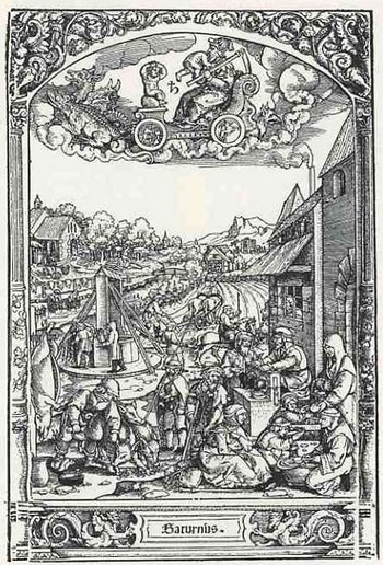
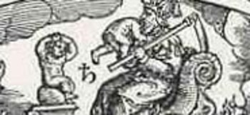
    I was getting ready with what was supposed to be the real post for today when I stumbled upon this woodcut of the Roman god Saturnus.  What makes this image so terrifically compelling is how benign it is—in its weird, mechanical, disinterested observational manner the artist conveys almost nothing about the act that we witness as the god plots his way across the sky in its celestial chariot.  Saturn (equated with the Greek Kronos, and the Titan father of Zeus, and also the name of the gaseous oblate six planet) commits acts of horror, and becomes, again and again, perhaps the greatest coward of the Roman pantheon of questionable deities. 

    It begins with Saturn being told his future:  that at some point in his life his son or sons will supplant him, catch him, replace him and kill him.  And the best thing that Saturn can think to do is to methodically eat his children, and he does manage to consume all but one—Zeus—who then fulfills the prophecy; but then again, who wouldn’t?  There is really very little like this in mythology—and, really, why should there be?
    Blogsaturn_ldetaileating

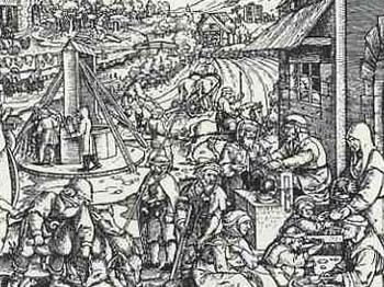
    Our artist—or engraver—is George Pencz (1500-1550), alive and dead very neatly at the century and half-century mark, and his work (“The Life of the Children of the Planet Saturn”) is illustrated in Folge der Planeten .  The image of Saturn racing along with his son’s head in his mouth looks naive compared top the rest of the illustration, which is a very lively, if quiet, depiction of the industry that his dead sons would have applied themselves to if they hadn’t been consumed by their father.  The illustration of Saturn is very disturbing to me, particularly when you notice the son-in-waiting, who is watching his father eat his brother, and in an incredibly pathetic and heart-breaking way is trying to protect himself by holding his head.  I think it is so very moving because it is a perfectly logical (from a child’s point of view) reaction to an unimaginable terror, and perhaps this is how Pencz can best deal with the vile god.
    Blogsaturn_ldetailallegory

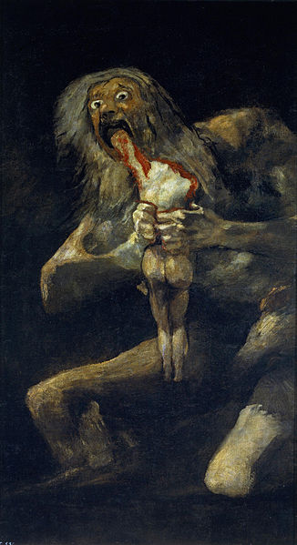
    Images of Saturn really are legion, but there are a host-and-a-half that are pretty upsetting, like the one above, and the one coming, below. I think that the one that is the test against which all others are measured is by Francisco Goya, who during his “black period” painted the truly terrifying image of Saturn devouring his child right on the wall of his house in 1824 (or thereabouts). It really is bad stuff. The scene as painted by Peter Paul Rubens isn’t much better.

    Saturn goya Saturn rubens


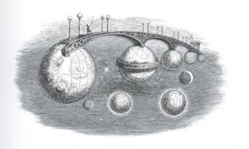
    Admittedly, J.I.I Grandville (1803-1847) didn’t conceive of this series of bridges as a plausible means of interplanetary travel and is in all probability an allegorical creation, but the image does–in an odd way–allow a dialogue on the idea of moving from planet to planet, which was still pretty solitary thinking in the mid-19th century. Although this didn’t have a direct effect on the perception of man’s place in the solar system, it did have a great and direct impact upon a vast number of illustrators and cartoonists who followed in his considerable wake.

    BlogfuturegrandvilleThis image comes from Grandville’s Un Autre Monde, published in 1844.
    In addition to an interplanetary bridge that there is another singular creation here in Grandville’s cosmos–a balcony constructed of the rings of Saturn (if indeed this was supposed to be Saturn–it is as advantageous as not to think of it in this way) and if we think of a balcony being a place to watch and observe, then we are brought instantly to W.G. Sebald’s Rings of Saturn, which is a textural masterpiece, and mostly I guess a novel about everything that Sebald observed in his walk through Suffolk.  (Another Saturn-related work of fiction is Sirens of Titan, by Kurt Vonnegut,  a very mature and insightful 1959 novel which really has nothing to do with anything here; I just needed to throw that in, what with him being a master storyteller, crank and human-caricaturist-observer and all…)  And so by 1844 it comes to pass that one French caricaturist/imaginist comes to draw an extraordinary and impossible land/space bridge between the planets only 234 years after Galileo  first glimpsed Saturn’s “handles”–give the optics of his telescope Galileo didn’t see the rings of Saturn as such, seeing rather two “extra bodies” on either side of the planet  It would take another 65 years and accumulations of observations by some of the greatest names in the history of astronomy (Galileo, Casini, Hevelius, Huygens) to show that the disk (singular) on Saturn was actually a series of rings.  (I should add that the first photograph of Saturn’s rings is not made until 1883.

    Saturn gnosis303
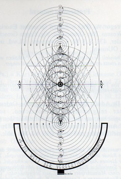
    Which somehow brings me to the troubled world of the “Saturn Gnosis”, the Fraterniti Saturni.  Actually the only place I’m getting to here is a picture (above), which I tried to understand before I realized what it was, and how much of an expanding hocus-pocus (otherwise defined as  “woo woo” in the words of James Randi) rabbit hole of diminishing returns it leads to, a dizzying history of competing complexities and nonsense.  But the image (found in a book edited by Eugen Grosche, (Offizielles Publikations-Organ der deutschen Gross-Loge Fraternitas Saturni Orient Berlin,  1929), comes from a psycho-sexual-astrological-magical group (one of a number of such associations in Germany and particularly Berlin in the 1920’s), and seems no less a part of reality as does Grandville’s Saturn.  Sameness ensues when you try to approximate the volume of limitless emptiness, or belief.

    ·Posted by :

    ·in:

    — —

  • Modern Stained Glass Windows–Secular Work, 1937

    JF Ptak Science Books    Quick Post

    Stained glass424

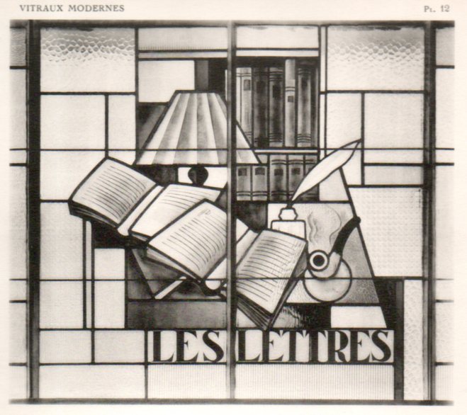
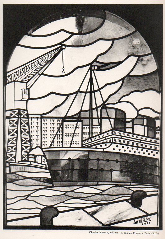
    I was browsing this very interesting book on an exposition of modern art (1937) which concnetrated on the stained glass windows.  I’ve reproduced a number of the secular images below, some of which are unexpected and remarkable:  there are images of jazz players, a portrait of Babar, steamships, laborers, racehorses, factory workers, and the like.  [The work:  MALLET-STEVENS, Robert. Exposition internationale de 1937. Vitraux modernes. Avant-propos de Paul Léon. Paris: Charles Moreau, 1937. Portefeuille in-4 (320 x 250 mm). 48 fine plates reproducing the work of  Décorchemont, Maumejean, Cingria, Robert Delaunay, and others. “L’Exposition de 1937, qui nous montre la ‘généralisation’ de l’architecture moderne, nous offre quelques vitraux de tout premier plan… Quand l’architecte voit dans l’espace des volumes bien ordonnés, le peintre verrier trace des lignes et oppose des couleurs heureuses… Je n’oserai dire que l’architecture moderne est en plein progrès, mais je puis affirmer que le vitrail ‘va très bien’!” (Robert Mallet-Stevens, Introduction).]

    The portfolio of images is available at our blog bookstore, here. 

    Stained glass414

    ·Posted by :

    ·in:

    —

  • German Decorative Painting in Biedermeier and the New Style (or Jugendstil), 1907

    JF Ptak Science Books   Quick Post

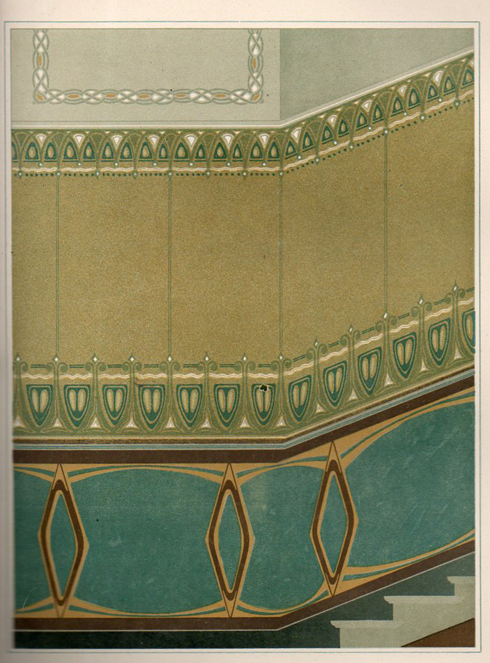
    This beautifully illustrated 1907 German book1 seems to me to be a sales catalog for a company selling flat-masks, or templates, through which desirable and somewhat complicated (or at last complex) painting may be produced.  A customer could leaf through this book of 60 designs which are arranged according to room type, and perhaps, if the fancy struck, could purchase the sheets and instructions necessary for the job to be done.  For example, plate #44 (Reggie Jackson’s number in the great summer of 1977), the “Pause mit Hilfsschablone” (its identifier in the “Preisliste” and offered at 10 Marks) is meant to decorate a wall for a stairway. 

    Jugendstihl361

    The great bulk of the designs are those for ceilings, and ceiling corners, as well as for wall designs and the small bits that run slightly above the floor and the wall (I’m sorry, but I don’t know the technical term for this).

    In any event it is a very surprising work to find–for me, at least–to see someone selling the possibilities of such advanced design motifs in a simple, order-it-from-our-catalog format.  [The catalog is available for purchase from the blog bookstore, here.]

    ·Posted by :

    ·in:

    —

  • Designs in Flowers, 1635

    JF Ptak Science Books   Quick Post

    This lovely, and short, pamphlet was published by Baltazar Moncornet in Amsterdam in 1635 as Livre de fleurs et de feuilles pour servir a l’art…Dessins de fleur pour orfeverie, with designs by Francois Lefebvre. Slender and tall, there was an engraved title followed by five plates for the entire production.  It is a very fine work, hard in detail, and worthy of close inspection.

    http://www.beauxartsparis.fr/ow2/catzarts/images/BIBMasson2911_02-60494.JPG

    ·Posted by :

    ·in:

    —