A Daily History of Holes, Dots, Lines, Science, History, Math, Physics, Art, the Unintentional Absurd, Architecture, Maps, Data Visualization, Blank and Missing Things, and so on. |1.6 million words, 7500 images, 4.9 million hits| Press & appearances in The Times, Le Figaro, Mensa, The Economist, The Guardian, Discovery News, Slate, Le Monde, Sci American Blogs, Le Pont, and many other places… 5000+ total posts since 2008.

Category: Art History

  • Big G’s: Grim & Gross Saturn: Grandville, Goya, Galileo and the German Gnostics

    JF Ptak Science Books  Post 1752
    Blogsaturn_large
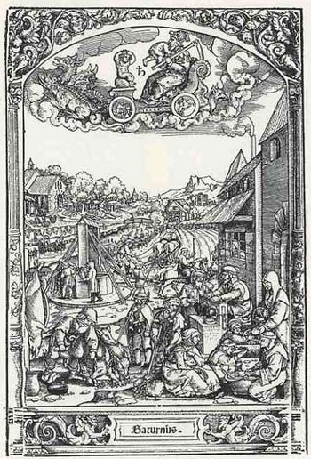
    I was getting ready with what was supposed to be the real post for today when I stumbled upon this woodcut of the Roman god Saturnus.  What makes this image so terrifically compelling is how benign it is—in its weird, mechanical, disinterested observational manner the artist conveys almost nothing about the act that we witness as the god plots his way across the sky in its celestial chariot.  Saturn (equated with the Greek Kronos, and the Titan father of Zeus, and also the name of the gaseous oblate six planet) commits acts of horror, and becomes, again and again, perhaps the greatest coward of the Roman pantheon of questionable deities. 

    It begins with Saturn being told his future:  that at some point in his life his son or sons will supplant him, catch him, replace him and kill him.  And the best thing that Saturn can think to do is to methodically eat his children, and he does manage to consume all but one—Zeus—who then fulfills the prophecy; but then again, who wouldn’t?  There is really very little like this in mythology—and, really, why should there be?
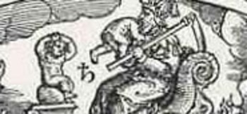
    Blogsaturn_ldetaileating

    Our artist—or engraver—is George Pencz (1500-1550), alive and dead very neatly at the century and half-century mark, and his work (“The Life of the Children of the Planet Saturn”) is illustrated in Folge der Planeten .  The image of Saturn racing along with his son’s head in his mouth looks naive compared top the rest of the illustration, which is a very lively, if quiet, depiction of the industry that his dead sons would have applied themselves to if they hadn’t been consumed by their father.  The illustration of Saturn is very disturbing to me, particularly when you notice the son-in-waiting, who is watching his father eat his brother, and in an incredibly pathetic and heart-breaking way is trying to protect himself by holding his head.  I think it is so very moving because it is a perfectly logical (from a child’s point of view) reaction to an unimaginable terror, and perhaps this is how Pencz can best deal with the vile god.
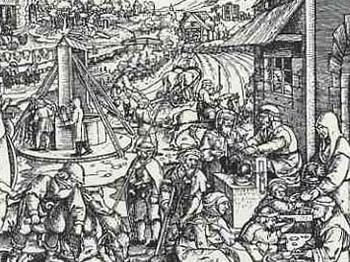
    Blogsaturn_ldetailallegory

    Images of Saturn really are legion, but there are a host-and-a-half that are pretty upsetting, like the one above, and the one coming, below. I think that the one that is the test against which all others are measured is by Francisco Goya, who during his “black period” painted the truly terrifying image of Saturn devouring his child right on the wall of his house in 1824 (or thereabouts). It really is bad stuff. The scene as painted by Peter Paul Rubens isn’t much better.
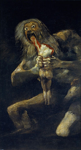
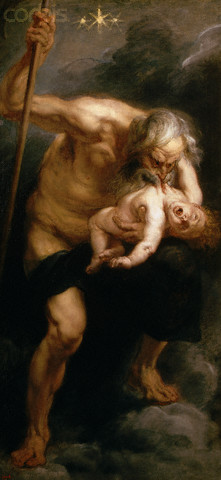
    Saturn goya Saturn rubens


    Admittedly, J.I.I Grandville (1803-1847) didn’t conceive of this series of bridges as a plausible means of interplanetary travel and is in all probability an allegorical creation, but the image does–in an odd way–allow a dialogue on the idea of moving from planet to planet, which was still pretty solitary thinking in the mid-19th century. Although this didn’t have a direct effect on the perception of man’s place in the solar system, it did have a great and direct impact upon a vast number of illustrators and cartoonists who followed in his considerable wake.
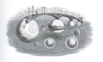
    BlogfuturegrandvilleThis image comes from Grandville’s Un Autre Monde, published in 1844.

    In addition to an interplanetary bridge that there is another singular creation here in Grandville’s cosmos–a balcony constructed of the rings of Saturn (if indeed this was supposed to be Saturn–it is as advantageous as not to think of it in this way) and if we think of a balcony being a place to watch and observe, then we are brought instantly to W.G. Sebald’s Rings of Saturn, which is a textural masterpiece, and mostly I guess a novel about everything that Sebald observed in his walk through Suffolk.  (Another Saturn-related work of fiction is Sirens of Titan, by Kurt Vonnegut,  a very mature and insightful 1959 novel which really has nothing to do with anything here; I just needed to throw that in, what with him being a master storyteller, crank and human-caricaturist-observer and all…)  And so by 1844 it comes to pass that one French caricaturist/imaginist comes to draw an extraordinary and impossible land/space bridge between the planets only 234 years after Galileo  first glimpsed Saturn’s “handles”–give the optics of his telescope Galileo didn’t see the rings of Saturn as such, seeing rather two “extra bodies” on either side of the planet  It would take another 65 years and accumulations of observations by some of the greatest names in the history of astronomy (Galileo, Casini, Hevelius, Huygens) to show that the disk (singular) on Saturn was actually a series of rings.  (I should add that the first photograph of Saturn’s rings is not made until 1883.
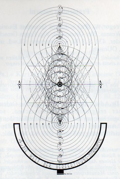
    Saturn gnosis303
    Which somehow brings me to the troubled world of the “Saturn Gnosis”, the Fraterniti Saturni.  Actually the only place I’m getting to here is a picture (above), which I tried to understand before I realized what it was, and how much of an expanding hocus-pocus (otherwise defined as  “woo woo” in the words of James Randi) rabbit hole of diminishing returns it leads to, a dizzying history of competing complexities and nonsense.  But the image (found in a book edited by Eugen Grosche, (Offizielles Publikations-Organ der deutschen Gross-Loge Fraternitas Saturni Orient Berlin,  1929), comes from a psycho-sexual-astrological-magical group (one of a number of such associations in Germany and particularly Berlin in the 1920’s), and seems no less a part of reality as does Grandville’s Saturn.  Sameness ensues when you try to approximate the volume of limitless emptiness, or belief.
    ·Posted by :

    ·in:

    — —

  • Modern Stained Glass Windows–Secular Work, 1937

    JF Ptak Science Books    Quick Post

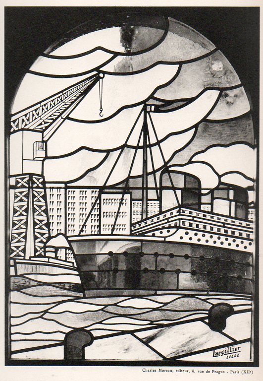
    Stained glass424

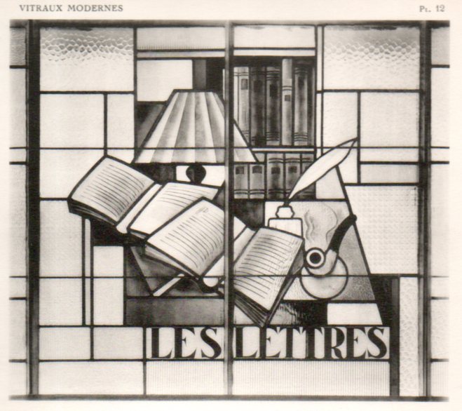
    I was browsing this very interesting book on an exposition of modern art (1937) which concnetrated on the stained glass windows.  I’ve reproduced a number of the secular images below, some of which are unexpected and remarkable:  there are images of jazz players, a portrait of Babar, steamships, laborers, racehorses, factory workers, and the like.  [The work:  MALLET-STEVENS, Robert. Exposition internationale de 1937. Vitraux modernes. Avant-propos de Paul Léon. Paris: Charles Moreau, 1937. Portefeuille in-4 (320 x 250 mm). 48 fine plates reproducing the work of  Décorchemont, Maumejean, Cingria, Robert Delaunay, and others. “L’Exposition de 1937, qui nous montre la ‘généralisation’ de l’architecture moderne, nous offre quelques vitraux de tout premier plan… Quand l’architecte voit dans l’espace des volumes bien ordonnés, le peintre verrier trace des lignes et oppose des couleurs heureuses… Je n’oserai dire que l’architecture moderne est en plein progrès, mais je puis affirmer que le vitrail ‘va très bien’!” (Robert Mallet-Stevens, Introduction).]

    The portfolio of images is available at our blog bookstore, here. 

    Stained glass414

    ·Posted by :

    ·in:

    —

  • German Decorative Painting in Biedermeier and the New Style (or Jugendstil), 1907

    JF Ptak Science Books   Quick Post

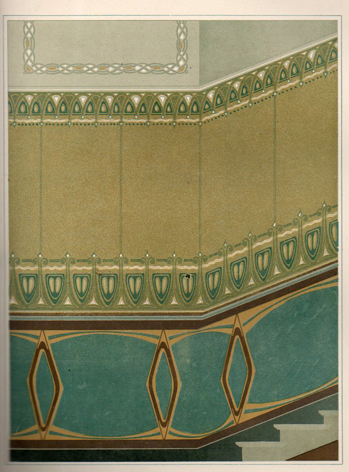
    This beautifully illustrated 1907 German book1 seems to me to be a sales catalog for a company selling flat-masks, or templates, through which desirable and somewhat complicated (or at last complex) painting may be produced.  A customer could leaf through this book of 60 designs which are arranged according to room type, and perhaps, if the fancy struck, could purchase the sheets and instructions necessary for the job to be done.  For example, plate #44 (Reggie Jackson’s number in the great summer of 1977), the “Pause mit Hilfsschablone” (its identifier in the “Preisliste” and offered at 10 Marks) is meant to decorate a wall for a stairway. 

    Jugendstihl361

    The great bulk of the designs are those for ceilings, and ceiling corners, as well as for wall designs and the small bits that run slightly above the floor and the wall (I’m sorry, but I don’t know the technical term for this).

    In any event it is a very surprising work to find–for me, at least–to see someone selling the possibilities of such advanced design motifs in a simple, order-it-from-our-catalog format.  [The catalog is available for purchase from the blog bookstore, here.]

    ·Posted by :

    ·in:

    —

  • Designs in Flowers, 1635

    JF Ptak Science Books   Quick Post

    This lovely, and short, pamphlet was published by Baltazar Moncornet in Amsterdam in 1635 as Livre de fleurs et de feuilles pour servir a l’art…Dessins de fleur pour orfeverie, with designs by Francois Lefebvre. Slender and tall, there was an engraved title followed by five plates for the entire production.  It is a very fine work, hard in detail, and worthy of close inspection.

    http://www.beauxartsparis.fr/ow2/catzarts/images/BIBMasson2911_02-60494.JPG

    ·Posted by :

    ·in:

    —

  • History of Lines: Perspective with Lances

    JF Ptak Science Books  Quick Post  [Part of the History of Lines series]

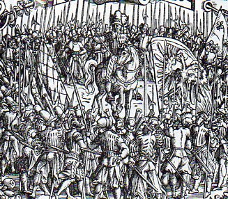
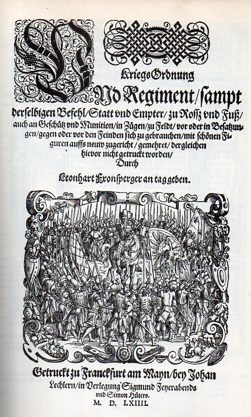
    I was quickly struck by the use of lances to establish a depth and perspective in this small woodcut on the title page of Leonhart Fronsperger’s Kriegsordung und Regiment…(1564), and how I have seen this device used many times over he years.  The artist here is the great Jobst Amman, and the book happens to be one of the most important works in military science published in the 16th century, addressing topics from troop movement to military economics to administration. (It is also one of the earliest books to address the subjects of pyrotechnics and rocketry, the later in the second chapter, “Vom Gescuetz und Feuerwerk”.) 

    Lance312
    The above is a detail from the title page:

    Lance311All that said, I’m fixed on the lances, and how they remind me somewhat of Paolo Uccello (1397-1475)–who is one of the founders of perspective–and his triptych The Battle of San Romano, with the third part of the trio in particular..  The painting was intended to be viewed together, depicting the battle (more-or-less) at morning/noon/night, the parts of which are shown below in that order.  The lances (especially in the “Counterattack”) are meant to heighten the sense of perspective–and the effect of the lances having basically no detail and being in brilliant color enhances that effect.  (In the first part of the triptych Uccello uses the alignment of dead soldiers and dropped lances to the same effect–particularly the ones beneath the hooves and in the vicinity of Niccolo de Tolentino’s spectacularly white and “solid” horse. (The business of the lack of detail in Uccello has been famously addressed in William Gaddis’ The Recognitions. I’ve written about Uccello frequently here, particularly in this note.)

    The left panel

    • Niccolò Mauruzi da Tolentino unseats Bernardino della Ciarda at the Battle of San Romano (dating uncertain, about 1435 to 1455), tempera on wood, 182 × 320 cm, Galleria degli Uffizi, Florence

    The center panel

    ·Posted by :

    ·in:

    —

  • On Antique Waves and Dropping Your Hat in Them

    JF Ptak Science Books   Post 1737  (Expanding post #850, On Dropping Your Hat in the Punic Wars)

    ++ Nov 24 dropped

    There is a particular class of illustration in which, among the secondary figures of the image, there is a small happening, an everyday trifle, that has been captured by the artist and included in the overall communication for no necessary reason. (for example, see here and below1). I’ve written about this a little before on this blog in posts about finding images-within-images: the unecessaries among the unnecessaries, the bits and pieces of everyday human existence that in and of itself is not worth commentary but which nearly everyone experiences.  Small bits, they are, of a tremendous human nature, the things that are done in private, or are so universal but inconsequential that they are shocking to see when illustrated in print.

    Titus Livius (59 BCE-17 ACE), better known to the English-speaking world as Livy, was a superior among superiors of Roman historians, writing on the history of his city and country.  His work, Romische Historie…, published in Mainz by Johann Schoeffler 1450 years later in 1514, was one of the most beautifully illustrated books ever produced in that city.  This is a considerable statement, as Mainz was the birthplace/hotbed of moveable type printing, being home to Johann Gutenberg and a number of other early presses. 

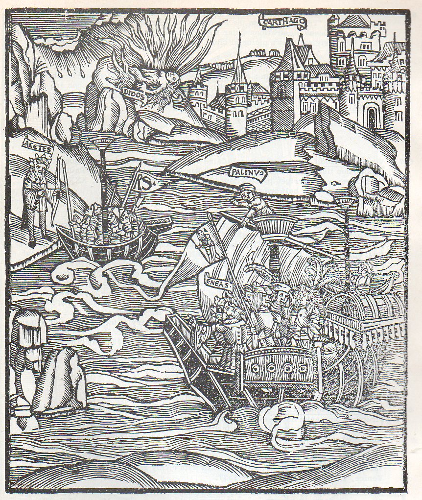
    And in looking at this fantastic work by Livy, I am a little embarrassed to find this spectacular bit of human tendency displayed in this woodcut depicting a naval engagement during the Punic Wars.  It is a beautiful thing, this scene of warfare depicted on tranquil seas and ribbony waves, determination in every face.  But what I noticed in the small boat at bottom right is a man reaching out into the water—not for a dropped oar, or to help a man overboard, or to catch his falling sword. 

    ++ Nov 24 dropped det
     He was reaching for his dropped hat. 

    I have reason to doubt that during the Punic Wars there may have been an unwritten chapter, “On the History of Dropped Hats During Warfare”.  Surely soldiers dropped their hats during the history of roman conquest, but I’d say that retrieving the headgear was more important at the Battle of the Bulge in protecting your noggin from badly splintering trees traveling at you at 180 mph and other such places than a wool cap dropped from a ship in pitched battle two hundred meters from shore. 

    I like this so because it is probably the first reaction that most of us would have—just a habit, battle raging or not—and just utterly human.  Just a little piece of back-history that doesn’t go anywhere and is lost to experience.  I’m sure that Herr Gutenberg dropped his hat at odd times, as did the unknown artist of this print.  Just an odd bit, like the first things printed on Gutenberg’s press being religious indulgences for people paying their way past Purgatory (and worse).  The fact that the indulgences preceded the great bible by several years doesn’t really matter, and neither does retrieving a dropped hat in a sea battle—but they do make interesting stories.   

    The only thing that I’d rather have the artist improve in this print were the waves–the ones on exhibit here weren’t very saucy.  Admittedly, waves were a large problem so far as depicting them goes, what with the whole vast subject of fluid dynamics so little known at the time.  THe person who would know this phenomenon best at this point–Leonardo–was thinking and working but wasn’t sharing. His “Studies of water Formations” (c. 1507-09)? and the later, magnificent “Deluge” (1513, nearly the year of publication of the above) would stay hidden for centuries, the big step forward in the West having to wait for another 120 and 140 years (respectively) for the works of Benedetto Castelli, and Evangelista Torricelli, 

    This aside, I think that I’d rather see heavier lines in my Renaissance waves, more in line with we find in Publius Virgilius Maro Oper accuratissime castigata…, a richly illustrated (104 large woodcuts) work published in 1537, even though the artwork (evidently) appeared in an earlier edition of 1502.  No matter, “The Master of Grueninger’s Workshop” created some beautiful waves:

    Wave301
    There’s nothing “wrong” of course with the Livy waves; the Virgil though has sharper, darker, blacker and stronger contrasts in the water. Of course, the Livy has that incredibly human act of the man reaching for his fallen hat int he heat of battle, and that’s something that rarely seems to happen in prints of the Renaissance. 

    Notes:

    1.  Some other Found Images posts:

    Found Images: Penny Lane and the Inexpensive Treat, London, 1896

    Found Images of the Great Wheel, 1895

    Finding Hidden Images in Antique Prints: 18th Century Forensic Social X-Rays of Florence by Guiseppe Zocchi


  • Sawing Through the Catalonian Mountains, 1499

    JF Ptak Science Books  Quick Post

    Mountains282
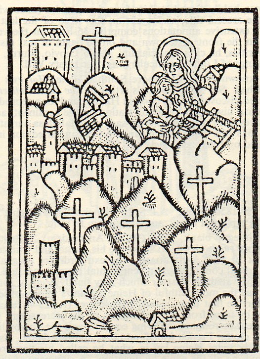
    The beautifully-named Gerardus de Zutphanis wrote de spiritualibus ascensionbus, a lovely gothic-lettered work of 84 leaves, in 1499, in the fifth decade passed the Gutenberg invention.  It was published in Montserrat–in Catalonian Spain, some 4,000′ or so about the valley floor– by Joseph Luschner, in the mountain keep of the Benedictine abbey there. 

    The woodcut image reproduced here was used as a printer’s device, and in it, remarkably, are shown not only the abbey, as well as some others as indicated by the series of crucifixes, but the improbable figure of the Virgin Mary holding the Christ child with both seemingly sawing their way through a mountain.  Its a magnificent thing–I particularly enjoy the use of dots in shading the mountainsides. 

    The press–or the business, the publisher that is–that produced this work is still in business today.

    ·Posted by :

    ·in:

    —

  • Courageous “Degenerate” Art, 1937

    JF Ptak Science Books    Post 1731

    I came upon this pamphlet out in the warehouse, and I was reminded again of the greatness and courage of some of the anti-NSDAP/Hitler artists in Germany in the early period of Nazism, 1933-1936.   There were many who were overtly anti-Nazi–like George Grosz and John Heartfield–in the political messages that were their artwork; then there were those  (like Felixmueller, Wollein, Otto Dix, Max Pechstein) who became enemies of the Nazi state because they chose to depcit the horrors of war or poverty or other social ills

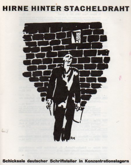
    Degenerate art257[“Brains Behind Barbed Wire”, with a woodcut by Frans Masereel.]

    John Heartfield, Blood and Iron, 1934

    And then, as the Nazis consolidated power they erected an enormous edifice of propaganda and thought control, codified in law and absorbed into societal practice, where artists and writers and their artwork and books and ideas were banned, being “deliberate sabotage of national defense”.   The books were burned, the art removed or sold or destroyed or hidden, the writers and artists threatened with extinction as well:  deported, thrown away, controlled, imprisoned, sent to concentration camps, murdered. 

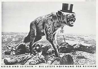
    Photomontage by John Heartfield, 1932

    [War and Corpses, by John Hearfield, 1932.]

    One way of another, they were mostly gotten rid of–the paintings and other works of those who were abroad or dead or otherwise not-reachable; and the art as well as the artists who were still in Germany, and whose presence could be controlled.

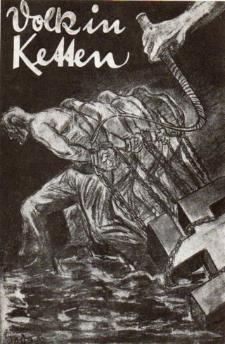
    Klinger258[“Max Klinger”, Volk in Ketten. Deutschalnds Weg ins Chaos, 1934]

    Some of the artists who were not able to escape, or who were Jewish and who did no tget sent to concentration camps, were murdered via the infamous Aktion 4 or T4 program–the mass murder of the physically disabled, the sick, the weak, the “moral degenerate”, and those too incapacitated to take care of themselves.  The name comes from the address of the organization responsible for it, at Tiergartenstrasse 4 in Berlin–the  Gemeinnützige Stiftung für Heil- und Anstaltspflege, [or Charitable Foundation for Curative and Institutional Care] which was run from (at least ) 1939 to 1945 under the direction of Recihsleiter Philipp Bouhler (who unfortunately escaped life by suicide after being captured by the Americans in May 1945). 

    [From Wiki: “This poster (from around 1938) reads: “60,000 Reichsmarks is what this person suffering from a hereditary defect costs the People’s community during his lifetime. Fellow citizen, that is your money too. Read ‘[A] New People‘, the monthly magazine of the Bureau for Race Politics of the NSDAP.”]

    To make things easier on the German mind, the NSDAP selected artists and entire art movements that were to be banned as “degenerate”, and displayed them in an infamous 1937 show called Entartete Kunst (“Degenerate Art”).  

    The people who committed their beliefs about the great Evil Thing that was National Socialism, those who committed their thoughts in art or literature, and did so in the 1933-1937 period, were brave people.  Hitler and Goebbels and the rest of the Nazi machine deeply appreciated the influence of visual images, being great practioners in the idea themselves, only though with vastly different content.

    The great social commentator/satirist/cartoonist for Harper’s Weekly magazine, Thomas Nast, also knew the great influence of the single visual image, and magisterially used his insight and art to great effect in helping to effect social change.  One of the evils he brought down–Boss Tweed of Tammany Hall–said that he didn’t fear anything that was written about him in the newspaper because his constituency “couldn’t read”.  But what he didn’t get, and what he never did understand, that the thing that brought him down were cartoons, and those were the things that people didn’t need to be able to read words in because they could already “read” the images. And it got him in the end.

    The manufacturers of the NSDAP recognized this factor and saw how much it could play against them, and so sought to remove “it”.  They went after the art, the artists, and the ideas, and came away from it all with safe and sanitized and partially meaningless culture. 

    The artists condemned in the 1937 Degenerate Art exhibition necessarily reads like a who’s-who of modern and 20th century art:  the show included Ernst Barlach, Willi Baumeister, Max Beckmann, Max Ernst, Wassily Kandinsky, Emil Nolde, Max Pechstein, Paul Klee, Ernst Krircherm Lyonel Feiniger, Oskar Schlemmer,  Franz Marc, El Lissitzky, Oscar Kokoschka, George Grosz, Marc Chagall, and Kurt Schwittersto name a few.  (A full list can be seen below.) Entire artistic movements were also to be eliminated in order to save the morality and conscience of the German people, including Bauhaus, Surrealism, Impressionism, Fauvism, Expressionism, Cubism and Dada. Basically, it was almost all of modern art.

    [Hitler visiting the Degenerate Art Show, 1937.)

    A fuller list of those exhibited at the 1937 Degenerate Art show.

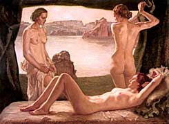
    These artist were abandoned/exiled/killed in favor of a more morally-robust and Aryan flavor, a genetic correctness, like the work here by Ernst Liebermann, moribund in its deadly color, greasy, tumescent hyper-non-sexuality:

    By the Water - Oil painting by Nazi artist, Ernst Liebermann

    which is picture postcard bad, like Franklin Mint artists gone to Nazism and shining/lustrous nudes.

    The “degenerate” label didn’t last very long in Germany, at least not in years–measured in lives, however, it is a completely different story.


  • A Peek into the Future of Modernist Painting–1863

    JF Ptak Science Books   Quick Post   [Part of the History of the Future series.]

    I’ve written on this blog on a number of occasions about the coming of The Modern, about the coming of many modernisms that came to life in the extraordinary period of 1885-1925 (which could even be shaved perhaps to  1895-1920), when nearly all things “modern” in nearly all fields came to be.  Sometimes though one can see a hint of the future, even though it might not necessarily be recognized at the time.

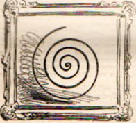
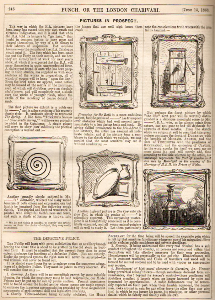
    Punch modern231_edited-1
    Such is the whisper of the future in this humorous, somewhat mocking piece on art in the 13 June 1863 issue of Punch, or the London Charivari.  Overall its pretty funny in a 19th century fashion, but what I am taken with most of course is the first piece, the framed non-representational artwork, a taste of the future that wouldn’t arrive for another 50 years with Wassily Kandinsky.  But here it is, or here is something, presented as art, in 1863, and with no discernible, naturalistic subject matter. 

    Punch modern231
    Even in satire, seeing such a picture give sone pause–if for no other reason, that even here in the early stretch of Impressionism, that such an image would appear in a very popular journal and have (a) no impact  and (b) not an ounce of staying power. 


  • “Writing of the Insane”, 1876: Very Early Art Brute Images?

    JF Ptak Science Books   Post 1712

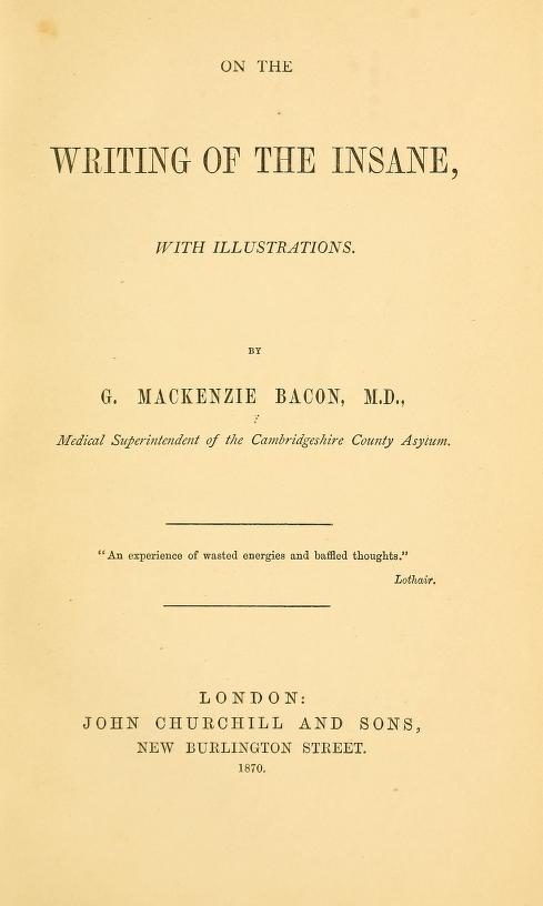
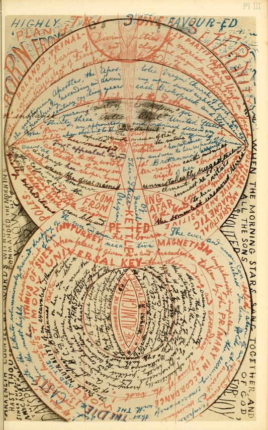
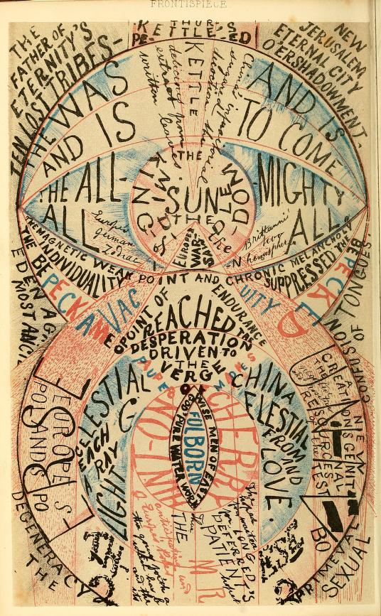
    Insane art 3 titke pageThis book–The Writing of the Insane, by George Mackenzie Brown, 1876– seems remarkable to me for the attention paid to the creative products of the insane. I am not sure when the first of these efforts occurred, but it seems to my experience that 1876 is an early production date for such an undertaking. It also seems to be a very early identification of the “special talents” of some of the observed individuals, including in the text of the book two remarkable (and remarkably “modern” looking) pieces of what today might be considered Art Brut/Outsider Art.

    The author is George Mackenzie Bacon (1836-1883), a doctor who took classes at Guys Hosptial and who had membership in the College of Surgeons in 1858.1 Bacon was the author of Primary Cancer of the Brain (1865) as well as an editing contributor of at least a dozen annual reports of the Committee of Visitors of the Cambridgeshire, Isle of Ely and Borough of Cambridge Pauper Lunatic Asylum (from 1869-1883 ro so). He definitely made improvements to the conditions of the inmates when he worked at Cambridegshire County Asylum (also known as Fulbourn Hospital, 1858-1992), where he provided those living there with more personal living space and patient-built work areas. This was certainly an interesting approach to take for the mentally ill, especially given the time and place.

    But in his (scant) published works it seems that the Writing of the Insane must be his masterwork for at least being among the earliest books to serve as an archaeology of deeply-different and illustrated thought:

    Insane art
    And this remarkable effort:

    Insane art 2

    [Source and full text, here.]

    This is certainly not a “celebration” of talent, but there are moments of recognition of such in the Writing of the Insane, which at the very least is a very early expose of the topic.  One of the earliest books written by someone who was admittedly “insane” (and this is very different from the many books written by insane, or brilliant, or misunderstood, or “complex”, or “different” author) came to us in 1846 by Green Grimes. thirty years before the Bacon work.  In  A Treatise on the Most Important Subject in the World: Simply to Say, Insanity…2 Grimes recounted his life at the Tennessee Hospital for the Insane, about which the blog Canton Asylum for Insane Indians writes:  “There are other Medical books which treat on Insanity, but comparatively few to the population, and none written by an Insane man,”

    Notes:

    1. There is scant personal information on Bacon available online. This data comes from the British Medical Journal, 3 March 1883, in an obituary on Bacon. 

    2. The full title is pretty full: A treatise on the most important subject in the world: simply to say, insanity: The only work of the kind in the United States, or, perhaps, in the known world, founded on general observation and truth. There are other medical books which treat on insanity, but comparatively few on the population, and none written by an insane man. This contains a short history of the author’s case, giving the general causes which produced the disease on him individually, manner of treatment and termination. Giving the only treatment by which a cure may be effected, the manner of detecting the disease, and the duties of sane parents towards the insane offspring of their bodies; with some general remarks upon idiotism, the jurisprudence of insanity, suicide, &c   

    The American Journal of Insanity simply states that the 94-page book is “very curious”.