A Daily History of Holes, Dots, Lines, Science, History, Math, Physics, Art, the Unintentional Absurd, Architecture, Maps, Data Visualization, Blank and Missing Things, and so on. |1.6 million words, 7500 images, 4.9 million hits| Press & appearances in The Times, Le Figaro, Mensa, The Economist, The Guardian, Discovery News, Slate, Le Monde, Sci American Blogs, Le Pont, and many other places… 5000+ total posts since 2008.

Category: Architecture and Building

  • Etienne Boullee Images/Picture Dump

    JF Ptak Science Books LLC  Picture Post//Image Dump

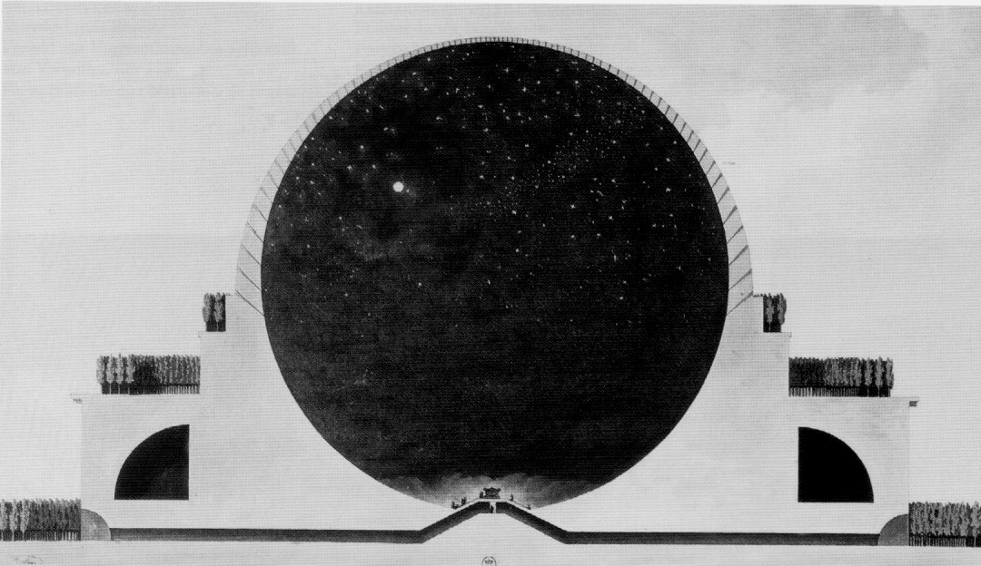
    Below area few images of the works of the architect Etienne Boullee.  I’ve entered quite a few posts on this blog featuring this late 18th century French visionary architect–just see here for a list of these entries. 

    Boulle newton


  • 200,000,000 Pounds of Buttocks–Or–Putting the Color Back in the Black-and-White

    JF Ptak Science Books   Post 977

    Well, this is a confusing title, with two seemingly unrelated affairs, no?  It is  probably sexier (?) too than the actual contents, but, we’ll let the cheeks fall where they may.  The origin of this post is found in the title to this large, over-sized 1937 pamphlet, Sat on by Millions:

    Mar 14 sat on

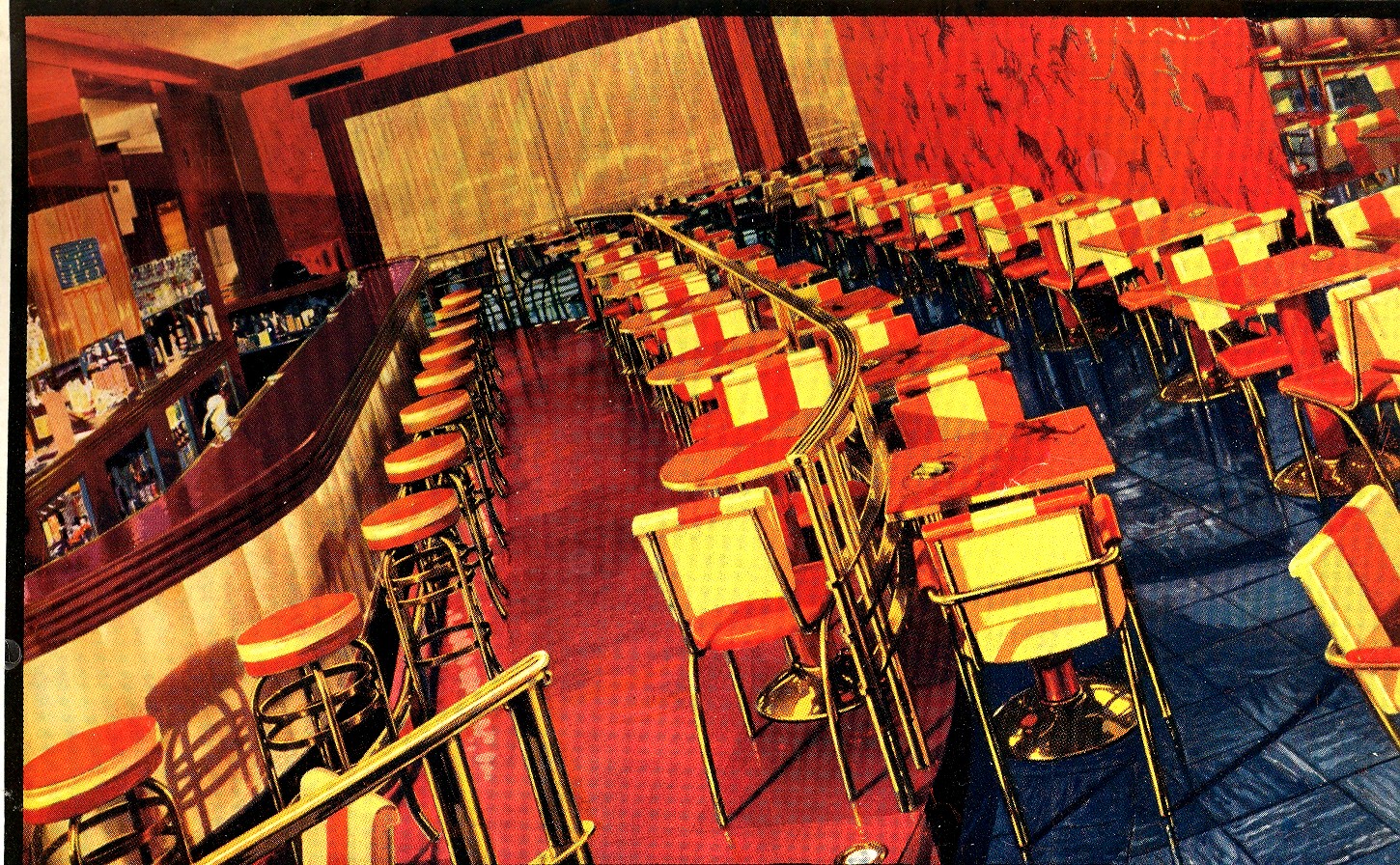
    This really is the “story of FABRIKOID”, a plastic-y bit of seating innovation brought to America by the good chemical engineers in service of du Pont.  It was the stuff used to make artificial artificial flowers and truck upholstery, book covers and bus tops.  But something happened somewhere along the line to make it more

    Mar 14 1st photo
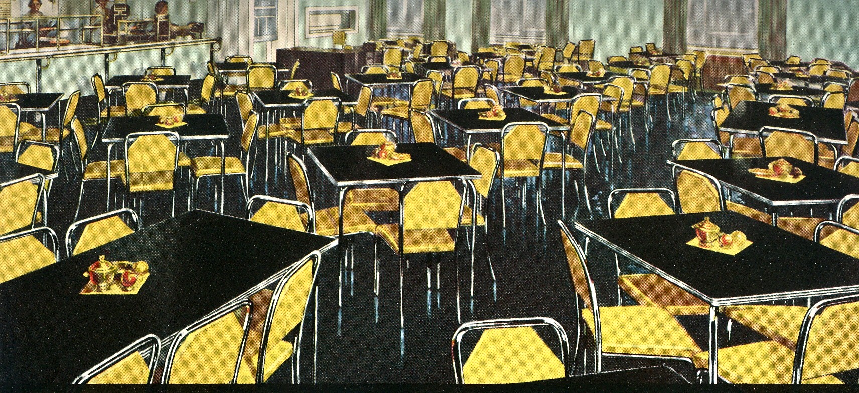
    attractive to look at and feel, and thus was born the cushioned and upholstered restaurant/movie house chair that you could simply spray off with water from a hose.  (My friend Andy is much enamored with his new Honda “Element”, the interior outfitted in such a way that he could, he related excitedly, “wash out with the garden hose”.)

     Mar 14 2nd photo

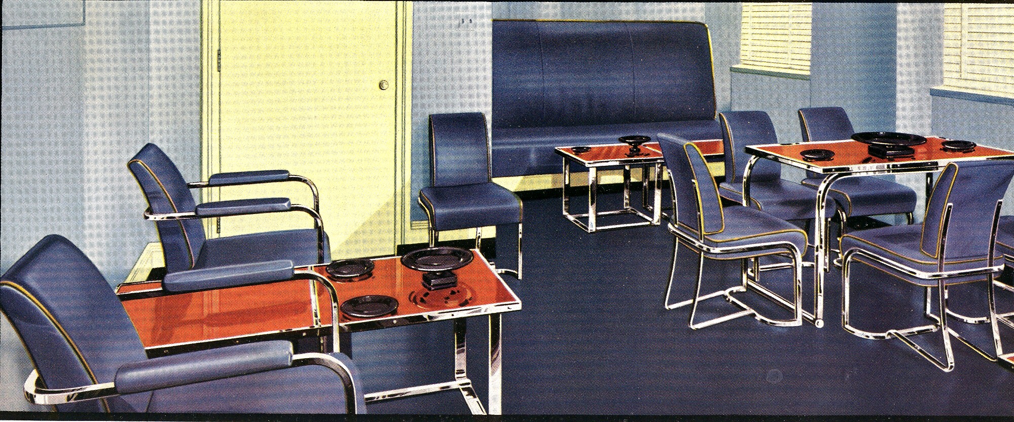
    [Cafeteria  at Hobart Manufacturing, Troy, Ohio.]
     

    Du Pont did test it out with 200 million pounds of buttocks–a mechanical test of the equivalent of a 200-pound man sitting on a FABRIKOID-covered seat one million times.  The flexing was evidently perfect, the company recalling another great success story of another FABRIKOID chair being sat on by thousands at the Chicago World’s Fair

    Mar 14 3rd photo

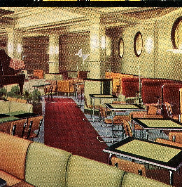
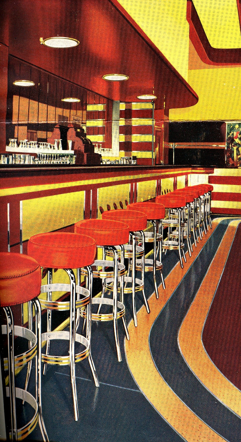
    [Cocktail lounge at Pittsburgh’s Seventh Avenue Hotel.]

    and then sent out on a tour around the country.  (I’m not sure that I’d stand in a line to sit in the most-sat-in chair in the world, as appealing as that might be…)

    Mar 14 4th photo

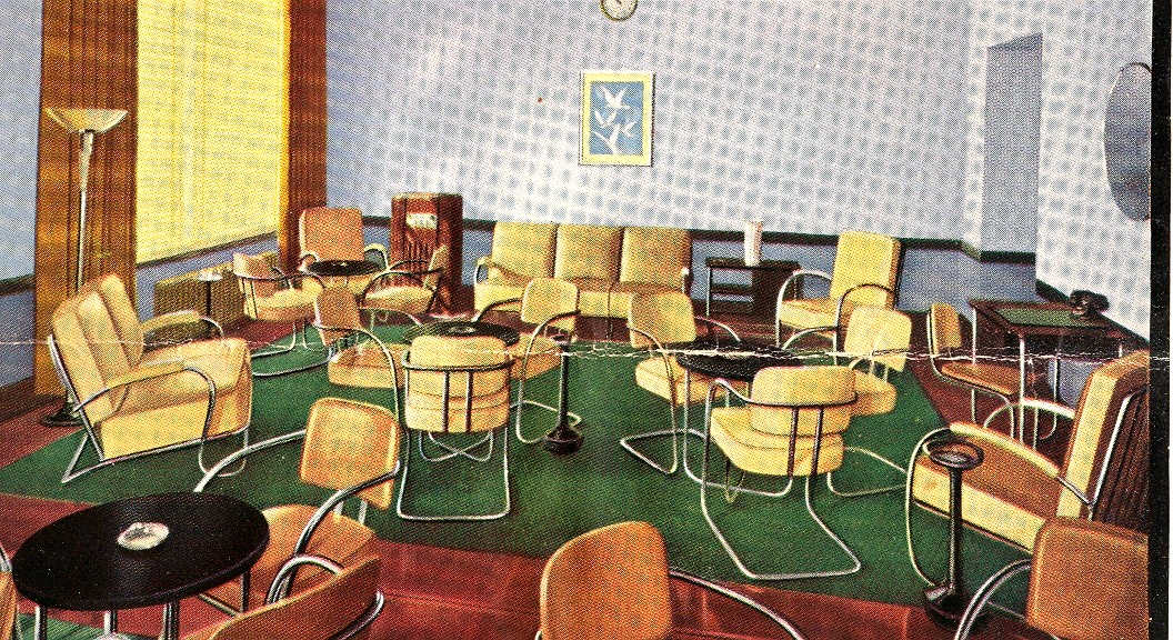
    [Federal Reserve Club of Los Angeles.]

    But the more appealing aspect of this pamphlet–aside from the great chemical achievement–are the luxurious (and early) color photographs of the FABRIKOID-covered furniture.  There are colors to remind everyone that color did exist in the 1930’s, and that when Bogart was cruising a bar for raw whiskey and a cig it could’ve had blue floors and red and yellow chairs, and not just the simpler gray stuff that we’re used to seeing.

    Mar 14 5th photo

    [Cocktail lounge, University Club, Troy, Ohio.]

    Perhaps it is better seeing Bogey in a haze of smoke snuggled into a blackish chair rather than what it might’ve (blue and yellow) been.

    Mar 14 7th red bar


  • Architectural Palindromes (or Semordnilap), Reversible Structures and Fractally Bad Ideas

    JF Ptak Science Books LLC  Post 9447--car park top

    “The Edge… there is no honest way to
    explain it because the only people who really know where it is are the ones who
    have gone over.
    “–(Dr.)Hunter S.Thompson

    Oddities
    and Curiosities and the Tryphiodorus Award

    Sometimes
    things that were just done because they could be done aren’t necessarily an
    accomplishment—they may use letters in the alphabet and make words, but the
    words really don’t seem to take us anywhere. 
    Literally.  There is a literary practice (and I mean this in a medical
    or forensic sense) in which the writer chooses to not use a particular letter
    of the alphabet, abandoning it for very private reasons into the dustbin of
    abandoned alphabet letters. (That dustbin is generally empty until one of these
    people show up with the idea of filling it, unless of course we expand the
    dustbin to include punctuation, and then it gets filled rat her quickly (though
    not in the Steinian sense).)

    The
    work which most filled the alphabet dustbin more than any in history is probably the
    Odyssey of Tryphiodorus (a Greek grammarian who flourished in Egypt ca. 4th century ACE) effort
    written in 26 parts, each segment abandoning one letter of the alphabet until
    each letter had been completely omitted from one section.. The author could
    have a lot of time by writing this 26-part cycle in all at once, in one part,
    abandoning all 26 letters at the same time—this may have produced a more
    elegant result (with the Bellman’s map coming to mind).

    7--car park mid This
    Odyssey may have produced a sort of a
    lipogramic palindrome, in a  squinty-eyed
    way. 

    Which
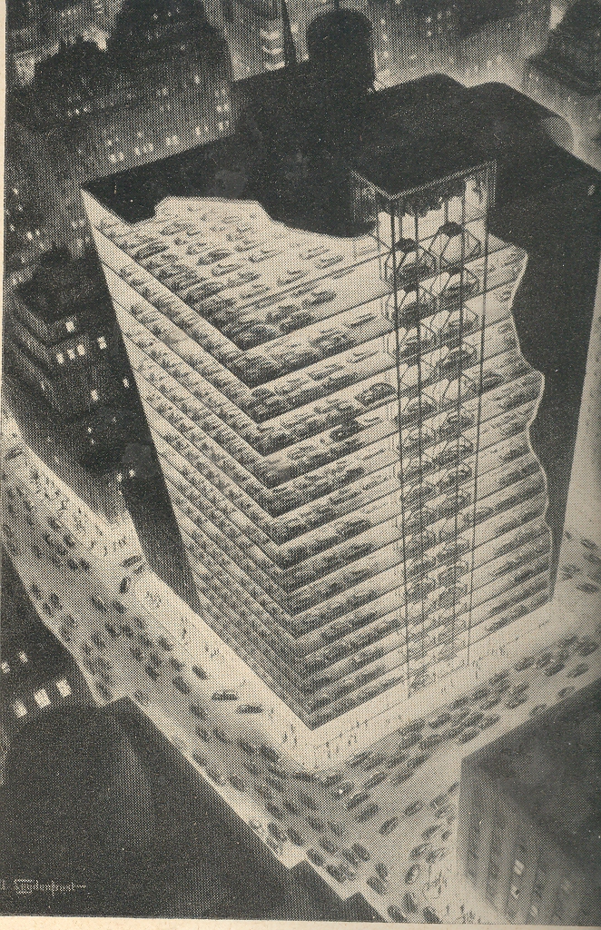
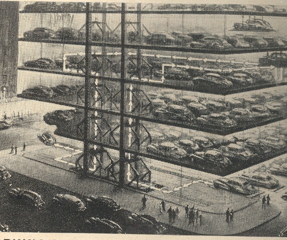
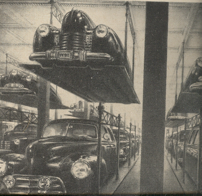
    brings me to this odd structure proposed by real estate mogul and hyper-builder  William Zeckendorf, whose vision brought to
    the pages of LIFE magazine in 1942 (?)  a 
    very tall completely automated structure designed for nothing but car
    parking. People would drive to NYC in their own cars (!) and park them in this
    car hotel; the car functions would be given over completely to the building, moved
    into their spots and juggled and finessed into position by conveyors and forklifts
    and such.  7--car park bot

    Cars
    in a building, moved about free of humans, rested; humans on the street making
    their own human traffic.  The whole idea,
    the entire structure, seems backwards to me, the meaning of a building turned
    inside out, wanting the essential idea, forwards and backwards being simply a
    bad notion.

    The
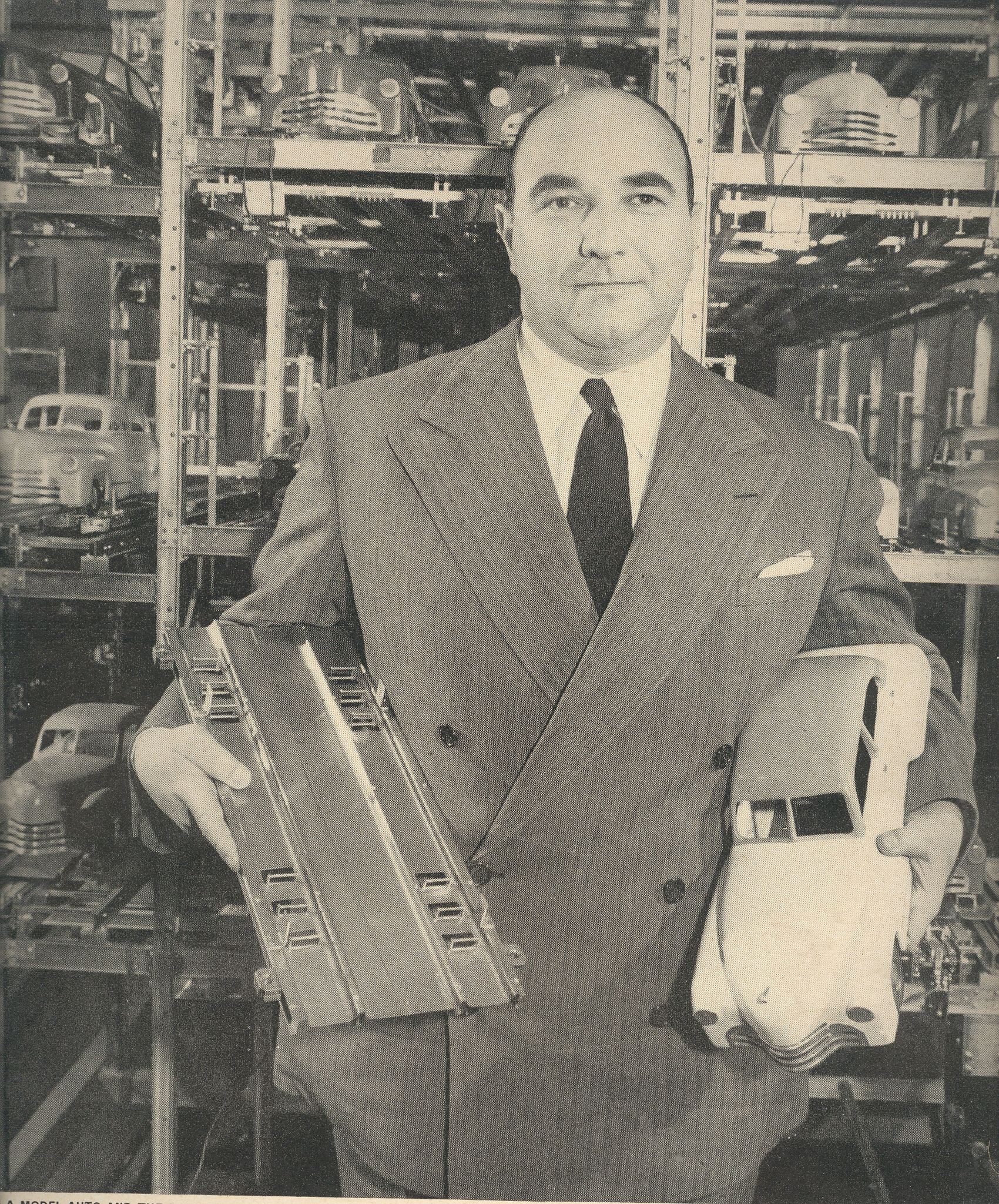
    picture of Mr. Zeckendorf—who was tremendously energetic and who had very many good ideas along with these heavily
    popularized odd plans—standing in front of a lovely (scale?) model of his
    parking structure makes me want to see another, smaller version of Mr.
    Zeckendorf  and his model standing just
    behind it, and smaller one after that, and so on…a fractally bad idea deserving of the Tryphiodorus award for missing the most sense. I bow deeply to Mr. Zeckendorf for trying and for constructing this beautiful (I want it) model.

    7--car portrait


  • Defining “Ugly” in Architecture: Rooftop Airport, NYC, 1946

    JF Ptak Science Books LLC Post 942   Bad Ideas Department

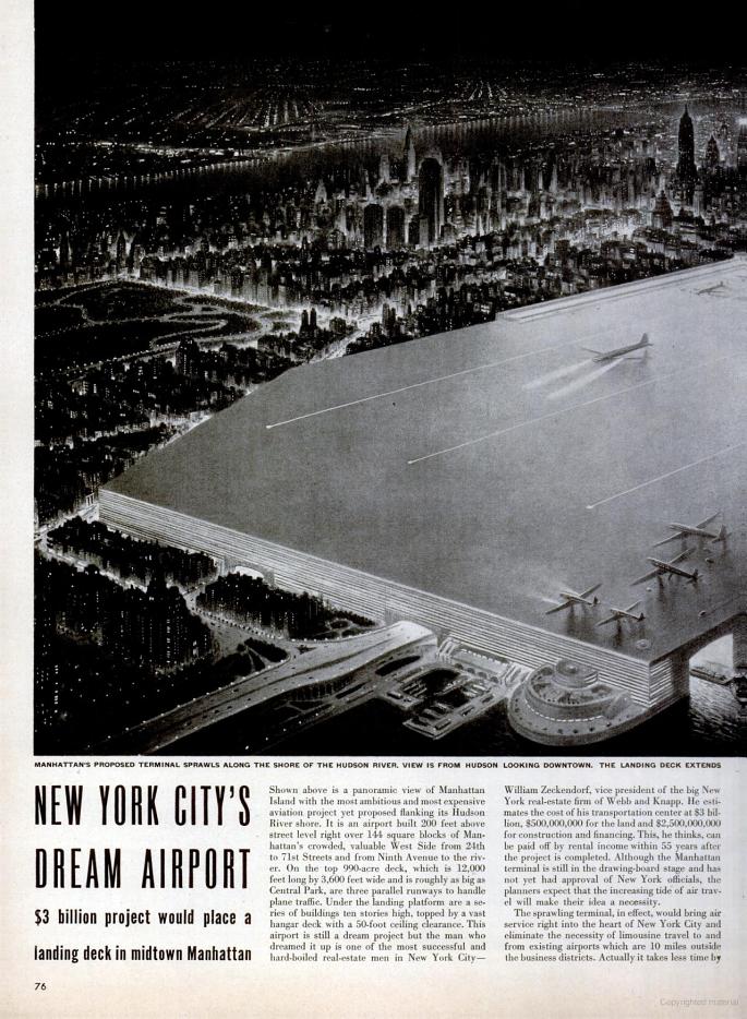
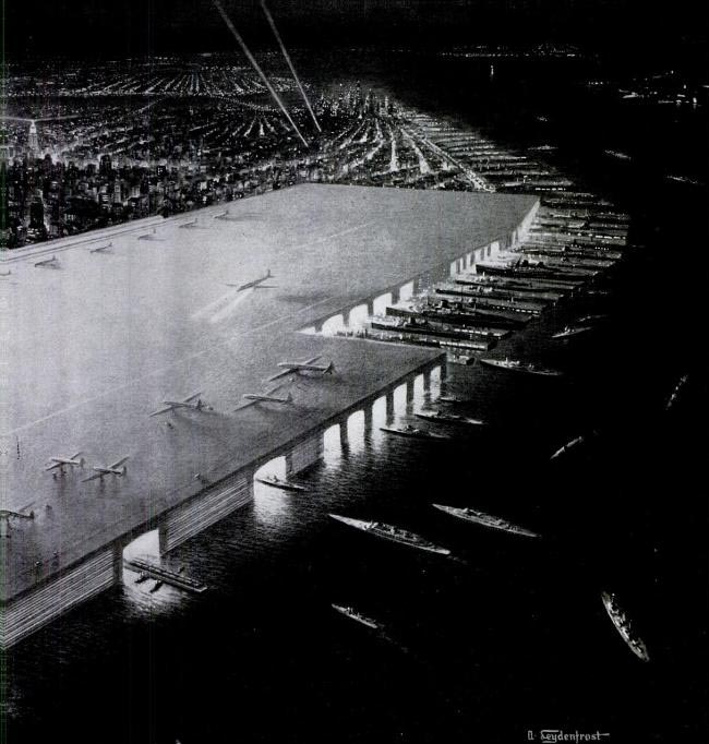
    I think that I’d like to introduce a subset in my Bad Ideas category:  Bad Flat Ideas.  To start it off, I found this very lovely example in LIFE magazine for 18 March 1946, the brainchild of generally-appropriate real estate mogul William Zeckendorf: a spectacularly bad idea of installing a rooftop airport along  a very long swath of property along the West Side. 

    Books 

    It seems as though the airport would extend from the bottom third of Central Park south to, well, I really can’t tell, perhaps lower midtown? Honestly, it doesn’t matter.  For all of its size it actually isn’t quite big enough, looking like there’s maybe 10 or 20 plane lengths margin-of-error at the end of the runway.  Plus there’s the *no* margin of error bit for the edges of the airport, which assumes that no plane will ever topple over the table top. Plus a host of other pertinent stuff.

    The penultimate line:  it is also incredibly ugly, a definition of architectural ugliness that few projects could match. 

    Books_003 det 

    The bottom line though to this project was the bottom line:  in the end, the Manhattan Airport would save about 15 minutes travel time to Philly over Laguardia. 

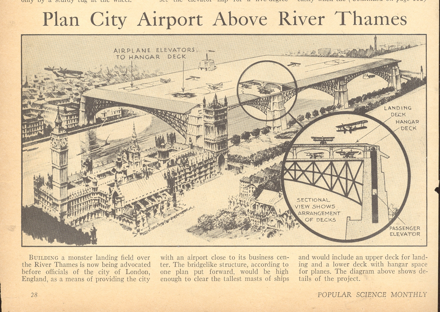
    I should not leave unmentioned the unmentionable project proposed for poor London (which I wrote about late last year here):

    Blog Dec 17 thames airport


  • Bombing New York City with Women, Meteorites, Nazi Amerika Bombers and Atomic Weapons

    JF Ptak Science Book LLC  Post 941

    Having just finished a post here on missing and duplicated-in-outer-space New York Cities, we return to the more grim possibilities of pre-Cold War cityicide.

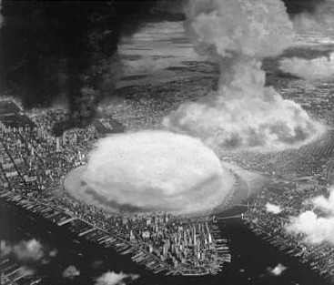
    I haven’t seen very many images at all of NYC under attack, and this one from nuclear attack on NYC from Collier’s Magazine (1948) is fantastically poignant, showing perhaps three ground-bursts of atomic bombs in Manhattan and Brooklyn.  At the time, 1948, the Soviets had just developed their bomb and I think had no way of getting one here.  But this didn’t speak to the future, and my guiess is that Collier’s was just taking it a little easy with the popular reading clientelle.  I can’t remember now how many weapons would’ve been targeted at NYC by the mid-1950’s, but I know it wasn’t a simple dozen.

    Atomic nyc

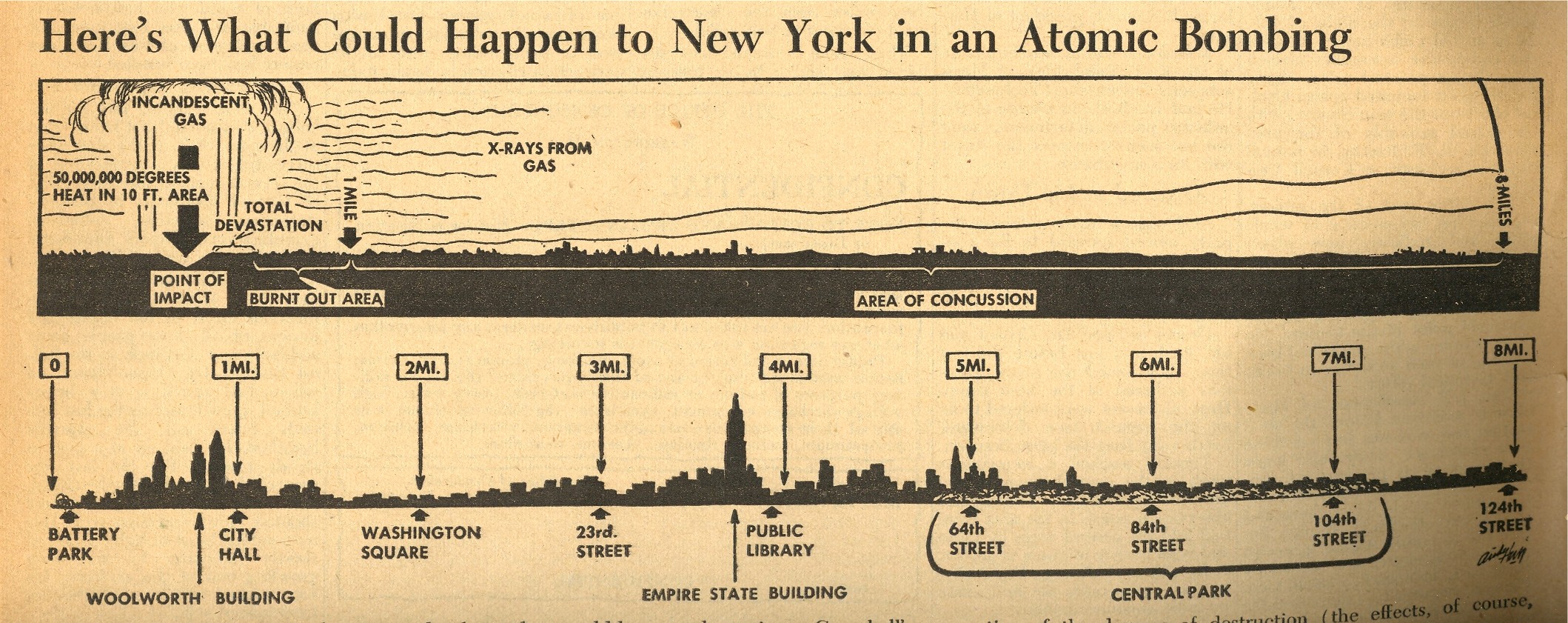
    A lateral view of this sort of explosion in Manhattan was presented in an extraordinary issue of the liberal PM Magazine, issued with a 7 August 1945 date (though I think it came out a few days later).  This would have been just a day after the Hiroshima bombing, and the 12 pages of dedicated coverage t the atomic bomb was really quite spectacular.  Included is the following small graphic that appeared on page seven which shows what effect the Hiroshima atomic bomb would have if dropped on New York City—it was no
    doubt gigantically sobering to anyone who looked at it, and brought the power of
    the bomb and its destruction to a common, understandable point. 
    I’m not an historian of the first newspaper coverage of the bomb, but
    it strikes me that this may well be the first graphic to depict the
    effects of an atomic bomb exploded over NYC.

    ==Blog July 26=PM cvr bomb map

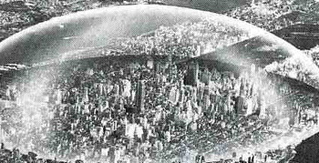
    Seeing the Collier’s pictures makes it that much more difficult to think about the idea of Buckminster Fuller that would help rid ourselves of radiation anxiety (which I wrote about earlier, here).
    Fuller’s idea is multiple orders of magnitude removed from the
    original idea of the arcade, constructing a dome1 to encapsulate NYC
    from the East River to the Hudson along 42nd St, and from 64th to 22nd
    St:  that’s two miles in diameter and, plus a mile high (or about five
    Empire State Buildings pile one on top of the other).  I’m not so sure
    how this would be built, or how things would be heated or cooled, or
    what the construction material was for the skin of the dome, or how
    people get in and out, or how you deal with heating and cooling, or how
    any noxious chemicals are expelled—but Mr. Fuller thought that the
    savings alone from snow removal from NYC streets would pay for the dome
    in ten years. 
    Big_archfuller_detail141

    Mr. Fuller also thought that the dome would protect the city (or
    this part f the city) from radiation fallout.  That could be true,
    assuming that of all the hundreds of nuclear warheads that the Soviets
    would’ve launched against NYC alone none of them would’ve found their
    target, except perhaps for the Ridgways or Staten Island, where the
    shock wave or winds produced by ensuing firestorms would not have
    disturbed the dome.  Of course if a warhead actually came close—or
    actually hit—the dome, the protection from radiation would be moot. 

    Another odd and stomach-wrenching image comes from that devilish scamp Eugen Sanger (dead before he was fifty,
    1905-1964), a German rocket designer and engineer for the National
    Socialists, went to work for the French Air Ministry following the end
    of World War Two after doing his all and thankfully falling short for 
    the Reichsluftfahrtministerium (RLM, or “Reich Aviation Ministry”).
    Manhattan_bombed_4

      He
    worked without rancor there until he was nearly kidnapped by Joe
    Stalin—for the purpose I suppose of continuing work on what may have
    been his greatest effort, unfulfilled during the war years—the Amerika
    Bomber.  The Soviets evidently thought that this might come in handy in
    1947.

    The Sänger Amerika Bomber (or Orbital Bomber, Antipodal Bomber or
    Atmosphere Skipper) was designed for supersonic, stratospheric flight,
    and had much more bang for the buck than the V2 (10000 feet/second
    exhaust velocity, as compared to the later V-2 rocket’s 2000
    meters/second, 6560 feet/second) and since it was stratospheric had a
    far greater range, coming in at better than 14,000 miles.  The
    22,000-pound weapon carried one large 8000-pound free-falling bomb.

    Sanger’s idea in the early 1940’s was to get this bomb to around
    Times Square. And since the Amerika Bomber was a relatively inexpensive
    weapon compared to the damage it could cause, there was room for
    producing a lot of them.

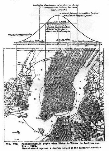
    Seeing Manhattan in the cross hairs like this is quite sobering, and it is an image that is rarely made.

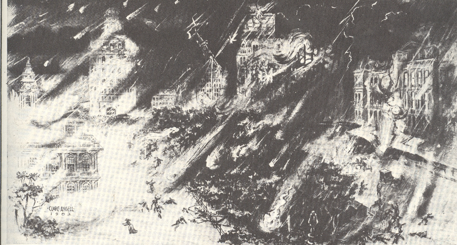
    Another attack on Manhattan depicted here comes from above, way above, Manhattan decimated by a meteorite “shower” of enormous magnitude. The image appears in an article by Hudson Maxim (1853-1927, brother of the 5--meteor more famous Hiram) “How the World Will End”, printed in 1910, and shows dozens of small meteorites striking NYC in the City Hall area. 

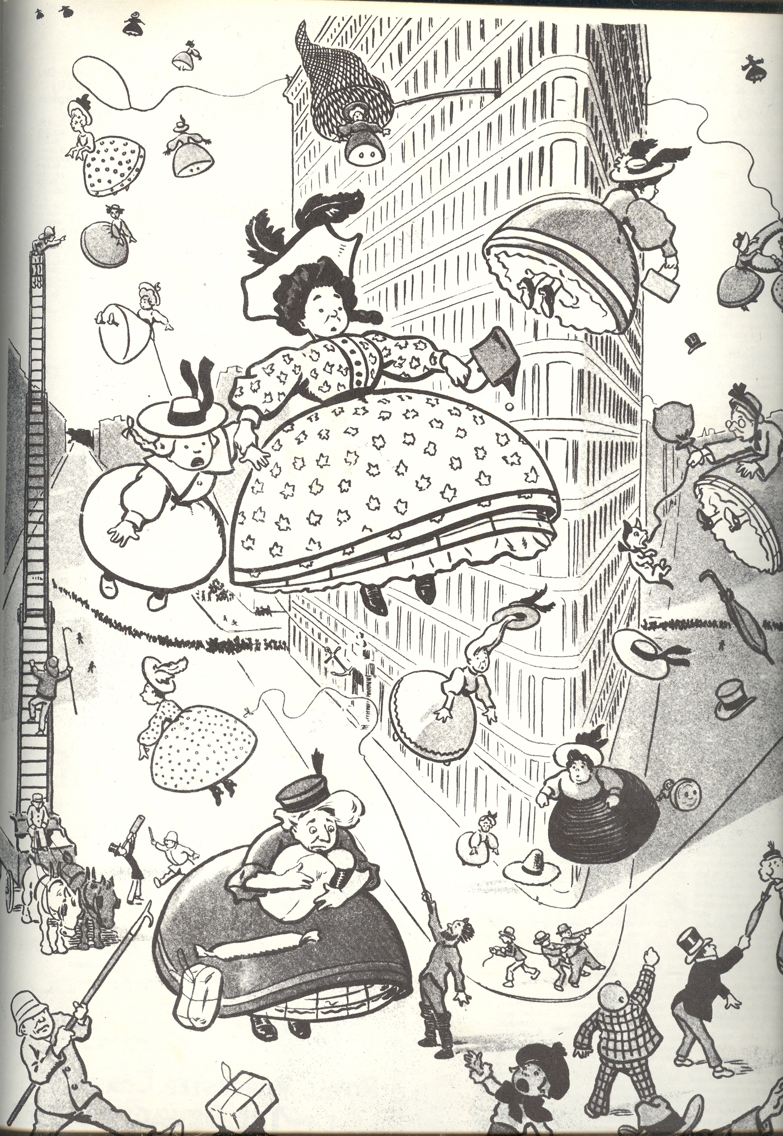
    The last image comes from 1904 and–when taken out of context–it seems
    as though Manhattan is in for the worst of it, with a view in front of
    the Flat Iron Building of an aerial bombardment of women.  This is
    probably one of the few bad things that weren’t done with/at women, and
    would actually predate the first use of explosives being dropped from
    aircraft.  Unfortunately the original, intended image was a poke at  crinoline ,
    and featured women being blown up into the air rather than the other
    way around, though I like my interpretation better.

    5-women

    Notes:

    (Source:  Buckminster Fuller in Think magazine, vol 34, Jan/Feb 1968.  AND of course the lovely work by Alison and Sky Michele Stone, Unbuilt America, McGraw Hill, 1976, pg. 99.)


  • New York City: Missing (1902) & Reproduced in Outer Space (1941)

    JF Ptak Science Books LLC  Post 940

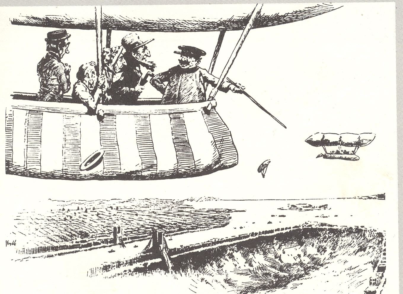
    NYC has certainly had its imaginary/creative trials and tribulations over the last 400 years or so, but I must say that these two depictions of the state of the city are the most, well, unexpected as any I’ve ever seen.  The first comes from 1902 and is a forward-looking appraisal of the chances of New York City in the near-future.  The aeronaut tourists are being told by the aviator/carny–floating above Manhattan in the future, in the year 1920–that those chances are not very good, the city having disappeared under its own weight, sunk by the growing skyscraper1 population in a ground loosened by too-numerous tunnels.  The cartoon is a joking editorial, of course, a riposte to the relatively new building jag that pushed big buildings to great new heights. [A post on more realistic views of the City of New York can be seen here]
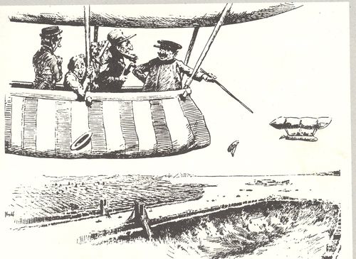
    3--nyc gone

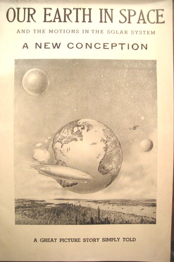
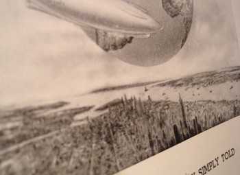
    The second image on the other hand is not a farce; it is one of the strangest (published) unintentionally Outsider, unintentionally Absurdist/Dada works that I’ve ever seen.  It appeared in a post at the very start of this blog (two years and 500,000 words ago) and it remains a capstone of Mondo Bizarro category2.

    Dsc04543

    This 1941 pamphlet isn’t so much “interesting” as it is interestingly illustrated, where all
    of the semi-coherent  interest resides, the text having left coherence far behind, somewhere, in it own intergalactic dust. 

    This is the only known example of the depiction of
    an extra-terrestrial New York City pictured with the earth in the
    background. 

    Huh?  Yes, this is the Big Apple in space—not its own
    space but THE space, outer space—somehow, impossibly, removed to some
    something-or-other (actually in this case, a “bubble”) that, while not
    being the Moon, was something like it, though not actually a solid and
    without gravity, floating on a base of floating effluvia and hope, but, well,
    you get the picture.  Whatever we’re floating on here (actually it is
    identified as the “perisohere” (don’t ask)) is very big and very very
    close to the home planet. 

    The author, David Gordon, is certainly after something, but what that “something” is I just don’t know. He starts things out for the reader asking a series of questions like “why does
    the earth and other heavenly bodies remain in the air and submerged”, answering them with other questions. 

    In all of this Mr. Gordon produced a work of staggering incredibility, more so since it wasn’t an intentional science fiction effort,  and in my book any time anyone reveals such a shocking piece of thought deserves a special kind of praise. I’m just thankful that the pamphlet was illustrated.

    Notes:

    1.  The word “skyscraper” appeared in print only nine years before this cartoon (Harper’s Weekly, April 1893), thugh the necessary elements like heating and
    cooling capacities, electrical lighting, plumbing [with appropriate, siphon jet
    toilets], elevators with dependable brakes, had been in place since the 1880’s or earlier.

    2..  One of the other capstone publications written about here is the monumentally bizarre work on sculpting in fat and lard:
    Dsc04544


  • Hiding Diseases: Plague and Smallpox
    JF Ptak Science Books LLC Post 936

    “Ring
    around the rosies, a pocket full of posies,

    Ashes,
    ashes, well all fall down.”

    This
    old nursery rhyme has more to do with plague than a skipping-and-falling song, more
    like the Tom Wait’s version of the “Dwarf’s Marching Song” (“Heigh Ho”, see
    below) than anything t0 blog jan 24ars mor424hat could ever be dreampt of in a Disney film. It was the
    mater-of-fact way of dealing with the vast death brought on by the various
    Plagues:  saying a round of rosaries to
    try and invoke divine intervention to keep the disease away from the prayer-mender;
    posies as a fragrant flower to mask the stench of those actually afflicted with
    the disease; and then of course the ashes from the piles of burnt corpses of
    Plague victims, fallen down to death. 

    These
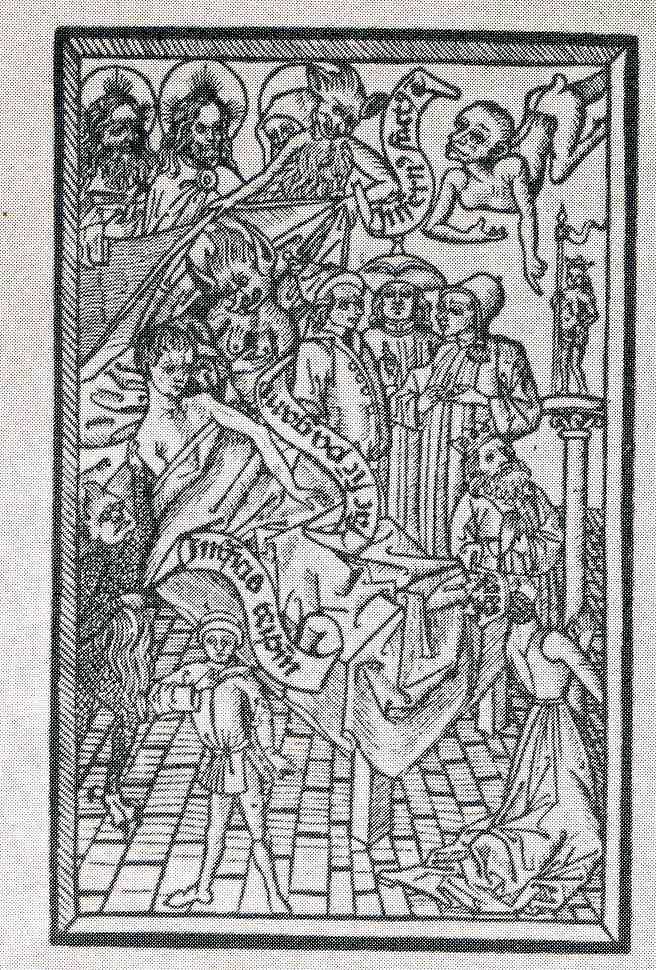
    two images show different aspects of segregating—if not hiding—disease.  The first is a propagandistic portrayal of a
    man dying of the Plague.  This snippet of
    plaguaganda was an ars morendi
    published in the 1460’s, and depicts a not-gruesome portrayal of what was
    generally a very gruesome death.  The
    inflicted lies there in bed, with sheets
    and
    a pillow, looking faint and removed in the retiring Victorian fashion
    (removed 400 years), surrounded by images of his faith/belief. 

    I
    suspect that anyone who knew anything about the Plague knew that this scene
    wouldn’t be truthful, necessarily, but I guess if it could even momentarily confuse
    the viewer into thinking that the visitation of Death could be so composed in
    the face of this horrendous disease, I guess that’s the hope you hang
    onto.  There is a minor battle between
    the possible claimants of the soul of The Sick, but that would be going on
    anyway whether the coming death was relatively peaceful, or not. There wasn’t
    much to be done—as the feeble attempts of preventing the disease would
    indicate, what with choices like urine baths, bleeding, leeching, bell ringing,
    pus-sucking, rotten animal corpse talismans, incense burning being some of the
    preventative choices—so like a belief in Heaven or Nirvana or whatever, the hopeful
    consolation of a possibly decent dying could keep people from running
    amok. 

    1-floating hosp

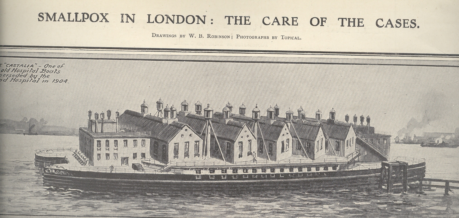
    The
    second shows the hospital hulk Castalia, “one of the old Hospital Boats superseded
    by land hospitals in 1904”, which was more a floating street than a hospital.  It was a complex of five buildings nested on the
    hulk of the double-hulled paddle steamer Castalia—appropriately named, as it refers
    to the Delphian  fountain that Apollo fabricated
    from the nymph “Castalia” and alludes to the possibility of rejuvenation and
    cleanliness, or health, perhaps).  The
    hospital held hundreds of smallpox patients, sent there by the Metropolitan
    Asylum Board in an effort to stem the flow of the disease and infection rates
    from the rest of the population of London.  Smallpox 
    was still a vast killer in mid-/late-Victorian England, and given the information
    available at the time this was a good social inoculation by distance and
    segregation.  (It is interesting to note
    that out-of-service de-masted, defrocked and striped ships of the line were
    used to house prisoners (though generally prisoners of war); in particular,
    those kept in the East River housing American soldiers inflicted vast death
    tolls via maltreatment and urgently hideous living conditions.)  This really doesn’t fit with the
    propagandist/suppressing model of the above, and its removal did prevent the
    contagion from spreading, but, well, it does look like the Asylum Board was trying to hide the sick.

    Notes:


  • Layers of Influence: Dante’s Inferno and Pozzo’s Perspective

    JF Ptak Science Books LLC  Post 934

    I’ve
    written several times in this blog about unusual perspectives in antiquarian
    images—namely, views looking straight up and straight down.  They really don’t exist, much, in the
    post-Daedalus pre-flight days, what with given the difficulty of fabricating non-cartographic
    images from the ground.  

    Next
    on what might seem to be a very obvious list of non-obvious interests are images
    with layers, levels, sections, plans, projections…sideways columnar views, locating objects
    in space and time. But mostly looking at things straight-on, ad then showing
    their relational layers.  As it turns
    out, these sorts of creations aren’t very much seen in the pre-modern
    geological era (say, prior to the 1790’s).This is a good example, an astrological man, showing the influence of the planets (and sun and moon) on the different layers of the brain:

    Blog--feb 9--arstro man Blog--fe 9--mole map


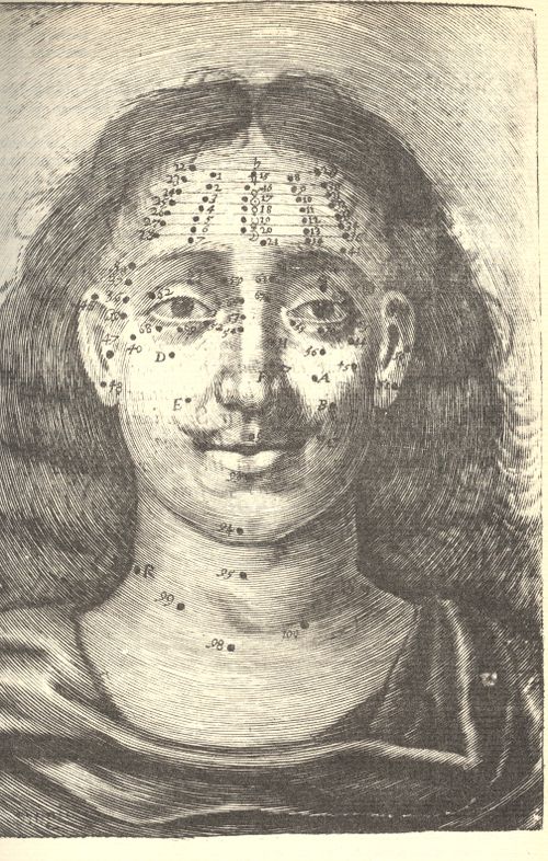
    Differentiated, say, from Richard Saunders’  Mole-map man,  (right) where facial (and etc.) moles were used as maps to determine some sort of specific actions on the organs underneath (and also by a tea-leaf divination, where the mole lines were connected and disconnected, and interpreted, according to the needs/whims of the observer):

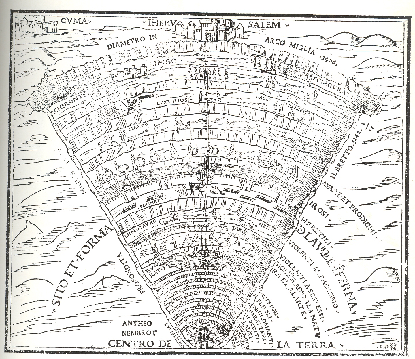
    The classic sort of image may be something like this fantastic depiction of the Inferno of Dante (shown here in the Comedia published in Venice by Gregorio de Gregoriis in 1515:

    Blog--feb 9--dante

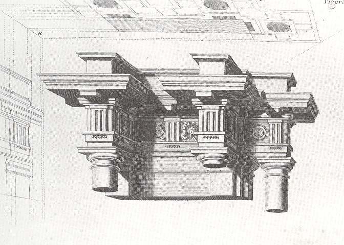
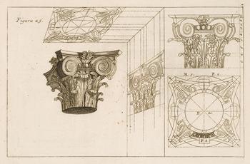
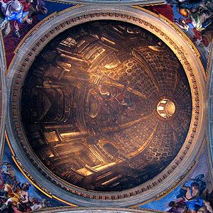
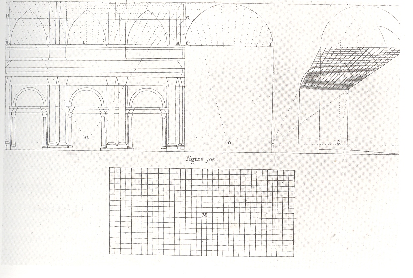
    The fantastic Jesuit Andrea Pozzo published results of his researches on perspective in his Perspectiva pictorum et architectoru (1693), explaining how he was able to compellingly, unbelievably  represent three-dimensional images on two-dimensional spaces, this image showing plan and projection and profile, effectively giving you a three-dimensional cross section of the architectural element:

    Blog--feb 9--pozzo column 

    And again:

    Blog--levels--pozzi column 

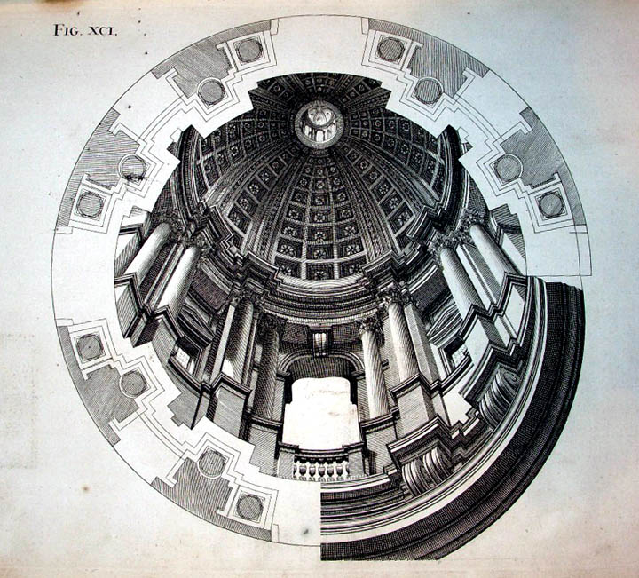
    And of course his masterpiece displayed, which is an engraving showing the plan of a flat ceiling of St. Ingacio in which he painted his magnificent trompe l’oeil masterpiece:

    Blog--levels--pozzi dome 

    Pozzo color

    Also in a way appropriate to this ramble is the explanation diagram by  Pozzo’s found in Martin Kemp’s The Science of Art, Optical; Themes in Western Art from Brunelleschi to Seurat, showing the imaginary depth of a deeply illusory painting on a (basically) flat ceiling surface:

    Blog--feb 9--pozzo ceiling

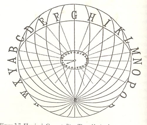
    Also in consideration for this area is Sir Sandford –the inventor of Standard Time–Fleming’s wonderful idea for a G-o’clock world, a same-time-everywhere planet, with his 1879 diagram illustrating the earth-penetrating time principles so:

    Blog--feb 9--fleing clock(Image source: “Time-reckoning and the selection of a prime
    meridian to be common to all nations” in the Proceedings of the Canadian Institute, Toronto, 1879 published by Copp, Clark)

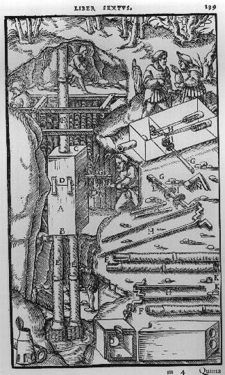
    Agricola’s De Re Metallica (from the first Latin edition f 1556) displays many interesting cross sections of Renaissance mines:

    Agricola 

    There’s much more to come in this area, of course–this is just what I had time to deal with this afternoon, though the this task is much more complicated in the 18th century world than in the 19th, when we find cross sections of the earth and  the oceans. But I’ll close here, with all faults.


  • Bulbous & Bubbly Design: Bloated Efforts on Land and in the Sky

    JF Ptak Science Books  Post 951

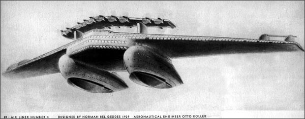
    Airliner 4

    Sometimes things are designed that are so bulbous and so inflated and so terribly hyper-packed that they are just destined never to be built beyond the imagination.  Among the largest of these things meant for the air was designed by a particularly  streamlined designer, Norman Bel Geddes, who basically owned the concept of aerodynamic function at all levels of design in the 1930’s.

    But Bel Geddes’ apoetically-named aircraft, Airliner 4, is an entirely different issue.  It may possibly be the largest, slowest, lowest, fattest and most lumbering plane ever designed. (And by this I mean that it stood a chance of some sort of actually being built and flown, as opposed to the monsters with wing-topped tennis courts and such.)

    This  530′-long 1.2 million pound beast took an hour to climb to its max ceiling of 10,000 feet where it would cruise along at an astonishing 100 mph.  It would wind its way lovingly across the country, slicing off its travel hours like frozen bologna, 30 hours from coast-to-coast, slowly, methodically, so as not to disturb its 600 passengers in their sleeping rooms.  But I’m not sure how much sleep would get slept, what with 20 (!) 1900 hp engines screaming overhead. 

    2--bulbous building 2


    The passengers who didn’t sleep could do a lot besides sit and be serviced by the aircraft’s crew of 155–they might actually need guides to get them through the oddness of the plane’s 9 decks, 3 kitchens, 2 dining rooms, solarium, 100-couple dance floor, gym, barbershop and medical offices (with waiting room).  Plus much, much more.  (I like a plane with a doctor’s office waiting room; perhaps the real genius would’ve been to come up with the smaller, more interior, extra waiting room to which one graduates before seeing The Doctor.) 

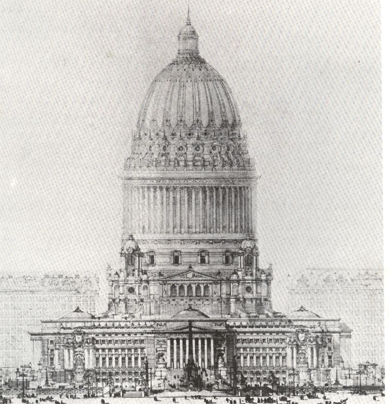
    Getting closer to the ground is the plan for the Chicago Civic Center (1909) by the usually accomplished Daniel H. Burnham. This beast looks more like a stubby nuclear- pulse intergalactic Mothership than anything that anyone would have wanted to build on the ground—at least in space it would be out of sight. 

    2--bulbous building


    In a struggling prose reminiscent of Lewis Sullivan Burnham writes1: “The Civic Center will be dependent for its effectiveness in the character if the architecture displayed in the buildings themselves…” which I think is self-referential, stating that the architecture’s effectiveness is dependent upon the architecture. If this is the case, the enormity of the Civic Center doesn’t save it from itself. 

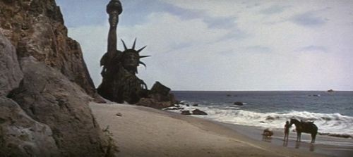
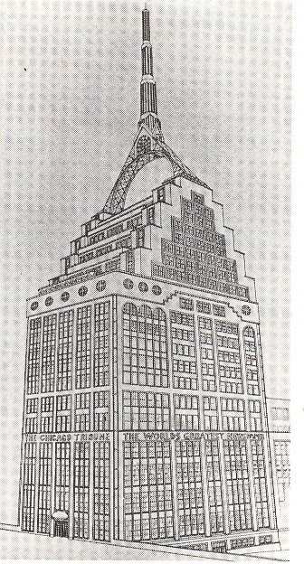
    Staying in Chicago we find another proposal, this for the ChicagoTribuneTower competition of 1922—many of the works submitted seem to my eye big and wide and ugly, but perhaps none more so than that offered by Ludwig Koloch.  This may well have been a nice design for the top third or so of a building, but not for three thirds–and actually, this may be four-thirds.  It reminds me of something rising from the sands at a beach in the future, the remnants of destroyed civilizations.  Without the apes.

     Notes:

    1. Daniel Burnham and Edward Bennett, Plan of Chicago, 1909. 
    2. Planet-of-the-apes-statue-of-liberty

  • Jobs of the Archaeo-Future: Airport Steerer (Bel Geddes’ Floating Airport)

    JF Ptak Science Books LLC  Post 950 

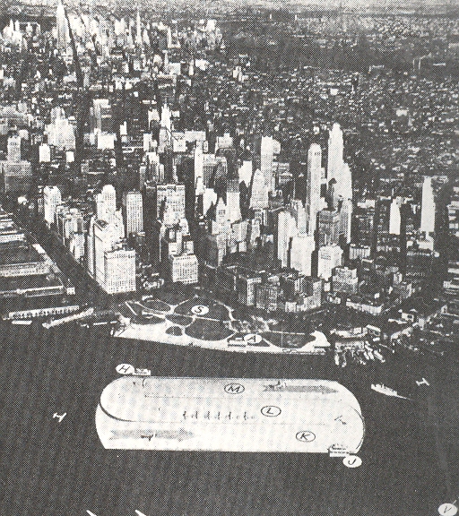
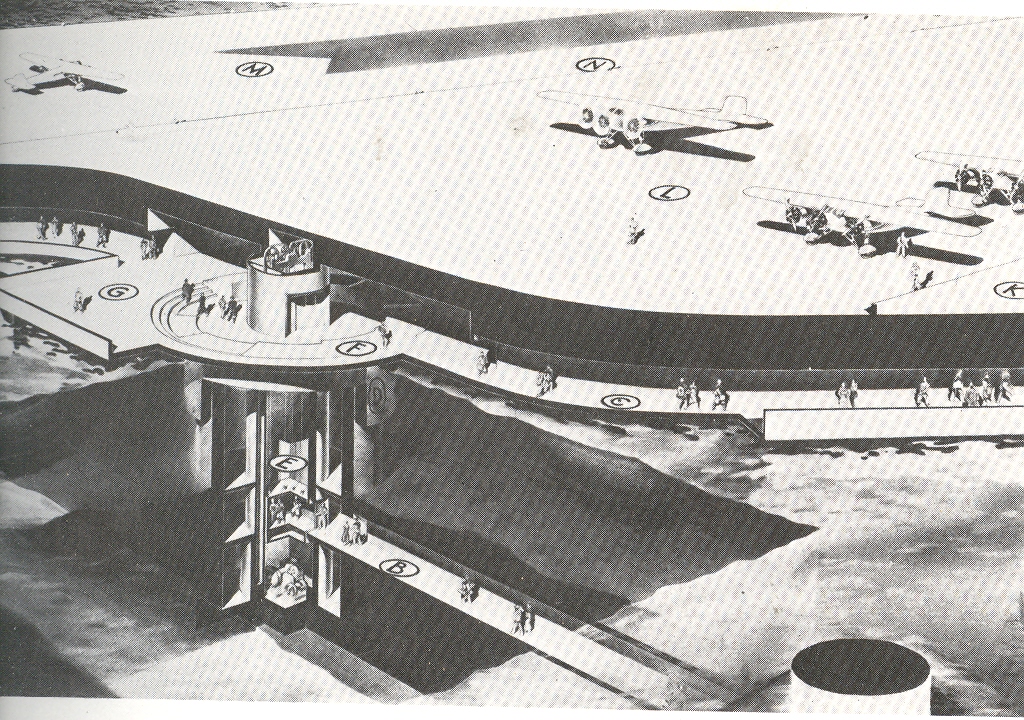
    1--bel geddes airport 2 

    Norman Bel Geddes (1893-1958) made fast, bulbously sleek and varyingly aerodynamic objects and ideas, and was a  vastly successful designer of things ranging from sets for the NY Metropolitan Opera House to telephones to cars to locomotives to the housing for the Mark I computer.  Ideas were his metier, and there seemed no lack of them–good, mostly; bad, sometimes. 

    Bud bad ideas can be beautiful, and elegant, if only for a very short period of time in which they might have actually functioned for the good.  One of these blisterers was his floating airport for the NYC harbor.  Passengers would access the airport via a 800-foot automatic walkway tunnel, and then up to various shuttles and such on the levels below the flight deck. This beast floated on columns floating on mobile caissons just above the harbor bottom, enabling the whole to be turned into or away from the wind, making for easy approaches and departures for the planes. But it is the pilot of the airport that seems most interesting to me, steering the giant propellers that lay under the corners of the structure, pushing the airport into/away from the wind. 

    This may well be the largest mobile steerable structure moving along the shortest courseway conceived as a possibly-buildable project of the twentieth century. 

    Associated posts on great and unbuildable architecture:

    Gigantic
    and Unbuildable Architecture: Philip Johnson and the Walled “Third City“

    Gigantic
    and Unbuildable Buildings: Leroy Buffington, 1889

    Fantastic
    and Unbuildable Architecture #6: the Pyramids of Gizeh in
    Detroit
    (
    Michigan),
    1908

    Gigantic
    and Unbuildable Architecture: Bucky Fuller’s Midtown Manhattan Dome, 1968

    1--bel geddes airport