A Daily History of Holes, Dots, Lines, Science, History, Math, Physics, Art, the Unintentional Absurd, Architecture, Maps, Data Visualization, Blank and Missing Things, and so on. |1.6 million words, 7500 images, 4.9 million hits| Press & appearances in The Times, Le Figaro, Mensa, The Economist, The Guardian, Discovery News, Slate, Le Monde, Sci American Blogs, Le Pont, and many other places… 5000+ total posts since 2008.

Category: Absurdist, Unintentional

  • Imago Mortis: Immortal and Post Mortem Hair

    JF Ptak Science Books LLC  Post 958  Blog Bookstore
    Death hair2

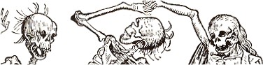
    I think that in the contest of hair between mortality and immortality, never-ending time wins.  This sentiment is based on seeing many images representing death and time over the years, not many of which I can not now produce on demand to make my argument a little more plausible, but, well, no matter.  Two examples will suffice for now.

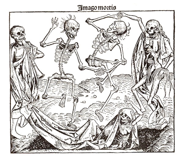
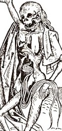
    The first example stands for many of its type: it is titled “Imago Mortis”  (the World of Death) and appears in Hartmann Schedel’s Liber chronicum (more commonly known as the Nuremberg Chronicles), one of the greatest illustrated (or certainly the most lavishily illustrated)  books of the 15th century.  Printed by Anton Koberger in Nuremberg on 12 July 1493, the Liber chronicum was basically just that, a walk through the known and imagined knowledge of the mid-Renaissance with the great humanist Schedel acting in the role of conductor.  There’s certainly much of interest and disinterest in this book; Schedel was not afraid to make a guess (and even a wild one) when facts didn’t fit or were unavailable.  (For example, he famously re-used the same view of a city to illustrate different cities.) 
    Death hair

    The Imago Mortis here is more like the Dance of Death, a subject visited many times by many great artists over a Death hair3 period of 500 years or so.  But my interest right now is only in the hair; particularly the hair of the figure at far right, whose (her?) hair seems to be not only flowing down her spine but through it and her ricase as well, spilling out in front of her across her pelvis. 
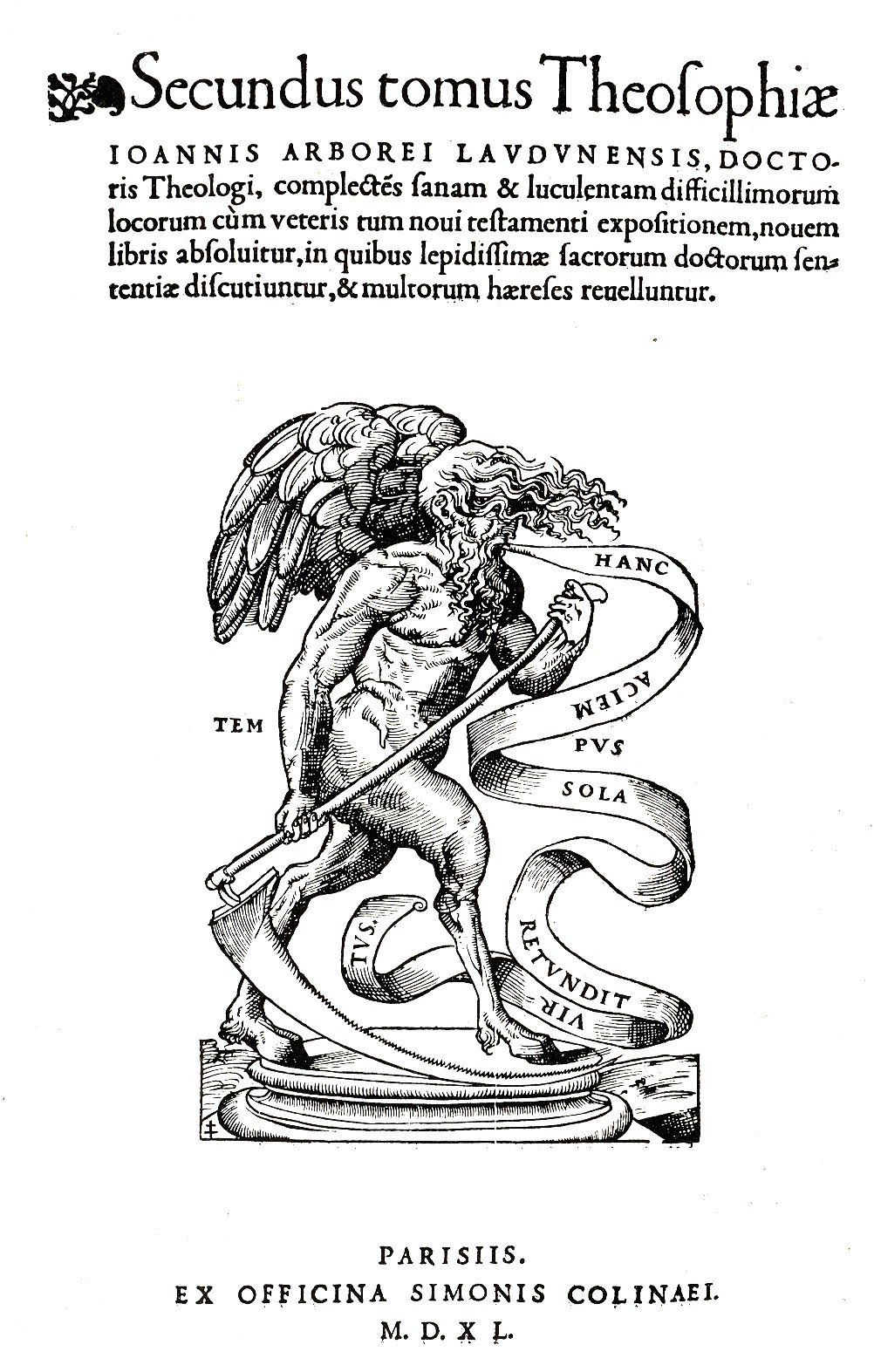
    Blog 12 4 time hairI’ve written earlier in this blog on the second  woodcut image: it appears as the printer’s mark (of Simonem Colineum, or Simon de Colines) in the
    second volume of Johann Arboreus’ Theosophia, complectens difficillorum…, which
    was printed in Paris
    in 1540. 

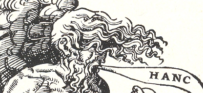
     Time isn’t very pretty here, and is made to seem a little
    Satanic, what with cloven hooves and the legs of some animal, strong torso and
    swift wings—the hair hiding the eye(s) completes a picture of damnable doom,
    and of whatever end we’re coming to. 
    Except for the righteous, though not quite: the word balloon describing
    Time’s spoken admonition is “Hanc Aciem Sola Retundit Virtus”, which means “only
    good deeds dulls the blade”.  That doesn’t
    necessarily mean “stops” the blade, which is bothersome.  I think that if someone were coming for me I’d like the blade as sharp as could be…

    I think the winner is Time, whose hair–although not quite as long as that of the dead–is far more luxurious, which at the end of the day carries it.  Also, Time’s hair is connected to a scalp; I don’t know what the deads’ hair is connected to.
    https://historyofideasblog.com/a/6a00d83542d51e69e2012876116274970c-pi


  • Outsider Logic Department: the Fabulous Curative Necessity of Fatty Meats

    JF Ptak Science Books LLC    Post 989

    [see also my related posts on Women Meat Pioneers and of course Meat String and Curled Hair]

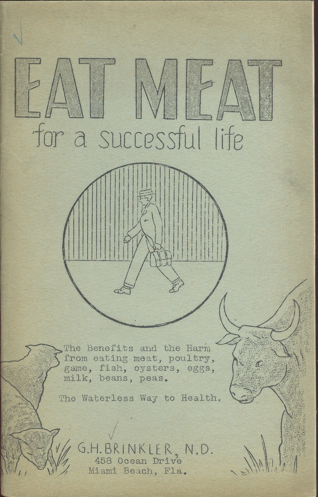
    I have a suspicion that the author of Eat
    Meat for a Successful Life
    , G.H. Brinkler 
    (a “N.D.”, doctor of nauturopathy,  from the American School
    of Naturopathy and the tautologically-surprising “founder” of the “Brinkler
    Club”) had a compromised and possibly antagonistic personal history with
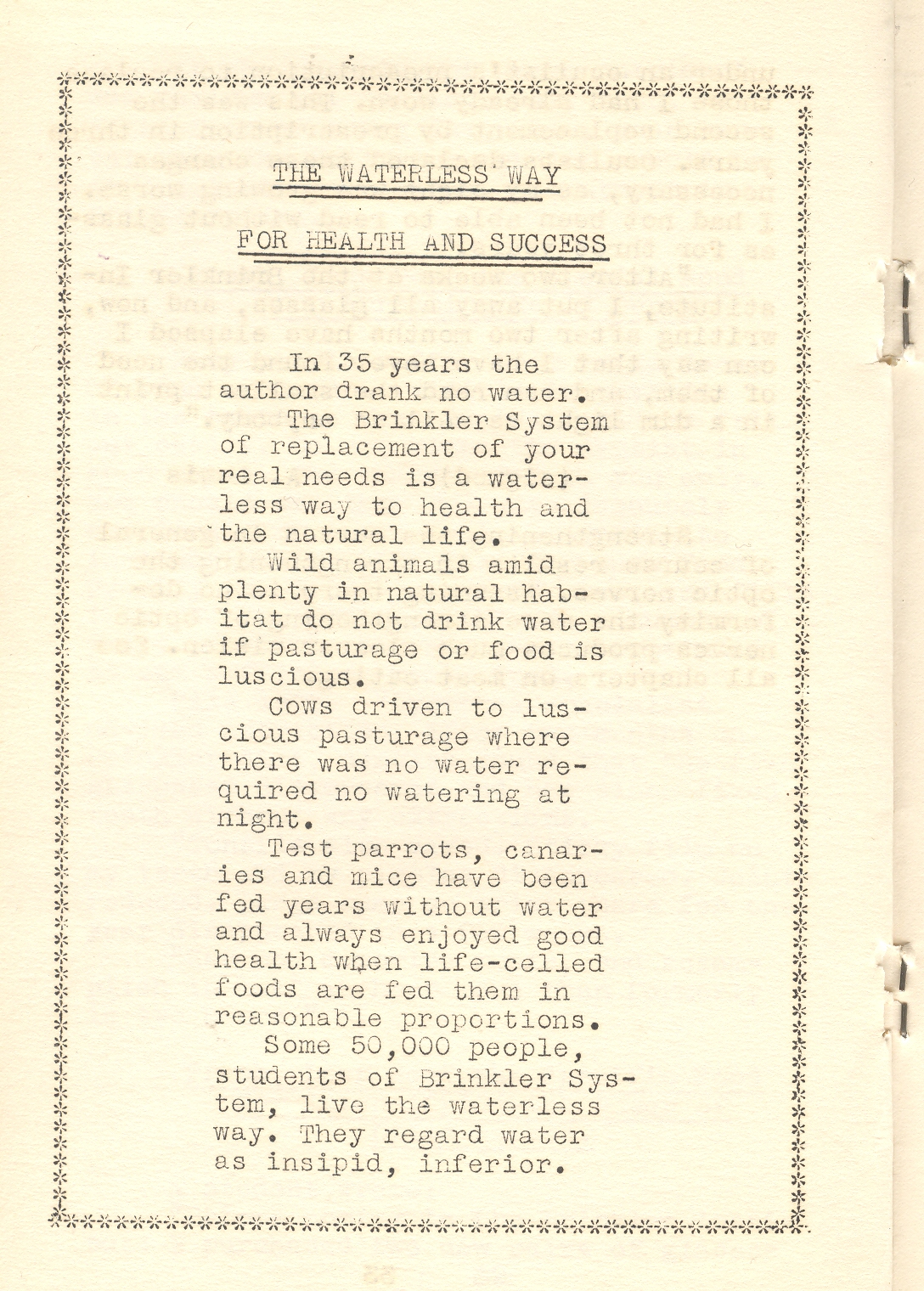
    vegetables.  And water, as Mr. Brinkler
    is also the originator of the “Brinkler
    Waterless Way
    to Health”, and a man who claims not
    to have drunk any water in 35 years. 

    Mar 26 eat meat

    Most humans don’t do so well without water after a few days, though there
    are extreme cases where people have survived for several weeks without water.
    To have survived 1,820 weeks seems pretty much to be well on its way to being a
    vastly under-appreciated record of human endurance.

    Mar 26 eat meat water 001

    But the main story here of course is the meat, with the waterless bit woven
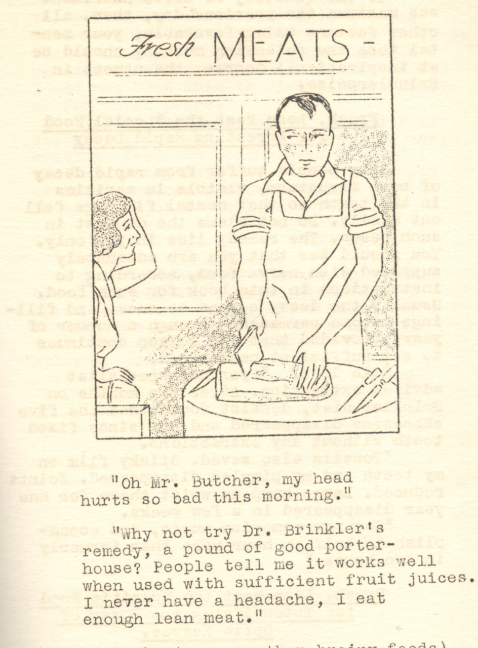
    through it like heart-ending marbling in a butt chop.  Meat, as we are told by Mr. Brinkler, is
    pretty much a “natural fixer” for just about anything.  Lazy in the morning?  A pound of pork on the broiler will cure
    that.  Sexual inadequacy?  Solved with meat (ingestion).  Poor memory?–the answer:  meat, and lots of it. And not only just meat;
    it definitely needs to be not lean. Big fatty meats are the greatest source of the
    desired “muscle food”; lean meats, unfortunately, are only “nerve foods”. Somehow
    the meat mixed with the waterless way induces the “nerve-ends” into a “more
    natural” and strengthened existence.

    Mar 26 eat meat water

    The Brinkler follower should also chew their meat less.  “The masticating fad might result in tiring
    the jaws and gross undernourishment”.

    I could go on and pull further quotes out of context from this piece, but
    that would be mean. The pamphlet (1934) I have is the U.S. Copyright Deposit copy, and I suspect that there may not have been many copies other than mine. I think that all the
    man was trying to do was sell broilers. 


  • “Women are Human, too”: Human Resource Workbook for Females, 1943

    JF Ptak Science Books LLC  Post 988

    In the history of archaic thought it doesn’t take very much at all to reach
    the uncomfortable bits in the sulfurously tangled history of the subjugation
    of women. But it is most interesting when you find the points at which the “backward-looking”
    archaic parts are actually somewhat forward-looking for their time.

    Mar 25 women equals but

    Mar 25 women are humans cvr

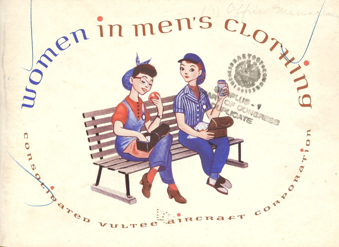
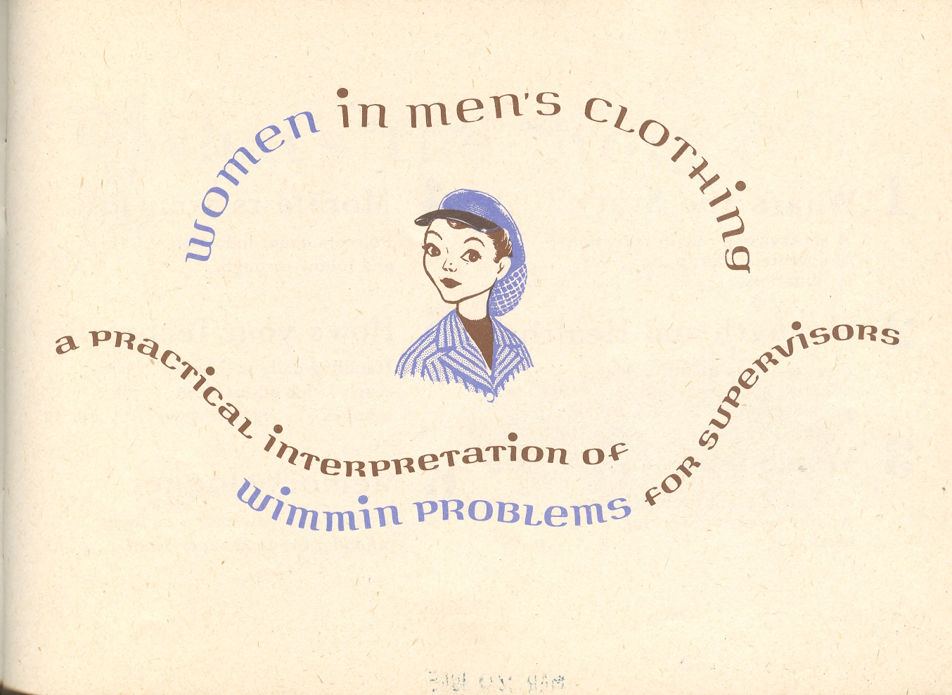
    Such is the case with this odd and interesting little pamphlet, Women in Men’s Clothing, published by
    the Vultee Aircraft Corporation, and published in 1943—it can be simultaneously
    awkward as a broken product of its time and oddly, slightly, futuristic (with a grudging and clawing recognition of women as possible equals as members of the work force).  Overall the publication looks pretty painful from today’s perch, but when you look a little past the winces you can see a little bit of recognition for women in general; at least this is far forward from anything that might’ve been published slightly before the war. 

    Mar 25 women are humans cvr title

    The pamphlet was intended as a human resources tool for managers and
    supervisors in an aircraft production facility where women had been sought and
    recruited to fill the very many vacancies brought on by the war.  (Millions of women entered the workforce for the
    first time between 1942-1945; millions of them exited too once the servicemen
    returned from active duty to reclaim their jobs.)  For most industrial supervisors, the prospect
    of women in the workforce was not a welcomed one, and many had never before needed to think of such a diversified workplace. This slight publication translated the idea of “women/”wimmin” for these
    men. 

    Mar 25 women human too

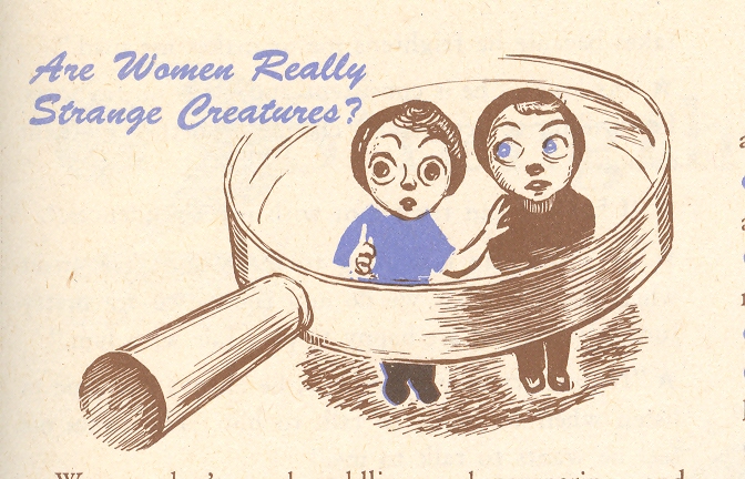
    The “translation” of the understanding of women from home to the workforce doesn’t go very far to advancing the understanding of women at work–they’re pretty much the same (dogmatic, condescending, sexist, domineering).

    Mar 25 women strange creatures

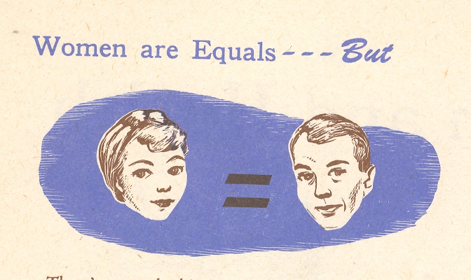
    All of that is pretty well summed up by the first picture in this series–the asterisked “equality” between men and women.  I must admit that I don’t think I’ve ever seen this “equals, but” label before, or at least so deep into the century. 

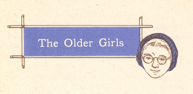
    Mar 25 women older girls

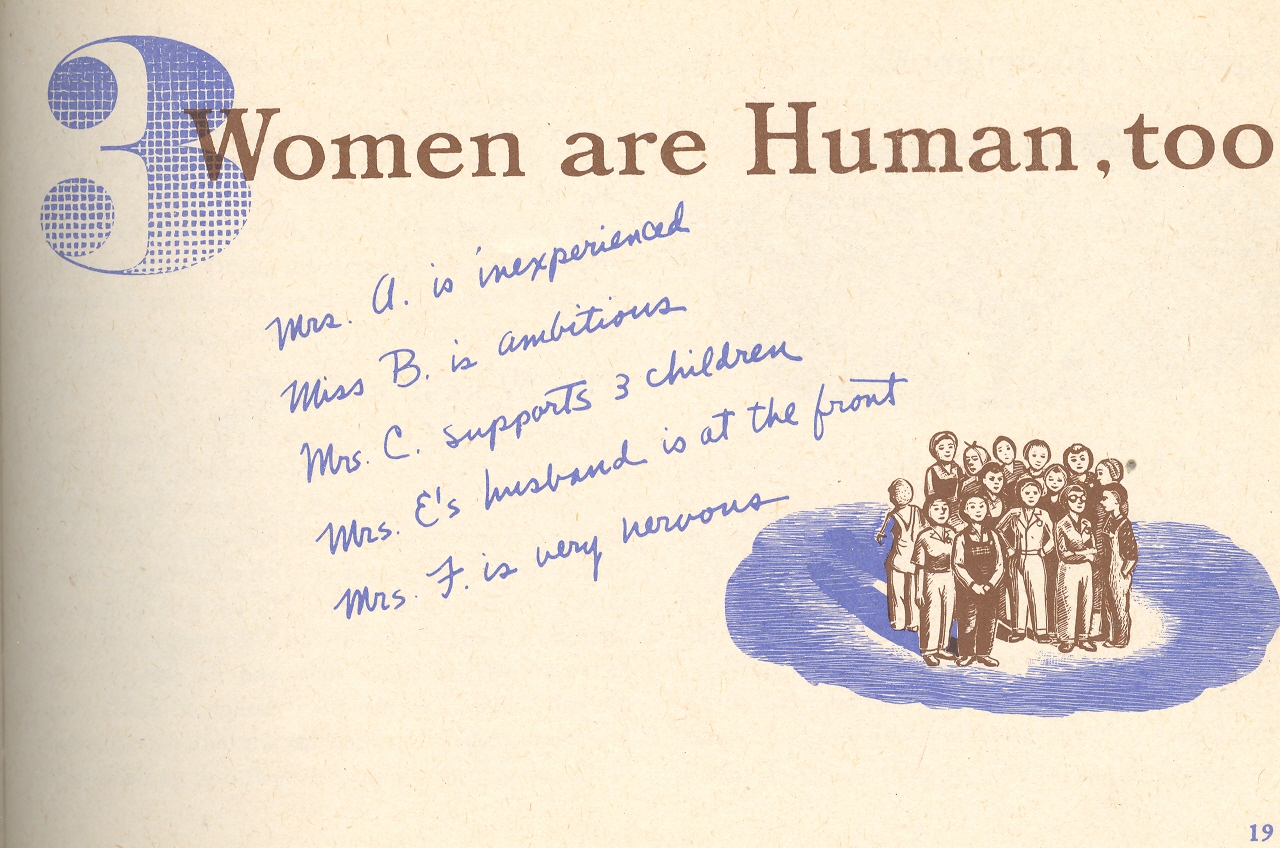
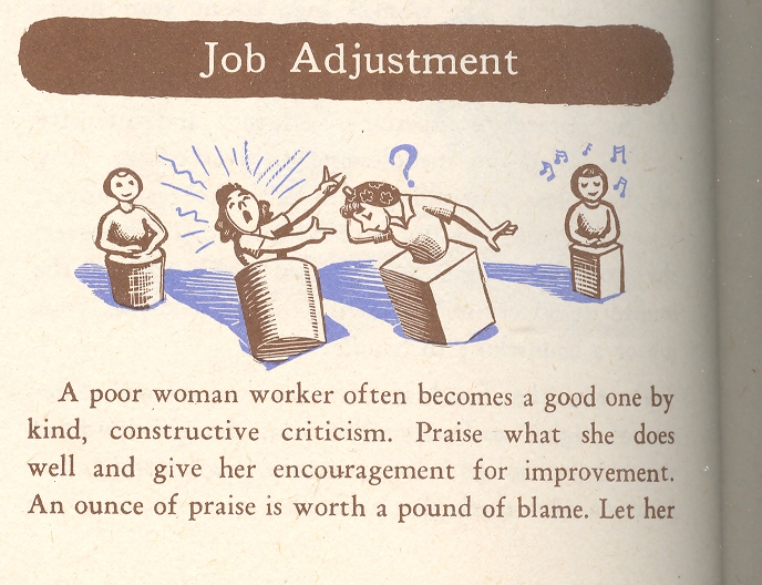
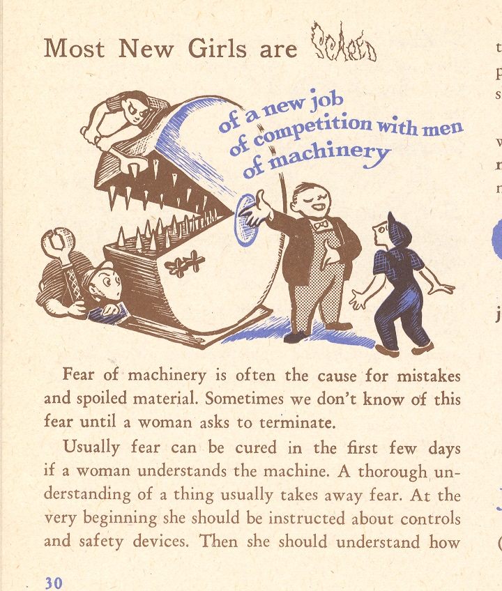
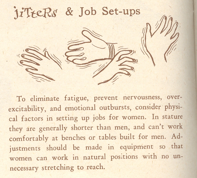
    And of course “women are Human, too” needs very little comment…as is the case for most of the images in the pamphlet.  

    Mar 25 women job adjust

    Mar 25 women chompers 

    Mar 25 women hands


  • Imaging Imagination: Diagrams of Humor & the Center of Levity, 1878

    JF Ptak Science Books LLC  Post 985 

    Mar 23 center of levity cvr det

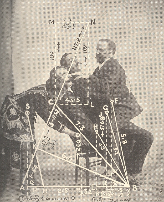
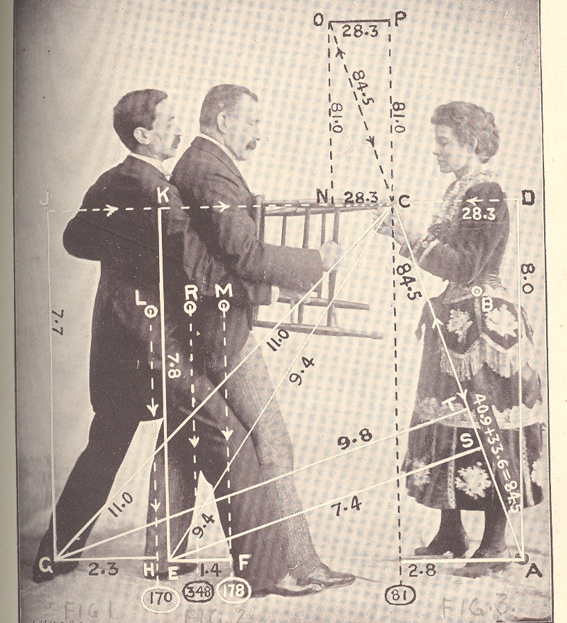
    [Wood-eating woman tells a joke to distract  three men sharing the last chair in creation in alternative chairless dot universe.]

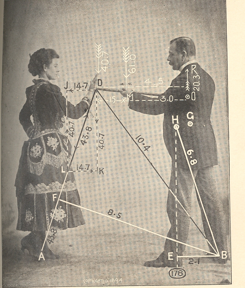
    Acerbic and punctilious, this work by an anonymous (Ambrose Bierce-like) late 19th-century
    cataloger of human-ness attempted to diagramaitcally display the
    sharing of humor among people.  The resulting images–all unexplained, not indexed, and left to a logical imagination–fit very nicely into a developing section on this blog called  Maps and Diagrams of
    Imagination and Ideas.

    Mar 23 center of levity cvr det 2

    {Woman finger-ingests chair presented to her by knee-connected chair-minions from talking-mustache close-male-pelvis universe.]

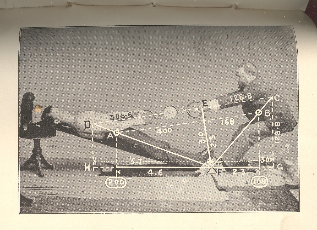
    In reality this short, small, wordless publication’s images looks like  natural philosophy textbook images displaying ideas like momentum and gravity…often they would be quite prosaic, with unnecessary natural accoutrement, little bits of added detail that had nothing really to do with the image displayed. The real intent of this document was to illustrate the center of gravity–it would’ve been more helpful if the publication had a title page or text of any kind for that matter, but since it doesn’t the mind ran free, allowing these representations to be a geometry of shared humor.  Which of course they are not–but the images do have a certain coy funniness to them…

    Mar 23 center of levity cvr det 3

    [Woman makes wooden point by stabbing Ear-lobed Mustache Man in the heart with her wooden palm finger.]

    Some of the other posts that could be included in this Imagining the Imagination category include:

    First photograph of a smell:

    Mathematical Thinking being Thought

    Map of Nothing:

    A Map of Holes in the Sky: 
    Heaven

    Map of Color-Sense Placement

    Unexpected Sense Impressions from Antique Prints: Sound

    Mar 23 center of levity cvr det 4

    {How it would be done if men gave birth.]

    Mar 23 center of levity cvr big det 

    {She is smiling. What do the other expression imply?]


  • Defining “Ugly” in Architecture: Rooftop Airport, NYC, 1946

    JF Ptak Science Books LLC Post 942   Bad Ideas Department

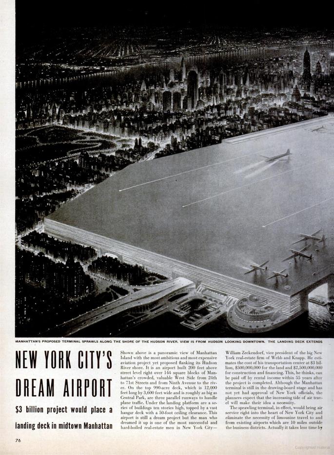
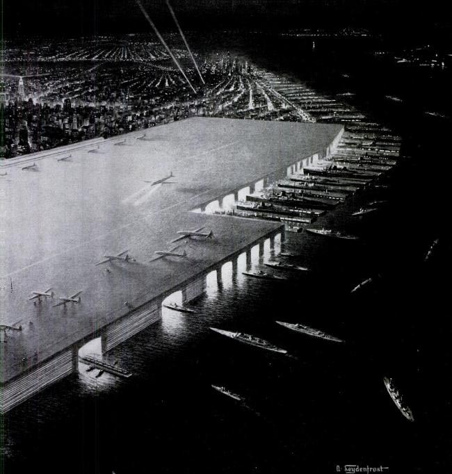
    I think that I’d like to introduce a subset in my Bad Ideas category:  Bad Flat Ideas.  To start it off, I found this very lovely example in LIFE magazine for 18 March 1946, the brainchild of generally-appropriate real estate mogul William Zeckendorf: a spectacularly bad idea of installing a rooftop airport along  a very long swath of property along the West Side. 

    Books 

    It seems as though the airport would extend from the bottom third of Central Park south to, well, I really can’t tell, perhaps lower midtown? Honestly, it doesn’t matter.  For all of its size it actually isn’t quite big enough, looking like there’s maybe 10 or 20 plane lengths margin-of-error at the end of the runway.  Plus there’s the *no* margin of error bit for the edges of the airport, which assumes that no plane will ever topple over the table top. Plus a host of other pertinent stuff.

    The penultimate line:  it is also incredibly ugly, a definition of architectural ugliness that few projects could match. 

    Books_003 det 

    The bottom line though to this project was the bottom line:  in the end, the Manhattan Airport would save about 15 minutes travel time to Philly over Laguardia. 

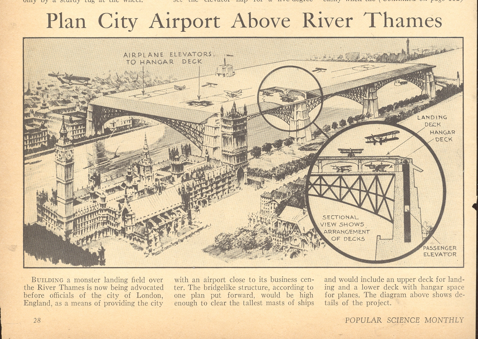
    I should not leave unmentioned the unmentionable project proposed for poor London (which I wrote about late last year here):

    Blog Dec 17 thames airport


  • Bombing New York City with Women, Meteorites, Nazi Amerika Bombers and Atomic Weapons

    JF Ptak Science Book LLC  Post 941

    Having just finished a post here on missing and duplicated-in-outer-space New York Cities, we return to the more grim possibilities of pre-Cold War cityicide.

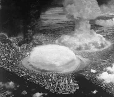
    I haven’t seen very many images at all of NYC under attack, and this one from nuclear attack on NYC from Collier’s Magazine (1948) is fantastically poignant, showing perhaps three ground-bursts of atomic bombs in Manhattan and Brooklyn.  At the time, 1948, the Soviets had just developed their bomb and I think had no way of getting one here.  But this didn’t speak to the future, and my guiess is that Collier’s was just taking it a little easy with the popular reading clientelle.  I can’t remember now how many weapons would’ve been targeted at NYC by the mid-1950’s, but I know it wasn’t a simple dozen.

    Atomic nyc

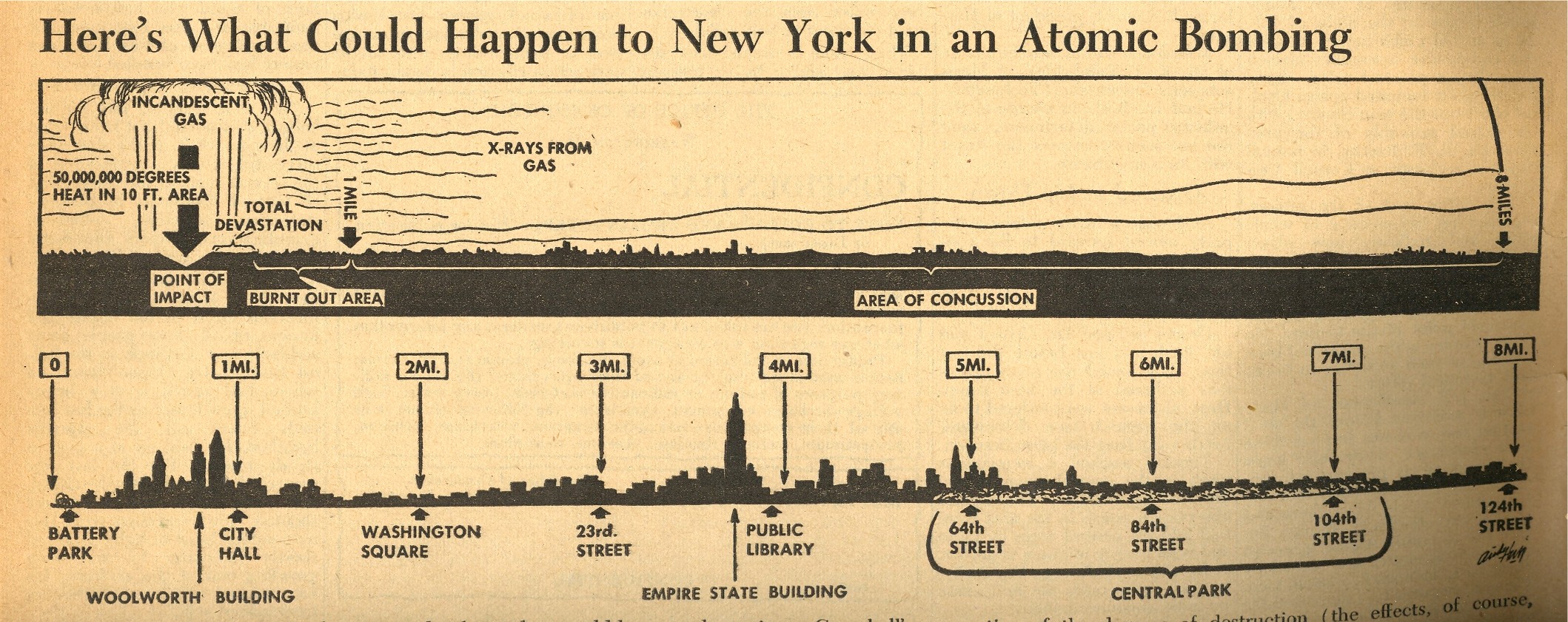
    A lateral view of this sort of explosion in Manhattan was presented in an extraordinary issue of the liberal PM Magazine, issued with a 7 August 1945 date (though I think it came out a few days later).  This would have been just a day after the Hiroshima bombing, and the 12 pages of dedicated coverage t the atomic bomb was really quite spectacular.  Included is the following small graphic that appeared on page seven which shows what effect the Hiroshima atomic bomb would have if dropped on New York City—it was no
    doubt gigantically sobering to anyone who looked at it, and brought the power of
    the bomb and its destruction to a common, understandable point. 
    I’m not an historian of the first newspaper coverage of the bomb, but
    it strikes me that this may well be the first graphic to depict the
    effects of an atomic bomb exploded over NYC.

    ==Blog July 26=PM cvr bomb map

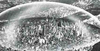
    Seeing the Collier’s pictures makes it that much more difficult to think about the idea of Buckminster Fuller that would help rid ourselves of radiation anxiety (which I wrote about earlier, here).
    Fuller’s idea is multiple orders of magnitude removed from the
    original idea of the arcade, constructing a dome1 to encapsulate NYC
    from the East River to the Hudson along 42nd St, and from 64th to 22nd
    St:  that’s two miles in diameter and, plus a mile high (or about five
    Empire State Buildings pile one on top of the other).  I’m not so sure
    how this would be built, or how things would be heated or cooled, or
    what the construction material was for the skin of the dome, or how
    people get in and out, or how you deal with heating and cooling, or how
    any noxious chemicals are expelled—but Mr. Fuller thought that the
    savings alone from snow removal from NYC streets would pay for the dome
    in ten years. 
    Big_archfuller_detail141

    Mr. Fuller also thought that the dome would protect the city (or
    this part f the city) from radiation fallout.  That could be true,
    assuming that of all the hundreds of nuclear warheads that the Soviets
    would’ve launched against NYC alone none of them would’ve found their
    target, except perhaps for the Ridgways or Staten Island, where the
    shock wave or winds produced by ensuing firestorms would not have
    disturbed the dome.  Of course if a warhead actually came close—or
    actually hit—the dome, the protection from radiation would be moot. 

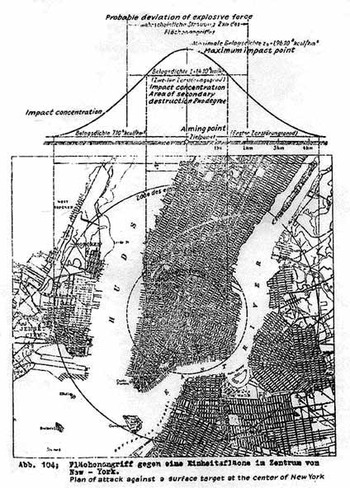
    Another odd and stomach-wrenching image comes from that devilish scamp Eugen Sanger (dead before he was fifty,
    1905-1964), a German rocket designer and engineer for the National
    Socialists, went to work for the French Air Ministry following the end
    of World War Two after doing his all and thankfully falling short for 
    the Reichsluftfahrtministerium (RLM, or “Reich Aviation Ministry”).
    Manhattan_bombed_4

      He
    worked without rancor there until he was nearly kidnapped by Joe
    Stalin—for the purpose I suppose of continuing work on what may have
    been his greatest effort, unfulfilled during the war years—the Amerika
    Bomber.  The Soviets evidently thought that this might come in handy in
    1947.

    The Sänger Amerika Bomber (or Orbital Bomber, Antipodal Bomber or
    Atmosphere Skipper) was designed for supersonic, stratospheric flight,
    and had much more bang for the buck than the V2 (10000 feet/second
    exhaust velocity, as compared to the later V-2 rocket’s 2000
    meters/second, 6560 feet/second) and since it was stratospheric had a
    far greater range, coming in at better than 14,000 miles.  The
    22,000-pound weapon carried one large 8000-pound free-falling bomb.

    Sanger’s idea in the early 1940’s was to get this bomb to around
    Times Square. And since the Amerika Bomber was a relatively inexpensive
    weapon compared to the damage it could cause, there was room for
    producing a lot of them.

    Seeing Manhattan in the cross hairs like this is quite sobering, and it is an image that is rarely made.

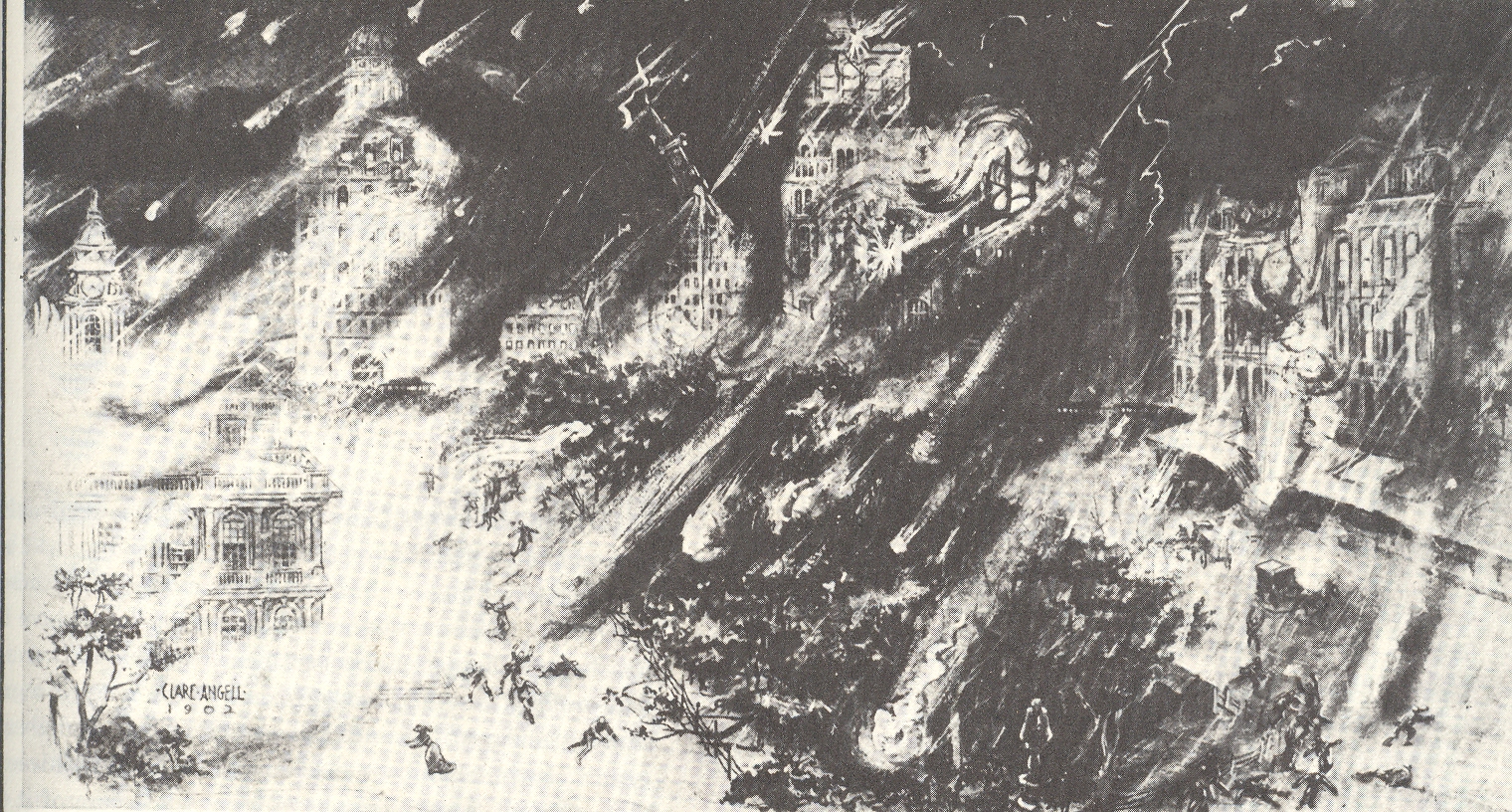
    Another attack on Manhattan depicted here comes from above, way above, Manhattan decimated by a meteorite “shower” of enormous magnitude. The image appears in an article by Hudson Maxim (1853-1927, brother of the 5--meteor more famous Hiram) “How the World Will End”, printed in 1910, and shows dozens of small meteorites striking NYC in the City Hall area. 

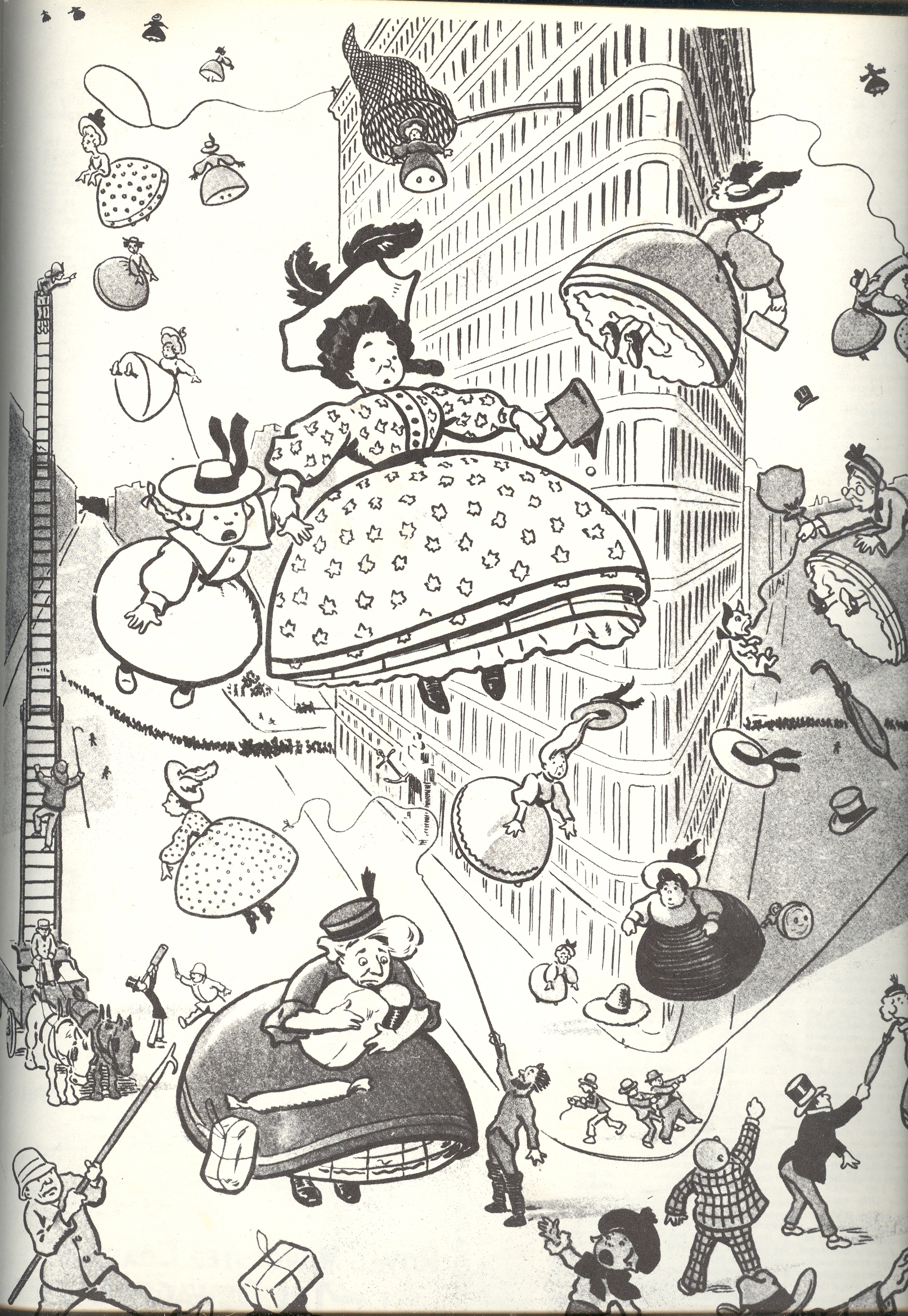
    The last image comes from 1904 and–when taken out of context–it seems
    as though Manhattan is in for the worst of it, with a view in front of
    the Flat Iron Building of an aerial bombardment of women.  This is
    probably one of the few bad things that weren’t done with/at women, and
    would actually predate the first use of explosives being dropped from
    aircraft.  Unfortunately the original, intended image was a poke at  crinoline ,
    and featured women being blown up into the air rather than the other
    way around, though I like my interpretation better.

    5-women

    Notes:

    (Source:  Buckminster Fuller in Think magazine, vol 34, Jan/Feb 1968.  AND of course the lovely work by Alison and Sky Michele Stone, Unbuilt America, McGraw Hill, 1976, pg. 99.)


  • New York City: Missing (1902) & Reproduced in Outer Space (1941)

    JF Ptak Science Books LLC  Post 940

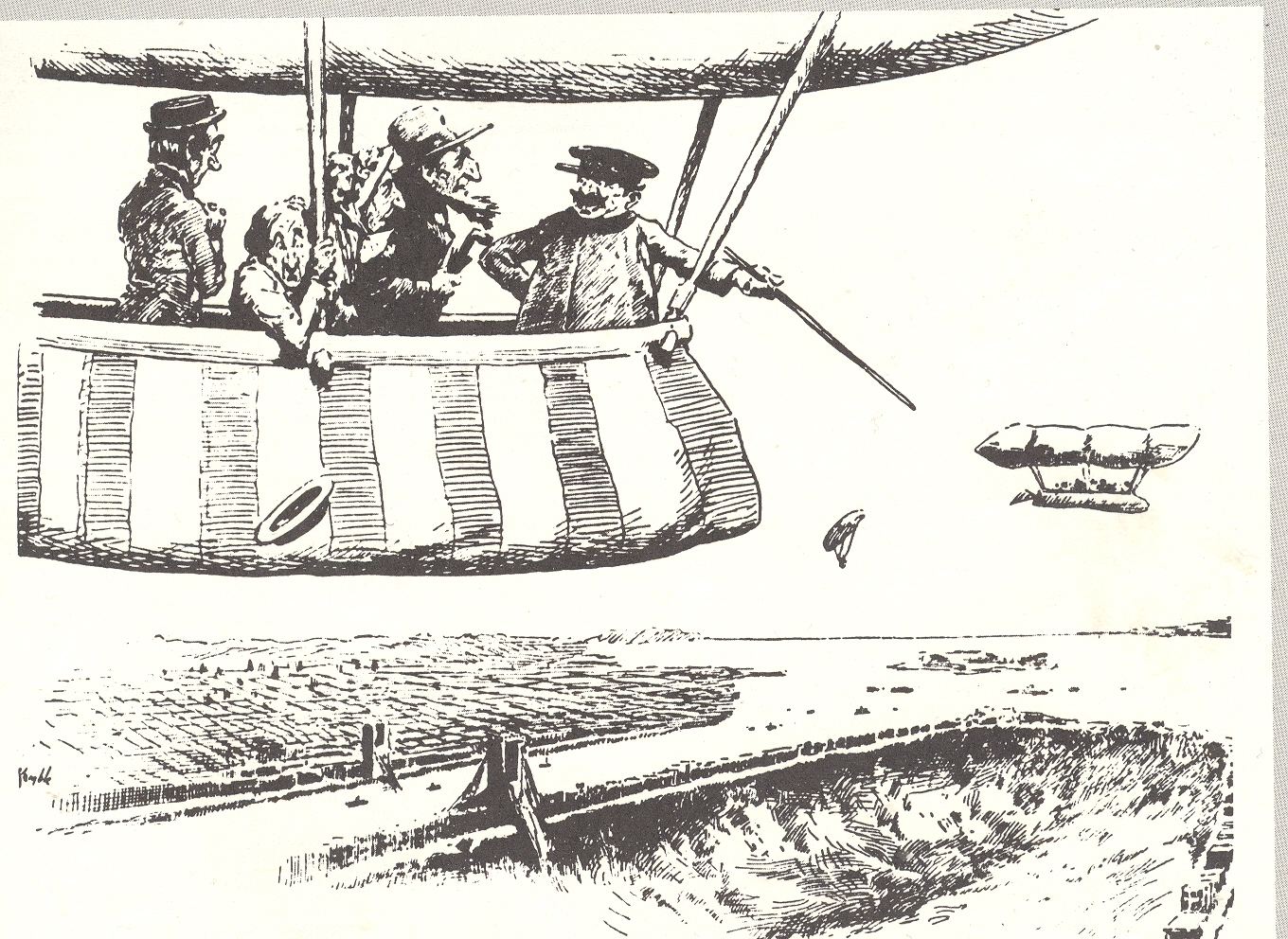
    NYC has certainly had its imaginary/creative trials and tribulations over the last 400 years or so, but I must say that these two depictions of the state of the city are the most, well, unexpected as any I’ve ever seen.  The first comes from 1902 and is a forward-looking appraisal of the chances of New York City in the near-future.  The aeronaut tourists are being told by the aviator/carny–floating above Manhattan in the future, in the year 1920–that those chances are not very good, the city having disappeared under its own weight, sunk by the growing skyscraper1 population in a ground loosened by too-numerous tunnels.  The cartoon is a joking editorial, of course, a riposte to the relatively new building jag that pushed big buildings to great new heights. [A post on more realistic views of the City of New York can be seen here]

    3--nyc gone

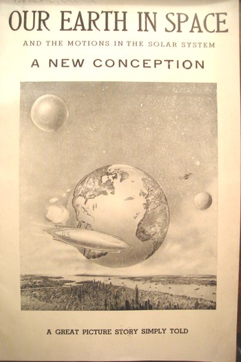
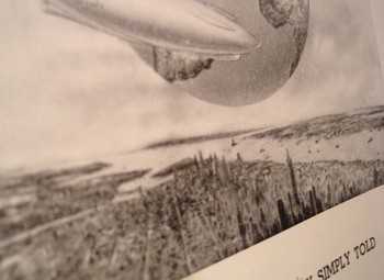
    The second image on the other hand is not a farce; it is one of the strangest (published) unintentionally Outsider, unintentionally Absurdist/Dada works that I’ve ever seen.  It appeared in a post at the very start of this blog (two years and 500,000 words ago) and it remains a capstone of Mondo Bizarro category2.

    Dsc04543

    This 1941 pamphlet isn’t so much “interesting” as it is interestingly illustrated, where all
    of the semi-coherent  interest resides, the text having left coherence far behind, somewhere, in it own intergalactic dust. 

    This is the only known example of the depiction of
    an extra-terrestrial New York City pictured with the earth in the
    background. 

    Huh?  Yes, this is the Big Apple in space—not its own
    space but THE space, outer space—somehow, impossibly, removed to some
    something-or-other (actually in this case, a “bubble”) that, while not
    being the Moon, was something like it, though not actually a solid and
    without gravity, floating on a base of floating effluvia and hope, but, well,
    you get the picture.  Whatever we’re floating on here (actually it is
    identified as the “perisohere” (don’t ask)) is very big and very very
    close to the home planet. 

    The author, David Gordon, is certainly after something, but what that “something” is I just don’t know. He starts things out for the reader asking a series of questions like “why does
    the earth and other heavenly bodies remain in the air and submerged”, answering them with other questions. 

    In all of this Mr. Gordon produced a work of staggering incredibility, more so since it wasn’t an intentional science fiction effort,  and in my book any time anyone reveals such a shocking piece of thought deserves a special kind of praise. I’m just thankful that the pamphlet was illustrated.

    Notes:

    1.  The word “skyscraper” appeared in print only nine years before this cartoon (Harper’s Weekly, April 1893), thugh the necessary elements like heating and
    cooling capacities, electrical lighting, plumbing [with appropriate, siphon jet
    toilets], elevators with dependable brakes, had been in place since the 1880’s or earlier.

    2..  One of the other capstone publications written about here is the monumentally bizarre work on sculpting in fat and lard:

    Dsc04544


  • Three Map Fits: a Color Map with Color and No Map, a Color Map in Black & White; AND a Black & White Map in White (only).

    JF Ptak Science Books  Post 934

    This confusing title is accurate without very much grant in license and tells a short and true story of three fitful maps, two of which are beautiful and one just so-so.  
    Color--color map  

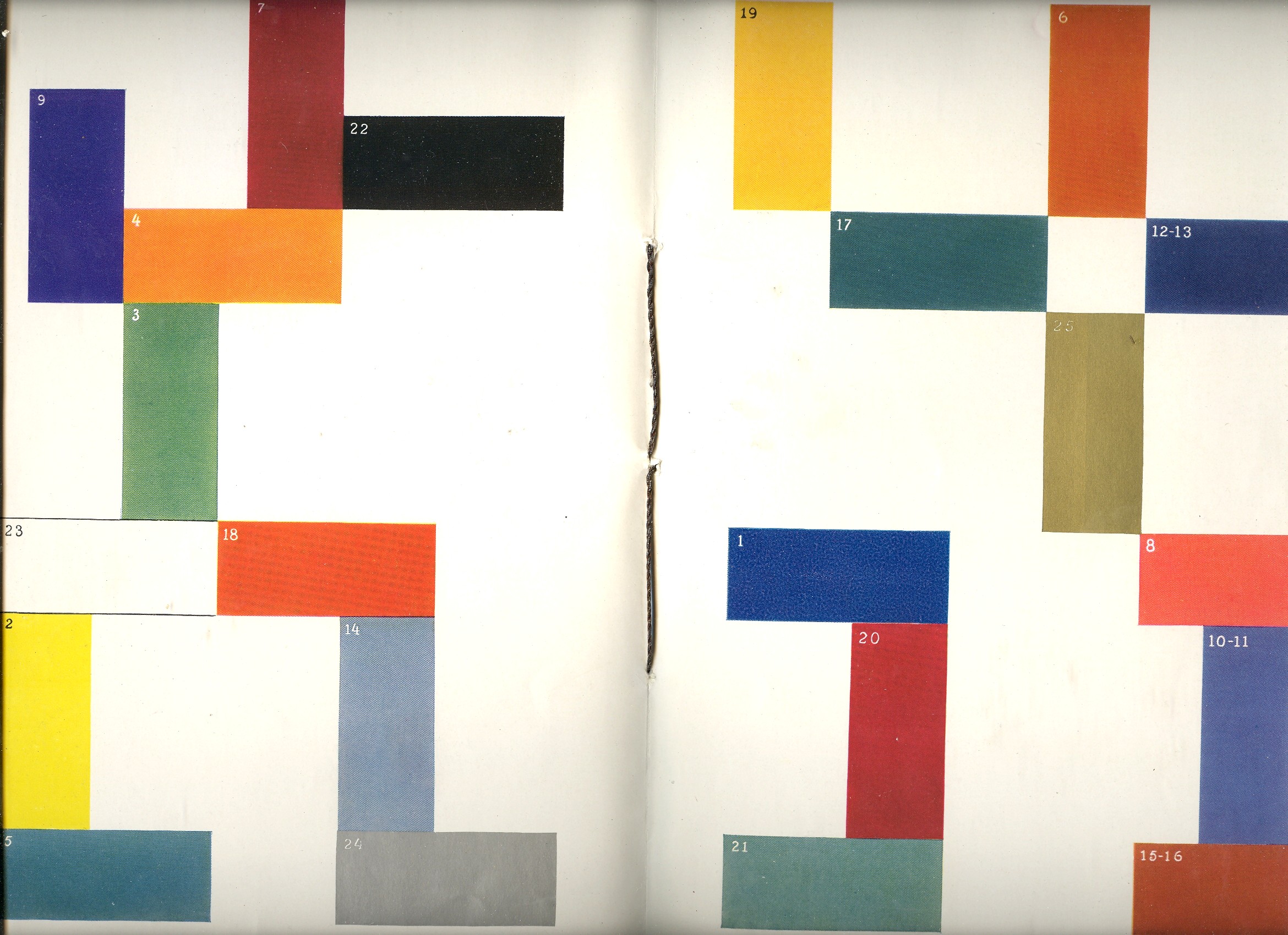
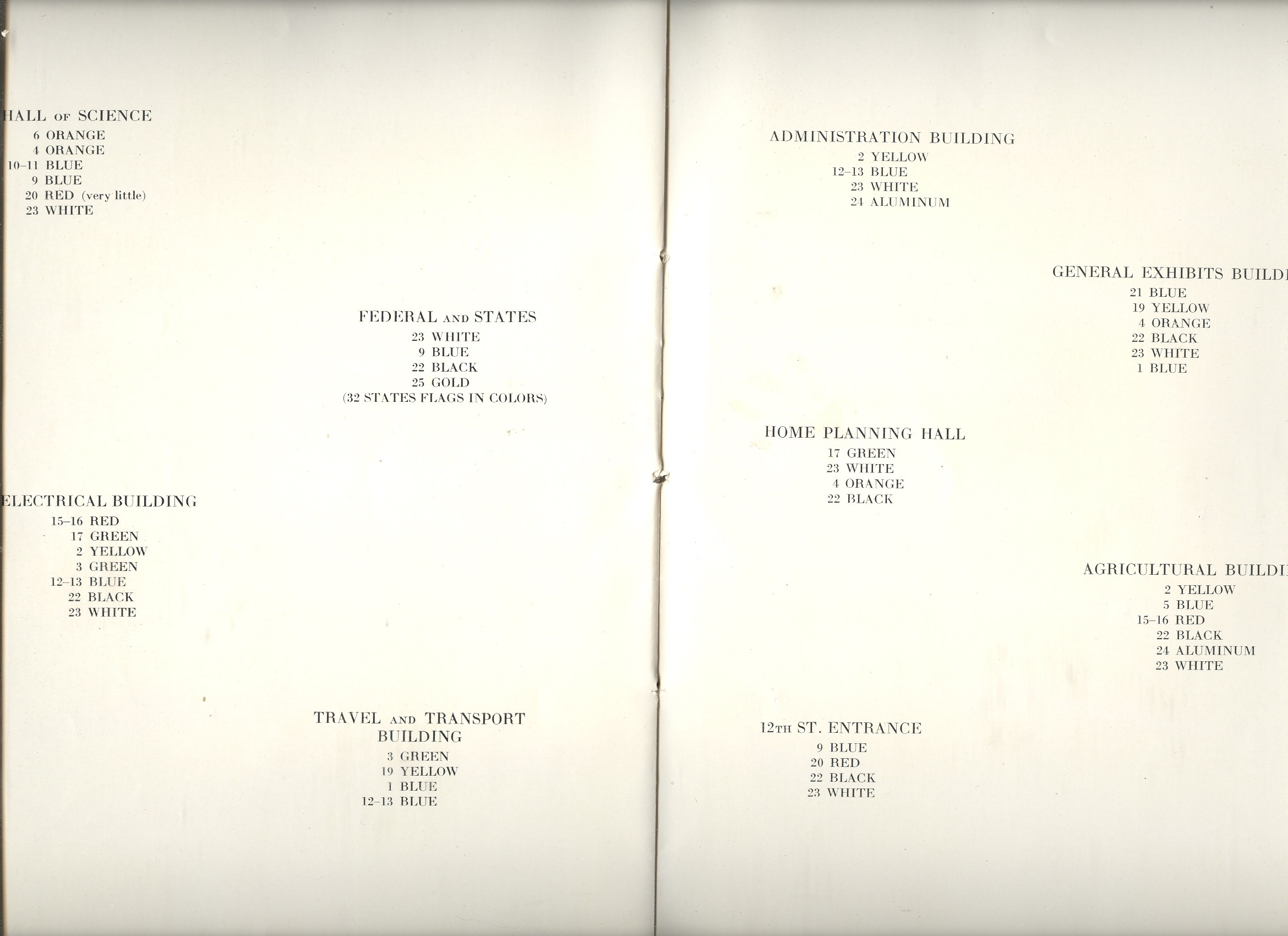
    The first map fit is featured in a beautiful pamphlet called A Century of Progress Colors and was issued by the Textile Color Card Association of the USA.(The title being a small play on the 1933 world’s fair in Chicago called “A Century of Progress”. The Textile Color Card Association was created to standardize color nomenclature and composition in industrial colors (and is still in existence.)  The map distributed the major pavilions at the fair by their dominating colors, naming those colors in the unusually-sequenced double-page key on the following pages (below1).  I can certainly appreciate the effort and the beautiful design it produced, but as a map of the fair it leaves much (if not everything) to be desired.
     

    Color--color map inside

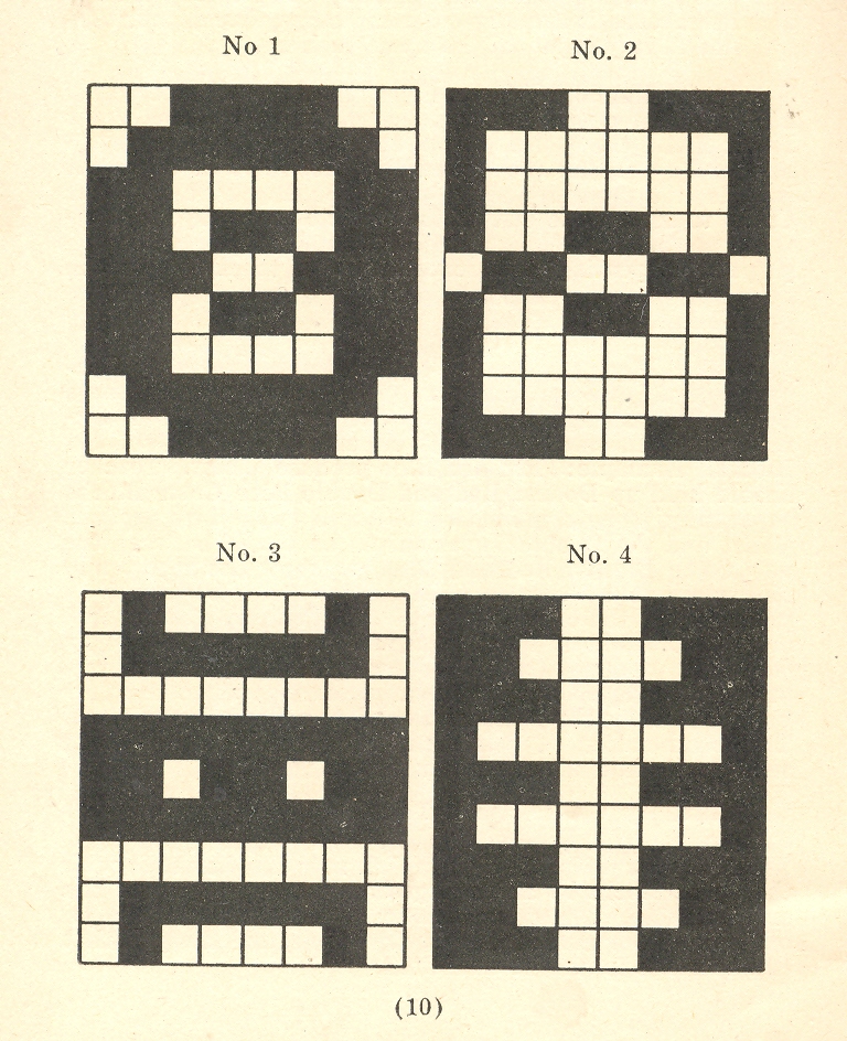
     The second map fit belongs to a small pamphlet published by Albert Coble called Games of Colors, Kindergarten and Primary Exercises.  Its actually an enterprising little book about reaching into the minds of little ones and explaining how colors are put together and how they relate to one another.  It is unfortunate that the drawings used to illustrate the color map part of the pamphlet were done in black and white.  Which is a little on the self-defeating side.  


     Color--b+w 001
     

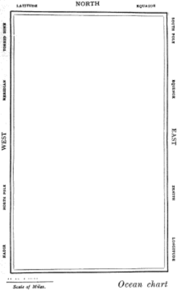
     But the finest fit of the three fits is fit number three, which is the map of the Bellman’s tale, starting the second fit of Lewis Carroll’s The Hunting of the Snark, an Agony in Eight Fits.


    Color map snark


    But the map that I think I love the most illustrates Lewis Carroll’s The Hunting of the Snark, an Agony in Eight Fits, and occurs in the Bellman’s tale, starting the second fit1. It is simply magnificent. 

    Then, of course, there is this:


    Notes:

    1. The key:


    Color--color map inside text


    2. The fit begins so:

    The Bellman himself they all praised to the skies-
    Such a carriage, such ease and such grace!
    Such solemnity too! One could see he was wise,
    The moment one look in his face!

    He had bought a large map representing the sea,
    Without the least vestige of land:
    And the crew were much pleased when the found it to be
    A map they could all understand.

    “What’s the good of Mercator’s North Poles and Equators,
    Tropics, Zones, and Meridian Lines?”
    So the Bellman would cry: and the crew would reply,
    “They are merely conventional signs!

    “Other maps are such shapes, with their islands and capes!
    But we’ve got our brave Captain to thank”
    (So the crew would protest) “that he’s bought us the best-
    A perfect and absolute blank!”


  • Unexpected Sense Impressions from Antique Prints: Sound

    JF Ptak Science Books LLC  Post 631

    [A continuation of the blog series “A History of Blank, Empty and Missing Things“]

    The
    sweetest pleasures come from unexpected sources. Mozart–who loved the game of billiards
    and was an exceptional aficionado1 of the game while playing it with little
    skill– enjoyed composing on the table as well,  rolling balls in geometric patterns across it
    while working. To observers it might have seemed as though he was interested in
    the patterns themselves; it delightfully turns out that what he was really looking at were
    the changing reflections in the surface of the balls. 

    Years
    ago my wife (Patti Digh) and I visited an artist in his studio at the lovely
    high-road-to-Taos town of Truchas, New Mexico.  We watched the artist at work for quite some
    time—well, actually, we listened to him work. 
    Although he was a lovely painter, the visual impact was overwhelmed by the sounds that he made padding back
    and forth (he was working on a big canvas) across an old and musical wooden
    floor –it deeply interesting, and the sound stays with us to this day. 

    I
    enjoy these quasi-synesthesic experiences a great deal, though they are very
    hard to “find”. Sometime though they slip into the print world, and I include three
    examples below. 

    (1)
    Putting the Pulp in Fiction, and Fact: the Sharp First Step in Paper-Making

    Ebay Feb 6 paper

    Just
    about the first step in making paper is collecting and preparing the raw
    materials from which the paper is made. 
    Linens, cottons, wood and straw (among other things) would be reduced to
    a pasty pulp through vigorous pounding, tearing, wetting stabbing and rending,
    all of which would be reduced to a pasty, fibrous pulp which would wind up after
    a bit spread over a wire mesh until dried and then, through a great
    non-miracle, becoming paper.  This is a
    process that was little changed in the Western world for many centuries.

    The
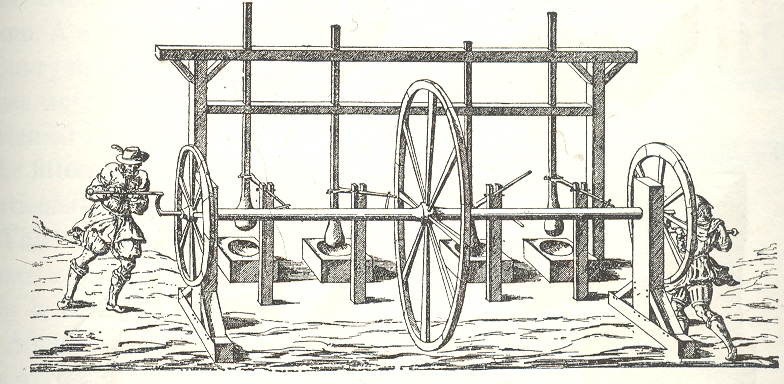
    most lovely of these early pulp-rendering, “stamping” machines, to me is the
    fabulous two-person human-powered stamper/shredder, published in 1579. (I don’t
    know the original source for the wood engraving; this image appears in Charles
    Singer’s monumental History of
    Technology, from the Renaissance to the Industrial Revolution
    , vol III.

    The
    men turn crank, crank turns wheels and rod, rod turns arms, arms forced to move
    vertical poles up and down, stampers on the end of poles pound the rags.  Actually the stampers had changeable stamps
    so that the man-machine could start with a spiked stamper for rendering and
    then move to a roundish stamp for pounding into decomposition in a wooden bowl
    with mushy water. 

    I
    just really like the machine and its representation, and of course the round
    stampers and bowls of mush.  It all seems
    so innocent in a creaking antiquarian way—but the great surprise for me is that
    I can just about hear this machine at work. 
    The all-wooden structure with slowing-turning wheels grinding against
    its constituent parts, worn smooth from use; the slow pounding of the stampers
    into the thick paste; the creaking motions of the too-slender
    superstructure.  I can hear it about as
    clearly as I can hear the soft/high clinking of the bottles in the milkman’s
    tray.

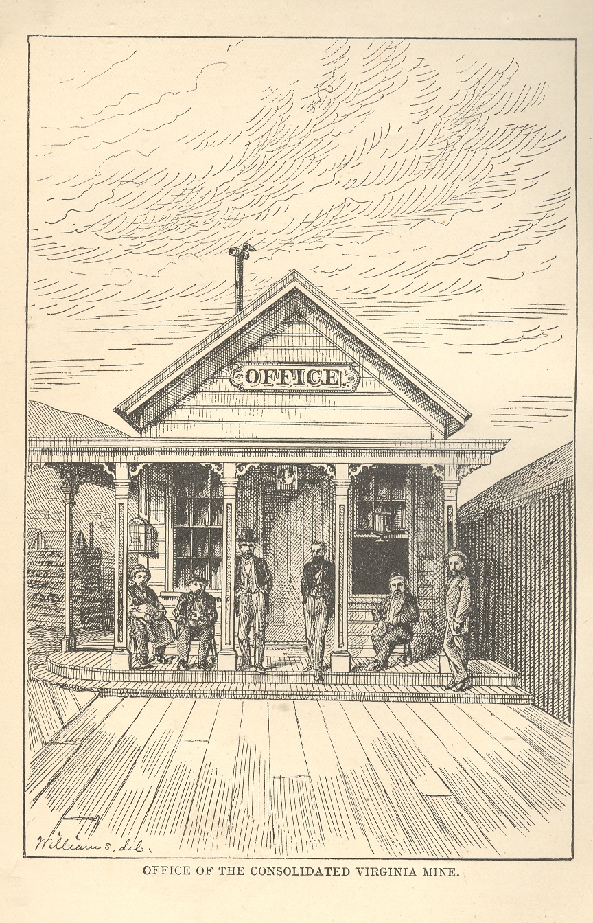
    (2)  A Scene of Western Quiet

    Ebay Feb 6 virginia mine

    The image comes from William Wright’s The History of the Big Bonanza and was published in 1877.  It is a very
    simple scene (“Office of the Consolidated Virginia Mine”), nicely and
    proportionally arranged, though somewhat challenged by its understanding of linear
    perspective. For reasons I don’t quite understand it might as well have been a
    picture of the high desert with no settlement whatsoever.  It simply seems still, and very quiet.

    (3)
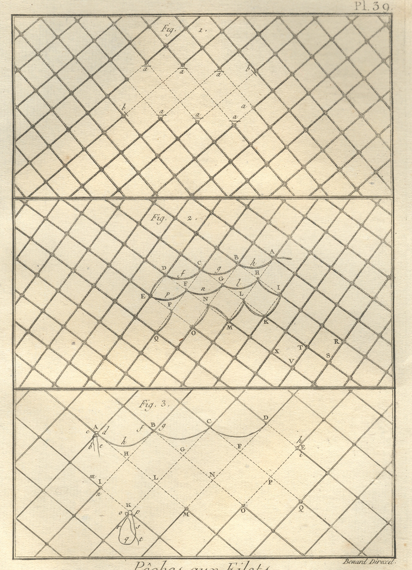
    Electrical Hum (and Ozone) Fishing Nets

    Ebay Feb 6 fishing net

    This
    image, from the quarto edition of the great Diderot and d’Alembert Encyclopedie (published over a number of years in the late 18th century), shows (I think) the
    ways to mend broken fishing nets. I have a definite sense of a high electrical
    hum from this, along with the added whiff of ozone.  Its hardly something that was intended by the
    artist, but it was the first thing that registered with me when I bought this
    print 25 years ago. 

    Things
    like this are available to us all of the time, simply waiting to be heard while
    being seen. 

    Notes

    1. After his death Mozart’s estate was reckoned, and the contents of his house and belongings were catalogued.  It was recorded that he had a very nice billiard table, and that he also had 12 cues.  Now 12 cues might’ve been there because he liked the feel of the wood, or that he liked their artistic merit on the wall or in the corner.  That, or he had a lot of people coming over to play.  I like the later interpretation.  Also, I cannot remember the reference for the ball/reflection story; please don’t tell me that it is wrong.  


  • How to Look Pretty or Smart, but Not Both: Ladies’ Home Journal Make-up Advice, 1933

    JF Ptak Science Books LLC  Post 930

    Ebay Feb 5 make up cvr

    [Continuing the posts What Makes Human Robot Girls, 1941, How to Get a Boy-Date, 1941, and The Missing Pieces of Women, Pope Joan and the Proper Girl]

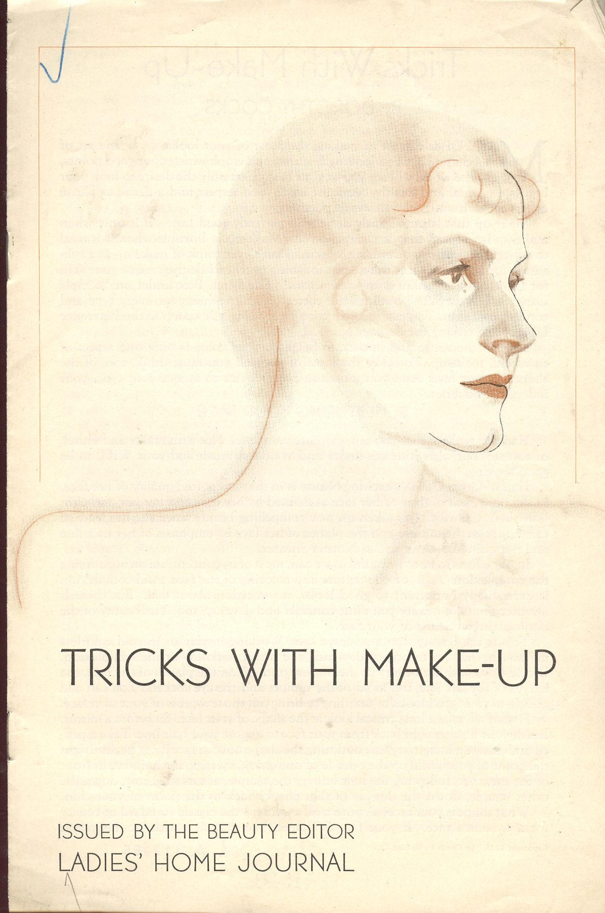
    Following on the tall heals of several posts on mid-1940’s social engineering for young women comes this rougey sprite by Dorothy Cocks, Tricks with Make-up.  It is one of a long series of quickly-produced pamphlets flung from the presses of the Ladies’ Home Journal under the stewardship of Elizabeth Woodward. 

    Ebay Feb 5 make up 1

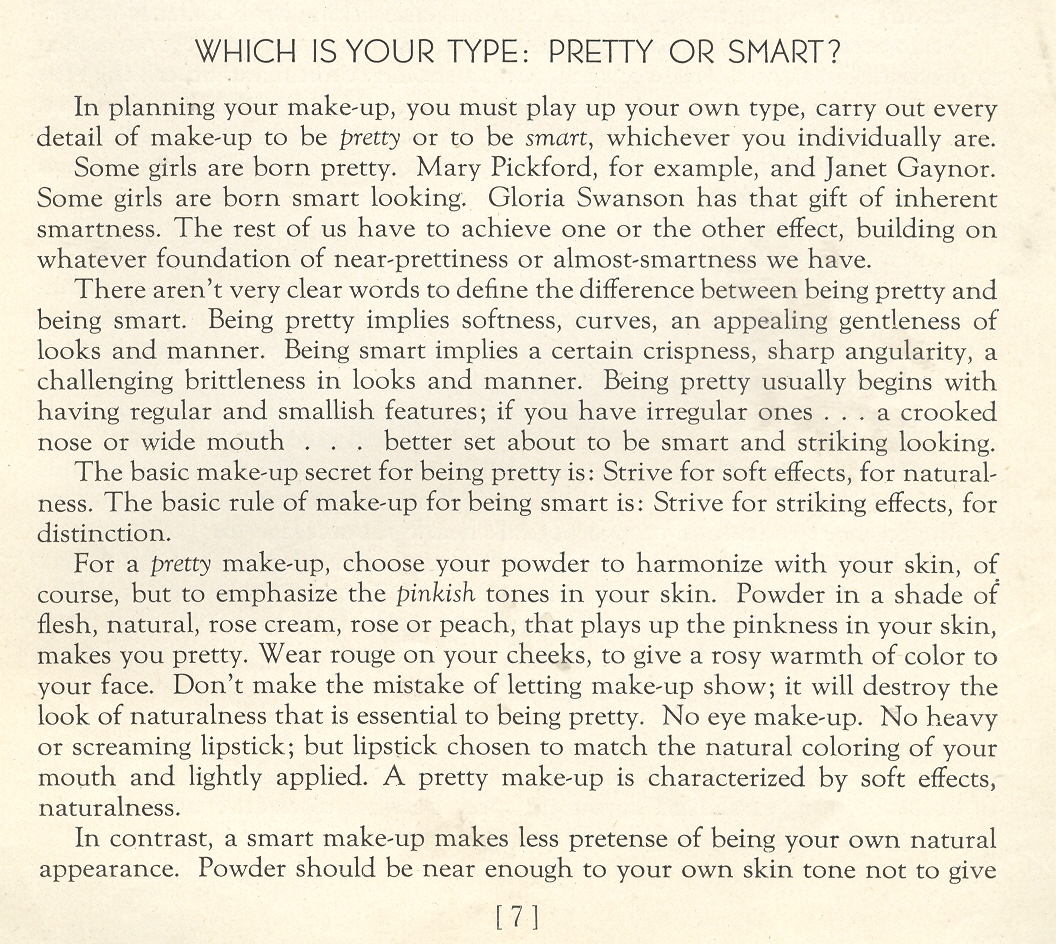
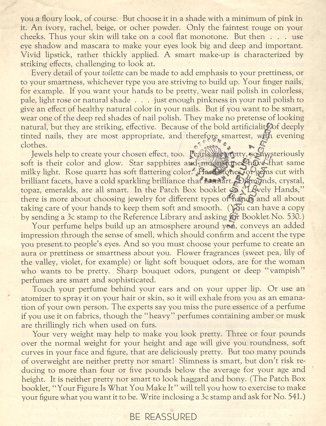
    There’s much to learn about what was expected of the social shell of women in this pamphlet, but what I’ve focused on is this jewel on page 7:  “Which is Your Type: Pretty or Smart?” And that’s it: no ground in-between, no space for something else, and evidently no room for being smart AND pretty.  Here it is:

     
    Ebay Feb 5 make up 2
    Ebay Feb 5 make up 3

    The advice to “touch perfume behind your ears and  above your upper lip” is a new one to me.