A Daily History of Holes, Dots, Lines, Science, History, Math, Physics, Art, the Unintentional Absurd, Architecture, Maps, Data Visualization, Blank and Missing Things, and so on. |1.6 million words, 7500 images, 4.9 million hits| Press & appearances in The Times, Le Figaro, Mensa, The Economist, The Guardian, Discovery News, Slate, Le Monde, Sci American Blogs, Le Pont, and many other places… 5000+ total posts since 2008.

Category: Absurdist, Unintentional

  • Unintentionally and Quietly Absurd Images: Twilight Zone Advertising for 7Up

    JF Ptak Science Books Post 1043

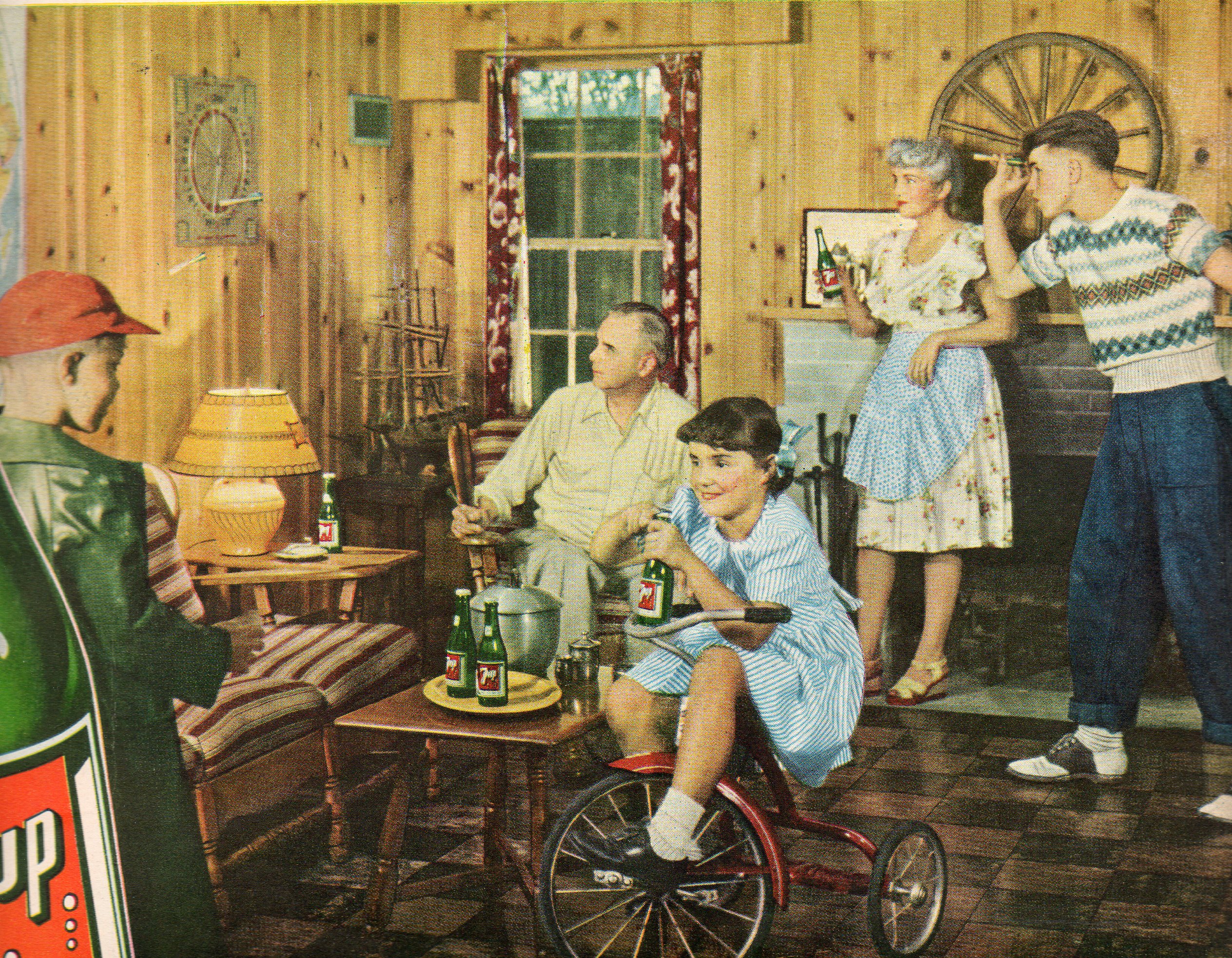
    What,exactly, is going on in this photo?  Yes they’re all helping to sell the delightful and refreshing pop soda called “7 Up”, but there’s something just off with each and every element.  

    000 7 up absurd017

    What is the story with the girl/woman on the trike, holding her bottle of pop as though it was the sudsy stuff?  She also must be at least 16 years old and looks a little possessed in having to wear those clothes in that pose.  She’s staring into the chest of the kid at left, who for some reason is wearing a heavy and shiny green coat there in the basement rumpus room.  Manchild Junior takes careful aim with his big dart as dad sits staring at the dartboard, waiting for his eyes to collect the darts as though they were magnetic dust in his eyeball magnet.  Mom seems to be plasticized and propped up against the fireplace, her bottle at an odd angle used only for toasting.  In All of this extends to the bottle, which hasn’t a single word on it, unless you cleave away the “up” from “7up”–there’s just truncated words and an incongruous woman in a bathing suit on the label.

    In short:  the photo has a low-suburban mid-creep distant-color affect, kind of like a human landscape version of a Joel Meyerowitz photograph.

    Meyerowitz07


  • Polywog Airmail of the Future

    JF Ptak Science Books  Post 1042

    000 sky mail015

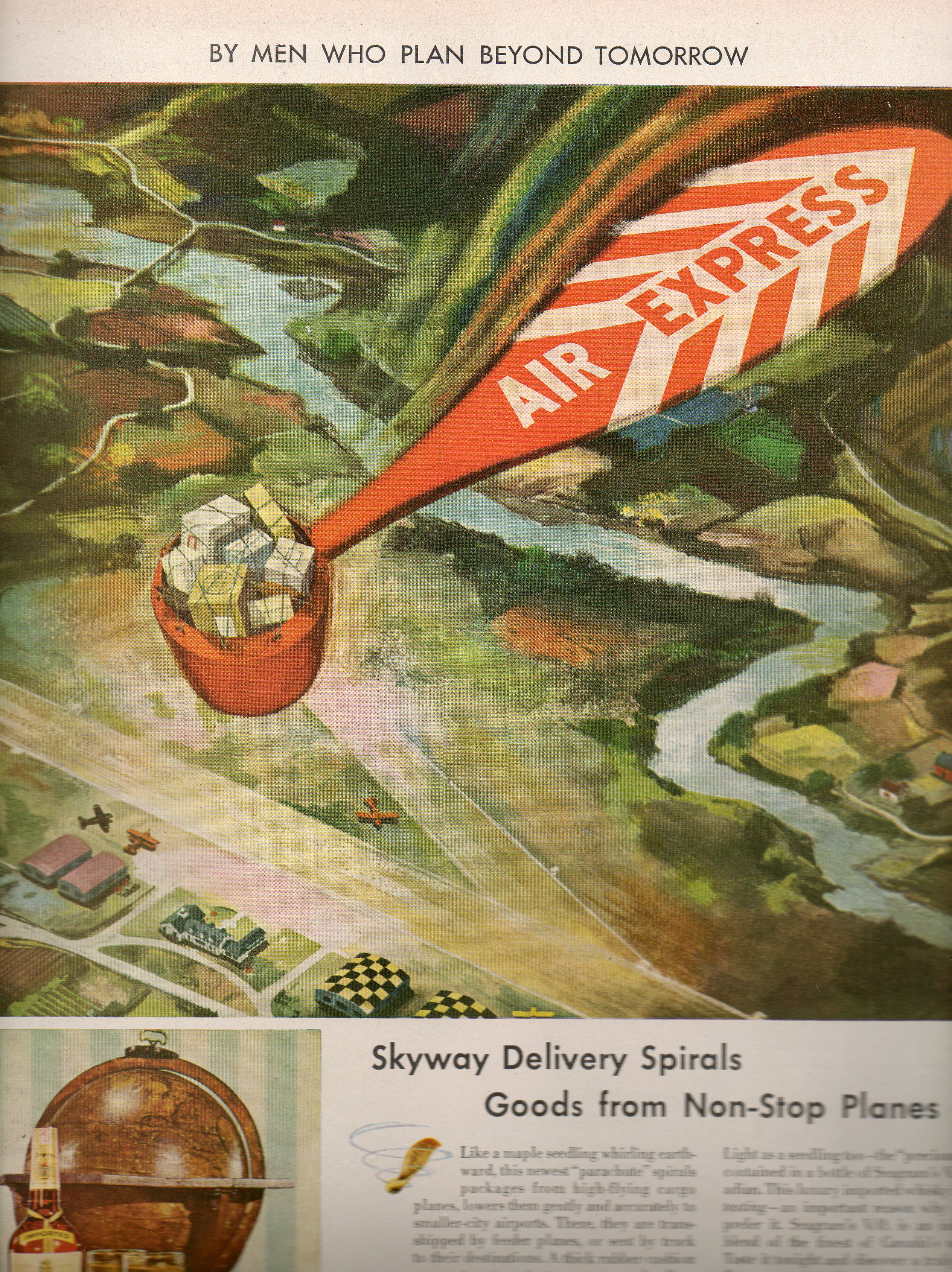
    The booze-driven future as seen by Seagrams (written about earlier in this blog as Atomic-Powered Farms) that appeared in the pages of LIFE magazine from 1945 to 1947 were quixotically science fictiony in the waterproof-duck department brand of invention.  Most of Seagram’s visions were goofy even though they all seem to have been serious statements on the future.  This example, the polywog air mail delivery system, seems to be as bad as any of them–worse even since the technology that the artist/designer was trying to circumvent was already far more sophisticated/logical/beneficial than this weird parachute delivery system for  the mail.  Once all the effort of packaging the mail into this contraption, retrieving it and then setting it up all over again for the next go is calculated, one would’ve been far ahead at all levels by just landing the bloody plane and getting rid of the mail.  That, or of course, just pushing the mail out in a container with a standard parachute also would’ve been a better solution than the one pictured. here. 

    Obviously Seagrams didn’t have their heart in futurology, except that which calculated the shortest possible time it would take to convince people to replace their empty Seagrams bottles. 

    Overall, this is just simply a very bad idea, no matter where you are in the timeline. 


  • Selling the Memory of Missing Things: Camel Cigarettes, 1947

    JF Ptak Science Books  Post 1041

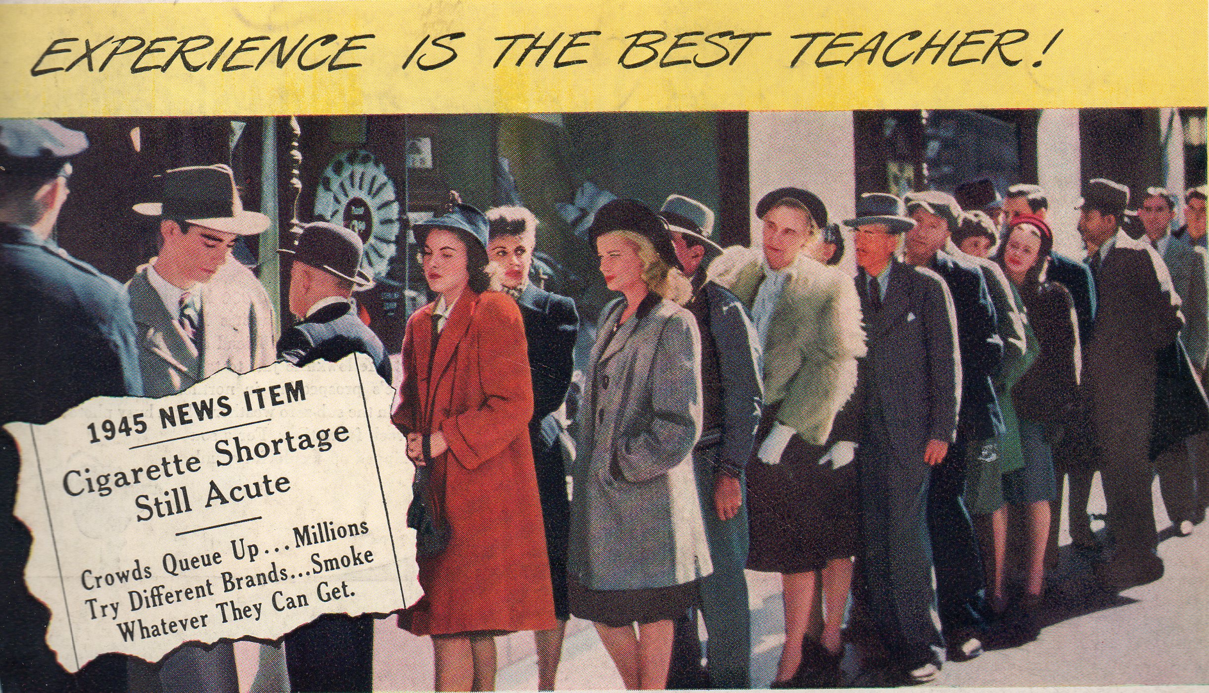
    Here I think is another instance (following yesterday’s post on “The Ineffable Religiosity of American Meat Memory”) of tweeking the American consuming memory, an advertisement bringing out the recollection of past shortages to make the present consumer want the now-abundant item even more.  In this case that item is the cigarette–Camel cigarettes to be specific.  The ad correctly refers to the two-year-old memory of cig

    000 cigarettes013

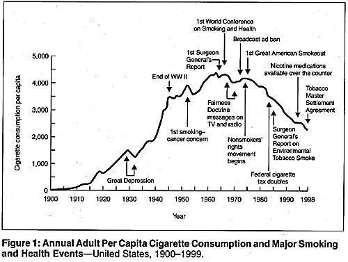
    shortage in the U.S.  Cigarettes became increasingly scarce during the war–soldiers were given smokes with their C-rations, exports increased, and so did general consumption.  At the beginning of 1940, 181 billion cigarettes were made in the U.S., with a per capita intake of 2,558 cigs a year; 1945 saw production spike to nearly double. By 1950, the production hit 370 billion, with the per capita use at 3,522 cigarettes a year, about a half-pack for everyone in the country.  In fact nearly half of the adult population smoked in 1950, making for more than a pack-a-day habit.  And it was Camels who lead the smokey way, comprising nearly 28% of all cigarette sales in the country (followed by Lucky Strikes and Chesterfields, their combined totals making another 42% of the market share).  In short, there were three giants who ruled the industry, and that for decades.  And before 1950, only 2% of all of those cigarettes had filters, so all of the harmful stuff got to the lungs cleanly.

    Back to the ad–I’m sure that these hatted folks weren’t smoking “whatever” they could get, especially with the cop standing at the front of the queue.  But in 1947 (the year this ad appeared in LIFE magazine advertising Camel cigarettes) the ciggie shortage experienced at the end of WWII was long dead and gone.  Camel just wanted to remind people of the craving for their missing cigarettes, especially the ones they enjoyed, and of course especially Camels.  The ad brought up the memory of smoking the off brands like Ramses and Pacayunes and how they tasted, and how “good” Camels were in comparison–and now one could buy Camels with reckless abandon, the freedom to consumer right to the edge of the grave. 

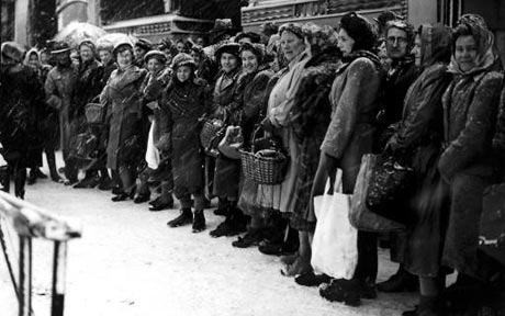
    The advertising message pricked the American memory of shortage; the U.K. on the other hand was experiencing the real thing, with massive amounts of shortages of nearly everything (from petrol to medicine to white linen), and queues and ration books were supplied to deal with the real problem.

    A “real” line in London, 1947, for food::

    000 winter-1948_798431c

    0000 cig consumption


  • Alpha & Omega Department: Leashed Women

    JF Ptak Science Books   (Picture Post)

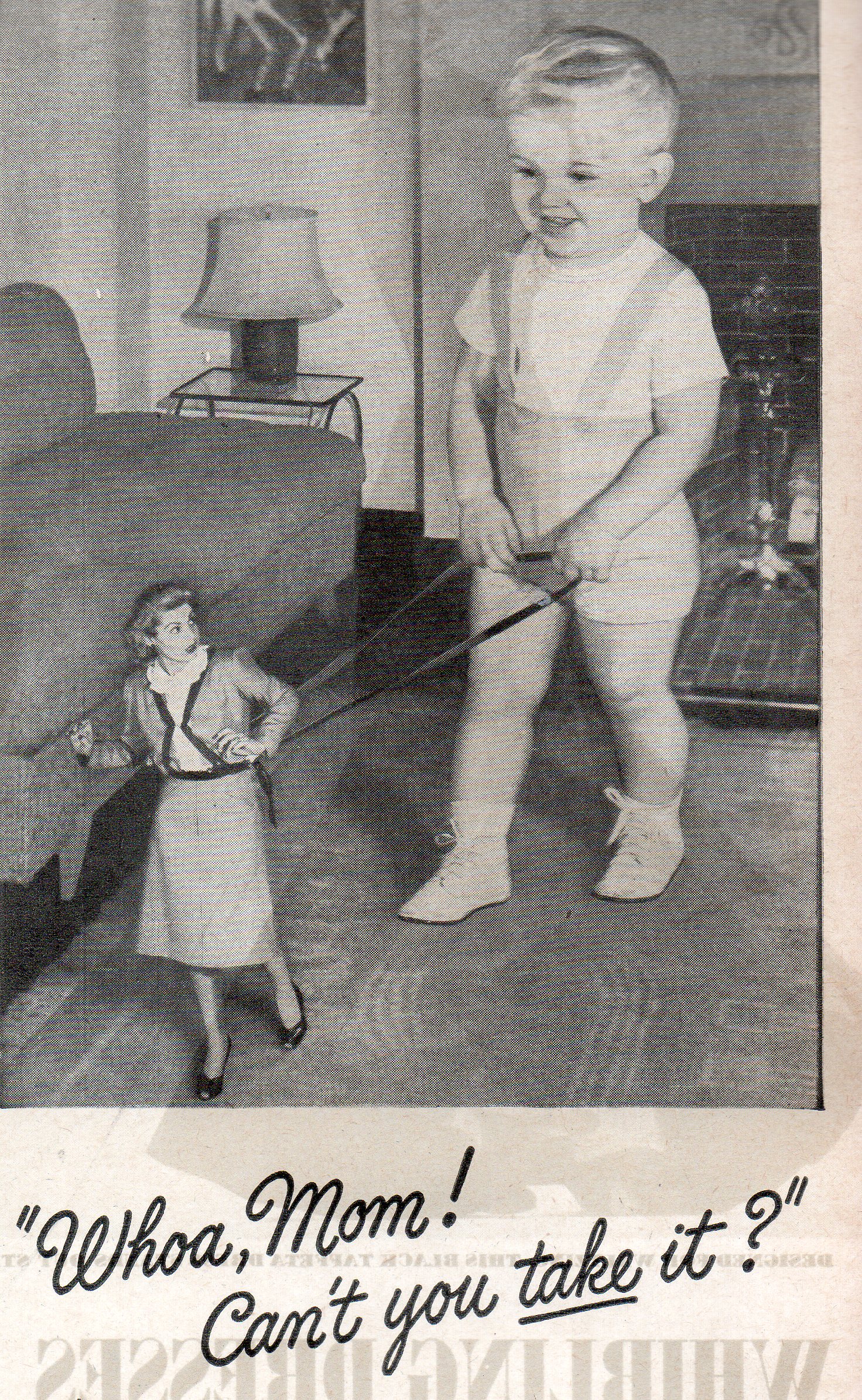
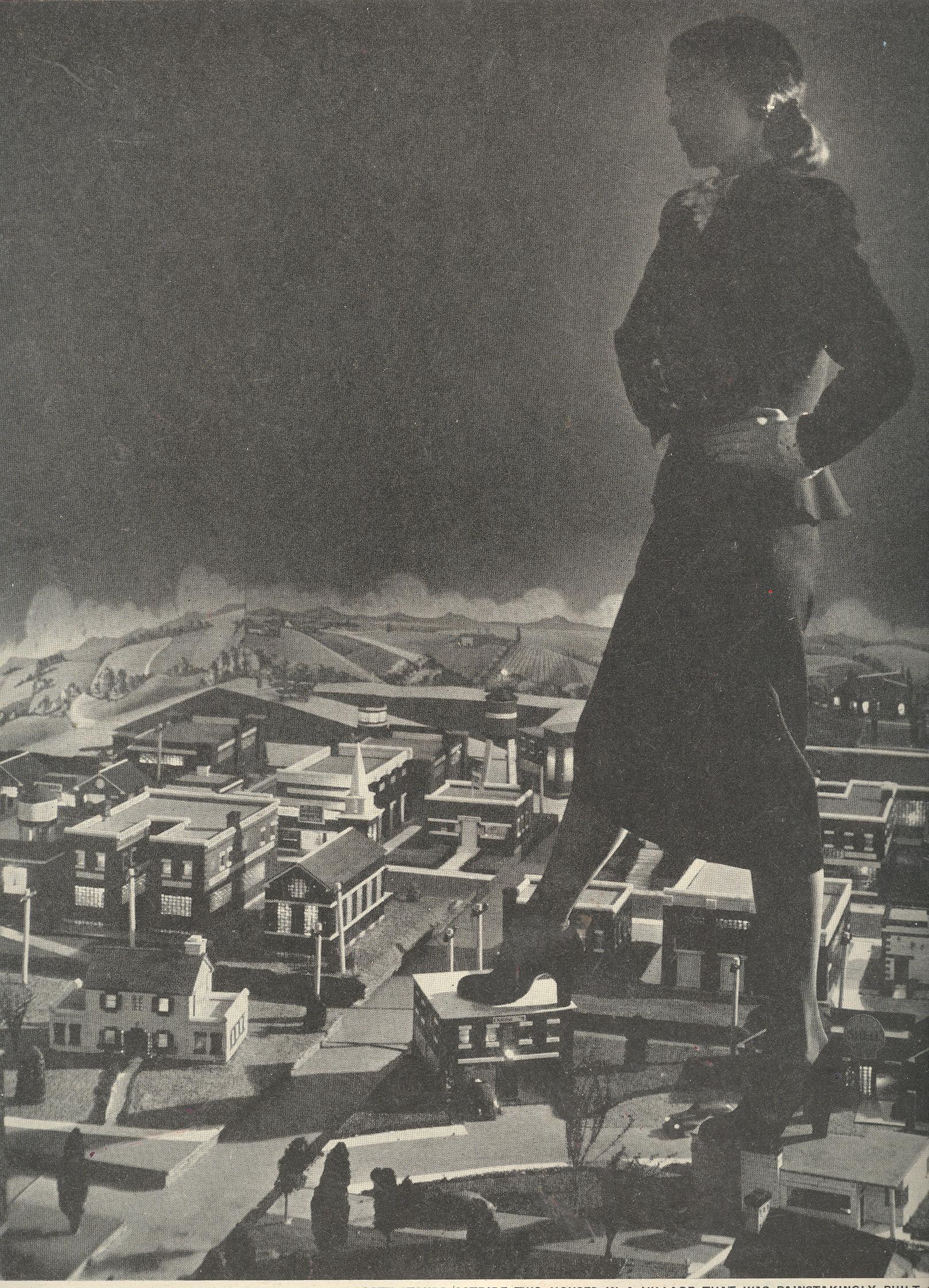
    This would also go nicely with my 200′-Tall Woman post, making the long and short of things and rounding out the other end of the spectrum for the greatest difference in hemline-to-ankle distance.

    000 women on a leash012 

    000 big woman


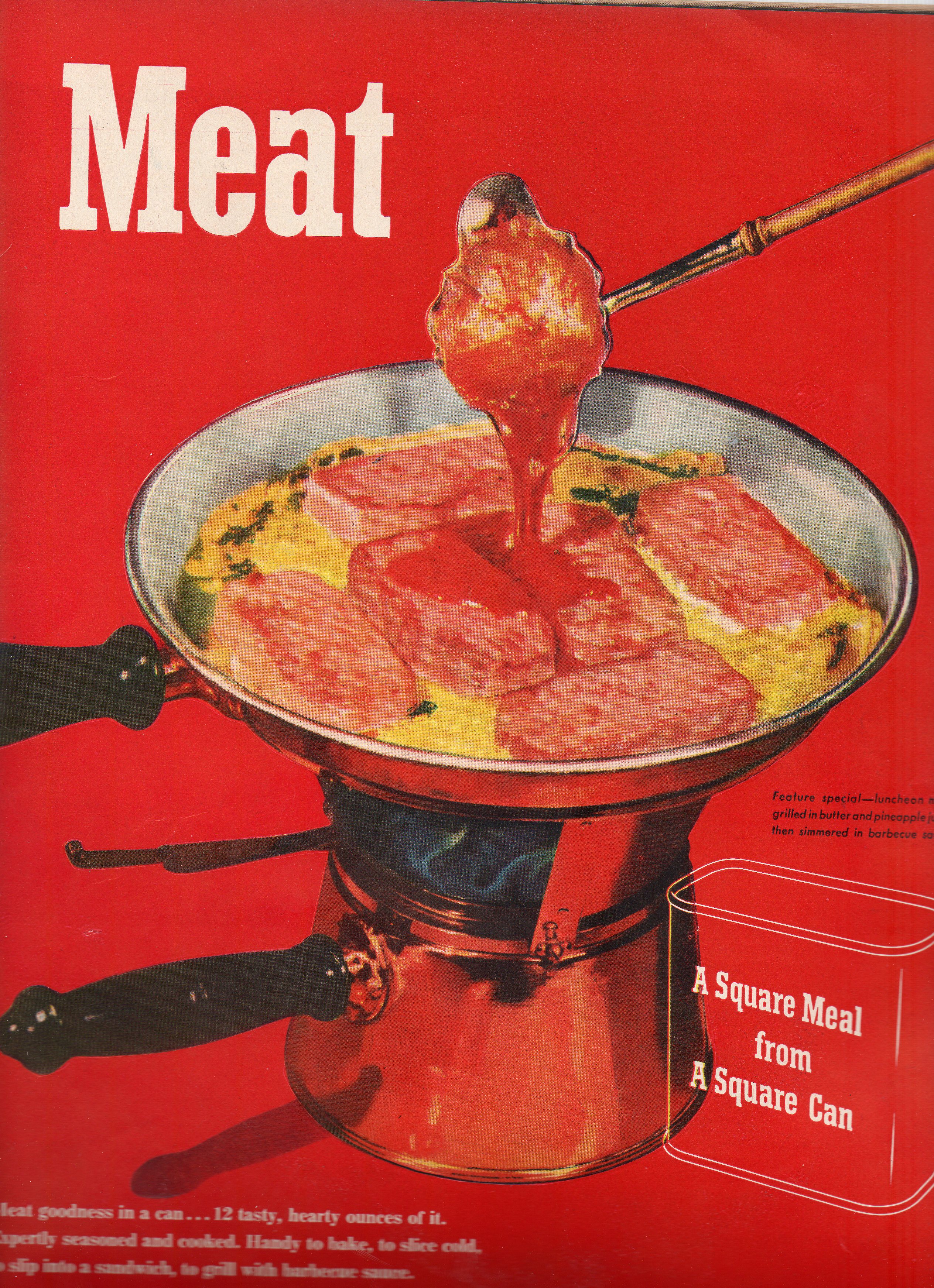
  • The Ineffable Religiosity of American Meat Memory: PREM, 1947

    JF Ptak Science Books   Post 1040                                                 


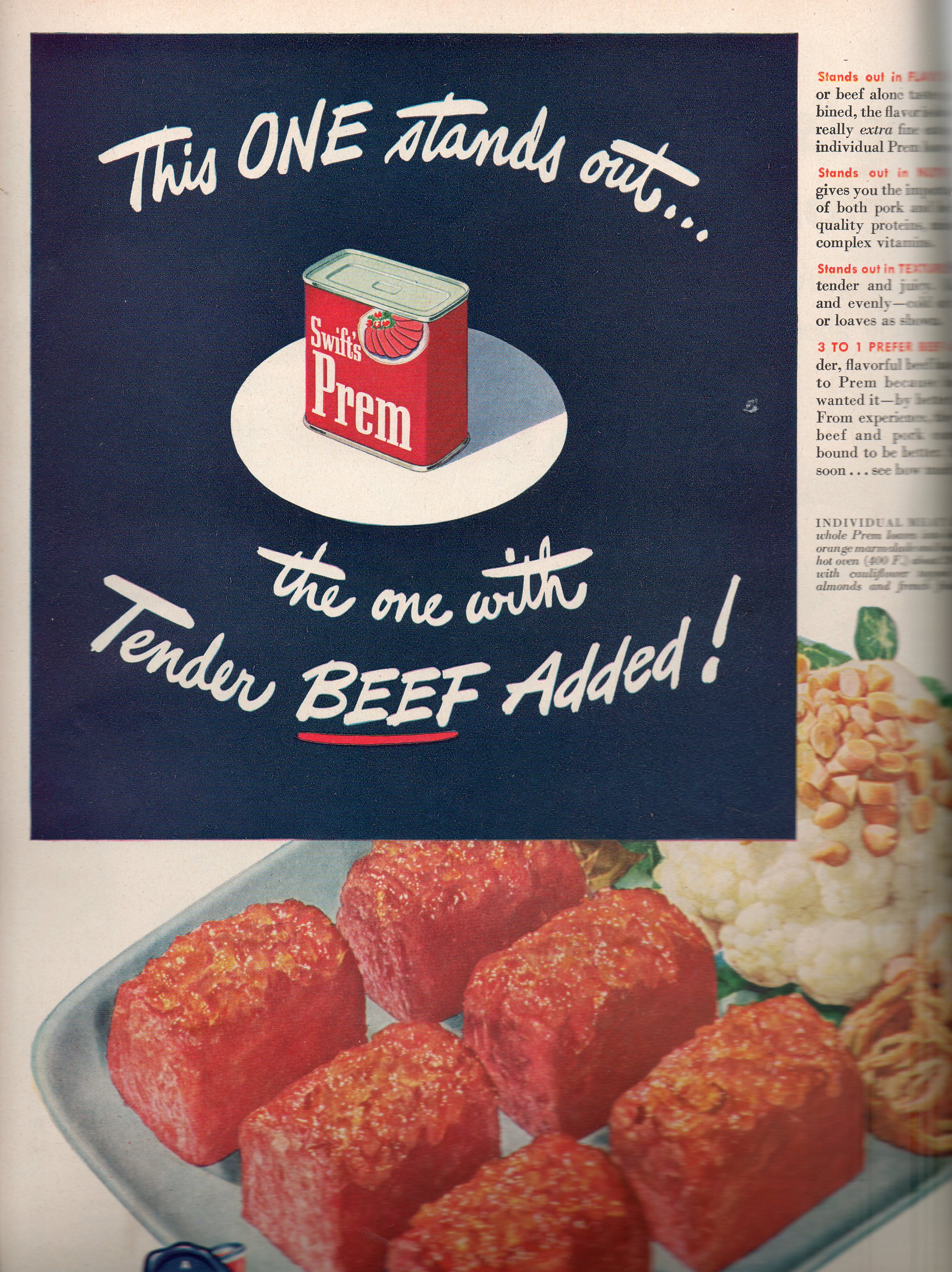
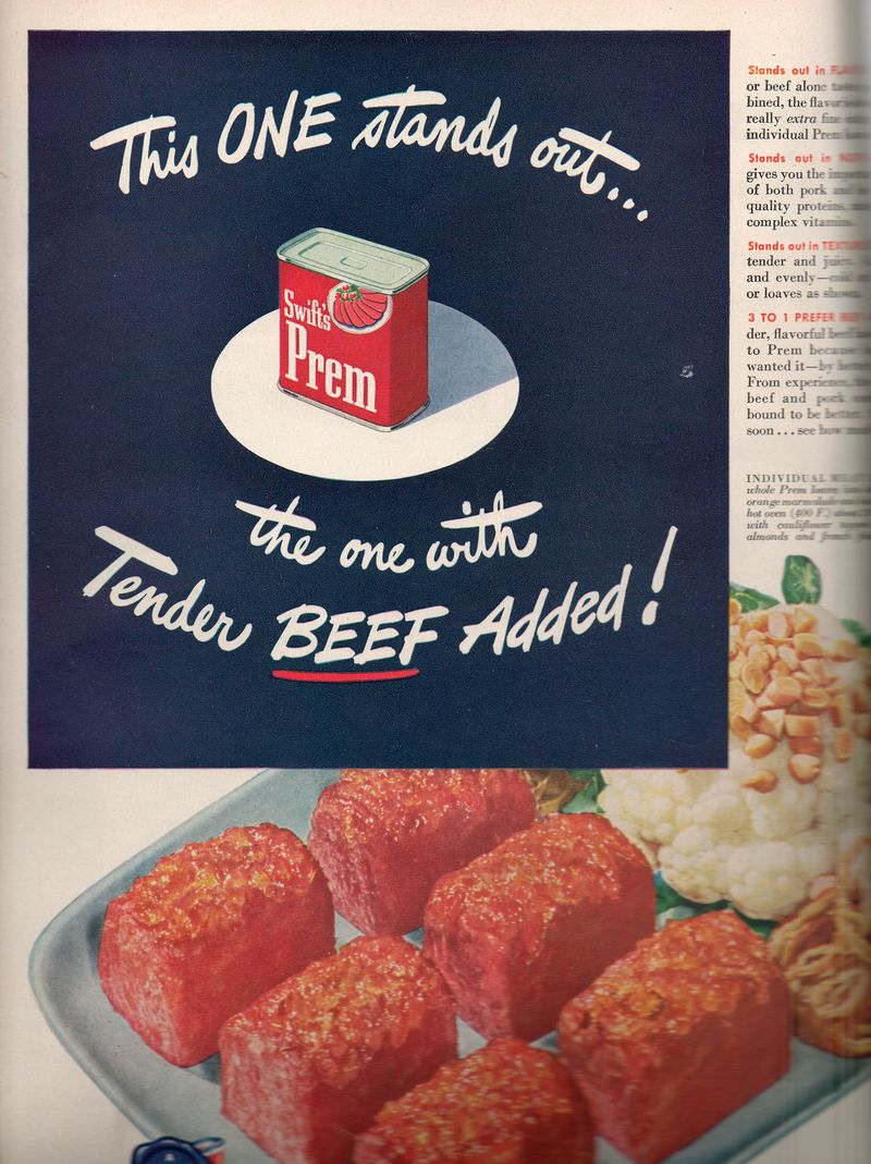
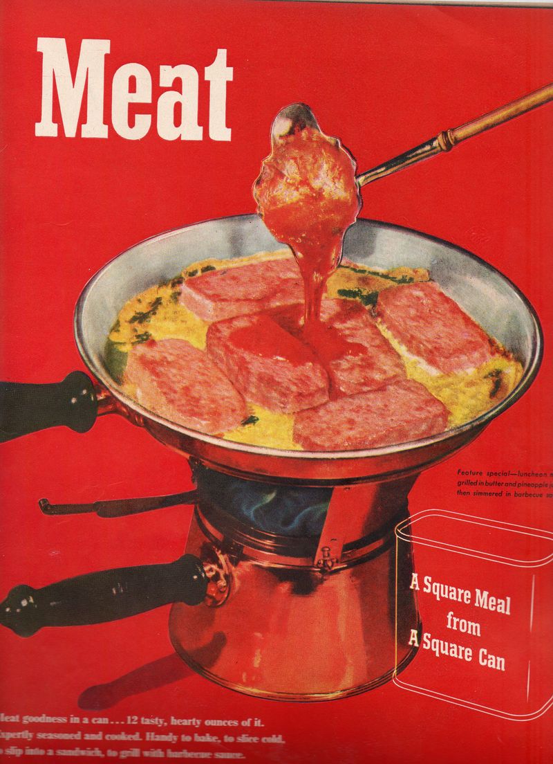
    The category of the specialty meat, the meat that both is and isn’t meat, is one that holds a particularly high place in the religico-belief system of consumption in America—and particularly so in the historical American meat memory.  For it is here, in this very purply ad in LIFE magazine in July 1947 that we find a reminder for a meat product being sold as such, printed with the statement that the meat is being sold with meat in it, which is odd because it suggests the rejoinder that the opposite is true, too.
    000 meat prem014

    The ad is magnificent in its own special way, falling just short of  reading “Prem Meat: Now with MEAT!”.

    The adipose-y Prem meat-like clone sprung from the mind of Elmer Gantry-looking Joe Hormel,  who I wrote about earlier in this blog under the title “Spam, Smeat, Spic, Prem, Mor & Arf: Food by Any Other Name”.   Prem was a Spam-like product, a waste-meat issue of food that was packaged as a molded solution for the lower-middle-class American family.  The belief in Prem and such things as meatfood must’ve been strong; I doubt that anyone who had the remotest imagination would have thought of it as an adhered-jell byproduct which nearly ended its life on the slaughterhouse floor waste grate before it was thought of as something that could be scrubbed off the metal grid, loaded with other extreme leftovers, loved up with coloring, solidifiers, sugars, preservatives and flavorings and then sold as an ingestable commodity.  The romance of Prem is lost if you drain it of its belief system and expose it as the salvaged refuse bin
    material that it was. 
    000 meat red010

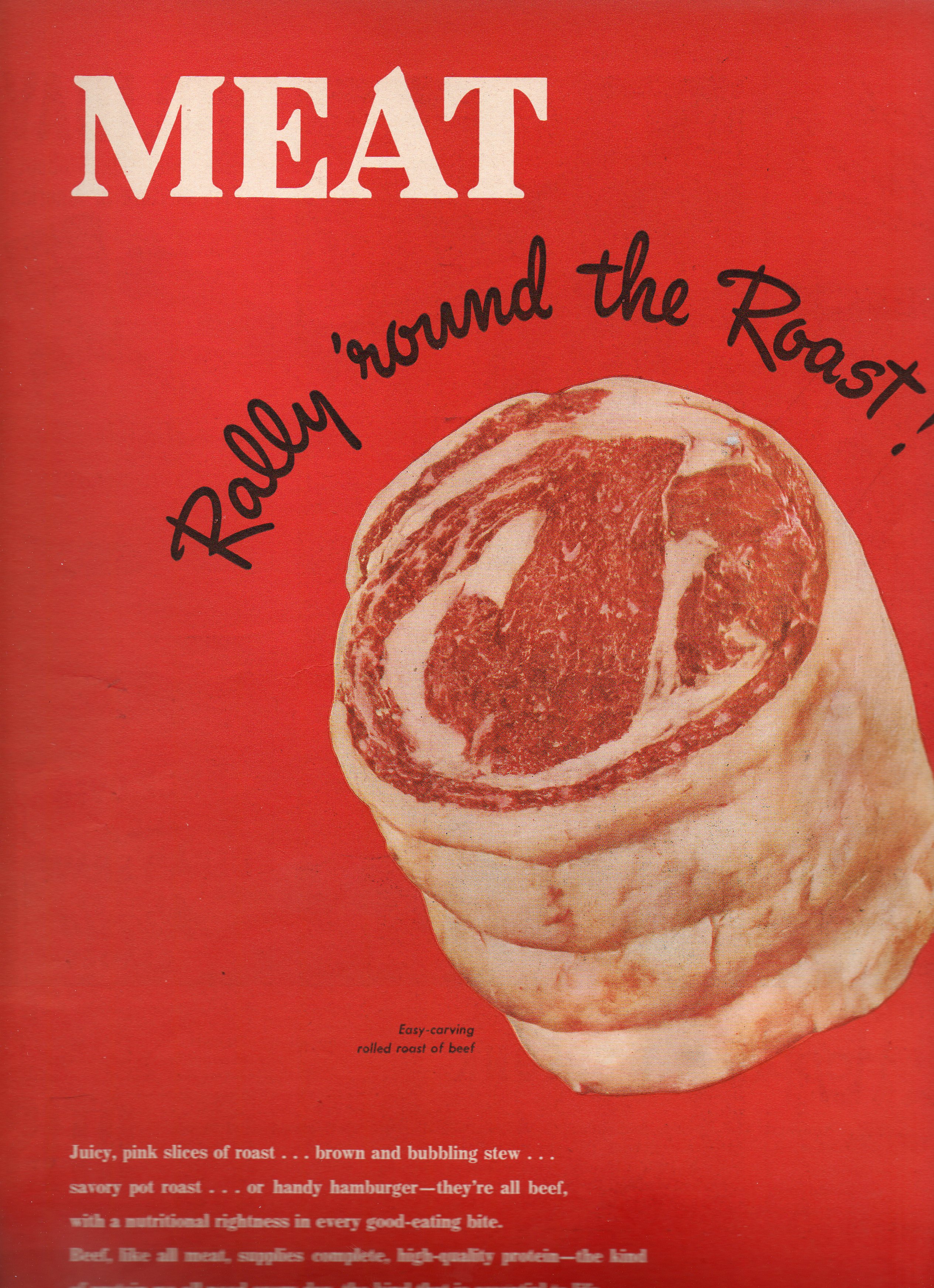
    As a 20-year vegetarian I’m strangely attracted to these ads, just as I would be any other piece of quackery from the sciences or medicine. These odd meat things were fortified with splashy store displays and crisp metal packaging.  It certainly looked okay in the pictures; could digestive goodness be far behind?

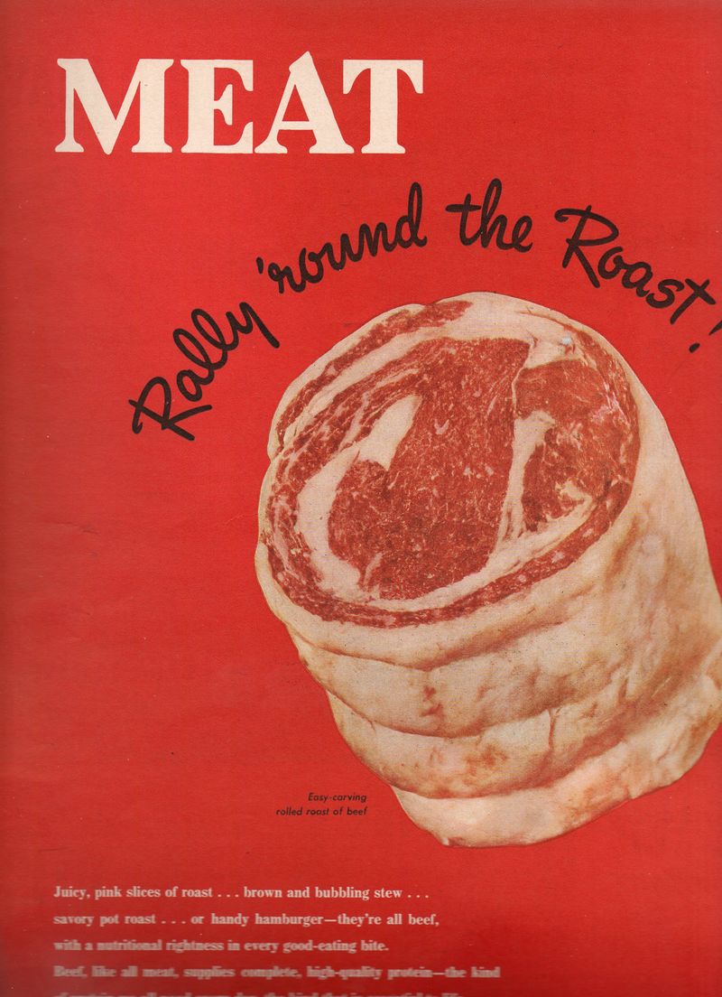
    The other bit that runs far and wide through LIFE that reminds Americans that the meat that they are eating is meat  , red meat, and the RED MEAT ads–these things are incredibly red, and big, and make quite the bloody splash considering that the ads were about 14 inches tall. 

    Anyway, reminding someone that they were eating more of their memory than the actual thing itself seems as though it would’ve opened more dangerous doors to unsavory discussions rather than closed them–but close them they did, as the new-old memories posted by these ads seem to have worked their sensate magics.
    000 meat red 2011


  • Dis-inventing the Left-Hand Turn–City Planning with Le Corbusier

    JF Ptak Science Books  Post 1038

    Somebody must’ve invented the automotive right-hand turn, and someone too must’ve come up with the idea of dis-inventing the left-hand turn–for the sake of this post and brevity that person might as well have been Le

    Right hand turn 2006

    Corbusier.  I know that city planners and traffic engineer types must’ve been working on the idea of how to push new traffic through old city streets, and the notion of making traffic not cross against itself must’ve come fairly early on, but I just offhand don’t know when.  It makes sense to me to not have cars make left-hand turns against oncoming traffic–it adds immeasurably (?) to the gas guzzling stop-and-go adventures in driving, the chain reaction of so many cars stopping and piling up behind one solitary driver waiting to make a left-hand turn against a stream of oncoming cars is just enormous.  Restricting the left-hand-turn to three right turns would slash the waiting/idling business and allow traffic to proceed quicker. (In a similar line of thinking my friend Richard Rudman from New Zealand points out that studies prove that restricting highway lane changes also makes enormous sense as well–it gets people to were they’re going quicker and with greater fuel economy if the flow isn’t interrupted by constant starts and fits of changing lanes.)            

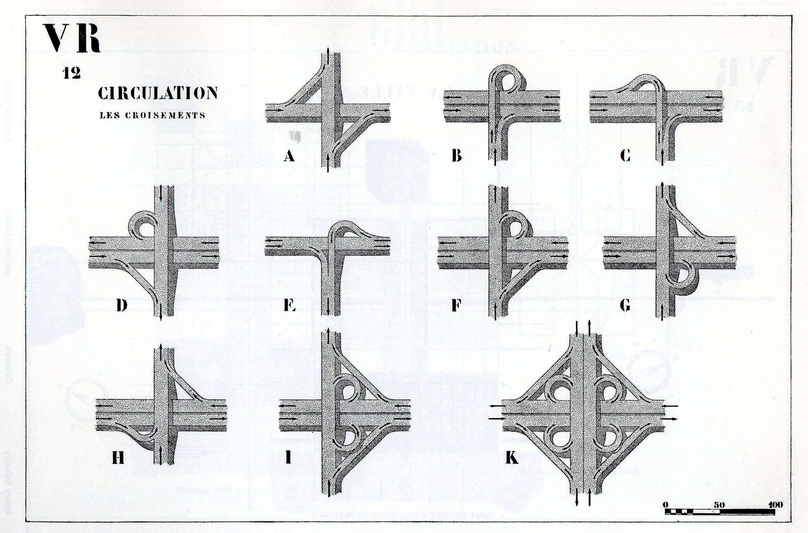
    Further on in The Radiant City we find this visual encyclopedia of right-handed turns:

    Right hand turn 10

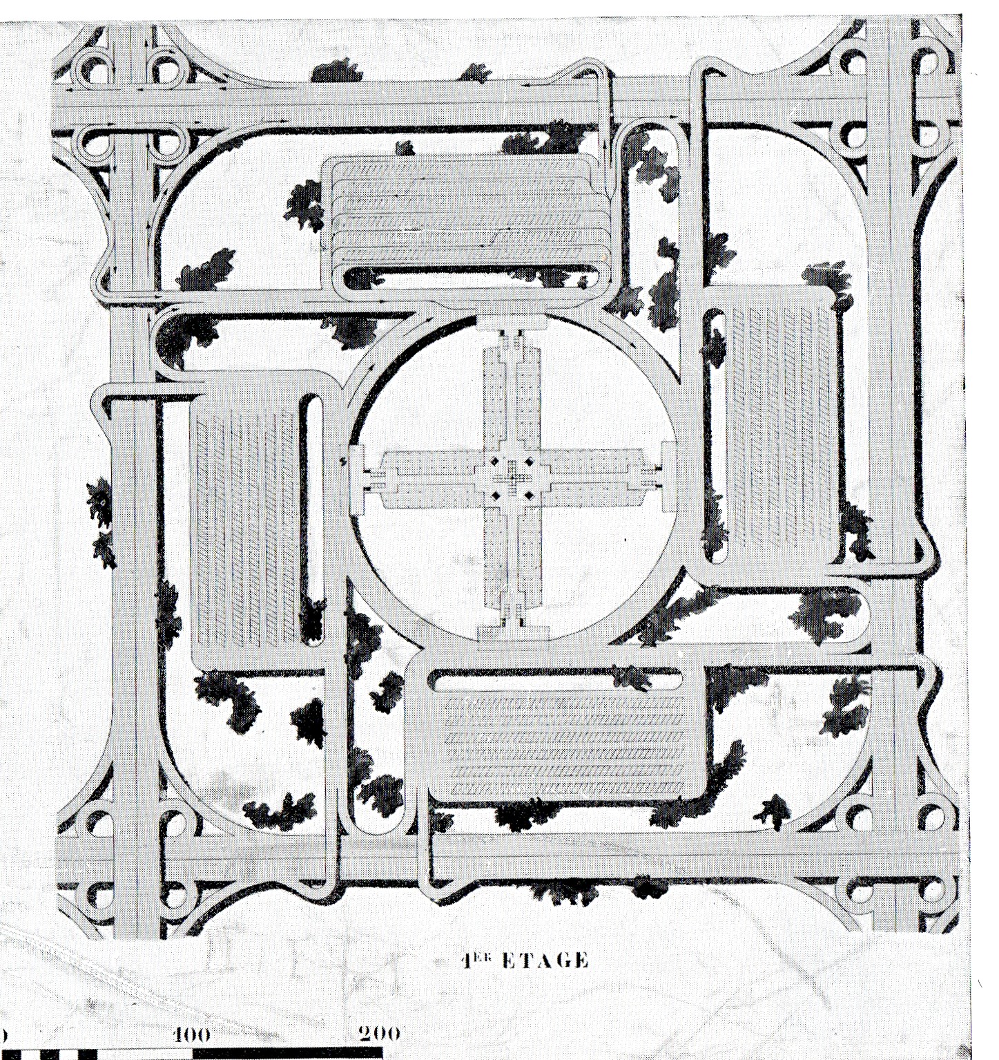
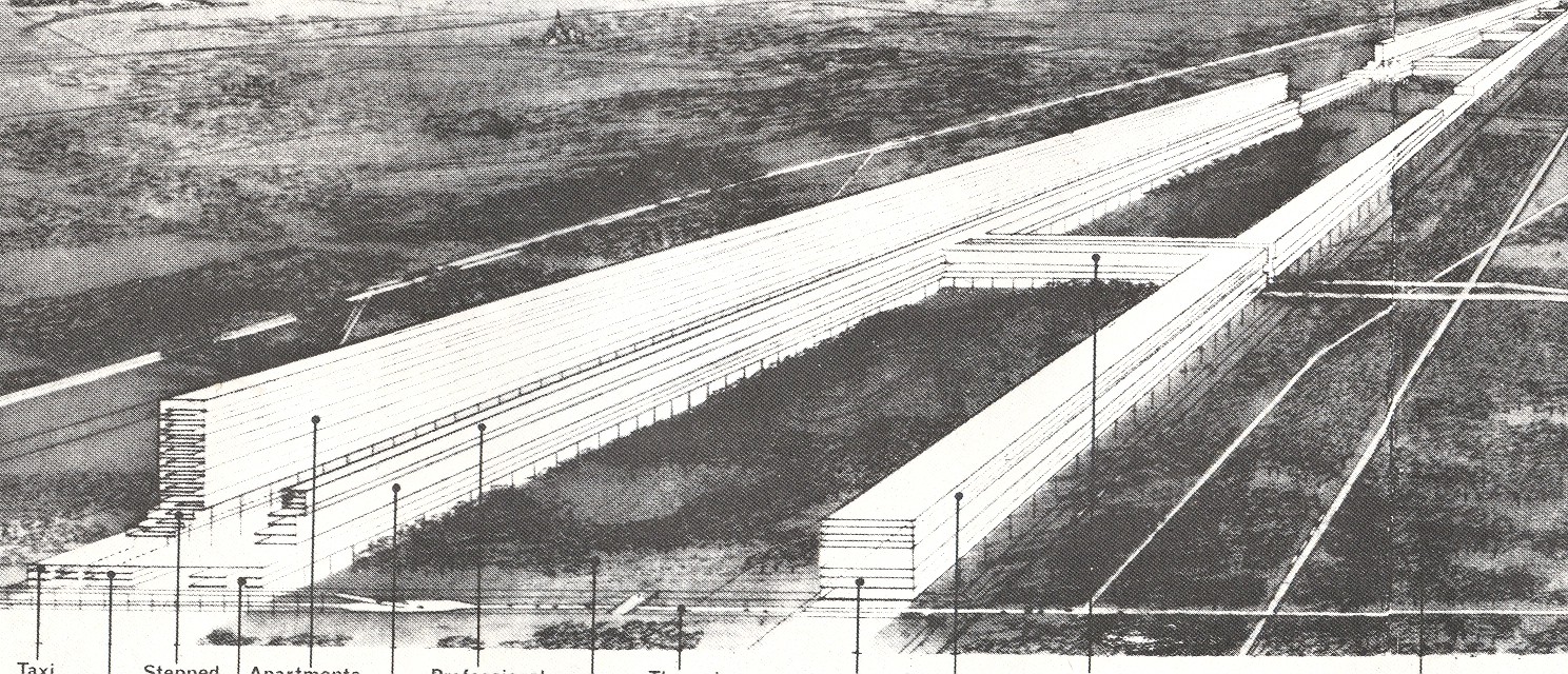
    And so we come to this plan, a part of the 1930’s Radiant City of Le Corbusier.  It is a section of a series of “horizontal skyscrapers”, “Cartesian (works) in steel and glass”, 220 meters tall buildings set in 400 meter square sections.  All of the architecture aside, the street plan is what interests me–all of the traffic here in this section of the Radiant City is in one direction along streets that are largely lacking right angles.  Elsewhere in the book Le Corbu presents his ideas for intersections for large cities–all of the designs remove the cross-traffic turn, keeping traffic flowing without those series of infinite stops.

    I’ve not been a very big fan of this man, but this is the stuff that seems to make sense to me. 

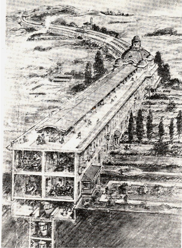
    These ideas are also in vast contrast to the city plans of linear cities (which I wrote about earlier here), seen in the 1910 Chambless image (below) and the 1932 Popular Science city (below that).

    Linear cities 2

    Linear cities

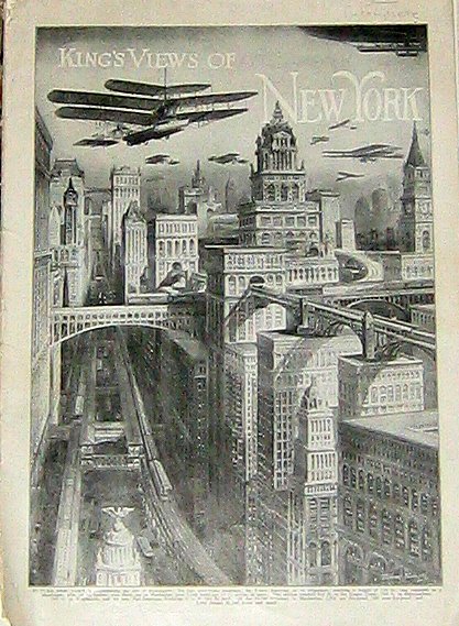
    It is also entirely different from the methods of dealing with traffic that were seemingly very popular in the early/first-third part of the century–massive 12-lane roadways, suspended garganutan affairs with traffic turning everywhere, some of which took place high in the air and in the interiors of massive skyscrapers. (Some of which I wrote about here.)

    Kings new york


  • The Message is the Medium, 2: Land Mines, Palestine, 1943

    JF Ptak Science Books LLC  Post 1036

    [An extension of the History of Holes series–things that are put into holes.]

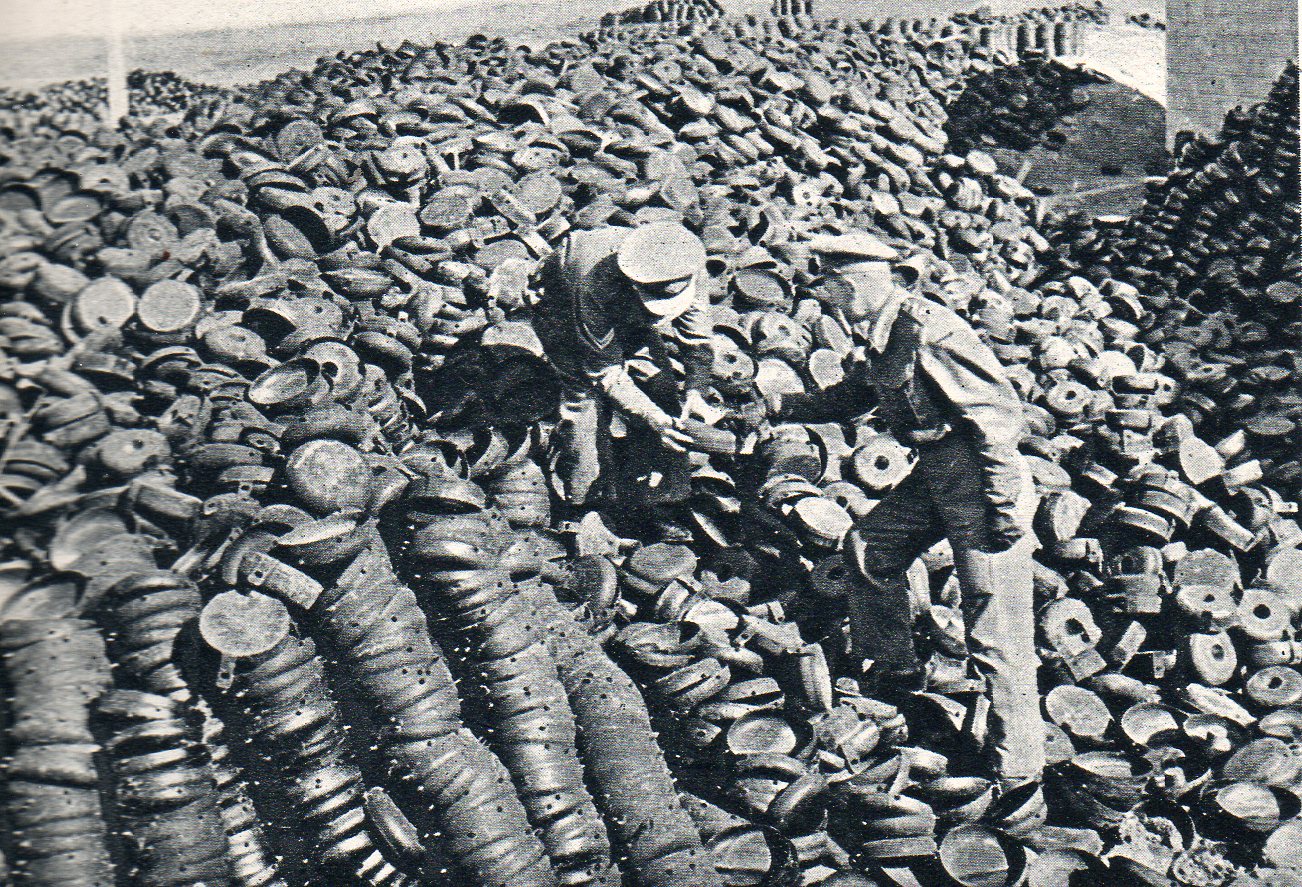
    Continuing a stroll through the Illustrated London News for 1943 I came across a series of photos of Britain’s “dependencies and friends” helping out in the war effort. This one is particularly remarkable and shows a vast

    Land mines004

    pile of yet-to-be-filled land mine canisters being serviced and readied for action in Palestine.  Its hard to imagine this sort of a scene, and this is only a part of the canister dump.  I reckon there to be easily 20,000 land mines just in what we can see, which represents about 1/1000th of all of the land mines used during the war. It also represents about 1/10,000th of all of the land mines that are in the ground right now around the world–in other words, this pile but 10,000,000 square feet worth. A pile like that could cover the square footage of the Empire State Building four times. 

    Emily Dickinson said that the brain was “the weight of god” (“wider than the sky” etc.)–if that’s so, what are these things the weight of?


  • The Message is the Medium–Children and Bombs, London, 1943

    JF Ptak Science Books  Post 1035

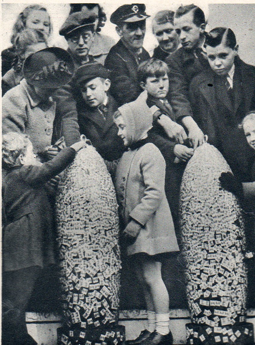
    I have no doubt that the history of decorating “bombs” reaches far back into dim history–decorating launched explosives I guess must be as old as the medium itself, though I’ve gotta say that the earliest photographs of decorated bombs goes back only to WWI.  In “reading” the Illustrated London News for the WWII years I found this image of children in Trafalgar Square fixing savings stamps to 500-pound bomb shells, part of a significant mile-long parade and will-to-win display–the “Wings for Victory” campaign– illustrating the Empire’s aeronautical might hat took place in London on 8 March 1943 and published a week later in the ILN.

    Children bomb003
    The “Wings for Victory” campaign targeted raising 150 million pounds; by this point more than 50 millions had been raised via monies being placed in War Bonds, Savings Bonds, Saving Certificates and Defense Bonds. My guess is that you’d get a sticker saying that you had invested x-pounds–these were the stickers placed on the bombs by the kids, I think. 

    It was pointed out in the accompanying text that the bombs would “at the end of the week…be dropped on Germany”.


  • History of Lines: Circles, Vortices or Tree Rings?

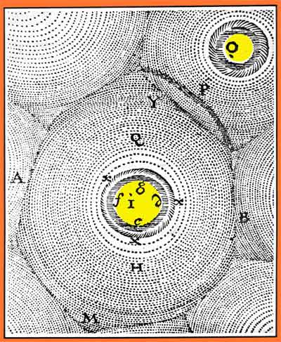
    JF Ptak Science Books   Post 1030Descartesunivab

    I thought at first that the detail of the photograph below looked liked Cartesian vortices, as seen in one of these engravings from his (Rene Descarte) Principes de la
    Philosophie
    (1644, basically a treatise on planetary motions).
    :

    1--may 14 circles det

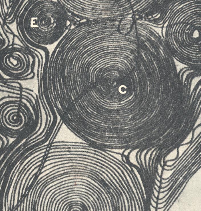
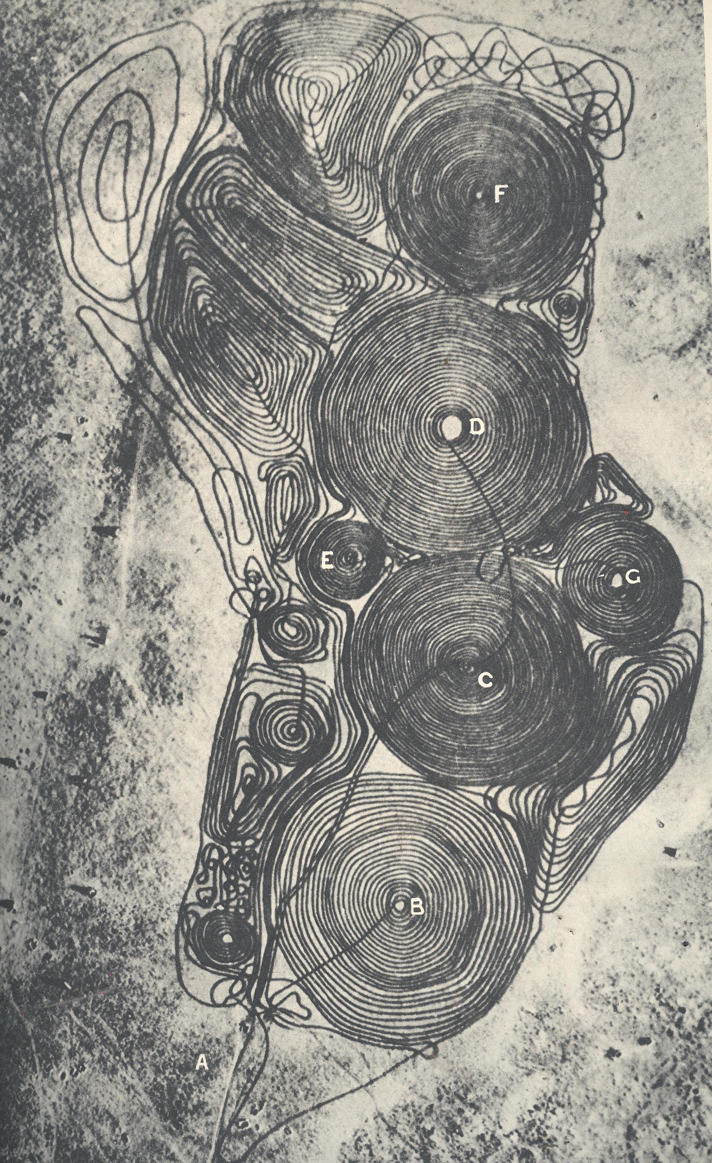
    Well, no, of course, these are not vortex representations writ large in the
    desert of Tunisia by Nazi German plows. They come close, though.  We’re
    looking at a photograph of what is supposed to be an airfield which has
    been beautifully plowed under by German sappers, done so to prevent the
    airfields being used by British forces subsequent to its abandonment by
    retreating German forces.  Looking more closely at the photos though I’m
    not sure what this really is–it just doesn’t look quite right.   On
    the other hand I don’t see offhand what might be gained if this was
    simply a retouched photo used for propaganda

    1--may 14 circles 

    Source:  Illustrated London News, 6 Feb 1943.


  • History of Dots Series: Dots of 1947

    JF Ptak Science Books   Post 1027

    {Another in the History of Dots series.]

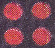
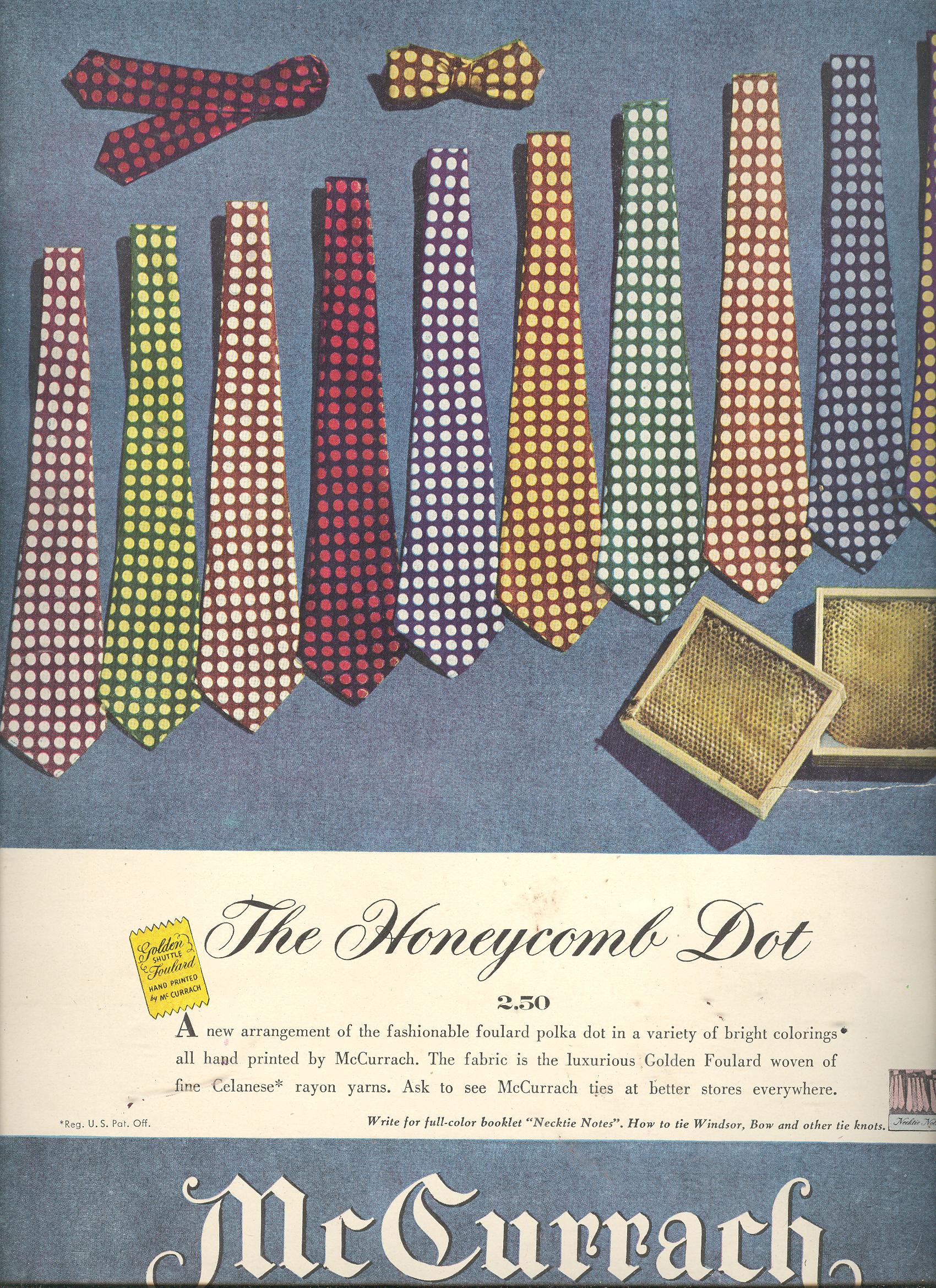
    The molecular chemistry of dots of 1947 is a beautiful thing, worthy of a powers-of-ten episode, though I can only do a gigantically scaled down version of it (a powers-of-two maybe) given pixelation and its dot-defeating and necessary tendency to relieve roundness and introduce squares everywhere. 

    1--may 13 tie dots det 1 

    1--may 13 tie dots det 2

    1--may 13 tie dots det 3

    1--may 13 tie dots det

    1--may 13 tie dots