A Daily History of Holes, Dots, Lines, Science, History, Math, Physics, Art, the Unintentional Absurd, Architecture, Maps, Data Visualization, Blank and Missing Things, and so on. |1.6 million words, 7500 images, 4.9 million hits| Press & appearances in The Times, Le Figaro, Mensa, The Economist, The Guardian, Discovery News, Slate, Le Monde, Sci American Blogs, Le Pont, and many other places… 5000+ total posts since 2008.

Author: JF Ptak

  • The Skies of the “Electrical Experimenter”

    JF Ptak Science Books   Quick Post

    The Electrical Experimenter is my new favorite magazine, and here’s why:
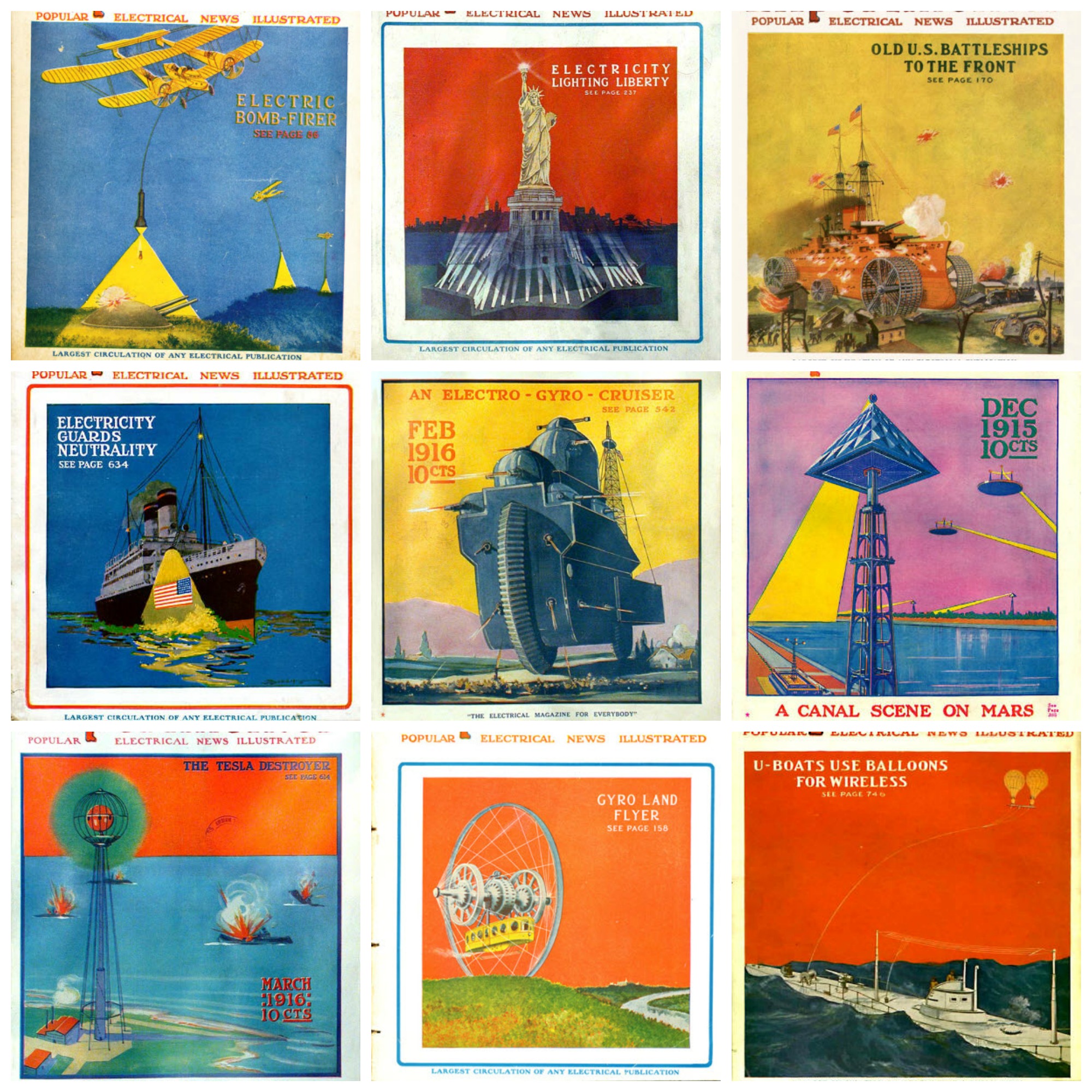
    Electrical Experimenter Skies MONTAGE _2_

    In addition to being thick and full of real electrical necessities and scientific bric-a-brac, it also held a fair amount of speculative thinking and just plain old science fiction (when sci fi wasn’t “plain” or “old”).  The EE was created and edited by the very busily creative Hugo Gernsback (1884-1967), a pioneer in science fiction, who held the magazine together from 1913 until 1929 (as the Electrical Experimenter from 1913-1920 and then as Science and Invention from then until the finale in 1931). There was evidently no holding back on cover design–at least from September 1915 until the end, when glorious ideas were display with flat design dominated by unusual and contrasting colors. For example, in the montage above, I was able to find glassy unadorned background skies that were red, yellow, purple, blue, and orange, with variation on each. Not only were the skies unusual, so were the surface colors: unusual blues, deep blacks, n=unnatural greens, purples, and so on. All of this framed some occasionally Highly Unusual and Not Expected Ideas. For example, in these WWI-era images–working right to left on the montage–there was an aerial bombing assistant of a light that illuminated the target through which a bomb could be deployed; a land battleship; an enormous motorcycle-like land megaship; a Martian canal-governing apparatus; a Tesla death weapon; an overland trolley housed in a gigantic spoked wheel; and a relatively tame portrayal of a communication system for a submarine. These are terrifically entertaining, and of course all they are are the covers. So, The Electrical Experimenter: terrific. 


  • A Declaration of Future Independence (1942)

    JF Ptak Science Books   Quick Post

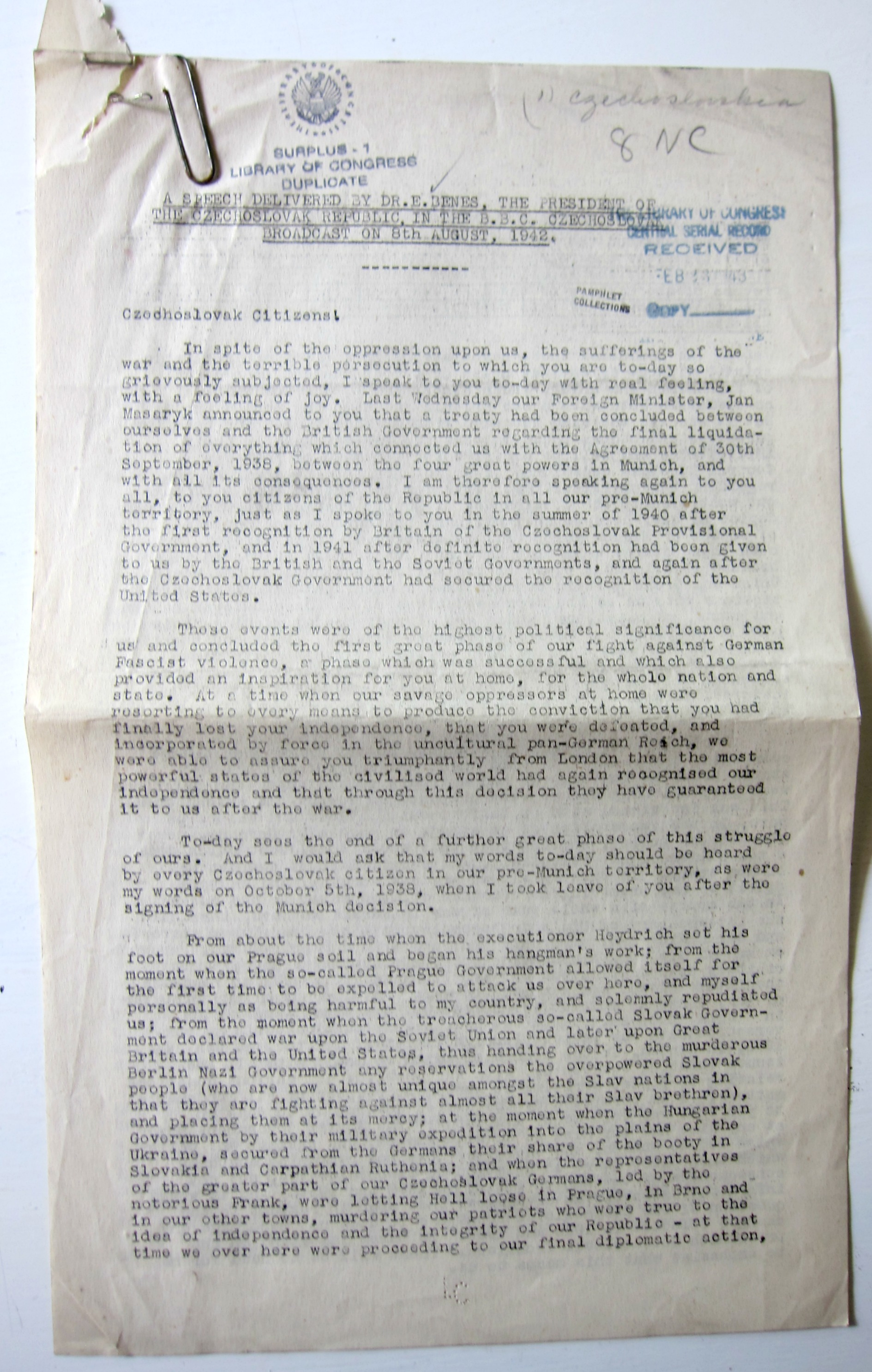
    “I am speaking to you once again since the time of the bloody persecutions to which you have been subjected from the inhuman German regime since the shooting of Heydrich”

    This morning I’m sharing a scarce document1of a radio broadcast for 8 August 1942 made by the president of the Czechoslovka Republic, Edvard Benes. In this address Benes (1884-1948) announces the formal nullification of the dreaded Munich Agreement (or Munich Diktat in Czechoslovakia) of 30 September 1938 in which the infamous “Peace in Our Time” appeasement was made with Hitler granting the Nazis annexation of certain parts of Czechoslovakia, and without the participation of the Czech government. Benes, who was the president of Czechoslovakia then in exile in London, reports on the action of Jan Masaryk concluding a treaty with the British government on the “final liquidation” of the Munich agreement and the return of the seized lands come war’s end.

    I’m sharing this now as I can find no trace of the address online nor is there any sighting of it in WorldCat or OCLC.  The full document follows the page-break:

    Benes 1942 front


  • Bad Places to Be (continued)

    JF Ptak Science Books   Quick Post

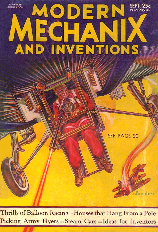
    I used to think that the belly gunner (in a ball turret) in a B-17 (or B-25, or PB4Y-1) was about the most dangerous/wrenching position to be in an aircraft. Here’s another, slightly earlier version of that, s cringeworthy effort without the protection that went along for the gunners in those other aircraft: 

    ModernMechanix Oct 1932

    [Source: http://www.magazineart.org/main.php/v/technical/modernmechanix/ModernMechanix1932-09.jpg.html]

    This is from Modern Mechanix for October, 1932–that’s a date I needed to check out because the position of this gunner looked so treacherous and exposed.

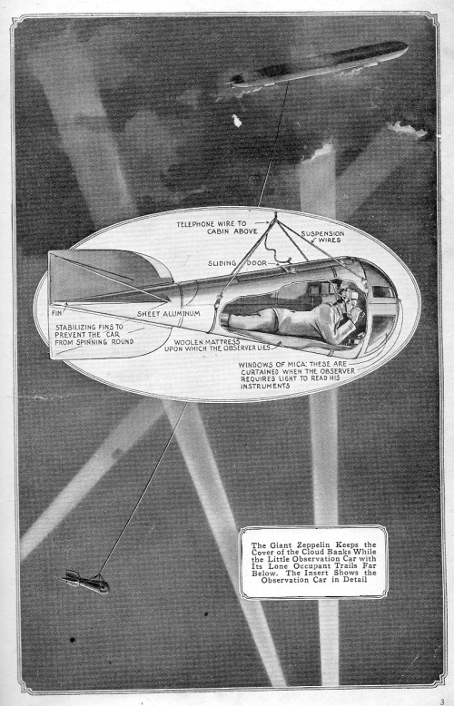
    In the same vein is this stone-cold illustration found in the January 1917 issue of Popular Mechanics. This was just a bad place to be: in a 14′-long bomb-like aluminum casing, hanging from a 3000′ 3/8″ cable suspended from a Zeppelin, trying to relay the positions of whatever you could find, and with people shooting at you. At least, though, the observer had a woolen mattress on which to lie (so says the caption).

    Aviation zeppelin bad place

    ·Posted by :

    ·in:


  • Vanderpoel’s Futuristic Designs and a Color Tile Catalog

    JF Ptak Science Books  Quick Post 

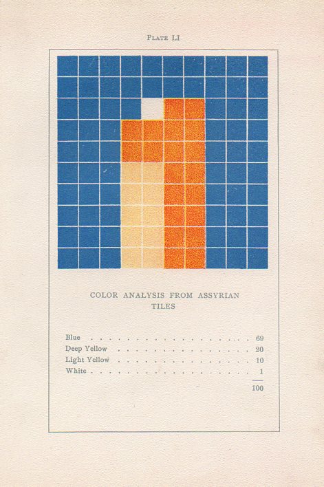
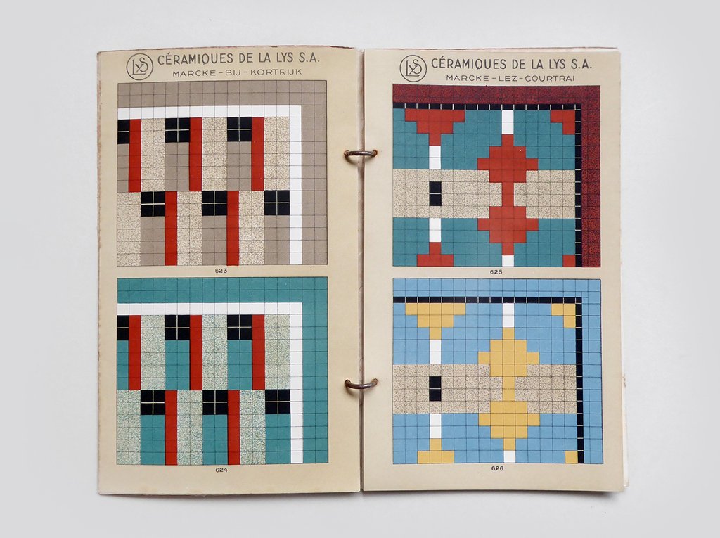
    Vanderpoel assyrian tilesWhile looking through a London stationer’s website for Blackwing pencils I found on their site a catalog for a floor tile maker that strongly reminded me of a gorgeous turn-of -the-century art book.

    I’ve written several times1 on this blog about the non-pre-discovery and non-pre-discovery-recognition of nonrepresentational art by the fabulous art theoretician Emily Vanderpoel. She wrote a a lovely and mysterious book in 1901 (a second edition appearing two years later)  called Color Problems for the Layman, in which she sought not so much to analyze the components of color itself, but rather to quantify the overall interpretative effect of color on the imagination–I think.  I know this sounds begging and vague, but I really haven’t been able to make much headway in the work, though it seems to display the occurrence and frequency of general colors in 100-block distributions. Vanderpoel seems to take the overall sense of the colors of, say, a Greek vase or mummy cloth or a teacup and saucer, and display the overall effect in her grid. As I said the procedure escapes me but the net result is beautiful. 

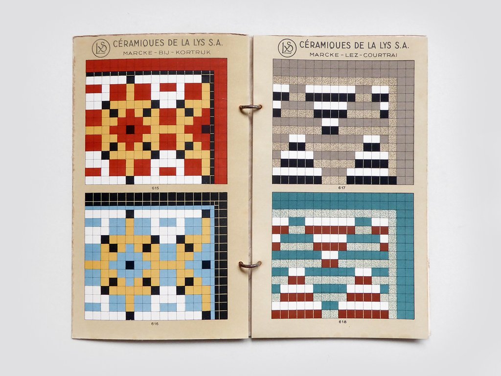
    The 1940’s tile maker’s illustrations of samples of their work are also quite strong, and as you can see bear some similarities with the Vanderpoel:

    Tile catalog Belgian _1_

    Tile catalog Belgian _2_
    [Tile image source: from the store perfectly-named Present and Correct https://www.presentandcorrect.com/collections/ephemera/products/tile-catalogue-1940s]

    Offhand I guess you could say that any of cubist/block/tile/mosaic designs could remind you of Vanderpoel–but not so, and in ways I can’t fully explain. It is something about the distribution and very involved nature of these tiles that pull it towards Vanderpoel…and perhaps it is the color selection. I’m not sure.  I have perhaps a dozen tile manufacturer catalogs from about this period (1930’s/1940’s) and none have struck me as strongly as this one does in its “relation” to Vanderpoel. In any event, there seems to be a “there” there. 

    Notes:

    1. Here are some links to the posts on Vanderpoel:

    • https://historyofideasblog.com/thesciencebookstore/2010/12/what-color-is-an-unintentional-modernist-masterpiece-of-book-illustration.html
    • https://historyofideasblog.com/thesciencebookstore/2008/04/shaping-space-a.html
    • https://historyofideasblog.com/thesciencebookstore/2015/02/mummyii.html

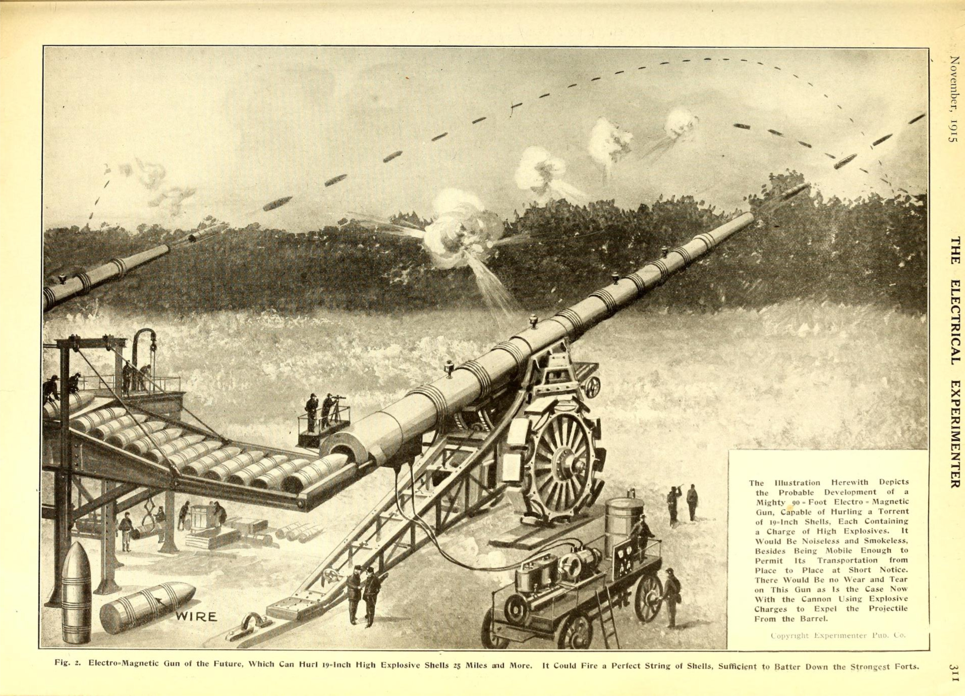
  • Big, Big Guns (Real and Imagined)

    JF Ptak Science Books   Post 2763

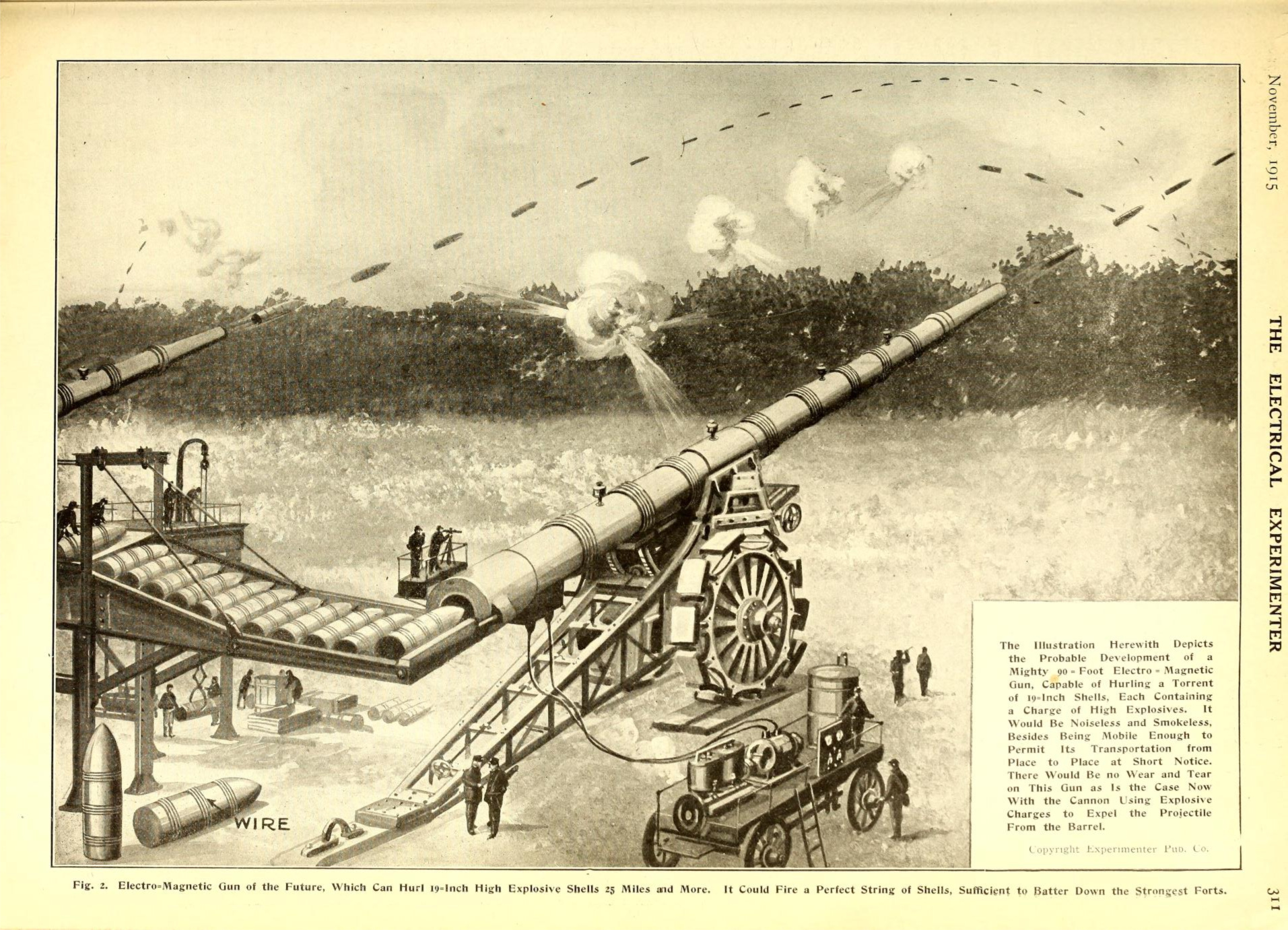
    While looking for an article on the imaginary gatekeepers of Martian canals in The Electrical Experimenter (1915) I found this illustration for a piece of speculative military tech (first image, below). The annoyingly-capitalized caption states this to be an “Electro Magnetc” gun 90′ long and rapid-firing 19-inch (480mm) HE. I guess they were somewhere along the very early reaches for the idea of what would become the contemporary EM rail gun being developed by the U.S. Navy. The power source for the gun shown above is not quite what the Navy has developed, as they employ something along the lines of a multi-million ampere pulsed DC power supply that creates the conductance to launch a shell with a muzzle velocity of 3500 m/s. At this point you don’t need explosives to cause damage at the other end–you just need a projectile. The 1915 version is far offline, except for the initial idea, which is a good one. Besides the shortcomings in the implementation realm of this weapon the writer here doesn’t have a very long vision for the future of warfare, saying that his cannon would be devastating to “forts”. This idea I thought was certainly quaint when written given that WWI was already into its second year, and unless by “forts” the writer meant “trenches”, this visioneer was very visioneering.  

    Electrical experimenter 1915 long gun[Image source: https://archive.org/details/electricalexperi03gern/page/350  Click to expand for a clearer image.]

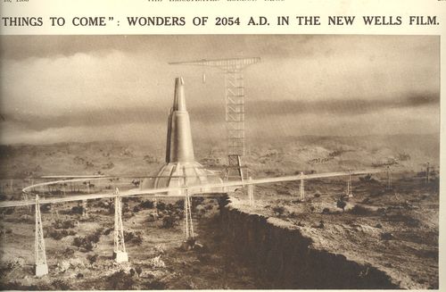
    Massive, monster cannons have existed for many years in idealized and theoretical, speculative worlds, like Tom Swift and his Monster Cannon.  In the history of early imaginary big guns H.G. Wells’ Babel-like cannon (pictured below in a still from the movie Things to Come (1936), an adaptation his The Shape of Tings to Come from 1931) is monumentally fabulous –1500 feet tall, with what looks like a  750′ base, all of which launched a 75′ tall capsule beyond the Earth’s

    Canons big wells

    gravitational pull with a spectacular explosiveness that would’ve made its occupants into instant jelly.  Tangentally-speaking here the launching of an object to escape the Earth’s gravity didn’t occur until 1946 when the highly-problematic but nevertheless-genius Fritz Zwicky fashioned a device to an experimental V-2 and via an electric explosive charge punched some object into space.


  • A First Alphabet of Missing “Firsts” in Art

    JF Ptak Science Books   Quick Post

    Keeping track of the first time something appears in a reproduced form is an interesting and perhaps useful exercise…well, it is at least diverting and occasionally helpful in connecting a few other disparate bits. I’ve wondered about some of this throughout the course of the blog, like the first time the Sun appears with a smiling face, and the first appearance in print of the spectrum of a star other than the Sun, or the first appearance of a portrait of Einstein (or Newton, or Goedel, or Feynman, or FDR), and so on.

    Sitting in the airport parting lot and waiting on the arrival of a plane (and after seeing a very unexpected flyby of a number of Sikorsky Super Stallions) I thought about what might be unusual objects and when it was that they first appeared in art, and organized them alphabetically. For example, when did an Adding machine of any sort make an appearance in a work of art? A Barking dog? A Crutch or cane, and then a broken crutch or cane?  A Dinosaur? (Or dead horse?)  An Eclipse? A Fork? (Also the representation of human Frailty?) A Girl, a House on Fire, an Incision, a Jail?  When does a Kitchen appear (though this may be one of the easiest to answer)? Where do we find the first Library depicted in art, or the first Microscope? When does the first Nighttime scene appear? How about the first image in art displaying the law of Octaves, or Pi, or a Quagmire, or a Ripple in a stream? And when does the first Stirrup show up, and the first Signature of an artist, or the first Toothless Smile? And what about leafless Trees, and Underwater scenes? When do we see the first Visions or dreams enter the artistic landscape, or the first Wire, or Yawn, or the number Zero? 

    So there you have it. If you have any answers to these questions, please do share, as I don’t have the answers (though I have some guesses, or approximations of a time period).  Probably there are some quickish responses for the first signed artwork, and the first appearances of the fork, and stirrup, and microscope. We’ll see. 


  • Submarine Cross Sections

    JF Ptak Science Books   Quick Post

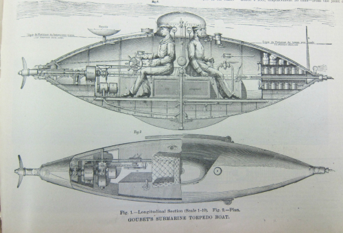
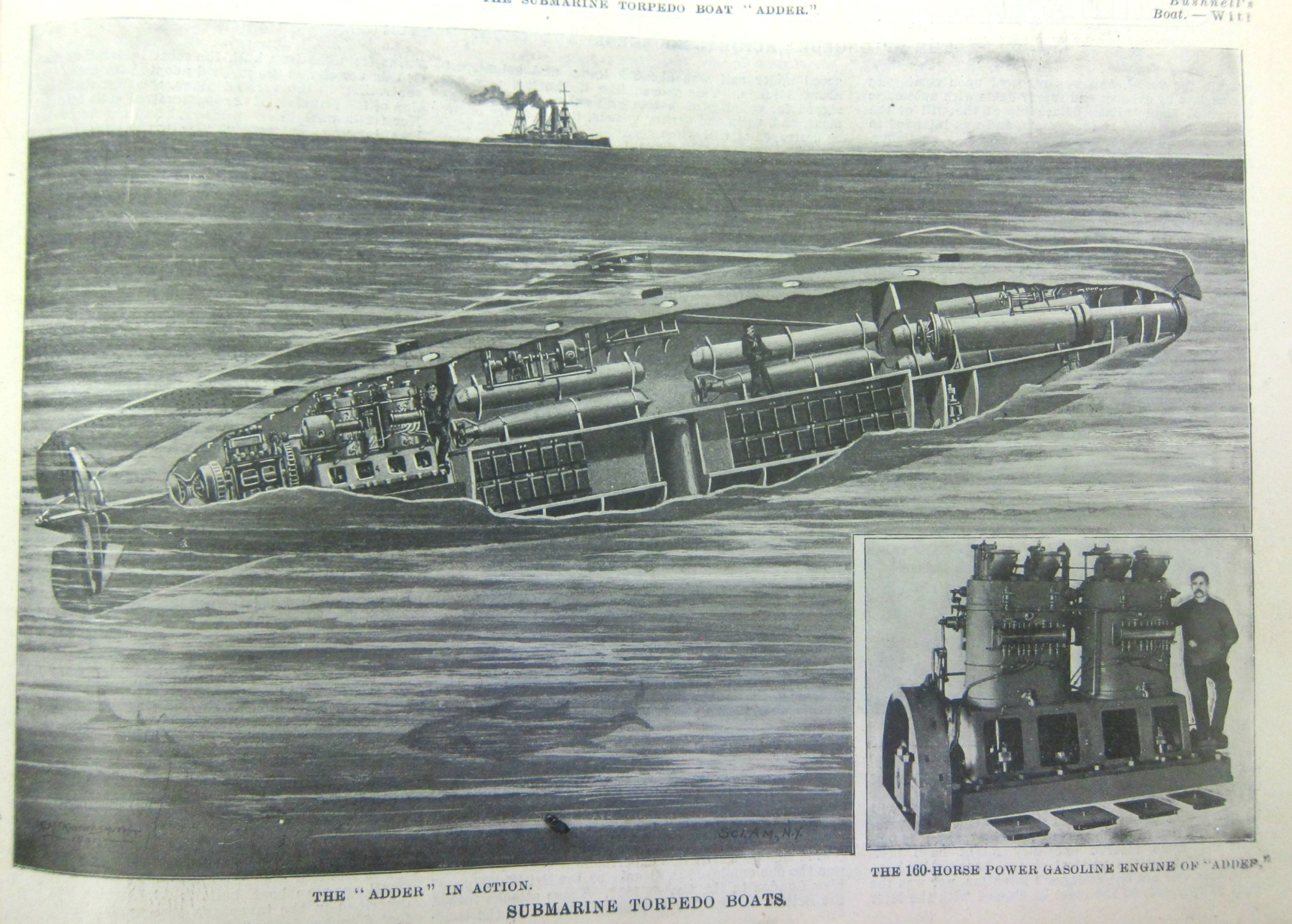
    This is a simple post adding to the collection of cross-section and cutaway images on this blog (see  https://historyofideasblog.com/thesciencebookstore/crosssections/ ). All of the images below are found in the February 15, 1903 edition of Scientific American Supplement: 

    Subnarine 4

    Subnarine 4


  • A Good Question on the Canals of Mars: “Are They Really There?” (1903)

    JF Ptak Science Books  Quick Post

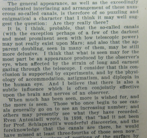
    Edmund Ledger (1841-1914, 38-year Member Royal Astronomical Society, professor of astronomy at Gresham College, 1875-1914) asks an excellent question in his short article, “The Canals of Mars”, in the Scientific American Supplement of 1903 (#1434 June 27, 1903, p 22983-4). He quickly reviews some current thinking on Schiaparelli’s canali and their reception as “canals”, made by Martians, and in his doubt asks the question: “Are they really there?”1

    Mars Ledger

    The canals had been questioned before of course, including by Ledger himself. Earlier in 1895 Ledger described one impossibility of the Seechi-named and employed-by- Schiaparelli canali as canals just in their sheer size: that in order for astronomers to observe the canals that they had to be at least 20 miles wide in addition to being thousands of miles long…a feat too great for anything to accomplish, something far beyond comprehension. (The Suez canal, completed not long before this, would have been nothing compared to the Martian works, being just about five times as long as the canali were thought to be wide. Also thinking no doubt would have been tempered in a bad way—like a poorly tempered anvil and its unpleasing response to being struck by a hammer—by the French failures in the decades that they squandered trying to build the 50-mile-long Panama Canal.)

    ·Posted by :

    ·in:

    —

  • Bubbles, Anti-Bubbles, and Reflections (and Not)

    JF Ptak Science Books   Post 2758     

    [For Jeff Donlan, Extreme Answer Lad of Answers!]

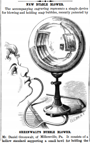
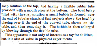
    This article was just a small 4″ or so notice  in the Scientific American on 2 August 1879, written for a new sort of apparatus to make bubble-blowing easier, or more effective, or “rounder”, or less anti-bubbly. (Actually that last would be a trick though I guess you could rig something like this up in an anti-air-breathing way, to create a bubble of liquid encapsulated by a layer of gas surrounded by a liquid. This is actually pretty easy to do standing around and would probably be a much harder thing to accomplish if you needed an apparatus for it. By the way “anti-bubble” should not be associated with the “Dirty Bubble”, which is a character from SpongeBob SquarePants.) 

    Back to the illustration: it is only about 2″ tall and a bit of a “filler”, but enough care is given it that it displays something which you never really see on bubbles in artwork: a reflection of an image! 


    Sci Am 1879 bubble blower _1_

    Sci Am 1879 bubble blower _2_

    If you go to Google and search out Renaissance/Bubble/painting or some such, you will find a number of examples of fine-looking bubbles: Gerrit Dou’s young boy blowing bubbles has life to the boy but not so much to the bubbles he’s blowing; J.E. Mallais bubble boy also has some somber fun but little exclusivity is paid to the bubble, same to for Naiveau, and de Gheyn; David Bailly’s self portrait has three happy bubbles with flair and color, and Desjardin’s allegory’s bubble maker is standing on a bubble with a fair amount of color and light to it. Even  the much-reproduced “Soap Bubbles” (ca. 1733-4) painting  by Jean Siméon Chardin (1699–1779)–which is perhaps one of the most famous antiquarian paintings involving bubbles–finds us with a bubble that is not very bubbly, without much reflection and optical interest…a too-subtle bubble. Not so in this image above, the anonymous artist collecting the 25-cent fee and giving the bubble some of the greatest bubble-life that I’ve noticed. 

    One thing those older artists do have a feel for more so than this piece above is the thinness of the wall of a bubble–here it looks pretty defined whereas with the others you get a real sense of lightness and fragility (though hardly knowing the thickness in terms of ^…as a matter of fact some of the artists mentioned were active before Newton, others before Huygens, and all before Young.) Anyway even though the business of bubbles seems to be kids’ stuff, with children playing at making bubbles in the artwork mentioned above, bubbles are worthy of some real thinking–if you understand bubbles (and anti-bubbles), you can address a fair amount more than that. 

    [I can’t really tell what the bubble-blower is seeing, what is being reflected, though one of the objects definitely seems to be a painting…]

    ·Posted by :

    ·in:


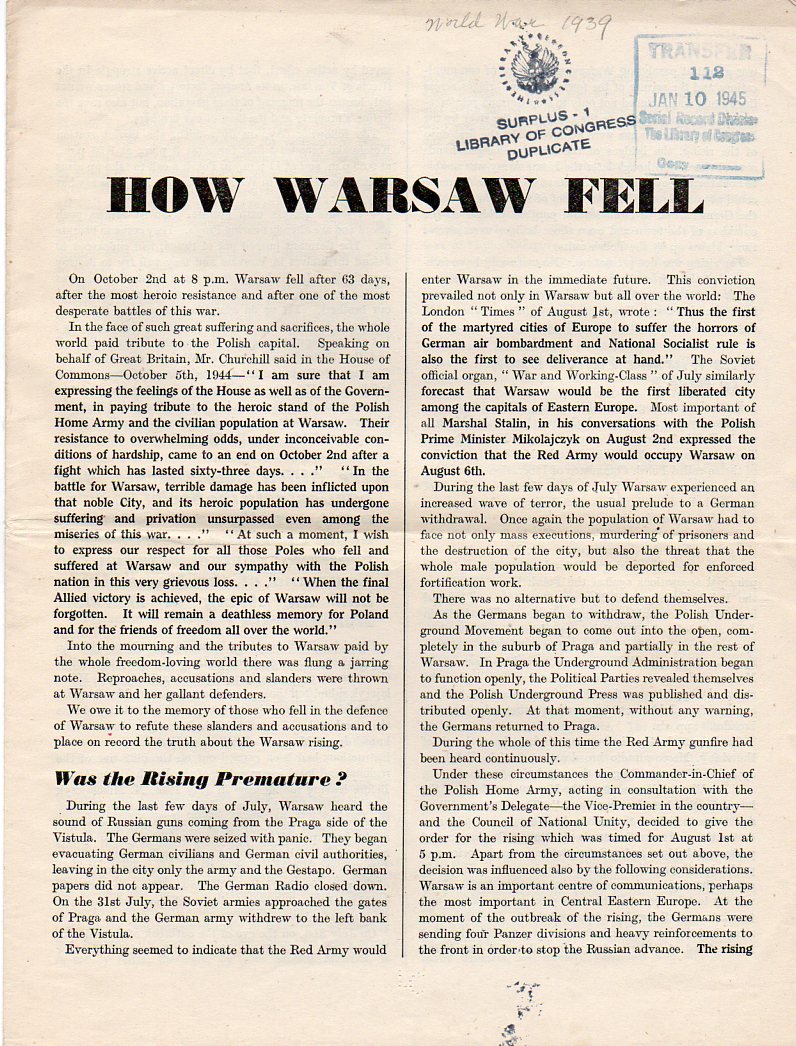
  • How Warsaw Fell (1944)

    JF Ptak Science Books  Post 2757 (expanding an earlier post) 

    The bottom line of the 63-day-long Second Warsaw Uprising (August/September 1944) is that the Soviet Union allowed the Polish Home Army to fail, watching from its position across the Vistula as the Nazis and Poles slugged it out, both exhausting themselves, the Nazis ultimately defeating the Poles, eliminating most of the Soviet concern for the Polish military and government, allowing the Soviet Union to take the country over more completely when the time came a few months earlier.  It was the Soviets’ choice to see two enemies annihilate themselves to have more control over Poland and immediately turn it into a vassal state when it rolled into Warsaw in January, with 85% of the city destroyed (“at the moment of its fall practically the whole city was [razed] to the ground”) and 600,000 of the city’s population  dead, along with 80% of the Home Army. 

    • Full text (though not from my copy) here, at Instytut Józefa Piłsudskiego w Londynie :http://pilsudski.org.uk/archiwa/dokument.php?nonav=&salatka=1&nrar=709&nrzesp=108&sygn=88&handle=709.238/632

      Warsaw774

    ·Posted by :

    ·in:

    —