JF Ptak Science Books Post 2765
So this is a loose-and-pulled-thread post–I bumped into something that led me somewhere coming face-to-face with an interesting reference to an unusual “first” in the history of cartography. I found the map and (correct) reference and tracked it down to the great Comptes Rendus. The map is the first one to use contours to convey statistical information. It was a short article and I was very curious to see the illustration of the map–I discovered that the paper written on an significant innovation on the display of information did not display the information. No image! This is one of those scarce article describing a breakthrough in the visual representation of data that doesn’t use an illustration of the pioneering work. After I figured it out that the description of the map was for the breakthrough map in question and satisfied with my read and translation of it, I went ahead and wrote a description for its sale on my blog bookstore. I was about to upload it but stopped to check out the mass database for booksellers called Addall dot com and found somebody had a loose issue of the document offered for sale at eight bucks! That was a disappointing end to an hour+ of research. The person selling the paper for $8 did not know what the article was all about, I reckon, since I thought it was slightly valuable…still, it was a damp blanket to shoulder on a wet and stormy night. Lastly, I should note that I haven’t yet found the original source for the map’s image that I was able to display here–I’ll hopefully do that in due course.
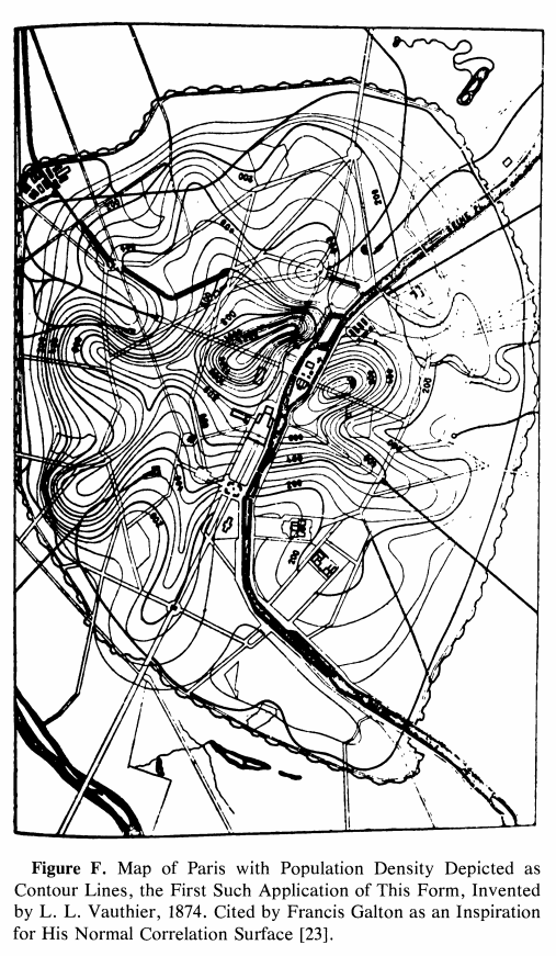
The paper was by the lyrically-named Louis Leger Vauthier (1815-1901) and titled “Note sur une carte statistique figurant la rapartition de la population de Paris” (found in the Comptes Rendus des Seaances de L’Academie des Sciences, 1874, vol 78, pp 264-267). It is evidently the “first statistical use of a contour map” according to https://infovis.info/ In a more expanded and restrictive description from Wikipedia, we see that Vauthier “…is credited with one of the earliest (if not the first) thematic map to use contour lines to display a non-geographic variable on map— a contour map of the population of Paris in 1874”. This is probably the more accurate and definitely more qualified description.
In any event the map as I said is described, but not pictured, which is pretty unusual to my experience. I did find a picture of the map here: James R. Beniger and Dorothy L. Robyn, “Quantitative Graphics in Statistics: A Brief History”, in The American Statistician, vol. 32, no. 1, pp. 1–11, 1978
And: https://www.sci.utah.edu/~kpotter/Library/Papers/beniger:1978:QGSH/index.html
The Vauthier article starts out with a simple statement about the map adopting the use of the terrain relief and using it to show the distribution of the population of Paris, using terms and descriptions that were already established and “quite familiar”:
- “Cette carte a pour objet de figurer, au moyen du procédé graphique généralement adopté aujourd’hui pour représenter le relief du terrain, la manière dont la population de Paris est répartie. En topographie, le relief s’acccuse par des courbes de niveau, s’échelonnant à diverses hauteurs au-dessus ou au-dessous du plan de comparaison adopté. Les plans, ou, plus généralement, les surfaces de niveau contenant ces courbes sont, d’habitude, pour la facilité de l’interprétation, conçus équidistanis, et l’on complète la description en inscrivant sur chaque combe la distance au plan de comparaison.”
- “La carte de la popidation procède de notions tout à fait analogues. Les courbes sinueuses qui y sont tracées passent chacune par des points ou la population est la même: ce sont, quant à la population, de véritables courbes de niveau. Elles sont équidistantes, en ce sens qu’elles s’échelonnent par degrés égaux de variations de la population ; quant aux nombres inscrits sur chaque courbe, ils représentent le nombre d’habitants à l’hectare. Ces brèves indications nous paraissent suffisantes pour que toute personne habituée à la lecture des cartes topographiques lise la nôtre sans difficulté. 11 nous reste à expliquer ce qu’est la surlace que nous avons représentée, quelle est sa génération et comment, en dehors des courbes de niveau qui y sont tracées, elle doit être conçue dans l’espace.”
The article continues in depth in the description of the data and how it was collected.
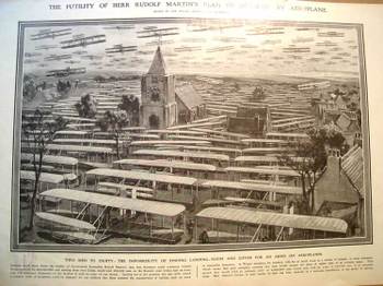
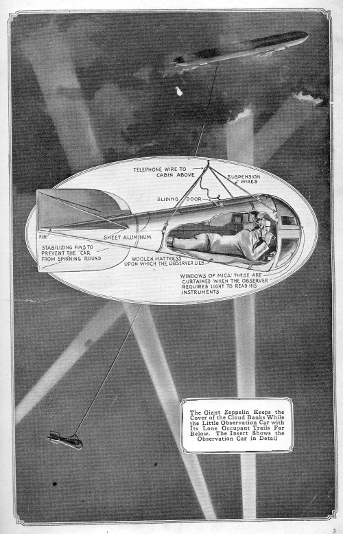
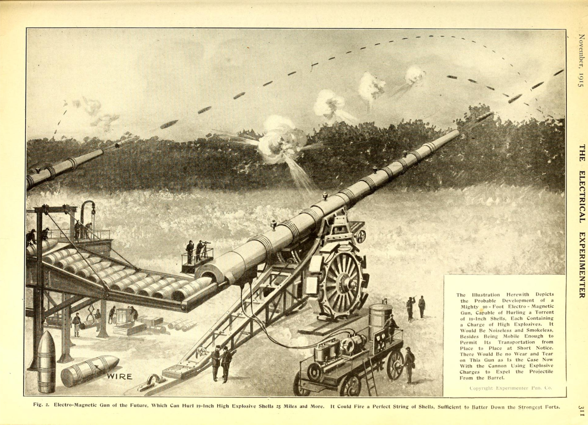
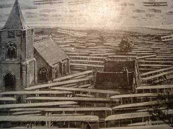 “Nothing could show better the futility of Government Councillor Rudolf Martin’s idea that Germany could construct 50,000 flying machines for 50-million pounds…and land 100,000 men on the Kentish coast from Calais within half an hour.” I would imagine that this illustration drove the point home to the folks who didn’t actually bother to read anything about the Martin defense plan. (It was in a similar way that Thomas Nast was able to control public opinion and sway political refuge and protection away from Boss Tweed. Tweed famously boasted that he didn’t care what the newspapers said about him because his power base didn’t read–he might’ve been and probably was correct here, so Nast took after Tweed via the political cartoon, and big too, and frequently; and the cartoons, even if the people looking at them couldn’t read, told the whole story graphically, and it was this that brought an end to Tweed more than anything else.)