A Daily History of Holes, Dots, Lines, Science, History, Math, Physics, Art, the Unintentional Absurd, Architecture, Maps, Data Visualization, Blank and Missing Things, and so on. |1.6 million words, 7500 images, 4.9 million hits| Press & appearances in The Times, Le Figaro, Mensa, The Economist, The Guardian, Discovery News, Slate, Le Monde, Sci American Blogs, Le Pont, and many other places… 5000+ total posts since 2008.
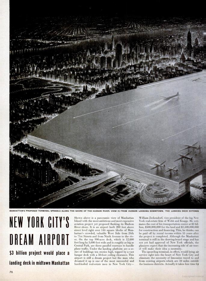
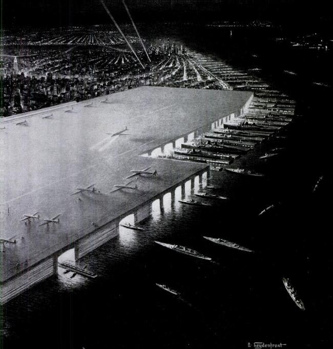
I think that I’d like to introduce a subset in my Bad Ideas category: Bad Flat Ideas. To start it off, I found this very lovely example in LIFE magazine for 18 March 1946, the brainchild of generally-appropriate real estate mogul William Zeckendorf: a spectacularly bad idea of installing a rooftop airport along a very long swath of property along the West Side.
It seems as though the airport would extend from the bottom third of Central Park south to, well, I really can’t tell, perhaps lower midtown? Honestly, it doesn’t matter. For all of its size it actually isn’t quite big enough, looking like there’s maybe 10 or 20 plane lengths margin-of-error at the end of the runway. Plus there’s the *no* margin of error bit for the edges of the airport, which assumes that no plane will ever topple over the table top. Plus a host of other pertinent stuff.
The penultimate line: it is also incredibly ugly, a definition of architectural ugliness that few projects could match.
The bottom line though to this project was the bottom line: in the end, the Manhattan Airport would save about 15 minutes travel time to Philly over Laguardia.
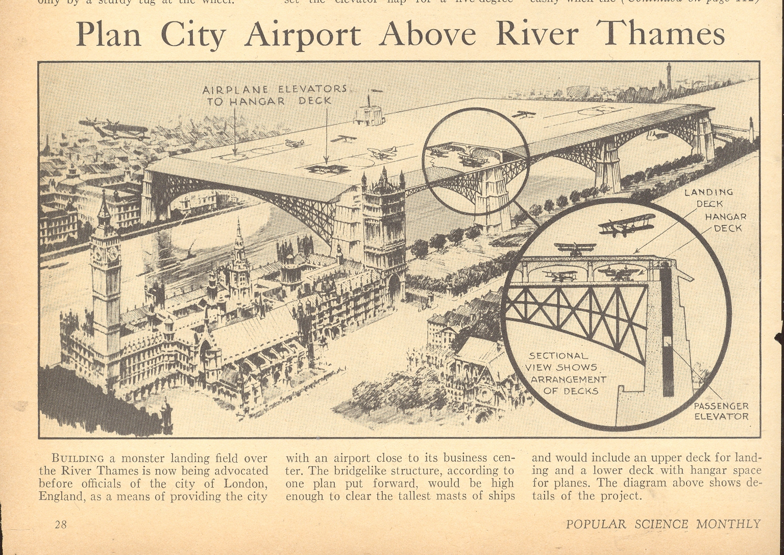
I should not leave unmentioned the unmentionable project proposed for poor London (which I wrote about late last year here):
Having just finished a post here on missing and duplicated-in-outer-space New York Cities, we return to the more grim possibilities of pre-Cold War cityicide.
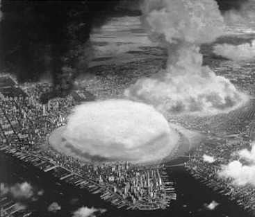
I haven’t seen very many images at all of NYC under attack, and this one from nuclear attack on NYC from Collier’s Magazine (1948) is fantastically poignant, showing perhaps three ground-bursts of atomic bombs in Manhattan and Brooklyn. At the time, 1948, the Soviets had just developed their bomb and I think had no way of getting one here. But this didn’t speak to the future, and my guiess is that Collier’s was just taking it a little easy with the popular reading clientelle. I can’t remember now how many weapons would’ve been targeted at NYC by the mid-1950’s, but I know it wasn’t a simple dozen.
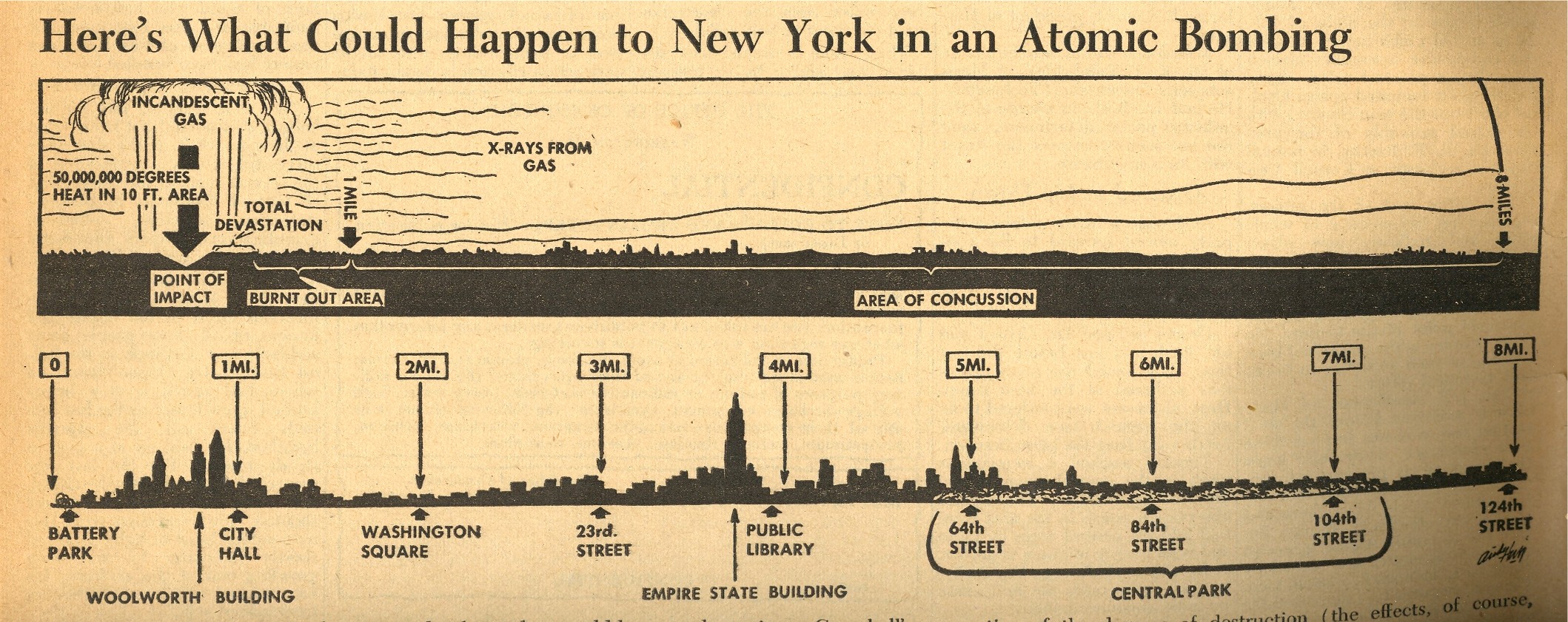
A lateral view of this sort of explosion in Manhattan was presented in an extraordinary issue of the liberal PM Magazine, issued with a 7 August 1945 date (though I think it came out a few days later). This would have been just a day after the Hiroshima bombing, and the 12 pages of dedicated coverage t the atomic bomb was really quite spectacular. Included is the following small graphic that appeared on page seven which shows what effect the Hiroshima atomic bomb would have if dropped on New York City—it was no
doubt gigantically sobering to anyone who looked at it, and brought the power of
the bomb and its destruction to a common, understandable point.
I’m not an historian of the first newspaper coverage of the bomb, but
it strikes me that this may well be the first graphic to depict the
effects of an atomic bomb exploded over NYC.
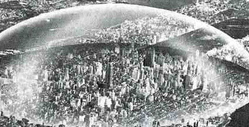
Seeing the Collier’s pictures makes it that much more difficult to think about the idea of Buckminster Fuller that would help rid ourselves of radiation anxiety (which I wrote about earlier, here). Fuller’s idea is multiple orders of magnitude removed from the
original idea of the arcade, constructing a dome1 to encapsulate NYC
from the East River to the Hudson along 42nd St, and from 64th to 22nd
St: that’s two miles in diameter and, plus a mile high (or about five
Empire State Buildings pile one on top of the other). I’m not so sure
how this would be built, or how things would be heated or cooled, or
what the construction material was for the skin of the dome, or how
people get in and out, or how you deal with heating and cooling, or how
any noxious chemicals are expelled—but Mr. Fuller thought that the
savings alone from snow removal from NYC streets would pay for the dome
in ten years.
Mr. Fuller also thought that the dome would protect the city (or
this part f the city) from radiation fallout. That could be true,
assuming that of all the hundreds of nuclear warheads that the Soviets
would’ve launched against NYC alone none of them would’ve found their
target, except perhaps for the Ridgways or Staten Island, where the
shock wave or winds produced by ensuing firestorms would not have
disturbed the dome. Of course if a warhead actually came close—or
actually hit—the dome, the protection from radiation would be moot.
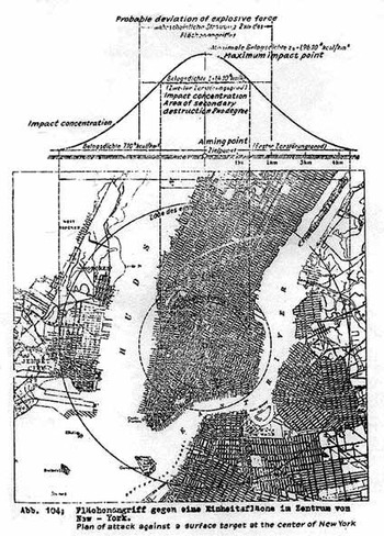
Another odd and stomach-wrenching image comes from that devilish scamp Eugen Sanger (dead before he was fifty,
1905-1964), a German rocket designer and engineer for the National
Socialists, went to work for the French Air Ministry following the end
of World War Two after doing his all and thankfully falling short for
the Reichsluftfahrtministerium (RLM, or “Reich Aviation Ministry”).
He
worked without rancor there until he was nearly kidnapped by Joe
Stalin—for the purpose I suppose of continuing work on what may have
been his greatest effort, unfulfilled during the war years—the Amerika
Bomber. The Soviets evidently thought that this might come in handy in
1947.
The Sänger Amerika Bomber (or Orbital Bomber, Antipodal Bomber or
Atmosphere Skipper) was designed for supersonic, stratospheric flight,
and had much more bang for the buck than the V2 (10000 feet/second
exhaust velocity, as compared to the later V-2 rocket’s 2000
meters/second, 6560 feet/second) and since it was stratospheric had a
far greater range, coming in at better than 14,000 miles. The
22,000-pound weapon carried one large 8000-pound free-falling bomb.
Sanger’s idea in the early 1940’s was to get this bomb to around
Times Square. And since the Amerika Bomber was a relatively inexpensive
weapon compared to the damage it could cause, there was room for
producing a lot of them.
Seeing Manhattan in the cross hairs like this is quite sobering, and it is an image that is rarely made.
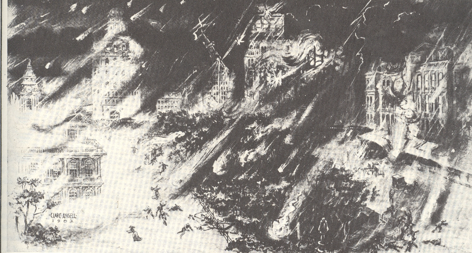
Another attack on Manhattan depicted here comes from above, way above, Manhattan decimated by a meteorite “shower” of enormous magnitude. The image appears in an article by Hudson Maxim (1853-1927, brother of the more famous Hiram) “How the World Will End”, printed in 1910, and shows dozens of small meteorites striking NYC in the City Hall area.
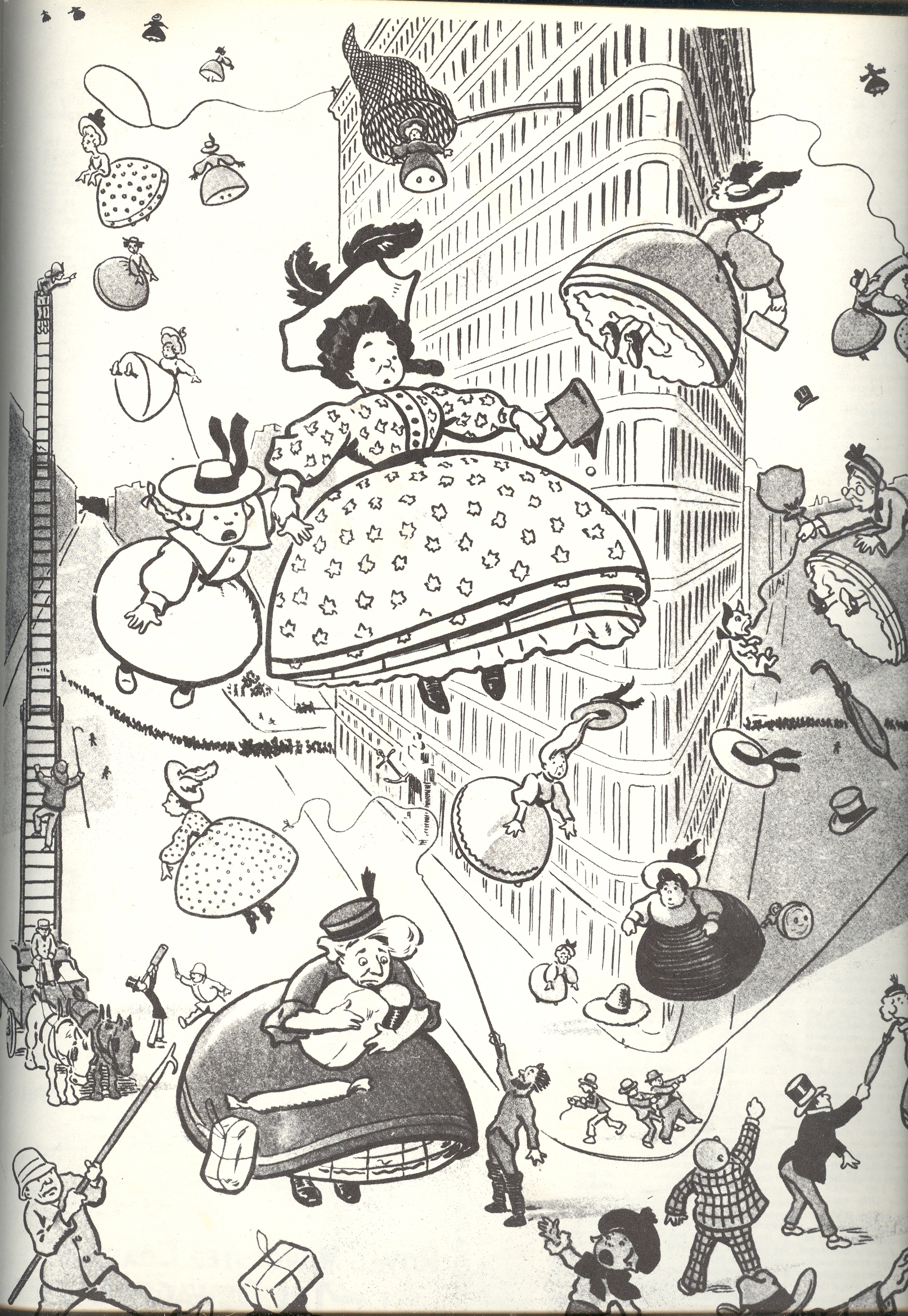
The last image comes from 1904 and–when taken out of context–it seems
as though Manhattan is in for the worst of it, with a view in front of
the Flat Iron Building of an aerial bombardment of women. This is
probably one of the few bad things that weren’t done with/at women, and
would actually predate the first use of explosives being dropped from
aircraft. Unfortunately the original, intended image was a poke at crinoline ,
and featured women being blown up into the air rather than the other
way around, though I like my interpretation better.
Notes:
(Source: Buckminster Fuller in Think magazine, vol 34, Jan/Feb 1968. AND of course the lovely work by Alison and Sky Michele Stone, Unbuilt America, McGraw Hill, 1976, pg. 99.)
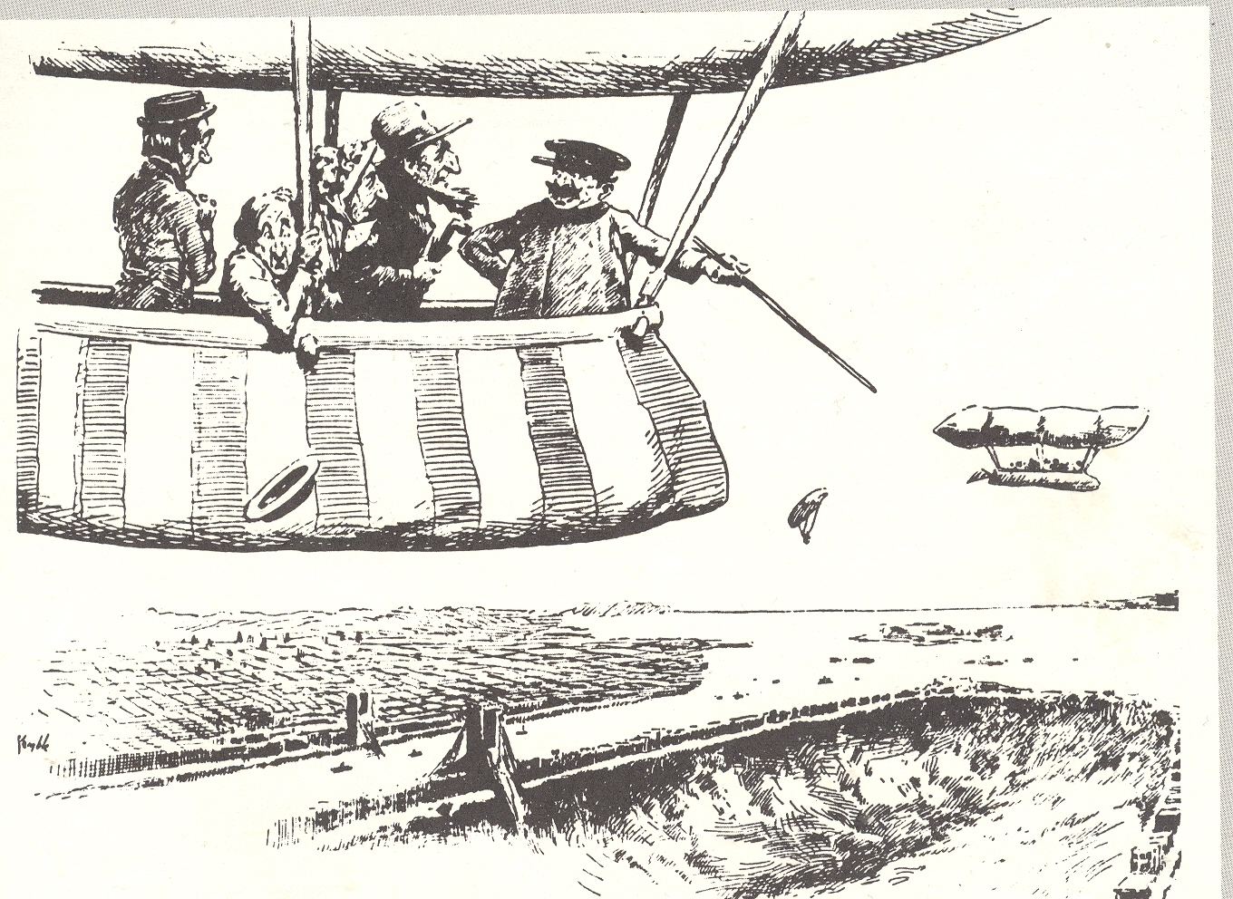
NYC has certainly had its imaginary/creative trials and tribulations over the last 400 years or so, but I must say that these two depictions of the state of the city are the most, well, unexpected as any I’ve ever seen. The first comes from 1902 and is a forward-looking appraisal of the chances of New York City in the near-future. The aeronaut tourists are being told by the aviator/carny–floating above Manhattan in the future, in the year 1920–that those chances are not very good, the city having disappeared under its own weight, sunk by the growing skyscraper1 population in a ground loosened by too-numerous tunnels. The cartoon is a joking editorial, of course, a riposte to the relatively new building jag that pushed big buildings to great new heights. [A post on more realistic views of the City of New York can be seen here]
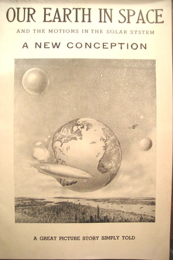
The second image on the other hand is not a farce; it is one of the strangest (published) unintentionally Outsider, unintentionally Absurdist/Dada works that I’ve ever seen. It appeared in a post at the very start of this blog (two years and 500,000 words ago) and it remains a capstone of Mondo Bizarro category2.
This 1941 pamphlet isn’t so much “interesting” as it is interestingly illustrated, where all
of the semi-coherent interest resides, the text having left coherence far behind, somewhere, in it own intergalactic dust.
This is the only known example of the depiction of
an extra-terrestrial New York City pictured with the earth in the
background.
Huh? Yes, this is the Big Apple in space—not its own
space but THE space, outer space—somehow, impossibly, removed to some
something-or-other (actually in this case, a “bubble”) that, while not
being the Moon, was something like it, though not actually a solid and
without gravity, floating on a base of floating effluvia and hope, but, well,
you get the picture. Whatever we’re floating on here (actually it is
identified as the “perisohere” (don’t ask)) is very big and very very
close to the home planet.
The author, David Gordon, is certainly after something, but what that “something” is I just don’t know. He starts things out for the reader asking a series of questions like “why does
the earth and other heavenly bodies remain in the air and submerged”, answering them with other questions.
In all of this Mr. Gordon produced a work of staggering incredibility, more so since it wasn’t an intentional science fiction effort, and in my book any time anyone reveals such a shocking piece of thought deserves a special kind of praise. I’m just thankful that the pamphlet was illustrated.
Notes:
1. The word “skyscraper” appeared in print only nine years before this cartoon (Harper’s Weekly, April 1893), thugh the necessary elements like heating and
cooling capacities, electrical lighting, plumbing [with appropriate, siphon jet
toilets], elevators with dependable brakes, had been in place since the 1880’s or earlier.
2.. One of the other capstone publications written about here is the monumentally bizarre work on sculpting in fat and lard:
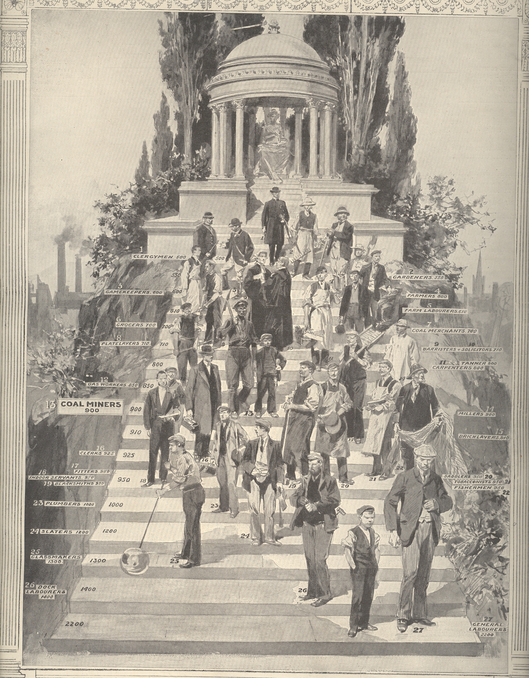
This pictorial graph shows the places in the temple of Hygeia1 of various British workers, their places on the stairs showing the possibilities of long life, or not.
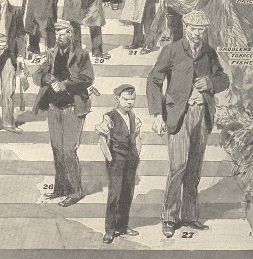
At the bottom: general laborers, the backbone of the society, ranking well down beyond virtually everyone else save for dock laborers. Unfortunately the scale at left—listing the progression of health, somehow, from 500 at the top to 2200 at the bottom—lists these two groups at 2200 and 1900, respectively., then jumping at third layer from the bottom at 1300 (glassmakers).That means that in the difference of 1700 between the top and the bottom that 90% of the classes represented were in the 500-1200 category (or a difference of 700 units) while the bottom two classes occupies the 1000 units; 80% of those represented occupy the first 500 units.I do wish that I knew what these numbers represented.
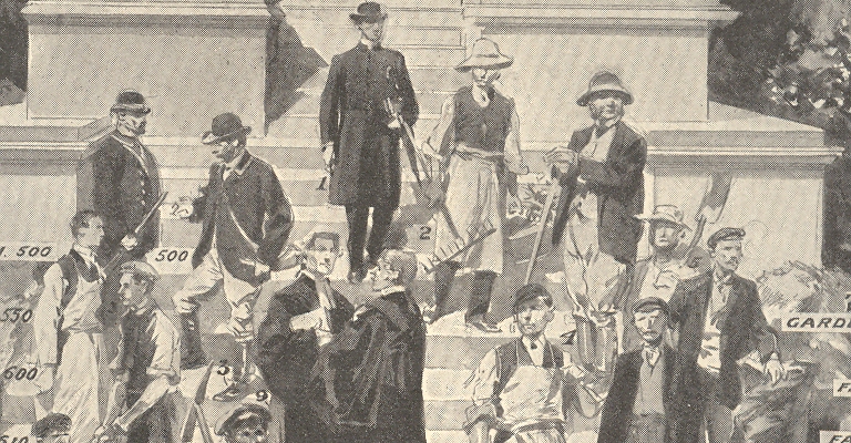
At the top of the list of health comes the clergy, followed by gardeners, gamekeepers and farmers.Next are grocers, farm laborers, platelayers, coal merchants and barristers and solicitors. Coming into the bottom steps of the health temple are tanners, carpenters, gas workers, coal miners, millers, clerks, bricklayers, fitters, indoor servants, blacksmiths, plumbers, saddlers, tobacconists, slaters, glassmakers, fishermen, dock laborers and general laborers.
It is interesting to note that in 1910 once a person in the U.K. or the U.S. reached the age of 60 their life expectancy was around 75; in 1850 this figure was 72.Today the life expectancy for this same group is 83 or so. Considering the enormous advances in medicine and medtech since then–in pre-Lister 1850 days there was still no sanitization of surgical instruments, for example—83 seems hardly Kurzweilian.
Notes:
1.Hygeia was the goddess of good health, and the daughter and attendant of the god Asklepios, a sister of Panakeia (all cure) and Iaso (remedy) and a companion of the Aphrodite.
Harold,
like the rest of us, had many impressions which saved him the trouble of
distinct ideas George Eliot.
A novel is balanced between a few true impressions and
the multitude of false ones that make up most of what we call life. Saul Bellow
No, this isn’t a story about the great saint but a much
lesser one.For centuries the pulse was
a vaguely understood thing reaching back into the murky medical past as far
back as Galen.The association of course
was with the heart, and the association of the heart was as the great
controlling center of all function and control of the human body—a theory that reached
far forward into the 16th century.
It is generally established that it was the fabulous work of
William Harvey (1578-1657) that brought into light the idea of pulmonary circulation,
but the idea was buried in a vastly-suppressed work by the brilliant and highly
problematic Michael Servetus (Spanish, 1511-1553).
Servetus (physician, cartographer, theologian, writer and
general all-adept Humanist of a high order) was in trouble with the church for
many reasons, not the least of which was trying to dislodge the theory of the
heart as sacred and the seat of wisdom. But he did establish that the heart was an organ, which didn’t sit well
with very many people, least of all the Calvinist court in Vienna
which found him guilty on many anti-Humanist grounds, including his
anti-Trinitarian Christology, which made him a reviled figure to Catholics and
Protestants.He was tried and found to
be dangerously heretical, and sent to the flames.(There was a practice at the time to burn
people alive using wet wood, providing a slow, baking environment in which the
subject was painfully nearly-baked alive before he/she was actually consumed by
the flames.People thought about this….In the engraved portrait of Servetus we see him being burned–along with his books, which are slow burning things, at upper right. As a matter of fact Servetus’ effigy was burned in some places along with his books, which explains the scarcity of some.)
Later on, Harvey
withstood blistering attacks on his correct statements on the circulation of
the blood (costing him nearly all the patients in his practice), though he at least
lived to see a brighter day: Servetus, on the other hand, didn’t, and was
burned at the stake for his heresies, one of which his attack on the spiritual
heart. (Plenty of others have paid for their insight and invention and would be
later celebrated Semmelweis wasn’t killed but did wind up in an asylum;
Galileo didn’t wind up in an asylum but did wind up imprisoned; Copernicus
wound up in neither place, escaping possible clerical criticisms by dying just
as his revolutionary work was published. Phillippe Lebon’s ideas for
illumination by gas were seen as ridiculous, as were the revolutionary ideas of
Edward Jenner and Luigi Galvani. Einstein’s 1905 ideas weren’t happily
received in France
for a decade, and David Hilbert’s impressions of mathematics in the middle of
the third decade of the 20th century was that it was “done”. )
And so I think we might as well remember Servetus today at
least as often as we do St. Valentine. Or multiple St. Valentine units—the name
seems to have been canonized in 496 ACE in memory of several people by this
name.At least Servetus had an
association with the heart in a positive way—I don’t know the Valentine/heart
connection though I suspect that at least one of them had their beating heart
ripped from their body.
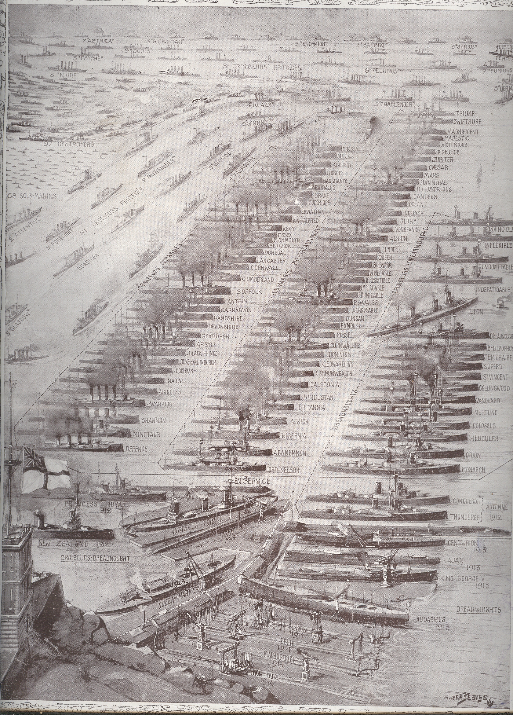
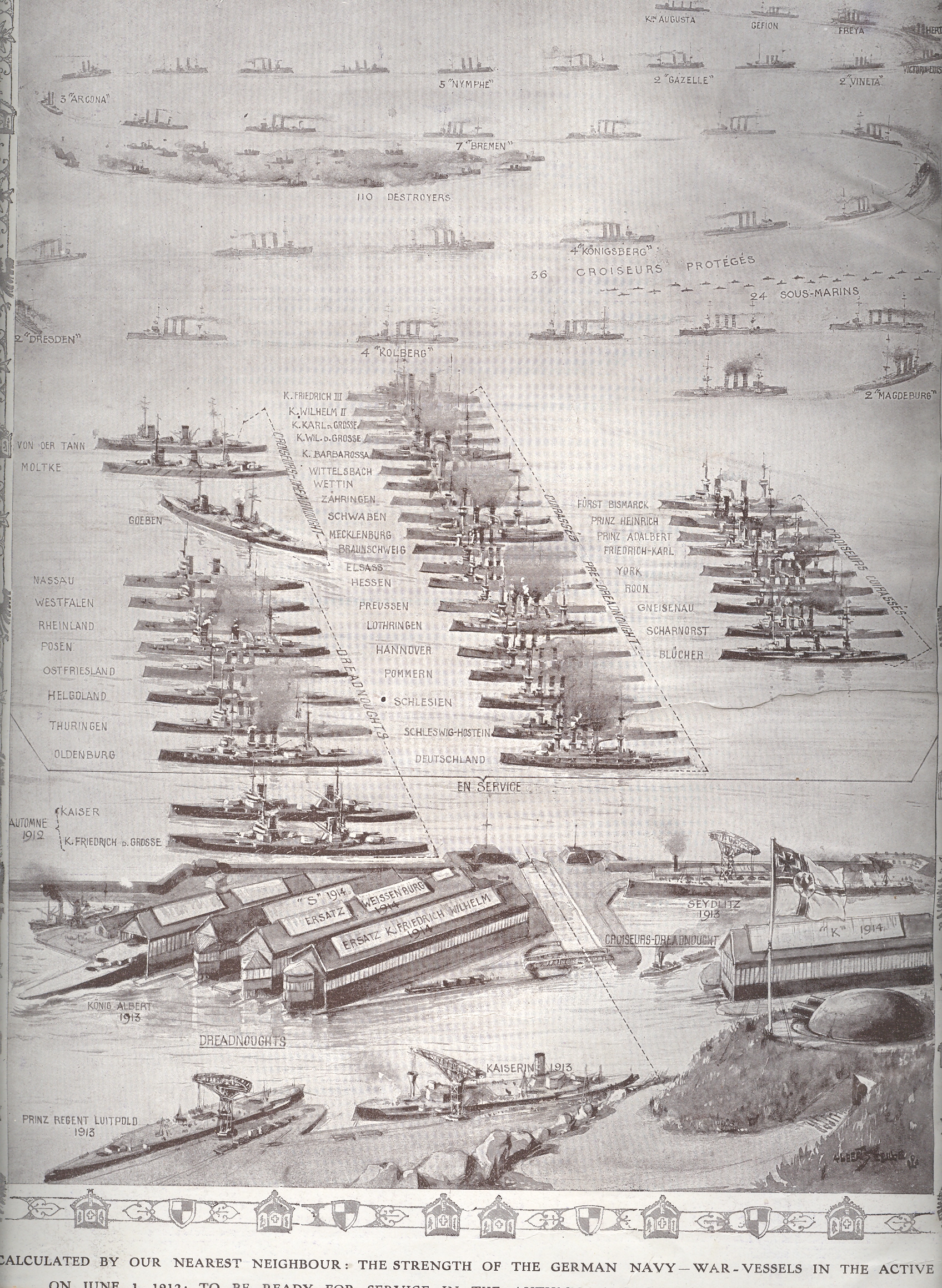
In the midst of a massive building campaign by Germany and a building-response by England the French journal L’Illustration published these two side-by-side pictorial comparisons of their two navies, which wound up being reprinted in the Illustrated London News soon afterwards in June 1912. [Royal Navy, left; German Navy right]
Germany began a rebuilding campaign in 1902 which by 1908/9 was seen by the British Admiralty as a “stab at the heart” of England’s military supremacy, and so the construction wars were undertaken.It’s a complicated period and a complex race, which I just can’t get into in a short post, so let’s just say that the Brits wound up the winners of the competition when these images were printed in June 1912.
The hidden element of some great importance, a trump card that would played in just 750 days, would be the small dot-like drawingslabeled “sous marins”. These would be the submarines, and it would be the subs that would be perhaps the most significant aspect of the entire German navy.
This was true in spite of what looks like an overwhelming preponderance of subs in favor of the Royal; Navy, where the count was 68 to Germany’s 24.It was really a question the type of sub, and as it turns out there were only 8 or 9 of the English count that could’ve been considered for blue water ops.
Germany began the war with 24 submarines in 1914; they recognized the ship’s importance and by war’s end ramped up production, winding up with 351 in total production and with 178 in action in 1918 alone. Of that overall number fully half (178) had been destroyed in combat, with another 11% sunk via other means. There were more than 12 million tons of Allied shipping destroyed by the German sub forces from 1914-1918 (half of that in 1917).
So these two illustrations do portray an overwhelming Royal Navy, but they certainly do not give any hit whatsoever to the coming importance of the German submarine fleet.
This
old nursery rhyme has more to do with plague than a skipping-and-falling song, more
like the Tom Wait’s version of the “Dwarf’s Marching Song” (“Heigh Ho”, see
below) than anything that could ever be dreampt of in a Disney film. It was the
mater-of-fact way of dealing with the vast death brought on by the various
Plagues:saying a round of rosaries to
try and invoke divine intervention to keep the disease away from the prayer-mender;
posies as a fragrant flower to mask the stench of those actually afflicted with
the disease; and then of course the ashes from the piles of burnt corpses of
Plague victims, fallen down to death.
These
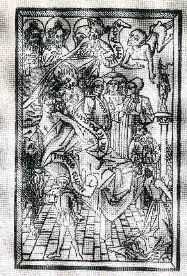
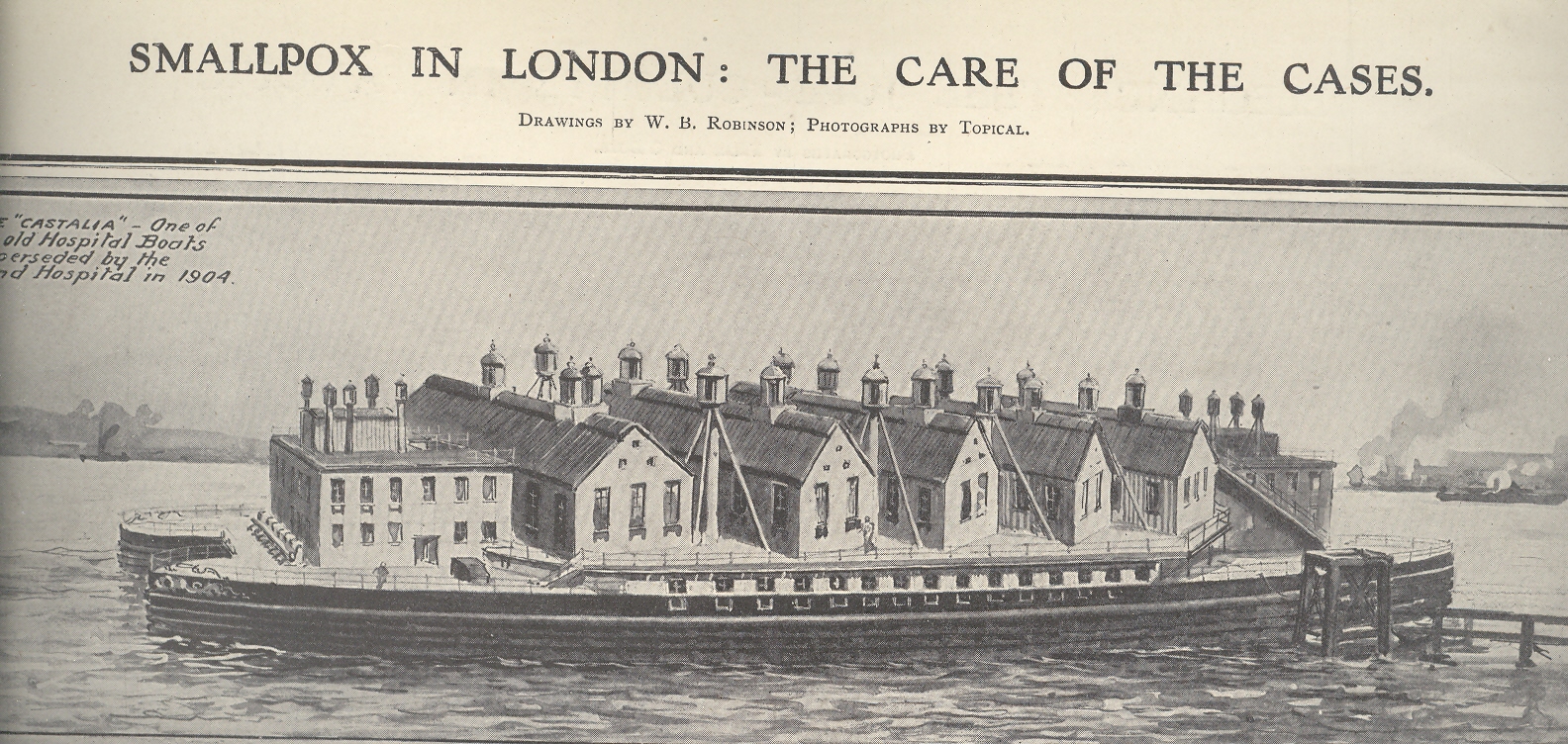
two images show different aspects of segregating—if not hiding—disease.The first is a propagandistic portrayal of a
man dying of the Plague.This snippet of
plaguaganda was an ars morendi
published in the 1460’s, and depicts a not-gruesome portrayal of what was
generally a very gruesome death.The
inflicted lies there in bed, with sheets
and a pillow, looking faint and removed in the retiring Victorian fashion
(removed 400 years), surrounded by images of his faith/belief.
I
suspect that anyone who knew anything about the Plague knew that this scene
wouldn’t be truthful, necessarily, but I guess if it could even momentarily confuse
the viewer into thinking that the visitation of Death could be so composed in
the face of this horrendous disease, I guess that’s the hope you hang
onto.There is a minor battle between
the possible claimants of the soul of The Sick, but that would be going on
anyway whether the coming death was relatively peaceful, or not. There wasn’t
much to be done—as the feeble attempts of preventing the disease would
indicate, what with choices like urine baths, bleeding, leeching, bell ringing,
pus-sucking, rotten animal corpse talismans, incense burning being some of the
preventative choices—so like a belief in Heaven or Nirvana or whatever, the hopeful
consolation of a possibly decent dying could keep people from running
amok.
The
second shows the hospital hulk Castalia, “one of the old Hospital Boats superseded
by land hospitals in 1904”, which was more a floating street than a hospital. It was a complex of five buildings nested on the
hulk of the double-hulled paddle steamer Castalia—appropriately named, as it refers
to the Delphian fountain that Apollo fabricated
from the nymph “Castalia” and alludes to the possibility of rejuvenation and
cleanliness, or health, perhaps).The
hospital held hundreds of smallpox patients, sent there by the Metropolitan
Asylum Board in an effort to stem the flow of the disease and infection rates
from the rest of the population of London.Smallpox was still a vast killer in mid-/late-Victorian England, and given the information
available at the time this was a good social inoculation by distance and
segregation.(It is interesting to note
that out-of-service de-masted, defrocked and striped ships of the line were
used to house prisoners (though generally prisoners of war); in particular,
those kept in the East River housing American soldiers inflicted vast death
tolls via maltreatment and urgently hideous living conditions.)This really doesn’t fit with the
propagandist/suppressing model of the above, and its removal did prevent the
contagion from spreading, but, well, it does look like the Asylum Board was trying to hide the sick.
This confusing title is accurate without very much grant in license and tells a short and true story of three fitful maps, two of which are beautiful and one just so-so.
The first map fit is featured in a beautiful pamphlet called A Century of Progress Colors and was issued by the Textile Color Card Association of the USA.(The title being a small play on the 1933 world’s fair in Chicago called “A Century of Progress”. The Textile Color Card Association was created to standardize color nomenclature and composition in industrial colors (and is still in existence.)The map distributed the major pavilions at the fair by their dominating colors, naming those colors in the unusually-sequenced double-page key on the following pages (below1).I can certainly appreciate the effort and the beautiful design it produced, but as a map of the fair it leaves much (if not everything) to be desired.
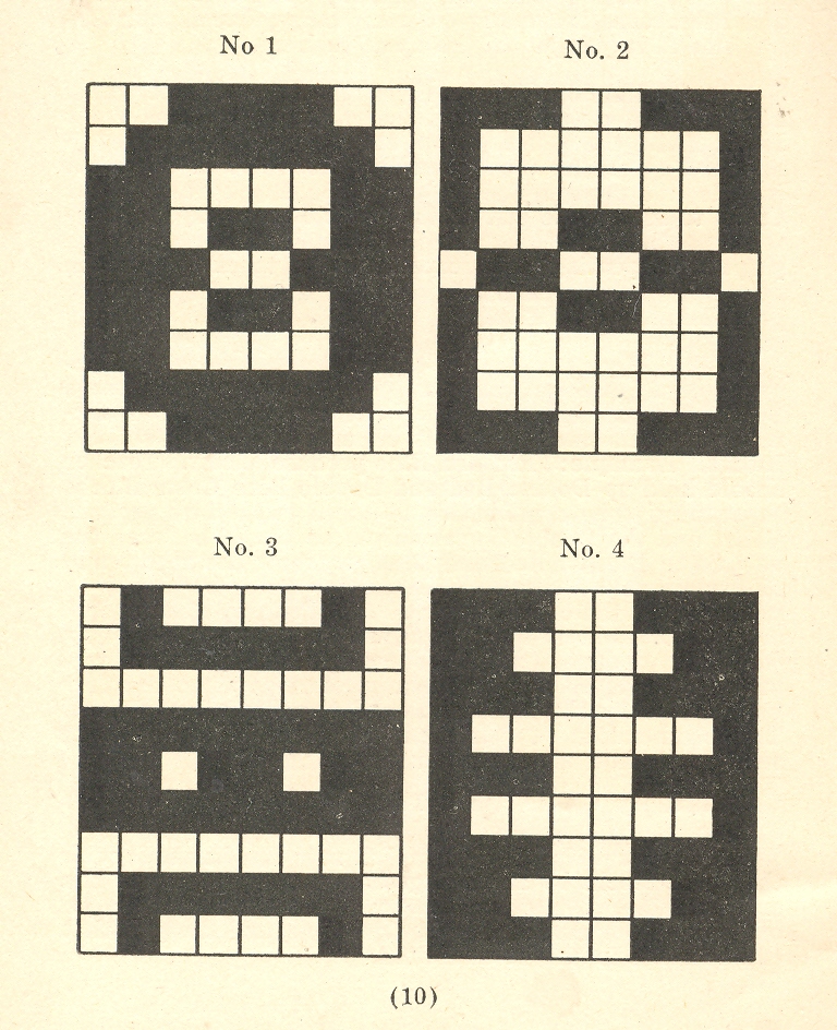
The second map fit belongs to a small pamphlet published by Albert Coble called Games of Colors, Kindergarten and Primary Exercises. Its actually an enterprising little book about reaching into the minds of little ones and explaining how colors are put together and how they relate to one another. It is unfortunate that the drawings used to illustrate the color map part of the pamphlet were done in black and white. Which is a little on the self-defeating side.
But the finest fit of the three fits is fit number three, which is the map of the Bellman’s tale, starting the second fit of Lewis Carroll’s The Hunting of the Snark, an Agony in Eight Fits.
But the map that I think I love the most illustrates Lewis Carroll’s The Hunting of the Snark, an Agony in Eight Fits, and occurs in the Bellman’s tale, starting the second fit1. It is simply magnificent.
Then, of course, there is this:
Notes:
1. The key:
2. The fit begins so:
The Bellman himself they all praised to the skies- Such a carriage, such ease and such grace! Such solemnity too! One could see he was wise, The moment one look in his face!
He had bought a large map representing the sea, Without the least vestige of land: And the crew were much pleased when the found it to be A map they could all understand.
“What’s the good of Mercator’s North Poles and Equators, Tropics, Zones, and Meridian Lines?” So the Bellman would cry: and the crew would reply, “They are merely conventional signs!
“Other maps are such shapes, with their islands and capes! But we’ve got our brave Captain to thank” (So the crew would protest) “that he’s bought us the best- A perfect and absolute blank!”
I’ve
written several times in this blog about unusual perspectives in antiquarian
images—namely, views looking straight up and straight down.They really don’t exist, much, in the
post-Daedalus pre-flight days, what with given the difficulty of fabricating non-cartographic
images from the ground.
Next
on what might seem to be a very obvious list of non-obvious interests are images
with layers, levels, sections, plans, projections…sideways columnar views, locating objects
in space and time. But mostly looking at things straight-on, ad then showing
their relational layers.As it turns
out, these sorts of creations aren’t very much seen in the pre-modern
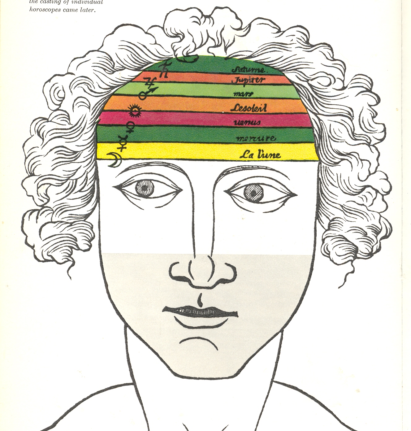
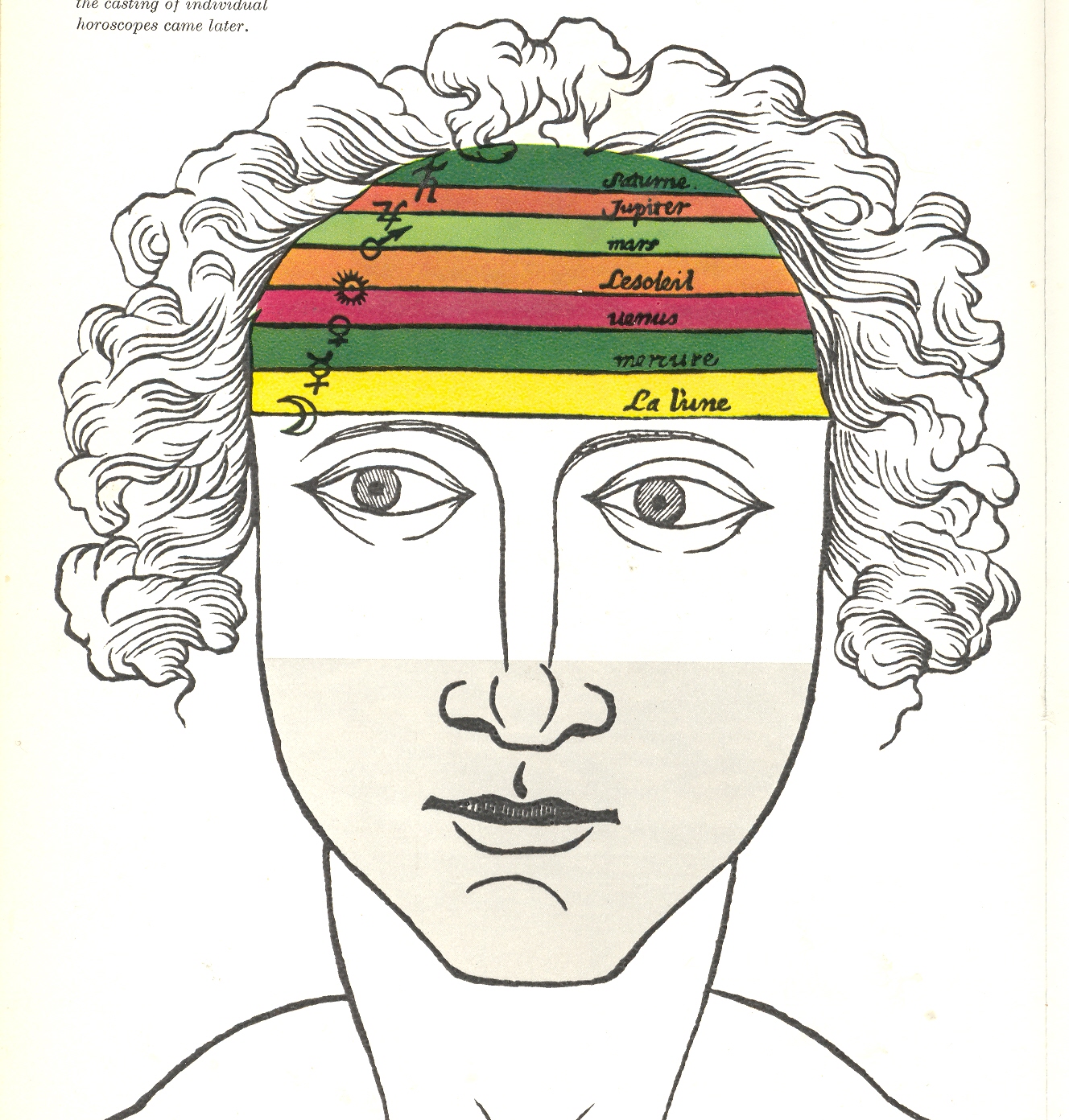
geological era (say, prior to the 1790’s).This is a good example, an astrological man, showing the influence of the planets (and sun and moon) on the different layers of the brain:
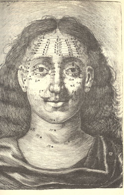
Differentiated, say, from Richard Saunders’ Mole-map man, (right) where facial (and etc.) moles were used as maps to determine some sort of specific actions on the organs underneath (and also by a tea-leaf divination, where the mole lines were connected and disconnected, and interpreted, according to the needs/whims of the observer):
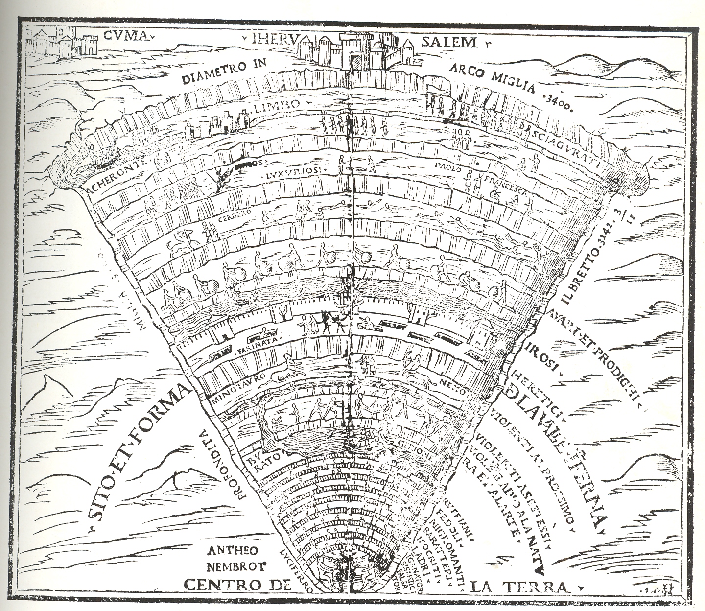
The classic sort of image may be something like this fantastic depiction of the Inferno of Dante (shown here in the Comedia published in Venice by Gregorio de Gregoriis in 1515:
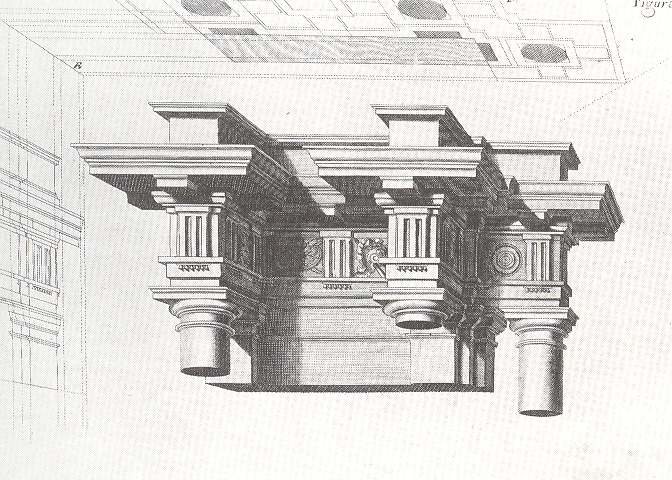
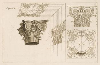
The fantastic Jesuit Andrea Pozzo published results of his researches on perspective in his Perspectiva pictorum et architectoru (1693), explaining how he was able to compellingly, unbelievably represent three-dimensional images on two-dimensional spaces, this image showing plan and projection and profile, effectively giving you a three-dimensional cross section of the architectural element:
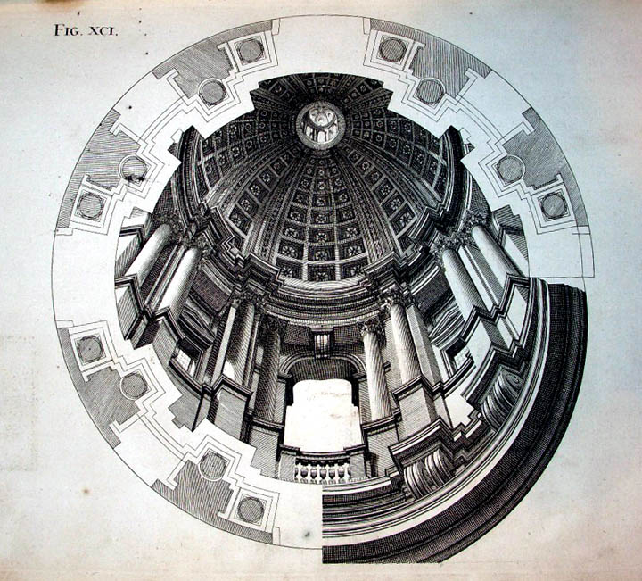
And again:
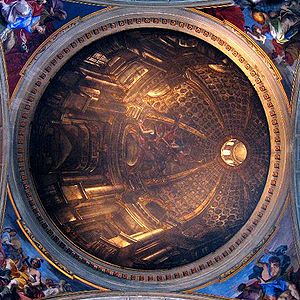
And of course his masterpiece displayed, which is an engraving showing the plan of a flat ceiling of St. Ingacio in which he painted his magnificent trompe l’oeil masterpiece:
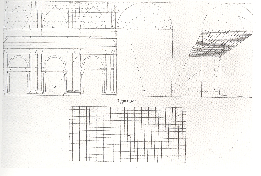
Also in a way appropriate to this ramble is the explanation diagram by Pozzo’s found in Martin Kemp’s The Science of Art, Optical; Themes in Western Art from Brunelleschi to Seurat, showing the imaginary depth of a deeply illusory painting on a (basically) flat ceiling surface:
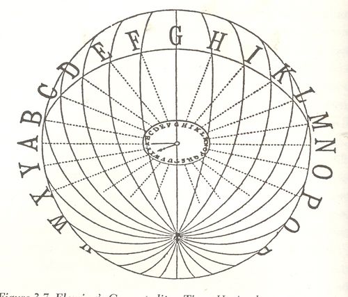
Also in consideration for this area is Sir Sandford –the inventor of Standard Time–Fleming’s wonderful idea for a G-o’clock world, a same-time-everywhere planet, with his 1879 diagram illustrating the earth-penetrating time principles so:
(Image source: “Time-reckoning and the selection of a prime
meridian to be common to all nations” in the Proceedings of the Canadian Institute, Toronto, 1879 published by Copp, Clark)
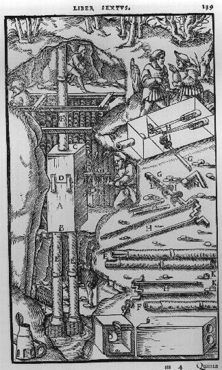
Agricola’s De Re Metallica (from the first Latin edition f 1556) displays many interesting cross sections of Renaissance mines:
There’s much more to come in this area, of course–this is just what I had time to deal with this afternoon, though the this task is much more complicated in the 18th century world than in the 19th, when we find cross sections of the earth and the oceans. But I’ll close here, with all faults.
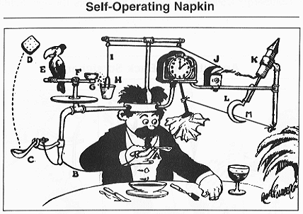
I
think no plumb line was ever so worked with pulleys and wheels, strings and
catclaws and other Rube Goldberg devices as were the demographic studies of
nuclear warfare.It is as though their
compass rose had no compass, with everything centered on the center, no way
out, no way in. just there.A faceless
clock face describing “G-2 o’clock” whenever it pleased.These studies seem to me the nuclear warfare
equivalent of the Bellman’s map (described earlier in this blog as the most
perfect map ever constructed): a pretty polygon describing a totally blank
surface.
I
have a number of these things here, some of which are restricted-distribution
publications, works of statistical fancy/fantasy meant for other eyes in the
same community dedicated to the fancies described, a tautological audience for
self-referential.
One
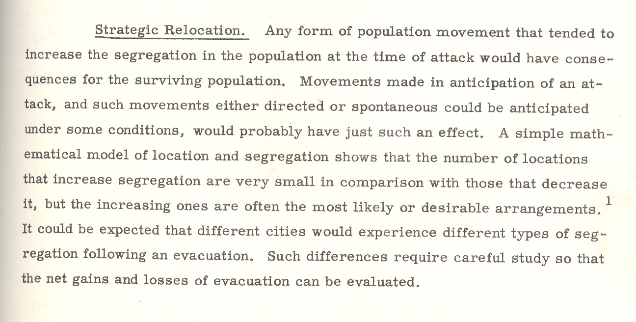
such bit, plucked from this pile is William W. Pendleton’s A Study of the
Demography of Nuclear War produced by “Human Sciences Research, Inc.” Outside
of its statistical foray in survivability and the procreative prospects of the
left-overs of vast nuclear exchanges, the work is a solemn attempt at
institutionalizing the death requirements of nuclear combat.The necessity of overwhelming carnage is
presented in ironic and underwhelming language, the first bits of which are
seen in the conclusion of pamphlet’s abstract1:
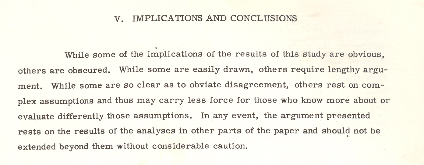
“Cities differ in the kinds and magnitudes of
change to which they might be subjected. Considerable variation in the demography
of surviving populations can be expected; that variation would be related to
policy decisions; and those decisions should therefore be examined for their
demographic implications.” [Emphasis mine.]
Put
another way, the city is the main focus of the survivability equations, and the
chances of the humans being bombed in those cities would change with—god help
us—the amount of bombing.
Cities differ in the kinds and magnitudes of
change to which they might be subjected.
This
is the key I think to understanding documents like this, making a simple
foundation statement so convoluted and tortured that it and most of what
follows make any sense outside of restating themselves. Which I guess is a
strength.
Back
to the pamphlet and the interesting table that attracted my attention.According to one study [and for the sake of
brevity I’m not going to describe the scenarios or data estimation methods and
so on] the U.S. would suffer 46% casualties [meaning immediate deaths and not
as a result of radiation or illness or starvation or the encyclopedia of
whatever that would lead to death somewhere down the road].The resulting demographic of the “perished”
by job description postulates that the most-killed category of worker would be:
(#1) aeronautical engineers, 86% dead; (#2) transportation equipment salaried
manager, with 79% killed; (#3), social scientists, with 78% of them going down
with their clients; (#4), authors, with 76% gone.
Authors?Of what, I wonder?The good ones with the bad?Are authors different from writers?And what do you call folks who produce tv
shows?Since the stats here are for 70
cities there’s no wonder that there aren’t any farmers in this table, as the
majority target areas (some 450 cities cited elsewhere as targetable, including
my own little burgh of Asheville, N.C.) would naturally have city
folk in them.And so I’m guessing that
three-quarters of all “authors” in 1960/6 were living in these target cities
and were going to go up in smoke.The
aeronautical engineers category is more understandable as every one of those
industries employing 50 or more people would be a target; frankly I’m surprised
that given the possible firepower of the Soviet Union
in 1966 that 14% would survive; I’d guess offhand that the number would be
2%.
Even
though this stuff is spread out in only 98 pages or so it would keep a person
busy segregating the Orwellian gems from those not; it would be a tricky
business as most of the “text” in the “not” category would be largely limited
to prepositions.
Here’s
another bit:a parenthetic poke at the
post-attack composition of Congress. It is stated that the “postattack”
(hyphenated no longer) Congress would be “quite different”.It would also be (“in
their eyes”) “more Conservative than the pre-attack (hyphenated!)Congress. It isn’t a cause for great prognosticational (?) liberty to assume that
the Congress might be more Conservative, but why on Earth did the author
qualify the assumption by saying “their eyes”? Pish and posh.
The
paper goes on its merry way, connecting the necessaries of Goldbergian delight,
and somehow nothing ever happened, which to me is a secret miracle.Especially given the weight of papers like
this one, which seems to medicate the effects of war, assuming that there will
be a Congress and that people will report back to work once the factories are
rebuilt and that there will be more segregation in the colossal world of post-attack
America, and on and on into the red dawn.
Mr.
Mencken’s view of Warren Harding comes to mind when I read this stuff and
wonder about how it was that we didn’t blow the whole place up:
“I
rise to pay my small tribute to Dr. Harding. Setting aside a college professor
or two and a half dozen dipsomaniacal newspaper reporters, he takes the first
place in my Valhalla of literati. That is to
say, he writes the worst English that I have ever encountered. It reminds me of
a string of wet sponges; it reminds me of tattered washing on the line; it
reminds me of stale bean soup, of college yells, of dogs barking idiotically
through endless nights. It is so bad that a sort of grandeur creeps into it. It
drags itself out of the dark abysm of pish, and crawls insanely up to the
topmost pinnacle of posh. It is rumble and bumble. It is flap and doodle. It is
balder and dash.”
Notes
1. The
abstract from the above paper: “The basic problem with which this report
is concerned is that of determining the kinds of demographic change that might
result from a range of nuclear attacks, ascertaining the effects of those
changes on the future of the surviving populations, and indicating possible
areas for Civil Defense action and planning. Earlier studies of the demography
of nuclear war were examined and their relevant conclusions and methodology
incorporated in the report. A different methodology–expected to be more
sensitive to compositional effects–was then designed. The new methodology was
tested and found to be more effective than the old. Surviving populations
representing a wide range of variation in attack conditions were created on the
basis of both old and new methodologies, and the demographic significance of
these populations was examined. Assuming a range of post-attack demographic
conditions, a series of projections was made on the surviving populations. The
demographic significance of the recovering populations was then examined. On
the basis of the analysis a series of recommendations relevant to Civil Defense
planning was made: Within the framework of this analysis the crucial variable
is the demographic pattern of the city. Changes in composition, as well as
size, could be of substantial magnitude and would last for generations in some
cases. Cities differ in the kinds and magnitudes of change to which they might
be subjected. Considerable variation in the demography of surviving populations
can be expected; that variation would be related to policy decisions; and those
decisions should therefore be examined for their demographic implications.”