A Daily History of Holes, Dots, Lines, Science, History, Math, Physics, Art, the Unintentional Absurd, Architecture, Maps, Data Visualization, Blank and Missing Things, and so on. |1.6 million words, 7500 images, 4.9 million hits| Press & appearances in The Times, Le Figaro, Mensa, The Economist, The Guardian, Discovery News, Slate, Le Monde, Sci American Blogs, Le Pont, and many other places… 5000+ total posts since 2008.

Author: JF Ptak

  • Dr. Johnson’s Definition of Letters, A-Z

    JF Ptak Science Books   Quick Post  #426

    I hear Jeremy Brett–as the ultimate Sherlock Holmes–reading this in my head.

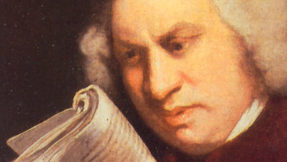
    The energy of Dr. Johnson must have been heroic–had to have been.  In addition to all of his other work, he sat down and wrote a dictionary–the first of its kind for the English language: A Dictionary of the English Language, which was printed in 1755.

    Samuel johnson2
    I’ve collected what he had to say about the letters of the alphabet, which is in itself a small and remarkable thing of sweep and brevity.  He sites the “labial” P, the “canine “R”, the unhappy hissing of S, the “note of aspiration” in H, and so on, in a forceful march to recording the language.  His book is a work of high beauty. 

    All of the material below comes from the JohnsonDictionaryOnline site, here.

    ~ A ~

    A, The first letter of the European alphabets, has, in the English language, three different sounds, which may be termed the broad, open, and slender.

    The broad sound resembling that of the German a is found, in many of our monosyllables, as all, wall, malt, falt; in which a is pronounced as au in cause, or aw in law. Many of these words were anciently written with au, as sault, waulk; which happens to be still retained in fault. This
    was probably the ancient sound of the Saxons, since it is almost uniformly preserved in the rustic pronunciation, and the Northern dialects, as maun for man, haund for hand.


  • Found Art in Oil Well Prospect Mapping, 1935

    JF Ptak Science Books  Quick Post 

    These diagrams of oil well surveys (printed ca. 1935) have a very fine found-art appeal to me–frankly, if hey existed apart from the printed text, I would not have known what they were or represented.  They do remind me quite a bit of labanotation.

    Ebay_sept_23_found_art661


  • The U.S. Civil War–Handy Alphabetical List of Battles

    Since we’re nearing the half-way point of the 150th anniversary of the war I thought to put together a handy list of battles–I think I’ve seen one elsewhere but really I cannot recall the locatiion, so I cobbled together a fast-and-simple alpha list to have on hand. 

    Alphabetical Listing of Major Civil War Campaigns, by Battle

    Allatoona Georgia October 5, 1864
    Amelia Springs Virginia April 5, 1865
    Antietam / Sharpsburg Maryland September 16-18, 1862
    Appomattox Station Virginia April 8, 1865
    Appomattox Court House Virginia April 9, 1865
    Aquia Creek Virginia May 29-June 1, 1861
    Arkansas Post / Fort Hindman Arkansas January 9-11, 1863
    Atlanta Georgia July 22, 1864
    Athens Alabama January 26, 1864
    Averasborough / Smiths Ferry / Black River North Carolina March 16, 1865
    Auburn / Catlett’s Station / St. Stephen’s Church Virginia October 13, 1863
    Auburn / Coffee Hill Virginia October 14, 1863

    ·Posted by :

    ·in:


  • Atomic- , Solar- and Vacuum-Powered Airport-Laden Dirigibles and Other Wide Ideas of Future Flight

    JF Ptak Science Books  

    Follow Me on Pinterest

    A post (“Nuclear Everything”) over at Dark Roasted Blend that featured a magnificent and stodgy atomic-powered zeppelin pushed me into this short visual note on differentially-powered airships, and then in general about airships with airports on them. (There’s a whole other category for planes-of-tomorrow that were so enormous that they had landing strips on their wings, but that’s another story.)

    And they remind me of things that just aren’t “right”, because these things just weren’t.  I’m not sure why, but I’m drawn into an old story about the legendary Charlie Goodnight, Texas pioneer, one of the creators of the idea of the cattle drive (the Goodnight-Loving Trail), a man who lived an extraordinary and powerful life.  He lived for a long time, too, from 1836 to 1929 (almost to the year of the birth of Larry McMurtry, who told a version of Goodnight’s story so spectacularly well in Lonesome Dove), well into a future so far advanced from the year of his birth that he could scarcely have imagined it.  Anyway, towards the end of his life, in 1916, Goodnight had the idea of making a movie of the Old West that included a “final” Indian buffalo hunt.  I’ve seen the film, and it is a fascinating, heartbreaking, wonderful/awful thing, that somehow might appeal to almost no one.  It certainly didn’t appeal to the folks at the time looking for a cowboy film, because much like Mr. McMurtry’s cowboys, Goodnight’s reality didn’t much resemble the cowboys that the public wanted to see.  In a sense Goodnight lived beyond the history that he so much helped to create, and that his old, passed “present” was something that the people in his future really didn’t want to recognize. Then of course one of the things that made it all seem “not right” to me was seeing a vignette of Goodnight entering into one of the scenes, in  a car, making the whole thing a little spooky.

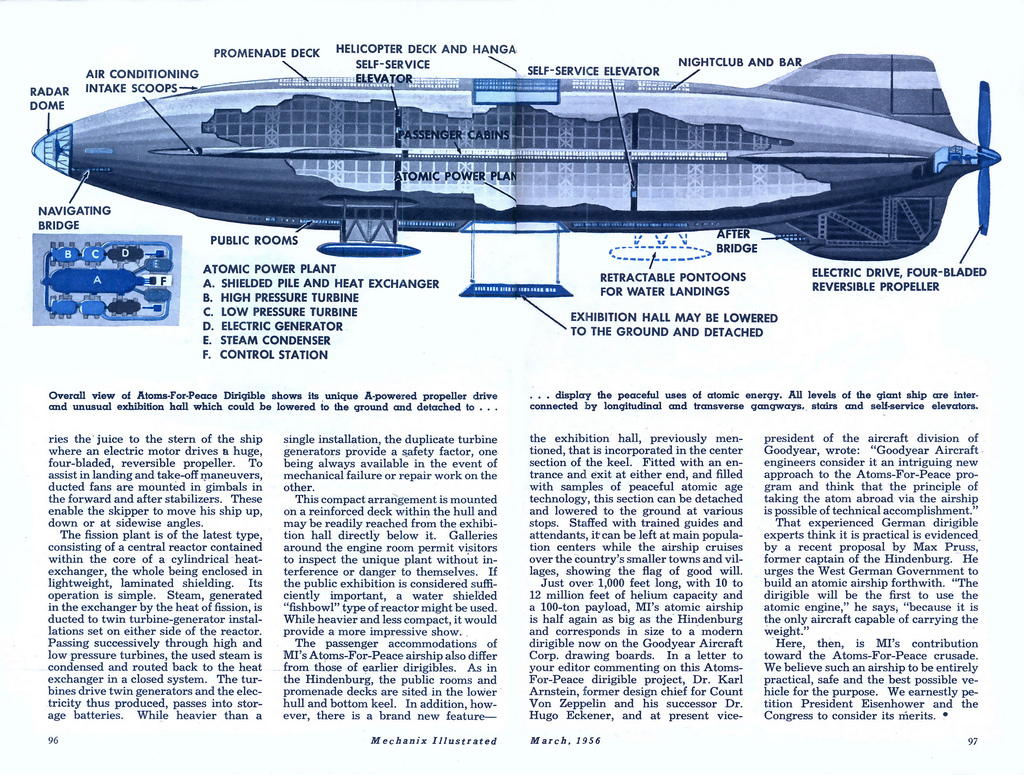
    First up is this mammoth flying advertisement to both peace and war, a nuke-powered dirigible proposed by Eisenhower in 1953 as part of the Atoms-for-Peace push, a move which by this point was already entirely too late.

    Atom everything zep for peace

    For some reason it was seen as a good idea to have a detachable convention hall built for the airship. \

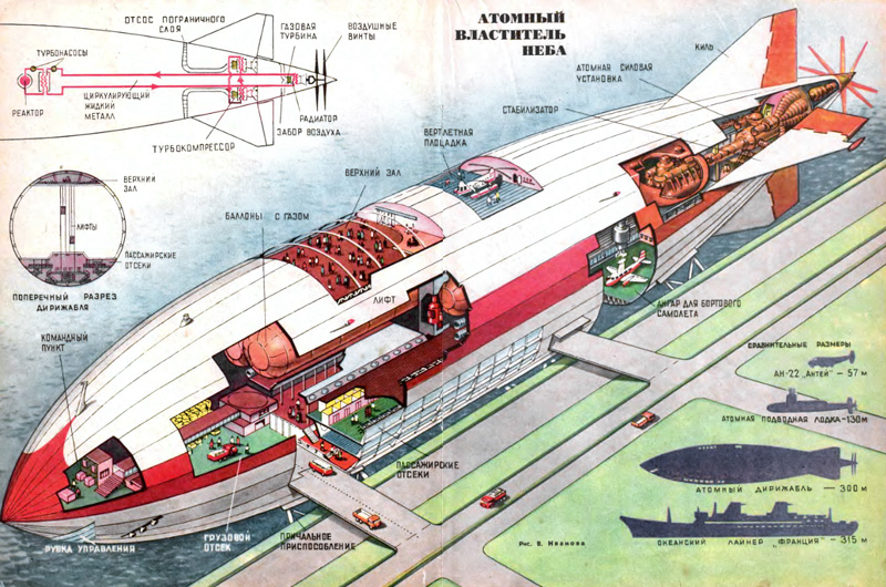
    And of course there is no greater element of a Something-for-Peace anything unless there was a competing idea, as seen in this mammoth Soviet atomic zeppelin, a ship completely absorbed in being bigger than the big thing that it already was:

    Atom everything zep

    At 300 metres this monster had room enough for virtually anything, though it didn’t have the retractable/detachable convention hall–it did however have a small airport. 

    Another dirigible approached the airport-on-board idea, but preferred solar power for its energy source.


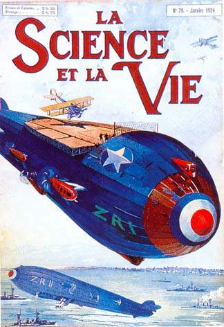
     The magnificent possible, 1924, saw another kind of airborn airport:

    https://historyofideasblog.com/a/6a00d83542d51e69e2012875ea3636970c-pi

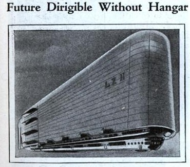
    Guido Tallei’s 1932 Diri-Disk was a combination airplane/dirigible, and looked as though it could harbor an expansive airport on its NCC-1701-like wing, but didn’t, alas:

    Konstantin Eduardovich Tsiolkovsky (1857-1835), the Russian/Soviet space pioneer who was nearly without peer (and who somehow survived the bloodlust of Stalin which sucked up and murdered so many of his scientific colleagues),  stepped outside his spaceflight bubble to write about this monster with collapsing sheathing:

    https://historyofideasblog.com/a/6a00d83542d51e69e20128769ed30d970c-pi

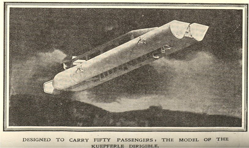
    The Kueperle dirigible, planned in 1909, was nothing if not pretty, and pretty is pretty much what the whole thing consisted of:

    https://historyofideasblog.com/a/6a00d83542d51e69e2012875ea2c87970c-pi

    And lastly, this example of the tracked airship–this must have been a popular notion because I’ve seen perhaps 15 different plans and I don’t spend much time at all reading in this area.  But harnessing the power of the balloon or dirigible or (kite!) whatever to a track system seemed to be a good idea, once upon a time:


  • Dots and Lines in Optical Diversion

    JF Ptak Science Books     Part of the History of Dots series  Post 2007

    Follow Me on Pinterest

    Long is the line in the history of art–far less so the dot. 
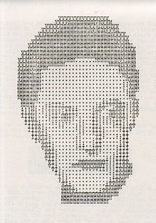
     
    Artyping216

    The line has been part of a long and deep inheritance of rendering a truth, factual, perspectival presence–in general, at least. Certain symbolic and metaphoric elements will sometimes confuse and collapse bits of the image, but the effort for centuries has been to present a balanced nature as close as practicable to its perfection.  That was the strength of the line. 

    The strength of the dot was in doing something not quite the opposite but approaching it. 

    It is interesting to think of the importance of dots in the first revolutionary changes in 500 years in the history of art.  Honestly, there wasn’t anything epochal that happened between the re-discovery of perspective (ca. 1330-1400) and the arrival of Impressionism (and just afterwards of non-representational art) in the 1872/3/4-1915 period.  
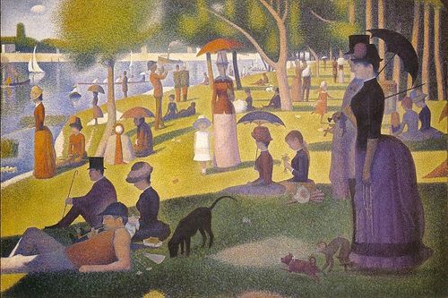
    Suerat Dots aren’t brought to bear formally in the revolutionary movement until the early 1880’s.  Impressionism for all intents and purposes is formed with the Societe Anonyme in 1872 (whose members included Monet, Pissaro, Degas, Sisley, Morisot and eleven others), and perhaps more realistically in 1874 when the Societe exhibited its first salon.  (The first show held at the Nadar Studio in Paris in April 1874; a tiny, one month long affair, compared to mammoth exhibitions like the Universal Exposition in Paris in 1867.) 

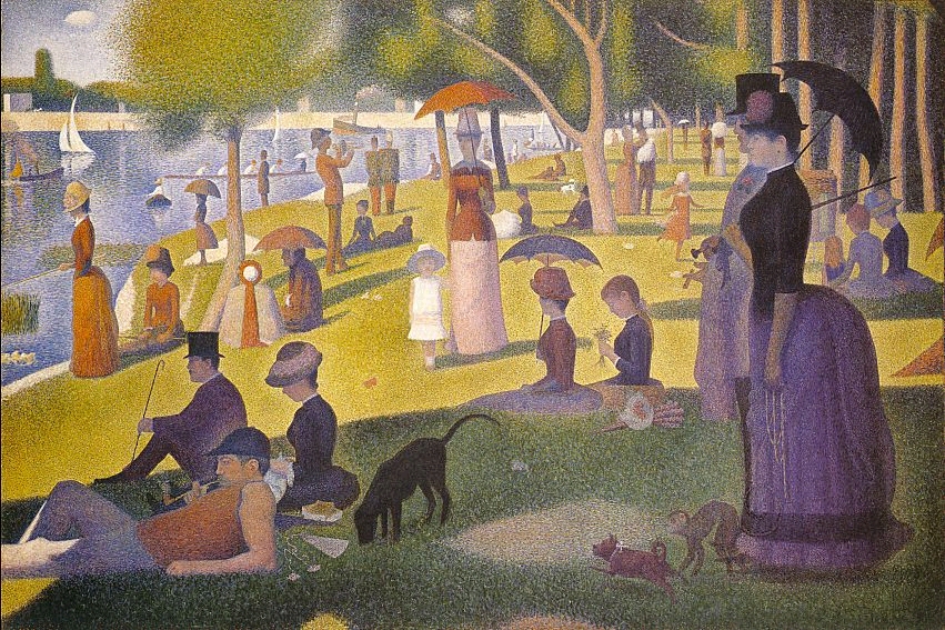
    It was Georges Seurat who brought the whole world to the dot experience with his artistic method of Pointilism, in particular with his magnificent Un dimanche après-midi à l’Île de la Grande Jatte, an enormous work given its composition—dots.  The dots replaced the brushstroke, and their placement in relation to their color was an absolutely brilliant innovation, establishing a perfect result for the viewer when examining the work as a whole.  (It may well be that the French chemist an designer Michel Chevreul made this discovery a few decades earlier, noticing the effect and changes in color depending on placement and—in his case, with fabric—color in the dyes for his material.)

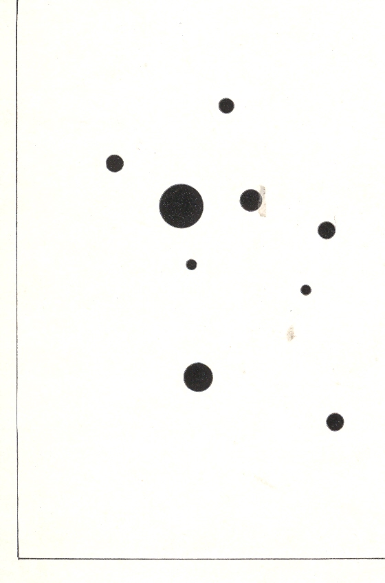
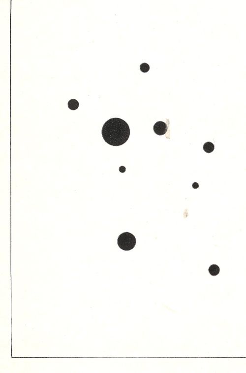
    Wassily Kandinsky (1866-1944), the discoverer of nothingness in art and the introduction of the first BLOG==july 13=kamd non-representational paintings in art history (1913) used his fair share of dots in his exploration of the previously invisible.  One good example is his 9 Points in Ascendance (1918), which is nothing but black dots, an impossible composition just two decades prior to its creation. 
    In the middle of this appeared the half-tone illustration, the great liberator of photographic illustration in popular publication.  Invented in the late 1870’s by Stephen Henry Horgan and used in the Illustrated London News for the first time in 1881, it made the publication of accurate images much feasible and economical.  No longer were readers dependent on the accuracies of artists interpreting photographs or photographed scenes—the photographs themselves were now publishable at little cost and in high quality, vastly increasing the veracity of published reports dependent upon images.  This was revolutionary in its own way, democratizing the sharing of images and icons.


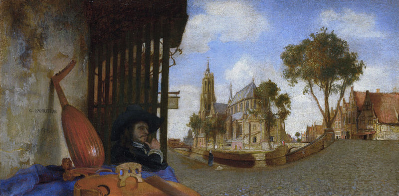
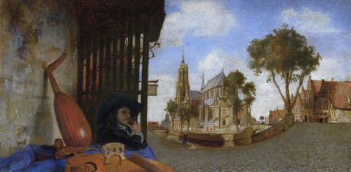
    That said about dots, the line was surely used to transport a bit of reality in art, even before the 18th century–among the earliest appearances being with Hans Holbein in his The Ambassadors of 1533, and a beautiful and very famous use was made by Andrea Pozzo in his illusionistic works at S. Ignazio in Rome in 1685 (and which I mention in an earlier post).  Certainly Carel Fabritius attempted and succeeded in this throughout his career, playing with the substance of perspective, as we can see here in his View in Delft, in 1652:
    Fabritius
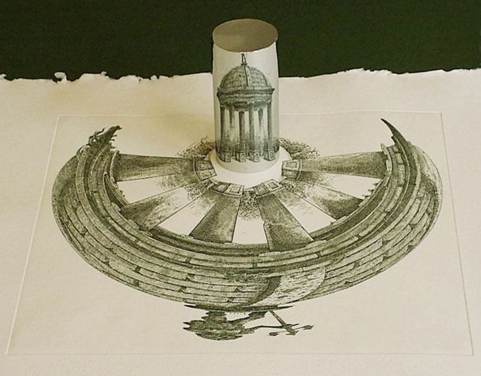
    Also the lines of the anamorphic image severely distorted the presentation of reality–if you had the mirror to distort it and if you had the mirror to reconstitute it:
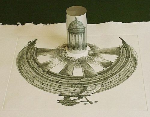
    Anamorphic art
    Source:  Anamorphic Art

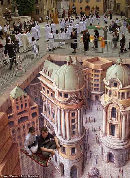
    This example is much more recognizable in widely-circulated images of the modern work of  people like Kurt Wenner, who have continued in the tradition of Leonardo’s researches in the difficulties of wide angle distortion:
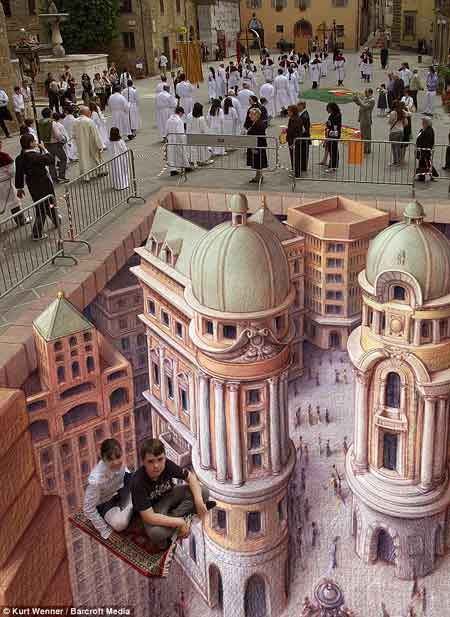
    Anamorphic art b
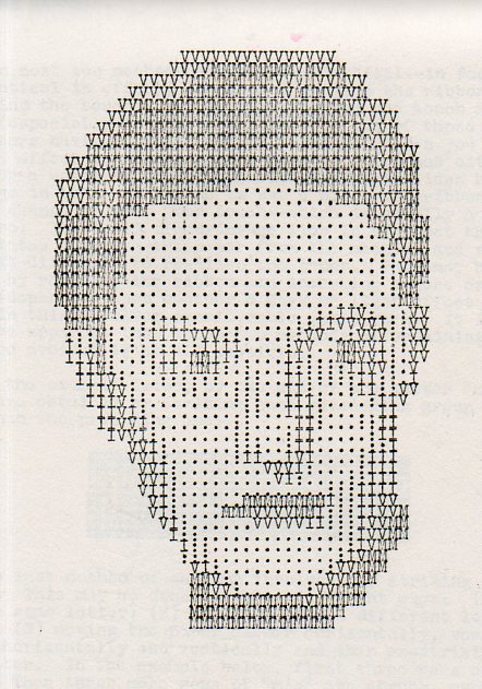
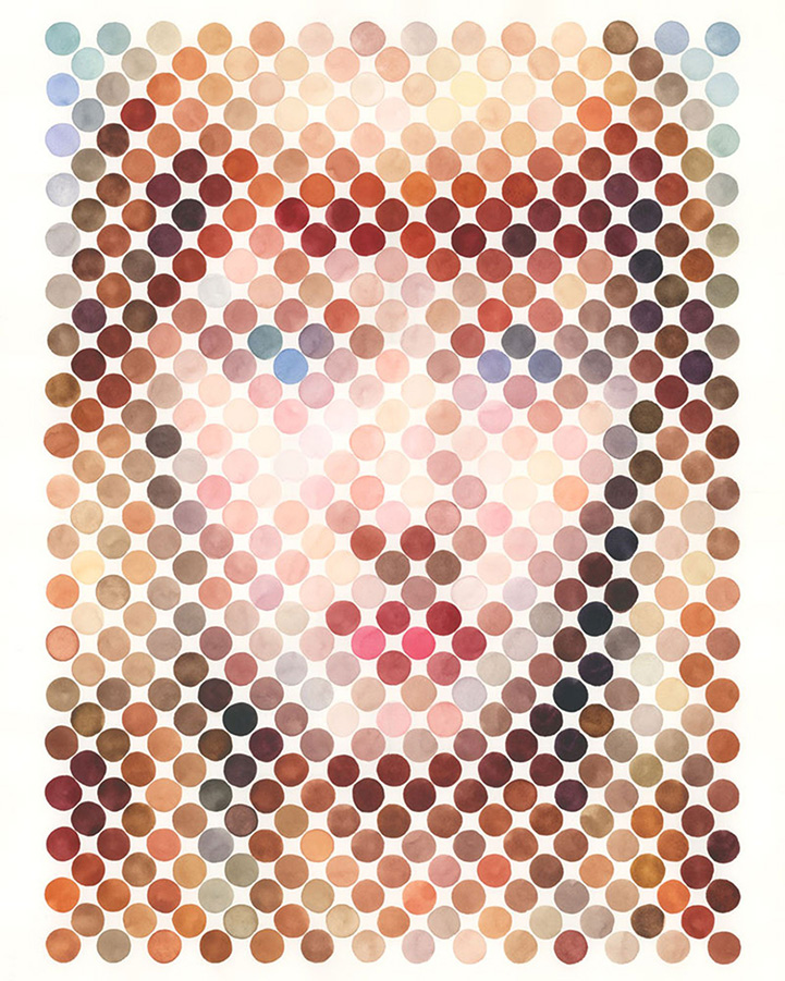
    Seeing this collection of dots in the construction of human faces I was reminded very strongly of the portraits made on the typewriter by Julius Nelson in his work, Artyping, published and sold for a dollar by the Artyping Bureau of Johnstown, Pennsylvania, in 1939 (and pictured first, above).  Nelson was an instructor in “secretarial science” in Windber High School in Pennsylvania and no doubt put together this pamphlet as something expressive of his artform and as an advertisement for his profession.  This was hardly the first time that anyone used the typewriter artistically, as I can recall some measure of artistic expression in type in Punch magazine as far back as 1869, though portraiture by typewriter does not appear to be a very wide section in the art world between those times. In any event, a portrait that he made here is rather close to those presented on the Modern Metropolis site–the “Dot Portraits”  Nathan Manire.
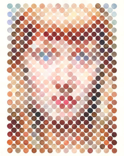
    Dot portraits

     Modern Art would have the final dispositional comment on the typewriter as an instrument of art, when Claes Oldenburg made his Soft Typewriter in 1963:
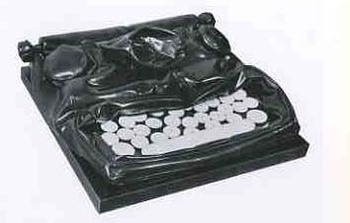
    Blogtypewriter_nwrriter_soft036_2 

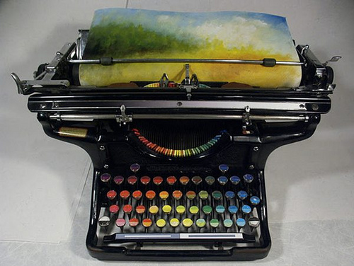
    And then, of course, the magnificent resurrection of the typewriter artform, replacing the spplication of black or red with something a little more complex:
    Typewriter chromatic
    [Source: the chromatic typewriter, by Tyree Callahan, found here  http://www.samanthahahn.com/blog/2012/01/16/chromatic-typewriter/]


  • Crytpo-MAGIC and the Japanese A-Bomb, August 1945

    JF Ptak Science Books   Quick Post

    This is document 63 of 80 from “The Atomic Bomb and the End of World War II, a Collection of Primary Sources”, from the National Secuiry Archive Electronic Briefing Book No 162,  edited by William Burr (2005). (The full source is available here.)  It is here where there is a brief review of supposed Japanese development of an atomic bomb. the information was courtesy of the MAGIC, a cryptonym for the successful effort of the United States Army Signals Intelligence Section (SIS) and the Navy Communication Special Unit to decode intercepted high-level Janapese messages. (A quick appraisal of MAGIC is available here.) Suffice to say for this quick post that the efforts of American cryptographers (with some help from our cousins in the U.K. at Bletchley Park) landed the U.S. the ability to read and render Japanese critical and encoded communications virtually from the very beginning of the war. 

    Read more: http://www.faqs.org/espionage/Nt-Pa/Operation-Magic.html#ixzz2OPnQy4oJ

    ·Posted by :

    ·in:


  • The Lonely Gold Windows in Blue Skyscrapers, 1928

    JF Ptak Science Books   Quick Post 

    Skyscraper213
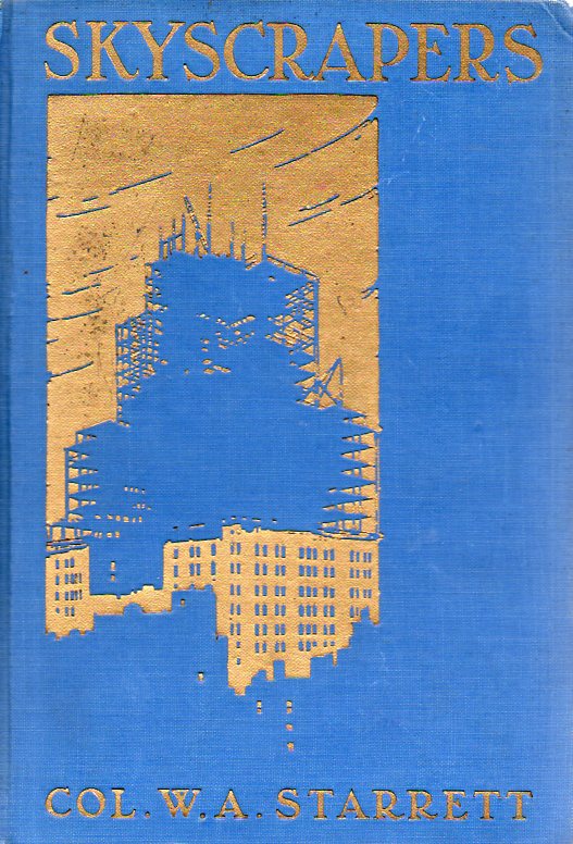
    This lovely cover belongs to W(illiam) A(iken) Starrett’s Skyscrapers and the Men who Build Them, published in 1928.  It is a design cut into the publisher’s blue cloth and highlighted a bit in gilt, and at least to my experience is fairly well singular.  Or at least very unusual.  The “skyscraper” as a building was at least seven decades old (as was the safety brake for the elevators–first referred to as “vertical rail car”– that made these six+ storey buildings  possible back in the early 1860’s) when the Starrett book appeared. Its an interesting achievement, and seems to be filled with a fair amount of history (he does talk about the history of elevators, for example) but mainly concentrates on the new buildings of the 1920’s.  Mostly, though, I liked the book cover. 

    Skyscraper211

    I like the foreground of the more-antique skyscraper in blue, giving way to the recent turn-of-the-century-esque skyscraper in gold, and then the massive under-construction monster in blue in the background–all set against a gold sky.  Its a job well done by the nameless designer.  The design has a Renaissance flavor to it, skyscrapers or not. 

    A review of the book appeared in the Town Planning Review in 1931 and is available in full text  here.
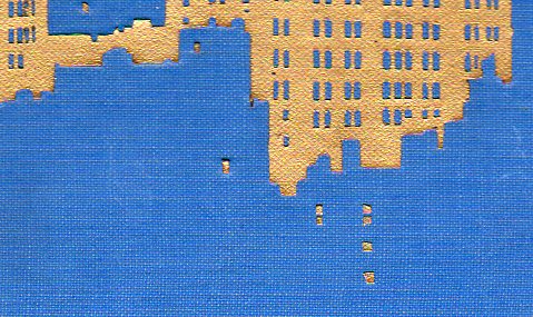
    And a detail of those lovely (2mm) windows at bottom:

    ·Posted by :

    ·in:


  • AtomPunk: Atomic Hair, Clothes, Swimsuits and Cake

    JF Ptak Science Books    Post 2006

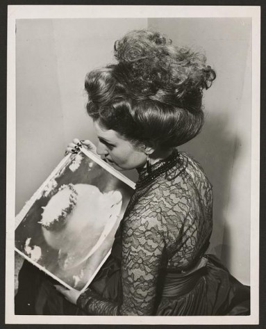
    Perhaps the way you get around the constant fear of Total World Annihilation is to triviliaze the thing that would bring this state of affairs about.  I’m not sure that this has been the case too very often in the history of Potential WorldWide Disasters outside of the great atomic fear of 1950-1990 (and soon to re-emerge, perhaps/probably).  So far as I know there were no V-2 Motels to correspond to the Atomic Motels of the American 1950’s;  nor was there Pestilence Wax, or AIDS Cakes, or Influenza Burgers, or Plague Patter, and so on.  I’m certain that some cases exists outside the atomic realm, but putting the atomic bomb to work on the runaway train that was an advertising antithesis to itself seems to me to be so far beyond anything else that I can think of…well, nothing seems to compete with its ready meanness to the great/monsterous possibilities of itself.  To wind up with a picture of an “a-bomb” on a ball of kid gum seems spectacularly evaporative to what the atomic bomb was.

    I’ve collected some examples of the atomic fear reversal at work:

    Atomic hairdo[via retronaught]


  • Justice and the Sign for Equality, ” = “

    JF Ptak Science Books     Post 2006

    
    Equal sign det


    Equal signWith the big discussion taking place at SCOTUS (rather, the same-ish big discussion taking place in two cases) and with the equality sign appearing everywhere, it might be interesting to take a look at when that symbol first came into use. 

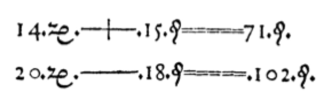
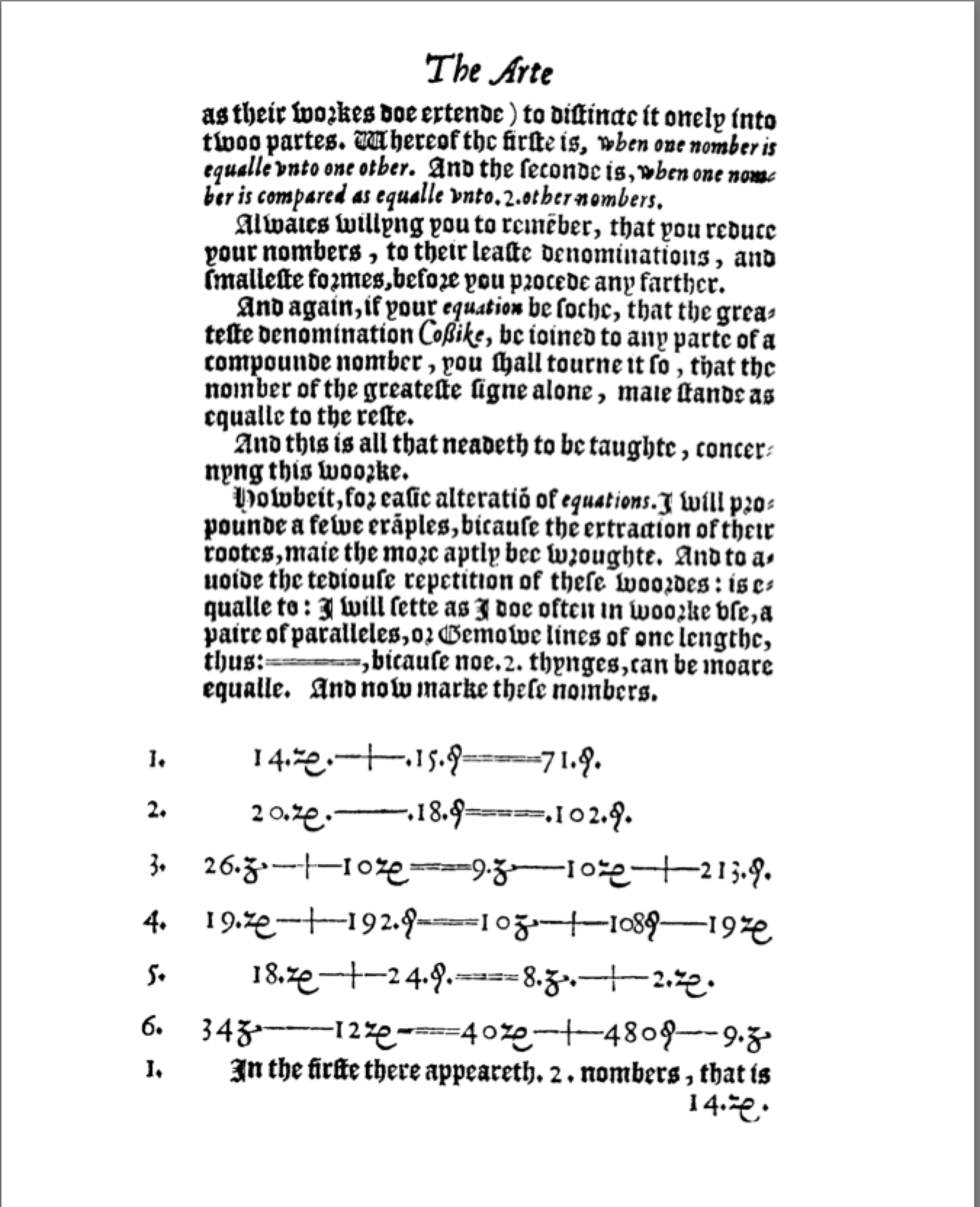
    It turns out that ” = ” makes its first appearance in print with the work of Robert Recorde (a Welsh mathematician and physician, who lived from 1512-1558), in his The Whetstone of Witte, whiche is the seconde parte of Arithmeteke: containing the extraction of rootes; the cossike practise, with the rule of equation; and the workes of Surde Nombers (printed in London in 1557). 

    In clear and concise language (in the fourth paragraph in the text at left) he introduces = = = = = to take the place of repeating the phrase “is equalle to”.

    Howbeit, for easie alteration of equations. I will propounde a fewe
    exanples, bicause the extraction of their rootes, maie the more aptly bee
    wroughte. And to avoide the tediouse repetition of these woordes : is equalle
    to : I will sette as I doe often in woorke use, a pair of paralleles, or Gemowe
    lines of one lengthe, thus: =====, bicause noe .2. thynges, can be moare
    equalle.

    [Page image via the MathMastery Blog, here.]

    The word “equal” comes from the Latin  aequalis, meaning “uniform, identical, or equal,” it also derives from aequus which perhaps more interestingly plays out as “level, even, just”.

    Either would do, for me, so long as the equality sign is put into play as the law of the land, and that this injustice and discrimination is brought to an end. At 456 years of age, = is far younger than the inequality it can replace.

    ·Posted by :

    ·in:


  • Photograph of a Street Abacus Seller, Russia, ca. 1860’s

    JF Ptak Science Books   Quick PostFollow Me on Pinterest

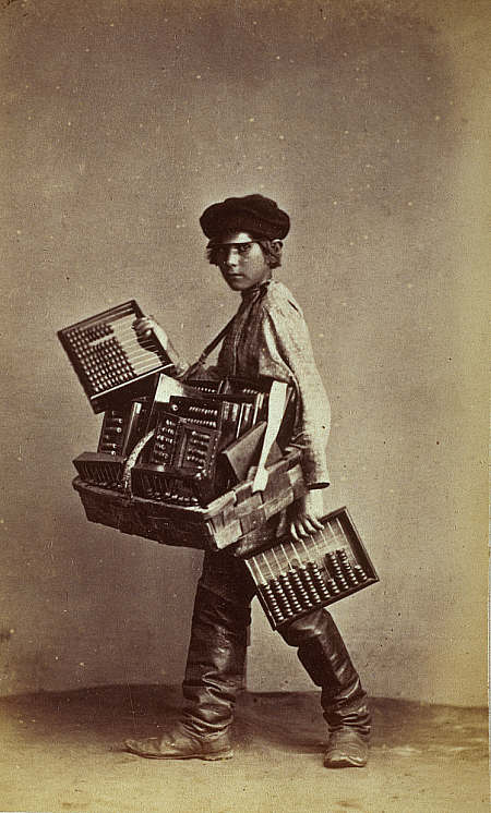
    Carrick abacus seller

    In my travels in and out of imagery and books, I’ve kept a small space allocated in what is left of my memory palace for images of the working poor and the laboring classes.  Most of the world’s population of course has been and still is composed chiefly of the daily (and not so) laborer, but if you were to measure images that were made of these folks while at work or with the tools of their trade, and compare it to the rest of the images of more-exalted people spending their time doing more-exalted things, I would guess that the images of the working classes would be vastly outweighed by the rest, at least in the ancinet to early-modern times (of say 1925)–that is why it is so very interesting to see third-quarter 19th century photographs of these people.

    This image was made by William Carrick (1827-1878, born in Scotland but who spent his life chiefly in Russia) in the 1860’s, and is found at the National Gallery of Scotland, here.  Carrick made important contributions to the ethnography and the history of photogaphy, documenting the lifestyle and costume of Russian peasants in the country.  It is probable that he made his series cartes de visite images of itinerant trades people as a sort of postcard to the tourist and taveling class–but what happened of course is that he recorded in great detail bits of everyday life that was in general invivible to the main sttream of people who were in the image-making class.  And so Carrick produced images of knife sharpeners, and tool sellers, and milk haulsers, and woodcarvers and hackmen and chimney sweeps and so on, pictures of the people who made the city run.  I was particularly struck by this image of a boy selling abacuses/abaci–Im not sure that I ‘ve seen a photograph/engraving of a street vendor of this sort of instrument, but here one is–a boy in the ‘tween years, wearing boots way too big, with a woven basket full of abacuses/abaci. (The varities here have two ranks of four beads–one for quarter-rubles and the other for quarter kopeks–while the other wires hold ten beads apiece.)

    Maybe the boy isn’t a ‘tween–maybe he’s younger than that. Maybe the boy is a girl.  In any event, the basket looks heavy, and I’m sure the child returned home with a weary back at the end of the day. 

    Other images by Carrick can be found at LuminousLint.com; a short biography of Carrick is available at Oxford Art Online..


    ·Posted by :

    ·in:

    —