A Daily History of Holes, Dots, Lines, Science, History, Math, Physics, Art, the Unintentional Absurd, Architecture, Maps, Data Visualization, Blank and Missing Things, and so on. |1.6 million words, 7500 images, 4.9 million hits| Press & appearances in The Times, Le Figaro, Mensa, The Economist, The Guardian, Discovery News, Slate, Le Monde, Sci American Blogs, Le Pont, and many other places… 5000+ total posts since 2008.

Author: JF Ptak

  • How High is the Sky? A Cross Section of Black and Red Earths

    JF Ptak Science Books    Post 2000

    [This is numbered post 2,000–a number that does not include another 500 or so “Quick Posts”–written for this blog since beginning in February 2008.]

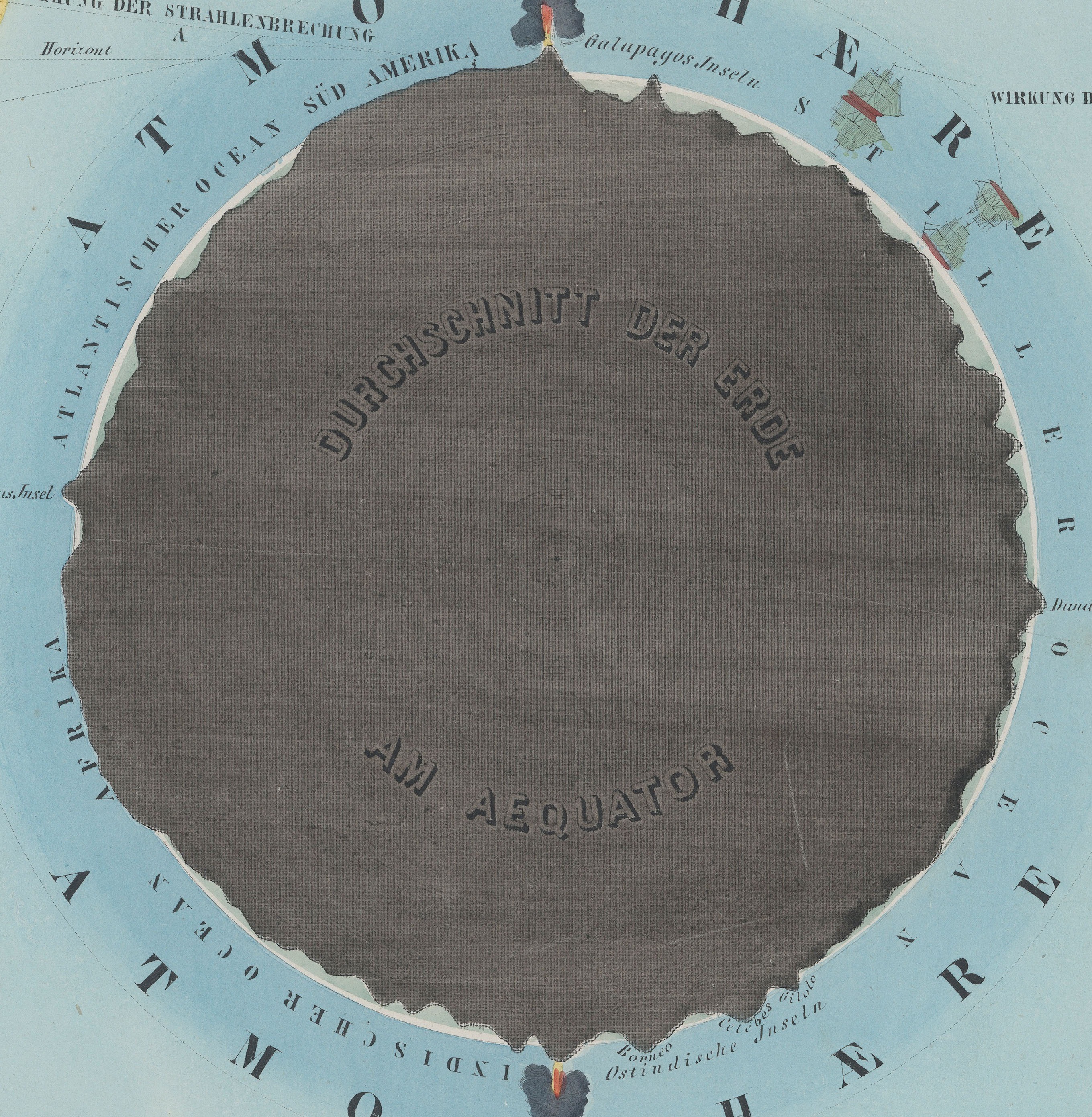
    Preyssinger Earth plan

    • “Der Erde und Ihre Atmosphare” from Astronomischer Bilderatlas, by Ludwig
      Preyssinger, published in 1853 (with 12 engraved plates1, following the
      first edition of 1840, which had 10 plates). Source: found at Michael Stoll’s flickr set, a superior and large image, here.]

    Our older daughter Emma asked that question years ago, when she was six or seven.  It was a great question, and one of those questions, really, that only kids can come up with. It is also reminiscent of Ruth Krauss and Maurice Sendak’s A Hole is to Dig, a classic work published in 1952 with these sorts of question/responses, a kid-cratic method of inquiry and answer, that is possible generally only with a younger and fluid mind.  (“What is a hole? A hole is when you step in it you go down” and “a hole is to dig” and so on.)

    People from long ago certainly knew that clouds were not nearly as high as the Sun and Moon and stars, but how high could they be? How high was the sky?  How thick was the envelope of air around the Earth?  Exploratory balloon ascents could help that question along, but only somewhat: heights attained in the first 80 years or so of ballooning reached 43,000 feet. (The question of ballooning and the limits of the atmosphere comes up early, as we can see with Jane C. Webb Loudon, the author of the anonymously-published The Mummy!: Or a Tale of the Twenty-Second Century  in 1827, interestingly published nine years after Mary Shelley’s Frankenstein:  “… and the  hampers are filled with elastic plugs for our ears and noses, and tubes  and barrels of common air, for us to breathe when we get beyond the  atmosphere of the earth.”)  In 1803, the record stood at 24,000; in 1835, 26,000; in 1862, 39,000; the record of 43,000 feet was reached in 1927, and at a great cost. On the other hand, more than half of the atmosphere exists at 3 miles above the Earth, and 70% of it is at 5 miles and under; at 22 miles exists about 99% of the atmosphere, and at 62 miles the atmosphere is so thin that it is a virtual vacuum, and is basically negligible. (The exosphere reaches out though to about to about 6,200 miles, but that’s where free moving particles are able to escape the Earth’s gravity and get swept away by the solar wind.)

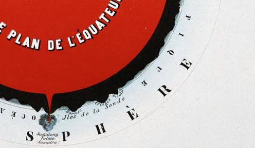
    Herr Preyssinger was trying to exhibit this atmospheric density in his illustration #10 to his beautiful astronomical atlas. (I should add here that Preyssinger’s work is a very uncommon production, made so that several of the engraved plates coul dbe held up to a solitary light source in a dark room and be illuminated cut-outs in the paper which also had transparent material on the verso to difuse the light…very smart.)  His illustration for the atmosphere was very effective, and was set against a plan of the earth made at the equator.  I’ve also included the same plate #10 from a French edition of the same work made slightly later, though the interior of this Earth is colored in a brilliant red.
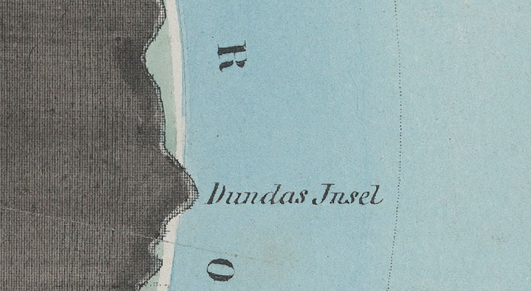
    Preyssinger Earth plan detaik_edited-1
    So when the engraving above was printed in 1862, the balloon ascension record stood at about 5 miles, getting humans to above 70% of the ocean of air.

    Relative to humans getting high above the ground, the atmosphere is high; relative to just about everything else–like the 99% at 22 miles compared to the 7,900 or so miles of the Earth’s diameter, the atmosphere is but a thin slip. IF we reached that distance down into the Earth, we would just be touching the outer mantle.
    Preyssinger red larger

    •  Fromt the French edition, printed in 1862, here.  French explanation (Astronomie Populaire ou Description des Corps
      Celestes, Astronomie Populaire en Tableux Transparents..
      .., published in
      1862) of plate X, here. 
    Preyssinger Earth plan det

    Notes:

    1. Twelve plates, as follows:  Die Central-Sonne und die Ansicht von der Fixsternwelt; Himmelskarte; Darstellung des Sonnensystems; Vergleichende Darstellung der Grösse der Planeten; Die Sonne und verschiedene Erscheinungen derselben; Der Mond durch das Fernrohr gesehen; Transparente Darstellung der Mondsphasen; Finsternisse; Ansicht von den Jahreszeiten; Die Erde und ihre Atomsphäre; Kometen und Aerolithen.

  • A Few Mechanical Men–Anthropomorphic SteamPunk

    JF Ptak Science Books    Quick Post

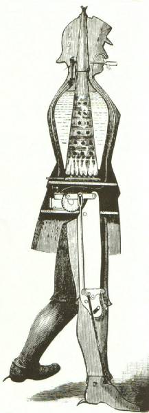
    In 1893 George Moore unrolled his papers and derived this wonderful mechanical man, a gas-fired steam-boiler-driven, half-horsepower, six-foot tall 5-mph dromedary.  It was made of “heavy tin”, had spikes on its heels for added traction, a  fire-funnel surrounded by water and connected in some way to a small but powerful motor.  The exhaust of course would exit through the nostrils. Or, in another version, the exhaust would come out via the machine’s cigar.


    Mechanical man steam george moore
    Earlier than this very striking machine came the 7’9″ steam man proposed by Zadick P. Deddrick.  The patent for the invention was granted in 1868, and was made to haul a rockaway carriage, the machine dressed as a man so as to not frighten horses int he street.  http://www.davidbuckley.net/DB/HistoryMakers/1868DederickSteamMan.htm


  • America at Work: a 1903 Film of the Soft Underbelly of Journalism

    JF Ptak Science Books   Quick Post

    News
    [Source: the Library of Congress, here.  Watch video.]

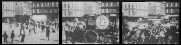
    This is a 53-second insight into one of the primary interfaces of the American news industry and the user–the interface being a mode of distribution–in this case, the paperboy.  The film’s source  is the American Memory Project at the Library of Congress, and is the creation of the American Mutoscope and Biograph Company in 1903. It is filmed in New York City (the LC description guessing that it is Union Square) and shows the delivery wagon for the New York World approaching a drop-off point for the new dailies. (The World, 1860-1931, was published by Joseph Pulitzer at the time that this movie was made.) It is quickly swarmed by the paperboys (along with a few men); the carriage is stopped, and a man begins tossing bundles of the folded paper into the crowd.  There is chaos, and confusion; there is shoving, grabbing, pushing, and fighting. Towards the end of the film the boys stand by to watch two other boys in a true fight. It is a visualization of an unpretty memory of youthful competition for the chance to make a few nickels and who wind up being point-men for an enormous news agnecy which must have had little regard for their being.  What a weak thing this is. 

    ·Posted by :

    ·in:


  • On Tanning Names on Newborn Babies (1930)

    JF Ptak Science Books  Quick Post  Daily Dose from Dr. Odd

    Baby tan181[Source: Popular Mechanics, October, 1930]

    I’m looking for post #2000–this isn’t it.  It is however Quick Post #450 or so, which means that we’re closing in on 2,500 overall posts in this blog since 2008.  But there should be something with a little more flavor than baby tanning for #2000. 

    This is a good/appropriate installment for the Daily Dose from Doctor Odd series.  As ideas go, it is not a very good one–but it is not among the Dantean 9th-level-worst.  If we classify bad ideas on a six-point Major-Minor scale, from MajorMajor to Major to MinorMajor and then to MajorMinor and then Minor and finally MinorMinor, this one would probably rank at the MinorMajor level. Or maybe even a full Major.  It is a bad idea.  (An example, by the way, of a full MajorMajor bad idea would be the electropunk centrifugal birthing patent machine, described earlier on this blog, here. Okay, here’s another:  on draining the Mediterranean Sea, here.)

    There are less invasive ways of ensuring that the correct baby is delivered to the correct parent(s) than tanning the baby’s name onto their body–which doesn’t of course take into account the instances where the baby’s skin is too dark or whatever to be tanned.  But the idea of subject a brand-new baby to a tanning lamp as  its welcome to the world seems a bit–what?–horrible. Exposure to ultraviolet rays that will cause a six-month brand sounds like it might stir up the melanosome pot to cause damage to organs other than the skin, that it could have been a real assault on the DNA.  Also, that metal object on the table looks a lot like a clamp–I hope it wasn’t. 


  • Mapping a Timid Whispered Revolution, 1938

    JF Ptak Science Books  Quick Post 


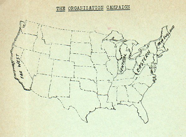
    Socialist New Party180


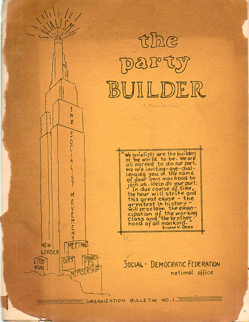
    Socialist New Party179The Part Builder, Organization Bulletin No.1  
    published inn 1938 by the Social-Democratic Federation’s “national office”, is an odd, semi-Outsider kind of publication, a skinny ingenuous cluster of littleness and naivete and homemade hope.  “Socialism” is a beacon of something (light or radio/television waves?) at the top of the Empire State Builind-like structure of the formation of the movement, as we can see in the quick-crude drawing on the left side of the pamphlet’s cover.  

    Maybe it an odd thing to use the new Empire State Building as a symbol for the movement, maybe not–the SDF was a splinter group that cleaved itself away from the Socialist Party in 1936 because it seems that the SP was too revolutionary/pro-Communist for the old line folks who formed the SDP. So maybe the building stood for something that the Communists and parties didn’t–I don’t know, and I’ve never been very good in following the histories of smallish political parties down their rabbit holes of formulations and re-constitutions and inter-tribal micro-warfare, so I really have no great insight into the symbolism. And perhaps given the rudimentary nature of the publication, maybe the symbolism went only so far as it was a thing that the artist/illustrator could actually sort-of draw.

    The main object of interest in this sad little pamphlet though was the U.S. map that appears on page two–it is striking in its way, a silent stab at making claim to potential SDF members in a very quietly outlined American map.  The regional labels are so small and tentative, and the vast inner ocean of undefined America is so, well, vast, that the map seems more one of timidity than anything else, a whispered revolution. 


  • The Plurality of the Heavens, 1613

    JF Ptak Science Books    Post 1999

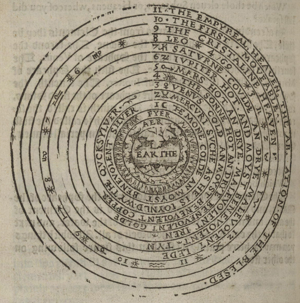
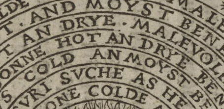
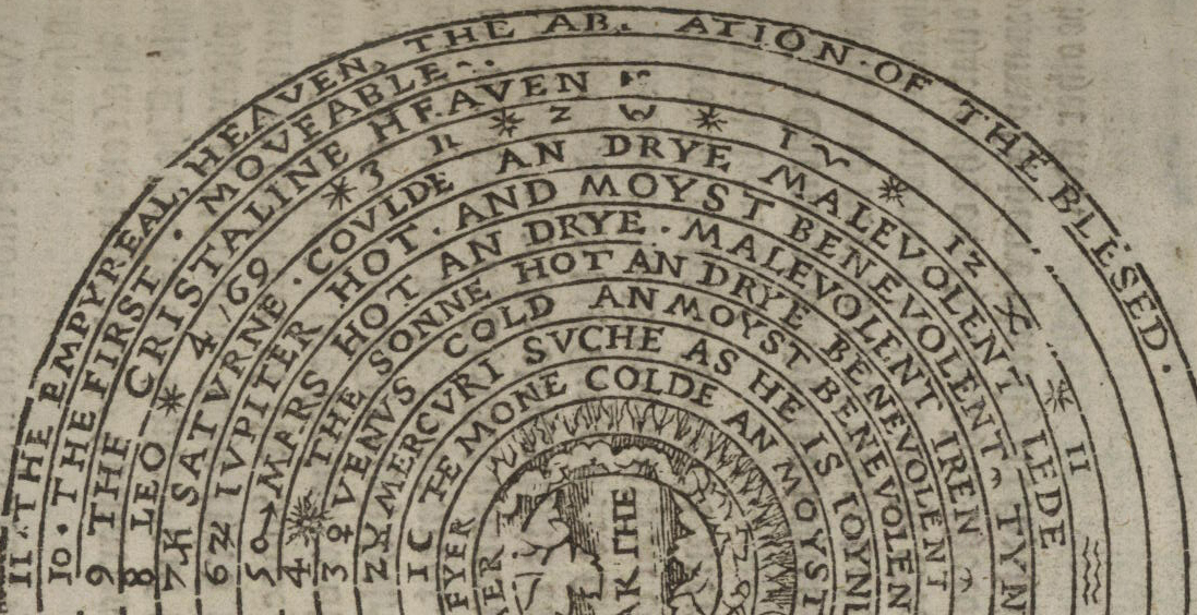
    This copy of Thomas Blundeville’s (1522-1606) work on astronomy and navigation contains some very fine examples relating to imaging the history of astronomy–a high-Renaissance work of scholarship and humanism.

    Cosmology Blundeuille 1607 detai text

    Cosmology Blundeuille 1607

    Cosmology Blundeuille 1607 detail big
    The book has a long and detailed title: M. Blundeuile his exercises : containing eight treatises, the titles
    whereof are set down in the next printed page : which treatises are very
    necessarie to be read and learned of all young gentlemen, that haue not
    beene exercised in such disciplines, and yet are desirous to haue
    knowledge as well in cosmographie, astronomie, and geographie, as also
    in the art of nauigation, in which art it is impossible to profite
    without the helpe of these, or such like instructions : to the
    furtherance of which art of nauigation, the said M. Blundeuile specially
    wrote the said treatises ..
    with this copy being the fourth edition (corrected and augmented), and printed in London in 1613–an interesting edition, which contained the new data of the circumnavigation of Sir Francis Drake.  

    [Sources: full text here via the Library of Congress; found via the pinterest collection of Trevor Owens.]

    Cosmology Blundeuille 1607 text


  • A Note on the Very Very Quiet Beginnings of Pi

    JF Ptak Science Books   Quick Post

    It seems that for such a great number as pi the naming of had little (where “little” = “no”) fanfare in its introduction.

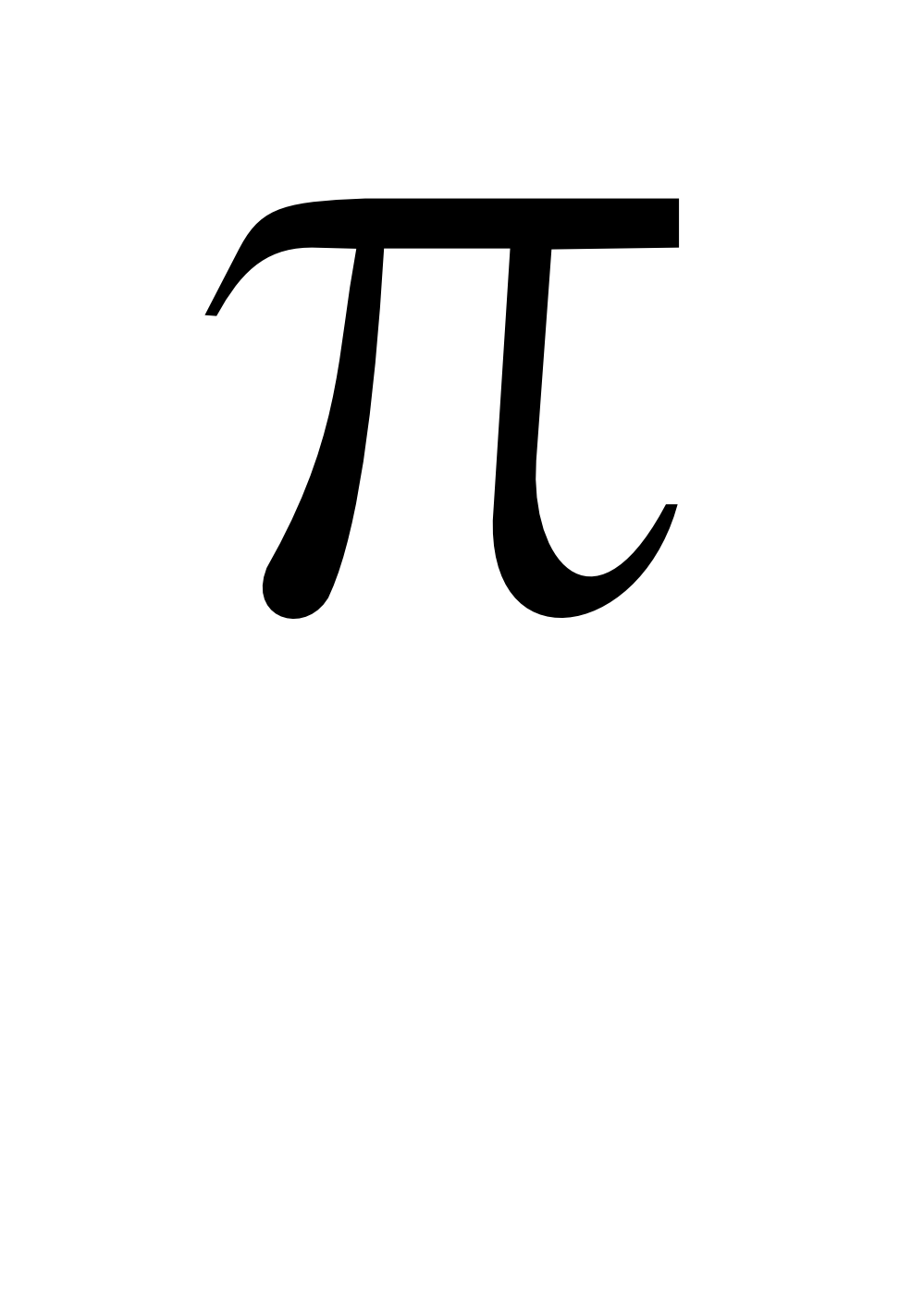
    Since it is just after 1:59 on this pi day of 2013 (3.14159…) it might be nice to have small bit of history on the first use of the symbol for pi. Pi the idea is ancient (on the ratio between the diameter of a circle and its circumference) but using the Greek symbol for the word is relatively new.  It shows up for about he first time here:

    on page 267 of William Jones’ (1675-1749) Synopsis Palmariorum…, which was in general a book for beginners in semi-advanced mathematics, and which was published in 1706.  Pi is represented as a square or the Hebrew letter “mem” in John Wallis’ Arithmetica infinitorum (published in Oxford in 1655), according to Florian Cajori in his A History of Mathematical Notations (volume II page 8), though William Oughtred had used the Greek letter in fractional form to designate the ratio as the periphery and the denominator as the diameter. Still, it was Jones who introduced the letter pi as the sign for the ratio, and he did it without saying very much at all about it.  Actually, he says nothing about it at all–just states the case, and that was it. 

    Cajori writes on to say that Jones used the symbol earlier in the book, but in a different context, and that the immediate reaction to the symbol (if there was a reaction) was also a bit of nothing, with many writers continuing to use different symbols to talk about pi for several more decades, and that it didn’t really come into use in general textbooks in German and French until nearly 1800. 

    And such was the quiet beginnings of

    Pi

    (Full text here.)


  • Splendid Small Astronomical Image–Paper Microscope Exercises,1856

    JF Ptak Science Books   Follow Me on PinterestQuick Post


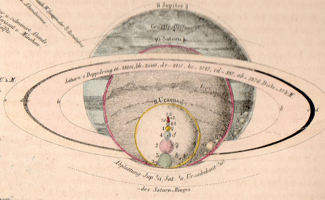
    These small images are elements composing an engraving from the atlas volume to accompany the polymathic Alexander von Humboldt’s (1769-1759) Kosmos, published in 1856 (the atlas volume online here, at the Biodiversity Library). Each of the small images is about 1.5″ square, with great detail–tiny and remarkable, and very well designed.

    Astronomy von Humboldt det137


  • On Filling-in-the-Blanks, 1757

    JF Ptak Science Books  Quick Post   Follow Me on Pinterest


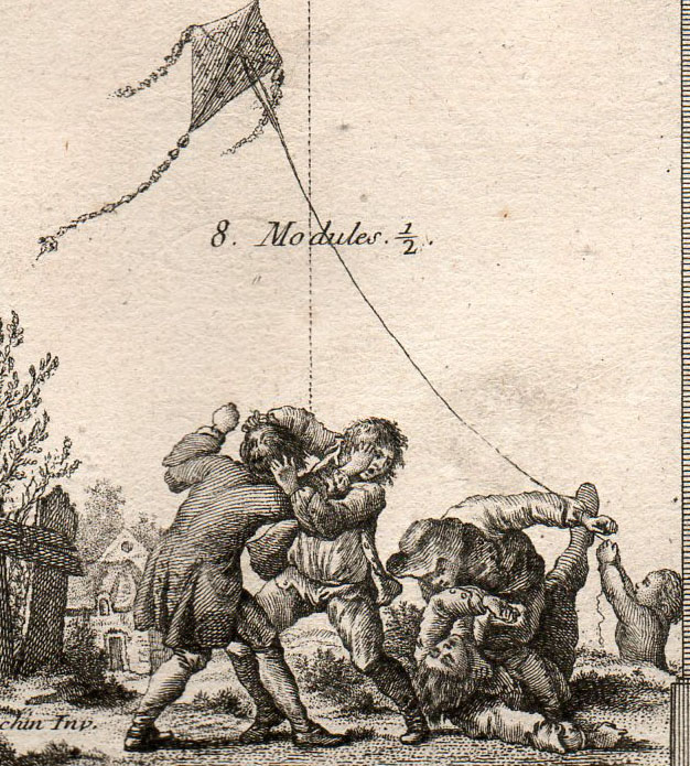
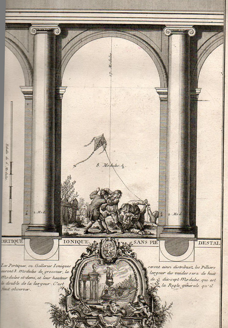
    This Rococo edition of Vignola [Jacopo (Giacomo) Barozzi da Vignola (Italian, Vignola 1507–1573 Rome)] features fabulous interpretations of the classic textbook, the images of columns and plans of buildings and designs of rooms and so on all are decorated with bits and pieces of 18th century humanism.  The detail above (with the nearly-full engraving below) is embellished with a very uncommon scene of children fighting and playing. It is one of many that are illustrated with scenes of everyday life which really have nothing to do with the image in which they find themselves, a little bit of When Worlds Collide happiness. 

    [Source: private.  The full title of the book:  Livre nouveau, ou, Regles des cinq ordres d’architecture / par Jacques Barozzio de Vignole ; nouvellement revù, corrigé et augmenté par Monsieur B*** architecte du roy ; avec plusieurs morceaux de Miche-Ange, Vitruve, Mansard, et autres célebres architectes tant anciens que modernes … ; le tout d’après Mrs. Blondel, Cochin et Babel, graveurs ..Edited by Jacques-François Blondel (French, Rouen 1705–1774 Paris); designed by Pierre Edmé Babel (French, 1720–1775); engravings designed by Charles Nicolas Cochin II (French 1715–1790); title page engraved by Jean-Charles Le Vasseur (French, 1734–1816).]


    Arch vignole 159

    Which is a detail from:

    Arch vignole 158


    ·Posted by :

    ·in:


  • A Very Uncommon USA-Cuba Celebration

    JF Ptak Science Books   Quick Post

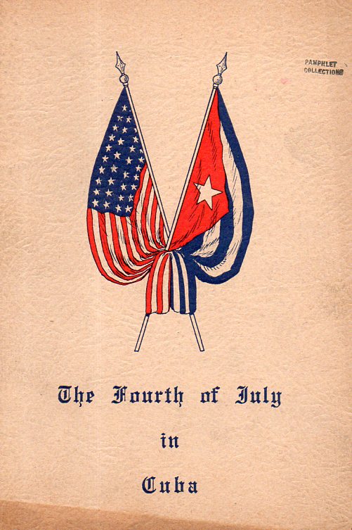
    Cuba USA 4th july174

    This pamphlet was full of hope and the prospects of engineering an economic relationship with the United States during a period of turbulence in Cuba, two years before the ratification of the progressive constitution of 1940. Printed in Havana in July 1938, it calls for “A frontierless Fourth of July” and “Dedicated by the Socio-Economic Union of Cuba to the people and Government of the United States of America”.  It came to me via the Library of Congress which in turn acquired it from the U.S. Supreme Court, which got rid of the document only a few months after it was received.  Let’s just say that this was a most unexpected piece of cover art. 

    ·Posted by :

    ·in: