A Daily History of Holes, Dots, Lines, Science, History, Math, Physics, Art, the Unintentional Absurd, Architecture, Maps, Data Visualization, Blank and Missing Things, and so on. |1.6 million words, 7500 images, 4.9 million hits| Press & appearances in The Times, Le Figaro, Mensa, The Economist, The Guardian, Discovery News, Slate, Le Monde, Sci American Blogs, Le Pont, and many other places… 5000+ total posts since 2008.

Author: JF Ptak

  • History of Holes: Lakes and Holes and Imaginary Tears

    JF Ptak Science Books   Quick Post

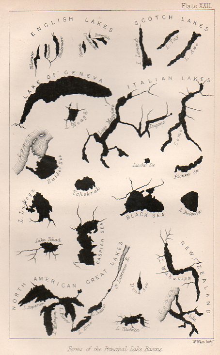
    This engraving was very nearly very interesting–I mean, it is interesting in that it shows the shapes of lakes together on a single sheet of paper, their shapes presented devoid of any other non-lakes.  Its really quite an arresting presentation, and coming at a relatively early time in presenting data in this fashion.  What the engraving doesn’t relate, unfortunately, is the size of the lakes relative to one another. 
    LAkes161

    And if the lakes were to be presented proportionally, Lake Geneva (surface area of 225 miles2 would be quite a speck compared to the likes of the Great Lakes, and Lake Superior (31,000 miles2) would speck-ish compared to the great Caspian (clocking in at 152,000 miles2). 

    This graphic appears still in the first decade or so of cartographic physical attributes being placed together, and was published in 1865 in the Popular Science Monthly. 
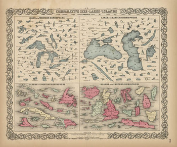
    Blogjuly_19_comparative_big_colton Here we go with a good representation of an engraving (above), this from 1856 and which may have been the first time that these 150+ lakes and islands of  the Western and Eastern Hemisphere were ever been printed on the same  page and in the same scale exclusive of their associative land masses  and placed contiguously, side-by-side.  They were, of course, seen in a  common perspective before on any world map, but I think that this is the  first year in which the islands and lakes of the world were displayed  without oceans and land masses, and the effect is a little odd.  If you  take away the color and the text the image takes on a very definite  biological flavor (I keep thinking of that tiny bone in the ear for the  small lakes…)  In any event it is far easier to compare these features  without the distractions of the non-lakes and non-islands clouding and  confusing our perspective fields.

    The largest lakes, here.

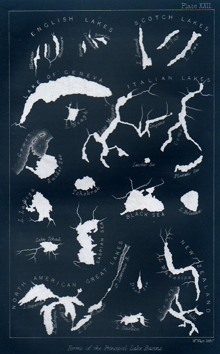
    And as long as we’re at, let’s have a look at the first image inverted, which gives the lakes a good healthy dose of anthropomorphism via imaginary rips, tears, moth- and bullet-holes.
    LAkes inverted


  • Melville on the Depiction of Whales

    JF Ptak Science Books  Quick Post

    I was digging a little in Herman Melville and Moby-Dick and fell into eleven pages of his scholarly ruminations on the depictions of whales in art and literature, fictional and otherwise.  Its really a very fine little gem, bobbing there in the nearly the exact middle of the book. (It is not the middle of the middle of the middle like Gettysburg in Mr. Foote’s The Civil War, a Narrative, where as it happens the battle appears in the middle chapter if the middle volume, but it is close enough.)  Here it is, from the full text at the University of Virginia:

    ·Posted by :

    ·in:


  • Ibsenity, 1891: “Not Only Should the Play be Spared Discussion, but also Performance”

    JF Ptak Science Books   Quick Post 

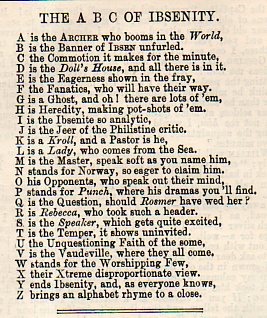
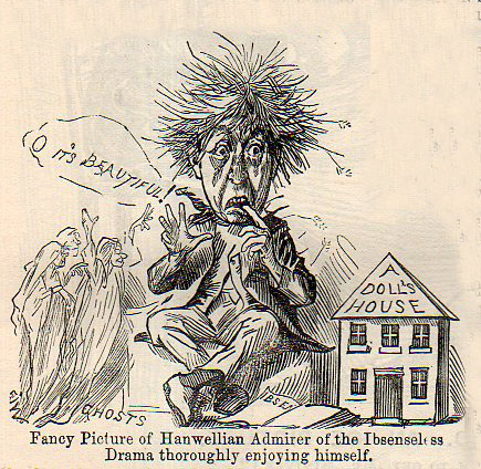
    These bits just caught my eye, found in the 1891 volume of Punch magazine, a smart and sharp-as-broken-glass humorous/satirical/social commentary popular English mag.  It takes Henrik Ibsen to a rough task: evidently, if Ibsen were a color-by-number portrait to be painted, Punch would give him the numbers “1” and “2”, and then color everything in one color.  Somestimes something can be revolutionary and essential and unlikable, even when it has become the modern world’s most-often-performed play. 

    Ibsen169I’m partial to created alphabets:

    Ibsenity166

    And the review of A Doll’s House that accompanies the satirical image above:

    ·Posted by :

    ·in:


  • Anti-Bolshevist Propaganda of High Impact, 1934

    JF Ptak Science Books  Quick Post

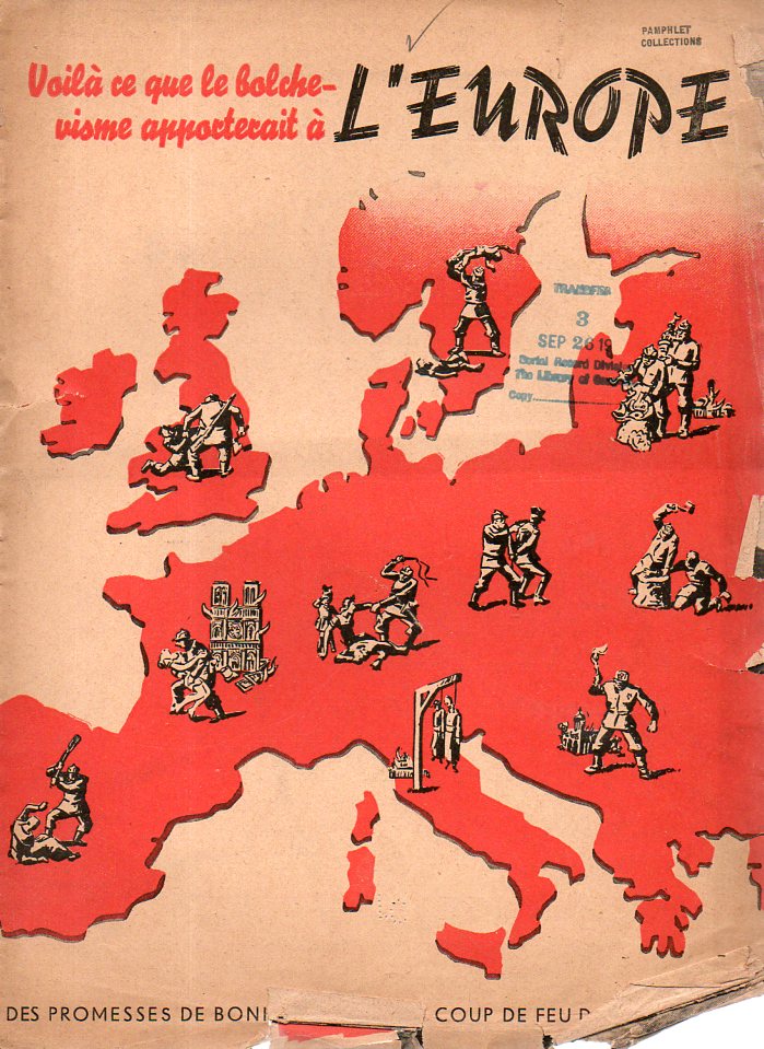
    This pamphlet is very strong–very deeply, drippingly, rippingly, troublingly, strong.  It is an anti-Soviet French publication, Voila ce que le bolchevisme apporterait a l’Europe, (Des Promesses de Bonneur Jusqu’au Coup de Feu dans la Nuque), anti-Socialist/Soviet/Bolshevist of the highest order.  “This is What the Bolshevist will Bring to Europe” has a cover based on a 1934 poster, and was so published in 1934 or 1935.  It is, essentially, a brutal portrayal of Stalinist Russia and what the coming of that communism would mean to Europe and the U.K.

    Anti-bolshevic164

    The poster–which is slightly larger and reaches deeper to the East–is available here.

    ·Posted by :

    ·in:


  • On Interior Views–Looking Someone Else’s Inside, Out

    JF Ptak Science Books  Follow Me on Pinterest Post 1996

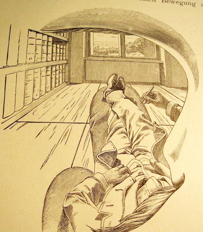
    I cannot think of another illustration by a scientist or philosopher who attempts to explain their own–literal, interior, physical–view of the world and then offer what this looks like to the reader from inside his own head, looking out through his own eye.  That’s exactly what the (unnamed but very Escher-esque?) artist did for Ernst Mach, who is doing precisely that right here on page 15 of his influential book  Die Analyse der Empfindungen. (That’s the  fourth German edition, also known in translation as The Analysis of Sensations and the Relation of the Physical to the Psychical, published in Jena in 1903.) It is a very unusual point of perspective, seeing the world under someone else’s eyebrow and over their moustache.Mach perspective copy
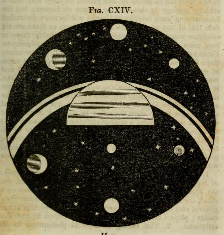
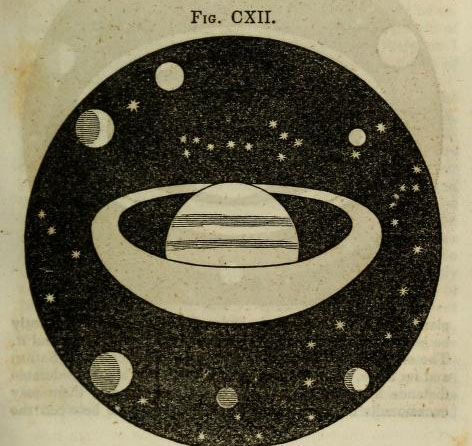
     In a sort-of-similar vein, there is another point of view that is extremely uncommon, another you-are-there perspective, though not interior to the person making the observation, but nearly so.  Here’s an example, just found, and an early one, this imagined from the far side of one of Saturn’s rings, looking back on the planet, and experiencing the distorition in perspective due to the closesness of the observer. 

    Astronomy dick view of sat from ring
    Another image, this one showing the view directly from “the first or second satellite” of Saturn, looking back and across the planet’s rings:

    Astronomy dick view saturnn's rings from satellite
    [Source:  Thomas Dick, Celestial Scenery, 1838, available in full at the Internet Archive, here.]


    ·Posted by :

    ·in:

    — —

  • History of Holes–the First Images of Holes Made by Insects?

    JF Ptak Science Books   Post 1995   Part of a series on The History of Holes #45Follow Me on Pinterest

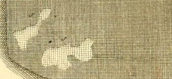
    Reaumur close-up det
    [Detail from one of the earliest images of holes made by insects? From Reaumur, citation following.]

    There are many different ways of looking at antique (or any other) scientific images.  Sometimes you see exactly what they’re supposed to be showing, and other times the viewer sees something more. Sometimes this “something more” is useful, and sometimes it is simply a side bit, not adding to the understanding of the image content, but curious nonetheless, useful in other ways.

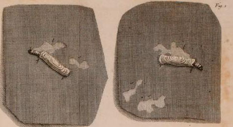
    And so is the case with this miniature/micro observation of this engraving which appears in the great work on the lives of insects by  René-Antoine Ferchault de Réaumur:  Memoires pour servir a l’histoire des insectes, which was printed in six impressive volumes (some 26cm tall) in Paris from 1734 through at least 1742,  illustrated throughout with 269 engraved plates, many depicting more than one subject. This was the masterwork of its time on insects, a great effort made and achieved on insect architecture, biology, and behavior–it was a careful and exacting work, magisterial.  Reaumur (1683-1757) was an exceptional talent and observer, writing for the Academie des Sciences on a really wide variety of subjects for over fifty years–and even with this large output, most of his work was delivered posthumously to the Academy.   

    My attention was drawn to him from an illustration in Barbara Maria Stafford’s Good Looking, Essays on the Virtue of Images (MIT, 1996, palte 93), which depicted the holes made by moths in cloth in volume 3 of the Memoires.  The first image, above, is a detail from the Reaumur engraving, with the full plate, following:

    Reaumur holes detail
    [Reaumur, Memoires pour servir a l’histoire des insectes… volume III,  from the Internet Archive, here.]

    And more:

    Reaumur holes
    The series on this blog concentrating on the history of holes may or may not make any contribution to anything at all, save for perhaps serving as an outpost on looking at images from a different perspective. 

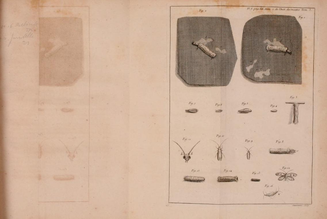
    And just for good measure, here’s an image of the ghost of the image of the mothy hole, an image imprinted on the page opposite the page on which the original image was printed, the ghosted mirror image of the hole captured in an ink/iron impression on paper. 

    Reaumur holes ghost

     Here are the links for the six volumes of Reamur’s Memoires:

    Mémoires pour servir à l’histoire des insectes (1734-1742)

    • Tome I : Sur les Chenilles et les Papillons, Imprimerie royale, Paris, 1734, 654 p., 50 pl. ;
    • Tome II : Suite de l’Histoire des Chenilles et des Papillons et l’Histoire des Insectes ennemis des Chenilles, Imprimerie royale, Paris, 1736, 514 p., 38 pl. ;
    • Tome III : Histoire des Vers mineurs des feuilles, des Teignes, des fausses Teignes, des Pucerons, des ennemis des Pucerons, des faux Pucerons et l’Histoire des Galles des Plantes et de leurs Insectes, Imprimerie royale, Paris, 1737, 532 p., 478 pl. ;
    • Tome IV : Histoire des Gallinsectes, des Progallinsectes et des Mouches à deux ailes, Imprimerie royale, Paris, 1738, 636 p., 44 pl. ;
    • Tome V : Suite de l’Histoire des Mouches à deux ailes et Histoire de plusieurs Mouches à quatre ailes, savoir des Mouches à Scies, des Cigales et des Abeilles, Imprimerie royale, Paris, 1740, 728 p., 44 pl. ;
    • Tome VI : Suite de l’Histoire des Mouches à quatre ailes avec un supplément des Mouches à deux ailes, Imprimerie royale, Paris, 1742, 608 p., 48 pl. ;
    • Tome VII : Histoire des fourmis, Paul Lechevalier éditeur, Paris, 1928, 116 p. & Histoire des scarabées, Paul Le Chevalier éditeur, Paris, 1955, 340 p., 21 pl.

    ·Posted by :

    ·in:

    — — —

  • Alphabet of the Magnetic Field: Breton Lists his Surrealists

    JF Ptak Science Books   Post 1994  Follow Me on Pinterest

    Breton

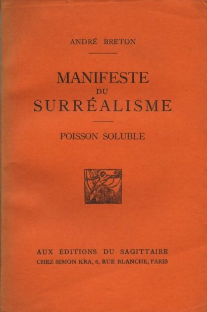
    Andre Breton (1896-1966)  may be the patron and founding saint of the movement we know as “Surrealism”.  “I believe”, he said, “in the future resolution of the states of dream and reality, in appearance so contradictory, in a sort of absolute reality, or surrealite, if I may so call it”.  So he wrote in his Manifeste du Surrealisme (pp 23-24), published in Paris in 1924, just days after the first meetings of the group of writers and artists to which he belonged called the Centrale Surréaliste or the Bureau of Surrealist Research, (also known as the Bureau of Surrealist Enquiries). Breton’s Manifesto was a defining element of the movement (in spite of its own probably intentional contradictions), and , well, entirely too much to summarize here in this minor post.  I am more interested presently in some of the names he discussed here and in a later work.


    Breton149
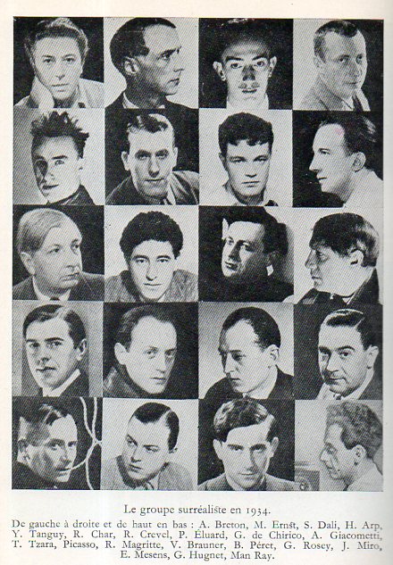
    [Source: Maurice Nadeau, Histoire du Surrealisme, Editiosn du Soeuil, 1964.]

     Breton made several interesting lists of artists and writers who he identified as Surrelaists or precursors of Surrealism, the names appearing in the  Manifestes… and then in the Anthologie de l’Humor Noir.  The suggestions are factual and fanciful, meant to be taken seriously and not–ir at least his reasons and identifiers of those names were to be taken loosely if not the names themselves.  In any event it is an itneresting amalgamted list, which is presented below, cobbled together from the two sources and then alphabetizied. These are names Breton mentions explicitly in his lists, and do not include all of those folks whos eart he discusses in those works. I mean to return to this with portraits and links, but for a start today I’d at least to start with the backbone of the names.

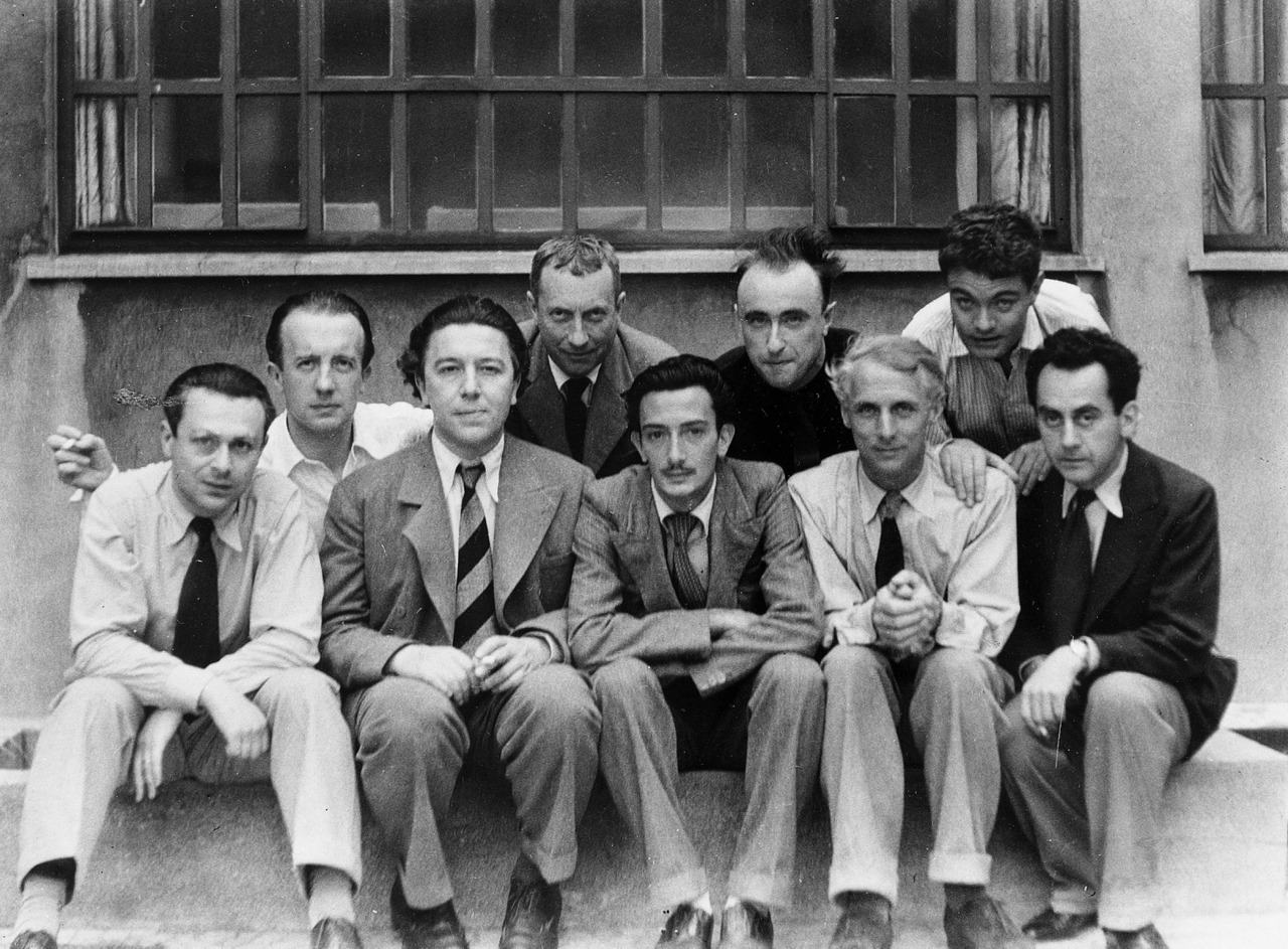
    Surrealist portrait Paris 1933

    [Source: the Paris surrealists, 1933: Tristan Tzara, Paul Éluard, André Breton, Hans Arp, Salvador Dalí, Yves Tanguy, Max Ernst, René Crevel and Man Ray. Photo by Anna Riwkin-Brick.  Image found here: Art and Studio Tumblr, here.]

    Manifestes du Surrealisme (1924) is available in French here and in English here.

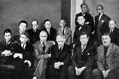
    Surrealists 1942[Artists in Exile, 1942:   Front row left to right: Matta Echaurren, Ossip Zadkine, Yves Tanguy, Max Ernst, Marc Chagall, Fernand Léger Second row: André Breton, Piet Mondrian, André  Masson, Amédée Ozenfant, Jacques Lipchitz, Pavel Tchelitchew, Kurt Seligmann and Eugene Berman. (Photo: George Platt Lynes]

    Breton’s definitions of surrealism:

    SURREALISME, n, m. Automatisme psychique pur
    par lequel on se propose d’exprimer, soit verbalement, soit par écrit,
    soit de toute autre manière, le fonctionnement réel de la pensée, en
    l’absence de tout contrôle exercé par la raison, en dehors de toute
    préoccupation esthétique ou morale. [Surrealisme. Noun, masculine. Pure psycic automatism, by which one intends to express verballym in writing or by any other method, the treal functioning of the mind. Dictation by thought, in the absence of any control exercise by reason, and beyond any aesthetic or moral preoccupation] 

    ENCYCL; Philso. Le
    surréalisme repose sur la croyance à la réalité supérieure de certaines
    formes d’associations négligées jusqu’à lui, à la toute puissance du
    rêve, au jeu désintéressé de la pensée. Il tend à ruiner définitivement
    tous les autres mécanismes psychiques et à se substituer à eux dans la
    résolution des principaux problèmes de la vie. [Encycl. Philos. Surrealisme is base on the belief in the superior
    reality of certain formes of association heretofore neglected, in the
    omnipotence of dreams, in the undirected play of thought…]


    ·Posted by :

    ·in:


  • Racism in Space

    JF Ptak Science Books   Quick Post   Follow Me on Pinterest

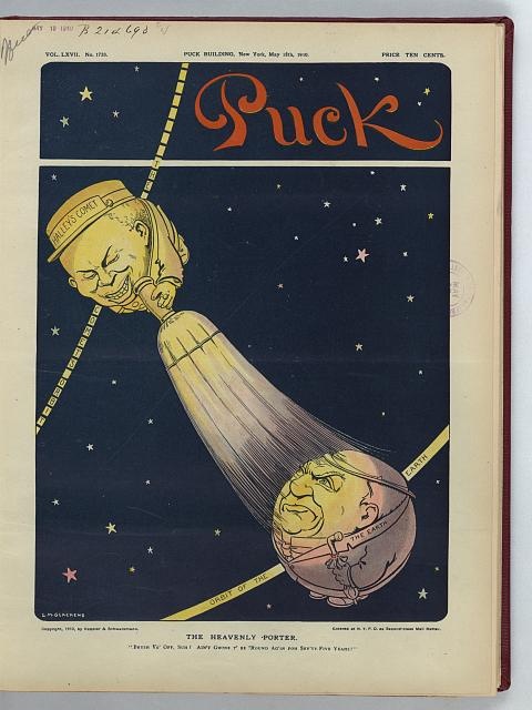
    Attributing human characteristics to extra-terrestrial bodies is an ancient practice.  Constellation It is an ancient human practice of giving stuff human attributes, to allow things to have powers of reason,and understanding, in order to make them understandable, intellectuallyconsumable.  This applies to (Father) time, many aspects of the
    possibilities of g_d, constellations, planets, the Man in the Moon, facial appellations of the Sun, winds, rain, and so on. Large chunks of our real and imagined worlds are given faces and mentions–that, plus personifications of elements, where we describe the difficult and the invisible with traits that are in our common human understandable currency:  like, for example, sin “lurking” and storms “hiding” and meteors “racing”. It makes the complex and uncommon more reasonable. 

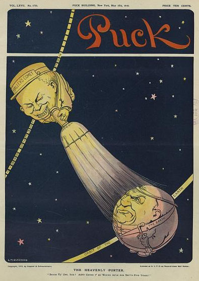
    In all of this, particularly in the personification and anthropomorphization of celestial entities, there are very few examples of vicious and cruel representation of a subject.  That is what struck me so about the following cartoon from Puck magazine–I am sure that I have never seen a racist representation of an element in the sky.  Until
    today. 


    Race sky

    [The heavenly porter: Caption: “Brush yo’ off, Suh? Ain’t gwine t’ be ’round ag’in foh sev’ty-five yeahs!”  Illustration in Puck, v. 67, no. 1733 (1910 May 18), cover.  Copyright 1910 by Keppler & Schwarzmann. Source:  Trevor Owens, via the LOC.]

    This is an example of how engrained racist thinking like this was at that time–and it makes a person think about the unthought aspects of racism exists elsewhere, at other times, and today. 

    ·Posted by :

    ·in:

    —

  • Von Braun on German Liquid Rocket Development, 1945

    JF Ptak Science Books Post 1994

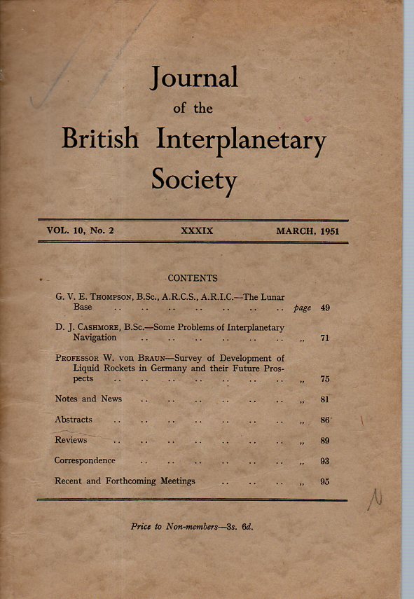
    Von braun title157I was prepared to just list this for sale in the books for sale section of this blog and be done with it–until I semi-realized that this famous (or at least significant) report is not to be found available online. Von Braun is far from being of interest to me–I don’t need to know his part of the space program from 1946-1977, though I am interested in his what he was doing from 1936-1945 when he was trying to kill London.

    Again, I’m no expert on this man, but reading between the lines of his politically whitewashed account of German/Nazi flying bomb program makes me wonder about his enforced/codified forgetfulness and suggestive memory.

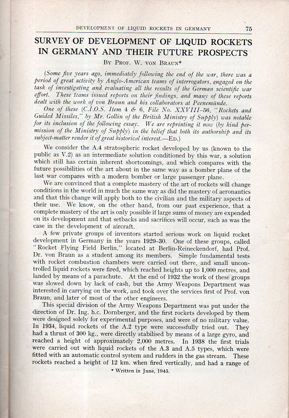
    The paper in hand is his “Survey of Development of Liquid Rockets in Germany and their Future Prospects”, a six-page effort that appeared in the Journal of the British Interplanetary Society on March, 1951. It is a reprint of a reprint of a report that he wrote for his Anglo-American interrogators in the summer of 1945, when he and the Allies were scurrying around and trying to figure out what to make of the post-war world with all of that valuable German technology-ops out there in the wind.

    In any event, von Braun wrote out this history and prognostication (as there is a big chunk of the paper devoted to future space travel and such) for them in 1945 which then found itself in print by at least 1946. There are many glosses. For example, his use of the A.-prefix determination throughout the course of the document to refer to the V-weapons though it is noted in the first sentence of the report (and no doubt by an editor), that the A.4 “is known to the public as the V.2”. (Perhaps that has the scent of freshness to it, to rid the report of a small part of its scrubbiness…or not.)

    He writes occasionally in the third person, and also makes the case that the development of the rocket complex at Peenenemunde was for research in high-flight/super-fast travel, when the place had always been intended for military applications. He does mention that the A.4 had severe problems with the guidance system, but that was acceptable since they were given large-target areas to bomb–such as “London”.

    It is an interesting read for what it says about the future of vast fast travel, as well as for what it does not say about defeat and responsibility and the use of slave labor and bombing large civilian areas. But that’s not what he was talking about, here.  Or basically ever.


    Von braun 1151


  • Structure for Wide Thinking–Gropius as Teacher

    JF Ptak Science Books 

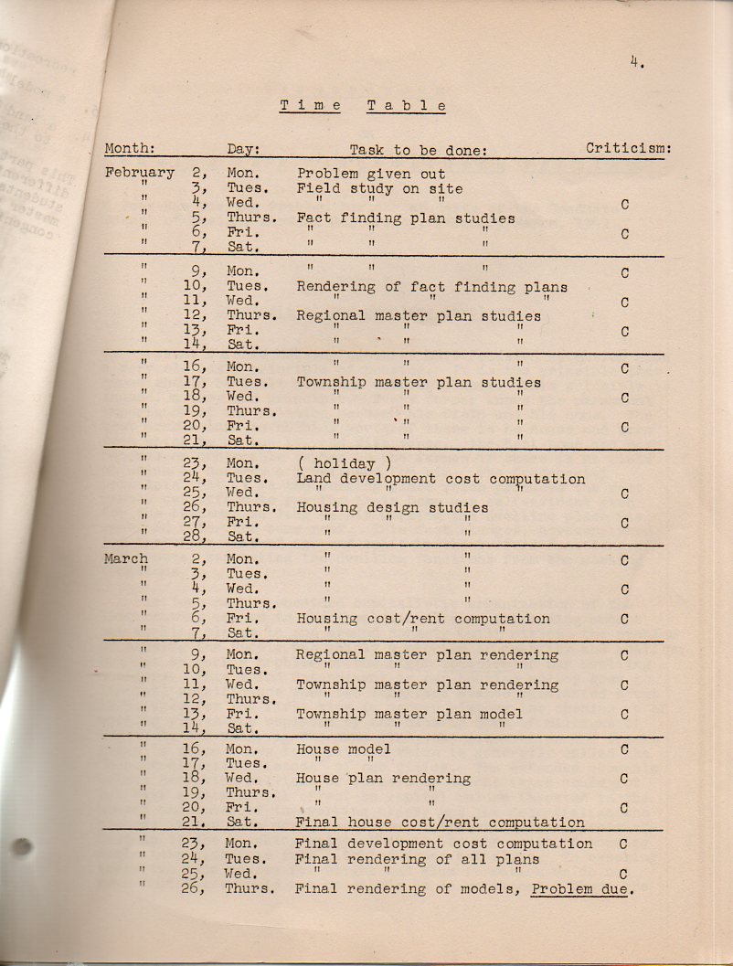
    Walter Gropius (1883-1969, founder of the Bauhaus School and one of the principle builders of modern architecture) and Martin Wagner (1888-1957) were thinking of a new type of “town”, of a different sort of settlement for people, when they wrote this exercise instructional for their Harvard course. Housing as a townbuilding1 problem, written during the war in 1942, was intended to be an exercise (or  “problem”), a case to be studied by the students in the departments of landscape architecture and the graduate school of design at Harvard. The class opened with this rare2 pamphlet as a basis for course work, given to the students on 2 Feb 1942, with the problem’s answers expected to be on Gropius desk five weeks later.  Gropius and Martin put a tough, wide-ranging, landscape-changing question and expected answers in a very short period of time, though they definitely had a very structured plan and approach to dealing with massive implications of their exercise.  The theory was outlined there in the paper, of course, and was expanded much more fully in class.  And then there was this: a full page of datelines and expectations, a way of dealing with a large problem in logical chunks, adding up the answered bits, and then delivering a larger answer at the end and on time. 

    Gropius table899
    [The original work is available at our blog bookstore.]

    I’m not an architecture or design historian, so much of this paper was a little lost on me–but I could definitely appreciate the way in which the great Gropius outlined the process of problem-thinking and solution for his students.  This may be the part of this paper that I liked the most. 

    In  “The Walter Gropius House Landscape: A Collaboration of Modernism and the Vernacular”3 (published in the  Journal of Architectural Education, 1984, 57 (3), p. 39) Eric F. Kramer wrote:

    “Sounding similar themes in a 1942 joint studio problem for landscape and architecture, Walter [Gropius] wrote of the inspiration of the vernacular landscape and of integrating with existing systems: ‘Such a landscape invites the artist planner to observe and preserve its variety of aspects, and to invent a settlement pattern that .ts into its natural beauty. Fortunately our forefathers have already traced out a settlement pattern that fits very well into the landscape.’ Gropius–the grand master builder and master teacher–set out the problem and the solution”.

    There are of course major statements in city-building and human resettlement in this work, but for now, I’m still concentrated on the Bauhaus-founder’s outline for problem solving.   

    Notes

    1.  The full title: Housing as a townbuilding problem; a post-war housing problem for the students of the Graduate School of Design, Harvard University, February-March, 1942.

    And in that publication Gropius writes: “When we speak of ‘new townships’ we think of a new type of human settlement “, with a redefined vision of what a “town” means, using an idea of “reception basins” for spheres of cities as centers of culture, art and commerce “and our open country as furtherer if an industrialized agriculture and of forestry and recreation”. (page 21).  And all of that to be manufactured along the lines of “planned super-highway systems, one branch of which is to go through New England region and will supposedly cut through the towns of Weston and Weyland”.–Gropius and Martin.

    2. This copy was in the Office for Emergency Management; only  six other copies have been found and these in excellent collections: MIT, Harvard Special Collections, Harvard College of Design, Cornell, Columbia and the NYPL (Special Collections).  So the publication is pretty scarce, and given its method of printing and distribution, it looks like not many survived, though it is difficult to say how many were actually printed.  In any event, few survived.

    3. The abstract of this paper is helpful: “The Walter Gropius House Landscape A Collaboration of Modernism and the Vernacular”. “The Gropius house landscape is a potent physical manifestation of the design debates of its era. The landscape is an element of both mediation and integration forging a reciprocal and evenhanded relationship between architecture and site. Shaped by modern architectural sensibilities translated to the landscape and developed at a moment when landscape architecture was struggling to .nd a modernist inspiration and voice, it is an object lesson in the development of a modernist landscape architecture in America…”   
    “In these studio problems, Gropius consistently encouraged students to find new form in the functional requirements of modern times and yet to integrate with existing systems through an understanding of their own functionally driven evolution.”

    ·Posted by :

    ·in: