A Daily History of Holes, Dots, Lines, Science, History, Math, Physics, Art, the Unintentional Absurd, Architecture, Maps, Data Visualization, Blank and Missing Things, and so on. |1.6 million words, 7500 images, 4.9 million hits| Press & appearances in The Times, Le Figaro, Mensa, The Economist, The Guardian, Discovery News, Slate, Le Monde, Sci American Blogs, Le Pont, and many other places… 5000+ total posts since 2008.

Category: Naming Things

  • Center of Attention–a Map of Women’s Visual Exploration of Men (1941)

    JF Ptak Science Books Post 1136

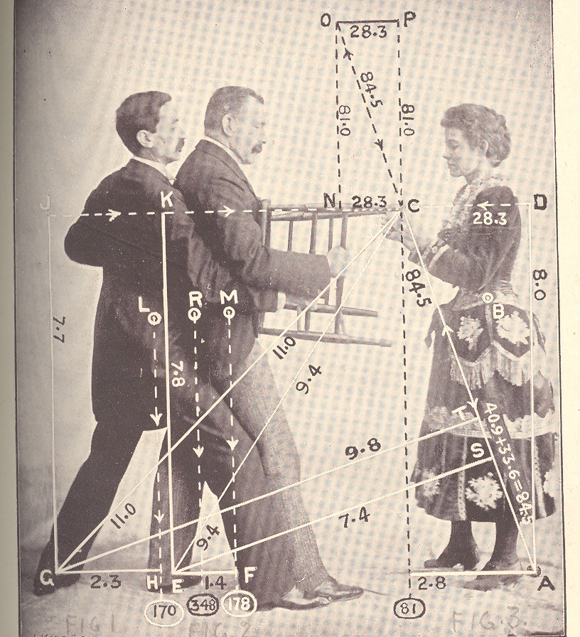
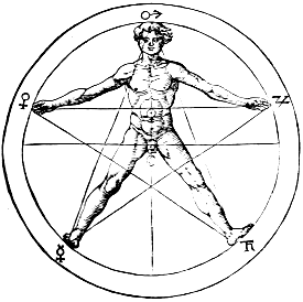
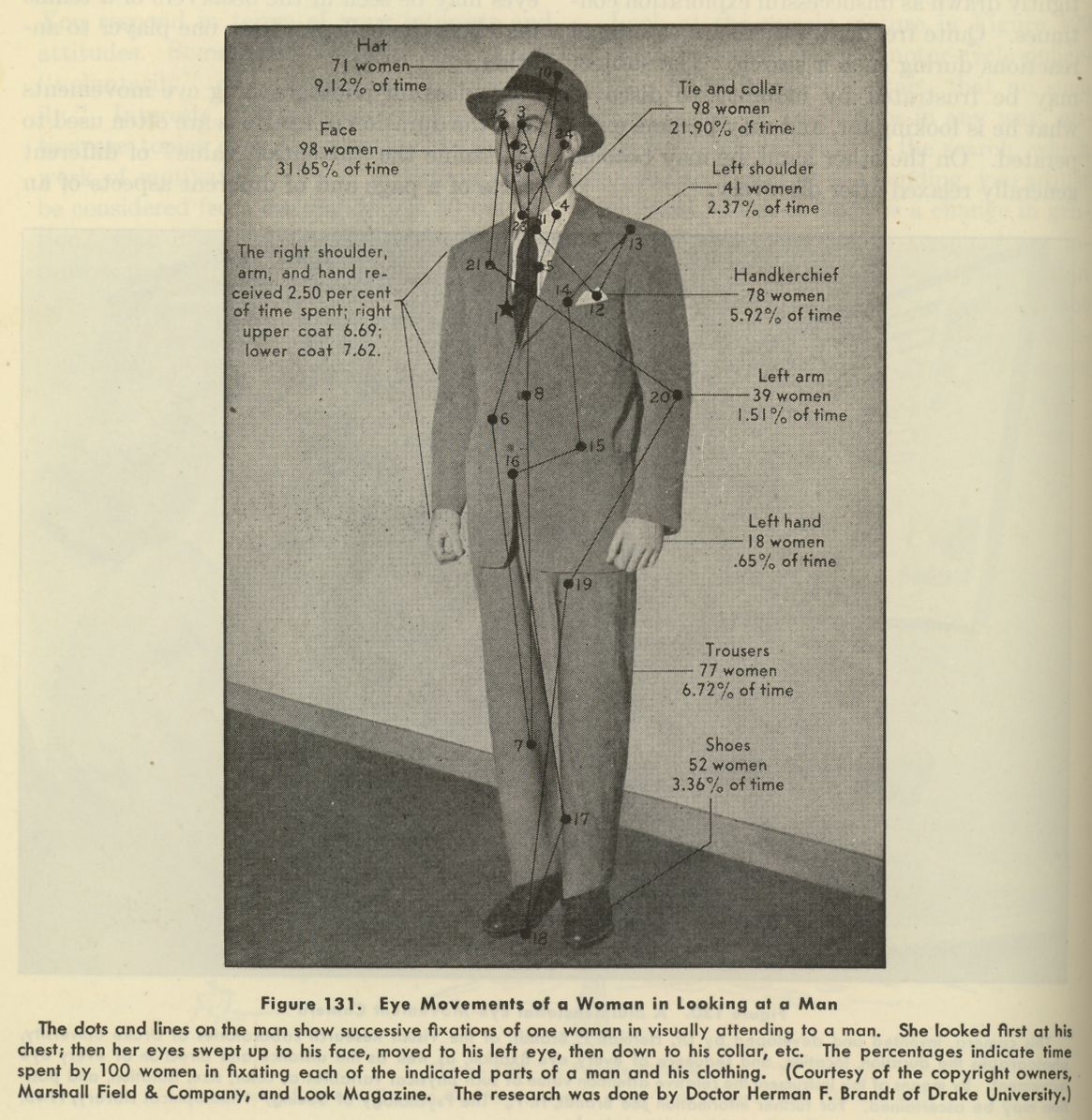
    The eye leads the brain, or the brain leads the eye, and from there, who knows where anything goes, especially when involved with a qualitative survey of a complex entity. This is more-or-less what we are dealing with here, in this image below, found on page 74 of a 1941 issue of Life magazine. (It is related in some way to an earlier post on this blog, a post called “The Center of Levity..”1 , though perhaps not really.)  It is hardly a map of the macrocosmos incised with Pythagorean precision on the body of man2, nor an astrological  or Kabalistic or Vitruvian perspective representation of humanity.  It is just a 1940’s  eye-trail map of where women looked at a man, a non-mathematical treatment of vague interest.

    Eye fixations

    It turns out that the seduction of a man’s body to a woman’s gaze–as difficult as that might seem from this photo–is fairly measurable, and was so even in the 1940’s, when the researcher Herman F. Brandt (Drake University, Iowa) produced this image.  And what it is, basically, is a map of where women looked when their eyes were tracked as they looked at this man.  Brandt had a long career investigating ocular fixation, and (I think) developed a camera that would track the reflection of beams of light on the corneas of his subjects, recording eye movement in horizontal and vertical planes, as they drank in this fine figure of manhood.  In any event his research was of interest to a wide variety of people, from neurologists to fashion designers–I’ve got no idea of how that interest was manifested, or if it turned out to be valuable information.  I do know that the Brandt work utilized by Marshall Field & Co. did produce a remarkable photograph open to all sorts of interpretation.   Visual stimulus point #19 was left uninterpreted and unmentioned, though the great majority of visual hits was above the waist, and above the neck.

    Notes:

    1. One of the images from the Center of Levity post:

    Mar 23 center of levity cvr det 2

    2. For example, this classic from Agrippa von Nettesheim, De Occulta Philosophia (1533):

    Agrippa


  • Occupational Alphabet 2, ca. 1844

    JF Ptak Science Books   Post 1104

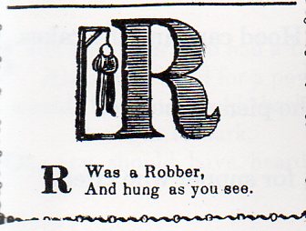
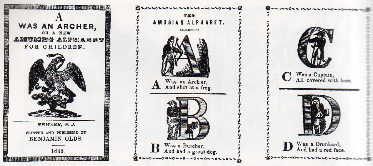
    Alphabet 2-robber280 Following yesterday’s “Occupational Alphabet” post comes A was an Archer, or a New Amusing Alphabet for Children, published in beautiful Newark, New Jersey, in 1844.  10 centimeters tall, this little 16-page pamphlet introduced children to associative memories of alphabets and occupations, accompanied by a rhyming couplet displaying a low quality of half the joined occupation. Thus, “Q” is for “Queen” but “of the lowest degree”. 

    And so:

    The Archer shot at a frog; the Captain was covered with lace, the Esquire had an insolent brow, the Gamester had ill luck, and so on.  It is interesting to note that the Robber was hanged for theft.

    Alphabet 2--a-c275


  • Occupational Alphabet, ca. 1850

    JF Ptak  Science Books   Post 1103

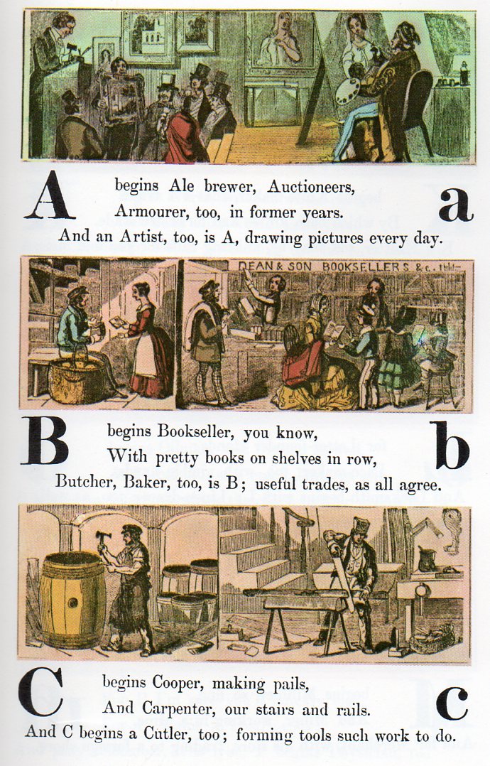
    Its interesting to see what jobs have survived over the years, and what jobs haven’t–particularly those jobs that would have been so widespread and popular that they would be instantly recognized by a child–so much part of the common culture that the initial letter of the job’s name could be used to help children learn the alphabet.

    Alphabet jobs a-c267

    In this version of commonplace employment found in a child’s alphabetical primer of ca. 1850, lists the following professions, most of which are still available for hire: ale brewer (especially here in Asheville, Beer City USA);auctioneer, armourer, artist, bookseller, butcher, baker, cooper, carpenter, cutler, dyer, dairyman, engraver, engineer, fishmonger, fiddle(r), florist, grocer, glazier, hatter, hawker, horse dealer, ironmonger, jeweller, knife-maker, knitter, letter-founder, lace-maker, locksmith, milliner, miner, merchant, nurse, newsman, oilman, optician, omnibus, pastry-cook, physician, rope-maker, rider, shoemaker, shipwright, scavenger, slater, surgeon, sawyer, saddler, tailor, turner, tanner, tinker, upholsterer, vintner, wharfinger, wax-chandler, yeoman, youth, zoologist.

    continued below with FULL ALPHABET:


  • Thomas Hogg, a Curious Man with 700 Varieties of Carnations, 1820

    JF Ptak Science Books   Post 1033

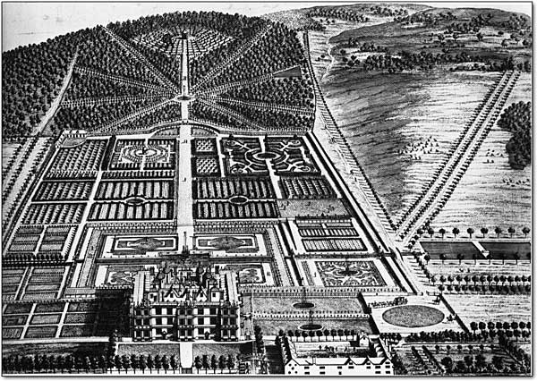
    Garden I just came upon this work1 on gardening and the carnation, by Thomas Hogg, printed in London in 1820.  It was evidently a pre-eminent book of its type for its time, Mr. Hogg occupying a high place in the gardening and flowering world of early 19th century England. (He found some high favorites at court who no doubt were able to help him pursue his vast interest, as we can see by the thesauro-laudatory words in his dedication page2.  I should add quickly that this is by no means an over-the-top dedication–although decorated with high praises, the dedication is not a Liberacesque celebration as some dedications have been, and would rank somewhere in the lower-middle in the ranks of glowing thanks.)

    What is more interesting to me though was the following mention that I found of Hogg in a contemporary British culture book:
                                               
    “Mr. Hogg, was master of an Academy at Paddington, Middlesex, he is now a florist at the same place, where he has a collection of Carnations and Primroses, perhaps the finest in the world. He is celebrated for his successful culture of them. He has more than seven hundred varieties of all prices from two to sixty shillings.”       

     700 varieties of carnations–of anything–is impressive.  I wonder ho wit was that Mr. Hogg was able to amass such an incredible storehouse of carnations? Hogg himself seems quiet on the issue, taking a modest exit with a quote from Shakespeare: “ I have neither the Scholar’s melancholy, which is emulation; nor the Musician’s, which is fantastical; nor the Courtier’s, which is proud; nor the Soldier’s, which is ambition; nor the Lawyer’s, which is politic; nor the Lady’s, which is nice; nor the Lover’s, which is all these.” He does make the point and an unusual argument  that it is his the will of the creator of the universe that humans appreciate, respect and grow flowers:   

    “As the hand of an all-beneficent Creator Has been graciously pleased to strew and decorate the earth with flowers, to gratify the sight by their beauty, and to refresh the sense of smelling by their fragrance, as we proceed from stage to stage along the rugged road of life; and as nothing which he has formed for the benefit of man was ever; designed by him to; perish or exist in vain, it is our duty to receive these pleasing productions of Him, among others, with all thankfulness, and to render them subservient to the purposes of health, pleasure, and amusement; for such no doubt he first bestowed them. In fact, the cultivation of flowers has in all parts, as well as in all ages of the world, engaged more or less the care and attention of a great part of mankind; for the same Being that created them, created in man also a wish and an inclination to cultivate and take charge of them…”   

    I guess that if the Creator was going to make people do something, gardening wouldn’t be a bad thing at all.  Mr. Hogg and his floral religiosity is a mystery to me, but I must respect a man who somehow created such an evidently splendid collection.  

    Notes:                                   

    ·Posted by :

    ·in:


  • Raising Greatness: James Hutton’s Deep View of Time, 1795

    JF Ptak Science Books   Post 1032

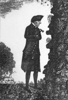
    I think that I’d like to start a series here on significant works in the history of ideas that were originally highly problematic or not accessible due to writing style or place of publication or misplaced appearance or, well, simply bad timing.   The storyline would be one of these great works whose significance suffered as a result of one or more of these issues, and then which was raised above its suffered complications to a place of higher (or more popular) esteem, allowing it to get to a place where the work could generate the new set of ideas that it was intended to help create in the first place. The first of these stories belongs to James Hutton and his revolutionary idea of deep time.  James_hutton

    Seeing more deeply into scientific time than anyone else in history, seeing the entirety of Earth’s history explained  in the sloping  red sandstone at Siccar Point (above the vertical greywacke), James Hutton worked through his theory of the earth in two stout volumes (The Theory of the Earth, with Proofs and Illustrations... in 1795), wrapping up geological evidence with a dogged, comma-ridden and usually-unwieldy prose. He had in fact written a much more elegant paper presenting the main thrust of his theory in outline in 17851, though this paper received a much more limited distribution.  In the long term it really didn’t matter, though, how pretty his writing was–but in the short term, it did.  He made the case for the vastness of time in an elegant way, even without the prospect of being able to know the age of the rocks he was looking at.  The processes of sedimentation, transportation and weathering of solids,  vertical elevation of the Earth’s surface in response to natural causes, and so on, were just not known to him; no matter, as Hutton trusted his theoretical inspiration to tell him that the 6,000-year old earth history clock on the wall was telling a tenth of a tenth of a tenth of a tenth (and on) of the larger, truer story of the age of the earth.  He knew that there were many orders of magnitude of age involved in the telling of the story–he just didn’t know how many. 

    He ended his great work bowing to the enormity of the sight of time:

    “Here are three distinct successive periods of existence, and each of these is, in our measurement of time, a thing of infinite duration. …
    The result, therefore, of this physical inquiry is, that we find no vestige of a beginning, no prospect of an end.”
                   
    Hutton’s work is inestimably important, Archibald Geike (the great 19th century geologist) commenting that it is impossible to praise the work too highly.  But then there was the problem of the density and just flat-out difficulty in reading Hutton’s writing, which restricted the book’s message to a dedicated academic class. Hutton did find his champion in James Playfair, who would strengthen Hutton’s work with new data and who would also help along the troubled Huttonian prose.  Playfair’s work is in of itself2 an important contribution to the history of geology and also of course evolution. His Illustrations of the Huttonian Theory of the Earth (1802), popularized and made the Huttonian work far more acceptable to a larger audience, and as the DNB says “presenting Hutton’s momentous theory in a clear and palatable form (which Hutton himself had failed to do), and in adding materially to the geological knowledge of the time”.

    It was Playfair’s treatment of Hutton that found its way into the mix of genius of Charles Lyell, whose own Principles of Geology3 found its way onto the Beagle and which were voraciously studied by Charles Darwin4 and then put to further use.
               
    Notes

    1. “Theory of the Earth; or an investigation of the laws observable in the composition, dissolution, and restoration of land upon the Globe”, presented in two parts, in Transactions of the Royal Society of Edinburgh, vol. 1, Part 2, pp. 209-304.  An earlier, related pamphlet was written and privately published for a very restricted and private distribution in 1785:   Abstract of a dissertation read in the Royal Society of Edinburgh, upon the seventh of March, and fourth of April, MDCCLXXXV, Concerning the System of the Earth, Its Duration, and Stability. Edinburgh. 30pp.   

    Eventually the book would wind up in a final form as An Investigation of the Principles of Knowledge and of the Progress of Reason, from Sense to Science and Philosophy in 2,138 pages, causing Playfair to remark that “The great size of the book, and the obscurity which may justly be objected to many parts of it, have probably prevented it from being received as it deserves”.
       
    This paper privately printed 1785 paper stated:
    “The solid parts of the present land appear in general, to have been composed of the productions of the sea, and of other materials similar to those now found upon the shores. Hence we find reason to conclude:
    1st, That the land on which we rest is not simple and original, but that it is a composition, and had been formed by the operation of second causes.
    2nd, That before the present land was made, there had subsisted a world composed of sea and land, in which were tides and currents, with such operations at the bottom of the sea as now take place. And,
    Lastly, That while the present land was forming at the bottom of the ocean, the former land maintained plants and animals; at least the sea was than inhabited by animals, in a similar manner as it is at present.
    Hence we are led to conclude, that the greater part of our land, if not the whole had been produced by operations natural to this globe; but that in order to make this land a permanent body, resisting the operations of the waters, two things had been required;
    1st, The consolidation of masses formed by collections of loose or incoherent materials;
    2ndly, The elevation of those consolidated masses from the bottom of the sea, the place where they were collected, to the stations in which they now remain above the level of the ocean.”

    2. Returning again to Geike, who  remarked (1905): “How different would geological literature be to-day if men had tried to think and write like Playfair!”

    3.  The Principles was an enormously influential book, and went through six editions in the first 11 years of its printing (1830-1840), seeing 12 editions during the author’s lifetime (the last edition corrected and added to by Lyell appearing just after the author’s death in 1875). 

    4.  Darwin had volume 1 when he shipped off, receiving volume 2 en route.  A quick look online reveals that there is no mention of Playfair or Hutton in either the Voyages or Origin.; Lyell is noted 14 times in the Voyages and 30 times in the 6th edition of the Origin.


  • A Short Look at Fifths and Fives: Joltin’ Joe, Legal Sausage and the Structure of Mathematics

    JF Ptak Science Books LLC  Post 925 

    I’m going to take a drive through five
    fifths—all of which don’t come close to making a whole—to get to my ultimate
    destination, a ribbon of numbers circling the earth.

    In
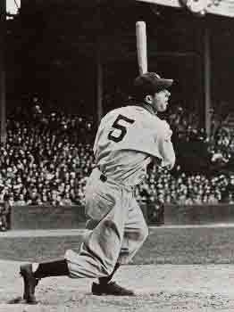
    American lDimaggioaw, “taking the fifth (Amendment)” allows you the prohibition of
    incriminating yourself, giving the supposed ability to look innocent whole not
    saying anything about anything for fear of legal repercussions, though this
    sausagey implosion from guilt seldom looks pretty. 

    There’s
    the fifth column (as in Hemingway’s play by this name), the
    not-fourth-but-fifth force, the musical perfect fifth of highest consonance,
    the Keplerian nestling of the five Platonic solids,  Beethoven’s Fifth, a fifth of (good) scotch,
    the fifth cardinal direction (the center), the five books of the Torah, the
    five pillars of Islam, the worst categorization of hurricanes and tornadoes, living
    in the fifth Mayan world, the fifth Fibonacci number, and on and on.

    And
    aside from being the number that Joe DiMaggio wore on his pinstripes, it is
    also the number of the  Euclidean postulate that called to all those who were
    interested in the possibilities of the postulate not being so—that there exists
    as perfect a non-Euclidean system as there is for the Euclidean.  The fact of the matter is that this calls
    into question the foundation, the very basis, of mathematics.  Or used to.

    Blog feb 1

    All
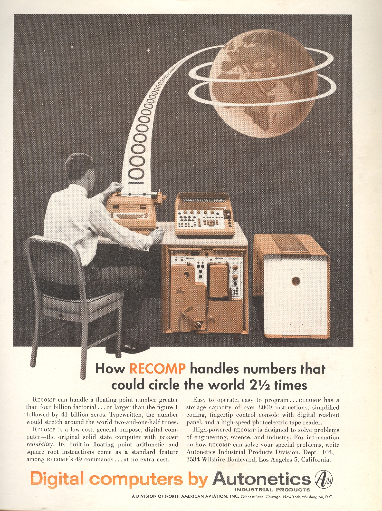
    of this was brought into mind by this 1957 ad for the RECOMP computer produced
    by Autonetics.  The image of a sheet of
    numbers circling the earth1, the product of digital computation, suggested
    structure, mathematical imperative and solidification of numbers.  But the point of this was the bottom line:
    what was the point, and for that matter, what was the point?  They were hardly physical things floating in
    space, but ideas (except of course in the worlds of Flatland). 

    Euclidean
    structure was the infallible, rigid, predictive, explanatory structure and the
    most accurate descriptor of physical space. 
    This had certainly been the case for fifteen hundred years or so, or at
    least until the struggling fifth postulate of Euclid’s Elements became really, well,
    unwieldy.  More to the point, the axiom,
    the parallel postulate axiom, wasn’t as self-evident as the first four, and
    wasn’t provable from the other nine of the first ten axioms.  And so came the unbelievable question, what
    if the fifth postulate wasn’t true?  What
    if there were other geometries—non-Euclidean geometries—that were as provable
    as that of the Master?  The possibility
    of relegating the understanding of nature and the physical surroundings to
    something other than the existing geometry was simply, positively,
    extraordinary. 

    The
    origins for this movement away from Euclid started with Girolamo Saccheri (his
    book published in 1733 but not “discovered” for its non-Euclidean importance
    for another 150 years) Georg Kluegel (1763), Johann Lambert (Theorie der
    Parallellinien,
    1766) and Adrien-Marie
    Legendre (1752-1833, who was sort of in a similar boat with Saccheri in that
    his work wasn’t actually published until after that of the next two
    mathematicians); and coming to a point of real invention in the work of Nikolai Lobachevsky (1792-1856) and Janos Bolyai3 (1802-1860). (It would be
    incorrect to credit these last two men [plus Gauss] with the creation of
    non-Euclidean geometry given the longish and complex history of its
    development.)

    This
    work brought into question the way in which the world was seen, and the very
    foundation of recording visualized space. 
    This is all much messier than had been planned (so to speak) by almost all
    previous mathematicians, questioning the very foundations of mathematics.  The orderliness of the earth-circling numbers
    doesn’t seem to be quite as they were, but as Henri Poincare stated, the “new”
    system isn’t anything better or worse, just different,  a new and more convenient way of looking at
    things4.

    Notes

    1. To be honest about it, the
      foundations of math bit didn’t suggest itself right away.  The first thing I thought when looking
      at what this paper trail was supposed to represent—a string of numbers 41
      billion zeroes long—didn’t look right. 
      Given the size of the numbers coming out of the “printer” there
      would need to be five times as many rings around the earth.  But when you read the text the numbers
      are supposed to be “hand written”. 
      Therefore if you assume the numbers to be less than an inch high
      and with no spaces in between, then this 2.5 times around the earth works
      out to be accurate to the number of inches in the circumference. 
    2. Still earlier work is found
      in the work of  Omar
      Khayyam
      ‘s Discussion of Difficulties in Euclid, John
      Wallis
      and Nasir
      al-Din al-Tusi
      … among others.
    3. Bolyai’s work—published as an
      appendix to his father’s work on the foundations of geometry—was privately
      reviewed by the great and impossibly smart Carl Gauss, who gave it a backhanded
      series of compliments while at the same time saying “I thought so…”  Which was true, evidently, as it looks
      as though he was working on the problem beginning in 1799.
    4. “If geometry were an
      experimental science, it would not be an exact science. it would be
      subject to continual revision … the geometrical axioms are therefore
      neither synthetic a priori intuitions nor experimental facts. They are
      conventions. Our choice among all possible conventions is guided by
      experimental facts; but it remains free, and is only limited by the
      necessity of avoiding every contradiction, and thus it is that postulates
      may remain rigorously true even when the experimental laws which have determined
      their adoption are only approximate. In other words the axioms of geometry
      (I do not speak of those of arithmetic) are only definitions in disguise.
      What then are we to think of the question: Is Euclidean geometry true? It
      has no meaning. We might as well ask if the metric system is true and if
      the old weights and measures are false; if Cartesian coordinates are true
      and polar coordinates are false. One geometry cannot be more true than
      another; it can only be more convenient.” –from:  M J Greenberg, Euclidean
      and non-Euclidean geometries: Development and history.
      (1980).

  • On Not Mentioning the Jews in Nazi/Polish/Holocaust Literature: “Spring Held No Hope”, 1942

    JF Ptak Science Books LLC  Post 902Blog jan 8 spring has no hope

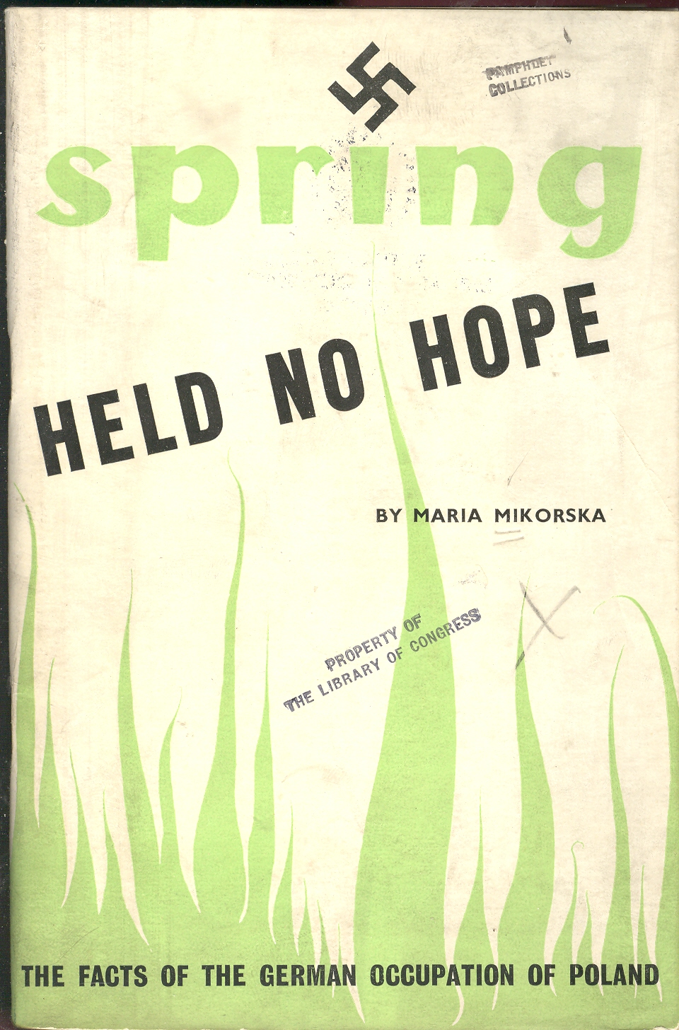
    Maria
    Mikorska’s Spring Held No Hope,
    published in London
    in June 1941 is a difficult, hard, emotional read, even in the genre of
    Holocaust literature.  It quickly paints
    a documentary history of bestial behavior of the Nazis in Poland.  I wonder though what happened to the
    mentioning of the Jewish issue in all of this reportage of inhuman
    transportation and treatment of humans, as the reference almost never
    occurs.  

    Reading
    though this 52-page pamphlet of terror and horror, I wondered what exactly
    happened to the missing reportage of the hunting and killing of the Jews as a
    group.. The period of 1939-1941 saw the beginning of the Endlösung der
    Judenfrage
    1 (“The Final
    Solution of the Jewish Problem”) in which 90+% of the 3.5 million Polish Jews
    alive in the Polish Second Republic were killed and exterminated, the primary
    victims of the Nazi Holocaust.  At this
    point in the war the Nazis were removing Jews from their cities and
    establishing regional ghettoes.  Once the
    Jews were collected in this manner it was easier for the administration of
    their extermination.

    Getting
    back to Spring Held No Hope and the lack of identification of the Jews as a
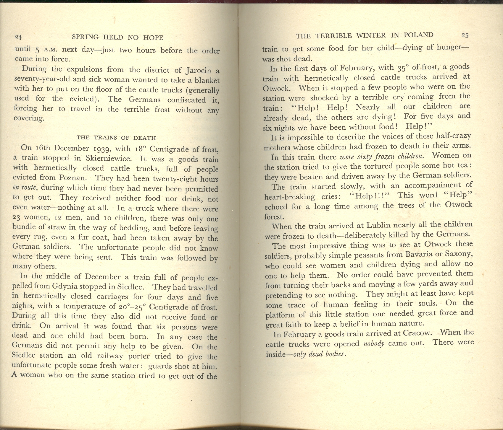
    persecuted group I turn to pp 24 and 25 (illustrated below and clickable).  

    Blog jan 8 spring has no hope 2pp

    The examples of inhuman transport and the
    direct extermination of men, women and children by starvation and hypothermia
    mention the cities Jarocin, Gdynia, Siedlice, Skierniewice, Lublin and
    Otwock:  all of which had large centers
    of Jewish populations that were removed by the Germans directly after the
    invasion and removed to ghettoes though this fact is not mentioned in this
    pamphlet. Ostensibly the collection of Jews was not in an effort to seize
    property (as the majority of the Jews in Poland at this time had little
    wealth) but rather to supply labor (being a group with the potential for
    hundreds of thousands, if not millions, of humans capable of performing slave
    labor).  The Jews in Gdynia (for example)
    were sent to Siedlice to establish a larger Ghetto immediately after the
    invasion; by 1942 the tens of thousands of occupants were either shot and
    killed or sent to Treblinka; 2,000 or so remained after this, though most of
    them were also soon sent to Treblinka; those remaining were all executed when
    the ghetto was completely liquidated on 14 April 1943. 

    I
    am in no way saying that it the murder of Poles during the Nazi occupation was
    limited to Jews—the 3.5 million Polish Jews represented 10% of the Polish
    population; of the remaining 90%, or 32 million or so Gentile Poles, some 3
    million were killed by the Nazis, or about 10% of that population.

    These
    are horrible stories told by Mikorska—but I’m bothered by the lack of the
    recognition of the Jews as the major, featured target in all of this and wonder
    if the author suffered an enormous sin of omission. This is far from being  a singular event–even the important and highly significant Eisenhower report on the concentration camps of May 1945 does not signify the Jewish people as anything out of the ordinary–and may well be indicative of the general practice of dealing with the Jewish aspect of the Nazi exterminations.

    Notes

    1.
    The name and practiced of the Final Solution was infamously adopted at the
    Wannsee conference on 20 January 1942, liquidating the ghettoes and sending the
    occupants to the six major concentration camps of Auschwitz, Belzec, Chełmno, Majdanek, Sobibór and Treblinka.

    I’ve written elsewhere in this blog on the Holocaust; for more, search “Holocaust” in the Google blogsearch in the left column.


  • Quantifying Art: the Art-ematics of Roger de Piles and Emily Vanderpoel

    JF Ptak Science Books  Post 890


    “The central nervous system is nature’s Sistine Chapel, but we have to bear in mind that the world our senses present to us… is a ramshackle construct which our brains have devised to let us get on with the job of maintaining ourselves and reproducing our species. What we see is a highly conventionalized picture, a simple tourist guide to a very strange city…”J.G. Ballard “The Kindness of Women” 1992 Source:  Disinformation and the Analysis of Beauty.

     I was thinking about major change in art, looking around for periods of that sort of change came to that period just before the onset of Romanticism.  The critic Roger de Piles (October 7, 1635 – April 5, 1709) wrote about this, about the 18th century version of refusees that we’d meet again in a major way in the 1850-1920 period, as they tried to shake their way free of the long-entrenched boundaries of Classicism.  Along the way of his elegant argument, de Piles stops to consider the merits of the capacities of artists and painters (his delineation), establishing for himself rules of artistic interpretation o0f beauty and artfulness. Correctness.  De Piles judged the imitation of objects, of “la belle nature”, the “exquisite mixture of nature’s forms and colors”1, and did so along four elements of his logic of taste: composition, drawing, color and expression. 

    De Piles employed this methodology in his book Dialogue sur le coloris ( Dialogue upon Colour, 1673)  comparing 49 artists, the complete list transcribed here from Manlio Brusatin Histoire des couleurs (Paris: Flammarion, 1986, pp.103-104), and which is reproduced in Elisabeth G. Holt Literary Sources of Art History, (Princeton: Princeton University Press, 1947), pp.415-416)”, and this then taken in toto from the wikipedia article here. Taking the next but curiously-untaken step, I simply added the totals for each giving an overall “Piles Score”, finding an average of 41.87. (Curiously enough when I was adding this column in my head, column by column, I ended for no reason at Leyden to begin the second column; the sums for the two columns both ending at Leyden were 109.)  :

    Painter//  Composition   Drawing   Color   Expression  =  Piles Score

    Average Piles Score= 41.87  (I don’t really understand his comparisons, and the “zeros” don’t register at all.  I do see that Giovanni Bellini rats out at a 24, Durer at 36, Holbein at 38 and Girgione at 39, while Leonardo rates higher than average at 49.)

    Andrea del Sarto 12 16 9 8  =  45

    Federico Barocci 14 15 6 10 = 45

    Jacopo Bassano 6 8 17 0 = 31

    Giovanni Bellini 4 6 14 O = 24

    Sebastian Bourdon 10 8 8 4 = 30

    Charles Le Brun 16 16 8 16  = 56

    Carracci 15 17 13 13 = 58

    Cavalier D’Arpino 10 10 6 2 = 28

    Correggio 13 13 15 12 = 53

    Daniele da Volterra 12 15 5 8 = 40

    Abraham van Diepenbeeck 11 10 14 6 = 41

    Domenichino 15 17 9 17 = 58

    Albrecht Dürer 8 10 10 8 = 36

    Giorgione 8 9 18 4 = 39

    Giovanni da Udine 10 8 16 3 = 37

    Giulio Romano 15 16 4 14 = 49

    Guercino 18 10 10 4 = 42

    Guido Reni x 13 9 12 = 34

    Holbein 9 10 16 3 =38

    Jacob Jordaens 10 8 16 6 = 40

    Lucas Jordaens 13 12 9 6 =40

    Giovanni Lanfranco 14 13 10 5 =42

    Leonardo da Vinci 15 16 4 14 =49

    Lucas van Leyden 8 6 6 4 = 24

    Michelangelo 8 17 4 8 = 37

    Caravaggio 6 6 16 O = 28

    Murillo 6 8 15 4 =  33

    Otho Venius 13 14 10 10 = 47

    Palma il Vecchio 5 6 16 0 = 27

    Palma il Giovane 12 9 14 6 = 41

    Il Parmigianino 10 15 6 6 = 37

    Gianfrancesco Penni 0 15 8 0 = 23

    Perin del Vaga 15 16 7 6 = 44

    Sebastiano del Piombo 8 13 16 7 = 44

    Primaticcio 15 14 7 10 = 46

    Raphael 17 18 12 18 = 65

    Rembrandt 15 6 17 12 = 50

    Rubens 18 13 17 17 = 65

    Francesco Salviati 13 15 8 8 = 44

    Eustache Le Sueur 15 15 4 15 = 49

    Teniers 15 12 13 6 = 46

    Pietro Testa 11 15 0 6 = 32

    Tintoretto 15 14 16 4 = 49

    Titian 12 15 18 6 = 51

    Van Dyck 15 10 17 13 = 55

    Vanius 15 15 12 13 = 55

    Veronese 15 10 16 3 = 44

    Taddeo Zuccari 13 14 10 9 = 46

    Federico Zuccari 10 10 8 8 = 36

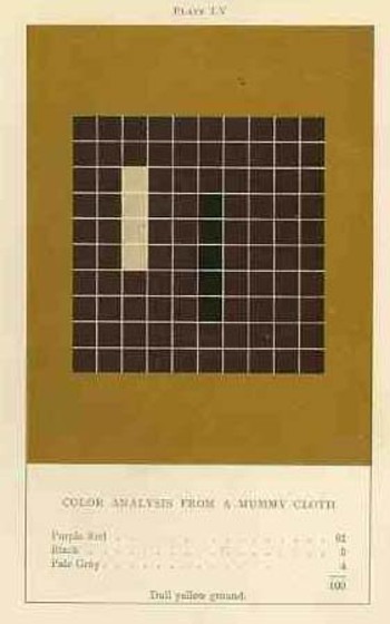
    The upper-deck-problematic Emily Vanderpoel looked deeply and arithmetically into art—she also produced a numerical grid of the artwork that she analyzed, going a step further to re-order the reality of the painting into a representative 10×10 square, distributing the color sense according to a secret algebra that I cannot identify.  She published the results of her work in 1901 and 1903, producing (in two editions) a gorgeous but mysterious book called Color Problems for the Layman, in which she sought not so much to analyze the components of color2 itself, but rather to quantify the overall interpretative effect of color on the imagination.  I know this sounds begging and vague, but I really haven’t been able to make much headway in her theory. 
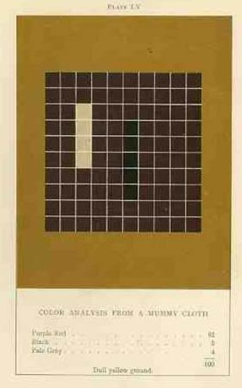
    Blog dec 28 vanderpoel By virtue of this effort, though, Vanderpoel had produced a strikingly illustrated book, with 118 color plates, all very intense, and beautiful, and in its way exceptional—unique perhaps.  Had the book been written thirty years or so hence we’d call it some sort of constructivist/constructionist artform.  But since the artwork in the book comes a decade before the first non-representational artwork in human history (or so), I don’t know exactly what to call it. 

    I really don’t know what it is, but I know that it is not entirely accidental, this pre-non-representational artform, because controlled geometrical color art is not accidental. 

    The net effect is glorious.  I just don’t know how she got there—which isn’t normally a consideration in art, except that this work is an instructional on how to understand color in art and nature, and the explanation of the procedure is ethereal.  Vanderpoel was and remains a respected author on porcelains and other applied and plastic arts.  In this work she looked at her fair share of porcelain, limogues, clay pots, burial urns, glass shards, and the like; she also analyzed clouds, mummy cloths (and casings), dew on morning grass, brocade, the eye of a blue jay, feathers, and another hundred or so poetic arrangements of the stuff of the world.  I still do not know what this book is trying to tell me, but I do know that it is remarkable.   
     Blog dec 28 hogarth

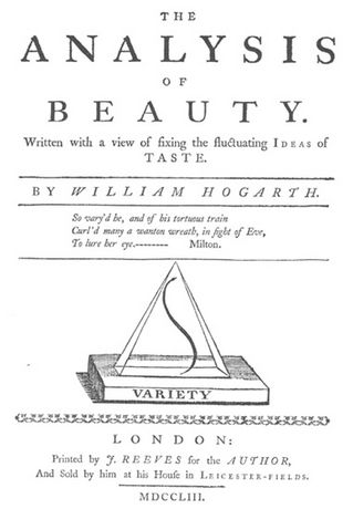
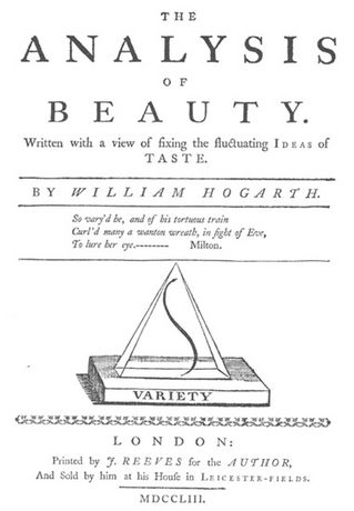
    On a much simpler note, the British artist William Hogarth  (1697-1764) perhaps pathologically induced the use and display of a curve, a single line (a “Line of Beauty and Grace” or “Serpentine Line”), that represented to him the most sublime (and correct) representation of artistic sense.3  It appears on the title page of his Analysis of Beauty (1753), situated within a triangle, and is embedded in a much more wide-ranging treatise on beauty in general (some of which makes sense, some not).  His argument for the line, though is very simple, and he chooses to explain his vision in images more than in words, and so reduces his own interpretation and reduction of artistic form and correctness to a single stroke.  And so if he were to look at Leonardo’s Vitruvian Man or Durer’s proportional man, he would have seen not the proportions as the elements of beauty, but the simple line of the exterior form. 

    NOTES

    1.Charles Abbe Batteux, Les beaux Arts reduits a un meme Principe, 1746.

    2. Color theory is old and pretty—as a matter of fact there is a very attractive gathering of color theory models (in black and white, though) displaying some two dozen or more color models from the last 400 years.  People like Della Porta (1593), our old friend and resident oddball polymath crank Kircher (1646), the smarter-than-you-could-believe Newton (1660), Waller (1686), Lambert (1772), the wide ranging and again polymathic Goethe (1792), Herschel (1817, who also ushered in our understanding of the other light-sensitive shape spacing medium of photography in 1840), the semi-forgotten Chevreul (1835), the beautiful Maxwell (1857), Wundt (1874, the early experimental psychologist who also looked for spirits/spiritmus and ghosts), von Bezold (1878), Rood (1879), Munsell (1918) Kandinsky (1914 and not decipherable by me) and Klee (1924), and so on towards the present, all tried to analyze the prospects of color.

    In trying to quantify the color images of the objects in her study, Vanderpoel establishes a 10×10 square grid, dividing all of the color in that object into individual units numbering to 100.  Then, somehow, she identifies the major colors and places them according to a system that I cannot understand within the grid.

    3. “The eye hath this sort of enjoyment in winding walks, and serpentine rivers, and all sorts of objects, whose forms, as we shall see hereafter, are composed principally of what I call the waving or serpentine lines… intricacy in form, therefore, I shall define to be that peculiarity in the lines, which compose it, that leads the eye a wanton kind of chance, and from the pleasure that gives the mind, intitles it to the name of beautiful”.—Hogarth, The Analysis of Beauty

    Elsewhere Hogarth writes that while the human body is beautiful not so much for its proportions, but “the more pleasing turns, and intertwinings of the lines, which compose its external form”. 


  • “Lesser Light Rules the Night…”—an Early Picture of Multiple Universes?

    JF Ptak Science Books LLC  Post 823  Blog Bookstore

    Blank and Empty Things #56

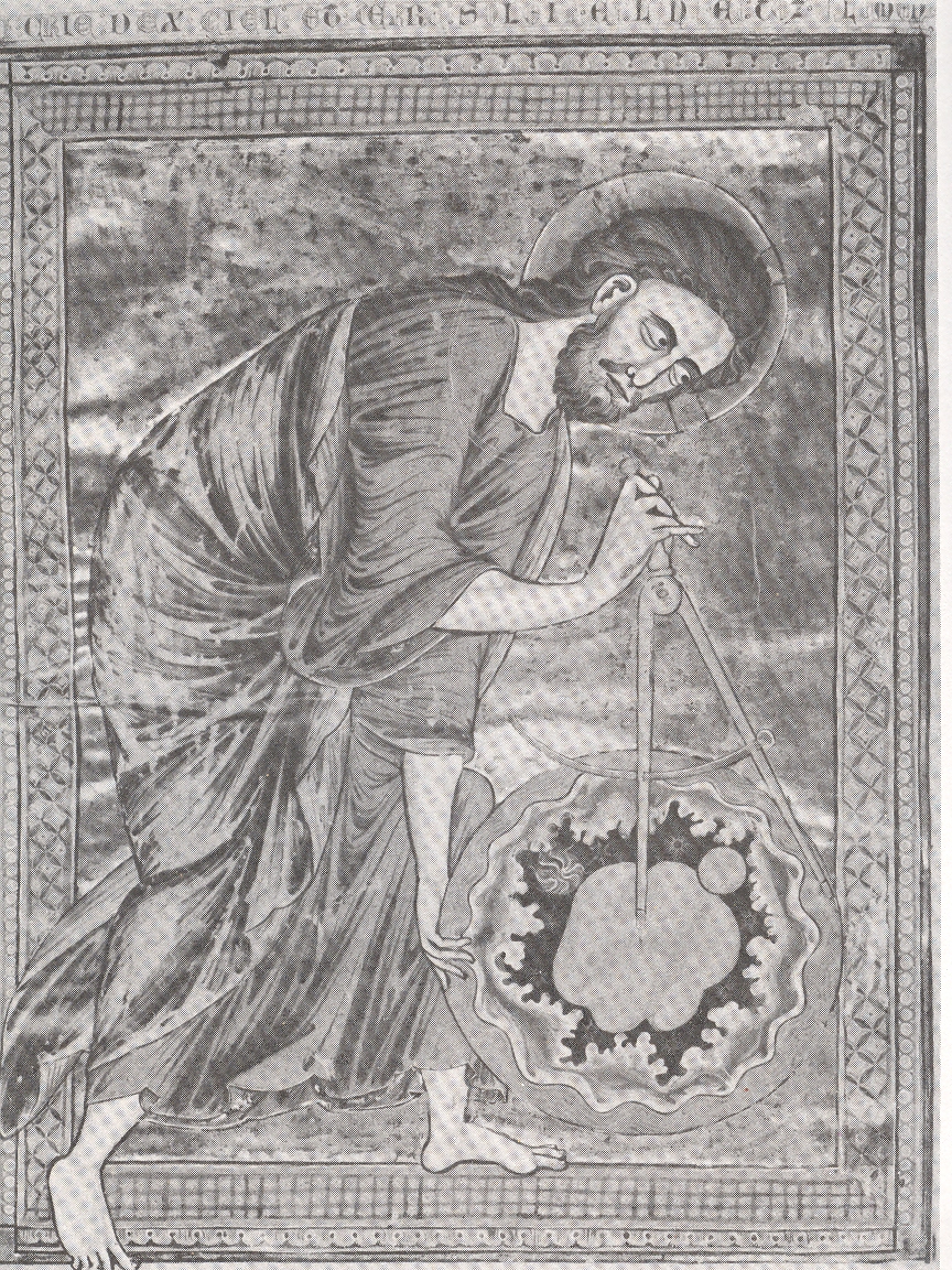
    This sort-of
    famous image, found in a French Bible
    Mortalisee
    made in Reims in the 13th century,

    Creator measuring

    displays The
    Creator measuring its creation, a sphere of the universe containing all of the
    stuff of creation, and including the Earth (pictured at upper right).  At least that is what I think this is—Creator
    stepping into the frame (its right foot outside the drawn border of the image),
    holding everything that it has made, and holding it all in the midst of another
    environment of some sort.  What that
    place might actually be, I don’t know. 
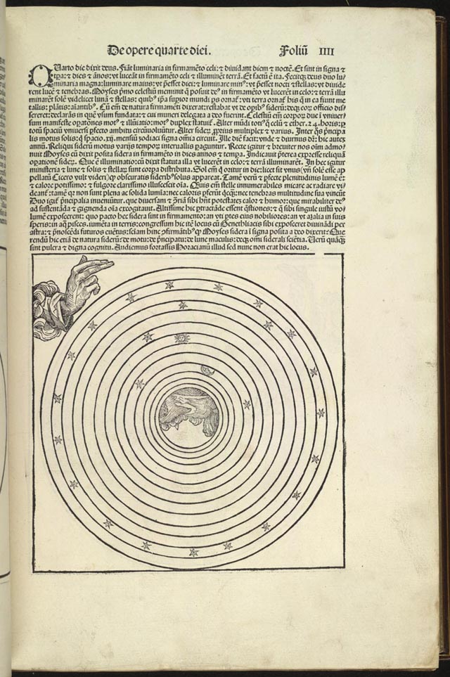
    Is that the space in-between the light created on the fourth day
    (pictured below from Schedel’s so-called Nuremberg Chronicle of 1493), the space
    that wasn’t the greater light to rule the day and the lesser light to rule the
    night?  In this spirit it was the stars
    that were supposed to separate these two lights, but the stars themselves in
    many of the concentric circle cosmologies weren’t part of the Heavenly sphere
    itself, which is what the Reim’s illustrations seems to say.  I suppose that it is all simply displayed
    somewhere in the OT, but from where I sit right now, this looks like a
    painfully early Western image of multiple universes. 

    Creator 4th day The other thing is:  what is the Creator looking at?  It is definitely very focused and wide-eyed, and is lasered on something about half of the diameter of the universe to the right, just on the other side of the dividers. Is this the biggest of the Blank and Empty Things that can be imagined? 


  • Curious, Secretive, Sacred Irish Independence Political Icons (?)

    JF Ptak Science Books  Post 821  Blog Bookstore


    “Malone. … My father died of starvation in Ireland in the black ’47. Maybe you heard of it?
    Violet. The Famine!
    Malone (with smouldering passion) No, the Starvation. When a country is full of food, and exporting it, there can be no famine. Me father was starved dead; and I was starved out to America in me mother’s arms. English rule drove me and mine out of Ireland . …” —George Bernard Shaw, Man and Superman (1903)


    0--blog---Nov 28 irish137


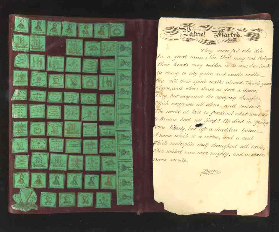
    “The Almighty indeed sent the potato blight but the English created the famine…a million and half men, women and children were carefully, prudently and peacefully slain by the English government. They died of hunger in the midst of abundance which their own hands created.”—John Mitchel (1815-1875), Irish Nationalist (and listed as a “martyr” in one of these badges/stamps)

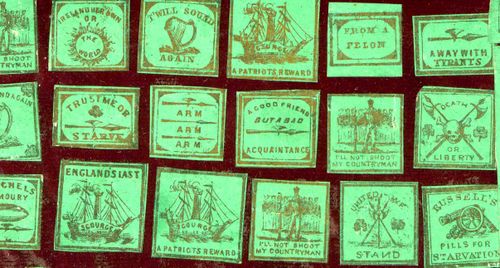
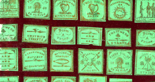
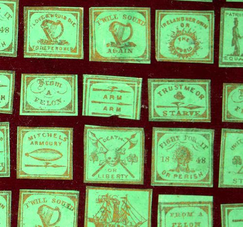
    I’m sorry to say that I do not know the origin of these diminutive, powerful emblems, and that what follows is all guess-work. They are only about a half-inch square or so, but they hold very powerful meanings in their messages.  I imagine that they were political messages to be worn, or posted in the mail, or used in subversive ways–because their messages were enormously subversive, taking on the occupying power of Great Britain at a time of supreme and enforced deprivation, an occupied people fighting against a spectacularly-better equipped foe.  The messages related to the Great Famine of 1847-1849, when the potato crops failed for three consecutive seasons , initiating a chain of events that caused the deaths of perhaps two million people, or 20% of the entire population of Ireland.  People didn’t starve so much as they did die of associative diseases related to the process of starving to death, al of which it seems could have been addressed by some sort of effort by the British government.  It does seem to me as though the people of Ireland were left to flounder and drown.  The stories of the extreme deprivation are horrible:  starving dogs digging up the bodies of the recently unguarded dead, rats attacking the dying for food, and so on.  Terrible, miserable stories coming from what is probably the worst of period of starvation in European history.  the scene has been duplicated numerous times in this century killing hundreds of millions of people:: in Soviet Stalin’s filthy anti-human pogroms, under the equally filthy Maoist adventures in production and nationalist strength in China, in Biafra, in Darfur, and on and on in our frailly stupid political existence here on Earth.

    The small badges have always seemed somewhat sacred to me; there’s just such a feeling of hope and inspiration and overwhelming empathy in them.  


    0--blog---Nov 28 irish 144


    0--blog---Nov 28 irish 145

    0--blog---Nov 28 irish138

    0--blog---Nov 28 irish 143