A Daily History of Holes, Dots, Lines, Science, History, Math, Physics, Art, the Unintentional Absurd, Architecture, Maps, Data Visualization, Blank and Missing Things, and so on. |1.6 million words, 7500 images, 4.9 million hits| Press & appearances in The Times, Le Figaro, Mensa, The Economist, The Guardian, Discovery News, Slate, Le Monde, Sci American Blogs, Le Pont, and many other places… 5000+ total posts since 2008.

Category: Maps/Diagrams of Imagination & Ideas

  • Quiet Images of Great Loss and Heroism–British Navy Losses, 1945

    JF Ptak Science Books  Post 1216

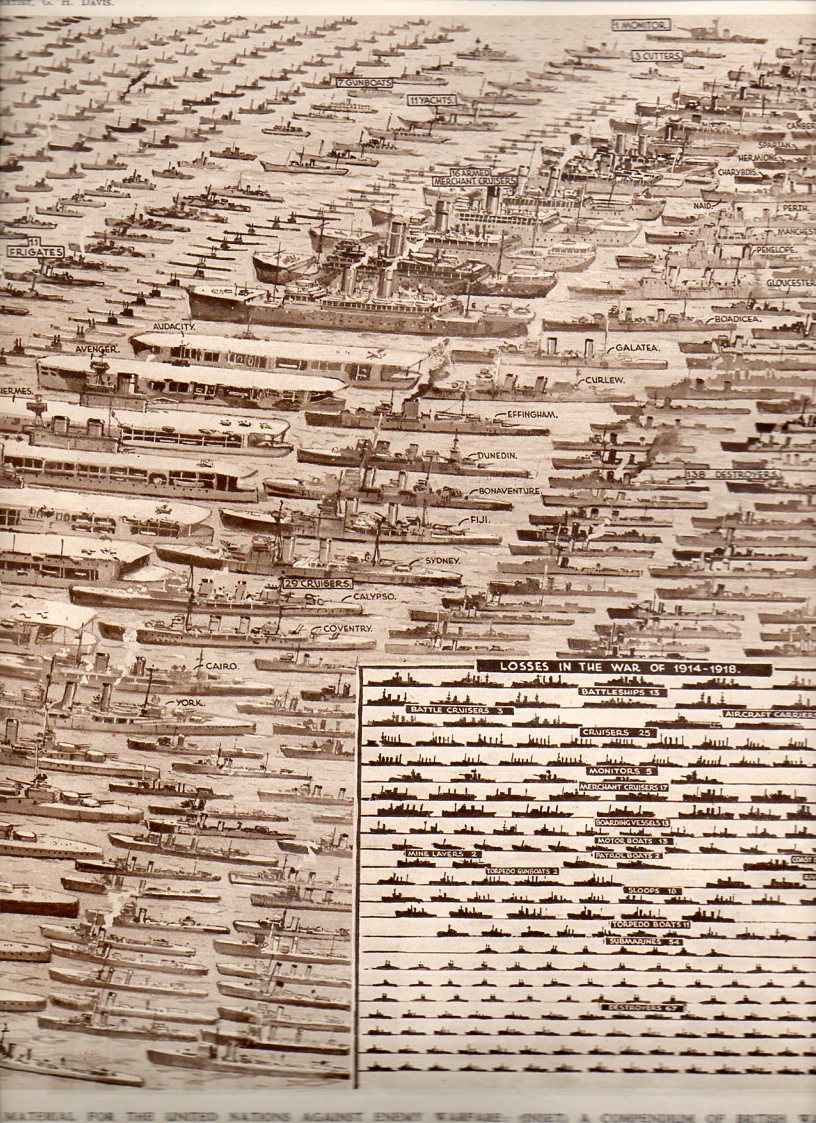
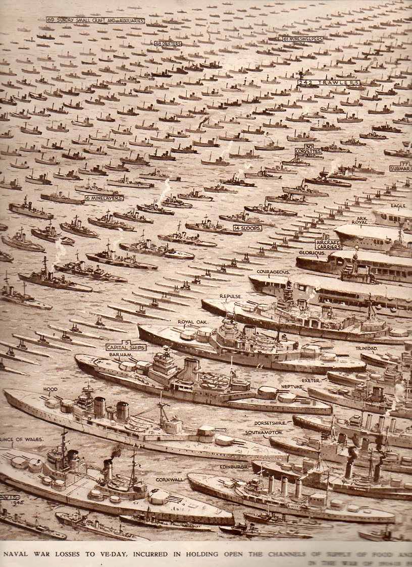
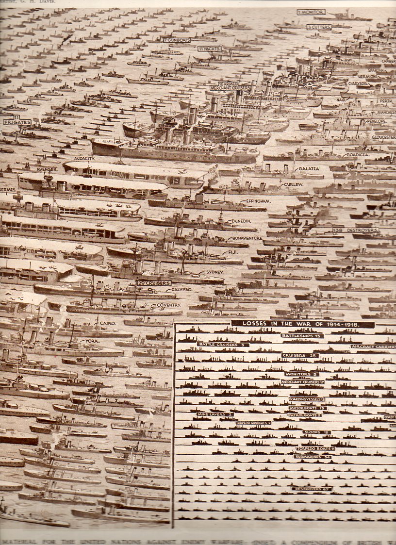
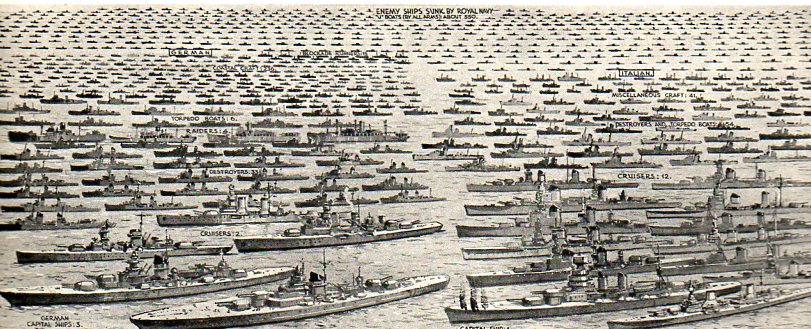
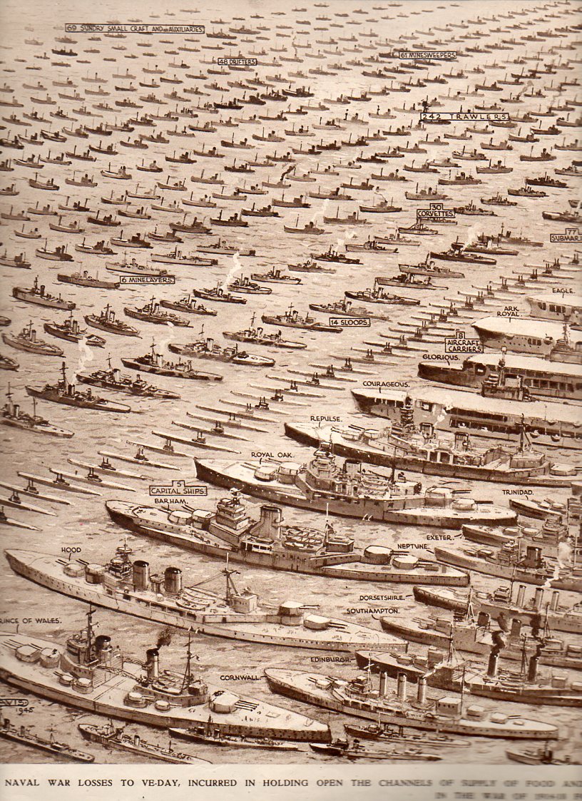
    This enormous, quiet image appeared in The Illustrated London News on 23 June 1945, just weeks after the termination of WWII in Europe.
    Navy Losses--left796 Navy Losses--right795

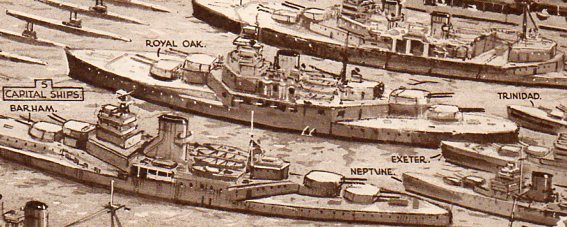
    It graphically presents every ship lost by Great Britain in the defense of “holding the seas against the Axis Powers…holding open the channels of supply and food and war material” from the outbreak of the war to VE day. The inset narrative states that there were on average nearly 3000 British and Allied ships at sea at any given moment, with the Royal Navy patrolling an aggregate  of 80,000 miles of trading routes, day in and day out
    Navy Losses--left796
    [This image is available for purchase–in the original and in a 30×40″ poster–at our blog bookstore.]

    It is a symbol of loss, of heroism, of lives not lived, of lives saved, of valor, of greatness, of will, of the cold black sea, of burning oil, of red waves, and above all, of sacrifice. Of splendid behavior.

    It is a terrible picture of what victory demanded of bravery.       

    It is as much an image of a military graveyard as anything else, a Remembrancer, especially for  those who were never recovered.  It is a grid, a finding aid, a visualizer, for all of those sailors lost in a sea that is indifferent to particular memory.

    Navy Losses--right795
    I can’t imagine how this image was received by the Illustrated London News reader on that day.  Did they suck their breath in at the scope of it, of the gigantic reminder of what all of those ships represented?  Was it the sort of image-reading that was forced, a white-knuckle, vacant-chested feeling of sweeping loss?  Of loss and gratitude?  Of gratitude and finding purpose for all of those sacrifices to the island nation?  I suspect that all of those words were in the minds of those readers in 1945–and also for emotions that have no words. 
    Navy Losses--left detail797

    Notes:
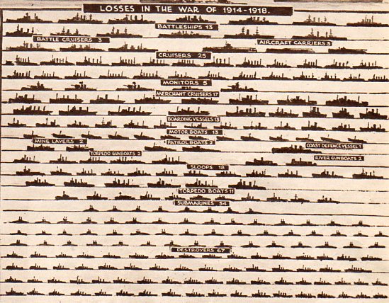
    There is also a small inset that shows in comparison the Royal Navy losses for WWI, 1914-1918. 

    Navy Losses--wwi798

    There is also this, an incredible single-page display of British merchant-marine war losses of 2570 ships.
                Navy Losses--merchant marine799

    Both images are the work of the incredible G.H. Davis, who provided cut-aways, cross-sections, maps, diagrams an all manner of information to the ILN readers throughout the war.  HE was an inexhaustible man of excellent design sense.


  • Mr. Mole, the Stationary Busby Berkeley of Mass Crowd Installation Photographs, 1918

    JF Ptak Science Books Post 1185

    I’ve long enjoyed these massively organized, captured moments of time and effort–large caliber photos of concentrated efforts of tens of thousands of people, all of their motion and utility directed to produce this one moment in time.  Perhaps the greatest practioner of this artform was Arthur S. Mole (1889-1983), the stationary Busby Berkeley of Big Organized Crowd Efforts (BOCE).  (He led an interesting life, coming from Scotland with his family to be part of a Utopian community led by John Alexander Dowie–a faith healing visionary, self-reported precursor to the second coming of Christ, and leader of the Christian Catholic Apostolic Church–at City Zion, Illinois. Dowie was a problematic man not without good and interesting qualities, though his to-the-death prayer duel with a rival visionary is an interesting story to be left for another time.)

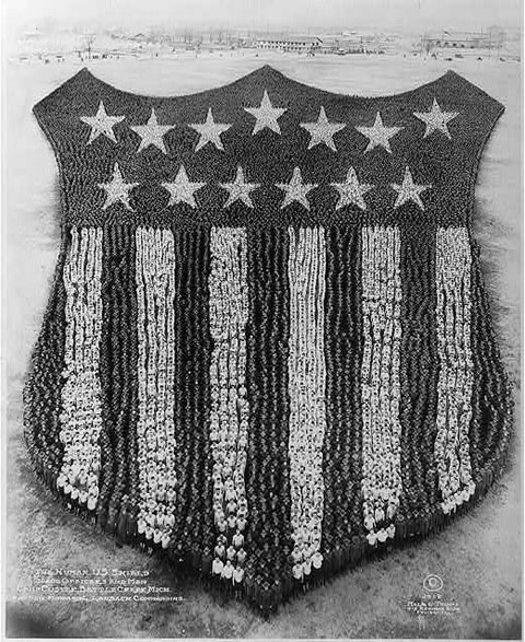
    I’ve always enjoyed this photograph  in particular–it was made from a 70′-tall platform with a 11×14″ view camera using a wide angle and a deep oblique angle, along with 30,000 soldiers from Camp Custer, Michigan.   It was made in 1918 by Mole, along with the evident and very capable choreography of John D. Thomas, who was the Doctor of Persepctive and Motion for the pictures.

    [Note: most of the images below are extremely clickable/zoomable.]

    Arthur-mole-human-us-shield

    Most of the soldiers are used to make the field at the top of the stripes–so near as I can tell (from the resolution image that I had to work with), there are about 300 men in each stripe (except for the outer two), meaning that there between 3,000 to 5,000 in the collected stripes, which puts something like 25,000 troops in the stars and their field. The middle stripe I reckon to be 150′ long; my guesstimate for the star field is 600′ deep and 1250′ wide, making a triangular collection of men 750’x1250′. That takes a little bit of planning to accomplish to ensure that everything is kept in perspective, and which also means that a lot more folks are needed at the top of the constructed image than at the bottom.

    Another excellent example is this photo made of the U.S. Marine Corps emblem using 6,000 marines at Paris Island in 1920.

    http://redtreetimes.files.wordpress.com/2010/05/arthur-mole.jpg


  • A Note on American Two-Way Border Wars

    JF Ptak Science Books  Post 1171

    Porosity  is a measure of spaces-in-between, voids in a material’s total volume.  Some things certainly have visible porous elements, like a cotton shirt or netting, and others–like rocks and soil–don’t.  Other elements are measurable but less visible and experimental than fluid flow though still experiential,  like truth and falsity, or the concepts of good and evil, good taste and bad, love, generosity, felicity.  Ideas like “god” are very porous, as are the prospects of salvation and redemption, and (getting into) heaven and hell. 
                               
    Skin is also porous because it is composed of, well, pores. We don’t think of things like skin being permeable, as it holds in the vast amounts of liquids that make up the majority of the human body (for example).  Football has porous defenses, a necessary design to the process of the game, because years of 0-0 games just won’t work so well as paid entertainment.  Poromechanics in real and abstract bits is all a matter of degree.  And direction.         
    http://blog.selfportrait.net/blog/wp-content/uploads/2010/07/frances-flora-palmer-for-currier-and-ives-across-the-continent-westward-the-course-of-empire-makes-its-way-1868.jpg
    The American border is fairly well porous–much less now than it used to be of course.  There’s 3,987 miles of border (excluding Alaska) with Canada, and another 1969 miles between the U.S. and Mexico (1241 of those shared with Texas), so there’s a lot of room for room–for people trying to get into the country.  The flow of people through/over the borders weren’t always gong one-way–the expansion of the country is a history of the mythic pioneer/settler moving into space contiguous  to property that was owned by the U.S.  (Actually, it wasn’t all contiguous, adventurers and “explorers and entrepreneurs and filibusterers reaching far and wide.)  It would be interesting to know how many miles of variable borders within the U.S. we have slipped through over the last few centuries–my offhand guess is that it is an order of magnitude greater than what we have right now.

    Before we constructed massive walls and armed our borders, before we started to erase the incised sentiments on the base of the Statue of Liberty, the border wars of the United States were being fought going the other way ‘round.  The borders of the country were extended in many different ways, not the least of which were what we would call “pioneers”–plus of course politicians and the military, all deeply at work in establishiung the sactions of expansion.

    For example, in the 1800-1850 period, there were 21 major attempts to access foreign properties to become part of the United States.  Ten of these were attempts made to purchase the land outright–only Louisiana (and that is a gigantic “only” was wholly successful, with Sonoma being half-successful.  Five of  the other cases– East Florida, West Florida, Texas, New Mexico  and Alta California–came to us via wartime acquisition.  Attempts to buy and bully Mexico for Baja didn’t work; Yucatan and Cuba escape our proposals for annexation and purchase as well, while Chihuahua resisted purchase, invasion and annexation. 

    All of this excludes Indian lands, of course, a list of the tribes involved in the 709 seizures1 can be found in the continued reading section, below.  (That’s the number of “transactions” for the 110 year history between 1784 and 1894, which extends beyond the 1800-1850 slice of our expansionist pie; there were still a hundred or so motions against the Indians during this time, not to mention the dreadful Southern Removals of the Five Civilized Tribes as well as the disastrous removals in Indiana.)

    Conquest and purchase has been the name of the game in moving the Americans through our borders, an exercise of great regularity and incredibly high return.  Again putting aside the Indian question, had we not pushed up against the owners of these lands in the first place and absorbed them in the second, instead of having California, Utah and Texas we may well have had the Republics of California and Texas and the entity of Dereret, not to mention a wide swath of the southwest (including New Mexico, Nevada and part of Colorado) reaching up nearly to SLC that still belong to Mexico.

    And what it all boils down to after the borders have been passed through and moved forward, again, are the people that wind up staying–pioneers, farmers. The log cabin came to symbolize this spirit in the 19th century, a picture of progressive civilization and stability, of spirit, of achieving Manifest Destiny.  In my own collection of images of log cabins (prior to the Civil War), there are very few of these structures that show people in or near them.  More often than not, the pictures are silent; every now and then, there is a woman in the doorway or inside looking through a window–a symbol of innocense and felicity. There are images with the log cabin in the background, the foreground filled with pulled stumps and men plowing the fields (with and without horses) I don’t own a single image that shows a man with a gun.  (I’ve not done a survey on this issue, but that’s my overall impression over the years.) A subtle message I think was definitely being sent.
     
    Even the name “America” proved to be exceptionally porous.  At one point it stood to include North and South America, and then  it changed to exclude South and Central, and then Canada, and then Mexico–it really only related to the United States during the period of greatest nation building.

    This is just an interesting thing to think about now when we discuss closing our borders–those lines had to get to those positions somehow over the last 500-odd years.

    Notes:

    1. Indian Land Cessions in the United States,1784-1894, United States Serial Set, Number 4015; this is the  second part of the two-part Eighteenth Annual Report of the Bureau of American Ethnology to the Secretary of the Smithsonian Institution, 1896-1897.  “The Schedule of Indian Land Cessions subtitle notes that it indicates the number and location of each cession by or reservation for the Indian tribes from the organization of the Federal Government to and including 1894, together with descriptions of the tracts so ceded or reserved, the date of the treaty, law or executive order governing the same, the name of the tribe or tribes affected thereby, and historical data and references bearing thereon.”

    Sometimes just seeing hte extent of a list of names gives you a much greater appreciation for the numbers involvewd than the sheer number itself:
    Acoma Pueblo
    Alabama
    Alsea et al
    Apache
    Apache (Eastern bands)
    Apache (Jicarilla bands).
    Apache (southern).
    Apache (Southern).
    Apache (Western bands)


  • Center of Attention–a Map of Women’s Visual Exploration of Men (1941)

    JF Ptak Science Books Post 1136

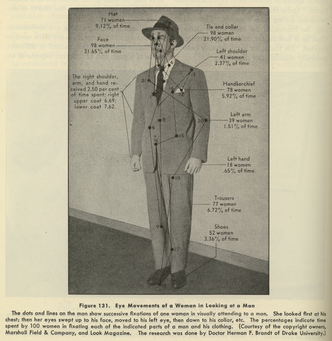
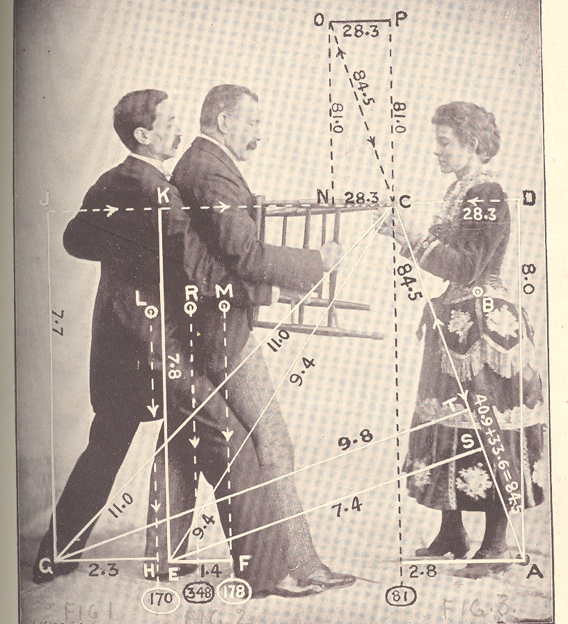
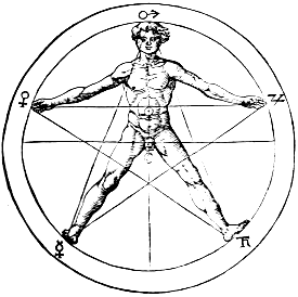
    The eye leads the brain, or the brain leads the eye, and from there, who knows where anything goes, especially when involved with a qualitative survey of a complex entity. This is more-or-less what we are dealing with here, in this image below, found on page 74 of a 1941 issue of Life magazine. (It is related in some way to an earlier post on this blog, a post called “The Center of Levity..”1 , though perhaps not really.)  It is hardly a map of the macrocosmos incised with Pythagorean precision on the body of man2, nor an astrological  or Kabalistic or Vitruvian perspective representation of humanity.  It is just a 1940’s  eye-trail map of where women looked at a man, a non-mathematical treatment of vague interest.

    Eye fixations

    It turns out that the seduction of a man’s body to a woman’s gaze–as difficult as that might seem from this photo–is fairly measurable, and was so even in the 1940’s, when the researcher Herman F. Brandt (Drake University, Iowa) produced this image.  And what it is, basically, is a map of where women looked when their eyes were tracked as they looked at this man.  Brandt had a long career investigating ocular fixation, and (I think) developed a camera that would track the reflection of beams of light on the corneas of his subjects, recording eye movement in horizontal and vertical planes, as they drank in this fine figure of manhood.  In any event his research was of interest to a wide variety of people, from neurologists to fashion designers–I’ve got no idea of how that interest was manifested, or if it turned out to be valuable information.  I do know that the Brandt work utilized by Marshall Field & Co. did produce a remarkable photograph open to all sorts of interpretation.   Visual stimulus point #19 was left uninterpreted and unmentioned, though the great majority of visual hits was above the waist, and above the neck.

    Notes:

    1. One of the images from the Center of Levity post:

    Mar 23 center of levity cvr det 2

    2. For example, this classic from Agrippa von Nettesheim, De Occulta Philosophia (1533):

    Agrippa


  • Mapping Humans, 1400-1759: Bloodletting, Moles, Bumps and the Stars

    JF Ptak Science Books   Post 1123

    The history of mapping the goods and ills, the past and present and the future on the human body must be about as old as writing, or older.  Ever since you could draw geometric proofs in the sand people have been mapping out the connections (or lack of) the parts of the human body, their relations to one another, the influences of the stars on them, the control of dermatological deformities on the health of the system, the lump and pits and dings on the cranium as an indicator of intelligence and prospects for the future, connecting the lines of electroshock results on facial contortions with the inner musings of the criminal brain, and on and on.  What brings my attention to this though are the overall full-body indexes, the general NYC subway map-like overlays on the entire body, and what they look like out of context. 

    For my purposes here, it really is just the out of context element, the found art, the pre-Absurdist, pre-Dadaist images that they maps create.  Granted the real stuff behind these images are by far more interesting, but I wanted to add these pictures to the blog’s alternative art category before their Duchampian attraction left me. 

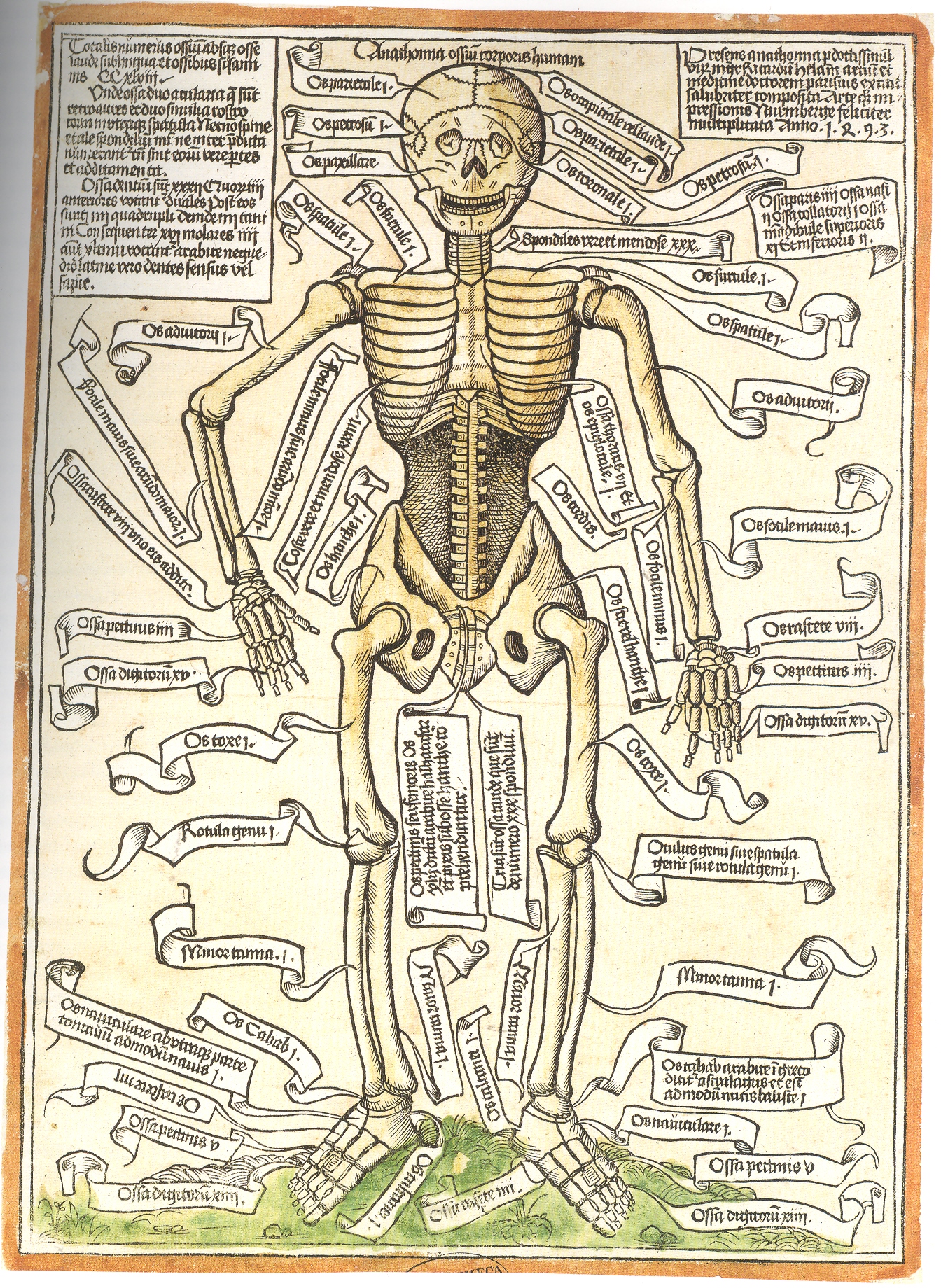
    To start with, for example, in this very breezy survey is the indexing of the very first illustration of a human skeleton. from Anathomia ossium corporis humani, printed the year after Columbus arrived in the Americas–this was the first revelation to the real world of science following a sleepytime of about 8oo years under the very heavy gaze of institutional religions. 

    Blog--may 5 skeleton

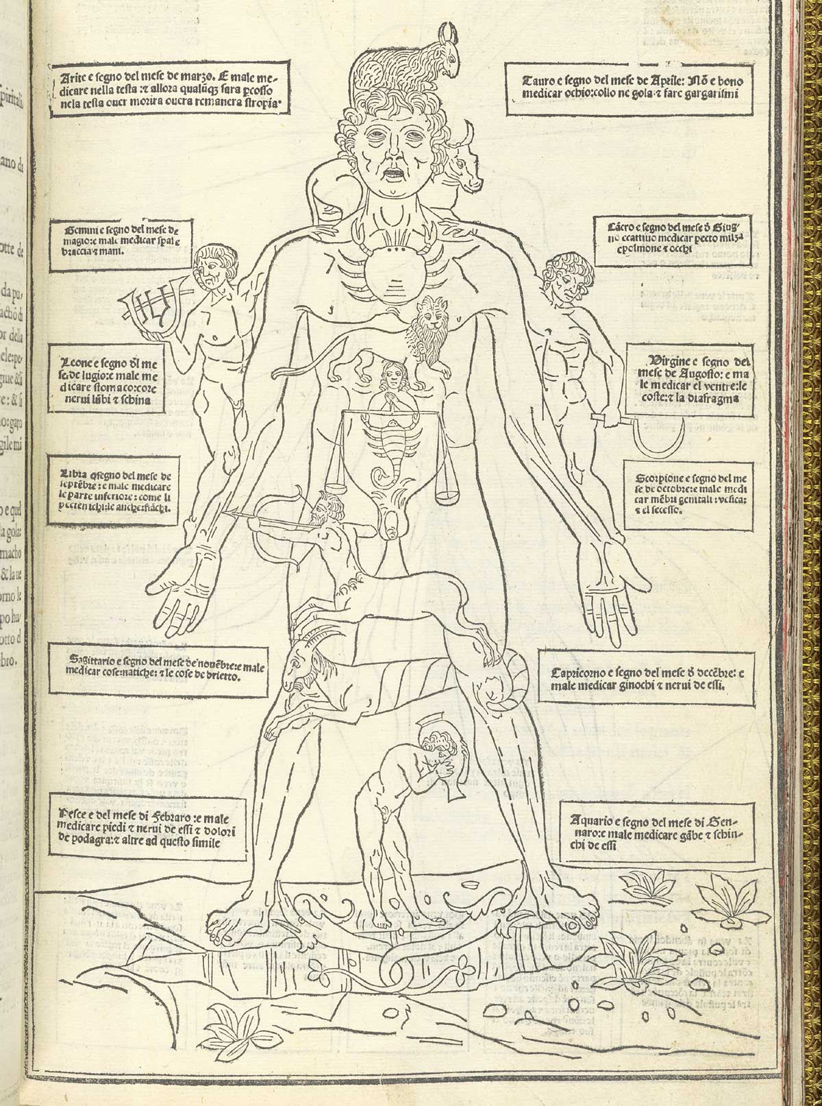
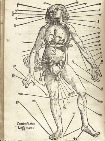
    Human map ketham_p15 In the same year that Columbus set sail for India came the anatomical publication of John de Ketham, with his overall map of astrological influences on the body, followed by a pretty-useful treatise on the treatment of war wounds, as well as the decidedly less-useful map of his locations for the best place to bleed a person of their bad humours. 

    Well, it really wasn’t like that, not how I mean by by snippy modernist viewpoint looking back on medical history with no contextual appreciation.  Bloodletting was an approach to healthfulness, as blood was seen as one of the four major elements (or “humours”) of the human body that needed to be kept in balance.  This was

    Gersdorffx400jpg_other_2accomplished via the application of leeches or by the more common (and quicker) practice of venesection, or opening a vein to allow the blood to come out. (Let’s reference Steve Reich’s magnificent “Bruise Blood” creation of 1966 at this point—I don’t think that I’ll ever have a better chance to drop a reference to this piece of revolutionary music in regards to venesection again.)  Thus this map was map for the practiconers of bloodletting—the physicians, and more probably the barbers and other assistants who would inherit this lesser procedure from the more-busy doctors.  In the history of maps of anatomy and the general practice of mapping the human condition, this woodcut x-ray of the best places to drain human blood would not survive close to the age of modernity, disappearing almost entirely by the 18th century, and becoming much more scarce well before that.

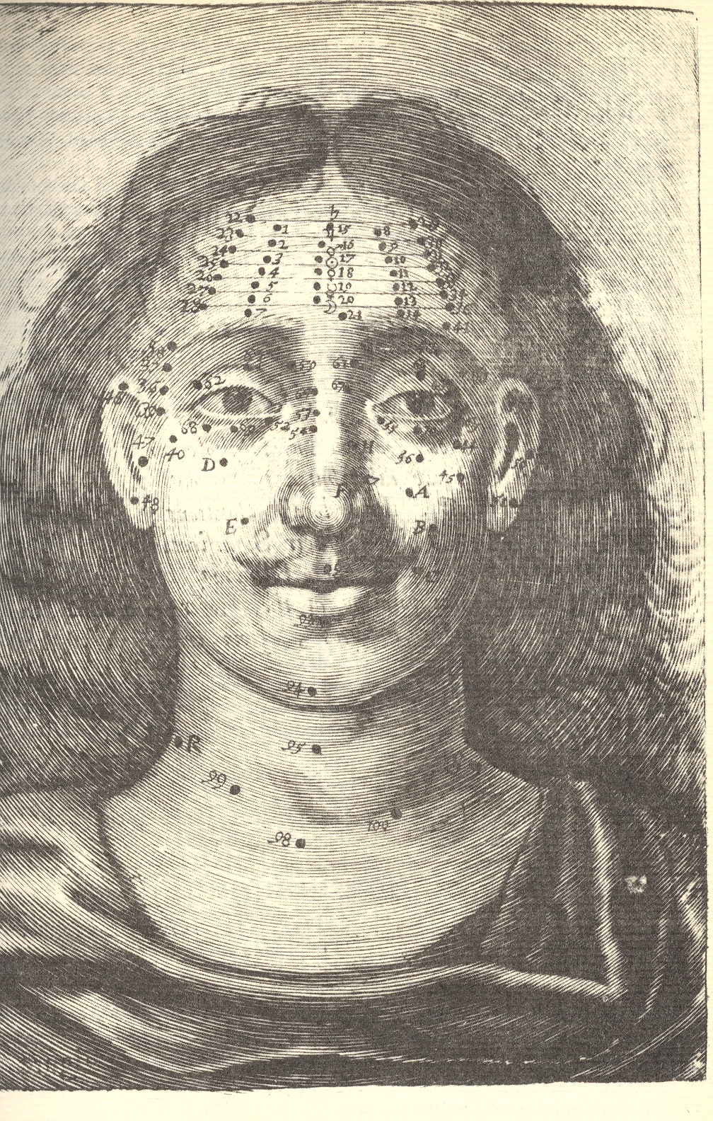
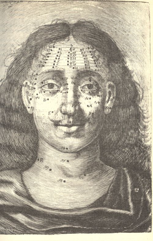
    Moving on to Richard Saunders (who I wrote about more fully here)continued a very ancient tradition into England, deep into modernity, by mapping the divine cosmos of moles and other facial extras for the purposes of health and prophecy:

    Blog--jun 11 circ mole


    Richard Saunders.  Physiognomie and Chiromancie, Metroscopie, the Symmetrical Proportions and Signal Moles of the Body, Fully and Accurately Explained; With Their Natural Predictive Significations Both to Men and Women (published in London, 1671, by Nathaniel Brook).in which he divines the psyche and the future with peoples’ moles. 

    [graphic]

    Visceral Anatomy From Reisch’s “margarita Philosophica,” Johann Schott, 1503

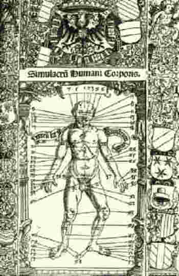
    Blogbloodletting_stoefflerI couldn’t let the above-mentioned  bloodletting image pass without reference to this excellent woodcut for Johann Stoeffler’s  Calendarium Romanum Magnum, printed in Oppenheym by the redoubtable  Jacob Koebel, (24 March) 1518.  It is a glorious display (entitled Simulcarum humani corporis) of seasonal (!) purgative and bloodletting locations on the body, meant to accompany a longish essay by Stoeffler on the practice in general.  The bulk of the book, however, had very little to do with this practice and was actually commissioned as a reform to the Julian calendar, provided with the impetus of the Lateran Council (1512-1517).  The result was a series of forty-one  propositions on the calendar and calendar-related practices, including work on eclipses, the zodiac, the occurrence of leap years, the Alexandrine and Roman calendars, the calculation of the occurrence of Easter, and so on, including the seasonal practices of bloodletting.

    I enjoyed this torso map by Salomon Alberti  in his Historia plerarumque partium humani corporis, in usum tyronum edita. Vitebergae (p1583, 8°; ibid., 1585, 8°; enlarged, ibid., 1601, 8°;(published from 1583 to 1630) for it simplicity.

    The rest of the images I’m going to have to show here as a simple Image Dump, at least for the time being:


  • Pictographic Messages to the Year 12,010: the Medium is the Mess.

    JF Ptak Science Books  Post 1103

    Talking to the Future: a Note of Pity to Ourselves in 300 Generations
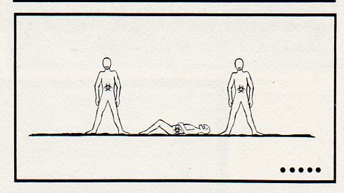
    Nuke waste--dead251

    In the history of words I’ll take a wild guess and say that fractions of 1% of everything communicated is directed at ourselves in the future–or at least it has the possibility of being directed to someone else when our deeds are long, long since forgotten. 

    And by writing to the future I don’t mean in an off-hand way, our words being read in 12,010 by chance, idea archaeologists looking at what people were talking about 10,000 years earlier; and I don’t mean via “reconstructing” our radio or tv broadcasts (in the not-right Jodie Foster Contact kinda way).  I mean intentional messages to be read a long time from today.   

    A more problematic entry would be images and symbols design to be read by future generations, in the deep future.  This is not a very deep category, though a famous (if not well designed) example being the one associated with Carl Sagan that was attached to the 1972 Pioneer 10 and 1973 Pioneer 11 spacecraft, which attempted to explain what humans were should either vehicle  in any eon come into contact with other-than-Earth life.
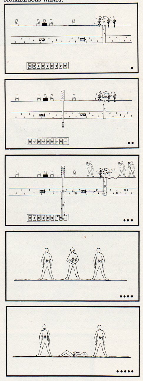
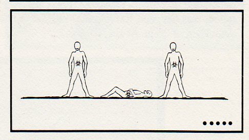
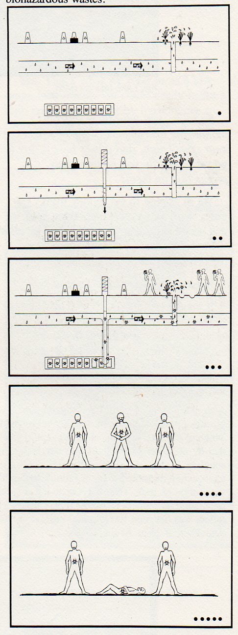
    Nuke waste--overall250 Another is the pictograph presented here, which appeared on page 117 of the ironically and extraordinarily-titled Reducing the Likelihood of Future Human Activities That Could Affect Geologic High-Level Waste Repositories1, the first half of which (bolded above) could make a nice departure for some other science fictiony type story.    But what these folks were talking about, plain and simple, was how to prevent future generations from digging into or other disturbing in any way buried masses of nuclear waste. 

    This pictograph is meant to be a non-linguisitc, universally-understood  warning to future generations that the ground they are standing on is above a nuclear waste storage site.  The plan was that nuke waste would be solidified and buried in rock hundreds of meters below the surface in an effort to keep in line with governmental policy of waste disposal2. The pictograph relates to the restricting of future human activities part of the title of the work in question–that is, folks in the future who might muck around, drilling, into the nuclear waste site.  This pictograph tells them why they shouldn’t do so, because of all of the terrifically lethal mojo underground. 

    As one might guess by the title, the report has its own communication problems–it is dense, turgid and not a particularly clear document.  It is a fine document illustrating the problems of communication, but not in the way it would have wanted to be, celebrating a reverse triumph in a Darwin Award/IgNobel type of way. And all of this in spite of/or because of a healthy slice of linguists, semioticians, logicians, artists, graphic designs, politicians,. sociologists and so on constructing the thing.

    The sign basically says that if you drill at this spot (to some unspecified depth) through aquifer or underground stream or water source or something that some point you may reach the biohazard nasty, which will then get into the water supply and into humans, which will then kill them.

    The sign was designed for 10,000 years hence, and depended upon pictures to convey the message rather than words (except for H20, and the biohazard symbol).  Of course the radioactive nastiness will be there for millions of years, which would be an entirely different story in terms of imaging.  Perhaps. 

    The one thing the design of the pictograph has in its favor is that it is read top to bottom–no language on Earth (so far as I know) is read bottom to top, though there are many differences in reading right-left/left-right.  Beyond that, the pictograph stumbles over itself–except for the last two images, which may or may not tell someone that something bad is happening. 

    There are plenty of time capsules and idea-vehicles to the future–I’m saddened that this was seen to be one of the essentials that we would pass on to our future selves.

    Notes:

    1. Reducing the Likelihood of Future Human Activities That Could Affect Geologic High-Level Waste Repositories (Technical Report prepared for Office of Nuclear Waste Isolation, Battelle Memorial Institute; BMI/ONWI-537; May 1984)

    2. “Present society’s responsibility is to dispose of radioactive wastes in a manner that is safe, is environmentally acceptable, and does not require long-term maintenance or surveillance. This ground rule is consistent with the objectives in the U.S. Department of Energy.”Reducing…, page 2.

    The pictograph, explained,  pp 115-116 from Reducing….

    The pictograph…was developed using the concepts and guidelines discussed by Givens (1981). The objective is to convey to the reader the sense that if the area below the markers is disturbed, toxic substances will enter the ground water and lead t o severe consequences. relies on several visual images acting in concert to relay the message.

    The ground surface exhibits peripheral markers and a central monument to denote relevance to the site where those markers and monument exist.

    The ground-water system is indicated by water-drop shapes and by the chemical symbol for water (the only departure from icons, used as a redundant measure).

    A repository far below the surface is depicted with the biohazardous symbol. The fact that the object portrayed below the surface is a repository may not be at all evident to a future reader from the first frame; however, the movement of the dark material from the repository through the aquifer and into the vegetables in the third frame, coupled with the movement of the biohazardous symbol, should imply the burial of biohazardous materials below the surface.

    The pictographic sequence exaggerates reality with regard to the rapidity of contaminant transport and uptake, and with regard to the severity of the consequences. However, exaggeration is necessary because both the clarity and the relevance of the message may suffer if.the pictograph attempts to indicate contaminant transport time of thousands of years. Similarly, the consequence portrayed, a painful death, over-exaggerates the cause-effect relationship and the rate of the individual’s demise (one out of three suffer death in the pictograph, whereas a
    to chance would be more representative).

  • New Map: Distribution of Slavery in North Carolina, 1860

    JF Ptak Science Books   Post 1099

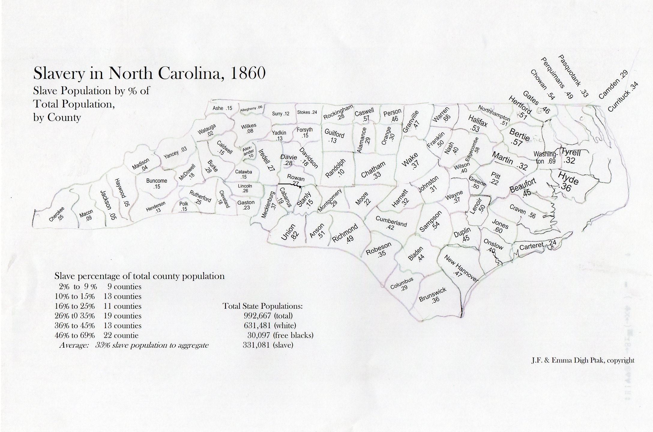
    My daughter Emma and I put this map together a few years ago for a project that just didn’t come about.  I found it this morning and thought to just post the thing and its tables.  It could certainly be dressed up some–or at all.  Color would be nice. So would a clickable interactive bit.  Caveats firmly in place, here it is–so far as I could tell there wasn’t such a descriptive tool like this available to quickly show the distribution of slave ownership (by county) in North Carolina. (Map is expandable.)

    Slavery nc237
    .  

    Data below in expanded reading section, slavery distribution arranged by heaviest concentrations to least.  

    Once you get into the mountain region of the state (the last third or so) where there are lots of hardscrabble/subsistence/poor farmers, slave ownership drops quickly. (I’m not sure how the Cherokee slave ownership factors into this.)  It would be nice to know how NC compares to the rest of the slave holding states, and I might do that yet–but for now I just wanted to share this relatively raw map before I lose it for good.


  • The 200′-Tall Woman and the History of Skirt Lengths–Interesting Images

    JF Ptak Science Books  Post 1023

    [Part of this site’s History of Women series.]

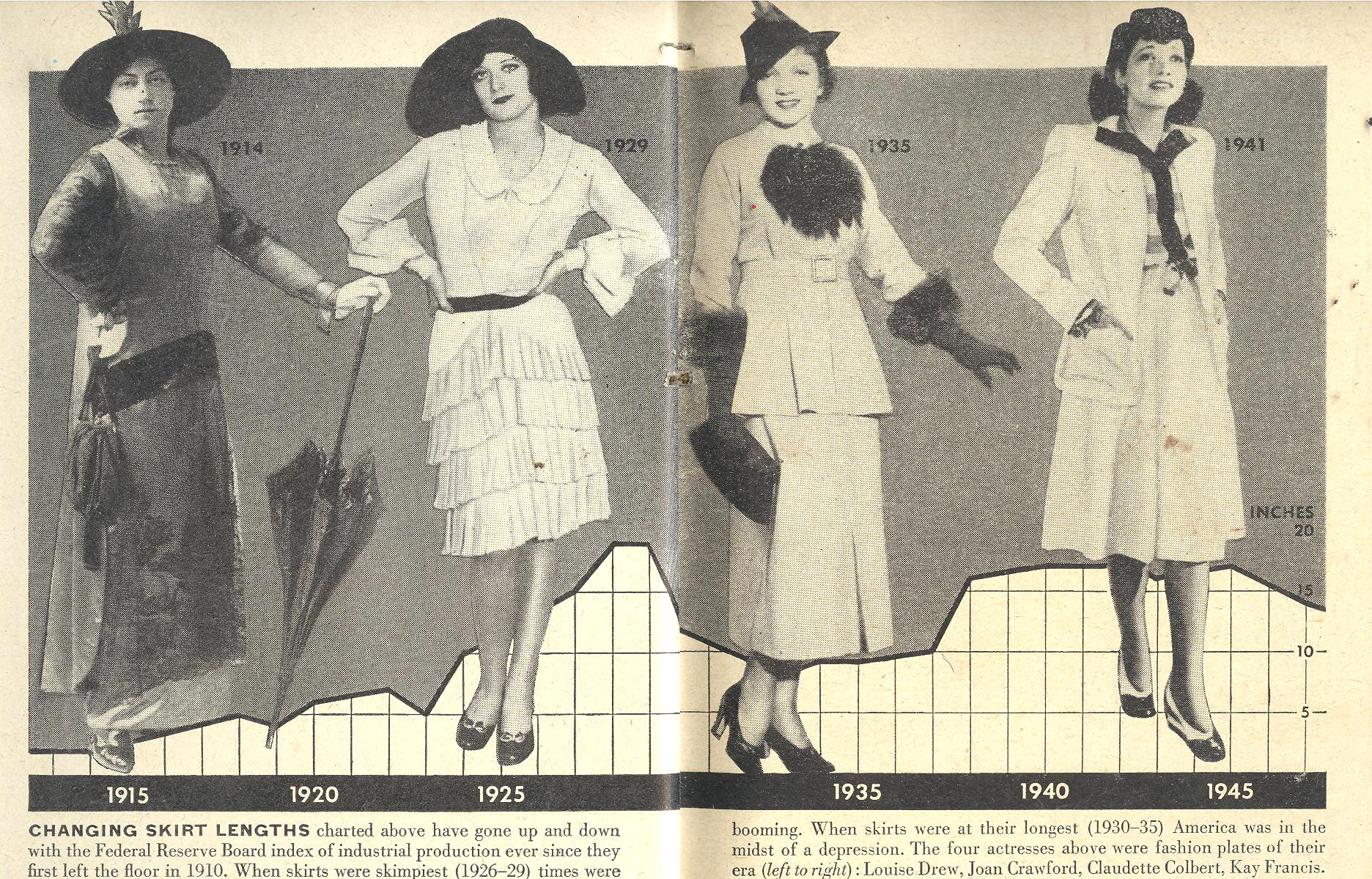
    This graph illustrating the history of skirt lengths in the United States is oddly interesting and appealing, a job well done.  I like that the graph lines fairly well reveal the amount of leg shown by the rising and lowering hemlines, measuring the height above the ankle from bottom to top. 

    1--may 7 skirt length 

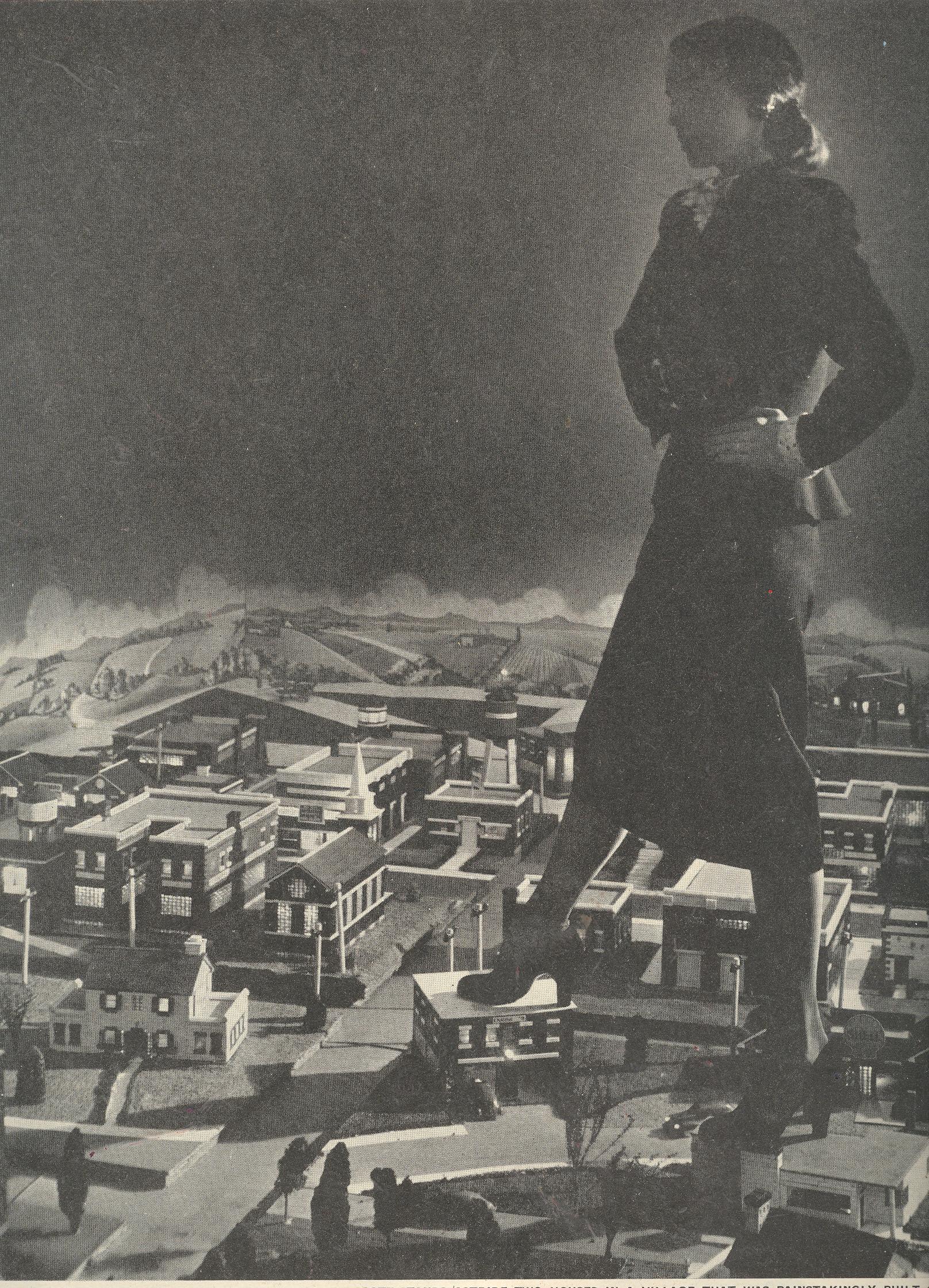
    Now:  I offer what I think must be the female record for the most distance between the ankle and the hemline–I reckon it to be about 60 feet. 

    There are certainly a wide universe of captions for this picture, but for some reason I’m most comfotable with the exposed-leg connection. 

    1--may 7 skirt length giant


  • Propaganda Maps of a Different Sort–Health Advertisements & Carto-Weirdia

    JF Ptak Science Books LLC  Post 1021

    “When I’m playful I use the meridians of longitude and parallels of
    latitude for a seine, and drag the Atlantic Ocean for whales.”
    –Mark Twain (Life on the Mississippi, 1883) 

    1--may 5 world map cleaned

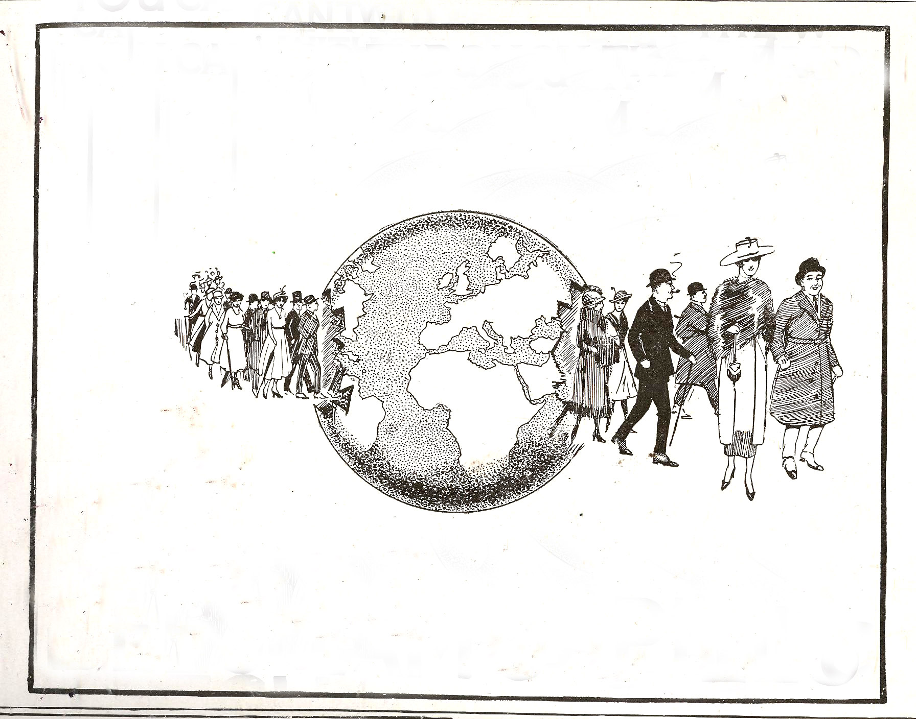
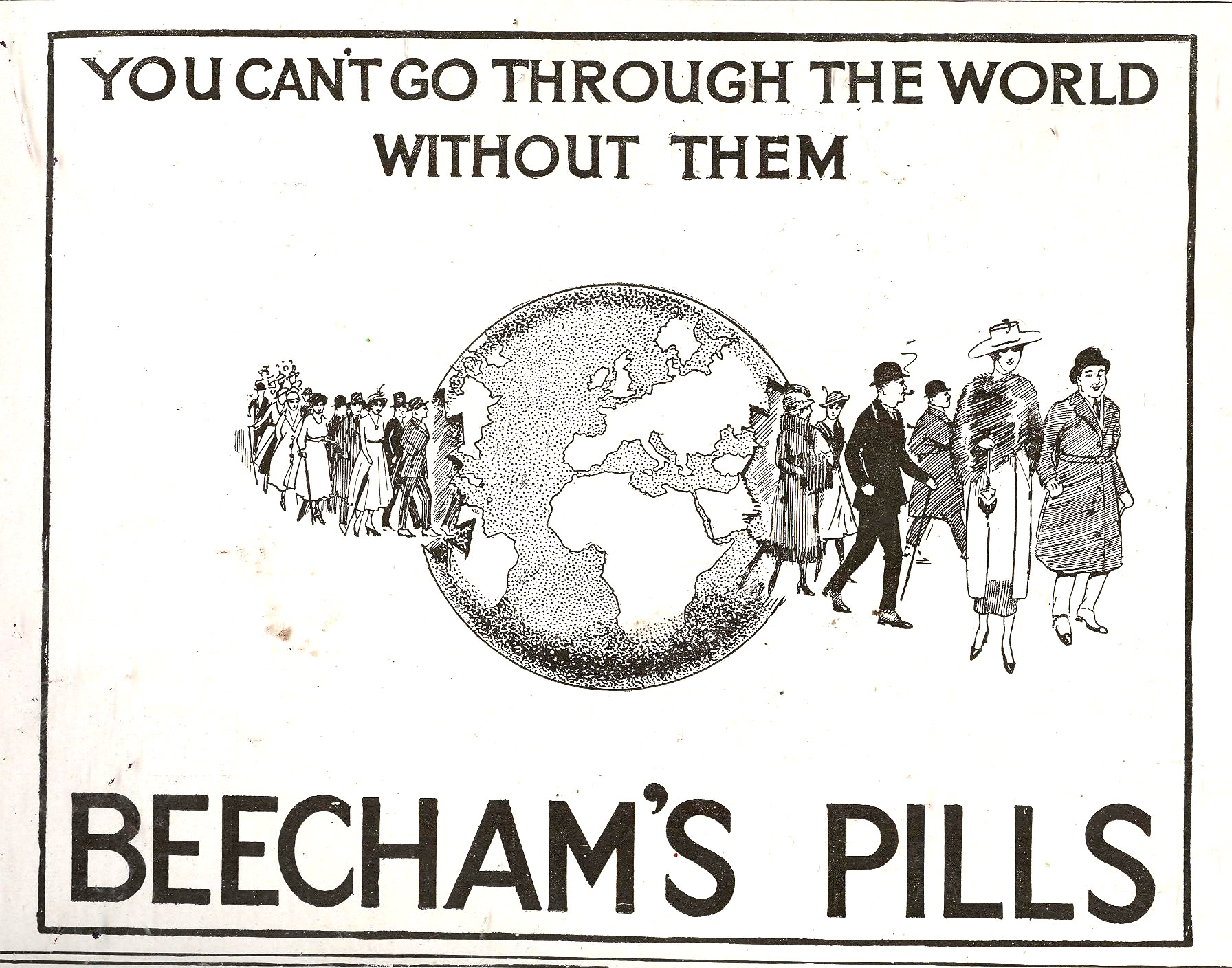
    1--may 5 world map In this blog’s continuing series on maps and propaganda come these two interesting and appealing examples, both appearing in England in the late ‘teens though their histories are older than that. They do come from a much longer tradition of finding physical landmarks of the body by which to navigate biological and mental needs–bumps and blemishes of the head, “reading” blood and urine,  general mechanical measurements of all sorts, and on and on, even so far as to include mapping the significance of the appearance and proximity of body moles and warts. (I addressed this earlier in a post on Mapping the Human Cosmos via Mole1--may 6 mole maps, here.)

     
    The first image belongs to Beecham’s Pills, long a staple of chemist/pharmacy and general goods sellers, which were basically patent medicine cure-alls composed of aloe, ginger and soap, and which found a happy market for more than 150 years (1842-1998).  Evidently Beecham’s did do something right in there somewhere, as they had some sort of positive effect on digestion.  Other than that I don’t know, though the little pills seem to not have caused any direct harm.

    The company has a long and huge advertising history, though one of the favorites that I’ve seen from this early part of the 20th century had folks marching through the globe, and happy to be doing so so long as they had their care trusted to Beecham’s.  

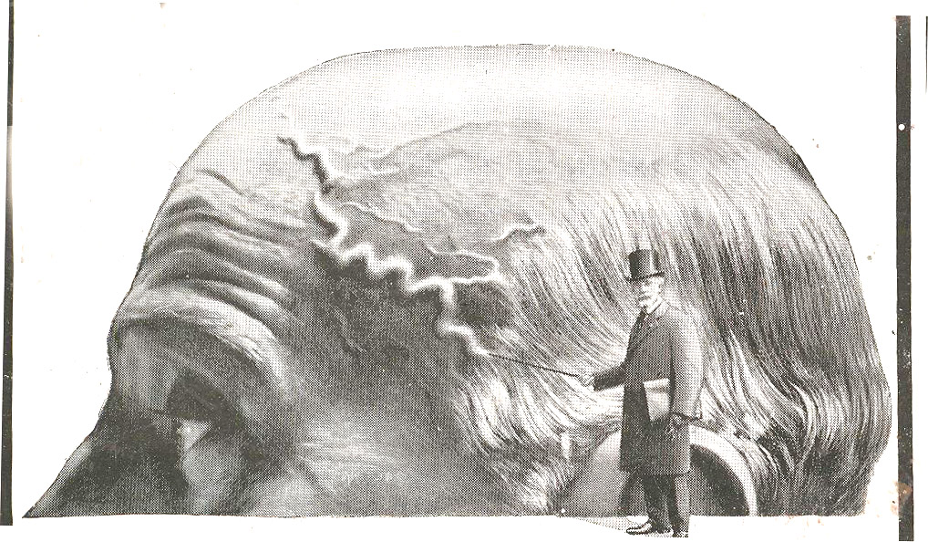
    Secondly is this odd bit that locates the center of one part of human health in the veins of head, showing that if you can indeed follow them like a map, then you’re in trouble and need to ingest the product sponsoring the scare measure, Urodonal (“dissolves uric acid”). Urodonal is of French origins and dates back to at least 1874; it was a quack medicine composed of “pleasant herbs” which would cure all sorts of aliments relating to kidney distress, plus fatigue, tired feet, aching back and of course obesity. 

    1--may 6 map weird
    The man in top hat was pointing to the Vesuvian vein with his cane, just in case you missed the thing.  But I guess in the modern age when everyone must “take” something, the nonsense concoction of Urodonal was better than most because it–like Beecham’s–didn’t actually do anything nasty to your body.  Unless of course you self-administered your medical care and relied solely on these agents for your necessary treatment for a real illness, which would mean trouble–and which is an entirely different story. 


  • Imaging Imagination: Diagrams of Humor & the Center of Levity, 1878

    JF Ptak Science Books LLC  Post 985 

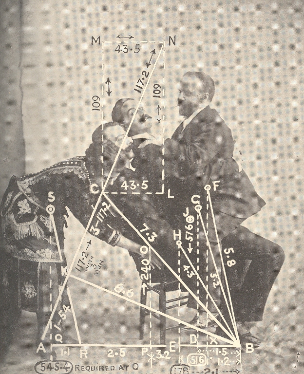
    Mar 23 center of levity cvr det

    [Wood-eating woman tells a joke to distract  three men sharing the last chair in creation in alternative chairless dot universe.]

    Acerbic and punctilious, this work by an anonymous (Ambrose Bierce-like) late 19th-century
    cataloger of human-ness attempted to diagramaitcally display the
    sharing of humor among people.  The resulting images–all unexplained, not indexed, and left to a logical imagination–fit very nicely into a developing section on this blog called  Maps and Diagrams of
    Imagination and Ideas.

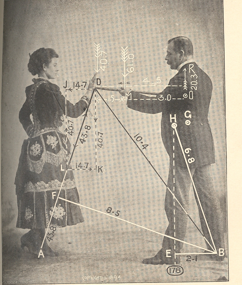
    Mar 23 center of levity cvr det 2

    {Woman finger-ingests chair presented to her by knee-connected chair-minions from talking-mustache close-male-pelvis universe.]

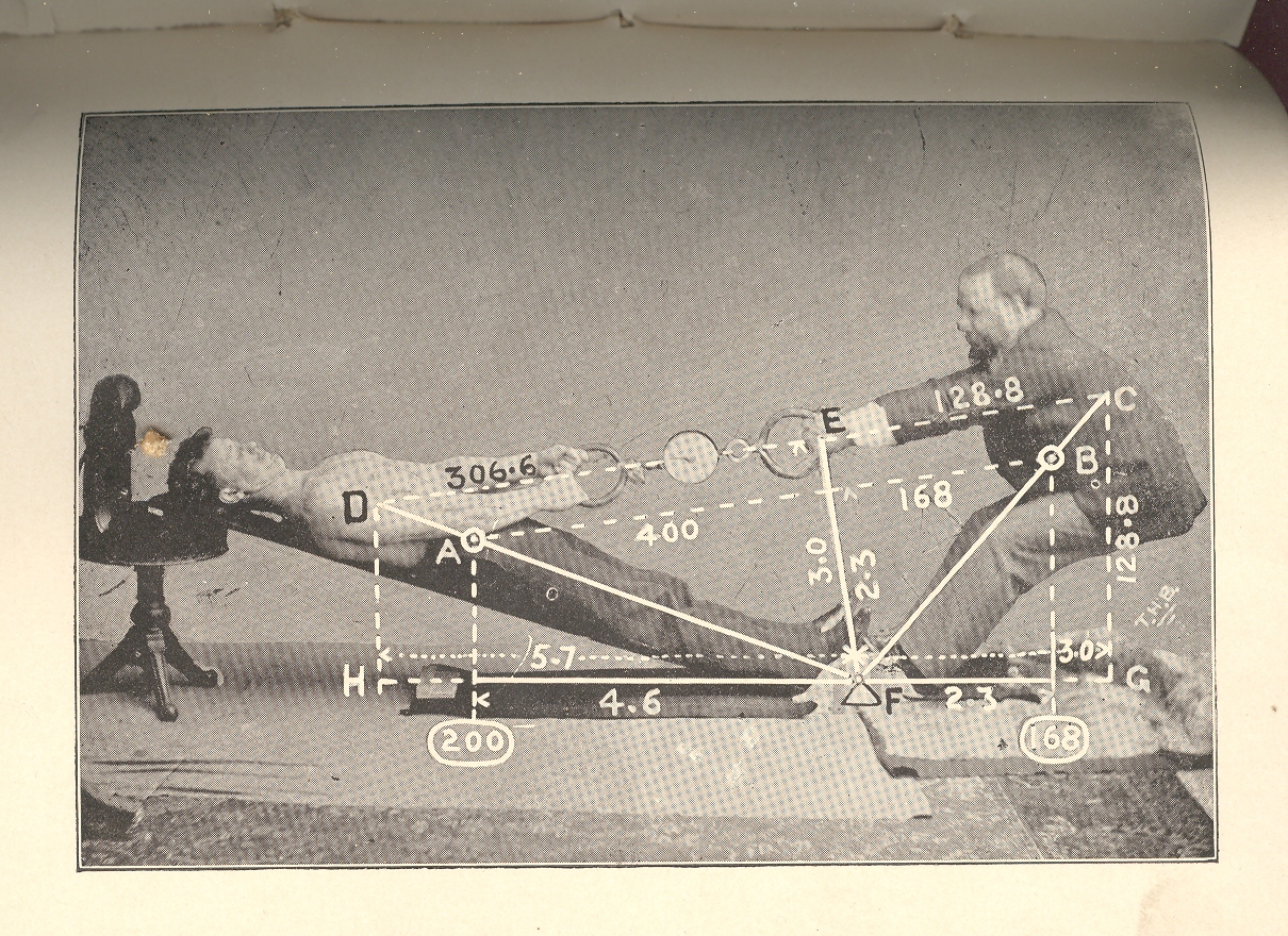
    In reality this short, small, wordless publication’s images looks like  natural philosophy textbook images displaying ideas like momentum and gravity…often they would be quite prosaic, with unnecessary natural accoutrement, little bits of added detail that had nothing really to do with the image displayed. The real intent of this document was to illustrate the center of gravity–it would’ve been more helpful if the publication had a title page or text of any kind for that matter, but since it doesn’t the mind ran free, allowing these representations to be a geometry of shared humor.  Which of course they are not–but the images do have a certain coy funniness to them…

    Mar 23 center of levity cvr det 3

    [Woman makes wooden point by stabbing Ear-lobed Mustache Man in the heart with her wooden palm finger.]

    Some of the other posts that could be included in this Imagining the Imagination category include:

    First photograph of a smell:

    Mathematical Thinking being Thought

    Map of Nothing:

    A Map of Holes in the Sky: 
    Heaven

    Map of Color-Sense Placement

    Unexpected Sense Impressions from Antique Prints: Sound

    Mar 23 center of levity cvr det 4

    {How it would be done if men gave birth.]

    Mar 23 center of levity cvr big det 

    {She is smiling. What do the other expression imply?]