A Daily History of Holes, Dots, Lines, Science, History, Math, Physics, Art, the Unintentional Absurd, Architecture, Maps, Data Visualization, Blank and Missing Things, and so on. |1.6 million words, 7500 images, 4.9 million hits| Press & appearances in The Times, Le Figaro, Mensa, The Economist, The Guardian, Discovery News, Slate, Le Monde, Sci American Blogs, Le Pont, and many other places… 5000+ total posts since 2008.

Category: Blank and Empty Things; A History of

  • Floating River, Lonely Tree: a Little Bit on the Aloofness of Things in Renaissance Illustration

    JF Ptak Science Books   Post 1651
     
    Malory870  

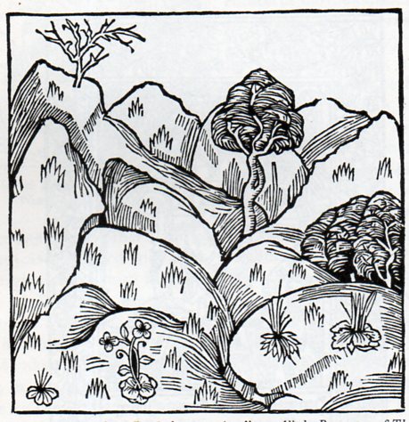
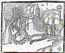
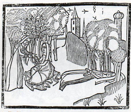
      Sir Thomas Mallory (c. 1405 – 14 March 1471), translated and compiled a collection of mostly 14th century romances regarding King Arthur known and published as the  Le Morte Darthur/Le Morte d’Arthur.  It  was first published by the great William Caxton in 14851and became quite popular,  being reprinted with additions and corrections in 1498 by William Claxton and then again by Wynkyn de Worde (in 1529). It is, in its way, beautifully illustrated, or at least interestingly illustrated–I can’t really say for sure if the woodcuts were done with great care or not.  But their effect is significant, and, whether naive or not or careless or not or simply at the artistic limit of its executor or not, the images do have their own peculiar beauty.  One that struck me in particular was this, 
     

    Malory869
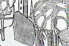
    the “floating river”, an out-of-perspective element of a very stationary world, a controlled chaos-ness in a static landscape.  I’m not sure what is going on with the trees, if the blankness is a part of reflected light, or if it is a representation of spaciousness between the limbs, or if they are simple wormholes in the woodblock.  Everything in the image seems to have its own sphere, locked into their own environment, existing apart from everything else.

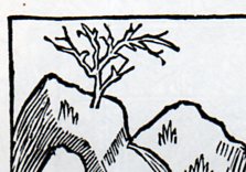
    I see the same issue with many other such works, bits dropped into place in a scene or landscape, all making their way into the viewer’s mind on their own, not really a part of a cohesive whole.  This may have been the intent, or again it may have rubbed up against the outer limit of what the artist (and their tools, and medium, etc.) was able to actually produce.  Here’s another example:
    Lonely tree872:

    Lonely tree871
    Its another lovely, lonesome image of separates from the beautifully-named book by Bartholomaeus Anglicus All the Properytees of Thyings, which was published in Westminster in 1495 (and also known as De proprietatibus rerum, also translated as On the nature of things, or On the properties of things), and which was originally written around 1225).  The book was a bestiary, a marvelous encyclopedia, a collection of all things as known in the 13th century–it would be interesting to represent all that is know today and compact it into a workable, logical, usable (printed !) book of a thousand pages.  The question of organization of knowledge would be the key, of course, and how to make one flow to another complementarily as practicable…it would be an interesting project (for someone else) to try and arrange the basis of human knowledge in a finite space like that.  The author of the book above organized his work as follows, in 19 books:  “god, angels, (including demons),   the human mind, or soul, physiology, of ages (family and domestic life), medicine, the universe and celestial bodies, time, form and matter (elements), air and its forms, water and its forms, earth and its forms including geography, gems, minerals,  and metals, animals, and color, odor, taste and liquids.”  The 2012 variety of categories would be somewhat different.

    Notes:

    1. This period, from say 1494 to 1525, was one of great creativity.  For example: 1494, Pacioli: Everything About Arithmetic, Geometry and Proportion; 1498,  Leonardo da Vinci: Last Supper; 1500, Michelangelo,  Pieta;  1504, Michelangelo: David and Bosch Garden of Earthly Delights; 1505, Leonardo Mona Lisa; 1506, work begun on St. Peter’s Basilica; 1508-1512 Michelangelo paints the Sistine Chapel; 1511, Erasmus, Praise of Folly;  1512: Erasmus, De Copia; 1513, Machiavelli  The Prince; 1516, More, Utopia; 1517, Start of the Reformation.

    Some samples of other bestiaries (compiled by The Medieval Bestiary):

    Hrabanus Maurus : De rerum naturis

    Isidore of Seville : Etymologies

    Lambert of Saint-Omer : Liber floridus

    Brunetto Latini : Li Livres dou Tresor

    Jacob van Maerlant : Der Naturen Bloeme

    Konrad von Megenberg : Das Buch der Natur

    Thomas de Cantimpré : Liber de natura rerum

  • Geography and Geology in Renaissance Art, #1–Rondo Island Earth and Eden

    JF Ptak Science Books   Post 1650   (Part of a series on the History of Blank, Empty and Missing Things.]

    [I wrote earlier in this blog on maps of the Garden of Eden, here.]

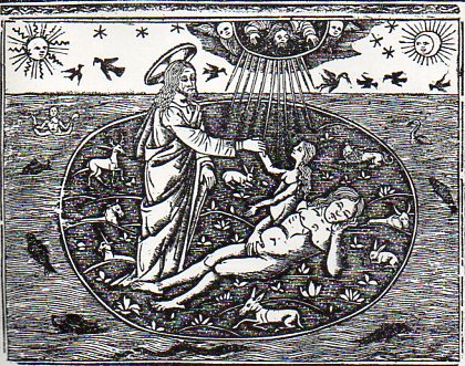
    This island is Island Earth, the chuchified beginnings of humanity, showing the creation of Woman from the rib of a sleeping Adam. I’m not referring to the 500-odd place names in the U.S. identified as “Eden”:  there are cities, towns, and villages named “Eden”, plus valleys, creeks, lakes, schools, shopping centers, malls, plazas, forests, and cemeteries–though I must say the though of an “Eden Cemetery” does sound appealing.  I’m talking about the Eden of Genesis–though Eden hardly makes an appearance anywhere else in the Bible.  Nor for that matter does the Fall of Man.  I’m also not talking about earlier references to Eden-like places, like Heden of the Persians, or the “Islands of the Blessed”/Elysium of the Greeks, or any of the other earlier versions of a paradise (some complete with a tree of knowledge/life guarded by a serpent/dragon) from which the Genesis version must surely have drawn.  This is strictly Old Testament, here.

    It is interesting that this image is a suggestion of the anatomical event, because Adam is shown whole and unmolested–I’ve seen many versions of this image showing Eve actually emerging from an opening in Adam’s side, but the artist here is content enough with the suggestion of the bio-event. 

    Islands977

    [Source: Jac. Phil. Foresti Bergomensis, SUpplementum supplementi chronicarum ab ipso mundi exordio…printed in VEnice, by G. de Rusconibus, 1510.  See the full image in the continue reading section.] 

    Eden seems set adrift in the sea of everything, floating there while the big change comes over Adam. (It is also fun to note that the hallow of the creator is given a three-dimensional affectation–perhaps later we’ll deal with the various shapes of hallos.)  Eden is supposed the perfect circle, held afloat by the great waters.

    Here’s another version, keeping somewhat within the Island Earth concept, but showing Eve emerging from a dourly distracted Adam–definitely this time connected to Adam in some way, though without any open cut.  (This image is from the great Bible of Anton Koberger, 1493. Picture source, here.)

    eve-koberger


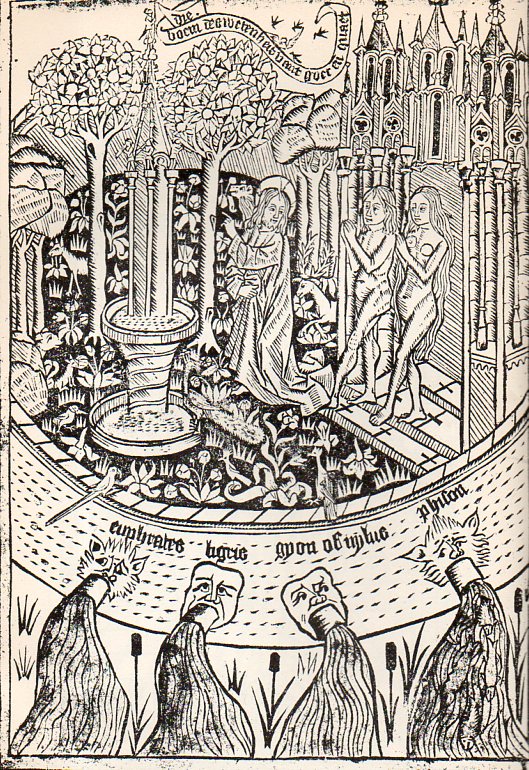
    Here’s nother image of the Garden of Eden as rondo, from Ludolphus de Saxonia (a Dominican for many years and a 14th c figure), Thoeck vanden leven ons heern ihesu christi (1487), which was I think the greatest Dutch achievement in the making of books in their history of early printing,  century, and in general one of the most beautiful woodblock books ever printed:

    Islands978
    Eden is again fortified, this time in stone, with the ornamental drainspouts of the four rivers making their exit in the foreground.  The glory of Eden abounds, but it is temptation that is presented them.

    Another version of Eden, this time in a rectangular configuration, is seen in this 17th c engraving, finding Eden on the map on lower Mesopotamia. 


    원본 크기의 사진을 보려면 클릭하세요


    There are other versions of Round THings that abound in Renaissance images, and we’ll get to them later, along with the depictions of caves, islands, and roads/paths meandering into infinity–those will come in just a little bit. 


  • On the Intellectual Power of Bathrooms–the British Museum, Education & Poor People in the 19th c.

    JF Ptak Science Books     Post 1649

    People, working people, the so-called “vulgar classes”, sailors, unescorted women, married women with babies, people who worked with their hands, people who worked (in general), all began their assault on the previously-just-for-the-“correct”-classes knowledge base of England–the British Museum–in the first third of the 19th century.  It was a failed attempt, really, because the powers-that-be of the Museum were repulsed by the idea of the underclasses coming in to the place were the proper people came to learn, fearful that they would be repelled by their lowered and unfortunate brethren.

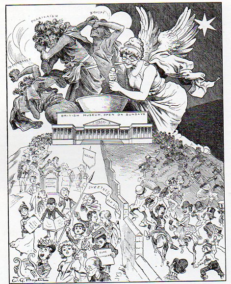
    Sunday975

    [“A Dream of the Future”–the Sunday Opening, from Judy, 1885.  Source: Lynn Barber, The Heyday of Natural History, Doubleday, 1980, page 166.]

    The Museum wasn’t open very much at all–only three days a week, receiving people between the hours of 10 and 4, restricting access to women with children, to women in general, as there weren’t any restrooms for females.   I’m not sure when the first women’s facilities came into being at the Museum, but it took them until 1879 before the place was opened daily.  And “daily” means every day, every day but Sunday, Sunday being a day not only of various religious obligations (which I think was the least of it), but also a day in which the greater percentage of the working class was not working ( which I think was the root of the issue).  That privilege of opening the Museum to the great unwashed, opening the place on Sunday, didn’t occur until 1896. I imagine even then that there was resistance to the innovation of reaching out to working people.

    The odd thing, now, is that many museums and libraries have been limiting their public hours, closing on Sundays, the day on which most people today find themselves not at work, restricting themselves to availability to a population of people who may mot be working a 5/6 day workweek. Plus ca change, plus c’est la meme chose.


  • When Data was Dada: Max Ernst, Dada, Graphs, and the Display of Non-Existent Information

    JF Ptak Science Books   Quick Post  (Part of the series on the History of Blank, Empty and Missing Things.)

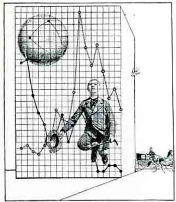
    This quasi/faux statistical/graphical modern art image by Max Ernst is found in the journal Mecano (issue no. 3 “Rouge”), which was the principal Dada publication vehicle, and issued by the artist Theo van Doesburg (in the Netherlands).  It arrived in 1922, just 10 years after the publication of Marinetti’s “Manifesto tecnico dellBlogernst030a letteratura futurista” and a year before Marcel Duchamp retired from painting, and just another two years before Andre Breton nailed down the meaning of Surrealisme (and again like a particle collision changed the direction of some of modern art). 

    The Dada Movement is generally thought to have started by WWI escapes in the neutral haven of Zurich (where the war was escapable for the duration), at the Cafe Voltaire, in 1916, the word “dada” being found as is generally believed by Tristan Tzara.)   I am trying hard to form some sort of memory for other Dadist, Futurist, Symbolist or other modern movements from the ‘teens and ‘twenties to use a graph such as this in the artwork but I cannot think of any.

    (By the way, also appearing in this issue of Mecano were Man Ray, R. Hausmann, Hans Arp, Kurt Schwitters, and others.) 


  • On Being Not Even Wrong–What is the Word for a Wrongness that Transcends “Wrong”?

    JF Ptak Science Books  Quick Post

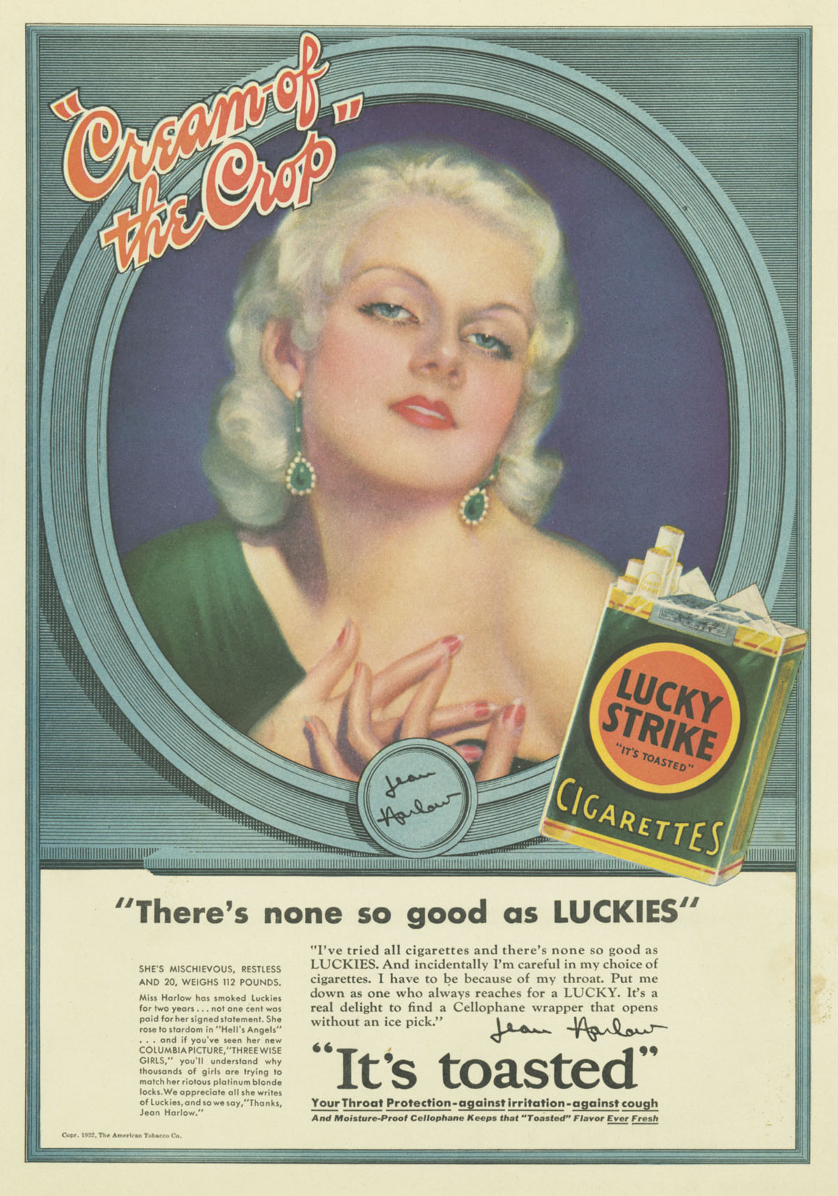
    This is just a very quick post making use of the excellent cigarette advertisement resource at Stanford University (all images used below are found in their archive, here).  This is the third installment on this blog on cigarette advertisements that are as wrong as wrong can be, so wrong–as I’ve said in earlier posts–that they aren’t even wrong, that they are on-beyond wrong in that classification that defines terminal wrongness. 

    http://elane.stanford.edu/images/exhibits/tobacco/embassy/inhaleheartcontent1L.jpg


    This stuff is worse than wrong–it is substantially a wrongness where the word “wrong” is too weak and impotent to describe a particular wrongness, much like the very-overused and not-replaced “spill” could be used to describe what happened in the Gulf Coast.  There is no one word in English I think that described that occurrence, just as there really isn’t one suitable word to describe this behavior of the tobacco industry.  The wrong that isn’t even wrong isn’t that it is nothing, but that the wrongness of the thing is too weakly described by the word. 

    Rudolf Peierls (a phsyicist of very high order and co-author of the Frisch-Peierls memorandum of 1940 that theorized a workable weapon fahioned of U-235) described the original use of the “not even wrong” phrase, attributing it to the great Wolfgang Pauli (Nobel physics 1945), who when shown a paper by a young physicist commented sadly that it wasn’t right, and it even wasn’t even wrong.  It was nothing. (It is interesting to note that if you took two of the things that these physicists were known for and placed them out of context in a literary/philosophical arena, they kinda work to describe Pauli’s wrongness principle:  that would be the Peirels Instability and the Pauli Exclusion principle.)

    These ads weren’t nothing.  And the odd thing is that they exist in their contemporary flavors today, efforts that will be seen in our short future as being as impossible as these antique ads seem to us today.  More’s the pity when we know almost all of the story. 


    And this one is just “__________”:

    http://elane.stanford.edu/images/exhibits/tobacco/luckystrike/certainlyL.jpg

    http://elane.stanford.edu/images/exhibits/tobacco/cigars_pipes/ronaldreganL.jpg


  • Mysteries of the Smoke Signals–Weird Secondary Enticements in Cigarette Ads

    JF Ptak Science Books    Post 1640

    [Continuing the post The History of Cigarette Eyes and part of the series on Blank, Empty and Missing Things.]

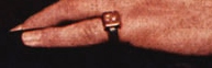
    Mysteries of smoke harrison det

    What is it about the pinky ring that makes you want to smoke?  And makes you want to smoke the cigarette in the pinky-hand’s counterpart?

    The psychology of advertising in cigarette ads in the 1940’s or thereabouts is a strange thing to me.  The secondary items in the ads–the stuff there besides the cigarette–are sometimes baffling and occasionally troubling,  disquieting, unusual things sent to capture the attention once the cigarette has been removed from the field of attention.  I’m pretty sure why those things are there–because of their suggestive natures and their attempt to relate directly with cigarette smoking–but I’m not aure how that connection between the object and the suggestion (of power, or control, or social beauty, or sex and so on) takes place.  The meaning and connection can be forced out with a little muscle, but that wasn’t supposed to be so hard for the viewing public back there eight decades ago.  The social contrivance of the connection seems to have slipped over time into a smoky nothingness, and I think that it would be interesting to try and restore it, if only for the sake of understanding that lost part of advertising’s quadratic equation.

    And so on to a few examples from the advertising world, all of the images coming from the great cigarette advertising archive at Stanford University (here).  Removing the cigarettes as a main focus of attention  in the following ads leaves us with pinky rings, puffy man-ladies, cigarette holders, close touching, electronics, stub-handed stubby cigarettes, wedding rings and suggestive “product  placement”. 

    The vast smokey elegances of pinky ring (from above):

    http://elane.stanford.edu/images/exhibits/tobacco/luckystrike/scientifictestsproverexharrisonL.jpg


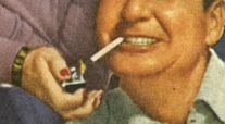
    The smokey, puffy man-lady (“so round, so firm, so fully packed”):

    Mysteries of smoke phil harris det

    Phil Harris just looks entirely and completely out of place, and not comfortable, though perhaps he just wanted to “feel pretty” getting a light from man-handed Alice Fayew?

    http://elane.stanford.edu/images/exhibits/tobacco/luckystrike/philharrisL.jpg


  • The History of Cigarette Eyes

    JF Ptak Science Books  Expansion and Correction(s) of  Post 1638 (Thanks to Orion Pozo at NCSU for starting this off by outing the Marlboro baby.) Part of the series on the History of Blank, Missing and Empty Things, Part 77:  Promises.

    “The world is my dream.”– Sir Karl Popper

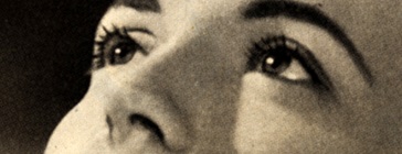
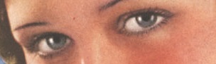
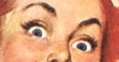
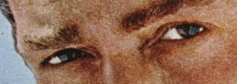
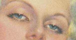
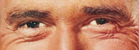
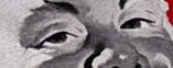
    In the History of Empty Promises advertisements for fulfilling experiences with safe/pleasant/not-addictive/sweet-smelling tobacco cigarettes would find a key position, if for no other very large reason than having killed so many millions of people.  Many of the lies told to the consuming public on the efficacy of cigarettes have come through billions of dollars worth of print advertisement, many of which featured the earnest eyes of someone famous (Babe Ruth, Lou Gehrig, the Duchess of Windsor), or authoritative (football referees, doctors, lawyers, airline pilots), or trustworthy (Santa, the family dog), or even innocent (teenagers and of course babies).  I’ve collected a few examples that I find particularly arresting–there are hundreds or thousands more to choose from.

    • Note–all images are drawn from the great resource at Stanford University on cigarette advertising, here.

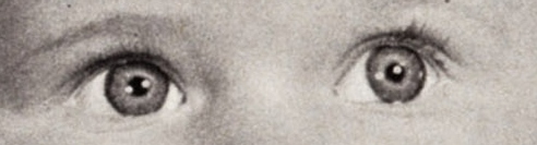
    Cigarette Eyes of Babies (for Mommy–for Daddy, see below):

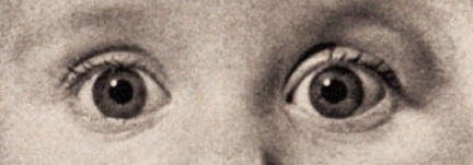
    Ciggie eyes baby
    In one of the high twisted occurrences in the history of Buying Things, Marlboro cigarettes started its life out as a smoke for women, a mild, feminine object for ladies.  And as we can see here an early appeal to the possible consumer came through the eyes of an infant.  The product didn’t sell well, and was repackaged for men, the baby eyes eventually being replaced by the iconic cowboy. This is one of the few times that an a consumer object that began its career as a sales vehicle for women crossed the gender barrier. 

    Ciggies--baby

    Cigarette Eyes (and Nostrils) of self-knowledge and belief (because nothing quite spells out personal knowledge than blowing hot smoke through your nose holes):

    Ciggie belief detail

    Ciggie belief

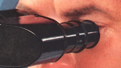
    Cigarette Eyes of the edification of pure scientific support for the glory of smoking:

    Ciggies--eyes w microscope det
    Chesterfield not only conquered the alphabet for cigarettes, but “science” as well.  Here we see Big Science affirming the ABC claim that there is no “aftertaste” in their cigarette.  (The ‘scope has no identifiers, probably taken away in the darkroom, but it looks like it might be a Spencer to me.  Maybe B&L.)

    Ciggies eyes of science

    Cigarette Eyes of Babies (for Daddy):

    Ciggie smokes daddy det

      Ciggies baby daddy


    Ciggie Slim-Lust Eyes:

    Ciggie slim detail
     

    Ciggie slim

    Cigarette Nurse Eyes of Trust and Responsiveness:

    Ciggie nurse detail

    Ciggie nurse


    Cigarette Teenager Eyes:

    Ciggie teens eye det


    Ciggie cheerleader

    Nothing quite spells out h-e-l-l (even to non-believers) than those things that are dangerous and targeted at children.  This add provides even a little more than that–the  leaping teenager does have a cigarette in her left hand  (if you look closely you’ll see it)  an is revealing quite a lot of herself in flight…even the angle of descent is suggestive.  At first glance I thought this was a cheerleader to be exposing so much, but, no–she’s just a teenager who is smoking and leaping.  


    Cigarette Teacher Eyes:

    Ciggie educators det
    Ciggie teacher

    Well, I guess that these weren’t necessarily teacher/scientist eyes, but the man in the suit was supposed to convey that.  He was after all smoking a smart cigarette, with a filter–something relatively new in the mid-1960’s when Lorilard Company pushed their Micronite filter.  It was supposed to filter out the bad stuff from cigarette smoke, and did so by employing crocidolite asbestos as part of the filtering agent–this is a form of asbestos that is the most dangerous of the amphibole asbestos family.  Evidently something like 18% of the miners who mined this sort of asbestos (also known as “blue asbestos” have died of mesothelioma–not contracted the disease, but died of it.  And here it was, being inhaled with cigarette smoke.)


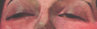
    Ciggie Eyes of Sex:

    Ciggie sex detail

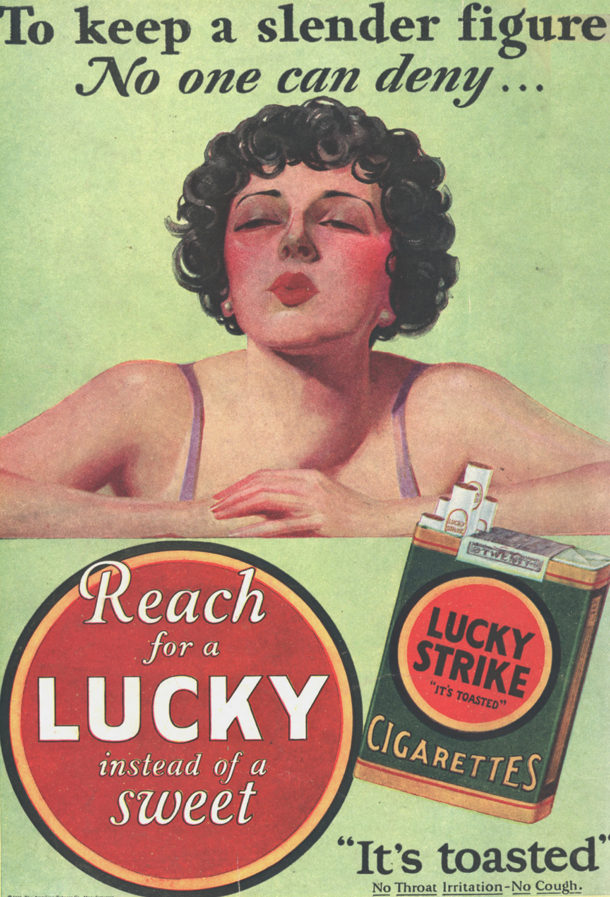
    This was far from being the first round of advertisements using sex as a possibility achieved via the purchase of a commodity. It was also not the oddest promise for weight loss from an unsuspecting product–cocaine was sold for this purpose as well in the early part of the century.  Heroin too.  I can guarantee that if you these this often enough it will loosen your grip on food, almost to the point of exclusion; and then, like magic, food gone, you will lose weight.  Cigarettes offered themselves as a substitute for candy–for women–and in this way became an inglorious end to what still seem the impossible dream of maintaining an always-improbable desired figure. 

    Ciggie sex


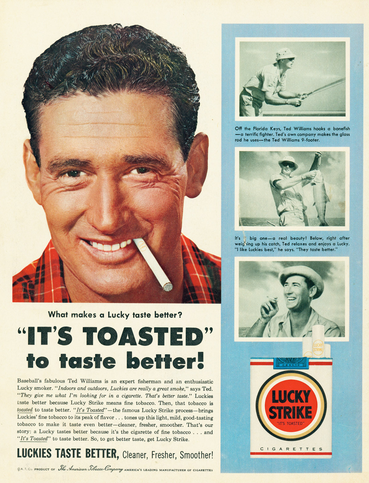
    Ciggie eyes of Teddy Ballgame:

    Ciggiee baseball detail

    Ciggiee baseball

    And from the other end of the field, a little inset picture of Babe Ruth, who evidently could tell his ciggies apart, blindfolded, and in uniform.  It is a creepy and surreal image:

    Ciggie athlete  ruth det last
    He didn’t have the best relationship with his wives, and had some other social factors weighing in against him, but the man was famously kind and generous with children, which gets him a “pass” in my book.  He died of cancer in 1948, aged 53. (His last public address was eloquent and heartfelt, a truly wonderful short speech.)

    Cigarette Eyes of Santa:

    Ciggie santa detail

    In a world of things in which everything was wrong, this was among the “wrongest”, so wrong it isn’t even wrong. There are many ads featuring Santa, some of which show him decorating a Christmas tree with boxes of cigs, others showing him with his sack full of yet more cigarette cartons.  Even in an Encyclopedia of Bad Taste, this would be a key entry.

    Ciggie santa


  • The History of Blank, Empty & Missing Things–When Everything was Missing

    JF Ptak Science Books   Post 1624   (Part of the series on the History of Blank, Empty and Missing Things.)

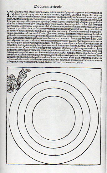
    Koberger bw884

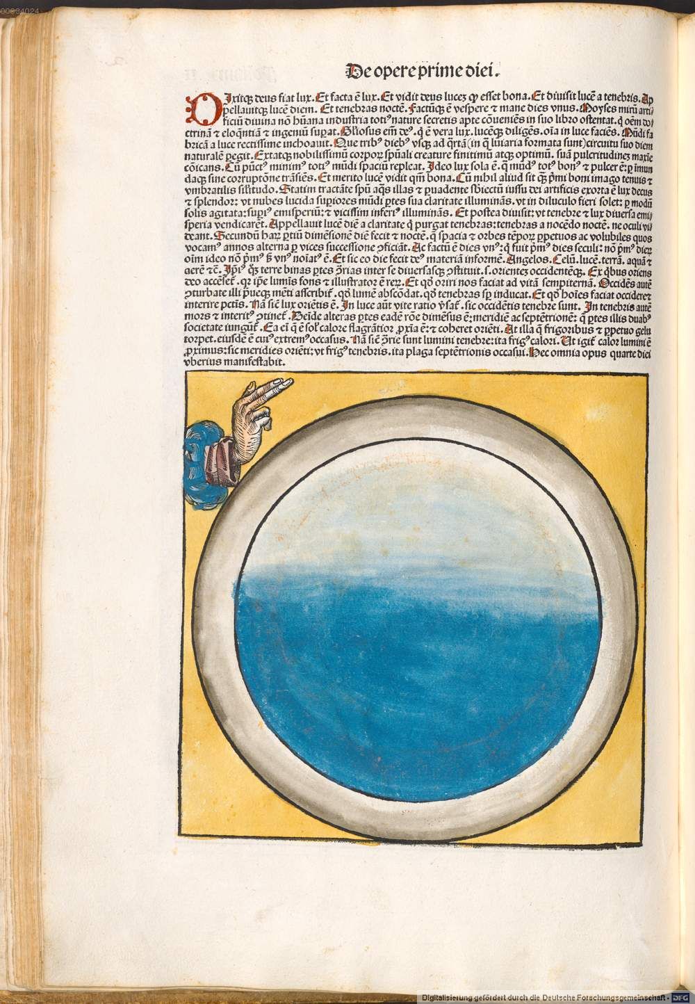
    Perhaps “everything” wasn’t missing, but almost everything was.  Certainly the ancients and even the more-moderns, even the scientists of the 16th and into the 17th centuries (until von Guericke in 1672), could not abide the idea of the existence of nothing.  The vacuum, a space in which there was nothing at all, was seen to be an anathema to the creations of the great creator, that the vacuum was antithetical to what was understood to be the nature of nature. (I wrote a post here earlier on when nothing was almost something.)

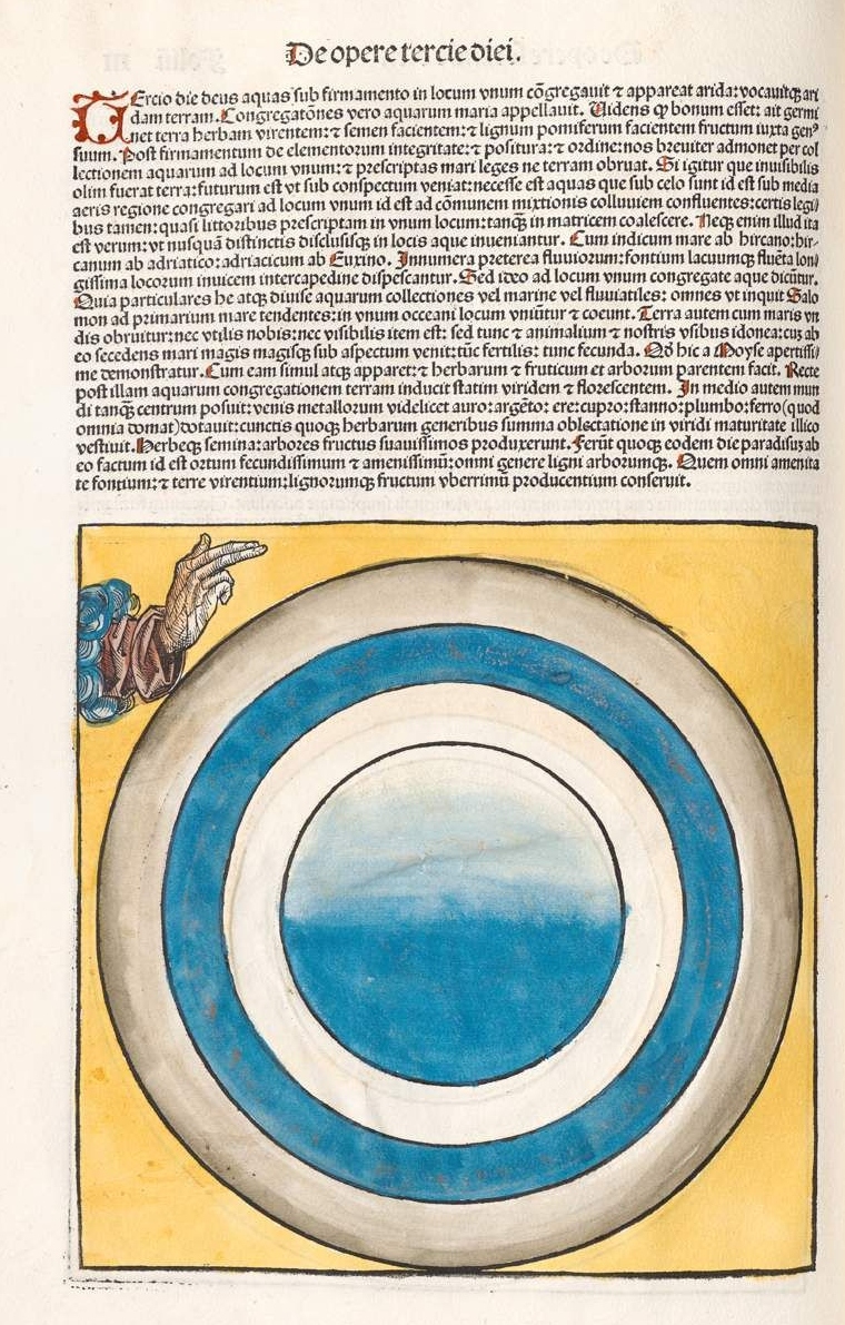
    But what we see here, above, is the third day of creation as presented in one of the most significant books printed in the 15th century, and it is somewhat problematic, because it depicts almost-northing.  That, or almost-everything. 

    The book was written in Latin by Hartmann Schedel (1444-1514, with the German translation by Georg Alt) , with the illustrations under the control of Michael Wohlgemut (1434-1519) and his stepson Wilhelm Pleydenwurff (c. 1450-1494), .and was published in Nuremberg in 1493 by Anton Koberger as Liber Chronicarum–known best to English-pseaking readers as the Nuremberg Chronicles (and to Germans as Die Schedelsche Weltchronik).  It is perhaps one of the greatest illustrated works in the first half-century of movable type printing, using more than 1800 woodcuts to tell the story of the world–according to the Bible, mostly.  (The book deals with the history of world in its seven ages–the first five of which deal with cumuulative history to the birth of Jesus Christ, while the sixth ages handles the history from Christ to the present day, and teh seventh carries along the future history of the world to the Last Judgment.  Not much then is devoted to the 1500 years preceding the publication of Koberger’s book. The author, Schedel, was a very religious man, and considered the work of teh Bible to come from the hand of god and therefore was infallible; on the other hand (so to speak), everything written outside of the Bible was that of humans, and so fallible, and therefore open to interpretation.)

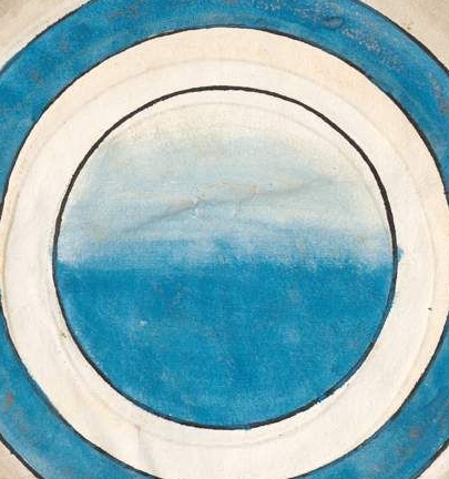
    Here is a colored version of the third day in the creation cycle mythology, which opens itself to much more visual congruence. (“On the third day God gathered together unto one place the waters under the firmament; and the dry land appeared. And God called the dry land Earth; and the gathering together of the waters he called Seas; and God saw that it was good, and said, Let the earth bring forth the green grass, the herb yielding seed, and the fruit trees yielding fruit after their kind.[Genesis 1:9-13.]”)

    Koberger color

    Koberger color b

    And the uncolored version, third day:

    Koberger bw det

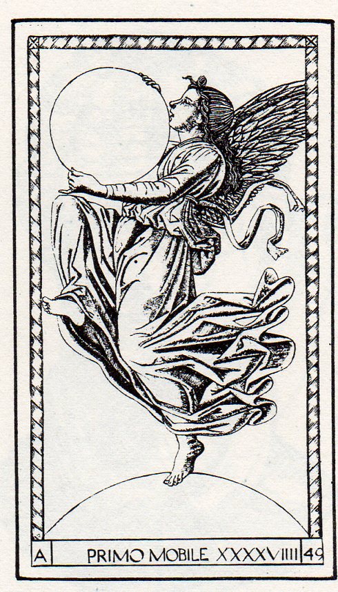
    This sort of “nothingness” is not unique, as we can see in this example from the Mantegna Tarocchi, showing the creator as Primum Mobile, the First Mover, holding what may well be our universe in its hands (and standing on another sphere of nothing, god knows what that might be):


    https://historyofideasblog.com/a/6a00d83542d51e69e20133f47ca205970b-piPerhaps I’m missing the larger picture, and that the circles/spheres are the things created, and that they are contained in the square surrounding them; and that the boundaries marked by the circular lines are not necessarily empty, and that it is the suggested of the circles that is the stuff created, placeholders, contained within the square of the creator’s domain.  Or maybe not. Perhaps the circles are signifiers for the elements–earth at the center, surrounded by water/air/fire. Perhaps the woodcut was just waiting for some color. 

    Notes:

    The English translation of the Nuremberg chronicle used here is from Beloit College (here) which also has a very lovely scholarly treatment of their copy of the Nuremberg Chronicle (here).

    Here’s the rest of the cycle, in color:

    “For he spoke and they were made: He commanded and they were created”  (Psalm 33)., so says the legend (IPSE DIXIT ET FACTA SUNT; IPSE MANDAVIT ET CREATA SUNT Psalm 32) which floats above god enthroned–but it is difficult to see the progress in the un-colored version of day three.  

    http://www.beloit.edu/nuremberg/graphics/Layout%20and%20Design-Full%20Page_lg.jpg

    The first day:

    Korberger 1st day real


  • Half-Missing People of the Renaissance

    JF Ptak Science Books   Post 1621     Blank, Empty and Missing Things series

    The thread on blank, empty and missing things becomes more interesting to me when it approaches the subject of humans and art.  And perspective.  It is a curious thing how over the course of 400 years–beginning say with the adoption of perspective in the work of Paolo Uccello–that the human form (and clothing and surroundings) was more and more realistically portrayed until it was not so, the “undoing” of perspective and realism coming with the Romantics and Impressionists, until realism and the portrayal of the very essence of a recognizable “thing” disappeared as a requirement in art in 1911. 

    But there are interesting forebears to the disappearing human, and some of them are found in the Renaissance.  Of course they’re mostly instructional on how to construct objects in proper perspective and such, but sometimes, well, sometimes they’re not, and the artist is purely suggesting human form.

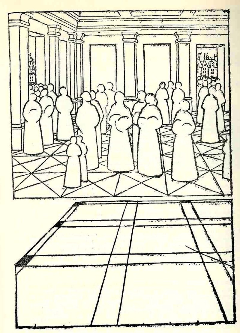
    Take for example the extraordinary work of Jean Pelerin (also called “Viator”) in his De artificiali perpectiva, a very rare woodcut-illustrated book printed n Nurenberg in 1509. In illustrating what he referred to as his “three point perspective” Pelerin removed much of the gothic-tradition bric-a-brac that is so heavily favored in these early books and replaced them with outlines from his rather astonishingly expressive notebooks, and replacing people, individual humans, with what may be the first “almost-entirely-absent” human forms. These roundish, ghost-like figures are just meant to hold the outlines of space, meant to function in the role of a simple comparative unit. This works quite well as an artistic technique—a solicitation tool which I think gives his reduced, “empty” humans an incredible, ethereal look unlike any other in the history of the first 60 or so years of printing.  It is difficult to imagine what the observer of these images back there in 1509 was thinking when they looked at these figures, and perhaps removed them from their textural context—it  would have been a unique visual experience for them

    Photo

     Albrecht Durer’s (1471-1528) drawing of a geometrical man was an amazing–startling, even–object to the early 16th century consciousness. His …Symmetria partium…humanorum corporum (1537) was a masterpiece, and a key piece of revolutionary visionary thinking.

    Photo


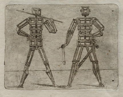
    His Underwysung der Messung (“Treatise on Measuring”) written about 500 years ago (in 1525) set the stage for this next work–it is here that we find some of the most recognizable of Durer’s illustrations of the instruments that he employed to do his perspective work.  Durer–so far as I can tell–created an orthographically rotating human figures in three-dimensional trapezoids, creating incredibly human-like non-human forms.  Supra-human, perhaps; mechanized, calculated, structural. His use of stereometry, the science of measuring volume, was adapted to this study of human form and the relationship between that and movement. 

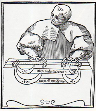
    Lodovico Fogliani, Musica Theoretica (Venice, 1529) which is somewhat reminiscent of a more -blank figure, though when you look at the images in teh book, most of the human figures are more detailed and refined.  This one seems only abotu half-done, with only the suggestion of a face and but little refinement in the clothing.  The subject’s fingers are also pre-robotic, like those fingers on a wooden manikin model if one had existed then.  Of course the figure is just there to depict scales and that’s about it, with just enough of a figure to stand as background to the transmitted info. 

    Blank ogliani878

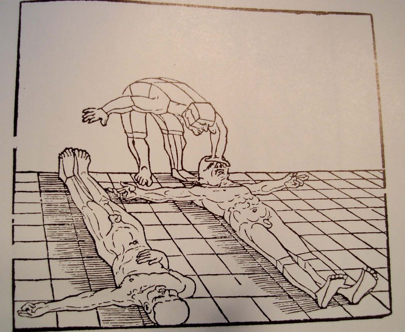
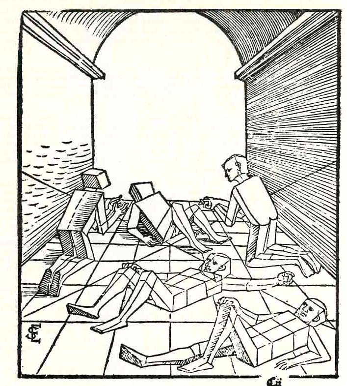
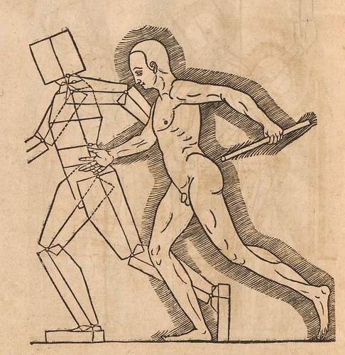
    Just a little while latter Erhard Schoen, in his Unnderweissung der proportzion und stellung der posssen liegent und dtehent, printed in Nurenberg  in 1538, presented another unique way of representing the human form in studying perspective.  He used simplified geometric form to stand in for the curvy humans, replacing them with proportional stacks of boxes which would more easily explain to the younger reader how to represent the human body n space and in proportion to other things.

    Photo

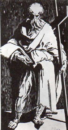
    In the next decade we see  in this woodcut of St. Andrew (or St. Philip) by Domenico Beccafumi (1486-1551) another suggestion of human form, this one though mostly shrouded in deliberate contrast and a had light, removing most of teh detail. 
    Blank domenico879

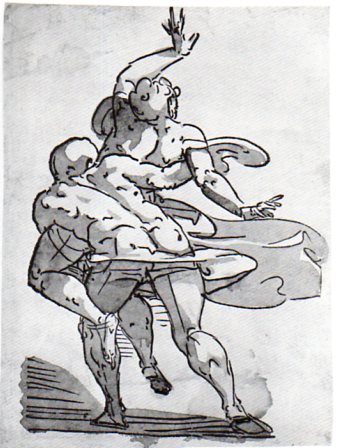
    While at about the same time Luca Cambiaso (d. 1585) produced this  woodcut,  “The  Rape of the Sabines”, which is mostly light with bare shadow, depicting motion and emotion more than detail. This again is hundreds of years before its more modern 19th & 20th century descendants. 
    Blank  cambiasi877

    And also this figure, again by Cambiaso, and recalling the efforts of Durer and Schoen:

    007cambiaso1
    And in 1564 comes this fantastic effort by Heinrich Lautensack, Des Circkels und Richtscheyts, auch der Perspectiva und Proportion der Menscher, which is beautifully described at the Bibliodyssey site, here.  
    Perspectiva (Lautensack) 1564 f

    Coming outside the confines of the Renaissance but just too fantastic to not include (although I could just simply change the title of this post to accommodate all)  is Giovanni Battista Braccelli’s fabu-landscapes of the human condition, published in his Bizzarie di Varie Figure in 1624. 

    (My thanks again to Bibliodyssey for surfacing Braccelli for me, and also to The Rare Book Room for posting all of the images in that rare work, and of course to the Library of Congress/Lessing J. Rosenwald pages, who made the images available for downloading, here.)

    Braccelli 5
    And a little later after this last–and again well outside of the Renaissance–the idea of the missing man, an image I just couldn’t resist:

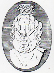
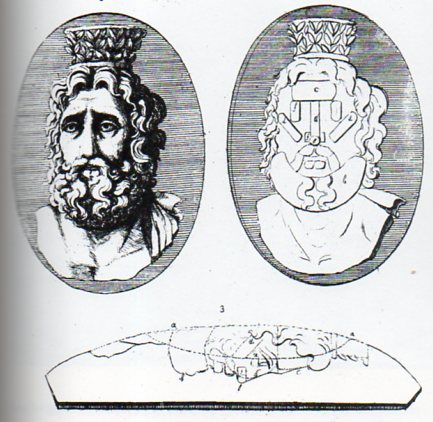
    Blank stafford882 which is a detail from

    Blank stafford881
    which is from the instructional by Laurent Natter, Traite de la methode antique (1754).  The engraving is one of a series that shows the technical process of a antique method of constructing antique cameos and coins, and in this case how the gem would be produced by modern methods. 


  • On the History of Blank, Missing and Empty Things: the Heart of Some Sort West

    JF Ptak Science Books  Quick Post   (Part of the series on the History of Blank, Empty and Missing Things.)

    Plains photo969

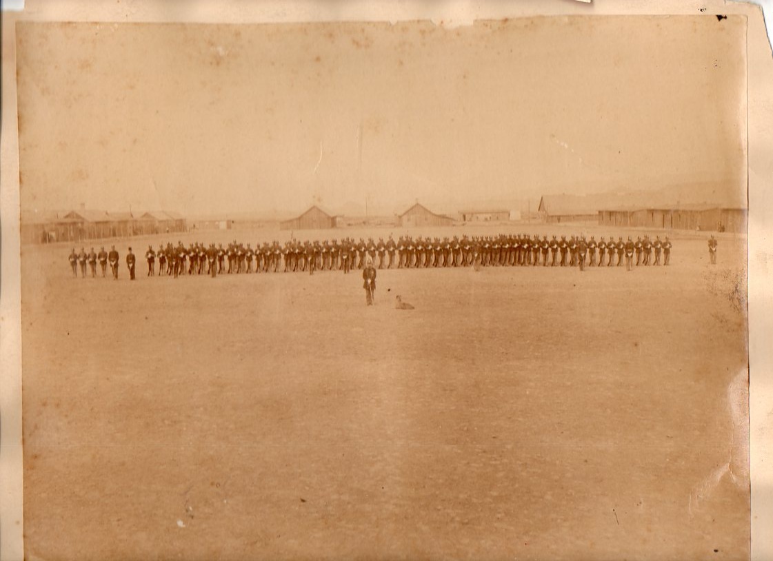
    I’ve owned this photograph for a long time.  It has been in the files for many years, waiting for something to happen to it, waiting for it to be a little understood in some slight way of identification.  I’ve still not gotten around to it.  To me, it has always seemed like a photograph of a small post out in the American Far West, 90 men in dress uniform inside their “fort”, or outpost, the commander and the camp dog addressed in front and the sergeants out on the flanks.  The enlisted men stand at ease. 

    Plains photo971

    I’m really not sure though who or where they are.  The camp is very spread out, for one thing.  And for the age (I reckon this to be made around 1885, perhaps a little earlier) I would’ve thought that boots would’ve been visible under trousers.  And their hats/helmets–they really don’t look to be made for the sun, and also seem too much of a bull’s eye/target.  That’s on first glance–nothing about their uniform seems fitted to the place:  no protection from the sun, trousers caught on low burrs and scrub, and so on.  But the uniforms–and helmets–seem to be in line with the Prussian-influenced dress of the time (or at least around 1882), including the ribbon-y materials draped around the commander’s neck.  (I really don’t know enough about U.S. Army uniforms to make a good qualified guess about who these men are.)

    But the photo as art has always intrigued me, capturing the heart of a lonely place.  I know, though, that having spent  a little time hiking in the desert that the place is hardly empty, or blank.  But it can still be lonely if you want it to be, a state which isn’t dependent on any of the conditions mentioned in the title of this post–its a created space, the loneliness.

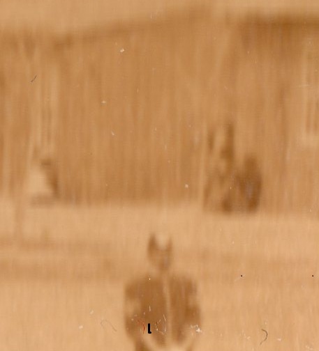
    I’ve wondered too about who those people are,  sitting together, (huddled?) at the far end of the soldiers’ barracks, a speck visible over the shoulder of the sergeant (the last figure on the right in the top photo)? I suspect they must be Native Americans, or at least indigenous people.  They’ve faded into history too with the rest of the people in the photograph, a chance at a piece of tangible memory missed because, well, no one made any notes (that survived, at least) about the image. 

    Plains photo972
    The photograph looks hot and cold to me at the same time…

    (This image is available for purchase via our blog bookstore, here.)