A Daily History of Holes, Dots, Lines, Science, History, Math, Physics, Art, the Unintentional Absurd, Architecture, Maps, Data Visualization, Blank and Missing Things, and so on. |1.6 million words, 7500 images, 4.9 million hits| Press & appearances in The Times, Le Figaro, Mensa, The Economist, The Guardian, Discovery News, Slate, Le Monde, Sci American Blogs, Le Pont, and many other places… 5000+ total posts since 2008.

Category: Blank and Empty Things; A History of

  • The History of Blank, Empty and Missing Things–the Voice of Beethoven

    JF Ptak Science Books   Post 1540   (Part of a long series on The History of Blank, Empty and Missing Things.)

    So, in the history of very creative people saying things, I wonder if Ludwig van Beethoven said the most of the least interesting things? I’m referring to his correspondence and other written works, and not his music of course—and given the music nothing else really matters. But given the amount of surviving letters and conversation books, and of course his staggering genius (which makes him one of the most important men of the century) it is kind of remarkable that there isn’t more attractive, inventive, interesting content in his communications—which at the very least makes reading the stuff somewhat disappointing, and, at the very most, pretty much the same.
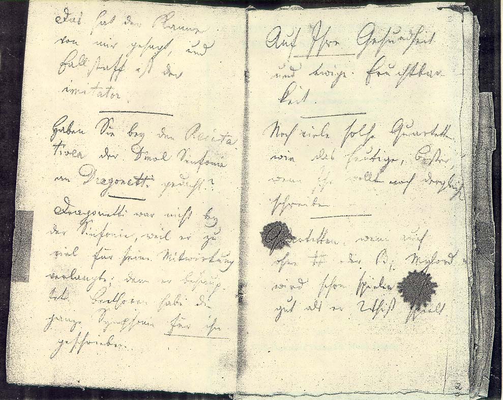
    Beethovenconversation2

    When Beethoven (who died at age 57 on 26 March 1827, a year younger in death than Dickens and five years old than Shakespeare—a remarkable thing to consider how much these people accomplished in a very short period of time) began his experience in being deaf he resorted to using largish, quarto-sized blank chap books for his visitors to write their questions and answers to him. These books, Konversationshefte, the Conversation Books, were precisely that—they recorded the conversations with Beethoven over a number of years. Unfortunately, they reveal some very basic, daily, non-sequitur sorts of stuff, and contain almost nothing of what Beethoven actually said.

    Sometimes—according to scholars—it is possible to intuit what Beethoven sort of said by looking at series of questions and answers from his guests. But by and large the notebooks offer few clues to what the voice of Beethoven was actually saying. This is particularly grueling given the extent of the notebooks—136 of these books remain, covering the periods from about 1819 to 1827. (Actually, at Beethoven’s death there were more than 400 of the things, but his biographer, Anton Schindler, the man who inherited much from Beethoven including the notebooks, managed to purposely destroy at least 160 of the books. Evidently he found them impolitic, among other things, and tried to protect Beethoven’s reputation by making the evidences of the supposed impertinences disappear.)

    The conversations cover all manner of small, daily bits of life, including numerous one-sided conversations with/to the Maestro on how to take his enemas. (It is extraordinary that such evidence remains in the face of how much other –and probably more interesting—material didn’t.

    The letters of Beethoven, too, as voluminous as they are, are a terror to read, mainly because—at least to a general reader—there’s so little of interest in them. I have no doubt that for scholars they are vast repositories for things like Lost Punctuation and the sort, but the letters as intellectual documents, as things that give and insight into the mind of Beethoven, or what he thought about his work, or the works of contemporaries, and so on, well, the content just doesn’t seem to be there. (There are some occasional bright spots, like his continued reference to how extraordinary Handel was and that he, the great Beethoven, still learns from the man, even on his deathbed, but there’s really very little like this, relative to the great weight of the sheer number of words in the letters.)

    A number of writers have quoted W.H. Auden saying that there was only one memorable sentence in the whole of the Beethoven correspondence.  I can’t yet find what this was to Auden–my first guess is that it is in the “Immortal Beloved” writing, where we do get a big, deep cut into Beethoven’s mind.

    The letters do reveal all sorts of other things, most of which makes me sad, particularly when the sick room of Beethoven is described in not-pretty terms as an outreach and indicator of his possible poverty, and how much the ill Beethoven had to worry about securing a little money to pull him through his illness and into the next half-year or so of life if he survived  himself. 

    Even making my way though the Thayer biography of Beethoven and looking for his voice is a chore. I tried to content myself constructing found poetry in the questions of the visitors to Beethoven in the notebooks, but that was fairly well a failure.

    It is in these cases that the authentic voice of Beethoven  seems to be almost entirely missing–a blank, empty and missing sound from the man who made some of the most beautiful music ever created.

    The other end of this part of blank, empty and missing things history, and sound, and Beethoven, would obviously be his deafness, or perhaps his depression (in the 1815-1820 period, when he was plagued by, well, something).  For years Beethoven heard very little; and then for years after that, he heard almost nothing at all.  But he was sensitive to vibration, so he was able to experience music, though in a different sense form what we think of as auditory.  Missing music–though I wouldn’t call it “Empty” or “blank.”


  • The Eyes of Hank Quinlan–Touch of Evil, 1958

    JF Science Books    Quick Post

    Hank Quinlan: Come on, read my future for me.
    Tanya: You haven’t got any.
    Hank Quinlan: What do you mean?
    Tanya: Your future is all used up. –from Touch of Evil, 1958  (Hank was played by Orson Welles; Tanya, his once-upon-a-time squeeze, by Marlene Dietrich.)

    http://parallax-view.org/wp-content/uploads/2008/10/touch-of-evil-quinlan1.jpg

    This has been one of my all-time favorite films, though I don’t want to actually see the thing too often.  It is sharp as glass, with hardly any grays in sight, mostly oblique black and white, giving the film a very “removed” feeling, cold, isolating.  Orson of course is a magnificent beast, the enormous shell of a spent bully with virtually nothing left to move around except for his undulating fat and a sliver of power, wielding that jiggly memory with eyeballs so puffy and dead that I do not know to this day how he achieved that pus-y look.  His entrance into the film is remarkable–big black car door opens, and the gigantic Orson pulls himself out, his pig-bristle slough-eyed face way too close to the camera for comfort.

    It is an odd movie, but just about every still you see from the thing is like a stand-apart photograph, a movie composed of 55,000 individual images.

    http://www.moviezeal.com/wp-content/uploads/picture-2-300x256.png


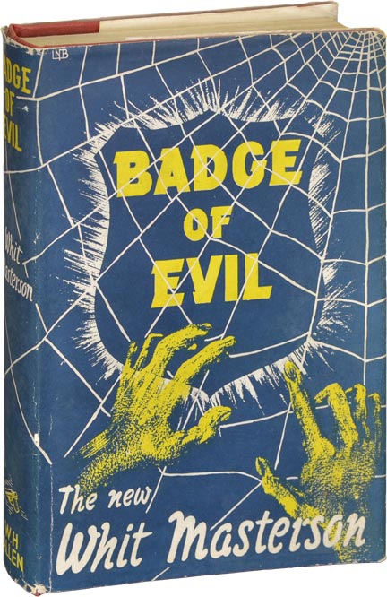
    Badge of evil The screenplay was written by Welles, though it may have been influenced by a novel by Whit Masterson (actually a pseudonym for another pseudonym, Wade Miller, which was the entity of Robert Wade and William Miller, which is entirely  too much rigorous hidenness for such a modest effort) called Badge of Evil (1956).  This doesn’t matter; the whole deal about the film is the brain behind the staging and filming, which belonged of course to Mr. Welles. 

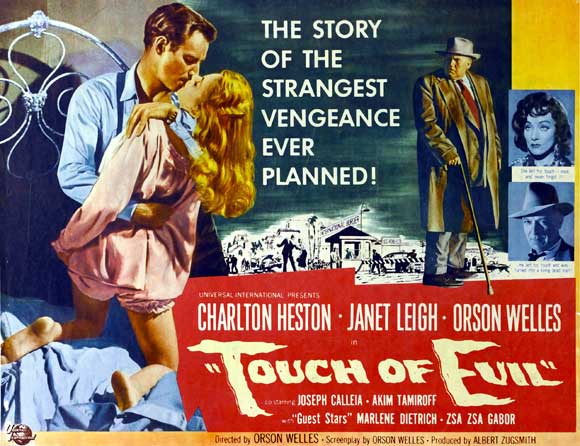
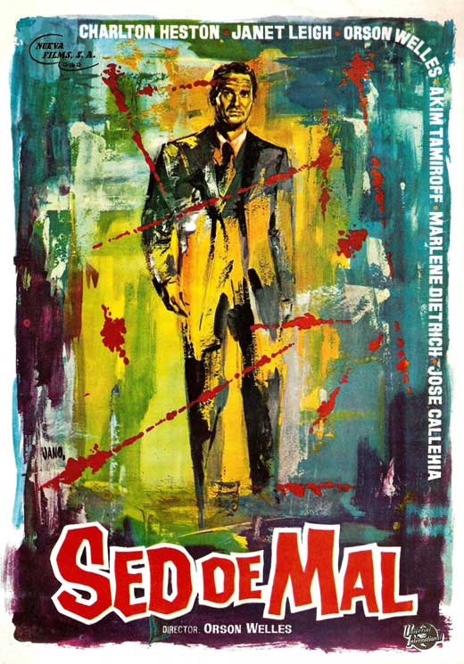
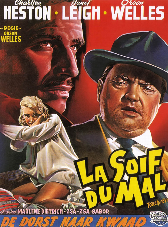
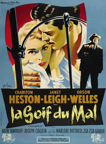
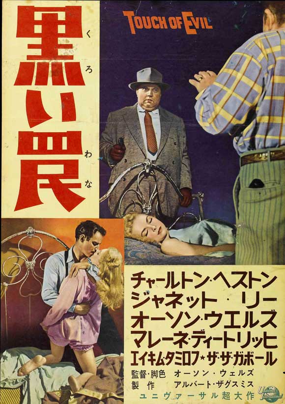
     All I really wanted to do with this piece today was post a variety of Touch of Evil movie posters.  Here they are:

    http://upload.wikimedia.org/wikipedia/en/f/fe/Touch_of_Evil_restored.jpeg

    This isn’t the entrance I was talking about–can’t find it–but this view of Orson is pretty good (comes at about 3:30):


    Touch-of-evil-movie-poster-

    Touch-of-evil-movie-poster-1958 d
    Touch-of-evil-movie-poster-1958

    Touch-of-evil-movie-poster-1958-
    Touch-of-evil-movie-poster-1958-g
    Schwartz: Well, Hank was a great detective all right.
    Tanya: And a lousy cop.
    Schwartz: Is that all you have to say for him?
    Tanya: He was some kind of a man. What does it matter what you say about people?


  • The Emptiness of John Wayne Movie Posters

    JF Ptak Science Books  Quick Post to the Blank, Empty & Missing Things series

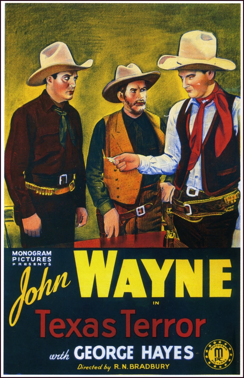
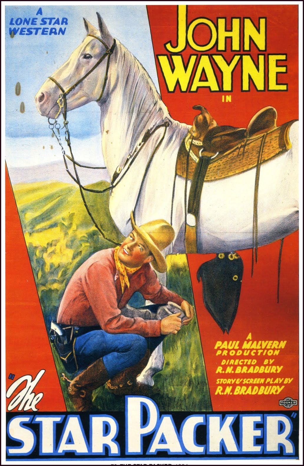
    I don’t know that I’ll ever really have the cultural appreciation of why or how movie posters (like those below) were able to attract people to come and see the movie.  They look like, well, like nothing.  They’re lovely, in their own way, but to me they do little to excite the imagination of what the movie might be about, unless of course all the movies were about the same thing, and since the star of all of them was John Wayne, maybe that’s all people needed to know.

    Honestly, now–how exciting and/or revealing is this?

    Or this?

    Ditto:

    And ?:

    I guess it was all John Wayne.

    Many more below:


  • A History of Blank, Empty and Missing Things, Part 75: Attracting Kisses and Repelling Sharks

    JF Ptak Science Books       Quick Post

    Part of a long series on Blank, Empty and Missing Things, here.

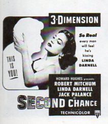
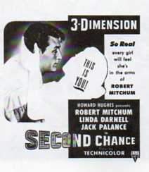
    It was necessary to just upload these images as quickly as possible, otherwise they’d’ve been lost in the gurgle and crush of other images–they’re excellent additions to one of this blogs longest series of posts (Blank, Empty and Missing Things).  The first image is a drawing from a (recent!) Patent Office report for a shark repellent suit–I guess most folks would think of chemicals or something along those lines, but this patent reached back into time’s dusty bins to retrieve this retro-Medieval inside-out Iron Maiden suit. Seems to me that there’s not a lot of room for a tank on this. 

    I particularly like the following images as they make room for both sexes to fill the arms of the filled-in person.  The 3-D experience was supposed to make you feel as though you “were there”. and maybe in 1953 (or whatever) it was the closest thing to an exterior virtual reality that there was. 

    3-d522

    And this:

      3-d523


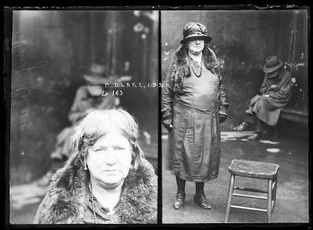
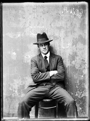
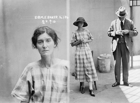
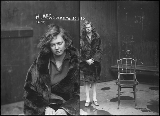
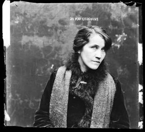
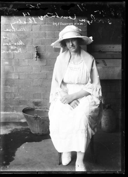
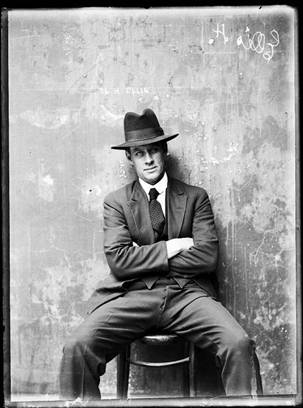
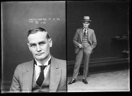
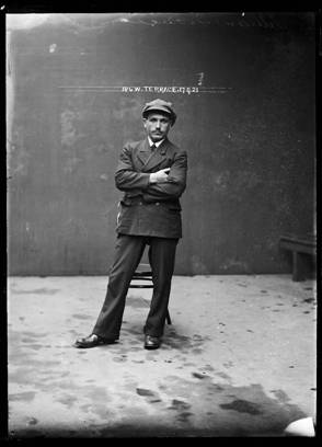
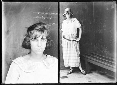
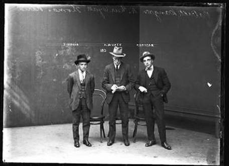
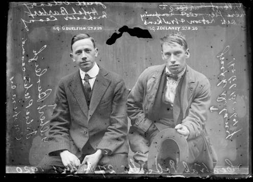
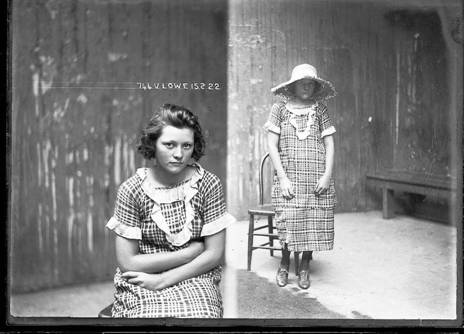
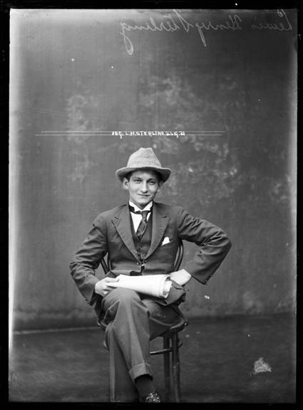
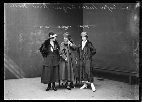
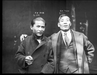
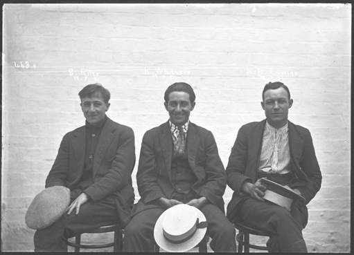
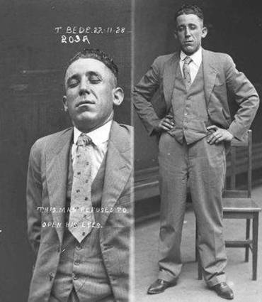
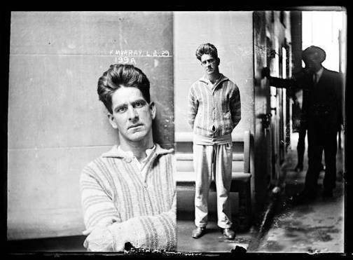
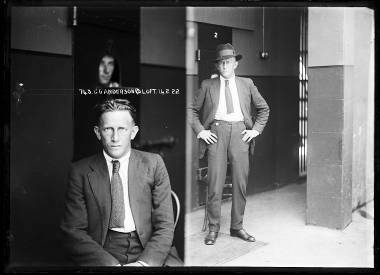
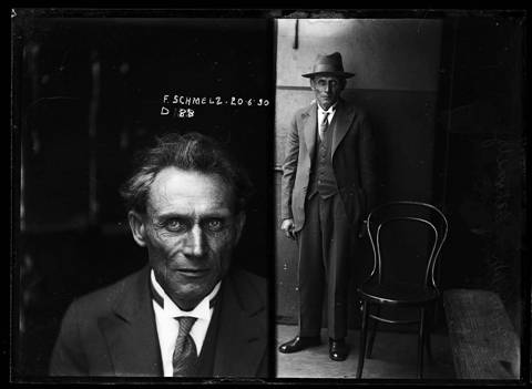
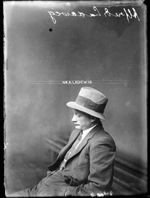
  • Picturing Naive-Disturbia: the Spectacular Loneliness of Australian Mug Shots

    JF Ptak Science Books   Quick Post

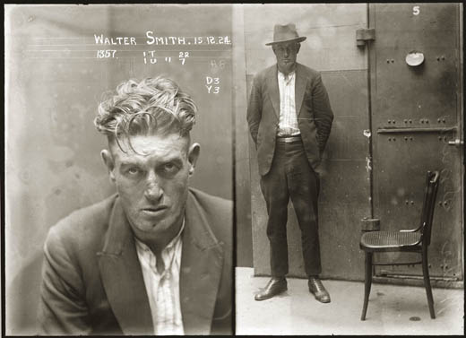
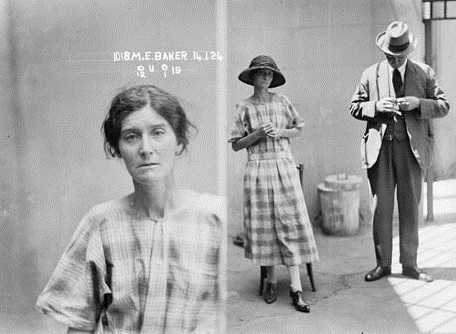
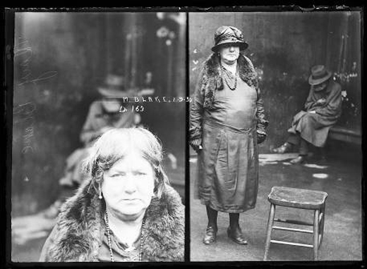
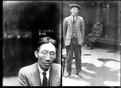
    For a thorough discussion of the series see the excellent article “Public eye, private eye: Sydney police mug shots, 1912-1930”, by Peter Doyle, in  Scan Journal (vol 2 number 3 December 2005)

      Australian mug shots

     Australian mug shots 1

    23

    11

    Aussie mug shot 2

     
    Aussie mug shot 2b

    Early-sydney-mug-shots-4

    4

     6

      Early-sydney-mug-shots-21

    10

    12

    13

    14


    Then there are photos like this, below, where the annotations become part of the art of the image:


    15


    16


    17


    18


    19


    20


    21


    22


    Early-sydney-mug-shots-11


    24

    .

    25


    26


    27


  • The Heaven of Disappeared Details

    JF Ptak Science Books   Post 1528   Part of this blog’s Blank, Empty & Missing Things series.

    What is the opposite of “the Devil is in the details”, without getting too terribly religious? Expressing detail in the history of art has been a progressive process, and perhaps in some sense that is what art was all about–adding detail, becoming more representational, more life-like, more expressive of the world and nature.   Perhaps that is what one essential element of art was all about for hundreds, or thousands, of years–a progression that marched its way through time with greater effectiveness and representation, for the most part, until relatively recently, when–in the early part of the 20th century–details began to disappear, until in some cases there were no details at all.  Or at least the details that people had been comfortable with for so long, like folds in dresses, or lustre in eyes, or thinness in clouds, or even the correct perspective in the re-invention of three-dimensional representation. 

    http://www.moma.org/collection_images/resized/042/w155h170crop/CRI_211042.jpg

    Detail changed with the  Romantics, and then definitely with the Impressionists, and then on into the the Cubists and the Abstract,  until the detail of what we would recognize as elemental objects would disappear altogether.  Corot, Cezanne, Gauguin, Whistler,  Seurat, Van Gogh, Picasso, Braque, Duchamp.  And then everything goes away with Kandinsky.  1911.  Details of references to the physical world slipping away into general sense impressions.

    It would probably make more sense to look at the Kandinsky at this point–I’d rather look at the Pierre Bonnard (1867-1947) and his La petite blanchisseuse (Roger-Marx 42, also known as the Small Washerwoman).  The wide expanse of her black working gown is a primary link to solid blankness, without detail of nearly any sort, missing parts of reality, allowed to go to Disappeared Detail Heaven.

    Photo

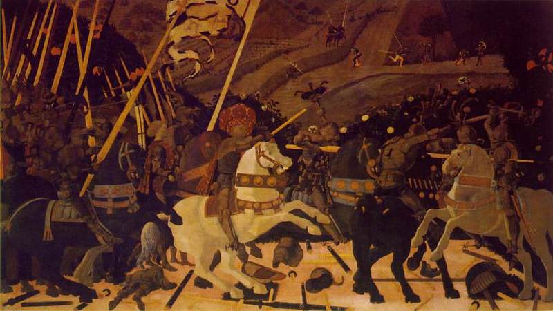
    The occupants of the Heaven was begun centuries ago, though the details banned there on purpose really only begins in earnest with the missing details of the solids in (Paolo)1 Uccello.  This great master (dissed terribly by Bernard Berenson I don’t know why) was one of the very few exceptions of artists who purposefully banned details from his work, just as the reality of the world crept deeper into the works of the late Siennese masters pointing out the details of their rediscovery of perspective. 

    There would be a long period in between Uccello and the other detail disappearers. 

    _____________

    1.  The phrase “the solids in Uccello” comes of course from the Great American Novel, William Gaddis’ The Recognitions, discovered and shared to my by the lovely Patti Digh. In some of his enomrous cnvases it is quite easy to find wide expaneses of nthing where detail should be…


  • A History Blank, Empty and Missing Things #77–Blank Enumerators in Sand, Pebble and Dust Computers

    JF Ptak Science Books   Post 1512

    Reisch c
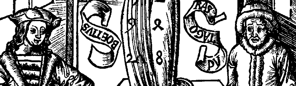
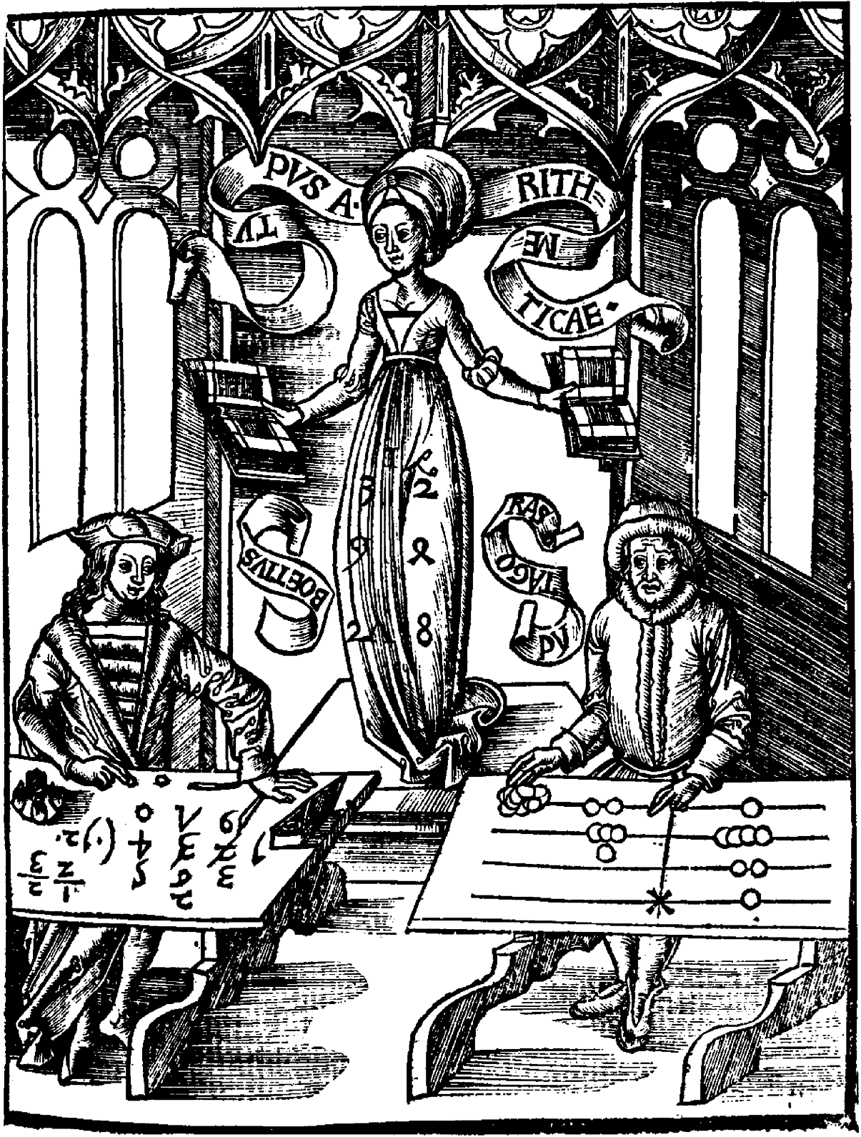
     This is a short note on the blank nature of the “checkers”, the place-holders, the missing numbers, of ancient computing machines,  the counters (jetton, or jeton1) used in early/ancient arithmetical reckoners, the material pieces used to aid in addition and multiplication “devices”. These bits were sometimes pebbles or shards of pottery or rocks, and placed on the ground with a grid drawn in dust, or in sand, or on any surface that could hold a line.  There are fancier and more permanent types of these instruments, as we see in the right side of this iconic woodcut image from a 1503 universal compendium of knowledge–a simple wooden table with incised counting lines, with the jettons being blank disks.

    The book that this  beautifully-illustrated counting board is found is in Gregor Reisch’s  Margarita Philosophica,  and depicts (amidst much else in the greatly humanist volume) representations of the mathematicians Boethius and Pythagoras working math problems on the given tools of their day. (The Reisch book is remarkable: it is basically a Renaissance encyclopedia of general knowledge, divided into twelve books:  grammar, dialectics, rhetoric, arithmetic, music, geometry, astronomy, physics, natural history, physiology, psychology,  and ethics.)  We can see in his expression that Boethius, on the left, is rather enjoying himself, knowing the superiority of his system of counting, which was the the Hindu-Arabic number notation–he definitely has a sly, self-appreciating smile on his face.  Pythagoras, working with the old counting table, definitely looks worried, or at least unhappy, unsettled.  Never mind that Pythagoras (570-495 b.c.e., none of whose works exist in the original, another sort of entry in our Blank History category) was at a definite disadvantage in the calculating department, being dead and all that for hundreds of years before the Arabic notation was more widely introduced in the West, probably being introduced by Pisano/Fibonnaci in the 12th century.  But it does fall to Boethius, the smirker, to have introduced the digits into Europe for the very first time, deep into the history of the Roman Empire, in the 6th century. 

    The numerical stand-ins in the Reisch book with which Pythagoras worked were blank, coin-like slugs used as placeholders, and would be used in place of rocks or pebbles or whatever other material was at hand. It is interesting to note that the Latin expression, “calculos ponere”, which basically means “to calculate”or “to compute”, is more literally translated into  “to set counters” or “to place pebbles” (upon a counting board) or to set an argument2,  which is exactly what some of the Roman daily reckoners would do at their work. And also used, in this case, by the unhappy Pythagoras. 

    Reisch

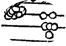
    Here’s a small close-up of the blanks:

    Reisch b
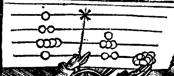
    The problem that the Pythagoras-person was working on (flipped 180  degrees) shows him adding the numbers 1241 and 82.  A jetton occupying the the top of the mark on the counting board, counting as one unit of 1000; followed by two units of hundreds; four tens; 2 on the ones.  The other number interestingly keep one jetton in between two lines, signifying an easy wade of enumerating 5 of any one kind, in this case depicting 8 tens units, coupled with two ones., thus making the number 82.)

    Reisch d

    For an excellent explanation of the many and varied methods of ancient calculations see the article by Steve  Stephenson3 on how ancient computers worked, found in the IEEE Global History Network site,  here. 

    It is a simple observation, but interesting to me nevertheless, that there was so much about these early counting systems that even though extremely useful they were also highly ephemeral–the counting boards being  inscribed in dust or sand or dirt, the counters/numerical placeholders being blank disks or pebbles or pottery shards–and so so much of the counting world depended on so little.

    Notes

    1. I should point out that these markers seem to have been decorated more often than not–its really just those items that appear in the Reisch book that I am addressing.   On jettons, in general, see here ;  also,  Jetons, Their Use in History.

    2. See Jen  (1998, April 25). “Roman Counting Instruments”, in The Math Forum at Drexel University. Also see Karl Mennigner’s  (1969) Number Words and Number Symbols: A Cultural History of Numbers, a big, academic/coffee table book on the history of numbers.  Also in general, see: Barnard, Francis Pierrepont, (1916). The Casting-Counter and the Counting-Board, A Chapter in the History of Numismatics and Early Arithmetic. Oxford University Press, London.

    3. This is a deep and nicely-explained effort looking at the development and different sorts of these instruments, as well as how they functioned.  Regarding the Reiwch woodcut, Stephenson says:

    1. Pythagoras has his abacus oriented with a vertical median line;
    2. The lines are equally divided so the same number of jettons can be accommodated on either side of the median line;
    3. The top horizontal line is marked with an X, (perhaps) to indicate the unit line; and
    4. On the right side of the abacus is a jetton in a space, all other jettons are on horizontal lines.

    On pp.313-314, Prof. Barnard describes and quotes from Legendre, François, 1753. L’Arithmétique en sa perfection, Paris, pp. 497-528, Traité de l’arithmetiqué par les jetons:

    It was permissible to set and to work the jettons of the sum without using the spaces [between lines], … But it was much more convenient to anyone who was expert at the practice, and less confusing to the eye, to reduce the number of jettons by using the spaces.


  • A History Blank, Empty and Missing Things #76–the American Bison Extermination Map

    JF Ptak Science Books   Post 1512

    Part of this blog’s series on Blank, Empty and Missing Things.  (My thanks to Blanche McCallister for setting me on this path this morning.)

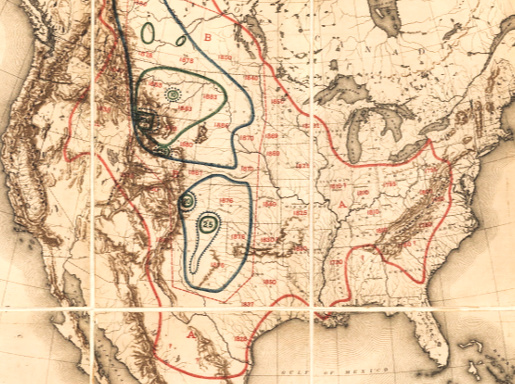
    “A disgrace to the American people in general, and of the government in particular.”  “The men who killed bison for their tongues and who shot them from railroad trains were murderers.”–William T. Hornaday, on the extermination of the American bison, particularly in the 1870’s.
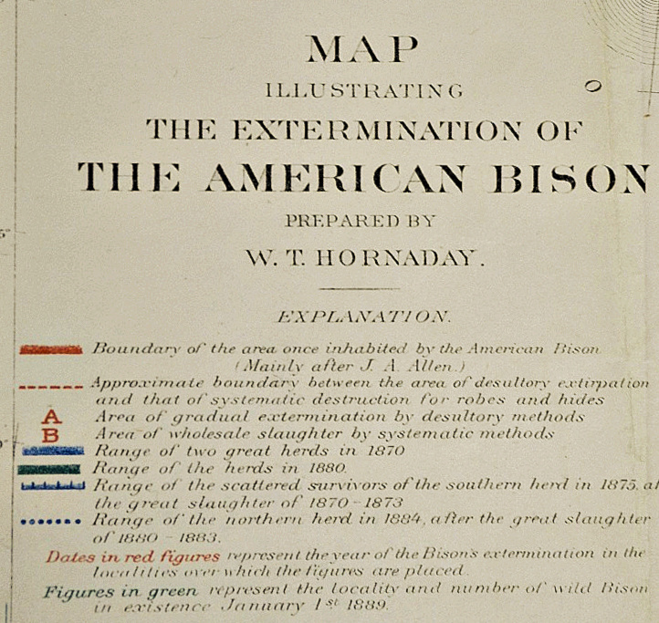
    William Temple Hornaday was an early–and probably a founding–member of the American conservation movement, and was also director of the National Zoological Park. He wrote a tremendously bitter and accurate report for the U.S. National Museum in 1894 on the extermination of the American bison, an absolute head-shaker, detailing the history of the bison in North America and its destruction at the hands of sportsmen, hunters, mindless dolts and many others who massacred tens of millions of the animal (“murdered” is the word Hornaday uses constantly).  To put the whole issue in perspective, Hornaday issued a famous map showing the shrinkage of the North American bison herd, setting out the enormity of the issue instantly on one piece of paper, a summary of hundreds of pages of bad stories and big numbers.
    Maps Hornaday


    Hornaday Map legend (1)

    And the legend

    [William T.Hornaday,  “Map Illustrating the Extermination of the American Bison”.  published in the 1886-1887 Report of the National Museum, Washington, D.C. entitled The Extermination of the American Bison, and printed by the ubiquitous Government Printing Office in 1894.  This full text version comes from the Library of Congress site.]

    The map certainly provides a real context to the numbers collected by Hornaday–numbers so big that it is hard to put them in any perspective.  For example, for the year 1873, the Atchison, Topeka and Santa Fe Railroad carried out 250,000 bison robes, 2.7 million pounds of bones and 1.6 million pounds of meat.  Generally the robe count was estimated at being about 1/6 of all the bison killed, so of the 1.2 million of taking this train ride in this one year (of aggravated annihilation) there was 1.6 million pounds of meat.  Now the refrigerated car was available at this time, so it was possible for meat to be transported to market, like 100 million pounds worth, but that was not of interest to anyone.  Not really.  Except of course for the bison tongue, which was sometimes the only thing removed froma  slaughter of thousands.  The tongue was a delicacy, and sold for 50 cents.  Just for the record, bison calf skins were sold for 50 cents, as well; adults were $1.25.  (Fifty cents in 1873 would be what the lowest-paid cowboy would be paid per day, half a dollar to the guy at the tail end of the cattle herd, the dust-eater.)  Over a three year period for the same railroad, 1872-4, there were 450,000 robes shipped, plus 2.2 million pounds of meat, and 16 million pounds of bones.  Again, this is about a pound-per-bison of meat, not even the weight of a tongue.

    Hornaday records the murder and murderers, repulsed at his findings–his revulsion comes through, as does the overwhelming lesson of carelessness and stupidity in dealing with the American landscape, and the creatures that lived on it. 

    The iconic photographs of bison skulls awaiting shipment are incredible, but I think it is the Hornaday map that gives the entire issue an overall correspondence to the magnitude of the destruction.


    And here’s a map of one of the last bison hunting expeditions, this undertaken for specimens for the National Museum, showing the enormous, continent-covering herds reduced now to individual dots on a large landscape.

    Image 192 of 208, The extermination of the American bison.    

  • The Earliest Art Inspired by the Epochal Discovery of the X-Ray?

    JF Ptak Science Books  Post 1493  [Thanks to Morbid Anatomy for surfacing this fantastic image!]

    Part of this blog’s series on  Blank, Empty and Missing Things:  the Skin.

    The impact of the sciences in (on?) art has been a frequent visitor to this blog–the photographic work of Etienne Marey and the coming of the futurists, the structuring of the fourth dimension, the discovery of the microscopic world, and so on., are fantastically interesting events which at some time bear some responsibility in the history of art.

    The artwork in question appeared in Jugend, Band 1, (February) 1896, and is called “Das Neue Strahlen”, calling directly on the announcement just a few months earlier in 1895 of Roentgen’s “Ueber eine neue Art von Strahlen”. The image depicts a young woman wearing a mask and clearly subjected to x-ray, as we see some parts of her clothing and beneath that the skeleton of her hips and legs, and within her rib cage we see a delicately drawn St. Valentine’s Day-like heart. 

    It seems to me–and this is just working on long memory–that this is an extremely early application of the X-Ray in the art world.  And while the anatomy is nothing new, the getting-to-the-anatomy is:   for the first time in human history, it was possible to see the structure of a body without performing a dissection, and it is this advance that the artist is exhibiting.  It is difficult to appreciate the impact of this advancement now–perhaps it would seem to people in 1895 something like a sudden announcement today that almost all surgery from this point forward is now accomplished with nanobots or a biological robotic element or whatever and which would eliminate virtually all previous complications of cut-and-stitch operations.  Monumental.  It was something like that for Roentgen’s discovery in 1895. 

    In 1895 50-year-old Wilhelm Conrad Röntgen’s ephochal discovery was announced (“Ueber eine neue Art von Strahlen”, “On a New Type of Ray”), which built upon the work of J. Plucker (1801-1868), J. W. Hittorf (1824-1914), C. F. Varley (1828-1883), E. Goldstein (1850-1931), Sir William Crookes (1832-1919), H. Hertz (1857-1894) and the horribly odious Phil Lenard (1862-1947 and who didn’t die soon enough). The experiment revealed as much to humans as did the experiments and inventions of Hooke and Leeuwenhoek on the invisible worlds revealed by their microscopes. Bertha, Roentgen’s wife, sat for 15 minutes while her husband passed his rays through her hand; she ran from the room once she saw the results, revealing her very bones and no doubt a strong sense of the fragility of life, and the strong presence of death.  Many had the a similar reaction to the Kandinsky’s shapes and Malevich’s white circles and red rectangles and Ibsen’s drama and Einstein’s dancing dust and the rogue syncopation of jazz—these newnesses were threatening to all of the established ways of looking at physics, and art, and theatre, and listening to jazz.  It was a new perspective which challenged the firmly established vision of these things, upsetting the nature of comfort and acceptance.    It is probably a very natural reaction to try and protect established memory—but memory is made all of the time, and so should be relatively flexible…at least it is mechanically healthier to allow a little bending than to be rigid and brittle. 

     Notes

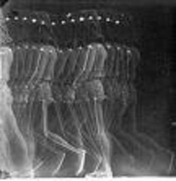
    For example, one of Marey’s sequenced photographs from the 1870’s and which reminds me of  Duchamp’s revolutionary Nude Descending:

    Marey 


  • The Long Fight for Captializing the “N” in “Negro”

    JF Ptak Science Books   Post 1483

    N “I believe that eight million Americans are entitled to a capital letter.” W.E.B. BuBois

    The history of the power of words is long and complex, and for the most part is on one side or the other of the political and social mirror, at least in the United States. Controlling the meaning of a word or phrase controls the idea which alters the way people approach it, defining the very heart of what may control the impulse for war or peace, which means that people may die as much for words as they will for ideas.

    Sometimes the idea of control is even simpler than the word—it may be a simple letter.

    Like the letter “N”.

    Since the American Civil War (now in its 150th year as of last month) when the use of the word “Negro” was used to describe African Americans, it appeared in print overwhelmingly with a small “n”. The idea was simple—to use a capital “N” would give a certain amount of respect and social diligence in referring to this race of people with a proper salutation; the small “n” minimized all of that, a symbol that these people were not worthy of having the initial letter of their race capitalized, and that because of their inferiority.

    This was also the case with the word “Colored”, which was used in the decades before the Civil War and then lightly after that, giving way to for a short time to “Freedman” and then Negro–”Colored” appeared in print as “colored” in the vast majority of times.

    The capital N was a rallying point, a common point of singularity for a large percentage of the Black population in the U.S.–and a very tiny percentage of the White population. We can deduce this because major papers such as the New York Times did not adopt a policy of using the capital “N” until 1930. And as a matter of fact the federal government documents printed “negro” small “n” beyond 1930, even though heavily lobbied to use the more enlightened and respectful “Negro”. The issue was evidently sidestepped throughout the Hoover administration.

    There was in the country a racism so entrenched and engrained that African Americans were seen as being wholly unworthy of being dignified with a capital “N”, and it was the natural way of things. As the editor of the Eatonton, Georgia, newspaper Messenger said when asked about the capitalization issue, that he would not be a party to it, because “it would lead to social equality.”

    And that’s just what everyone ws trying to avoid. And like the federal government, the control of the capital “N” extended into historical control as well. When W.E.B. DuBois wrote an article for the venerable American Historical Review, the editor, J. Franklin Jameson, refused to allow the use of DuBois’ capitalized “Negro”. As the editor of the Dictionary of American Biography, Jameson refused the capital “N” in the publication until it was terminally embarrassed into doing so, in 1937.

    And so it goes, 60 or 70 years of fighting for the minimum respect of capitalization.

    And this doesn’t even address the use of the reviled “n” word, which is a story unto itself. And in which there was also debate over the years as to whether or not that be capitalized.

    Notes:
    The major source of the information in this post comes the fantastic article by  Donald L Grant (12/01/1975). “Some Notes on the Capital \”N\””,  Phylon (0031-8906), 36 (4), p. 435, who did a splendid job of research.  There’s also a bit of memory pulled from H.L. Mencken’s The American Language (4th edition), which was clear and concise, even though Mr. M. had a small social problem here and there with minorities.  It must be said in his defense that the magazine he edited, The American Mercury, “always” used the capital N.