A Daily History of Holes, Dots, Lines, Science, History, Math, Physics, Art, the Unintentional Absurd, Architecture, Maps, Data Visualization, Blank and Missing Things, and so on. |1.6 million words, 7500 images, 4.9 million hits| Press & appearances in The Times, Le Figaro, Mensa, The Economist, The Guardian, Discovery News, Slate, Le Monde, Sci American Blogs, Le Pont, and many other places… 5000+ total posts since 2008.

Category: Architecture and Building

  • Cathedral of Dust of the “Wrong Arrested”–Vernacular Redemption, 1939.

    JF Ptak Science Books  Post 1890

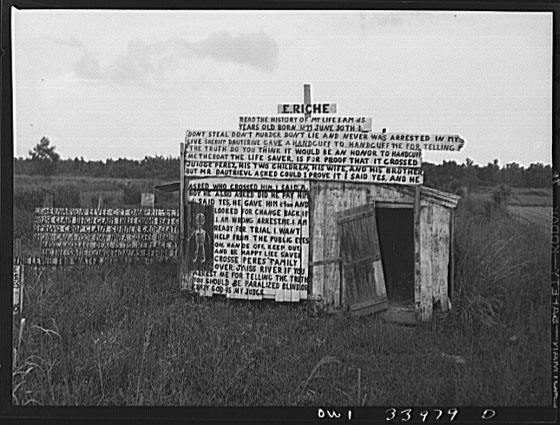
    This is an image of an engineered redemption, found in the mist of Placquemines Parish, Louisiana, in 1939.  There is no doubt in my mind that the author, Mr. E. Riche, was done with running from whatever it was that was chasing him–printing his truth would no doubt cut it down. “I am wrong arrested” Mr. Riche says, and wants “help from the public eye”. 

    Oh my g_d. If this isn’t a Mr. Cash song, I don’t know what is.

    FSA--signs--redemption_edited-1
    This is a photograph of fantastic humanity, of a person witnessing for themselves, stating their beleift, defending their honor, exploring the present, and staking a very visual land claim in reality.  And then–with all that said, all of this person’s dignity and belief displayed for everyone to see–the author lives in the sign he or she created. It is as though someone has engineered a three-dimensional public-philosophical house in which to live, and then actually lives there. 

    As a testament to a simple call to fairness and justice, this image is an extraordinary and powerful reminder to the power of spirit. For some reason I can feel this person’s letter down to the cellular level. 


  • A Charming “First” Traveller’s Guide to Rome in Full Text, 1600

    JF Ptak Science Books  Quick Post

    Franzini 1
    I was very happy to find a full-text and nicely-navigable copy of this classic work online. Giorlamo Francini’s Le
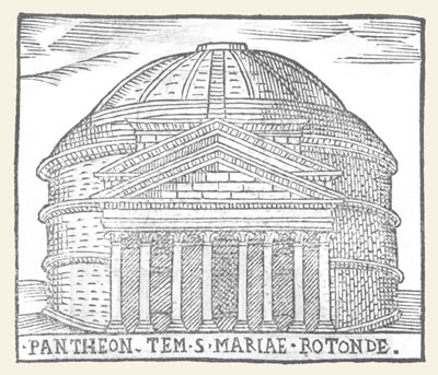
    Cose maravigliose dell’alma citta di Roma, anfiteatro del mondo : con  le chiese, et antichita rapresentate in disegno / da Girolamo Francino ; con l’aggiunta del dottor Prospero Parisio (In Roma : Ad instanza di Gio. Antonio Franzini, & herede di Girolamo Franzini) was printed in 1600 and is considered an iconic work on travel writing, as well as one of the first sophisticated/modern “guide books” to the city of Rome. It was pocket-sized, and contained all manner of information about buildings and artists–useful info, if you had never been to the city before. It was also a distinct difference from books intended to the pilgrim; this book was definitely looking for a popular, general readership, looking to benefit in their stay in Rome by having a literary, artistic, and architectural key to the city. 

    The illustrations are charming and lovely–even though small (less than two inches square),  they provide just enough detail for you to unmistakeably identify the principle structures.   The full text (with illustrations) is located here.

    ·Posted by :

    ·in:

    — —

  • The Life of Enormous Baroque Curves in Womens’ Fashions

    JF Ptak Science Books   Quick Post

    Theodore Andrea Cook wrote a lovely book called The Curves of Life, published by the admirable firm of Constable and Company in London in 1914, a book which is filled with all manner of marvels of insight in finding curves in natural and created situation. (I wrote a little about the book in an earlier post about stairs, here.) The beauty of spirals found in fero-concrete, geometries of Minoan clay seals, the beauty of the human laminae of cochlea of interval, the colon of the Dogfish, Maori war canoes, and so on, were all subject matter ripe for the discriminant picking of Mr. Cook as he explored the depths of curves.


    Curves756

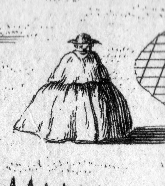
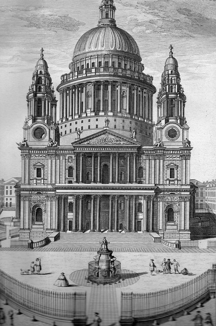
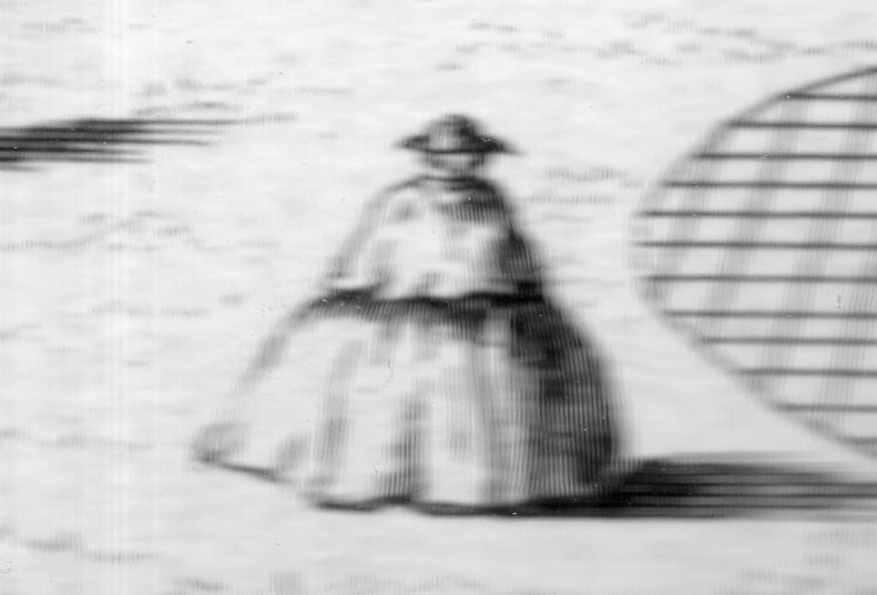
    One thing that perhaps escaped his grasp–at least in this book–was the curve in the costume of Baroque women oif semi-high (or at least non-ordinary) standing. As I’ve seen a number of times in some illustrated books, the trend towards the curvilinear is absoutely outstanding. The example that I came across tonight is an excellent example. Of course there was no great need to supply interesting bits of social life in these engravings of famous architectural achievenents outside of supplying a human scale to the structures, but as if often the case the artist (or engraver) went a little further than was really demanded by the artistic “needs” of the image and provided some interesting and at times very unexpected glimpes into somewhat-common street life

    This image comes from Regles des cinq ordres d’architecture de Jacques Barozzio de Vignolle, which was originally written by Vignolla (1507-1573) in 1560. and published in 1680 or so.  The engraving of our interest here is “Elevation du Portail de la Cathedrale de St. Paul de Londres”, and the main part of that is the 1% in the bottom quarter, showing a very roundish dress. 

    Curves754

    An outstanding curve of high fashion, not seen in the Cook book.

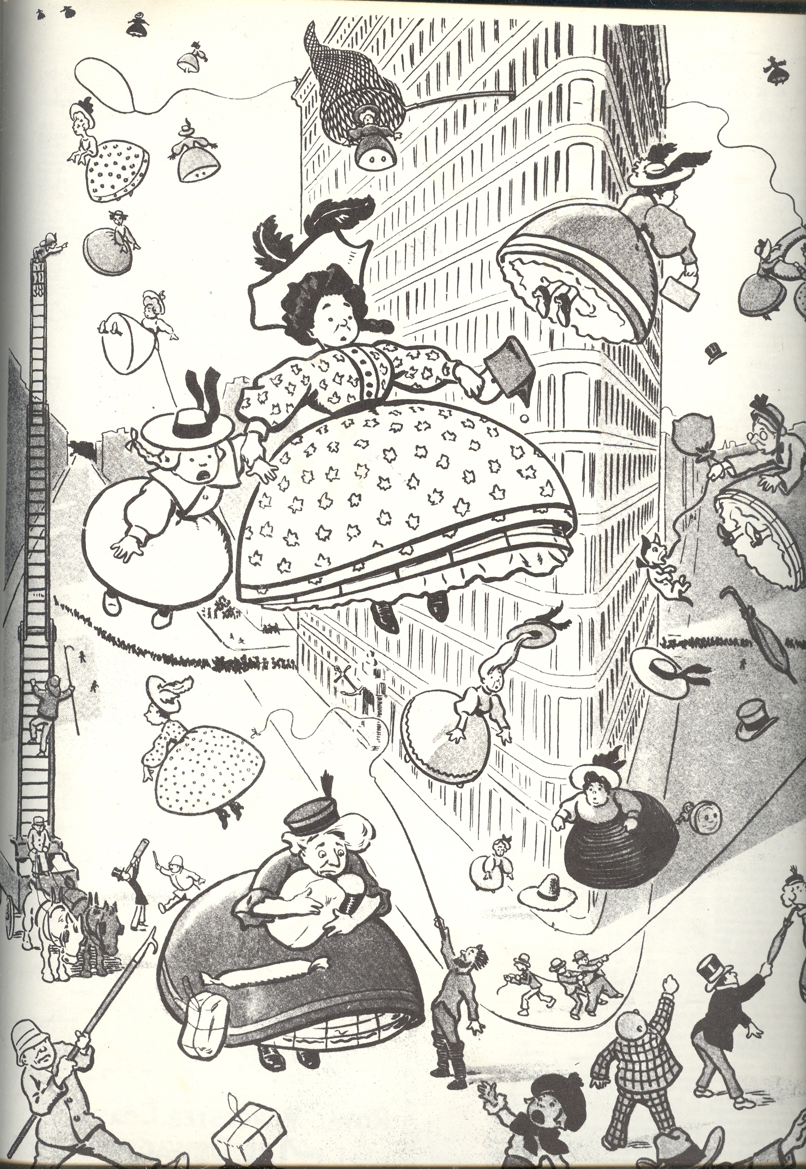
    This also reminds me a little of bombing fashinistas in an earlier post I wrote (here), showing parachuting (though they look a little like bombs) on this 1904 image. 

    5-women


  • Beautiful Technical Illustration & a Snapshot of Hard Work in 1800

    JF Ptak Science Books   Post 1878 

    There is, buried deep within this engraving, a small but penetrating snapshot of working life in very early 19th century England.  Very working life.  We’ll get to that in a moment, after introductions are made to the brilliant composer of these images.
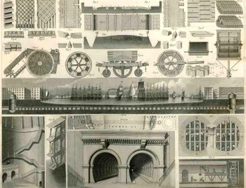
    Blogtunnel_full239 J.G. Heck wrote and compiled a fascinating and complex work entitled The Iconographic Encyclopedia of Science, Literature and Art, and was published in America for the first time in 1851 following Spencer Baird’s translation from its original German.

    The key to his work is the amount of data displayed on each of the 500 engraved plates illustrating this work and the way in which it is arranged.  The design and layout of the 30,000 items on these 500 plates was a work of genius, and for my money it is easily the best-presented complex means of the display of data and objects that was published in the 19th century.   

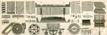
    Take for example this illustration in the technology section (a subdivision of the applied arts which is a sub division of the plastic arts) and, continuing in this complicated scheme, was Plate 1 from Section X Number A1 with a description found in the text on a dozen pages in Section 2 of Volume 2 on section pages 134-150 and overall page numbers 835-851 (!).  The plate contains 35 figures, very finely executed and rendered (many of the other of the 500 plates have 100 or more figures), and is in general related to the construction of roads and tunnels (and further, part of the “communications” section).
    Blogtunnel_top240

    This of course would be a perfect Hypertext candidate.

    The illustration itself contains an enormous amount of information.  The row along the top third or so is dedicated to street construction and paving stone, showing stones in plan and profile, as well as a cross section and ground plan of a “typical” street (including sidewalks).  It is interesting to note the detail of the cross section and the stonework that is placed beneath the horse and wagon section of the street.  There are some other beauties here as well–details of wooden paving blocks, the plan for a Laves of Hanover road, different ways of cutting stone blocks—but we won’t deal with those right now, except to point out that there are several renderings of street cleaners and road rollers (of Shettenmann and another of Schaefer) used to border the street section from the tunnel section. 

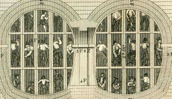
    Blogtunnel_middle241 The middle section of the engraving is of course a cross section of the Thames tunnel of the beautifully-named Isambard Kingdom Brunel (begun in 1825 and completed 1843, the tunnel 35 feet wide (11 m), 20 feet (6 m) high and 1,300 feet (396 m) long, running between Wapping and Rotherhithe at a depth of 75 feet (23 m)).  The representation here is only one inch high and ten inches long but is loaded with just fabulous detail, no the least of which are the (less than) 1mm tall workmen that can still be seen in the tunnel.
    Blogtunnelbig_detailig247  
    The enlarged detail shows a section of the tunnel being built according to Brunel’s new specifications:  a larger, shielded tunnel being constructed around the interior construction of 12 individual tunnels (each about tall enough to allow a (short) man to stand erect. 

    It is unneccessary to say how difficult this work must have been. Cramped, dirty, dark, stale-aired, and dangerous, this was the very definition of a compromised working environment.

    In short, the engraving is a superb example of *correct* design of great artistic  ability, all accomplished while displayed heaps and gobs of interconnected, complex information. 

  • Bad Idea Department: F Lloyd Wright and the Goodness of the Bombing of Britain

    JF Ptak Science Books  Post 1866  

    [I’ve written earlier on a related and very bad idea, Atomurbia, for atom-bomb-proofing American cities, here.]

    Reading Nicholson Baker’s Human Smoke I found a set of very unflattering and semi-unbelievable quotes from the unpretty Frank Lloyd Wright.  Present at a MoMA exhibition he was sharing with D.W. Griffith (detailed in the publication Two Great Americans published by the museum in 1940), Wright chose the background of the Battle of Britain, in which German bombs were falling on English cities killing thousands, to promote his city design idea of Broadacre (among other things).

    In development since 1932 (appearing in his book The Disappearing City) and kept on until his death in 1959, Wright’s idea for city /suburban development spread a “city” ti its limits, nearly stripping it of its citiness and expanding it towards the horizon in a wide and low wave of a complete suburbia.  With this, Wright must have reasoned, Broadacre City must have seemed “bomb-proof” compared to the normal concept of the city, and decided to make the best of a horrible situation to promote his idea.

    And with this, he was quoted in November 1940 in the New York Times, saying:

    “I would not say that the bombing of Europe is not a blessing, because at least it will give the architects there a chance to start all over again”

    To say that this was an idea best left to the imagination rather than in the pages of the Paper of Record goes without saying.

    And what of the architects whose buildings were lost during the Blitz?  Say, like Christopher Wren?

    “I don’t think that anyone will miss Wren’s work very much” (This, and the quote above, found in Baker, page 248.)

    I’ve had a problem with Wright for a long time, but had never bumped into this part of his thinking before.

    [Wright’s wrongs on the Bombing of Britain are also recorded in Peter Shedd Reed (ed), The Show to End All Shows: Frank Lloyd Wright and The Museum of Modern Art, 1940 (MoMA 2004, here), and here, in the Milwaukee Journal for 22 June 1941, and also in the News Chronicle of London in”How I would Rebuild London”]


  • A History of Blank, Empty and Missing Things: The Skin of Reinforced Concrete

    JF Ptak Science Books   Quick Post    An addition to in the post The History of Blank, Empty and Missing Things:  Stone and Wood.

    Arch  reinforced concrete648
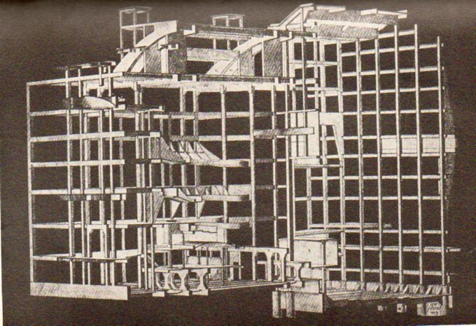
    Auguste Perret, a modern master in the use and adaptation of reinforced concrete, drew this fantastic skeleton representation of his “Theatre des Champs Elysees” (1913)–it was the great stuff that held the building together, minus the walls and everything else that makes a building a building, and a revolutionary approach in modern construction.  It reminds me strongly of this image

    Ogardus335
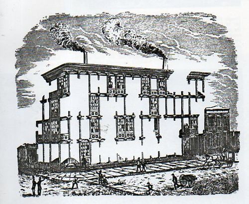
    which is a  remarkable illustration of the strength of the new approach to materials in architecture–cast iron–from a 16-page pamphlet by the inventor, architect and cast iron pioneer James Bogardus (1800-1874, Cast Iron Buildings, their Construction and Advantages, 1856 and 1858 second edition).

    The history of concrete in itself is pretty interesting and of tremendous antiquity, dating as a very useful and extraordinarily sound material at least to the Roman times.  The Peter Greenaway love affair (in his film “The Belly of an Architect”) with Agrippa’s Pantheon is one of concrete–the building stands today still of course, made of concrete, its dome still the largest un-reinforced concrete dome in the world. 

    And the Perret, complete:

  • Magritte-Like Disorienting Geometry in Found-Art Urban Design, 1925

    JF Ptak Science Books  Quick Post

    Future street630 a

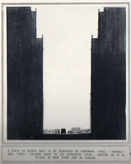
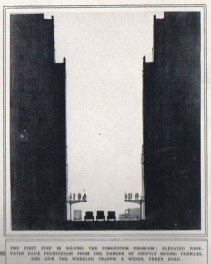
    These images “Traffic on Three Levels; Solving Street Congestion” from the Illustrated London News (15 August 1925) struck me as something much more–or much less?–than their appeal to urban design.  I think that it is very difficult to look at these images and not see them from the top, down. Even by the time you get to the fourth image at bottom right, the design still pulls attracts your eye to the top of the image and away from the traffic scene below.

    They seem to have that sense of abstract art, achieving a type of geometry and disorientation, both at the same time, pulling you into the work and de-arranging it at teh same time.  And that to me makes it highly artful, if unintentional.  They are sort of hallucinating–I know that is a bit of a stretch–but their confusion of the expected with this sort of misty, unknown atmosphere, has a sense of Rene Magritte to them had he worked his magic in geometrical blocks. 

    Future street630 b


  • Putting Black-and-White Back into Color: 1930’s Schoolrooms

    JF Ptak Science Books    Post 1840

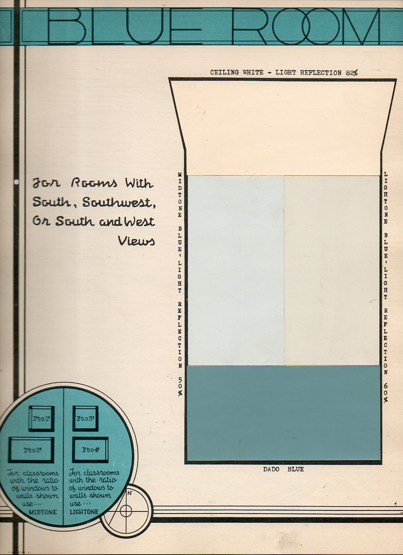
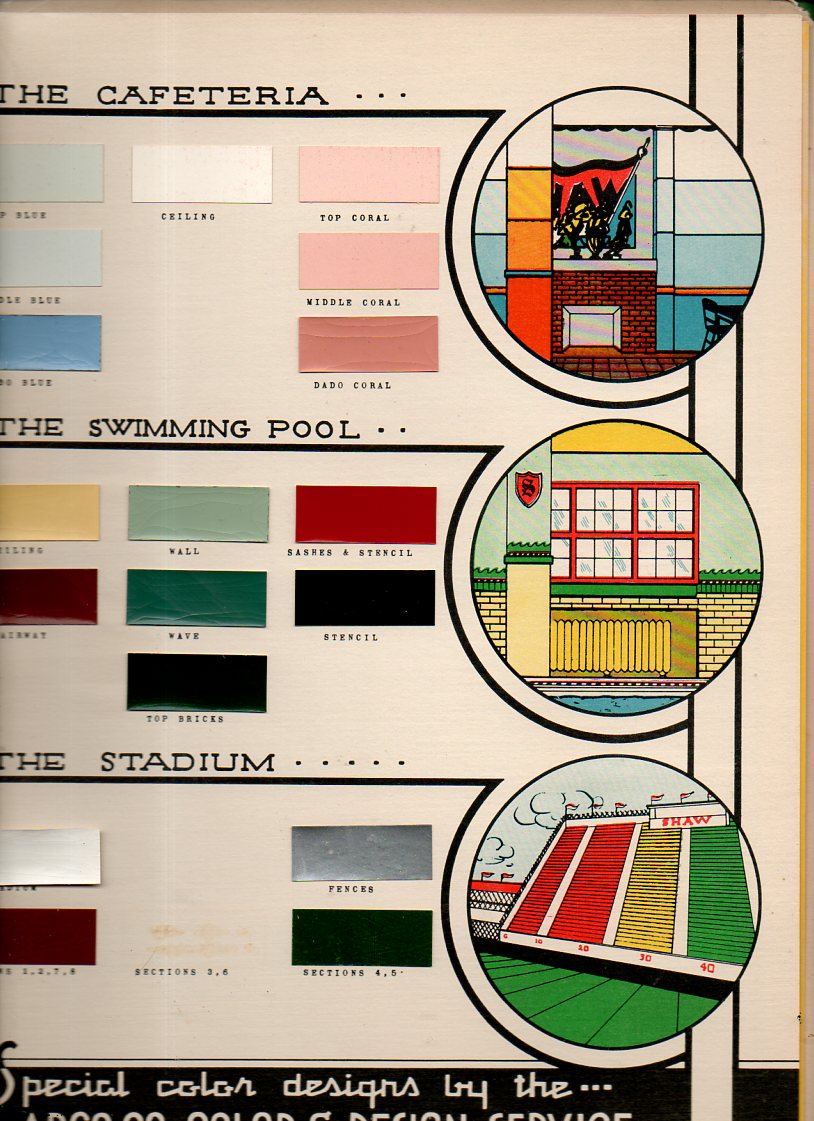
    Its easy to assume a modern prejudice regarding the interior decoration of 1910-1940 school rooms, allowing a certain conceit and picturing them in shades of gray, the images formed being “colored” by the images of those things that we have seen, almost all of which have turned up in black-and-white photographs or movies. But of course we know that this can’t be true, and that Humphrey Bogart didn’t always wear a gray worsted in his movies, and didn’t move that gray suit through gray rooms. Its just that the image-formation is influenced by what we’ve seen, and since what we’ve seen of these rooms is mostly without color, then our images are difficult to assemble outside black-and-white.  This applies to just about everything from that era, which explains why it is such a glorious shock to see motion pictures or photographs of (say) New York City street scenes from 1944. (And why is it such a jolt to the visual system to learn that police cars in Chicago during the 1933 World’s Fair were orange?)

    This thinking came to the surface again this morning when I uncovered the Paint Specifications for the Model School, prepared for the East Cleveland Board of Education under supervision of the Foremost Authorities, and published by ARCO in 1939.  It reminds us that the only thing that lived in black-and-white in those days are in our memories.  (I’ve written about unexpected color in Lost German Color of 1927,  The Very Describale Macro Color of 1937, The Color Green in the History of Squares, and of course the non-immortal 200,000,000 Pounds of Buttocks-or-Putting the Black-and-White back into Color, and others.   [This item is available for purchase via our bookstore blog, here.]

    Color school587

    Color school592

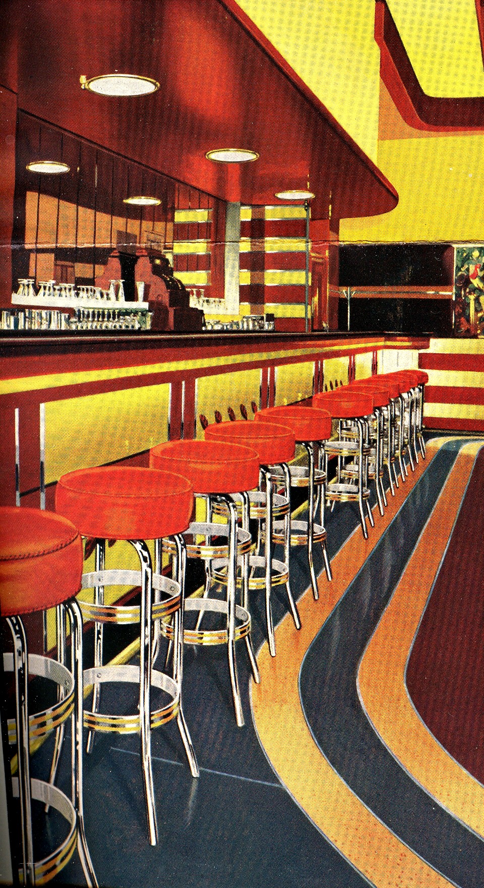
    The rest of the ARCO catalog is below; but first, here’s a sample from the 200,000,000 Pounds of Butts post, showing the 1938 barroom in color:

    Mar 14 7th red bar


  • The Future of Building in Manhattan, 1875

    JF Ptak Science Books   Post 1828

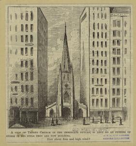
    This is an interesting and somewhat reserve view of the future of Manhattan, as seen from the pre-Centenniel eye of 1875, showing Trinity Church bookended by high-rise structures:

    A view of Trinity Church in the immediate future, if they go on putting up stores in the style the are now building.[Source: Harper’s Weekly, via the New York Public Library Digital Collection, here.]

    It would have been difficult to imagine structures of any greater height here in pre-elevator (and pre-elevator/Westinghouse brakes)  and early post-iron-structure days than the spire of Trinity Church. This Trinity (the third and current occupiers of an old spot at 79 Broadway, the first of the Trinitys going up in 1698 with the help of he block and tackle of Capt. William Kidd, privateer/probably-not-pirate) was the tallest building in Manhattan when it was built in 1846 (at 281′ to the tip of the spire), and remained so the tallest until the construction of the New York World  Building (305′) in 1890. (The World building was torn down in 1955 to make room for another on-ramp for the Brooklyn Bridge.)  So when this image was published it was still another 15 years away from anything being taller than the Trinity tower, which meant it was a pretty fair leap of faith to assume department stores crowding out the church’s airspace back in 1875.

    It is a pretty good approximation of what actually happened, though the canyonesque feel for development is more on Wall Street than it was here contiguous to the church grounds, though almost no one could imagine the dense high-rise growth that is there today:
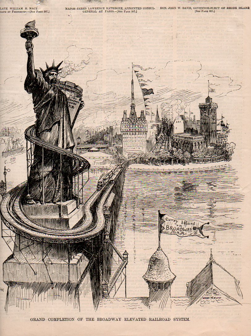
    There are many more colorful approximations of what might happen in Manhattan, one of which I’ve included below, showing the full and complete development of downtown, with trains leading away from the city right through the Statue of Liberty. This peep into a possible future appeared in Harper’s Weekly on 18 May 1887.  It is the work of artist W.A. Rogers and depicts a filling-up lower Manhattan, complete with broad avenues lined by elevated trains whose reach evidently knows no bounds. The new elevated subway winds its way across the harbor to Liberty Island, where it wraps itself around the feet and up the body of the newly–dedicated Statue of Liberty (opened in October of the previous year).  In the foreground is the cupola of a transit station with a fluttering flag advertising “Coney Island via Broadway”–I’m not sure what this is all about, as the placement of the island has nothing to do with anything except making a point in the cartoon.
    https://historyofideasblog.com/a/6a00d83542d51e69e2014e87fca7be970d-pi
    It is interesting to see though that the Trinity spire is still very visible.

  • The HIstory of Holes and Filing Them with Windows–Louis Sullivan’s “Jewel Boxes”

    JF Ptak Science Books     Post 1811

    Sullivan arch548
    In the History of Holes there exits a subcategory among many others that addresses holes in buildings and their filling-up.  The “holes” of course must be openings for windows, and the filled-in bit are the windows themselves.

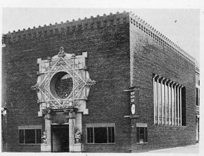
    The great American architect Louis Sullivan designed a number of bank buildings large-on-the-small–really, quite small for banks–but outfitted them with some spectacular detail, some of which were the windows, and some of which worked.  The size and scope of his (1914) Merchants National Bank, in Grinnell, Iowa, building is wonderful, though I’ve got to say that the enormous window in the facade and the crenulated baroque cartouche is really quite too much.  I don’t know where it all came from, but it seems as though it is from some other–much larger–building.  The idea seems to work though on some of he other buildings in this “series” of small-but-involved bank buildings–his “Jewel Boxes”–and particularly with larger, half-circular windows, but not I think with his pinhole camera ocular god effort here. 

    Sullivan arch549

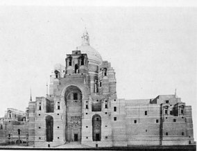
    (There’s plenty of time to discuss windows and holes and such outside of the work of Louis Sullivan‘s  (1856-1924) “jewel boxes”, and I can hardly wait to have a look at Edward Lutyen’s (1869-1944) proposal for the massive neo-gothic Liverpool Anglican Cathedral, above, where the windows are most uncompromising, but that will keep for later.  Don’t look now, but that would have been the world’s largest dome).

    And some of the other Sullivan minor miracles, his “Jewel Boxes”, can be seen below as they exist today.  This first example, The Peoples Savings Bank in Cedar Rapids, Iowa, was built in 1911.  If you squint your eyes a bit you can see what this building was meant to be, though today it lives in a case of urban bits of blight and a massive block of a building that seems to be pushing the poor Sullivan building into the street.