A Daily History of Holes, Dots, Lines, Science, History, Math, Physics, Art, the Unintentional Absurd, Architecture, Maps, Data Visualization, Blank and Missing Things, and so on. |1.6 million words, 7500 images, 4.9 million hits| Press & appearances in The Times, Le Figaro, Mensa, The Economist, The Guardian, Discovery News, Slate, Le Monde, Sci American Blogs, Le Pont, and many other places… 5000+ total posts since 2008.

Category: Anticipation, History of

  • On Being Obvious, (Again)

    JF Ptak Science Books   Quick Post
    Follow Me on Pinterest

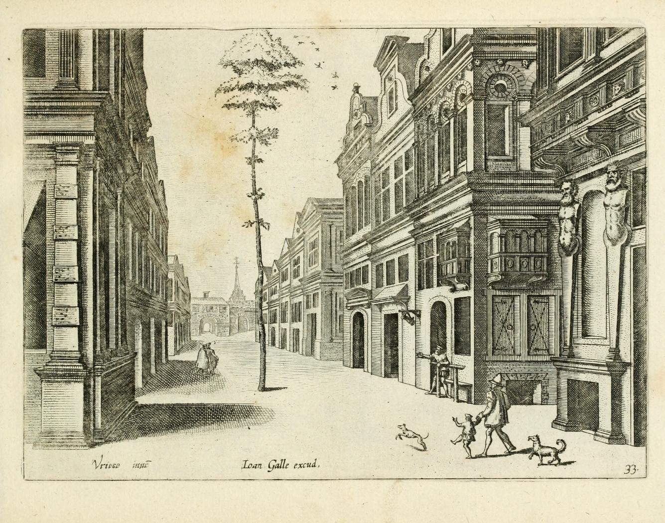
    The following example of Great Obviousness comes from one of the great masters of perspective on the Continent, Jan Vredeman de Vries,  (architect, engineer and man with a vision), and appear in his work Variae Architecturae Formae, and published in 1601. (The whole of the book is available at the Internet Archive, here.)

    It would be interesting to know the history of this tree and its obvious salvation–it doesn’t seem to be older than the street or the buildings, yet, there it is, a tree the diameter of an adult waist in the middle of a very populated street 

    Obviousness

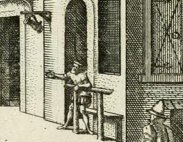
    Below you can see the detail of the man at the middle right–he is absolutely pointing to teh tree, perhaps sharing his amazement with the man and child coming down the street. The pointer had been seated, probably, on the bench behind the bar that was in front of the bar/saloon/draughthouse that he was probably inside of, perhaps enjoying a pint of five, perhaps making the tree even more amusing than it was. (The tilted stein is clearly visible advertising a place for thirsts to stop.) The child is reacting to something, and even so the dogs–the second of which seems to be stopped mid-stride in amazement.

    Obviousness detail

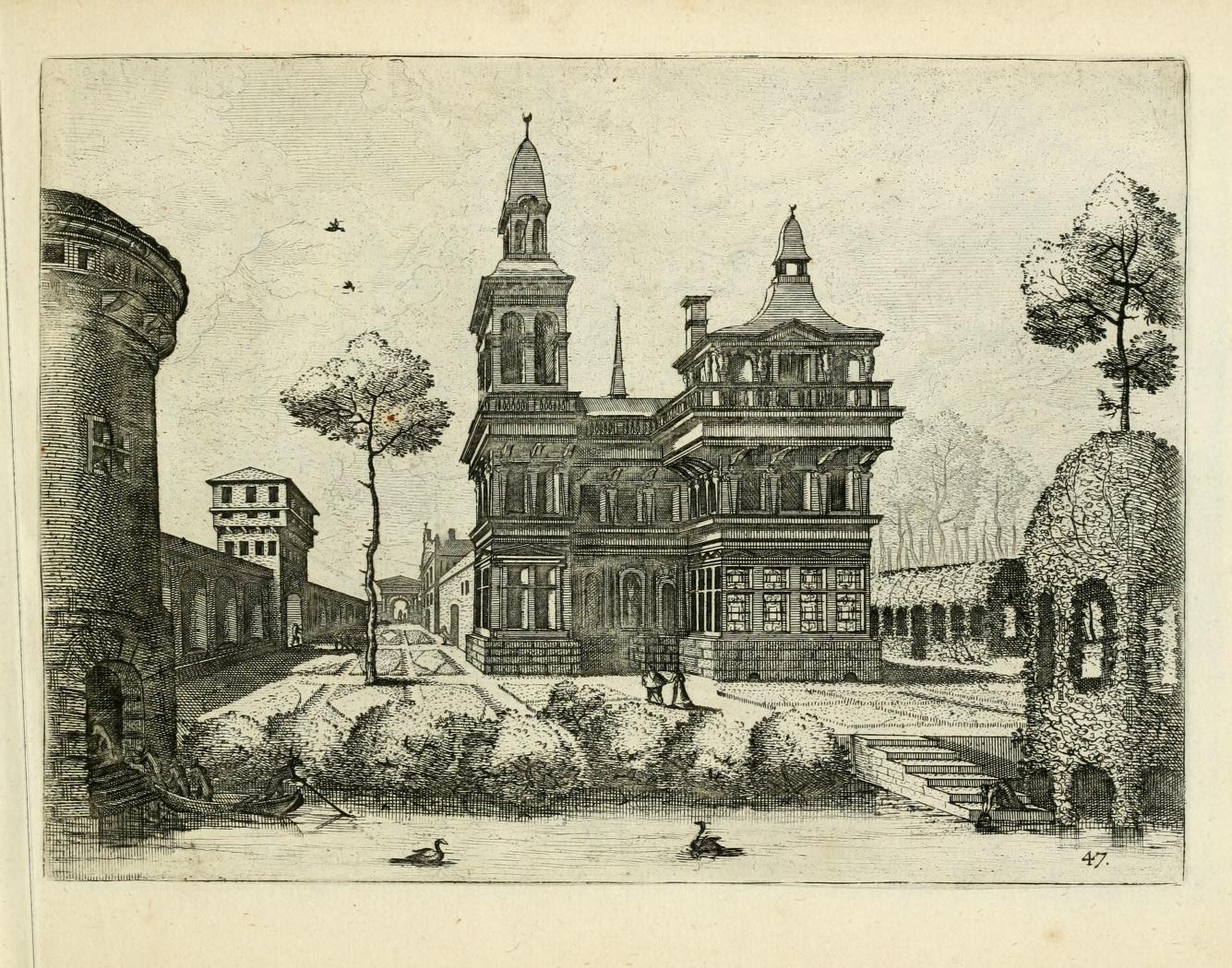
    Another exzmple of the unexpected tree comes later in the same book, when we see one tree in th emiddle of a plan garden and the other growing on top of what might be an herbarium. (On closer inspection the figure at lower right is a woman collectig some water in a jug; without magnification the seen looks a little more sinister than it is.)Obviousness 2


  • Earth Squared and Halved and Shrunken and Invisible and Doubled and Miniaturized–the Astounding “Mystery in Space”

    JF Ptak Science Books   Post 1936

    Follow Me on Pinterest

    This post is a part of overlapping categories, including:

    • Duplicate Earths (including Mondo Bizarro, Science Afflictions and the Dubious Mind—Bad Science, Part 1. NYC in Space (?!) here and Extra-Earth Humano-Alien Souls From Outer Space Repopulate Earth-Hell!!(??) here)

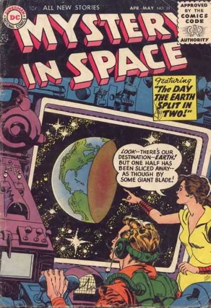
    Earth strange half earth
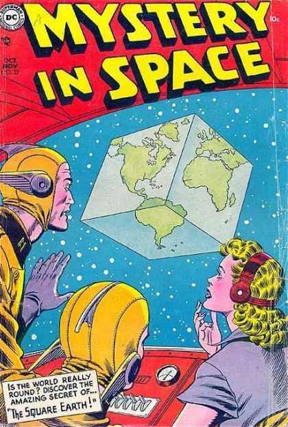
    In the five years or so of collecting information and stories for the odd-bits section of this blog  I have never encountered so many choice visual examples in one place for strange/weirdly-imagined/impossible/high-SciFi of the Earth than with the comic book, Mystery in Space. The very dedicated keepers of Coverbrowse.com website have reproduced thousands (?) of covers of pulpily-published science fiction and exotic-thinking comics books, including the home base in which all sixteen-plus years of Mystery in Space live.

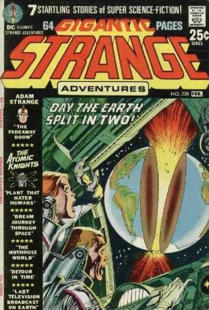
    I’ve just found another Earth-halved image, this from the comic Strange:

    Earth split in two!

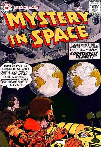
    Earth strange duplicate
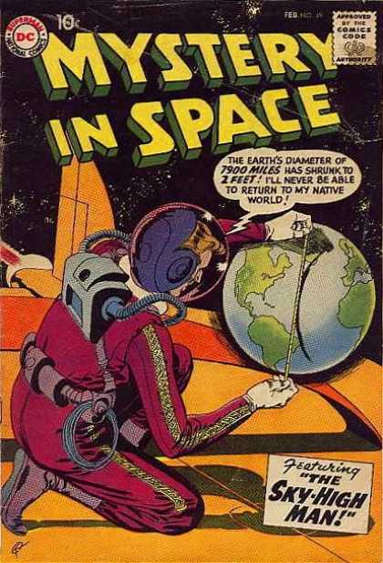
    Written from 1951-1966, Mystery in Space very freely uses words like “astounding” and “astonishing” and “amazing” and “strange” to describe itself–on its cover (!)–and then lives up to it in so many astounding/astonishing/amazing/strange ways.  Keeping simply to odd representations of the Earth, we find it halved, duplicated,cubed, miniaturized, dragged, tugged, targeted, canaled, and bullseyed; it is also the background to a WWI biplane attacking a spaceship in space, a flying skyscraper, and an alien craft lifting the United States from its geological moorings–in short, a very high and filling feast. And this, again, is just judging this book by its cover, which might actually be the best thing to do as the covers tell enough of the story to let your imagination tell the rest of the adventure. The covers tell fabulous stories of such highly unexpected ideas that they may be the only part of the book that we need to bother with, the cover doing away with the need for the printed narrative; and it may be the case that it saves the reader from the interior eye-splitting out-of-time writing.

    Earth strange mini earth
    The artwork and promise of the story are almost always (issue-after-issue) compelling, and there are a number of superb examples of simple jaw-dropping, belief- suspending, flabbergasting and mostly bad but very unexpected science fiction. But this is so potentially high-bad that the “bad” looks good, a tried-and-true badness the content of which is so surprising that its high degree of creativity and difference transcends everything else.  And since we’re just looking at pictures/cover art, there is no time-sink involved wading through turgid/florid/bad-bad prose for hours to only discover that the story is only getting simpler and lost and the writing even worse (worser). So Mystery in Space is a great visual luxury, a bookmark for ideas rendered in artwork that is obviously deadline-dependent, swirling in bad color and modest skill seemingly steeped in smoke and alcohol, and which delivers joyful incredulous surprises time after time.

    Earth strnage cubed earth


  • Daily Dose from Dr. Odd: Apple Maps of Eating, from the Little to the BIG Eat

    JF Ptak Science Books    Daily Dose from Dr. Odd

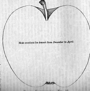
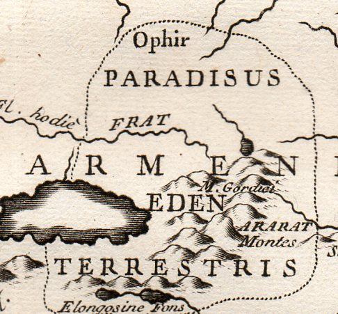
    I’ve made a post here before on the location of the Garden of Eating, um, “Eden”, here, which I guess might be the ultimate of all Apple Maps, The Big Eat; but I’ve found these two (below) that are entertaining and probably not interetsing though they are without the overwhelming consequences of the first map. They’re just about apples, and not what apples might represent (which I think was an unwieldy way for a Creator of the Universe to test the future of humankind with).

    Apple map897 detail[Source:  “Choice Variety of Apples”, in American Agriculturist, New York, 1848, vol VII/no. III, page 79.]

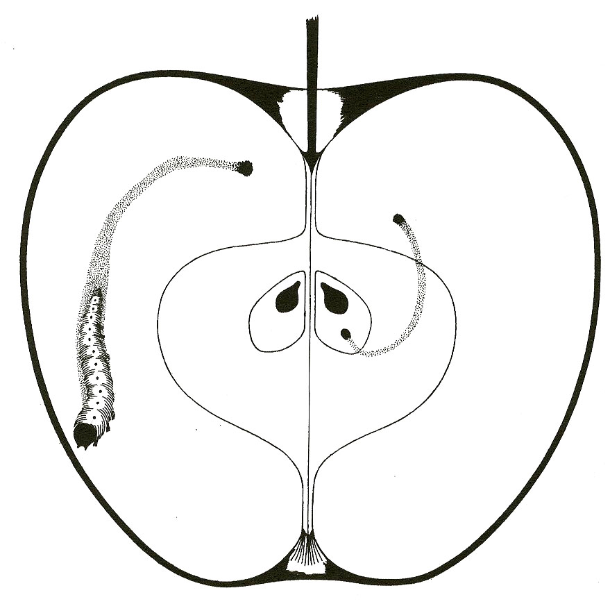
    And of course the route of Small Things Internally Eating Apples:

    Apple map[Source: Maps Incohate, here.]

    Eden 2359
    [Source:private collection, Tabula Paradisi Terrestris justa Systema Auctoris incisa a P. Stark-Man was
    printed late in the 18th century, probably around 1775, and locates the
    GOE far in the north country, near the Dead Sea, deep in old Armenia,
    near Mount Ararat (where Noe and his family were supposed to have landed
    after the creator flooded the world killing everything, where
    everything else, young and old, infant younger, men women children,
    beasts and ants, were killed by a wrathful OT maker.).]


  • Blank and Missing Things: Land (California as an Island)

    JF Ptak Sciene Books    Part of the series on The History of Blank, Empty and Missing Things.

    The influence of economic strategy seems to be the Old Red Sandstone of the geology of life on this planet, and sometimes it reaches right into cartography, expressing itself in unusual ways.  Such may be the case with the creation of the idea of California beign an island.

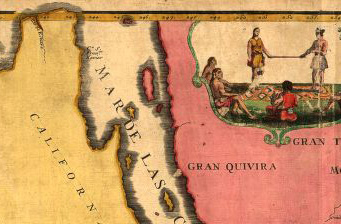
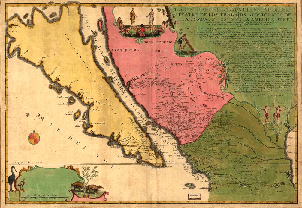
    California as an island det[A detail of a sample map showing California as an island, by Nicolas de Fer, 1720, and depicting the famous missing land at the north end of the Gulf of California.]

    In general, much of the vast expanse of blankness of the continent in the 16th and 17th century was hidden under ornate Baroque cartouches and their encumbrances, which was a tried-and-true method of taking up space on  a map where you didn’t (a) really know what was their and (b) didn’t want to make stuff up to fill in the white space. By necessity most of North America was unknown to cartographers at this time because, well, there was no reliable information to work with.  The far reaches of the middle North American western coastline enjoyed a history of
    connectivity with the large land mass that exists east of the Gulf of
    California, the region known today as “california” being connected to the rest of the continent from the early 16th century.

    About 116 years later, though, cartographic thinking on part of the coast changed.  Antonio de la Ascensíon is credited with first giving flight to the idea that the California Peninsula was in fact an island–and so, beginning in 1620, California would frequently make guest appearances on maps as an island. (Fray Antonio was born in Salamanca in 1573/4 and studied there and at the College of Pilots in Seville; he was ordained in the Order of Discalced Carmelites, and sent off to Mexico. As a cosmographer he accompanied Sebastian Vizcaino (1548-1624) on his expedition to California to find a good port for Spanish galleons coming from Manila, which is when Antonio produced his diaries with the famous island maps1.)  This map was created during a period where there was heavy competition for trade routes and geographical knowledge was actual currency, so there was some amount of cartographic information that was proprietary. When the abbot’s map was lost to/and recovered by the Dutch, the changes that were made to California were codified and published–the Spanish thought it not necessary to correct the misinformation. Perhaps.  In any event, it seems plausible that the Spanish crown had no interest in involving itself with what may or may not have been the loss of proprietary information, and so let the island business slide.  Until1751, when the King of Spain issued a proclamation saying that California was indeed not an island.

    This practice continued to about 1747, when there was more than ample evidence to suggest that the island status of California was erroneous–still, it took several decades for the last of the island-maps to make its appearance. 

     
    California as an island


  • Roentgen, Marey, & Malevich on the Edge of Modernity

    JF Ptak Science Books   Post 1924


    Pleasant_1bertha
    The 1895/1896 issues of Nature magazine are compliantly normal until the first weeks of
    1896 when the first of a flood of articles is published about the astonishing discovery of 50-year-old Wilhelm Conrad Röntgen. The English-language popular science journal announcement of his December 28, 1895  “Ueber eine neue Art von Strahlen” (“On a New Type of Ray”), appeared on 16 January 1896, and began the introduction of a new state of human experience.  Roentgen’s experiments—built upon the work of J. Plucker (1801-1868), J. W. Hittorf (1824-1914), C. F. Varley (1828-1883), E. Goldstein (1850-1931), Sir William Crookes (1832-1919), H. Hertz (1857-1894) and the odious Phil Lenard (1862-1947)—revealed as much to humans as did the experiments and inventions of Hooke and Leeuwenhoek on the invisible worlds revealed by the microscope.  There are more than 150 articles on the Roentgen (and soon to be “X-“) Ray, all published within 12 months of the original announcement, almost all excitedly, trying to comprehend, elucidate, expand, verify, this new world. 

    Blogxraybigads_2
    [The news of the discovery is first and most popularly reported in the January 6, 1896 London Standard:  “The noise of war’s alarm should not distract attention from the marvelous triumph of science which is reported from Vienna. It is announced that Professor Routgen (sic) of the Wurzburg University has discovered a light which for the purposeBlogxrayad
    of photography will penetrate wood, flesh, cloth, and most other organic substances. The Professor has succeeded in photographing metal weights which were in a closed wooden case, also a man’s hand which showed only the bones, the flesh being invisible”. By the end of the month the news was completely absorbed, worldwide.]

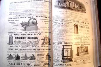
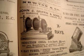
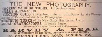
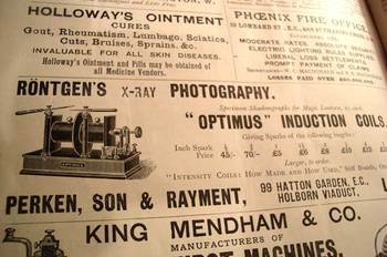
    I looked at the advertising in these issues (my copies of Nature for these decades generally have the original paper wrappers for the weeklies, complete with ad copy), looking for the first time that a Roentgen machine was offered for sale to the general public.  As it turns out, they popped up 12 March 1896 (once), 19 March (twice), and then about once a week for the rest of the year.  A little surprising, I think, a little light to my Monday-morning quarterback’s eye—I expected more; bigger, more, splashier.  But the ads are small and sedate, hardly similar to the discovery they represent. 

    Blogfeb_22marey
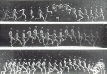
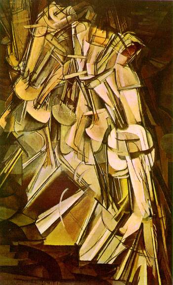
    The rest of the world, the rest of the advertising world, stayed the same–the Roentgen discovery and the enormous possibilities and promises of his “new photography” lived in their own unique sphere, unencumbered by their sassy new brother.   This mild response seems dimmer still when you compare it to that which greeted other (relatively) simple but still major advancements in the world of photography.  Take for example Etienne Marey, who was a technoid and physician who was able to capture motion of all sorts–he was able to develop a picture so to speak of the movement of blood in the body via his instrument to calculate blood pressure, and he also created a shotgun-style camera that made the Blog_feb_22_nude
    world’s first high-speed photographs of movement.  And so it cane to pass that in the late 1870’s and early 1880’s people were instantly able to see what a horse looked like when it galloped or what the body did *exactly* when jumping over a chair.  When you couple this with fourth-dimension material one wonders why it took several more decades to bump into these images in the art of 1907+. 

    (Duchamp Nude Descending series, 1915; above, Marey, 1881)

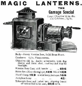
    And what indeed was normal in these pages?  Magic lanterns
    and magi lantern slides appearMagiclantern
    at all levels; the gorgeous Wimshurst machine gets heavily advertised; the redoubtable Negretti & Zambra advertised all manner of excellent scientific instruments (biographs, thermogrphs.  Nadeer Bros. advertised a pretty standard cell, and the ancient Crossley displayed their “new” oil engines, “suitable for all classes of agricultural work”.  J.H. Stewart was selling their semi-automatic electric arc lamp, while across the page was Newton & Company’s “Newtonian” arc lamps for lanterns (“self feeding and focus keeping”).  Microscopes and prepared slides abound, and Thomas Bolton advertises discretely and effectively for their “living specimens for the microscope”. 

    The Physical Review, the American upstart in the science world advertises that its third volume was available, while its distant cousin, the Psychological Review, advertised its own third volume.  Booksellers seem to take the most space, thank goodness. 

    Blogxrayepps
    There are a few medical throwbacks:  Epp’s Cocaine takes out occasional tenth-page ads for their “cocoa-nib extract, tea-like” selling its ‘gentile nerve stimulant”.  Right underneath is “Holloway’s Pills”, promising to cure biliousness, sick headache, indigestion, and all (?!) internal complaints.   These are brilliant simple samples of the skeleton of science in world-dominant Great Britain, in a world dominated at that time by H.A, Lorentz, Ernst Mach , Roentgen, Korteweg, de Vries, Bateson, Jean-Baptiste Perrin, Pierre Curie, Zeeman, Becquerel, Joseph Thomson,  Ernest Rutherford, Marconi, Ramsay, Fitzgerald.  And so on. 

    Nothing offered for sale here offered any significant clue to the pregnant world of modernity that was nearlyBlogxray3
    there—the world would become ‘modern” almost immediately following Roentgen, with revolutionary, epochal changes in art (in non-representational form more so than Impressionism), theater, literature, music.  Just about everything changed (except politics).  But there is no hint to paradigm shift hidden in the ads, just as they were with the machines selling the promise of Roentgen’s “new photography.  There’s something about the fine glass, superb turning of the screw, and a perfectly oiled gear though that makes this sort of perfection seem so lonely in the world of larger change.  Bertha, Roentgen’s wife, sat for 15 minutes while her husband passed his rays through her hand; she ran from the room once she saw the results, revealing her very bones and no doubt a strong sense of the Blog_feb_22_malevich
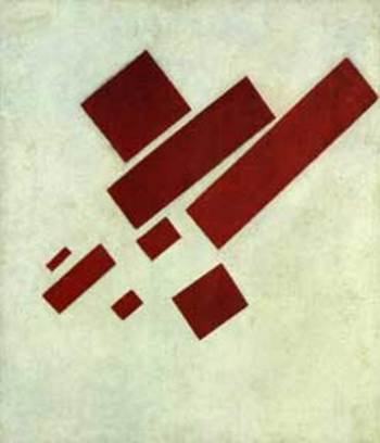
    fragility of life, and the strong presence of death.  Many had the same reaction to the Kandinsky’sBlogxrayad2
    shapes and Malevich’s white circles and red rectangles and Ibsen’s drama and Einstein’s dancing dust and the rogue syncopation of jazz.  It is probably a very natural reaction to try and protect established memory—but memory should be more flexible than that, I think, to keep a healthy mind.

    (Malevich’s 8 Red Triangles, 1915)


  • Patent Drawings for Voting Machines, 1873-1971

    JF Ptak Science Books    Quick Post, Election Day

    I’ve just simply collected a representation of  sixteen patent drawings for voting machines for the decades from 1873 to a very early electronic voting apparatus in 1971. Today I simply filled out a paper ballot with a pencil, which was in turn read by the real voting tabulator.

    I  found very few examples for “ballot boxes” or “ballot ____”  or “vote ___” anything prior to 1850; most of  the patent actions seem to take place after 1875 (perhaps ignited by the very problematical “stolen” election of 1876. 

    I don’t know if it is ironic/prophetic/problematic that the first example is by an inventor named “Doolittle”.

    1873


    1875


  • On Seeing Things Backwards Series, 1: UNIVAC and the 1952 Election

    JF Ptak Science Books   Post 1917

    Univac-cronkite
    Leonardo wrote backwards and from right to left, Benjamin Button lived backwards at the hands of Scott Fitzgerald, Rene Magritte’s man in the bowler saw the back of his head, Herrimann’s Ignatz the Mouse I am sure saw the back of his head looking around the world with the world’s most powerful telescope, rugby passes are all done backwards, paper images of vue optiques appear backwards, lightning for all intents and purposes starts backwards from the ground up, reverse mathematics are worked from theorems to axioms, and the Chicago River (1900) was engineered to flow backwards for the foreseeable future, while the Mississippi River famously flowed backwards for just a bit in the New Madrid Earthquake of 1812. 

    I can only imagine what audiences must have felt when they saw the first moving pictures played backwards–seeing them played forwards was a novel-enough (and revolutionary) idea, but the simple idea of reversing the direction of the film would have proved to be equally fascinating. 

    Imagine the first time you witnessed a staged train wreck on film, back there in 1897, and imagine being able to see it played over and over again, until you were filled.  I’m not so sure that there were even any still photographs of a train wreck as it occurred to this point, even with advances in film speed and lens, so seeing the even unfold in front of you at leisure must have been overwhelming.  Now imagine these same folks seeing the event and watching the locomotives reconstitute themselves.  It would have been an extraordinary event.  Even observing the Etienne Marey sequences and seeing what actually happens when a person bends over to pick up a pail of water would have revealed almost as much in new detail as when Galileo was in the middle of his earliest observations. 

    Looking at things backwards is a good idea so far as thinking about engineering problems and of course in checking experimental results in the sciences–its not so good an idea though to change the results produced by the scientific method because they’re not a good intuitive fit to expected parameters.

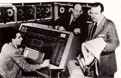
    Such was the cased with the first (and successful) employment of a computer to predict the outcome of a presidential election.  THe computer was the UNIVAC (the world’s first commercial computer and a blazingly fast machine at 10k operations a second, nearly six orders of magnitude lower than “superfast” by contemporary standards), which was brought in by Remington Rand to CBS News to crunch the numbers on the tight race between General Dwight Eisenhower and Gov. Adlai Stevenson (II) on 4 November 1952.  (Stevenson was the son of a former U.S. Vice President and would run again against Eisenhower in 1956.) Pioneers Pres Eckert and John Mauchley, along with Max Woodbury (and programmer Harold Sweeney, who is seated at the UNIVAC’s control panel and who seems never to be mentioned in the iconic photo at top, with Eckert at center and anchorman Walter Cronkite at left).   CBS News Chief Sig Mickelson and Cronkite were not comfortable with the proposal, but ran with it anyway, sensing a moment of the-future-is-now.

    The Eisenhower/Stevenson race was seen by the large majority of pundits to be too close to call, so when the UNIVAC’s results pointed to a landslide for Eisenhower (438 electoral votes and 43 states to Stevenson with 93 electoral votes and 5 states) folks got very sweaty and nervous, not trusting the outcome. As this was still a very early age in human-machine interaction, and the computed results fell far away from perception and expected response, changes were made in the UNIVAC’s programming to determine a more “reasonable” response by the machine, the new results making the race very tight and fitting human expectations and giving Eisenhower a very slim margin of victory.  As poll results started to sweep in an hour or so later indicating that Eisenhower was showing with a huge victory, the UNIVAC was again reprogrammed and at about midnight the announcement was made that the UNIVAC had indeed been correct in the first place.  The final results were 442 electoral votes for Eisenhower and 89 for Stevenson.  In the next presidential election in 1956 the three networks all had computers working for them–with them–and a different perception had been formed on working with computers. 


  • Interesting Images of Renaissance Hell–on Title Pages

    JF Ptak Science Books   Post 1917

    Bloghelltp078Images of Hell do not often appear graphically depicted right on the title page of books, even though books speaking to Hell and warning us of its coming number in the hundreds of thousands, if not more, particularly if you interpret religion as the means for keeping people away from the ring of fire.    Few people are shy about depicting Hell in general, though there evidently is some reluctance (or forbearance, or oversight) to showing it front-and-center on the title pages of books.

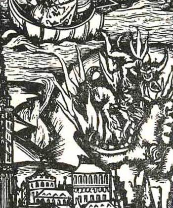
    A terrific exception to this rule is Jacobs de Voragine’s Passional, Hyr hewrrey sick an dath winter deel, printed in Basel in 1511, and illustrated by various and unidentified Strassburg woodcut masters.  In this extraordinary title page we see the vision of the adoration of the Virgin Mother and child supported in a rose of light, aided by guiding winds and various floating saints, and shown lowering the holy book directly to the city of Strassburg. In either corner positioned above the temporal city and below the firmament are two visions of hell, one less vicious and the other more so:  to the left we see some of the pious praying for better judgment as they are about to be consumed by the background flames, while to the right is a far more ambitious and morbid vision of hell featuring the famous Hellmouth.  The Hellmouth makes appears all throughout the history of art (as we can see in this Brueghel painting, for example), but it is a little curious that, outside of the mention of Leviathan (translated from Hebrew, Job 41:1), Hellmouth (as the entrance to hell) doesn’t make an appearance in the Bible.
    Bloghelltpdetail
     

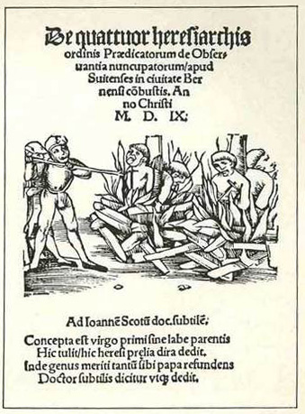
    What is more easily found, at least in the artwork on title pages throughout the Renaissance and the Baroque, are images of people about to be sent to hell. A good and chilling example of this can be seen in the artwork for Thomas Murner (1475-1537) De quattor heresiarhis ordinis Praedicatorium de Observantis nuncupatorum…, printed (again) at Strassburg in 1509.  The pamphlet tells the story of Johannes Jetzer and his accomplices (including four monks) who were tried (under torture) for blasphemy after it was revealed that they colluded to defraud people with a bogus story of religious visions, employing the bloody tear of Mary.  All were found guilty and the four monks were burned alive at the stake—Jetzer having escaped—and sent immediately to the deeper, more fiery, pit.

    Hell on title page
    This isn’t quite showing the coming of hell as in the first case, but it is getting close.  In any event, I found it interesting to see the depiction of the Bad Place right there on the title page of the Murner bokk.


  • The Unspoken Bits in Antique Historical Charts: Africa, 1826

    JF Ptak Science Books     Quick Post

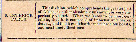
    John L. Blake’s Geographical Atlas is interesting for what it says and doesn’t say–granted, you can’t much take someone to task for things that they do not say, unless of course the unspoken bit makes a louder noise in its absence than in its presence. 

    Africa chrono816


  • Sequential Illustration and the Seven Stage Rule of Human Decay

     JF Ptak Science Books       Post 1910

    Among graduated indicators the semi-physical allocations of measurable units time must be the most significant–or at least in modern times, over the last few hundreds years, when the popular class was able to afford time-keeping devices so that they could have a greater appreciation and control over time past and future.  Simplified articulations of long periods of time is generally not a topic of illustration, however–art and illustration showing the development of a story is generally not a common occurrence in published form. 

    It is not terribly uncommon in ancient and early modern times, though.  Trajan’s Column is an excellent example of a sequential story, this told in stone; legends and myths and other stories are told in vases and friezes in Greece, and in various codices and altars in Mayan and Mixtec cultures. 

    But in more modern times the telling of the sequential stories in published form, again, is not a common thing.  Even the telling of the story of the development of, say, a tree or the  life cycle of a bird is just not a common occurrence, in spite of the more-popular appearance of graphical and expressive modes of displaying quantitative data in the mid-19th century. 

    http://www.internetmonk.com/wp-content/uploads/AdamAndEve_Garden_Lucas_Cranach.jpg

    Perhaps the most common of the early transitions in displaying these stories since the Renaissance have been in the telling of the lives of the Saints, or in the Passion of the Christ, or in the depiction of the legend of Adam and Eve (as in the work of Lucius Cranach, above).  There are interesting cycles showing the Christian mythic formulation of the creation of the world, as in the case of Thomas Burnet’s (illustrated title page to his)  Sacred History of the Earth  where there is a glorious seven-sphere display of the beginning and ending of our planet. 

    [Source, with full text, here.]

    I wonder though if one of the most popular and common sequential depictions of an important and shared story is that of the ages of man/people:  generally they show a pyramidal showcase of silhouettes or full-body portraits of one person as that body develops and decays over the major decades of a life.

    They would normally appear in a configuration like the following:

    File:The Stages of Life BM 1992 0125 31.jpg

    And earlier on, very famously, like so:

    File:Stages of Life by Bartholomeus Anglicus 1486.jpg

    (I’ve written about and identified these and other related depictions of the ages of man here.)

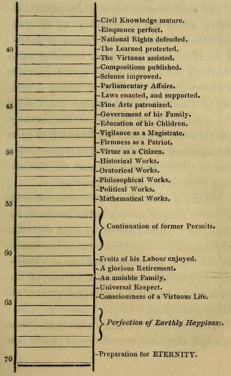
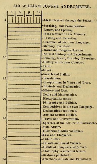
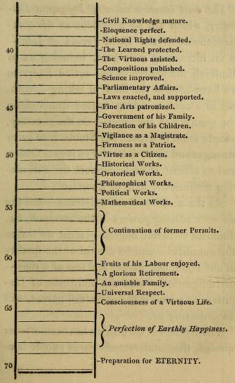
     I came to think about all of this again after reading an interesting post in the excellent Public Domain Review blog where I found this absolutely delightful “barometric” rendition of the stages of life, a sequential, top-to-bottom graphical display of the stages, but without illustration.  I cannot remember seeing such a “list” before, and was not familiar with the book from which it came (The art of invigorating and prolonging life, by food, clothes, air, exercise, wine, sleep, &c
    and peptic precepts, pointing out agreeable and
    effectual methods to prevent and relieve indigestion, and to regulate
    and strengthen the action of the stomach and bowels … : to which is
    added, the pleasure of making a will …

    which was printed in 1822 by Constable for Hurst/Robinson in London, the full text of which can be found at the Internet Archive). 
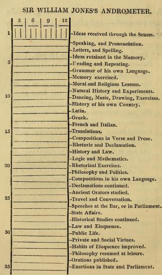
    Stages of life (a)

    Stages of life (b)

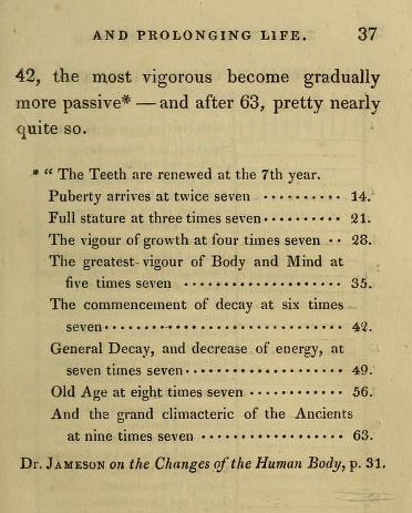
    And the “Rule of Seven” which precedes the longer list above:
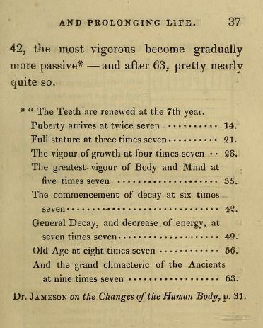
    Stages of living rule of 7
    It is interesting to note that this was the fourth edition of this work, and that the end of the book, the very synopsis for ideas of full life and longevity, the whole is topped off by a chapter on happy-making and your personal will. 

    There were many admonishments that made and still make perfect sense found in these pages:  early to bed and early to rise sort of material.  Plain, but sensible.  Eating early. Dressing sensibly.  Eating (for the time) modestly. Interesting recipes. Pure air making for “a diverted mind”.  Good advice for the mature bookbuyers there in first quarter 19th-century England.  I imagine that most of those readers were no doubt born in the second-to-last decade of the 18th century, which means that their instructions on Daily Life business was from their parents who got their information from their parents, which means by 1822 much of the handed-down wisdom relating to diet and exercise was from the early 18th century.   Perhaps this work was the breath of fresh air that people needed, making it popular enough to find its was into at least four editions. (Also worth noting is that the average resting pulse rate for the readers of this book was said to be 60, which I think is lower than the American national average today.)

    There is of course a suffocating number of ill-advised recommendations, like for athletes, where the consumed foods should not include veal, lamb, pork, fish or cheese puddings, “or vegetables”, which leaves little room for anything besides red beef, which was to be had in quantities, including beef pudding, jellied beef, and “beef tea”. There was also a lot of beer and malt liquor drinking, with suggestions for “three pints of home-brewed” to be had with dinner, followed by three glasses of wine (‘the less, the better”)–then again, clean/drinkable water was a tough go at times, so beer was a common-enough stand-in.  All things being equal, the advice utilized whatever was the good data for the time. 

    The long list from birth to death of supposed and impending accomplishments is interesting particularly for the “decaying” part (which is outlined in the second chart) of life, where we find that at age 54 a person should be conducting their mathematical works, after which (from 55 to 60) one is relegated to pursuing “former works”.  (After all, the period of general decay according to the Rules of Seven chart begins at age 6×7.) And it is here that the creative life ends, because from this point to the preparation for eternity the life is spent enjoying one’s earthly works.

    In any event, I just wanted to point out the unusual nature of the “William Jones’ Andrometer”, which is a display of information that is outside my usual experience. 

    Note:

    I briefly considered including “logic trees” in this description, as they do tell a story, in a way.  ParticPorphyrysularly
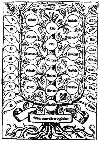
    Porphyry’s Tree came to mind (which was a classification in diagrammatic form on different kinds of being) and then Pacioloi’s summary of ratios from his Summa de arithmetica (1494). They do certainly represent a structured depiction of thought, but they are not a narrative, though they would provide the structure for one. Anyway, I’m convinced tonight at least that these diagrams don’t belong in the sequential illustration discussion.  (And in a weird way these diagrams enter the modern conversation so far as their overuse is concerned. Even in the Middle Ages the idea of the logic tree was being so over- and mis-employed that they would remind the modern reader of the “Top 15 (or whatever number) Photographs of Butterflies (and again, whatever he counted thing might be).)