A Daily History of Holes, Dots, Lines, Science, History, Math, Physics, Art, the Unintentional Absurd, Architecture, Maps, Data Visualization, Blank and Missing Things, and so on. |1.6 million words, 7500 images, 4.9 million hits| Press & appearances in The Times, Le Figaro, Mensa, The Economist, The Guardian, Discovery News, Slate, Le Monde, Sci American Blogs, Le Pont, and many other places… 5000+ total posts since 2008.

Author: JF Ptak

  • History of Lines–a Note on the First Appearance of the Addition (“+”) Sign

    JF Ptak Science Books   Post 1575  [Part of the History of Lines series]

    Lines--addition sign 3 Widman det644
    The history of lines is full and rich with symbols, some of which have absolutely nothing to do with the extension of trust and belief and hope and fear–unless you’re a young student studying math or chemistry or physics.  One symbol in the maths that seems to have no exact age except to say that it is semi-ancient is the addition sign.  (It will be interesting in this series on the history of lines to address the origins of  other symbols like the sign for pi, division. multiplication, percent, inequality,  equality and so on.)
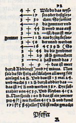
    Lines--addition sign Widman642
    I say “semi-ancient” because the symbol for addition is a hieratic form of the Egyptian hieroglyphic, looking like a capital “A” in a way, without the horizontal crossbar.  The earliest appearance of a symbol for addition in Europe was in the 13th century, with the letter “p“, appearing in various forms, as well as the word “plus”, “used in connection with the Rule of False Position”1.  The concept also appears as the word itself, as “et”, or “and”, which just so happens to closely resemble the symbol that the concept would become a few centuries later.  The earliest appearance of the symbol we would recognize instantly today as an addition sign came in the 1489 book by Wideman, the Behenunde und kuepsche Rechnung (seen above in detail and in full, from the 1532 edition of the work), while the first time the “+” appears in an algebraic equation for the first time 25 years later, in a work by Vander Hoecke.  

    It is interesting to think of the life of these symbols before they became themselves. 

    I am not certain of this, but it seems that the first “+” printed in the United States did not occur until the 20th edition of James Hodder’s2 Arithmetic3 was printed in Boston in 1719, and this at the press of James Franklin (1697-1735), the fourth child of ten in the Franklin family that included Benjamin (1706-1790).  So it is entirely possible that 13-year-old Ben helped his older brother print the first addition sign in the British Colonies. 

    Notes:

    1. D.E. Smith, The History of Mathematics, volume II, p. 397

    2. Hodder in 1672 wrote “note that a + (plus) sign doth signifie Addition, and two lines thus = Equality, or Equation, but a X thus, Multiplication,” no other symbols being used.”  (Smith p395)

    3.  In his introduction, Hodder says:

  • History of Lines–Measuring Things with People, 1522

    JF Ptak Science Books  Quick Post (Edited-and-added version of Post 1019)

      0 blog feb 20 line611det

     “My car gets forty rods to the hogshead, and that’s the way I likes it!”–Grandpa (Abe) Simpson, from The Simpsons  (That’s about 500 gallons to the mile.)

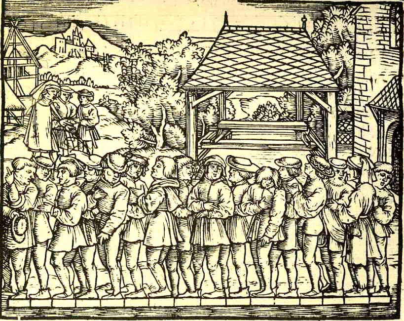
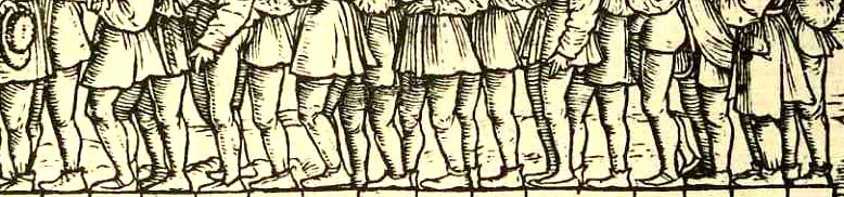
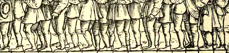
    A line, a connection of two points in space, is about as basic an imaginary thing as we have here on earth.  Humans have used these creations to build all sorts of straight things, from roads to building to ships to literature to mathematics and on and on.  What doesn’t happen very often, at least not in Western art in the last 500 years or so, is for people to be represented in art in a straight line that is not a processional (including military, religious, political venues), or that is not along a bench next to a table, or not supported by another artificial structure like a fortress wall (to give their waiting or standing a form to accommodate).   That weakens the line field considerably–after all, what else is there to line up for?  They’re not queuing up for a sale at Gimbels, and they’re not waiting patiently for a place on the bus.  There’s just not that much to form a line for, evidently. 

    0 blog feb 20 line611 There is, on the other hand, this (above and below), what I take to be rare representation of my odd requirements:  a delightful woodcut from Jacob Koebel’s 1522 Von Ursprung der Teilung, Mass und Messung dess Ertrichs, der Ecker, Wyngarten, Krautgarten und anderer Velder…, an early surveying handbook (probably the first ever printed in Germany) that could be used to measure and set out (as stated in its title) herb gardens, vineyards, farms and the like.

    I’m not 100% sure of this, but I think what is going oin in this image is the measruing of a rod (or “rute” in German), which is about 5.5 meters or 16 feet; and what we have in the picture is 16 men being positioned over a measuring device and beign overseen by the powers that be, at rear. On the other hand, maybe not:  the English rod was 16.5 feet, while the rod measurement for Saxony, Rhineland, Bavaria and Baden were different as well; Sweden also came in at 16 feet to the rod.  The other big question was:  how long was a “foot”? Since that measure also chnaged (varing between 23.51 cm in Wesel and 40.83 cm in Trier and  31.387 cm up north in the Rhineland)  the measurement of anything with variable units of measure seems to have been problematic, or at least in a post-facto measure.  [The whole issue of “absolute” units of measurement is another post for another time (and a much bigger and moire compelx story).] For right now I’m content to have found this pretty image, which in the end was probably the work of the author Koebel (1470-1533), who seems to have been a jack-of-all-trades; and while he was concerned with property and measurement, he also showed his flair with charm, as this group of men atest. 


  • History of Lines–Where is “there”? The Medieval T-O World Map

    JF Ptak Science Books   Quick Post  

    Lines--t map639

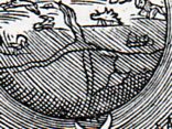
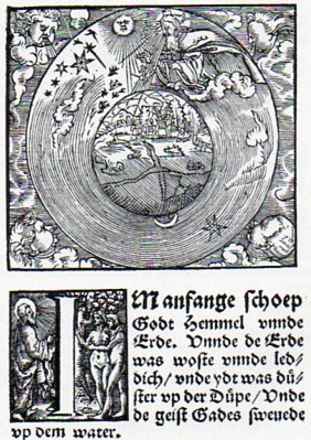
    This woodcut cosmological illustration from a 1526 Bible is a subtle and very late printed rendition of a great and classic Medieval idea.  At the center(or thereabouts)  of the globe of the Earth there is a seeming confluence of two great rivers, but what it reminds me more of is the T-O map, the orbis  terrarum, the direct descendant of the

    Lines--t map638

    Greco-Roman map making.  The T-O map makes distant and deep calls into the past, finding a home in Macrobius (around 400 CE) and Orosius (5th century )and more famously with Isidore of Seville (ca.  600), a work known to most folks today because of its appearance in Seville’s Etymologarum of 1472, which is also the first map printed in Europe (pictured below). (Why is took almost 20 years after Gutenberg to print a map is mysterious to me.)

    Generally Jerusalem would appear at the center of this sort of map, which would have appealed to the necessary people that the publication needed to have the appeal of.  The Mediterranean would separate Europe and Africa from Asia, while all of the land masses (the stuff outside of the “T” structure” were surrounded by the great “O”, the ocean(s).

    Sixteen years later a remarkable map of the world would appear in Ptolemy’s Geographia, an Ulm-printed masterpiece that appeared in 1486. 

    . Ptolemy's world map (around 140 CE);copy Ulm edition of 1486.
    But I think that the crossed lines from the Luther Bible of 1526 was really just a suggestion of the past, not meaning to lean on the Medieval world at all.  Still, though there they are. 

  • Disinventing Left, Part II–Eliminating Left Pages

    JF Ptak Science Books   Post 1572

    If (and only if, (iff)) eliminating left turns in auto traffic is a good idea, perhaps getting rid of the left-sided newspaper page is a good idea, too.  (?)

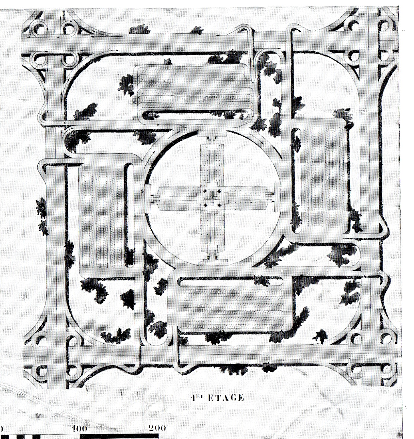
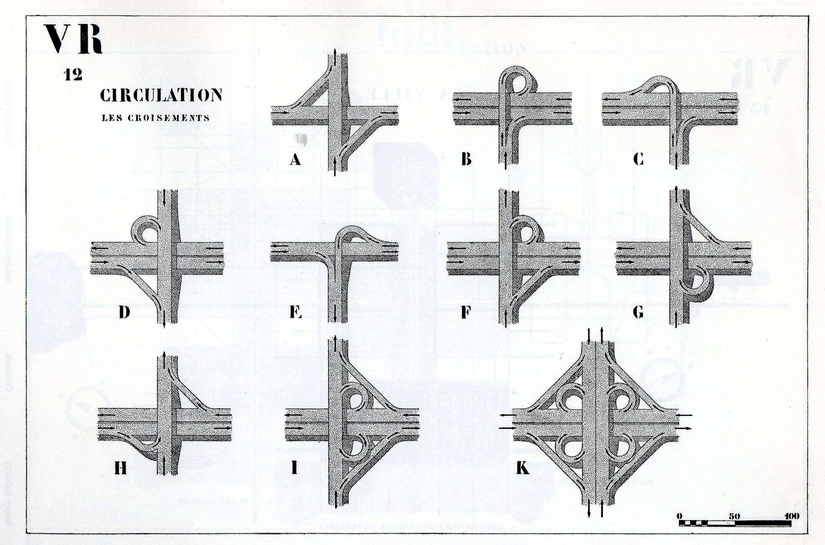
    A post appeared earlier in this blog on dis-inventing the left-hand traffic turn, which for better or for worse was laid at the feet of Le Corbusier, who imagined a new network of inner-city traffic turns as follows:

    Right hand turn 2006

     which appeared in his Radiant City (edition of 1930).   He beautifully includes the following crib sheet for the incremental development of right-turns-only in cities, which I think can stand on its own as the template for x-number of short stories:

    Right hand turn 10

    This is nestled into one of many plans, though Le Corbu’s recipe for mega-sameness seems desperate to me–this one called for a massive complex of 220-meter-tall structures nested in 400-meter squares, going on and on. 

    But I think at its base that eliminating left hand turns for cars in cities seems like a good idea–making the left turn a series of three rights seems at it base to make traffic flow smoother, and since enormous amounts of time and energy and  everything else comes as a result of volatility in traffic flow, and since a lot of that volatility comes as a result of the formation of lines behind cars that are crossing traffic for a turn, then getting rid of the cause of volatility seems the logical response.  Unless of course it causes volatility elsewhere.

    In 1905–one of the greatest years for ideas in the history of ideas, ever, though the following is not one of them–George Ebenezer Morrison proposed to eliminate a source of unease and volatility in publishing advertising revenue by destroying the idea of the left-hand page of text.  He made the case that the value of advertising space on the left-hand side of newspapers and magazines and such was far less than the ads that appeared on the right-side pages–this because, he said, people tend to hold what they are reading with the right-side centered in front of them, leaving the poor left-side abandoned on, well, on the left.  So, with attention centered on the right, ad space was at a premium. 

    Mr. Morrison’s solution–his idea, for which he was granted a patent in the U.K. 1905/105291–was to print the left-hand pages upside down, so that once the right-side was read, the reader would turn the newspaper etc. upside down to read the second half, and thus the left-side page would be entirely eliminated. So, all things being equal, everything would now be right-sided.

    I am not sure if–like finding new traffic problems in multiple right-hand turns–eliminating the left page doesn’t create the same issue with the left side of the all-right-hand page reading material.

    I am sure that Facebook and Kindle and etc.–having already gotten rid of the pages in toto–are now at work in eliminating the left side of our monitors. 

    And whatever it is going on right now, the same thing seems to be going on, it politics. 

    Notes:

    1.  I’d share the patent image, but it is just a rectangle divided into eighths.


  • History of Lines–I AM a Man, 1968

    JF Ptak Science Books   Quick Post for the History of Lines series

    Lines--I am a man b

    “I am an invisible man. No, I am not a spook like those who haunted Edgar Allan Poe; nor am I one of your Hollywood-movie ectoplasms. I am a man of substance, of flesh and bone, fiber and liquids—and I might even be said to possess a mind. I am invisible, understand, simply because people refuse to see me.”
    —Ralph Ellison, Invisible Man (1952)

    There are many powerful images and messages from the American Civil Rights movement of the 1950’s and 1960’s.   To me, the sign held by the striking sanitation men in Memphis, Tennessee, during February/March/April 1968, is one of the most extraordinary.  The strike started in February after the limited response to requests for improved safety conditions for sanitation workers after two men were crushed to death by a truck failure several weeks earlier.   It grew quickly into something much larger. 

    http://www.royarden.com/blog/pictures/8b-Civil-Rights-I-am-a-man.jpg

    Martin Luther King had been in close contact with strike organizers, which had the help (by early March)  as well of James Bevel and Ralph Abernathy of the Southern Christian Leaderships Conference’s (SCLC).  King  returned to Memphis on 3 April, 1968, and gave what turned out to be his speech that evening.  It was purely magnificent; and if you watch it, after everything is said and done, you’ll see how exhausted the man was, as he almost collapses at its end.

    King ends the speech this way:

    “Like anybody, I would like to live a long life–longevity has its place. But I’m not concerned about that now… I’ve seen the Promised Land. I may not get there with you. But I want you to know tonight that we, as a people, will get to the Promised Land”

    Dr. King was shot and killed the next day, shot to death on the balcony of the Loraine Motel, as he was getting ready to go to dinner.

    The mayor of Memphis was not moved enough by this event to settle the strike, and stood firm.  The strike was finally ended after the intercession of President Johnson.

    I’m interested in the “I Am a Man” sign not only for the lines of resistance of the marchers who held these and other signs, but also for its sublime simplicity, and the insistence of the underlining of Am.  These are some of the strongest lines that have ever been made in this country. 


    ·Posted by :

    ·in:

    —

  • History of Lines (Note)–Getting There for the Common Reader. Sebastian Munster, 1551

    JF Ptak Science Books   Quick Post for the History of Lines*series

    Lines munster636  det c

    Sebastian Münster

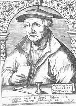
    Sebastian Munster (1488-1552) did not contribute a great or even an original work in the history of mathematics, or even in surveying, or map making.  What makes his Cosmographia  important, and what made it so very successful (entering 24 editions over a hundred years), was that he was among the first scholars of the time to put all of this disparate material together, and to give credit where credit was due, and to present an accumulation of important information in a scholarly, reasoned way.  He also made all of this accessible to the general reader, so that the information and methodology could be spread very wide.  It was in fact the first time that the stuff of the world in general was described in German–that of course is very important; but the fact of the matter is that the presentation and scholarship that resulted in this work was in itself ground-breaking.

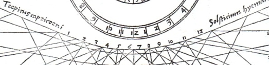
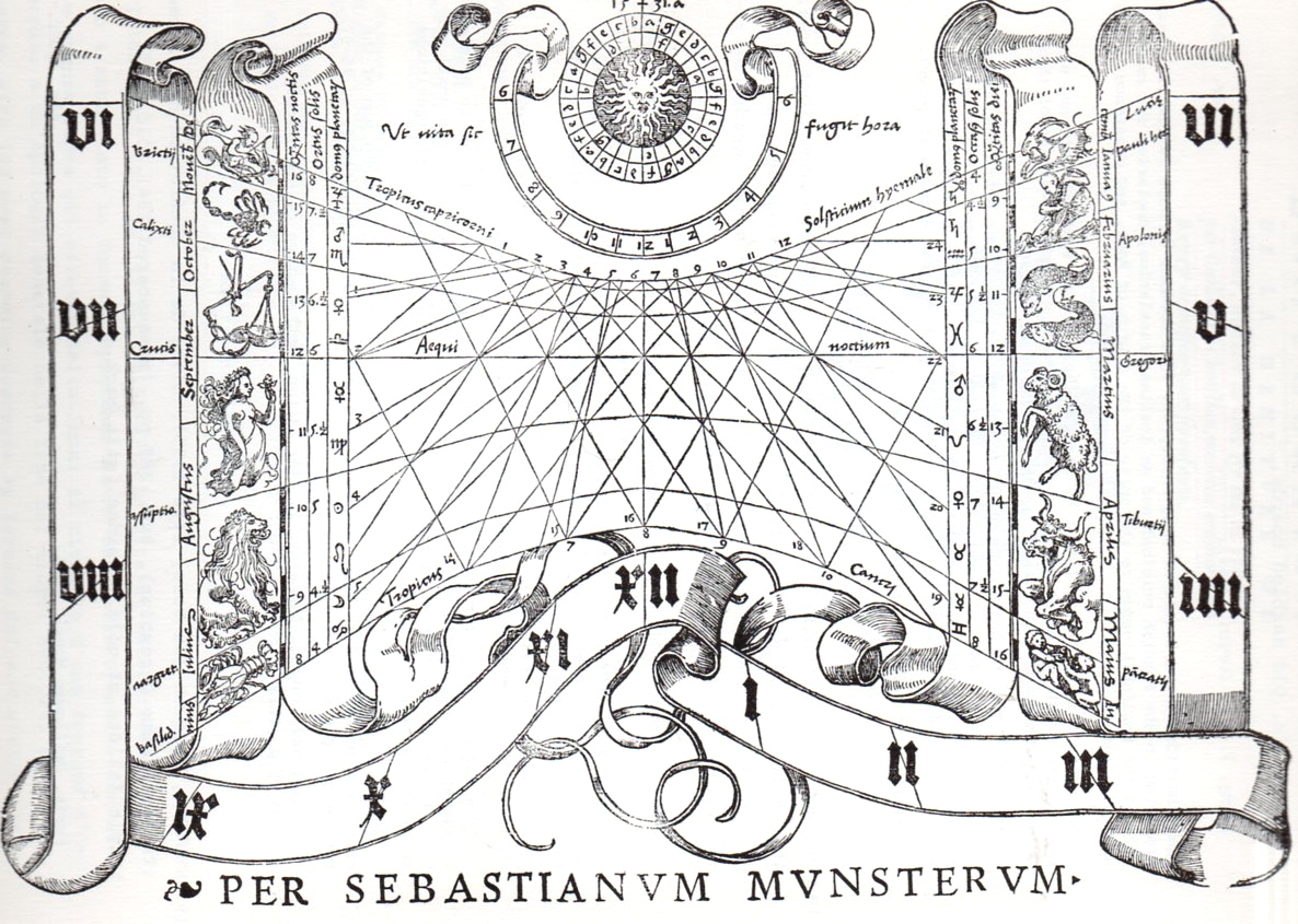
    I’ve chosen an image from another of Munster’s works, his Rudimenta mathematica1, which was a practical work on time reckoning, and another work of celebrated importance.

    1. Rudimenta mathematica : haec in duos digeruntur libros, quorum prior geometriae tradit principia seu prima elementa, unà cum rerum et uariarum figuraru[m] dimensionibus, posterior uerò omnigenum horologiorum docet delineationes, 1551. 

    And the full image, one of the woodcuts illustrating the section on the construction of sun dials:


    Lines munster636

    Contents of the 16th century editions of the Cosmographia.
    1. Book I – Astronomy, Mathematics, Physical Geography, Cartography
    2. Book II – England, Scotland, Ireland, Spain, France, Belgium, The Netherlands, Luxembourg, Savoy, Trier, Italy
    3. Book III – Germany, Alsace, Switzerland, Austria, Carniola, Istria, Bohemia, Moravia, Silesia, Pomerania, Prussia, Livland
    4. Book IV – Denmark, Norway, Sweden, Finland, Iceland, Hungary, Poland, Lithuania, Russia, Walachia, Bosnia, Bulgaria, Greece, Turkey
    5. Book V – Asia Minor, Cyprus, Armenia, Palestine, Arabia, Persia, Central Asia, Afghanistan, Scythia, Tartary, India, Ceylon, Burma, China, East Indies, Madagascar, Zanzibar, America
    6. Book VI – Mauritania, Tunisia, Libya, Egypt, Senegal, Gambia, Mali, South Africa, East Africa

    Note on introducing line fragments for the History of Lones series:

    * I think that if I had a sense for design and some artistic talent that I could perhaps make something interesting out of bits and pieces of the details of a hundred famous lines.  Or two hundred.  Unfortunately, I don’t possess those talents, so I’ll just have to write about it as though it has been done, already.  If we could whisk ourselves away 50 years into the past to the great world of early broadcast television, back into the days of glorious black and white, it would be interesting to present the details singly and first on a game show like the lovable “What’s My Line” show. (Another guest, another one of the hundred or two that could appear, can be seen below*, though I think this one is a dead giveaway.)


  • Prometheus Unbound; or, the Triumph of Science in Olympus (1879)

    JF Ptak Science Books   Post 1571

    The wonderful Punch, or the London Chiarivari strikes again for the year 1879.  The quick-browse is seldom complete, as I’ve witnessed again and again; 1879 revealed several fantastic images that were posed to this blog last week (here, for the Technology Museum of the Future and also here for Thomas Edison’s Anti-Gravity Underwear and Kite Babies), and as it turns out just a few pages away, there existed a larger, two-page illustration that was again on the triumph of science, and which I missed completely, twice.

    The message in this cartoon is the glory of “science”, which was flying very high indeed in the newly-electrified times of 1879.  Dominating the image is Mr. Punch himself, holding the electrical sun in one hand, illuminating everything.  To his right, Mars and Heracles stand before an enormous cannon, with different reactions; Bacchus sits astride a barrel of coffee of all things with Pan enjoying a short cup of Joe, while in the lower left corner Hades himself is making a photograph of Eros (?), an hourglass slung across his back, finally coming to grips with capturing change.  In the right corner at bottom is a young man who is intent perhaps on reporting on the situation via a handy public telephone–such things didn’t yet exist in 1879, the telephone being just three years old, but the artist thought enough of its future power to add it into this scene of the triumph of science and technology over the panoply of gods and demigods.

    On the right ide of the image the gods make no further advance against science and technology.  Ares-as-workingman is puzzled by the giant Nasmyth hammer, with the Cyclops in the background a little more concerned, disbelieving what their eye told them.  Poseidon is shuttled away in the lower left, accompanied by what looks to be a weeping mermaid., hustled to the exit by a torpedo, a diver in a deep sea suit, and what I think is a special life-preserving inflatable suit.  In the middle of the image we see two women dressed in legal and academic garb, looking determined before a finicky Hermes; and above them, lording over it all, is a very dissatisfied Zeus, and a headache-y Hera.

    Since the image is entitled “Prometheus Unbound, or Science in Olympus”, I guess that Zeus must be reacting to electricity as the unbound Prometheus, a modern version of a kind power given to humankind via electricity.  It is this new Prometheus that is the undoing of the god’s retreat.

    Overall, this is a very plain Victorian view in the trust of science and technology to lead in all things, even the very basis of much of European mythology.   [I hope that I haven’t abused the mythology too much.]


  • History of Lines–the Heart, Arteries and the Circulation of the Blood, 1628 (1639)

    JF Ptak Science Books     Post 1570

    Harvey635
    I think that if I had a sense for design and some artistic talent that I could perhaps make something interesting out of bits and pieces of the details of a hundred famous lines.  Or two hundred.  Unfortunately, I don’t possess those talents, so I’ll just have to write about it as though it has been done, already.  If we could whisk ourselves away 50 years into the past to the great world of early broadcast television, back into the days of glorious black and white, it would be interesting to present the details singly and first on a game show like the lovable “What’s My Line” show. (Another guest, another one of the hundred or two that could appear, can be seen below*, though I think this one is a dead giveaway.)

    http://vintage45.files.wordpress.com/2011/04/whats-my-line.jpg

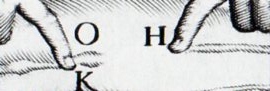
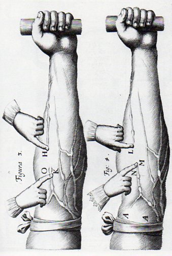
    Today’s line section from this blog’s History of Lines series comes to us from William Harvey, being an illustration in his epochal Exercitatio anatomica de motu cordis et sanguinis in animalibus (or On the Movement of the Heart and Blood in Animals).  It was in this book that Harvey published his experimental results on how blood moved through its course in the body, showing that the 1400-year-old Galenic idea concerning the movement of blood was all wrong. 

    Harvey634
    Harvey had conducted experiments via the scientific method–and was among the earliest to do so–and established early on, by 1615 or thereabouts, that the Galen theory regarding the movement of the blood was incorrect. He found that contrary to long-established belief the liver did not convert food into blood, and that the lungs did not push the blood through the  body, and that blood was not continuously generated.  Why wait until 1628 to publish his results?  I suspect that he was not looking forward to the problem and notoriety of publishing results that went against the medical grain–actually some of which were the exact opposite of the accepted practice–which in fact was the case for decades after the first edition appeared.  But Harvey presented his results in his short book in a concise way, explaining how it was that the heart and arterial systems functioned, and then in a second section of the work displayed how the blood was circulated rather than produced. (He was able to establish that if Galen’s theory was correct that the liver would have to produce 540 pounds of blood every day–a simple impossibility.)

    Harvey’s work had a revolutionary effect on the study of physiology and medicine at the same sort of level as Copernicus or the use of the telescope by Galileo–I think that there is little doubt in that.  Harvey was able to produce his results through experimentation and without the benefit of the microscope, which would have helped him enormously had he been able to identify capillaries–something that would have to wait for Marcello Malpighi and his publication in 1673, sixteen years after Harvey’s death. 

    Notes:

    Lines copernicus b

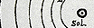
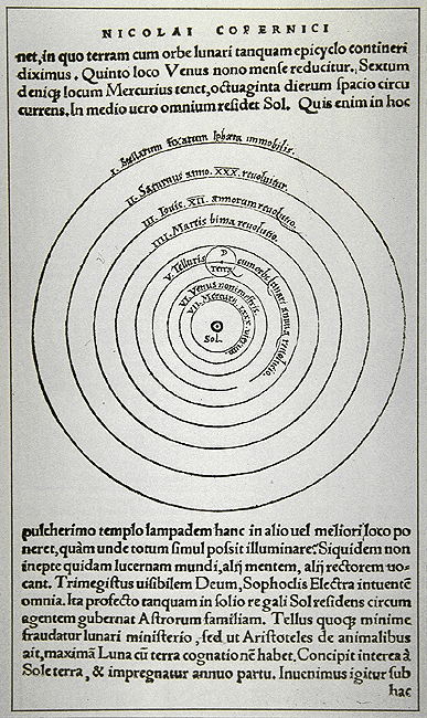
    The detail from the big image in Copernicus’ De revolutionibus orbium coelestium (On the Revolutions of the Heavenly Spheres), 1543.

    Lines copernicus


  • A Lesson in Civil Rights taken from a 1944 Piece of Cardboard–Philly Motormen, Jackie Robinson and War

    JF Ptak Science Books   Post 1569

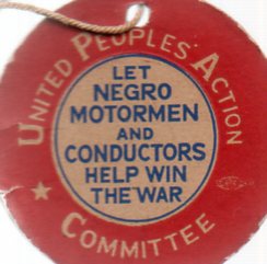
    Negro motormen633
    This political “button” has been in my house –along with a a dozen or two others–for quite some time, small signifiers for large events.  This one, though, is more suggestive than assertive; a measured, tenuous  political statement that seems today as though there should have been no disagreement in its message. 

    The button was issued in 1944, at what might have been the very most crucial time for America in fighting World War II.  The message wasn’t to support the idea of sending Black Americans to fight in the war–it was rather a call to White America to acknowledge the need for employing Black Americans as motormen and conductors on Philadelphia street cars as replacements of the men who went off to fight the war. 

    There was very strong resistance to having Black people interact with White people on a public convenience.

    In the same year, in July 1944,  Jackie Robinson (then of UCLA)  was a newly-commissioned 2nd lieutenant in the United States Army, stationed in Fort Hood, Texas, with the legendary 761st “Black Panthers” Tank Battalion.  On 6 July he boarded a U.S. Army desegregated bus, where he was told by the driver to move to the back, into the Negro section; Robinson refused; the driver backed down, and continued on his way, though not without his revenge.  At the end of the run, he alerted Military Police, who would arrest Robinson on a variety of phoney charges.  It was recommended that Robinson be court-martialed. The commander of the 761st, a White colonel named Paul Bates, refused to do so–which led Robinson to be transferred to the 758th Battalion where there was no problem in undertaking the legal action.  By August, with charges reduced, Robinson went to court and his charges were dismissed.  But by that time, the damage was done, and he would not be sent overseas to fight.  He was sent to Camp Breckinridge in Kentucky where he served as an athletics coach for the few months he had in the Army, and he was honorably discharged in November, 1944.  It was while he was at Breckinridge that a former Negro Leagues player for the Kansas City Monarchs suggested that Robinson write to the ballclub for a tryout.  He did, they did, and the rest is history.

    Negro motormen632 In 1944 in Philadelphia–though it could have been in many other cities in the northern part of the United States, though  this would not have been attempted almost anywhere in the South outside of the Pullman car–the question was whether society would tolerate a Black person interacting with White customers on streetcars.

    It was almost at this same time, in November 1944, that General Eisenhower decided to send Black troops to fight with Whites in battle.  There was strong resistance to this behavior in the military, not the least of which came from Ike’s own chief of staff, Lt. Gen. Walter Bedell Smith.  It would take an Executive Order (#9981) from the next president, Harry Truman, to end the de facto segregation of the U.S. Army; it would take another war, and another three years (to the day)  for the U.S. Army to announce its plans to desegregate, on 26 July 1951.

    In spite of there being motormen and conductors working in other northern cities like Cleveland, Detroit and Indianapolis, wrapping the string for the United People’s Action Committee around a button on your shirt or jacket would have been a controversial step to take–a step that looks alarmingly small to us here in the future, but it was a societally big one back in 1944. 


  • Note on the Visual Semantics of Ideas: John WIlkins, Jorge Luis Borges, Oliver Byrne

    JF Ptak Science Books   Post 1568

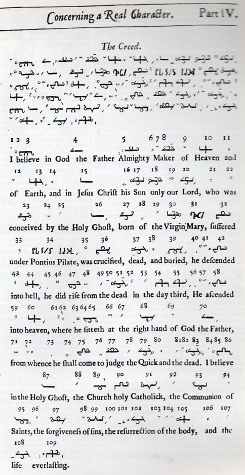
    John Wilkins’ construction of a new, theoretical language, a visual semantics of idea that was to be read and not spoken, a new international language to communicate thought, seems straight from the heart of the great Jorge Luis Borges.  And in fact, Wilkins does come from Borges, in a way–as part of a story Borges wrote in 1942, a fantastical semi-non-fictional account of Wilkins’ fabulous effort1.

    Wilkins was a 17th century figure with a sort-of 20th century idea, but even advanced to this point in time, and with actual mathematical and linguistic tools at his disposal, his work is still better as a sci-fi movie backdrop than anything else–not that there’s anything wrong with that.  The book of his in question, An Essay towards a Real Character, and a Philosophical Language, was published in London in 1668, and was an very interesting, Aristotelian non-standard approach to construct a universally understood language composed of characters which were in a way axiomatic of a developing system of genera, a taxonomy of ideas, that were somehow, fantastically, capable of expressing the foundations and flights of human thinking. 

    Borges’ presented Wilkins in a very Borgesian way in his  “The Analytical Language of John Wilkins“, mixing fact with creative fancy, exhibiting Real Character as though it was being re-discovered and studied by living academics. 

    Wilkins631

    It reminds me somewhat of other massive buit not-quite-nowhere-near-there efforts by people like Oliver Byrne and his color-coded approach to Euclid (1847), J.H. Woodger with his Axomatic Methods in Biology (1937), and Clark Hull’s Principles of Behavior (1944). Fascinating ideas, constructed with big brains, but which ultimately produce a product which more deeply confuses and obscures the subject matter it set out to explain–and which don’t really work, anyway.  But they are beautiful things int heir own right–Byrne’s work in particular also happened to be one of the most beautiful books produced in the 19th century–assemblies of bits and pieces that are occasionally magnificent but whose final destination was of course The Twilight Zone.

    They were in some way a Search for a Perfect Language (as in the work by Umberto Eco); they sought to step deeply outside themselves in an effort to grasp a higher knowledge, perhaps not much too unlike Isaac Newton and his  deep experimentation in alchemy, looking for the massive truths that were handed down to the few selected ancient ones.  They are beautiful things with a lot of very good thinking–they just weren’t right. 

    Notes:

    1.  “The Analytical Language of John Wilkins“, 1942, in which Borges presents an imaginary intellectual archaeologist assessing the work, comparing it in particular to the imaginary encyclopedia Celestial Emporium of Benevolent Knowledge.

    “He divided the universe into forty categories or genera, these being further subdivided into differences, which were subdivided into species. He assigned to each genus a monosyllable of two letters; to each difference, a consonant; to each species, a vowel. For example: de, which means an element; deb, the first of the elements, fire; deba, a part of the element fire, a flame. In a similar language invented by Letellier (1850) a means animal; ab, mammal; abo, carnivore; aboj, feline; aboje, cat; abi, herbivore; abiv, horse; etc. In the language of Bonifacio Sotos Ochando (1845) imaba means building; imaca, harem; imafe, hospital; imafo, pesthouse; imari, house; imaru, country house; imedo, post; imede, pillar; imego, floor; imela, ceiling; imogo, window; bire, bookbinder; birer, bookbinding. (This last list belongs to a book printed in Buenos Aires in 1886, the Curso de Lengua Universal, by Dr. Pedro Mata.)”–Jorge Luis Borges

    Borges described Wilkins’ taxonomy as follows, dividing it into 14 categories (compared to the original Wilkins list of 40):

    Those that belong to the emperor; Embalmed ones; Those that are trained; Suckling pigs; Mermaids; Fabulous ones; Stray dogs; Those that are included in this classification; Those that tremble as if they were mad; Innumerable ones; Those drawn with a very fine camel hair brush; Et cetera; Those that have just broken the flower vase; Those that, at a distance, resemble flies.