A Daily History of Holes, Dots, Lines, Science, History, Math, Physics, Art, the Unintentional Absurd, Architecture, Maps, Data Visualization, Blank and Missing Things, and so on. |1.6 million words, 7500 images, 4.9 million hits| Press & appearances in The Times, Le Figaro, Mensa, The Economist, The Guardian, Discovery News, Slate, Le Monde, Sci American Blogs, Le Pont, and many other places… 5000+ total posts since 2008.

Category: Information, Quantitative Display of

  • Design: Showing a Lot with a Little

    JF Ptak Science Books  Quick Post 


    Crowns 277

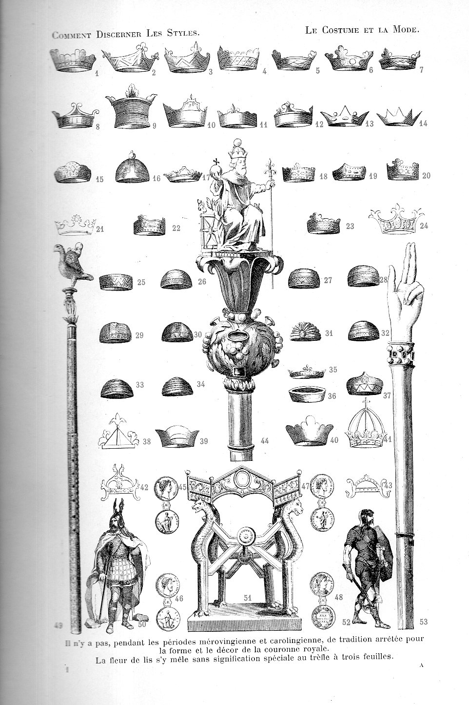
    This detail of a couer du sacre/hand of justice was a sceptre used in coronation in the years shortly after the reign of Charlemagne (d 814) and Charles le Chauve (d. 877, and sounding so much nicer than Charles the Bald). It is the last illustration on a 53-item engraved page displaying ancient crowns and tiaras in the very useful Comment Discerner les Styles du VIIIe au XIXe Siecle…etudes sur les formers et les Variations dans le Costume et la Mode, by L(eon) Roger-Miles, volume III, and published in Lyon around 1900.  Roger-Miles (1859-1928) was a fastidious presenter, and over the course of his work illustrated several thousand items of clothing and accoutrement. The reason I like this book so much I think was Roger-Miles’ success in arranging all of these bits on relatively limited space, and doing so in a clear, articulate, and artistic manner.  Here’s the full page of illustrations from which the sceptre was taken:

    Crowns 276

    [This is not the cleanest scan, but it is a thick book, and doesn’t want to be opened too broadly…]

     Even though there is a lot of material and many drawings on this sheet, there is still a very good amount of clean, unused space. 


  • The History of Lines: Representing the Unknown (1828)

    JF Ptak Science Books   Quick Post

    The History of Lines series

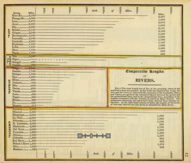
    This is another entry in a series of posts on maps and the representation of quantitative data, this one being early in the development of this genre of imagery.  The map (a little guy at 5×7″) is from An Atlas Accompanying Worcester’s Epitome of Geography, published in Boston by Hilliard, Gray & Co., in 1828. 

    Comparative River Hilliard detail

    [Source: Images of the Hilliard map found at David Rumsey’s map website, here: http://www.davidrumsey.com/luna/servlet/s/xz62g8]

    In the 46 river lengths displayed here, 45 have distinct measurements; one–the Niger–does not, or almost does.  The indistinct and suggested delineation shows what was know of the river, and what wasn’t, with bits on either side of the middle section (reached and surveyed by the fabulously-named Mungo Park, 1771-1806, at the turn of the century). Much of the Niger wasn’t well known at this point, though it had been plotted in part since antiquity–with all of that the overall length was well approximated (very close to its nearly-2500 mile length, the main river in West Africa).  The line/dot combination was an honest approximation of displaying the river’s length, and not often seen.  
    Rivers comparative Hilliard


  • Graphical Display of Data: Korean War Aircraft Production, 1950

    JF Ptak Science Books  Quick Post

    Information and Qualitative Display of Data Series

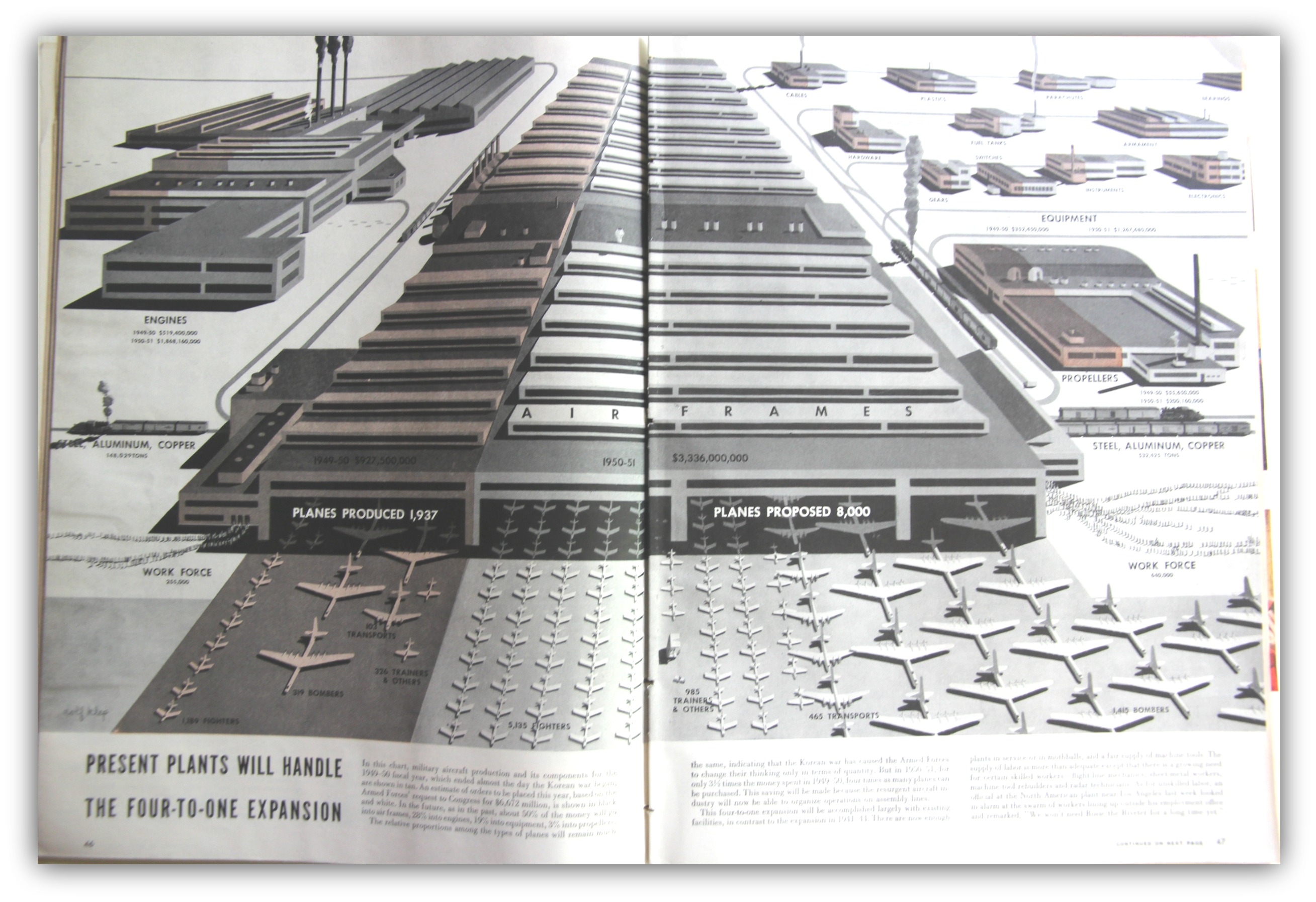
    As stated, this is a simple post of an interesting piece of graphical display of data, this time coming from Life magazine, August 28, 1950. It vividly compares the general production of military aircraft for 1949/50 versus what was coming in 1950/1.  We can see comparisons for budget, workforce, aluminum, copper, engines, and of course aircraft (trainers, fighters, transports, bombers), and shows the huge difference between the relative peace of 1949 and the beginning of the Korean War  two months earlier than this article in 1950.  

    Korean War Aviation[Source: LIFE Magazine, August 28, 1950]


  • Unusual Maps: US Financial Impact on the World, 1929

    JF Ptak Science Books  Quick Post

    Map finance 1929251

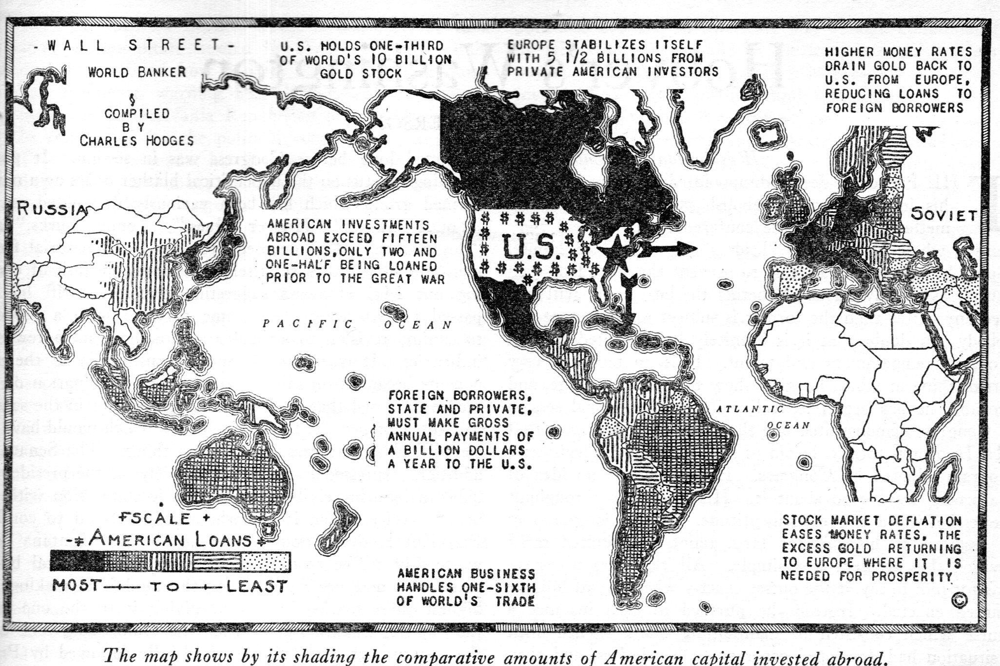
    By the time this map of U.S. foreign investments appeared in The Nation on December 4, 1929, the Wall Street Crash was 41 days old.  The giant ride to the top had pretty much dissipated by August 1929, and there was the beginning of the decline in September and October. October 24th was the beginning of the Great Crash–the 25th brought a glimmer of hope with buy-backs; but this was followed by Black Monday (the 28th) and then the bottom fell out of the bottom the next day (Black Tuesday, October 29).  There were some small fits and starts–at least enough for the columnists at The Nation to declare that the recovery had begum, as seem in a few articles in October–but they were sorely mistaken. 

    In any event, I haven’t seen this map before, and I thought to share.  


  • Blank and Missing Things: a Map of Missing People of Europe and Russia, 1881

    JF Ptak Science Books  Expanded Post 636 (from 2009)  Blog Bookstore

    The History of Blank, Missing and Empty Things (Thread, #45)

    “Heaven and earth were one form…. (then they were separated from one another…)”

    “The mind is its own place, and in itself can make a heaven of hell, a hell of heaven..” 
    –John Milton, Paradise Lost

    In ancient times the representation of the gods and beliefs was handed from one writer or storyteller to the next, on and on, changes here and deletions there, for many generations.  This practice was possible (necessary?) because there really wasn’t a solitary scripture to follow (as in the Koran or the Bible) and no priestly class to guard and cherish a particular strong story line in all of its barbed details.
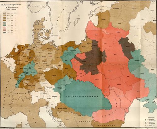
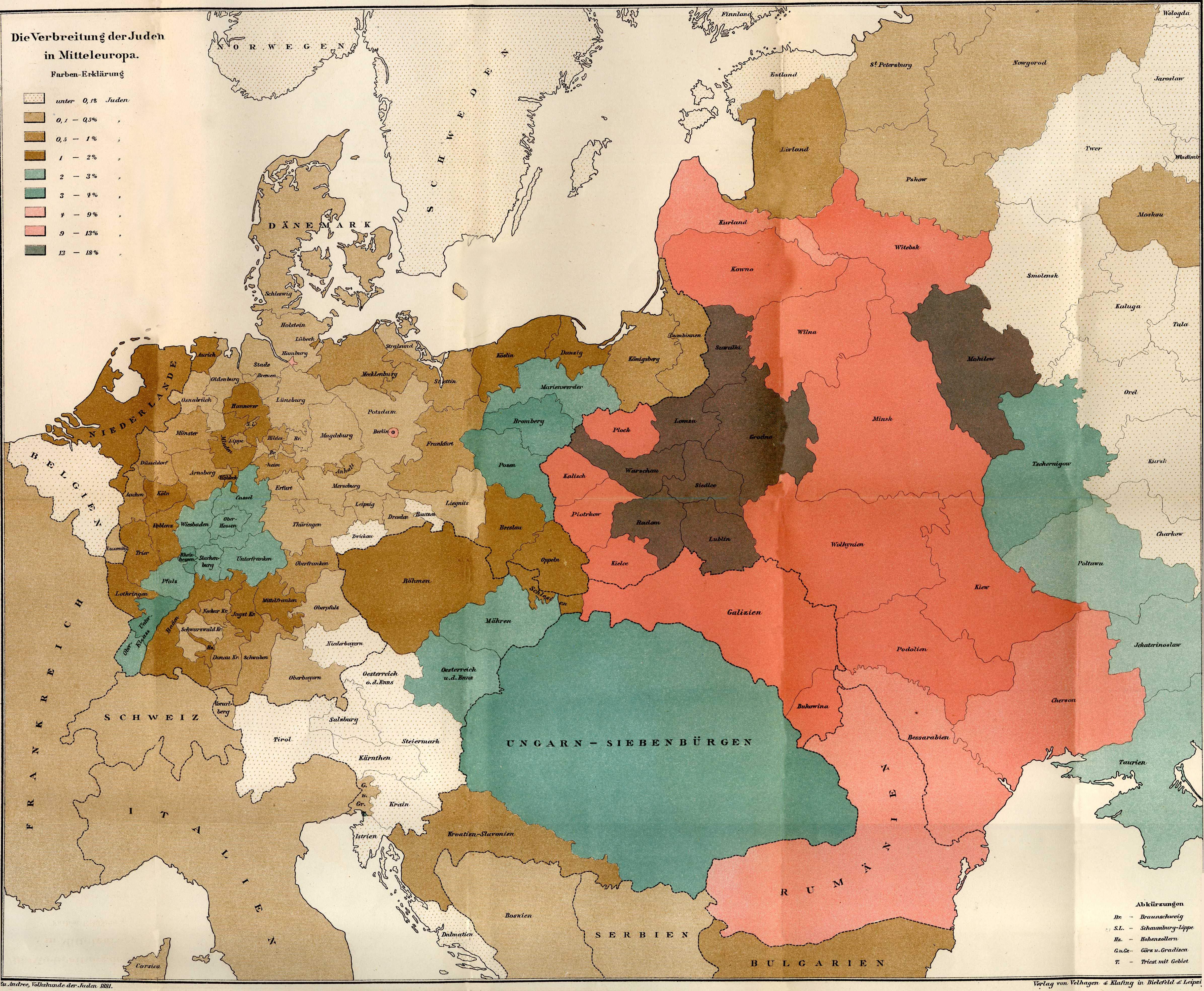
    Juden_1881  [Image source: wikicommons, https://commons.wikimedia.org/wiki/File:Juden_1881.JPG  The image is greatly expandable.]

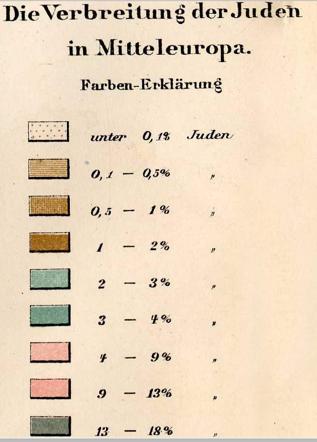
    And the key to the map:
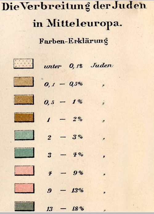
    Maps Jewish populations in Europe

    There are of course bits that have survived intact for millennia.  One of these is this fragment from one of Euripides’ lost plays (only 20% or so are complete), The Wise Melanippe, and begins a statement of cosmogony that states the creation of all things.  The separation of heaven and earth has always stuck with me, because this separation begins with Euripides with the creation of the world seems to continue on its way with mini-separations of all things over the course of time—like the cosmological world-bearing turtles—all the way down. 

    I’m not sure how or who exactly did this heaven-rending, or to what force it owed its being:  evidently the Presocratics tended to depersonalize the actions of the gods and grant their actions to natural forces, so the issue with the heaven-separation business may well have been a motive force rather than a god.  Anyway it’s the tearing apart, the removal, the separation phenomena that got my attention to begin with, and one which has stayed with me, though I’m sure that Euripides didn’t have that sort of violent rending in mind while describing the birth of the earth.

    And so it is with this map1 showing the concentrations of the Jewish people in Europe  in the late 19th century. Between the time of the publication of this map—1881—and the beginning of the Nazi regime in  Germany in 1933, there were many persecutions and Pogroms and deportations of the Jewish people.  Nothing prepared anyone for the concentration camps and the systematic extermination of that people between 1935 and 1945.  What this map shows is the distribution of the Jewish people (by percentage of the total population) before they were eviscerated:  the difference between this map in 1881 and the map of 1945 would be completely different.  The Jews were gone:  killed.  Some deported.  Others escaped.  But they were basically torn from Europe  in the cruelest manner so that in almost every case the only indicators of their existence were shadows. 

    There are large-scale maps of this sort of evidence for other groups of people in their pre-Euripidean tearing from their home:  maps showing the locations of Indian tribes in North America (pre-Columbian, 17th century, 19th century, they’re all telling pretty much the same devastating story) is one good example of a slender category.  There aren’t maps for the mass extermination by starvation created by Joe Stalin, or the millions murdered by Pol Pot or Mao.  There are of course more small-scale, localized maps depicting the results of forced relocations or devastating war or drought or hunger or floods.  But few, I think, take such a compelling x-ray of a people’s past on a continental scales such as this. 

    Notes:

    1. “Die Verbreitung der Juden in Mitteleurope”  found in  Richard Andree’s , Volkskunde der Juden…,  Verlag von Velhagen & Klefirg in Bielfeld und Leipzig:  1881. 


  • Skinny Data: City Populations, 1920

    JF Ptak Science Books  Quick Post

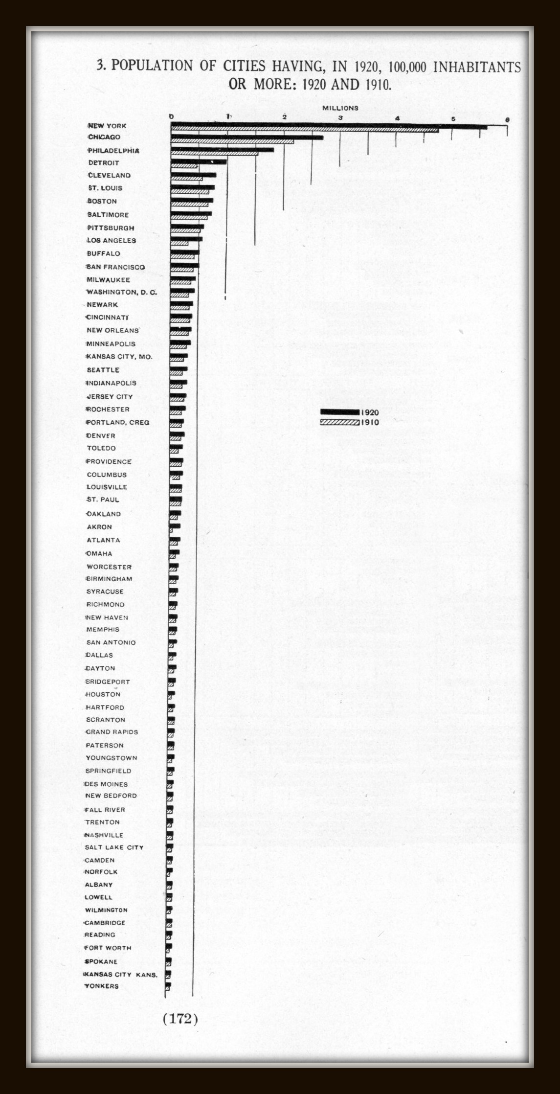
    This fine, odd, and aggressively progressive-towards-skinniness of a graph appeared on plate 143 (page 173) in the great series of data visualization classics, the Statistical Atlas of the United States, published in Washington D.C., 1924.  It is one of the simplest maps showing the development of the populations (compared to these extraordinary and classic attempts, here), and it is interesting to see where cities stood in 1920 relative to where they are today.  For example, Detroit comes up at fourth in 1920, Cleveland 5th, Pittsburgh 8th, Buffalo 10th, Milwaukee 12, Newark 14th, Cincinnati 15th–of these, only Detroit (#19) and Milwaukee (#28) break the top-thirty in the census for 2010.  

    Dataviz census 1920  city size241


  • “The Body as Army and Navy”, 1921–Mechanical Images of Sensory Capacity

    JF Ptak Science Books  Quick Post


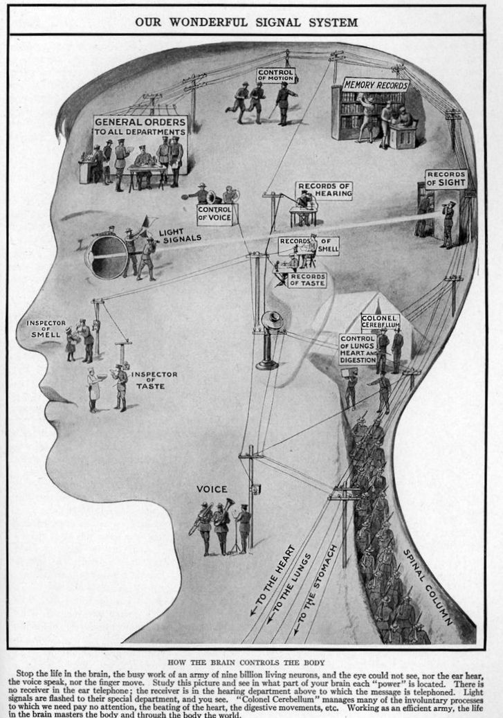
     These creative displays are found in Marion Florence Lansing’s The Wonder of Life (volume 11, Supplementary), published in 1921.  They represent a somewhat humanized-but-roboticized/automated approach to displaying he control of the senses, which seems to have been a developing style in the 1920’s giving the popular cultural appearance of mechanical people (the term “robot” appearing for the first time in this same year in Karel Capek’s play R.U.R.). The images also appear, appropriately enough, in the chapter titled “The Machinery of Our Bodies”. 

    Map of the senses


  • Children and Labor, 1910-1920

    JF Ptak Science Books  Quick Post


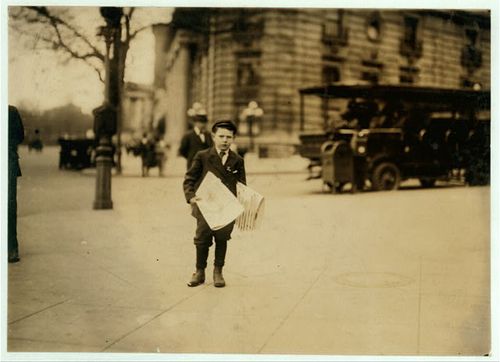
    Newsboy

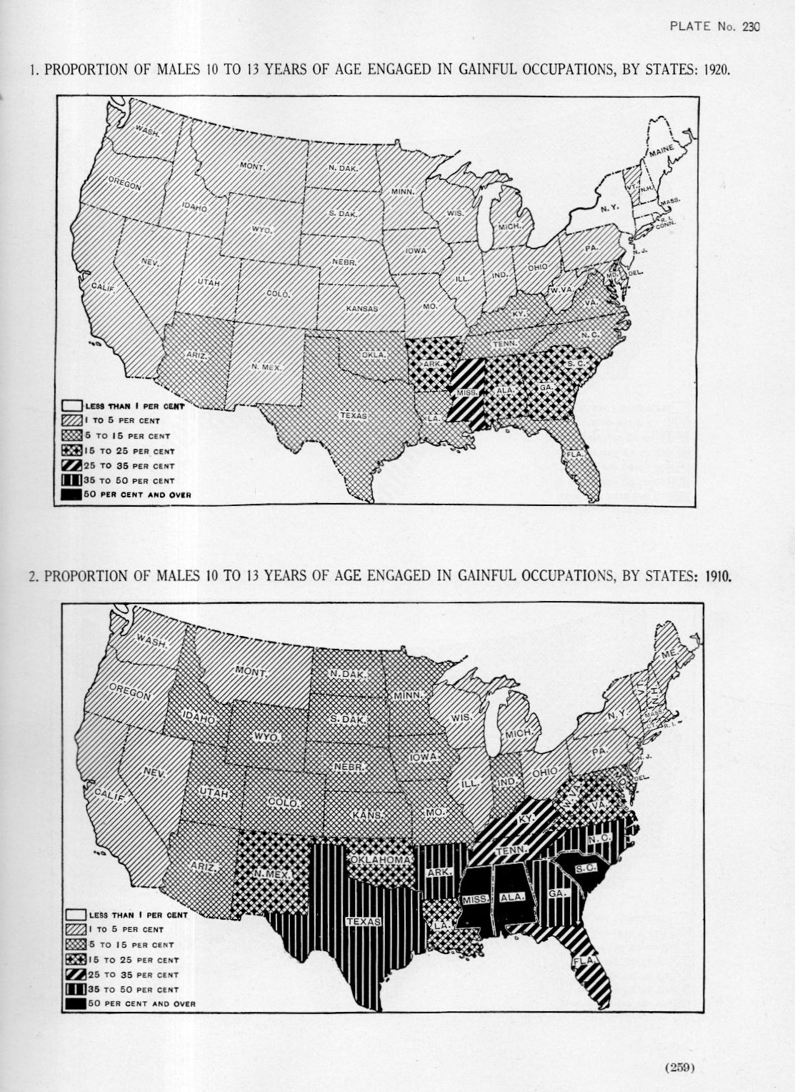
    Welcome to the not-too-distant past, the era of my grandmother, when in 1910 50% or more of 10 to 13 year-old boys in Mississippi, Alabama, and South Carolina were working, and working at real jobs.  There does seem to be a remarkable change in the employment situation in the next census of 1920.  

    [The maps below appear in Statistical Atlas of the United States, prepared by Charles S. Sloane, published in Washington, 1925, plates 230 and 232.]

    See some earlier posts on child labor: 

    among others…

    Maps employment children238

    Child work--childs creed


    Maps of the proportion of females 10 to 13 years of age engaged in gainful occupations, 1920:


  • Extraneous Alphabets: Imperative Incidentals in Dante. And the Devil.

    JF Ptak Science Books  Post 2533

    There is a peculiar beauty to discovering a sleeping obviousness–something that is so present and apparent and minor that it can present for a while before you suddenly recognize it, and then the obviousness is all that you can see. “Hiding in plain site” is something that it might be called, though I don’t think we have a word for it in English.  
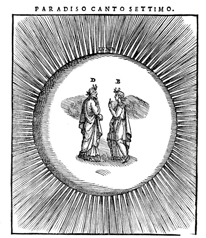
    Dante beatrice237

    Here’s an example of it, found in Dante. It may seem perverse to look at beautiful images like this/these illustrating one of the greatest stories that has ever been spun, but the tiny letters signifying the actors defined in the motion take on their ow unusual lives for me.  It seems very odd to identify objects that are so obvious and form the direction of the story and need no identification. (Some things need no introduction, like Dante and Beatrice, and Yogi Berra. (A friend told me a story of going to a function and being seated next to Berra for dinner, Yogi walking up to him and extending a hand saying “Hi, I’m Yogi”. No kidding?))  But I guess someone thought the notation was necessary, even if it both spoils and beautifies the simplicity of the design.  

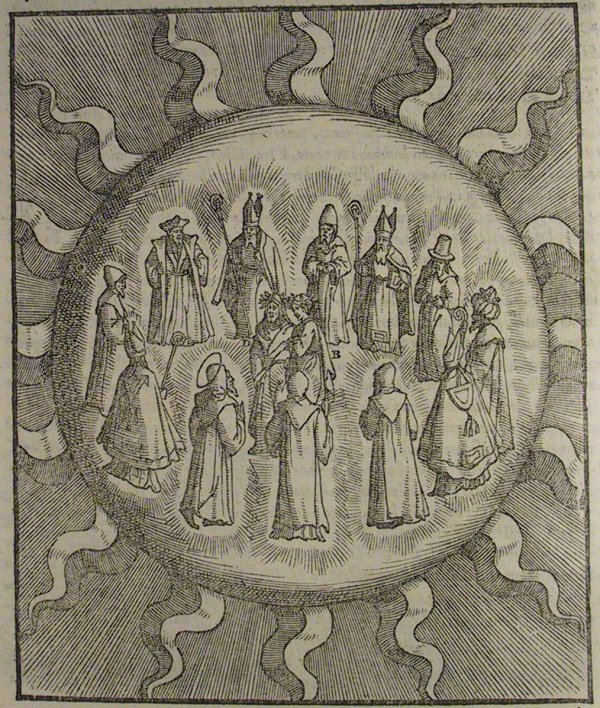
    The edition of Dante is by Alessandro Vellutello, (La Coemdia con la nova espostione de Alessandro Vellutello…published in Venice in 1544) who extended himself to include the (87) illustrations that I just mentioned, and included a text full of glosses. No doubt the signifiers in the illustrations are aids to the supplementary text–still, they seem to be fairly unnecessary. 

    • Here’s an entire gallery of the Vellutello illustrations at World of Dante, http://www.worldofdante.org/gallery_vellutello.html

    Dante sun big

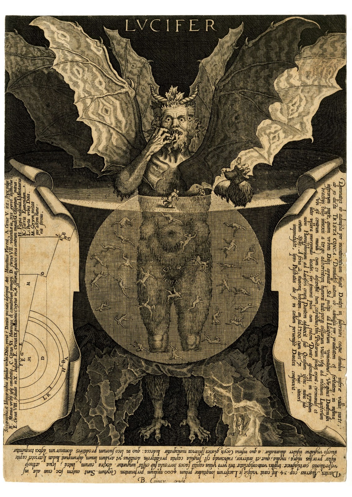
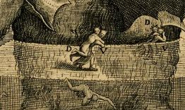
    That said, most of the time I appreciate the annotated image (speaking here of the non-technical/scientific ones)  mainly because without the help the iconography sometimes escapes me.  The Vellutello illustrations are much more “modern” than previous illustrations made for Dante, and seem to bridge the centuries of differentiated understanding so far as the interpretation of the images are concerned. On the other hand I appreciate the effort made for explanation in the engraving by Cornelis Galle of the Devil as it lived and breathed in Dante, the help coming in many forms. For example, without the annotations I would probably never have noticed the “D” and “V” figures (Virgil carrying Dante) so I  am thankful for the help:

    Lucifer

    Lucifer detail


  • WWI Endgame Dataviz, 1918

    JF Ptak Science Books  Quick Post

    DATAVIZ Bombs230

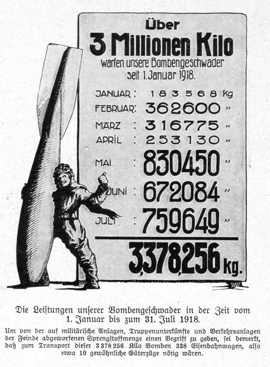
     I found this interesting graphic in the Illustrirte Zeitung (Leipzig) showing the production of bombs in Germany for last half-year of WWI. The aviator seems happy enough, at least for the readers of the magazine, reassuring that something was goign on in the defense of the country, even though the writing was pretty much on the wall when this image appeared in late August, 1918, six weeks away from the end.  It is a small graphical display–about 2.5×4 inches or so–and it is a congratulatory message on the massive amount of munitions that were produced from January-July 1918.  This was one among many that just wasn’t enough.  

    DATAVIZ Bombs229