A Daily History of Holes, Dots, Lines, Science, History, Math, Physics, Art, the Unintentional Absurd, Architecture, Maps, Data Visualization, Blank and Missing Things, and so on. |1.6 million words, 7500 images, 4.9 million hits| Press & appearances in The Times, Le Figaro, Mensa, The Economist, The Guardian, Discovery News, Slate, Le Monde, Sci American Blogs, Le Pont, and many other places… 5000+ total posts since 2008.

Category: Art History

  • The Heaven of Disappeared Details

    JF Ptak Science Books   Post 1528   Part of this blog’s Blank, Empty & Missing Things series.

    What is the opposite of “the Devil is in the details”, without getting too terribly religious? Expressing detail in the history of art has been a progressive process, and perhaps in some sense that is what art was all about–adding detail, becoming more representational, more life-like, more expressive of the world and nature.   Perhaps that is what one essential element of art was all about for hundreds, or thousands, of years–a progression that marched its way through time with greater effectiveness and representation, for the most part, until relatively recently, when–in the early part of the 20th century–details began to disappear, until in some cases there were no details at all.  Or at least the details that people had been comfortable with for so long, like folds in dresses, or lustre in eyes, or thinness in clouds, or even the correct perspective in the re-invention of three-dimensional representation. 

    http://www.moma.org/collection_images/resized/042/w155h170crop/CRI_211042.jpg

    Detail changed with the  Romantics, and then definitely with the Impressionists, and then on into the the Cubists and the Abstract,  until the detail of what we would recognize as elemental objects would disappear altogether.  Corot, Cezanne, Gauguin, Whistler,  Seurat, Van Gogh, Picasso, Braque, Duchamp.  And then everything goes away with Kandinsky.  1911.  Details of references to the physical world slipping away into general sense impressions.

    It would probably make more sense to look at the Kandinsky at this point–I’d rather look at the Pierre Bonnard (1867-1947) and his La petite blanchisseuse (Roger-Marx 42, also known as the Small Washerwoman).  The wide expanse of her black working gown is a primary link to solid blankness, without detail of nearly any sort, missing parts of reality, allowed to go to Disappeared Detail Heaven.

    Photo

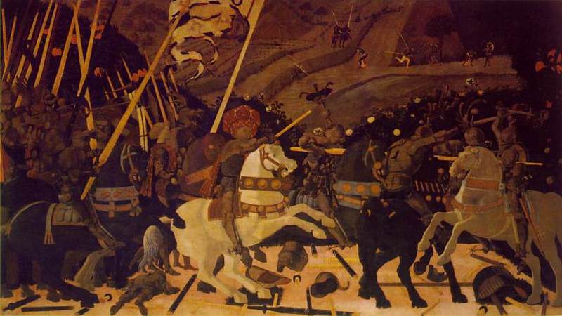
    The occupants of the Heaven was begun centuries ago, though the details banned there on purpose really only begins in earnest with the missing details of the solids in (Paolo)1 Uccello.  This great master (dissed terribly by Bernard Berenson I don’t know why) was one of the very few exceptions of artists who purposefully banned details from his work, just as the reality of the world crept deeper into the works of the late Siennese masters pointing out the details of their rediscovery of perspective. 

    There would be a long period in between Uccello and the other detail disappearers. 

    _____________

    1.  The phrase “the solids in Uccello” comes of course from the Great American Novel, William Gaddis’ The Recognitions, discovered and shared to my by the lovely Patti Digh. In some of his enomrous cnvases it is quite easy to find wide expaneses of nthing where detail should be…


  • The Eyes of Hank Quinlan–Touch of Evil, 1958

    JF Science Books    Quick Post

    Hank Quinlan: Come on, read my future for me.
    Tanya: You haven’t got any.
    Hank Quinlan: What do you mean?
    Tanya: Your future is all used up. –from Touch of Evil, 1958  (Hank was played by Orson Welles; Tanya, his once-upon-a-time squeeze, by Marlene Dietrich.)

    http://parallax-view.org/wp-content/uploads/2008/10/touch-of-evil-quinlan1.jpg

    This has been one of my all-time favorite films, though I don’t want to actually see the thing too often.  It is sharp as glass, with hardly any grays in sight, mostly oblique black and white, giving the film a very “removed” feeling, cold, isolating.  Orson of course is a magnificent beast, the enormous shell of a spent bully with virtually nothing left to move around except for his undulating fat and a sliver of power, wielding that jiggly memory with eyeballs so puffy and dead that I do not know to this day how he achieved that pus-y look.  His entrance into the film is remarkable–big black car door opens, and the gigantic Orson pulls himself out, his pig-bristle slough-eyed face way too close to the camera for comfort.

    It is an odd movie, but just about every still you see from the thing is like a stand-apart photograph, a movie composed of 55,000 individual images.

    http://www.moviezeal.com/wp-content/uploads/picture-2-300x256.png


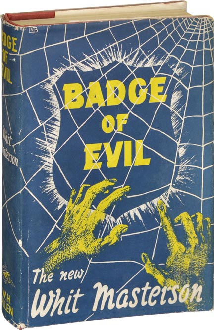
    Badge of evil The screenplay was written by Welles, though it may have been influenced by a novel by Whit Masterson (actually a pseudonym for another pseudonym, Wade Miller, which was the entity of Robert Wade and William Miller, which is entirely  too much rigorous hidenness for such a modest effort) called Badge of Evil (1956).  This doesn’t matter; the whole deal about the film is the brain behind the staging and filming, which belonged of course to Mr. Welles. 

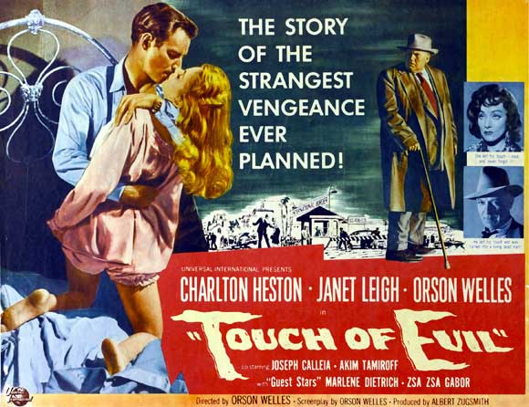
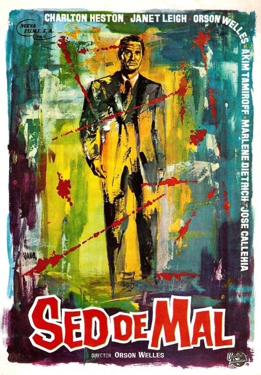
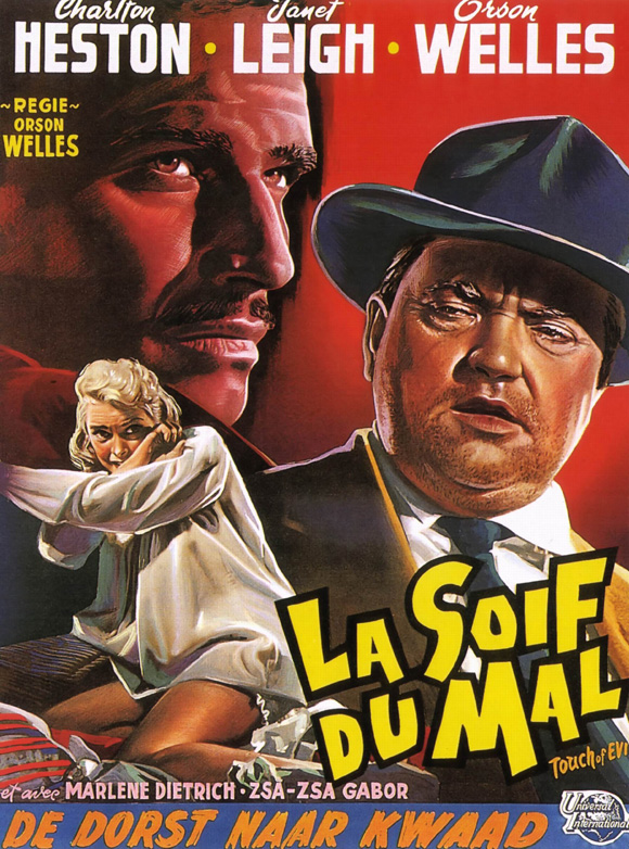
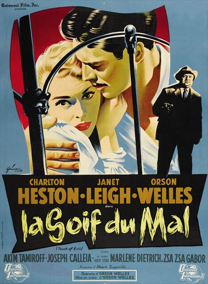
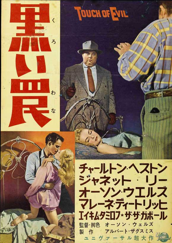
     All I really wanted to do with this piece today was post a variety of Touch of Evil movie posters.  Here they are:

    http://upload.wikimedia.org/wikipedia/en/f/fe/Touch_of_Evil_restored.jpeg

    This isn’t the entrance I was talking about–can’t find it–but this view of Orson is pretty good (comes at about 3:30):


    Touch-of-evil-movie-poster-

    Touch-of-evil-movie-poster-1958 d
    Touch-of-evil-movie-poster-1958

    Touch-of-evil-movie-poster-1958-
    Touch-of-evil-movie-poster-1958-g
    Schwartz: Well, Hank was a great detective all right.
    Tanya: And a lousy cop.
    Schwartz: Is that all you have to say for him?
    Tanya: He was some kind of a man. What does it matter what you say about people?


  • German Art Between the Wars

    JF Ptak Science Books  Quick Post

    As it turns out there is a low-level significant assembly of published German art and book covers here in the Rancho Deluxe–its not a collection because that would imply too much order; it is barely an assembly.  There’s just a lot of it here, segregated, because I liked whatever it was/is.

    These are some examples of a life-underground, or underground actions, that appeared in the pages of the great illustrated newspaper, the Illustrirte Zeitung.

    German between th ewaqrs526
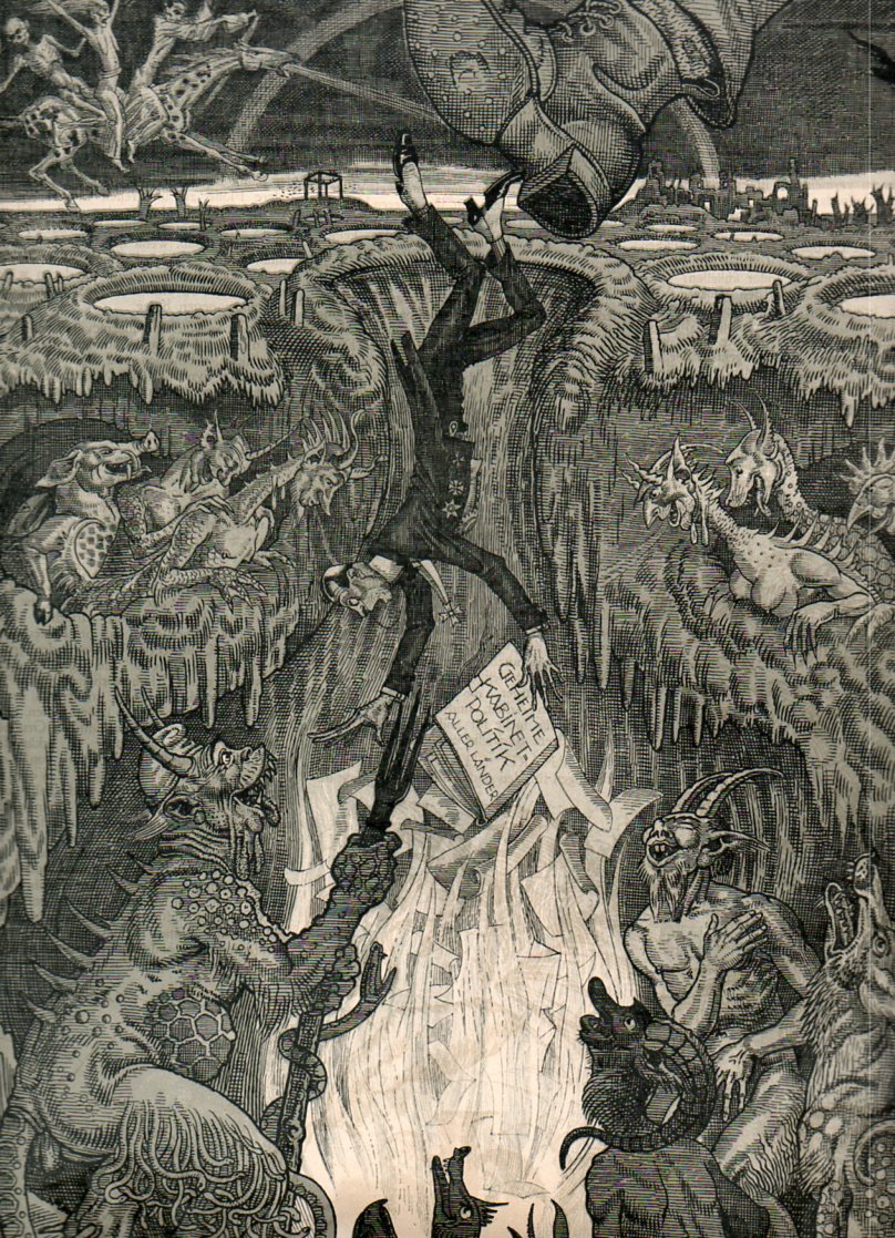
    The first is by Willi Munch(-khe), a Jugendstil artist (1885-1961), a very expressive, and dark, interpretation of what should be done with German politicians in the ripe days following the end of WWI.  This image, published aorund 1922/23, shows a decorated and fancy spats-wearing politician being booted into the hole of hell.  The book he is carrying (Geheme Kabinet-Politik Aller Landes/Secret Political Rules of Our Country or thereabouts), seems to be broken, its pages spilling out to feed the fires of the nasty inferno, lighting and heating the way for the failing pol as the devils and monsters await his arrival, much to the controlled agreement of the monster-y spectators in the hell galleries. 

    German between th ewaqrs527

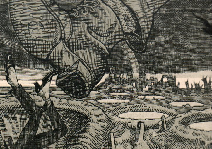
    We can guess why the man/symbol is being sent to the ring of fire–the tattered, worn, hobnailed boot with the old patched pants above, the myriad of tombstones, the water-filled bomb craters,m the completely shattered trees, the bombed out cities, and of course the witches and death riding a speckled fire-breathing horse in a dark sky, pretty much round out the picture of “why”.  Several years after the end of the war and into a problematic realm of the democratic Weimar Republic, and just freshly into the hyperinflation that wiped out whatever the middle class had managed to save (banknote denominations climbing to literally astronomical levels, reaching 1×10¹⁴), there was a lot to complain about. 

    ·Posted by :

    ·in:

    — —

  • The Unbearbale Lightness of Nerves, Homer Simpson Hair, & Rhino Chins of the Renaissance, Part I

    JF Ptak Science Books   Post 1480

    In the structured and orderlZocchiy world of Renaissance painting and illustration I find the semi-wild, stringy, lonely, unruly strands of this and that, the minor elements of an artistic composition, to sometimes be most interesting.  This is so mainly because they could be considered ephemeral pieces of the work, minor additions to a developed scene, not particularly necessary to the whole.  But they there are, and sometimes they are highly unusual.  In the larger scheme of things these elements can be background or foreground figures, sometimes added for the purposes of scale in what is supposed to be an architectural study–but there are times when these small figures, sometimes occupying perhaps a tenth of a percent of the illustrated scene or less, are given vast and vivid lives by what may have been an engraver desperate for a little artistic freedom.  And so that’s why we see unusual aspects of the population peopling-up a city square scene, showing off a town hall or cathedral. 
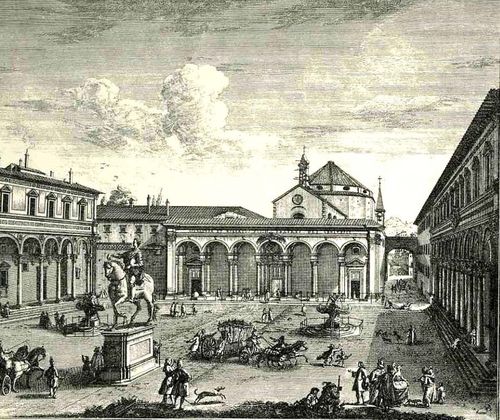
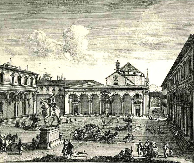
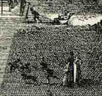
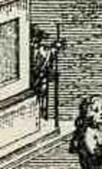
     For example in the engraving Veduta della Piazza della SS Nunziata Statua Equeftre di Ferdinando Primo, Fonti, e Loggie Laterall by Giuseppe Zocchi (1711-1767) it would’ve been easier certainly to leave the plaza empty, but Zocchi doesn’t, filling in the empty spaces with several dozen people, most of  whom are really rather busy.  In addition to royal coaches and animated discussions, we can find a number of unusual images.  There is a very curious sub-scene of a women with three children, one of whom seems to be falling, or leaping, the woman holding her hand straight out in front of her.  Directly above them we can see a man pulling a small carriage with another person in it.  Is this person a child?  Are they elderly?  Infirmed?  And what about the (probably elderly) figure who we can half see, leaning their back against the equestrian statue, holding a staff?  Why bother adding half of figure (from the rear)?  Why on earth did Zocchi choose to add
    Bloglooking_closely_1__carriage_2
    characters like these when it would be substantially easier to show a gent walking with a stick?  Is the artist expressing a little semi-invisible artistic freedom, or just using his powers of observation to make the commissioned part of the art more interesting?  Or perhaps Zocchi has nothing whatsoever to do with these tiny figures—perhaps it is all the work of the engraver, who was responsible for translating Zocchi’s paintings into metal, adding these figures as he went? 

    I think it is fascinating!  Perhaps what the story is here is that these were really just simple street scene, common street life, and the artist simply included them in the work?  That would make them 18th century snapshots of common life in Florence, something that wasn’t ordinarily captured by very many artists at all.
    Bloglooking_closely_1__man_caneWhat I’d like to look at today seems even more ephemeral than found people in town squares–it is, quite literally, the smallest bits of the artwork:  the dissected tendons, the hair on the remaining skull of Death, the stubble on the chin of a rhinoceros, and to look at the great liberty and beauty with which these fragments are represented, particularly if they are lonesome, segregated things of high simplicity.  Lean, articulated, severe, lonely, small elements.

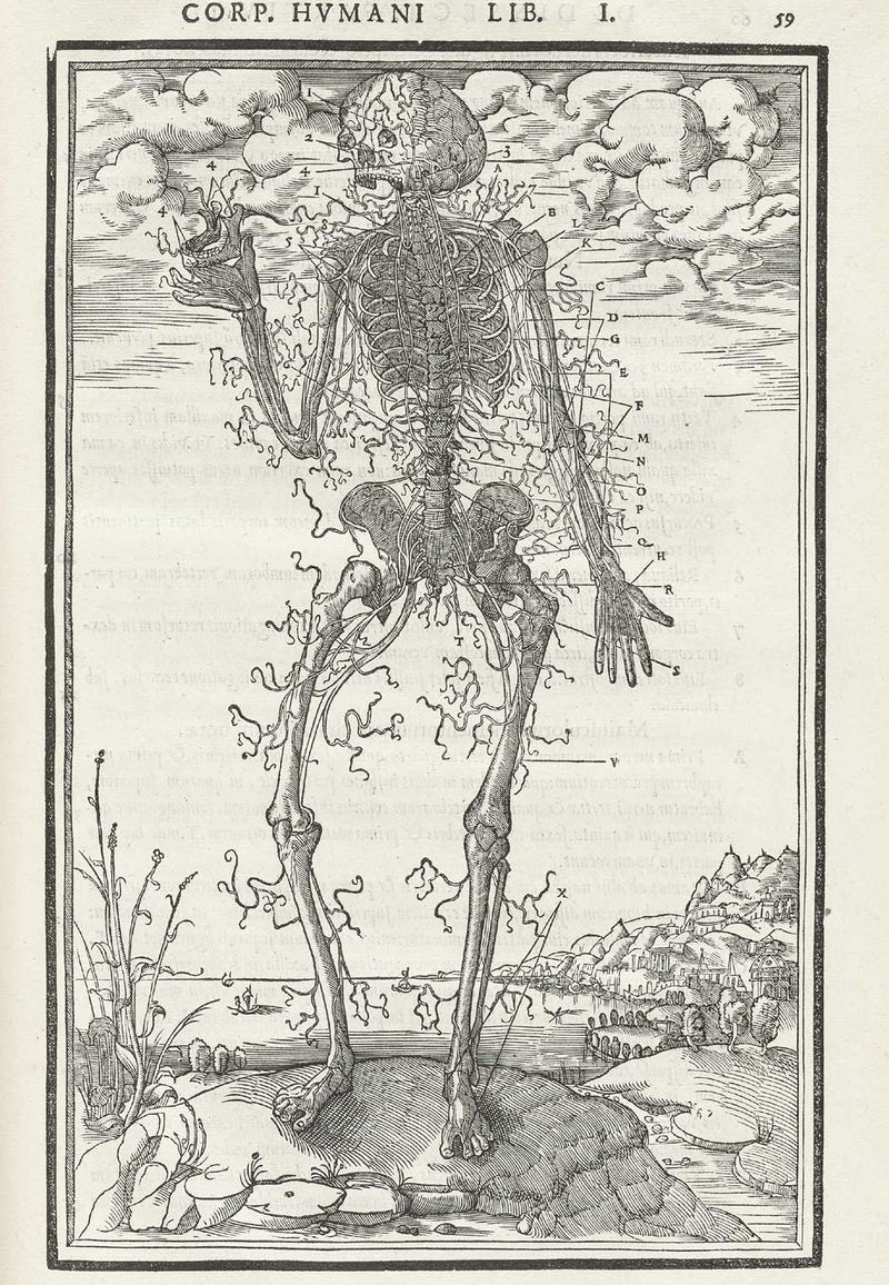
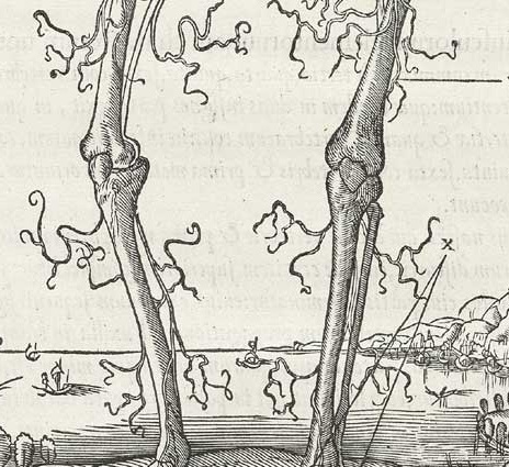
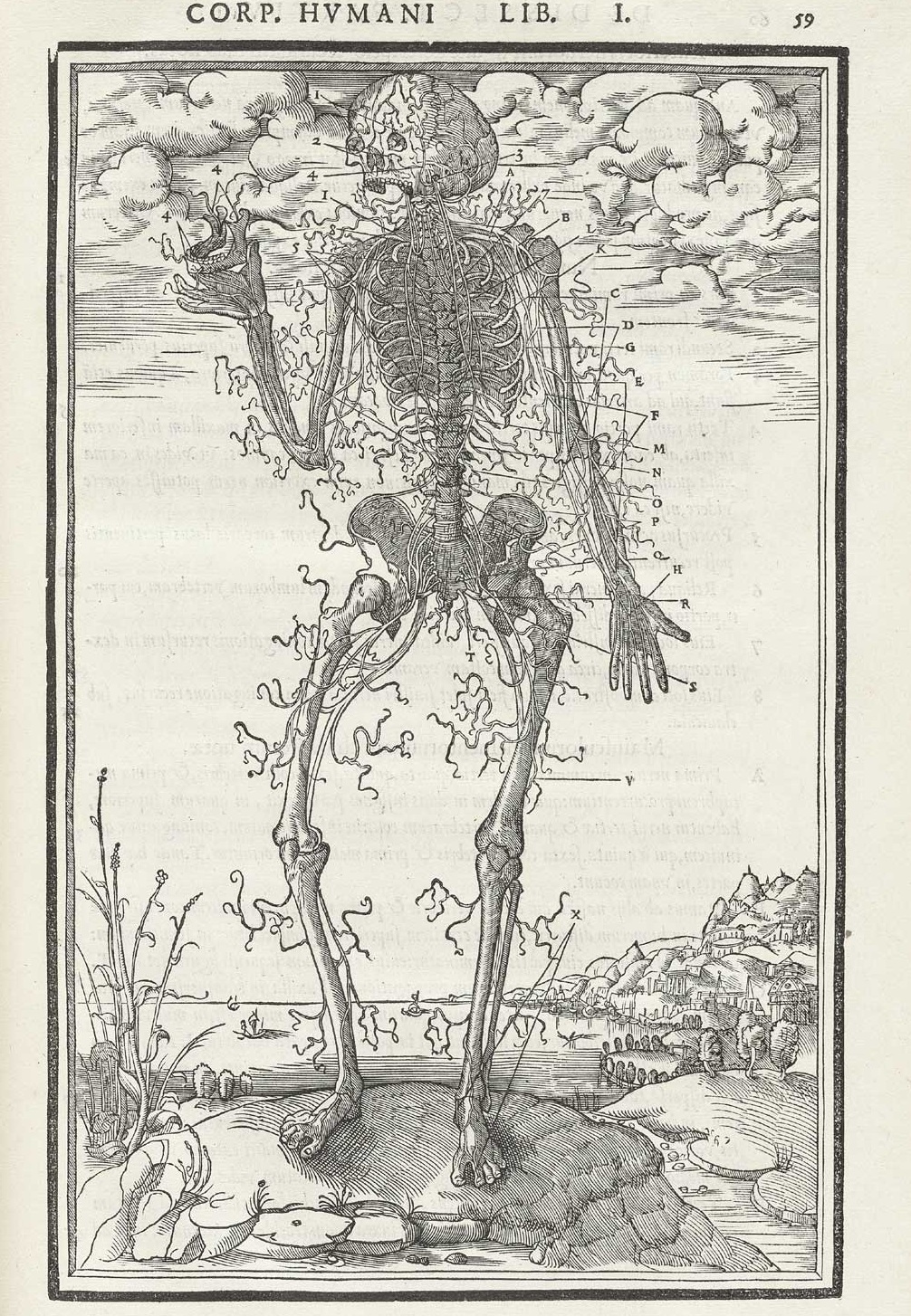
    The first example comes from Charles Estienne’s De dissectione partium corporis (“On the dissection of the parts of the human body”), which was printed in 1545 and which was very nearly the first truly extraordinary anatomy book, almost beating Vesalius to the punch, had it not been for some printing foibles.  One of the illustrations that I’m focusing on is his dissection of nerves, the spindly, flowing ones being cutaneous nerves that supply skin sensation (thanks to Alex Baker for the correction!) , which look for all the world to be beautiful dendritical elements being blown by a breeze, maypole wrappings come undone, celebratory flags…something beyond tendons.  I know that the artist and designer are simply trying to show the reader their structure and so it makes sense to display them like that, but they have a certain classical beauty in their representation that seems far beyond what might be considered necessary for the task at hand. 
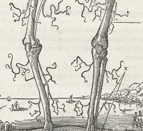
     

    Estienne_p059 b
    And the full image:

    Estienne_p059

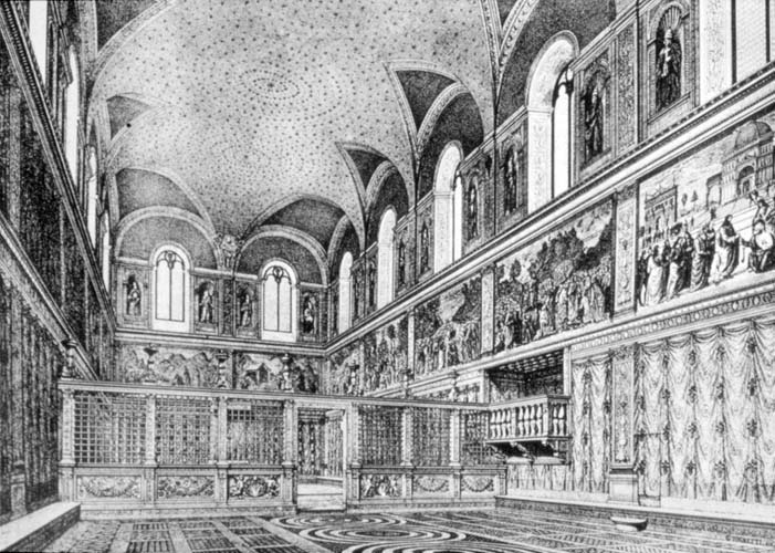
     This is completely different from sparse and the orderly control of empty space; nothing at all like, say, the Sistine Chapel ‘before”, with its ceiling beautifully and lightly decorated with stars (I guess gold on a sea of deep blue?):
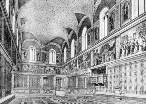
    Sistine

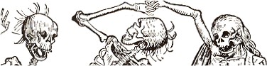
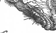
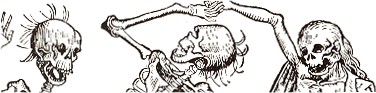
    I have found a number of examples of little bits of hair dancing on the top of its head (or skull) as though the few strands were luxirant manes floating in oil like a halo around the lucky owner–but no, our artist (below) depicted one of Death’s mortal victories in vestigial Homer Simpson-like lonely hairs.
    Death hair2

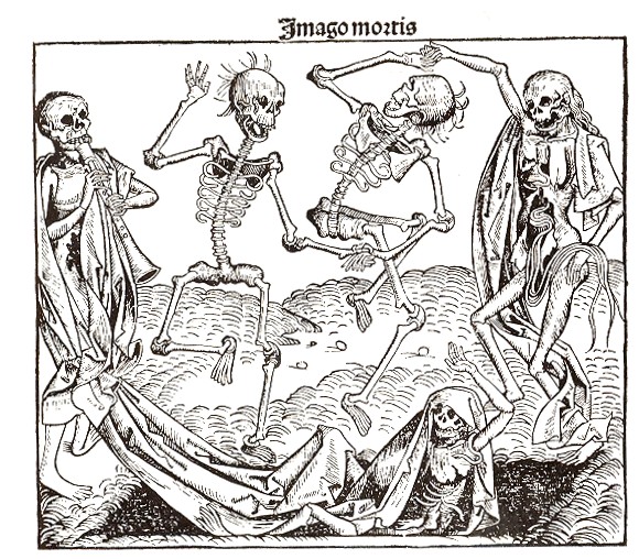
    The full image (below) is called “Imago Mortis”  (the World of Death) and appears in Hartmann Schedel’s Liber chronicum (more commonly known as the Nuremberg Chronicles), one of the greatest illustrated (or certainly the most lavishly illustrated)  books of the 15th century.  Printed by Anton Koberger in Nuremberg on 12 July 1493, the Liber chronicum was basically just that, a walk through the known and imagined knowledge of the mid-Renaissance with the great humanist Schedel acting in the role of conductor.  There’s certainly much of interest and disinterest in this book; Schedel was not afraid to make a guess (and even a wild one) when facts didn’t fit or were unavailable.  (For example, he famously re-used the same view of a city to illustrate different cities.)  But for my lowly interests, its the hair of Death that interests me.

    Death hair
    And just in case you don’t know the “Homer Simpson” reference:

    Hair homer
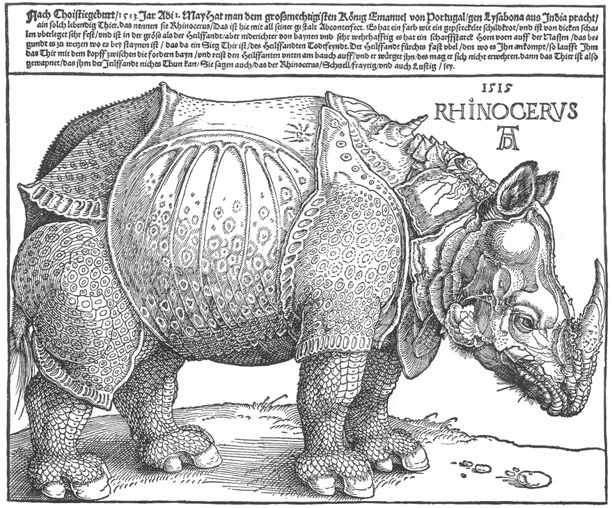
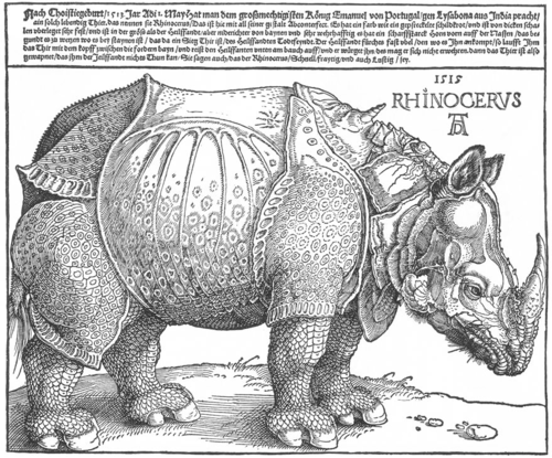
    Albrecht Durer does manage to come into play here, if not for some of his trees or the bits of string that he renders holding other bits aloft, but for his famous if not-terribly-original rhinoceros, which he had never seen though which he had seen images of, and for which he had taken the trouble to include the beast’s chin hairs:
    Dürer_rhino_full det

    Dürer_rhino_full
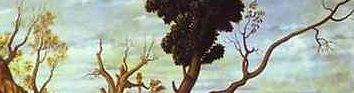
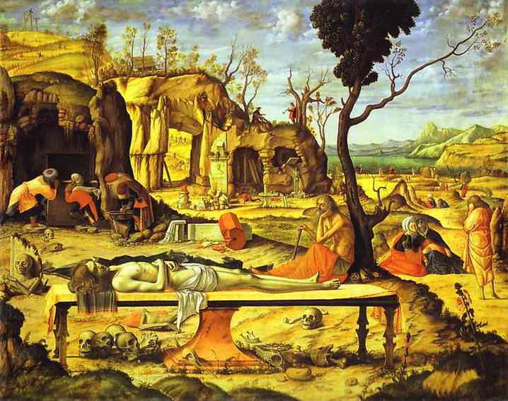
    And another example, this times for trees, in Carpaccio’s Mediations on the Dead Christ (Berlin), where we see the sparse and gangly dendrical-like bits on the trees on the hill in the background, as well as on the dead branch of the half-dead tree in the foreground:
    Unbearable tendons  carpaccio detail

    Unbearable tendons  carpaccio
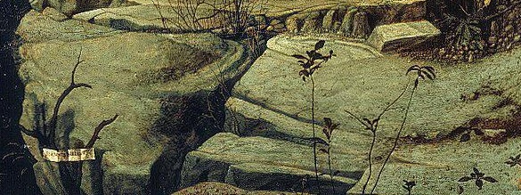
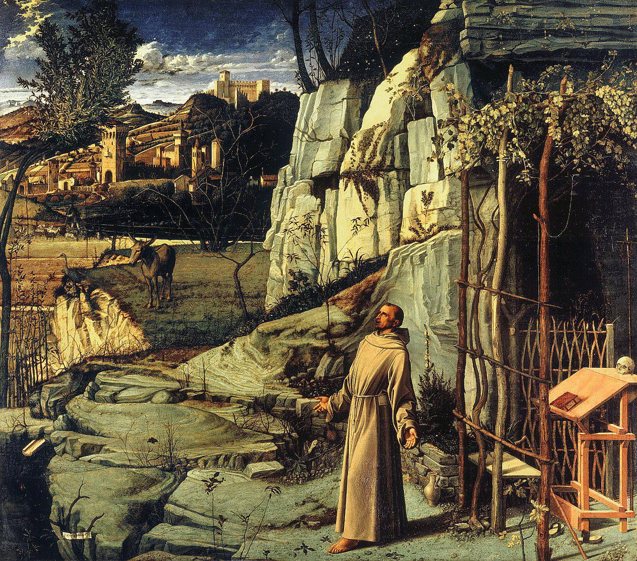
    This sparseness is almost there but not quite so in Bellini’s Stigmatization of St. Francis, which is in general a very dense composition with many competing elements, perhaps making the foreground weeds a little more singular:
    Unbarable  st francis detail

    Unbarable  st francis

    This uniqueness extends too into the geological strata foreground of Mantegna’s Madonna of the Quarry, or rather to the shelf of ground on which the Madonna stands. 
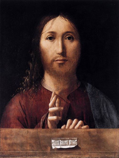
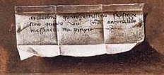
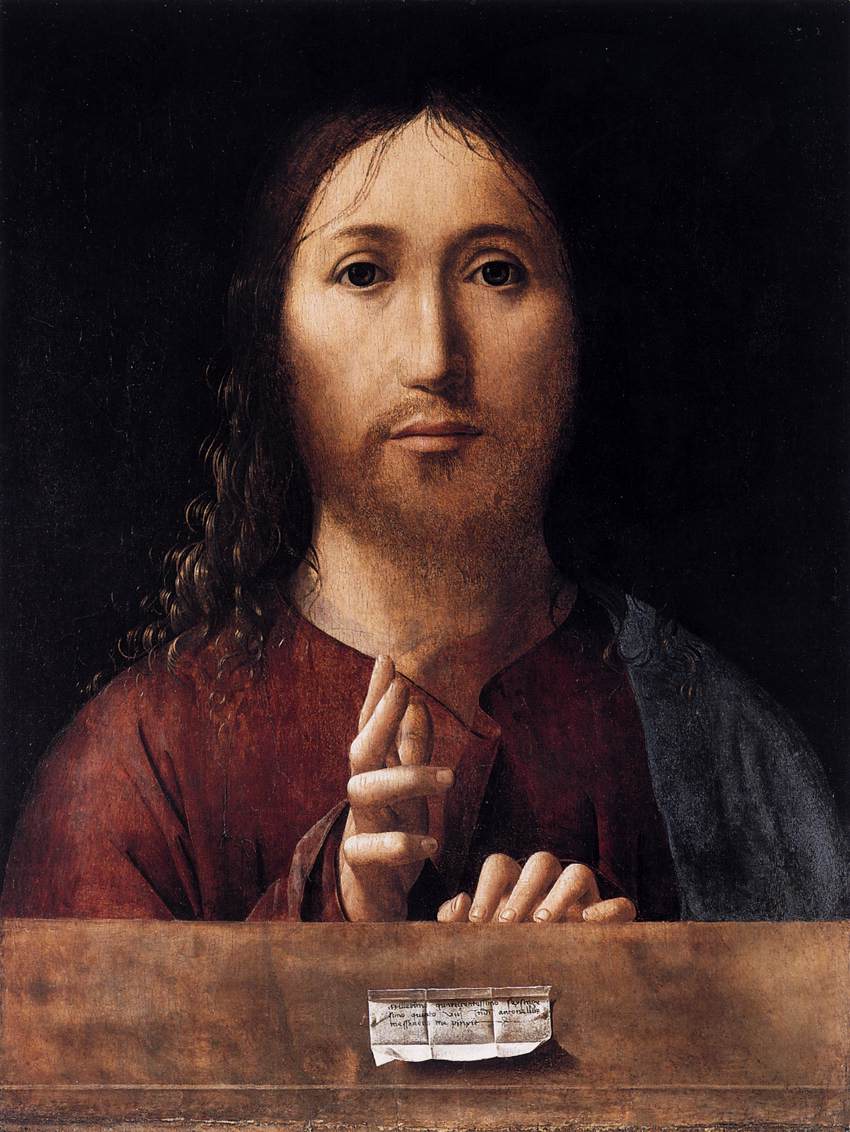
    This sort of solitary expedition into spareness and quiet can be found in many places, if you just look for it; for example, in the bit of scrolled paper used as a small trompe l’oeil in Messina’s Salvator Mundi (1465):
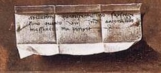
    Unberable  messina b
    a detail from
    Unberable  messina
    as can be seen in many paintings over the centuries…
    End Part I.

  • Species of Explosions: Human Anatomy, Explained

    JF Ptak Science Books   Post 1479

    Anatomia universale... by Paolo Mascagni and Antonio Serantoni

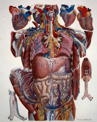
    Species of explosions come in all sorts of shapes and sizes, and basically release some sort of energy (chemical, nuclear, mechanical and so on), but in the cases we’ll look at here they are none-of-the-above.  The energy released in these explosions are in the form of potential, a knowledge-driven, controlled and reversibly ordered demolition, a deconstruction in slow motion.  The medical “explosion view” for the study of anatomy is a remarkable thing, especially when you considered not only the pre-Cat and pre-MRI times, but also the pre-Xray (1895) days of imaging the inside of the body–the images not only show you the bits and pieces alone but also in relation to the other bits around them.  The body becomes an archaeological dig, each level preserved so that a viewer could easily see the dependencies and relations between one thing and another. 

    Take for example Paolo Mascagni’s (1755-1815) beautiful Anatomia universale (an example seen above), which was printed in Florence in 1833 and has the look and sensibility of something much later.  Mascagni is able to achieve this depth not only from the exploded view, but also for the (somewhat exaggerated) coloring setting the specimen on top of a blank background the combination of the color and the background giving the whole thing a 3-D-ish feel–and if not that, then certainly a living image in which there is some fair amount of depth. 

    Anatomy exploded
    Another version of the exploded view which is also quite effective from the same work by Mascagni is his “exploded thorax”, showing a more limited display of the more closely-aligned organs. 

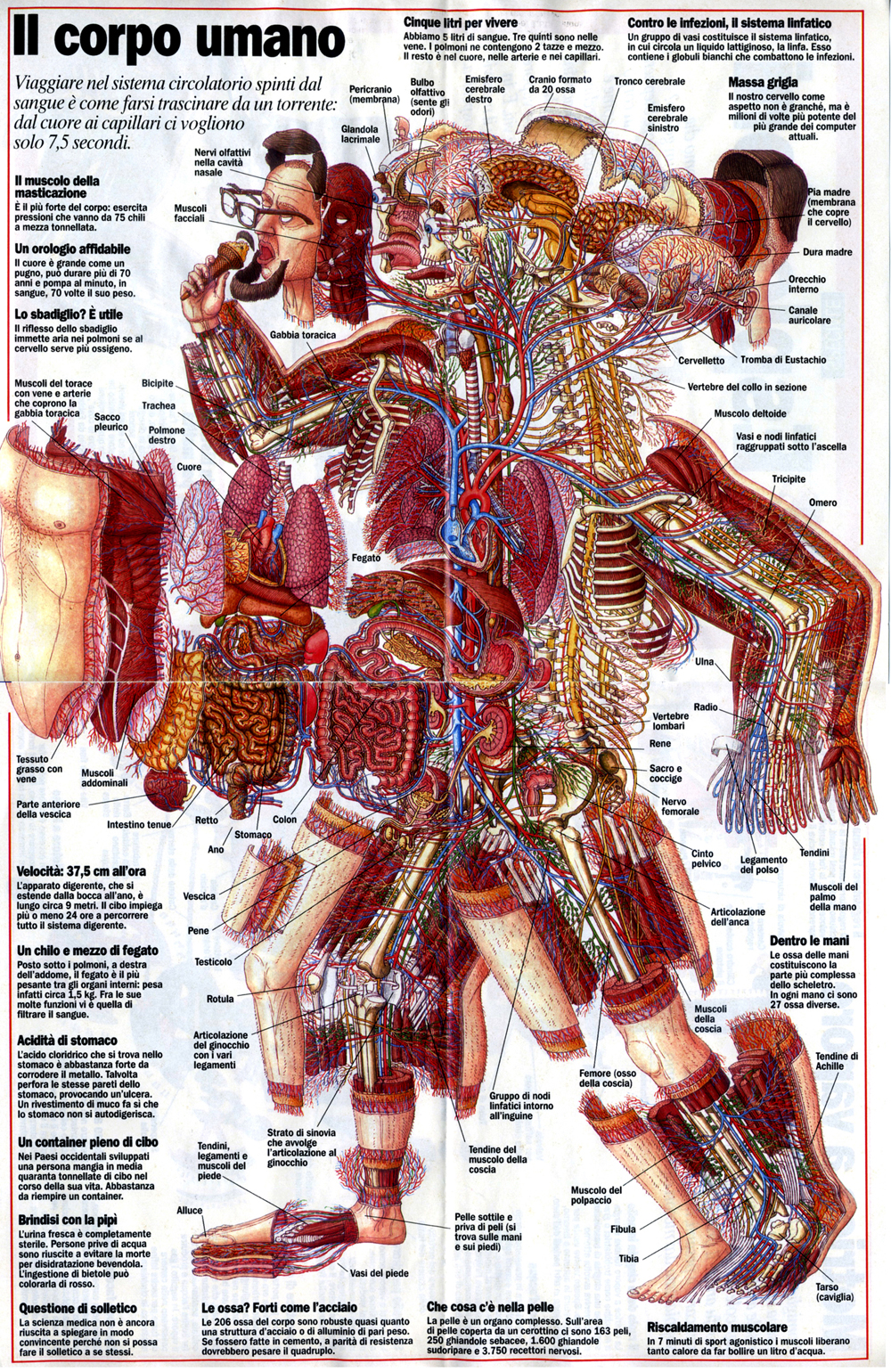
    When these views appear today–which is generally much more uncommon given the other technical ways of envisioning multiple layers of complex associated items–they have more of a sense of the antiquarian, retro feel to them, though they are no less useful for it.  As a matter of fact  I still prefer these views for understanding technical and engineering  and architectural complexes than anything else. And the modern master of this genre for me is Stephen Beisty, who performs his magic mostly in the tech and engineering fields, but who occasionally dips into the messy wet stuff of biology, as we can see in this fabulous exploded view:

    Anatom exploded beisty

    There are of course many other examples of (drawn) exploded views in the history of anatomical illustration, but I think these will do for now as good examples of the art.


  • Things-out-of-Place Department: Books in Anatomies and Bridges in Impressionist Paintings

    JF Ptak Science Books   Post 1478

    I’ve been making a few entries over the last few days on antiquarian anatomy books, and wonder now about books in anatomies. I’m not certain what the appeal is, but it has a strange and immediate affinity for me to bridges in pre- and early Impressionism, a direct line to these bridges and to the other technological and engineering entities that were depicted in these canvases.  I’m not sure what the connection is to the two outside of the obvious verb-y part of “bridge”, but there seems to be an innate connection between the two, for me.  Somehow the book shouldn’t be of interest to the lifeless and dissected cadaver, but it is, and images of the two together turn up here and there in the history of anatomical illustration.  As much as the anatomist and artist work together to try to remove their subject from the confines of a book so that their work is freer and more accessible to the reader, to remove the illustrations from the pages of the book in which they appear, they do sometimes employ the image of the book to make a more prosaic and allegorical point.And as the object of design and wonder and beautiful geometry, one might think of the bridge as a object in Impressionist paintings from that movement’s earliest periods would be not quite the sort of thing that would be the subject of as many paintings as they were.  The unnatural angles of their supplementary parts  seem to make them not quite the fit for the early Impressionists.  But they were, and probably so for their 90-degree assaults on the natural landscape. 

    Perhaps what I think of the aesthetics of the treatment of bridges during the Renaissance, and the adoration of the Rialto and Pone Vecchio and all the rest, just wouldn’t make their way to the Impressionists’ canvases. But of course basically most ot them did paint bridges–Seurat, Cezanne, Van Gogh (a fantastic, small stone-and-wood miniature drawbridge), Derain, Pissarro, Renoir (the Pont-Neuf), Marquet, Sisley and of course and perhaps most famously, Monet (Charing Cross, Giverny, and all the rest)–all painted bridges.  I guess the bridge is just a shorthand for the representation of engineering and technology in general in Impressionism, which to my eye seems quite strong. 

    But getting back to books in anatomies:

    Ontleding des menschelyken lichaams by Govard Bidloo and Gerard de Lairesse

    Govard Bidloo approached the issue of the book in a most unusual fashion, making it appear as though the dissected hand and forearm were emerging from a semi-opened book, the long index finger coming to a pointing pose, suggesting perhaps that the viewer take heed of what is contained in the work. The image appers in Bidloo’s Ontleding des menschelyken lichaams (or Anatomia Humani Corporis) and was printed in Amsterdam (at what may have been the pinnacle decade of Dutch book publishing) in 1690; the book was illustrated by Gerard de Lairesse (1640-1711), a leading light in the Golden Age of Dutch painting, and perhaps one of the most famous painters alive there after the death of Rembrandt. There’s all manner of symbolism going on here, but what I like the most is the little crutch under the cadaver’s hand’s thumb. 

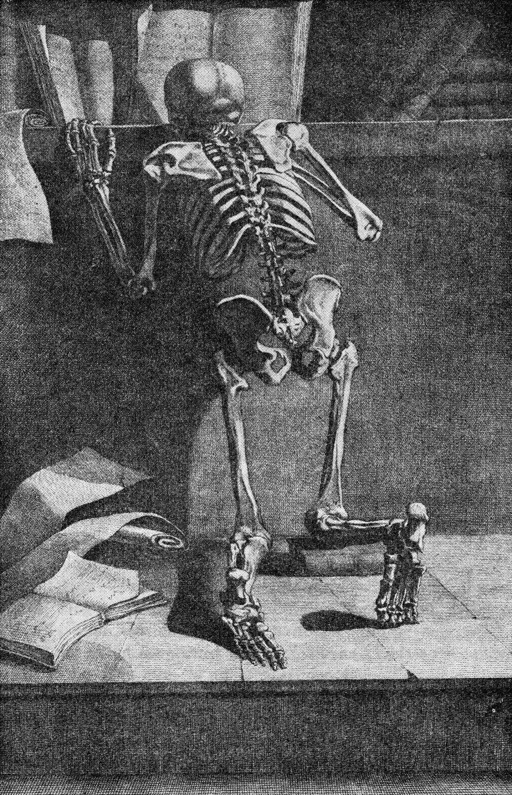
    Jacques Gamelin’s Nouveau reueil d’osteologie et de myologie, dessine d’apres nature (1779)  places skeleton and books togehter again, though this time their can be little doubt about the overall message that the designer and author tried to send to their readers. 

    Int he long run, and I guess in the short run as well, neither the bridge in Impressionism nor the book in anatomies is quite so much out-of-place as they are simply unexpected.

    Note:

    Van Gogh’s bridge at Arles–not an essential image whatsoever for this post–I just like the bridge. Van Gogh painted the bridge four times in oil and once in watercolor, all in a very short time.  (His stay at Arles was about 444 days, during which he made about 200 paintings, being some of his greatest work.

    Vincent Van Gogh Miscellaneous Buildings Technology Modern Age Impressionism Neo-Impressionism


  • Ultra Realism in Anatomical Illustration, 18th Century.

    JF Ptak Science Books   Post 1477

    [In case there are younger readers here, this is a notice that some may consider the following images disturbing.]

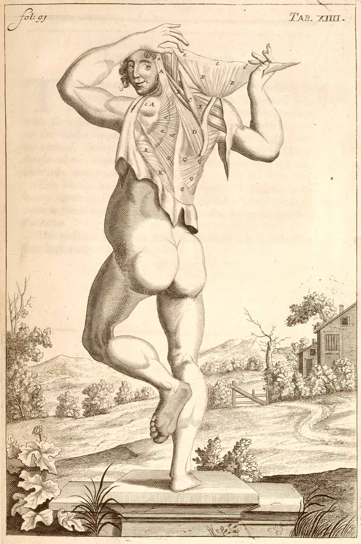
    Anatomy john brown dancing In the antiquarian world of anatomy books dissection and presentation take place on many different levels–there are very straightforward, unadorned displays of various body parts on blank backgrounds and with no attention paid whatsoever to anything beyond the dissection; there are others that place the dissections and cadavers and whatever the subject of dissection might be in prosaic fields, or against a distant cityscape, or in a well-appointed room, or against a generic table, or within some sort of Baroque ornamentation, and so on.  (We’ll be seeing more of these presentations in the next few posts.)  In general though the work of the anatomist is presented in  a basically “finished” state–that is, the dissection is presented in an artistic manner, with a sense of design for the subject material. (Here’s one example of hundreds of possibilities: John Browne’s A Compleat Treatise of the Muscles, as they appear in the Human Body...1681.)

    There are not many examples (before, say 1850) in the history of anatomical display that show the specimens in the stage of display that was almost entirely unadorned, as though we are looking directly at the anatomist’s table.  Such is the case in the extraordinary work of the anatomist Govard Bidloo (1649-1713) and (artist) Gerard de Lairesse (1640-1711) called Ontleding des menschelyken lichaams…, published in Amsterdam in 1690, which is an unremitting attack on realism in the art of anatomy.  There is absolutely no favoritism paid to anything in these images except for truthful display, right down to the nails and pins used to give messy stuff a more-recognizable (to the layman) form. 

    Ontleding des menschelyken lichaams by Govard Bidloo and Gerard de Lairesse
    Ontleding des menschelyken lichaams... by Govard Bidloo and Gérard de Lairesse
    Engravings of the bones, muscles, and joints by John Bell

    Another, later, uncommon example of this realism is found in the 1804 work of John Bell’s Engravings of the Bones, Muscles, and Joints, Illustrating the First Volume of the Anatomy of the Human Body

    Illustrations of dissections by Ellis and Ford

    These images are a world away from the overwhelming majority of works of anatomy produced from the 16th to the 19th centuries; and that Bidloo’s work was so early makes it that much more remarkable. 

    Source note:  all images courtesy of the National Institutes of Health National Library of Medicine, here.


  • Blank and Missing Things Series–Antiquarian Anatomical Skin (Appended)

    JF Ptak Science Books   Post 1476  -part of the Blank, Missing and Empty Things series.

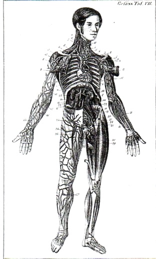
    Carl Ernst Bock (1809-1874) was a physician and anatomist (and son of the anatomist August Carl Bock of Leipzig, 1782-1833), whose many publications include the very popular  Hand-Atlas der Anatomie des Menschen  nebst einem tabellarischen Handbuche der Anatomie.(first printed in 1841).  This is a good example of his reaching out across the social strata to publish something that was accessible to the public-at-large, making him a pioneer in the distribution of medical information.

    I’m sorry to say that in all of this man’s beautiful work I  focused on this superior full-body anatomical–the odd thing here is that the only skin remaining on the body is on the head, where we see a  face and full head of hair.  To my experience this is a very highly unusual visualization.

    Anatomy bock482

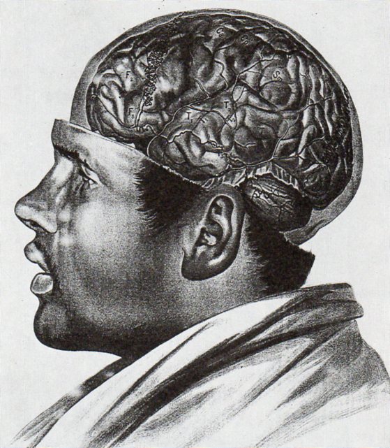
    In an almost-the-opposite approach (which is much more common) Albert Adamkiewwicz (in his Taflen zir Orientierung an der Gehirnoberflaeche des lebenden Menschen...(printed in 1894, in Vienna) offers the following:

    Anatomy adamkiewicz484

    As with the other image above I only have a second generation image of this, and only in black and white–the color original is truly remarkable. 

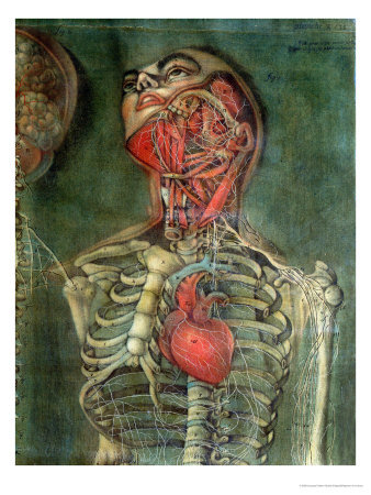
    Another excellent example of an anatomical dissection leaving the face intact occurs several times in the massively interesting work of Jacques Gauthier Dagoty, whose work I remembered but whose name I forgot, making it fairly difficult to find the illustrations.  But here they are, from Anatomie des parties de la generation de l’homme et de le femme, published in Paris, in 1773, with Dagoty (1717-1785)  acting in multiple roles of author/designer/anatomist/painter, who produced these magnificent painterly dissection studies of great detail and warmth.

    Anatomie des parties by Gautier D’Agoty and Duverney

    And this:

    Missing skin b
    There are many other studies in the volume, but few retain the face.

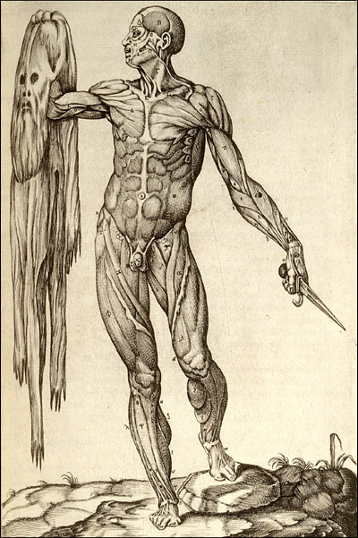
    Then there’s this, the other end of the spectrum, where we see the flayed anatomical specimen and its skin though not in contact with one another, which is a special category indeedy:

    Missing skin c

    This copperplate engraving comes from Juan Valverde de Amusco (Valverde) (1525-1588 or thereabouts), Anatomia del corpo humano… (printed in Rome in 1559), and stands quite apart (though not alone) from the rest of the anatomical oeuvre of the 1550-1750 period.  

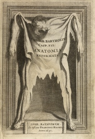
     And let’s not forget Thomas Bartholin’s frontspiece for his Anatomoa, published by F. Hackis in Leyden in 1651, which is similar to the Valverde:

    Anatomy skin bartholoiin


  • A High Achievement in Obstetric Art, 1781

    JF Ptak Science Books   Post 1473

    Anatomy bauldeqocue483

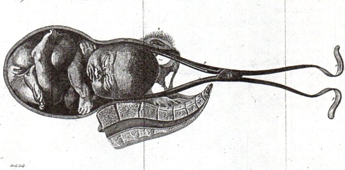
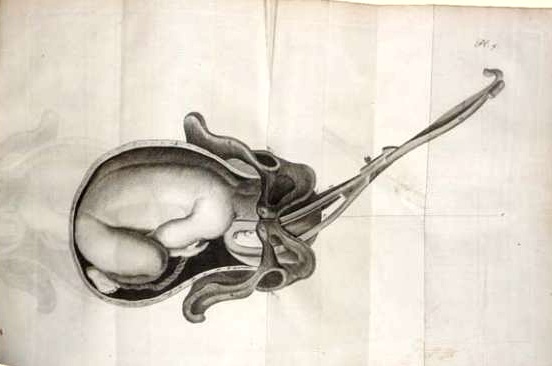
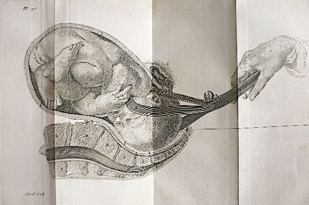
    One of the great thinkers in the history of gynecology was Jean Louis Baudeloque, whose 1781 book L’Art des Accouchemens was perhaps one of the most significant works in the history of obstetrics. This work was important not only for its great clarity and ease of explantion and control of its subject, but also for the exceptional illustrations.  I find them incredible not only for their spectacular detail but also for their control of blank space, a feat not easily accomplished…and I think a somewhat courageous approach to illustration during this era.

      Baudelocque

    For example, in the accompanying engravings (all of which are second generation and so are not nearly as sharp as the originals), we are left with a detailed image of only what was necessary for the explanation in the text, a terribly modern approach to illustration and clarity, so much so that it seems almost impossible that the image was made more than 230 years ago. 

    Baudelocque 2

    Obviously the representation and the subject matter give away the age of the image, but certainly not the design or placement.

    Note:  It should also be pointed out that chief among Baudeloque’s contributions was his teaching career, during which he would instruct upwards of 150 pupils per year (mainly at the Ecole de Sante) in clear and precise terms on his approach to obstetrics, not the least of which was in the use of instruments such as the foreceps and pelvimeter, a distribution of a very useful information base which seemed to have spread exponentially as his students went out into the midwifery field. 


  • Black Soils of the Renaissance (from the Things-out-of-Place Department)

    JF Ptak Science Books   Post 1471

    It is interesting to see things as they aren’t, particularly when the time things were being what they weren’t was a long time ago.  An example of this appears in an earlier post here about the use of red skies in Renaissance painting, which was something completely unexpected to me, a spectacular use of beauty found in an alternatively beautiful place, a reminder of why it looks so odd to us to see a clock running backwards.

    Why does a clock run clockwise, anyway?  It seems to me that most other things that go ’round seem to do so “counter clockwise”, and seeing a clockface with the hands sweeping themselves backwards ticking off the minutes and hours seems antithetcal, even though the same function is being performed–its just happening in a slightly different manner. 

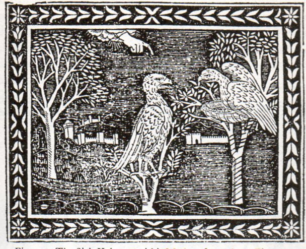
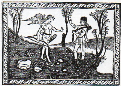
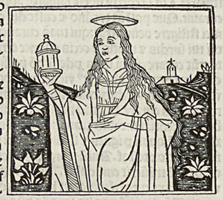
    And so to the question of the ground.  If skies can be red, why not the ground black?  Especially in wood engravings that are 500 years old?  No reason for it not to be so, especially when you’re working in black ink and nothing else but the suggestion of open, unused white spaces, with no midtones.  And once you think about it a little, the use of black as a ground color makes perfect sense, differentiating it from the sky. Its just that we don’t think of the ground in that way, and so when it appears it seems quite out of place its a bit of a shock–but then we get over it, nearly instantly. And so the fortress of normalcy fails.

    Here’s a few examples of Black Soils of the Renaissance.

    “The Sick Vulture and his Mother”, from Aesop,  Vita Esopi, printed in Florence, 1508:

    Black soil 1471
    “Christ entering Jerusalem”, from Bonaventura, Meditazioni sopra la Passione, printed in Florence, about 1494.

    Black soil 2472
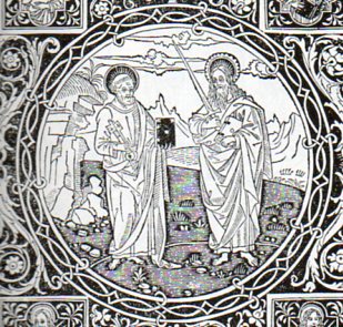
    Detail of the frontispiece to Epistolo e Evangelii, printed in Florence in 1495:

    Black soil 3473
    Frontispiece to Frederico  Frezzi, Il Quadriregio, printed in Florence, 1508:

    Black soil 4474
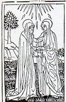
    Christophoro Landinus, Formulario di Epistole, “The Visitation”, Bologna, 1485:

    Black soil 5475

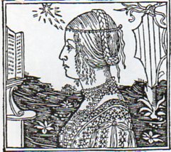
    “Damisella Trivulzia”, image from Giacomo Filippo Foresti, De Claris Mulieribus, printed in Ferrara, 1497

    Black soil 5476 Black soil
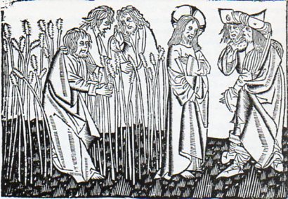
    Ludolphus de Saxonus, Levenons Heeren, “Disciples Plucking the Ears of Corn”, printed in Delft, 1488.

    Black soil 5477

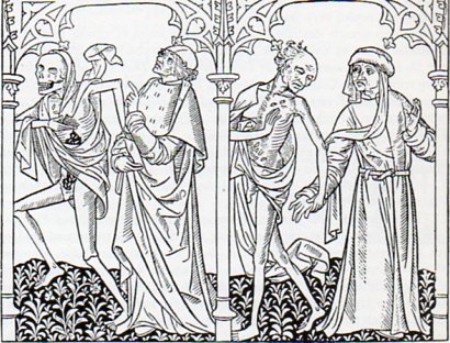
    The Danse Macbre des Hommes, printed in Paris by Couteau and Menard, showing Death visiting the astrologer and the bourgeoise, 1492. 

    Black soil 5478
    There are no doubt many more, but these willl do for now.

    Did anyone mention the Solids in Uccello?


    ·Posted by :

    ·in:

    — —