A Daily History of Holes, Dots, Lines, Science, History, Math, Physics, Art, the Unintentional Absurd, Architecture, Maps, Data Visualization, Blank and Missing Things, and so on. |1.6 million words, 7500 images, 4.9 million hits| Press & appearances in The Times, Le Figaro, Mensa, The Economist, The Guardian, Discovery News, Slate, Le Monde, Sci American Blogs, Le Pont, and many other places… 5000+ total posts since 2008.

Category: Art History

  • The Call of the Book: Antoine Verard and Illustration, ca. 1500

    JF Ptak Science Books   Quick Post

    Vereard885
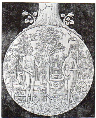
    M. Verard was a very active bookseller, printer and publisher, operating in Paris between about 1485 and 1512.  He produced a catalog of his printed works that was very extensive, containing more than 100 works.  One of them, a Bible published in 1502, contained this spectacular woodcut, “The Root of all Evil”, showing Adam and Eve at the crucial moment, a very considerable man-serpent completely engulfing the fruit tree, winning the confidence and trust of Eve.  And above it all grows the tree of humanity its roots firmly in place along the sphere of the fall of man.  

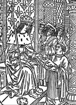
    I also quite like the portrait of Verard, shown offering one of his books to King Charles VII, hoping for his approval:

    Verard book


  • Deceptive Perception: Giant Super Women of Pulpdom and High Art

    JF Ptak Science Books   Post 1617

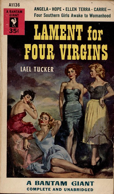
    Sometimes things are just not what they seem to be.  Sometimes they are deceptive and uncommon and somewhat hidden–and sometimes deceptive even to themselves. Sometimes the deception is intentional, and sometimes it is just a mistake, but a deceptive one. In the following cases, the deceptive elements are relating to size–kike the example below, in the cover illustration for the campy (“Southern” with names like those?) troubles of mid-1950’s “girls awakening into womanhood”:

    photo
    If you take a closer look at the reclining figure just abpve the word “giant”, you can see that she is one, unintentionally.  She’s just badly drawn, or something, a victim of foreshortening–we can see that her leg from her knee to her foot is as long as an entire keg of her companions, making this person about eight feet tall.
    On the heels of the eight-foot-tall woman comes one who is far more famous, ultra-famous, really.
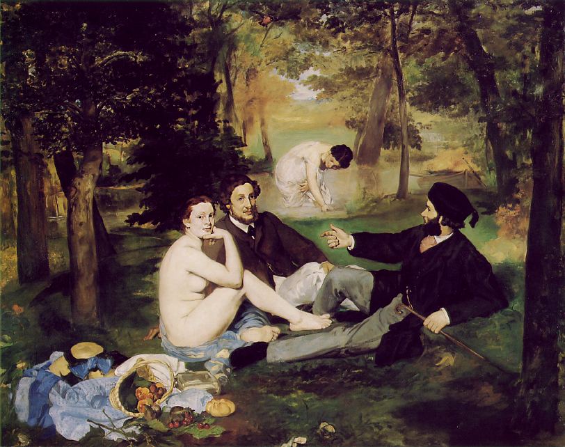
    Le Dejeuner was a scandal when it was exhibited in 1863—Manet painted what he wanted to, unbound by perspective, by color, by composition, and on and on. The folks in the painting were not connected to anything, really, and were unconnected to each other, no one paying any of the others any mind, even when the women were naked.  Nothing seems to be going on—the people are just simply there. 
    Blog--march 7--manet bathers
    This is in itself was a disconnect from previous practices, the vision in painting was about something, and was directed.  Light seems to be coming from a number of different places, and the shadows from the trees reflect this, simultaneously stretched towards and away from the light sources.  The bathing woman in the background, or what used to be background, had she been drawn using proper perspective, would’ve been about nine feet tall.  But what happens here is that there is no foreground or background in this painting, just middle.  It was this collection of abandonments, starting here in the Le Dejeuner in 1863, that ushered in the modern in art. 
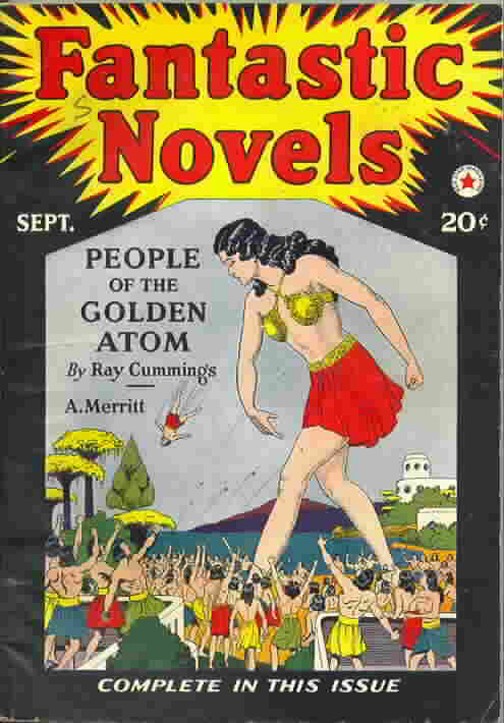
    Then there’s the fifty-foot-tall woman who really isn’t that tall in relation to the people around here. 
    There are times when even things that are made to look extraordinary and plainly, outrageously identifiable as what they are, simply aren’t–and sometimes they’re not even close.  For example, this cover of Fantastic Novels (1921?) seems to tell a straightforward story, but as it turns out the giant is giant but one living within a world in an atom of a gold wedding ring.  (I told a fuller version of the story of thiis here.)  So this giant is a giant but only so in her own world. 
    Man throwing

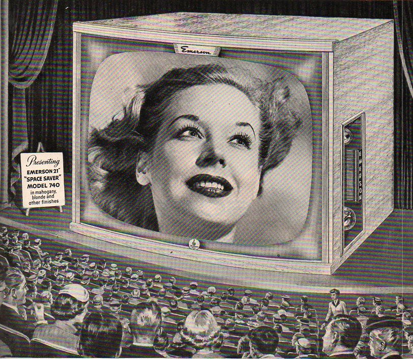
    Rabelais’ Gargantua and Pantagruel, Hobbes’ Leviathan, the Buddha at Yungang (Shanxi) and Melville’s whale were all pushed to their competitive monsterous edges in the 1950’s, when you were more likely to think of The Bomb and creeping Communism before thinking back to any of these great representations.  And it is also my general impression, having been paging through Life magazine for the 1950’s, that there are some other major, lesser heralds of gigantism, especially if you paid attention only to the advertisements. There were 1950’s colossal characters who were pale imitators of their earlier counterparts–the Amazing Colossal Man and Colossal Woman being two minor mirrors of older ideas–but they hardly contained the colossal ideas that were resident in the earlier creations. (Perhaps part of that is due to having just witnessed the demise of two enoromities in Hitler  Stalin.) But this woman seems to be the largest of the lot–I make her to be about 100 feet tall.  There’s really nothing deceptive about her, except of course that this giant is only a head. 

    Monumental television theatre446


  • The Game and Play of Chess, a Morality Play: 1474

    JF Ptak Science Books   Post 1616   (Part of the History of Lines series.)

    It turns out that one of the most famous and iconic books on chess is really not about chess at all.  Jacobus de Cessolis, (Jacopo da Cessole, c. 1250 – c. 1322) the author of  The Game and Playe of the Chesse1, found its way into print in the very highly capable hands of William Caxton in 1474 (“Fynysshid the last day of marche the yer of our lord god. a. thousand foure honderd and lxxiiiia”) and into a second edition in (about) 1483. Caxton produced a spectacular, beautiful work on moral and ethical virtue and challenge, using the game of chess as the foundation for metaphor and aliteration of the wide classical literature that it calls upon.2.  The book doesn’t tell you how to play–but it does instruct on how to live.  A great aid to the book’s power are the sixteen strong woodcuts (“repeated to make twenty-four figures”3), which mo doubt were a strong influence on their viewers.

    I have included this entry in this blog’s History of Lines series for the connection between the lines of morality and the lines of he chessboard and the movement of its pieces, which were at last the outward and symbolic basis for the ethical lessons of the work if not used in actuality. 

    Notes:

    1. The book was one of the first books ever printed in English, and was probably the first morality play printe in the language. It was reprinted many times, later under the title of Liber de moribus hominum et officiis nobilium super ludo scacchorum (‘Book of the customs of men and the duties of nobles or the Book of Chess’).

    2. Arthur Hind, An Introduction to the History of Woodcut, 1935.  Volume II, p. 708.

    3. The commentary quoted here is from the facsimile edition of the original work published in London in 1883 by Elliot Stock with notes by William E.A.Axon

    The authors named in this study include “Saint Ambrose (2 references), Anastasius (1), Avicenna (2), Saint Augustine (9), Saint Basil (1), Saint Bernard (2), Boethius (3), Cassiodorus (1), Cato (5), Cicero (6), Claudian (2), “Crete” (1), Diomedes (1), Florus (1), Galen (1), Helinand (4), Hippocrates (4), Homer (1), Saint Jerome (3), John the Monk (1), Josephus (4), Livy (2), Lucan (1), Macrobius (1), Martial (1), Ovid (6), Paulus Diaconus (1), Petrus Alphonsus (2), Plato (4), Quintilian (3), Sallust (1), Seneca (15), Sidrac (1), Solinus (1), Symmachus (1), Theophrastus (1), “Truphes of the Philosophers” (2), Turgeius Pompeius (1), Valerius Maximus (23), Valerian (7), Varro (1), Virgil (2), “Vitas Patrum” (2).”


  • Fabulously Beautiful Non-Fascist Spaghetti

    JF Ptak Science Books    Post 1604

    {Images sources via 50Watts and Bibliodyssey]

    I wonder if there is a dominant semiology for the created cultures of advertising under the Fascist regime of Mussolini (which ruled the Kingdom of Italy from 1922-1943, and then followed by the Republican Fascist Party which ruled the Italian Social Republic from 1943 to 1945)  or as much so as there was for Adolf Hitler’s Nazi Germany?  A sweeping and broad generalization at which I’m just guessing at here is that the German model for creating a particular, wide-spread iconology of regime-controlled national images far outweigh their contemporaries in Italy. 

    One of the most inspired and perhaps one of the leading iconoclasts in Italy during this time was Federico Seneca, who seemed to stray far from any mainstream representations in the many ads and designs he produced from 1922-1945.  Seneca (1891-1976) really had the chops–he had a remarkable insight for placement and design and produced some beautiful and futuro-odd posters for some of Italy’s iconic companies. (The Futurism bit is a little “odd” because Marinetti’s attempt to make the/his movement the official art of the Fascist regime was rejected by the pwoers-that-be.)  I pray ask:  who would have thought of such a provocative, spare, impacting design top sell Buitoni pasta?   These creations were masterpieces of advertising poster art, and seemed to have little or nothing to do with Italian politics.

    1919 to 1935 or so, Seneca served as artistic director for ad campaigns for Perugina and Buitoni, while from the middle ‘thirties to WWII and from his own Milan-based studio he also produced graphics and posters for Italrajon, Fiat and Cinzano.  Then–for me, at least–there is a vast blank spot occupied by WWII, out of which Seneca emerges around 1950, doing more work for Cinzano, as well as Agipgas, Pibigas, Energol and  Lane BBB.


    Seneca wasn’t alone of course in his alone-place–there were plenty of artists in Italy sharing their own nodes of individuality.  For example, this fantastic poster for Amaro Gambarotta tuxedo sales in 1928 by  Saxida

    Ad for Amaro Gambarotta tuxedo, 1928, Saxida
    Though certainly this quasi-futurist style could be lovely, highly stylized, and political, as we see in this cover for a book on the young Fascist handbook, Il Capo Squadra Balilla, created in 1935 by Zedda. 

    Zedda, Il Capo Squadra Balilla, cover for Fascist youth handbook, 1935 Italy

    And of course there was plenty of work done solely for propaganda reasons:

    But for molding the cultural mind via advertising art, the Italians seemed to stay far-afield of their Germanic brethren. 

    ·Posted by :

    ·in:

    —

  • Another Example of Antique Artwork by Children, 1888 (though not really)

    JF Ptak Science Books   Quick Post   [Part of the antiquarian art for/by children series.]

    Kid art840 –The Sublime Antiquarian Art of Children, here.     

    –An Image Addition to a Series of Posts on the Antiquarian Publication of Artwork by Children, here.

    –The Great Rarity and Sublimity of Antiquarian Artwork by Children, here. 

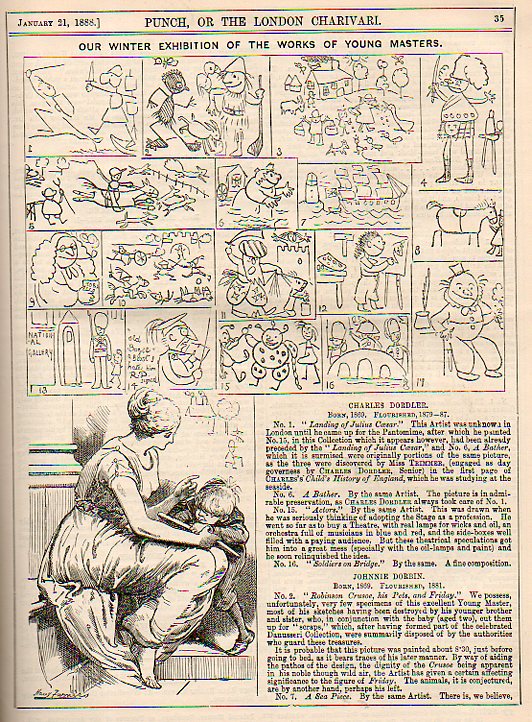
    I’ve written a number of posts to this blog on what I find to be a rare aspect of illustration–antiquarian publishing of artwork by children.  As explained in some of the earlier pieces (linked above) it seems to me that artwork made by children appear generally by chance, although this work starts to make a few appearances in late 19th and early 20th century pedagogical works on how to teach children in school and the layout of the classroom. But in general, the work just didn’t see much light of day in the publishing world.

    Kid art841
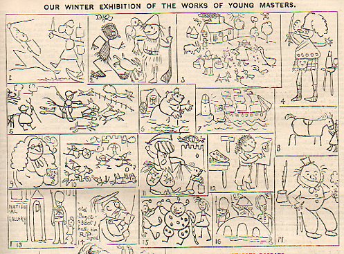
    This image, found in the 24 January 1888 issue of Punch, or the London Charivari magazine, comes close to the issue, but not really–I’m sure that the work is that of one of the magazine’s full-time illustrators.  But the fates are in this image’s favor simply for bringing attention to the art of the very young.  I particularly like the image at bottom, with the small boy working hard at whatever is on his paper in the lap of his muse, with drawing graffiti on the wall over his head. 

    The key to the images, below:


    ·Posted by :

    ·in:

    —

  • A Forty-Year Precursor to Modernism–Found Cubism in 1870

    JF Ptak Science Books  Quick Post     [History of Lines #18]

    I was very surprised to come across this illustration while browsing the (3 April)  1870  volume of Punch, or the London Charivari .

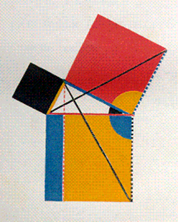
    I cannot think of any particular peculiar or unusual edition of Euclid that was published at about this time to demand such an unusual illustration. (The only newish edition that comes into any possible play here is Oliver Byrne’s semi-insane First Six Books of Euclid, published by the Chiswick Press in 1849 and one of the most unusual and beautiful books of any sort printed in the 19th century–but then again that was 21 years before this volume of Punch.) And by “unusual” what I really mean to say is “highly unexpected” , as this all-angular depiction of a woman appears for all the world to be a Cubist- or Expressionist-like image, predating those movements by four decades. 

    But the Angular Woman just seems to be happenstance, a happy precursor to a revolution-in-the-making, an accident forty+ years too early.  She is extraordinary–and for some reason she is smoking a cigarette. 

    [Below–an illustration from Oliver Byrne, illustrating the propositions of Euclid via the use of color rather than words, a beautiful but non-functioning work.]

    Blogrealbyrne


  • History of Lines, #17: the Artist Painting the Negative, Camille Corot, 1874

    JF Ptak Science Books   Post 1584   [Part of the History of Lines series]

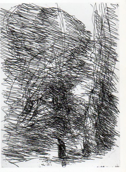
    Corot657 An interesting appearance of lines in art that seemingly crosses several disciplines and chronological development is Jean-Baptiste Camille Corot’s The Dreamer and the Large Trees (1874).  It is vivid artwork full of motion, expressing itself in an impressionistic sense that seems almost more abstract expressionist than mid-early Impressionist. (As an Impressionistic work it would be well into the second decade of the movement; if Abstract Expressionist, it is three decades early.)  It is a brusque, almost savage portrayal of a somber person in a deep wood, though the lines that is is composed of say anything but that. 

    The print was made via the cliche verre process1–Corot used a semi-photographic medium in which there was no camera, as it was the artist who drew the negative, who created the image from nature without a lens and without a camera body (thus eliminating lensless photography like pinhole), drawing directly on the medium (which in this case is glass, insinuated by the cliche) and then exposed/printed onto a photo-sensitive paper (the verre).  The artist is in a sense making a photograph directly of the image in their mind, recording it on the medium, and then printing it from there. 

    Of course there are other important lines in the history of art: Vincent Van Gogh Starry Night (1889), Giacomo Balla, Street Light (1909), Umberto Boccioni States of Mind (1911), Michael Larionov’s Rayonist Painting (1913),   Robert Delaunay Windows, (1912), Roberto Crippa (1921-1972), Jackson Pollock (1912-1956, particularly Number 1, 1948), and any numbers of works by Barnet Newman.  And of course the Cubists: Braque, Gris, Picasso, and the rest; the Constructivists like Malevich, and on and on into the sunset.  But the reason I’ve chosen Corot is because of the unexpected, wildish impressionist qualities that seem so far out of place, even with the movement. 

    Notes:

    1.  Cliche Verre was quite popular with French artists of this period, used by Theodore Rousseau, Charles Daubigny, Charles Jacques, Francois Millet and others.  The process itself appeared very early on in the history of photography, being described in Robert Hunt’s technical manual on artistic photography as early as 1841, two years after photography’s beginning.

    The images:

    ·Posted by :

    ·in:

    — — —

  • History of Holes: the most Famous Hole in Art?

    JF Ptak Science Books  Post 1583   [Part of the History of Holes series]

      Holes--brunelleschi2_large

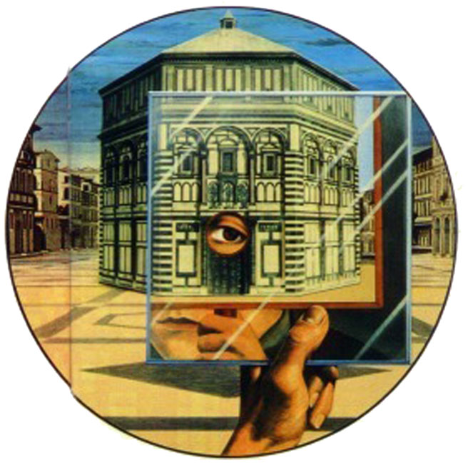
    Filippo Brunelleschi is most often credited–from Vasari to Kemp–as the modern discoverer of linear perspective (or re-discoverer in the eyes of Samuel Edgerton Renaissance Rediscovery of Perspective, 1975 or John White, The Birth and Rebirth of Pictorial Space, 1987).  The Greeks most certainly had mastered some aspects of perspective as is in evidence in their surviving architecture (though not artwork remains exhibiting this), but Brunelleschi for all intents and purposes1 discovered it for the rest of humanity. 

    Edgerton remarked that the discovery “marked an event which ultimately was to change the modes, if not the course of Western history”, with one reason for this magnitude being that technological and architectural ideas could be far more easily intellectually-transmitted as societal property rendered in perspective than had they not been issued so.  (I wonder, for example, if this might have been the reason why there was no Chinese technological renaissance during the Renaissance–because the idea of linear perspective was not adopted until relatively late, meaning that transmitting complex technical ideas was far more difficult.)

    Brunelleschi employed a brilliant method to capture the depth of his scene–in this famous case, the Baptistery in

    peepshow.gif

    Florence.  Employing this method helped the architect to understand the mathematical principles of perspective and to become its earliest master. 

    Perspective is the romance of balance and the mathematics of proportion, at the center of which is the vanishing point, an interestingly-named point of departure and similarity, where parallel lines not parallel to the image plane appear to come together, in an early singularity.  So it is this great and famous hole helping to establish a great and famous dot (which I guess could make an appearance of its own in this blog’s series on The History of Dots). 

    Perspective c

    Another famous hole that comes a little later (a hundred years or so later) belongs to Albrecht Durer (The Painter’s Manual, 1525)

    http://www.oneonta.edu/faculty/farberas/arth/Images/ARTH_214images/Durer/durer_perspnude_large.jpg

    where Durer illustrates the artist at work using a perspective device along with a vielo. 

    There are other holes in the history of art to be sure, but these are perhaps the most significant ones that appear in the Renaissance–there are others in architecture, for example, but my thinking is that the Brunelleschi hole takes precedence.  Other interesting and significant holes begin to appear a little later on, for the development of peep machines, and the camera obscura, and then of course photography, but they will come in a later post. 

    Notes: 

    1. Earlier though not complete efforts were made in Alhazen’s Perspectiva, c. 1000 A.D., Roger Bacon’s Opus Majus, c. 1260 A.D., John Pecham’s Perspectiva communis, c. 1270 A.D..,  and Alberti’s  Della pittura (1435).

    Another perspective machine of Durer: 

    ·Posted by :

    ·in:

    — —

  • A Lesson in Civil Rights taken from a 1944 Piece of Cardboard–Philly Motormen, Jackie Robinson and War

    JF Ptak Science Books   Post 1569

    Negro motormen633
    This political “button” has been in my house –along with a a dozen or two others–for quite some time, small signifiers for large events.  This one, though, is more suggestive than assertive; a measured, tenuous  political statement that seems today as though there should have been no disagreement in its message. 

    The button was issued in 1944, at what might have been the very most crucial time for America in fighting World War II.  The message wasn’t to support the idea of sending Black Americans to fight in the war–it was rather a call to White America to acknowledge the need for employing Black Americans as motormen and conductors on Philadelphia street cars as replacements of the men who went off to fight the war. 

    There was very strong resistance to having Black people interact with White people on a public convenience.

    In the same year, in July 1944,  Jackie Robinson (then of UCLA)  was a newly-commissioned 2nd lieutenant in the United States Army, stationed in Fort Hood, Texas, with the legendary 761st “Black Panthers” Tank Battalion.  On 6 July he boarded a U.S. Army desegregated bus, where he was told by the driver to move to the back, into the Negro section; Robinson refused; the driver backed down, and continued on his way, though not without his revenge.  At the end of the run, he alerted Military Police, who would arrest Robinson on a variety of phoney charges.  It was recommended that Robinson be court-martialed. The commander of the 761st, a White colonel named Paul Bates, refused to do so–which led Robinson to be transferred to the 758th Battalion where there was no problem in undertaking the legal action.  By August, with charges reduced, Robinson went to court and his charges were dismissed.  But by that time, the damage was done, and he would not be sent overseas to fight.  He was sent to Camp Breckinridge in Kentucky where he served as an athletics coach for the few months he had in the Army, and he was honorably discharged in November, 1944.  It was while he was at Breckinridge that a former Negro Leagues player for the Kansas City Monarchs suggested that Robinson write to the ballclub for a tryout.  He did, they did, and the rest is history.

    Negro motormen632 In 1944 in Philadelphia–though it could have been in many other cities in the northern part of the United States, though  this would not have been attempted almost anywhere in the South outside of the Pullman car–the question was whether society would tolerate a Black person interacting with White customers on streetcars.

    It was almost at this same time, in November 1944, that General Eisenhower decided to send Black troops to fight with Whites in battle.  There was strong resistance to this behavior in the military, not the least of which came from Ike’s own chief of staff, Lt. Gen. Walter Bedell Smith.  It would take an Executive Order (#9981) from the next president, Harry Truman, to end the de facto segregation of the U.S. Army; it would take another war, and another three years (to the day)  for the U.S. Army to announce its plans to desegregate, on 26 July 1951.

    In spite of there being motormen and conductors working in other northern cities like Cleveland, Detroit and Indianapolis, wrapping the string for the United People’s Action Committee around a button on your shirt or jacket would have been a controversial step to take–a step that looks alarmingly small to us here in the future, but it was a societally big one back in 1944. 


  • Strange Things in the Sky Dept.: Mountains and Allegories of Time

    JF Ptak Science Books  Post 1554

    In the history of mountains seldom have they raised themselves so magnificently as that seen in Jacopo da Valenza’s St. Jerome in the Wilderness. Painted in about 1509, da Valenza (who flourished from 1478-1509) depicts the 4th century Saint–a Doctor of the Catholic Church,  proponent of asceticism, scholar, philosopher, historian and translator of the Bible–sitting calmly and reading a book balanced on the top of  a rock pile, sitting in a deep state, with a metaphorical depiction of time and biography looming impossibly and invisibly behind him in the form of a mountain.

    I believe that the scene that wind their way around the mountains are those from St. Jerome’s life, displayed for all but not to him, shown as a chronological memory in simultaneous display. 

    The imagery of the mountain displays as much history and imagination as required by the viewer.  It has a distinct Tower of Babel quality to it, though here the mountain very decidedly has no upper limit, no summit, the mountain disappearing into the north end of the painting, and actually seems to be getting larger and more dense as it ascends. 

    Jerome is serene, larger matters on his mind than a simple history of one life. 

    The saint is frequently shown in very stark surroundings, and occasionally appears in more formal and lush biblio-related scenes–as the man did, after all, serve his Pope in very advanced capacities in Rome for a number of years.  But this I think is how we picture Jerome in a generalized way–except for the extraordinary mountain.