A Daily History of Holes, Dots, Lines, Science, History, Math, Physics, Art, the Unintentional Absurd, Architecture, Maps, Data Visualization, Blank and Missing Things, and so on. |1.6 million words, 7500 images, 4.9 million hits| Press & appearances in The Times, Le Figaro, Mensa, The Economist, The Guardian, Discovery News, Slate, Le Monde, Sci American Blogs, Le Pont, and many other places… 5000+ total posts since 2008.

Author: JF Ptak

  • A Paper Mirror and the History of Blank Things–Illusory (Sea) Power

    JF Ptak Science Books  Post 1228

    [This is a part of our History of Blank, Empty and Missing Things series.]

    Mirrors don’t necessarily have to reflect something to show  reflection–they merely need to offer you a picture of something that can show the difference of something real versus a false image of that same thing.  “Through a glass darkly” (1 Corinthians 13:12) isn’t necessarily a reflecting surface though it is a reflective one; neither is the painting in The Picture of Dorian Gray.  Harry Potter’s Erised mirror does act like a mirrorish mirror, and Narcissus does come to a bad and wasted end in front of his pondside reflection (the “perilous mirror”of the Romance of the Rose).  The queen’s mirror in the tale of Sleeping Beauty doesn’t reflect but does give advice, and Alice’s Adventures…  in 1871 begin with wondering what was on the other side of a mirror (“looking-glass”) above her mantel–in a similar vein Kurt Vonnegut introduces a mirror as a “leak” into another dimension rather than a reflection.   Sometimes you get a hand-held thing with glass, and sometimes you just get a piece of paper.

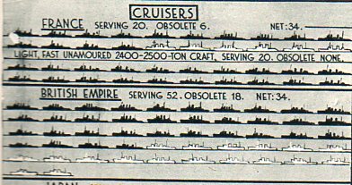
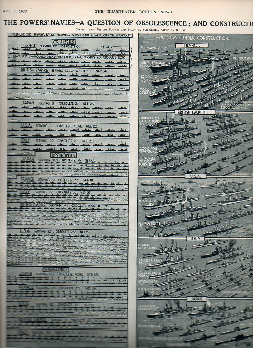
    Navy obsol818 This graphic from The Illustrated London News (5 August 1933, and available for purchase here) is an interesting case in point for a paper mirror.  It is interesting in how it presents a reported state of affairs and its actual condition.  In this case, the artwork shows the supposed/reported strength of the navies of the five major seafaring powers (France, British Empire, Japan, United States and Italy) and what those navies wpuld look like if the outmoded and obsollete ships were removed.  The modern and servicable ships are shown in black silhouette; the numbers of obsolete vessels were shown in white.  The dipiction of blank or empty of missing ships was a very convincing tool depicting the actual state of the major powers’ navies compared to a more romantic means of reporting naval strength. It must have been an excellent wake-up  to thopse with the capacity to see the truth, presented on one piece of paper, a mirror by any other name.

    Navy obsol cruisers819


  • 1 Inch=$370 Million: a Great Height of Graphical Representation of Quantitative Data

    JF Ptak Science Books  Post 1227

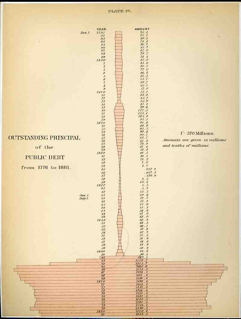
    0 ebay 13 graphs268[Click image to enlarge; both original images are available for purchase from our blog bookstore.]

     It isn’t often that you see money represented by dry measure, but that’s what happened here in these two examples from the fantastic Walker Statistical Atlas ( Statistical Atlas of the United States based on the results of the tenth census 1880 with contributions from many eminent men of science and several departments of the government Comp. under the authority of Congress by Francis A. Walker, M. A., superintedent of the tenth census … and published in 1884).  What we see here is a history of American federal indebtedness from 1791 (when the public debt stood at 75.1 million dollars) to 1881 (about 2 billion).  Using the CPI (consumer price index) as a factor to translate that number in 2008 dollars (or so), the 2 bil grows to about $40 billion (a nickel then is about a dollar now). The interesting part of the legend–and what drew me to this graphic even before its somewhat unique shape–state “1”–370 millions”, that is one inch of pink horizontal bar stands for about $370,000,000, and the last bar on this graph is about 6 inches long, which, adjusted for inflation, would now be about 10 feet long. .That said, the really interesting part comes next–if we use this measure to graph a horizontal bar for the American debt as it stands in 2008, it would pink a pink bar that was about a HALF MILE long to express our 10(+) trillion dollars of debt.  OR, somehow, the old debt of 1881 would be about 1 story of a house, while the 2008 version would be up one side of the Empire State Building and down the other (and yes that includes the aerials).  I don’t know how to put this comparison in context, the differences are so staggering. 

    0 ebay 13 graphs269
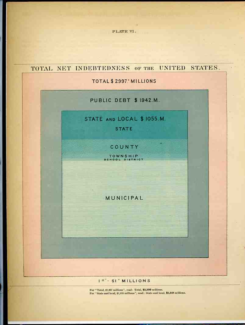
    After having popped a neuron or two trying to get my head around that one, we’ll further confuse the situation with the second chart, which shows the total net indebtedness of the U.S. in 1881 in terms of square inches; or, at the bottom of it all, a 7×7 inch square represented the entirety of the $3 billion owed out.  49 square inches. Working backwards this time, our $10 trillion (or $10,000,000,000,000.00 writ large) adjusted back to a CPI value in 1881 would have covered about 88 PAGES of the atlas or 9,000 square inches.  Again, the numbers are just almost too big to mean anything. 

    We, as a country, owe one hell of a lot of money.

    And yes there are many different ways of trying to figure out what one 1881 dollar “means” in terms of 2008, but the CPI is the most simple to use and least argumentative and at least gives a pretty good idea of scale.  It would be more useful to try and establish the degree of difficulty  of turning the corner on the debt in 1881 compared to doing that today, but this is just a late-night post at the end of the week, and I don’t have a good clue about how to try and measure that bit simply.


  • History of the Federal Minimum Wage and Its Deeply-Past Present

    JF Ptak Science Books   Post 1226

    0 blog jan 30 substandard489I’ve included this post in the Blank/Missing/Empty thread of this blog because the Federal minimum wage has been proportionally increased more so in th e last two years than at almost any time in its history, the increases really only get it up to what it niormally has been, maybe a little higher, with CPI-adjusted. This post is in response to an article in the New York Times today saying that the new minimum wage is equal to that of 1968, which is probably accurate.  The real point is that during the mid- Clinton years and the early Bush yeras the minimum wage languished during a time of tremendous growth for those who already had money–the poor for the years of 1992-2005  were left largely unprotected, unmolested by fortune.

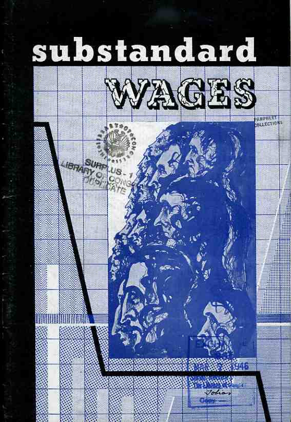
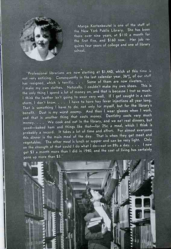
    Leafing my way through this interesting pamphlet, Substandard Wage, an Analysis of their Extent and Effect, and What Must be Done to Establish a Higher Wage Level, design “and presentation” by Abraham Joel Tobias for the Textile Workers Union of America, CIO, and for the Congress of Industrial Organizations, I found some very interesting bits.  First of all, the work was done to aid the working poor, people who were employed and making a wage, but the wage just wasn’t enough necessarily to being them out of poverty.  (The poverty line wasn’t invented as an economic bell weather until 1959.)  The first of the working poor that I read about was a librarian, Marga Kortenbeutel* (of the NYPL) who was working for $1,440.00 a year in 1945, which was just keeping her barely afloat, what with cutting out her 89-cent lunches and all.   That’s the equivalent (CPI adjusted) to about $17,500 a year in 2008 dollars.  Of course, the general economy was not doing well during the war, though it would rebound substantially by the late ‘40’s. The minimum wage, first established in 1938, was equal to about $3.50 2008n dollars in 1945. By 1950 this jumps to $6.25, and from there to about 1988 the minimum wage stays at at least that rate, with the period 1958-1978 soking aqt an average of about $8.hour.  From 1988 forward the minimum wage falls, winding up at about 5 dollars/hour in 2008, with the period 2003-2008 being the lowest level of real wages since World War II.0 blog jan 30 substandard490

    But what was this in terms of the rest of the population; what did these figures for minimum wages mean in the  society at large?  Was this a livable wage?  If we define “livable” as above what the government considered to be the “poverty level”, and “working” is a 40-hour work week and a 50-week working year, the answer is a quick “no”.  In 1959, when the poverty level was established, the minimum wage for the working person brought them to 67% of the income necessary to be “poor”; that left a gap of 33%, and that isn’t good.  That gap continued to close to 1968, when minimum wage go to within 10% of the poverty level, and then it began a slow and steady-ish decline.  The spiral down bottomed out for a bit in 1989, when it hit 52%,   building back up to just a touch over 60% in 1997.  From 1997 until the new minimum wage was instituted in 2006, the gap widened steadily, hitting 50%.  In 2008, with the new minimum wage in place , the gap is still at 41%, meaning that the new wage levels still only come to within 59% of what is supposed to be the poor line in the United States.  59% stops things from being a ridiculous slap in the face of American working poor, but not by much.  And it affects too few:  the minimum wage applied to a high of about 17% of the entire working population in the U.S. in 1979; today, the minimum wage which gets the working poor a little more than half-way to poor, applies to only 2.5% of the population. 

    *As it runs out, I found a little bit about Ms. Koretenbeutel; at the time of the publication of this pamphlet, Margathe was 35 years old.  She married someone named Voorhis in 1960, and died in 1971.  That’s all I’ve got.

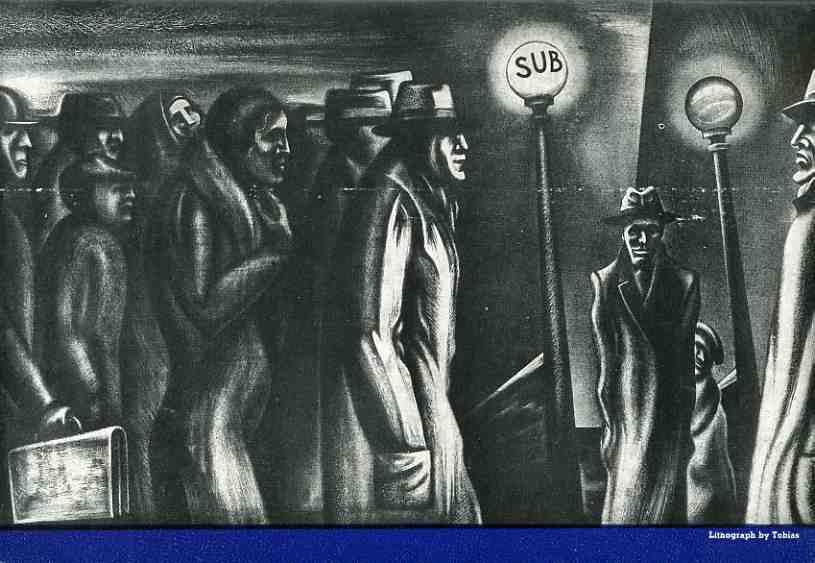
    The image below is from the back cover of the pamphlet, described as a “lithograph by Tobias”. 

    0 blog jan 30 substandard491


    A Timeline of Minimum Wage Levels, 1938-2009  (in continued reading section)

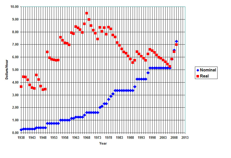
    Minwage The graph, above, is from Oregon State University website on the history of the minimum wage.  The accompanying text to it is also below.  The graph depicts “nominal” versus “real” minimum wages by year, the red dots (the nominal) showing what the original minimum wage translated to in 2008 dollars.

    A federal minimum wage was first set in 1938. The graph shows nominal (blue diamonds) and real (red squares) minimum wage values. Nominal values range from $0.25/hr in 1938 to $6.55/hr as of July 2008. The graph adjusts these wages to 2007 dollars (red squares) to show the real value of the minimum wage. Calculated in real 2007 dollars, the 1968 minimum wage was the highest at $9.47. The real dollar minimum wage (red squares) falls during periods Congress does not raise the minimum wage to keep up with inflation. The period 1997-2007, is the longest period during which the minimum wage has not been adjusted. The minimum wage increases in three $0.70 increments–to $5.85 in 2007, $6.55 in mid 2008, and to $7.25 in mid 2009. The real values after 2007 are projected for future decline in purchasing power. 

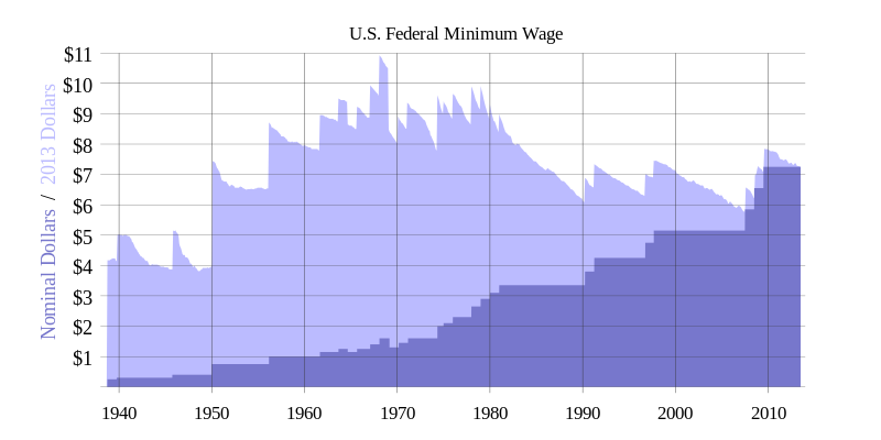
    Minimum wage History_of_US_federal_minimum_wage_increases


    [Graph from Wikipedia on the minimum wage, here]

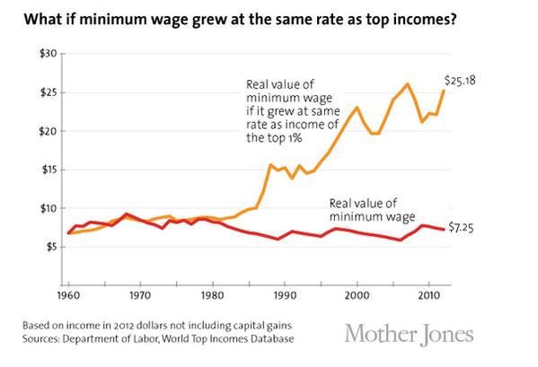
    And this interesting graph from MotherJones, showing what the minimum wage would look like if it had kept pace with the salary increases for the top one percent:


     Minimum wage top income


  • Simple Alphabetical List of Major Civil War Battles

    I just wanted to introduce the first of a series of new pages on this blog devoted to the U.S. Civil War. The 150th anniversary of the war begins soon, and I plan to do a Civil War day-by-day newspaper article for contemporary coveragre of thhe war, beginning in December.

    Alphabetical Listing of Major Civil War Campaigns, by Battle

    Allatoona Georgia October 5, 1864
    Amelia Springs Virginia April 5, 1865
    Antietam / Sharpsburg Maryland September 16-18, 1862
    Appomattox Station Virginia April 8, 1865
    Appomattox Court House Virginia April 9, 1865
    Aquia Creek Virginia May 29-June 1, 1861
    Arkansas Post / Fort Hindman Arkansas January 9-11, 1863
    Atlanta Georgia July 22, 1864
    Athens Alabama January 26, 1864
    Averasborough / Smiths Ferry / Black River North Carolina March 16, 1865
    Auburn / Catlett’s Station / St. Stephen’s Church Virginia October 13, 1863
    Auburn / Coffee Hill Virginia October 14, 1863

    ·Posted by :

    ·in:


  • Attacking Darwin’s Descent of Man in The London Times, 1871.

    JF Ptak Science Books   Post 1225

    “But with regard to the material world, we can at least go so far as this—we can perceive that events are brought about not by insulated interpositions of Divine power, exerted in each particular case, but by the establishment of general laws.” W. WHEWELL: Bridgewater Treatise.

    “To conclude, therefore, let no man out of a weak conceit of sobriety, or an ill-applied moderation, think or maintain, that a man can search too far or be too well studied in the book of God’s word, or in the book of God’s works; divinity or philosophy; but rather let men endeavour an endless progress or proficience in both..” BACON: Advancement of Learning.

    The quotes above stand alone, the first things that the readers see, sitting on the half-title page of  Charles Darwin’s On the Origin of Species (first published in 1859 in an almost-immediately sold out run of 1250 copies) an extraordinary, epochal book that was a lightning rod for reception both good and bad, heaven and hell, the Boschian hells of which were clearly not deserved, then or now.  (It is easier to understand a poorly-reviewd Origin in 1859 or through the 1860’s or even through the rest of the 19th century or even somehow through the early twentieth, but not afterwards.)

    Twelve years after the first edition of the Origin (and two years after the appearance of the Origin in its fifth edition) came his elegant and formibible The Descent of Man, and Selection in Relation to Sex

    The Times of London gave such an awful review of the book that a review of this review was published in the April edition of Nature [(Darwin),  Charles.  REVIEW of Review: The Descent of Man.  London:  Nature,  1871, volume 3, 20 April 1871].   It was Thomas Stebbing who wrote the response to The Times‘ incitful, hateful attack upon the Descent of Man. The Times saw Darwin’s work as an attack upon society,  accusing him of undermining authority and principles of morality, opening the way to “the most murderous revolutions”.  A “man incurs a grave responsibility when, with the authority of a well-earned reputation, he advances at such a time the disintegrating speculations of this book.” Stebbing’s review of the review is drippingly sarcastic, pointing out obvious errors in specific and the tone of the article in general in the defense of the book. Darwin’s “facile method of observing superficial resemblances” (says The Times) incites Stebbing to issue the following: “they may fancy that truth is worth discovering , even when it seems to involve some contradictions to our pride and some loss of comfort to our finer feelings…” (What a great line!) The article runs about 1000 words, and is a two-column, 1-page bit. [This issue of Nature may be purchased from our blog bookstore, here.]

    “No one ought to feel surprise at much remaining as yet unexplained in regard to the origin of species and varieties, if he makes due allowance for our profound ignorance in regard to the mutual relations of all the beings which live around us.” Darwin, leading the last paragraphs of the end of the introduction to the Origin, page 7.


  • The Sublime Antiquarian Art of Children, Part I

    JF Ptak Science Books   Post 1224

    Children's art--3846
    Among my favorite places in Washington, D.C.–a place where I lived for 29 years–are its cemeteries; in particular Rock Creek Cemetery, but more specifically, Congressional Cemetery.  Congressional is a big place, tucked away, sort of, away in Southeast D.C.–that is if you can tuck away a 30-acre piece of land. Congressional is an odd place, filled with many interesting people; its filled with their actual remains, and also their memories. There are many folks who have been interred in spirit in the cemetery, in cenotaphs; there are also many who have been laid to rest their temporarily, in the Public Vault, until conditions (in the old days) improved to have their remians received in their final resting place. 

    Children's art--2845
    Among those in the temporary funeneral housing were JQ Adams, William Henry Harrison, Dolley Madison, and Zachary Taylor. It may be one of the great vaults in the history of our country, a small place holding great people.

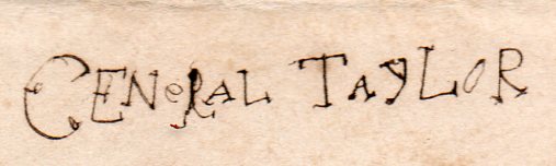
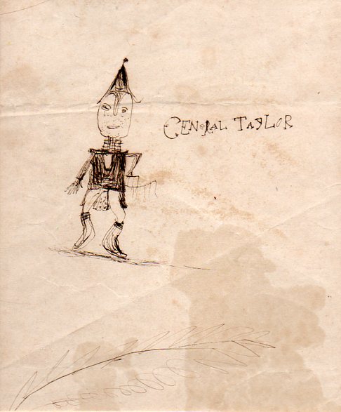
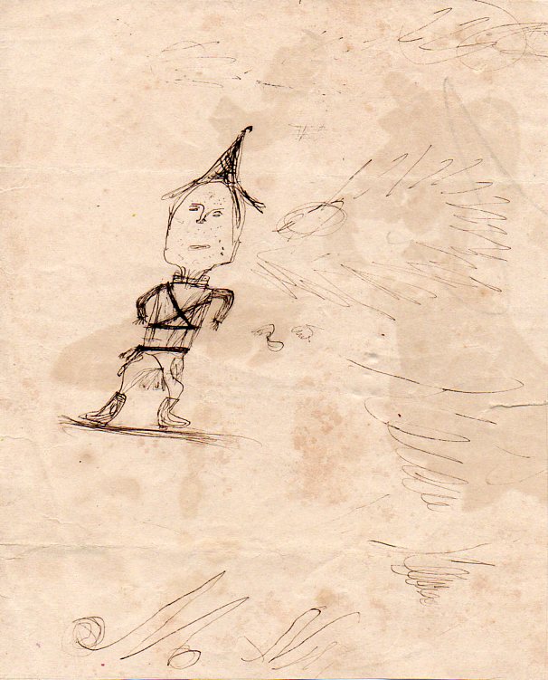
    President Taylor.  General Taylor.  That’s why I’m here right now.  He’s the subject of these magnificent efforts by an unnamed child.  The boy, or girl, drew these images on the back of a section o fmap that was printed in about 1845-1850, just about at the time that Taylor was at his greatest height–a general, a famous militaryu leader, about to become president of the United States without ever having been elected to any office.  He was a gigantic figure at the time, and no doubt occupied some piece of mind of the artist who rendered him, The General.

    I came to collecting childrens’ art in a roundabout way–not so much “collecting” per se as in “finding” them.  They’re difficult things to locate.

    First of all, materials were scarce.  Paper, pencils, ink–these were not common things for kids to own in the 19th century, especially more in the middle and early parts of the century.  These items were expensive, especially if you were a kid in a working-class family who didn’t have much of anything at all, anyway. In addition to a real crunch, a severity of absence, of the basic materials, the art that was made had to survive the artist’s own hands.  And then it needed to survive being culled from family clutter for a generation. And another. And another. And another. And four more.  150 years of parents clearing out the clutter is a lot to survive. 

    And so there doesn’t seem to be much left.

    I find them in flyleaves of old textbooks and such.  Its not as though there is are websites devoted to such things–at least not until now.

    And so I’m selling two of the three portraits of The General that I own.  I’m keeping one.  They just feel superb, to me.

    If you’re interested in owning one, visit the blog bookstore, here.  I’m developing now a site for nothing but pre-1900 kid art. 

    The artwork of children is a gorgeous thing, even when the children are not your own.  Its not that there is a sense of a certain charm, or charms–the words are just too weak. The vocabulary is more in the realms of the work being sublime, far more so than anything else.

    Children's art--1844


    ·Posted by :

    ·in:

    — —

  • When White Newspapers Photographically Discovered Lynching

    JF Ptak Science Books   Post 1223

    In the long line of “firsts” in the history of photography–the first photograph, the first photo of a human, the first photo of the Moon, the first color photo, the first photo on paper the first mention of the word “negative”, and so on–the first published photograph of a lynching of an African American in America took place late, late in the history of photography, late in the history of lynching Blacks, late in the history of conscience, late. Too late.

    Even though images of lynching began to appear in pamphlet in the 1890’s, and then in Black-owned newspapers in the ‘teens, the first images in White-owned newspapers didn’t make appearnaces until the 1920’s.   The images were seen as being too upsetting, too divisive, too much.. During an era of yellow journalism and sensational exploitation of disasters and murders and crimes and bad craziness–usually accompanied by photographic illustrations–the pictures of hanged or burned black people was where the white-owned journalistic establishment drew their line in their own segregated sand.

    In a thorough and disturbing  work, Lynching and Spectacle, Witnessing Racial Violence in America, 1890-1940 (UNC Press, 2009), Amy Wood identifies numerous cases in which lynching/burning photos in Black-owned papers appear in White-owned papers, though with the victims of the violence cropped and edited out.  All that is shown in so many cases are the faces of the lynch mob and a mild description of what they were up to–their gross indignty white-washed, the enormous suffering and fear of their victim almost completely removed.  The images are revolting, sick, sadistic–but so are many of the other images that appear in these sanitizing newspapers over the same time.  The editors just weren’t showing images of these White-based hate crimes.

    This is necessarily an exaggerated summary of these events–and there were many White-owned newspapers (like the Chicago Tribune) that decided to carry news and statistics of lynchings back into the 1890’s)–but the fact remains that these same stories were not photographically covered until 85 years ago, within the lifetimes of 5% of the American population.  And it should also be noted that by the mid-1920’s there had already been many thousands of lynchings in the United States, and that it took decades for this sort of journalism to occur.

    [I do have the following material for sale to individuals; that, or I’ll donate all of them to an appropriate institution.]

    I came to this book by Woods after reading through some of the anti-lynching pamphlets here–well, those, and a postcard of an infmaous lynching and burning scene, a spectacularly ugly image, meant to entertain.  It is a repulsive idea–that such suffering could be seen as a joke and used on the front of a postcard to entetrtain the receiver.Lynching--appeal--web
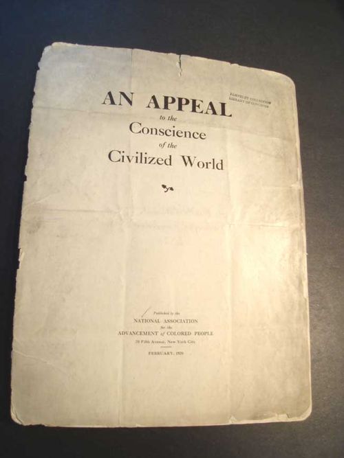
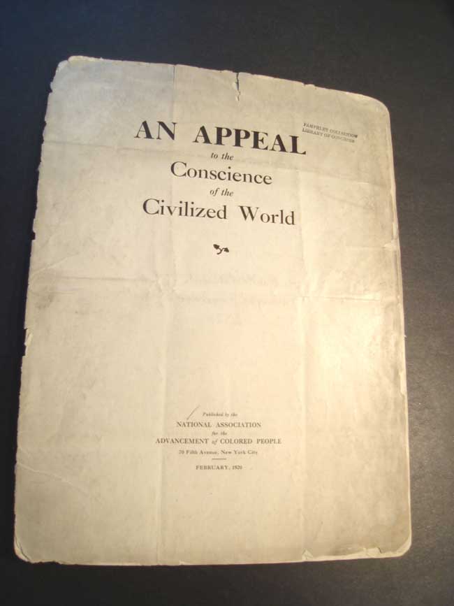
    An Appeal to the Conscience of the Civilized World, published by the National Association for the Advancement of Colored People, i s exactly that–a basic plea to stop lynching in the United States, a prayer for understanding, a call to action which is really a call for people to just stop lynching Black people. It is an incredible document, seemingly from another century but not so, being printed in 1920, just 90 years ago.

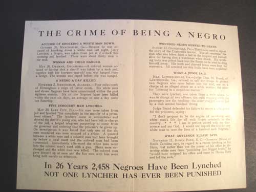
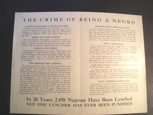
    The next pamphlet (really just a fold piece of 11×8 inch paper), A Crime of Being a Negro, is a little older (printed in 1912 at 20 Vesey Street in NYC), and details “some of the 51 lynchings which have occurrd during the last six months…and there are others”. It also makes the emphatic statement at the bottom, “in 26 years 2,456 Negroes have been lynched/not one lyncher has ever been punished”.  This would have been quite a crowd of lynchers–given the number of Blacks killed in this way, the total crowd of lynchers may well have been 50,000 people.
    Lynching--crime-being-negro


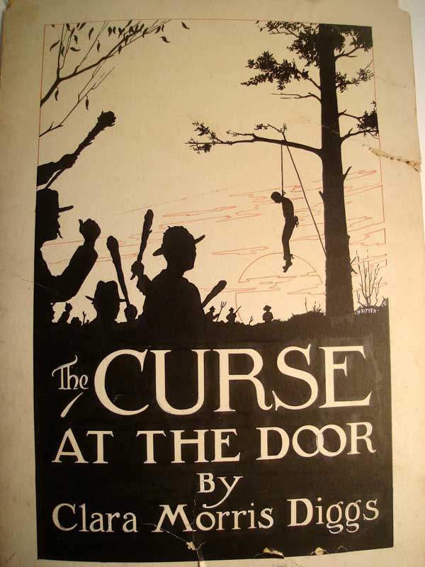
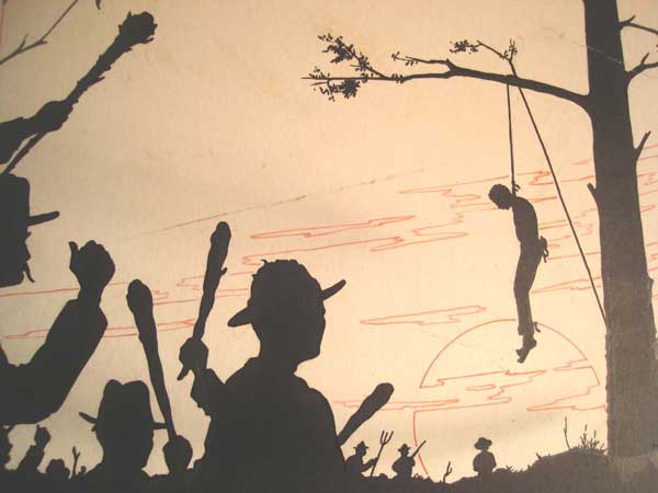
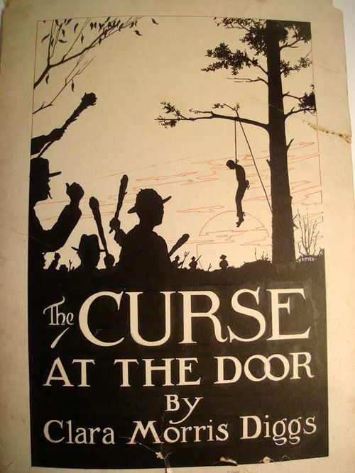
    One of the most shocking things that I have here in my small collection of items relating to these heLynchinginous actions is this original art, or mock-up, for the book The Curse at the Door, by Clara Morris Diggs.  The artwork and design is the work of Merton Witten (“Artist and designer”)  Illustrated scene of a lynching, being the original dustjacket art for the novel The Curse at the Door, by Clara Morris Diggs1.
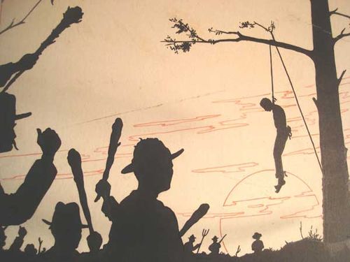


    Lynching2


    Lastly is this scarce mimeographed report by Robert Taylor Gray,  The Supreme Court Proposal and the Wagner Van Nuys Anti-Lynching Bill. It is basically a letter to Senator A.H. Vandenberg, Robert F. Wagner and four others from Gray, from typed originals, and dated   3rd August, 1937.

    It reads: “It scarcely takes a statesman to see that the murder of any citizen by a gang.is not justified on any grounds whatsoever. If any single Congressman dissents from the point of view here taken, I should appreciate his advising on what legal or moral grounds it is done.” If you thought that there wouldn’t be any dissent among Congress-people, you’d be wrong.

    Gray was a very prominent Philadelphia Quaker and scion of a business begun in that city in 1683. He was on numerous committees for racial fairness and equality including the Whittier Center Housing Corporation (where hhe extracted a promise from the Secretary of Commerce that the Public Works Administration would not build new apartment complexes ruled by discrimination or racial unfairness, a major coup)..

    Gray writes about the difficulty of establishing the Wagner Van Nuys Anti-Lynching Bill  and its coming to loggerheads with FDR’s plan to pack the Supreme Court. Evidently the President’s need for Southern support for his court plans would have to be purchased with the defeat of this Bill. Versions of this 1937 Bill (strongly written by the NAACP) had failed to pass the House and Senate in 1934 and 1935. The general way of defeat for these bills had been Southern Filibuster. So even though the bill was defeated, there weren’t any “no” votes cast against it–but it certainly had enough storming enemies to keep it from getting anywhere near a vote in the U.S. House of Representative.

    Time Magazine, 28 January 1938, reported the following:

    “The actual contents of the Wagner-Van Nuys Bill, as simple as they were familiar, would scarcely keep the U. S. Senate busy for that period. Like its predecessors, it provided for Federal prosecution, and a $5,000 fine or up to five years’ imprisonment, or both, for sheriffs & peace officers who did not afford criminals and suspected criminals reasonable protection from mobs (any gatherings of more than three persons).”

    (The principle Southern anti-anti-lynching bill proponents were) ” Tom Connally’s loyal little band-Georgia’s Russell, North Carolina’s Bailey, South Carolina’s James Byrnes, Tennessee’s Kenneth McKellar, Louisiana’s Ellender, and Pat Harrison.”

    “But if the practice has been general, the opposition to laws intended to suppress it has centred in the South. For two generations Southern Representatives and Senators have greeted every lynching bill that came up for debate with a reaction as sharp and unfailing as would be produced by a polecat. Snorted Georgia’s Richard Russell last week of the latest and one of the most threatening Federal attempts to prosecute and punish lynchers: “Skunk meat.”
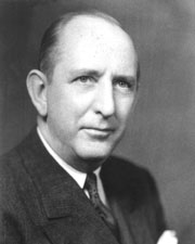
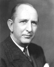
    Richard_Brevard_Russell In 1938 a Republican U.S. Senator from Georgia, Richard Russell, Jr.–a man who would rise to be President pro tempore of the Senate and leader of a conservative Republican coalition within the Senate, the great American legislative and deliberative body–referrred to legislation aimed at bringing lynchers to justice as “skunk meat”.  Here’s his picture.  He was indeed a product of his time(s)…well, perhaps he produced the product of his time, he and others like him were the manufacturers of this machine.  He did after all make it possible for this despicable outrage to continue and made it possible for those working way outside the law–the lynchers–to escape prosceution.  He subverted the law.  And he was one of the highest officials in the land. So I’d say he was a little more than just product–people like this were the producers.

    Notes

    1.The address for Merton Whitten on the back of the board lists 35 Mt. Vernon Street in Boston–this is Beacon Hill, and is in the same block (today) as the Colonial Society of Massachusetts (a very considerable old structure). Julia Ward Howe lived next door once upon a time. Whitten is listed as a “Commercial Artist” in the 1923 Boston Directory with a business address of 118-A Bowdoin.


  • Strange Things in the Sky Department: Aircraft, 1919

    JF Ptak Science Books   Post 1222

    Blog--May 20--minerveA

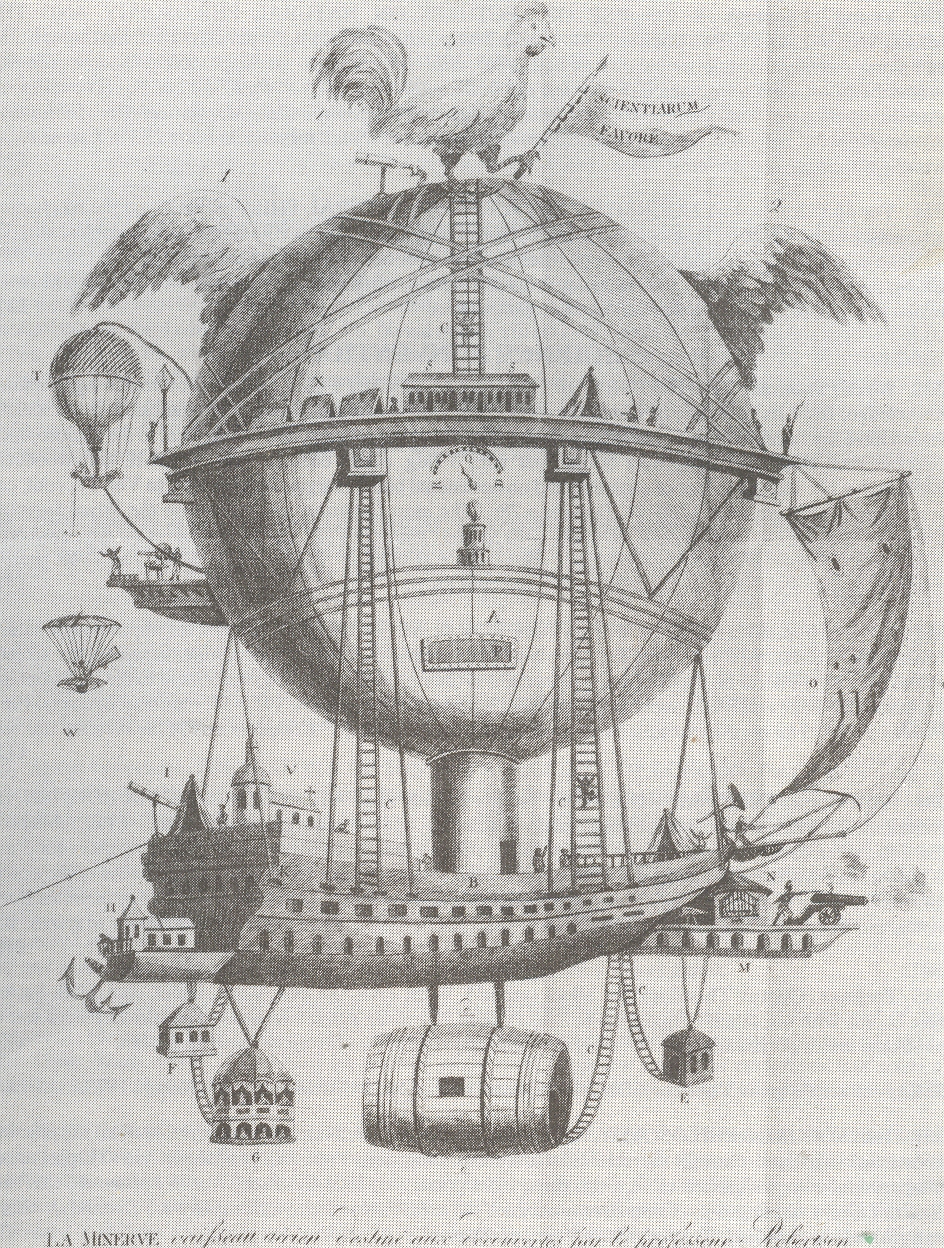
    I’ve written earlier in this blog about odd things found in the sky, some of which is imagined  (holes, extra Earths, blank Heavens, disembodied hands/feet/eyes/ears,proto-human empty aliens,  rat) and some of which were/are possibily real (like this fabulous aircraft with an escape pod for women, located here). [Both of these images are available from our blog bookstore, here.]

    These images present incredible, indelible ideas to us here in 2010, images of creations that look more like created steampunk for a retro-futurist novel than something real.  But they were actually state-of-the-art techno advances for their times, decent ideas, solutions for knotty problems that had no better answers than those presented. 

    Strange sky--launch plane839

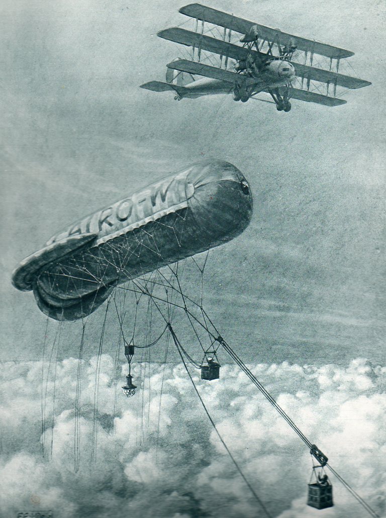
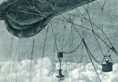
    The first is “The Clapham Junction of the Air, a Cloudland Signal-box”, seen in The Illustrated London News for 15 March 1919.  The idea was simple–cloud cover prevented aircraft from seeing their objective (lacking RADAR, which wouldn’t appear for another 23 years) and so something needed to be done to communicate with them above the clouds to relay data on ground conditions.  And so we have the tethered kite balloon with a mobile travelling car, the man in which would relate the necressary info to the waiting aricraft above.  (The description of the image notes that the aircraft is “one of a coming type”.)

    Strange sky--launch plane crowd det840

    Strange sky--launch plane det841

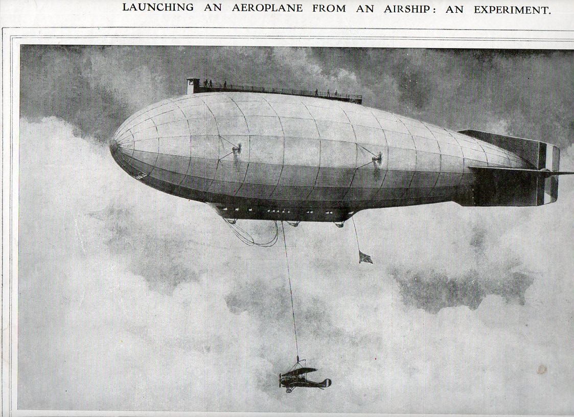
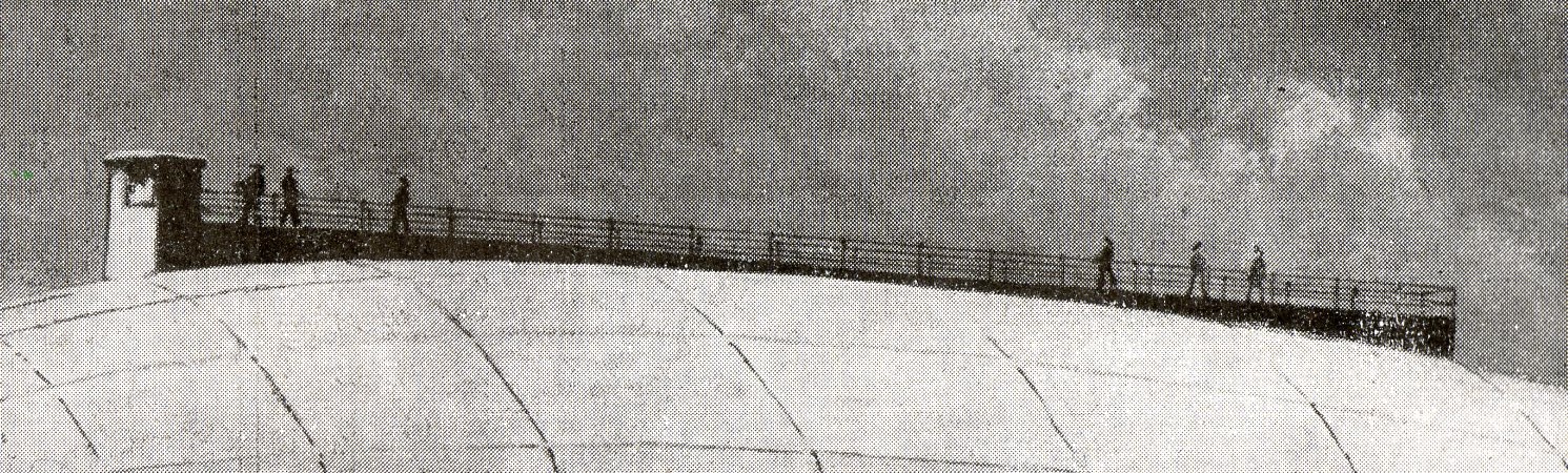
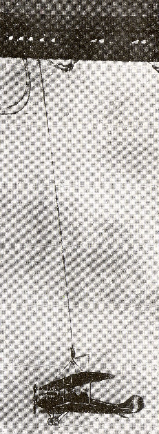
    The second image appears in The Illustrated London News for 1 March 1919 and is entitled “Launching an Aeroplane from an Airship, an Experiment”, and shows a helium-filled airship (“of the near future”) about to drop an aircraft.  The airship would have risen to some height with the aircraft already at tether, travelled a distance far beyond the normal range of the airplane-in-tow, and then release it–after a fall of a thousnad feet or so, the engines would start, and the plane would be operational.  that was one way of advancing air cover far beyond what woul dhave normally been feasible. 

    The set of problems encountered here woul de remedied in relatively short order, say with a few years of the publication of these pictures–but for teh time being, in 1919, this was the best that could be offered. 

    Strange sky--lmessages842
    Strange sky--lmessages det843


  • Buckle-Up for the Nuclear Holocaust–The Fat Man’s Big and Terrifically Bad Idea

    JF Ptak Science Books LLC  Post 1221
    ==Blog July 27=wiener title

    Atomic and Nuclear Weapons   and The History of Bad Ideas series

    This is one of those ideas that just went viciously bad on contact, turning into an enabler of  the very thing that it was supposed to help prevent:  turning the Easter Bunny into Dr. Strangelove.  In the History of Bad Ideas, this one is top-tier. 

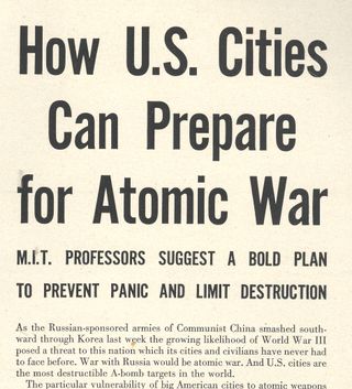
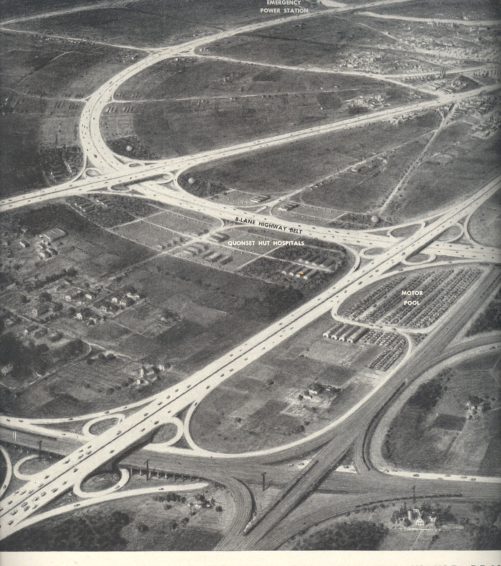
    LIFE magazine published “How U.S. Cities Can Prepare of Atomic War:  How M.I.T. Professors Suggest a Bold Plan to Prevent Panic and Limit Destruction” in their 18 December 1950 weekly issue, just in time for Christmas.  The plan was a partial response to the dire situation faced by the U.S. in Korea and the growing threat of China and of course the Soviet Union’s nuclear arsenal.  The government recognized that there was little planning in place to deal with the outcome of possible nuclear attack, and established the Federal Civil Defense Administration to help deal with the “problem”.  The problem  was how to make U.S. cities somewhat prepared to deal with being bombed with nuclear weapons—given that cities had a hard enough time dealing with 5:30 pm commuter gridlock, throwing a hundred megatons of explosive power into the equation made things more difficult. 

    ==Blog July 27=wiener left

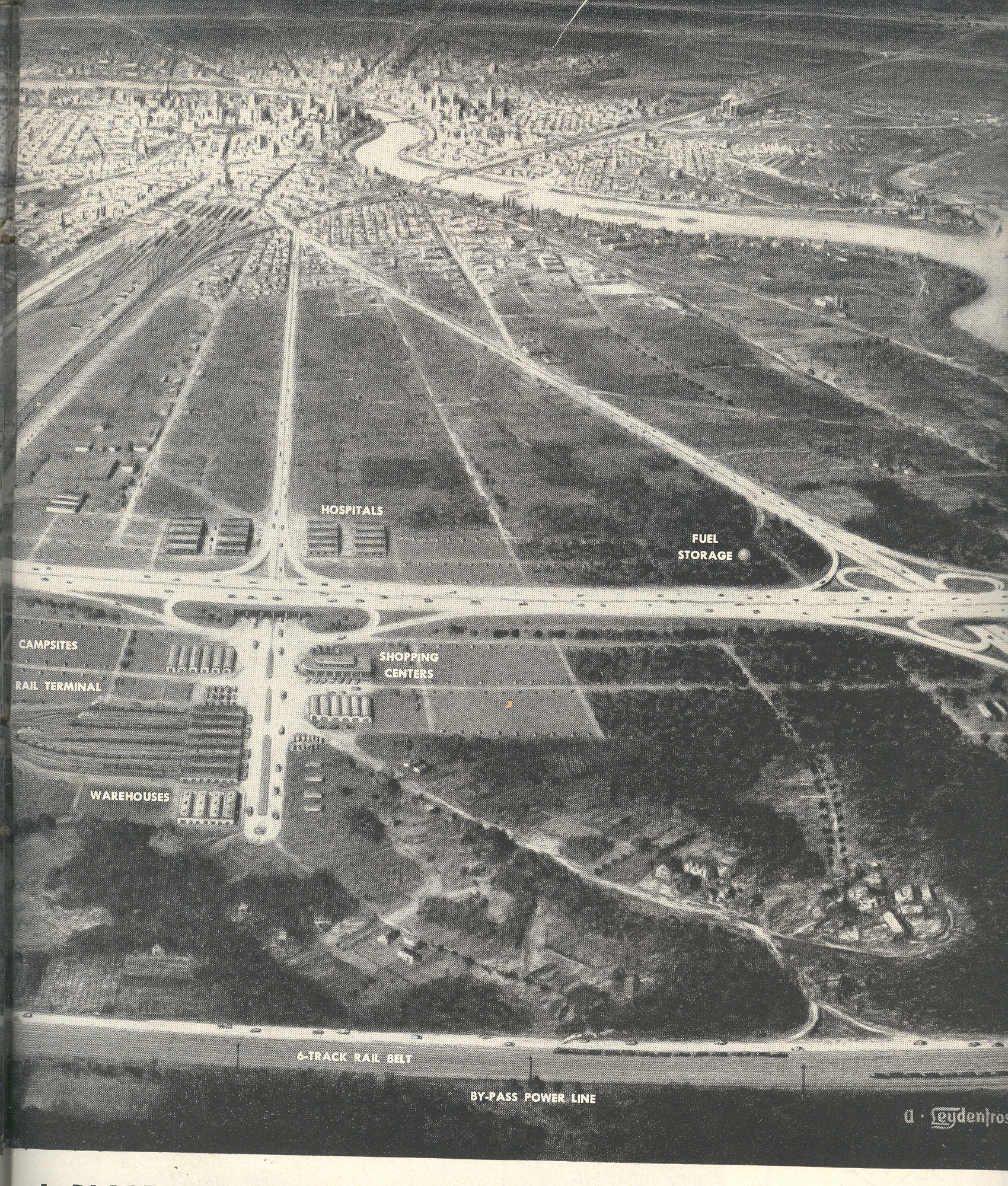
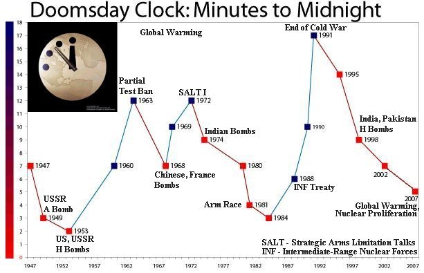
    One reaction was to construct concentric outer highways around metropolitan areas, “life belts around cities (which) would provide a place for bombed-out refugees to go”. In the birds eye view provided here, we see the plan in action, the main parts of which are an 8-lane “express” highway belt 10 miles away “from the built up edges of the city” , and a 6-track railway belt five miles further out, these accompanied by various feeder arms stretching straight-away from downtown.  In between the two outer rings would be land that would be kept free of development, so that farms and tent cities could be constructed after the attack. There would also be major collections of hospital and fuel depots in the greenbelt area.  Infrastructure would already be in place (gas and electricity, supplied with power from who-knows-where).   Shopping centers and a giant “motor pool:” would also already be in place, waiting for the Doomsday clock to strike midnight. 

    ==Blog July 27=wiener right

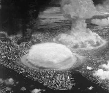
    One of the overwhelming presumptions here is that the interspersed green life living within the concentric rings of escape and transport routes would survive the attack. As would the highways.  Why on earth wouldn’t that infrastructure be attacked as well? Given the proliferation of weapons, it would seem highly unlikely that The Aggressor would target just downtown areas of major cities—they would of course have to include the safespots as well. Not that there would be that much of a change in targeting parameters:  exploding a series of 1 or 5 or 10 megaton warheads over a city like the one pictured here would pretty much decimate anything within the 15-mile life zone set out for survival.  With weapons in this megatonnage range, we’re talking about an explosive force that would be inconceivable, even using the Hiroshima explosion as a currency.  It is hard to imagine what happens when you deliver 3 or 4 5-megaton weapons to a city like this; when each of them would have the explosive force of 5,000 or so Hiroshimas, it is pretty clear that nothing will be left.

    This planning gap reminds me of the question dealing with UFO running/landing lights:  why are they there?  Even assuming a modest strike in the kiloton range (which simply would not be the case) why would these defensive structures not be a target, particularly, oh dear sweet creator, since they would actually be forming an enormous target, and one that even a half-blind flying pig could find from altitude? Ultimately, it wasn’t a good question to ask because the answer would reveal the helpless, soulless situation for what it was.  It was precisely an adult version of the ‘duck-and-cover” cartoons that showed the good students who got under their (wooden) desks being shielded from the atomic nastiness that just knocked down their school.  And of course these concentric evacuation and mobilization rings, even if they had miraculously survived a purposely modest attack, and even if they actually worked to handle the flow of millions of people in their eight lanes, and even if all of those millions driving these highways didn’t have any accidents that would choke the flow of traffic (and on and on), we still haven’t approached the radiation question.  For it was in the greenspace between the two concentric rings in which tent cities for the evacuees and homeless would come to life, some ten miles from ground zero (if, again, they weren’t themselves directly bombed with weapons in the megaton range). 

    So, in short, the way that these efforts would work is if (a) there was a lot of lead time to the attack, (b) everyone left the city in an orderly fashion, (c) nobody had any traffic choking accidents, (d) there was no radiation, and (e) one and only one “antique” nuclear weapons was used in the attack.  Given these parameters, the plan just might work. 

    One of the authors of this not-particularly well-thought or original idea was in fact a great and original thinker; this enormous and costly and not effective plan was certainly not one of his best moments.  Norbert Wiener (1894-1964), one of the co-conspirators of this idea, was a boy genius who grew into an adult genius, and that growing part didn’t take long at all.  He graduated with a Harvard Ph.D. in 1912 at age 18 and went on to a distinguished early career as a logician, studying under Russell and Hardy and Landau and Hilbert.  He left that part of his life mostly behind by the end of WWI, dedicating  himself to mathematics.  One of Wiener’s great accomplishments was (during the early stages of WWII) designing the capacity for anti-aircraft guns to be self-aiming, improving their accuracy (and effect) immensely.  This was the foundation of his communication theory which became the basis for his creation of cybernetics, a superior creation with vast applications over many fields. 

    By the beginning of the Cold War, Wiener became a pacifist, leading him down a dark and murky road to this “life belt” idea.  Perhaps this approach had precisely the wrong effect:  by lending the idea of sustainable and orderly survivability to nuclear war might have led people top believe that nuclear was survivable; and if there is a game played in which its two players are not necessarily both losers, then the specter of “winning” a nuclear confrontation with the Soviet Union becomes a possibility, making the whole idea of fighting with nuclear weapons feasible. 

    Doomsday

    I’ve not a clue as to what the great Norbert Wiener was thinking when he worked this out; even as a (and perhaps “the”) math guy,  the numbers just don’t add up. 

    When I put on my Jorge Borges x-ray specs the plan looks prettier, and of course involves libraries.  The outer concentric circles are still there, as are the green spaces, and the express/democratic ways of getting there; but what you would find there, on the highway ring, would be a series of libraries and dataports, and endless stream of books, and words, and numbers. 

    Addendum:

    One of among many things that I didn’t discuss above was the placement of such a greenbelt/lifebelt system for cities like New York, or San Francisco, or Los Angeles.  As we can see in the depiction of a nuclear attack on NYC from Collier’s Magazine (1948) there’s sorry little area for that highway ten miles out from 42nd Street…

    Atomic nyc


  • Display of Quantitative Data: What was Left of the Japanese Navy, 1945 [Short Post]

    JF Ptak Science Books    Post 1220

    Japanese sinking detail

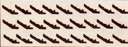
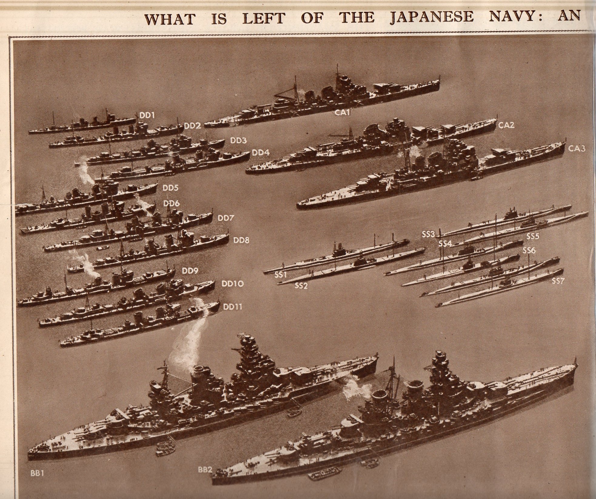
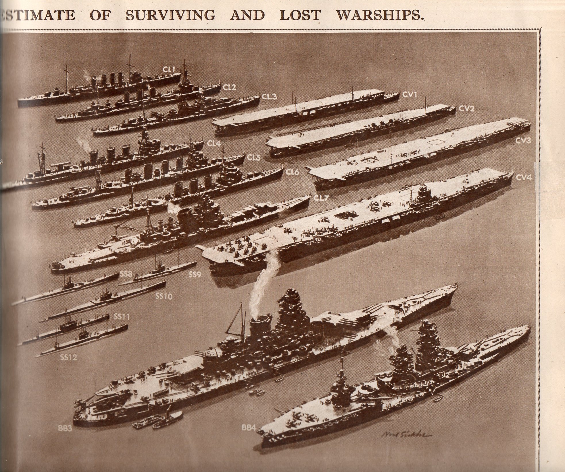
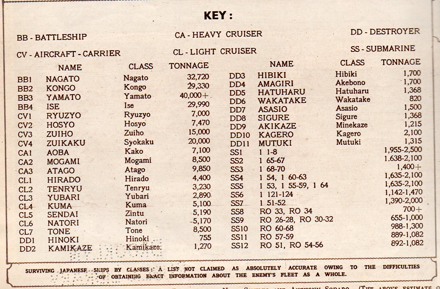
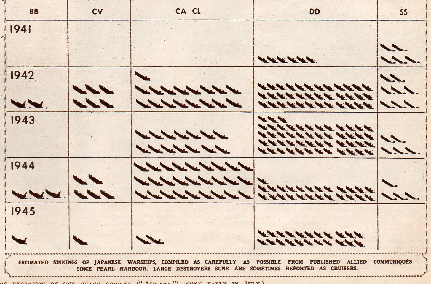
    This double-page spread in the Illustrated London News for 28 July 1945 displays what was left of the Japanese Navy.  Originally appearing in LIFE magazine a few weeks earlier, the image represents classes of Japanese naval ship, multiplied by the estimated number of ships in that class.  Even after all of the great  losses of 1942/3, the Japanese Navy was still the third largest afloat. 

    The navy consisted of an estimated 10 battleships, 6 carriers, 15-30 cruisers, 60-80 destroyers,and an not-estimated number of subs–or at least that is what was being published as the case in LIFE/ILN.

    This is an excellent display of a significant amount of historical data, made quickly understandable to even a quick reader, or even to a non-reader.  Two weeks from this date would find this information about the remaining Japanese Navy to be beside the point.

     Japanese Navy 1205 

    Japanese Navy 2206

    Japanese Navy 3207

    This chart shows the numbers of each class of vessel sunk by year:

    Japanese Navy 4208