A Daily History of Holes, Dots, Lines, Science, History, Math, Physics, Art, the Unintentional Absurd, Architecture, Maps, Data Visualization, Blank and Missing Things, and so on. |1.6 million words, 7500 images, 4.9 million hits| Press & appearances in The Times, Le Figaro, Mensa, The Economist, The Guardian, Discovery News, Slate, Le Monde, Sci American Blogs, Le Pont, and many other places… 5000+ total posts since 2008.

Author: JF Ptak

  • A Million Miles of Barbed Wire? (1918)

    JF Ptak Science Books   Quick Post

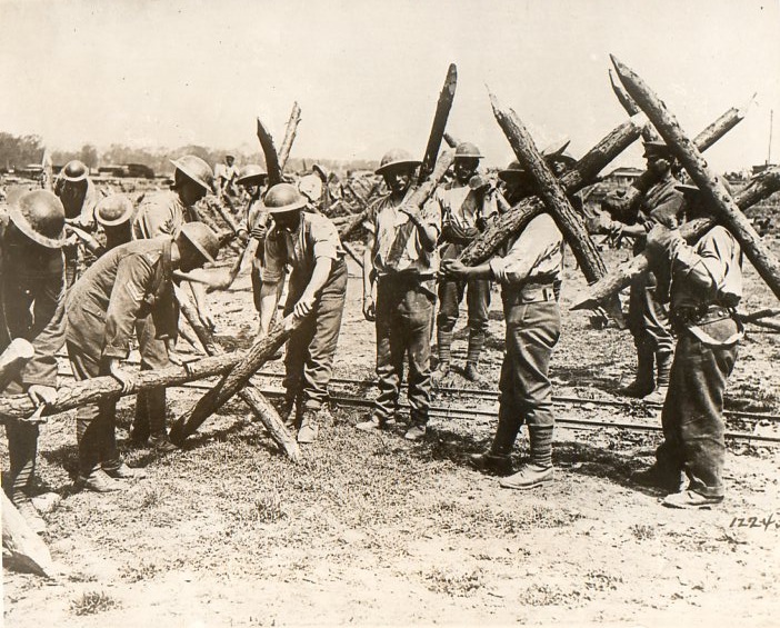
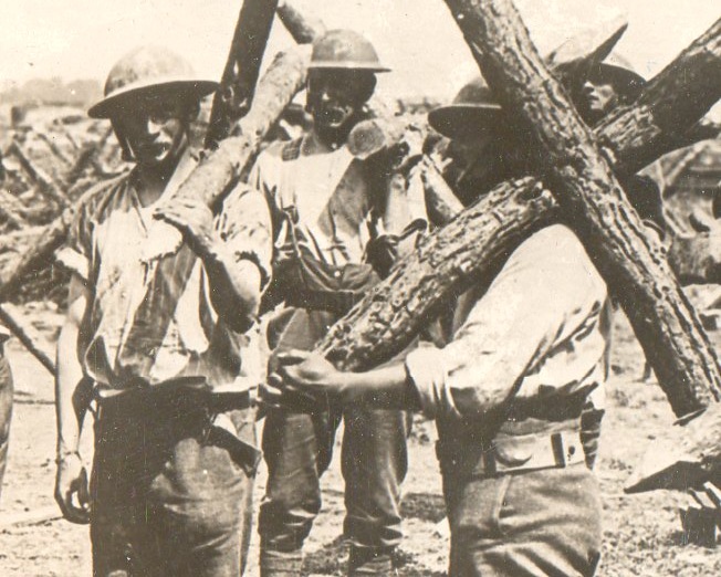
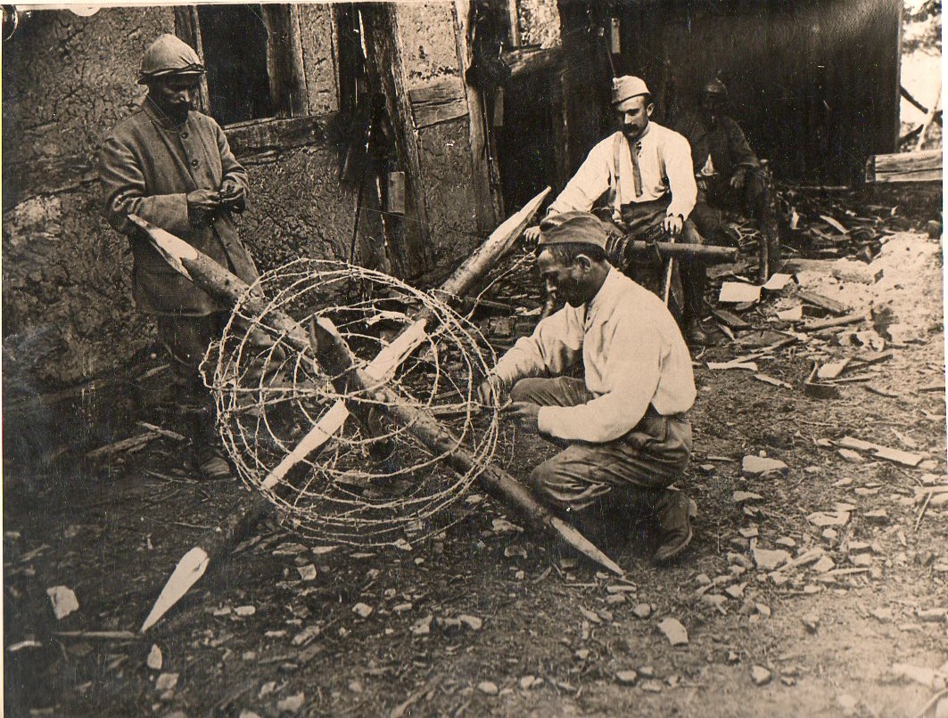
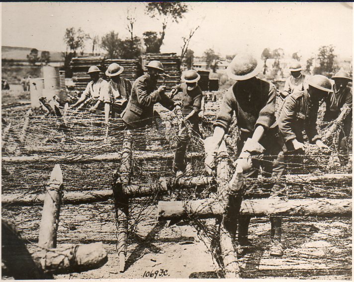
     The following photos were found in my small collection of World War I news photo service images, all of which were made in 1918.  They show the preparation of barbed wire entanglements–these were devilish things, made to grab a soldier and suck them in into a deeper hold when resisted, like a sort of sharp, metallic quicksand.  Since there were something like 12-25,000 miles of trenches dug during WWI, I think that it might be a safe bet to say that there were a million miles of barbed wire fencing laid down–that would be equal to about 75 feet of wiring for every soldier who served, or about 200 feet for every person killed. Given the tactics, the trenches, the barbed wire, the machine guns, the gas, and so on, it is no wonder that there was very little advancement over battlefields that stretched for miles and involved hundreds of thousands of troops, costing (sometimes) hundreds of thousands of casualties.  It would have been just insane-nasty to have to charge through fields of this stuff while being bombed and shot at by people in holes.  (All three original photos are available at our blog bookstore.)

    No gloves, here, not for the soldier weaving the wire or for the spinner in the background:

    Arbed wire301

    I notice that in this photograph the only person wearing gloves is the lead model, front-and-center:

    Arbed wire297
    Arbed wire298

    Here’s the support staff assembling the

    Arbed wire299
    Arbed wire300

    ·Posted by :

    ·in:

    —

  • The Old is New Department: Refuting Darwin with Commas, Adjectives, and the Creator (1873)

    JF Ptak Science Books    Post 1423

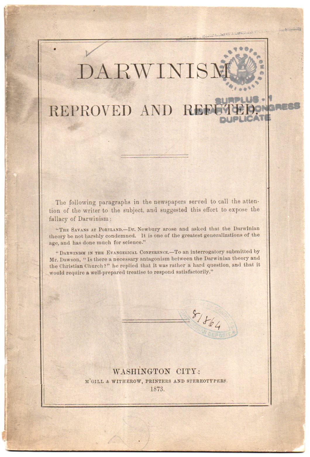
    Darwin refuted296 I wasn’t going to write anything at all about this pamphlet, but the vocabulary was so strong and vehement, and reminded me so much of what we can read in today’s daily press, that I thought to at least pick out some of the choice morsels. 

    Darwinism Reproved and Refuted, published in Washington D.C. in 1873, is left without any attribution to the author, the writer not caring to sign his/her name, not even to use as the wood into which some shingle with a weak social sciences/psych/religious Ph.D. could be nailed.  It is just left to the imagination or indignation that the writer didn’t or couldn’t feel confident enough to actually sign their work.  It is also one of hundreds if not thousnads of anti-Darwin vehemence–there is a chance I guess that there were more of these things written than there are visible-to-the-naked-eye stars in the night sky.  (The original pamphlet is available at our blog bookstore.)

    The author has little room for Mr. Darwin’s work1, clearly on a super-rant over The Descent… and on the theory of evolution, using such colorful words in runny purple prose like “\repugnant, revolting, unsophisticated, outrage, deadening influence, peculiar, fallacious, cunning”–and this coming from the first two paragraphs.  Needless to say, even though  the writer was too weak to sign their name, they did have some strong opinions. 

    “Utterly false, radically and fundamentally wrong, futile in the extreme, unreliable, ungrounded, false, short-sighted (in relation to god), ridiculous…” continues the author. The endowments of the Creator stuff doesn’t work its way in until the third page, when the adjectival and adverbial assault was already on it way, all without the assistance of any scientific counterexamples–but then the rest of the work is dedicated to proving the godless nature of Darwin’s work and its escape from scientific reality.

    We find this:  “Evolution is founded on materialism, which is another term for atheism”….”let this doctrine be compared with the Mosaic account of creation, and then the student of nature determine if he will choose for his progenitors Darwin’s pair of ring-tailled [sic] monkeys, or ‘Adam…’ “

    And so that’s what we get to in the refutation:  the Creator.  Old version of a contemporary complaint to get Darwin tossed out of classrooms to protect the youth of America, replacing it with divination.  The author writes:  “In the investigation of nature which is the proper province of the scientist, the most effectual method of studying it, in order to render this subject clearly intelligible to the human mind, is to regard the economy of nature as a form of government, having God for its founder, its Supreme Ruler, and Law-giver.”

    There’s not too much one can do with that, and even though it sounds antique, isn’t necessarily so, because the philosophy exists today, only with fewer commas. 

    Notes:

    1.  By 1873 Darwin already had produced an epochal body of work, including but not limited to On the Origin of Species by Means of Natural Selection, or the Preservation of Favoured Races in the Struggle for Life (1859),  On the various contrivances by which British and foreign orchids are fertilised by insects (1862), On the Movements and Habits of Climbing Plants  (1865), The Variation of Animals and Plants under Domestication (1868), The Descent of Man, and Selection in Relation to Sex (1871), and  The Expression of Emotions in Man and Animals (1873)


  • An Uncomfortable Caricature: Darwin, the Descent, and the ASPCA (1871)

    JF Ptak Science Books  Post 1422

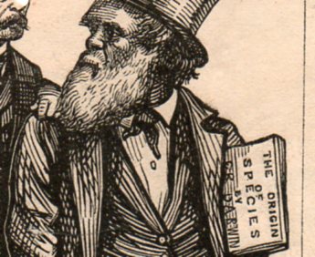
    Darwin cartoon  bergh294

    Poor Mr. Bergh.

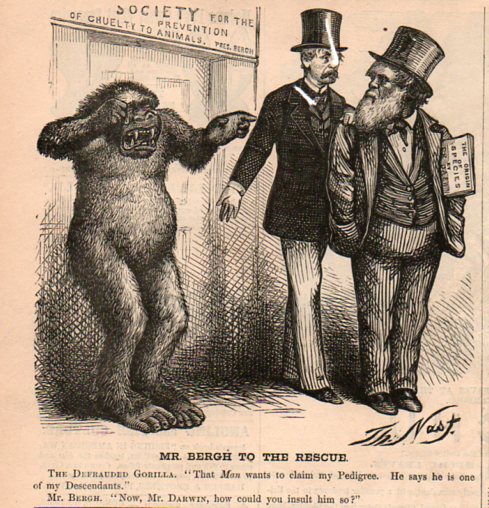
    I wonder what his reaction was to appearing in this 1871 Harper’s Weekly cartoon by the great and indomitable Thomas Nast, linking him in a terrible and probably inscrutable way with the man of the century? 

    Henry Bergh was the founder of the American Society for the Prevention of Cruelty to Animals (mainly I think in response to the treatment of work horses and the campaign for anti-sweating rules), and he is grabbing Darwin’s shoulder to remind the old man that in the shadow of the publication (earlier that same year) of The Descent of Man, and Selection in Relation to Sex (twelve years after the first edition of the Origin, and two years after the appearance of the Origin in its fifth edition) that a great harm was being done to the weeping gorilla.  Weeping because he was upset at being coupled with Darwin, weeping with the insult that someone such as Charles Darwin could be associated with him, with Mr. Bergh gently but firmly pointing out to Darwin that by connecting himself with the gorilla that he was doing a grave injustice to the gorilla.  (The original is available on our blog bookstore.)

    Darwin cartoon  bergh295
    Of course Darwin didn’t use a gorilla in the Descent, but no matter–it was a quick work by Nast and it contained enough of the stuff of some truth to reach publication.  Nast after all usually produced two of these small sketches plus a full-page work every week, and would do so for decades.  He got his point across–and it was a point shared by many, not the least of which/whom was The Times.

    The Times of London gave such an awful review of the book that a review of this review was published in the April edition of the British journal Nature1.   It was Thomas Stebbing who wrote the response to The Times‘ inciteful, hateful attack upon the Descent of Man. The Times saw Darwin’s work as an attack upon society,  accusing him of undermining authority and principles of morality, opening the way to “the most murderous revolutions”.  A “man incurs a grave responsibility when, with the authority of a well-earned reputation, he advances at such a time the disintegrating speculations of this book.” Stebbing’s review of the review is drippingly sarcastic, pointing out obvious errors in specific and the tone of the article in general in the defense of the book. Darwin’s “facile method of observing superficial resemblances” (says The Times) incites Stebbing to issue the following: “they may fancy that truth is worth discovering , even when it seems to involve some contradictions to our pride and some loss of comfort to our finer feelings…” (What a great line!)

    And so Thomas Nast piled on, though I’m not sure if he had a personal opinion on the matter–I prefer to think of Nast as rather forward thinking, at least in terms of more-correct thought on Indians/women/Blacks/the KKK/public education/government corruption, though he did have his failures in regards to the Irish, Catholics in general, the Pope, and some other areas2.  Nast may have just been reporting on public sentiment, or maybe not.  He at least doesn’t depict Darwin in a physically abusive manner like so many others, though Darwin does appear a little on the stubby side. 

    But getting back to Bergh–I have my doubts that he would’ve been entertained by being depicted so.  As I said, he founded the ASPCA, and also founded the American Society for the Prevention of Cruelty to Children.  He inherited a fine family fortune, and put it to good use.  He died at home, 429 5th Avenue (around 38th St and 5th, just a couple of blocks from where the NYPL would be) in 1888.  I hope he didn’t care; I doubt Charles did. 

    NOTES

    1. Nature,  1871, volume 3, 20 April 1871.

    2. He hated Gen. George McClellan so far as I can tell, which gives him an “A” rating in my book.
     

    ·Posted by :

    ·in:

    —

  • Bad Ideas Department: Restructuring the City and the “Terminal Box”, Neopolis, 1938

    JF Ptak Science Books   Post 1421

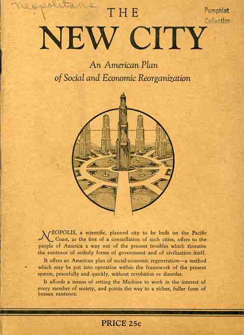
    0-blog---Nov 14 new city075 The unnamed author of The New City, an American Plan of Social and Economic Reorganization (1938), makes a hard-edged plea for the formation of a new American society—and by “new” the author really means it, advocating a different economics, social structure and even the physical development of new cities and abandonment of the old physical and philosophical structures. (The rare original of this deterministic futuristic publication is located at our blog bookstore.)

    Sprinkled among the Swiftian notions of rightness, quixotic lancings of social ills and a general bombardment of the structure of society are some interesting and isolated points: 
    “America is the supreme user of the machine…ravishing the irreplaceable wealth of one of the earth’s richest continents, tearing down forests, looting the treasures of coal and draining the reservoirs of oil and natural gas, by methods scandalously wasteful.” 

    This leads the author to the Depression, “a decade of demonstration of the profit system’s inability to deliver to the people the needs of life, a painful heartbreaking demonstration”.  0-blog---Nov 14 new city076

    It is the profit-deliverers, not the machines or people, who are to blame.  One way of addressing the distribution system, was, unfortunately, Russia—“a form if society set up to overcome this impasse of the capitalistic system of production and distribution”.  Of course the Russians–the Soviets–were just in the middle of their enforced starvation/gulag/brutalization period under Josef Stalin, the gigantic negative parts of which were still in general not known to the great unwashed. 

    The unnamed author dips lightly into Socialism, and then into Fascism and Nazism, though the only thing he/she really has to say about the later two is that “their answer [to economic woe] was in the seizure or control of the means of production by the state”, their own brutal means skipping off unnoticed into a pinkish glow, though the loss of personal freedom is “disdained”. 

    The New City is actually a new world order, a new governmental form to take advantage of technological advancements leading to “nationalized urbanization” The first city in this new order is Neopolis, and this pamphlet was a call to those who would stand as its citizens.  (There’s actually a sort of application form, though all it really is a bill-of-sale for ordering more copies of the New City pamphlet.)

    Even though the pamphlet is easily obtained, membership, the possibility of being a Neopolitan, is something entirely different.  The difference is actually exceptional, perhaps the most extraordinary thing about this whole misguided idea.  “Membership is to be carefully controlled at all times” we read. . “It is not desired to build up a huge and unwieldy membership of poorly-assimilated elements….interesting educational instruction…with tests to determine the fitness of the member for loyal, cooperative activity, leading, necessarily, to the elimination of those who may be found undesirable”. 
    That’s some pretty muscular, steroidal stuff, particularly after such a glancing blow against the Soviets and Nazis. 
    0-blog---Nov 14 new city077
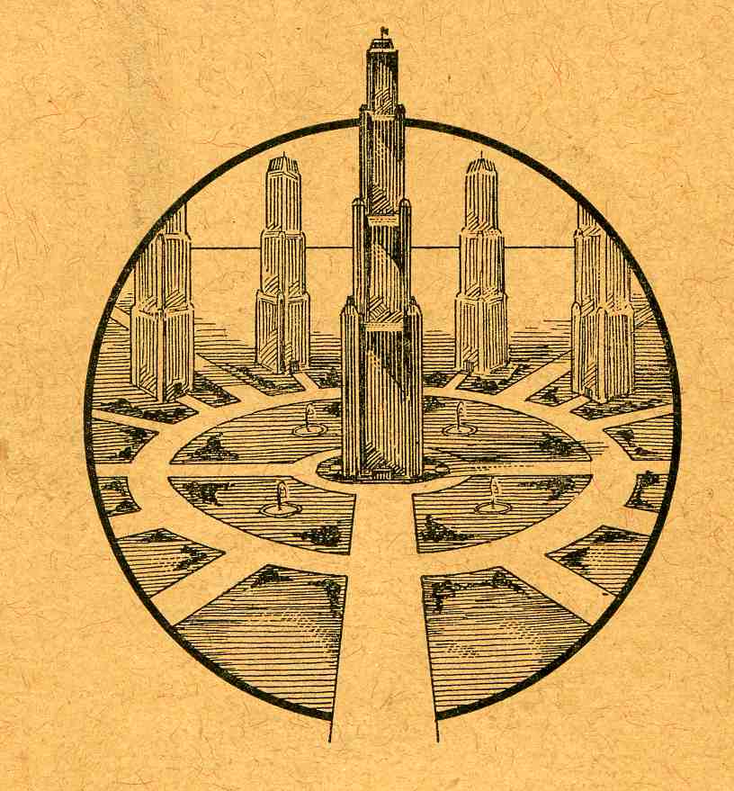
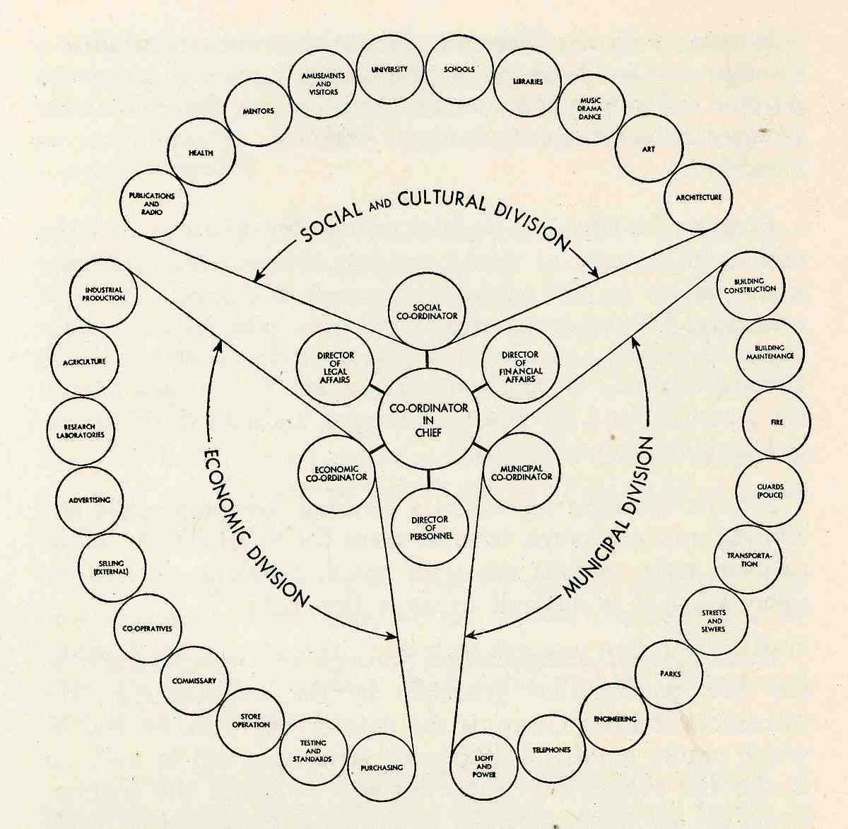
    Since this is just an “abridgment” of a soon-to-be-written 250-page explanation of the concept, the complex and concentric organization of society is left mainly to the drawing of its plan, the physical layout of the city based upon this ideal. 

    The Seattle-based author never did quite make it past page 29, never did name themselves, and never provided a concrete place where all of this heady stuff was being think out.  It is a sort of pretty design in a creepy/queasy way, there on the front cover, but that’s about as far as it goes.  If anyone actually did send any money to this quack thinker, it wound up in a nicely metaphorical place:  at “Terminal Box 3463”. 

    This may be the very best idea to come out of touching this pamphlet—a place where people can send correspondence regarding Bad and/or Dead or Dying Ideas: “Terminal Box ______”.  I guess that box number would be pretty high by now. 

    Stalin20 (Uncle Joe, before he killed the children, and dozens of millions of others.)


  • Little Pieces and Superb Design: Rockets, Canons, and other Boom Boom

    JF Ptak Science Books  Post 1420

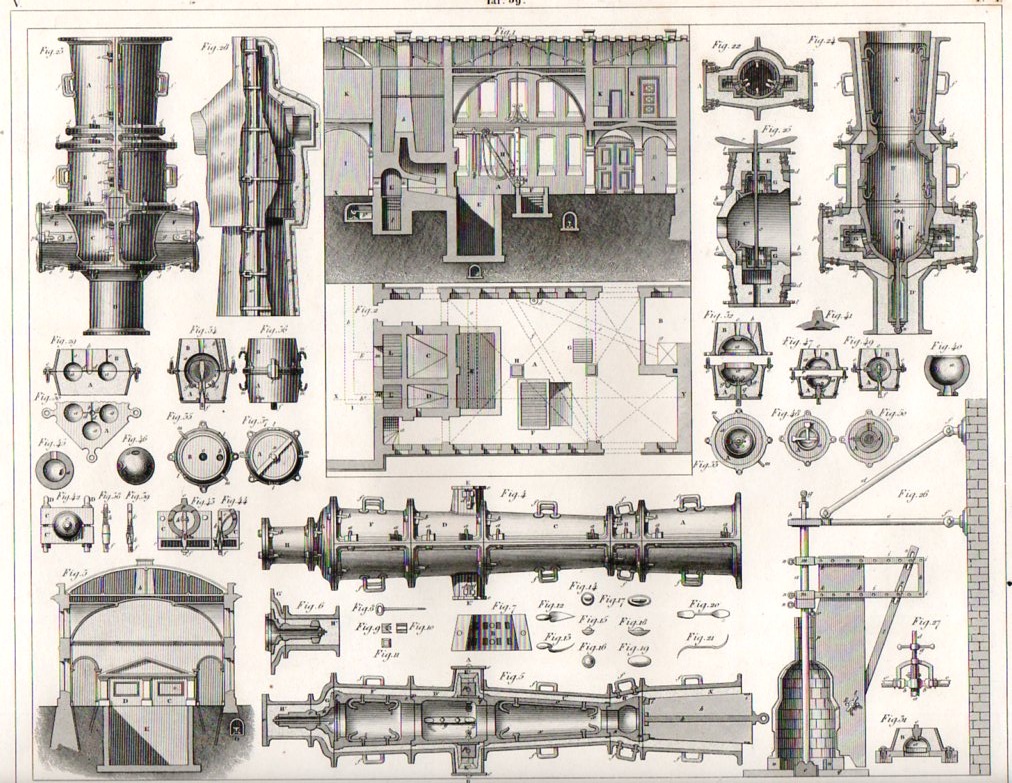
    Artillery285

    The Iconographic Encyclopedia of Johan Georg Heck (printed 1851)  turns out to be perhaps one of the best designed books of its type in the nineteenth century.  Seemingly no  matter how much diverse information is hosted per page, whether the items number in the dozens or over a hundred,  the artist managed to distribute them with such grace and apparent ease that it is an absolute pleasure to see it all arranged before you. 

    Take for example the following two engravings of artillery fabrication of the early/mid 19th century.  There are 49 complex images on this first  piece of 11×8-inch paper (above), and yet there seems to be also a lot of white space.  It is a full but not crowded display of superb craftsmanship–it is also all very interesting. (Both are available for purchase from our blog bookstore.)

    To start, the main figures at top-center shop the plan and elevation of a workshop for casting canons, and we can clearly see the main furnace (“A”) for the big guns, surrounded by smaller auxiliary furnaces for smaller pieces.  Off to the side we see “K”, which is the drawing room and also the place where the director of the plant would live. Underneath it all in section we see various pipes and drains used to take away water and ash.  The structure on the lower right is for forming the business end and the purpose of the canon or mortar–namely, the ammo, and in particular, the pattern mold of a 50-lb mortar.  The long vertical pole at left used to place he liquid metal under pressure in the hearth, the ball being at the very bottom center.

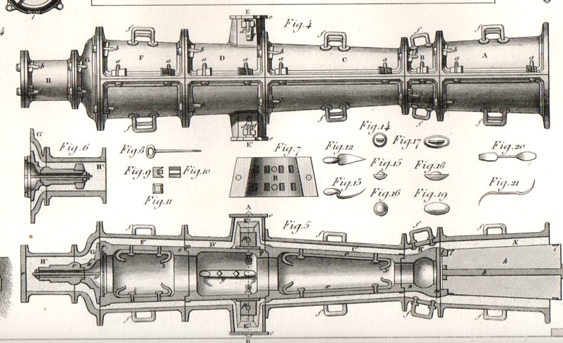
    I’ve enlarged figures 4 and 5 to show the particulars of a canon (dry sand) mold, #4 being the exterior of the mold and #5 showing a cutaway so that one could see the six-ponder canon that was being formed inside.

    Artillery286

    There is just so much in this image that a more knowledgeable person could easily go on for pages describing each and every bit. 

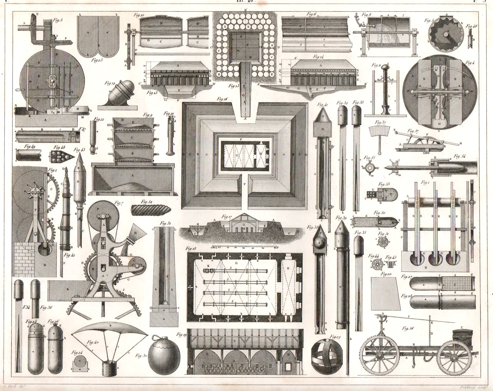
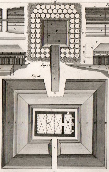
    The second image displays cartridges and (in general) fireworks–military pyrotechny.  What strikes me right away in this image are the five architecturals in the running vertically down the middle of the sheet.  They show what to do with gunpowder once it has been manufactured, which is an important consideration on handling and safety prior to it being used in battle–the first plan shows a field magazine, while the other four show the disposition of the construction of a permanent magazine, which show plenty of ventilation as well as massive walls which are in turn sunk into the earth and surrounded by ramparts.  It also seems that the roofing is huge, built no doubt to accommodate an earth filler.  Each of the barrels carried a hundred pounds of powder, so there was considerable interest not to allow the magazine to blow up, and if it did, to have the blast go mainly skyward. 

    Artillery287

    Some other items of interest in the second engraving include the incendiary devices (at bottom, #s 29+30),  signal rockets (#s 32,33,34,35), and the Congreve rocket, (#40 and #52,  which is much bigger and meant to be fired on the enemy, it being an incendiary); #53 is another Congreve, but this one scatters grenades as it is in flight. 

    Artillery288

    There’s a lot that can be described here but it goes a little beyond what I wanted to do with this post–it is also a lot beyond what I know about the subject.


  • Horses in the Sciences: Proving Nothing and Something

    JF Ptak Science Books   Post 1419   [Dedicated to our primum mobile family horse person, Emma Digh Ptak.]
    Horsepower281

    The history of horses in the sciences is not a very wide subject area, though I’d like to look at a few instances in which they help to prove both something and nothing–particularly in the third case below, when the “nothing” was a very big “something”. 

    First, in the history of horsepower (and such an odd history it is, having somewhat and famously to do with billing issues for steam powered engines) there is a certain restricted high-percentage element that are just no-go, unworkable ideas.  Some of them served as the basis for further and deeper thinking,and some of them were simply far ahead of the technical abilities of their times. 

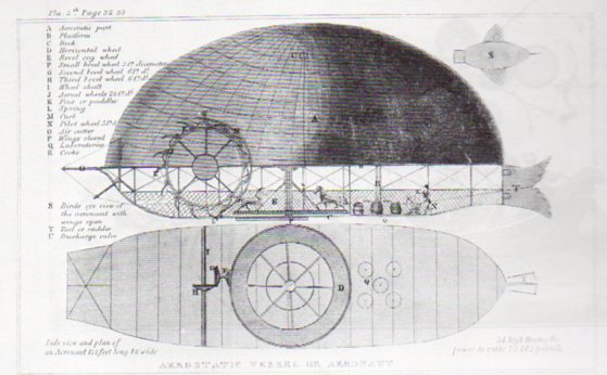
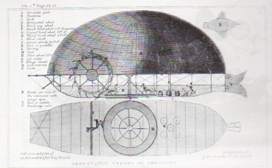
    In 1825 Edmond Genet1 published an interesting book (Memorial on the upwards forces of fluids and their applicability to several arts, sciences and public improvements) which in and of itself is a milestone in a number of different technical aspects–one part of it though sensationally and beautifully elevates itself to the Not-Quite-a-Good-Idea-at-Almost-Any-Time Department.
    Horsepower282
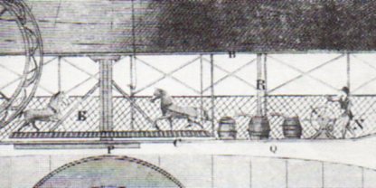
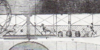
    “The actual plans of Genet’s airship called for a balloon shaped to resemble the rounded back of a large fish and containing about 1,023,000 cubic feet of hydrogen gas, with a platform or deck fastened beneath. Two horses, moving on a revolving wheel on this platform, were to provide the power for operation of a pair of large, silk-covered aerial wheels, while the rudder in imitation of a fish tail was intended “not only to steer the machine, but also to supply it with an additional force of propulsion”. –Genet in his Memorial…

    One thing that makes Genet’s work so impressive is that as a result of it he applies for and is granted the first patent made in the U.S. for a flying machine.  The flying machine he presented in his work though is a little problematic:  the canopy and the machine itself are not at all drawn to scale, and their size and breadth are lost a little in that under-representation.   I’d say that the figures in the drawing should be half of what they are, given that the flying machine was 132′ long and 46 feet wide (and 54 feet high), and the canopy was to be filled with a million cubic feet of helium.  The thing was a beast, and was supposed to be blessed with the capacity for lifting 72,000 pounds2.   The horses were along for the forward propulsion, moving two large paddle wheel-type wheels on either side of the airship.  It just doesn’t look right.

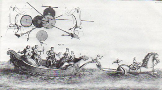
    Next is a tempting mechanism, an inset living inside a larger engraving depicting a mode of transport not-so-tempting.  It comes from Colonel Jean-Gaffin Gallon’s (1706-1775) Machines et inventgions approuvees par l’Academie Royale des Sciences....published between 1735 and 1777, and poetically covers its subject over a 111-year span from 1666 to 1777.   The massive work was illustrated with nearly 500 engravings covering all manner,shapes and description of technological invention and advancement, not the least of which was the first illustrated description of Pascal’s logic machine.  Amid all of this vast wealth of potentially revolutionary achievement,. I pluck out this equine example of possible nothingness: 

    Horsepower280

     which I am just not sure about, not having the text.  I can only hope that the horse was some sort of imaginary mechanical something, given its task and its size.  From the looks of its neck and the rider and the length of the horse, if it was a living thing it would have been gargantuan. 

    Here’s an appearance in the Gallon work (from 1735) of another, mechanical, horse that was used for stage productions, and which seemed fairly articulated:

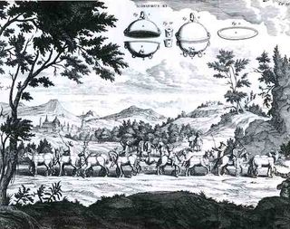
    And thirdly, there is this, perhaps the most famous image of horses in the history of scientific illustration:
    Mantegna vacuum von guer

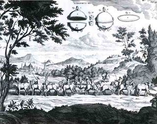
    This beautiful illustration is from one of the greatest experimental physics books of the 17th century, coming as it does from Otto von Guericke’s  Experiemnta nova (ut vocantur) Magdeburgica de vacuo spatio (Amsterdam, 1672).  (In another minute department, this one is also I guess the greatest book ever written by a Mayor of anywhere (as von Guericke (1602-1886) was mayor of Magedeburg for 33 years).)  The image shows the greatest of von Guericke’s efforts, and one of the greatest (or most important) experiments in experimental science–the dramatic demonstration of the vacuum, showing here that teams of horses could not pull apart two halves of an evacuated sphere, and of course the efficacy of air pressure operating against it (um, the vacuum). The “floating” bits in the sky were an exploded view of the sphere that was the subject of the experiment. 
                   
    What was more important though, and what the general reader today might easily miss, was that von Guericke created something that many scientists and philosophers said didn’t, and couldn’t, exist:  the vacuum.  In modern times, Copernicus depicted the universe as a vast void; Descartes came in the back door (following the ancient and interesting though incorrect theory of Aristotle), not liking the idea very much, and claiming that such empty space couldn’t exist.  Von Guericke provided the proof that the vacuum, that nothing, did exist.

    As a matter of fact the issue of nothingness was very contentious, with the concept of its possibility and the display of a vacuum not achieved until this effort by von Guericke, with his team of horses tugging away at the essence of nothing.

    NOTES

    1.  Genet is best remembered in American history as “Citizen Genet”, at least far more so than that being remembered for gentleman farming or his work in aerostatics and invention.  “Edmond Charles Genet had tried to recruit American volunteers to serve in the armies of Revolutionary France and to outfit American privateers to fight against the British. Despite President Washington’s orders for him to desist from his high-handed appeals to the American public, he continued the same practices until he was forced from office. Washington permitted him to remain in this country as a private citizen, saving him saving him from the possibility of being guillotined for his failure.” So writes the great historian of Science I Bernard Cohen.  It wasn’t altogether true though that it was Washington who saved Genet; his being allowed to remain in the U.S. was strongly pursued and lobbied by Alexander Hamilton, Genet’s greatest detractor/enemy/nemesis in Washington’s cabinet.

    2. By contrast, the Wright I Flyer (the famous first-flight airplane of 1903) had a wingspan of 40 feet, weighed 625 pounds and sported a 12 horsepower, 170 pound  engine (and which by the way was all produced for about a thousand dollars–not nothing, but not a lot).
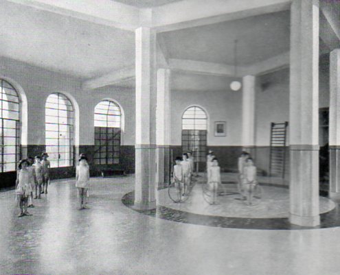
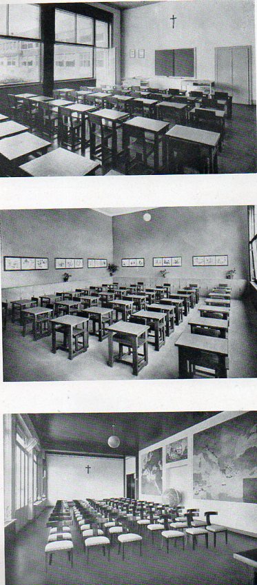
  • The Problematic and Unspeakably Brief Beauty of Linoleum: Italy, 1933

    JF  Ptak Science Books   Post 1418

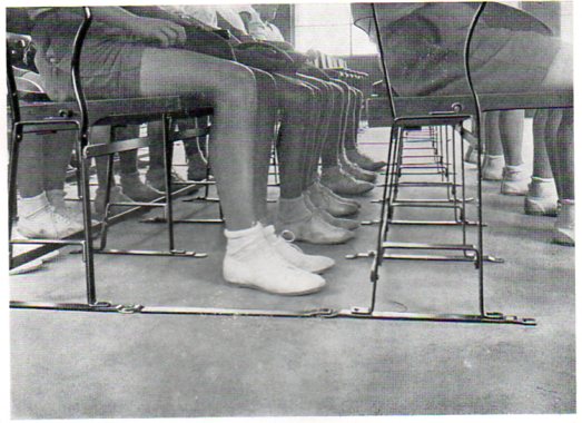
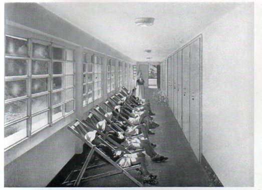
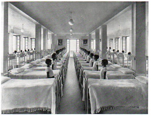
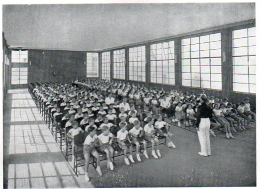
    Linoleum italian275
    In my imaginary History of Lines there is a chapter or two for humans-in-line(s).  In the history of the world, the fourth and fifth decades of the twentieth century—the 1930’s and ‘40’s—were big ones for human lines.   Big does not imply good, because as we all know lots of humans lined up for all manner of unspeakable nastiness during this time and well more than 100 million didn’t make it out alive (considering all of the wars, purges, revolutions and stupidity).

    The lines here are a little more benign, though with shriveled overtones of corrected respect.

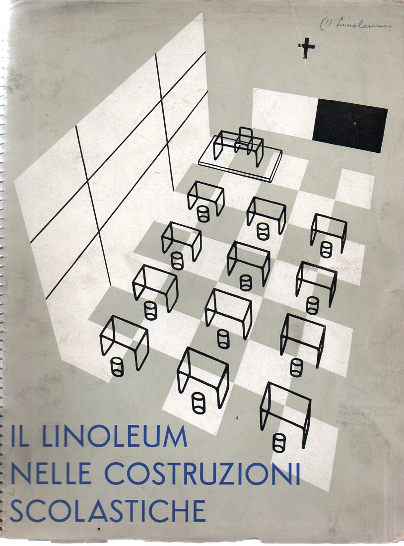
     Oppressive obedience in a well-designed environment is still like dressing your ear-infected 14-year-old St. Bernard/Jack Russell (?!) mixed breed in baby booties—its just not right, and these images attest to this simpy comparison. All of these photographs come from a delightful manufacturer’s catalog for linoleum products (Il Linoleim nelle Costruzioni Scolastiche), which was printed in Milano in 1933.(The original is available at our blog bookstore.)

    Linoleum italian277
     I’ll undoubtedly write a post on this stylistic beauty later on, but suffice to say for right now that it really is a lovely thing.  If only we could forget the Mussolini part.  Now I’m no fan, necessarily, of linoleum, but if I had to live on a linoleum island far removed from civilization and I had to choose a design for my world, I would choose the designs from this catalog, without hesitation. They’re spare, well-proportioned, beautifully design utilitarian designs; they are also very shiny and cold with a dispirited order, but so it goes.  The catalog seems to speak for its times, the inspired design bowing to the weighty needs of the flatulent state.

    Linoleum italian278

     Even though the people (mainly child people) are in very structured environments, they still look as though they really don’t believe in whatever it was was happening–of course the y were at school, or in an academic environment, or hospital, or something (as the titlf of the work states). There is something just wrong in the child-straight lines and seemless expanse of linoleum, something that looks as though details have been left out, that there is a ground-in sameness to everything, that the indifference to difference is so to make the children of a sort of sameness.  Ihope that they did okay–most would be around 80 or 85 by now, if they survived.

    Linoleum italian276


    Linoleum italian279

      Linoleum italian271

    Linoleum italian272 

    Linoleum italian270


  • Obfuscation as a Weapon–on Teaching Indians to Read, 1875

    JF Ptak Science Books   Post 1417 

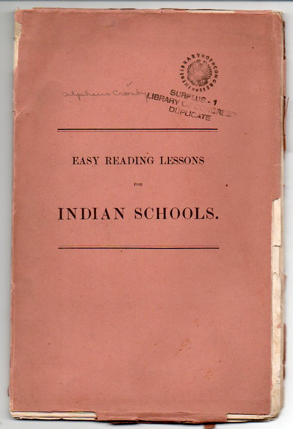
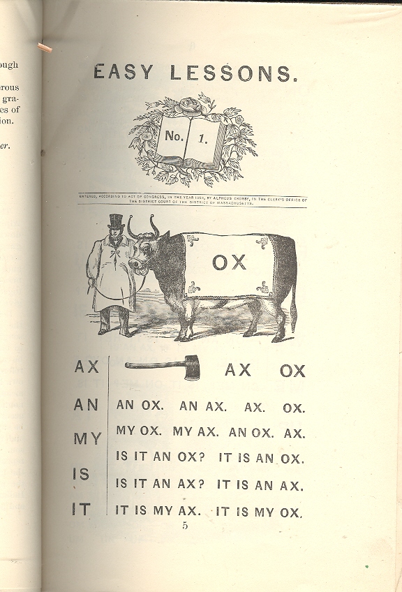
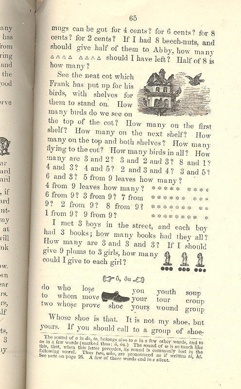
    This small pamphlet, Easy Reading Lessons for Indian Schools, was published for the Department of Indian Affairs (as a section of the Interior Department, classifying the Indian along the lines of cattle and agriculture) by the federal government, printed by the indomitable Government Printing Office in Washington DC in 1875.  (The original is available at our blog bookstore.)

    Indian school269 It is an unintentionally quiet indicator of the general American policy towards the Native American in the last quarter of the 19th century.  The work is indifferent to any particular need of the student.  It is intended for the person who could not read, and nowhere in this work is there a listing of the alphabet.  It is ignominiously but softly complex, and looks to me to be a total disaster as a text.  (This is true when comparing the work to nothing at all; but when you stand it next to, say, McGuffey’s reader or the Eclectic or any of the other classic how-to-read books of the 19th century, the weaknesses of the Indian book become instantly clear.

    How in the name of great bog could anyone have thought it just and fair and equitable to teach English-illiterate “Indians” to read with such an instructional?  It isn’t even close to being a book, and it comes no where near to being able to transcend its own terminal obliqueness.  It introduces simple words and phrases in a tongue-twisting ways, and then complicates the situation by quickly adding more structured words in a more confusing environment.  The thing is terrifying.  I actually had a hard time reading it out loud. 

    Here on page 17 (already!) is a tremulous example:

    “See the lad.  Is it Mat?  It is Mat; and Fan is by him on the sod.  He has his hat. But it is not on. Has Fan a hat?  Mat has a bat. Dan cut it by the bog. Mat had his bat, and ran at my dog Boz., and sat on a log, and hit him.  He did it in fun. And Boz had his fun.  He got the bat and ran it way and hid it in a box. Dan got it but bid Mat not hit the dog.”

    Indian 001

    For crying out loud! (The bat by the way is, yes, a baseball bat.  Pretty early stuff in 1875.)  Why would someone use this series of images to teach someone how to read?  The pamphlet continues to exhaustion, taking only 80 pages to do so. For me it is a perfect symbol of the way in which the government—in general—dealt with the “Indian Problem”.  Confusing children and making life more needlessly complex, making it harder for them to succeed, making it more difficult for them to rise above the difficult situation that they have unexpectedly been born into,  is a superior sign of inferiority of the dominant power. 

    Wait a minute.  Am I writing about the Indian in 1875 or the poor kids in  SE DC in 2009?  I can’t tell.  The corruption of the social model for caring for people who need federal attention more than anyone else—the underprivileged child—is antiquarian and entrenched and as strong as ever.  At least there’s a moral foundation for the care of kids whose parents cannot afford health insurance.  Um, oh, wait another minute….

    Indian 002


  • Ancient Motion Pictures, Part III: Street Scenes and Human Urban Landscapes, 1902–Belfast, Wigan, Bradford, Manchester

    JF Ptak Science Books  Quick Post

    Again from the BFI comes a series of absolutely super urban motion picture landscapes showing bits and pieces of ordinary city life at the turn of the century–I find them exquisite.  The first is a movie taken from the front of a horse drawn tram in Belfast, 1901, along Royal Street:

    Another glorious motion picture of street scenes in a major city at the turn of the century:  Manchester, 1902. 

    Electric tram rides from Forster Square, Bradford, in 1902:

    This street scene at Wigan is remarkable for the pure joy of the people who have gathered to be int he film–I particularly like man with his broad-brimmed-hatted daughter on his shoulder towards the end of the film, the father following the camera trying to get his daughter into the film.  Just lovely. 

    cvcv

    ·Posted by :

    ·in:


  • Ancient Motion Pictures, Part II: India, England, France, 1898-1899

    JF Ptak Science Books   Quick Post

    The first segment here is a collection of Lumiere brothers films, the first of which (made in 1896) shows the release of factory workers at their shift’s end–included are a large number of women:

    Another lovely film called “Santa Claus”, which may well be the first movie of Santa ever made (1896):

    Even though this 1899 film is entitled “Panorama of Calcutta” it is actually of Varanasi, India:

    View from the front of a locomotive, coming into Barnstaple, 1898:

    From the great BFI (British Film Institute), a lush moving picture of the launch of the HMS Albion, which actually shows the front end of the making of an enormous Thames River tragedy.

    From the BFI channel:  “E.P. Prestwich’s footage of the launch of the battleship HMS Albion on 21 June 1898 looks deceptively serene and gentle. What it doesn’t show is that when the ship hit the water for the first time, it created a wave that swept away a jetty, drowning an estimated 39 people in the process, one of the worst peacetime disasters in the Thames’s history.”


    ·Posted by :

    ·in: