A Daily History of Holes, Dots, Lines, Science, History, Math, Physics, Art, the Unintentional Absurd, Architecture, Maps, Data Visualization, Blank and Missing Things, and so on. |1.6 million words, 7500 images, 4.9 million hits| Press & appearances in The Times, Le Figaro, Mensa, The Economist, The Guardian, Discovery News, Slate, Le Monde, Sci American Blogs, Le Pont, and many other places… 5000+ total posts since 2008.

Author: JF Ptak

  • A Great Graphic Fumbled–What 300,000 Army Trucks Almost Looked Like, 1944

    JF Ptak Science Books   Post 1529

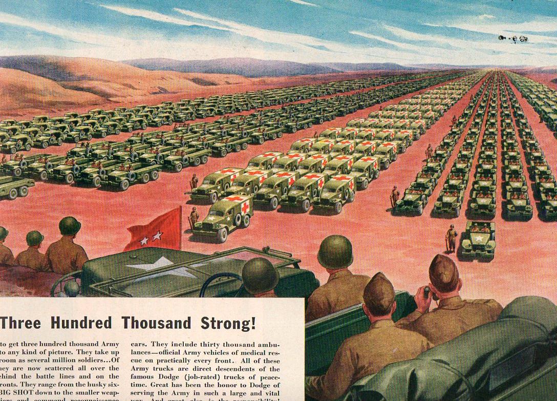
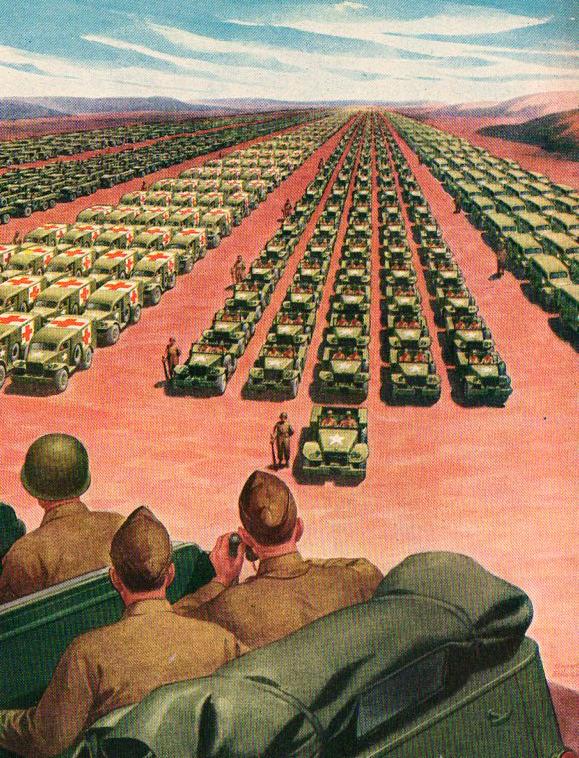
    If each of the 2,000 trucks pictured below carried $100,000,000 dollars in hundred dollar bills, how many trucks would it take to carry away the national debt?  Every one of them–this entire scene.  70 times.  Twenty miles of this convey, each truck carrying $100,000,000, would carrying off the debt.  Actually it would take 40 trucks (each with 100 million) to cart away the amount of debt accrued in daily interest on the national debt of 14 trillion dollars.
    Massive graphic548
    This Life magazine ad for the Chrysler Corporation–makers of Dodge–took the form of a public service announcement and a push to buy more ear bonds, though it really was an advertisement for itself and its wartime efforts.  What it proposed to graphically portray were the 300,000 trucks that it manufactured (to that point) for the U.S. Army–and the image that they use to get the point across is arresting, but it doesn’t come close to doing the job.

    It seems to me that the visible trucks here number about 2000 for the five columns; and I calculate that each of what we can see of the columns to be about 1500 feet long.  In order to show 300,000 trucks we’d need to show this page 150 times; or what Chrysler is showing is 1/150th of their total wartime production of trucks.  To show them all would take a lot of time for the two-star to review, hours, in fact.  I reckon that the five-column-wide display for the 300k trucks would be about 150 miles long. 
    Massive graphic549

    So even though this image is very persuasive and impressive, it doesn’t come close to the magnitude of the number’s display.

    Similar to the Chrysler ad is this:
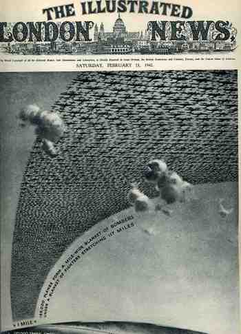
    1ebay_sept_30185000_planes695This arresting cover image for The Illustrated London News of 21 February 1942 illustrates the (new) American production program for planes and tanks for 1942 and 1943  The caption reads: “185,000 planes form a mile-wide blanket of bombers under a blanket of fighters stretching 117 miles” which is actually a double blanket of planes–if they were thinned out to form one layer it would stretch one mile wide from Washington D.C. to New York City, which is quite an unimaginable ribbon.

    The numbers and depiction are in some aspects similar, though it is still very difficult to get the point across of how massive these numbers really are.

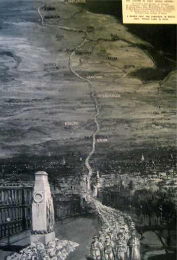
    The Chrysler ad says that the depiction of the trucks would “take up as much room as several million soldiers”, though it seems to me that any of the columns alone would do so. A while ago in this blog appeared a short piece on what 1,100,000 British war dead would look like, as presented by the Illustrated London News:
    Blogmarch

    The image (printed in 1933) shows the column stretching from London to Durham–London through Hitchin, through Bedford and Peterborough and Grantham, past Sheffield and Leeds and York, and then on to Durham–a distance of 269 miles or so.  Four across, a 269-mile column of dead soldiers.  That makes a pretty big point on an extraordinary sacrifice. 

    So the short end of the story is that back there during 1944, the Chrysler Corporation somehow managed to vastly underplay their war effort in an advertisement to themselves. 


  • The Heaven of Disappeared Details

    JF Ptak Science Books   Post 1528   Part of this blog’s Blank, Empty & Missing Things series.

    What is the opposite of “the Devil is in the details”, without getting too terribly religious? Expressing detail in the history of art has been a progressive process, and perhaps in some sense that is what art was all about–adding detail, becoming more representational, more life-like, more expressive of the world and nature.   Perhaps that is what one essential element of art was all about for hundreds, or thousands, of years–a progression that marched its way through time with greater effectiveness and representation, for the most part, until relatively recently, when–in the early part of the 20th century–details began to disappear, until in some cases there were no details at all.  Or at least the details that people had been comfortable with for so long, like folds in dresses, or lustre in eyes, or thinness in clouds, or even the correct perspective in the re-invention of three-dimensional representation. 

    http://www.moma.org/collection_images/resized/042/w155h170crop/CRI_211042.jpg

    Detail changed with the  Romantics, and then definitely with the Impressionists, and then on into the the Cubists and the Abstract,  until the detail of what we would recognize as elemental objects would disappear altogether.  Corot, Cezanne, Gauguin, Whistler,  Seurat, Van Gogh, Picasso, Braque, Duchamp.  And then everything goes away with Kandinsky.  1911.  Details of references to the physical world slipping away into general sense impressions.

    It would probably make more sense to look at the Kandinsky at this point–I’d rather look at the Pierre Bonnard (1867-1947) and his La petite blanchisseuse (Roger-Marx 42, also known as the Small Washerwoman).  The wide expanse of her black working gown is a primary link to solid blankness, without detail of nearly any sort, missing parts of reality, allowed to go to Disappeared Detail Heaven.

    Photo

    The occupants of the Heaven was begun centuries ago, though the details banned there on purpose really only begins in earnest with the missing details of the solids in (Paolo)1 Uccello.  This great master (dissed terribly by Bernard Berenson I don’t know why) was one of the very few exceptions of artists who purposefully banned details from his work, just as the reality of the world crept deeper into the works of the late Siennese masters pointing out the details of their rediscovery of perspective. 

    There would be a long period in between Uccello and the other detail disappearers. 

    _____________

    1.  The phrase “the solids in Uccello” comes of course from the Great American Novel, William Gaddis’ The Recognitions, discovered and shared to my by the lovely Patti Digh. In some of his enomrous cnvases it is quite easy to find wide expaneses of nthing where detail should be…


  • H-Bomb Wipes out Brooklyn. And Chicago. And New York.

    JF Ptak Science Books  Post 1527          Part of the Atomic and Nuclear Weapons series

    Wipe out Brooklyn

     [Source:  Conelrad blog and also at the website]
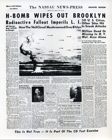
    I stumbled on this bombing of Brooklyn article at the excellent Conelrad website–it is an excellent addition to my slight collection of vintage depictions of American cities being nuked.  As part of the necessary scare tactics in the pursuit of the arms end of MAD, the destructive power of these weapons were shown against a background that Americans could readily understand.  Thinking of atomic and then nuclear holocaust in terms of multiple units of Hiroshimas and Nagasakis was one thing–showing the effects of these weapons on an American grid was something else.

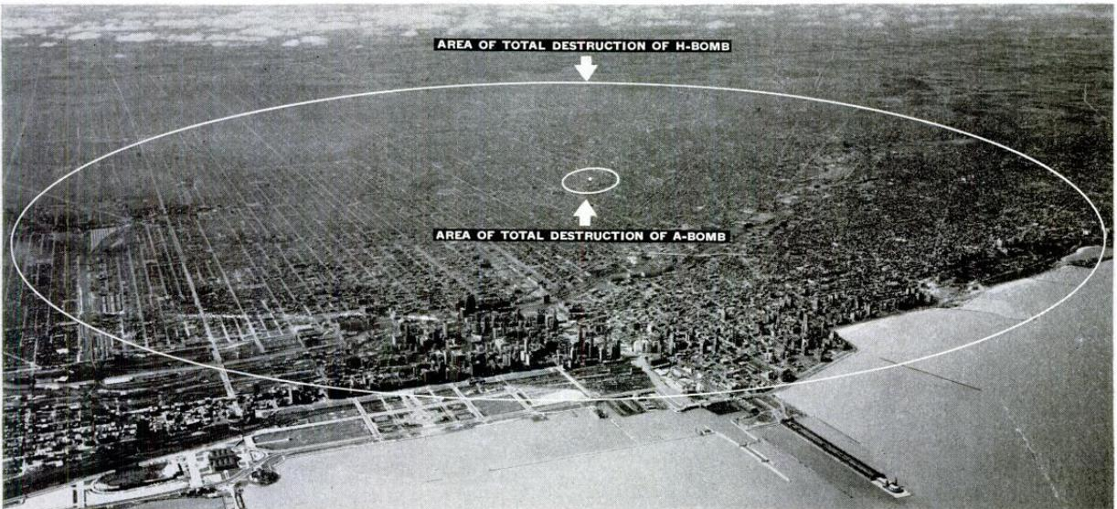
    This next  graphic shows the difference in destructive capacity of an atomic bomb (small circle beneath an air-burst detonation) and a hydrogen bomb (the large circle showing area of total destruction, which in this case would be about 50 square miles) on the city of Chicago.

    Wipe out chicago
    [Source:  LIFE Magazine, 30 Jine, 1950]

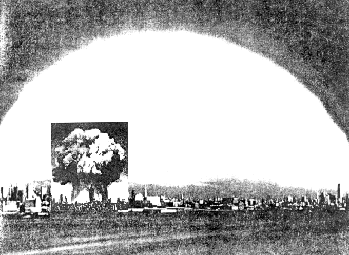
     The next image is much like the preceding, only showing a profile of Manhattan and the difference between the explosions of a Hiroshima bomb and a hydrogen bomb (of 20 megatons).

    http://bioinfo.mbb.yale.edu/~mbg/fun/both-bombs.gif

    [Source: BioInformatics Lab, Yale  http://bioinfo.mbb.yale.edu/~mbg/fun/both-bombs.gif]]

    But don’t worry, even if the Chicago and Brooklyn and New York and so on were destroyed, the U.S. Navy would survive, which would  be either great or horrible if you were a sailor:]

      H-Bomb  WIpe out NAvy
    And as usual, the point is made with one weapon being detonated, rather than the x-number that would actually be deployed.  Depicting, say, 10 weapons being used against these cities–while being a more accurate portrayal of what nuclear war might look like–might have looked like something beyond the usefulness of propaganda. 


  • FearNaughtia Coffins: Life Detectors, Escape Ladders, Breathin’ Pipes and Premature Burial

    JF Ptak Science Books   Post 1526

    I’ve written here before on the wonderful book by Jan Bondeson, Buried Alive, the Terrifying History of our Most Primal Fear 1(Norton, 2001) and on the difficulties of determining death in the 19th century, and the various ways that people sought to deal with and sidestep the possibilities of premature burial.  In continuing those posts I’d like to add the following  drawings from hopeful reports of the U.S. Patent Office, some of which really didn’t make that much applicable sense, but, well, you can patent just about anything if it hasn’t already been patented. 

    These coffins were constructed to allow their occupants to ring or telephone or telegraph or signal with smoke or light and so on should the dead respond to their lost life while buried.  As I point ou tin the earlier (linked) post, determining death was a difficult task in the 19th century, so there wsa a legitimate fear-of-being-buried-alive concern.  OF course, the best way yo determine death would be to allow the supposed-dead to lay out for three days at the end of which the body became a corpse and putrefy–the decay part was the true determiner of death. WHy people had to bury the dead into a coffin and be placed underground faster than the three days is a mystery, particularly if there were so many people who lived in fear of waking up in an underground coffin. 

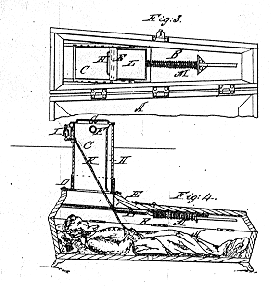
    And so to the solutions, the first of which was brought to the world by Franz Vester of beautiful Newark, New Jersey.  Well, Newark was probably beautiful when this patent was granted in 1868, and maybe this idea seemed so, too.  Here’s what would happen if a dead body awoke in Vester’s safety coffin:  their hands were attached to a rope that would be connected to a top-side bell, and the not-deceased would tug on it for all they were worth.  After that, a sliding door above the face would be moved, and the coffin’s occupant was then supposed to pull themselves up to a short laddered tunnel that was connecting the living world from the sleep-of-worms-world.  Were there problems?  Yes, of course, but so far as it has been recorded no person ever saved themselves suing this coffin, in spite of Vester’s very strenuous exercises to promote his invention.

    http://www.americanartifacts.com/smma/life/g13.gif

    [Image source:  American Artifacts, via VanVleck]

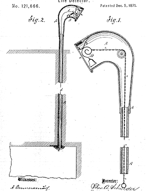
    A few years later from just downthe road in Hoboken, Theodore Schroeder and Hermann Wuest were granted a patent for another rope-activated sounding device.  The 1871 patent revealed what was pretty much a common thread to come–rope, hands, bell.  Theoretically, if the dead awoke they would tear away at the bell until the prefect or whomever arrived to dig them out.  The pair from Hoboken added a few tweaks here and there–one that allowed a release of fresh air into the coffin, and another which used an electromagnetic deice to replace the hand engine.  I’m not sure how long someone can last in a coffin underground, but it can’t be very long at all.  Why someone would think that adding an air vent to a coffin where the dead have been underground for a few days already doesn’t seem to make much sense, except to the coffin manufacturers. 

    http://www.americanartifacts.com/smma/life/g1.gif


    The next example comes from the beautifully-named Albert Fearnaught, who although not from mid-Jersey patented a device again using a rope around the wrist of the dead, this time though the rope was attached to a spring-loaded device that would release a flag when activated from below. 

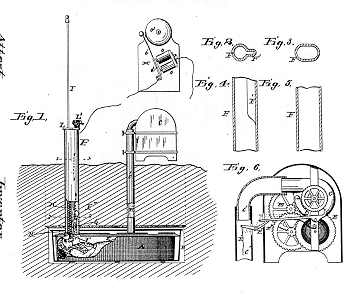
    This next (1885) patent has a slight variant on the rope-hand solution:  the string-finger. Well, there was also some electromagnetic stuff involved, but basically the string on the finger of a moving not-dead-corpse would activate an electric bell and yadda yadda yadda people would come to help and release.  The added extra here, the clear-coat undercoating, is a device that would allow the folks topside to peer down and see the face of the interred, and whether or not it was animated, I guess. 

    http://www.americanartifacts.com/smma/life/g4.gif

    Hubert Deveau evidently had grown tired of all of these hand/finger-operated back- from-the-dead resurrection devices, and constructed (in his patent of 1894) a relatively simple groundskeeper-alerting-breathing-device combo–a pipe that could be moved up by the head of the person int he coffin which would in turn activate a spring-something that would keep the pipe poking-up above the ground.  It would deliver fresh air to the buried, and would evidently be a warning sign to the cemetery man that something was afoot, underfoot.

    Funny thing her is that most of the systems I looked at for this post involved a single device to release the prematurely-buried–it seems to me that there should have been at least one back-up system in case the main apparatus failed.  I mean, if you’re going to become intensely psychotic, why would you then depend on one thing to get you out of your buried coffin?  And that one thing is, basically, a rope.  What if the thing failed?  I’m just saying that I expected to see a little more comfort juice applied to these solutions than I saw. 

     And why current radio talk show fearmongers like Glenn Beck isn’t all over these things, I don’t know–they Fearnaughts for just about everything else…

    Notes:

    1. A fine article on patent remedies for premature burial can be found here: “Signals from the Grave, Early Patents for Detecting Life in Buried Persons”, by Richard Van Vleck, in American Artifacts, issue 45, July 1999. 


  • Incontestable Oddness: Inflatable Puffy Shirts for the Dead & Coffins with Retractable Legs

    JF Ptak Science Books   Quick Post

    Some things that seem perfectly odd seem to take on another life, an extra life, when you put moveable things on it.  For example, coffins that have anything “retractable” seems a little much. As corpse receptacles, coffins as a box seem, I guess, an odd thing–scooping out a body’s innards and replacing them with packing, toxic preservative, gums, paint, glue, plastic, rubber, wire, pins, needles and such seem to be a little on the extreme side, especially when you are going to put that body into a hole in the ground and cover it with dirt.  What better thing than to enclose the corpse in a container so that the horrible idea will be further kept from deterioration?  Then there’s the container for the coffin, and the slumber vault cement liner, and so on. 

    This weirdness turns professional (to paraphrase the Good Doctor) when movable/retractable bits are added to the coffin.  In a long “is this really necessary?” list, one of the last/first would concern retractable legs on a coffin, or perhaps the retractable flower vases, or the inflatable puffy shirt.  There’s a strange sociological history going on in the thousands of death/corpse/funeral-related reports from the U.S. Patent Office, which will make it much easier for the anthropologists of the future to understand our present concerns with death, or life. 

    [Most of the following patent reports are entirely understandable by their titles.  The first in the list though needs a little explanatory help–this is a garment was made with numerous openings to accommodate different forms of corpse body shapers, including inflatable balloons, putty, clay and other material that would help the dead body look a little more not-dead.]

    [And then of course the explanation of the thing, which has a distinct federal-ese flavoring.]

    [I like this one because of the name association with the Norden bomb sight, a once-top secret improvement in delivering bombs dropped from planes, and which helped put many people into a coffin, if only figuratively.] />/>/>

    />/>


  • A Monumentally Questionable Idea: Screw Coffins

    JF Ptak Science Books  Quick Post     Part of the History of Goodbye series.

    “May I touch it?”

    “Please don’t, it will leave a mark”– on corpses, from Evelyn Waugh’s The Loved One. 

    In the vast history of humans and their disposing of the dead, of the great rituals and spectacular belief systems pertaining to the body and the non-corporeal bits and flavorings within, there is probably not much at all dealing with the creation of screw coffins with duckies on top.

    Such is the very recent idea of  this painful looking piece of business:  slide the body in, stand the screw coffin upright, and then by motive force either human or mechanical screw the thing into the Ea rth.  This is all done for the theoretical modesty of economical land usage.  And I guess this would make sense, even more so, than putting a corpse in  a very expensive box, a corpse that has been treated so that it will decay very slowly over long periods of time, stuck in a box that is made to further prevent decay, and then place the whole thing (horizontally) into the ground, where no one will ever see it again. It seems like such a great effort to undertake to simply hide a body under a thousand pounds of dirt, when the corpse might as well not even be there.  SO I guess if it makes sense to observe this practice, you might as well take up less ground. 

    The logistics might be a problem–after all, you’ll need a casket for the coffin to transport the thing from the church or wherever to The Place of Last Repose, as I don’t very well imagine the look of the torpedo screw in the confines of some holy relic or draped-up maudlin-eseum.  I mean, the thing would look repulsive. 

    And the little bits that go on top really don’t help it, either:

    I’m not sure why these coffins are placed in a swamp, or why one of the statuettes is a fish. 

    The whole “placement” business seems rather indelicate–I can’t imagine anyone’s elderly Auntie standing around to watch The Beloved twisted underground by a John Deere:

    This is actually one of a number of different contempo-coffins designed to both save space and disgust.  Here’s the Vampire Stake coffin:

    And the bullet coffin:

    And the pleasure-tipped Probe coffin:

    And of course the artificial flower tapered urn coffin:

    As I said, perhaps when it comes to burying people, looking at the practice under a macroscope, it is all the same. 

    It does, however, seem as though it is dramatic evermore with each turn of the screw.  It also looks pretty difficult to do.


  • Bad Ideas Department: Attack Islands and the Invasion of England, ca. 1800

    JF Ptak Science Books   Post 1525 (Continuing, in a way, an earlier post.)

    Sometimes bad ideas aren’t really so until they are very, very big–and then put in water.  These are some examples of what was probably a propaganda campaign on a disturbing, Twilight Zone-y invitation to imagination of a French invasion of England at about the time of Napoleon.  Napoleon I.  England had been invaded before, but not by the wily Corsican.

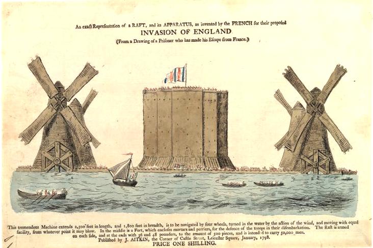
    The first apparatus of war was a monumental thing, and was displayed for the world in this engraving, printed ca. 1798-1801.  An exact representation of a raft, and its apparatus, as invented by the French for their proposed invasion of England, printed in London by J. Atkin, portrayed the monster:  2500′ x 1800′, with a enormous stone fortification that seems to have been about 500×500′, the thing was powered by four water turbines driven by 550′-tall windmills, it was supposed to be capable of supporting 500 36- and 48-pounder canon, plus 50,000 troops.  It looks like it was built for calm water. 

    Invasion of England

    This next beast wasn’t quite so beastly as the first beast, a beast to the monster.  This was the St. Malo seacraft, a thing designed in 1791 that was supposed to be 600×33 feet, supporting the same 500 canon as above, and would transport 15,000 troops.  The added feature here–in addition to the windmill-driven engines, was a bomb-proof central structure, which I guess held the troops in safety as the ship was bombarded from the shore.

    Raft st malo

     The unlikely craft below, even though it looks not nearly as large as the preceding two craft, actually carried more troops (60,000) and more canon (600) than the ship.  I’m not at all impressed that the design we’re  looking at here could support a tenth of those numbers.  But, on the other hand(s), if it wasn’t going to be built and never existed, it really doesn’t matter that the scale was all mess up.  [Image source:  Low Tech Magazine.]

    http://krisdedecker.typepad.com/.a/6a00e0099229e88833012875609248970c-pi

    This satirical print shows a French invasion force making its way to England above and below the channel–there are attack balloons as well as a considerable atta-Chunnel. 

    http://krisdedecker.typepad.com/.a/6a00e0099229e888330120a65fa66b970b-pi

    [Image source:  Low Tech Magazine.]
    The truth of the matter is probably closer to the images below than they were to the massive attack-islands that are pictured above.

    File:My ass in a bandbox-Robert Holborn.jpg


    File:Conversation across the water.jpg


  • Society of Consequences: the Value of Life and the Importance of Horse Manure, 1859

    JF Ptak Science Books    Post 1524

    In the epochal year of 1859 (Darwin’s Origin of Species is published) Philip P. Carpenter (1819-1877) contributed a very interesting article to The Canadian Naturalist and Geologist and the Proceedings of the Natural History Society of Montreal (the full article appearing here).  Among many things, the intriguing title “On the Value of Human Life in Different Parts of Canada” suggests something that might seem a translucent to the modern reader–that in the statistics, somewhere, is a Bell curve that might establish what the “average” person was.  The idea of the “average man”–a statistical impossibility at the time–was important in the sociological application of the statistical work of the early and very influential mathematician Adolphe Quetelet (1796-1874, fl. 1840’s), whose theorizing underneath his numbers was questionable and wincing, but Mr. Carpenter really doesn’t approach this–he has a much more current and applicable idea in mind.  He was interested in the positive and major consequences of relatively minor government investment in the health of the population and the upkeep of the basic infrastructure of a city.

    In collecting his data on birth/death/mortality rates in some major cities in Canada, Mr. Carpenter undertakes a cost-benefit analysis (of sorts) to show how much it would cost to prevent a certain percentage of those deaths, and that a very small investment in maintaining a city’s infrastructure would wind up saving lives and money as a result.  It is an elegant, interesting argument.

    He points to some statistics for the city of Munchen, establishing that the sewering and cleaning of 20 street there reduced the mortality  rate from 31 to 25  per  1000 (“that is, preventing 21 deaths and 588 cases of sickness in seven months”), saving the community the cost of caring for the ill and reducing the amount of time lost in the workplace.

    Basically, Carpenter establishes that adding sewers and just simply cleaning the streets–basic sanitary measures–is an economic benefit to the local community, arguing that “as the cost of sanitary measures is generally the greatest obstacle to their adoption, it may be well to inquire whether their neglect is not still more costly”.  And that it not only made a certain amount of intuitive sense to undertake these measures, Carpenter felt as though he had the numbers (later found to be very problematic) to display how much more “neglect” would cost.  For example:

    A key and simple element to defining health for Canadian cities was horse manure, which those cities seemed to be awash in  Carpenter makes a very simple case for simply using the manure for fertilizer rather than just throwing it into the river, and that the act of cleaning this waste not only was beneficial for the health of the community, but was also had value for cultivation..  This may seem trivial now, but in 1859, evidently, it wasn’t an obvious issue.  Carpenter concludes:

    This was a very satisfying read, and the author made a simple, solid and convincing economic case for “doing the right thing”.  It would turn out later in the 1860’s and 1870’s that Carpenter’s statistical methods were deeeply flawed, leading to him being abandoned by the association that he helped to create–a bitter pill, to be sure, since the overall conclusions about public health were correct, if not the numbers.  After all was said and done, Carpenter was out to save people (particularly the poor), more so than an actuarial table. 

    Notes:

    An interesting table showing the relative health of the cities in the countryside versus, say, the Gotham of Montreal:


  • Strange Things in the Sky Department: When Worlds Collide (1933+1951)

    JF Ptak Science Books   Quick Post  Part of our Strange Things in the Sky Department

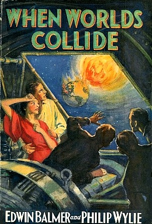
    When Worlds Collide wasn’t so much about another world colliding with the Earth–it was another star, a “rogue star”, that enters the solar system and heads directly towards the Earth.  Luckily for a selected few, a billionaire astronomer sees the thing coming and decides to construct a spaceship to populate a friendly “planet” near Alpha Centauri.  Oh well, its 1933, and perhaps anything was possible–after all, the Empire State Building (which is depicted in so many of these movie posters in a not-good way) was just finished in 1931, after two years of construction (!). 

    So the following are movie posters for the 1951 film version of the 1933 book–except for the first image, which is from the book.

    Strange sky--when worlds collide   


    http://www.mattfind.com/12345673215-3-2-3_img/movie/v/z/n/when_worlds_collide_1951_300x439_193460.jpg


  • Strange Things in the Sky Department: Floating Ships, Cities, Airports

    JF Ptak Science Books   Quick Post

    This is a  continuation of a  series of posts in the Strange Things in the Sky Department. 

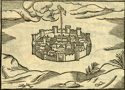
    This image of St. Augustine’s City of God shows the Primum Mobile holding the walled city (Rome, or Romish) aloft, the artist distinguishing it from the earthly city:

    http://iamyouasheisme.files.wordpress.com/2010/09/heavenly-city.jpg

    Strange things sky Perspective drawing

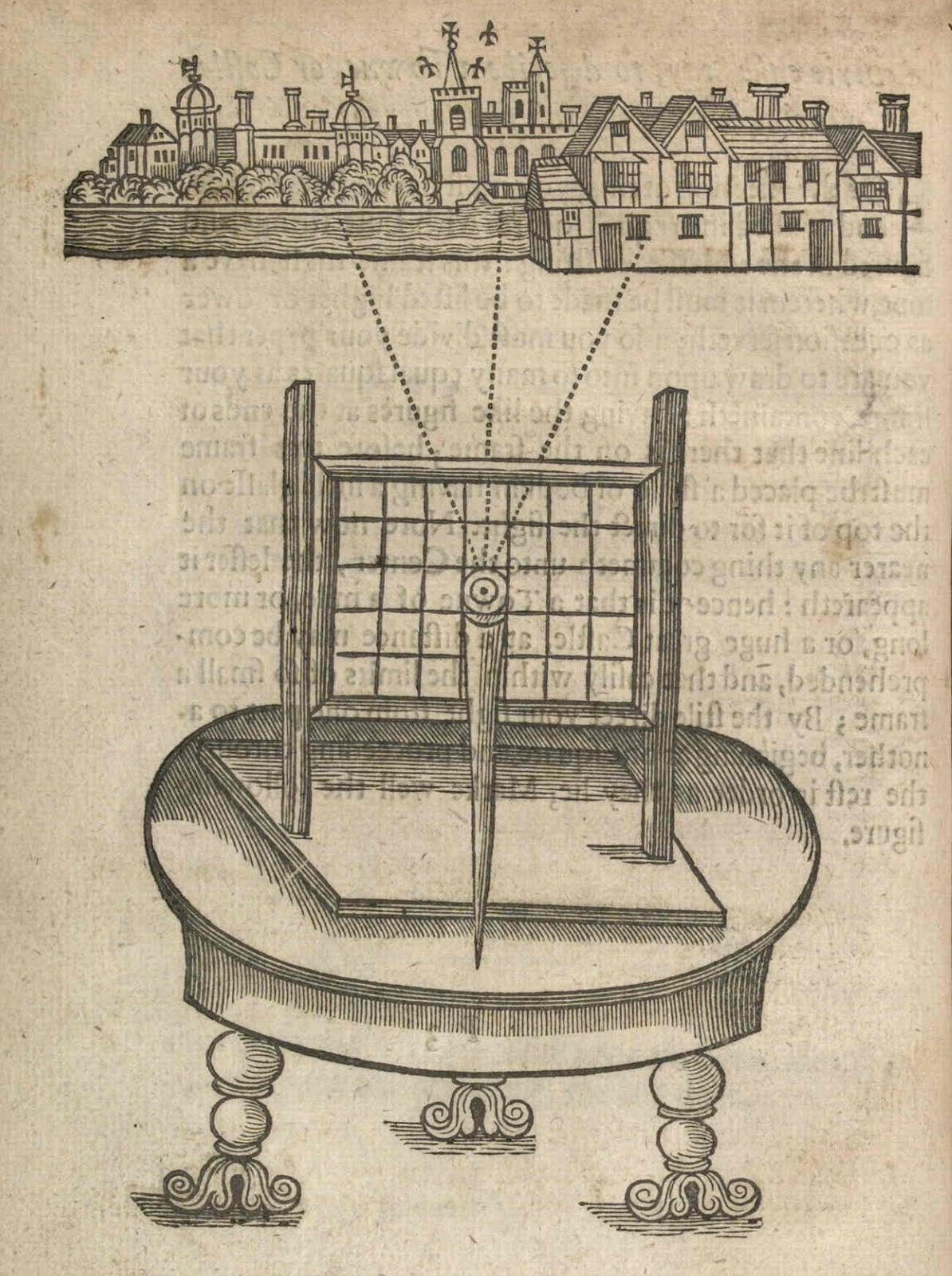
    Perspective drawing apparatus, from  John Bates’ encyclopedic The Mysteryes of Nature and Art : Conteined in foure severall Tretises, the first of Water Workes, the Second of Fyer Workes, the third of Drawing, Colouring, Painting, and Engraving, The fourth of divers Experiments, as wel serviceable as delightful: partly collected, and partly of the Authors Peculiar Practice, and Invention, printed in London ” for Ralph Mab and are to be sold by Iohn Jackson and Francis Church at the Kings armes in Cheapside 1634″.   [Source: the fabulous Bibliodyssey blogsite.]   This was a book that Isaac Newton owned and worked from when he was a teenager, using its useful recipes and instructions to build a number of bits, prankish and practical.  (This city isn’t actually floating, of course–it just looks that way.)

     [airwonder_1929_11_frpaul.jpg]

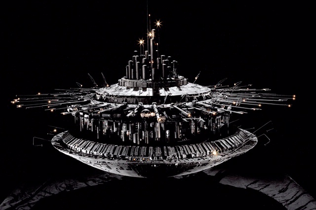
    Here’s a semi-famous illustration that appeared earlier in this blog–perfect here to offset the older “floating cities”.  This one depicts a floating or hovering or anti-gravity-something installation of a future Manhattan, existing peacefully above its former Earth-bound base, now overgrown with nature.  The New Manhattan Air Island is many square miles of buildings, and reminds me of the mothership from Close Encounters of the Third Kind. 

    http://www.nasm.si.edu/webimages/640/WEB10041-2003_640.jpg

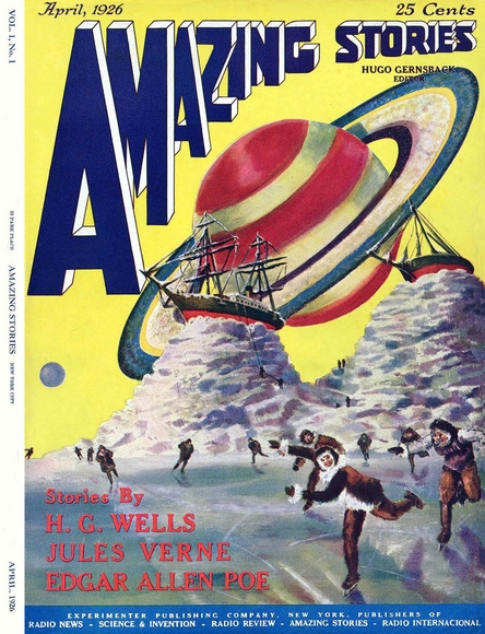
     I just don’t know the story behind this image, though perhaps it is…well, I don’t know.  There’s a whole lot of things that it could be, but then there’s the Tall Ships on the top of mountains of ice and the air-breathing skaters in the foreground…I don’t know: 

    Strange things in sky  saturn


    Science Wonder Stories ship in sky

    [Source: http://pulpcovers.com/tag/sciencewonderstories/]

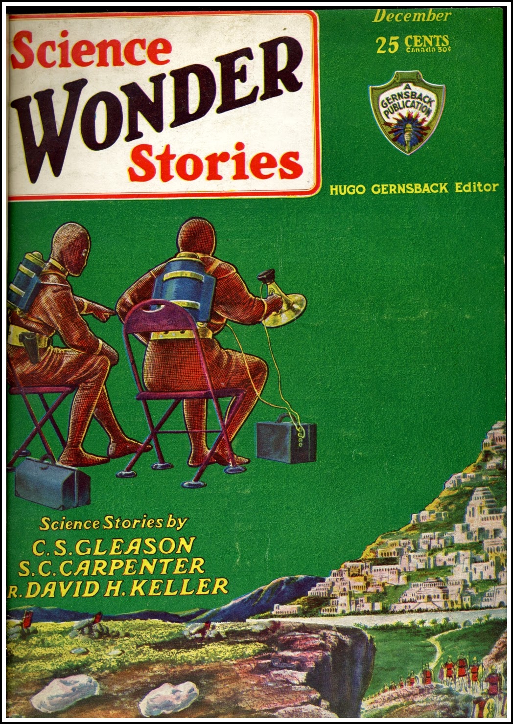
     And this in a sort-of opposite way to the above, a disembodied sitter in a very articulated space:

    Science wonder stories seated floating

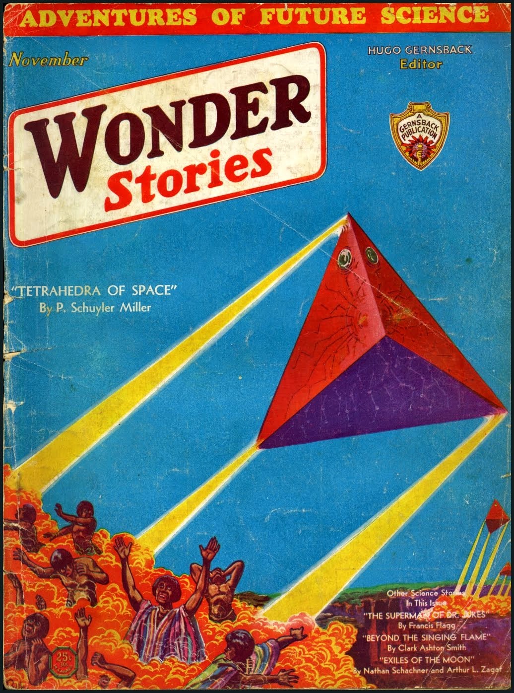
     I’m not sure what to make of these buggers, though it is very creepy looking…,perhaps its the bad-blue sky that just sets everything off badly:

    Wonder stories cubic triangles

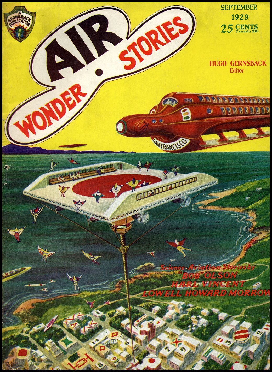
    This image from yet another ubiquitous Gernsback publication and shows (another!)  floating airpad/port for whatever sort of hovering vehicle that approaches.  Interestingly there are a number of skydivers using unisuitwhich probably seems pretty attractive to skydivers today.  Also the roof decorations are unexpected!


    Airwonder_1929_09_frpaul


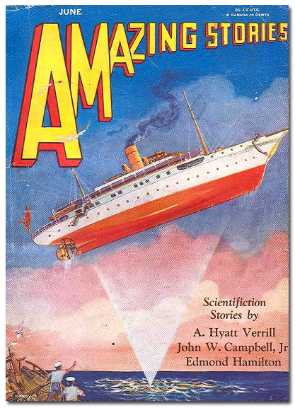
    Amazing stories floating ship

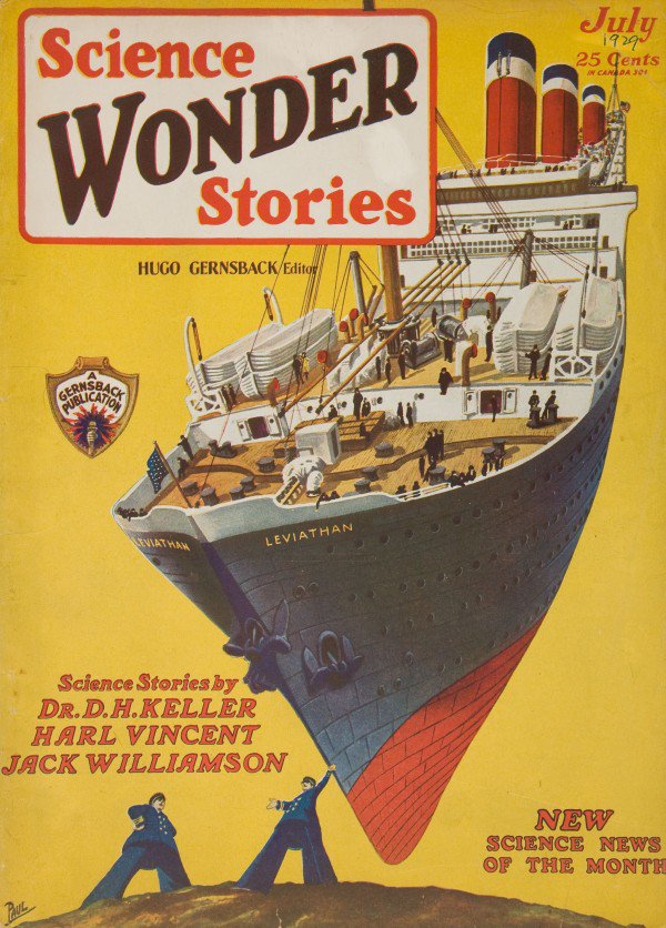
    [Source: http://thatsmyskull.blogspot.com/2007/11/ocean-liners-in-sky.html]

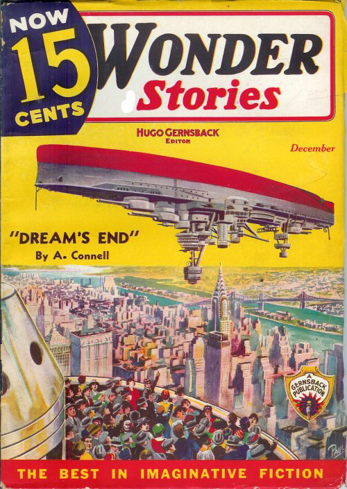
    WOnder stories upside down floating ship