A Daily History of Holes, Dots, Lines, Science, History, Math, Physics, Art, the Unintentional Absurd, Architecture, Maps, Data Visualization, Blank and Missing Things, and so on. |1.6 million words, 7500 images, 4.9 million hits| Press & appearances in The Times, Le Figaro, Mensa, The Economist, The Guardian, Discovery News, Slate, Le Monde, Sci American Blogs, Le Pont, and many other places… 5000+ total posts since 2008.

Author: JF Ptak

  • Things Not Built: Liberty Landing and Closing NYC Harbor, 1935

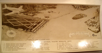
    Dsc04768 I recently uncovered an interesting, unpublished and probably not-acceptable engineering report to extend the ports capacity in the Hudson River at New York City–the ports of the  area being famously over-busy for a long period of time, especially right before World War II.  Charles Palliser and Frederick W. Capon presented a proposal in 1935 for a unification of the port and airport facilities to take care of the overcrowding and overworked problem.

    What they came up with was Liberty Landing, a mile-long and half-mile-wide facility that nearly bumped into theDsc04769 Statue of Liberty (and hence its name).  The plan called for backfilling the “flats” that were just south of Jersey City, as “the natural formation of these were very favorable”, which meant that the airport-port combo would extend all the way into the harbor to the edge of the channel, which would put it further out than the Statue of Liberty, which would also be just hundreds of feet away from the end of the north runway.
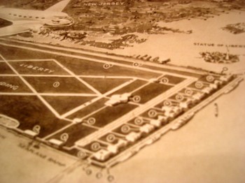
    Also attached to the backfill and new land would be a one-mile-long floating dock.  Oh my!

    The floating island would also have vehicular tunnels that connected it to Staten Island and the Battery.  There were facilities for seaplanes, airplanes, railroads, dirrigbles, and trucks, plus a military installation, a custom’s house and the US Mail Service, so that all commerce would converge at this one point, which sounds interesting (for about 20 seconds). 
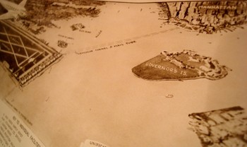
    Dsc04773
    This is a good candidate for the “Better Left Undone” award for 1935.

    As I look at the photograph of the aerial view of the plan it strikes me that if the designers increased the surface area by only 125% or so they could’ve connected the new facility with Governor’s Island AND Brooklyn, building a land bridge from Jersey City to Coney Island—a superbly bad idea to cap an already strongly bad idea. 

    The report is called, simply, Liberty Landing, and published by the architect in Jackson Heights, NYC, 16 Septmeber 1935.  This is also the U.S. Copyright Deposit copy (accepted 10 October 1935), which is where the history of this project ends.
  • On the Geography of the N-Word

    JF Ptak Science Books   Post 1625

    There are 5601geographic names in this country starting with the word “Negro”.  Since “Negro” wasn’t really recognized widely as having a capital “N”–that a whole race of people weren’t deserving of a capital letter–until the late 1930’s, these place names didn’t start out this way, using the word “Negro”.  They used something else.  And I think that it is a safe bet that in 1962, when offensive names were removed from designating geographical places in the U.S., that almost all of these “Negro” places had been changed from “Nigger”.  And that wasn’t all of them, either.

    I think that this is just a small percentage of the changed titles.  For example, I own a very large (30 sq ft) map of the place I live, Buncombe County (NC), that contains at least 25 place names using the word “Nigger”.  Today in the state there are 12 names using the word “Negro”.  It is possible that at one time then there could have been hundreds of place names printed on county maps for the state of North Carolina designated “Nigger” that have simply been replaced or erased or changed in some way.

    Among many other things, language is a bomb, a land mine, a virus, a means to an end–and sometimes it is just not pretty as a signifier, or classifier.  Sometimes it is an oppressive thing, an offensive weapon, a prison. We are reminded of that today as we see with the recent business with presidential candidate Rick Perry’s family hunting patch near Paint Creek, Texas.  The place was called “Niggerhead”, the name painted on a rock at one of the place’s gates, and had been there for years–it may have been there as recently as 2008, though Gov. Perry says the word was painted over in 1983 or ’84.  When the name was painted over seems to be open for discussion. It shouldn’t be. 

    The fact of the matter is that the word “Nigger’ was used in thousands of geographic designations in printed maps, and still used in large numbers up to 1962. 

    As I pointed out, the capitalization of the word “Negro” was hotly debated up until the late 1930’s, when most anti-capital forces gave in.  Even though “Negro” had not been recognized as being worthy of a capital “N”, “Nigger” was, and appeared so on countless maps and other published and official (and federally printed) documents.  In this instance the use of the offensive word along with using the small “n” in “negro” proved to be another very effective means of controlling a people by controlling the language in which they were discussed. Using words as weapons like this has come with an incalculable cost, and the Rick Perry episode of slowly dealing with one of those words is a good reminder of this long and indoctrinated legacy of repression and hate, and how not-far away it all is.

    Notes:

    There are places today called “Negro Jim”, and Andy, and Bob, Bill, Jake, Jack, James, Joe and so on, and you know for certain that “Negro James Landing” wasn’t named so 50 years ago.  Squint your eyes and you can well imagine the original name:  Negro Ditch, Cut, Island, Jump, Canyon, Branch, Lake, Head, Heads, River, Hollow, Knob, Hill, Prong and of course “Negro Jumpoff” could hardly have started out their lives using “Negro”.

    Currently, of the 560 place names using “Negro”, 8 are in New England and 54 are in the Middle Atlantic states.  The distribution is as follows:  AL, 17; AK, 7; AZ, 21;  AR, 18; CA, 55; CO, 19; CT, 2; DE, 1; DC, 0; FL, 13; GA, 7; HI, 0; ID, 11; IL, 12; IN, 3; IA, 1; KS, 7; LA, 10; KY, 22; ME, 1; MD, 6; MA, 2; MI,1; MN, 1; MS, 1; MO, 18; MT, 10; NE, 3; NV, 14; NH, 0; NJ, 2; NM, 44; NY, 22; NC, 12; ND, 0; OH, 6; OK, 19; OR, 29; PA, 15; RI, 1; SC, 7; SD, 9; TN, 37; TX, 30; UT, 7; VT, 2; VA, 17; WA, 6; WVa, 6; WI, 3; WY 15. 

    I should note that there are still 10 places in the U.S. using the name “Redskin”.  Not including a football team for the Nation’s Capital.


    ·Posted by :

    ·in:


  • The History of Blank, Empty & Missing Things–When Everything was Missing

    JF Ptak Science Books   Post 1624   (Part of the series on the History of Blank, Empty and Missing Things.)

    Koberger bw884

    Perhaps “everything” wasn’t missing, but almost everything was.  Certainly the ancients and even the more-moderns, even the scientists of the 16th and into the 17th centuries (until von Guericke in 1672), could not abide the idea of the existence of nothing.  The vacuum, a space in which there was nothing at all, was seen to be an anathema to the creations of the great creator, that the vacuum was antithetical to what was understood to be the nature of nature. (I wrote a post here earlier on when nothing was almost something.)

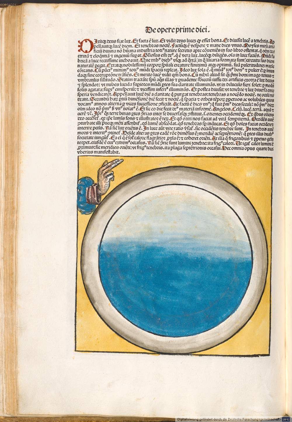
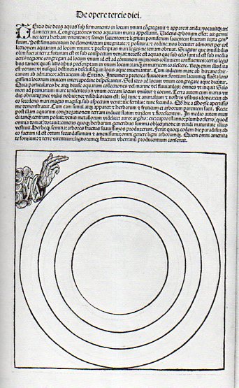
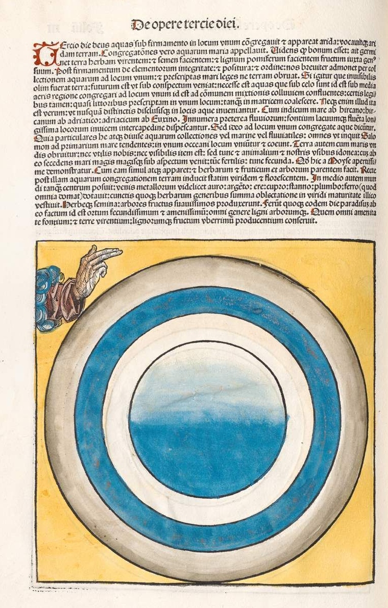
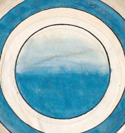
    But what we see here, above, is the third day of creation as presented in one of the most significant books printed in the 15th century, and it is somewhat problematic, because it depicts almost-northing.  That, or almost-everything. 

    The book was written in Latin by Hartmann Schedel (1444-1514, with the German translation by Georg Alt) , with the illustrations under the control of Michael Wohlgemut (1434-1519) and his stepson Wilhelm Pleydenwurff (c. 1450-1494), .and was published in Nuremberg in 1493 by Anton Koberger as Liber Chronicarum–known best to English-pseaking readers as the Nuremberg Chronicles (and to Germans as Die Schedelsche Weltchronik).  It is perhaps one of the greatest illustrated works in the first half-century of movable type printing, using more than 1800 woodcuts to tell the story of the world–according to the Bible, mostly.  (The book deals with the history of world in its seven ages–the first five of which deal with cumuulative history to the birth of Jesus Christ, while the sixth ages handles the history from Christ to the present day, and teh seventh carries along the future history of the world to the Last Judgment.  Not much then is devoted to the 1500 years preceding the publication of Koberger’s book. The author, Schedel, was a very religious man, and considered the work of teh Bible to come from the hand of god and therefore was infallible; on the other hand (so to speak), everything written outside of the Bible was that of humans, and so fallible, and therefore open to interpretation.)

    Here is a colored version of the third day in the creation cycle mythology, which opens itself to much more visual congruence. (“On the third day God gathered together unto one place the waters under the firmament; and the dry land appeared. And God called the dry land Earth; and the gathering together of the waters he called Seas; and God saw that it was good, and said, Let the earth bring forth the green grass, the herb yielding seed, and the fruit trees yielding fruit after their kind.[Genesis 1:9-13.]”)

    Koberger color

    Koberger color b

    And the uncolored version, third day:

    Koberger bw det

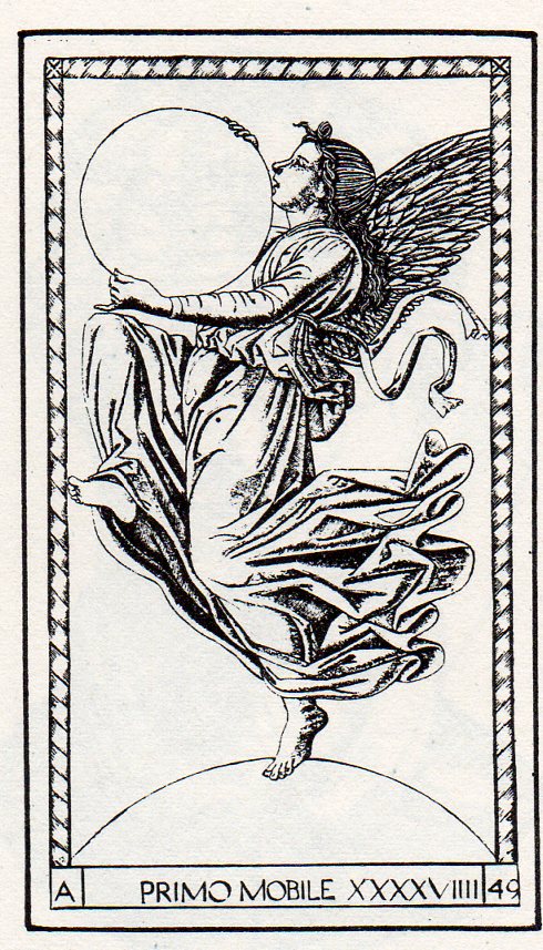
    This sort of “nothingness” is not unique, as we can see in this example from the Mantegna Tarocchi, showing the creator as Primum Mobile, the First Mover, holding what may well be our universe in its hands (and standing on another sphere of nothing, god knows what that might be):


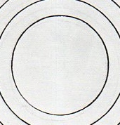
    https://historyofideasblog.com/a/6a00d83542d51e69e20133f47ca205970b-piPerhaps I’m missing the larger picture, and that the circles/spheres are the things created, and that they are contained in the square surrounding them; and that the boundaries marked by the circular lines are not necessarily empty, and that it is the suggested of the circles that is the stuff created, placeholders, contained within the square of the creator’s domain.  Or maybe not. Perhaps the circles are signifiers for the elements–earth at the center, surrounded by water/air/fire. Perhaps the woodcut was just waiting for some color. 

    Notes:

    The English translation of the Nuremberg chronicle used here is from Beloit College (here) which also has a very lovely scholarly treatment of their copy of the Nuremberg Chronicle (here).

    Here’s the rest of the cycle, in color:

    “For he spoke and they were made: He commanded and they were created”  (Psalm 33)., so says the legend (IPSE DIXIT ET FACTA SUNT; IPSE MANDAVIT ET CREATA SUNT Psalm 32) which floats above god enthroned–but it is difficult to see the progress in the un-colored version of day three.  

    http://www.beloit.edu/nuremberg/graphics/Layout%20and%20Design-Full%20Page_lg.jpg

    The first day:

    Korberger 1st day real


  • Imago Frammeni: Boulle, the Dogon, Jouffret, the Simple and the Complex

    JF Ptak Science Books   Post 1623 

    Changing the Mind’s View of Simple and Complex Ideas via Different Image Perspectives

    Photo

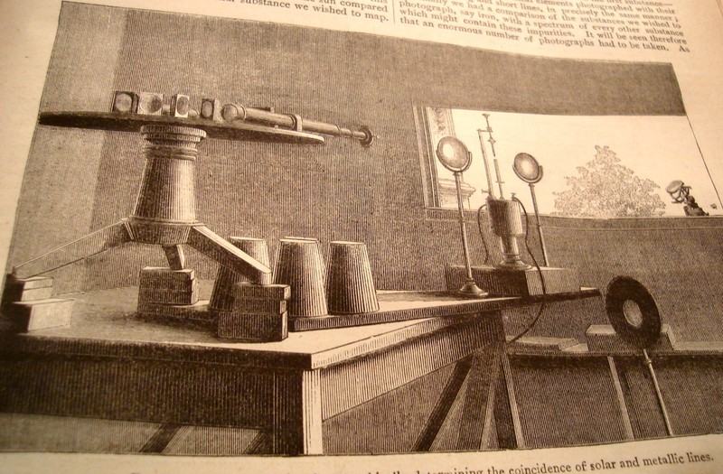
    I’m always very interested in curious things, or standard, “average” things pictured in non-standard ways, as the change in perspective can lead to entirely new observations and discovery.  Seeing this illustration in an article by J. Norman Lockyer (Nature 1881) I was shocked by its clarity and usefulness—Lockyer was simply showing the arrangement of his apparatus for his solar spectrum experiments but the angle of observation (being at such an oblique angle as is normally found) was just, so, well, “correct”.  The image I thought was perfect for the reader—not only that, it was designed artistically and with grace, and one can see exactly what Lockyer was up to.  Diagrams would’ve worked almost as well, but there is just something so extraordinary here that you could just about work from the image if there was no description. 

     
    Looking at things differently is hard work—that’s why I think it is always good to refresh the neuronal sap and look at great examples of unusual , insightful imagery.

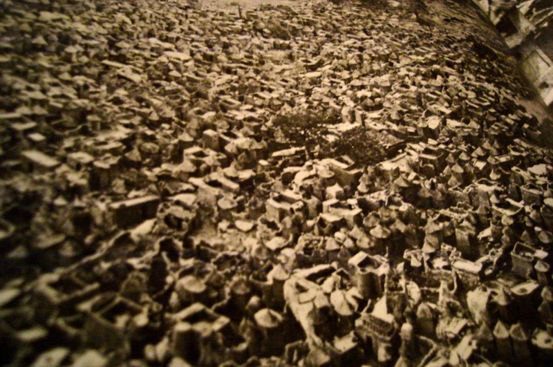
    Sometimes it works to read the description of what the image is before actually viewing it to see the differences of the image that you form in your brain before seeing the thing itself.  For example, when reading about the Dogon, a cliff-dwelling people of the plateau of Bandiagara, south of Tombouctou, and how they would make houses and then towns out of the rocks fallen from cliffs, you get what is probably a pretty benign image.  When you see photographs of these structures it seems as though the brain just simply isn’t ready for their impossible nature, though you quickly, instantly, recover (once you convince yourself the photo is real) and—voila—your mind has been expanded.  (This photo is from an expansive work by Bernard Rudofsky, Architectures without Architects, Doubleday, 1964.) 

    Photo

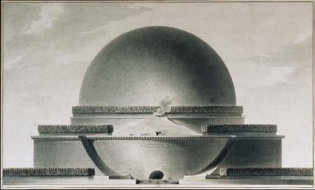
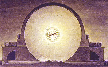
    The (internally) spectacular Etienne Boullee can greet us in the same way with some of his eye-popping architectural creations (unbuilt architecture by an architect, in this case, compared to the built architecture of the non-architects above).  Boullee’s “Plan du Cenotaphe de Newton”, a gigantic memorial to Newton  that was dancing with necessary privacy in Boullee’s brain during the French Revolution (and also during a particularly

    Photo

    un-Newtonesque time in on-your-knees-to-Cartesian-principles France)  is another superior example.  Reading the description of the structure just doesn’t quite do, and it seems whatever grand comes of that is tarnished and stripped away  by the obesely florid sentiment of none other than Ledoux’s poetic sentiments “…O Newton!  Sublime Mind!  Vast and profound genius!  I conceived the idea of surrounding thee with thy discovery…”.  Oy.   Boulle adds to this inspirational atrocity by saying of the sphere:  “…we must speak of a grace that owes its being to an outline that is as soft and flowing as it is  possible to imagine…”   And once the demand of “oh  dear god just please show me the picture” is met, we are left with a turned-around brain and another heavenly exaltation, or profanity.  The Cenotaph is just Grand-Canyon-Spectacular. 

    Photo

    Complex can turn on the simple in this way, where we can have those “a-ha” moments from, say, early efforts at picturing the fourth dimension or non-Euclidean geometry to a new perspective of looking at Roman ruins.  The arrival on the non-Euclidean geometries  in the 19th century posed new issues, not the least of which was representing the ideas.  Our saintly Hermann von Helmholtz believed –contrary to most elevated opinions—that the human mind could indeed intuit complex space and figures of these geometries.  (The difficulty not only from the obvious intellectual hardships in picturing the concepts but also because the geometry of Lobachevsky http://www-groups.dcs.st-and.ac.uk/~history/Mathematicians/Lobachevsky.html was called somewhat into doubt when some of its results were cast in doubt by contemporary astronomical observations.—and this even though so far as the great Gauss was concerned there was no deviation in Euclidean values.)   Helmholtz did this by employing the three-dimensional pseudosphere model of Beltrami.  (Reluctance to these ideas would end soon enough, for, as Linda Dalrymple Henderson points out with such sotto voce, “the convenience of Euclidean geometry would prove inadequate once Einstein” hit in 1905.)

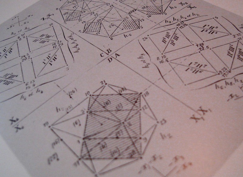
     The work of Beltrami  and H.P. Manning  (Geometry of Four Dimensions, 1914), and Jouffret  (Traite elementaire de geometrie a quarte dimensions, Paris 1903) in illustrating these complex ideas (the titles of which were in themselves daunting as with Jouffret’s “plane projections of the sixteen fundamental octahedrons of an ikosatettrhroid”) would in themselves prove to be entirely irresistible to the world of the arts. 

    Photo

    Charles Howard and Maurice Princet I think had as much to do with  the creation of cubism and abstract art and the imaging of time than anyone, including the painter (I shudder to say his name) of Les Demoiselles (1907) or the lovely Georges Braque (Houses at Estaque, 1908) or Jean Metzinger or even the sublime comedian Duchamp’s Nude DescendingDsc04584 (1914).  The hypercube starts to show up a lot in some Bauhaus genres and even into the palette of Frank Lloyd (“Stinky”) Wright (with his St.Dsc04589 Mark’s Tower plan, NYC, 1929).  I can only imagine the shock to the brains of these creative geniuses in seeing the display of such a novel idea.  (For the ultimate treatise on this see Linda Dalrymple Henderson’s The Fourth Dimension and Non Euclidean Geometry in Modern Art, Princeton  1983).  And no the art didn’t come first. 
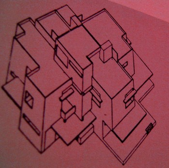
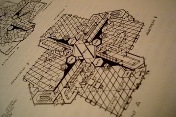
    Dsc04578
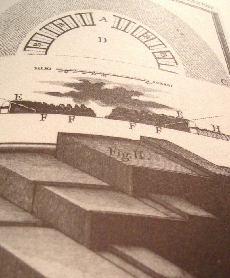
    But coming back to the simple, and in the same frame as the first example that we mentioned in Lockyer, we have the unlikely find of Giovanni Piranesi.  In my opinion his most spectacular work is found in his frammeni (the diverse bits and pieces of architectural and sculptural bric-a-brac found objects that are collected together on one stage) and in his archaeological detail.   His attention to new perspective in showing the crucial aspects of structure and building in Rome is tremendous and

    Photo

    unexpected—as an example we see here the child’s-eye-height view of three steps of the reconstruction of the theatre of Pompey.  I must say that I’ve seen a lot of architectural images in my time but nothing quite comes to me so surprisingly as this step-level view of the reconstruction of a Roman theatre,  This happens throughout the lesser-known Piranesi, with great details of tools, and cross sections of the very deep footings of bridges, and so on.  It is really refreshing, lovely, unexpected work. 

    Photo

    We’ll return to this subject from time to time as I have hundreds of interesting examples to draw from—for example, the remarkable Emily Vanderpoel’s Colour Problems which is ostensibly an undecipherable attempt to quantify color arrangement in art but through the lovely examples displaying this attempt pre-date the modern re-invention of non-representational art by at least a dozen years.  Stay tuned! Dsc04592


  • Half-Missing People of the Renaissance

    JF Ptak Science Books   Post 1621     Blank, Empty and Missing Things series

    The thread on blank, empty and missing things becomes more interesting to me when it approaches the subject of humans and art.  And perspective.  It is a curious thing how over the course of 400 years–beginning say with the adoption of perspective in the work of Paolo Uccello–that the human form (and clothing and surroundings) was more and more realistically portrayed until it was not so, the “undoing” of perspective and realism coming with the Romantics and Impressionists, until realism and the portrayal of the very essence of a recognizable “thing” disappeared as a requirement in art in 1911. 

    But there are interesting forebears to the disappearing human, and some of them are found in the Renaissance.  Of course they’re mostly instructional on how to construct objects in proper perspective and such, but sometimes, well, sometimes they’re not, and the artist is purely suggesting human form.

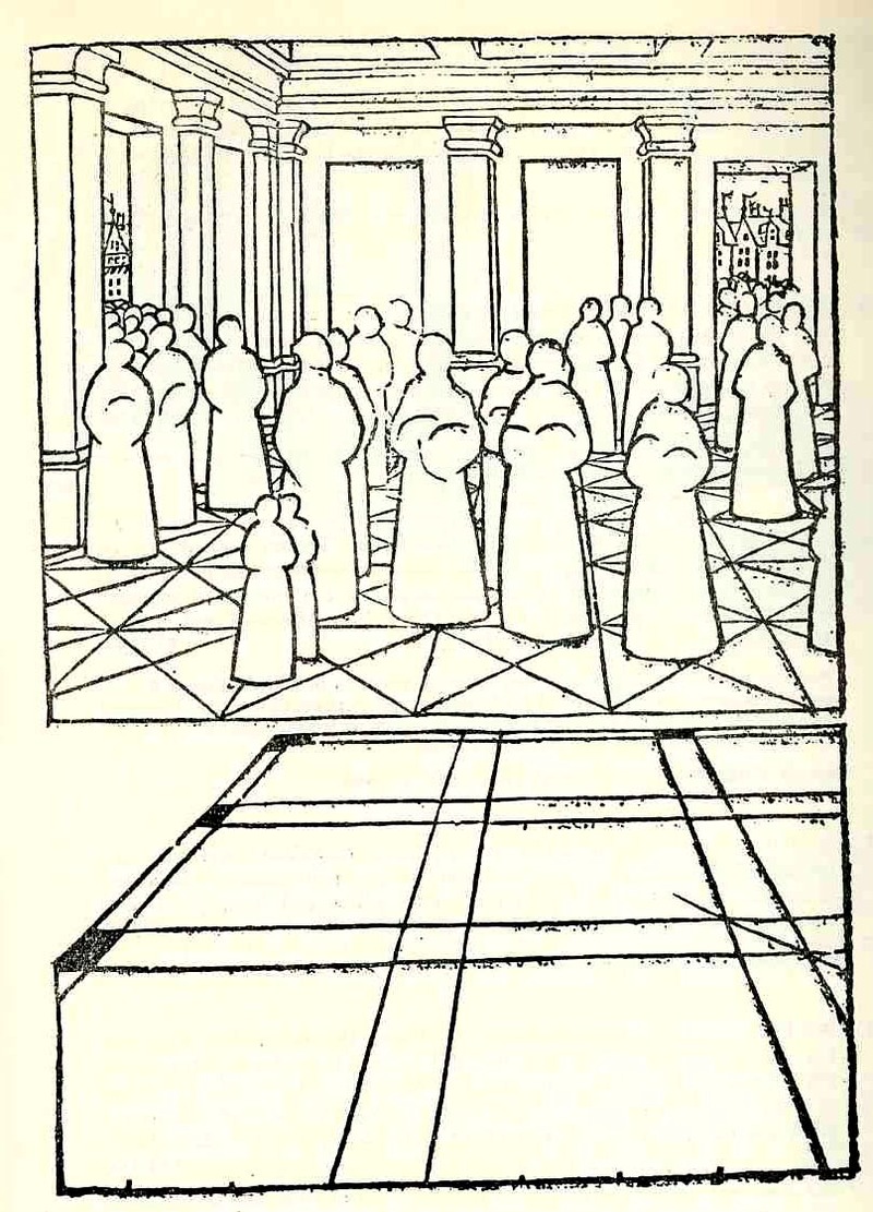
    Take for example the extraordinary work of Jean Pelerin (also called “Viator”) in his De artificiali perpectiva, a very rare woodcut-illustrated book printed n Nurenberg in 1509. In illustrating what he referred to as his “three point perspective” Pelerin removed much of the gothic-tradition bric-a-brac that is so heavily favored in these early books and replaced them with outlines from his rather astonishingly expressive notebooks, and replacing people, individual humans, with what may be the first “almost-entirely-absent” human forms. These roundish, ghost-like figures are just meant to hold the outlines of space, meant to function in the role of a simple comparative unit. This works quite well as an artistic technique—a solicitation tool which I think gives his reduced, “empty” humans an incredible, ethereal look unlike any other in the history of the first 60 or so years of printing.  It is difficult to imagine what the observer of these images back there in 1509 was thinking when they looked at these figures, and perhaps removed them from their textural context—it  would have been a unique visual experience for them

    Photo

     Albrecht Durer’s (1471-1528) drawing of a geometrical man was an amazing–startling, even–object to the early 16th century consciousness. His …Symmetria partium…humanorum corporum (1537) was a masterpiece, and a key piece of revolutionary visionary thinking.

    Photo


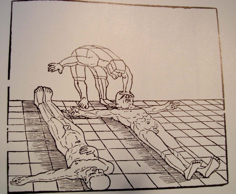
    His Underwysung der Messung (“Treatise on Measuring”) written about 500 years ago (in 1525) set the stage for this next work–it is here that we find some of the most recognizable of Durer’s illustrations of the instruments that he employed to do his perspective work.  Durer–so far as I can tell–created an orthographically rotating human figures in three-dimensional trapezoids, creating incredibly human-like non-human forms.  Supra-human, perhaps; mechanized, calculated, structural. His use of stereometry, the science of measuring volume, was adapted to this study of human form and the relationship between that and movement. 

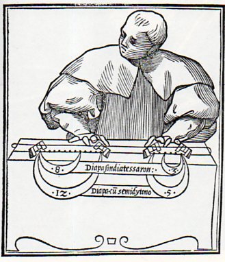
    Lodovico Fogliani, Musica Theoretica (Venice, 1529) which is somewhat reminiscent of a more -blank figure, though when you look at the images in teh book, most of the human figures are more detailed and refined.  This one seems only abotu half-done, with only the suggestion of a face and but little refinement in the clothing.  The subject’s fingers are also pre-robotic, like those fingers on a wooden manikin model if one had existed then.  Of course the figure is just there to depict scales and that’s about it, with just enough of a figure to stand as background to the transmitted info. 

    Blank ogliani878

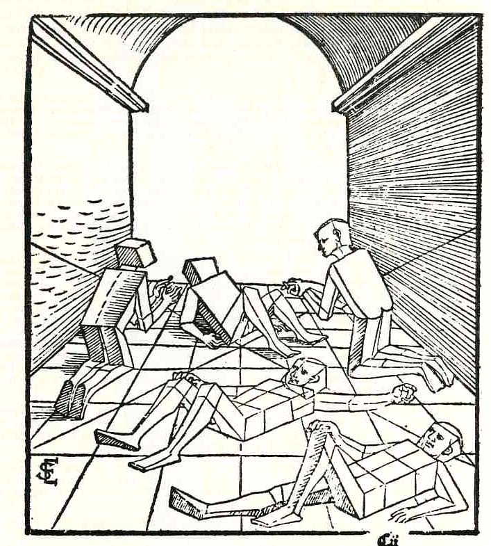
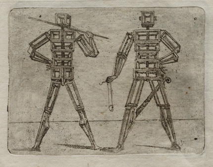
    Just a little while latter Erhard Schoen, in his Unnderweissung der proportzion und stellung der posssen liegent und dtehent, printed in Nurenberg  in 1538, presented another unique way of representing the human form in studying perspective.  He used simplified geometric form to stand in for the curvy humans, replacing them with proportional stacks of boxes which would more easily explain to the younger reader how to represent the human body n space and in proportion to other things.

    Photo

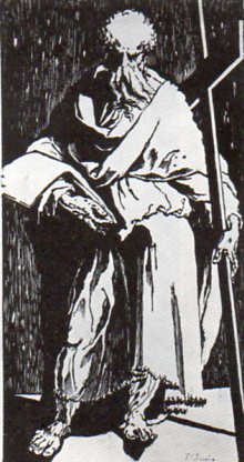
    In the next decade we see  in this woodcut of St. Andrew (or St. Philip) by Domenico Beccafumi (1486-1551) another suggestion of human form, this one though mostly shrouded in deliberate contrast and a had light, removing most of teh detail. 
    Blank domenico879

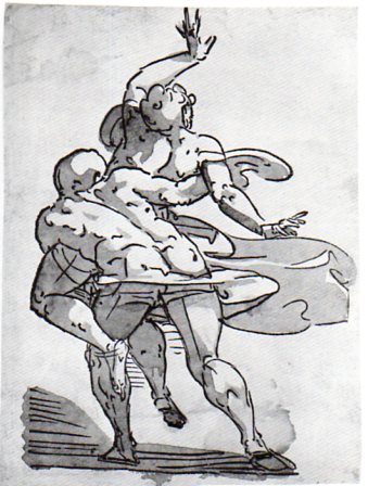
    While at about the same time Luca Cambiaso (d. 1585) produced this  woodcut,  “The  Rape of the Sabines”, which is mostly light with bare shadow, depicting motion and emotion more than detail. This again is hundreds of years before its more modern 19th & 20th century descendants. 

    Blank  cambiasi877

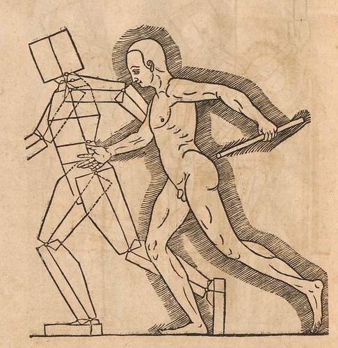
    And also this figure, again by Cambiaso, and recalling the efforts of Durer and Schoen:

    007cambiaso1
    And in 1564 comes this fantastic effort by Heinrich Lautensack, Des Circkels und Richtscheyts, auch der Perspectiva und Proportion der Menscher, which is beautifully described at the Bibliodyssey site, here.  
    Perspectiva (Lautensack) 1564 f

    Coming outside the confines of the Renaissance but just too fantastic to not include (although I could just simply change the title of this post to accommodate all)  is Giovanni Battista Braccelli’s fabu-landscapes of the human condition, published in his Bizzarie di Varie Figure in 1624. 

    (My thanks again to Bibliodyssey for surfacing Braccelli for me, and also to The Rare Book Room for posting all of the images in that rare work, and of course to the Library of Congress/Lessing J. Rosenwald pages, who made the images available for downloading, here.)

    Braccelli 5
    And a little later after this last–and again well outside of the Renaissance–the idea of the missing man, an image I just couldn’t resist:

    Blank stafford882 which is a detail from

    Blank stafford881
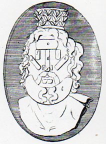
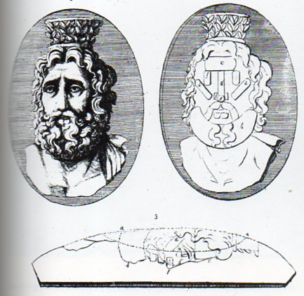
    which is from the instructional by Laurent Natter, Traite de la methode antique (1754).  The engraving is one of a series that shows the technical process of a antique method of constructing antique cameos and coins, and in this case how the gem would be produced by modern methods. 


  • Curious Cuts: Books in Bosch

    JF Ptak Science Books    Quick Post

    Bosch cure of folly book detail
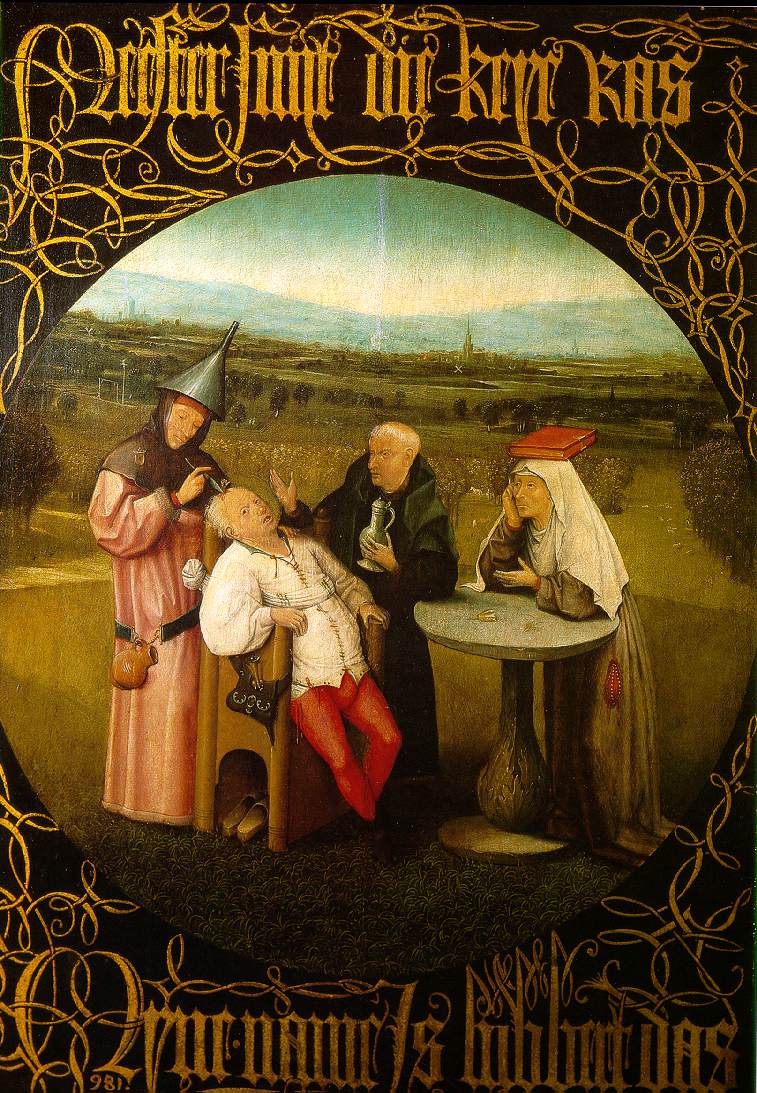
    Books are a favorite symbol, a venerable icon, a useful tool for developing ideas in Renaissance paintings.  They do sometimes make unusual appearances, this time–and not too unexpectedly–in the work of Hieronymus Bosch.  The painting, Cutting the Stone, (also called The Extraction of the Stone of Madness or better yet The Cure of Folly) was completed by Bosch in 1494 and lives today in the Prado. 

    Bosch cure of folly
    Bosch was at the very least a very curious character, hardly a man of his time–he seems difficult for us to place in the 15th century given the extraordinary range of his deep imagination.  He seems to be more a man of the modern times rather than one of the Renaissance.  I mention that the painting is in the Prado, finding its way there from the collections of Spanish sovereigns, who collected Bosch as a deeply Christian painter who depicted the travesty of sin and moral neglect rather than his own deep fantasy.

    Bosch cure of folly brain
    The scene is described by the inscription above and below it:

    Meester snyt die keye ras
    Myne name Is lubbert Das

    (in English: “Master, cut away the stone
    my name is Lubbert das”).

    The man in the chair, the man undergoing some sort of cranial/brain surgery is an everyman of sorts, a Dutch Everyman Fool named Lubbert (translated to “castrated dachsund”)..  A charlatan medico stands and removes symbols of lunacy and foolishness from his brain, images of flowers standing for the fool’s stone of long folklore.  The medicine man wears an inverted funnel for a hat, a symbol for emptiness, nothingness.  Likewise his purse is stuffed with straw, another iconic display of greed compounded and gaining nothing at all. 

    But what I am attracted to right now in this painting is the woman on the right balancing a book on her head.  It seems to me to be a very rare case of a Renaissance image of  a book displayed in this manner–usually books are simply held and are symbols of learning or wisdom or piety.  In this case, the woman is just part of the general folly which is the concern of the quack surgeon, a closed book (impossibly?) balanced in tribute to the craziness before her, perhaps hoping for the words to seep through the pages and into her own head. 

    There are a number of other images of this operation, which was in its way a standard procedure for the relief of insanity, or depression, or lunacy, or basically of any mental complaint or “error”, which can be found (along with description) on the bioephemera blog, here. 

    For example, there is this scene of mass extraction of the stones of madness by Peter Brueghel (painted ca. 1550)

    Bruegelmadness.jpg

    Its a pretty miserable scene.

    Again, I’m really just after the book in the Bosch. 


  • Pearl Harbor & the Maginot Line: the Sneak Attack of 1932

    JF Ptak Science Books  Post 1619

    See also these posts: The Maginot Line, the World’s Heaviest Bad Idea? and The Invasion of America, 1935

    If the Maginot Line could float, it might have been well represented by the U.S. Navy during the 1930’s (and up to about, say, 7 December 1941).  It was pretty much understood that the previous thinking about battleship power as the mainstay of naval capacity had to be re-accessed following the Japanese attack on Pearl Harbor, and that the aircraft carrier and naval air power were certainly, absolutely, a devastating new weapon and strategic initiative.

    The power the attack on Pearl by a task force of aircraft carriers had already been demonstrated to the ruling powers of the U.S. Navy and by one of their own, nine years earlier, at 0800 hours on 7 February 1932. 

    During Fleet Problem XIII and Grand Joint Exercise 4 Vice Admiral Harry Yarnell (1875-1959, U.S. Naval Academy Class of 1897), showed the rest of the Navy what the aircraft carrier could do.  In the war game between two naval forces (blue vs. black) Yarnell (commanding blue) chose a different approach in confronting the black team.  Rather than have the battleships duke ti out in horizon-to-horizon shelling, he brought his force of two aircraft carriers (the Lexington and the Saratoga) and four destroyers (all under radio silence) from California to the home base of the black team at Pearl.  Operating beyond the normal shipping lanes and squalls he was able to successfully approach the base without being detected, and launched 157 planes against the ships and the defending aircraft (which was still on the ground).

    Committing imaginary strafing Yarnell’s attacking force decimated the defending aircraft; and in dropping flour-sack bombs the attacking force pulverized the ships docked at Pearl.  It was an extraordinary victory for the blue team, and it should have been a monumental wake-up for all those decision makers involved in running the Navy. 

    In spite of the obvious victory by Yarnell, the exercise was seen as something as a fluke, and the umpires evaluating the manuevers judged the use of the aircraft carrier in a possible attack on Pearl Harbor to be “doubtful”.

    In his review of teh exercise Yarnell clearly stated that the aircraft carrier should become the main arm of the U.S. Navy–it would certainly be so for other navies, including potential enemy navies, thereby putting the U.S. on an unequal footing should this course of action not be followed.  He was certain that he demonstrated that a major change was due in American naval tactics and strategy, and that in order to fight a transoceanic war that six to eight aircraft carriers would be necessary.

    The battleship admirals carried the day, though, saying post facto that their remaining force (and the part out at sea) would have been able to catch up to the retiring aircraft carriers and destroyers and from long range send them sinking, and that the air defense that had been so badly beaten by Yarnell really wasn’t so and that their was actually a strong defending air response.  But probably not.  In any event, the battleship people probably didn’t want to see time and effort and money removed from their own projects, and so the Yarnell results were dismissed,

    Between 1936 and 1940 the U.S. Navy laid keels for twelve ships, including eleven battleships and one aircraft carrier. 

    Yarnell retired in 1939 at age 64, after having been the admiral in command of teh U.S. Asiatic Fleet. 

    When the Japanese attacked on 7 December 1941 they did so using six aircraft carriers (each carry between 54 and 72 planes) for a total of 387 planes (excluding spares and including 48 air patrol Zeroes and six seaplane scouts for reconnaissance).  And that, as they say, was that.

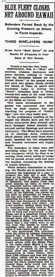
     The funny thing about these results is that the New York Times seems to have been reporting on the progress of the maneuvers throughout their course, over a period of weeks,k which would (if we assume that the commanders and officers in Hawaii were reading the newspapers) tip the hand of a “surprise” attempt, further weakening the case for the battleship folks.  

    PD LLC expenses876
    Notes:

    1. “ARMY IS PREPARED TO ‘DEFEND’ HAWAII: Officers Inspect “Black” Defenses From Air — Planes Mass for War Manoeuvres. ATTACK” DUE SATURDAY ” Blue” Forces Under Command of Admiral Leigh Slips Silently Across the Pacific. “New York Times (1923-Current file) [New York, N.Y] 04 Feb 1932: 13. HONOLULU, Feb. 3 — Hawaii’s “Black” army settled down today in its field positions to await the onslaught of the “Blue” force, which is steaming somewhere in the Pacific, en route for its attempted conquest of these islands. Defense arrangements have been completed in every sector and installations have been inspected from the air by a staff of officers and reported satisfactory.

    “BLUE FLEET CLOSES NET AROUND HAWAII: Defenders Forced Back by the Growing Pressure Wireless to THE NEW YORK TIMES.” New York Times (1923-Current file); Feb 10, 1932; ProQuest Historical Newspapers: The New York Times (1851-2007) pg. 15.

    ·Posted by :

    ·in:


  • Manuscript Material on the Installation, Operation and Maintenance of the UNIVAC, 1949-1957

    JF Ptak Science Books   Post 1619

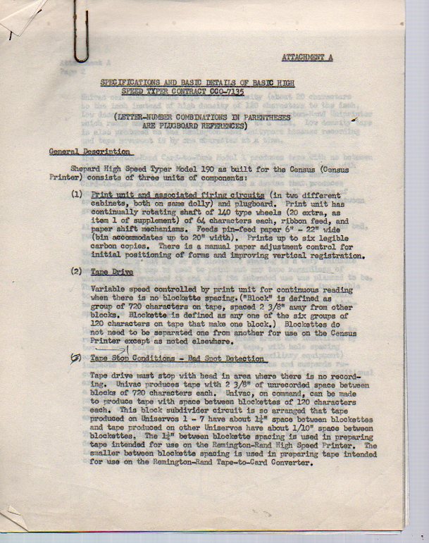
    This is a group of materials from the estate of Ralph Mullendore (see below), an early and integral team member of the electronic computation section of the U.S. Bureau of the Census, who was responsible for the installation and maintenance of the UNIVAC there, at Census.  The papers are on their way to a history of computer science section at the library at North Carolina State University where they will hopefully be enjoyed by any and all who have an interest in the early stages of the maintenance and tinkerings on America’s first commercial computer. It should be remembered that the hands of the man who wrote all of these notes were the same hands that worked on this monumentally important machine, the first of its kind in existence.

    Mullendore a751


    Mullendore f782

    Many mor eimages, below.

    ·Posted by :

    ·in:


  • Deceptive Perception: Giant Super Women of Pulpdom and High Art

    JF Ptak Science Books   Post 1617

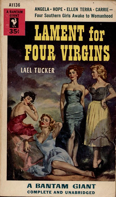
    Sometimes things are just not what they seem to be.  Sometimes they are deceptive and uncommon and somewhat hidden–and sometimes deceptive even to themselves. Sometimes the deception is intentional, and sometimes it is just a mistake, but a deceptive one. In the following cases, the deceptive elements are relating to size–kike the example below, in the cover illustration for the campy (“Southern” with names like those?) troubles of mid-1950’s “girls awakening into womanhood”:

    photo
    If you take a closer look at the reclining figure just abpve the word “giant”, you can see that she is one, unintentionally.  She’s just badly drawn, or something, a victim of foreshortening–we can see that her leg from her knee to her foot is as long as an entire keg of her companions, making this person about eight feet tall.
    On the heels of the eight-foot-tall woman comes one who is far more famous, ultra-famous, really.
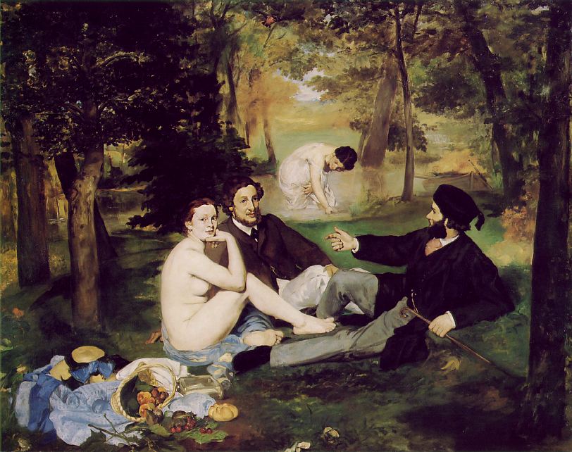
    Le Dejeuner was a scandal when it was exhibited in 1863—Manet painted what he wanted to, unbound by perspective, by color, by composition, and on and on. The folks in the painting were not connected to anything, really, and were unconnected to each other, no one paying any of the others any mind, even when the women were naked.  Nothing seems to be going on—the people are just simply there. 
    Blog--march 7--manet bathers
    This is in itself was a disconnect from previous practices, the vision in painting was about something, and was directed.  Light seems to be coming from a number of different places, and the shadows from the trees reflect this, simultaneously stretched towards and away from the light sources.  The bathing woman in the background, or what used to be background, had she been drawn using proper perspective, would’ve been about nine feet tall.  But what happens here is that there is no foreground or background in this painting, just middle.  It was this collection of abandonments, starting here in the Le Dejeuner in 1863, that ushered in the modern in art. 
    Then there’s the fifty-foot-tall woman who really isn’t that tall in relation to the people around here. 
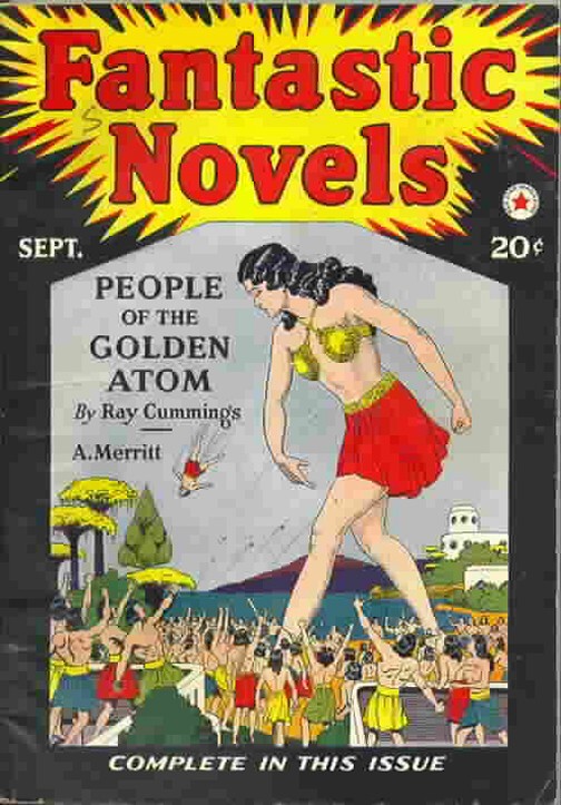
    There are times when even things that are made to look extraordinary and plainly, outrageously identifiable as what they are, simply aren’t–and sometimes they’re not even close.  For example, this cover of Fantastic Novels (1921?) seems to tell a straightforward story, but as it turns out the giant is giant but one living within a world in an atom of a gold wedding ring.  (I told a fuller version of the story of thiis here.)  So this giant is a giant but only so in her own world. 
    Man throwing

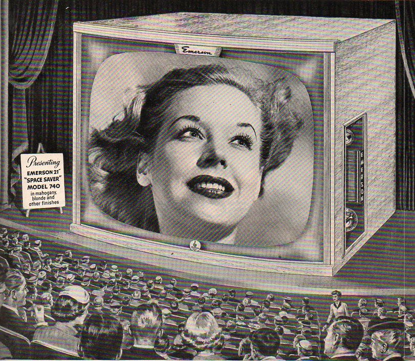
    Rabelais’ Gargantua and Pantagruel, Hobbes’ Leviathan, the Buddha at Yungang (Shanxi) and Melville’s whale were all pushed to their competitive monsterous edges in the 1950’s, when you were more likely to think of The Bomb and creeping Communism before thinking back to any of these great representations.  And it is also my general impression, having been paging through Life magazine for the 1950’s, that there are some other major, lesser heralds of gigantism, especially if you paid attention only to the advertisements. There were 1950’s colossal characters who were pale imitators of their earlier counterparts–the Amazing Colossal Man and Colossal Woman being two minor mirrors of older ideas–but they hardly contained the colossal ideas that were resident in the earlier creations. (Perhaps part of that is due to having just witnessed the demise of two enoromities in Hitler  Stalin.) But this woman seems to be the largest of the lot–I make her to be about 100 feet tall.  There’s really nothing deceptive about her, except of course that this giant is only a head. 

    Monumental television theatre446


  • The Game and Play of Chess, a Morality Play: 1474

    JF Ptak Science Books   Post 1616   (Part of the History of Lines series.)

    It turns out that one of the most famous and iconic books on chess is really not about chess at all.  Jacobus de Cessolis, (Jacopo da Cessole, c. 1250 – c. 1322) the author of  The Game and Playe of the Chesse1, found its way into print in the very highly capable hands of William Caxton in 1474 (“Fynysshid the last day of marche the yer of our lord god. a. thousand foure honderd and lxxiiiia”) and into a second edition in (about) 1483. Caxton produced a spectacular, beautiful work on moral and ethical virtue and challenge, using the game of chess as the foundation for metaphor and aliteration of the wide classical literature that it calls upon.2.  The book doesn’t tell you how to play–but it does instruct on how to live.  A great aid to the book’s power are the sixteen strong woodcuts (“repeated to make twenty-four figures”3), which mo doubt were a strong influence on their viewers.

    I have included this entry in this blog’s History of Lines series for the connection between the lines of morality and the lines of he chessboard and the movement of its pieces, which were at last the outward and symbolic basis for the ethical lessons of the work if not used in actuality. 

    Notes:

    1. The book was one of the first books ever printed in English, and was probably the first morality play printe in the language. It was reprinted many times, later under the title of Liber de moribus hominum et officiis nobilium super ludo scacchorum (‘Book of the customs of men and the duties of nobles or the Book of Chess’).

    2. Arthur Hind, An Introduction to the History of Woodcut, 1935.  Volume II, p. 708.

    3. The commentary quoted here is from the facsimile edition of the original work published in London in 1883 by Elliot Stock with notes by William E.A.Axon

    The authors named in this study include “Saint Ambrose (2 references), Anastasius (1), Avicenna (2), Saint Augustine (9), Saint Basil (1), Saint Bernard (2), Boethius (3), Cassiodorus (1), Cato (5), Cicero (6), Claudian (2), “Crete” (1), Diomedes (1), Florus (1), Galen (1), Helinand (4), Hippocrates (4), Homer (1), Saint Jerome (3), John the Monk (1), Josephus (4), Livy (2), Lucan (1), Macrobius (1), Martial (1), Ovid (6), Paulus Diaconus (1), Petrus Alphonsus (2), Plato (4), Quintilian (3), Sallust (1), Seneca (15), Sidrac (1), Solinus (1), Symmachus (1), Theophrastus (1), “Truphes of the Philosophers” (2), Turgeius Pompeius (1), Valerius Maximus (23), Valerian (7), Varro (1), Virgil (2), “Vitas Patrum” (2).”