A Daily History of Holes, Dots, Lines, Science, History, Math, Physics, Art, the Unintentional Absurd, Architecture, Maps, Data Visualization, Blank and Missing Things, and so on. |1.6 million words, 7500 images, 4.9 million hits| Press & appearances in The Times, Le Figaro, Mensa, The Economist, The Guardian, Discovery News, Slate, Le Monde, Sci American Blogs, Le Pont, and many other places… 5000+ total posts since 2008.

Category: Prints–looking HARD/deeply at

  • Odd Things in the Sky Department: Der Herr Gott in a Cape, and Bombs Away

    JF Ptak Science Books LLC Post 510
    Blog--brunswig
    What upsets people is not things themselves, but their theories about things.
      —Epictetus, quoted in the epigraph to Laurence Sterne, The Life and Opinions of Tristram Shandy, Gentleman (1759)

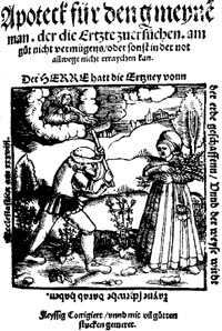
    Continuing a minor thread on “Odd Things in the Sky”, which also joins up nicely with another odd thread, “Things Out of Place”,  come these two interesting, just-remembered images, showing a stiff-armed god and a big old bomb coming out of the sky.  The first, left, is the title page of the Strassburg-born army surgeon  Hieronymus Brunschwig’s Apoteck fuer den Gmeine man der die Ertzet.  Published posthumously in 1530, the good dead doctor offers wide and varied instructions and ruminations on medicine (per se) and health care to the average person–meaning, basically, the person with enough money to buy a book but who could not afford a doctor (probably a slim margin).  the book was filled with reasoned and reasonable approaches to taking care of health and illness, with cures and recipes for everything from itchyness to syphilis.  Presumably the Der Herr Gott of Einstein is doing a little more than throwing dice, taking a very prescribed interest in the hoeing man and gathering woman.  It is interesting to see that the man emerging from the cloud, somehow needs a cape. Blog--blondel_title
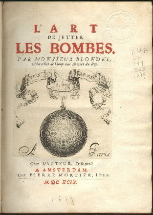
    Coming from the sky next is a bomb, the creation of  Francois Blondel, (1618-1686) in his L’art de jetter les bombes…, published 1699.  Blondel was as good in building as he was in un-building, being in charge of the public works of Paris (and appointed so by Louis XIV, being perhaps one of the
    most important architectural/engineering positions that could be
    imagined by the French mind), as well as being an expert in the
    construction of forts and fortifications.  His work on bombs and
    artillery was ready to be published 15 years or so before 1699, but the
    King saw that even though there was a lot of interest and use to his
    military in seeing the treatise published, the same was also true of
    his enemies.

    But of interest to me here is the title page and the bomb not only falling from the sky, but  falling from the bannered heavens.  There’s nothing soft or spooky about the book itself, which is all business, of course, as important to the military man of 1700 as, say, Robert Coles’ book on underwater explosions was in 1965 or Urbanski’s Chemistry of Explosives a decade earlier.  And even though Blondel certainly built on Galileo’s work on the parabolic flight of such weapons, the bomb on the front cover is falling straight down. 

  • Things out of Place Department: a Cloud of Magnetism in the Sky Poked by the Needle of God

    JF Ptak Science Books LLC  Post 508

    0 blog feb 9 missing magnet543“And even though I’m sitting waiting for Mars

    I don’t believe there’s any future in cause

    Hole in the sky, gate way to heaven

    Window in time, through it I fly…”

    Black Sabbath, “Hole in the Sky”, 1975

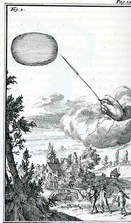
    Well, there were many liberties taken with this title, though on the face of it, the title is correct (sort of).   This image comes from a relatively obscure (or at least quite rare) copy of  Joachim Dalance’s work Traite de l’Aiman, divise en deux parties, la premiere continent les Experiences et la seconde les raisons que l’on en peut rendre... which was printed by Henry Weinstein in Amsterdam in 1687 (just across the waters in London Isaac Newton’s fantabulous Prinmcipa Mathemtica was being printed in the same year).    This important work on magnetism featured a number of good and useful observations on magnetism, interspersed with some semi-useless bits:  the magnetically floated coffin of Mohamets is mentioned and disproved, the origin of magnetism is asserted by hypothesis and is not pretty, along with some “fanciful conception(s) of the magnet’s potential”*; on the other hand, there is a mention of the invention of the compass, the real use of magnets, a mention of declination, and the orientation of a compass needle in a magnetic field is shown.  All pretty good stuff, considering the time.  (The magnum opus on the magnet was published in 1600m by William Gilbert and was called De Magnete, Magneticisque Corporibus, et de Magno Magnete Tellure (On the Magnet and Magnetic Bodies, and on the Great Magnet the Earth), though folks have been writing on magnetism since Aristotle and Thales)

    M. Hofer, the author of the quote above, mentions that the pamphlet’s images “are particularly good scientific illustrations”, though doesn’t mention this, figure 2, as being anything significant.  Trying to dissect the phenomenal imagery, which purports to depict the origins of the sources of magnetism, we see something like a “magnetic cloud” in the sky, about to be pricked by a needle held by the primum mobile.  That, or it is a missing piece of sky, a gapping hole, though not in the sense of what we’re getting now in the ozone layer, or in the fantastic billion-light-year wide swath of nothingness in the foamy universe.  Perhaps it is more like the Black Sabbath lyrics after all, a hole in the sky, pricked by the creator, to loosen the fabric of magnetism and getting a glimpse of heaven.    Or something.  

    [I should point out that Dalance was an out-and-about guy, with high-level correspondence, and who seemed to be at the right places at the right time.  Among many contributions to the sciences, Dalance–who was a friend of Henry Oldenbourg, helped introduce Huygens to the Royal Society as well as to the French Academy of Sciences, acting as an intermediary for the most part.  He seems to be an interesting guy.]

    *–Ph. Hofer, Baroque Book Illustration, page 42


  • The 18th Century Bible on Dutch Canal and Dam Construction: Tileman Horst Theatrum Machinarum, 1737

    JF Ptak Science Books LLC  Post 461

    0 blog jan 08 horst368

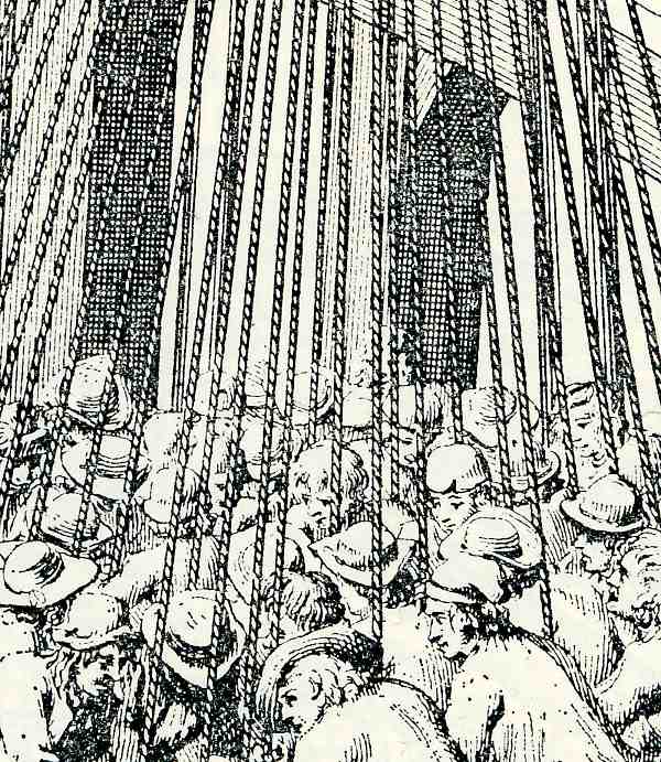
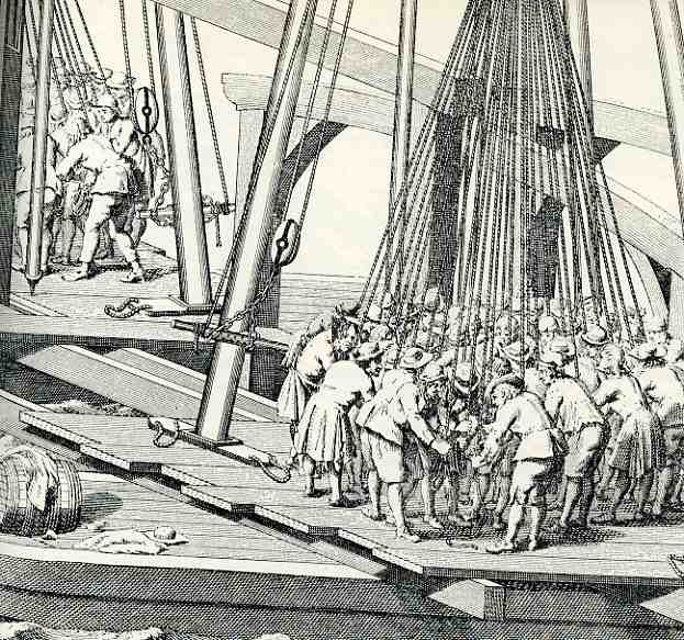
    Tileman van der Horst and Jan Schenk produced the Theatrum Machinarium
    Univesale
    *, one of the most celebrated works on the construction of all those
    elements so necessary to keeping life dry in Amsterdam 9the place of the book’s
    publication).  It was perhaps the most
    important work then produced on dikes, sluices, dams, weirs, canals and
    swing-bridges, the very elements of existence in Holland.  Jan Schenck was the engraver of this work,
    which may also be the most accurate and the most sumptuously illustrated book
    of its type in Holland in the 18th century—the technical aspects of the
    rendering was just superb. In the image (which is a detail of a detail of a
    larger folding plate) I reproduced at left and below we see that Schenk and Horst weren’t kidding around in their treatise:  what we see here is the elevation for a plan
    showing the laying-in of pilings for a larger structure.  This is still tricky business today in Amsterdam, given the soil
    structures on which the city is built, some of these pilings go down hundreds
    of feet.  This group of about fifty men
    is certainly struggling with something big; but just how big it is I do not
    know.  (They do look rather well-dressed
    for being about to muck around in the foundation area of a structure.) And this
    draws my attention to the planks on which they all stand; the boards seem just
    enormous, looking to be two feet wide and several inches thick, and long.  I’d be very curious to know where this lumber
    was coming from, as I feel it certainly wasn’t local.

    0 blog jan 08 horst367
    *Theatrum Machinarum Universale.. of
    Keurige Verzameling van .. Waterwerken, Schutsluizen, waterkeringen, ophaal- en
    draaibruggen
    . Printed in Amsterdam., by Petrus Schenk en Zoon, 1757-74.  Illustrated with 50 engravings on 47 partly folding plates.


  • Celebrating a Good Idea that Sounds Silly: Concrete Ships

    0 blog jan 06 concrete ship361
    JF Ptak Science Books LLC  Post 459

    0 blog jan 06 concrete ship362

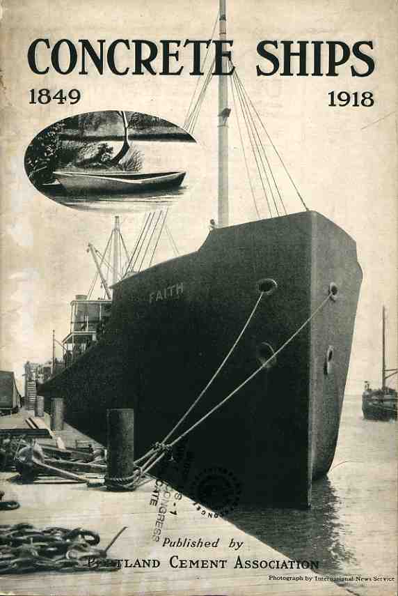
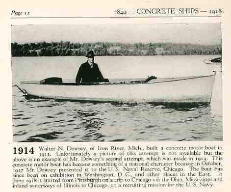
    This 1919 pamphlet’s title certainly sound more odd than the concept it describes:  concrete boats have been around for a long time, (160 years at least), and they make a lot more sense than a quick-think would give them (lumbering, unstoppable, heavy prep trucks come to mind).  For boats over 25 feet long, it is probably the easiest and cheapest material to employ, and it doesn’t need weatherproofing.  And, as an interesting website dedicated to concrete boats (ferro-boats) observes, a 30-foot 8-ton displacement ship made of either wood or concrete will weigh the same, which means that the very first image that comes into our heads when you say “concrete ship” is just wrong. 

    It looks like the French were the first to come up with the idea in about 1848, patenting the most winning methods of construction in 1855.  Since then there have been 12,000 or so of these 25-ft+ ships built, including a 130′ yacht and a 120′ British sub.  This method of construction certainly saw its time, especially during wartime, when steel production was in high demand.

    Please note:  posts over the next seven days or so will be somewhat truncated; I’m moving my store so time is a little scarce. Thanks for bearing with me.


  • Very Literal (and Persuasive) Images–Christ in a Winepress

    JF Ptak Science Books LLC  Post 490

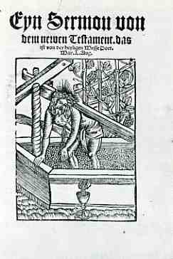
    0 blog jan 24 christ wine420Seldom are images less equivocal than this fantastic woodcut dominating the title page of Martin Luther’s Eyn Sermou von dem newen Testament das ist von der heyligen Messe…, a tallish, 14-page pamphlet printed in Leipzig in 1520.  We see the Christ of Luther (1483-1546) being pressed, crushed under the weight of the crucifix which is also a part of the wine press in which Christ stands–the screw to the press passes through the cross which applies the weight, spilling Christ’s blood which collects in a sacramental chalice.  For Luther, the covenant of Christ’s blood is everlasting, connecting his redemption to man without the need of priests.  And by 1520, Luther certainly had no need of priests.  He was filled with a reforming rage against the papal machine, becoming especially annoyed (in 1517) with the putrifing effects of the funding of the building of St. Peter’s Basilica, which bowed under the flatulent weight of Pope Leo X, who was very busy selling indulgences* from sin to those who could afford to.  So between 1517 and the publication of this pamphlet in 1520, there was the Papal indulgence issue, whose appalling nature led to Luther’s 95 theses on the door at Wittemberg; then came the Diet of Augsberg in October 1518, and then the excommunication of Luther in 1520.  A very busy three years.  

    * (from the Wiki biography on Luther)  “A Dominican monk named John Tetzel was assigned to the sale of
    indulgences in Saxony. A talented and unscrupulous salesman, Tetzel was
    willing to make any claim that improved sales. He thus promised not
    only a reduction in punishment for sin, but complete forgiveness of all
    sin and a return to the state of perfection enjoyed just after baptism.

    “He added that if one would generously purchase indulgences to speed
    the release of a deceased loved one from Purgatory, no actual
    repentance on the part of the giver was even necessary. Marketing
    genius that he was, Tetzel employed a memorable jingle to make his
    offer clear and simple:  “As soon as the coin in the coffer rings, a soul from Purgatory springs.”


  • Finding Hidden Images in Antique Prints: 18th Century Forensic Social X-Rays

    JF Ptak Science Books   Post 484


    Even though I truly enjoy the intimate pathology of antique prints, finding “hidden” images within images within images, it seems as though I’ve only made 25 or so posts about them, and this in spite of thousands of such images to choose from.  Posts like “Hidden Children: Found Art and Social Vignettes Inside Art“,  “Revealing the Worlds Inside of Prints: Finding Hidden Human Geography in Old Prints” and “Finding Hidden Images in Antique Prints: 18th Century Forensic Social X-Rays” are good representatives of this genre.  

    0 blog jan 23 vickers412

    Images hold selective secrets for different people of divergent interests.  Sitting through a motion picture, for example, shows a series of still images flashed before us—in a single scene people bring to bear their own ways of experience and observation.  A forensic pathologist will see things shown within their specialty different from someone with a chemical explosives background who will see a bomb differently from an ER doc who would respond to an emergency room differently from a bookseller who might notice in the scene that the paperback edition of a tree Grows in Brooklyn being read by an American G.I. in 1944 didn’t exist yet, and so on.  A single image can hold a tremendous variety of depth and interpretation depending on the observers’ perspective. 

    0 blog jan 23looking hard surrey414

    Most of the time when I look at prints now in the antique map shop that I own (and now my only public venue now that the history of science bookshop has been alive solely online now for the last 6 years) I am looking at the extraneous “stuff” that is used as filler to the print’s purpose, and I find the uncommitted art just fascinating, sort of like “loose” unnecessary snapshots of common life, everyday life, of people walking by.

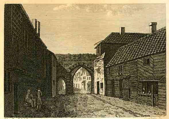
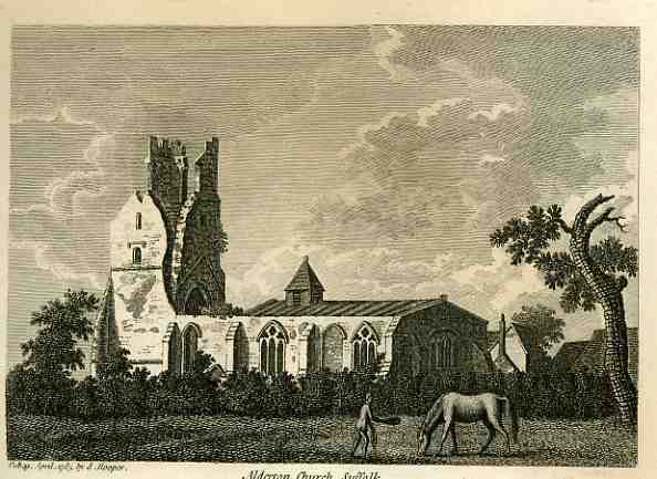
    These two images are from a series of etchings done by S. Hooper in 1785 of ancient and semi-ancient ruins in Surry and Sussex.  The first is of Bermondsey Abbey, Surry, a 12 th century English Benedictine monestary with precursors reaching back another 500 years.  I’m pretty sure that it is the central archway(s) that are the remnants of the structure in this print,

    0 blog jan 23looking hard surrey415


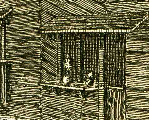
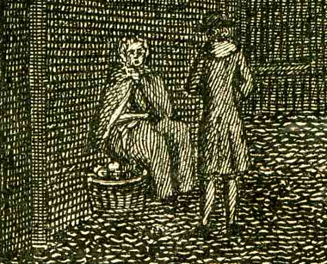
    with Renaissance-era occasional buildings sprouted up around it.  I find the old shopkeeper’s window (i.e. “store”) at the right to be very interesting, someone selling their services or wares from a location that I would bet was hundreds of years old even by 1785.  The shop would be ready for business by opening the shutters and flipping down the table/ledge.  I wonder too about the woodworking on the second floor of this curious structure, placed in an unconventional diagonal.  The shaded feature of the shawled woman selling her goods from a basket to what seems a well-dressed man is another curious addition. 

    The second image is of Alderton Church, Suffolk, and the feature of itnerest here this time not so  hidden at all, though it is incidental and it is sweetly odd.  the ruins of the church are

    0 blog jan 23looking hard surrey417

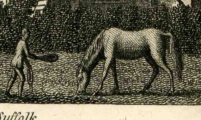
    adequately rendered, but the horse in the foreground is just beautifully done, far more so than required by its half-inch appearance in the full-size original.  Also, the man approaching the grazing horse does so slightly hunched, with a hat outstretched (offering a treat inside?), and doing so I’d say in a kind, respectful manner, trying as he was to put a halter on the horse.  It is just a lovely, quiet sub scene that is unnecessary to the architecture of the ruin but probably very necessary to the artist or etcher who wanted just a tiny flight of fancy now-and-again, and so placed something of artistic merit in a dead space of the print. 


    0 blog jan 23looking hard surrey416


  • Looking Straight-On at Things in Antique Prints, Part 2

    JF Ptak Science Books LLC  Post 483 (continuing Post 20)

    0 blog jan 23 vickers411
    In one of my earliest posts on this blog I wrote: I’ve always been intrigued by antiquarian images
    that looked straight down, or up, at things–90 degree, perpendicular, real
    straight-on stuff, giving a feel for depth (or height) and perspective. 
    Funny thing is that in the wide world of scientific images, they really don’t
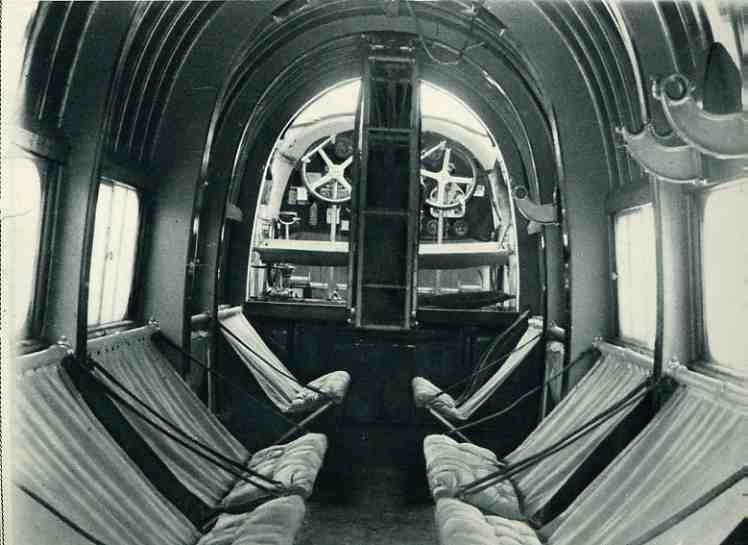
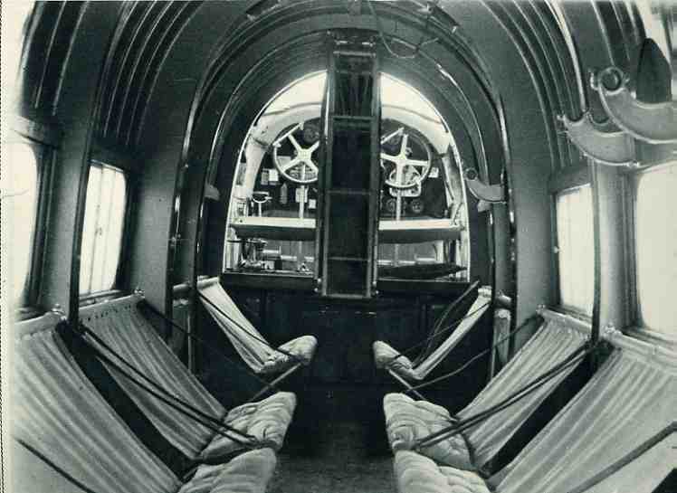
    show up very often.”  Still rue.  I really haven’t noticed that many straight-on images–perhaps the paucity of these things is as simple as them not being “as pretty” as other views.  I have found another, today, showing the interior of the “spacious RAF” Vickers “Victoria” troop carrier aircraft for (January 5) 1929.  It was indeed spacious for the time, and was one of the largest planes in the air. 

    The Vickers Victoria first flew in 1922—this 1929 monster
    was powered by two 570hp engines which allowed it to cruise at a modest 110 mph,
    taking it 11 minutes to climb to 4900 feet. 
    It had a crew of two and carried 22 troops—it looked as though it might
    do more than that, but this was quite a load given the time and the altitude at
    which the plane would function.  As you
    can see by the fellow standing in the foreground, it was a very tall plane—17 feet tall, with a 59’ long body on a massive  87’ wingspan (that made even more impressive
    by the wings’ 2,178 square foot surface). 


    0 blog jan 23 vickers410


    The view here is from the rear of the aircraft looking
    straight forward, and I notice that the pilots didn’t have any backrest for
    their seats.  The interior, even though
    fairly threadbare and essential, did have upholstered seats for the folding
    chairs. 


  • Material Things Out-of-Context: the Statue of Liberty in Paris, 1884

    JF Ptak Science Books LLC  Post 482

    0 blog jan 22 statue409


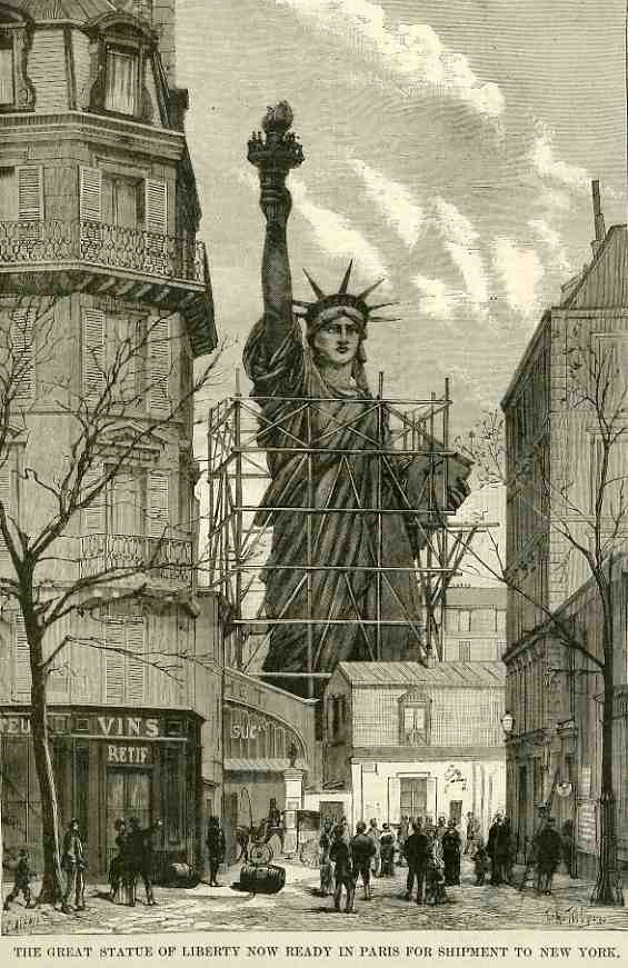
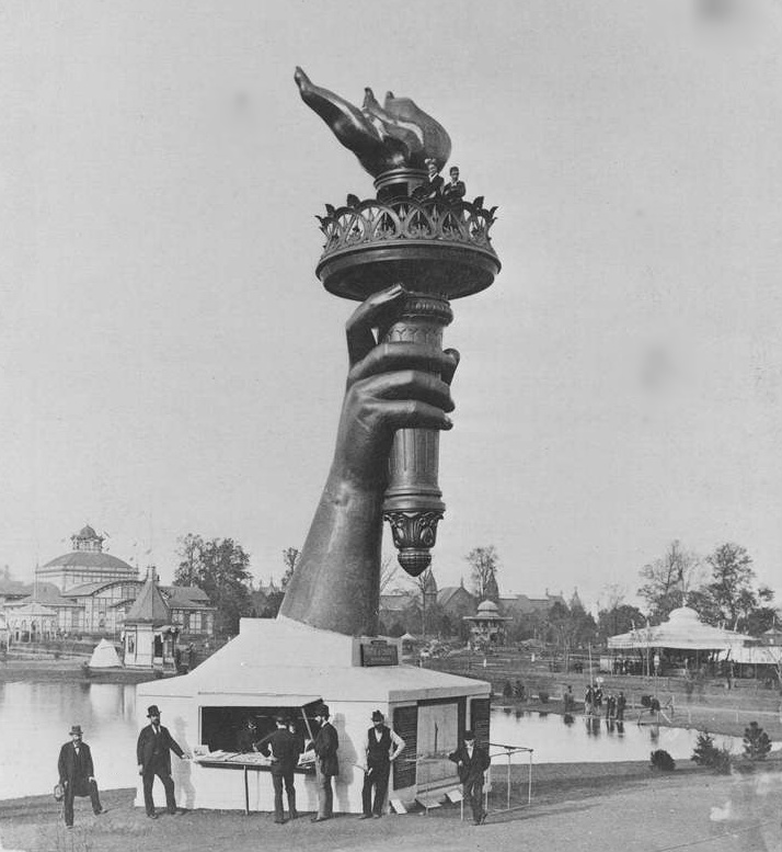
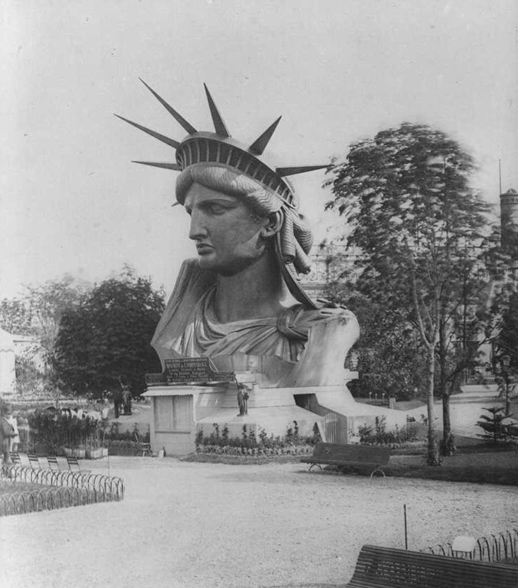
    “The colossal statue of Liberty, which is to be placed as a pharos in New York Bay, is at last finished.” So leads this front-page story of the Scientific American for May 10, 1884 (published in its Supplement section #413).  The image reminds me of many that I have seen over the years of familiar objects being found in unfamiliar places.  In this case, the statue loomed over the warehouses as it was assembled in the courtyard of Gaget et Gauthier, rue de Chazelles, Paris, prior to its shipment to the United States. (It was shipped in 350 pieces and packed away in 315 crates, bouncing its way to America in the French frigate Isere.)  The arm of  the statue made an appearance all on its own at the Centennial Exhibition in Philadelphia in 1876, and then rested at Madison Square in NYC until joined by the rest of the body in 1886.  The head of the statue was also separately exhibited in Paris until 1885.


    Liberty arm

    Out-of-context is interesting and dissonant and anything but normal; and anything-but-“normal” is good, seconding the claim of Mme. Curie that “dissymmetry causes phenomena”, which means that something happens that is not part of the ordinary, and that in turn means that something new can be discovered. 

    Liberty head


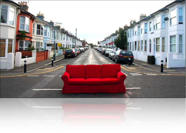
    There are some interesting and purposeful collections of instituted disturbances like this: for example, there’s the red Couch Project, a continuation of a photographic odyssey of a large red couch that has been moved many thousands of miles across the world, finding itself in situations entirely unexpected of a piece of furniture. Then too there is Philippe Halsman’s The Jump Book (1959), in which he simply asked (famous) people to “jump”. Red couch

    He semi-seriously (probably not seriously at all)  interpreted their efforts, fitting their jumps into what he saw as his subject’s personality.  Peter Ustinov (shown here) tries hard to look as though he is not jumping, while Richard Nixon jumps a very careful, self-conscious  and studious jump.  

    Jump


    In any event, in spite of liking thee last two works immensely, I prefer the unintentional out-of-context molestation of required memory.  (Though anything else that can get me to the not-normal stage of being is welcome.)


  • Institutionalized Racism and the Sale of Toys and Music and Frivolities

    JF Ptak Science Books LLC Post 479

    0 blog jan 21 negro393

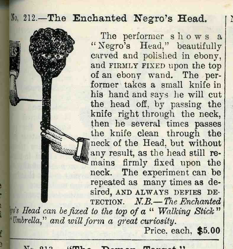
    Leafing my way through a reprint of the Peck & Snyder Out & Indoor Sports and Pastimes Catalog for 1888, looking for baseball equipment and giant bagatelles, I found this stunning advertisement.  I knew of the tragic and long history of this form of “entertainment”, as does everyone, but I must say I never considered the costume end of it.  And here it was.

    The minstrel show, or minstrelsy, appeared as an American invention in the 1830’s–much more so by the early 1840’s.  It depicted  blacks in only the worst possible ways, as shiftless, lazy, buffoonish, stupid, flawed in almost every way, an idiotic race with a musical advantage, relayed in predictable units, accompanied by a developing genre of American music.  The ad here is for the accoutrement of the performers, layers of red rouge and carbon to build on white faces one of the lowest forms of racial archetypes that this country has produced. 

    0 blog jan 21 negro394
    The astonishing thing is that it is just a simple ad in the middle of
    the page of the middle of a catalog for entertainment and sports
    bits–nothing special at all, nothing remarkable to distinguish this
    gaping hole of morality from the games and exercise equipment that
    surrounds it.  And that’s the deep horror of stuff like this, this sort
    of stereotyping that was so lethal and filled with hate, and not making
    a ripple in the awareness of anyone’s sense of correctness: the
    creation of this racial image was so complete that even its most base
    element could appear as an insignificant trifle in a sporting catalog. 

    Even more extraordinary is this ad that appears just a few dozen pages
    later.  “The Enchanted Negro’s Head” was a prop in a magic trick that
    involved drawing a knife across the neck of the black head. “The
    performer takes a small knife and says he will cut the head off”–I can
    imagine the sort of conversation between performer and audience before
    his action is undertaken, getting the audience ready to kill the “Negro
    Head”.  It would not have been pretty.  And that’s not all–once you were done with the “trick” part of cutting off the head, it “(could) be fixed to the top of a walking stick or umbrella….(to) form a great curiosity”.

    These characterizations appeared in uncountable forms in virtually every aspect of social life in this country, finding its insidious way even into something as seemingly innocent as a magic trick. It is the very vast smallness of this racism that make it so terrifically convincing and lethal. Looking at something like this makes me feel the enormous weight of the all that went into the attempted assassination of this race. 

    **My friend Joy Holland–chief of the Brooklyn Room at the Brooklyn Public Library at the Grand Army Plaza in the heart of Brooklyn USA–recently started a wonderful history blog at the library called Brooklynology.  A recent post there talks about a minstrel-related find in their ephemera collection–it is quite interesting; take a look. 


  • Alaska Calls: the Comma King Heads for the Hills. Naive Surreal Collection, Part 9.

    JF Ptak Science Books LLC  Post 478
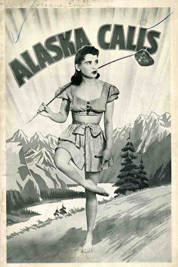
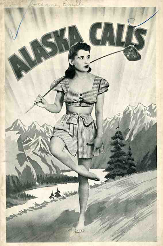
    0 blog jan 20 alaska calls392 So.  I really couldn’t tell what was going to happen in this pamphlet, a fine example from my Naive Surreal collection.  Unfortunately, it is a bit of only a lonely hearts tale, in spite of the monumentally-odd cover of the southern girl with hairy legs and a hobo switch and no shoes and a bare midriff in the wilds of Alaska.  The only thing that the text has going for it in the oddness department–with the exception of being badly written–is the enormous,use,of,the,comma.  I don’t know what the record is for the badly-employed use of the comma might be, but, well, this little story must be making quite a run for it.  In the dedication, for example, which is ten lines and 100 words long, there are 18 commas.  More follow.  Many more. 

    The cover must stand on its own–and it does.