A Daily History of Holes, Dots, Lines, Science, History, Math, Physics, Art, the Unintentional Absurd, Architecture, Maps, Data Visualization, Blank and Missing Things, and so on. |1.6 million words, 7500 images, 4.9 million hits| Press & appearances in The Times, Le Figaro, Mensa, The Economist, The Guardian, Discovery News, Slate, Le Monde, Sci American Blogs, Le Pont, and many other places… 5000+ total posts since 2008.

Category: Prints–looking HARD/deeply at

  • Anthropomorphic Display of Quantitative Data: Flight Safety, 1912

    JF Ptak Science Books LLC  Post 815

    Even though masses of people had been used in panoramic photography for some years (thousands of people, usually soldiers, gathered to form a living liberty bell, or portrait of George Washington, or some such thing) , I cannot recall the use of humans as a direct statistical aid as in this bio-bar graph, found in the pages of The Illustrated London News for 1912 (page 357).  000-ebay--Nov 7 air death005
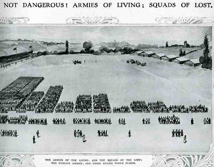
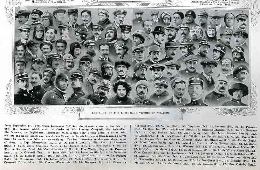
    The article asks the question of whether air travel (and flight in general) was “safe”, and responded by graphing its “yes” response with this image. The larger groups in the top half of the image represent the number of flyers flying for that particular country; the small groups below show the number of aviators killed.  (There is no date of reference in particular but it seems to me that these are total deaths since flying began in Europe in earnest in 1905.) The photomontage below shows a selection of some of the most famous dead aviators. The number of deaths as a percentage of those flying seemed quite acceptable in the year of publication (1912) ; however if these figures were iterated forward to 2009 the death rate would be staggering, sending many thousands of aviators (and crew and passengers) to their deaths each year.  In the United States we save that safety failure for deaths in automobile accidents, which still kill about the same number of Americans each year as were U.S. soldiers lost for the entire war in Vietnam.  In spite of this the odds for survival looked pretty good in 1912. 
    000-ebay--Nov 7 air death portrait006


  • The Ape of God

    JF Ptak Science Books LLC  Post 813 

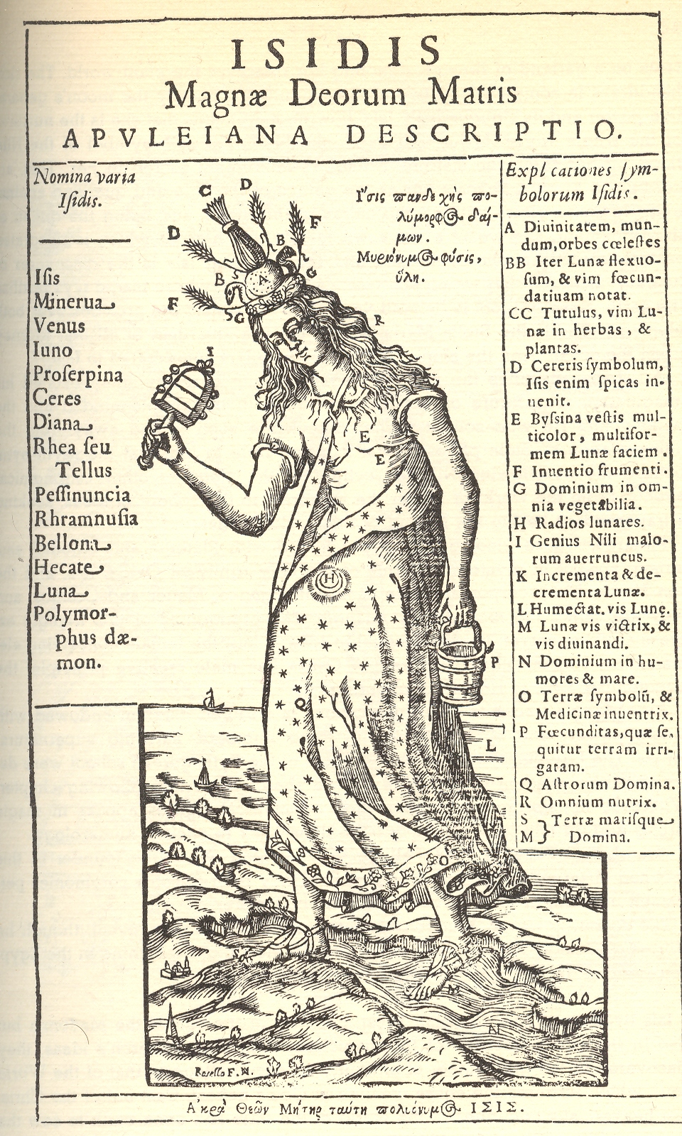
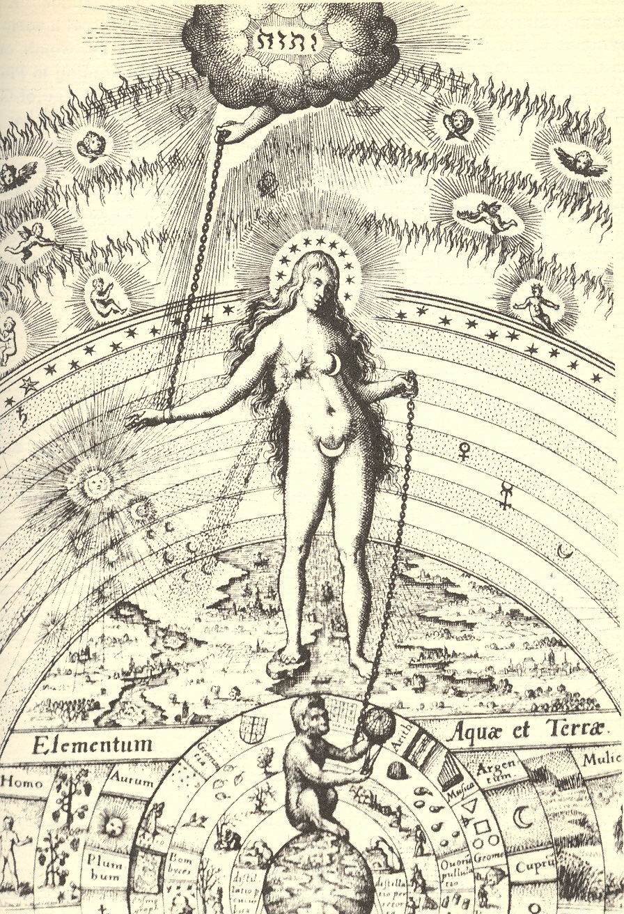
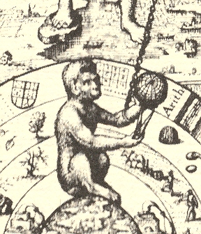
    These two interesting and complex images of the goddess Isis1, dripping as they are with symbolism and reference, are most interesting to me because of the depiction of man as the ape of god.  (No, not the Wyndham Lewis  Apes of God reference to poseurs and scumbags and indolents in the art world, just man in general.)
    + blog 10.30 isis
    The first and second image both show Isis standing on land and in the water, bridging the two, being the goddess of each; she stands slightly bent over in each, and has long flowing hair, a symbol of her as the nurturer of the Earth, as is the  adornment of the fertility symbol of the Moon in her stomach/womb.  The two Isis carry different things: the first, a pail (symbolizing the Nile, which she controls and floods with her tears for the loss of her Osiris) and a sistrum (a musical instrument peculiar to her celebration).  The second image’s hand-connections are more complex:  Isis’ right hand is connected directly to the creator, reaching from a cloud above the upper firmament of angels; her left hand is connected to our title’s interest, the ape of god—man.  The ape/man is seated on the

    + blog 10.30 isis 2  

    Earth, surrounded by concentric spheres of animals, minerals, intellectual practices (I can easily see “arith”metic, “geom.”etry, “musica” and others represented), water and Earth, the planets(including the Sun) in their courses, the starry realms, and then several spheres of I’m-not-sure but heavenly and ethereal. Man as ape is seated chained to Isis, the giver of life, and contemplates (with dividers) a model of the sphere on which he is seated.

    Notes

    1. Isis (also know to different cultures as Minerva, Aphrodite, Ceres, Hecate) was an ancient Egyptian/Greco/Roman goddess, idealized as the perfect mother, the Great Mother, patron and issuer of nature, magic and fertility—the giver of life, a Madonna.  She was the daughter of Geb and Nut (god of the Earth and goddess of the sky) and husband of Osiris, and was in general very high-power stuff.

    + blog 10.30 isis 2 man ape


  • Odd Art Department: Art Brut in Advertising?

    JF Ptak Science Books LLC  Post 810  Blog Bookstore

     + blog 10.26 tauranga

    There’s not much in this illustration–the entire back page of an oversize pulbicity tourist pamphlet–to suggest any sort of professionalism, or training, or, well, ability.  But there it is, badly drawn, with unusual (if not bad) coloring, trying to entice people to visit this seaside resort in New Zealand. 

    Maybe this is more “outsider art”
    than Art Brut.  Art Brut was a term used by
    Jean Dubuftet to describe raw/rough art produced by non-artists (and those
    mostly mental asylum residents1).  Art
    critic Roger Cardinal coined “outsider art” as a English-language adaptation of
    the Dubuffet term2, and has since come into use to describe unusual,
    technically naïve and unschooled Otherness of artworks.  This cover illustration is certainly bearing
    a pretty good-sized helping of otherness to it, from its pale, weird coloring
    to its basic inability to draw.  Somehow
    though it is attractive to me, and ultra-calming when it is not troubling.  It is just one of those peculiar works that
    is good and bad at the same time.

    Notes:

    1. A spectacular and early example
    of Art Brut is found in the phenomenally detailed, insightful-of-other-worlds
    work of  Adolf Wolfli.

    2. “Those works created
    from solitude and from pure and authentic creative impulses – where the worries
    of competition, acclaim and social promotion do not interfere – are, because of
    these very facts, more precious than the productions of professionals. After a
    certain familiarity with these flourishings of an exalted feverishness, lived
    so fully and so intensely by their authors, we cannot avoid the feeling that in
    relation to these works, cultural art in its entirety appears to be the game of
    a futile society, a fallacious parade.” – Jean Dubuffet. Place à
    l’incivisme
    (Make way for Incivism). Art and Text no.27 (December 1987 –
    February 1988).


  • History of Boredom: St. Joseph’s Ennui in the Nativity?

    JF Ptak Science Books  Post 809   Blog Bookstore

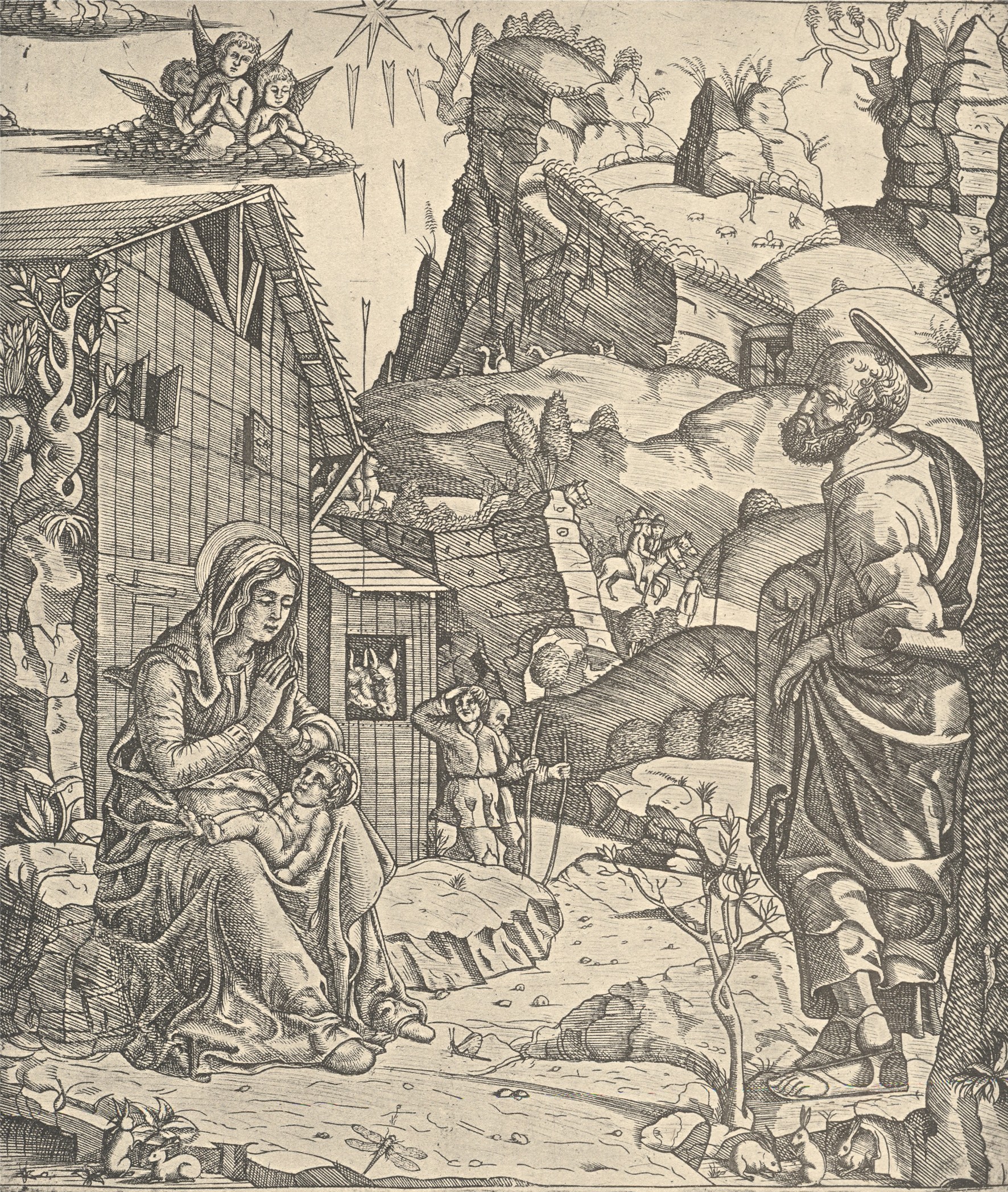
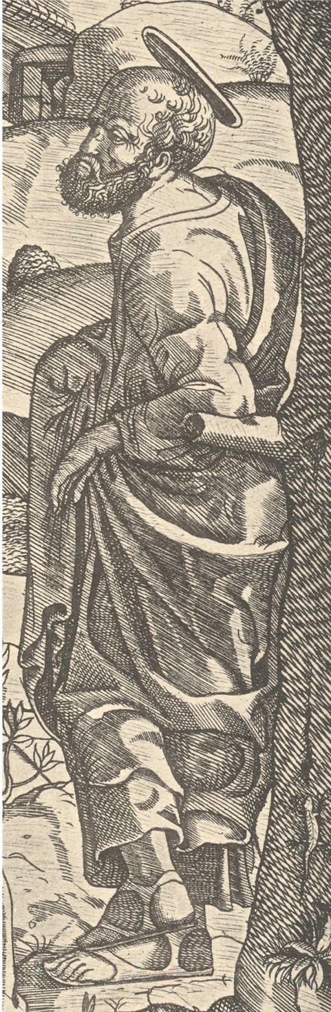
    This woodcut, the work of the semi-anonymous “Italian Monogrammist” and printed around 1510, shows the newly arrived Christ in the arms of his mother, taking the airs outside the stable. What is unusual to me here is the attitude of St. Joseph, who adopts a dictionary-ready pose of nonchalance:  he is leaning against a tree, his left arm propped up at the elbow on a tree limb, his feet crossed at the ankles, with a look of I-don’t-know-what on his face. 

    + blog 10.26 nativity

    He is definitely not of the standard Josephs that one sees in this scene.Perhaps he is communicating a certain type of tiredness, but I doubt it. The man is staring off into space, not looking at wife and baby, not looking at the many visitors coming through the tunnel in the mountain and excitedly rounding the nearby turn in the road, not looking at anything that we can see.  He’s not seeing the invisible stuff either:  not the praying angels and not the sun-ray daggers.He’s not tired, not excited about the baby and wife, not excited about the visitors, and in a pose of resident uncaring relaxation–boredom might be the easiest and best explanation, except, well, it doesn’t make for a good story. 

    + blog 10.26 nativity det


  • Portraits Within Portraits: Images of Exhaustion, Defeat and Old Youth

    JF Ptak Science Books LLC  Post 806  Blog Bookstore

    + blog 10.24

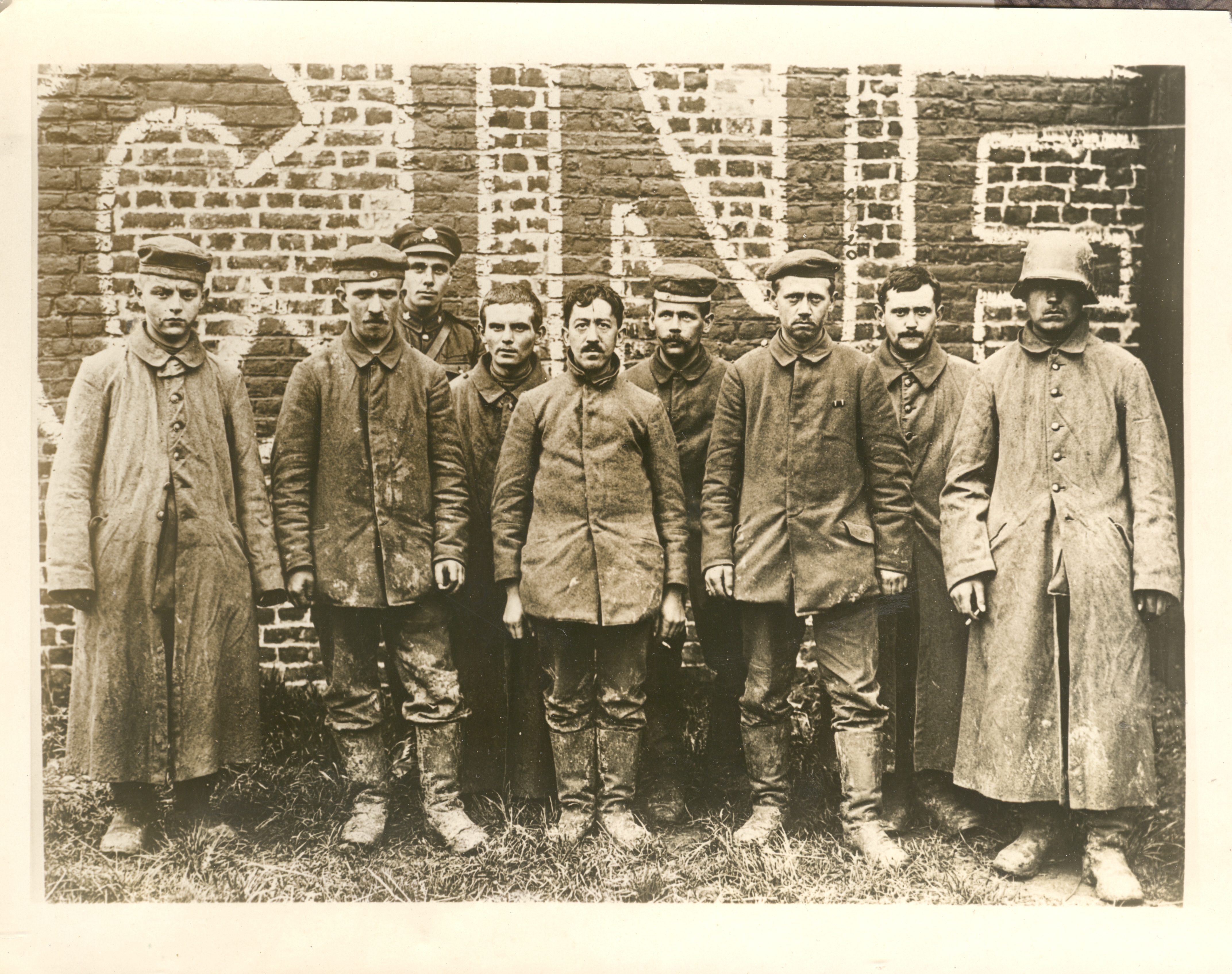
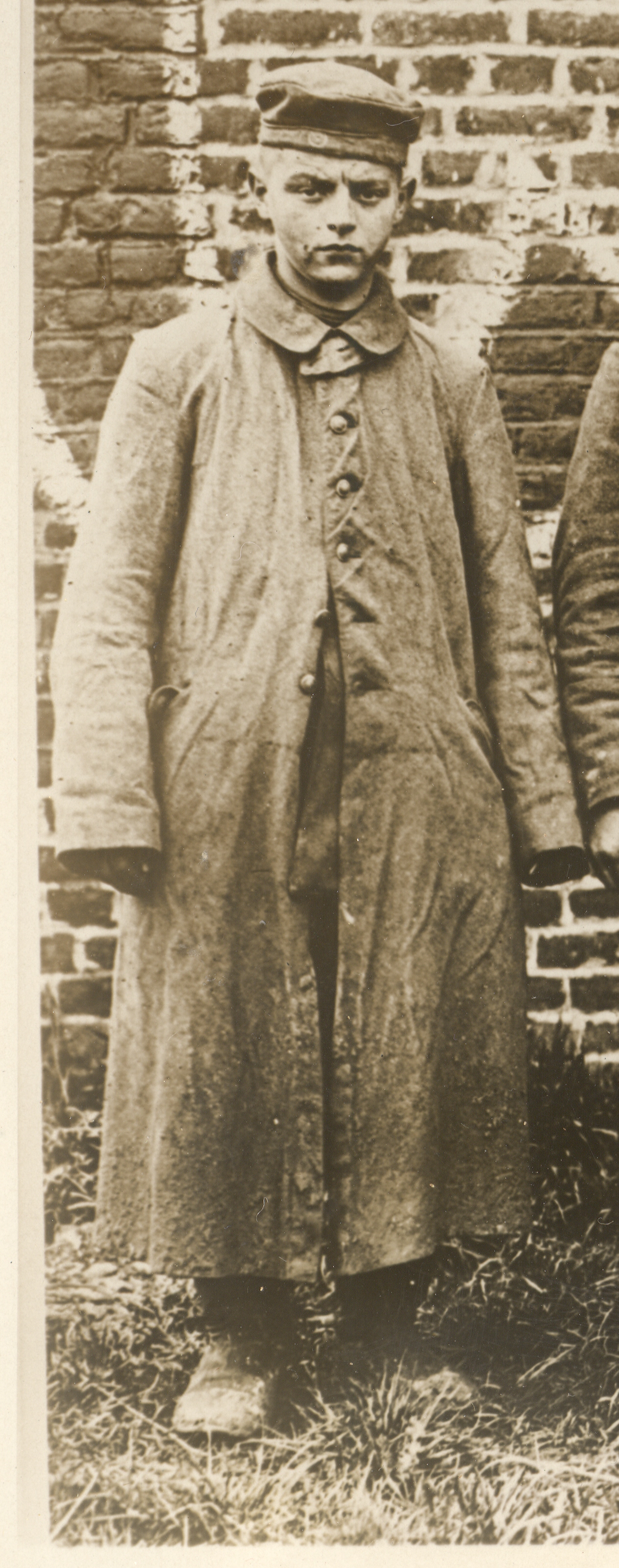
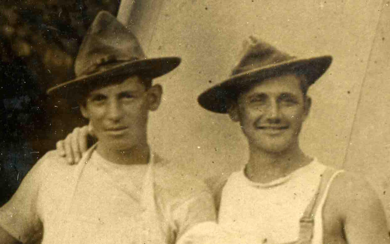
    Earlier today I made a post on some of the images in my collection of WWI News Service Photographs. (These were photos that were sold by an image agency to newspapers and journals which looked for stock photos of, well, whatever, and after paying a use fee would include the photo in the story they were reporting.)  This photo is one of three in a series that show German POWs being marched around a town in France and stopped here and there for a photo.  The picture was taken deep into 1918, within a month or two of the end of the war,.when the Germans were already defeated.  From the look of things, these soldiers were done: tired, mostly beaten, dirty. They at least had most of their buttons on their coats (which is actually a very big deal, keeping your overcoat closed in cold weather to keep warm and alive), their boots looked warn but intact, and they looked not terrible undernourished (though I doubt anyone in the group weighed more than 150 pounds).  

    + blog 10.24 boy left

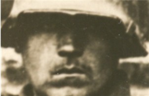
    The group is bookended by two remarkable figures:  the soldier on the left looks not 16 or so, but with a not-new ground in toughness.  He’s all smooth face and baby fat, though he has at least survived the grueling fighting.  The soldier on the right could be the prototype for any number of propaganda posters that popped up in Berlin in the early 1930’s advocating the sold-out but not defeated German soldier of the Great War whose fate must be avenged. 

    + blog 10.24 eyes

     Almost everyone was cupping a ciggy.

    Lastly, the guy third from the left seems to be a Canadian guard, not that this group was going to try to escape.


  • Portraits Within Portraits: Found Images in WWI Photographs

    JF Ptak Science Books LLC  Post 805  Blog Bookstore

    0 blog jan 12baker374

    In
    my collection of WWI News Photo Service Agency photographs I would say
    that half or so of them show  scenes like this–semi-informal group
    portraits of military support groups.  500 portraits like this seem to
    be a lot, and I’m not sure why these images are so well represented.
    Except of course that there weren’t that many images (overall) of
    active-battle scenes. 

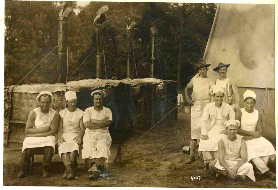
    These bakers, working at a front-line
    support station, from my read were probably taking a break, and the
    photographer took the opportunity to draw them together for the
    portrait.  I don’t know why they’re separated so, but they do look as
    though they have a real camaraderie–it is just a wonderful picture,
    full of friendship and loyalty, and I’m sure it has never been
    published before.  

    0 blog jan 12baker375


  • History of Blank & Missing Things, #55: Empty Theory from Good Data

    JF Ptak Science Books LLC  Post 801  Blog Bookstore

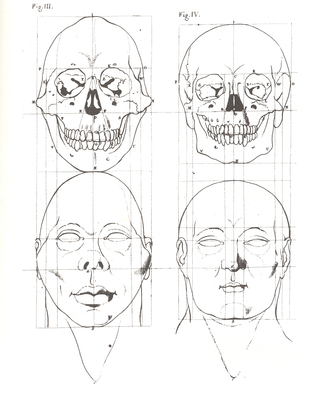
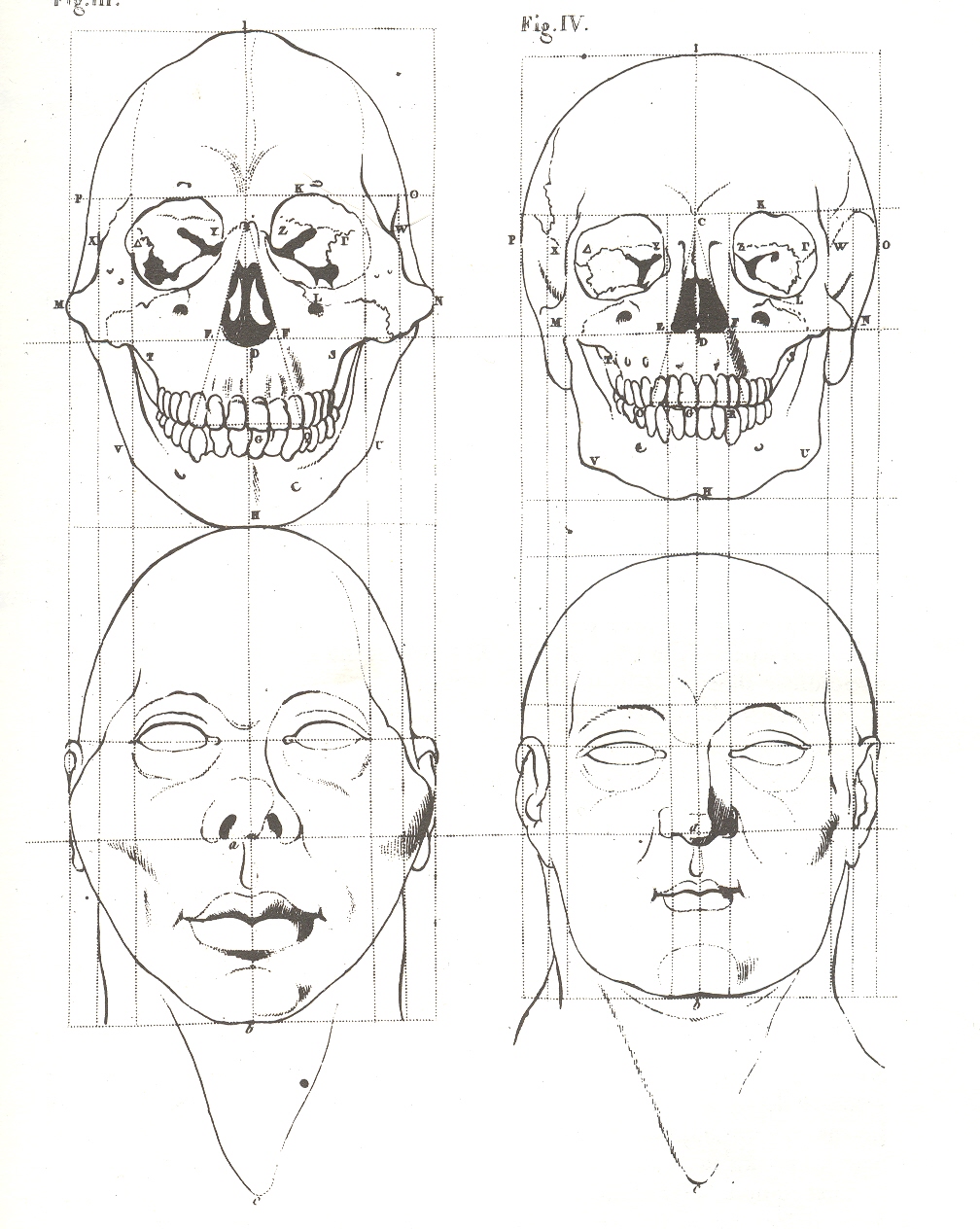
    It is difficult to imagine the impact that Pieter Camper’s intellectual leap had on his fellow anatomists back at the turn of the 19th century with this image1–with a mass of collected data, Camper was able to realistically suggest the facial qualities of a skull.  I’m not sure exactly when this effort was first made, but it seems to my memory that this is a very early effort.  But the mass of Camper’s work generally takes a bad turn turn when it came to representing his findings with theory. + skull

    I wrote about Camper earlier on this blog addressing his  “Bad Ideas of 1778”, in which it seemed as though he was doing anatomic transformations of animals into humans. Camper  (1722-1789) was a determined and excellent observer, which led to him understanding the skull like no other, but who was also lost among the numbers.  He was full of angles and degrees, articulating genetic possibilities by the measure of a face and the sentiments of its accumulated measurements.  He was also in his mind fully capable of judging a person by the physical measurement of their faces, which led to publications like his 1764 Oration on the Origin and Colour of the Blacks, in which he writes:

    “…some attribute peculiar to the quarter of the world; or the specifications of some singular ornament, peculiarity of dress, or of custom…. Thus, an Asiatic is distinguished from an European by colour and dress: the African and American, being somewhat similar in colour and dress, are known by the addition of a crocodile and elephant, a cargo of tobacco, incision of the skin, tatowing [tattooing], plumes of feathers, &c.“

    Which leaves us, well, nowhere.

    He collected some great data, but Camper was able to advance little beyond its diagrammatic representation:  theory was not his calling.

    Notes:
    1  The engraving comes from Camper’s posthumous  Dissertation sur les variétés naturelles qui caractérisent la physiognomie des hommes de divers climats et des différens ages suivi de réflexions sur la Beauté; particulièrement sur celle de la tête; avec une Manière nouvelle de dessiner toute sorte de têtes avec la plus grande exacitude.


    \


  • The Bumpy Earth and the Loss of Perfection, 1543

    JF Ptak Science Books LLC  Post 800 

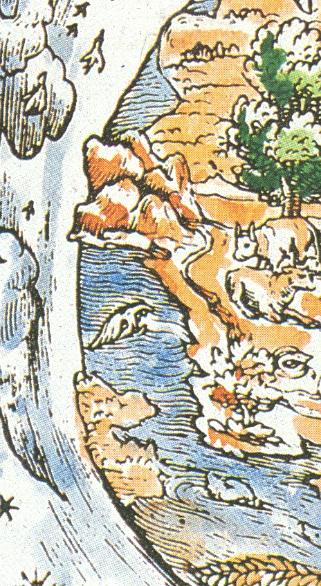
    The idea of the Earth as a sphere is an ancient one, proved over and over
    again across the centuries, most famously proved by Aristarchus with a stick
    and a hole and a shadow. The idea of the Earth as perfect, as a perfect sphere,
    is an old belief wrapped in layers of hopeful scientific thought, God’s
    creation and the cradle of mankind necessarily being perfect (Summa aside).  This was a rigidly enforced perception and a
    religious assumption, just like the belief that the Earth was the center of this
    universe, and that a vacuum was a theological and therefore physical
    impossibility.  (See my post On the Discovery of Nothing.)+ earth perfect

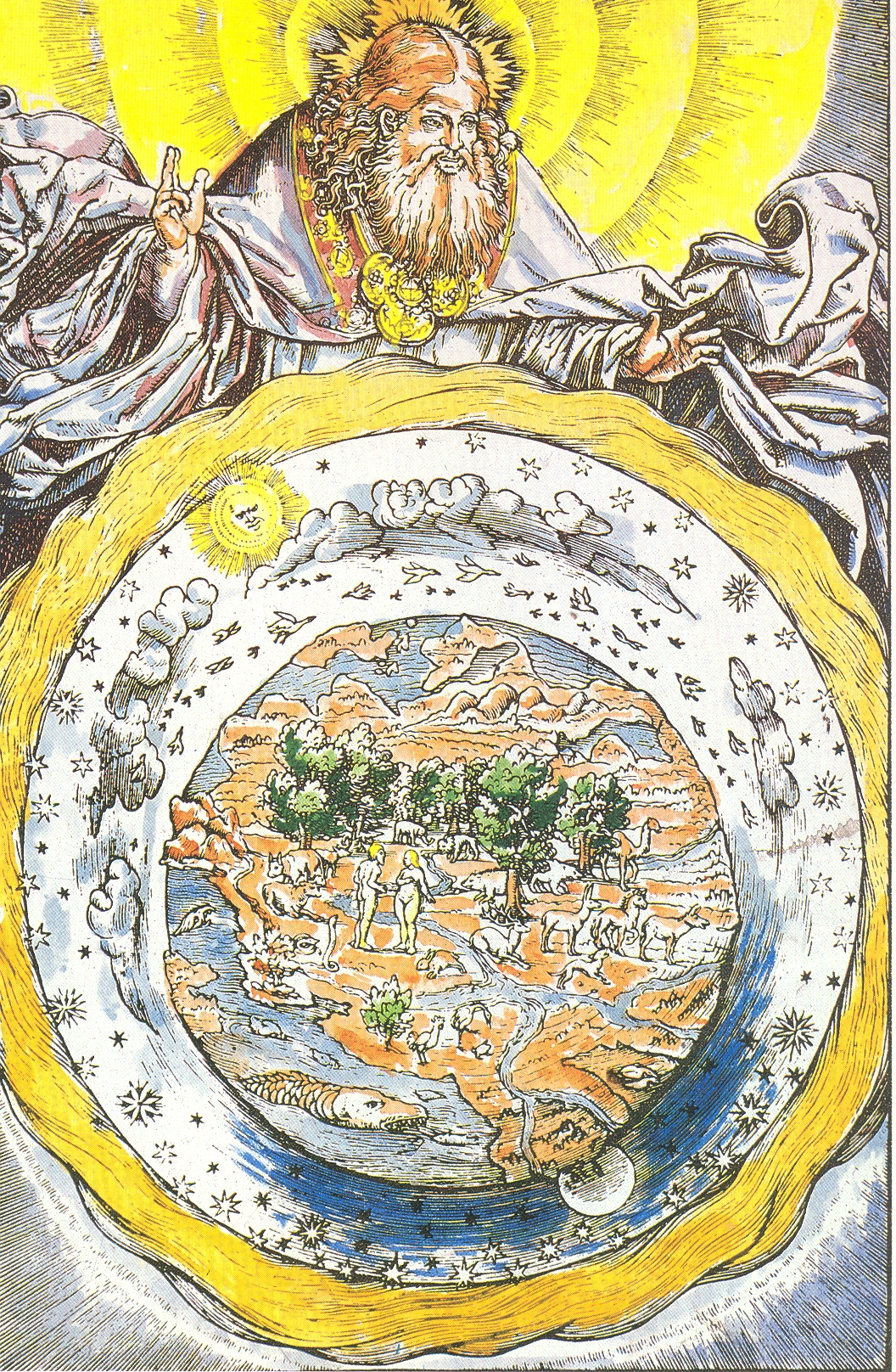
    The
    woodcut illustrated here—a depiction of a robbed and medaled God lording over
    his creation—is interesting in its depiction of what seems to be a not-perfect
    sphere of the Earth. The planet is definitely not smooth around its perimeter,
    and the inclusion of three-dimensional mountain rendering accentuates this
    depiction, which to me seems all very novel. 
    The source for this image is given as a “Martin Luther Bible of 1543”,
    but that is wrong, unfortunately, which makes it less of a story. 
    If this woodcut was really done in 1543 it would’ve occurred in the same
    year as two monumental publications: 
    Nicolas Copernicus’
    De revolutionibus orbium coelestium and Andreas Vesalius’
    De humani corporis fabrica (On
    the Fabric of the Human Body)
    ,
    marking what is the birth of modern science.  (The print appeared in Luther’s translation of the Bible in 1534.)

    + earth perfect det

    But offhand I don’t see Luther’s “Bible” for this year, and in general 1543 is not a good year in general for Luther
    so far as I’m concerned.  He busily
    published
    Von den Juden
    und ihren Lügen
    (On the Jews and Their Lies ) and  Vom Schem Hamphoras und vom Geschlecht
    Christi
    (On the Holy Name and the Lineage of Christ), both of which
    were horrible anti-Semitic attacks, and worse. 
    For example, from the first work, he wrote that the Jews were a “base,
    whoring people, that is, no people of God, and their boast of lineage,
    circumcision, and law must be accounted as filth.”, and
    in the second wrote that it was not an immoral act for not killing Jews.  This really has nothing to do with the point
    of this post, but I just couldn’t let the reference to 1543 slide by without
    mentioning this very ugly tragedy of Luther’s  theology. 


  • Rectangles as Impossible Elements in Interior Design

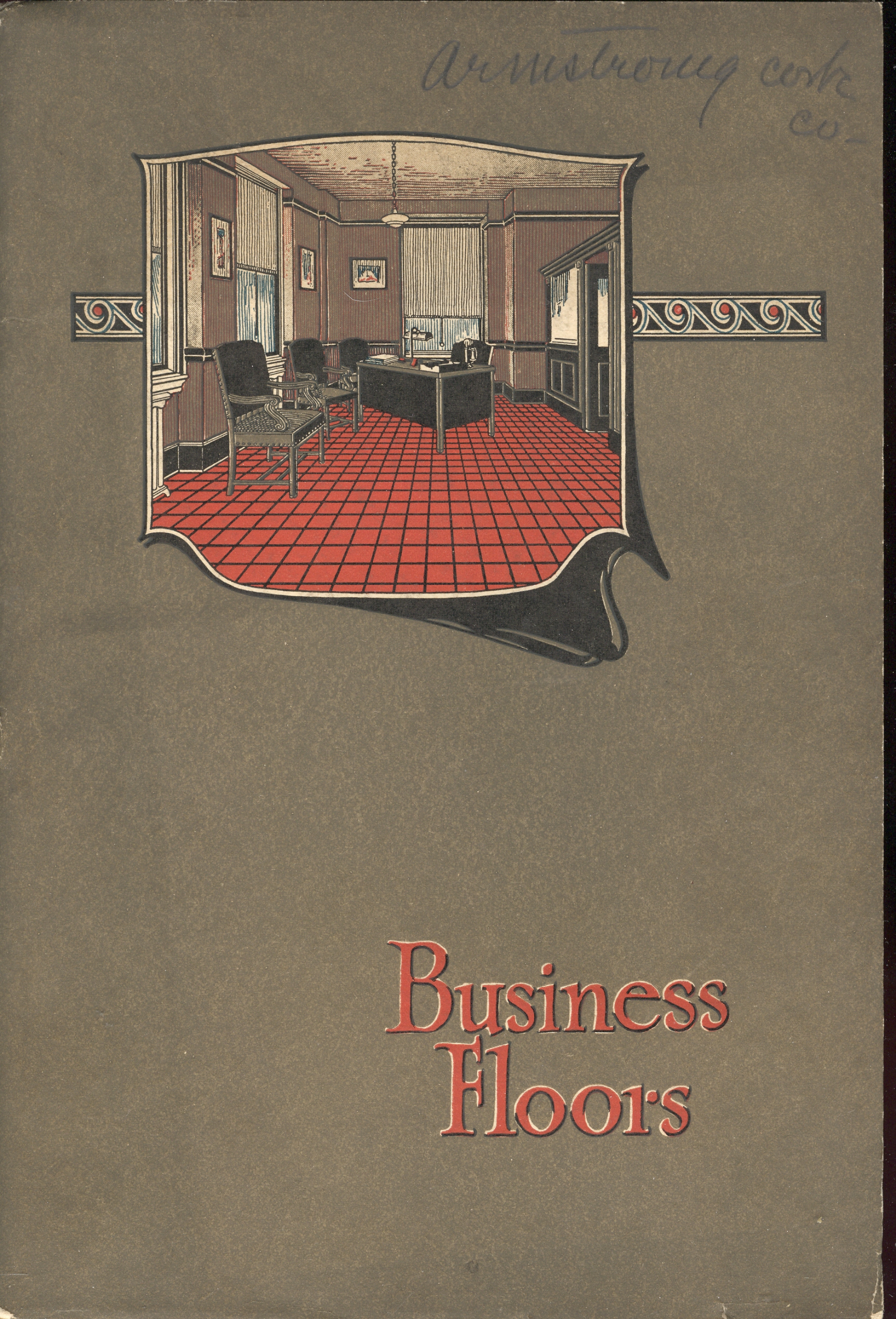
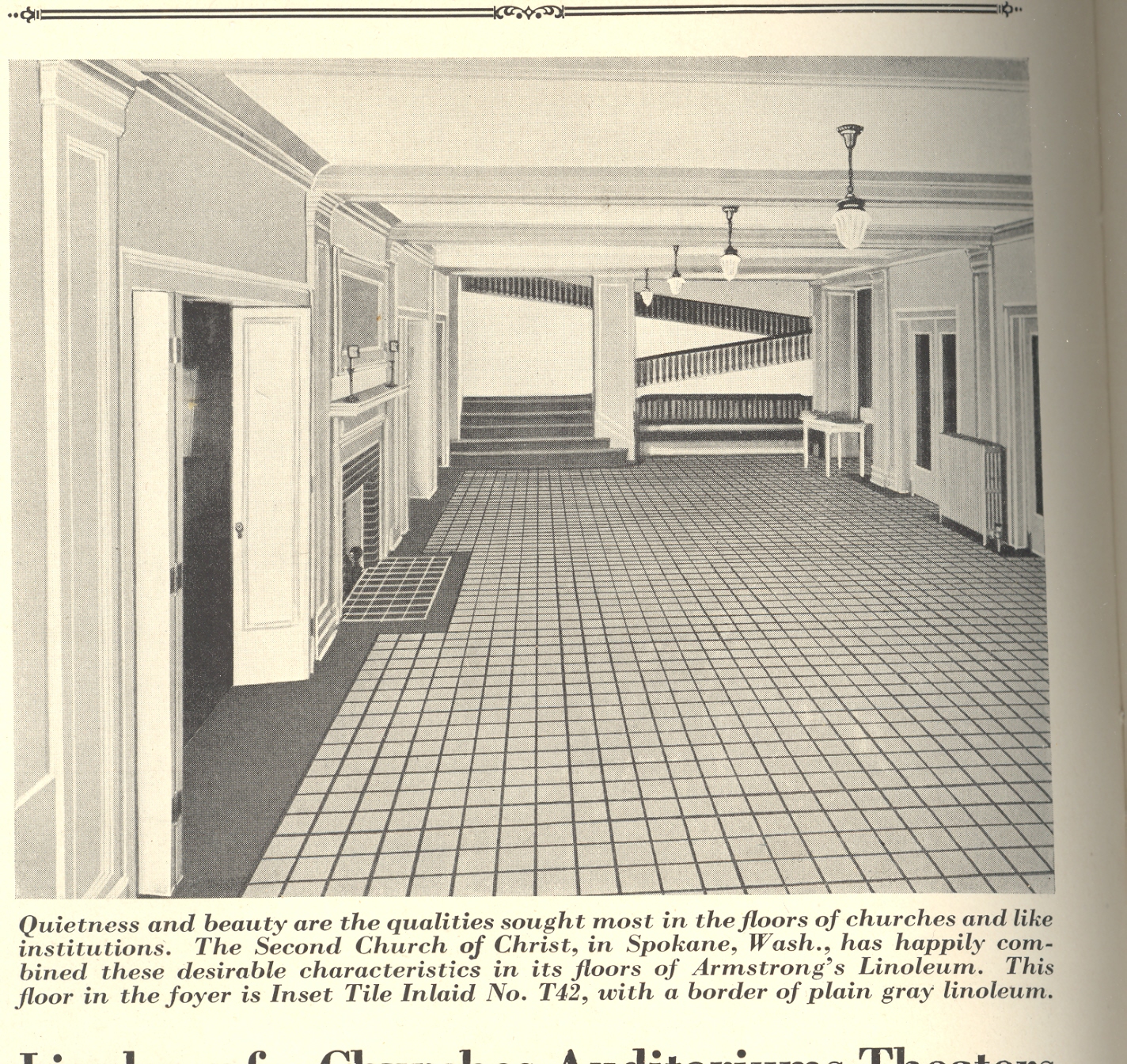
    JF Ptak Science Books LLC  Post 798  Blog Bookstore+ squares title

    Sometimes, there are simply too many rectangles.

    But this sentiment is just a function of its time—for example, in this
    glorious manufacturer’s catalog by the Armstrong Cork Company (of Lancaster,
    PA), the incredibly-titled Business Floors, there simply aren’t enough rectangles
    to go around. 

    For example:

    + squares  + squares 2 

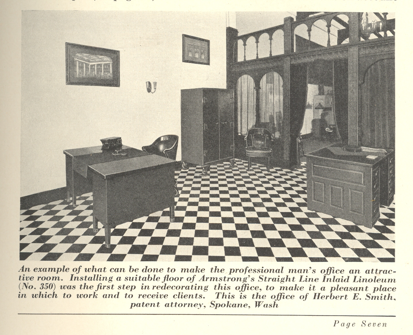
    And the perspective-bending distortions of this office, the point of view pulling the squares into rectangles before your eyes:

    + squares 3

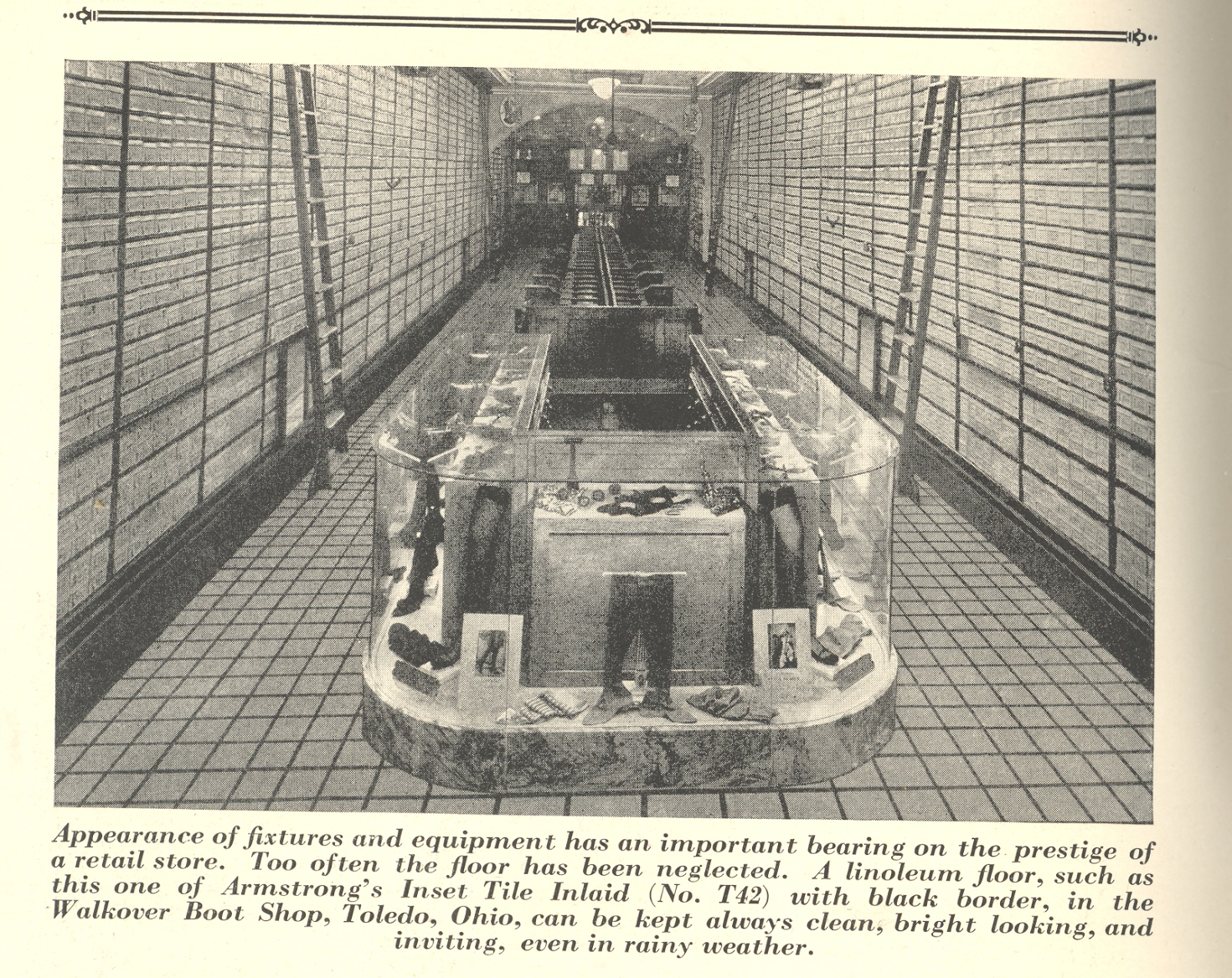
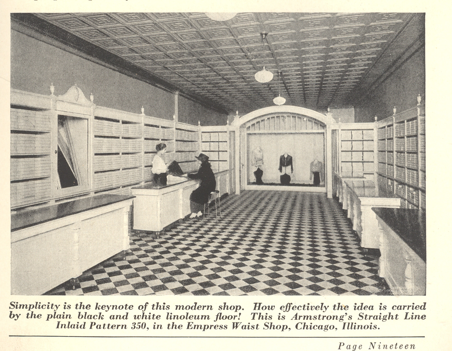
    And this mysterious masterpiece, which the cork company calls “simple”.  It is true that there is virtually nothing in this shop that draws the eye of the customer away from the clerk (the goods are stacked away perfectly in uniform boxes around the walls of the store), but the hundreds and hundreds of rectangles do nothing but confuse.  And aggravate.  A little Einstein on the Beach on the PA system and there would be no customers at all. 

    + squares 3 001


  • Advanced Weirdness Department: Wincingly Dated Underwear Stares

    JF Ptak Science Books LLC   Post 796   Blog Bookstore

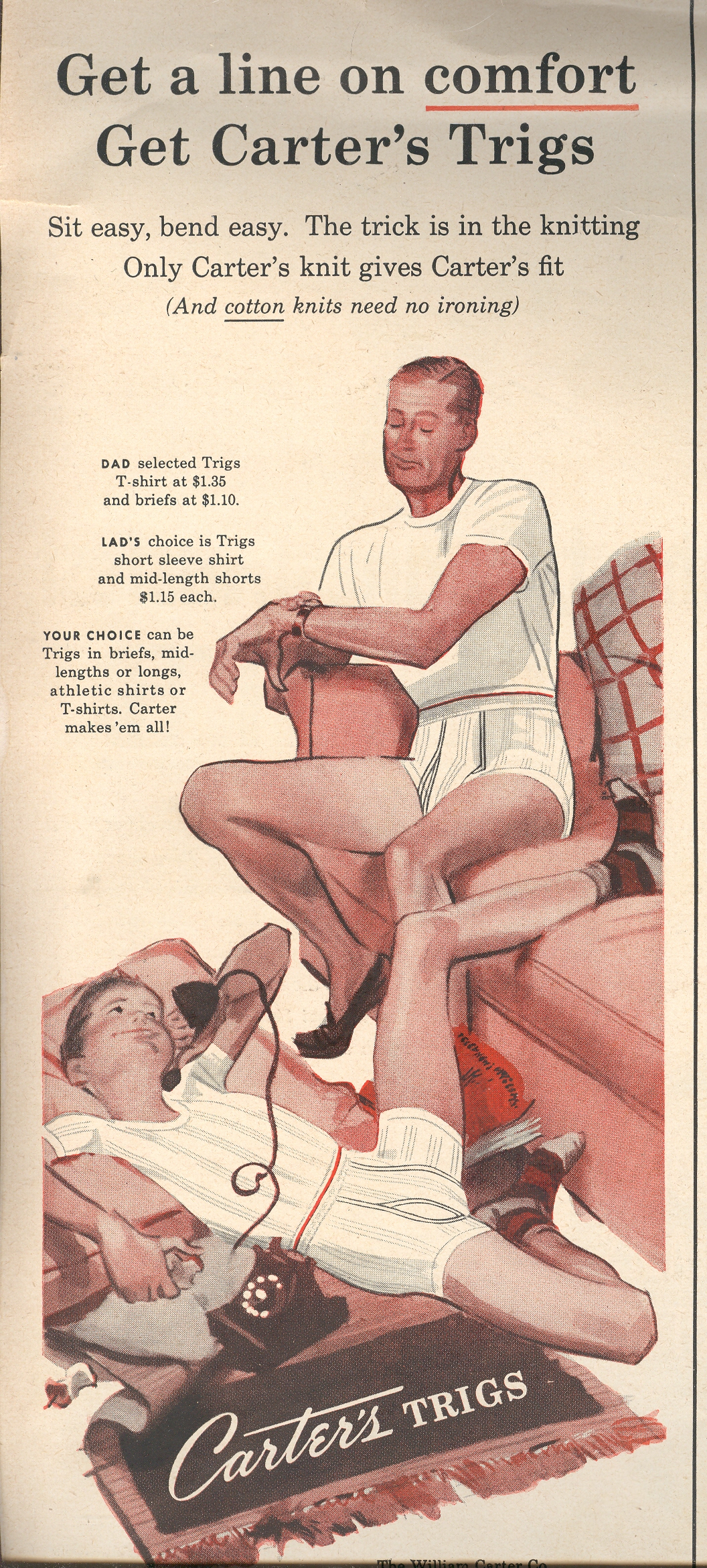
    + boy This Carter’s underwear ad from LIFE magazine (1950) makes a weird pronouncement—it
    is behavior and body language that was evidently  entirely appropriate for the time, that there
    was nothing amiss or untoward or askance or unusual in the position or the
    glances of the two models.  Now, today,
    the whole scene is at least unsettling, squirmy.