A Daily History of Holes, Dots, Lines, Science, History, Math, Physics, Art, the Unintentional Absurd, Architecture, Maps, Data Visualization, Blank and Missing Things, and so on. |1.6 million words, 7500 images, 4.9 million hits| Press & appearances in The Times, Le Figaro, Mensa, The Economist, The Guardian, Discovery News, Slate, Le Monde, Sci American Blogs, Le Pont, and many other places… 5000+ total posts since 2008.

Category: Art

  • Artists in/and their Studios: Bacon, Braque, Kandinsky, and others.

    JF Ptak Science Books   Post 1175

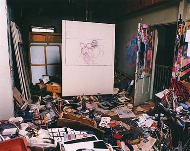
    I.m not sure what sent me scurrying around for images of artist’s studios–iniitally I was looking to see what was on the walls of the artist’s workspaces, but there were so many that it couldn’t be done in my allotted time.  For now I just want to simply post these images of 30 studios and continue later on as a page with more images and  detail on the artists.  For now, I’ve included images of the studios of Bacon, Bonheur, Bonard, Braque, Cezanne, Chagall, Derain, Chase, Friedrich, Kandinsky, Le Corbusier, Mondrian, Remington, Teixidor, Villon, and Vlaminck. (The majority of these images are drawn from Alexander Liberman’s The Artist in his [sic] Studio, 1960; there’s much of interest in that book, including vivid observations and descriptions.)  The other, older, images are depictions of the generalized artist’s workshop and studio.  Enjoy.

    Francis Bacon studio

      Studio--farancis bacon

    Rosa Bonheur studio

    Studio--rosa bonheur
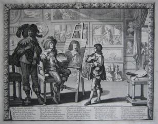
    Abraham Bosse, depiction of  a studio.

    Studio--abraham bosse
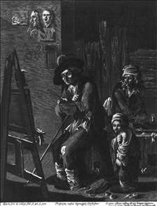
    Both, Andreas (depiction of a poor artist’s studio)

    The Poor Painter in His Studio


    ·Posted by :

    ·in:

    —

  • Occupational Alphabet, ca. 1850

    JF Ptak  Science Books   Post 1103

    Its interesting to see what jobs have survived over the years, and what jobs haven’t–particularly those jobs that would have been so widespread and popular that they would be instantly recognized by a child–so much part of the common culture that the initial letter of the job’s name could be used to help children learn the alphabet.

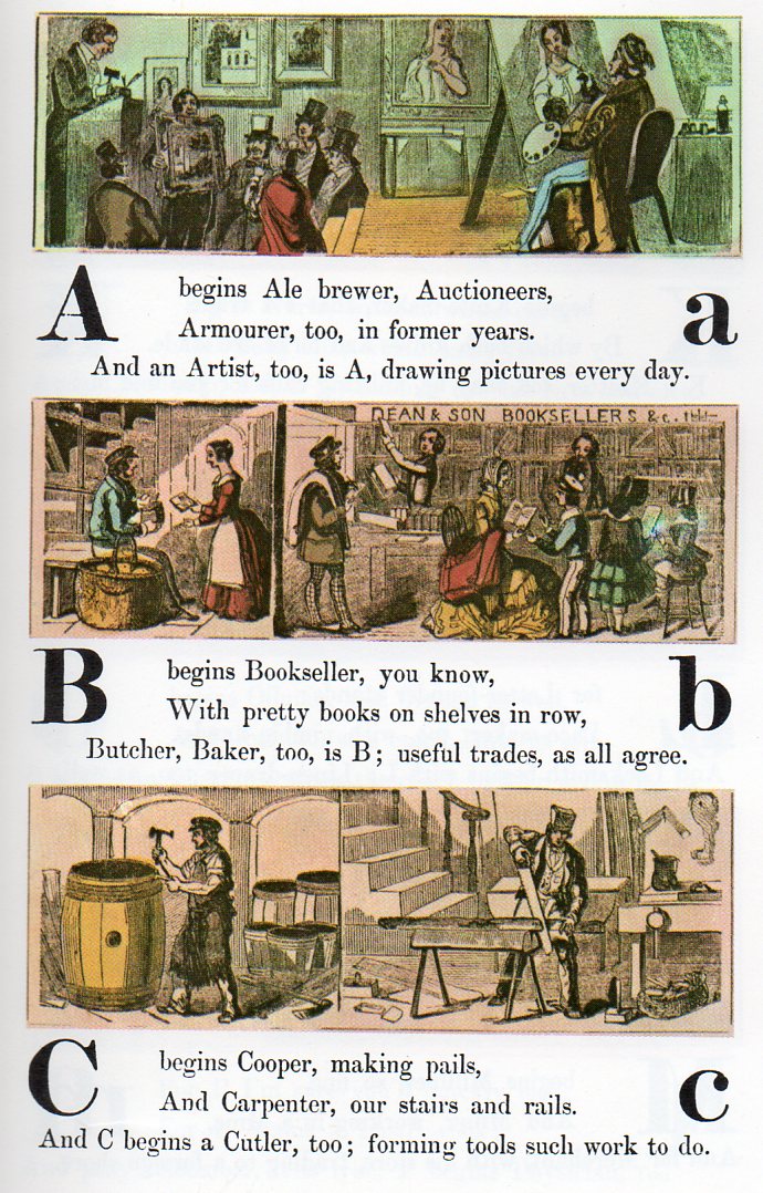
    Alphabet jobs a-c267

    In this version of commonplace employment found in a child’s alphabetical primer of ca. 1850, lists the following professions, most of which are still available for hire: ale brewer (especially here in Asheville, Beer City USA);auctioneer, armourer, artist, bookseller, butcher, baker, cooper, carpenter, cutler, dyer, dairyman, engraver, engineer, fishmonger, fiddle(r), florist, grocer, glazier, hatter, hawker, horse dealer, ironmonger, jeweller, knife-maker, knitter, letter-founder, lace-maker, locksmith, milliner, miner, merchant, nurse, newsman, oilman, optician, omnibus, pastry-cook, physician, rope-maker, rider, shoemaker, shipwright, scavenger, slater, surgeon, sawyer, saddler, tailor, turner, tanner, tinker, upholsterer, vintner, wharfinger, wax-chandler, yeoman, youth, zoologist.

    continued below with FULL ALPHABET:


  • Children’s Questions, Bernard Berenson and Paulo Uccello

    JF Ptak Science Books  Post 1093

    I love the idea of being able to look at things like a child.  To come towards things with such an authentic and unpolluted curiosity would be an enormous gift for anyone past this age of discovery and exploration–its where some of the great questions are asked.  I have learned so much from my daughters and their friends over the years that it makes me want to be around kids all of the time.  (Well, maybe not “all”…)

    In the history of benchmarks of creativity I’d have to say that the one for the Child’s Question stands among the greatest–at the very least it can show a careful listener how look at things differently–and sometimes savagely so. 

    For me these attempts come in strange ways–sometimes it comes in the form of just imagining that I knew nothing whatsoever about the topic.  (I remember a story about told by the mother of the American dustbowl-era artist Thomas Hart Benton.  Benton was a late speaker–nothing came out of him until he was one and a half years old.  But when it came, it came with a bang: standing on his porch in the early evening and looking at the Moon, he turned to his mother and said “What is that?”.  Magnificent.)

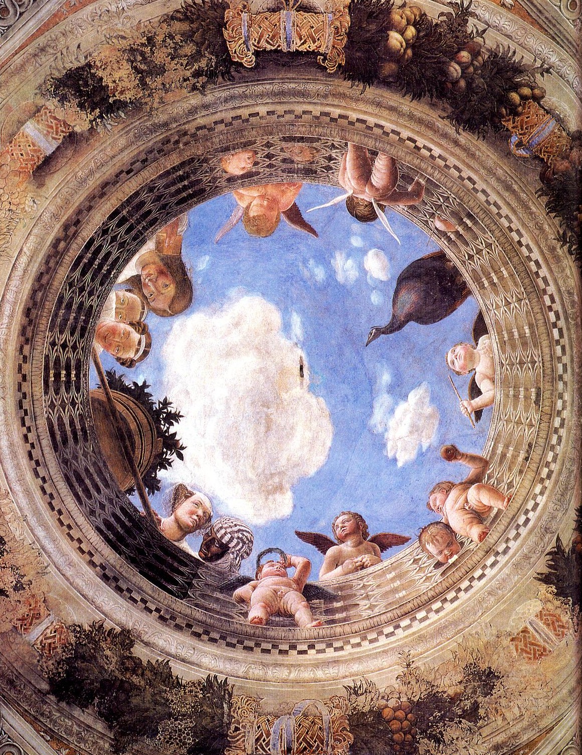
    For example there’s the glorious work by by Andrea Mantegna (1431-1506) in the Castello di San Girogio in Mantua (mainly La Camera degli Sposi).  The oculus is the focal point of a ceiling that stands over what some people consider to be the most beautiful room in the world, painted in almost every aspect and surface by the great Mantegna.
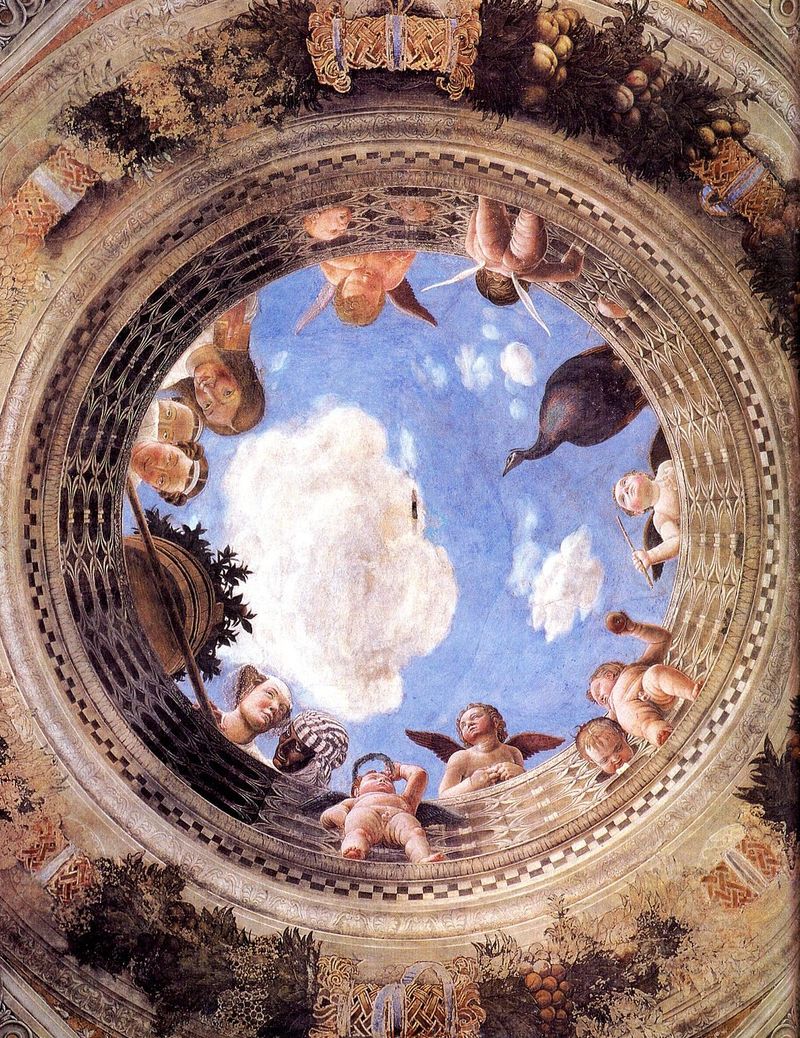
    Mantegna-large It is a magnificent thing created by a great Renaissance master.  But what in the world is going on up there above everyone’s heads?  I guess that you could infer all sorts of mythological and symbolic bric-a-brac to explain the scene, but, if you forgot about all of that, what it looks like is that everyone up there is waiting for a bucket of water (or something) to be poured down on the folks below.  Simple explanations are sometimes the best–and so are the obvious ones. 

    And so I turned to a book that I’ve breezed through but never read, a staple I guess for anyone interested in the  history of art, Bernard Berenson’s The Italian Painters of the Renaissance (1952) to see what he had to say about this work.  But before I got there I stumbled my way through Berenson’s long and thick paragraphs, filled with commas and very long sentences, tumbled my way across the name of Paulo Uccello.  And it wasn’t a pretty fall.

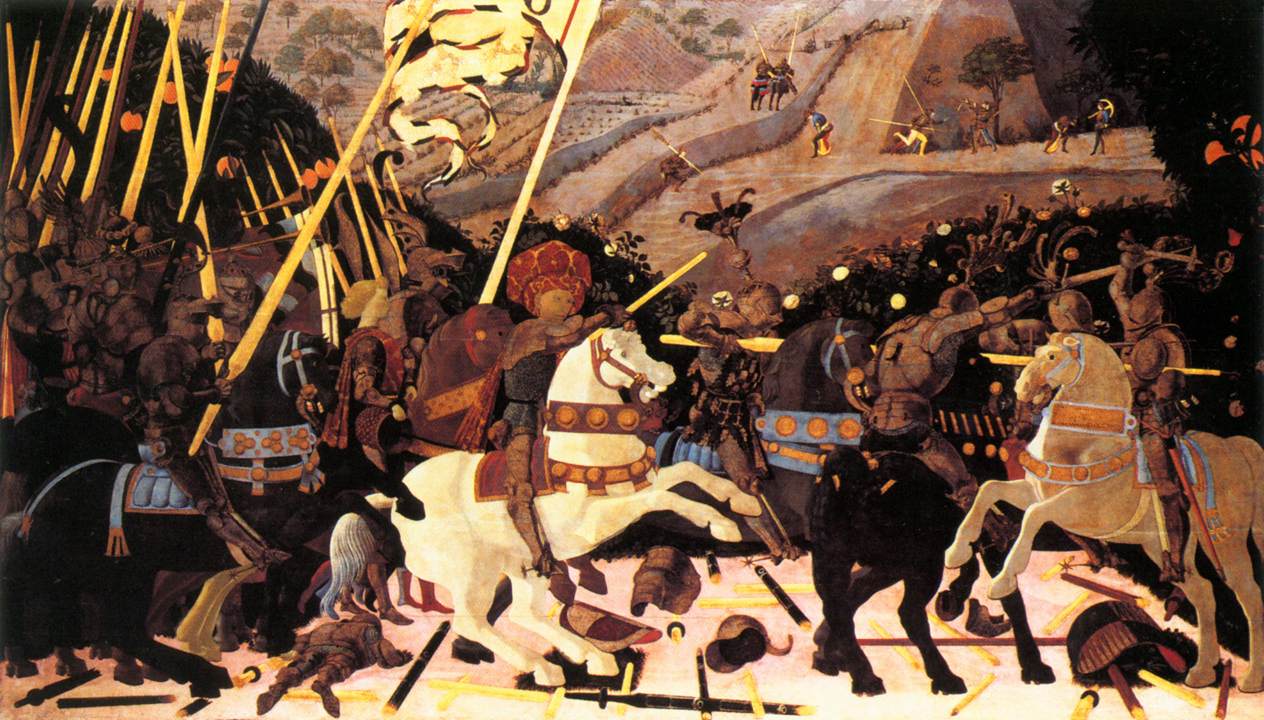
    I was introduced to real appreciation of the great Uccello (1397-1475) by my wife Patti Digh, who had thought long and hard about him through the Great American Novel The Recognitions, by William Gaddis. (Credit where credit is due: I never read the book before meeting Patti, and it is she who first supported the GAN claim for the problematic Gaddis.)  It’s a long and complex book, The Recognitions, and we won’t get into it here–just the part about Uccello.  And it is here that Gaddis makes a wonderful operation about the solids in Uccello. 
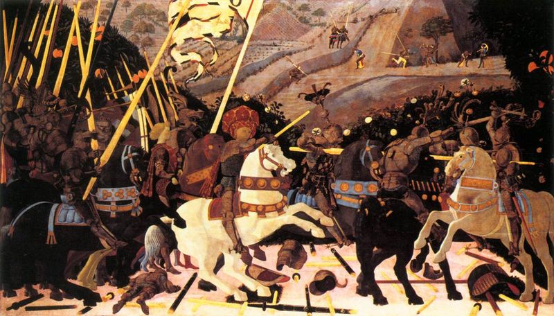
    Uccello

    Uccello was coming out of the Gothic era (sort of) and into the Renaissance (sort of) with a remarkable and just-about revolutionary control of the idea of perspective.  Maybe it was gotten through the polishing of the early doors of Lorenzo Ghiberti, or something else, I don’t know–he was a very private, deeply secretive man whose life (and philosophy) is mostly mystery.  Anyway, he was among the first scientifically-based artists to work in perspective, and he was just simply an important guy in the history of art.  But what Gaddis recognized that in all of this fabulous detail and naturalism, that there are great expanses of pure, unmodified, non-detailed colors.  Horse rumps can be simply white; parts of armor, just big flat blacks.  Beautiful.  The question was: what was he thinking?  In this great porridge of color and scientific delight, where was the detail?  Why did he leave out muscles and shadow and sinew and sweat and whatever, content for some reason to just dress that particular part of the painting in pure color?  It seems very 20th century to me.

    And so now that I had moved away from Mantegna, I wanted to see what Bereneson had to say about Uccello. And with an open mind I was completely invaded: Berenson didn’t really see Uccello as a artist, at all.

    As a matter of fact, Berenson wrote that there wasn’t much of a difference between Uccello’s paining and a map, and didn’t think of Uccello’s efforts “as a work of art”.  He felt that Uccello was more of a scientist whose interest and ability didn’t necessarily relate its subject in an artistic way.

    “Uccello had a  sense of tactile values and a feeling  for colour, but in so far as he used these gifts at all, it was to illustrate scientific problems” Berenson wrote. Ouch. He continues, “In Uccello’s “Sacrifice of Noah’…there is mathematical certainty but certainly…no psychological significance”, which is where he sees no difference between Uccello’s painting and a map.  He claims that Uccello and his successors “accomplished nothing artistically” but did provide the tools for more gifted artists who would come later. 

    Strong stuff from someone who knew his stuff–I only knew the book by looking at the pictures. Berenson isn’t out there alone in his feelings for the beautiful Uccello * and I tried to open my head up to seeing what these guys saw.  But, as Patti said, “they’re just wrong”. 

    I’ll take that over trying to figure out a new way of looking at the fabulous Uccello.   
                                               
    * For example, Donatello found his friend to be lacking in a certain creativity, lacking a depth of uncertainty; also Alberti does not include him in hist famous list of artists in De Pictura.
    ·Posted by :

    ·in:

    — — —

  • Beautiful Title Pages: the Flight of the House of the Virgin Mary, 1524

    JF Ptak Science Books   Post 1086

    00-blog-Oct 25 mary flying919


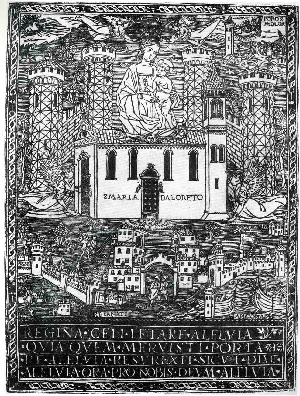
    This is an interesting,
    almost (?)-revolutionary and curious woodcut depicting the flight of
    Santa Maria
    di Loreto, and was printed in 1524.  At the bass of it all the
    print depicts the first of a series of moves of the house of the Virgin
    Mary (mother
    of Jesus) to safe harbors, away from the Moslem/Turkish army that
    invaded
    Nazareth in 1291.  The myth states that
    the structure was picked
    up and moved by angels from
    Nazareth to the Dalmatian town of Tersatto (near Fiume, which is today’s Rijeka, Croatia).  It then made its way to its
    final resting
    place at Loretto, Italy via the two other Italian towns (identified at the bottom corners of the print) of Recanati and Ancona.

    One of the most interesting aspects of
    the print to my eye though is its attempt to display an oblique perspective of the
    town of Loretto, the house being lowered by angels on the other side of the town’s fortifications.

     (In 1854 Pius
    IX consecrated the house as a miracle in his Bull “Inter Omnia” of 26 August 1852, declaring

    “Of all the shrines consecrated to the Mother of God, Immaculate Virgin,
    one is in first place and Shines incomparable radiance: the venerable and most
    August House of Loreto … (…)
    In Loreto, in fact, it venerates the House of Nazareth, so dear to the Heart of God, and
    that manufactured in the Galilee, was
    later (moved) from foundations, and for the divine power, was
    transported
    far beyond the seas, first
    in Dalmatia
    and then to Italy. “
    And it was for this enormous feat of air travel that Pope
    Benedict XV declared St. Mary the patron saint of aviators, on
    24 March 1920.)


    ·Posted by :

    ·in:

    — — —

  • German Design Elements: Miniature Advertising Art, 1880-1930

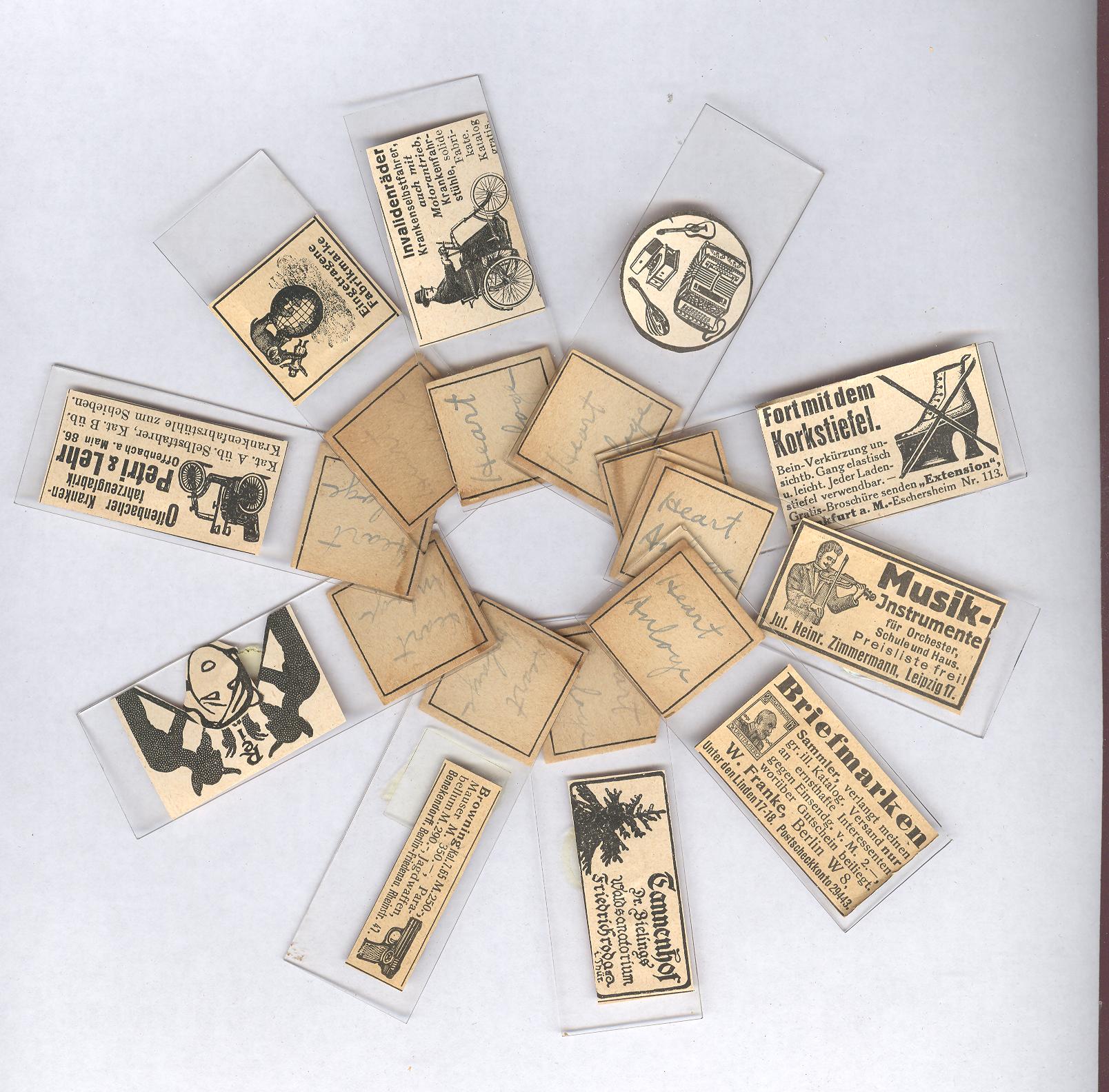
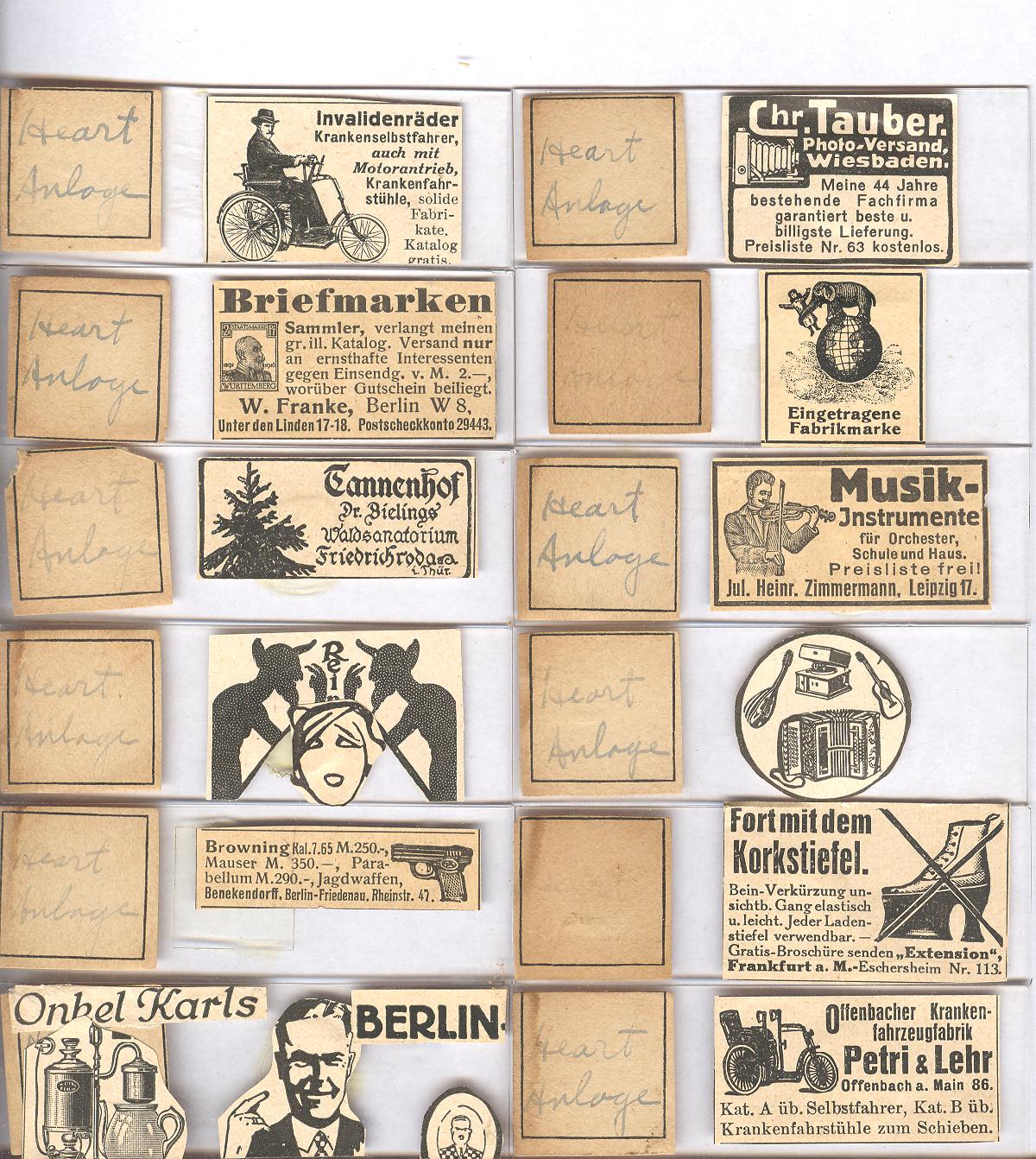
    JF Ptak Science Books LLC  Post 1006 April 16 mini german 15

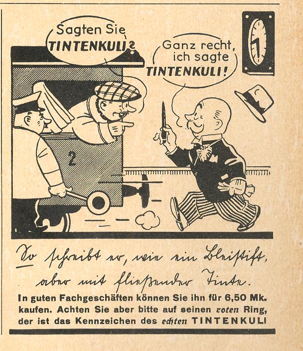
    April 16 mini german9 det The Illustriete Zeitung, published in Leipzig beginning in 1855,  was a popular, middle-road/middle-class Life-like
    magazine.  I have a long run of this big, well-written,
    sumptuously-illustrated journal, beginning about 1870 and extending
    though the end of the war in 1945, and at this point I’ve looked through just about every issue. It is fascinating on many levels,
    and has proved to be a valuable source of historical minutiae as well
    as an excellent  resource for images and graphical displays of
    quantitative data. One aspect that I’ve never looked at very
    closely though are the advertisements–actually, the miniature
    advertisements. There are thousands of them sprinkled throughout the magazine, the thyme on the rice, the za’tar on the bagel.  

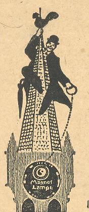
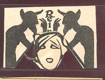
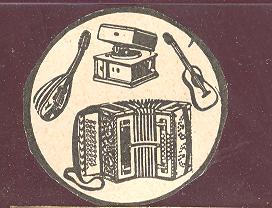
    April 16 mini german7 good det Here are three decent  examples showing the complexity and superior design of these little bits:  the top-right image is only an inch square, and was published in 1924;   the slim image just above is only an inch tall, while the example below-right is smaller yet, about a third (!) of an inch ’round.

    I’ve decided to begin to reproduce some of them here, mainly because
    so many of them are gorgeous design elements, many of which just don’t
    exist past the pages of this journal. 


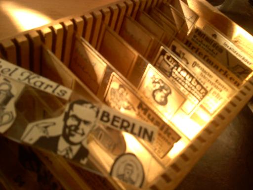
    April 16 box One thing that I’ve done with them is to construct “Onkel Karl’s Berlin Glass Diary”, a series of microscope slides with these small images as specimens illustrating the imaginary diary of Karl Muefler as he strolls the streets of Berlin in 1925 looking for “missing paper”.  The original images are all very small, generally smaller than an American penny, and can be fantastic: sometimes there are thirty of them clustered on one of the Illustriete Zeitung’s back advertising pages.

    I’ll return to this category from time to time and add more images, hopefully compiling several hundred or so examples.   

    April 16 mini german  

    Image is 1.5 inches tall and printed in 1930.

    April 16 mini german 13

    Image is 2 inches square, printed 1938.

    April 16 mini german 14 

    Image is 2 inches square and printed in 1938.

      April 16 mini german 12

    (This image is less than half-an-inch tall, printed 1919)

    April 16 mini german3 det

    This image measures about 1/3 inch, printed 1925.

    April 16 mini german4 det

    Image meaures about 1.5 inches tall, printed 1919.

      April 16 mini german8

    (This measures about 1/3 inch, printed 1882.)

    April 16 mini german6 det

    April 16 mini german2

    ·Posted by :

    ·in:

    —

  • The (Really) Last Word in Skin Care: Lip Prep, Eye Sealing, Cavity Solidifiers and the Rubbery Chemical Appeals of Embalming Fashions

    JF Ptak Science Books LLC   an expanded post (#975) from 2010Mar 13 esco cover

    [Faint of heart, stop here.]

    This carefree stroll through the geology of death prep and care comes to us via the Embalmers’ Supply Company (ESCO) catalog, of 1941, serving and selling to members of the embalming profession since 1886.  It provides the Practioner with all means necessary to scrape away facial muscle, cement the jaw, seal the eyes, color “old age” eyebrows, fill cancerous cavities, mold over gaping wounds, position the arms, contour the chin, scoop out the brain, replace the blood, pull out the bowels, and all other manner of removal/drainage/fillup, and then apply makeup to cover all suture wounds and other “deficiencies”.

    Mar 13 eye sealer


    ·Posted by :

    ·in:

    —

  • Medical and Liturgical Cardiac Pathology, 18th Century: Scarpa & Senac vs. the Throne of Satan

    JF Ptak Science Books LLC  Post 952

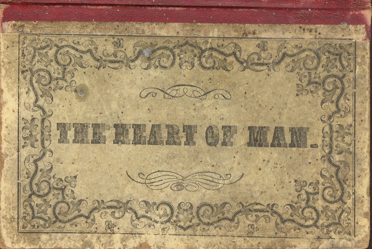
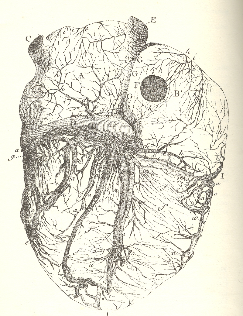
    0--heart of man 1 It is a bit odd to compare these three relatively contemporary
    works on the human heart and to see their points of correlation and (vast)
    departure. The first belongs to Jean Senac, whose Traite de la Structure de Coeur…(published in 1749) was one of the
    most valuable works on the 18th century on the heart, laying a firm
    foundation for the study of its pathology. 
    Senac

    Senac  

    (1693-1773, born in Gascony
    and later physician to Louis XV) was the first visitor to many aspects of the
    heart’s physiology, describing delation (as the most common evidence of cardiac
    pathology), correlated hydrothorax with cardiac failure, pericarditis, and much
    more—he also published exquisite illustrations by Jacques Poitier to accompany
    his text.

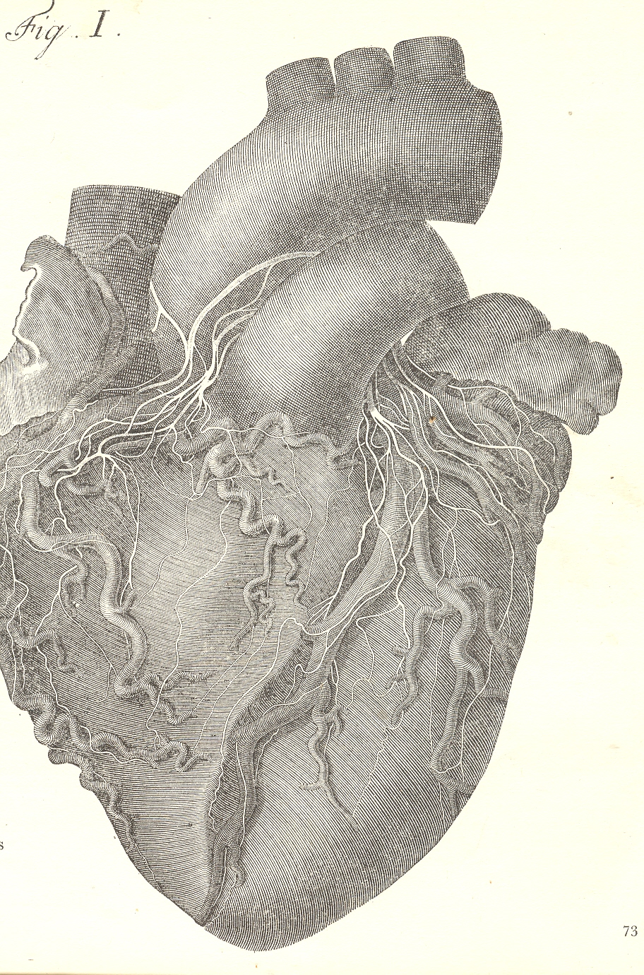
    The next image is the first to properly describe the nerves
    of the heart, and was published in the magnificent Antonio Scarpa’s Tabulae neurologicae ad illustrandam
    historiam anatomicam cardiacorum…
    in 1794. 
    Scarpa was a monumentally

    Scarpa

    accomplished anatomist who was also a gifted
    artist, and it is his own work that illustrates this masterpiece.  The original edition of this work is huge,
    atlas-sized, and the images of the heart are life-size and float in plenty of
    free, very wide and perfect margins.


    On the other end of the spectrum we have this liturgical
    philosophical anatomy of the stages of the heart in grace and disgrace.  Mostly I’m interested in the foul part, which
    shows the advanced mortification of the organ in seating the throne of Satan. The
    edition here is The Heart of Man, either
    a Temple of God or the Habitation of Satan1,
    and
    is a very heavy-handed 1842 illustrated edition from Harrisburg (PA) version of
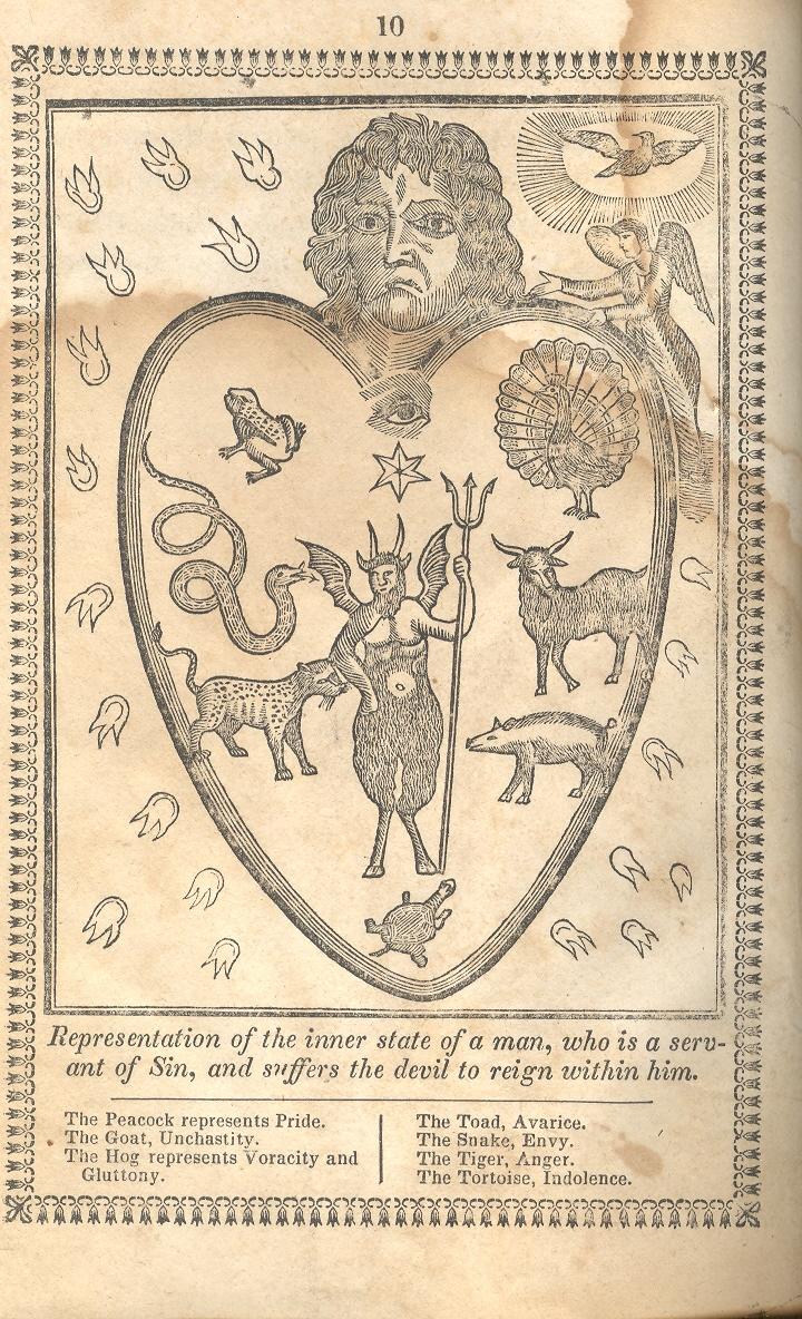
    a French text of 1732.  It is illustrated
    with ten versions of the state of the heart, ranging from perfect grace to the installation
    of the Beast, and several points in between, the degrees of gaining and losing
    each station. 

    0--heart of man satan 1

    The first image shows the heart of man completely dominated
    by Satan, with Man the sinner’s troubled face (along with the mark of Cain (dominating
    his wayward organ.  The emblematic
    animals infesting his heart include the peacock (with its misleading
    haughtiness), goat (“a lascivicious, stinking animal” representing “unchastity”
    and impurity), hog (gluttony and intemperance), snake (seducer), tiger (cruelty
    and ferocity) and tortoise (indolence). They chase from the hear the holy ghost
    and an angel, and allow the presence of Satan (front and center). 

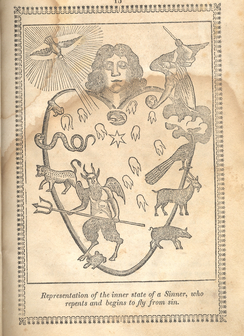
    The second image is interesting in that it shows the
    movement of a bad/evil/wicked heart to a more pious one, though it is just in
    the transition stages.  In my experience
    it is uncommon to see an emblematic illustration of a half-way point of, well,
    anything; this woodcut seems to capture, to be a snapshot so to speak, of the
    human heart undergoing transformation. 


    Notes:0--heart of man satan 2

    1. The original title was something along the lines of Spiritual Mirror of Morality, in which every
    Christian, who desires his salvation, may view himself, know the state of his
    soul, and profitably learn to regulate his life according to it
    . Hardly gender-neutral,
    the title makes four specific gender references to men. 

    ·Posted by :

    ·in:

    — —

  • History of Holes 12: Caves in mid-Renaissance Art

    JF Ptak Science Books LLC  Post 909

    “When [the soul] is firmly fixed on the domain where
    truth and reality shine resplendent it apprehends and knows them and appears to
    possess reason, but when it inclines to that region which is mingled with
    darkness, the world of becoming and
    passing away
    , it opines only and its edge is blunted, and it shifts its
    opinions hither and thither, and again seems as if it lacked reason.”  Plato, The Republic book. VI, 508d

    Cave--osservanza

    Plato
    dipped deep into the myth/metaphor/parable/analogy/allegory of the cave,
    contrasting it with the allegory of the sun, discussing the pursuit of
    knowledge real and not-so.

    I
    like the idea of the half-displayed, semi-schematic, fade-away disposition of
    the cave and how painters dealt with them and their hidden contents in early Renaissance
    art.

    Its
    difficult to show a cave, a dark hole (occurring in all rock types and
    topographic situations, btw) that really hadn’t been dealt with scientifically
    yet—even if humans had been using them one way or another for thousands of
    years. 

    I’ve
    noticed these images time in and time out, and I’ve not really saved them, or
    at least I haven’t segregated the odd etched or engraved images, though they
    are all here somewhere, so I can add to this post from time to time.  The image that I’ll use tonight comes from
    Harvard’s Fogg Museum and is the work of the Master of
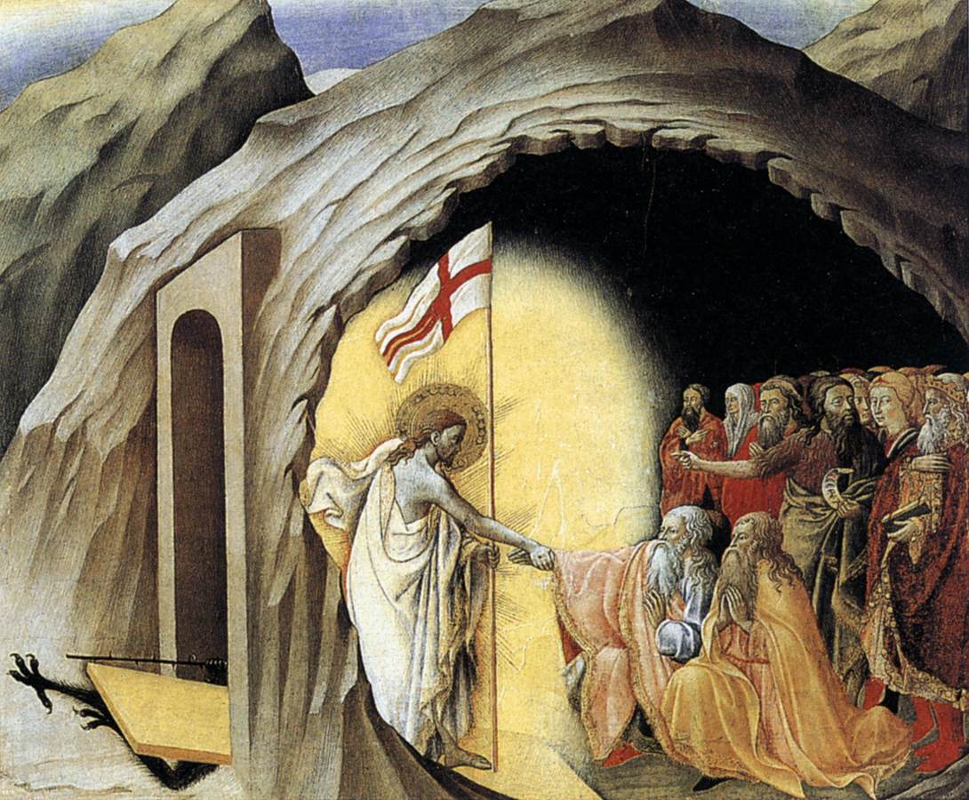
    Osservanza (Sienese school, fl 1430-1450, manuscript illustrator).  It is a popular image, “Christ in Limbo”,
    though of the others working in this genre we see Christ generally at the
    entrance to a tomb/cave-like place, standing just outside of the doorway (as with Mantegna, Durer, Pacher, Fra Angelico and others). The Master of Osservanza gives us an
    exquisite cutaway view of the cave of limbo, showing both the outside and the
    inside, which is an uncommon and beautiful perspective.

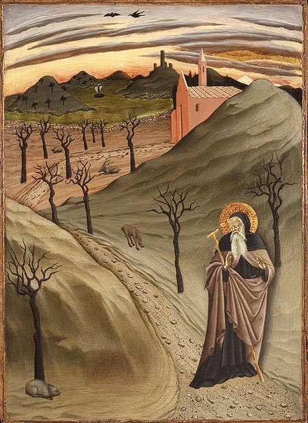
    I should add that the tearingly odd “Saint
    Anthony Abbot Tempted by a Heap of Gold”, also painted by the Master of Osservanza (ca. 1435) depicts the least-likely-of-all-saints-to-be-tempted-by-gold reacting in horror to, well, nothing.  Nothing at all. We see him reacting to what used to be there, but which for some reason was removed, painted-over at some dim point in the dusty past, for reasons that I do not know.  (And so the painting could easily move into my Blank and Empty Things series.) But the desert landscape is so sparse and the sky so surreal with bent clouds that it is easy today to overlook the gold entirely. 

    St. anthony

    [I know there’s SO much more to this business with the caves–I just wanted to get this post started before it all went down the thought-hole.]


  • Unintentional Absurdist Art: Flying Boats with Bucket Feet, 1745

    JF Ptak Science Books LLC  Post 901

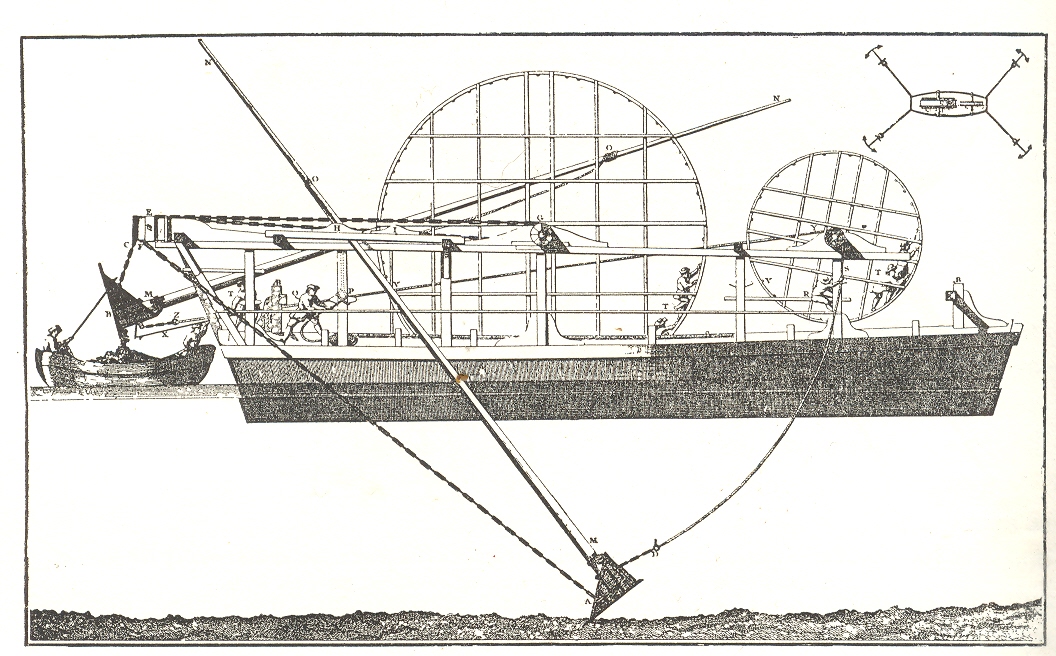
    This
    treadmill-powered French pontoon dredge, printed around 1745, looks for all the
    world as though it is floating in mid-air, propelling itself along with two
    bucket-ended legs, elegantly and impossibly moving its miracle-y-balanced self
    forward against all forms of reason and logic, a clunky 18th century
    non-transforming Transformer.  The
    profile actually and simply shows a dredge at work and just  fails to show the water in which it
    floats. 

    Blog jan 6 absurd

    The
    boat’s dredge is powered by four humans in two treadmills which would move the buckets
    back and forth, scraping up the river silt and then emptying it into the shuttle
    launch aft.  Simple and ingenious—except when
    taken out of context, where it begins to look like some advanced Age of Reason floating
    boat which, although awkward-looking, is not without its charm.  

    Source:  Charles Singer, History of Tecnology, volume IV,
    pg. 634.  Singer loftily notes that this machine
    “is reminiscent of Goethe’s poem Der Zauberlehring
    which inspired Paul Dukas’s well known symphonic poem L’apparenti sorcier” and which would be better known to most folks as
    Mickey’s Sorcerer’s Apprentice gig in Fantasia.


  • Out of Context Department: Artists Taken by the Devil, 1620

    JF Ptak Science Books LLC  Post 848  Blog Bookstore 

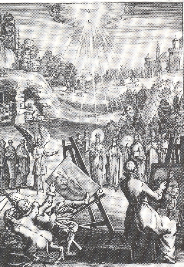
    Mark Twain said that Adam only took the apple not because it was delicious or attractive but because it was forbidden.  I wonder why this operative of Satan was so interested in this artist (pictured below), who was seemingly and boringly making his way through a standard portrait of an imagined vision of the Holy Mother. She and the other holies (some of whom appear to be “simply” human and clerical compared to the rest of the iconic foundations of Christianity) are being bathed in pure holy light; an angel at left, seemingly with nothing else to do, unnecessarily points to the main attraction, making sure that the artists knew that it was the folks with the halos who were to be painted. .  [It would be surreal and interesting to imagine a short sequence in which we see these two artists working busily on their unseen canvases, sweating as the oils fly, recording the celestial scene before them, golden and glowing people illuminated by the light of the creator; finished, the artists reveal their work, one painting the holy congress, while the other turns his  godless landscape canvas featuring the odd tower at right-rear. “I could never paints hands” he might’ve said.]

    ++ blog ++ nov 15 artist The engraving is the work of Bortius a Bolwert (1580-1643 and a pupil of the much better-known Abraham Bloemaert) for A. Suquet’s morality and Heaven/Hell peepbook, Den wech des eeuwich levens…which was printed in 1620. I don’t know what the original message was for this image, unless it was something simple, some punishment for a less-than-pure artist painting purity; perhaps the devil took the artist at death, showing the reader that not only is death available to call at any time, but that the devil was right there, too, to whisk you away to the lake of fire even while your oily hommage to the creator was wet on your easel.  It might well simply be in the dance of death tradition–so beautifully and haltingly executed by people like Albrecht Durer–showing Death visiting people of all ranks and professions, the moment of extinction coming at the time most perfectly illustrating the deathee’s station of life. 

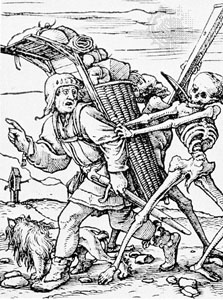
    Also appearing under such titles as Ars moriendi, Memento mori, Vanitas, Dancs Macabre,  the Skeleton Dance,  la Danza de la Muerte, Totentanz, and the Chorea Machabæorum, among others, the idea of the Dance of Death existed as morality plays and in literature for many centuries.  In the years before printing in Europe, there were many versions of time’s massacre in frescoes in churches and chapels all across Europe (see here for an interesting chronological listing) as well (of course)as in myriads of manuscripts.  In addition to Durer, some of the early post-Gutenberg masters of this genre included Konrad Witz,  (1460); Bernt Notke,  (1463); Hans Holbein the Younger (1538),  Daniel Nikolaus Chodowiecki,r Johann Elias Ridinger.  (See here for an introduction to and explanation fo the Holbein cycle.) Holbein pedler
    In music too the Dance of Death scenario is seen many times:  the Danse Macabre (by Camille Saint-Saëns, 1874); Songs and Dances of Death, (by Modest Mussorgsky, 1875); Dance of Death in Symphony No. 4, 2nd Movement (by Gustav Mahler, 1901); Mattasin oder Toden Tanz, (by August Nörmiger, 1598);  (Dance of Death), in Ballad of Heroes, (by Benjamin Britten, 1939); Dance of Death, in Trio in E Minor, op. 67 (by Dmitri Shostakovich, 1944); Totentanz ( by Franz Liszt, 1849 AND Felix Woyrsch in 1905 AND Arnold Schoemnber in 1914 AND Wilhelm Kempff in 1931, and on and on.  I didn’t mean to go on about this, but just wanted to make the point that the Looming Nature of Death really was so in Medieval and Renaissance Europe–and where death as waiting at virtually every turn, the Devil wasn;t too far behind. 

    (Also, see Bibliodyssey for a wonderful woodblock book of the dance of death.)

    ·Posted by :

    ·in:

    —