A Daily History of Holes, Dots, Lines, Science, History, Math, Physics, Art, the Unintentional Absurd, Architecture, Maps, Data Visualization, Blank and Missing Things, and so on. |1.6 million words, 7500 images, 4.9 million hits| Press & appearances in The Times, Le Figaro, Mensa, The Economist, The Guardian, Discovery News, Slate, Le Monde, Sci American Blogs, Le Pont, and many other places… 5000+ total posts since 2008.

Category: Absurdist, Unintentional

  • The Very Seat of Solitary Utopian Anarchy–a Radical Approach from Scranton, 1878

    JF Ptak Science Books     Post 1848

    “In 1873, when Morse advocated an end to all political rule, Alcott commented about Morse in his journal.  ‘Once, I might have accepted fully his doctrine of Individual Sovereignty, ignoring all interference from institutions conventions and creeds of all kinds, as during the Fruitlands and non-taxpaying periods of my life.  It was putting this logic to its ultimate consequences, and individual issues,—abolishing the social and political order altogether. . . .  It left me an outcast and a vagabond.—  The sincere victim of a half-truth seen in the light of an idea at last’.”–Amos Alcott, friend of Sidney H. Morse (author of the pamphlet below), from the site Alcott.net 

    I just could not resist this pamphlet, all dressed in white and red, catchy and playful title…I thought it would be a nice catch for my Daily Dose of Dr. Odd series, until I realized straight away that it was a serious publication.  Well, the mood of the discourse was a little common and jocular, but the message certainly wasn’t. 
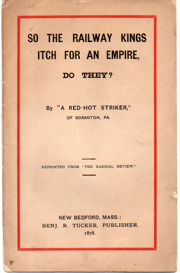
    Radical620[The original is available from our blog bookstore, here.]

    The author was Sidney H. Morse (“The Red-Hot Striker”) and the piece was a rant against big money, monopoly/combinations and The Ruling Class. It was published in “The Radical Review”, which was published by the anarchist and free-thinker Benjamin Tucker, in 1878.  The executive summary for this short piece is plain–first, there should be no “executive”, and second, most of all of this revolves around free Communism and the statement “it takes a great many poor men to make one rich man”. 

    It seems that Mr. Morse (fl. 1870-1900) might have left many of his radical thinkers behind (like Mr, Alcott, above) when he went free-range and advocated no government or controlling system whatsoever, every person their own entity.  I’m not sure so that most people could get away with that thinking even left to themselves in a themself universe, every person in their own Utopian-solitary-anarchy. Seems as though the expectations of whatever this was, (no expectation or all-expectation) , was just too expectant.

  • Imaging Aliens 1859-1959, Part I: American Traders in Yokohama Bay, 1859

    JF Ptak Science Books    Post 1832

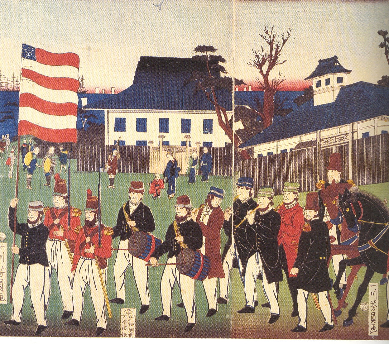
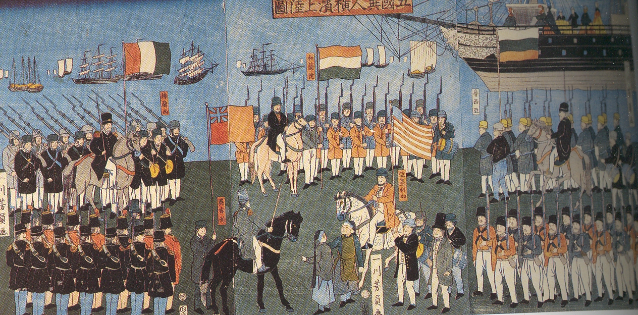
    Following hundreds of years of intrigue and shadowy majesty, of imagined life and legend, the Japanese finally allowed its transformation to take place, opening itself to trade and other permissibles with the rest of the world.  It was the beginning of massive cultural, industrial and scientific cross-fertilization, ending centuries of isolation and self-sustained empire–and which basically took six years to occur.  The change started with the efforts of the U.S. government and its liaison in Commodore Matthew Perry, establishing diplomatic and trade relations with Japan via Perry’s expedition there in 1853. By 1859* the transformation was very well underway, with Yokohama—as one of the major trading ports in Japan—being what former US

    Blog==July 5=flag

    Ambassador to Japan William Leonhart called “the microcosm of Japanese modernization”, and the port opened for trader with the foreigners.  Japanese artists responded to this influx of exceptionally different people with the Yokohama-e school of woodblock illustration—these artists were primarily from the Utagawa school, and worked illustrating the controlled invasion of their country for three decades, producing some 800 prints. Blog==July 5=flag4


    I like the idea of microcosms. Actually I like the detail within microcosms—sometimes, admittedly, the microcosms just don’t work, though their elements sometimes do. 


    The Yokohama-e school of  Japanese illustration was the pollination zone for the distribution of Japanese interpretations of these new cultures coming to their country.  They are a beautiful mix of the old (the very old) and the forces that were rubbing up against that antiquity, the old reacting to something brand new, images never seen before. 


    And in all of this beauty of newness, and all of the observations of never-before-seen rituals, and uniforms, and ships, and people, the thing that I have latched onto like a bad cold from a kindergartener is the American flag—and actually, the field of blue and the stars of the American flag.  For some reason the blue field is almost, always, tiny; and I’ve no idea why.  But I just love it—the flag looks big and billowy and alive, and it has that tiny blue space.   Blog==July 5=flag2


    *1859 was a very big year in the history of science:  it saw the publication of Darwin’s On the Origin of Species, and also the creation of Bunsen and Kirchhoff’s spectrum analysis.  A monumental year for the development of insight and vision.  


  • Created and Estranged Alphabets of Visionary, Creative and Boring Things

     JF Ptak Science Books  Quick Post

     So.  As it turns out there are at least 23 alphabets (of sorts) created or estranged on this blog (compared to the six that show up in my archive search under “alphabet”).   A few more and we might have an alphabetical post of alphabet posts.  Here they are, the ABCorama:

    An Alphabet of Australian Convict Mugshots, 1900-1920, here. 

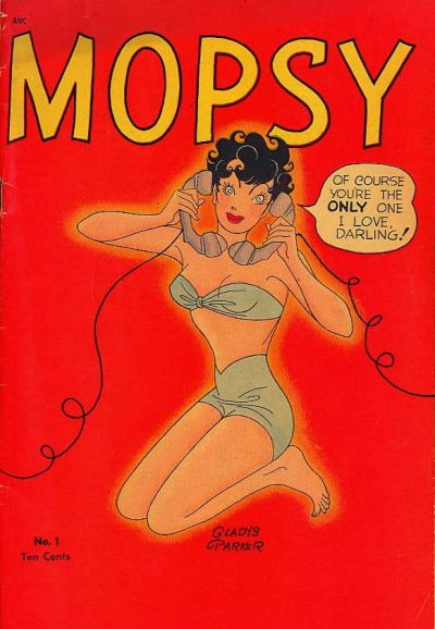
    Alphabet of Retro-Vision Women, ca, 1940’s/1950’s, here.


    Grrlz--mopsy

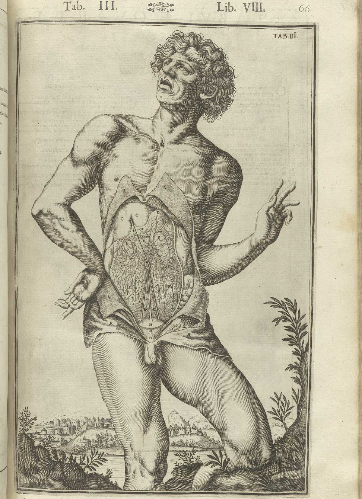
    An Alphabet of Anatomical Emotions and Feelings–Installment 1, here. 

    Contempt

    Casseri_p66  dandy

    ·Posted by :

    ·in:

    —

  • Wholly Mondo Bizarro: Outsider Thinking, 1888

    JF Ptak Science Books   Post 1844

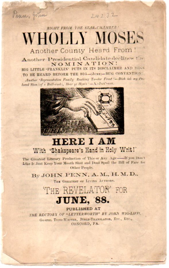
    It is difficult to lose your reader right in the very title of your text. But I do think that John Penn (“the Greatest of Living Authors” accomplishes this in his  

    Right from the Star-Chamber! Wholly Moses Another Coutnry Heard from Another Presidential Candidate declines the Nomination! Big Little Franklin Puts in its Disclaimer and Begs to be Heard Before the Big–(June)–Bug Convention... And on and on. 

    Bizarre602
    I can find nothing for Mr. Penn, who claims that this is Volume 3 Number 2 of a magazine called The Revelator (June 1888), a magazine that doesn’t seem to exist in the holdings of the massive WorldCat/OCLC.  The message of the slim and fragile pamphlet is–in the most kind appreciation possible–unclear.   There seems to be a lot of political something going on, though it is a tangled webby road. Much of the center stage seems occupied by the election of 1888, when President Cleveland was renominated in a peaceful convention, but then bested by Republican challenger Ben Harrison in the electoral college in one of those elections where most stuff seemed to be going relatively fine in the United States.  (Cleveland would come back to defeat Harrison in 1892.)  So references to something like “Big Little Franklin” might actually refer to Benjamin Franklin Jones (1826-1903) who was the chair of the RNC from 1884-188 and the force behind the failed James Blaine nomination in ’88.  Some references are obscure but solid, and some are just obscure and unsolid, and others turn the deep corner of obscure and fly into the arms of mondo bizarro.

    Perhaps it was all just theatre.  And perhaps it was the work of someone who had some money and insisted of giving a platform to his black-and-white kaleidoscope, and had the thing printed (if not published) there in Concord, Pennsylvania, in 1888 (also known here as “J.P. 6600”).

    Here’s the last page–the pamphlet is too delicate to open and scan any of the interior–perhaps this is enough:


  • A Prehistoric Rayograph–a Proto-Example of Man Ray from 1810

    JF Ptak Science Books   Post 1843

    “I have never painted a recent picture.” Man Ray, 1966

    “Unconcerned but Not Indifferent”—1976, Man Ray’s epitaph.

    Emmanuel Radnitzky (1890 –1976) removed the “Emm_uel”  and the “__dnitzk” from his names to become Man Ray, a South Philly-born, Brooklyn- and Manhattan-bred Parisian ex-Pat artist became (by the early 1920’s) perhaps the most influential of the Dadaist/modernist photographers. No offense to his given name, but “Man Ray” is superior.

    0 blog jan 27 man rayograph 1943 0 blog jan 27 man ray


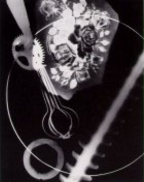
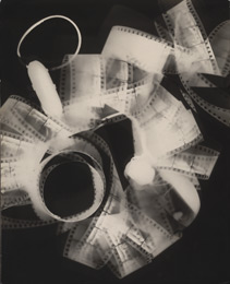
    And Man Ray was far more than a photographer, as he worked across many different art forms, not the least of which was motion pictures.  But what comes to my mind first with his name is his self-titled “rayograph”, a photographic process which was actually a photogram, which was the direct exposure of an object placed upon a photosensitive paper.  This is also the earliest form of photography, something employed by Fox Talbot who called it “photogenic drawing”) as early as 1834.  (I wrote a little bit about this process in a post “Things That Almost Were But Weren’t”.) But Man Ray’s rayographs stand clear and distinct to me, different even from his contemporaries’ works (including Susan Derges, Max Ernst, Raoul Hausmann, Laszlo Moholy-Nagy and Alexander Rodchenko).  

    0 blog jan 27 man rayograph 2

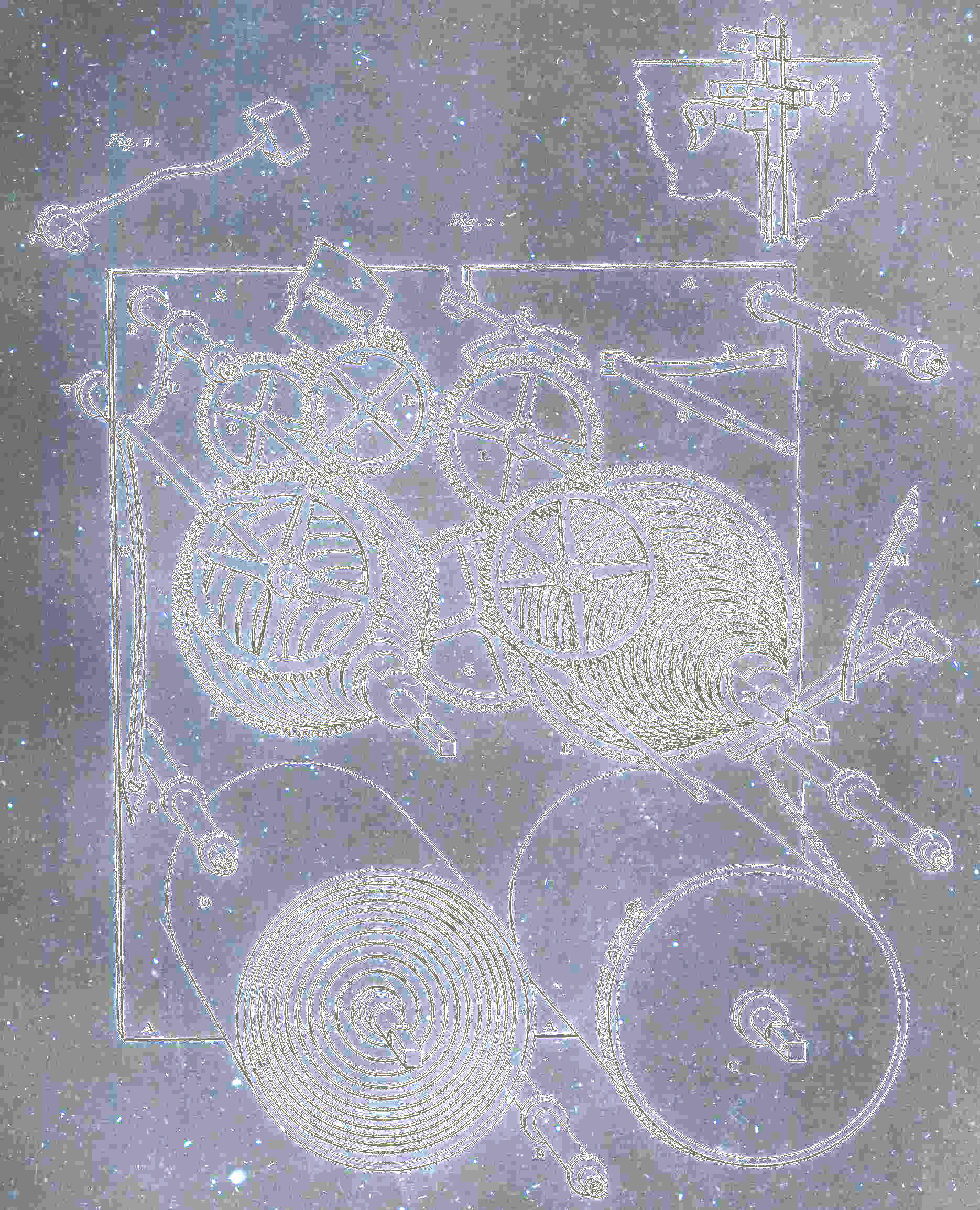
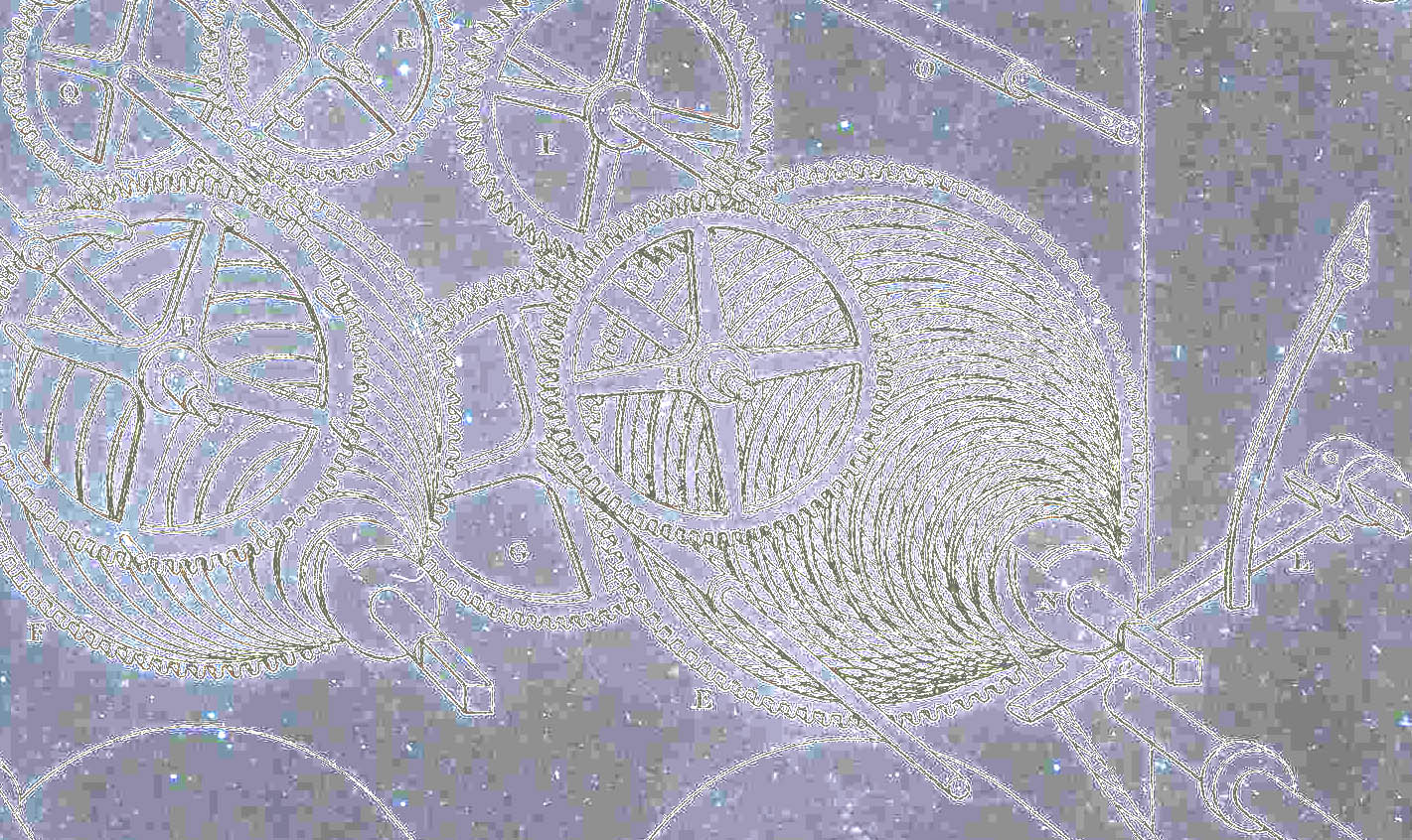
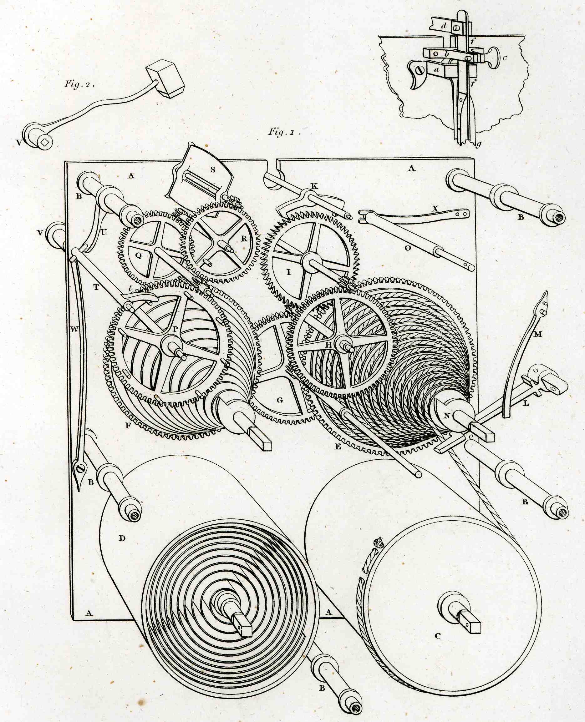
     Of course my antiquarian pretender (the image on the above right) to the rayograph isn’t one—it just had the look and feel of one, contained that shock of recognition that I had seen it before, and the palce where I would’ve seen it was with Man Ray.  All I did with this engraving—an image of clockworks published in Abraham Rhee’s Encyclopedia of 1810–was to solarize it.  So it isn’t even a rayograph, but just looks like one, though Man Ray did work quite a bit with the solarized image.  I just like it. 

    0 blog jan 27 man ray 2

    This is the engraving in its “before” (and superior) state:

    0 blog jan 27durer459  


  • On Paper Sculpting of Nothing

    JF Ptak Science Books  Post 1842   (Continuing a post on The Importance of Nothing in the History of Blank, Empty and Missing Things thread.)

    Bug shells black595

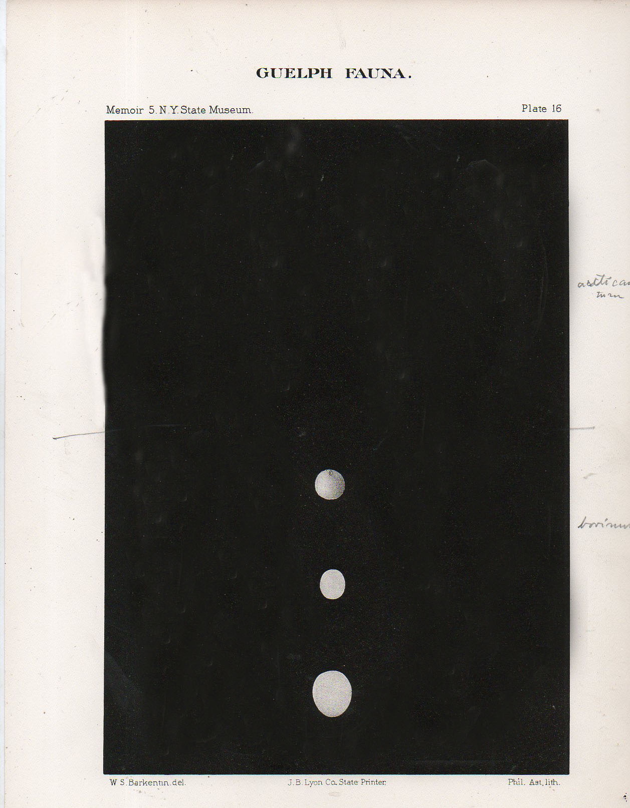
    There is nothing quite so attractive sometimes as nothing.  Free, unused blank, empty space that can occur on a painting or in a print or on a green or red landscape or between notes in a piece of music;  the use of nothing, of blank space as an attenuator or a simple resting spot can be a critical element.

    Images from natural history, physical and medical sciences and encyclopediae can be extremely full with a hundred or more sections and not be crowded at all, though very full–other attempts at designing information display like this are far less successful, and become just crowded amalgams that remind us of badly articulated cabinets of curiosity.  Of course these things are not made to stand on their own and were to be used in conjunction with texts, but still, they seem to be strong enough to stand on their own.

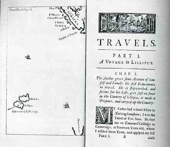
    The blank spaces seem to occur more naturally on maps, in spite of the impulses of mapmakers (or at least their engravers) to fill the blank spaces with whatever might have been on hand–found or fictional or hypothesized landforms/animals/people/waves and such.  But some came quite naturally to the blank and free spaces, even in fictional maps, like the following (from Jonathan Swift’s Gulliver’s Travels (1726, amended 1735), or Travels into Several Remote Nations of the World, in Four Parts. By Lemuel Gulliver, First a Surgeon, and then a Captain of several Ships):

    000-ebay--Nov 4--gulliver996


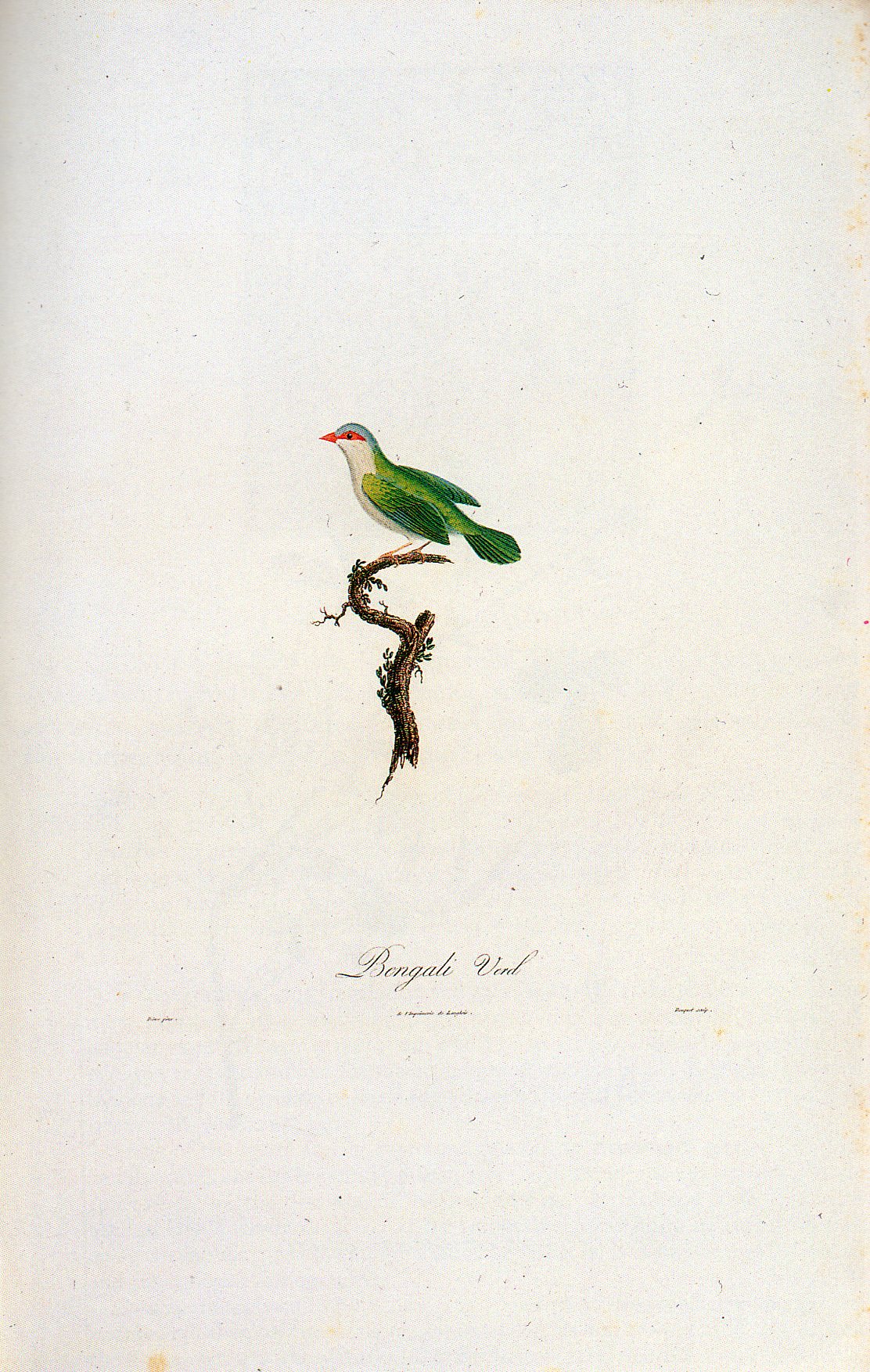
    But these originally-occurring blank spaces are not why we’re here today.  As much as they can be beautiful, as in the following, as in this example of not filling up space by Louis Jean Pierre Vielliot in his 1805 work on natural history:

    Patti--WIWFY-Cover design Bird407

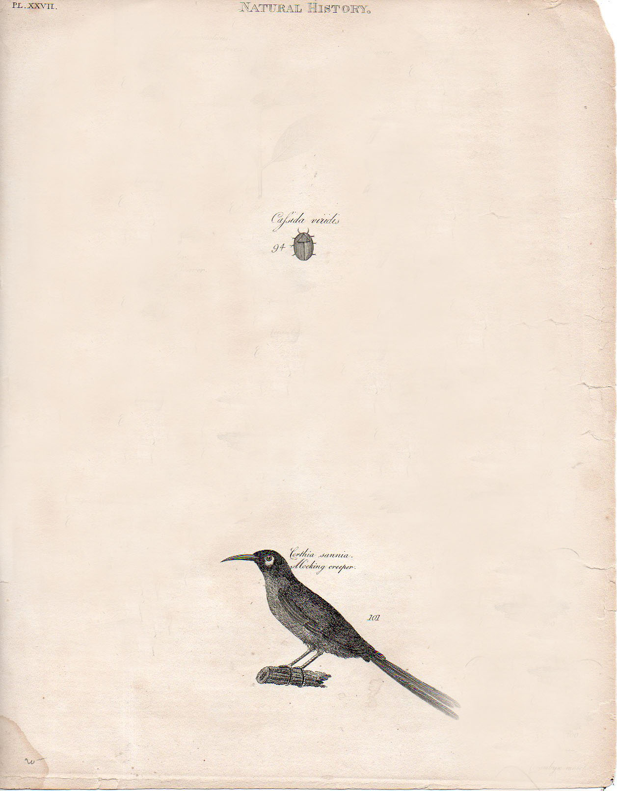
    What brings me to empty space tody is its pursuit in crowded images.  For example, the following image, a lovely and very crowded thing from the gorgeous encyclopedia by Abraham Rees, is made less crowded with some slight manipulation in photoshop, removing enough to cause the engraving to have a new and scrupulous interest in its missing bits and blank space:

    Bug593


  • “Kill Sin Pimple” and other Religious Nicknames of the 17th Century

    JF Ptak Science Books    Post 1841

    Barebones601

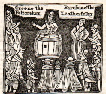
    Who Is that man pointing and speaking from the preacher barrel? 

    This quaint woodcut appeared as the cover illustration to a pamphlet entitled A Word to Fanatics, Puritanism and Sectaries1; or, New Preachers New, and it answers my question: the screamer is Mr. Praise-God-Barebone who is attended by his attender, a more-commonly named Mr. Green (“the Feltmaker”), and is shown preaching to a small crowd, many of whom are shown with long faces and in deep caricature, more so to mirror words they are hearing.  Barebones is not presented in a friendly light, as the pamphlet was a warning to the general reader of the rising crowd of untrained and possibly heretical religicos who were gathering attention in and about London in the (Cromwellian fanatical) 1640’s.  They were seen as diffident, destructive, and definitely of the dimpled damaged variety of street entertainer. The interestingly-named pamphlet and Mr. Barebone was reported by the  magazine, The Mirrour, (July 19, 1823) as “the object of the work is to ridicule such persons without education undertake to expound the Scriptures, and who, ignorant themselves, have the vanity to pretend to teach others”. The powers that be were not amused.

    After dispatching the screamers The Mirrour then lists a number of very compelling and some-never-heard-of-before-by-me nicknames, like Barebone’s brother “Christ Came Into the World to Save” Barebone, followed by these examples: Accepted Trevor, of Norsham; Redeemed Compton, of Battle; Faint Not Hewit, of Hearthfield; Make Peace Heaton of Hare; God Reward Smart, of Firehurst; EarthAdms, of Warbleton; Called Lower of Warbleton; Kill Sin Pimple, of Witham; Return Spelman, of Watling; Fly Debate Roberts, Britling; Be Faithful Joiner, of Britling; Mare Fruit Fowler, of ast Hadley; Weep Not Billing, of Lewes; and Meek Brewer, of Okeham.  The magazine claims official records as the source for these names, but, well, who knows–perhaps the editors were just attempting to put a larger exclamation point on their biting article.

    These are extraordinary names in some ways similar to the passive reportage nastiness of H.L. Mencken’s nickname walk-through in his The American Language, but not quite so–in that book, the old problematic sage of Baltimore staggers his way through unbridled American enthusiastic for the common person’s testing and misunderstanding of English.  The religious  nicknames  seem more like baseball nicknames from the 1920’s, or earlier.  But of course these names predate those efforts by nearly 300 years.

    Somehow I’d like to see trading cards for these guys–although half-ancient that don’t give much leeway to their modern sports varieties.  Baseball has provided ceaseless though a little limited entertainment, tending sometimes toward the poetic overstatement (the Chairman of the Board, The Mighty Slider, The Great Significance) though it does get down to business in the ‘40’s and ‘50’s (the golden age of BB nicknames).  Here are a few examples, minus the racist stuff:  Pork Chop, Tater, Gummy, Whale, Pickles, Rawmeat, Spud, Bunny, Beast, Kitten, Possum, Slug, The Rat, Pudge, Tomato Face, Buttercup. (The most effective nicknames could’ve been made by combining two of the single names:  “Spud Rawmeat”, “Pudge Slug” or “Gummy Buttercup”, for example.)  There’s an awful lot of them dealing with food, and a whole heck of  a lot dealing with facial features; they all seem to outweigh ball playing ability, by far.  All this said, I do have a sweet pull for the religious nicknames. 

    Notes:

    1.  Sectraries:   members of a sect, especially those who belongs to a religious sect that is regarded as heretical or schismatic.


  • Putting Black-and-White Back into Color: 1930’s Schoolrooms

    JF Ptak Science Books    Post 1840

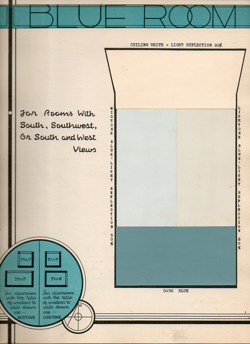
    Its easy to assume a modern prejudice regarding the interior decoration of 1910-1940 school rooms, allowing a certain conceit and picturing them in shades of gray, the images formed being “colored” by the images of those things that we have seen, almost all of which have turned up in black-and-white photographs or movies. But of course we know that this can’t be true, and that Humphrey Bogart didn’t always wear a gray worsted in his movies, and didn’t move that gray suit through gray rooms. Its just that the image-formation is influenced by what we’ve seen, and since what we’ve seen of these rooms is mostly without color, then our images are difficult to assemble outside black-and-white.  This applies to just about everything from that era, which explains why it is such a glorious shock to see motion pictures or photographs of (say) New York City street scenes from 1944. (And why is it such a jolt to the visual system to learn that police cars in Chicago during the 1933 World’s Fair were orange?)

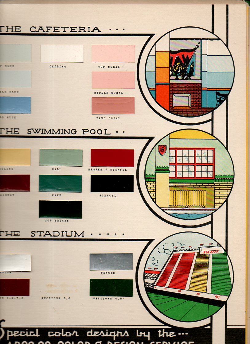
    This thinking came to the surface again this morning when I uncovered the Paint Specifications for the Model School, prepared for the East Cleveland Board of Education under supervision of the Foremost Authorities, and published by ARCO in 1939.  It reminds us that the only thing that lived in black-and-white in those days are in our memories.  (I’ve written about unexpected color in Lost German Color of 1927,  The Very Describale Macro Color of 1937, The Color Green in the History of Squares, and of course the non-immortal 200,000,000 Pounds of Buttocks-or-Putting the Black-and-White back into Color, and others.   [This item is available for purchase via our bookstore blog, here.]

    Color school587

    Color school592

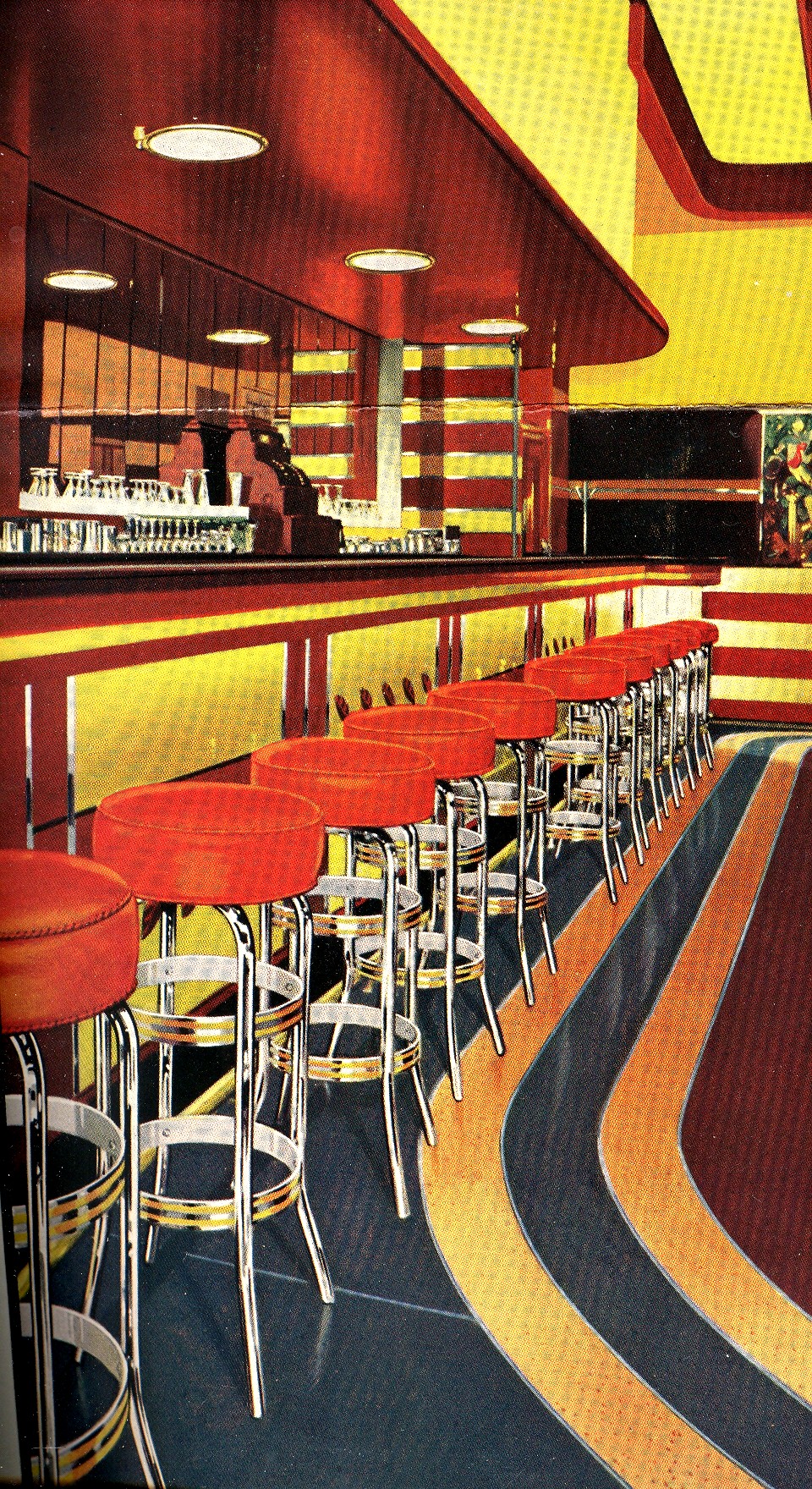
    The rest of the ARCO catalog is below; but first, here’s a sample from the 200,000,000 Pounds of Butts post, showing the 1938 barroom in color:

    Mar 14 7th red bar


  • A History of Blank, Empty & MIssing Things: the Soul and “The” Heaven

    JF Ptak Science Books     Post 1839

    0 blog jan 29 soul missing


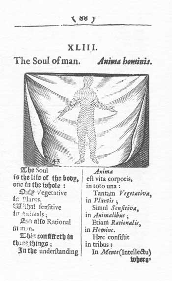
    Continuing a thread of interesting and odd observations of things that are empty, absent and disappeared are the following two images: the first, of the human soul; and the second, a picture of The Heaven. 


    The image above is a very spotty, molecular-like and modest image of the human soul, which seems to fill at least the outlines of the body, though there is a lot of nothingness in-between.  I’m not sure if the cloth, or sheet, is in front or behind the soul, or if the soul is impregnated into the object; I think that I’d rather believe it to be in front, placed there for whatever slim modesty it affords the gone person behind it.  This Outline (?), or  Depiction (?) is  found in Anima Hominis. (on pages. 88–9) from Charles Hoole’s English translation of Comenius’ Orbis Sensualium Pictus* published in 1659.

    The English translation of the Latin verse reads as follows: :

    The Soul is the life of the body, one in the whole: Only Vegetative in Plants. Withal sensitive in Animals; And also Rational in man.

    This consisteth in three things;

    In the understanding whereby it judgeth, and understandeth a thing good and evill, or true or apparent;

    In the will, whereby it chooseth, and desireth, or rejecteth or misliketh a thing known.

    In the Mind, whereby it pursueth the good chosen, or avoideth the evill rejected.

    Hence is hope, and Fear, in the desire and dislike;

    Hence is love and joy, in the fruition;

    But Anger, and Grief, in suffering.

    The true judgment of a thing is Knowledge; the false is Error, Opinion, and Suspicion.

    I found this image while looking for something entirely different, and was tremendously and wonderfully interrupted, at She-Philosopher. 

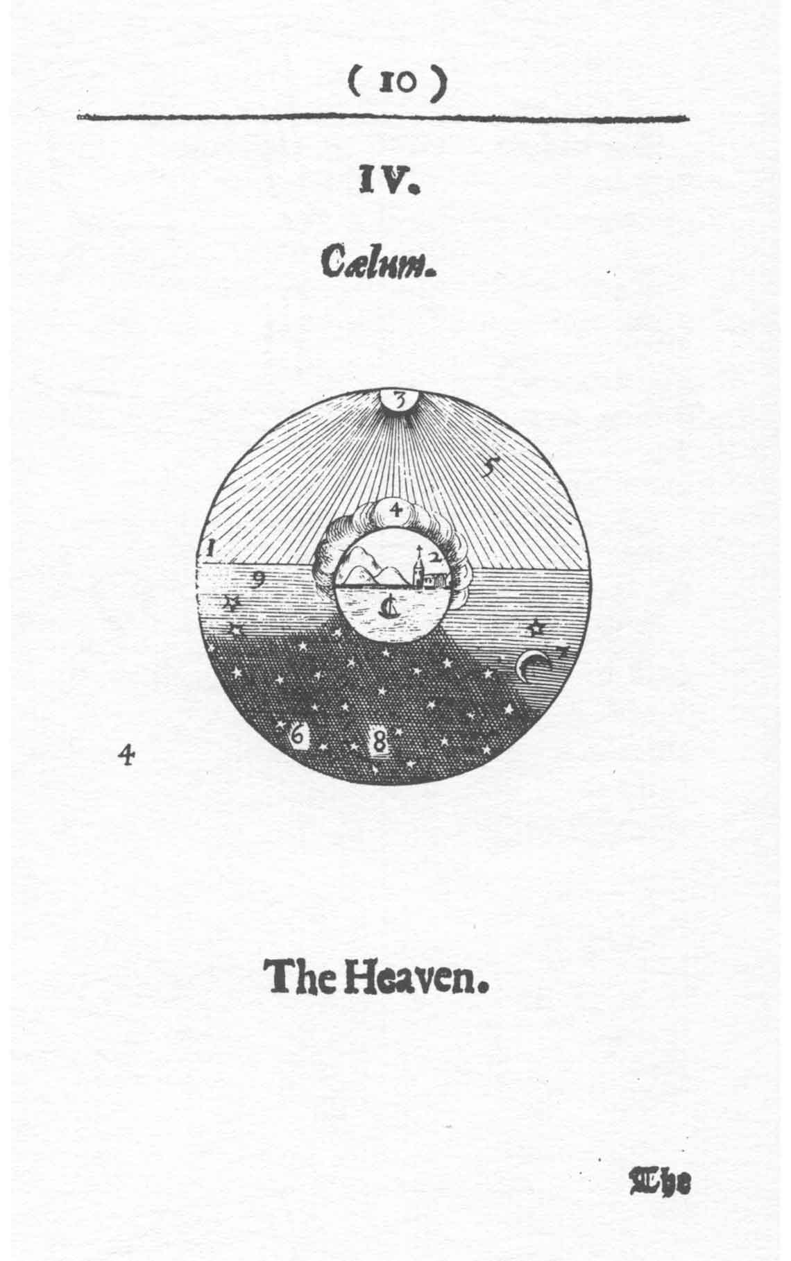
    0 blog jan 29 missing heaven Also, earlier in this same book (occupying pp 10–11) is plate IV, Coelum (“The Heaven”),  which as filled up with lines as it is still looks surprisingly empty–after all, no one’s home.

    You can click on the image for something large, or at least large enough to read the numbers hat are referred to in the verse.  Unfortunately, the number “4” towards the bottom-left just refers to this being the fourth illustration, and does not find a home in the text (another 4 being present within the circle of the engraving).  It would’ve been much more interesting had this extra-universal 4 referred to the whiteness around it, far removed from the depiction of what was thought to be the cosmos so neatly contained in the circles to its right.  .

    (I would like to point out that the use of the word “twinckle” toi describe starlight is about the earliest usage for the word that I’ve seen.)

    The English translation of the Latin verse reads:

    The Heaven 1. is wheeled about, and encompasseth the Earth 2. standing in the middle.

    The Sun 3. wheresoever it is shineth perpetually, howsoever dark Clouds 4. may take it from us; and by its rayes 5. it causeth light, and the light, Day.

    On the other side over against it is Darkness 6. and thence Night.

    In the Night, shineth the Moon, 7. and the Stars 8. glister, and twinckle.

    In the Evening 9. is Twilight, In the Morning, 10. the breaking, and dawning of the Day[.]

    *The lovely and very full title is actually as follwos:  Joh. Amos Commenii Orbis sensualium pictus. Hoc est, omnium fundamentalium in mundo rerum, & in vita actionum, pictura & nomenclatura. Joh. Amos Commenius’s Visible world, or, a picture and nomenclature of all the chief things that are in the world, and of mens employments therein. A work newly written by the author in Latine, and High-Dutch (being one of his last essays, and the most suitable to childrens capacities of any that he hath hitherto made) & translated into English, by Charles Hoole, teacher of a private grammar-school in Lothbury, London. For the use of young Latine-scholars. London: Printed for J. Kirton, at the Kings-Arms, in Saint Paules Church-yard, 1659.


  • Women in Sports–Early and Vintage Photographs

    JF Ptak Science Books   Quick Post

     I’ve scouted some interesting photographic images of women in sports from the fine New York Public Library Digital Collections (here). They’re mostly from the ‘twenties, though there are some earlier imges from the 1890’s, as well as some later ones from the 1939 World’s Fair. Enjoy.

    Sports - Boxing - Women in Trylon and Perisphere sweaters boxing