A Daily History of Holes, Dots, Lines, Science, History, Math, Physics, Art, the Unintentional Absurd, Architecture, Maps, Data Visualization, Blank and Missing Things, and so on. |1.6 million words, 7500 images, 4.9 million hits| Press & appearances in The Times, Le Figaro, Mensa, The Economist, The Guardian, Discovery News, Slate, Le Monde, Sci American Blogs, Le Pont, and many other places… 5000+ total posts since 2008.

Author: JF Ptak

  • Extending Manhattan: Filling in the East River & Part of NYC Harbor

    JF Ptak Science Books   Extending Post 1470 
    Follow Me on Pinterest 

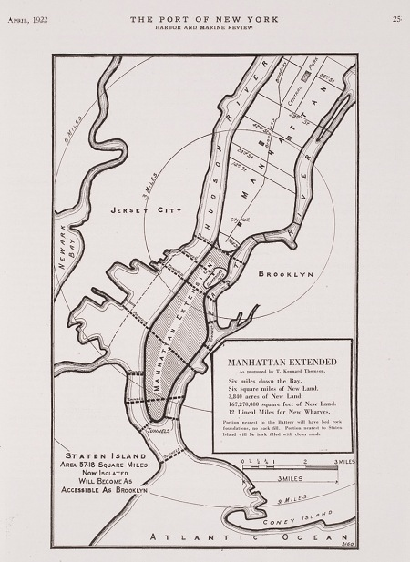
    A while ago I wrote a post on  Herman Soergel’s  plan for extending the landmass of the countries around the Mediterranean Sea by damming the straits of Gibraltar, lowering the sea and irrigating the Sahara–an original, interesting but not very good idea, filled with briney cultivation and racial politics. In the past on this blog I’ve written about other city plans–and in particular, for New York City–that have involved floating Manhattan into the harbor, or filling up large chunks of the Narrows, or floating the city on an enormous anti-gravity platform, and so on. Some of those plans were real, some science fiction, and some were plainly beyond both.  The plan presented above is another monster, but at least this one could work, if not for the doing of it, and the expense. And the will.
    NYC Really Big
    But the bottom line, according to the engineer doing the thinking on this project, Kennard Thomson, would supposedly net the city a cool billion dollars after everything was said and done, and that would be 1916 dollars–that was equal to about 5% of the American GDP (!) in 1916, which would be about $400 billion in terms of 2010 GDP.  I’m not sure how Thomson came up with this very big/very round number, though it must have been done for effect–I can just imagine him standing before a smokey room filled with civil engineers talking about his massive plan for enlarging NYC and throwing out the billion-dollar figure, watching the cigars glow red in exhaled disbelief.
    NYC really big
    [Source: Popular Science, 1916.]

    Thomson did know what he was talking about–he was a busy (and “leading” according to the NYT) Manhattan civil engineer of stature, working on the Canal Barge and being the principal engineer for the Municipal and Singer buildings, for example–and his project seems to be well within the scope of possibility.  Their sensical aspects however are, well, questionable. 

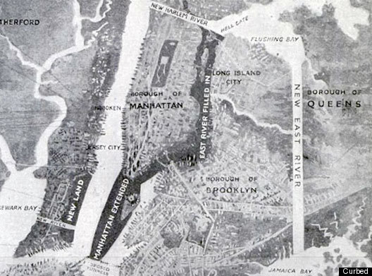
    Here’s the story–around 1911, while examining proposals to repair and extend New York’s wharves, Thomson came upon the idea–a magnificent, fabulous idea–of adding new wharves by adding new lands to the city.  In short, the overall plan was to fill in the East River (!!) and reclaim the new land for city living,  dam Hell Gate,  construct a New East River (from Flushing to Jamaica Bay),  extend the tip of Manhattan Island from the Battery to within a quarter-mile of Staten Island (!), create a new 40-square-mile island between Sandy Hook and Staten Island, extend the Jersey shoreline, add two new Manhattan-sized appendages to the east shore of Staten Island, and more.  All of this would be connected by various new bridges and roads and tunnels, as well as a 6-track elevated railway that would circumnavigate the city.  The purpose of all of this would be to add 100 miles of new docks, an enormous amount (“50 square miles of reclaimed land”) of new land and the capacity for NYC to house 20+ million people, all of which would be worth a billion dollars. 

    Thomson really meant “really” in the title for the proposal. There have been reclamation projects undertaken in New York Bay since then of course, and I think that virtually all of what Thomson talked about could be done.  I think it would be a very interesting project for a class of some sort to undertake an estimation of what such a thing would cost today (and I would guess to duplicate the idea in real terms now would take up a sizable chunk of the GDP).  Maybe all of this will make sense at some more future point. 

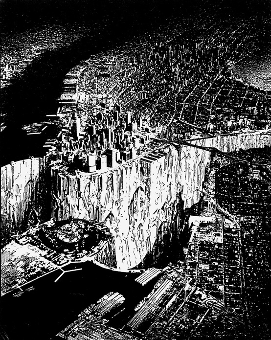
    And along this line of thinking I include a very interesting drawing made by architect Lebbeus Woods, showing the bedrock part of Manhattan. He empties the East River and damns (?) the Hudson, and also builds some new port extending from Staten Island or out from Jersey…but the effect of the dry river bed between Manhattan and Brooklyn.  Andthen some–he empties the river, and then deepens/excavates, heightening the depths (?!) of Manhattan Canyon. The depth of the river where we can see it in the drawing is maybe 100 feet, and certainly (judging the depth against the heights of the structures in the lower island) the canyon is deeper than that–maybe an order of magnitude deeper.
    NYC woods
    [Source: Lebbeus Woods, here.]

    Notes:

    –A good read on Thomson and Woods can be found here, at Telemachus Untitled. 

    –A contemporary NY Times article on the Plan can be seen here and another (with illustrations) from 1913 here (“Plan to Fill in East River to Solve Port Problems”).

    –Another treatment of the whole idea can be seen at Frank Jacob’s great Strange Maps blog, here.


  • The History of Dots: Dots in the Harmonious Motion of Battle, 1647

    JF Ptak Science Books  Quick Post    Part of a series on The History of Dots

    Follow Me on Pinterest 

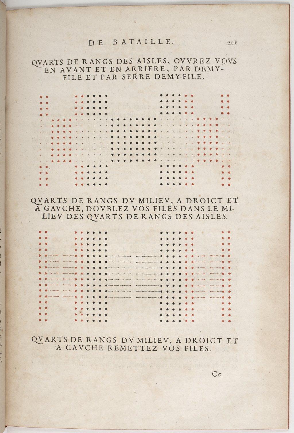
    Colbert de  Lostelneau’s (French Marshall and Commander of the French Royal Guards)  Le
    mareschal de bataille..
    .1and printed by Estienne Mignon
    in Paris inthe year 1647, is one of the earliest books to be printed in
    colros. This rare book, which was a superior cummulative work on
    tactics and strategy and military thought (and which in parts leaned
    very heavily on earlier and sometimes unattributed books), employed the
    new venue of color printing to highlight its musketeers/pikemen/cavalry
    symbols in three shapes and in three colors for easier understanding of
    the movement of three different aspects of an army.  It is said that in
    this way the military theory was made more adaptable and practicable.

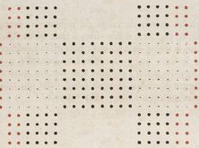
    In the history of dots, though, these color-printed varieties are significant as being among the first of their kind.

    Color dots detail
    And the full image (both of which are located at  Gallica–website for the Bibliotheque Nationale de France, here):

    Color printing dots lostelneau


  • Requiem for a Hankie–Golden Directory of Missing Apparel Manufacturers, NYC, 1939

    JF Ptak Science Books   Post 1937 (Part of the series on the History of Blank, Empty and Missing Things)

    Follow Me on Pinterest

    Apparel905
    Tony Soprano may have been a murdering and lecherous crook, but the man was always on hand with a handkerchief if a sobbing woman needed one.  They were washed and ironed and folded by the wife he would cheat on, and he’d dab his brow from murderous sweat with it, but, well, he had one when it was needed.  Few people carry one around, nowadays, and very few people manufacture them, at least here in the U.S., let alone in NYC, the place opposite Tony’s Exit 13.

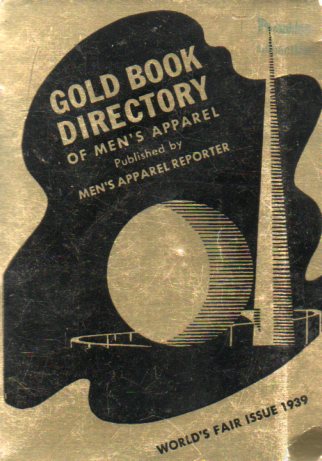
    Apparel904The Gold Book Directory of Men’s Apparel (“published by Men’s Apparel reporter”) was issued for the World’s Fair in 1939–it is a stubby, 320-page, 5-inch-tall and designed booklet, and it is pretty much a mausoleum-y reminder of what once was.  New York had been a center of clothing manufacturing for  a long time, and this pamphlet reminds us of that–and I’m not getting too rosey and sentimental about a tough trade that had its share of abuse of the unprotected,   as there were generations of immigrants who passed through those sweat-box meat grinders choking out pants and shirts for the lower- and middle-class while making pennies-per-piece. The shirt-pocket-sized golden book does remind us of industry that once was, and now moved overseas to perhaps even more vast abusing sweatboxes to produce cheap goods at clothing prices lower than they were (CPI-adjusted) in 1939. 

    It is striking to see the tabbed division headings:  “New York Hat and Cap Manufacturers” (listing 100+ businesses), “New York Handkerchief Makers”(60+!), robes (60), shirts (300), underwear (250), robes (90), evening dress (100), waistcoat (50), cumberbunds (24), label makers (woven (!)75), and of course New York Pajama Manufacturers, weighing in (with a line of pj’s called “Mr. Stubb” for “the short man”) with more than 120 manufacturers.  It is really enough to make the modern reader misty for lost  times.  Now, these categories were not mutually exclusive, and the Zenith Underwear Company could also produce handkerchiefs, but there is ample evidence here of vastly lost and different times–not only in the loss of domestic manufacturing, but also in the disappearance of the need for evening dresses, cumberbunds, waistcoats and (almost-but-not-quite) handkerchiefs. 

    Here’s a bit that appeared on this blog a little while ago on the grim part of the garment manufacturing industry in NYC (called Ancient Myths Modern: the Other Statue of Liberty, 1911, here):

    A tenement gleaner, New York C... Digital ID: 416509. New York Public Library


  • On Being Obvious, (Again)

    JF Ptak Science Books   Quick Post
    Follow Me on Pinterest

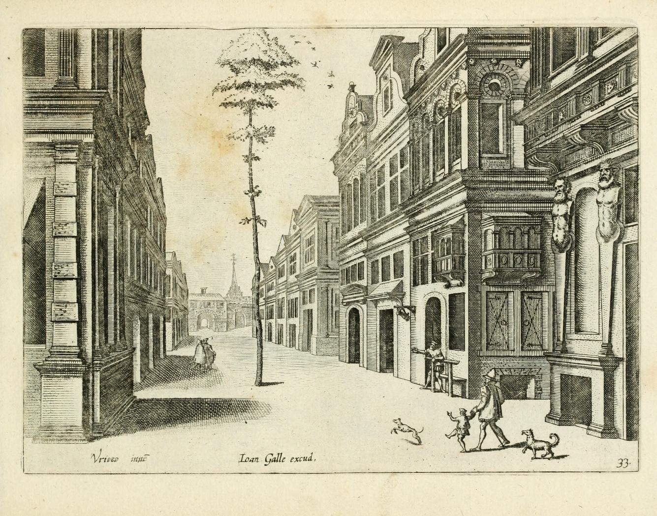
    The following example of Great Obviousness comes from one of the great masters of perspective on the Continent, Jan Vredeman de Vries,  (architect, engineer and man with a vision), and appear in his work Variae Architecturae Formae, and published in 1601. (The whole of the book is available at the Internet Archive, here.)

    It would be interesting to know the history of this tree and its obvious salvation–it doesn’t seem to be older than the street or the buildings, yet, there it is, a tree the diameter of an adult waist in the middle of a very populated street 

    Obviousness

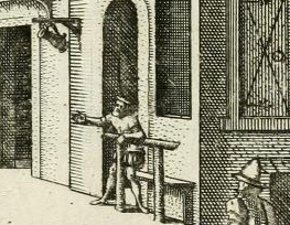
    Below you can see the detail of the man at the middle right–he is absolutely pointing to teh tree, perhaps sharing his amazement with the man and child coming down the street. The pointer had been seated, probably, on the bench behind the bar that was in front of the bar/saloon/draughthouse that he was probably inside of, perhaps enjoying a pint of five, perhaps making the tree even more amusing than it was. (The tilted stein is clearly visible advertising a place for thirsts to stop.) The child is reacting to something, and even so the dogs–the second of which seems to be stopped mid-stride in amazement.

    Obviousness detail

    Another exzmple of the unexpected tree comes later in the same book, when we see one tree in th emiddle of a plan garden and the other growing on top of what might be an herbarium. (On closer inspection the figure at lower right is a woman collectig some water in a jug; without magnification the seen looks a little more sinister than it is.)Obviousness 2


  • The Theatre of the Infinite Horizon

    JF Ptak  Science Books   Post 1937

    Follow Me on Pinterest

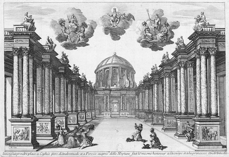
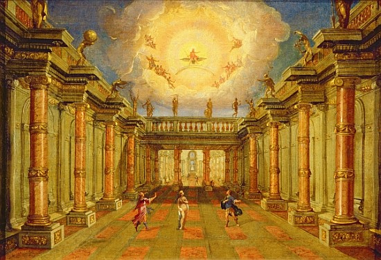
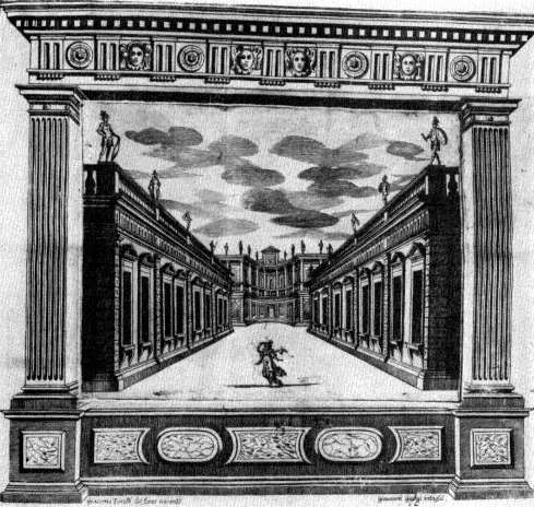
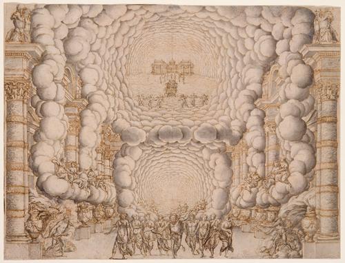
    I am hardly an historian of the theatre (and having said that will give me a chance to make some mistakes in what I am about to say) but so many of the stage designs of  Giacomo Torelli look to be concentrated at an infinite horizon that I wanted to collect a few of them in one place.  Torelli (1608-1678) was an artist and artistic-technician who brought engineering skills to the stage, and was evidently a much-sought-after designer, given his very special

    Theatre perspective-Torelli

    [Image source: WIki, here.] Set design for Act 5 of Pierre Corneille’s Andromède as first performed on 1 February 1650 by the Troupe Royale at the Petit-Bourbon in Paris.]

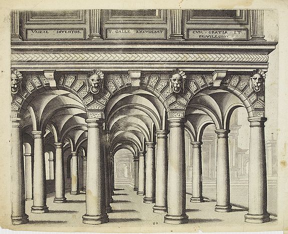
    I do have to say that the Torelli puts me in mind of the perspective king of 17th c Continental architecture, Vriedman de Vries  (1527 – c. 1607), especially with the columns (from his Architectura, 1633):


    Vriedman de Vries[Source: Swaen.com]

    talents and innovations.  He was absolutely interested in one-point perspective and the techniques used to gather the audience’s vision and suck it all into the low-center of the back of the stage, giving the production a fabulous quality of depth and distance. (He also provided the ingenuity and gearwork for quick changes of massive scenery by one stagehand, working under the stage with pulleys and winches, hauling large elements on and off stage during a performance.  His work can be seen in the iconic Encyclopedie of Denis Diderot in a section for “Machines du theatre” in 1772.)

    The other thing that strikes me immediately with these images is their absolute usefulness in toy paper theatre. By making eight copies of the first image (above) and by cutting out each seven layers of columns (the opening space between the two sides becoming progressively smaller), and then the last  and eight level of the mansion in the background and then standing them up and placing them all-in-a-row with an inch between them (accordion style), one could make a lovely 3-dimensional miniature stage.  (Scene changes would be an entirely different matter.)

    [Source: see note #1, below]

    Torelli 2

    [Source: Copia-di-Arte.com, here.]  

    Torelli 3

    [Source: Publishing.cdlib.org, Operain Seventeenth Century Venice, the Creation of a Genre, by Ellen Rosand.]

    Torelli 4

    [Francesco Buti/Isaac de Benserade, “Les Noces de Pelée et de Thetis”; Source:  Oesterreichisches Theatre Museum,  here]

    Notes:

    1. Bryan, Michael| (1889). Dictionary of Painters and Engravers, Biographical and Critical. Volume II : L-Z,
    new edition, revised and enlarged, edited by Walter Armstrong &
    Robert Edmund Graves. Covent Garden, London: George Bell and Sons


  • Trees as Symbols in Displays of Information

    JF Ptak Science Books  Expanding an earlier post  
    Follow Me on Pinterest

     I’m fond of images of trees, but
    mostly if they are forensic or employed to display relationships between ideas
    or data.  One of my favorites for the
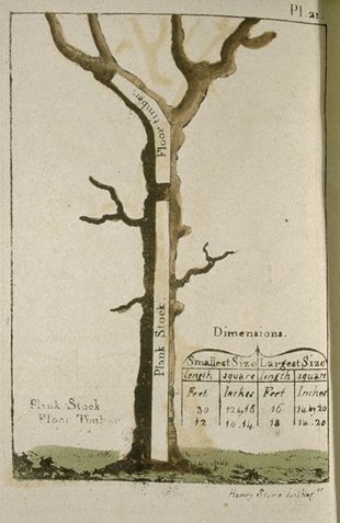
    former is this great image from Peter Guillet’s 
    Timber Merchant’s Guide. Also, a Table, Whereby, at One View, May Be
    Seen the Solid and Superficial Measure of Any Square or Unequal Hewed Logs or
    Plank…1
    (printed
    in Baltimore by
    J. Longrove in 1823). 

    Tree--timber guillet


    Guillet was basically
    a tree dissector, a harvester of wood for the construction of naval ships.  His book shows how to make the best—the most
    efficient—use of various varieties of trees, displaying how to employ different
    sections of trees for different parts of a ship. The book must’ve been an
    indispensable handbook down at the mill.  
    At the every least, it certainly introduced a novel way of looking at
    trees.  

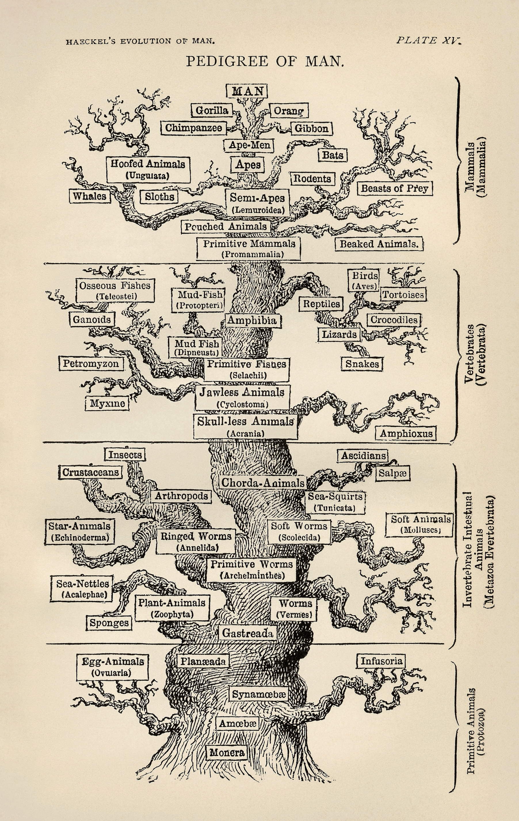
    Tree-haeckel  


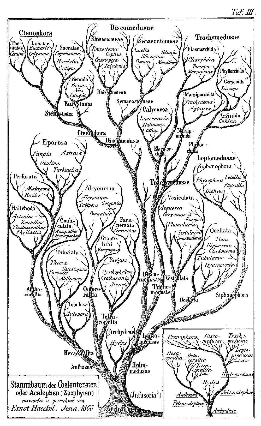
    This tree2 was a figure drawn by biologist and eminent
    Darwinian Ernst Haeckel3 (1834-1919), the branch spaces relating to intervals
    which were unrepresented in the fossil record. The image was perhaps the most
    popularly successful part of his two-volume double-wristbender—it was a
    difficult book, not well written or presented, with Charles Darwin himself finding
    it “impossible to read”.

    Tree_of_life_by_Haeckel  

    The second tree, offered by Haeckel in his The
    Evolution of Man
    (1879): shows the general evolutionary progress of
    living things culminating in man, the hopeful and suspected end (or height, or
    crowning achievement) of the process of evolution.  Which is a little odd, come to think of it,
    to have there be nothing above man, not even a space for unimaginable improvement,
    not even a single unused branch to express the possibility of supra-human
    development. 

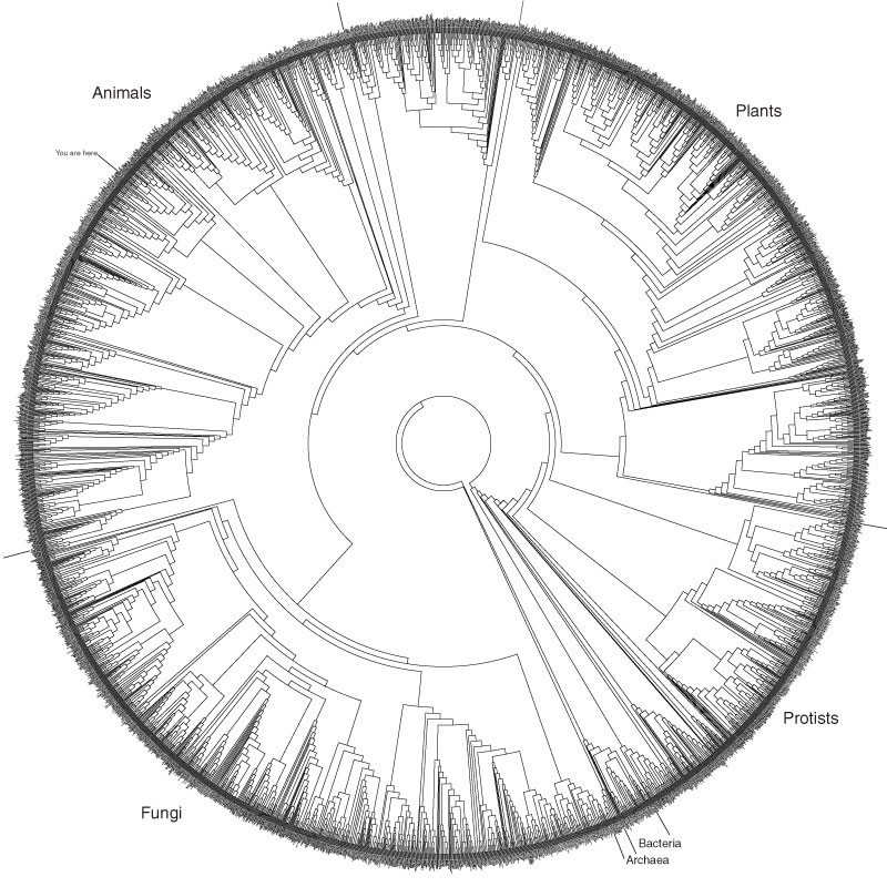
    By far the most complex of the tree of life series is the
    tree ring of life, an exploding and explodably adaptable image generated by the
    Life Website which begins at the beginning, with “life” itself.4

    Tree ring of life

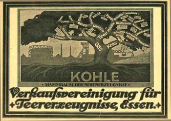
    The coal tree of life is a particularly confusing image. Even though this is a simple classification scheme, and a
    very-well designed graphic at that, the use of the tree describing the genealogy
    of coal by-products just seems, well, wrong. The use of the tree in defining a visual phylogenic interrelatedness of
    living things appears pretty much for the first time in the first edition of the
    Origin of Species in 1859, and it is the only diagram that
    appears in the
    book. (And by this I mean the use of the tree-scheme for scientific
    purposes:  the tree of life of course has been used for many, many
    centuries, the philosophical design woven into the fabrics and incised
    into the stone of many cultures.  It sort of appears in print in
    classification usage at least by the wily and polymathic Athansius
    Kircher, who used it to display the elements in a Kabbalistic Tree of
    Life some 350 years ago.)

    Tree coal
    The Verkaufsvereinigung fuer
    Teererzeugnisse (of Essen) used this idea in
    1922, publishing the ad for their company in the Illusrtriete Zeitung (Leipzig). The great tree spring from a bed of coal (“kohle”)
    exhibiting the “stammbaum der nebenerzeugnisse” (roughly the “pedigree of our
    product”), with the trunk being gas, branching out into tar, coke and cyan and
    so on.  Even though it’s the lifeblood of
    the continuing industrial revolution, and even though we’re hundreds of years into
    a deep need with the products, the use of the tree just seems antithetical to it
    all on all levels of recognition, especially now.

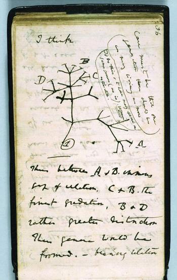
    Then of course there’s the Darwin tree, an incredible diagram from his notebooks, prefaced with the extraordinary understatement, “I think”. 

    There will be more of these tree to come, shortly, including a tree of dermatological disease and some Kabbalisitc trees of life, but they’ll have to wait for right now.
    Darwin_first_tree_2

    Notes:

    1. The full title, as follows: Timber Merchants’ Guide. Also, a table,
    whereby, at one view, may be seen the solid and superficial measure of any
    square or unequal hewed logs or plank, from one to forty-seven inches. Also,
    plates representing the figures of the principal pieces of timber, used in
    building a seventy-four gun ship of the line, in standing trees
    .

    Tree ring oflife explana

    Also, Guillet had some interesting ideas on the conservative use of forest
    lands (from Franklin Hough’s Report upon Forestry, a government document
    printed in 1876):

    “Individuals wishing to make
    the most of their woodlands will find it very profitable to cut their timber by
    sections, sparing to  very acre ten or twelve of the most promising size white
    oaks or pines, whichsoever the soil will produce best; range the order of their
    lands so as to cut a section every year. For example, say a man has 200 acres of
    woodland divided into sections of 10 acres each, then, by cutting one section
    every year, he would have young timber twenty years old, which makes excellent
    firewood, and I should say that in common lands wood of twenty years’ growth
    would yield 15 or 20 cords of firewood per acre, besides fencing-timbor
    sufficient to always keep in good repair an inclosure of 200 acres. Then the 10
    or 12 trees growing in reserve will, at the end of 80 or 100 years, furnish
    timber fit to make shipping or staves. Where land has become useless from long
    cultivation, a little trouble only is necessary to make it productive and
    profitable to the owner. By inclosing it for a few years and encouraging the
    growth of the most promising younj* trees, which will generally spring np
    spontaneously, all the advantages above described will be derived from it,
    which is certainly the best way that worn-out or sterile land can be disposed
    of. Such a course recommended to and adopted by individuals wonld not only be
    to their own private gain, but also of great public utility.“

    2. “Monophyletischer
    Stambaum der Organismen” from ‘Generelle Morphologie der Organismen’ (1866).

    3. Wiki biography
    of Haeckel
    http://en.wikipedia.org/wiki/Ernst_Haeckel

    4. Explanation of the second diagram, as follows from Discover Life: “Phylogeny
    is the organizing principle of modern biological taxonomy, and a guiding
    principle of modern phylogeny is monophyly: a monophyletic group is considered
    to be one that contains an ancestral lineage and all of its descendants. Any
    such a group can be extracted from a phylogenetic tree with a single cut. The
    tree shown here provides a guide to the relationships among the major groups of
    the extant (living) organisms in the Tree of Life as we have presented them
    throughout this book. We do include three groups that are not believed to be
    monophyletic; these are designated with quotation marks.”   See also HERE for a different view of this diagram.


  • The Eyes of Dr. John Dee, Mathematician and Astrologer

    Dee480

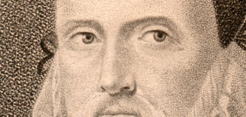
    Above is a detail of a stipple engraving of the great mathematician and astrologer,  John Dee.  It is simply titled “Dr. John Dee” (1527-1600), and was published and printed in  London by  T. Cadell,  1798. This is a very fine portrait (5×4″ on a 7×5″ sheet) undertaken in an accomplished/naive style after the painting by George Perfect Harding (d. 1868) and engraved by Nicolas Schenker (1760-1848).  [We offer the original (pictured below) at our blog bookstore, here.]

    ·Posted by :

    ·in:


  • The Visual Genetics of Color and an Unintentional Pre-Modernist Masterpiece

    JF Ptak Science Books Post 1282–continued, & now with the Full Text book!

    Follow Me on Pinterest

    [Earlier in this blog, about 1200 posts ago, a million words ago, I wrote about an extraordinary book by an aesthetician named Emily Vanderpoel.  It is “extraordinary” in a narrower sense, and that “extraordinary” might not actually be positive for its original intent.  The extra-intent of the book, what has come out of it for me, was something that was unintentionally accomplished by the author.  The images that she used to illustrate her color theory ideas–the basis of which are not really comprehensible to me–turn out to be artwork in themselves, a found art, the artistry of the images taking over the original intention for the arrangement of their color.  I’ve found the book now at the Internet Archive in all of its glory, and downloaded only 150 times.  I’m still at a loss to know why this work hasn’t received more attention

    The idea of how we put parameters to something like the visual field is a gargantuan topic—it is something that architects and geometers and physicists and mathematicians (in general) have dealt with forever.

    The full text is available HERE via Internet Archive.

    Blogcolorvander_2poel_063
      Mapmakers have perhaps the most visualized aspect of this on paper, performing the semi-miracle of translating three dimensions into two; physicists have a more difficult time, taking the opposite approach, sort of , and translating two or three dimensional space into x-number of dimensions.  Anatomists had a difficult time of their subject until relatively recently in human history, what with the sublime religious curfews on messy knowledge and all coming into play, poking around into the heart and such as though it was an affront to the sanctity of the creator (M Servetus’ ideas on the circulation of the blood via the heart, making the heart a tool and not the brain or some odd conjunction of creative divine power, cost him his life, burning slowly alive at the stake…how mysterious the whole world of RNA Genotype-Phenotype Mapping and such would seem to him if he could have a peek into the future/present from wherever he is.)
    Blogcolorvanderpoel_062

    Color theory is old and pretty—as a matter of fact there is a very attractive gathering of color theory models (in black and white, though) displaying some two dozen or more color models from the last 400 years.  People like Della Porta (1593), our old friend and resident oddball polymath crank Kircher (1646), the smarter-than-you-could-imagine Newton (1660), Waller (1686), Lambert (1772), the wide ranging and again polymathic Goethe (1792), Herschel (1817, who also ushered in our understanding of the other light-sensitive shape spacing medium of photography in 1840), the semi-forgotten Chevreul (1835), the beautiful Maxwell (1857), Wundt (1874, the early experimental psychologist who also looked for spirits/spiritmus and ghosts), von Bezold (1878), Rood (1879), Munsell (1918) Kandinsky (1914 and not decipherable by me) and Klee (1924), and so on towards the present, all tried to analyze the prospects of color.

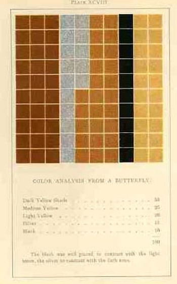
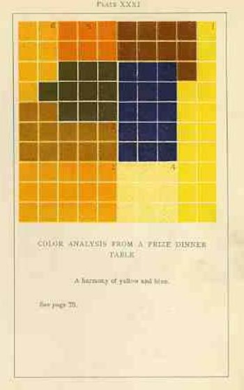
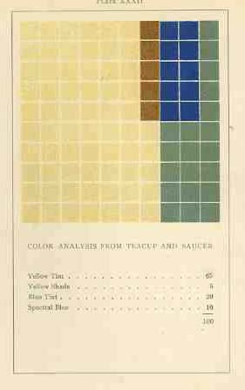
    Not in this list is the very highly problematic Emily Vanderpoel, who in 1901 and 1903 produced (in two editions) a lovely but mysterious book called Color Problems for the Layman, in which she sought not so much to analyze the components of color itself, but rather to quantify the overall interpretative effect of color on the imagination.  I know this sounds begging and vague, but I really haven’t been able to make much headway in the work.

    Blogvanderpoel_1057
    I’m attracted to this effort because of its attempt at quantifying such abstract thoughts.

    By virtue of this effort, though, Vanderpoel had produced a strikingly illustrated book, with 118 color plates, all very intense, and beautiful, and in its way exceptional—unique for it time perhaps.  Had the book been written thirty years or so hence we’d call it some sort of constructivist/constructionist artform.  But since the artwork in the book comes a decade before the first non-representational artwork in human history (or so), I don’t know exactly what to call it. 
    Blogvanderpoel_2058

    I really don’t know what it is, but I know that it is not entirely accidental, this pre-non-representational artform, because controlled geometrical color art is not accidental. 

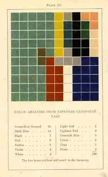
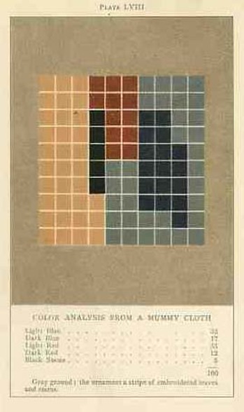
    In trying to quantify the color images of the objects in her study, Vanderpoel establishes a 10×10 square grid, dividing all of the color in that object into individual units numbering to 100.  Then, somehow, she identifies the major colors and places them according to a system that I cannot understand within the grid.

    Blogvanderpoel_3059

    The net effect is glorious.  I just don’t know how she got there—which isn’t normally a consideration in art, except that this work is an instructional on how to understand color in art and nature, and the explanation of the procedure is ethereal.  Vanderpoel was and remains a respected author on porcelains and other applied and plastic arts.  In this work she looked at her fair share of porcelain, limogues, clay pots, burial urns, glass shards, and the like; she also analyzed clouds, mummy cloths (and casings), dew on morning grass, brocade, the eye of a blue jay, feathers, and another hundred or so poetic arragenments of the stuff of teh world.  I still do not know what this book is trying to tell me, but I do know that it is remarkable.   


  • Ships in the Skyline: Graphic Displays of Information

    JF Ptak Science Books   Quick Post (Overall post #2515)

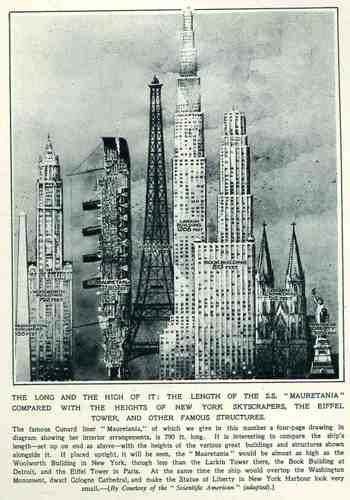
    This wonderful display (appearing in The Illustrated London News for 26 March 1927, page 518) of quantitative data isn’t quite as whimsical as it appears in detail, though I can think of onlyBlog1sept_16_ship_skyline_detail5_2
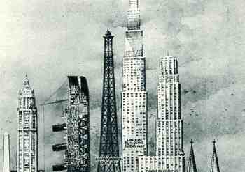
    a few (antiquarian) times that I have seen a ship made part of a cosmopolitan vertical cityscape.  It is a great way of comparing two disparate, out-of-place equals, and certainly can get the idea of the size of something as stand-alone and solitary as a great ship to children (and adults, too) by comparing it to something as obvious as a tall building.,  This time its really just comparing the length of the SS Mauretania with the heights of some famous and notable buildings. (The Mauretania, 1906-1935, was a fabled, luxurious and fast ocean liner of the Cunard line; it was refitted for a resurgent oceanic service at about this time.)   In the larger, expanded second image we see the Mauretania stacked up against (from left to right) the Washington Monument (555′), the Woolworth Building (792′), the Mauretania  (790′), the Eiffel Tower (984′), the Larkin Building (proposed at 1208′), the Book Building (873′), the Koln Cathedral (512′) and the Statue of Liberty (305′).  The Larkin Building (not the F.L. Wright structure of the same name) was a proposed super-tall of 110 floors for 330 W. 42nd Street that was proposed in 1926 and not canceled until 1930, and which would’ve been the tallest building in the world.   In any event, this was a big ship–the largest in the world when it was launched as a matter of fact–and the drawing is wonderful.   (Upon closer inspection, there is a terrific amount of detail in the cross section of the ship.)                                                   

    Blog1sept_16_ship_skyline564


  • The Battle of the Extra Earths: Mini-Extra-Earth Vs. Full-Sized-Standrard-Earth (?)

    JF Ptak Science Books  Quick Post     Part of a series on Strange Things in the Sky

    Follow Me on Pinterest

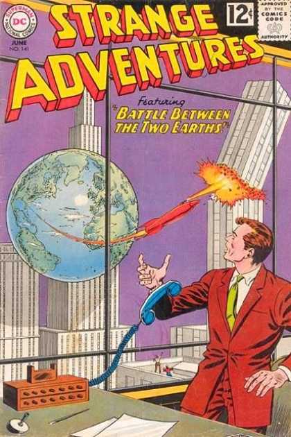
    This is a quick addition to the Extra-Earth category of this blog–and an amazing one. In the other examples the extra-Earths appear simply appear , with little or no interaction between the two. In this instance we have one Earth attacking the other. 

    Extra earth

    There is no necessity for this to make much or any sense, what with the purple sky and, of course, the extra-Earth–but the attacking rocket taking off from the extra-Earth extra-Florida (or thereabouts) seems to grow in size as it gets closer to its target.  After all, the attacking extra-Earth is less than 300′ away from what has become an enormous and marauding space vehicle (judging from the distances in relation to the buildings) which is now longer than the extra-Earth-America is wide.  But in the world where a miniature extra-Earth can attack a standard-sized-Earth, this would be a minor quibble. 

    Honestly, I think I like to write about such things for the joy in having to think of a title for the post.