A Daily History of Holes, Dots, Lines, Science, History, Math, Physics, Art, the Unintentional Absurd, Architecture, Maps, Data Visualization, Blank and Missing Things, and so on. |1.6 million words, 7500 images, 4.9 million hits| Press & appearances in The Times, Le Figaro, Mensa, The Economist, The Guardian, Discovery News, Slate, Le Monde, Sci American Blogs, Le Pont, and many other places… 5000+ total posts since 2008.

Author: JF Ptak

  • Fabulist Images from an Accomplished Genre-ist

    JF Ptak Science Books  Quick Post

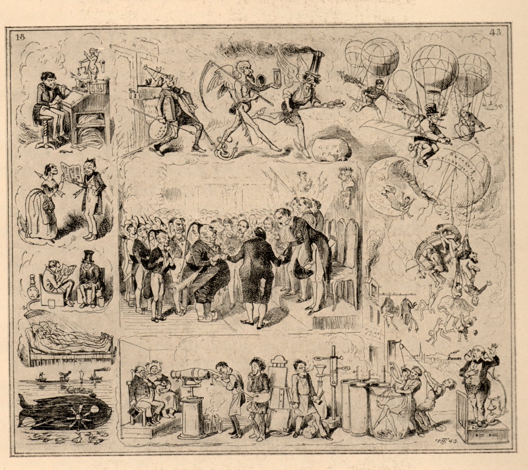
    I stumbled upon these very inventive, peep-into-the-future of  imagination images by Theodor Hosemann in journal Exlibris Buchkunst (for the year 1910).  Hosemann’s (1807-1875) name came into a blurry recognition as a leading genre painter and very busy illustrator in mid-century Germany, but certainly not for these images, which remind me very much of J.J. Grandville, one of the leading imagist illustrators of the 19th century.  (Grandville has been a subject in this blog quite often; for example, see here.)

    Hosemann908
    The originals were completed in 1847 and depict some of the trials demanded of future vision, looking into the year 1947. I particularly like the steam-driven horse-mobiles and the steaming-hatted Mercury laughingly outrunning a grimaced Time. 


  • Cartographic Evidence of Hell in Texas, 1888

    JF Ptak Science Books    Post 1941  
    Follow Me on Pinterest 

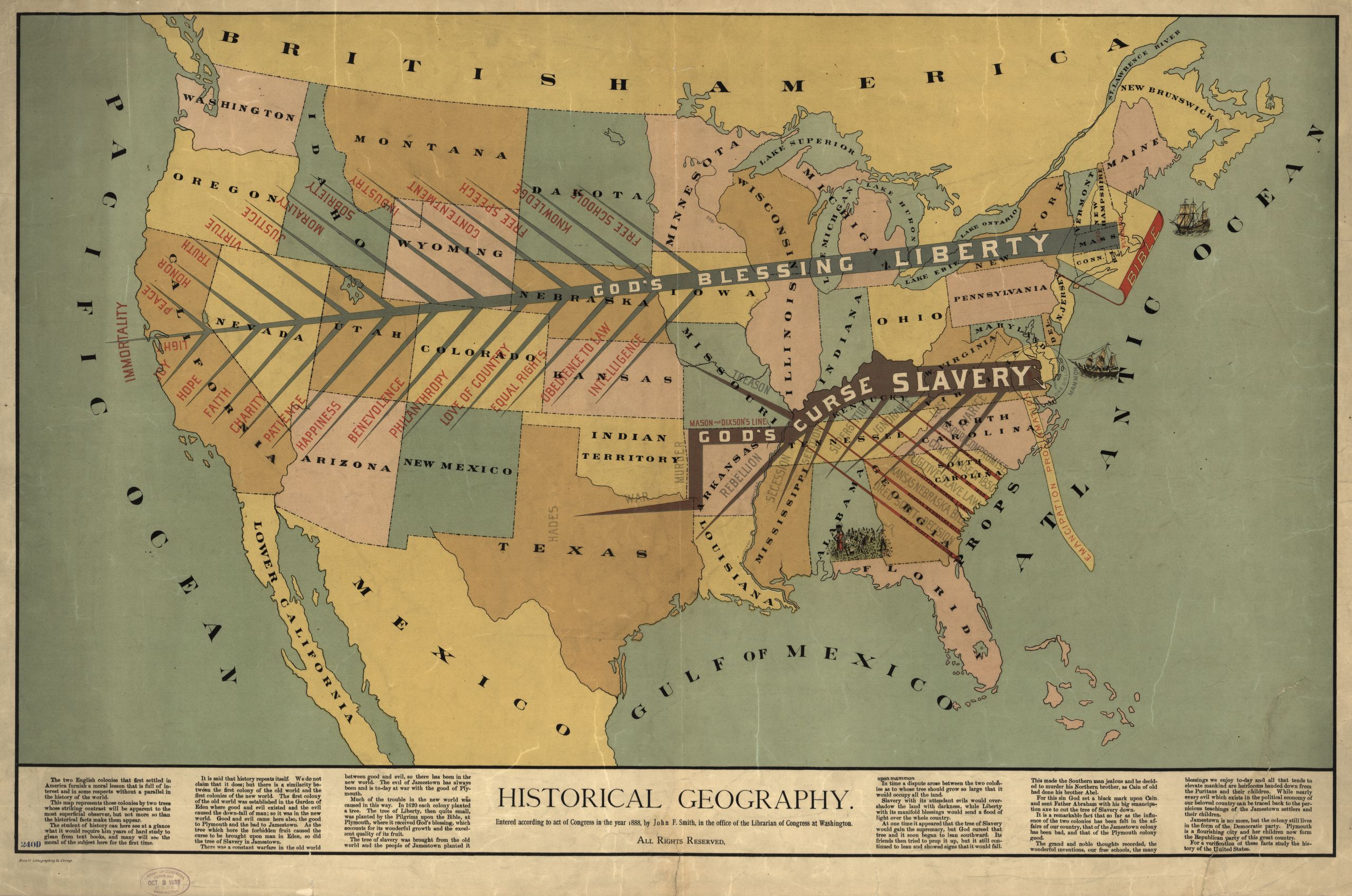
    Slave map 1888 texas
    Just yesterday in this blog I made an entry on a very striking, viciously anti-slavery Moral Map of the U.S. It is very red and was printed in 1854, just barely before the great troubles really started to begin in 1856, and it stands on its own as a fine representation of a map-with-a-message.  The map below by John F. Smith (Historical Geography) was printed in 1888, and although it was made after slavery it still carried a very strong message–perhaps not as graphic as the 1854 map, but certainly as vehement, and perhaps more-so, with a very heavy dosage of Reconstructionist retribution laced in its text. There is a sense of channels of warm blood flowing through canali of stone altars, a mass on the chest to Huitzliopochtli.  It has its own sense of deep danger.

    Slave map 1888
    [Source:  the Library of Congress.  The map is very expandable.]

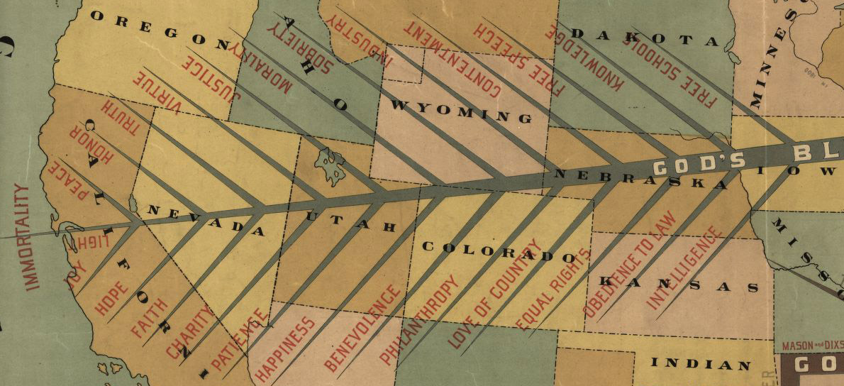
    The map is divided North and South by two lightning-like trees, “God’s Blessing, Liberty” and “God’s Curse, Slavery.”  The limbs of the tree of Liberty read “Light, Joy, Hope, Faith, Charity, Patience, Benevolence, Philanthropy, Love of Country, Equal Rights, Obedience to Law, Peace, Honor, Truth, Virtue, Sobriety, Industry, Contentment, Free Speech, Knowledge, Free School.”

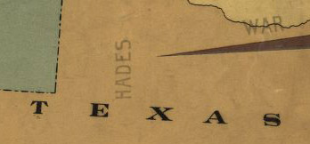
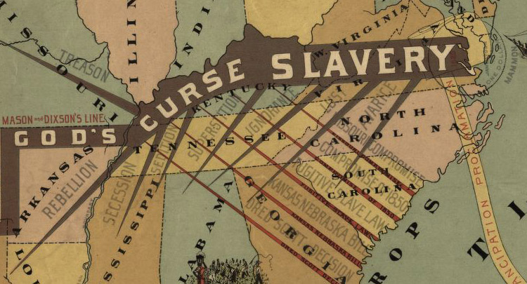
    The limbs of the dark, crooked tree of slavery read: “Murder, War, Rebellion, Treason, Secession, Sedition, Superstition, Ignorance, Avarice, Lust” and of course “Hades”. these are hosted on the spikes of the Missouri Compromise, the Compromise of 1850, Fugitive Slave Laws, Kansas-Nebraska Act, Dred Scott.”

    “Hades” might not be that far off, at least for the heat/difficulty index, as this one seems to be located right about at the eastern boundary of the Llano Estacado, which in centuries past was a very highly difficult place to navigate. 

    Slave map 1888--detail 2

    Slave map 1888 det 3


  • More Outhouse Book Reviews: British Privy Statement

    JF Ptak Science Books  Quick Post   [Part of the Daily Dose from Dr. Odd series]

    Follow Me on Pinterest


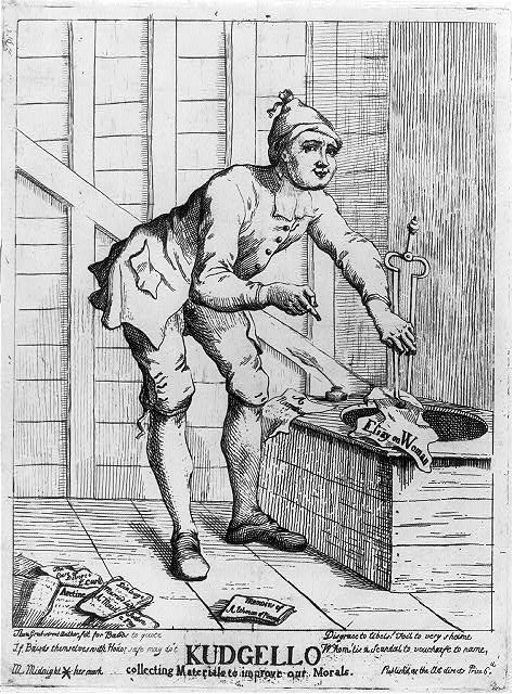
    Just two days ago there appeared in this blog a bit on an image I had never seen before–dogs acting as biological book reviewers, doing with books one of the things dogs do best. And then, this, (“Kudgello collecting materials to improve our morals”) printed around 1766 and another scatological review of books, this based on morals and highly scented books of a sexual nature, all seemingly removed with fire tongs from the wastebucket of an outdoor privy.

    Outhouse books
    {Source: the Library of Congress]  

    The books on the floor, the rescued books, include Dialogue
    … Married Lady … A Maid, Aretine
    (Mansfield, William Murray, Earl of, 1705-1793), Sodom, a play, and Memoirs of a woman of pleasure (Cleland, John, 1709-1789)

    The verse at bottom includes: “Thou Grub street author, fit for Bawds to
    quote / If Bawds themselves with Honor safe may do’t / Disgrace to
    libels! Foil to very shame / Whom ’tis a Scandal to vouchsafe to name.” Also: “M. Midnight * her mark ; Publish’d as the Act directs, Price 6d.”

    Of course the principal interest here is what the semi-smug Kudgello is hoisting from the pit, Essay on Woman, which was written by Thomas Potter in about 1755 with the assistance of John Wilkes This was a take-off of Alexander Pope’s Essay on Man, though without the intelligence, art, insight or writing ability. I’ve included this image in the blog because it is so unexpected–and that it comes fast on the heals of a similarly-unexpected scatological book review found only 48 hours earlier.


  • The Moral Map of the United States, 1854 (and other Maps of Slavery)

    JF Ptak Science Books  Post 1940

    Blogslavery_detail

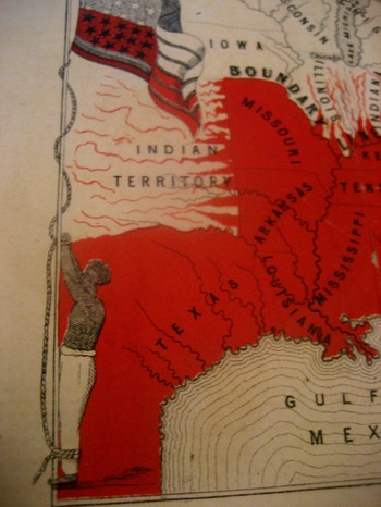
    This incredible, indelible image is another from our collection of graphical representations of data and ideas.  This map, is entitled Moral Map of North America, 1854; (the Slave States are coloued Red, the blighted influence of Slavery is also deeply felt in those parts more slightly streaked with Red)€.  I can find no record of this map, printed obviously by our Brethren across the ocean–€”that and the fact that it was printed in 1854 is all the publishing data that I can find thus far.

    The poem at bottom reads:

    United States! Your banner wears
    Two Emblem €”one of Fame;
    Alas! The other it bars
    Reminds us of your shame.
    The white man’s liberty in types
    Stands blazoned by your stars;
    But what’s the meaning of your stripes;
    They mean your Negro-scars.

    Reciting this poem by Thomas Campbell before an abolitionist convention in 6 March 1851, William Wells Brown continued (as was reported in the National Anti-Slavery Standard):

    “The name of the United States is becoming a hissing and bye-word in the mouths of the inhabitants of every clime.  My country is indeed the land of oppression. There is not a rood of territory over which the Stars and Stripes€ fly, on which William and Ellen Craft or myself could be protected by law. Wherever the American flag is seen flying on the continent of the New World it points us out as slaves; and we enjoy to-night a degree of freedom in your town that we could not if we were in the land of our birth. I often speak of America as my country, but in point of fact I have no country. In the language of one of the noblest of the Negro’s champions in the United States.  €œMy country is the wide, wide world; My countrymen are all mankind.”€

    Brown should know:  his mother was a slave and his father the plantation owner who later granted him his freedom.  Brown then worked the underground railroad and much, much more, working with William Lloyd Garrison and Wendell Phillips.  Among his published works included the incredible  Clotel, (1853), which was one of the first novels published by an African-American in the U.S.,  and which discusses in great detail the relationship between Thomas Jefferson and his slave/lover/mistress Sally Hemings.

    The map is definitely a tale of morality, showing a definite margin of slavery but also depicting slavery leeching its way through the border states. It is interesting to note that Washington D.C. is represented in red as it was indeed a slave-holding district, with a slave pen right on the Mall in the 1830’s. 

    The most striking feature to me of course is the slave who is lashed hand-and-foot to the flagpole on which the American flag is flying, as €”this is the only time that I have seen the slave and the flag portrayed as a unit, together, the slave being tortured by the standard of our country. 

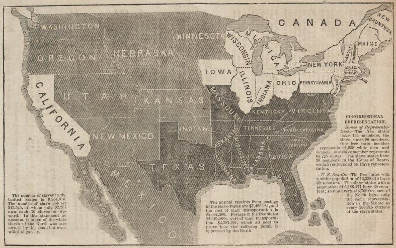
    (Here’s another contemporary map depicting the expansion/limitation of slavery from a blog post on the Kansas-Nebraska act on the excellent antiqueprintsblog site, described here):

    1856 John Jay Freedon and Slavery
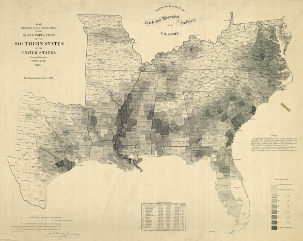
    And this famous map of the United States slave holding region depicting slave ownership by density and by county, which is described in detail (along with pull-outs and expansions at the New York Times website: 

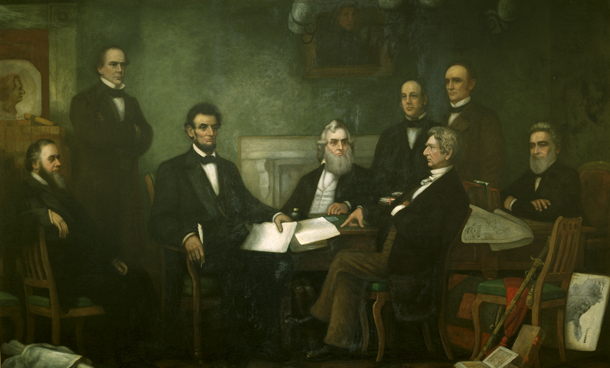
    “(Francis Bicknell) Carpenter spent the first six months of 1864 in the White House preparing the portrait (of Lincoln reading the Emancipation Proclamation to his Cabinet), and on more than one occasion found Lincoln poring over the map. Though the president had abundant maps at his disposal, only this one allowed him to focus on the Confederacy’s greatest asset: its labor system. After January 1, 1863—when the Emancipation Proclamation became law—the president could use the map to follow Union troops as they liberated slaves and destabilized the rebellion.” Quote pull from the NYT via Flowing Data.

    Map slavery US 1864
    The Carpenter painting (described in another New York Times piece here, with the map clearly visible at the lower right):

    Lincoln emancipation proc
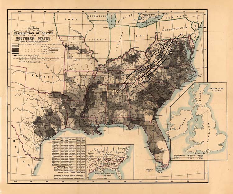
    Another fine example of a slavery map showing the details of the institution was made by Adolph von Steinwehr (a cartographer and geographer who would serve as a brigadier general in the Union Army) in 1861:

    Map slave 1861 Steinwehr
    The data given in the  three maps above is great and indispensable, but the first map still perhaps makes the most indelible impression. 


  • Marble Clouds and their Emotional Shadows: Cloud Geometries in Art

    JF Ptak Science Books   Post 1942 (Part I)
    Follow Me on Pinterest

    I silently laugh at my own cenotaph 
    	And out of the caverns of rain..  Percy B. Shelley, "The Cloud", 1820
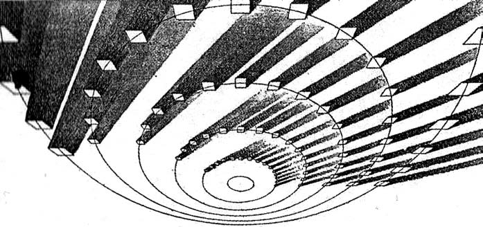
    [John Ruskin, Cloud Perspectival, 1860. Source for all Ruskin images:  “Cloud Studies: The Visible Invisible”,
    by Mary Jacobus, here.]

    John Ruskin (1819-1900) was still a very young man when he published the start of a series of works in art criticism, Modern Painters, in 18431.  To refer to it as a great work in critical theory is painting the work with a narrow brush, though–it had a very sweeping overall effect, and addressed all manner of issues integral to art, and was a developing vision of what art was looking at in the 19th century.  Ostensibly it began as a defense of the work of J.M.W. Turner and the way in which that man represented nature in his pre-Impressionist, pre-Expressionist work. Ruskin makes the case that the works that were so grating part of the art world i the 1830’s were highly consistent with centuries of representing nature in art–and not only that, but presenting evidence that turner did so like no other artist in history.  Ruskin would weave further volumes of Modern Painters through the body of his other work for the next 17 years, publishing the last installment in a fifth volume in 1860.

    Turner (1775-1851) was a great Romantic and a lot of that work tends towards a very full and very early expression of Impressionism and Expressionism, something that not everyone was ready for in the first quarter of the 19th century. This is particularly so in his paintings of clouds, and even more so in cloud/ocean interaction.  They are sweeping and breath-taking and very emotional works, in some ways like the late string quartets of Beethoven–powerful, provocative, internal dialogs of the deep power of nature. He must stand with John Constable as the Cloud Man of the 19th Century, or perhaps Constable stands with him.  They both in a way stand with Luke Howard, the scientist who was really the first classifier of clouds–an undertaking which in some impossible way escaped the recognition of the greatest classifiers it he history of science–and who did so in a paper in 1802, written at a time when Constable and Turner were both young artists.

    Turner and Constable both painted clouds like perhaps no others before them; and Ruskin, in his deep appreciation for the importance of the representation of nature int he art, also made a contribution to the understanding of clouds that was of an extraordinary nature. In the fifth volume of his Modern Painters Ruskin attempts a perspective study of clouds, and may have been about the first to do so. The illustrations of this effort I think are incredible, and remind me very much of installing a sort of rigidity to clouds, a cloud geometry, veritable studies of stones and blocks in the sky.  The imaging part of this exercise must have been an enormous thing back there in 1860, to think of clouds in a perspectival way, floating very large geometric objects in the sky. The astonishing results are seen (above) and following:
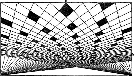
     And this:
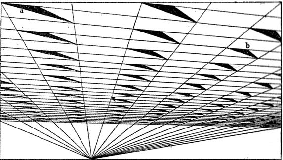
    [John Ruskin, Cloud Perspective: Curvilinear., Modern Painters, Vol. V, Plate LXV.]

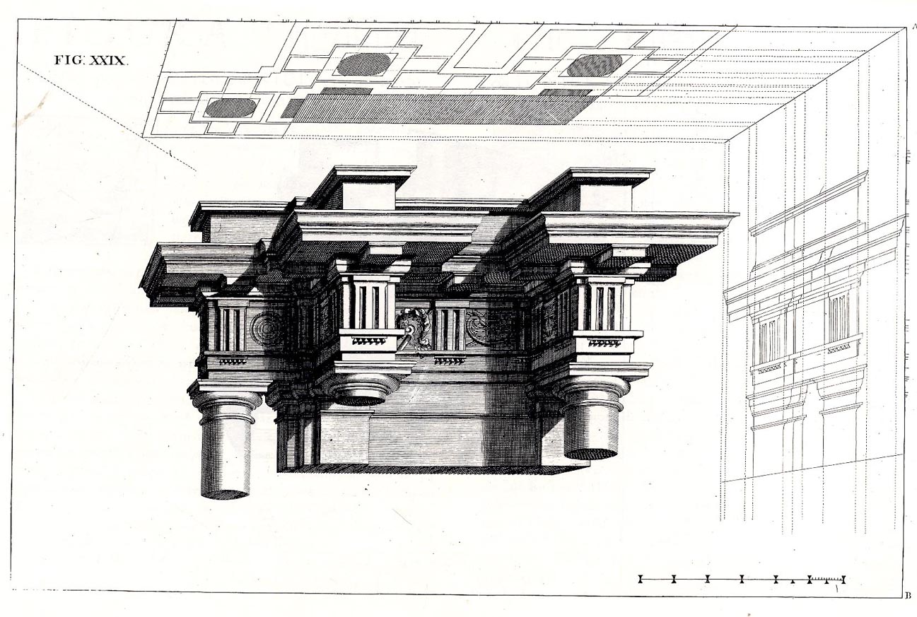
     In a way the first image reminds me of Andrea Pozzo’s work in his monumental   Rules and
    examples of perspective proper for painters and architects
    (1693):
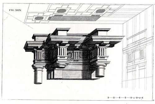
     
    Pozo

    but really more in the way that Pozzo’s work seems to be elevated and floating in a heavy perspectivist space, bigger and blockier sky-borne marble than with ruskin.  But still, the disembodied floatiness of the Pozzo work is ethereal.

    Ruskin does round out his blocky and beautiful geometry, which definitely reminds me of work w=that would appear 90 years later:  Ruskin, again:
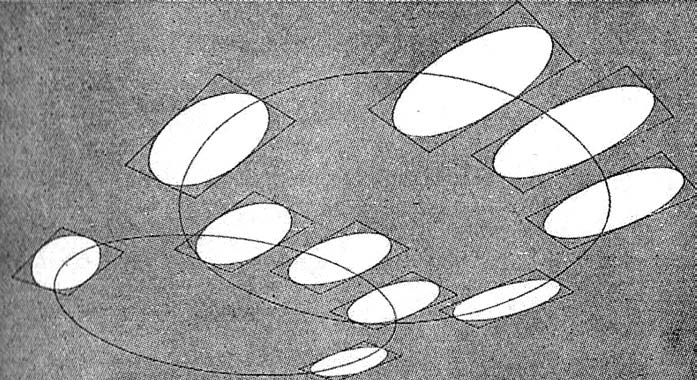
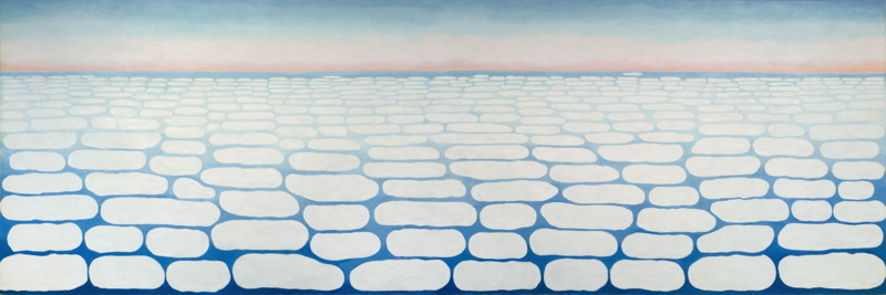
    And  Georgia O’Keefe’s Clouds III (1963), though her clouds tend towards a more rigid geometry in Clouds IV (1965, following):

    Clouds O'KeefeO’Keefe, Clouds Above the Sky III, 1963

    Clouds okeefe sky above iv 1965O’Keefe, Clouds Above the Sky IV, 1965

    Ms. Georgia is definitely seeing her clouds with different eyes than Ruskin, and they are entirely different creatures–but still, the two come together in my head as relatives. The clouds, I mean.

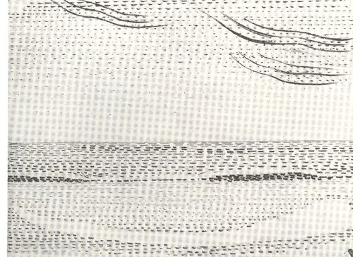
    I started looking around for early hard-line cloud geometries and thus far I haven’t found very much, though there is a tremendous example by Henry Van de Velde’s (1863-1957) “Sun at Ocean (Rhythmic Synthesis”) which I found in  Werner Hoffman’s Turning Points in Twentieth century Art, 1890-1917 and which was executed in 1888/9, looks to me to be absolutely incredible for its time, a nearly non-representational, proto-abstract something, done three decades before these genres came into being.
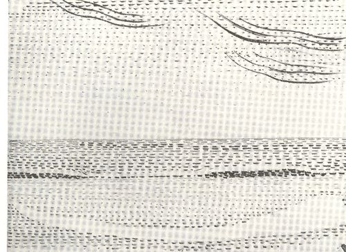
    Clouds van de velde
    I don;t know where the designer Van de Velde fits in the early history of non-representational art, but his effort in the second to last decade of the 19th century certainly seems to be very unusual for its time, and a good example of creative cloud representation. 

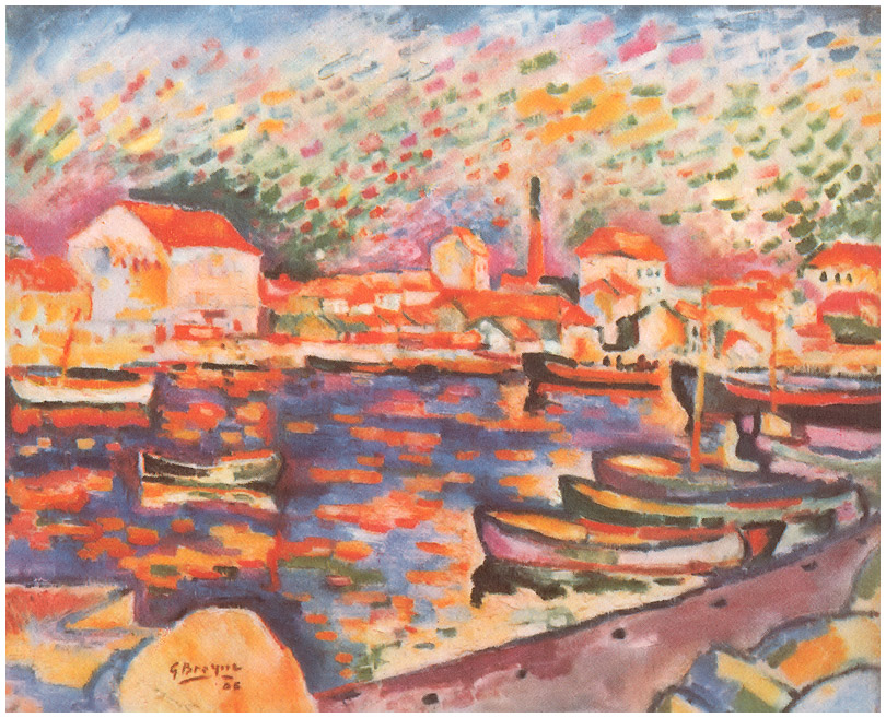
    Non-standard cloud imagery is much easier to finding the 20th century, like those of Georges Braque in his La Ciotat Harbor (1906):
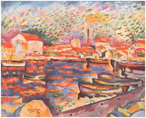
    Clouds braque
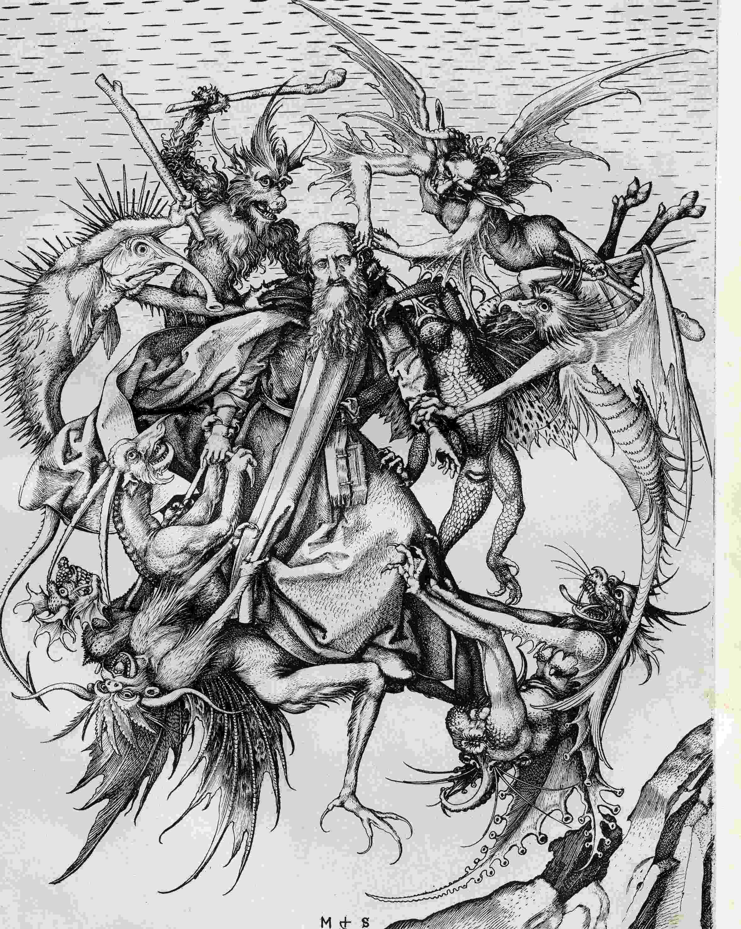
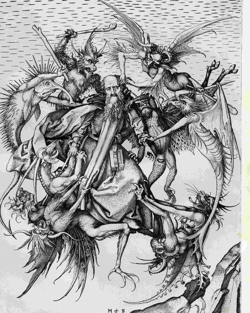
    Even this starts to have the look of something earlier, particularly if you turned the clouds-in-art clock way back, say, into the Renaissance. For example Martin Schoengauer‘s spectacular  The Temptation of St. Anthony, which was printed in 1470/5, has
    a beautiful, fluid circularity to it, full of an earthy roundness even
    as the saint is pursued by demons.  But the sky in the background is
    populated with nothing but dashes to suggest clouds, and which also starts to look something like the Fauvist and Expressionist works to come, 400/500 years later.
    Clouds schoengauer

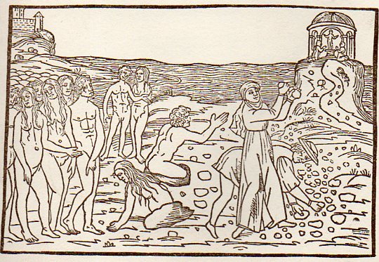
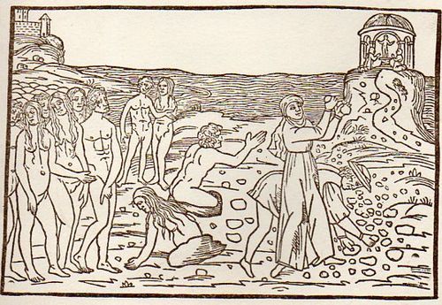
    (There are many examples of the sky being simply not represented at all, particularly in woodblock,

    like this image from Ovid (Accipe Studiose Lector P. Ouidij Metamorphosin...printed in Venice in 1509:
    Clouds no couds livy913

    “You could not see a cloud, because
    No cloud was in the sky:
    No birds were flying overhead —
    There were no birds to fly”.–Lewis Carroll, Through the Looking Glass.

    There are many non-sky images like this.

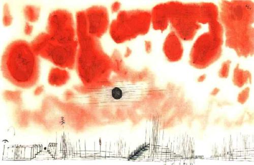
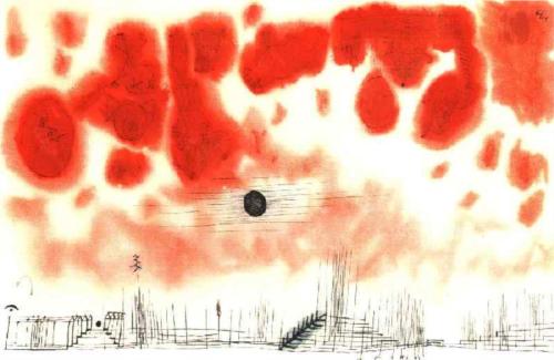
    Another interesting modern example is this Paul Klee (though it comes fairly late in that career, in 1940):
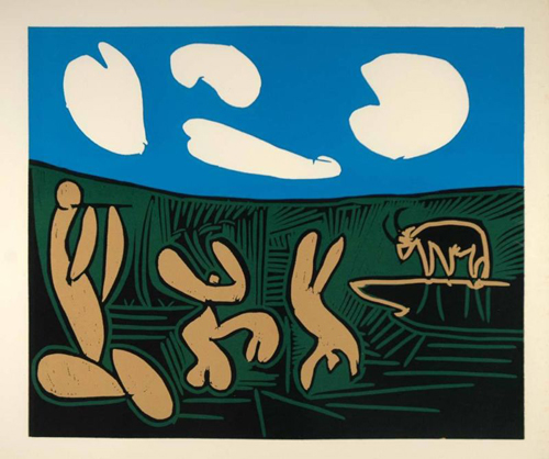
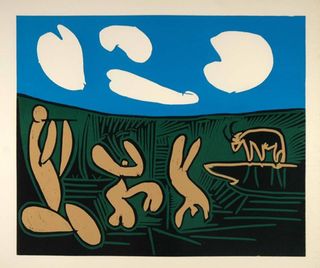
    Clouds Paul Klee 1940And an example from the ubiquitous Picasso, still later, in 1962:
    Clouds Picasso

    But earlier images are harder to locate.  The obvious early-ish source (though still much later in the century) would be Van Gogh (say, with Starry Night) and Monet, though the fractalesque Van Gogh gets much closer to the re-interperative power of the Ruskin images than the reflected impressionist beauty of the Monet.

    Clouds Monet
    On a cursory look around the antiquarian painterly sky-world, it is becoming obvious that the cloud geometries of Ruskin are very uncommon. 

    Notes

    1.  For full text of Ruskin’s  Modern Painters , see  (1873)volume 5 for (1860) and  (1873)

  • Dogs as Book Reviewers, 1697

    JF Ptak Science Books  Quick Post

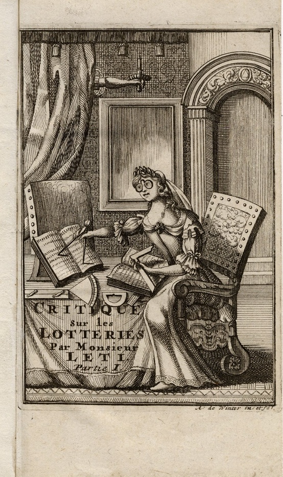
    Having a go at Pinterest I came across a very interesting image–a satirical, and very biting, portrayal of a woman as a scholar (here, with thanks to Whitney Trettien). The artist gives the woman a very monkey-ish feeling, a trained animal aspect, sitting there trying to figure our the words in a book with a right angle and a compass, and sporting monstrous glasses. 

    Books woman
    The work is by Gregorio Leti (1630-1701), Critique historique, politique, morale, economique et comique sur les lotteries, which was published in 1693. (Available at the Folger Shakespeare Library, here.) Leti was a critic of many things, but most particularly of the Catholic Church and of the Pope, a collection of efforts which earned a place for all of his works on the Index Librorum Prohibitorum.

    Within the same book is another double page image, the top showing a writer besieged by his demons, and the bottom, well, the bottom shows the work of dog reviewers of the written word. It is the only antiquarian print that I have seen of such behavior.   


  • Wicked Polly Reveals the Sameness of Names, 1827

    JF Ptak Science Books  Quick Post

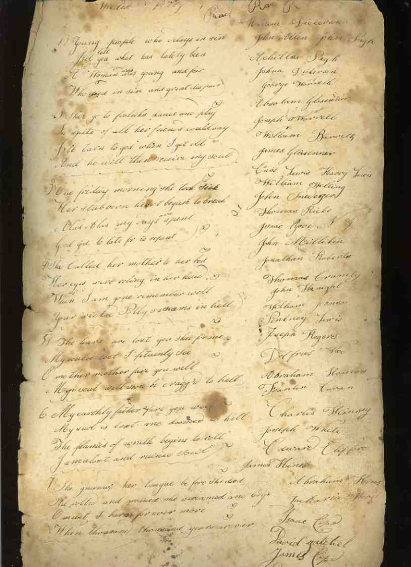
    00-blog-Oct 22-polly908 In my collecting of antique children’s art (that is, art produced by children from 1880 and earlier) I’ve stumbled across a number of interesting other associated, relateable,  things.  One such item is this manuscript copy–from 1827–of a much older children’s warning/lesson poem, called “The Lamentable Story of Wicked Polly”, a scare-the-kids-to-death kind of poem, instilling (and installing) a very healthy dosage of the wrath of god, a falling away from the just Jesus, and the regretably-late realization on the everlasting pain of sin.  A rosey children’s lullaby it is not.

    [The lyrics are below; click on the images for a more legible resolution.]

    But the side interest here is literally at the side, a perhaps revealing bit of marginalia in which the copyist has recorded the names of 54 children (I imagine).  Are these names the names of classmates, other children in school, kids in town?   There are 26 girls and 28 boys; the girls, as it turns out, have 9 different names; the 28 boys have 18 different names. I wonder why?  The girls have the following names (and with the number of holders):  Ann (7), Ekiza (4), Mary (4), Hannah (3), Sarah (3), Mary (3), Jane (2) and then one each for Lydia, Sidney and Maria. 

    The boys have more imaginative names:  most popular are William (4) and John (4); this is followed by Joseph (3), James (2), and Abraham (2).  The rest of the names are single-uses, and include: Achilles, Joshua, George, Absolom, Enos, Thomas, Pinkney, Charles, Edward, Zachoria, Isaac, Dening and Reason.  This is a small and unexpected sample, but it is interesting nonetheless–I don’t even have an explanation, just this observation. 


    ·Posted by :

    ·in:


  • A History of Blank, Empty and Missing Things: Mona Lisa’s Jewelry

    JF Ptak Science Books  Post 1939    Part of the series on the History of Blank, Empty and Missing Things.

    Follow Me on Pinterest

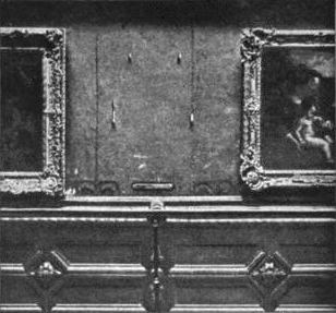
    Mona_lisa_stolen-1911

    [A photo of the place on the wall in the Louvre where the Mona Lisa lived until stolen in 1911.]

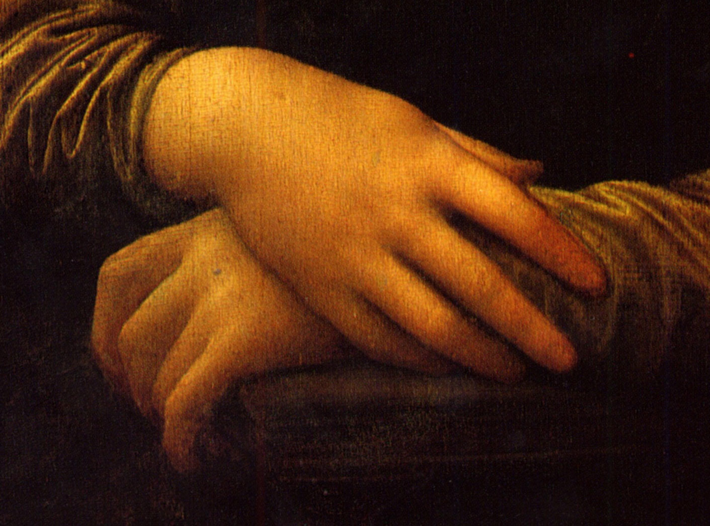
    I bumped into a Google search page that was filled with entries for designers and jewelers with business names invoking the Mona Lisa–Mona Lisa Jewelry and so on.  This coupling could well be found in the crushed metaphor jar in the back of the refrigerator.  One thing is for certain: no doubt the real Mona Lisa had plenty of money (probably the wife of a successful merchant named Francesco de Giocondo) and privilege to afford jewelry, but in the Leonardo’s painting she is pictured quite plainly, wearing none. Her hair is also very simply portrayed. This was a rare thing to do in portrait–as a real people who portraits were being made usually wore as much jewelry as they could or in some sensical variation of that. The hair too was a big deal–all you have to do is take a quick survey of hairstyles of Renaissance women in paintings and it will become instantly clear hairstyles were complex and involved. Mona Lisa’s dress, too, is very simple–plain even–and in understated, muted color. 

    Mona_Lisa yhands
    All of this was exceptionally unusual for the time.

    There’s not a speck of jewelry on the Mona Lisa, and her hair is simply parted, falling to her shoulders.  Maybe Leonardo didn’t want anything in the painting to fix it at any specific point in time, as the whole entity seems to be in a state of suspended completion, or complete but not quite there, still becoming something.  Perhaps highly defined hair and jewelry on her fingers would have been unacceptable anchors, giving places for the eyes to land and move away from the lush layers of light and tone that give the painting some of its enormous “motion”. 

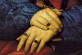
    It is hard to imagine the hands of Mona Lisa like those seen in the portrait by Raphael of  Maddalena Strozzi Doni. Painted at about the same time as the Mona Lisa, the 22-year-old master Raphael achieved a great image of course, but one very much in opposition to Leonardo’s. (The next year Raphael would paint St. Catherine, who would have no jewelry and simple hair, but of course she was also a saint–but he did give her some pretty fancy and involved clothing, in spite of the wheel she was leaning against. Depictions of saints and religious icons are different from secular portraits–but even here it is difficult to break away from imaging luxurious cloth and clothing.)

    Raphael msddalena hands[The hands of Raphael’s  Maddalena Strozzi Doni, 1506.]

    So in the history of missing things, or of missing jewelry and finery, the Mona Lisa must rank pretty high. It was just unusual to think of a business name invoking the antithesis of what the business is about. 

    The Mona Lisa of course became one of the most famous missing things in the history of missing things when she was stolen by the not-very-bright Vincenzo Peruggia in 1911, but that’s another story (and one which I talk a little about in the post The Most Famous Missing Doorknob in the History of Art).


  • What the Eye of God Sees: Gassendi’s Vision, 1658

    JF Ptak Science Books   Post 1938
    Follow Me on Pinterest


    Gasseni eye of god det_edited-1
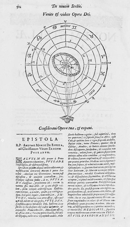
    Pierre Gassendi (1592-1655) published this God’s-eye-view of creation a few years after his death in the fourth volume (Astronomica) of his six-volume Opera Omina.  His friends and supporters of course saw to the publication of this mathematician/philosopher/logician’s work1 back there in 1658, so Gassendi–a very prominent thinker from a long-line of thinkers nearly on the verge of great discovery here and there and certainly a witness to it–made his greatest adventure in publishing only in death. 

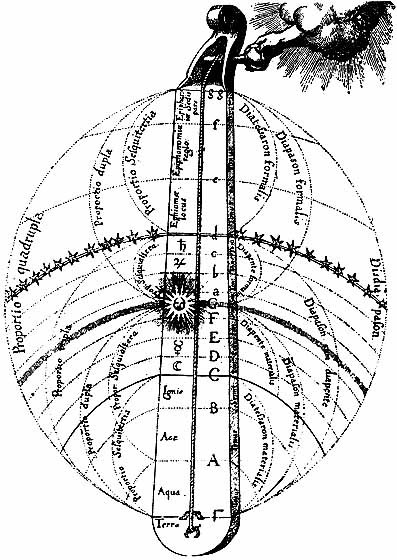
    Imaging a physical god is a tricky business in the history of the printed book. Bits of the creator of the universe turn up in book illustrations over hundreds of years, though I am not sure when the very first picture of a part of god appears.  The hand of the creator (generally seen as the Primum Mobile) is not terribly uncommon in images of a scientific nature in the 17th and 18th centuries, and is perhaps best exemplified by Robert Fludd’s famous Monochord:

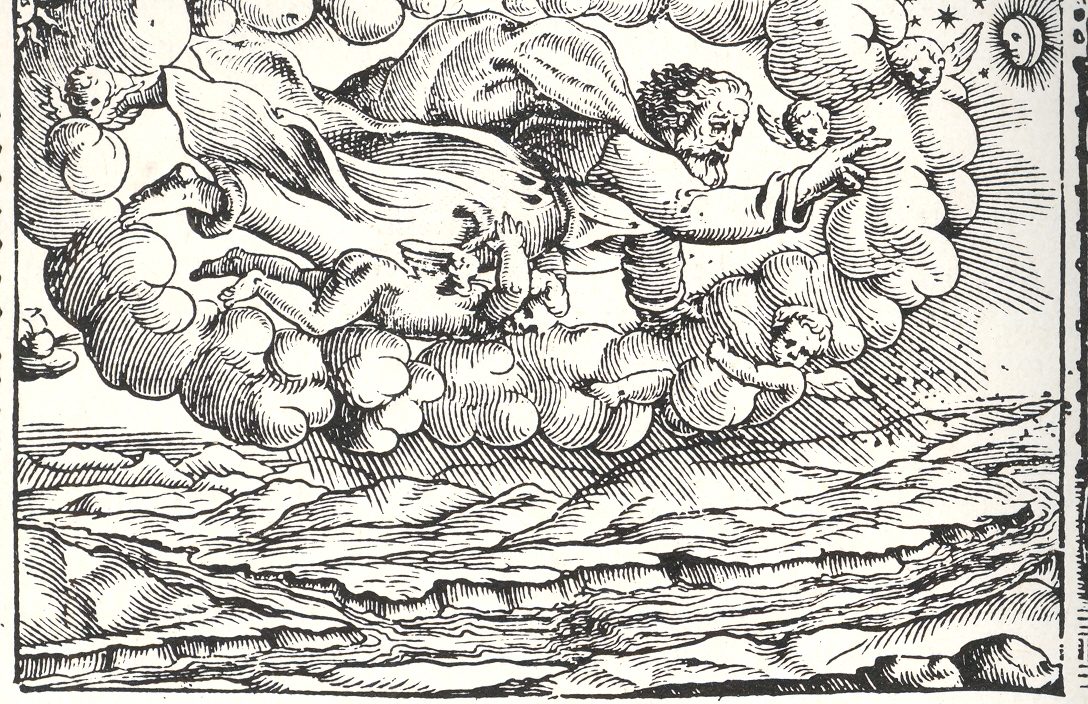
    Robert fludd celestialOf course there are many instance of the full-bodied god being seen through a break in the clouds, though in all the instances of this that I have seen the tantalizing peak into whatever region it is that this god exists is left entirely blank, a small white space. As so:

    God in the sky

    (Title page is for the narrative poem Le Metamorfosi, Ovid’s  Metamorphoses,
    translated into Italian by Gioseppe Horologgi, and published in Venice in 1563. See an earlier post on this blog, A History of Blank and Empty Things: God in a Hole in the Sky, here.)

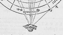
     The eye of god is also not very uncommon, and is represented by an eye and also in a sacred triangle.  Less common though are images like Gassendi’s, which in a way, in an odd and almost offhand way, give the reader a sense of what it is that god might be seeing in  agodly-lineof-sight  Perhaps this is incorrect–but in judging his image with others in my experience it seems to me that the representation is a little more “personalized” here than just about anywhere else.

    Gasseni eye of god

    Notes:


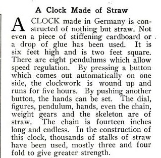
  • Daily Dose from Dr. Odd: Clock Made Entirely of Straw, 1916

    JF Ptak Science Books   Daily Dose of Dr. Odd 

    Follow Me on Pinterest 

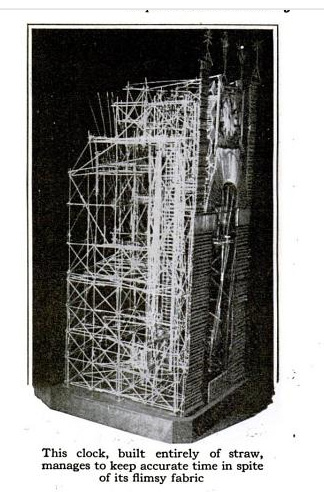
    Extraordinary! 

    Clock of straw[Source: Popular Science, 1916, here.]
    Clock straw text