A Daily History of Holes, Dots, Lines, Science, History, Math, Physics, Art, the Unintentional Absurd, Architecture, Maps, Data Visualization, Blank and Missing Things, and so on. |1.6 million words, 7500 images, 4.9 million hits| Press & appearances in The Times, Le Figaro, Mensa, The Economist, The Guardian, Discovery News, Slate, Le Monde, Sci American Blogs, Le Pont, and many othr places… 5000+ total posts since 2008.

Category: Perception

  • First Printed Views of America: Columbus in Print in 1493

    JF Ptak Science Books   Quick Post

     Christopher Columbus was born in 1451, and born sometime over a three-month period that no one seems to be able to button down.  He (known as Christophorus Columbus in Latin, and Cristoforo Colombo in Italian and Cristobal Colon in Spanish)  and in an audacious dash to shortcut European rivals in trade with the East became one of the first Europeans to explore the Americas.  In his first of four voyages to what would be called “the New World”, he landed in the Bahama archipelago, and in time explored the Greater and Lesser Antilles, Central America, and the Caribbean coast of Venezula, claiming all for the Spanish Kingdom. 

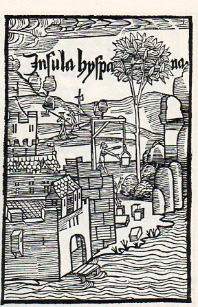
    The first images of his adventures appeared in Oceanica Classis, printed by Johann Bergmann de Olpe, in Basle, in 1493–the first, below, showing an imaginary view of the Island of Hispanola.  In the image of Insula Hyspania, below, we see Native peoples running from the approaching ship and long boat–they of course did not run far enough. (By the end of the 1620’s, something like 75% of the indigenous population in contact with Europeans (or in contact with people in contact with them) were dead, mostly from epidemics and diseases and lesser illness for which they had no immune systems.)

    Columbus933

    Four (of the other eight, two of which were repeated)  images from this fantastic work can be seen below:


  • Polling for Opinions on the Japanese, 1944

    JF Ptak Science Books   Post 1627

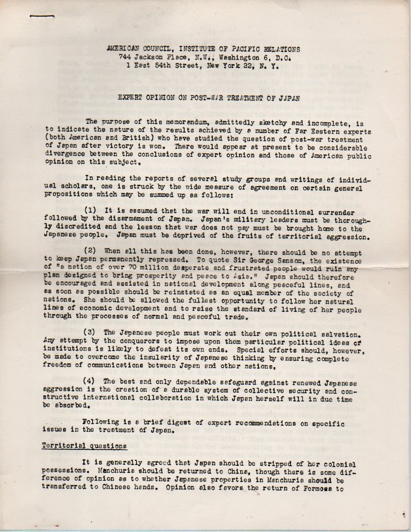
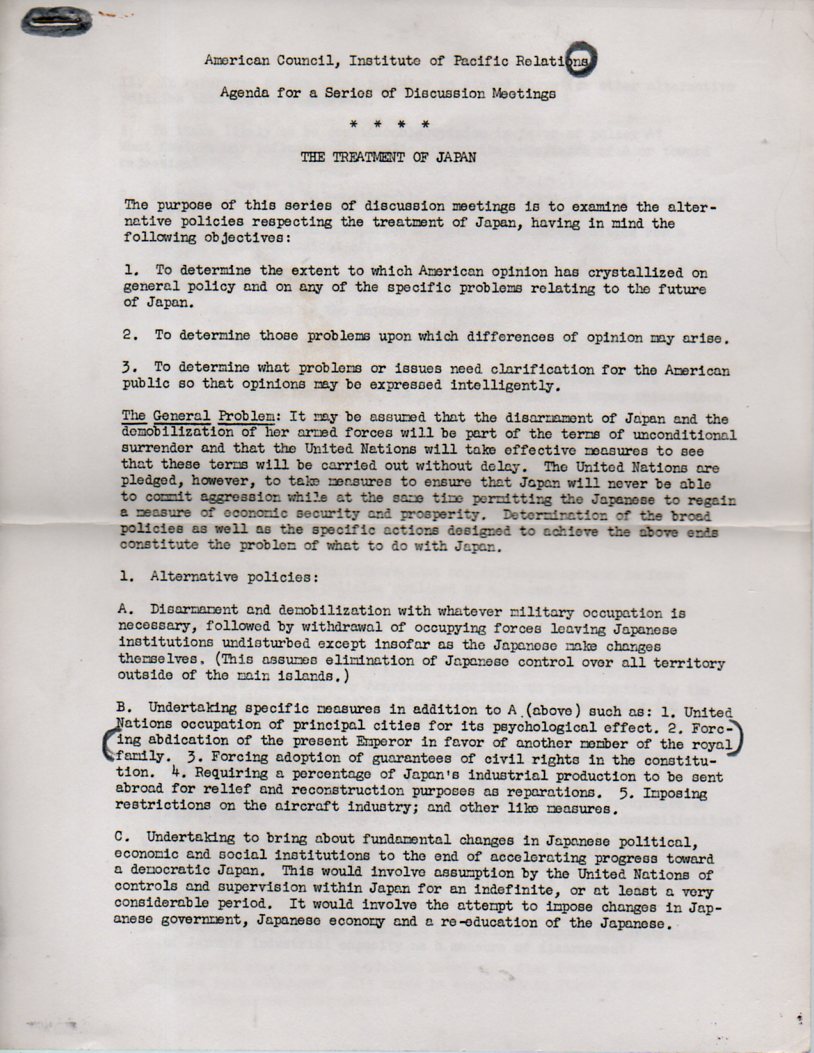
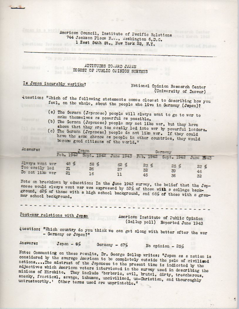
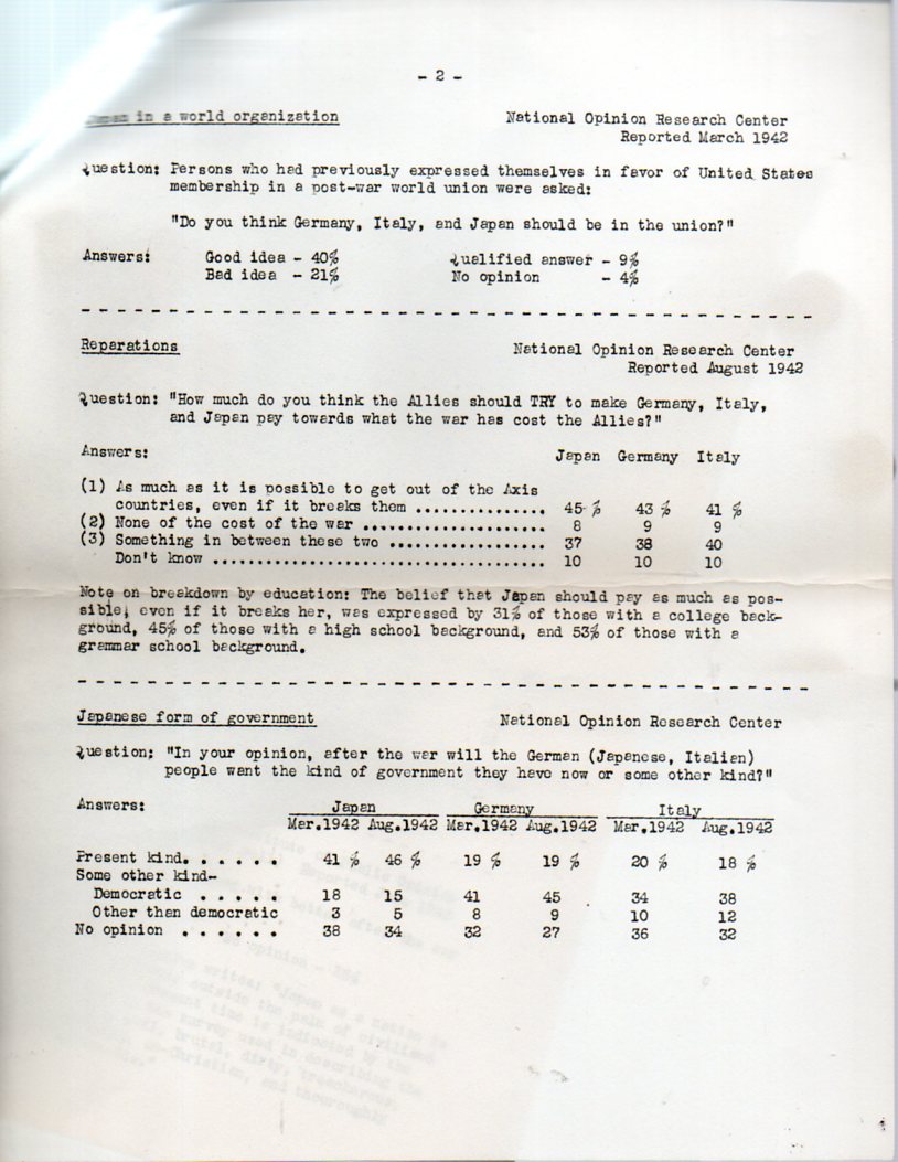
    I uncovered a few interesting documents this morning from The American Council, Institute of Pacific Relations (in 1944 at the address 744 Jackson Place, N.W., D.C.) relating to collecting opinions on Japan and the Japanese, right at the height of the war.   And this is what the American Council was doing–prep work to assess the extent of public opinion on the treatment of Japan post-war, which entailed reviewing existing polling data (from Gallup) was well as conducting their own original research. [These documents are available from our blog bookstore, here.]

    Japan Public Opinion treatment after891
    The “first” issue (so far as I can determine)  was perhaps the most aggressive:

    Is Japan incurably warlike?

    The question was asked of an undefined group over three periods of time  (February 1942 to June 1943) for both Japan and Germany, the statements the respondents having to choose from being: “always want war”, “too easily led” and “do not like war” at three different times, from February 1942 to June 1943.  From Feb ’42 to June ’43, people’s opinions that the Japanese “always want war” went up from 48% to 62%, while for the same time the same question regarding the Germans stayed about the same, 22%.  The Gallup Poll for June 1943 reported that for 75% of the respondents only 8% of the folks thought that “we can get along” with the Japanese, while 67% favored our chances with the Germans. 

    Get along with them or not, or feeling that they are war-like or not, had little to do with the opinions of people (reported by the National Opinion research Center, August 1942) who thought that reparations should be paid, and paid hard, by the Axis powers across the board, “as much as it is possible to get out of the Axis countries, even if it breaks them”.

    Japan Public Opinion treatment after892

    The following two papers came a little later, closer to the realization that victory was coming, that the war would be over, that victory would be taken–probably at the end of 1944 or the beginning of 1945, when position statements were more circumspect than the earlier public opinions.  “Expert Opinion on Post-War Treatment of Japan”  was more understanding when speaking to the post-war existence of Japan, stating in a number of different ways that “there should be no attempt to keep Japan permanently repressed” and “the Japanese people must work out their own political salvation”.  Also that there would be no “continuing burden of reparations payments…as done with Germany after the last war”. 

    Japan Public Opinion889
    The overall feeling of this and the following document (“The Treatment of Japan”) can be found in the section “Teaching Japan a Lesson”:  “United Nations effort should be directed toward demonstrating to the people of Japan the advantages of making peace rather than the penalties of losing a war”.  The issue regarding the Emperor and whether or not he should or could stay–an issue that would stay with high command right through the second week of August 1945. 

    Japan Public Opinion890

    ·Posted by :

    ·in:

    — —

  • Deceptive Perception: Giant Super Women of Pulpdom and High Art

    JF Ptak Science Books   Post 1617

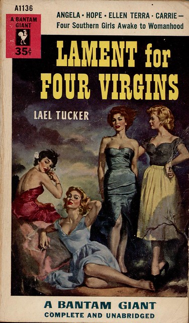
    Sometimes things are just not what they seem to be.  Sometimes they are deceptive and uncommon and somewhat hidden–and sometimes deceptive even to themselves. Sometimes the deception is intentional, and sometimes it is just a mistake, but a deceptive one. In the following cases, the deceptive elements are relating to size–kike the example below, in the cover illustration for the campy (“Southern” with names like those?) troubles of mid-1950’s “girls awakening into womanhood”:

    photo
    If you take a closer look at the reclining figure just abpve the word “giant”, you can see that she is one, unintentionally.  She’s just badly drawn, or something, a victim of foreshortening–we can see that her leg from her knee to her foot is as long as an entire keg of her companions, making this person about eight feet tall.
    On the heels of the eight-foot-tall woman comes one who is far more famous, ultra-famous, really.
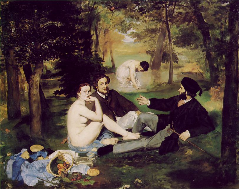
    Le Dejeuner was a scandal when it was exhibited in 1863—Manet painted what he wanted to, unbound by perspective, by color, by composition, and on and on. The folks in the painting were not connected to anything, really, and were unconnected to each other, no one paying any of the others any mind, even when the women were naked.  Nothing seems to be going on—the people are just simply there. 
    Blog--march 7--manet bathers
    This is in itself was a disconnect from previous practices, the vision in painting was about something, and was directed.  Light seems to be coming from a number of different places, and the shadows from the trees reflect this, simultaneously stretched towards and away from the light sources.  The bathing woman in the background, or what used to be background, had she been drawn using proper perspective, would’ve been about nine feet tall.  But what happens here is that there is no foreground or background in this painting, just middle.  It was this collection of abandonments, starting here in the Le Dejeuner in 1863, that ushered in the modern in art. 
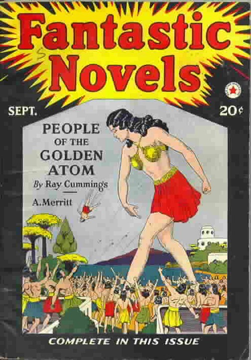
    Then there’s the fifty-foot-tall woman who really isn’t that tall in relation to the people around here. 
    There are times when even things that are made to look extraordinary and plainly, outrageously identifiable as what they are, simply aren’t–and sometimes they’re not even close.  For example, this cover of Fantastic Novels (1921?) seems to tell a straightforward story, but as it turns out the giant is giant but one living within a world in an atom of a gold wedding ring.  (I told a fuller version of the story of thiis here.)  So this giant is a giant but only so in her own world. 
    Man throwing

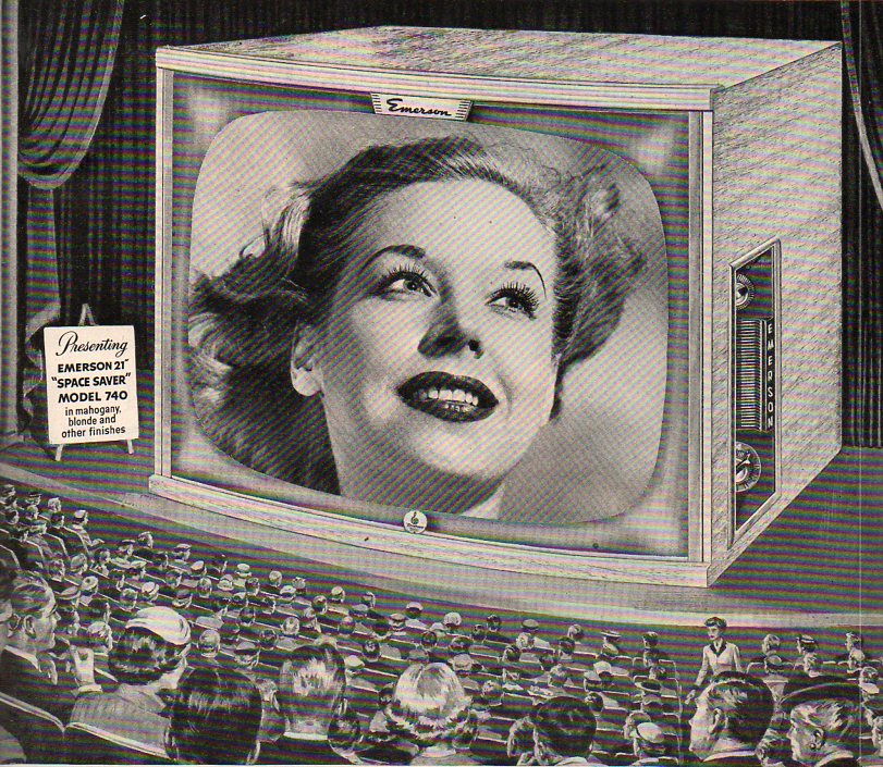
    Rabelais’ Gargantua and Pantagruel, Hobbes’ Leviathan, the Buddha at Yungang (Shanxi) and Melville’s whale were all pushed to their competitive monsterous edges in the 1950’s, when you were more likely to think of The Bomb and creeping Communism before thinking back to any of these great representations.  And it is also my general impression, having been paging through Life magazine for the 1950’s, that there are some other major, lesser heralds of gigantism, especially if you paid attention only to the advertisements. There were 1950’s colossal characters who were pale imitators of their earlier counterparts–the Amazing Colossal Man and Colossal Woman being two minor mirrors of older ideas–but they hardly contained the colossal ideas that were resident in the earlier creations. (Perhaps part of that is due to having just witnessed the demise of two enoromities in Hitler  Stalin.) But this woman seems to be the largest of the lot–I make her to be about 100 feet tall.  There’s really nothing deceptive about her, except of course that this giant is only a head. 

    Monumental television theatre446


  • Looking at Things Straight Down: Streets and Sunspots, 1868

    JF Ptak Science Books   Post 1608

    “Vision:  a device that belongs to those who have it. Far-reaching and fore-shortened, it is something that works best when used closely, loosely, finely and not at all. A gift-and-a-half and a half-a-bother.”  
    The imagined Devil’s Dictionary of Not Ambrose Bierce

    Straight down861

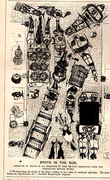
    In the many years that I have been looking at antiquarian prints, I must say that in the hundreds of thousands of them that it is very rare to see an image that looks straight down from a height upon its subject.  And that is exactly what struck me about this print in the 22 August 1868 issue of Punch, or the London Charivari magazine.  Straight down ti is that we’re looking, straight onto a busy city street, presented here as though it were the face of the sun, the hansom cabs and people in the thoroughfare being sunspots.

    [I’ve written earlier here on this and related topics, including:  Rare Antique Visions of Looking Straight Down at Things; Looking Straight Up, Down, Across and Through; Points of View, Outside-Looking-In and Inside-Looking-Out; and Looking Straight DOwn at Things as Found-Dadaist Objects.]

    The sunspot were in the mind of Mr. Punch the very life of the sun, and so too for the bits of humanity filling the streets.

    At first I wasn’t sure that “sunspots” were chosen for this cartoon for any particular part of their history in 1868–that is, if 1868 wasn’t a particularly big year for sunspots.  In general they were certainly known by this point for more than a thousand years, though the greatest recent attention with optical instruments occurred with Thomas Harriot, Johannes & David Fabricus and Christoph Scheiner all around 1610-1612, and then most famously with  Galileo who recorded them in 1612 in his Istoria e Dimostrazioni Intorno Alle Macchie Solari e Loro Accidenti Rome (or History and Demonstrations Concerning Sunspots and their Properties, published 1613).  And closer to this time (among other things) Heinrich Scwabe had published (in 1843) a major advance on the cycle of sunspots.  But as it turns out, though, the word “sunspot” had just entered the language in 1868, according to the Oxford English Dictionary, coming via Sir Norman Lockyer’s Elementary Astronomy (1868), arriving as “sun-spot”.  High delightful!  Punch was really quite on its toes on this one, employing a brand new word for a well-established astronomical phenomena to a rare view of looking straight down at a bustling street, cycles and all.  (Another sort of cycle would soon come to be applied in the next few years in the pages of Nature to sunspots from the brilliant logician (and other things) William Stanley Jevons–this bit of thinking done in trying to correlate sunspots and economic depressions.  This one wouldn’t hold, though it was a very interesting idea.)


  • The Great Farm Security Administration (FSA) Photography Series, in Color: Japanese Internment Camps

    JF Ptak Science Books   Quick Post

    The following images were made by Farm Security Administration/Office of War Information photographers during World War II and are part of the famous FSA photography series that I  have written about here.  The color photographs–which were made in the first decade or so of the use of this new medium–represented only about 1,600 of the collection of 160,000 images in the FSA archive, and are far less known than their black-and-white complements, many of which are new iconic symbols for this period.  The color images are beautiful works, and somehow seem to bring these historic images a little closer to the present.

    This series are some of the few color images made of daily life in the Japanese Relocation Camp at Tule Lake in 1942/3.  The internment (“relocation”) of American citizens of Japanese heritage in “reservations” is a result of Executive Order 9066, signed into power by Franklin Roosevelt on 19 February 1942.  I’ve written about this episode in several places on this blog, including here. 

    Japanese-American camp, war emergency evacuation,[Tule Lake Relocation Center, Newell, Calif.] 1942 or 1943.

    http://memory.loc.gov/service/pnp/fsac/1a35000/1a35000/1a35014v.jpg

    ·Posted by :

    ·in:

    — —

  • Signs of Discrimination: Photographs from the Library of Congress FSA Collections

    JF Ptak Science Books  Quick Post

    Negro drinking at "Colored" water cooler in streetcar terminal, Oklahoma City, Oklahoma

    All of the photographic material below comes from the U.S. Library of Congress website for its prints and photographs division, and is a very small sample of what is offered from its online holdings of Farm Security Administration/Office of War Information (FSA and OWI) photographs. It is not ancient history–most of the images are 75 years old or so, a part of our near-past which still shadows our near-future.

    “Photographers working for the Farm Security Administration Historical Section (later transferred to the Office of War Information) were encouraged to document continuity and change in many aspects of life in America during the years the unit was in operation. They were particularly encouraged to photograph billboards and signs as one indicator of such developments. Although no documentation has been found to indicate that photographers were explicitly encouraged to photograph racial discrimination signs, the collection includes a significant number of this type of image, which is rarely found in other Prints and Photographs Division collections.”

    Beale Street, Memphis, Tennessee

    On of the great innovations in a sea of great things accomplished during the Franklin Roosevelt administrations was the formation of the FSA, a division of the government established to help farmers through the devastating Dust Bowl and Great Depression.  A subset of the FSA was a photographic unit which was set up to document the progress made by the FSA (and provide, I am sure, for some much-needed good news, a hearts-and-minds campaign).  This division was headed by Roy Emerson Stryker, who wound up hiring a collection of dream-team photographers unlike any ever assembled for a single purpose.  Esther Bubley, Marjory Collins, Mary Post Wolcott, Arthur Rothstein, Walker Evans, Russell Lee, Jack Delano, Gordon Parks, Charlotte Brooks, John Vachon, Carl Mydans, Dorothea Lange and Ben Shahn were sent out all across the country and wound up with the greatest and most beautiful photographic history ever assembled.  There were about 77,000 images made, and I recall reading (somewhere) that the total budget for the Stryker group for the years 1936-19421 was about $100,000, meaning that each completed image cost just over a dollar apiece.

    Rex Theatre for colored people. Leland, Mississippi Delta

    1) Bethlehem-Fairield shipyards, Baltimore, Maryland.
    May 1943.
    Arthur Siegel, photographer.
    “A drinking fountain.” [Sign: “White.”]
    Location: D-90666
    Reproduction Number: LC-USW3-26442-E
    [view catalog record]


    A drinking fountain labeled with a sign 'White.'
    1
    2) Memphis, Tennessee. October 1939.
    Marion Post Wolcott, photographer.
    “Secondhand clothing stores and pawn shop on Beale Street.”
    [Sign: “Hotel Clark, The Best Service for Colored Only.”]
    Location: E-2185
    Reproduction Number: LC-USF33-30637-M3
    [view catalog record]
    Secondhand clothing stores and pawn shop on Beale Street labeled with a sign: 'Hotel Clark, The Best Service for Colored Only.'
    2

    3) Durham, North Carolina. May 1940.
    Jack Delano, photographer.
    “A street scene near the bus station.”
    Location: E-255
    Reproduction Number: LC-USF33-20522-M5
    [view catalog record]

    A street scene near the bus station.
    3
    4) Durham, North Carolina. May 1940.
    Jack Delano, photographer.
    “At the bus station.”
    Location: E-5153
    Reproduction Number: LC-USF33-20522-M2
    [view catalog record]


    At the bus station.
    4


    ·Posted by :

    ·in:

    — — —

  • Two Gloriously Famous Bugs

    JF Ptak Science Books   Post 1605

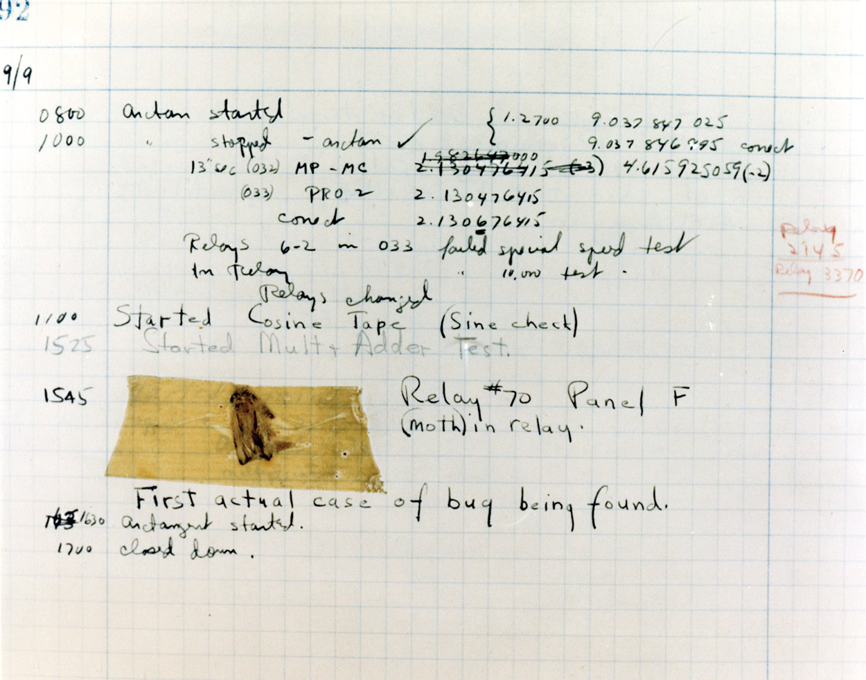
    September 9, 1947, is a big day in the page of The Big Book of Famous Bugs. This one found by Admiral Grace Murray Hopper in relay #70 of panel F of Harvard’s MARK II computer.  It was a 5 cm moth, actually, that was gumming up the works.  Hopper–an integral part of several teams  working on programming the earliest computers–witnessed the event, recorded the finding of the insect, and coined the word “debugging”.  She was an important figure in the history of computation, though Dr. Hopper is remembered by the general audience more for the bug than anything else.

    Grace Hopper Bug

     [Image source: https://yalealumnimagazine.com/articles/2633/you-can-quote-them]

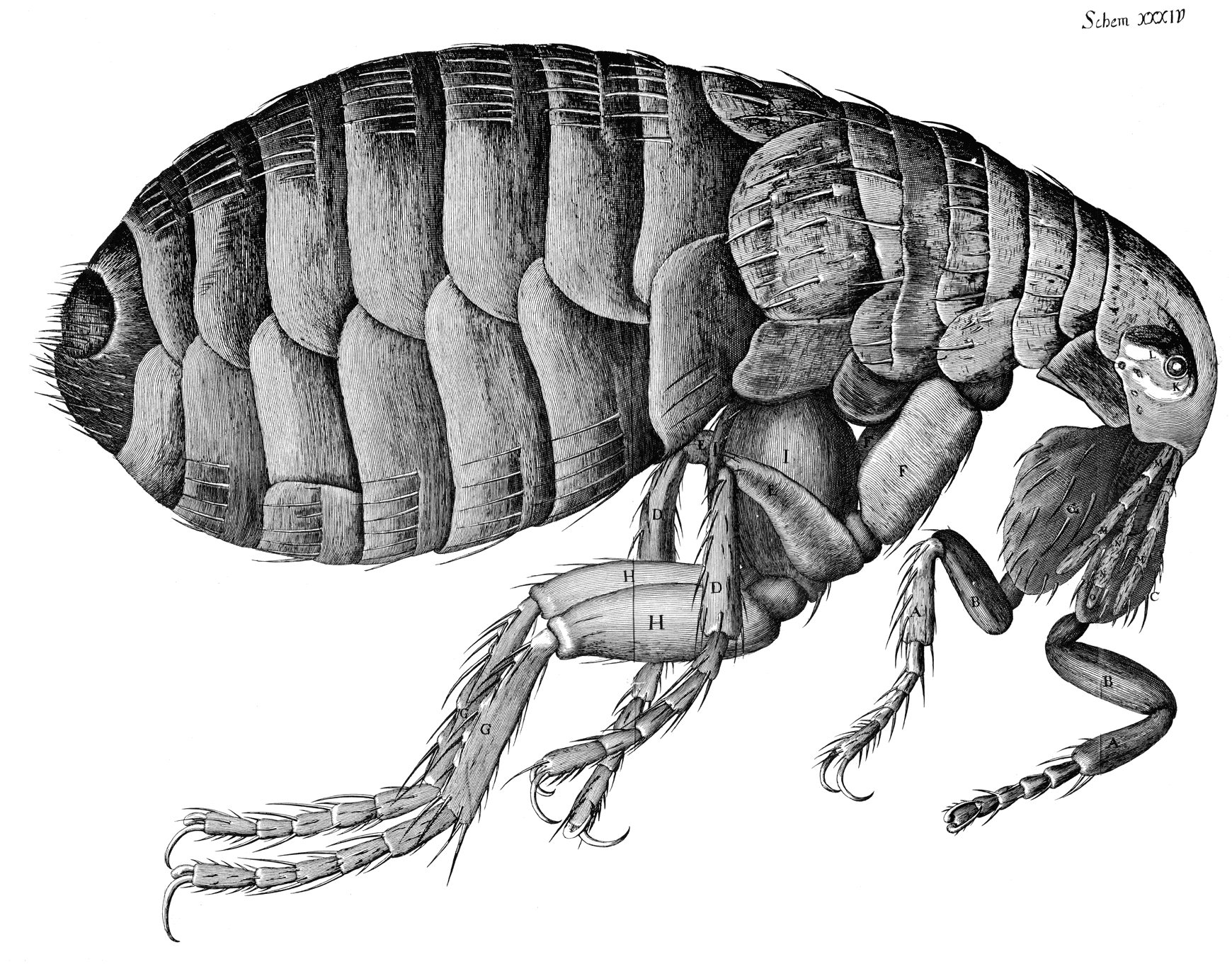
    The other famous bug, perhaps the most famous in the history of science, belonged to Robert Hooke.

    Hooke--flea

    I’ve written elsewhere in this blog about Robert Hooke, and how, if there had somehow and impossibly been no Newton, he might’ve taken Sir Isaac’s place in the popular mind.  He was a tireless, relentless observer and experimenter, who lost little effort in a stranded idea and pursued interesting and problematic questions relentlessly.  More than others too he chased his won glory—minor but long and insistent—the years of which wore thin on many people in the scientific community.  But there were many characteristics of the man that made him not quite so lovable and endearing—not that Newton was any of those things, as he was not, but if you are going to be a secondary luminary to a super nova you’ve got to have something else going for you that the other man doesn’t have—sharing, helpful, greatly generous—to get you into the long pre-dusty pages of history. Also it would’ve helped if Hooke chose his battles with a little more aplomb and ingenuity—the war which began in 1672 with Newton went very badly for Hooke and followed him to the grave (and far beyond). 

    What I’d like to talk about right now, though, of the many things to talk about concerning Robert Hooke, is the most iconographic image he ever produced, and perhaps one of the most famous scientific images of the 17th century—the flea. 

    The 28-year old Hooke published the results in a gorgeous and revolutionary book, Micrographia (a lovely e-text edition appears at Gutenberg, here) in 1665, which became an instant best seller and highly praised and valued. (Samuel Pepys, perhaps among the shiniest stars whose imprimatur was like a royal blessing, said the book (was) “the most ingenious book that I ever read in my life.”) There is no telling what the people of the mid-17th century thought of seeing such incredible discoveries in the little semi-invisible stuff that made up their normal, daily lives.  The only thing that somewhat equates to this would be if the first images of the Hubble were those of Earth-bound objects whose detail had previously been unknown.  Hooke’s observations and drawings of things like the common flea were just an astonishment—that such a creature of “low order” could have such intricate detail and design was a complete revelation.  The drawings of the fly’s eye, too, was an inescapable wonder, an incredible object to consider as having any detail pre-microscope, and then revealed to have unimaginable design and elegance.

    And so the famous second bug.

    …”it is my hope, as well as belief, that these my Labours will be no more comparable to the Productions of many other Natural Philosophers, who are now every where busie about greater things; then my little Objects are to be compar’d to the greater and more beautiful Works of Nature, A Flea, a Mite, a Gnat, to an Horse, an Elephant, or a Lyon.”—Robert Hooke at the end of his 28-page preface to Micrographia (1665)


  • Man is But a Worm–Darwin and Redon, 1881-1883

    JF Ptak Science Books   Post 1589

    http://cdn2-b.examiner.com/sites/default/files/styles/image_full_width/hash/b2/77/b277d4d3e88c41151d8a3c709696c8c8.jpg

    In the last tow years of his life Charles Darwin enjoyed some critical and popular success  with the publication of his The formation of vegetable mold, through the action of worms,  which was published by the steadfast John Murray in London in October of 1881.  It sold at a better clip even than On the Origin of Species, which had sold very well 22 years earlier.  By the time the cartoon (above) appeared in print by the relatively mid-brow Punch magazine (by Linley Sambourne, 6 December 1881) Darwin’s book sold about 7,000 copies, which for the time would make it a pretty good seller.

    Darwin only had a few months left to live at the time of the Punch publication (12 February 1809 – 19 April 1882), and I’m not too sure about what the old man would’ve felt in seeing it.  Actually, the Old Man wasn’t all that old, but at 73 and with a belly full of worms or whatever and a lifelong list of complaints real and imagined, Darwin was older than jis years.  After everything had been said and doen, and the tons of complaints heaped upon him from all quarters, I suspect that the cartoon would mean nothing to him.

    {Just for the record, we follow the evolution of worm-to-man in a trip one and a quarter times around the clock, starting with a big old (flat?)worm at bottom left, which develops counter-clockwised into a chimp-worm, then into a monkey-thing, then into a sort of comic-relief Darwin-ape-man, winding its course into Charles Darwin himself.  Not flattering to the man or the idea.]

    It would on the other hand be a curious thing to imagine Darwin meeting for a chat with the expansive evocateur Odilon Redon, who created some of the earliest (non-confrontational editorial) art based on Darwin’s Origin.  Redon (April 20, 1840 – July 6, 1916) published eight lithographs based on Darwin’s work in  Les Origine (Paris,  Lemercier and Cie), and they were unlike anything that I’ve ever seen regarding evolution–as a matter of fact (perhaps), Redon’s artwork in general was unlike most anything else that existed.  (Redon acknowledged this, of course, saying  “My drawings inspire, and are not to be defined. They place us, as does music, in the ambiguous realm of the undetermined.”)

    http://www.19thcenturypost.com/The%20Misshapen%20Polyp%20Floated%20on%20the%20Shores,%20a%20Sort%20of%20Smiling%20and%20Hideous%20Cyclops,%20Plate%203%20from%20Les%20Origines,%201883,%20by%20Odilon%20Redon,%20Museum%20of%20Fine%20Arts,%20Boston.jpg

     “The Misshapen Polp Floated on the Shores, a Sort of Smiling and Hideous Cyclops”, plate 3, 1883.

    But I don’t see that much being said between the two men, across a small table having tea–though I don’t have any hesitation saying that Redon would’ve had a lot of questions for Darwin.  My feeling is that Darwin wouldn’t have that many coming back. 


  • When 2-D LOVE is 3-D LUST: Picturing another Spatial Dimension is Easier if you are Homer Simpson

    JF Ptak Science Books   Post 15023-d521
    A note dragging together–against their will–the movie Hypercube, Homer Simpson, Marcel Duchamp, Jimmy  Neutron, Emile Jouffret, Filippo Marinetti, Paolo Uccello and Edwin Abbott.  Warning: this might not work.

    We saw a movie the other night, Cube 2, Hypercube, which I think is meant to be Cube2, but I honestly think that the title didn’t appear that way because not that many people (?!) would know how to “pronounce” the little superscript floaty “2”.  The movie was pretty interesting, telling the story of a group of people “imprisoned” in a large, sterile cube with a door on each face that opened into an identical cube, and on and on into a Borgesian infinity-hell.  At one point the people are theorizing on the nature of the Cube, winding up with someone saying that they might all be in a fourth spatial dimension. 
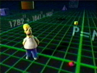
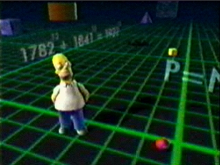
    3dHomer It brings up a pretty well-worn thought about visualizing a different dimension, and then it occurred to me that the only general-population folks who seemed to be most at ease with this idea were cartoon characters: and since I am a father of children, a Father of Children, I am very well familiar with recent cartoon history.  Homer Simpson, for example, slips from his two-dimensional world into what was supposed to a three dimensional world, and he seems perfectly comfortable.  (The equation in the background, 1782^12 + 1841^12 = 1922 ^12 is correct for the first nine digits, but not for the last thirty.  Plus, since the product of odds is odd, and the product of evens are even, the sum of even and odds is odd, so the answer must be wrong. But close.  And really, really good for little Homer.) Timmy Turner (Fairly Oddparents) and Jimmy Neutron (of the show bearing his name) switch worlds,one going 2-to-3 D and the other the other way ’round, with both being perfectly comfortable in their new space.
    3-d Of course the issue of imagining a three-dimensional shape in a two-dimensional world is pretty knotty if you are not having a cartoonist draw out your brain’s interpretations of the world.  The great classic of this is Edwin Abbott’s Flatland, an 1884 book about a two dimensional world of shapes that encounters a dot that grew concentrically and outwardly, a dot expanding and then contracting itself in a series of circles, morphing until it appeared as a new and revolutionary form rising from the plane of Flatland, evolving into a new thing, a Sphere.  The folks in Flatland had a hard time with it.
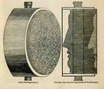
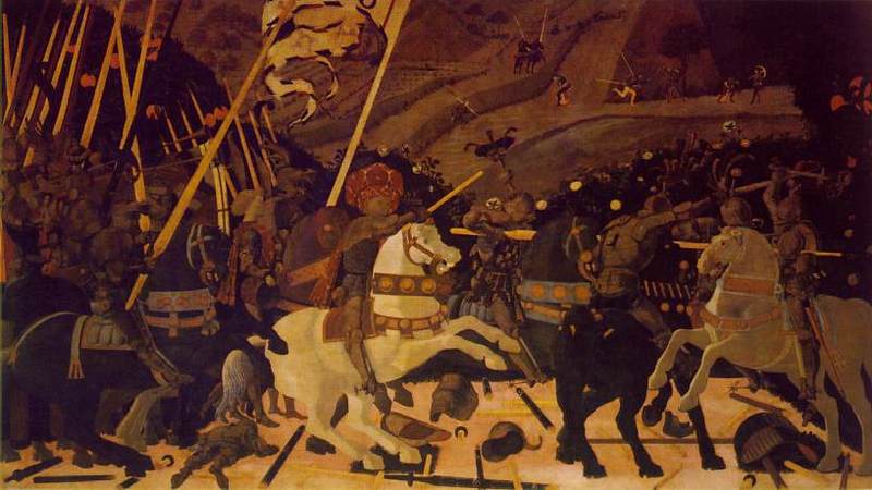
    Blogphysiog320Depicting a third dimension in a two-dimensional space is tough, the whole deal being rediscovered in perspective only relatively recently in the history of human thought, being only about 600+ years old. (In quasi order perspective is brought to the West by Cimabue, the Isaac Master, Giotto, Duccio, Maso, Avanzo, Lorenzetti, Donatello, Ghiberti, Fra Angelico, and so on, not the least of whom would include our beautiful Paolo Uccello.)  Giving real “flavor” to the extra dimension was still quite difficult, even in the 19th century.  In the “Spirit of Discovery” section of the British weekly magazine The Mirrour of Literature, Amusement, and Instruction for 22 October 1836 there is a short notice on the “physiognotype”, “a machine for taking casts, lately invented by a gentleman in Paris”.  We’re accustomed to these devices now as they’ve been for sale in toy shops for decades—but in 1836 it was a real breakthrough for making instantaneous three-dimensional models of small things.  In 1836 there really wasn’t any simple way of producing a direct, proportional model like this in 3-D except for encasing it in plaster and then casting from that mold.  Two-dimensional modeling was easier, and there were numerous devices constructed for this purpose as people pursued the still-hot rage of physiognomic forecasting, with simpler means (like shadow portraits) being hundreds of years earlier.  (Photography remember is still three years away from being announced and another few years from being sort o3-d519f accessible to middle-class folks.)
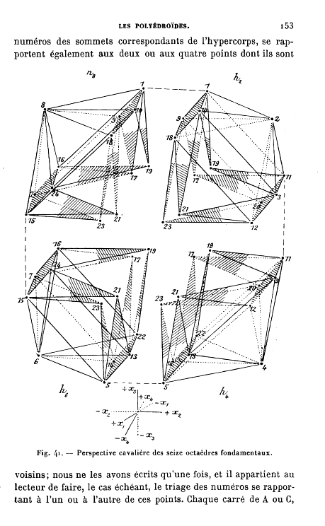
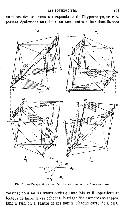
    Imaging the fourth dimension was more a product of mathematics than of art, with people like Emile Jouffret1 getting to it a little before Marinetti and Duchamp and the squirrely Picasso did. (Thinking on the fourth dimension goes back as far as Kant, at least, and the real work begins in the first half of the 19th century2.)

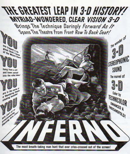
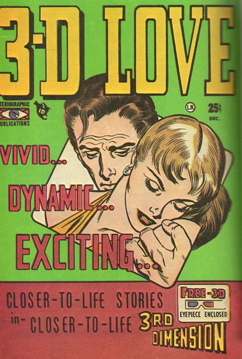
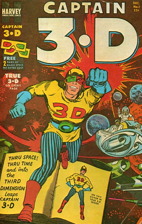
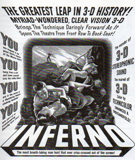
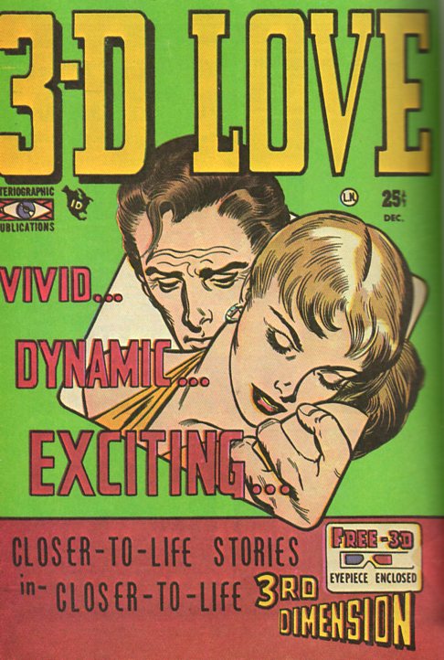
      But it seems as though the cartoon (like Homer, above) and comic book characters have a much easier time with this added-dimension issue, using it to full advantage without muss or fuss, and certainly without any philosophical commentary.  Their reach across the aisles of the 1952 Rexalls and other general merchandise emporia  with enough floor space for a revolving magazine 3-d520 stand was straight into the heart of the common reader, filling them with the hope/fear of their two-dimensional explorations into what they called their 3-D  3D  3.D  Three Dee world, selling “closer-to-life stories in closer-to-life 3rd Dimension”. 
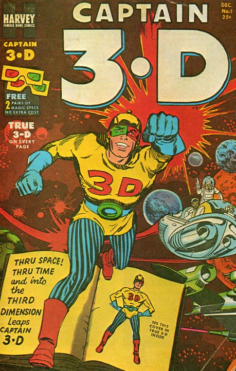
    It seems that the same might be true for 3-D movies as well, the characters busting out into a new dimension (sometime fully aware of it) without a care or riddle, the main effect of finding the new spatial dimension sitting squarely in the minds of the observers, who are already in that dimension and reacting to somethingf with a surprising surprise of seeing a familiar thing in its proper context.

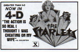
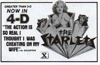
    I’d love to know what that fourth spatial dimension looks like, as promised by The Starlets…or maybe not.
    3-d524

    Notes:

    1. Jouffret, E.  Traite Elementaire de Geometrie a Quartre Dimensions et Introduction a la Geometrie a n-Dimensions. Paris:  Gauthier-Villars,  1903.  1st edition. ! 215pp. and   Jouffret. Melanges de Geometrie a Quatre Dimensions.   220pp. Paris:  Gauthier-Villars,  1906.  1st edition. (Perhaps one of the most classic works of the late 19th and early 20th c on imaging the fourth dimension–certainly well known to the Cubists and Futurists, I’m certain that it sparked any number of ideas in the art world.)

    2. The first major work arrives with Hermann Grassmann’s “Die Lineale Ausdehnungdlehre” (Theory of Linear Extensions) in 1844 (and the subsequent translations of the work as well as original work by Arthur Cayley); followed by Ludwig Shclafli (1814-1895) “Theorie der vier flachen….” (Theory of Continuous Manifolds, 1852 but not published until 1906), Riemann’s 1854 speech (which was not published until 1867 and which appeared translated by William Kingdom Clifford in Nature in 1873, G.F. Rodwells “On Space of Four Dimensions” (Nature, May 1873),  Dodgson/Carroll‘s  Through the Looking Glass (1872) deep references, Zollner “On Space of Four Dimensions”

  • The Heaven of Disappeared Details

    JF Ptak Science Books   Post 1528   Part of this blog’s Blank, Empty & Missing Things series.

    What is the opposite of “the Devil is in the details”, without getting too terribly religious? Expressing detail in the history of art has been a progressive process, and perhaps in some sense that is what art was all about–adding detail, becoming more representational, more life-like, more expressive of the world and nature.   Perhaps that is what one essential element of art was all about for hundreds, or thousands, of years–a progression that marched its way through time with greater effectiveness and representation, for the most part, until relatively recently, when–in the early part of the 20th century–details began to disappear, until in some cases there were no details at all.  Or at least the details that people had been comfortable with for so long, like folds in dresses, or lustre in eyes, or thinness in clouds, or even the correct perspective in the re-invention of three-dimensional representation. 

    http://www.moma.org/collection_images/resized/042/w155h170crop/CRI_211042.jpg

    Detail changed with the  Romantics, and then definitely with the Impressionists, and then on into the the Cubists and the Abstract,  until the detail of what we would recognize as elemental objects would disappear altogether.  Corot, Cezanne, Gauguin, Whistler,  Seurat, Van Gogh, Picasso, Braque, Duchamp.  And then everything goes away with Kandinsky.  1911.  Details of references to the physical world slipping away into general sense impressions.

    It would probably make more sense to look at the Kandinsky at this point–I’d rather look at the Pierre Bonnard (1867-1947) and his La petite blanchisseuse (Roger-Marx 42, also known as the Small Washerwoman).  The wide expanse of her black working gown is a primary link to solid blankness, without detail of nearly any sort, missing parts of reality, allowed to go to Disappeared Detail Heaven.

    Photo

    The occupants of the Heaven was begun centuries ago, though the details banned there on purpose really only begins in earnest with the missing details of the solids in (Paolo)1 Uccello.  This great master (dissed terribly by Bernard Berenson I don’t know why) was one of the very few exceptions of artists who purposefully banned details from his work, just as the reality of the world crept deeper into the works of the late Siennese masters pointing out the details of their rediscovery of perspective. 

    There would be a long period in between Uccello and the other detail disappearers. 

    _____________

    1.  The phrase “the solids in Uccello” comes of course from the Great American Novel, William Gaddis’ The Recognitions, discovered and shared to my by the lovely Patti Digh. In some of his enomrous cnvases it is quite easy to find wide expaneses of nthing where detail should be…