A Daily History of Holes, Dots, Lines, Science, History, Math, Physics, Art, the Unintentional Absurd, Architecture, Maps, Data Visualization, Blank and Missing Things, and so on. |1.6 million words, 7500 images, 4.9 million hits| Press & appearances in The Times, Le Figaro, Mensa, The Economist, The Guardian, Discovery News, Slate, Le Monde, Sci American Blogs, Le Pont, and many other places… 5000+ total posts since 2008.

Category: Information, Quantitative Display of

  • A Strong U.S. Flag, 1903, and an Alphabet of Advertised Needs

    JF Ptak Science Books    Post 2444

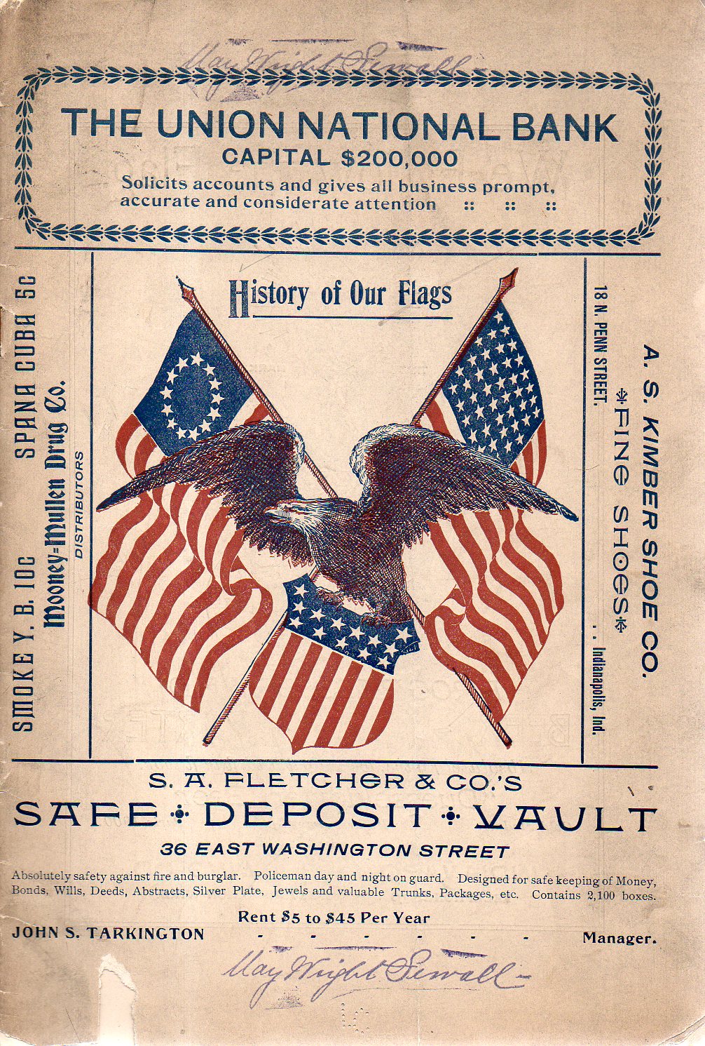
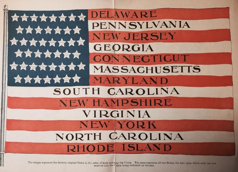
    Aside from everything else in this pamphlet, there is a lovely double-page illustration of a United States flag that is very striking:

    Flag history

    The other nice part is that the pamphlet–part of my haul of the “Pamphlet Collection”of the Library of Congress some years back–is that it was once the property of May Wright Sewall (1844-1920), who was one of the major leaders in the history of women’s rights in the USA, her influence and leadership spread over several decades. (She was on the executive committee of the  National Woman Suffrage Association from 1882 to 1890; was president of the National Council of Women for the United States from 1897 to 1899, and president of the International Council of Women from 1899 to 1904, among much else.) The pamphlet also has a stamp showing that it was donated from the Sewall estate by her literary executor in 1923.

    • This item is offered for sale via our blog bookstore, here.

    Flag Sewall919

    The other bit that strikes me are the ads which are everywhere on the pamphlet–from crowding out the title on the front cover to loading up the interior pages; the work does have some nice illustrated history of the flag which is engulfed by ads. It is interesting to look at the ads to get a bit of an idea of the geography of need-and-satisfying it:   

    A Near Alphabet of (100+) Advertisers  in the 28pp document include:

    • Bailing Machines
    • Beer Dusseldorfer Beer–we follow the flag! (“Telephones 576”)
    • Beer (“American Brewing Company” Telephones 407″)
    • Boarding, Feed and Sale Barn 
    • Books (“Blank books and stationery”)
    • Canned Fruits from Ko=We=Ba
    • Carriages (“The Co-operative Carriage Co.”)
    • Clay working machinery (from C.A. Potts)
    • Coal, Coke and Wood
    • Dental College of Indiana
    • Electrical Supply 
    • Flour, Grain and Hay from the Wm Rouse & Son central elevator
    • Groceries (“Groceries, Meats and Canned Goods, always fresh”)
    • Iron work 
    • Jewelry
    • Lumber & Shingles
    • Millinery
    • Oil and Supply for the mill
    • Pharmacy 
    • Pianos
    • Pianos, player (from “the Aeolian Company”)
    • Pulleys, Paper
    • “Pictures and Picture Framing”
    • Regalia (“The Indianapolis Regalia Co., for Lodge Regalia, Costumes, Flags, Badges, Banners”)
    • Rocking Chairs (and go-carts and children’s carriages)
    • Safe Deposit Vault
    • School (“Knickerbocker Hall, Boarding and Day School for Girls”)
    • School (“Girls’ Classical School”–this is actually a school run by Ms. Sewall)
    • School (“Tudor Hall School for Boys”)
    • Shoes
    • Stationery
    • Tailor
    • Tin, sheetwork and furnace work
    • Undertaker
    • Upholstery
    • Wagons
    • Water (“Indianapolis water Co supplies excellent water for domestic use”)


  • Quiet Images of Great Loss and Heroism–British Navy Losses, 1945

    JF Ptak Science Books  Post 2443

    (This post appeared in the Blog Bookstore in 2010 but evidently not in the blog itself.  Here it is, somewhat modified.)
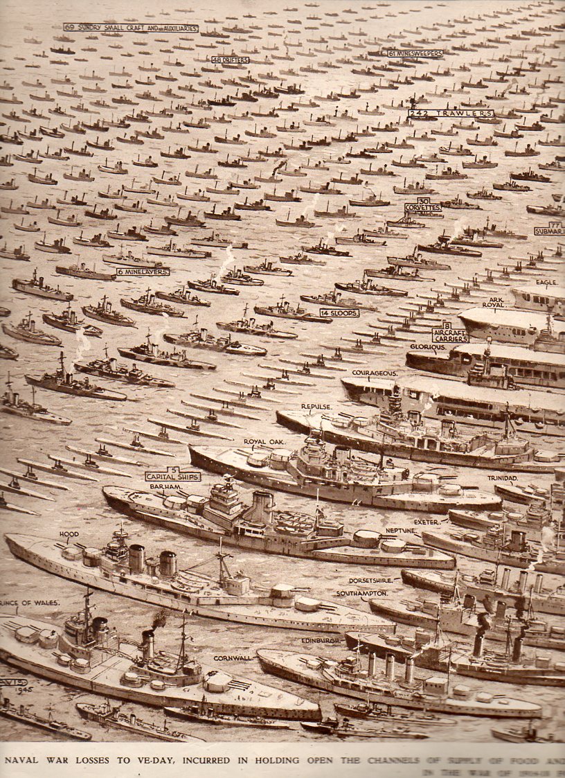
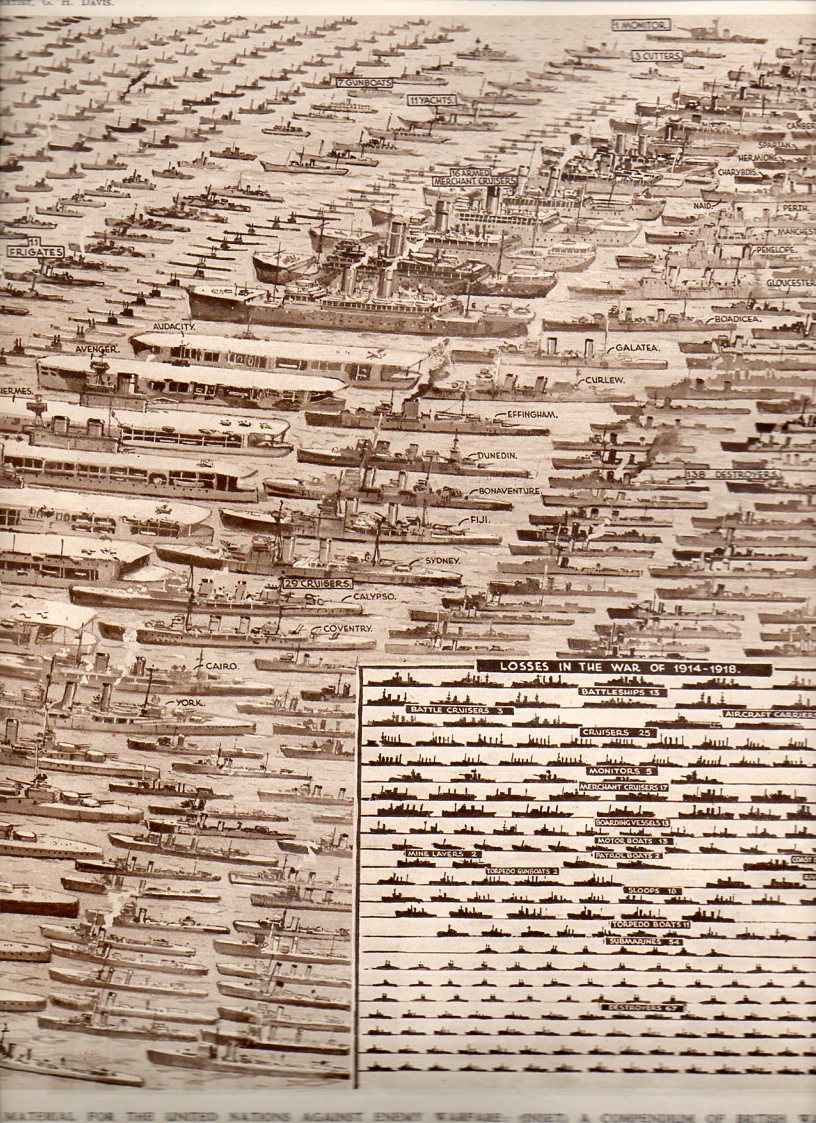
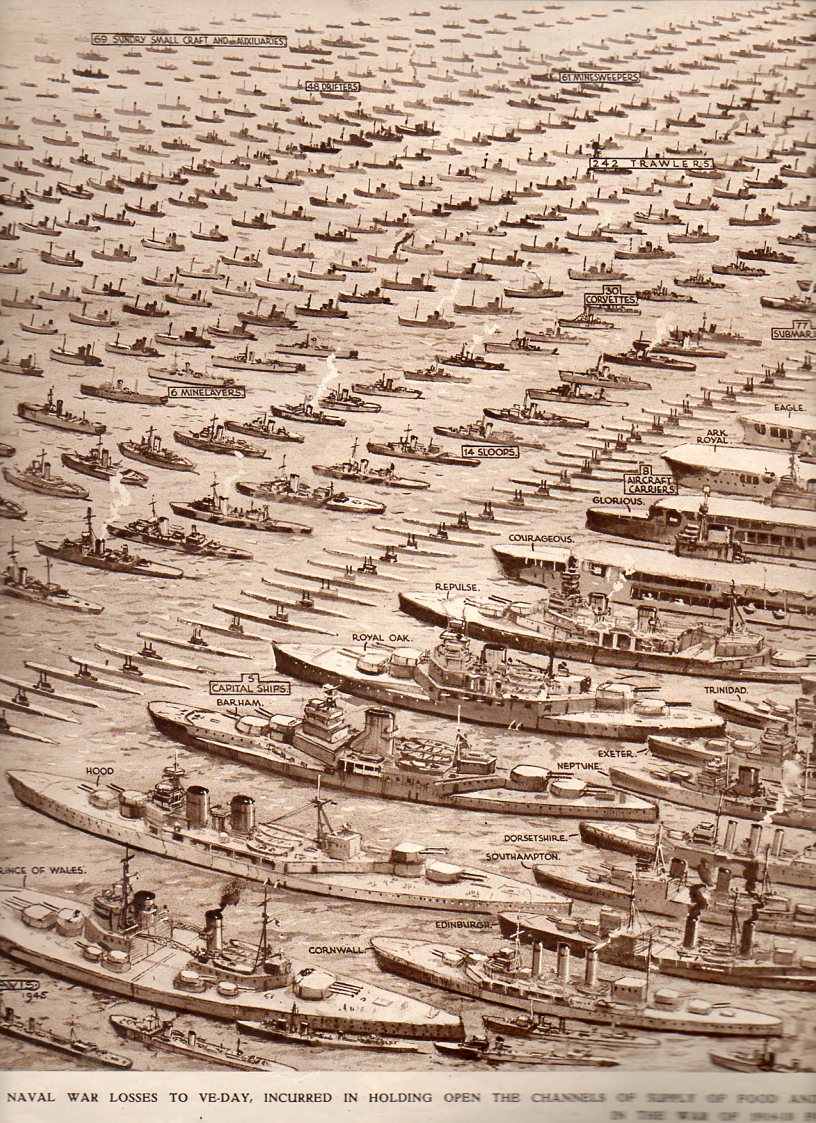
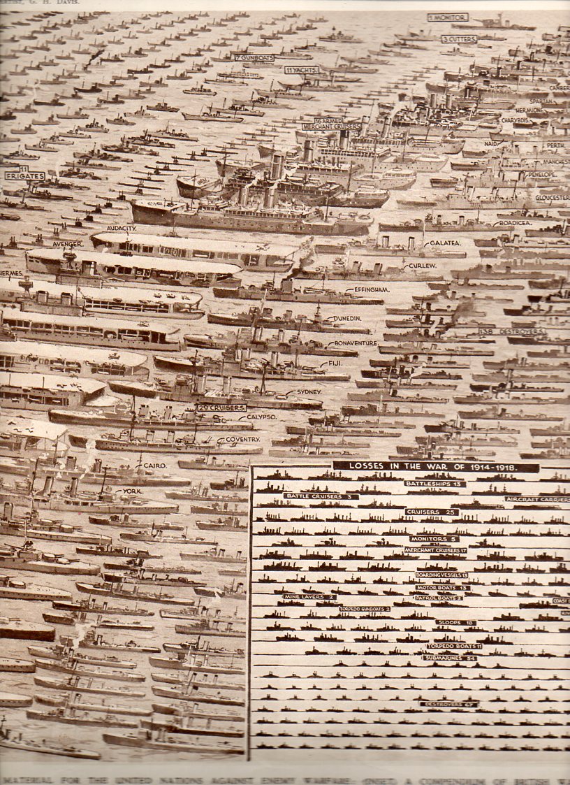
    This enormous, quiet image appeared in The Illustrated London News on 23 June 1945, just weeks after the termination of WWII in Europe.
    Navy Losses--left796Navy Losses--right795

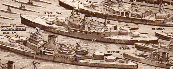
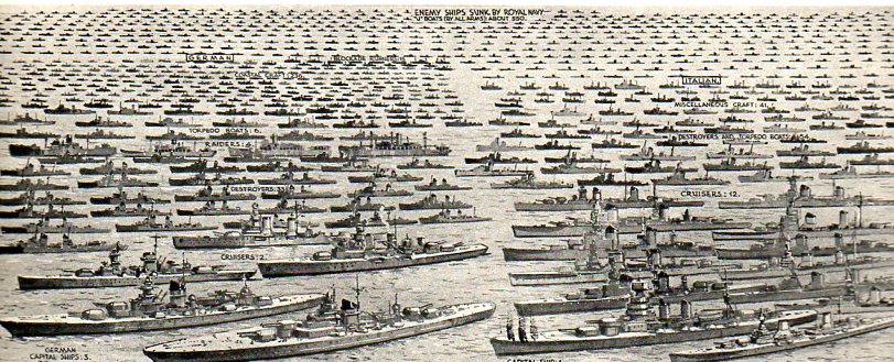
    It graphically presents every ship lost by Great Britain in the defense of “holding the seas against the Axis Powers…holding open the channels of supply and food and war material” from the outbreak of the war to VE day. The inset narrative states that there were on average nearly 3000 British and Allied ships at sea at any given moment, with the Royal Navy patrolling an aggregate  of 80,000 miles of trading routes, day in and day out


    Navy Losses--left796

    It is a symbol of loss, of heroism, of lives not lived, of lives saved, of valor, of greatness, of will, of the cold black sea, of burning oil, of red waves, and above all, of sacrifice. Of splendid behavior. 

    It is a terrible picture of what victory demanded of bravery.        

    It is as much an image of a military graveyard as anything else, a Remembrancer, especially for  those who were never recovered.  It is a grid, a finding aid, a visualizer, for all of those sailors lost in a sea that is indifferent to particular memory.

    Navy Losses--right795
    I can’t imagine how this image was received by the Illustrated London News reader on that day.  Did they suck their breath in at the scope of it, of the gigantic reminder of what all of those ships represented?  Was it the sort of image-reading that was forced, a white-knuckle, vacant-chested feeling of sweeping loss?  Of loss and gratitude?  Of gratitude and finding purpose for all of those sacrifices to the island nation?  I suspect that all of those words were in the minds of those readers in 1945–and also for emotions that have no words.  
    Navy Losses--left detail797

    Notes:
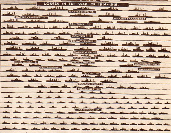
    There is also a small inset that shows in comparison the Royal Navy losses for WWI, 1914-1918. 

    Navy Losses--wwi798

    There is also this, an incredible single-page display of British merchant-marine war losses of 2570 ships. 
               Navy Losses--merchant marine799

    Both images are the work of the incredible G.H. Davis, who provided cut-aways, cross-sections, maps, diagrams an all manner of information to the ILN readers throughout the war.  HE was an inexhaustible man of excellent design sense.


  • Unfathomable Dots–324,198 Stars and Knowing the Structure of the Milky Way, 1873

    JF Ptak Science Books  Post 1107 (from 2010, Appended April 27, 2015)
    [A continuation of our History of Dots  series.]

    Stars--vivible stars 2 det304


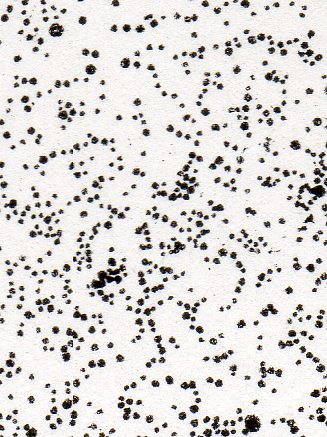
    The history of dots must have some fair share of its content filled with a very varied history of astronomy, which just goes to show that even within the seeming-sameness of microscopic investigations of dots that its subcategories could be so vast and differentiated. (The image above is a small detail from the following image, below.)

    Dots aren’t necessarily just dots–even in representing the stars, dots have a rich history. The first star-dots published in the West appear in 1482, taken from the work of the first century astronomer and philosopher Hyginius1, and is a book that contains maps of the constellations composed of such beautiful light-encrusted bits.  There wouldn’t be another work like this one, strangely, for another 75  years. Alessandro Piccolomini’s2 work of 1559 (which would be the first true star atlas), and again we see the familiar representation. 

    Galileo’s dots were very aggressive.  By 1610 he had produced his fifth and most powerful telescope, allowing things to be seen one thousand times closer, using it to make enormous discoveries–discoveries so big in fact that their towering significance is a but hard to understand today in the context of early 17th century knowledge. It was all published in his fantastic Sidereus Nuncius on March 4, 1610—the extraordinary  very title page3 of the book proclaiming some of the great discoveries of Galileo’s adventure.

    One monumental outcome of Galileo’s work was expanding the number of stars in the sky, which was basically mucking around with the perfect plan of the creator–formerly a cornerstone for the existence of a divine being.  With the exception of comets and eclipses the sky had remained immutable, a perfect score of the creator’s creation, until 1572, when Tycho Brahe noticed something new in Cassiopeia, something that was not a comet—a “something” that was a star. This was momentous because the night sky had been seen for centuries as being complete—a new star, the Nova of Brahe, contradicted this high belief, offering the possibilities of newness where there had not been one previously.  And so too with Kepler’s new star of 1602.

    One of the things that Galileo brought to the world was an entirely new sky, revealed to him through his telescope—so many stars that he could only guess (though he reckoned that there was an order of magnitude more stars than previously known “stars in myriads, which had never been seen before….and which surpasses the old, previously known, stars by ten times”).
       
    Which brings me to the images that I stumbled on today from “Statement of Views respecting the Sidereal Universe”4which was  the work of the astronomer and great popularizer,  Richard A. Proctor (“B.A. (Cambridge), Honorary Fellow of King’s College, London”).

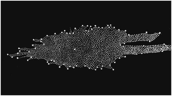
    Proctor’s dots challenge all dots that have come before so far as theorizing on the structure (and extent) of the Milky Way is concerned.  Proctor refers to William Herschel’s5–the man who first gave the Milky Way its shape and who fixed our own sun in an inferior and not-particularly-special place inside that map–statement that the extent and constitution of the Milky Way is “unfathomable”. 
     
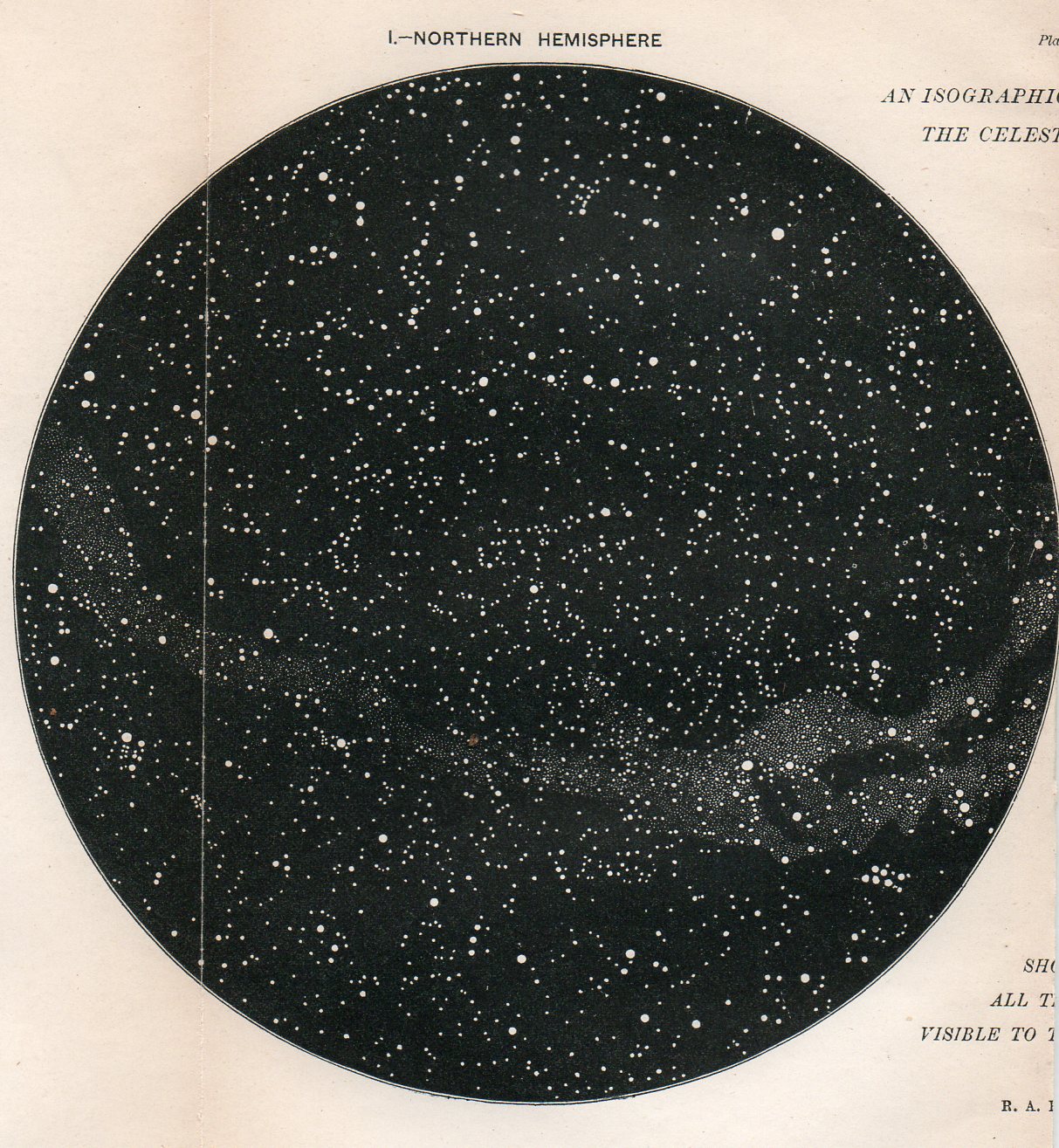
    Proctor gets there by presenting a map of the night sky with stars visible to the naked eye:
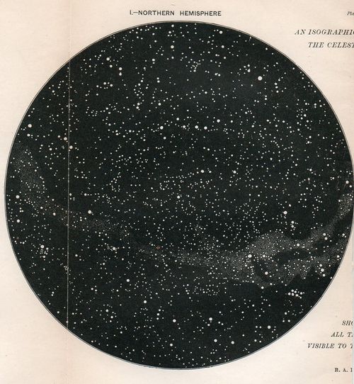
      Stars--vivible stars 2303
    And then the double hemisphere map of the northern and southern skies “We have here the first step towards just views of the constitution of the Milky Way, or rather the next step beyond the great, but little noticed, discovery of Sir W. Herschel’s, that the bright clouds of the Milky Way are for the most part spherical clusters of stars.”(Page 546.)

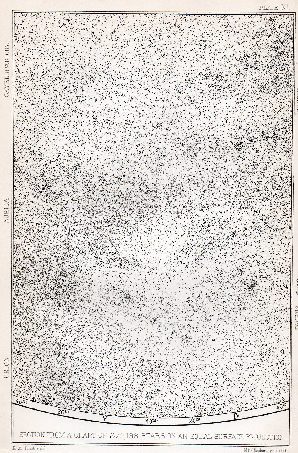
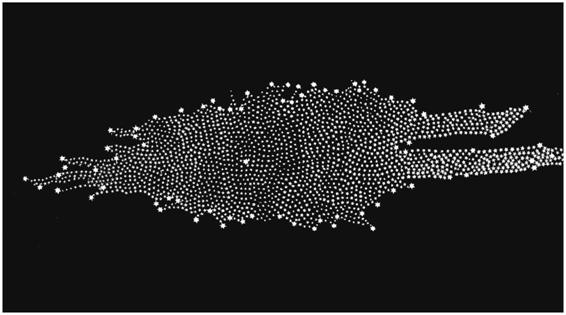
    Finally is the crux of the matter: two sections of an fantastic map displaying 324,198 stars visible via a 2.5 inch aperture telescope.
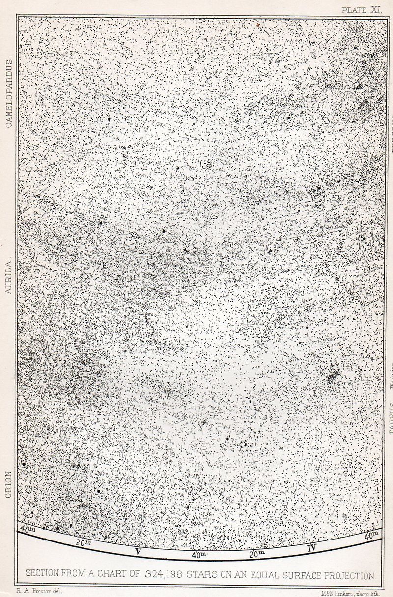
    Stars--324k300
    (The following being a small detail in the above section:)
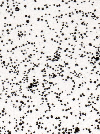
    Stars--324k deyt301
    He comments:“I assert, without the slightest fear of contradiction by any possessing such knowledge, that the broad teaching of the equal-surface chart. 0/3 24,000 stars disposes finally of all theories of the constitution of the sidereal universe which had previously been enunciated. The chart does not definitively indicate a new theory—rather it suggests the idea that the constitution of the sidereal universe is too complex to be at present ascertained. But it completely negatives (i), the stratum theory (even in the modified form apparently retained by Sir W. Herschel) ; (ii), the flat-ring theory of Sir John Herschel ; and (iii) the infinitely extended stratum theory, with condensation towards the mean plane, which Struve adopted.” (Page 547)

    I think that for 1873 the verbose Mr. Proctor got his point across.     

    Notes

    1. Hyginius Mythographus (fl. 1st century A.D.). Poeticon astronomicon. Edited by Jacobus Sentinus and Johannes Lucilius Santritter. Venice: Erhard Ratdolt, 14th October 1482. The first star atlas per se, standing alone in its field for a century.

    2. Piccolomini, Alessandro.  De la Sfera del Mondo.  1559                              

    3.  Galilei, Galilei  Sidereus Nuncius (known in English as Starry Messenger), published 1610
    The title page reads: Great and very wonderful spectacles, and offering them to the consideration of every one, but especially of philosophers and astronomers; which have been observed by Galileo Galilei … by the assistance of a perspective glass lately invented by him; namely, in the face of the moon, in innumerable fixed stars in the milky-way, in nebulous stars, but especially in four planets which revolve round Jupiter at different intervals and periods with a wonderful celerity.

    4. Journal of the Royal Astronomical Society, Paper, Abstracts and Reports of the Proceedings of the Society from Niovember 1872 to June 1873, vol XXXIII, London, printed by John Strangeways, 1873.                    

    5. It seems that few people now remember Frederick William Herschel as a great discoverer of alternative existences, but, well, that’s pretty much what he did–and he did it during a time that must’ve made his astronomical discoveries seem like science fiction .For example, in 1785 Herschel published a revolutionary image of the “Stellar System” (the Milky Way), showing its irregular pattern and the off-center placement of our sun amidst a panoply of other stars.
    (His image was remarkably and substantially correct, with the most grievous error being the placement of the sun too close to the center of the galaxy.) It was an image which bought the concept of a not so humano-centric idea into popular philosophy, and that our sun was a star among stars in a sea of stars.
    Herschel


  • A Great Map Showing a Complex Distribution of Nationalities, NYC 1895

    JF Ptak Science Books    (Post 1343–expanded)

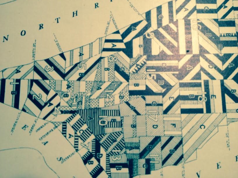
    Frederick Erastus Pierce (1878-1935) is the creator of the extraordinary The Tenement-House Committee Maps: printed on one sheet of paper for Harper’s Weekly in 1895, Pierce presents his data on the distribution of the population of Manhattan with two maps,  one showing the densities of Manhattan populations (on top) and the other the distribution of nationalities (at bottom). 

    [I should point out that the original of this map is for sale at our blog bookstore, here.]

    Nationalities Map 4

    Here’s an overall view of the maps–this example from the Library of Congress, as I could not make an accurate image of the one I have here–I do include some details of the maps from my own copy, however, which are found just above, with several below.


  • Cut-Away Schematic: British Vickers Medium Tank, 1925

    JF Ptak Science Books  Quick Post

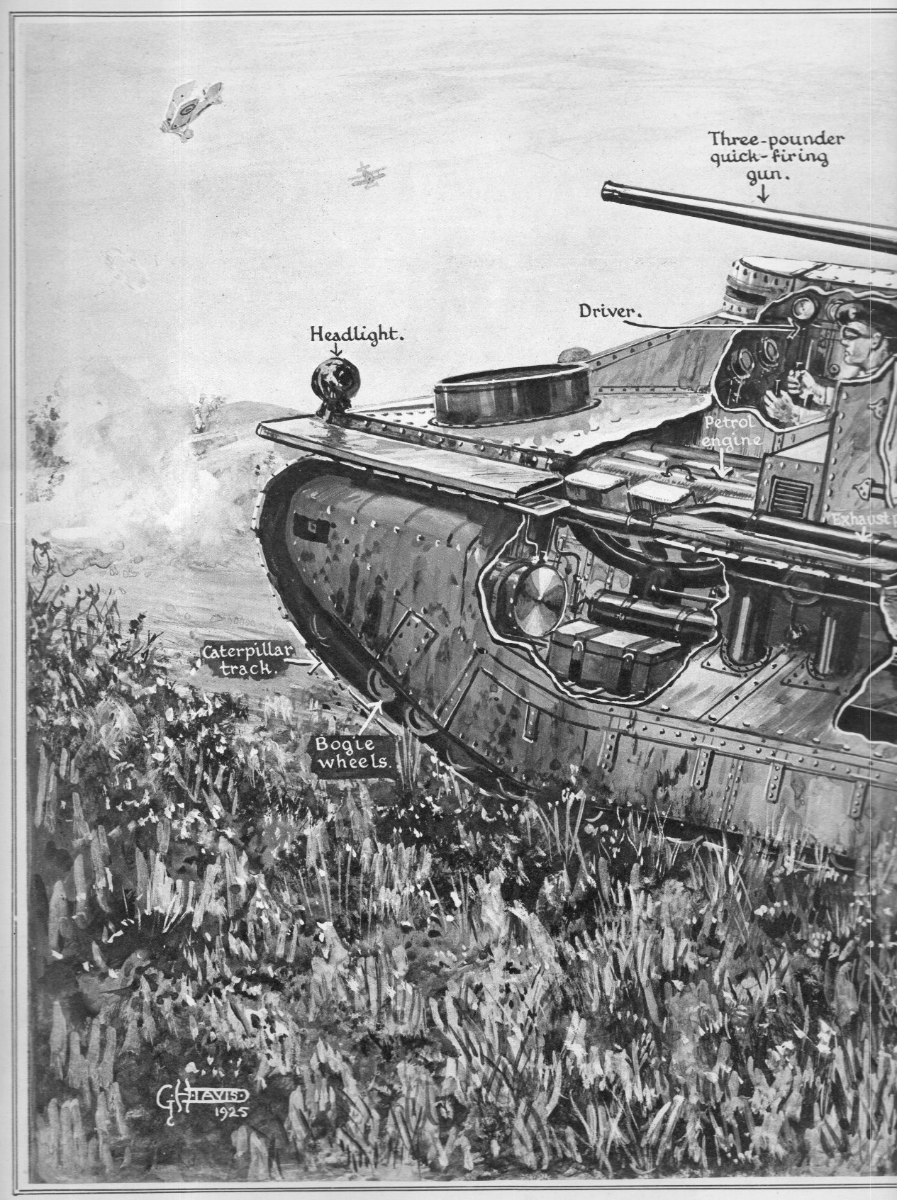
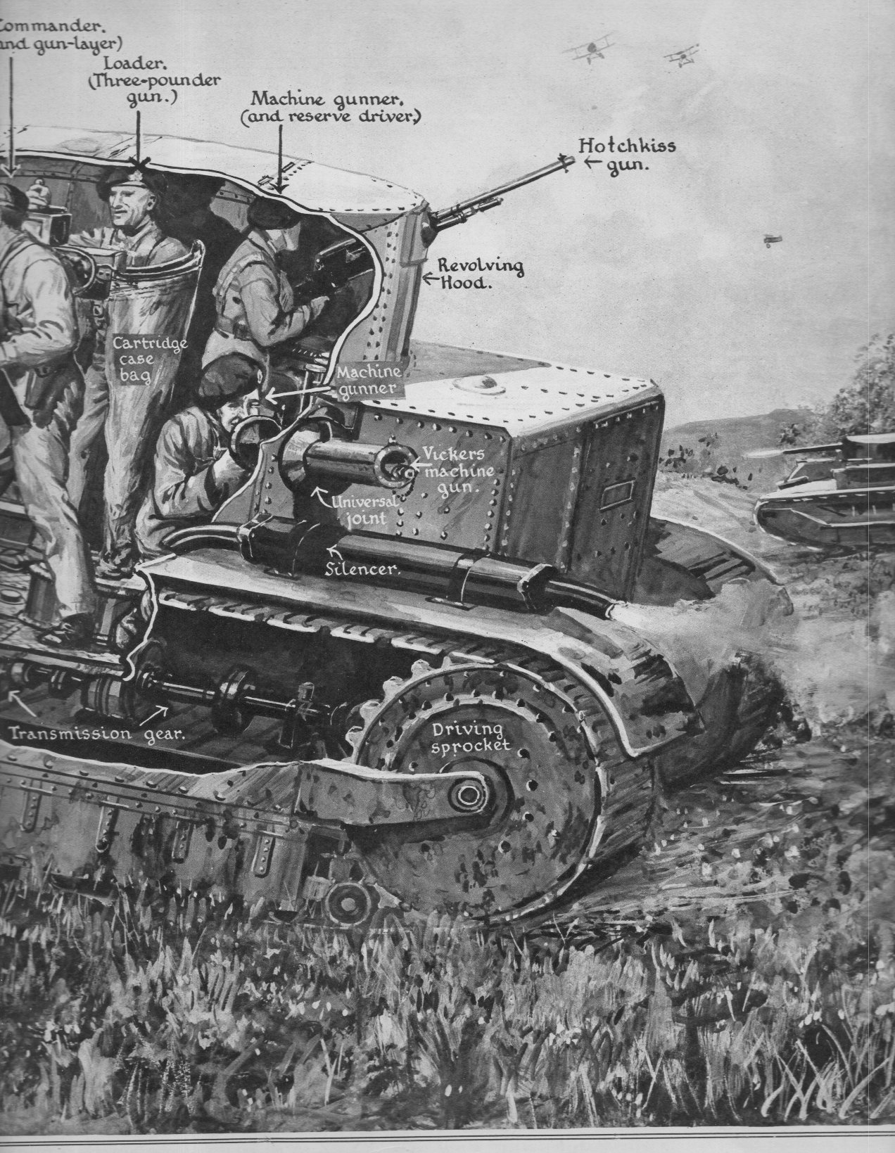
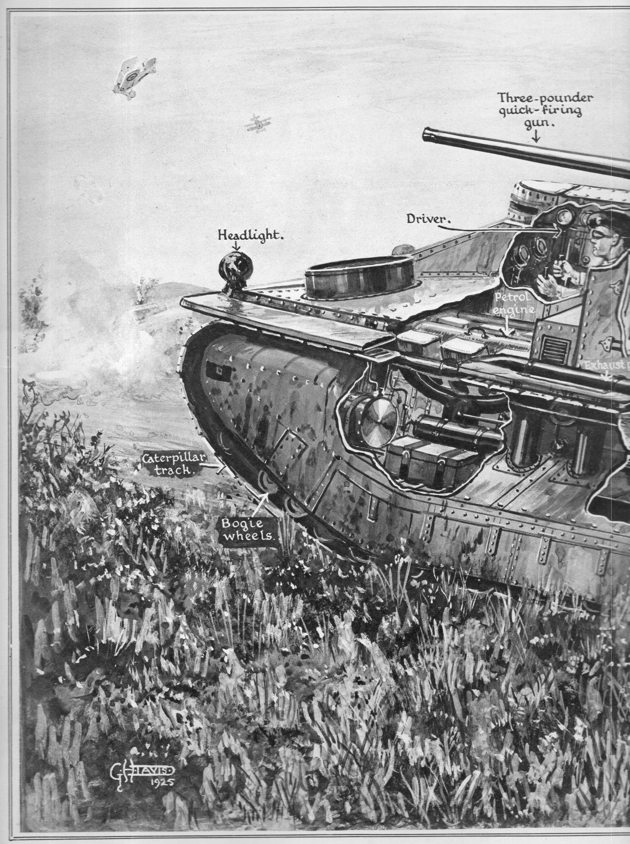
    One of my favorite popular technical illustrators of the 20th century was G.H. Davis (1881-1963), who worked enormous accomplishments for the Illustrated London News for some forty years.  His specialty seemed to be the cut-away schematic, showing half-exposed/half-not technical schematics on mostly oblique angles.  The example below is a fine one, showing the (not-named) British 1925 tank, which I believe must be the Vickers Medium I or variation thereof.  It was certainly an improvement over the tanks used in WWI, and for all intents and purposes it seems a “modern” tank. 

      Tank 1925743

    Tank 1925744


    Tank 1925743


  • Visual Display of Data: German Military Weakness, 1929

    JF Ptak Science Books   Quick Post

    Military graph canons734 bug

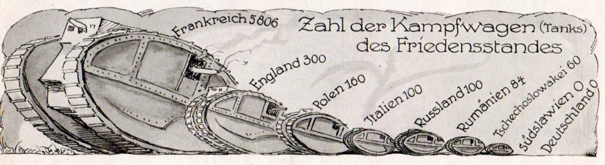
    In 1929 Germany was still abiding by the Treaty of Versailles, which was the peace treaty ending WWI and signed in 1919. The 440-clause treaty spent the first two dozen or so clauses were spent on President Wilson’s League of Nations, while the rest was a distribution of punishment and reparations against/on Germany.  The German military as directed by Versailles was limited to 100,000 soldiers, and had 1926 machine guns, and 2886 cannons.  as stipulated Germany could have no tanks and no air force, and was limited to six ships and no subs, and had to keep the Rhineland free of all armed forces.  

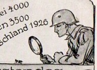
    By 1928 Germany was certainly having multiple regressive thoughts about the Treaty, and public demonstrations of questioning its efficacy began to appear with more frequency.  In this example–from the Illustrite Zeitung (Leipzig)–a strong statement was graphically displayed showing the state of the German military situation.  As you can see, there is scant measurement for just about anything in the military sphere for Germany–and to press the matter home ever more so, in addition to the nulls and tiny numbers, there (in the sixth section down, and magnified above) is a helmeted German soldier with a large magnifying glass inspecting the German totals of the nearly-invisible machine gun totals.  

    This would all be completely changed by 1934, when the Nazis were already well on the way to having a competitive (and modern) fighting force which counted 4.5 million troops.  It would only get worse.  

    Illustrirte Zeitung, 1928:

    Military graph canons732


  • Graphs of Astronomical Discovery

    JF Ptak Science Books   Quick Post        Reference Series    

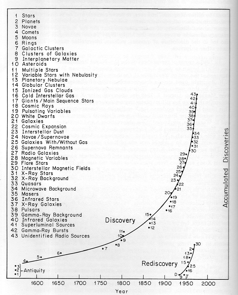
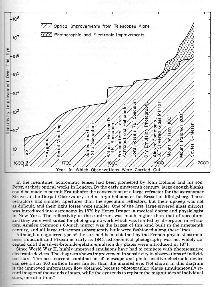
    This interesting graph of cosmic discovery (and re-discovery) is found in the open pages of Martin Harwitt’s Cosmic Discovery, the Search, Scope, and Heritage of Astronomy, Basic Books, 1981 (page 14).  It is an interesting advanced-introductory book which has a number of surprises, including this astro-discovery graph (below). There’s another unusual display of historical data in an optical power of telescopes graph,  which plots “Sensitivity improvement over the eye” of telescopes with astronomers and observatories over time, from Galileo to 1980 (and which is found on page 175). They’re handy and useful and tell in a quickish glance some parts of the history of astronomy.  

    Atronomical discovery timeline842

    Atronomical discovery timeline843


  • Build Your Own Chemical Slide Rule!

    JF Ptak Science Books    Post 2425

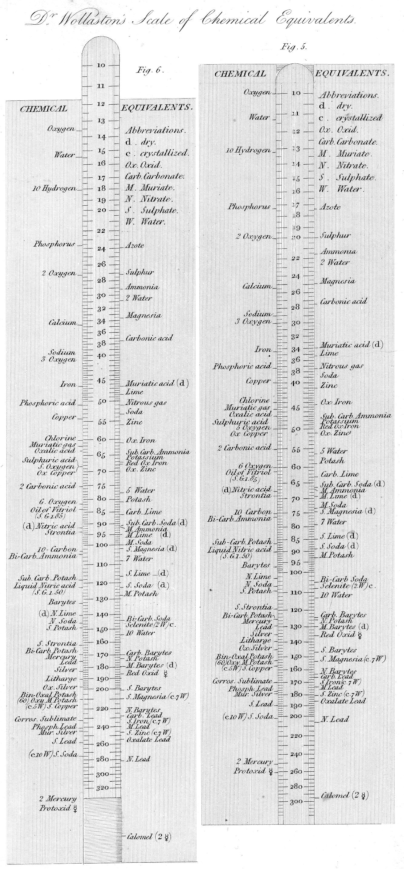
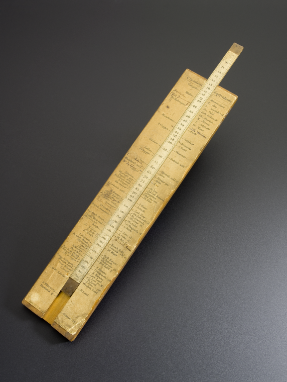
    Well, not a chemical-chemical slide rule/computer, not a biological thing, “just” a push-pull homemade bit cut-out from an article on chemical equivalents from 1814. But very neat, and  a major bit of thinking and articulation for the early 19th century. The original occurs in 1814 in a paper published by the Royal Society in the Philosophical Transaction by the eminent chemist William Wollaston, and a good description of the effort appears on Carmen Giunta’s excellent Chemistry Classics site (http://web.lemoyne.edu/giunta/):

    “In late 1813 he read a paper [published in 1814] that included an extensive compilation of “equivalent weights” or combining masses (closely related to molar masses) and a sort of chemical slide rule on which the weights were arranged. Wollaston’s paper included not only a table of equivalent weights but a summary of data from which he compiled the table, mainly analyses published by other chemists…”

    The copy of the slide rule that I’m using here is found in the great encyclopedia by Abraham Rees and which was published a few years later (1818)–its just a sharper copy with different design details than found in the original.

    Wollaston835

    And a photograph of an antiquarian version from the Science Museum (U.K.): 
    Wollaston[Source, #2, below)

    Notes:

    1. Full text of the 1814 paper:  William Hyde Wollaston, “A Synoptic Scale of Chemical Equivalents,” Philosophical Transactions of the Royal Society 104, 1-22 (1814).

    Another good article from the Chemical Heritage Foundation (“The Golden Rule”) :http://www.chemheritage.org/discover/media/magazine/articles/29-3-the-golden-rule.aspx

    2. And another from the Science Museum (UK) http://www.sciencemuseum.org.uk/online_science/explore_our_collections/objects/index/smxg-12515


  • Reading the Floor: Wittgenstein, Vonnegut, Breton

    JF Ptak Science Books  Post 2423

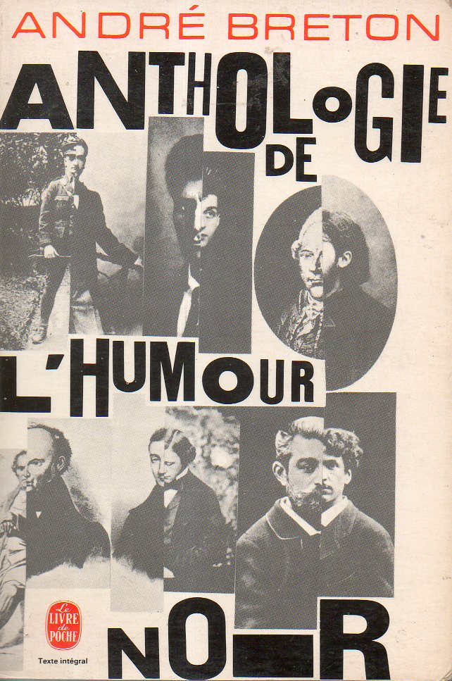
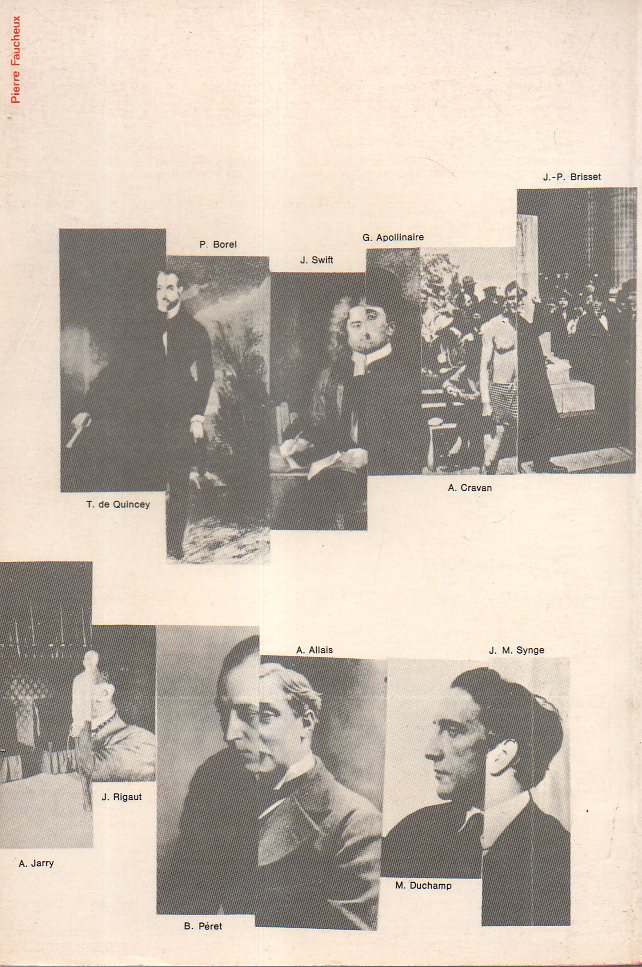
    Never pass the opportunity to pick up a dropped book.  Picking books up from the floor (in bookstores, libraries) has proven to be a definite education for me. It is where I first learned of the name of Ludwig Wittgenstein when I was (picking up the skinny Tractatus… which was not only on the floor but open and upside down, in D.C. in 1974), and the first exposure I had to Kurt Vonnegut (in the old Brentanos in Manhattan in 1969, finding Player Piano), just to name a few.  I know it would be interesting to make a list of all of the good and bad that I’ve found on the floor, but the lost books are lost to uncaring and neglect of memory.  One that came up just today is Andre Breton’s selection of Black Humor–found on the floor of a bookstore I can’t remember the name of but was on Rue Milton in Montreal in 1978. This was interesting because even though it was upside down it had an interesting rear cover design–flipped over it became a must-buy.  I’m pretty sure I had heard of Breton at that point but had never read him–and there he was, in an unusual-looking little paperback, waiting for me to buy it for two dollars. I bumped into this old friend this morning, moving a box to get to a pile of the journal Comptes Rendus…, and then losing sight of the Angelo Secchi papers on spectroscopy from 1866 I was supposed to find in favor of looking through the in-the-way box.  And in the bottom of the box was the Breton.

    Breton809[I like the “i” in “noir” most of all.]

    It was a collection of people who wrote wincingly and oddly and funny-bitterly, exposing things with uncomfortable not-sustained laughter.  Breton includes selections form the work of 45 writers, many of which I admit to having never heard of before, and a number of others whose names were under years of braindust, and most of which I cannot read now with my mostly-failed French.  

    The book was published in 1940 and was immediately banned by the Petain French State government of occupied and controlled France, the government that was known more familiarly known by the name of the town in which the government’s center was in, at Vichy. Breton (1896-1966) escaped France and spent the war in the U.S. and Canada and the Caribbean, but returned to Paris in ’46 and saw his anthology (one of his many books) back into print in 1947.  It was re-issued in 1966 (my copy) as the “definitive edition”, though I am not sure that it is any different from the two earlier printings.  That’s okay, because it was Breton who moved out of Dada to found Surrealism, so he can say what he wants to say while saying it and not saying it.  

    Breton810

    Good French or bad, the references are still very useful–so far as I can recall, all of these writers were worth pursuing.  (I left Picasso off the list even though he is represented in the collection because, well, I just don’t like or need him.)

    I’m certain that Breton would approve of this floor-reading education.  

    ________

    And by the way some give the term “black humor” to Breton.  It is much older than that in the history of medicine, as a bilous, disease-causing agency. (For example, it is found in Shakespeare Love’s Labour’s Lost i. i. 228   “Besedged with sable coloured melancholie, I did commende the blacke oppressing humour to the most holsome phisicke of thy health-geuing ayre”.) It may well be: the OED finds an obscure 1916 reference using the term as it is intended today (“C. V. Stanford & C. Forsyth Hist. Mus. x. 212   They [sc. Russian songs] give utterance to a ‘yearning without hope’… Humour there is. But it is the black humour of the drunken headsman”) and then another for 1951.  No mention of anything in the mid-ground.  Perhaps it is the first common usage of the phrase…

    The contributors:


  • Nazi Propaganda Map of Communist Threat and Expansion, 1933

    JF Ptak Science Books   Quick Post

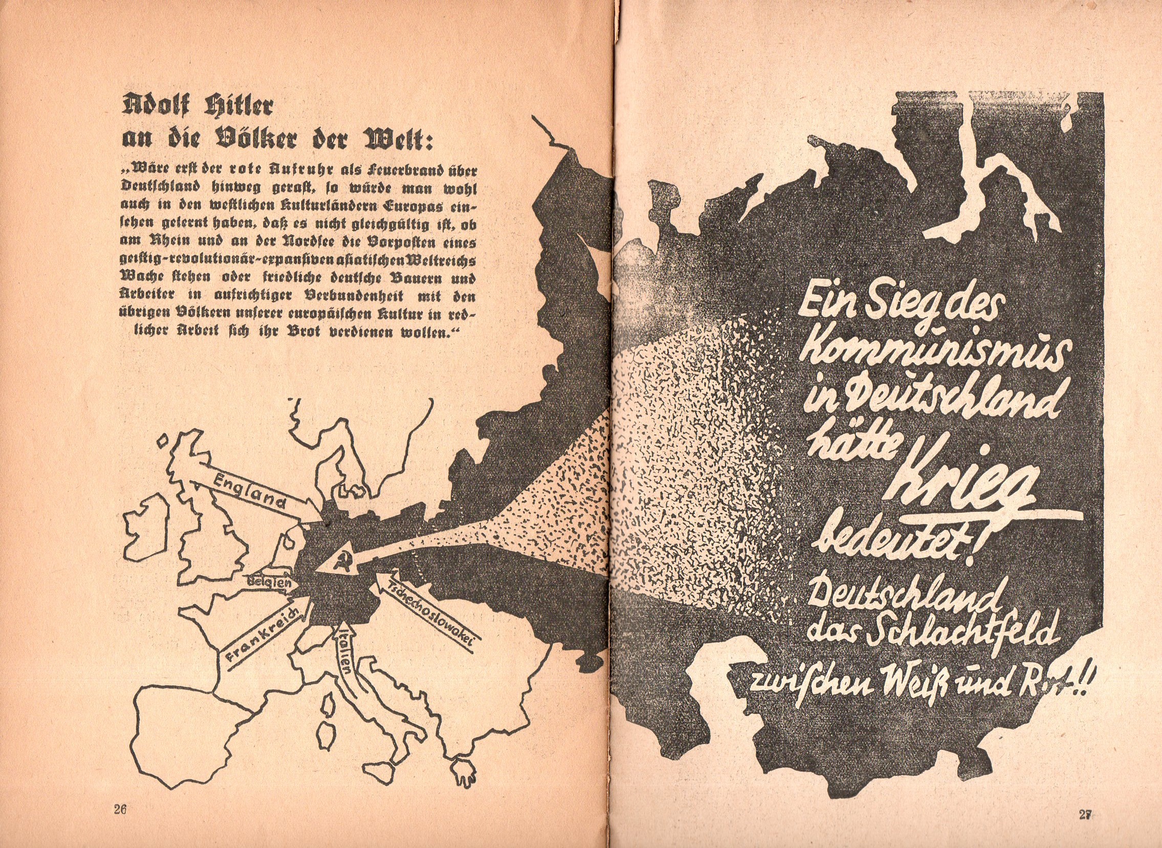
    Not long after Hitler’s election in 1933 this curious pamphlet appeared: Ein Kampf um Deutschland (1933), short and thin, is a  work filled with anti-Communist photos and images portraying them in as harsh a bad light as you could muster in 32 pages.One of the images is this map showing in no uncertain terms threats to Germany from the west, but most importantly a gigantic threat coming from the Communist east, the arrow striking right through the heart of Germany, with the hammer and sickle (the symbol only about 16 years old at the time) coming to rest just about on top of Berlin.  

    Nazi map communiast762

    For all of this Hitler would sign a Non-Aggression Pact with the Soviet Union six years later (22 August 1939) with the plan of dividing some Eastern conquests with the Russians.  Less than two years later came Operation Barbarossa, with Hitler launching a massive surprise invasion of the Soviet Union on 22 June 1941. Dozens of millions of lives later, it would all be over in four years.  

    And the opened cover for the pamphlet, or what is left of it:

    Nazi map communiast763