A Daily History of Holes, Dots, Lines, Science, History, Math, Physics, Art, the Unintentional Absurd, Architecture, Maps, Data Visualization, Blank and Missing Things, and so on. |1.6 million words, 7500 images, 4.9 million hits| Press & appearances in The Times, Le Figaro, Mensa, The Economist, The Guardian, Discovery News, Slate, Le Monde, Sci American Blogs, Le Pont, and many other places… 5000+ total posts since 2008.

Category: Information, Quantitative Display of

  • Among the Earliest Published Images of Chaco Culture, 1851

    JF Ptak Science Books   Post 2467

     Pueblo Bonito–built between 840-1100 SCE– is a ruin of the ancestral Puebloan peoples and is located in northern New Mexico. It is situated on a small rise in the long Chaco Canyon, and I’d say that viewing the ruins from photos or maps doesn’t convey the grandeur as you approach it walking up the slight rise–it really does sit prettily in its environment, and is very impressive. (The ruins are about 50 miles east of Canyon de Chelly and about the same distance from the Four Corners.)Kern bonito002
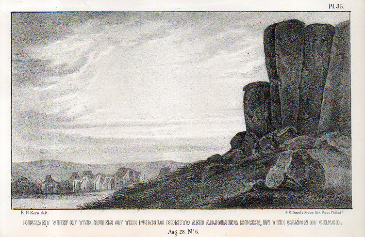
    This image–the first ever published of the structure?–appeared via the military and government exploring expedition and published in the report Journal of a military reconnaissance, from Santa Fé, New Mexico, to the Navajo country, by J.H. Simpson. Simpson was in charge of the exploring party, assisted by the guides Sandoval (Navajo), Hosta (Jemez Pueblo), and Carravahal (Mexico)1.

    The artwork is by Richard Kern (d. 1853) who along with his brother Edward (1822/3-1863) led extraordinary and near Zelig-like lives of exploration, and were among the first to provide accurate, scientific visual reports of the environment, architecture, and people in the Arizona, New Mexico, and southern Colorado areas (and especially in the Four Corners region). 

    • Full text of the report can be found here:  https://archive.org/details/journalamilitar00simpgoog

    This is one of the many images made for the work, undertaken under great duress at times, and under severe hardships, by Richard and Edward Kern during this reconnaissance of the Navajo lands of the Southwest. The remarkable thing is not only how they survived, but also how truthful the published images are to the original drawings.  

    And the original black+white wash, found int eh collections of the Academy of Natural Science of Philadelphia:
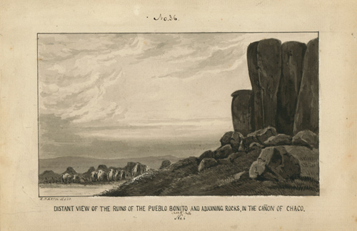
    Kern pueblo bonito

    [Source: Academy of Natural Sciences, Philadelphia, Everett Sale Library  http://www.ansp.org/research/library/archives/0100-0199/kern146/]

    And the text associated with the drawing, pp 40-42: 

  • Map of Rivers and Waterfalls, 1851

    JF Ptak Science Books    Quick Post

    Maps Rivers Waterfalls981

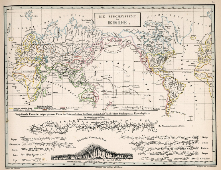
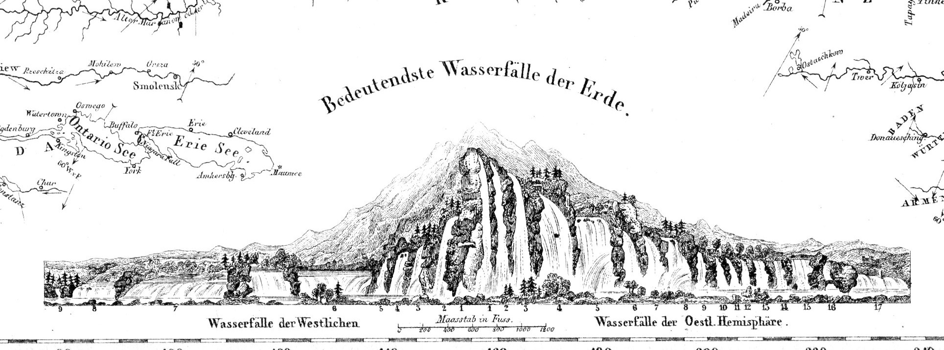
    Before the Neil deGrasse Tyson version and update of Carl Sagan’s landmark television series, Cosmos, there was Alexander von Humboldt, and his enormously influential book of the same title, printed in 1845-1862.  Well, von Humboldt’s (1769-18591) book was actually Kosmos when published in German, which is where it started its life (and which von Humboldt suffered mightily for in it English translation), and in which this map appears.  Von Humboldt was enormously studied and educated and of a high scientific mind over many subjects, one of those 19th century figures who seemed as though they could know everything, a polymath of high order (along the lines of Goethe and von Helmholtz and Thomas Young and others).  He was a meteorologist and biogeographer before those sciences existed; a naturalist, geographer, archaeologist, and explorer, a natural philosopher of magnitudes.

    • The original maps is available for sale at the blog’s bookstore, here.

    Kosmos reflected his lifelong interest in order, and what he did was astonishing–he attempted to unifying the complexities of nature in one book (of five volumes), binding the various branches of science together in a cohesive whole, attempting to show how the laws of the universe acted here on Earth.  It was a very influential work, very progressive, a masterwork of scientific method.  Kosmos.

    Maps--River system


  • An Extraordinary Map of Battle Death–“Body Density Maps”, 1918

    JF Ptak Science Books   Post 2461

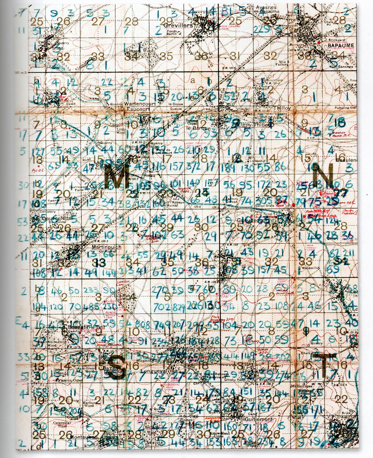
    At first glance this detailed and dense map looks foreboding and somehow off-putting–at least for me, and that was before I understood what the numbers represented.

    The blue numbers on this section of a larger map refer to soldiers killed on the battlefield of the 1916 Somme battlefield. It is the work of Lieutenant Colonel Arthur Messer (Assistant Director of Graves Registration and Enquiries in France), who undertook to record the crosses of the Fallen on the battlefield and register their location, and then to re-inter the bodies together in larger cemeteries.  

    MAP DEATH DENSITY977

     [Source: John Hughes-Wilson, The First World War in 100 Objects, Firefly Books, 2014.]

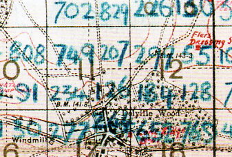
    What we are seeing here are pieces of four 6×6 grids (one complete and three partial) numbered (in red) 1-36, each one of these squares further subdivided into four section.  Each larger square composed of 36 squares is 1000×1000 yards total, meaning that each one of the 36 subdivisions is about 166×166 yards, and each of the four segments of one smaller square is 83 yards. The blue numbers indicate a soldier killed on that field of battle which means that in the large 36-square “M” subdivision  #18 that there were 210+29+372+17 fatalities, or 628 on a 166×166 yard field, or in one case 372 killed on a 83×83 yard plain.   The deaths were even more intense on other areas of the field–in Square S #11 there were 749+207+234+126, or 1,416 deaths in that 166×166 yard field, and 749 on the 83×83 yard field.  It is hard to visualize such loss. I picture a U.S. football field–there are 22 players on the field during play, and that seems to populate the area pretty well–casualties of 749 soldiers on a similar area would be nearly 35 times that, meaning that placed equidistantly and with a few feet on the sides they would cover the field.  There are, what, 75 people on a football team?  That means at the beginning of the game when all of the players and coaches and staff and cheerleaders and member of the band run out onto the field to take their places, they would all be dead–and then some.  That is a lot of death.  

    MAP DEATH DENSITY978

    According to the Imperial War Museum, temporary markers for fallen soldiers looked like this:

    Wooden cross

    After the war the Imperial War Graves Commission replaced the wooden crosses with stone markers.  

    The wooden markers would then returned to the family.  

    [Source: http://www.iwm.org.uk/learning/resources/remembrance-in-the-first-world-war]


  • Explosive Anatomy, 1833

    JF Ptak Science Books   Post 1479– (from 2011, expanded)

    Anatomy--mascagni[Mascagni image(s) source: National Library of Medicine, here.]

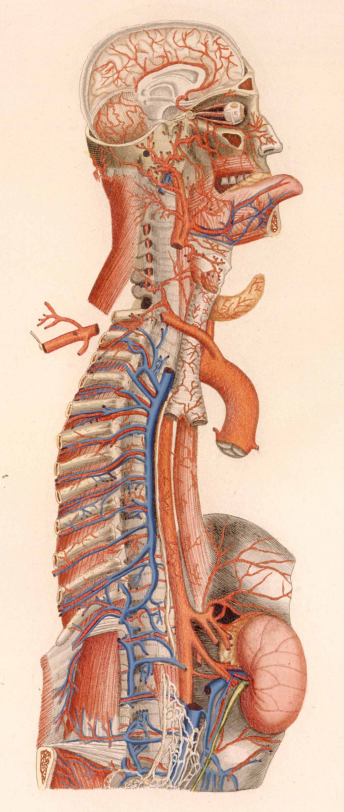
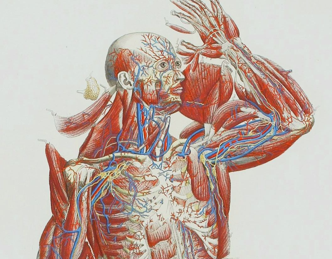
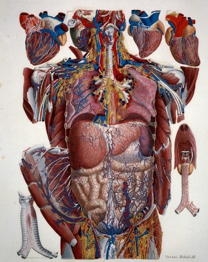
    Species of explosions come in all sorts of shapes and sizes, and basically release some sort of energy (chemical, nuclear, mechanical and so on), but in the cases we’ll look at here they are none-of-the-above.  The energy released in these explosions are in the form of potential, a knowledge-driven, controlled and reversibly ordered demolition, a deconstruction in slow motion.  The medical “explosion view” for the study of anatomy is a remarkable thing, especially when you considered not only the pre-CT and pre-MRI times, but also the pre-X ray (1895) days of imaging the inside of the body–the images not only show you the bits and pieces alone but also in relation to the other bits around them.  The body becomes an archaeological dig, each level preserved so that a viewer could easily see the dependencies and relations between one thing and another. 

    Anatomy mascagni three

    Take for example Paolo Mascagni’s (1755-1815) beautiful Anatomia universale (an example seen above), which was printed in Florence in 1833 and has the look and sensibility of something much later.  Mascagni is able to achieve this depth not only from the exploded view, but also for the (somewhat exaggerated) coloring setting the specimen on top of a blank background the combination of the color and the background giving the whole thing a 3-D-ish feel–and if not that, then certainly a living image in which there is some fair amount of depth. 

    Anatomy exploded
    Another version of the exploded view which is also quite effective from the same work by Mascagni is his “exploded thorax”, showing a more limited display of the more closely-aligned organs. 

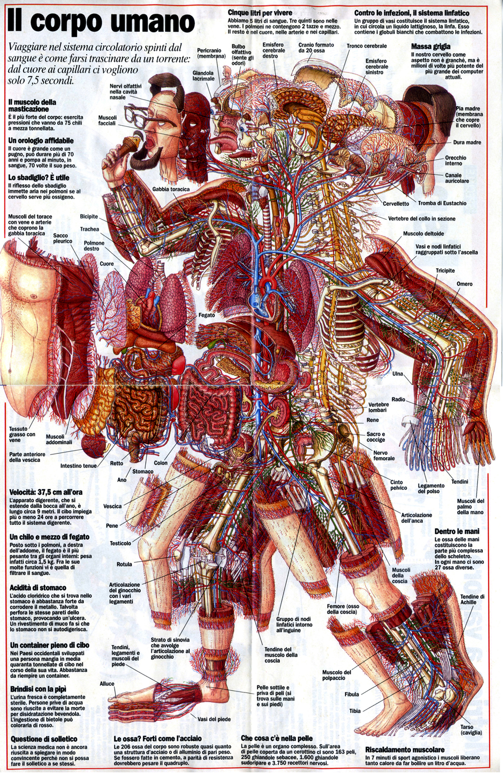
    When these views appear today–which is generally much more uncommon given the other technical ways of envisioning multiple layers of complex associated items–they have more of a sense of the antiquarian, retro feel to them, though they are no less useful for it.  As a matter of fact  I still prefer these views for understanding technical and engineering  and architectural complexes than anything else. And the modern master of this genre for me is Stephen Beisty, who performs his magic mostly in the tech and engineering fields, but who occasionally dips into the messy wet stuff of biology, as we can see in this fabulous exploded view:

    Anatom exploded beisty

    There are of course many other examples of (drawn) exploded views in the history of anatomical illustration, but I think these will do for now as good examples of the art.


  • Maps: Climate Change, Population, Drought

    JF Ptak Science Books  Quick Post

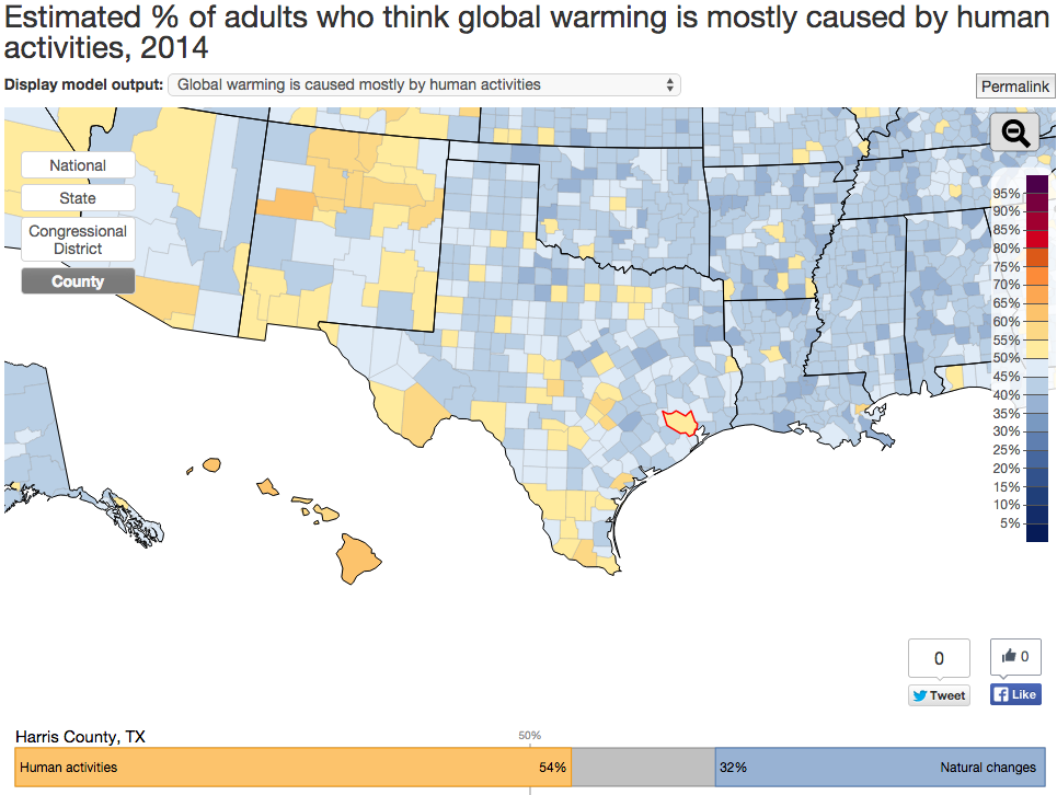
    Interactive Map on Global Warming Opinions

    Click a state and more detailed parts of the questionnaire are revealed, including whether the climate change is largely a result of human action and thirteen other questions arranged in the three areas of policy  support, risk perception, and beliefs.  

    One odd thing is the percentage of people opposed to renewable energy R+D–I’m not sure why 21% would say so, why someone would be against becoming more-or-less self-sufficient. Another 25% are opposed to regulating CO2 emisisons, which combined with the renewable opposition is frustrating to comprehend.  

    Data map global warming

    SOURCE:  http://environment.yale.edu/poe/v2014

    Population

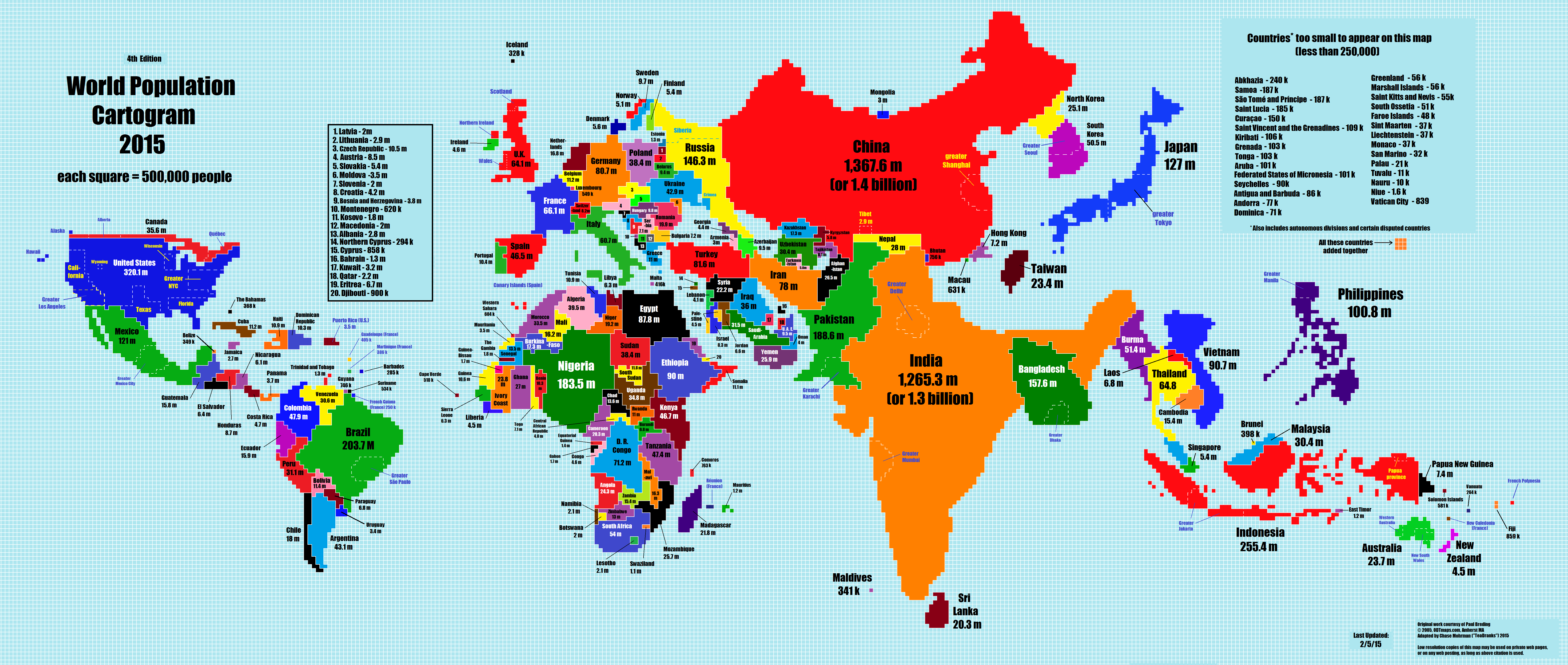
    The 2015 World Population Cartogram, showing country population in discrete blocks equal to one million people each.  Not a projection but looks like one, and interesting:

    Data maps pop growth

    SOURCE:  NPR blog, here  http://i.imgur.com/I81xSNt.png


    Drought Map, 2011-2015.
    Data map interactive drough mapThere’s a fine and scary interactive map if you follow the link to the NPR site showing the development of the drought situation in 1200 counties in the U.S.

    SOURCE:  http://www.npr.org/2012/07/18/156989764/interactive-mapping-the-u-s-drought


  • Dots of Death, 1937

    JF Ptak Science Books  Quick Post    

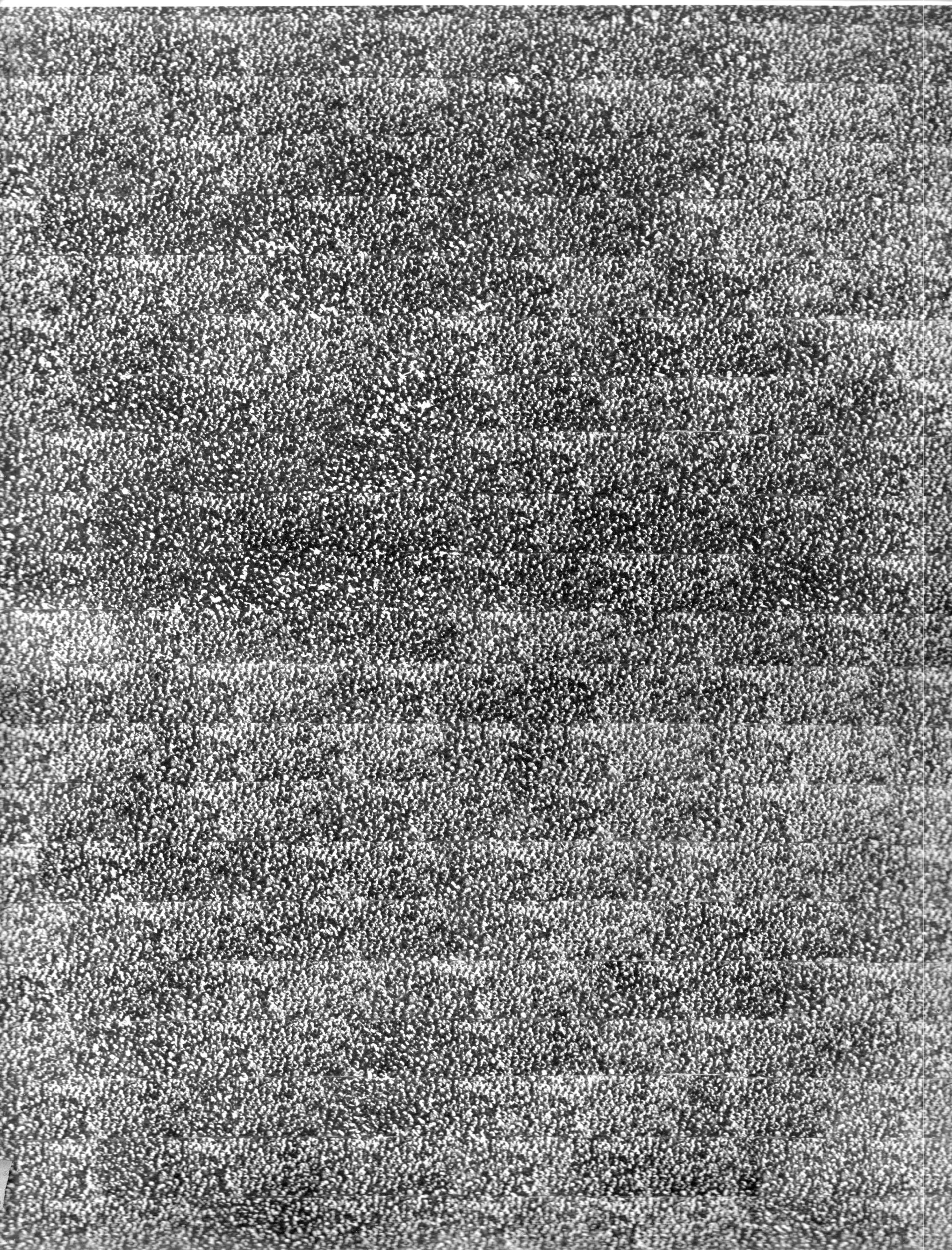
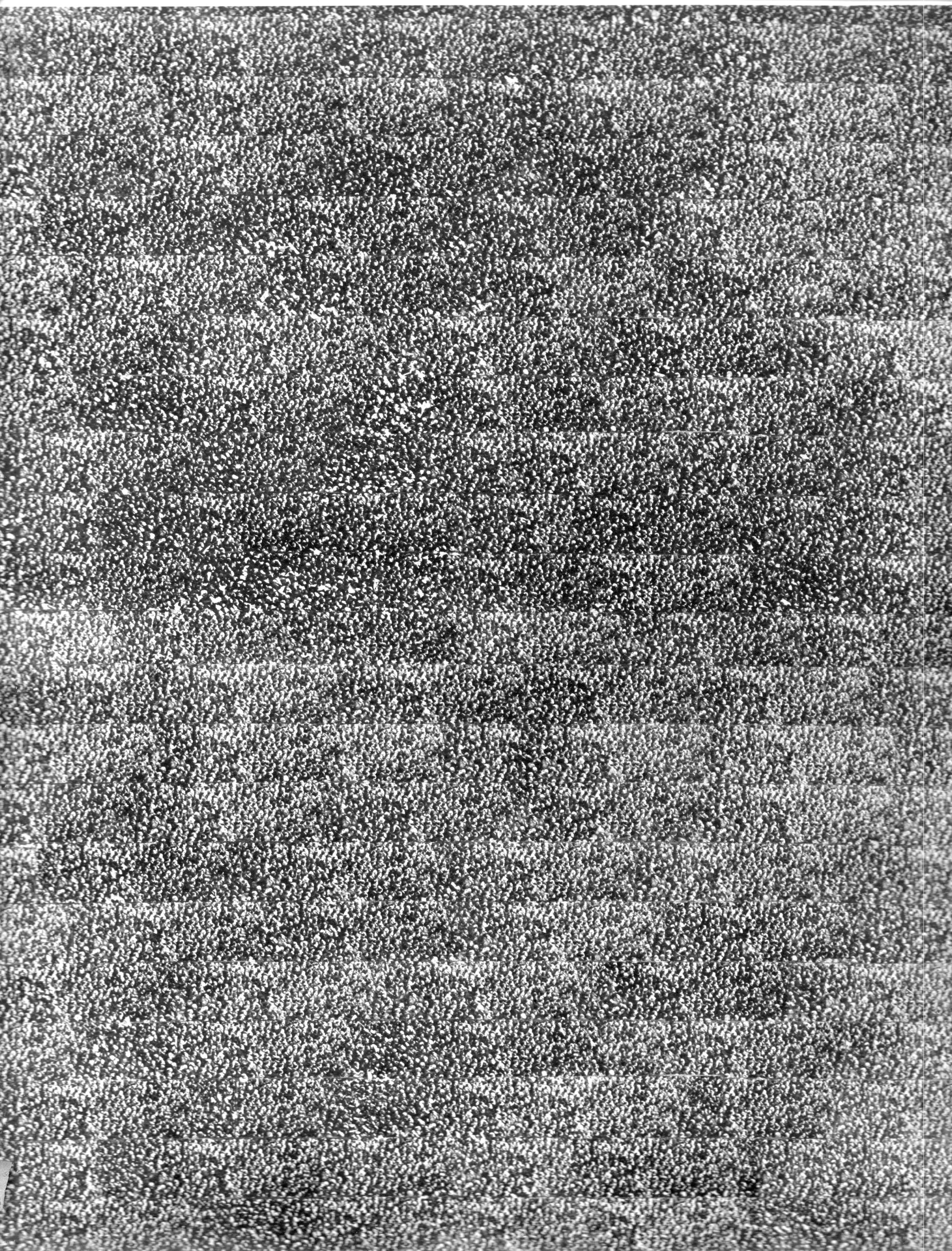
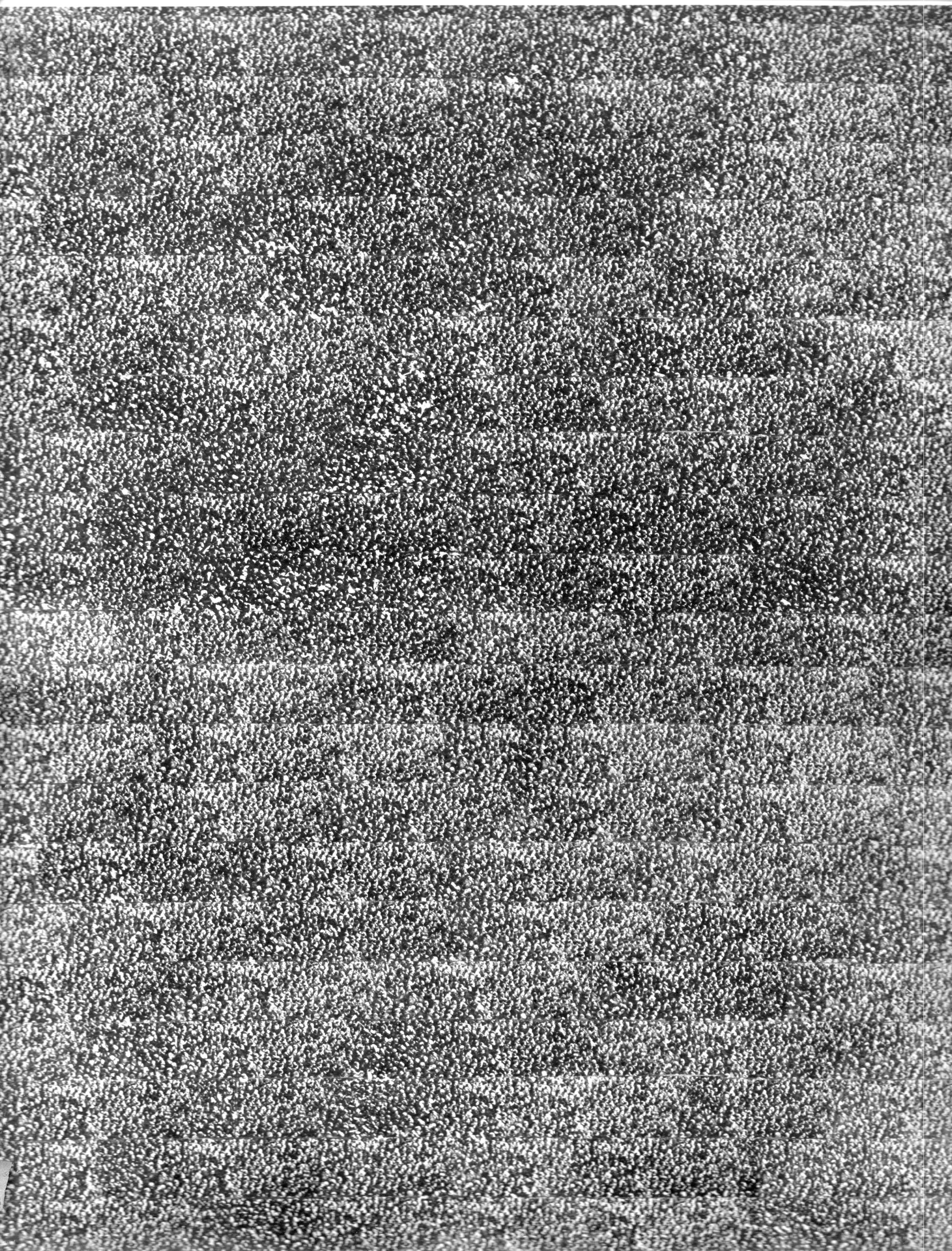
    This intriguing and striking collection of dots is actually an articulated portrait of death. Road death.  The composite picture appeared in the Illustrated London News on December 18, 1937, and when the reader opened the magazine to the big two-page spread–11×18″ big–they were probably shocked. The picture represents 67,000 people killed on British roads in auto accidents over ten years.  “Nothing less than appalling” is what the heading reads. 

    Just down the road, at the end of WWII eight years later, you would need 1,200 of these double sheets to represent the dead of that conflict. 

    Auto deaths865

    Auto deaths865


     Here’s a detail of one of the images:

    Auto deaths865


  • Human Advertising Bots: Berlin, 1919

    JF Ptak Science Books   Quick Post

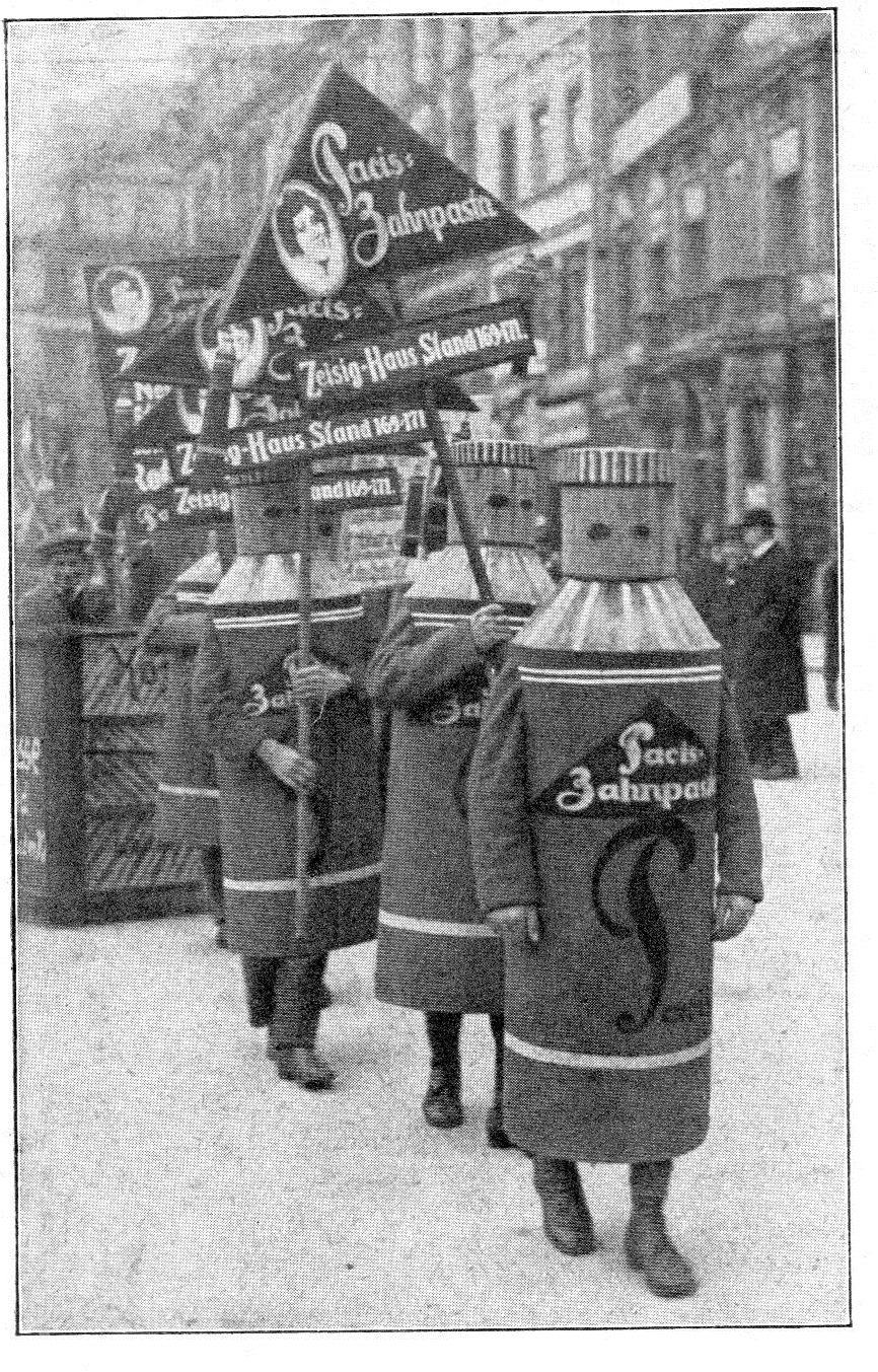
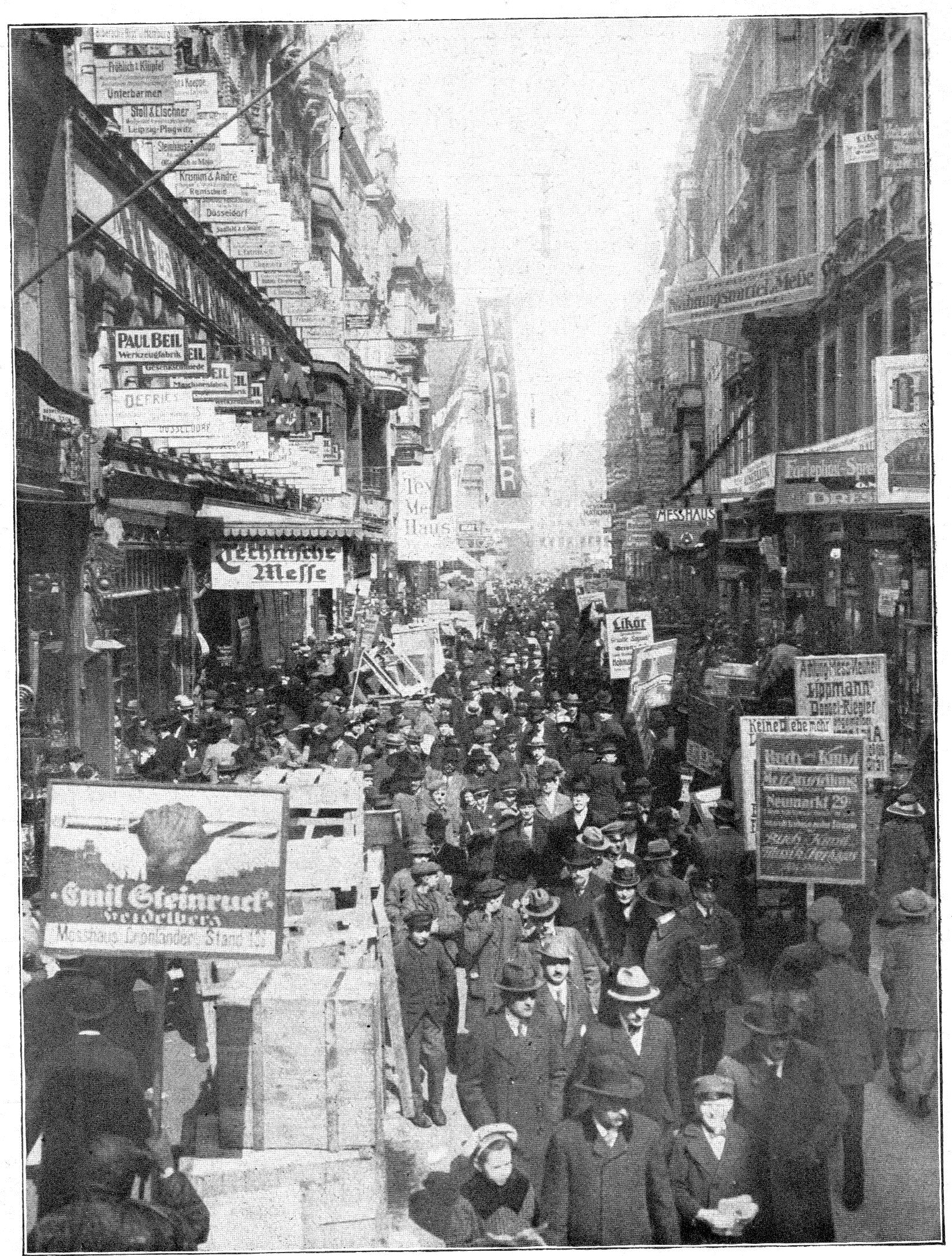
    These two photographs of the streets of Berlin come from the 19 May 1919 issue of Illustrirte Zeitung. Evidently there are lots of people carrying placards and advertisement vehicles, and–as we see in the lead photo–some people wearing costumes of the advertised product. Between the two images, it seems that a good percentage of the crowds are actually advertising media.  

    Gereman ads 1919864

    I don’t know  why this is the case.  Germany certainly was in a bad place seven months after the end of WWI, (recovering from food shortages, experiencing money shortages, numerous political parties fighting among themselves and everyone fighting with Communists),  and just three months before the adoption of the Weimar constitution, and two months after what would be the disastrous Versailles Treaty was signed. Maybe there was a shortage of newsprint, or a shortage of money for people to buy magazines and/or newspapers, which mean people weren’t seeing advertisements and which means that perhaps retailers were being hurt even further, and so an army of placard-holders was let loose on the streets of Berlin and other cities to get out the consumption-reminders..  Or maybe not. In any event, the photographs are stunning.  

    Gereman ads 1919863


  • Chess-Playing Computers and “Mechanized Thinking”, 1950

     JF Ptak Science Books   Quick Post

    ShannonI was reading the great Claude Shannon’s article, “A Chess-Playing Machine”, in the Scientific American issue for February 1950 (volume 182, No. 2, pp 48-52). It is the first popular appearance of Shannon’s technical paper (which would appear a month later in the Philosophical Magazine), and is one of the earliest appearances of an attempt to understand the necessities of a computer for playing a game of chess.

    David Shenk in his wonderful The Import Game: a History of Chess sums up the background to the Shannon very nicely: 

    “Since the mid-1940s, scientists had aimed to create a thinking machine, an apparatus that could compete with or even surpass the human brain in logical operations, pattern recognition, problem solving and even language. Chess was found to be a useful testing ground because of its combination of simple rules and mind-bending complexity… Shannon was fascinated by chess’ potential in the pursuit of what he called ‘mechanized thinking.’ But he became convinced that computer chess and other AI pursuits should not be modeled on human thought… Computers, at least as they were understood then, could calculate very quickly, following programmed instructions. This particular strength—and limitation—of computers suggested a different route for AI, a new sort of quasi-intelligence based on mathematical computation. Chess would be a central proving ground for this new type of intelligence. Theoretically, at least, the game could be fully converted into one long mathematical formula” –Shenk, pp 201, 211

    “The father of the modern chess computer was MIT’s Claude Shannon, a mathematician regarded as the founder of information theory, who in 1950 published a paper called ‘Programming a Computer for Playing Chess. Shannon identified some of the algorithms and techniques that form the backbone of chess programs today.”–Nate Silver, The Signal and the Noise


  • Unexpected Graph of Nazi Elections, 1919-1933, and the Beginning of the End

    JF Ptak Science Books   Post 2427

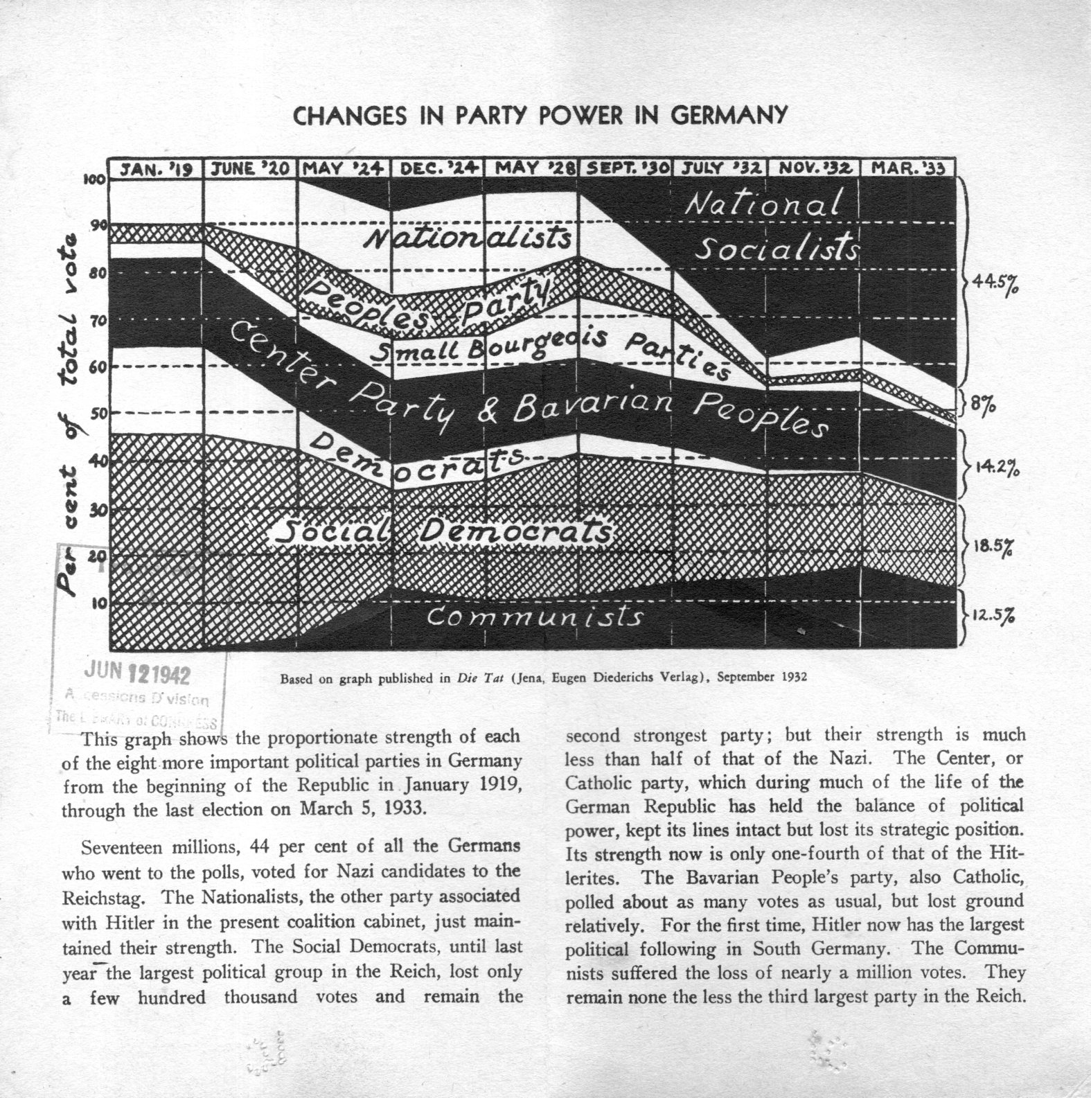
    This graph shows the growing shadow of The End, the falling curtain, creeping across the the vertical and the horizontal.  This was published to show the results of the fatal 1933 election–this was the one right after Hindenburg appointed Hitler Chancellor who immediately dissolved the Reichstag and so necessitated a new election. That election followed months later, and in spite of massive Brown Shirt presence, plus NSDAP intimidation, violence, coercion and son on, Hitler’s party did very well, but perhaps surprisingly not as successful given all of those other factors.  He didn’t have control of the government as a result of the election that gave the Nazis 43% of the seats in the Reichstag.  It would come to develop that Hitler and the party found enough support to implement the Enabling Act, which would give Hitler the power to enact laws without the support of the Reichstag.  Four months later, with the political and power struggle over, there were no other parties in Germany besides the Nazi Party, and that would become Hitler’s ultimate power, and the true beginning of the rotting of Germany and the coming of the deaths of dozens of millions of people.  

    Nazi election453

     [Source: private, via the Library of Congress from the OSS library.]


  • Avaition Cross-Section, 1940

    JF Ptak Science Books   Quick Post

    Schematic  bomber 1940850

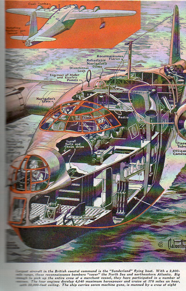
    This is a not-frequently-seen schematic of the Royal Air Force’s Sunderland, a flying boat, and the largest airplane in British service, pictured and slightly dissected in Popular Mechanics in 1940.  (Apologies for the blurry definition on the left side–the book is huge, and not very friendly to the scanner.)