A Daily History of Holes, Dots, Lines, Science, History, Math, Physics, Art, the Unintentional Absurd, Architecture, Maps, Data Visualization, Blank and Missing Things, and so on. |1.6 million words, 7500 images, 4.9 million hits| Press & appearances in The Times, Le Figaro, Mensa, The Economist, The Guardian, Discovery News, Slate, Le Monde, Sci American Blogs, Le Pont, and many other places… 5000+ total posts since 2008.

Category: Information, Quantitative Display of

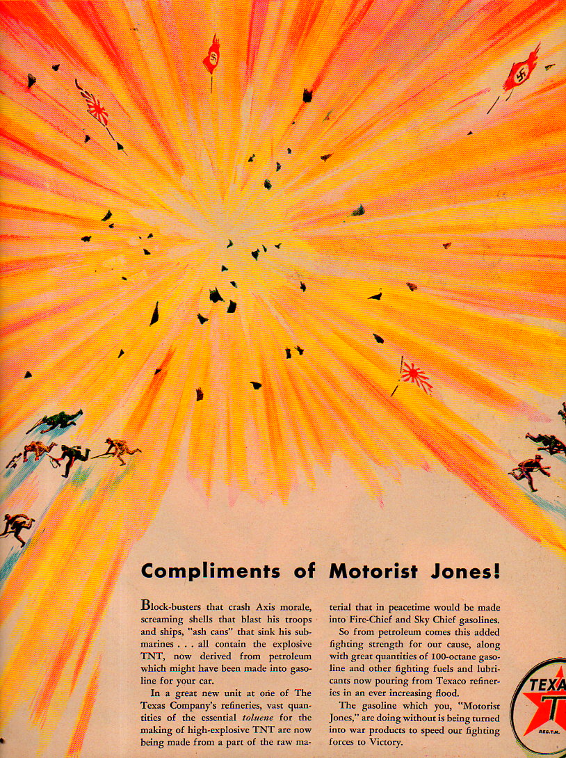
  • Powerful Design–Smithereens, 1943

    JF Ptak Science Books   Quick Post

    The Texaco Company was not kidding around when they expressed appreciation for their customers who still bought their product when available after rationing restrictions–they addressed their customers and showed them the result of channeling their rationed petroleum into the production of TNT. The graphic is the result of Texaco applying themselves to the war effort, and they did not want their current and future customers to forget it.  

    Design--Smithereens024[Source: LIFE magazine, November 15 , 1943.]

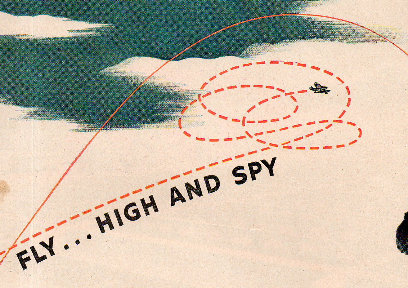
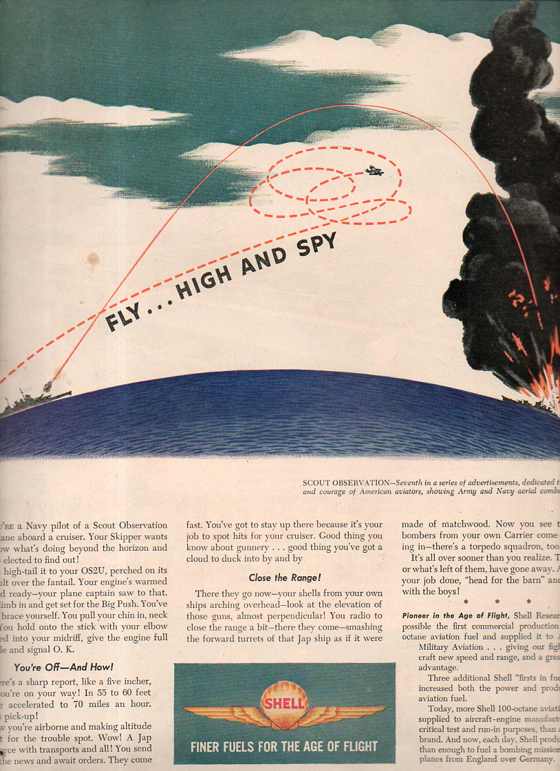
     Additionally, in a similar vein and from later in the year in LIFE,  comes this from Shell Oil:

    Design--smithereens 2027I’m perfectly okay with the “fly…high and spy” part.

    Design--smithereens 2026


  • The History of Meat Maps: “Fluid Beef” Atlases

    JF Ptak Science Books   Post 2488

    • [Please be aware that there were 75 blog posts and another 30,000 words made on this blog in June, 2015–check them out by going to the Recent Posts block at right]

    Meat, seaweed, “beef fluid”, corn, pasta, spices, shrimp, bananas–have all served as a bases for the construction of maps–not maps of _____-producing areas, but the maps themselves being made of the actual thing (or image of it) itself.  Antique examples of this semi-anti-accomplishment are tough to find, with the Moderns being a little more common (as we can see on the Time magazine site, the background of the maps being negatives of antiquarian maps).  

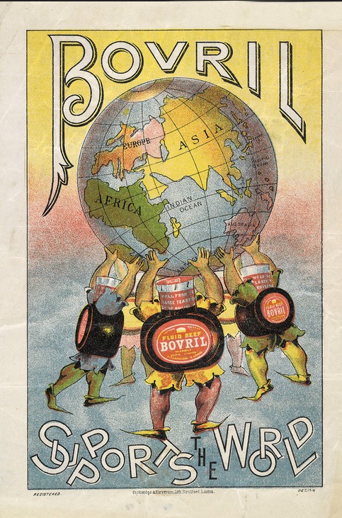
    And so I just had to stop and collect up this image found on Flickr of the rectifying and emboldening Bovril “fluid beef” holding up the world, like an Atlas constructed of water and suspended beef-ish squeezings, which is a lot less appetizing than the original myth.  I can’t think offhand of another atlas-like entity made of meat-things holding up the world. 
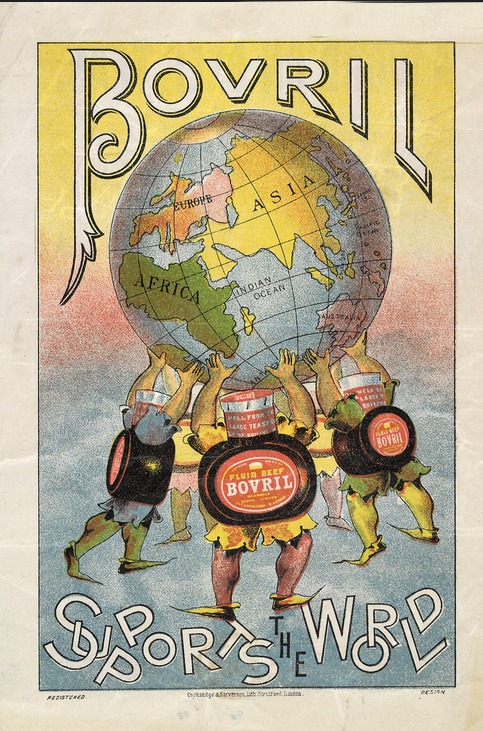
    Maps of meat foodI do not know what the land mass is off the African west coast, except that it shouldn’t be there.  Probably it was supposed to be a too-close South America.  

    Also I should point out that the idea for constructing non-food things from food does go back a long way–there are numerous sculptural items in art and architecture that employ food/foodbits going back many century. The most famous of these maps, I guess, is the semi-magnificent The Porcineograph, produced by the Forbes Lithographic Manufacturing Company of Boston in 1876 or so, which defines the states and territories of the U.S. in terms of their regional foods.  

    This porcineograph

    [Map source:  the Library of Congress.]

    And before proceeding any further, I must at least make reference to another master in this field, an earlier, perhaps revolutionary figure (without producing a revolution), Giuseppe Arcimboldo (also spelled Arcimboldi; 1527-1593), who painted (in his non-conventional works) fantastic portraits and images using fruits, vegetables and other natural objects as the sole source of representation.  On the other hand his influence may not have been so very well known, as many of his works were stolen during war time in the mid-17th century, and he fell rather deeply into obscurity until being revived and resurrected by the Surrealists in the 20th century. 

    http://www.lessing-photo.com/p2/400706/40070643.jpg

    [Image source: http://www.giuseppe-arcimboldo.org/]

    Also in a nearby carrot patch lives some of the work of Nicolas de Larmessin (1640-1725)–an enormously creative and productive artist–who in his way created a genre similar to the great and ancient Dance of Death/.Danse Macabre/Totentanz--though his was the Dance of Life, and in some cases he used mostly food to construct and decorate his portraits.  

    There are more of these examples, to be certain, but that’s all there is time for today.  It is probably some sort of bona fide sub genre, although not a big one, and even there it may all be invisible.  

  • History of Lines: Chronology of European History, ACE 14-1813

    JF Ptak Science Books  Quick Post      History of Lines series

    MAPS--PANTOGRAPHY 4 DETAIL158

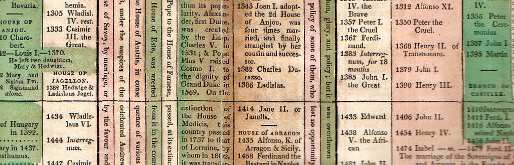
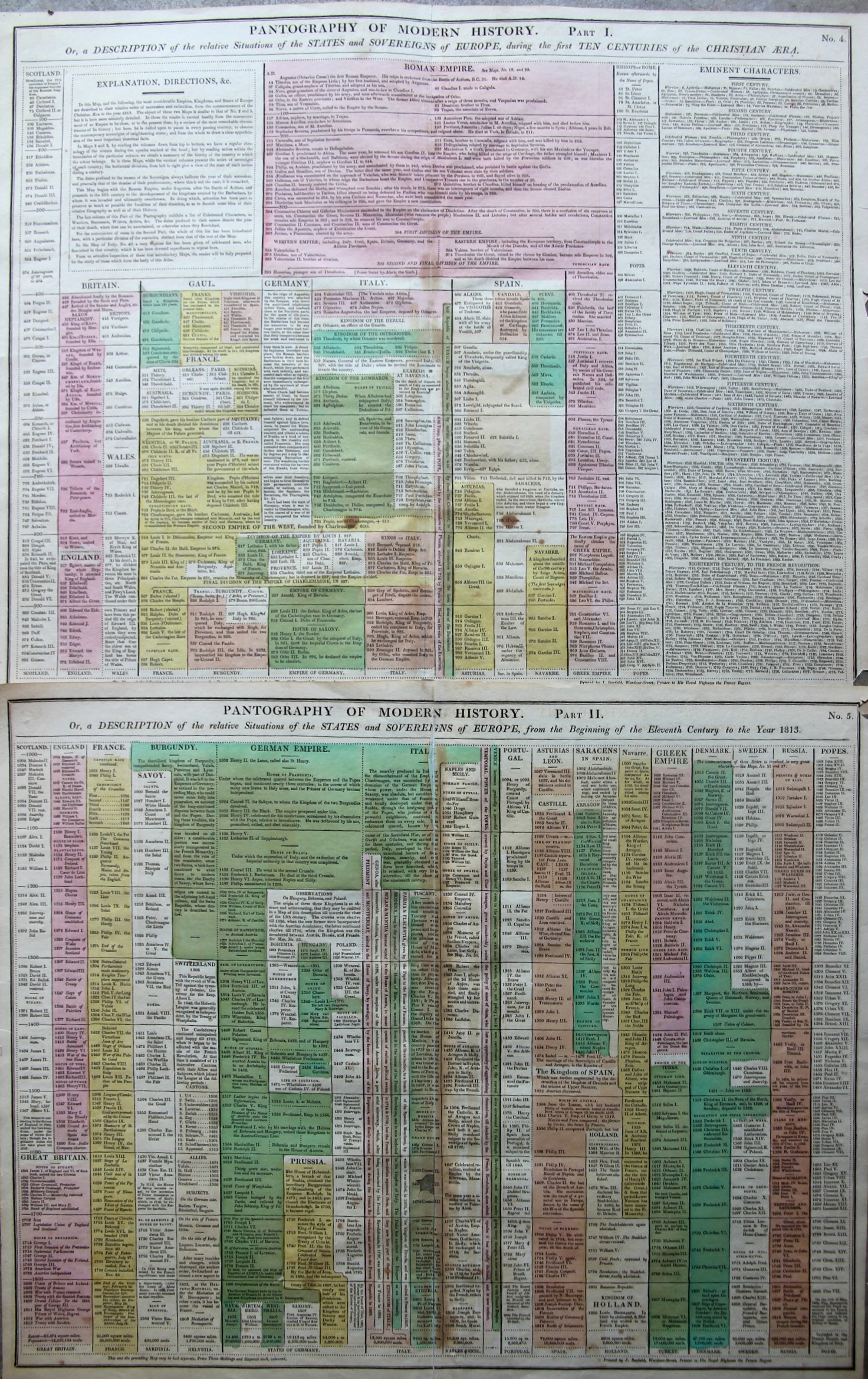
    The “Pantography of Modern History” packs a lot of information into a relatively small space, surveying a good chunk of the history of the West from the year 14 to 1800.  (It is very similar and may be a pirated English version of a French effort that I describe in this post, earlier on this blog.) The sheets are 16×20″ making the full pantography 32×20″ or so–I reckon that there are about 1000 data points on the four square feet or so of paper.  There are some descriptions of events but most of the effort is keeping the ruling heads in order.  This version is a little easier to follow than the French because the design is somewhat sparser, making the bits easier to discern.

    Maps--Pantography _3_

    I’m a big fan of this sort of data display.  

    • Published in Lavoisne’s Complete ….Geographical Atlas, printed by J. Barfield,  1815. “Pantography of Modern History. Or, a Description of the relative Situations of the States and Sovereigns of Europe, during the first Ten Centuries of the Christian Era” Accompanied by “… from the Beginning of the Eleventh Century to the Year 1828”. 

  • What They Wore: the U.S. Soldier, May 1941

    JF Ptak Science Books  Quick Post

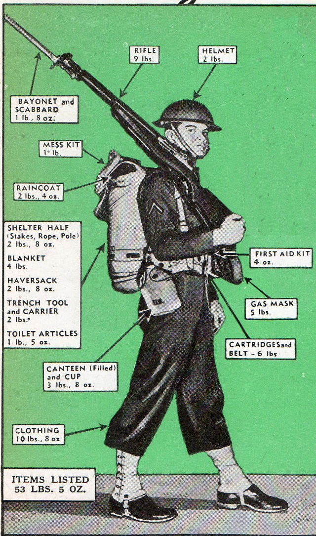
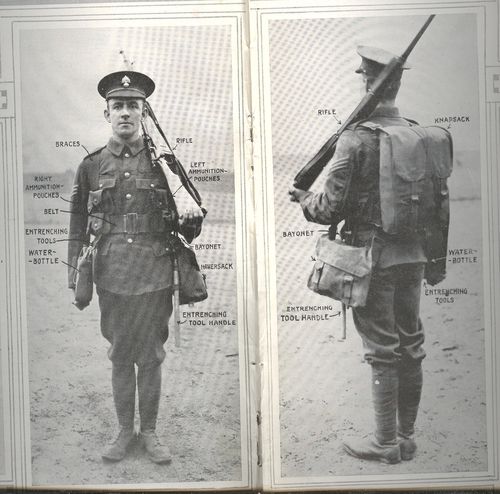
    Earlier in blog I wrote a post (“Things They Took to War, 1915“) about what the soldiers of the U.K. carried into battle.  In many ways it was inspirational and heartbreaking to see what there soldiers marched off with to meet their fate.  I’ve stumbled into another visual record like this, though this time for the U.S. just before our involvement in WWII, appearing in the July 1941 issue of Popular Mechanics.  

    WWII SOLDIER GEAR993

    I reckon that this soldier weighs 148 pounds. which means that his gear amounted to about a third of his body weight.  I suspect that one of the first things these soldiers learned was what they actually needed to carry, and how to make whatever that was to be quiet and non-reflective. Of course this gear would change in about six months, and change again shortly after that.  

    • For example this private was using the M1917 helmet, which would within months be replaced by the steel M-1 helmet–over 22 million of these helmets would be made by September 1945.
    • That’s a lot of helmets. End-to-end in a line they’d stretch from NYC to L.A. and halfway back. On the other hand that number represents about 1/3 of the total war dead in WWII.  

    The outfitted solider of the British Army, 1915:

    Blog jan 30 infantry center btm

     (“Things They Took to War, 1915“) 


  • Superior, Tiny, Mountain Height Profile Insets, 1856

    JF Ptak Science Books  Post 2446

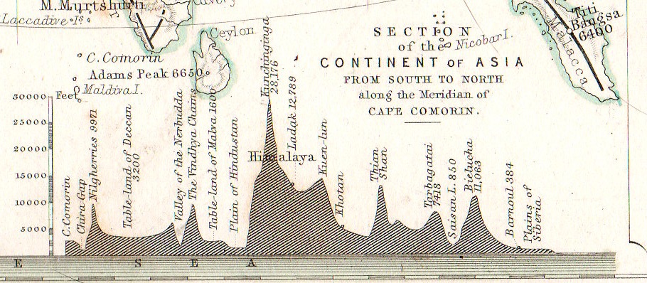
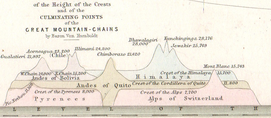
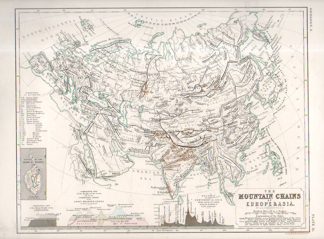
    One of the favorite parts of map reading–especially for 19th century maps–is finding the small, add-on gems of represented data clinging to the sides of the main map, along the margins and in the corners.  Although this map by W. and A.K. Johnstons in itself a fine work of art  and displays some knotty and previously hard-to-com-by data, the two bits at teh bottom of the map just give the overall project a deep lustre.    Alexander Keith Johnston (1804 – 1871) came to this task via the suggestion of Alexander von Humboldt, the results of his own phenomenal research and exploration finding their way into Johnston’s atlas.   

    • The original map may be purchased via our blog bookstore, here.

    Geological mountain ranges934

    This version of “The Mountain Chains of Europe and Asia” is found in the second edition of the Johnston’s The Physical Atlas – A series of maps & illustrations of the Geographical Distribution of Natural Phenomena embracing I. Geology II. Hydrography III. Meteorology IV. Natural History, published in 1856 (following the first edition of 1850).  

    Geological mountain ranges935

    Each of the small inset measures about 1″x1.5″ in the detail of the following:

    Geological mountain ranges933

    Notes:

    Some contemporary notices on the Johnston Atlas: 

    “For the first time, in this country, the principles of graphic representation are here applied to the delineation of the most important facts of external phenomena. Simple but significant symbolical signs have been introduced to an extent, and with an effect, hitherto never contemplated. The contents of the many volumes, formerly the sole depositories of information regarding the different kingdoms of nature, have been condensed and reproduced with a conciseness, precision, completeness, and promptitude of application altogether unattainable by any other agency.”–from a longer description for the atlas found at Chest of Books, here.  

    “This splendid volume will fill a void long felt in this country, where no work has been attainable presenting the results of the important science of Physical Geography in a distinct and tangible form. “–Forgotten Books (here)


  • Bumping into the Invisible: the Coolidge Tube, 1911

    JF Ptak Science Books   Post 2463

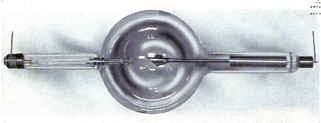
    I’ve bumped into another issue of the Physical Review (December 1911, pp 409-430, volume II (second series), #6) with the important William D. Coolidge  paper, “A Powerful Roentgen Ray Tube With a Pure Electron Discharge”.

    A decade-and-a-half after Wilhelm Roentgen’s discovery of x-rays (an epochal paper published at the tail end of 1895) this is the first appearance of what we think of as the modern X-Ray tube–a design that would be used for decades to come, and which provided clear and more accurate that had been seen, in a way opening this world up, well, exponentially. It is a very significant contribution to the history of science, and it was cool to find it again by chance.

    Coolidge_xray_tube[Source: Wikipedia, showing the Coolidge tube ca. 1917.]


  • Among the Earliest Published Images of Chaco Culture, 1851

    JF Ptak Science Books   Post 2467

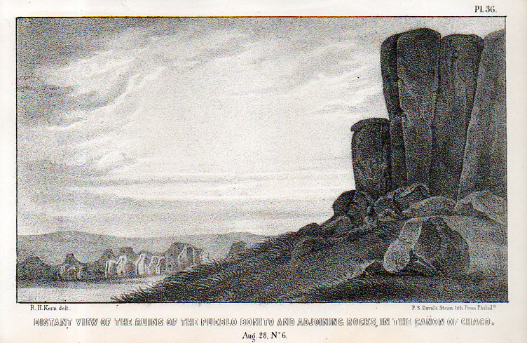
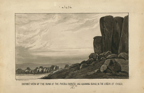
     Pueblo Bonito–built between 840-1100 SCE– is a ruin of the ancestral Puebloan peoples and is located in northern New Mexico. It is situated on a small rise in the long Chaco Canyon, and I’d say that viewing the ruins from photos or maps doesn’t convey the grandeur as you approach it walking up the slight rise–it really does sit prettily in its environment, and is very impressive. (The ruins are about 50 miles east of Canyon de Chelly and about the same distance from the Four Corners.)Kern bonito002

    This image–the first ever published of the structure?–appeared via the military and government exploring expedition and published in the report Journal of a military reconnaissance, from Santa Fé, New Mexico, to the Navajo country, by J.H. Simpson. Simpson was in charge of the exploring party, assisted by the guides Sandoval (Navajo), Hosta (Jemez Pueblo), and Carravahal (Mexico)1.

    The artwork is by Richard Kern (d. 1853) who along with his brother Edward (1822/3-1863) led extraordinary and near Zelig-like lives of exploration, and were among the first to provide accurate, scientific visual reports of the environment, architecture, and people in the Arizona, New Mexico, and southern Colorado areas (and especially in the Four Corners region). 

    • Full text of the report can be found here:  https://archive.org/details/journalamilitar00simpgoog

    This is one of the many images made for the work, undertaken under great duress at times, and under severe hardships, by Richard and Edward Kern during this reconnaissance of the Navajo lands of the Southwest. The remarkable thing is not only how they survived, but also how truthful the published images are to the original drawings.  

    And the original black+white wash, found int eh collections of the Academy of Natural Science of Philadelphia:

    Kern pueblo bonito

    [Source: Academy of Natural Sciences, Philadelphia, Everett Sale Library  http://www.ansp.org/research/library/archives/0100-0199/kern146/]

    And the text associated with the drawing, pp 40-42: 


  • Map of Rivers and Waterfalls, 1851

    JF Ptak Science Books    Quick Post

    Maps Rivers Waterfalls981

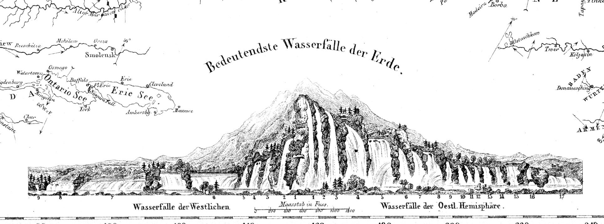
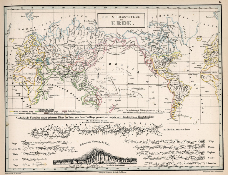
    Before the Neil deGrasse Tyson version and update of Carl Sagan’s landmark television series, Cosmos, there was Alexander von Humboldt, and his enormously influential book of the same title, printed in 1845-1862.  Well, von Humboldt’s (1769-18591) book was actually Kosmos when published in German, which is where it started its life (and which von Humboldt suffered mightily for in it English translation), and in which this map appears.  Von Humboldt was enormously studied and educated and of a high scientific mind over many subjects, one of those 19th century figures who seemed as though they could know everything, a polymath of high order (along the lines of Goethe and von Helmholtz and Thomas Young and others).  He was a meteorologist and biogeographer before those sciences existed; a naturalist, geographer, archaeologist, and explorer, a natural philosopher of magnitudes.

    • The original maps is available for sale at the blog’s bookstore, here.

    Kosmos reflected his lifelong interest in order, and what he did was astonishing–he attempted to unifying the complexities of nature in one book (of five volumes), binding the various branches of science together in a cohesive whole, attempting to show how the laws of the universe acted here on Earth.  It was a very influential work, very progressive, a masterwork of scientific method.  Kosmos.

    Maps--River system


  • An Extraordinary Map of Battle Death–“Body Density Maps”, 1918

    JF Ptak Science Books   Post 2461

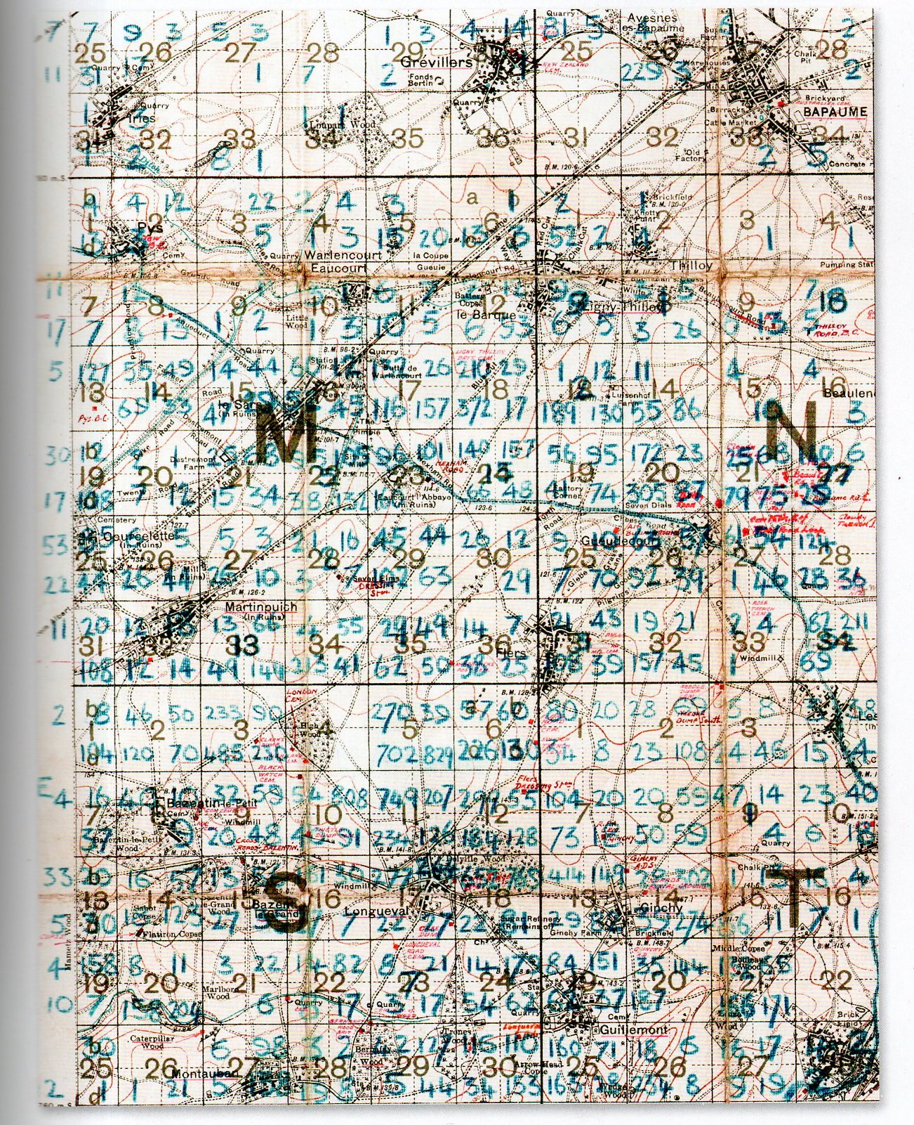
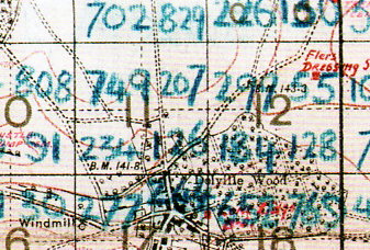
    At first glance this detailed and dense map looks foreboding and somehow off-putting–at least for me, and that was before I understood what the numbers represented.

    The blue numbers on this section of a larger map refer to soldiers killed on the battlefield of the 1916 Somme battlefield. It is the work of Lieutenant Colonel Arthur Messer (Assistant Director of Graves Registration and Enquiries in France), who undertook to record the crosses of the Fallen on the battlefield and register their location, and then to re-inter the bodies together in larger cemeteries.  

    MAP DEATH DENSITY977

     [Source: John Hughes-Wilson, The First World War in 100 Objects, Firefly Books, 2014.]

    What we are seeing here are pieces of four 6×6 grids (one complete and three partial) numbered (in red) 1-36, each one of these squares further subdivided into four section.  Each larger square composed of 36 squares is 1000×1000 yards total, meaning that each one of the 36 subdivisions is about 166×166 yards, and each of the four segments of one smaller square is 83 yards. The blue numbers indicate a soldier killed on that field of battle which means that in the large 36-square “M” subdivision  #18 that there were 210+29+372+17 fatalities, or 628 on a 166×166 yard field, or in one case 372 killed on a 83×83 yard plain.   The deaths were even more intense on other areas of the field–in Square S #11 there were 749+207+234+126, or 1,416 deaths in that 166×166 yard field, and 749 on the 83×83 yard field.  It is hard to visualize such loss. I picture a U.S. football field–there are 22 players on the field during play, and that seems to populate the area pretty well–casualties of 749 soldiers on a similar area would be nearly 35 times that, meaning that placed equidistantly and with a few feet on the sides they would cover the field.  There are, what, 75 people on a football team?  That means at the beginning of the game when all of the players and coaches and staff and cheerleaders and member of the band run out onto the field to take their places, they would all be dead–and then some.  That is a lot of death.  

    MAP DEATH DENSITY978

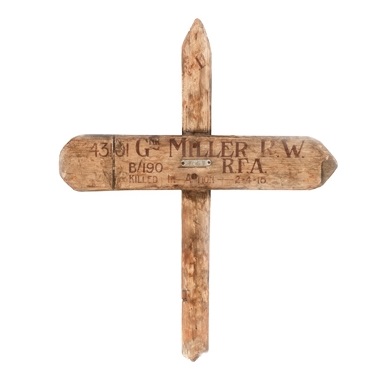
    According to the Imperial War Museum, temporary markers for fallen soldiers looked like this:

    Wooden cross

    After the war the Imperial War Graves Commission replaced the wooden crosses with stone markers.  

    The wooden markers would then returned to the family.  

    [Source: http://www.iwm.org.uk/learning/resources/remembrance-in-the-first-world-war]


  • A “Living Space” Propaganda Card: Germany, 1930’s

    JF Ptak Science Books   Quick Post

    MAP Lebensraum_Propaganda_Card_ver1

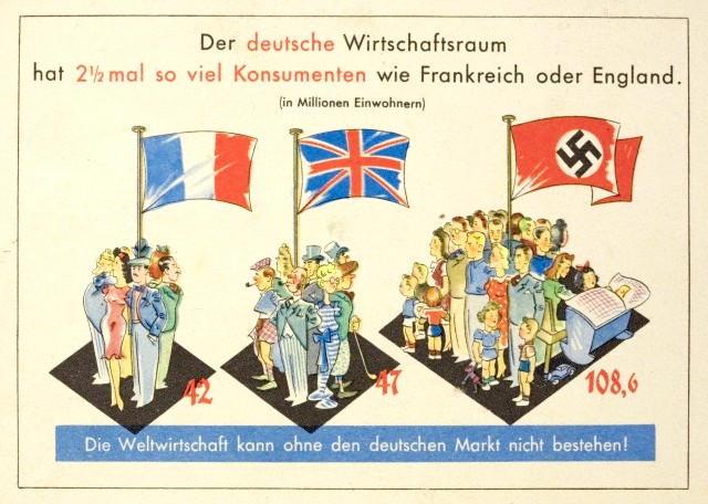
    This is a piece of Nazi propaganda showing relative population densities for France, England, and Germany in the 1930’s, showing that Germany was far more ‘crowded” than the other two countries, and that the necessity for conquering other countries for “living space” was justified. A poor argument believed by millions.  (I should point out that the German’s Germany is the only one featuring children (eight including an infant in a pram), and that the Brits are shown in a creaky/slouchy fashion.) It certainly got the point across–you didn’t even have to read to understand the message.  

    [Source: http://www.authentichistory.com/1930-1939/4-roadtowar/1-germany/]